This Apartment Had Some Serious Blank Slate Problems. One Designer Found a Fix
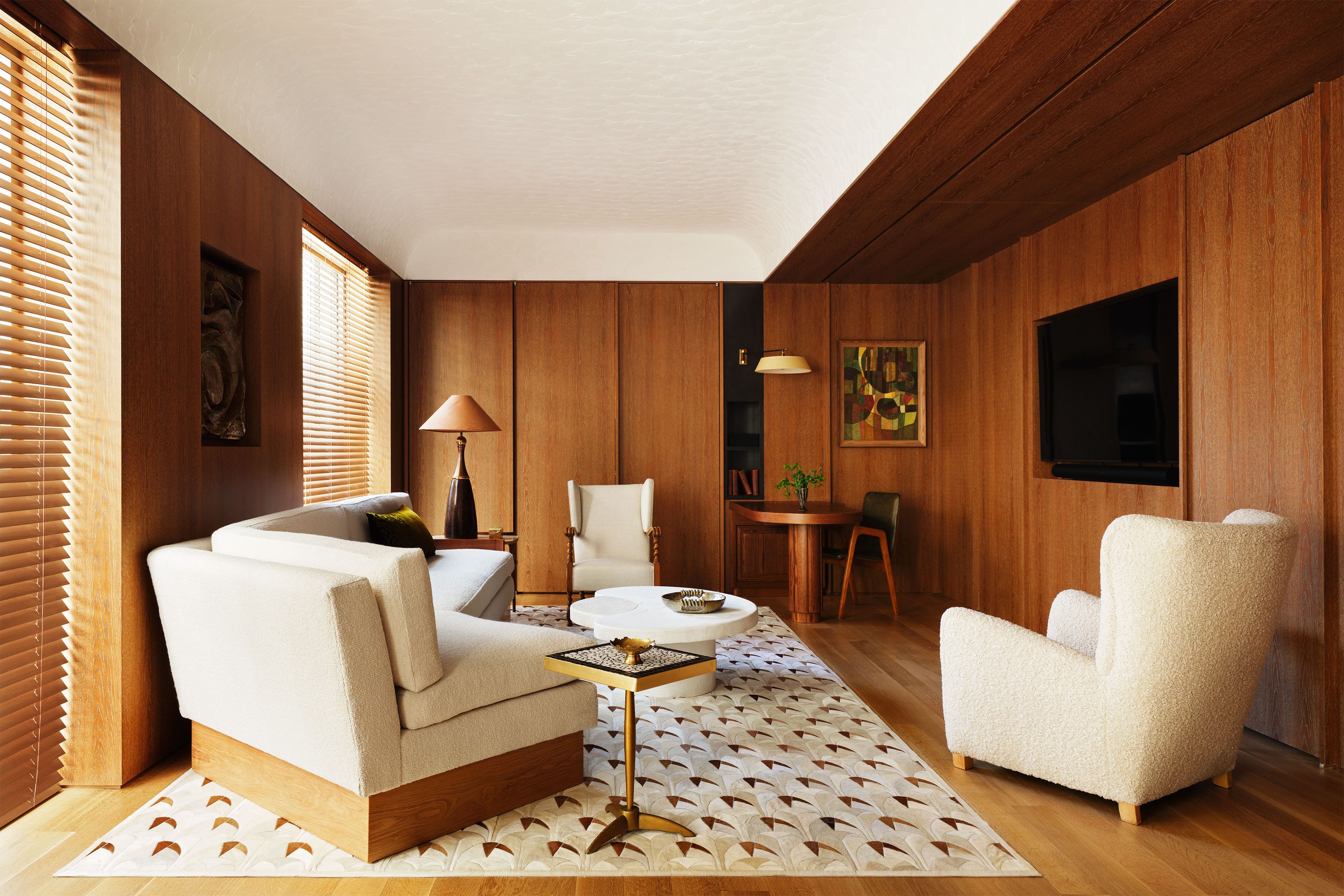
Never underestimate the power of a niche. This is one lesson you learn upon exploring this coolly elegant Upper East Side residence with interior design and architecture by the firm of Nannette Brown. Take the vestibule, where a semicircular recessed seating area sheathed floor to ceiling in zellige tile offers a striking perch for changing shoes. Or the primary bedroom, where a cashmere-upholstered daybed built into an alcove serves as an inviting spot for lounging. And dont forget the wood-paneled library, where a snug little wall niche makes the perfect display shelf for a piece of sculpture. Everywhere you look, functional nooks and recesses abound.Adrian GautIn a Manhattan residence designed by Nannette Brown, the walls in the living room, and throughout the home, feature plaster finishing by Geri Menaged of Couture Faux Arts. The sofa is custom, the iron table bases have a custom glass top by Lucid Glass Studio, the curtains are of a fabric by Brentano, and the rug is by Patterson Flynn. All space is valuableespecially so in New York City, where one never wants to waste an inch, says Brown. But it wasnt simply the economics of scarcity that inspired her unique approach to the apartments plethora of recessed areas. Located just off Park Avenue, the 4,000-square-foot apartment was a blank slate, as she puts it, when she was brought on by the clients. Too blank, in her opinion. As many of these new luxury buildings tend to be, the apartment was bereft of interior architecture, she says. My goal was to un-white-box the apartment.The homeowners are a creatively minded couple (he works in fashion; shes a former DJ) who had moved out of the townhouse where they raised their children, now grown. Ready for the next phase of their lives, they were keen on starting fresh and decided not to bring a speck of their old furniture with them.Adrian GautA guest room was converted into a study for the wife, with a custom sofa in a Castel fabric. The shutter panel insets are in a Dedar fabric. As they told Brown, known for her clean, edited, monochromatic interiors, they wanted their new home to feel light, serene, and modern. Their proclivity toward modernity, especially, piqued the designers creative instincts. The apartments in this neighborhood tend to be very traditional, as the architecture is mostly prewar, Brown says. I loved that this couple wanted to go a different way. And so the clients agreed to rip out the pristine walls and fancy developer finishes in order to realize Browns vision.Tour This Upper East Side ApartmentOne of the first major elements to go was a vaguely Art Deco metal railing that divided the dining area from the sunken living room. In its place, Brown added an understated wall of brushed white oak, which provides an earthy materiality as well as a more defined separation of the two spaces. The living room needed a focal point, so Brown installed a stone fireplace (electric) with an overmantel of the same knotty white oak on the living rooms formerly blank wall. A pair of floor-to-ceiling plaster doors, lying flush against the fireplace, unfold to reveal a bar and buffet. All space is valuableespecially so in New York City, where one never wants to waste an inch.In the entry hall, where there had been plain drywall between the dining area and sunken living room, Brown placed a monumental vertical column of honed silver travertine. I wanted it to look like this stone had been emerging from the ground below, she says. Its somber shade of gray is echoed by the silvery gray tile lining the vestibules seating nook, which Brown created by stealing space from a deep closet in the adjacent powder room.Adrian GautThe guest room features a wallcovering by Rose Tarlow. The bed and linens fabric is by Brentano, the curtains are of a Claremont fabric with trim by Pindler, and the rug is by Nordic Knots.The designers most dramatic transformation involved the north wing of the apartment, which originally housed four bedrooms, including the primary suite. The couple really needed only twotheir own and one guest roomso Brown duly removed the two spares as well as a bathroom and, with some sneaky reconfiguring, created a large oak-paneled library and TV room that flows into their bedroom. The entire wing is set off by graceful doors of blackened steel and ribbed glass that Brown says she designed to look like they had been there forever.In all, it took almost nine months of heavy lifting before the apartment was truly ready for the owners to move in. But the couple, who took residence last spring, say it was more than worth the wait. Everything came together seamlessly, says the wife. And we continue to have the pleasure of discovery.This story originally appeared in the November 2024 issue of ELLE DECOR. SUBSCRIBE


