With the continuous advancement of image upscaling technology, arguably one of the few genuinely good uses for generative AI, I bet twenty years from now, new generations won’t be able to comprehend why CSI: Miami’s “zoom and enhance” was at one point a meme, considering they’ll probably have better image-enhancing tools available for free via a simple Google search.
While powerful, AI upscalers – most of which increase an image’s resolution by generating new pixels based on the existing ones and the millions of pictures they’ve been fed – aren’t without their flaws, often losing smaller details, hallucinating non-existent features, smearing the outlines, and overall giving otherwise normal images this “AI look” one can recognize at first glance.
Of course, it’s no secret that the aforementioned downsides are by no means unique to AI upscalers and have existed even when upscaling technology was still in its infancy, a point recently reaffirmed by Game Developer and former DreamWorks Animation Supervisor Lionel “SeithCG” Gallat, whom you might know from his 2018 action RPG Ghost of a Tale.
A few days ago, SeithCG revisited the 2013 Blu-ray remaster of Disney’s The Sword in the Stone, a classic 1963 retelling of the Arthurian legend about the young king-to-be pulling Excalibur from a stone (or an anvil) to prove his royal lineage. While the film wasn’t a massive success upon release, it made its mark with splendid animation and a unique art style, characterized by pencil-textured lines that gave The Sword in the Stone a distinct look.
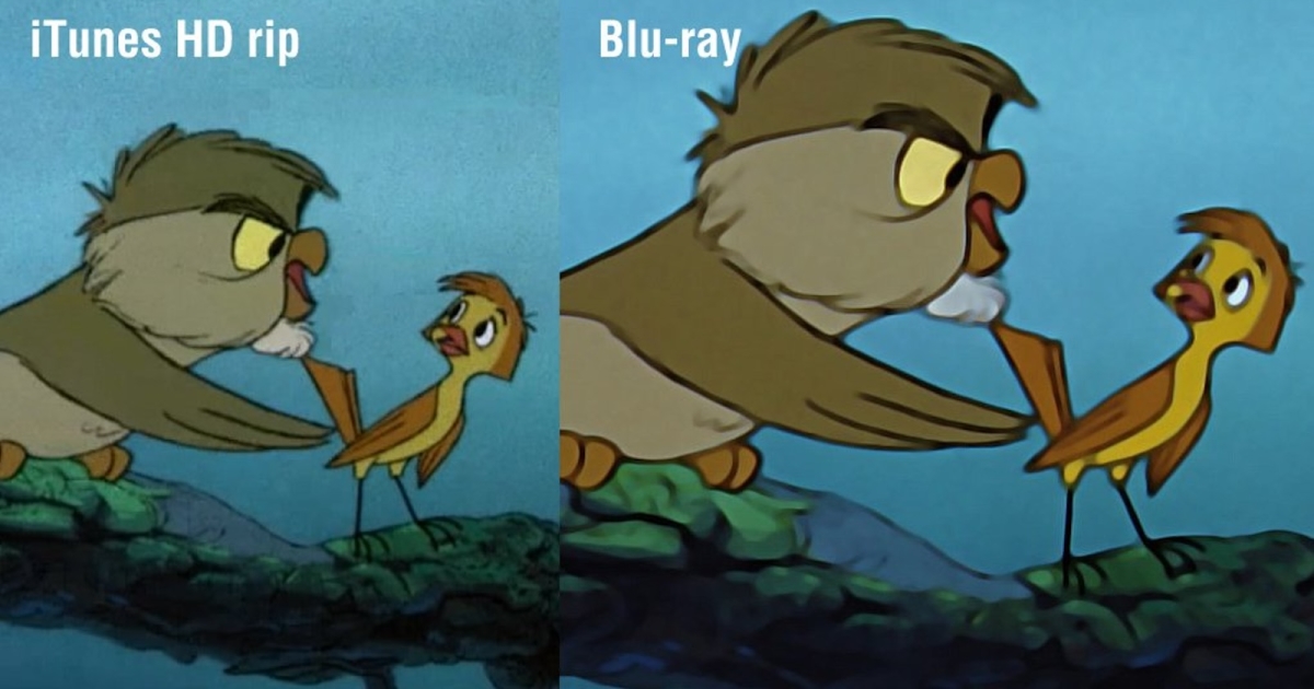
Unfortunately, it’s precisely these outlines that the 2013 remaster butchered. In his Twitter thread, SeithCG provided several screenshots comparing scenes from the original movie with the remastered version, and the difference is shocking. The movie’s signature line art was obliterated, many fine details were lost, and the entire visual charm of the film was reduced to what SeithCG succinctly described as a “flat shapeless blob”.
Here are some of the comparison screenshots the developer has provided:
According to a 2013 movie review by Kenneth Brown, the culprit behind the disastrous outcome was the use of digital noise reduction (DNR), a technique designed to smooth out the picture and eliminate things like pixelation and film grain, but at the cost of finer details. Brown called the remaster’s use of DNR “unforgiving,” noting that it resulted in some of the worst digital smearing he had ever seen – an assessment that’s hard to argue with.
“The animators’ line art has been scrubbed to the point of appearing squishy, disheveled or, at its worst, nearly indistinct (as if it’s been blotted away), and every now and then it falls into all three categories,” the review reads. “The painted backgrounds have the telltale smeariness of noise reduction gone awry – as does the print, which tends to feature ugly artificial cleanliness – and grain has been wiped away in its entirety, almost to comical ends. How bad does it get? It isn’t uncommon to run across a sequence that looks as if it’s been restored using tracing sheets and Crayola markers.”
Much like most Disney stories, however, this one also has a happy ending. As SeithCG noted, the version of The Sword in the Stone currently streaming on Disney+ is not the same as the flawed remaster and “looks good, no DNR shenanigans there.” You can check it out yourself by clicking this link.
And what do you think about the 2013 remaster? What are some of the most outrageous DNR implementations you’ve seen? Tell us in the comments!
Don’t forget to join our 80 Level Talent platform and our new Discord server, follow us on Instagram, Twitter, LinkedIn, Telegram, TikTok, and Threads, where we share breakdowns, the latest news, awesome artworks, and more.


