Introduction
Hi readers! My name is Guillaume Paluch. I am a twenty-year-old Belgian guy, and I have just finished my third year of a Bachelor’s degree. Three years ago, I had barely touched a computer seriously. I would say all these amazing things in the making-of of big movies woke up my curiosity, and what fascinated me the most were the creatures. I must admit I was kind of the dinosaur guy.
Then, I joined the fresh Belgian CG Academy school, where the professors played a big role in my first encounter with the 3D world. However, I don’t think I got all my skills from them. A big part of it is about thinking through ideas, self-learning, and a bit of a mindset like, “If some artists can create such cool things, why not me? I’m not that different, I think”. And I am wondering today if that curiosity I was speaking about just evolved into a very early passion for animation and, by extension, for storytelling.
On this very day, I have contributed to a project, Gloomy Eyes The Game, at a very nice Belgian studio named Fishing Cactus. I was put in charge of the main cinematics of the game from the beginning of my internship before being engaged until October. I have to admit, I was really lucky to find such a great first professional experience with such a cool project. At the moment, I have just finished my contract and am currently seeking new challenges around the world.
Apart from that, I have not yet been involved in any professional projects, only personal ones and schoolwork. I’m mentioning this because I had the chance to work on more contextualized whole animation projects rather than more isolated animation exercises. I believe this pushed me to develop a broader vision and allowed me to dream big without feeling bored by my work. I always tried to add a personal touch to make each project special and often set myself extra challenges. Sometimes, this led me to go too far and miss the objective of the assignment, but I wasn’t doing it just for the grades anyway, just for personal pleasure.
The TFE Project
It’s quite a story, to be honest. We knew that for our third and final year, we needed to complete a TFE, which means Travail de Fin d’Études in French. It is like a graduation project. I named it after TFE as a quick and amusing choice. There were a few kinds of it, such as technical animation, rigging, or character design. However, there was another option that intrigued me. It was the narrative TFE.
While it wasn’t necessarily more difficult, we just had to tell a story. But I found it more challenging and interesting than the others. Because I envisioned the golden opportunity to prove that I could handle all aspects of technical animation, rigging, and character design in one project while also telling a compelling story. So, I made my choice, even though I didn’t fully know how I was going to approach it.
I struggled a lot with what I wanted to convey. I wanted to explore the theme of war in a horror context, filled with death and dark elements. However, I had tackled a similar vibe the year before and wanted to take a different approach. I began to contemplate this while on the bus, allowing my mind to wander and dream about a fly. I drew inspiration from various experimental artists and works, such as The Cell by Tarsem Singh and Bill Viola for their marvelous ideas, as well as Joel Coen’s Tragedy of Macbeth for its mythology. I also looked to Ron Mueck and Sergio Toppi for their incredible spatial staging. The fact is, I envisioned the look of the shot before developing the story. I think that’s why it has such a dreamlike and abstract quality, and it makes sense considering the kinds of artists I referenced.
I wanted to delve into the themes of death and the grief of loved ones. I imagined a fly that makes the corpse speak in his death state, and I envisioned a killer who cannot escape the flies surrounding the body he has just murdered. Initially, my concept was very blurry. And it still does.
It became even more, when I cut my rough storyboard from 3 minutes and 30 seconds down to just 2 minutes, considering that I didn’t have enough time. Indeed, it was around February, and I needed to complete everything by the end of May, including my making-of, my written graduation project (which was a different type of graduation work that was entirely written and more traditional), and, of course, my most important, my internship. I can say I haven’t slept so much during these days!
I liked the idea of it resembling abstract art. You know, the kind of graphic production that makes you stand in front of it, wondering what’s going on inside the artist’s head. The “story” was set, but it wasn’t compelling enough. I needed something more, something that would motivate me.
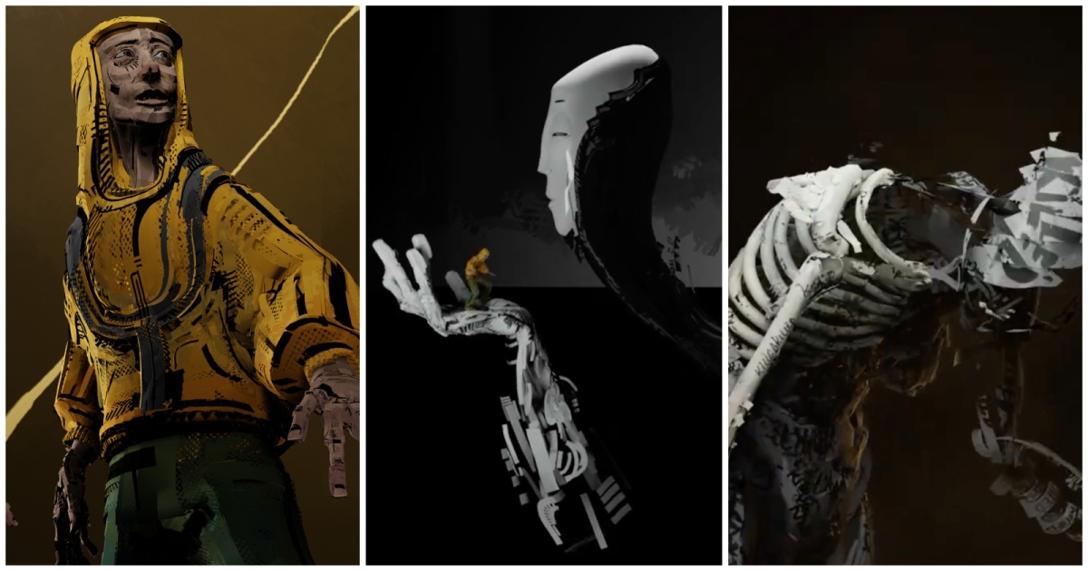
I had in mind the work of several 3D artists and work, such as Bozo Balov, Matt Schaefer, and the South of Midnight teaser trailer. All of them had a highly graphic and “illustrative” style. I aimed to reach that level in terms of graphic expression. While contemplating the visual aspect, I worked on all the preproduction tasks, designing the characters and thinking about the scenes. For the characters, I had the Protagonist/Killer, the Fly, the Memory, and the Dead. I decided to create the character designs using Quill, a VR software for modeling and animation.
I don’t think there’s a specific message behind it, except that you cannot escape memory. It will catch you in moments when you have nothing else to think about. Memory is the starting point of your entire imagination, and it’s important to embrace it because that’s your whole being, even if it scares you.
But In the end, it feels like my own mind is trying to tell you something I cannot fully explain. It’s like a weird dream of mine. I feel like I failed to keep this message consistent from start to finish. Maybe it’s even deeper that way; I don’t really know.
Storyboard & Blockout
The staging was very instinctive. At first, I created a rough and not-so-attractive storyboard to make a short video edit and see if the rhythm worked well. Once I cut it and had a clearer idea of what it would look like, I developed a more detailed and polished storyboard. You see, I don’t have a clear understanding of how other artists approach storyboarding. It often seems to be the same: clear but not detailed.
However, I enjoyed drawing inspiration from various illustrators and aimed for a more graphic approach. That’s why I found it quite acceptable to spend a little more time on a well-crafted storyboard, more like comics kind. I must admit that I exceeded the estimated shot count, but after a few weeks of working alone on your project, you gain a clearer understanding of the number of final shots you are going to do.
As always, you need to do a blockout. I started it as soon as I had the WIP character models for the scene scale, like inside the bus, for example.
Modeling
The modeling was quite a challenge! I had heard about VR tools before, but I had never had the opportunity to try one. The first step was to find the material. Fortunately, the studio where I was interning also worked on projects that involved VR headsets and technology. I asked if I could borrow a VR headset during my internship, and luckily, they agreed.
As you know, I didn’t have much time, so on the very day I borrowed the headset, I installed Quill and started “playing around” with it. After a few spacing anatomy exercises, I began creating the characters. Each character presented specific challenges in terms of modeling, rig, and animation. Since I was just starting with this software, I made a list based on importance and complexity.
The first character on the list was the Dead character. This was supposed to be a simple corpse. Given that, this character was the most interesting one to start with: I could make errors on it, and no one would notice. Additionally, it had a very “anatomical” body, allowing me to practice my perspective skills. To make it easier, this was the only character I created using a reference model; I modeled over the surface of a previous model. I added anatomical details like bones and muscle groups.
Then, I worked on the Fly, which presented a challenge because I needed to use very precise anatomical references, such as the halteres for the wings (stabilators). The next was the Protagonist. The challenge for him was the face. I had to model if thinking about of the rig was going to deform it. For the rest, the coat was very “geometric” and pretty easy to do. I enjoyed adding little details to the basic shape of it.
Finally, I designed the Memory, incorporating a very “Sergio Toppi” pattern across the body, but not for the face, it had to be immaculate.
For each of these characters, I initially created a blocky model to establish their proportions. I imported this model into Quill to create the basic lines, and then I continued from there, removing the blocky model. I also had a fascination with hands, so I wanted to create very distinctive ones: more “rational” for the Protagonist and curvier for Memory, resembling the flow of a river to represent memories flowing through her kind of “veins”. Unfortunately, I didn’t have the opportunity to explore Quill further, as the software is capable of much more in terms of character modeling and even animating in a 2D style. I encourage you to explore your creativity through this software if you have the opportunity and the materials. Many artists are doing amazing work with it, and that’s really inspiring, even for non-VR artists.
Topology & Texturing
The retopology pipeline for the character was something I hadn’t considered until I saw the first characters emerging from the modeling phase. Thanks to Quill, it has an optimization brush that reduces the number of quads in your mesh. I tried to maximize the areas that didn’t require any heavy resolution. And let the other part that required that resolution for close-up or skinning deform. For instance, with the Protagonist, who has a very linear design, I could significantly reduce the number of quads while maintaining full resolution for the face, just as we do with any classic 3D character. However, with Quill, it’s impossible to reduce the quad count as much as with traditional character modeling; you always need more quads to maintain its brushy style. So, it is still pretty heavy.
For texturing, I used Substance 3D Painter. I didn’t implement a complex pipeline, as I used principally the color settings. I unwrapped the UVs in Blender using the automatic UV unwrap because it was nearly impossible to organize all the brushes UVs on the Quill model for a proper UV panel. Therefore, I hand-painted the character directly in the 3D view.
I also used different UDIMs for the important parts that needed more details for the close camera shot, like the Protagonist’s face. Regarding the backgrounds and various props, I modeled them with optimization in mind and focused on cleaning up the UV unwrap. This approach allowed for a more efficient texturing pipeline and sped up the overall process.
I hadn’t figured out the texturing at first because I didn’t have any, and we were only two weeks away from the deadline! But a nice fact: I had done my internship at this time, so in the end, I managed to do it, and I’m quite satisfied with the result given the short time frame. I felt more comfortable with the hand-painted techniques. It was actually nice to have the freedom to make mistakes during the process, as it could even enhance the “dirty” and “rough” aesthetic I was going for. To be honest with you, I did not texture some parts. For example, the projector that you can see in the middle of the short film is just textured on the top because we can see it. But here’s a fun fact: the back part is flashy blue and green fluo, and nobody knows that… except you now.
I also used a more complex texturing technique for the characters. As you can see, some of them have a noisy texture. I was worried that the hand-painted style might make it difficult to clearly distinguish the characters from the background. So, I adopted a technique that Bozo Balov had already used: adding alpha-animated noise. Each character has a different pattern. The Protagonist has a more “comics” style with small dots, the Fly’s texture is finer and faster, and the Dead character has a more pronounced noise but still allows the painted words on her body to be readable.
Choosing the colors for each character wasn’t the most challenging part of the project. The Protagonist’s yellow symbolizes danger as in nature, where bright colors often indicate toxicity or lethal threats. At first glance, we might think he is the victim, which is what we’re used to, but he is actually the one who has killed before. The Fly follows the classic Calliphora vomitoria colors, the typical blue fly, simply because this species eats flesh. For the Dead character, I opted for a grey, aged appearance, like an old mummy. Memory herself was rendered in black and white to represent her Manichean duality, inspired by the white makeup of a geisha, symbolizing seduction.
Composition
The last scene was heavily inspired by comic book illustrations. The shapes and composition were designed to make Memory appear imposing, omnipresent, and always larger than the protagonist. She holds him in her hand while simultaneously appearing behind him as a second entity. This concept was directly borrowed from Francis Ford Coppola’s Dracula. The religious pose of her hand before resting it on his shoulder was meant to convey a sense of holiness. Despite her intimidating presence, the protagonist realizes that she is a part of him and accepts her. He allows her to cover his eyes, guiding him through his memories, sounds, images, and feelings like a cinematic experience.
The final shot was one of the more “graphic” ideas I developed while refining the storyboard. The composition was striking because Memory’s hand concealed exactly what was behind it: the protagonist’s eyes, which were filled with fear. In the parts that were not hidden, we could see Memory gently cradling his head, covering his eyes but, at the same time, revealing something to him in his past. It was as if she was giving him the ability to look inward, allowing him to see something deep within himself.
Rendering
I initially planned to render this short film in Unreal Engine. I had already worked with the software before and really enjoyed how we could light the scenes. Around that time, I discovered the short film War is Over by Dave Mullins, which was incredible and further inspired me. However, midway through production, I realized I couldn’t manage it within the available time. So, Unreal will have to wait for another project!
Instead, I decided to stick with Blender, which I was much more familiar with. It felt like the safer option, and I also needed to work quickly, so I rendered everything in Eevee. After tweaking a few settings, I was pleasantly surprised by the quality it produced.
For the bus scene, I experimented and did a lot of research. I visited several buses in my area, looking for a specific older model. I also studied photos of bus interiors at night to see how my phone camera was filming it. I tried to not perfectly recreate the lighting but to capture the mood, sleepy, warm, and slightly blurry. The dark setting helped me optimize one particular shot where the camera was positioned above the seats. There’s a part of the bus that isn’t lit, so I didn’t waste time modeling or texturing that area. It was funny to see it in the viewport: just a few seats and then a giant hole in the floor!
During post-production, I mainly focused on ensuring that the scenes maintained a consistent mood. To achieve this, I applied hue corrections and other standard post-production adjustments, but nothing too significant. I did have to make a few edits, such as the shot with the big eyes and Memory in front of them. However, elements like the title at the end and even my name were already integrated into the scene itself. I wanted everything to blend naturally, including the lighting and other visual elements.
And I almost forgot: I have added a few 2D effects in Photoshop. First to add above the noise a few real 2D brushes frame by frame. And then to replace the motion blur with a more illustration effect! I think it is the kind of detail that makes a difference.
Animation
I handled all the animations in Blender, but first, I had to do the rigging, which wasn’t exactly enjoyable. I used an auto rig for the humanoid characters, and typically, you can use automatic skinning. While it’s never perfect, it usually just requires a few adjustments. However, in this case, likely due to the Quill process, there wasn’t a single unified mesh. Instead, the characters were made up of multiple small brush meshes, which Blender doesn’t handle well. As you can imagine, the automatic capture didn’t work properly, so I had no choice but to capture everything manually.
Once I had the base capture, I decided to make the most of it by rigging individual brush parts to act as specific joints for body mechanics. For example, Memory has at least 30 different bones in just one forearm. The Dead character has her belly rigged to make the flies escape through her decaying flesh, and the protagonist has subtle stripes on his shoulders that move in one of the final shots.
As for the Fly, I rigged it as well but this time without any automatic device: I wanted a little bit of fun for this one. Nothing too complex, but I made sure the abdomen could squish, which is a real characteristic feature I wanted to capture, along with the halteres (the small structures that help with flight stability).
For the animation process, I usually start by setting up the camera shots with simple animated boxes to get a rough idea of the staging and rhythm. Then, I animate the characters in their T-poses. After that, I do a classic blocking pass with well-defined key poses. At this stage, the animation looks more like stop-motion, with keyframes in constant interpolation. Once the rhythm feels right and the body mechanics are solid, I switch to spline and refine the poses and curves.
But the work doesn’t end there. After polishing the body animation, I added a specific layer just for the fingers, which I consider just as important as the face. If the character has a face, I animated that next, starting with eye direction, followed by opening/closing the eyes, then the eyebrows, and finally the mouth. This process, of course, applies when there’s no lip-sync involved.
I did use one trick for the Fly. I left some parts of the animation in a constant curve because it fits this rapid gesture, like a spasm. Even the bus parts were rigged because I wanted full control over them. It also made sense in case I ended up rendering in Unreal Engine: I’d only need to export the animation as a skeletal mesh. However, there’s not much to elaborate on regarding that part. I think the part I enjoyed animating the most was the fly transition when it dives through the bus. This is by far my favorite, as the flight is coordinated with the music, and I feel it created a very organic and fluid motion.
My second favorite is the extreme close-up of the Protagonist’s eyes. You can see all the small details, from the texturing to the subtle animation with the micro-movements around the eyes. For both of these shots, I feel like I achieved exactly what I had envisioned, and that’s very satisfying. What about yours? What is your favorite shot?


