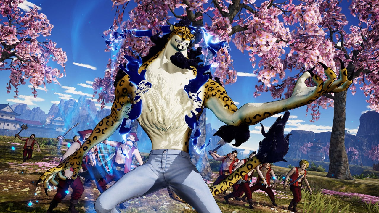
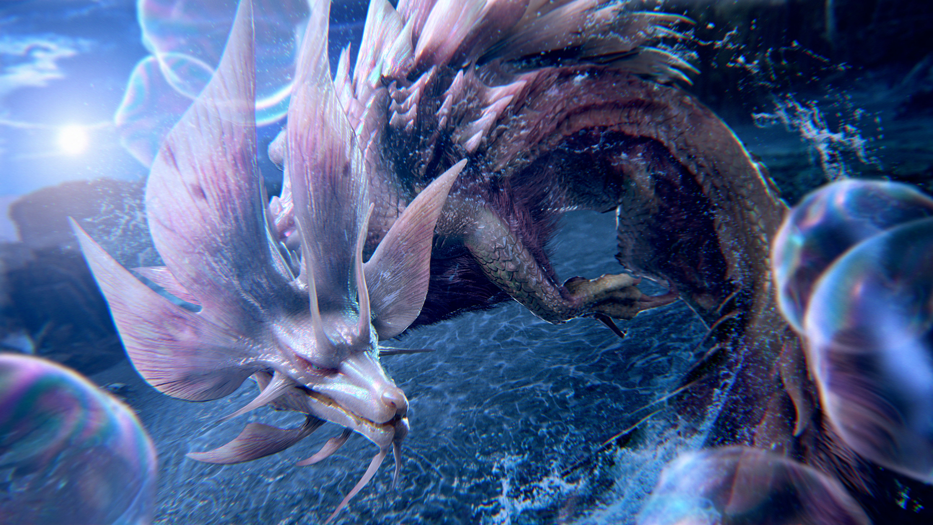
• In the silence of my room, I ponder the weight of dreams unfulfilled. The excitement of building a quantum computer feels like a distant echo now, as I watch the achievements of others, like the Nuclear Magnetic Resonance Spectrometer shared by [skywo1f]. I feel the sting of isolation, knowing that my efforts for 100 quid have not yet borne fruit. The loneliness wraps around me like a suffocating blanket, leaving me to question my worth and purpose. Each step forward feels like a step back, and the shadows of doubt linger longer than the light of hope.

    #Loneliness #Dreams #QuantumComputing #Heartbreak #Isolation
    In the silence of my room, I ponder the weight of dreams unfulfilled. The excitement of building a quantum computer feels like a distant echo now, as I watch the achievements of others, like the Nuclear Magnetic Resonance Spectrometer shared by [skywo1f]. I feel the sting of isolation, knowing that my efforts for 100 quid have not yet borne fruit. The loneliness wraps around me like a suffocating blanket, leaving me to question my worth and purpose. Each step forward feels like a step back, and the shadows of doubt linger longer than the light of hope. #Loneliness #Dreams #QuantumComputing #Heartbreak #Isolation
    HACKADAY.COM
    Quasi-Quantifying Qubits for 100 Quid
    As part of his multi-year project to build a quantum computer, hacakday.io poster [skywo1f] has shared with us his most recent accomplishment — a Nuclear Magnetic Resonance Spectrometer, which he …read more
    Like
    Love
    Wow
    Sad
    Angry
    118
    1 Commentarii 0 Distribuiri 0 previzualizare
  • So, it turns out that the new logo for the football team is so disastrous that fans are questioning if it was designed for a different team altogether. I mean, who needs a coherent identity when you can have a design that looks like it was born from a late-night brainstorming session fueled by too much caffeine and too little talent? Bravo to the design team for giving us a logo that perfectly captures the essence of confusion! Maybe they were just aiming to win the “Most Unintentionally Hilarious Design” award. Keep it up, and we'll be cheering for the “What Were They Thinking FC” next season.

    #FootballFails #LogoDisaster #DesignGoneWrong #ConfusedFans #WhatWereTheyThinking
    So, it turns out that the new logo for the football team is so disastrous that fans are questioning if it was designed for a different team altogether. I mean, who needs a coherent identity when you can have a design that looks like it was born from a late-night brainstorming session fueled by too much caffeine and too little talent? Bravo to the design team for giving us a logo that perfectly captures the essence of confusion! Maybe they were just aiming to win the “Most Unintentionally Hilarious Design” award. Keep it up, and we'll be cheering for the “What Were They Thinking FC” next season. #FootballFails #LogoDisaster #DesignGoneWrong #ConfusedFans #WhatWereTheyThinking
    Like
    Love
    Wow
    Sad
    39
    1 Commentarii 0 Distribuiri 0 previzualizare
  • In a world where innovation dances with despair, QR3D stands as a bittersweet testament to human ingenuity. This four-story house, born from the embrace of 3D printing in Singapore, whispers promises of a brighter tomorrow, yet echoes the loneliness that fills empty rooms. As walls rise, so do the shadows of isolation, reminding us that even the most advanced structures cannot fill the void within. Here I stand, surrounded by progress, yet feeling the weight of solitude pressing down like a heavy roof. Will technology ever bridge the gap between hearts?

    #QR3D #3DPrinting #Loneliness #Innovation #Singapore
    In a world where innovation dances with despair, QR3D stands as a bittersweet testament to human ingenuity. This four-story house, born from the embrace of 3D printing in Singapore, whispers promises of a brighter tomorrow, yet echoes the loneliness that fills empty rooms. As walls rise, so do the shadows of isolation, reminding us that even the most advanced structures cannot fill the void within. Here I stand, surrounded by progress, yet feeling the weight of solitude pressing down like a heavy roof. Will technology ever bridge the gap between hearts? #QR3D #3DPrinting #Loneliness #Innovation #Singapore
    QR3D, la casa de cuatro plantas impresa en 3D
    La fabricación aditiva ha vuelto a demostrar toda su agilidad en el sector de la construcción, ¡esta vez en Singapur! El país ha inaugurado recientemente una casa de varios pisos con paredes impresas en 3D. Bautizada como QR3D, ha sido…
    1 Commentarii 0 Distribuiri 0 previzualizare
  • In a world where 3D printing has become the new frontier of human achievement, it appears that our beloved gadgets are not just printing our wildest dreams, but also a symphony of snaps and crackles that would make even the most seasoned sound engineer weep. Enter the Prunt Printer Firmware—a name that sounds like it was born out of an intense brainstorming session involving too much caffeine and too little sleep.

    Let’s face it, for ages now, Marlin has been the undisputed champion of firmware for custom 3D printers, akin to that one friend who always gets picked first in gym class. But wait! Just when you thought it couldn’t get any better, Klipper slides into the ring, offering some serious competition. Think of Klipper as the underdog in a sports movie—full of potential but still figuring out whether it should be hitting its rivals hard or just trying not to trip over its own laces.

    Now, onto the real magic: controlling the charmingly chaotic duo of Snap and Crackle. It’s almost poetic, isn’t it? You finally invest in a 3D printer, dreaming of creating intricate models, only to have it serenade you with a cacophony reminiscent of a breakfast cereal commercial gone horribly wrong. But fear not! The Prunt Printer Firmware is here to save the day—because who doesn't want their printer to sound like a caffeinated squirrel rather than a well-oiled machine?

    Embracing the Prunt Firmware is like adopting a pet rock. Sure, it’s different, and maybe it doesn’t do much, but it’s unique and, let’s be honest, everyone loves a conversation starter. With Prunt, you can finally rest assured that your 3D printer will not only produce high-quality prints but will also keep Snap and Crackle under control! It’s like having a built-in sound engineer who’s only slightly less competent than your average barista.

    And let’s not overlook the sheer genius of this firmware’s name. “Prunt”? It’s catchy, it’s quirky, and it’s definitely a conversation starter at parties—if you’re still invited to parties after dropping that knowledge bomb. “Oh, you’re using Marlin? How quaint. I’ve upgraded to Prunt. It’s the future!” Cue the blank stares and awkward silence.

    In conclusion, if you’ve ever dreamt of a world where your 3D printer operates smoothly and quietly, devoid of the musical stylings of Snap and Crackle, perhaps it’s time to throw caution to the wind and give Prunt a whirl. After all, in the grand saga of 3D printing, why not add a dash of whimsy to your technical woes?

    Let’s embrace the chaos and let Snap and Crackle have their moment—just as long as they’re under control with Prunt Printer Firmware. Because in the end, isn’t that what we all really want?

    #3DPrinting #PruntFirmware #SnapAndCrackle #MarlinVsKlipper #TechHumor
    In a world where 3D printing has become the new frontier of human achievement, it appears that our beloved gadgets are not just printing our wildest dreams, but also a symphony of snaps and crackles that would make even the most seasoned sound engineer weep. Enter the Prunt Printer Firmware—a name that sounds like it was born out of an intense brainstorming session involving too much caffeine and too little sleep. Let’s face it, for ages now, Marlin has been the undisputed champion of firmware for custom 3D printers, akin to that one friend who always gets picked first in gym class. But wait! Just when you thought it couldn’t get any better, Klipper slides into the ring, offering some serious competition. Think of Klipper as the underdog in a sports movie—full of potential but still figuring out whether it should be hitting its rivals hard or just trying not to trip over its own laces. Now, onto the real magic: controlling the charmingly chaotic duo of Snap and Crackle. It’s almost poetic, isn’t it? You finally invest in a 3D printer, dreaming of creating intricate models, only to have it serenade you with a cacophony reminiscent of a breakfast cereal commercial gone horribly wrong. But fear not! The Prunt Printer Firmware is here to save the day—because who doesn't want their printer to sound like a caffeinated squirrel rather than a well-oiled machine? Embracing the Prunt Firmware is like adopting a pet rock. Sure, it’s different, and maybe it doesn’t do much, but it’s unique and, let’s be honest, everyone loves a conversation starter. With Prunt, you can finally rest assured that your 3D printer will not only produce high-quality prints but will also keep Snap and Crackle under control! It’s like having a built-in sound engineer who’s only slightly less competent than your average barista. And let’s not overlook the sheer genius of this firmware’s name. “Prunt”? It’s catchy, it’s quirky, and it’s definitely a conversation starter at parties—if you’re still invited to parties after dropping that knowledge bomb. “Oh, you’re using Marlin? How quaint. I’ve upgraded to Prunt. It’s the future!” Cue the blank stares and awkward silence. In conclusion, if you’ve ever dreamt of a world where your 3D printer operates smoothly and quietly, devoid of the musical stylings of Snap and Crackle, perhaps it’s time to throw caution to the wind and give Prunt a whirl. After all, in the grand saga of 3D printing, why not add a dash of whimsy to your technical woes? Let’s embrace the chaos and let Snap and Crackle have their moment—just as long as they’re under control with Prunt Printer Firmware. Because in the end, isn’t that what we all really want? #3DPrinting #PruntFirmware #SnapAndCrackle #MarlinVsKlipper #TechHumor
    Keeping Snap and Crackle under Control with Prunt Printer Firmware
    For quite some time now, Marlin has been the firmware of choice for any kind of custom 3D printer, with only Klipper offering some serious competition in the open-source world. …read more
    Like
    Love
    Wow
    Sad
    Angry
    632
    1 Commentarii 0 Distribuiri 0 previzualizare
  • The 25 creative studios inspiring us the most in 2025

    Which creative studio do you most admire right now, and why? This is a question we asked our community via an ongoing survey. With more than 700 responses so far, these are the top winners. What's striking about this year's results is the popularity of studios that aren't just producing beautiful work but are also actively shaping discussions and tackling the big challenges facing our industry and society.
    From the vibrant energy of Brazilian culture to the thoughtful minimalism of North European aesthetics, this list reflects a global creative landscape that's more connected, more conscious, and more collaborative than ever before.
    In short, these studios aren't just following trends; they're setting them. Read on to discover the 25 studios our community is most excited about right now.
    1. Porto Rocha
    Porto Rocha is a New York-based agency that unites strategy and design to create work that evolves with the world we live in. It continues to dominate conversations in 2025, and it's easy to see why. Founders Felipe Rocha and Leo Porto have built something truly special—a studio that not only creates visually stunning work but also actively celebrates and amplifies diverse voices in design.
    For instance, their recent bold new identity for the São Paulo art museum MASP nods to Brazilian modernist design traditions while reimagining them for a contemporary audience. The rebrand draws heavily on the museum's iconic modernist architecture by Lina Bo Bardi, using a red-and-black colour palette and strong typography to reflect the building's striking visual presence.
    As we write this article, Porto Rocha just shared a new partnership with Google to reimagine the visual and verbal identity of its revolutionary Gemini AI model. We can't wait to see what they come up with!

    2. DixonBaxi
    Simon Dixon and Aporva Baxi's London powerhouse specialises in creating brand strategies and design systems for "brave businesses" that want to challenge convention, including Hulu, Audible, and the Premier League. The studio had an exceptional start to 2025 by collaborating with Roblox on a brand new design system. At the heart of this major project is the Tilt: a 15-degree shift embedded in the logo that signals momentum, creativity, and anticipation.
    They've also continued to build their reputation as design thought leaders. At the OFFF Festival 2025, for instance, Simon and Aporva delivered a masterclass on running a successful brand design agency. Their core message centred on the importance of people and designing with intention, even in the face of global challenges. They also highlighted "Super Futures," their program that encourages employees to think freely and positively about brand challenges and audience desires, aiming to reclaim creative liberation.
    And if that wasn't enough, DixonBaxi has just launched its brand new website, one that's designed to be open in nature. As Simon explains: "It's not a shop window. It's a space to share the thinking and ethos that drive us. You'll find our work, but more importantly, what shapes it. No guff. Just us."

    3. Mother
    Mother is a renowned independent creative agency founded in London and now boasts offices in New York and Los Angeles as well. They've spent 2025 continuing to push the boundaries of what advertising can achieve. And they've made an especially big splash with their latest instalment of KFC's 'Believe' campaign, featuring a surreal and humorous take on KFC's gravy. As we wrote at the time: "Its balance between theatrical grandeur and self-awareness makes the campaign uniquely engaging."
    4. Studio Dumbar/DEPT®
    Based in Rotterdam, Studio Dumbar/DEPT® is widely recognised for its influential work in visual branding and identity, often incorporating creative coding and sound, for clients such as the Dutch Railways, Instagram, and the Van Gogh Museum.
    In 2025, we've especially admired their work for the Dutch football club Feyenoord, which brings the team under a single, cohesive vision that reflects its energy and prowess. This groundbreaking rebrand, unveiled at the start of May, moves away from nostalgia, instead emphasising the club's "measured ferocity, confidence, and ambition".
    5. HONDO
    Based between Palma de Mallorca, Spain and London, HONDO specialises in branding, editorial, typography and product design. We're particular fans of their rebranding of metal furniture makers Castil, based around clean and versatile designs that highlight Castil's vibrant and customisable products.
    This new system features a bespoke monospaced typeface and logo design that evokes Castil's adaptability and the precision of its craftsmanship.

    6. Smith & Diction
    Smith & Diction is a small but mighty design and copy studio founded by Mike and Chara Smith in Philadelphia. Born from dreams, late-night chats, and plenty of mistakes, the studio has grown into a creative force known for thoughtful, boundary-pushing branding.
    Starting out with Mike designing in a tiny apartment while Chara held down a day job, the pair learned the ropes the hard way—and now they're thriving. Recent highlights include their work with Gamma, an AI platform that lets you quickly get ideas out of your head and into a presentation deck or onto a website.
    Gamma wanted their brand update to feel "VERY fun and a little bit out there" with an AI-first approach. So Smith & Diction worked hard to "put weird to the test" while still developing responsible systems for logo, type and colour. The results, as ever, were exceptional.

    7. DNCO
    DNCO is a London and New York-based creative studio specialising in place branding. They are best known for shaping identities, digital tools, and wayfinding for museums, cultural institutions, and entire neighbourhoods, with clients including the Design Museum, V&A and Transport for London.
    Recently, DNCO has been making headlines again with its ambitious brand refresh for Dumbo, a New York neighbourhood struggling with misperceptions due to mass tourism. The goal was to highlight Dumbo's unconventional spirit and demonstrate it as "a different side of New York."
    DNCO preserved the original diagonal logo and introduced a flexible "tape graphic" system, inspired by the neighbourhood's history of inventing the cardboard box, to reflect its ingenuity and reveal new perspectives. The colour palette and typography were chosen to embody Dumbo's industrial and gritty character.

    8. Hey Studio
    Founded by Verònica Fuerte in Barcelona, Spain, Hey Studio is a small, all-female design agency celebrated for its striking use of geometry, bold colour, and playful yet refined visual language. With a focus on branding, illustration, editorial design, and typography, they combine joy with craft to explore issues with heart and purpose.
    A great example of their impact is their recent branding for Rainbow Wool. This German initiative is transforming wool from gay rams into fashion products to support the LGBT community.
    As is typical for Hey Studio, the project's identity is vibrant and joyful, utilising bright, curved shapes that will put a smile on everyone's face.

    9. Koto
    Koto is a London-based global branding and digital studio known for co-creation, strategic thinking, expressive design systems, and enduring partnerships. They're well-known in the industry for bringing warmth, optimism and clarity to complex brand challenges.
    Over the past 18 months, they've undertaken a significant project to refresh Amazon's global brand identity. This extensive undertaking has involved redesigning Amazon's master brand and over 50 of its sub-brands across 15 global markets.
    Koto's approach, described as "radical coherence", aims to refine and modernize Amazon's most recognizable elements rather than drastically changing them. You can read more about the project here.

    10. Robot Food
    Robot Food is a Leeds-based, brand-first creative studio recognised for its strategic and holistic approach. They're past masters at melding creative ideas with commercial rigour across packaging, brand strategy and campaign design.
    Recent Robot Food projects have included a bold rebrand for Hip Pop, a soft drinks company specializing in kombucha and alternative sodas. Their goal was to elevate Hip Pop from an indie challenger to a mainstream category leader, moving away from typical health drink aesthetics.
    The results are visually striking, with black backgrounds prominently featured, punctuated by vibrant fruit illustrations and flavour-coded colours. about the project here.

    11. Saffron Brand Consultants
    Saffron is an independent global consultancy with offices in London, Madrid, Vienna and Istanbul. With deep expertise in naming, strategy, identity, and design systems, they work with leading public and private-sector clients to develop confident, culturally intelligent brands.
    One 2025 highlight so far has been their work for Saudi National Bankto create NEO, a groundbreaking digital lifestyle bank in Saudi Arabia.
    Saffron integrated cultural and design trends, including Saudi neo-futurism, for its sonic identity to create a product that supports both individual and community connections. The design system strikes a balance between modern Saudi aesthetics and the practical demands of a fast-paced digital product, ensuring a consistent brand reflection across all interactions.
    12. Alright Studio
    Alright Studio is a full-service strategy, creative, production and technology agency based in Brooklyn, New York. It prides itself on a "no house style" approach for clients, including A24, Meta Platforms, and Post Malone. One of the most exciting of their recent projects has been Offball, a digital-first sports news platform that aims to provide more nuanced, positive sports storytelling.
    Alright Studio designed a clean, intuitive, editorial-style platform featuring a masthead-like logotype and universal sports iconography, creating a calmer user experience aligned with OffBall's positive content.
    13. Wolff Olins
    Wolff Olins is a global brand consultancy with four main offices: London, New York, San Francisco, and Los Angeles. Known for their courageous, culturally relevant branding and forward-thinking strategy, they collaborate with large corporations and trailblazing organisations to create bold, authentic brand identities that resonate emotionally.
    A particular highlight of 2025 so far has been their collaboration with Leo Burnett to refresh Sandals Resorts' global brand with the "Made of Caribbean" campaign. This strategic move positions Sandals not merely as a luxury resort but as a cultural ambassador for the Caribbean.
    Wolff Olins developed a new visual identity called "Natural Vibrancy," integrating local influences with modern design to reflect a genuine connection to the islands' culture. This rebrand speaks to a growing traveller demand for authenticity and meaningful experiences, allowing Sandals to define itself as an extension of the Caribbean itself.

    14. COLLINS
    Founded by Brian Collins, COLLINS is an independent branding and design consultancy based in the US, celebrated for its playful visual language, expressive storytelling and culturally rich identity systems. In the last few months, we've loved the new branding they designed for Barcelona's 25th Offf Festival, which departs from its usual consistent wordmark.
    The updated identity is inspired by the festival's role within the international creative community, and is rooted in the concept of 'Centre Offf Gravity'. This concept is visually expressed through the festival's name, which appears to exert a gravitational pull on the text boxes, causing them to "stick" to it.
    Additionally, the 'f's in the wordmark are merged into a continuous line reminiscent of a magnet, with the motion graphics further emphasising the gravitational pull as the name floats and other elements follow.
    15. Studio Spass
    Studio Spass is a creative studio based in Rotterdam, the Netherlands, focused on vibrant and dynamic identity systems that reflect the diverse and multifaceted nature of cultural institutions. One of their recent landmark projects was Bigger, a large-scale typographic installation created for the Shenzhen Art Book Fair.
    Inspired by tear-off calendars and the physical act of reading, Studio Spass used 264 A4 books, with each page displaying abstract details, to create an evolving grid of colour and type. Visitors were invited to interact with the installation by flipping pages, constantly revealing new layers of design and a hidden message: "Enjoy books!"

    16. Applied Design Works
    Applied Design Works is a New York studio that specialises in reshaping businesses through branding and design. They provide expertise in design, strategy, and implementation, with a focus on building long-term, collaborative relationships with their clients.
    We were thrilled by their recent work for Grand Central Madison, where they were instrumental in ushering in a new era for the transportation hub.
    Applied Design sought to create a commuter experience that imbued the spirit of New York, showcasing its diversity of thought, voice, and scale that befits one of the greatest cities in the world and one of the greatest structures in it.

    17. The Chase
    The Chase Creative Consultants is a Manchester-based independent creative consultancy with over 35 years of experience, known for blending humour, purpose, and strong branding to rejuvenate popular consumer campaigns. "We're not designers, writers, advertisers or brand strategists," they say, "but all of these and more. An ideas-based creative studio."
    Recently, they were tasked with shaping the identity of York Central, a major urban regeneration project set to become a new city quarter for York. The Chase developed the identity based on extensive public engagement, listening to residents of all ages about their perceptions of the city and their hopes for the new area. The resulting brand identity uses linear forms that subtly reference York's famous railway hub, symbolising the long-standing connections the city has fostered.

    18. A Practice for Everyday Life
    Based in London and founded by Kirsty Carter and Emma Thomas, A Practice for Everyday Life built a reputation as a sought-after collaborator with like-minded companies, galleries, institutions and individuals. Not to mention a conceptual rigour that ensures each design is meaningful and original.
    Recently, they've been working on the visual identity for Muzej Lah, a new international museum for contemporary art in Bled, Slovenia opening in 2026. This centres around a custom typeface inspired by the slanted geometry and square detailing of its concrete roof tiles. It also draws from European modernist typography and the experimental lettering of Jože Plečnik, one of Slovenia's most influential architects.⁠

    A Practice for Everyday Life. Photo: Carol Sachs

    Alexey Brodovitch: Astonish Me publication design by A Practice for Everyday Life, 2024. Photo: Ed Park

    La Biennale di Venezia identity by A Practice for Everyday Life, 2022. Photo: Thomas Adank

    CAM – Centro de Arte Moderna Gulbenkian identity by A Practice for Everyday Life, 2024. Photo: Sanda Vučković

    19. Studio Nari
    Studio Nari is a London-based creative and branding agency partnering with clients around the world to build "brands that truly connect with people". NARI stands, by the way, for Not Always Right Ideas. As they put it, "It's a name that might sound odd for a branding agency, but it reflects everything we believe."
    One landmark project this year has been a comprehensive rebrand for the electronic music festival Field Day. Studio Nari created a dynamic and evolving identity that reflects the festival's growth and its connection to the electronic music scene and community.
    The core idea behind the rebrand is a "reactive future", allowing the brand to adapt and grow with the festival and current trends while maintaining a strong foundation. A new, steadfast wordmark is at its centre, while a new marque has been introduced for the first time.
    20. Beetroot Design Group
    Beetroot is a 25‑strong creative studio celebrated for its bold identities and storytelling-led approach. Based in Thessaloniki, Greece, their work spans visual identity, print, digital and motion, and has earned international recognition, including Red Dot Awards. Recently, they also won a Wood Pencil at the D&AD Awards 2025 for a series of posters created to promote live jazz music events.
    The creative idea behind all three designs stems from improvisation as a key feature of jazz. Each poster communicates the artist's name and other relevant information through a typographical "improvisation".
    21. Kind Studio
    Kind Studio is an independent creative agency based in London that specialises in branding and digital design, as well as offering services in animation, creative and art direction, and print design. Their goal is to collaborate closely with clients to create impactful and visually appealing designs.
    One recent project that piqued our interest was a bilingual, editorially-driven digital platform for FC Como Women, a professional Italian football club. To reflect the club's ambition of promoting gender equality and driving positive social change within football, the new website employs bold typography, strong imagery, and an empowering tone of voice to inspire and disseminate its message.

    22. Slug Global
    Slug Global is a creative agency and art collective founded by artist and musician Bosco. Focused on creating immersive experiences "for both IRL and URL", their goal is to work with artists and brands to establish a sustainable media platform that embodies the values of young millennials, Gen Z and Gen Alpha.
    One of Slug Global's recent projects involved a collaboration with SheaMoisture and xoNecole for a three-part series called The Root of It. This series celebrates black beauty and hair, highlighting its significance as a connection to ancestry, tradition, blueprint and culture for black women.

    23. Little Troop
    New York studio Little Troop crafts expressive and intimate branding for lifestyle, fashion, and cultural clients. Led by creative directors Noemie Le Coz and Jeremy Elliot, they're known for their playful and often "kid-like" approach to design, drawing inspiration from their own experiences as 90s kids.
    One of their recent and highly acclaimed projects is the visual identity for MoMA's first-ever family festival, Another World. Little Troop was tasked with developing a comprehensive visual identity that would extend from small items, such as café placemats, to large billboards.
    Their designs were deliberately a little "dream-like" and relied purely on illustration to sell the festival without needing photography. Little Troop also carefully selected seven colours from MoMA's existing brand guidelines to strike a balance between timelessness, gender neutrality, and fun.

    24. Morcos Key
    Morcos Key is a Brooklyn-based design studio co-founded by Jon Key and Wael Morcos. Collaborating with a diverse range of clients, including arts and cultural institutions, non-profits and commercial enterprises, they're known for translating clients' stories into impactful visual systems through thoughtful conversation and formal expression.
    One notable project is their visual identity work for Hammer & Hope, a magazine that focuses on politics and culture within the black radical tradition. For this project, Morcos Key developed not only the visual identity but also a custom all-caps typeface to reflect the publication's mission and content.
    25. Thirst
    Thirst, also known as Thirst Craft, is an award-winning strategic drinks packaging design agency based in Glasgow, Scotland, with additional hubs in London and New York. Founded in 2015 by Matthew Stephen Burns and Christopher John Black, the company specializes in building creatively distinctive and commercially effective brands for the beverage industry.
    To see what they're capable of, check out their work for SKYY Vodka. The new global visual identity system, called Audacious Glamour', aims to unify SKYY under a singular, powerful idea. The visual identity benefits from bolder framing, patterns, and a flavour-forward colour palette to highlight each product's "juicy attitude", while the photography style employs macro shots and liquid highlights to convey a premium feel.
    #creative #studios #inspiring #most
    The 25 creative studios inspiring us the most in 2025
    Which creative studio do you most admire right now, and why? This is a question we asked our community via an ongoing survey. With more than 700 responses so far, these are the top winners. What's striking about this year's results is the popularity of studios that aren't just producing beautiful work but are also actively shaping discussions and tackling the big challenges facing our industry and society. From the vibrant energy of Brazilian culture to the thoughtful minimalism of North European aesthetics, this list reflects a global creative landscape that's more connected, more conscious, and more collaborative than ever before. In short, these studios aren't just following trends; they're setting them. Read on to discover the 25 studios our community is most excited about right now. 1. Porto Rocha Porto Rocha is a New York-based agency that unites strategy and design to create work that evolves with the world we live in. It continues to dominate conversations in 2025, and it's easy to see why. Founders Felipe Rocha and Leo Porto have built something truly special—a studio that not only creates visually stunning work but also actively celebrates and amplifies diverse voices in design. For instance, their recent bold new identity for the São Paulo art museum MASP nods to Brazilian modernist design traditions while reimagining them for a contemporary audience. The rebrand draws heavily on the museum's iconic modernist architecture by Lina Bo Bardi, using a red-and-black colour palette and strong typography to reflect the building's striking visual presence. As we write this article, Porto Rocha just shared a new partnership with Google to reimagine the visual and verbal identity of its revolutionary Gemini AI model. We can't wait to see what they come up with! 2. DixonBaxi Simon Dixon and Aporva Baxi's London powerhouse specialises in creating brand strategies and design systems for "brave businesses" that want to challenge convention, including Hulu, Audible, and the Premier League. The studio had an exceptional start to 2025 by collaborating with Roblox on a brand new design system. At the heart of this major project is the Tilt: a 15-degree shift embedded in the logo that signals momentum, creativity, and anticipation. They've also continued to build their reputation as design thought leaders. At the OFFF Festival 2025, for instance, Simon and Aporva delivered a masterclass on running a successful brand design agency. Their core message centred on the importance of people and designing with intention, even in the face of global challenges. They also highlighted "Super Futures," their program that encourages employees to think freely and positively about brand challenges and audience desires, aiming to reclaim creative liberation. And if that wasn't enough, DixonBaxi has just launched its brand new website, one that's designed to be open in nature. As Simon explains: "It's not a shop window. It's a space to share the thinking and ethos that drive us. You'll find our work, but more importantly, what shapes it. No guff. Just us." 3. Mother Mother is a renowned independent creative agency founded in London and now boasts offices in New York and Los Angeles as well. They've spent 2025 continuing to push the boundaries of what advertising can achieve. And they've made an especially big splash with their latest instalment of KFC's 'Believe' campaign, featuring a surreal and humorous take on KFC's gravy. As we wrote at the time: "Its balance between theatrical grandeur and self-awareness makes the campaign uniquely engaging." 4. Studio Dumbar/DEPT® Based in Rotterdam, Studio Dumbar/DEPT® is widely recognised for its influential work in visual branding and identity, often incorporating creative coding and sound, for clients such as the Dutch Railways, Instagram, and the Van Gogh Museum. In 2025, we've especially admired their work for the Dutch football club Feyenoord, which brings the team under a single, cohesive vision that reflects its energy and prowess. This groundbreaking rebrand, unveiled at the start of May, moves away from nostalgia, instead emphasising the club's "measured ferocity, confidence, and ambition". 5. HONDO Based between Palma de Mallorca, Spain and London, HONDO specialises in branding, editorial, typography and product design. We're particular fans of their rebranding of metal furniture makers Castil, based around clean and versatile designs that highlight Castil's vibrant and customisable products. This new system features a bespoke monospaced typeface and logo design that evokes Castil's adaptability and the precision of its craftsmanship. 6. Smith & Diction Smith & Diction is a small but mighty design and copy studio founded by Mike and Chara Smith in Philadelphia. Born from dreams, late-night chats, and plenty of mistakes, the studio has grown into a creative force known for thoughtful, boundary-pushing branding. Starting out with Mike designing in a tiny apartment while Chara held down a day job, the pair learned the ropes the hard way—and now they're thriving. Recent highlights include their work with Gamma, an AI platform that lets you quickly get ideas out of your head and into a presentation deck or onto a website. Gamma wanted their brand update to feel "VERY fun and a little bit out there" with an AI-first approach. So Smith & Diction worked hard to "put weird to the test" while still developing responsible systems for logo, type and colour. The results, as ever, were exceptional. 7. DNCO DNCO is a London and New York-based creative studio specialising in place branding. They are best known for shaping identities, digital tools, and wayfinding for museums, cultural institutions, and entire neighbourhoods, with clients including the Design Museum, V&A and Transport for London. Recently, DNCO has been making headlines again with its ambitious brand refresh for Dumbo, a New York neighbourhood struggling with misperceptions due to mass tourism. The goal was to highlight Dumbo's unconventional spirit and demonstrate it as "a different side of New York." DNCO preserved the original diagonal logo and introduced a flexible "tape graphic" system, inspired by the neighbourhood's history of inventing the cardboard box, to reflect its ingenuity and reveal new perspectives. The colour palette and typography were chosen to embody Dumbo's industrial and gritty character. 8. Hey Studio Founded by Verònica Fuerte in Barcelona, Spain, Hey Studio is a small, all-female design agency celebrated for its striking use of geometry, bold colour, and playful yet refined visual language. With a focus on branding, illustration, editorial design, and typography, they combine joy with craft to explore issues with heart and purpose. A great example of their impact is their recent branding for Rainbow Wool. This German initiative is transforming wool from gay rams into fashion products to support the LGBT community. As is typical for Hey Studio, the project's identity is vibrant and joyful, utilising bright, curved shapes that will put a smile on everyone's face. 9. Koto Koto is a London-based global branding and digital studio known for co-creation, strategic thinking, expressive design systems, and enduring partnerships. They're well-known in the industry for bringing warmth, optimism and clarity to complex brand challenges. Over the past 18 months, they've undertaken a significant project to refresh Amazon's global brand identity. This extensive undertaking has involved redesigning Amazon's master brand and over 50 of its sub-brands across 15 global markets. Koto's approach, described as "radical coherence", aims to refine and modernize Amazon's most recognizable elements rather than drastically changing them. You can read more about the project here. 10. Robot Food Robot Food is a Leeds-based, brand-first creative studio recognised for its strategic and holistic approach. They're past masters at melding creative ideas with commercial rigour across packaging, brand strategy and campaign design. Recent Robot Food projects have included a bold rebrand for Hip Pop, a soft drinks company specializing in kombucha and alternative sodas. Their goal was to elevate Hip Pop from an indie challenger to a mainstream category leader, moving away from typical health drink aesthetics. The results are visually striking, with black backgrounds prominently featured, punctuated by vibrant fruit illustrations and flavour-coded colours. about the project here. 11. Saffron Brand Consultants Saffron is an independent global consultancy with offices in London, Madrid, Vienna and Istanbul. With deep expertise in naming, strategy, identity, and design systems, they work with leading public and private-sector clients to develop confident, culturally intelligent brands. One 2025 highlight so far has been their work for Saudi National Bankto create NEO, a groundbreaking digital lifestyle bank in Saudi Arabia. Saffron integrated cultural and design trends, including Saudi neo-futurism, for its sonic identity to create a product that supports both individual and community connections. The design system strikes a balance between modern Saudi aesthetics and the practical demands of a fast-paced digital product, ensuring a consistent brand reflection across all interactions. 12. Alright Studio Alright Studio is a full-service strategy, creative, production and technology agency based in Brooklyn, New York. It prides itself on a "no house style" approach for clients, including A24, Meta Platforms, and Post Malone. One of the most exciting of their recent projects has been Offball, a digital-first sports news platform that aims to provide more nuanced, positive sports storytelling. Alright Studio designed a clean, intuitive, editorial-style platform featuring a masthead-like logotype and universal sports iconography, creating a calmer user experience aligned with OffBall's positive content. 13. Wolff Olins Wolff Olins is a global brand consultancy with four main offices: London, New York, San Francisco, and Los Angeles. Known for their courageous, culturally relevant branding and forward-thinking strategy, they collaborate with large corporations and trailblazing organisations to create bold, authentic brand identities that resonate emotionally. A particular highlight of 2025 so far has been their collaboration with Leo Burnett to refresh Sandals Resorts' global brand with the "Made of Caribbean" campaign. This strategic move positions Sandals not merely as a luxury resort but as a cultural ambassador for the Caribbean. Wolff Olins developed a new visual identity called "Natural Vibrancy," integrating local influences with modern design to reflect a genuine connection to the islands' culture. This rebrand speaks to a growing traveller demand for authenticity and meaningful experiences, allowing Sandals to define itself as an extension of the Caribbean itself. 14. COLLINS Founded by Brian Collins, COLLINS is an independent branding and design consultancy based in the US, celebrated for its playful visual language, expressive storytelling and culturally rich identity systems. In the last few months, we've loved the new branding they designed for Barcelona's 25th Offf Festival, which departs from its usual consistent wordmark. The updated identity is inspired by the festival's role within the international creative community, and is rooted in the concept of 'Centre Offf Gravity'. This concept is visually expressed through the festival's name, which appears to exert a gravitational pull on the text boxes, causing them to "stick" to it. Additionally, the 'f's in the wordmark are merged into a continuous line reminiscent of a magnet, with the motion graphics further emphasising the gravitational pull as the name floats and other elements follow. 15. Studio Spass Studio Spass is a creative studio based in Rotterdam, the Netherlands, focused on vibrant and dynamic identity systems that reflect the diverse and multifaceted nature of cultural institutions. One of their recent landmark projects was Bigger, a large-scale typographic installation created for the Shenzhen Art Book Fair. Inspired by tear-off calendars and the physical act of reading, Studio Spass used 264 A4 books, with each page displaying abstract details, to create an evolving grid of colour and type. Visitors were invited to interact with the installation by flipping pages, constantly revealing new layers of design and a hidden message: "Enjoy books!" 16. Applied Design Works Applied Design Works is a New York studio that specialises in reshaping businesses through branding and design. They provide expertise in design, strategy, and implementation, with a focus on building long-term, collaborative relationships with their clients. We were thrilled by their recent work for Grand Central Madison, where they were instrumental in ushering in a new era for the transportation hub. Applied Design sought to create a commuter experience that imbued the spirit of New York, showcasing its diversity of thought, voice, and scale that befits one of the greatest cities in the world and one of the greatest structures in it. 17. The Chase The Chase Creative Consultants is a Manchester-based independent creative consultancy with over 35 years of experience, known for blending humour, purpose, and strong branding to rejuvenate popular consumer campaigns. "We're not designers, writers, advertisers or brand strategists," they say, "but all of these and more. An ideas-based creative studio." Recently, they were tasked with shaping the identity of York Central, a major urban regeneration project set to become a new city quarter for York. The Chase developed the identity based on extensive public engagement, listening to residents of all ages about their perceptions of the city and their hopes for the new area. The resulting brand identity uses linear forms that subtly reference York's famous railway hub, symbolising the long-standing connections the city has fostered. 18. A Practice for Everyday Life Based in London and founded by Kirsty Carter and Emma Thomas, A Practice for Everyday Life built a reputation as a sought-after collaborator with like-minded companies, galleries, institutions and individuals. Not to mention a conceptual rigour that ensures each design is meaningful and original. Recently, they've been working on the visual identity for Muzej Lah, a new international museum for contemporary art in Bled, Slovenia opening in 2026. This centres around a custom typeface inspired by the slanted geometry and square detailing of its concrete roof tiles. It also draws from European modernist typography and the experimental lettering of Jože Plečnik, one of Slovenia's most influential architects.⁠ A Practice for Everyday Life. Photo: Carol Sachs Alexey Brodovitch: Astonish Me publication design by A Practice for Everyday Life, 2024. Photo: Ed Park La Biennale di Venezia identity by A Practice for Everyday Life, 2022. Photo: Thomas Adank CAM – Centro de Arte Moderna Gulbenkian identity by A Practice for Everyday Life, 2024. Photo: Sanda Vučković 19. Studio Nari Studio Nari is a London-based creative and branding agency partnering with clients around the world to build "brands that truly connect with people". NARI stands, by the way, for Not Always Right Ideas. As they put it, "It's a name that might sound odd for a branding agency, but it reflects everything we believe." One landmark project this year has been a comprehensive rebrand for the electronic music festival Field Day. Studio Nari created a dynamic and evolving identity that reflects the festival's growth and its connection to the electronic music scene and community. The core idea behind the rebrand is a "reactive future", allowing the brand to adapt and grow with the festival and current trends while maintaining a strong foundation. A new, steadfast wordmark is at its centre, while a new marque has been introduced for the first time. 20. Beetroot Design Group Beetroot is a 25‑strong creative studio celebrated for its bold identities and storytelling-led approach. Based in Thessaloniki, Greece, their work spans visual identity, print, digital and motion, and has earned international recognition, including Red Dot Awards. Recently, they also won a Wood Pencil at the D&AD Awards 2025 for a series of posters created to promote live jazz music events. The creative idea behind all three designs stems from improvisation as a key feature of jazz. Each poster communicates the artist's name and other relevant information through a typographical "improvisation". 21. Kind Studio Kind Studio is an independent creative agency based in London that specialises in branding and digital design, as well as offering services in animation, creative and art direction, and print design. Their goal is to collaborate closely with clients to create impactful and visually appealing designs. One recent project that piqued our interest was a bilingual, editorially-driven digital platform for FC Como Women, a professional Italian football club. To reflect the club's ambition of promoting gender equality and driving positive social change within football, the new website employs bold typography, strong imagery, and an empowering tone of voice to inspire and disseminate its message. 22. Slug Global Slug Global is a creative agency and art collective founded by artist and musician Bosco. Focused on creating immersive experiences "for both IRL and URL", their goal is to work with artists and brands to establish a sustainable media platform that embodies the values of young millennials, Gen Z and Gen Alpha. One of Slug Global's recent projects involved a collaboration with SheaMoisture and xoNecole for a three-part series called The Root of It. This series celebrates black beauty and hair, highlighting its significance as a connection to ancestry, tradition, blueprint and culture for black women. 23. Little Troop New York studio Little Troop crafts expressive and intimate branding for lifestyle, fashion, and cultural clients. Led by creative directors Noemie Le Coz and Jeremy Elliot, they're known for their playful and often "kid-like" approach to design, drawing inspiration from their own experiences as 90s kids. One of their recent and highly acclaimed projects is the visual identity for MoMA's first-ever family festival, Another World. Little Troop was tasked with developing a comprehensive visual identity that would extend from small items, such as café placemats, to large billboards. Their designs were deliberately a little "dream-like" and relied purely on illustration to sell the festival without needing photography. Little Troop also carefully selected seven colours from MoMA's existing brand guidelines to strike a balance between timelessness, gender neutrality, and fun. 24. Morcos Key Morcos Key is a Brooklyn-based design studio co-founded by Jon Key and Wael Morcos. Collaborating with a diverse range of clients, including arts and cultural institutions, non-profits and commercial enterprises, they're known for translating clients' stories into impactful visual systems through thoughtful conversation and formal expression. One notable project is their visual identity work for Hammer & Hope, a magazine that focuses on politics and culture within the black radical tradition. For this project, Morcos Key developed not only the visual identity but also a custom all-caps typeface to reflect the publication's mission and content. 25. Thirst Thirst, also known as Thirst Craft, is an award-winning strategic drinks packaging design agency based in Glasgow, Scotland, with additional hubs in London and New York. Founded in 2015 by Matthew Stephen Burns and Christopher John Black, the company specializes in building creatively distinctive and commercially effective brands for the beverage industry. To see what they're capable of, check out their work for SKYY Vodka. The new global visual identity system, called Audacious Glamour', aims to unify SKYY under a singular, powerful idea. The visual identity benefits from bolder framing, patterns, and a flavour-forward colour palette to highlight each product's "juicy attitude", while the photography style employs macro shots and liquid highlights to convey a premium feel. #creative #studios #inspiring #most
    WWW.CREATIVEBOOM.COM
    The 25 creative studios inspiring us the most in 2025
    Which creative studio do you most admire right now, and why? This is a question we asked our community via an ongoing survey. With more than 700 responses so far, these are the top winners. What's striking about this year's results is the popularity of studios that aren't just producing beautiful work but are also actively shaping discussions and tackling the big challenges facing our industry and society. From the vibrant energy of Brazilian culture to the thoughtful minimalism of North European aesthetics, this list reflects a global creative landscape that's more connected, more conscious, and more collaborative than ever before. In short, these studios aren't just following trends; they're setting them. Read on to discover the 25 studios our community is most excited about right now. 1. Porto Rocha Porto Rocha is a New York-based agency that unites strategy and design to create work that evolves with the world we live in. It continues to dominate conversations in 2025, and it's easy to see why. Founders Felipe Rocha and Leo Porto have built something truly special—a studio that not only creates visually stunning work but also actively celebrates and amplifies diverse voices in design. For instance, their recent bold new identity for the São Paulo art museum MASP nods to Brazilian modernist design traditions while reimagining them for a contemporary audience. The rebrand draws heavily on the museum's iconic modernist architecture by Lina Bo Bardi, using a red-and-black colour palette and strong typography to reflect the building's striking visual presence. As we write this article, Porto Rocha just shared a new partnership with Google to reimagine the visual and verbal identity of its revolutionary Gemini AI model. We can't wait to see what they come up with! 2. DixonBaxi Simon Dixon and Aporva Baxi's London powerhouse specialises in creating brand strategies and design systems for "brave businesses" that want to challenge convention, including Hulu, Audible, and the Premier League. The studio had an exceptional start to 2025 by collaborating with Roblox on a brand new design system. At the heart of this major project is the Tilt: a 15-degree shift embedded in the logo that signals momentum, creativity, and anticipation. They've also continued to build their reputation as design thought leaders. At the OFFF Festival 2025, for instance, Simon and Aporva delivered a masterclass on running a successful brand design agency. Their core message centred on the importance of people and designing with intention, even in the face of global challenges. They also highlighted "Super Futures," their program that encourages employees to think freely and positively about brand challenges and audience desires, aiming to reclaim creative liberation. And if that wasn't enough, DixonBaxi has just launched its brand new website, one that's designed to be open in nature. As Simon explains: "It's not a shop window. It's a space to share the thinking and ethos that drive us. You'll find our work, but more importantly, what shapes it. No guff. Just us." 3. Mother Mother is a renowned independent creative agency founded in London and now boasts offices in New York and Los Angeles as well. They've spent 2025 continuing to push the boundaries of what advertising can achieve. And they've made an especially big splash with their latest instalment of KFC's 'Believe' campaign, featuring a surreal and humorous take on KFC's gravy. As we wrote at the time: "Its balance between theatrical grandeur and self-awareness makes the campaign uniquely engaging." 4. Studio Dumbar/DEPT® Based in Rotterdam, Studio Dumbar/DEPT® is widely recognised for its influential work in visual branding and identity, often incorporating creative coding and sound, for clients such as the Dutch Railways, Instagram, and the Van Gogh Museum. In 2025, we've especially admired their work for the Dutch football club Feyenoord, which brings the team under a single, cohesive vision that reflects its energy and prowess. This groundbreaking rebrand, unveiled at the start of May, moves away from nostalgia, instead emphasising the club's "measured ferocity, confidence, and ambition". 5. HONDO Based between Palma de Mallorca, Spain and London, HONDO specialises in branding, editorial, typography and product design. We're particular fans of their rebranding of metal furniture makers Castil, based around clean and versatile designs that highlight Castil's vibrant and customisable products. This new system features a bespoke monospaced typeface and logo design that evokes Castil's adaptability and the precision of its craftsmanship. 6. Smith & Diction Smith & Diction is a small but mighty design and copy studio founded by Mike and Chara Smith in Philadelphia. Born from dreams, late-night chats, and plenty of mistakes, the studio has grown into a creative force known for thoughtful, boundary-pushing branding. Starting out with Mike designing in a tiny apartment while Chara held down a day job, the pair learned the ropes the hard way—and now they're thriving. Recent highlights include their work with Gamma, an AI platform that lets you quickly get ideas out of your head and into a presentation deck or onto a website. Gamma wanted their brand update to feel "VERY fun and a little bit out there" with an AI-first approach. So Smith & Diction worked hard to "put weird to the test" while still developing responsible systems for logo, type and colour. The results, as ever, were exceptional. 7. DNCO DNCO is a London and New York-based creative studio specialising in place branding. They are best known for shaping identities, digital tools, and wayfinding for museums, cultural institutions, and entire neighbourhoods, with clients including the Design Museum, V&A and Transport for London. Recently, DNCO has been making headlines again with its ambitious brand refresh for Dumbo, a New York neighbourhood struggling with misperceptions due to mass tourism. The goal was to highlight Dumbo's unconventional spirit and demonstrate it as "a different side of New York." DNCO preserved the original diagonal logo and introduced a flexible "tape graphic" system, inspired by the neighbourhood's history of inventing the cardboard box, to reflect its ingenuity and reveal new perspectives. The colour palette and typography were chosen to embody Dumbo's industrial and gritty character. 8. Hey Studio Founded by Verònica Fuerte in Barcelona, Spain, Hey Studio is a small, all-female design agency celebrated for its striking use of geometry, bold colour, and playful yet refined visual language. With a focus on branding, illustration, editorial design, and typography, they combine joy with craft to explore issues with heart and purpose. A great example of their impact is their recent branding for Rainbow Wool. This German initiative is transforming wool from gay rams into fashion products to support the LGBT community. As is typical for Hey Studio, the project's identity is vibrant and joyful, utilising bright, curved shapes that will put a smile on everyone's face. 9. Koto Koto is a London-based global branding and digital studio known for co-creation, strategic thinking, expressive design systems, and enduring partnerships. They're well-known in the industry for bringing warmth, optimism and clarity to complex brand challenges. Over the past 18 months, they've undertaken a significant project to refresh Amazon's global brand identity. This extensive undertaking has involved redesigning Amazon's master brand and over 50 of its sub-brands across 15 global markets. Koto's approach, described as "radical coherence", aims to refine and modernize Amazon's most recognizable elements rather than drastically changing them. You can read more about the project here. 10. Robot Food Robot Food is a Leeds-based, brand-first creative studio recognised for its strategic and holistic approach. They're past masters at melding creative ideas with commercial rigour across packaging, brand strategy and campaign design. Recent Robot Food projects have included a bold rebrand for Hip Pop, a soft drinks company specializing in kombucha and alternative sodas. Their goal was to elevate Hip Pop from an indie challenger to a mainstream category leader, moving away from typical health drink aesthetics. The results are visually striking, with black backgrounds prominently featured (a rarity in the health drink aisle), punctuated by vibrant fruit illustrations and flavour-coded colours. Read more about the project here. 11. Saffron Brand Consultants Saffron is an independent global consultancy with offices in London, Madrid, Vienna and Istanbul. With deep expertise in naming, strategy, identity, and design systems, they work with leading public and private-sector clients to develop confident, culturally intelligent brands. One 2025 highlight so far has been their work for Saudi National Bank (SNB) to create NEO, a groundbreaking digital lifestyle bank in Saudi Arabia. Saffron integrated cultural and design trends, including Saudi neo-futurism, for its sonic identity to create a product that supports both individual and community connections. The design system strikes a balance between modern Saudi aesthetics and the practical demands of a fast-paced digital product, ensuring a consistent brand reflection across all interactions. 12. Alright Studio Alright Studio is a full-service strategy, creative, production and technology agency based in Brooklyn, New York. It prides itself on a "no house style" approach for clients, including A24, Meta Platforms, and Post Malone. One of the most exciting of their recent projects has been Offball, a digital-first sports news platform that aims to provide more nuanced, positive sports storytelling. Alright Studio designed a clean, intuitive, editorial-style platform featuring a masthead-like logotype and universal sports iconography, creating a calmer user experience aligned with OffBall's positive content. 13. Wolff Olins Wolff Olins is a global brand consultancy with four main offices: London, New York, San Francisco, and Los Angeles. Known for their courageous, culturally relevant branding and forward-thinking strategy, they collaborate with large corporations and trailblazing organisations to create bold, authentic brand identities that resonate emotionally. A particular highlight of 2025 so far has been their collaboration with Leo Burnett to refresh Sandals Resorts' global brand with the "Made of Caribbean" campaign. This strategic move positions Sandals not merely as a luxury resort but as a cultural ambassador for the Caribbean. Wolff Olins developed a new visual identity called "Natural Vibrancy," integrating local influences with modern design to reflect a genuine connection to the islands' culture. This rebrand speaks to a growing traveller demand for authenticity and meaningful experiences, allowing Sandals to define itself as an extension of the Caribbean itself. 14. COLLINS Founded by Brian Collins, COLLINS is an independent branding and design consultancy based in the US, celebrated for its playful visual language, expressive storytelling and culturally rich identity systems. In the last few months, we've loved the new branding they designed for Barcelona's 25th Offf Festival, which departs from its usual consistent wordmark. The updated identity is inspired by the festival's role within the international creative community, and is rooted in the concept of 'Centre Offf Gravity'. This concept is visually expressed through the festival's name, which appears to exert a gravitational pull on the text boxes, causing them to "stick" to it. Additionally, the 'f's in the wordmark are merged into a continuous line reminiscent of a magnet, with the motion graphics further emphasising the gravitational pull as the name floats and other elements follow. 15. Studio Spass Studio Spass is a creative studio based in Rotterdam, the Netherlands, focused on vibrant and dynamic identity systems that reflect the diverse and multifaceted nature of cultural institutions. One of their recent landmark projects was Bigger, a large-scale typographic installation created for the Shenzhen Art Book Fair. Inspired by tear-off calendars and the physical act of reading, Studio Spass used 264 A4 books, with each page displaying abstract details, to create an evolving grid of colour and type. Visitors were invited to interact with the installation by flipping pages, constantly revealing new layers of design and a hidden message: "Enjoy books!" 16. Applied Design Works Applied Design Works is a New York studio that specialises in reshaping businesses through branding and design. They provide expertise in design, strategy, and implementation, with a focus on building long-term, collaborative relationships with their clients. We were thrilled by their recent work for Grand Central Madison (the station that connects Long Island to Grand Central Terminal), where they were instrumental in ushering in a new era for the transportation hub. Applied Design sought to create a commuter experience that imbued the spirit of New York, showcasing its diversity of thought, voice, and scale that befits one of the greatest cities in the world and one of the greatest structures in it. 17. The Chase The Chase Creative Consultants is a Manchester-based independent creative consultancy with over 35 years of experience, known for blending humour, purpose, and strong branding to rejuvenate popular consumer campaigns. "We're not designers, writers, advertisers or brand strategists," they say, "but all of these and more. An ideas-based creative studio." Recently, they were tasked with shaping the identity of York Central, a major urban regeneration project set to become a new city quarter for York. The Chase developed the identity based on extensive public engagement, listening to residents of all ages about their perceptions of the city and their hopes for the new area. The resulting brand identity uses linear forms that subtly reference York's famous railway hub, symbolising the long-standing connections the city has fostered. 18. A Practice for Everyday Life Based in London and founded by Kirsty Carter and Emma Thomas, A Practice for Everyday Life built a reputation as a sought-after collaborator with like-minded companies, galleries, institutions and individuals. Not to mention a conceptual rigour that ensures each design is meaningful and original. Recently, they've been working on the visual identity for Muzej Lah, a new international museum for contemporary art in Bled, Slovenia opening in 2026. This centres around a custom typeface inspired by the slanted geometry and square detailing of its concrete roof tiles. It also draws from European modernist typography and the experimental lettering of Jože Plečnik, one of Slovenia's most influential architects.⁠ A Practice for Everyday Life. Photo: Carol Sachs Alexey Brodovitch: Astonish Me publication design by A Practice for Everyday Life, 2024. Photo: Ed Park La Biennale di Venezia identity by A Practice for Everyday Life, 2022. Photo: Thomas Adank CAM – Centro de Arte Moderna Gulbenkian identity by A Practice for Everyday Life, 2024. Photo: Sanda Vučković 19. Studio Nari Studio Nari is a London-based creative and branding agency partnering with clients around the world to build "brands that truly connect with people". NARI stands, by the way, for Not Always Right Ideas. As they put it, "It's a name that might sound odd for a branding agency, but it reflects everything we believe." One landmark project this year has been a comprehensive rebrand for the electronic music festival Field Day. Studio Nari created a dynamic and evolving identity that reflects the festival's growth and its connection to the electronic music scene and community. The core idea behind the rebrand is a "reactive future", allowing the brand to adapt and grow with the festival and current trends while maintaining a strong foundation. A new, steadfast wordmark is at its centre, while a new marque has been introduced for the first time. 20. Beetroot Design Group Beetroot is a 25‑strong creative studio celebrated for its bold identities and storytelling-led approach. Based in Thessaloniki, Greece, their work spans visual identity, print, digital and motion, and has earned international recognition, including Red Dot Awards. Recently, they also won a Wood Pencil at the D&AD Awards 2025 for a series of posters created to promote live jazz music events. The creative idea behind all three designs stems from improvisation as a key feature of jazz. Each poster communicates the artist's name and other relevant information through a typographical "improvisation". 21. Kind Studio Kind Studio is an independent creative agency based in London that specialises in branding and digital design, as well as offering services in animation, creative and art direction, and print design. Their goal is to collaborate closely with clients to create impactful and visually appealing designs. One recent project that piqued our interest was a bilingual, editorially-driven digital platform for FC Como Women, a professional Italian football club. To reflect the club's ambition of promoting gender equality and driving positive social change within football, the new website employs bold typography, strong imagery, and an empowering tone of voice to inspire and disseminate its message. 22. Slug Global Slug Global is a creative agency and art collective founded by artist and musician Bosco (Brittany Bosco). Focused on creating immersive experiences "for both IRL and URL", their goal is to work with artists and brands to establish a sustainable media platform that embodies the values of young millennials, Gen Z and Gen Alpha. One of Slug Global's recent projects involved a collaboration with SheaMoisture and xoNecole for a three-part series called The Root of It. This series celebrates black beauty and hair, highlighting its significance as a connection to ancestry, tradition, blueprint and culture for black women. 23. Little Troop New York studio Little Troop crafts expressive and intimate branding for lifestyle, fashion, and cultural clients. Led by creative directors Noemie Le Coz and Jeremy Elliot, they're known for their playful and often "kid-like" approach to design, drawing inspiration from their own experiences as 90s kids. One of their recent and highly acclaimed projects is the visual identity for MoMA's first-ever family festival, Another World. Little Troop was tasked with developing a comprehensive visual identity that would extend from small items, such as café placemats, to large billboards. Their designs were deliberately a little "dream-like" and relied purely on illustration to sell the festival without needing photography. Little Troop also carefully selected seven colours from MoMA's existing brand guidelines to strike a balance between timelessness, gender neutrality, and fun. 24. Morcos Key Morcos Key is a Brooklyn-based design studio co-founded by Jon Key and Wael Morcos. Collaborating with a diverse range of clients, including arts and cultural institutions, non-profits and commercial enterprises, they're known for translating clients' stories into impactful visual systems through thoughtful conversation and formal expression. One notable project is their visual identity work for Hammer & Hope, a magazine that focuses on politics and culture within the black radical tradition. For this project, Morcos Key developed not only the visual identity but also a custom all-caps typeface to reflect the publication's mission and content. 25. Thirst Thirst, also known as Thirst Craft, is an award-winning strategic drinks packaging design agency based in Glasgow, Scotland, with additional hubs in London and New York. Founded in 2015 by Matthew Stephen Burns and Christopher John Black, the company specializes in building creatively distinctive and commercially effective brands for the beverage industry. To see what they're capable of, check out their work for SKYY Vodka. The new global visual identity system, called Audacious Glamour', aims to unify SKYY under a singular, powerful idea. The visual identity benefits from bolder framing, patterns, and a flavour-forward colour palette to highlight each product's "juicy attitude", while the photography style employs macro shots and liquid highlights to convey a premium feel.
    Like
    Love
    Wow
    Angry
    Sad
    478
    0 Commentarii 0 Distribuiri 0 previzualizare
  • A routine test for fetal abnormalities could improve a mother’s health

    Science & technology | Hidden in plain sightA routine test for fetal abnormalities could improve a mother’s healthStudies show these can help detect pre-eclampsia and predict preterm births Illustration: Anna Kövecses Jun 11th 2025WHEN NON-INVASIVE prenatal testingarrived in 2011, it transformed pregnancy. With a simple blood test, scientists could now sweep a mother’s bloodstream for scraps of placental DNA, uncovering fetal genetic defects and shedding light on the health of the unborn baby. But the potential to monitor the mother’s health went largely unappreciated.Explore moreThis article appeared in the Science & technology section of the print edition under the headline “Testing time”From the June 14th 2025 editionDiscover stories from this section and more in the list of contents⇒Explore the editionReuse this content
    #routine #test #fetal #abnormalities #could
    A routine test for fetal abnormalities could improve a mother’s health
    Science & technology | Hidden in plain sightA routine test for fetal abnormalities could improve a mother’s healthStudies show these can help detect pre-eclampsia and predict preterm births Illustration: Anna Kövecses Jun 11th 2025WHEN NON-INVASIVE prenatal testingarrived in 2011, it transformed pregnancy. With a simple blood test, scientists could now sweep a mother’s bloodstream for scraps of placental DNA, uncovering fetal genetic defects and shedding light on the health of the unborn baby. But the potential to monitor the mother’s health went largely unappreciated.Explore moreThis article appeared in the Science & technology section of the print edition under the headline “Testing time”From the June 14th 2025 editionDiscover stories from this section and more in the list of contents⇒Explore the editionReuse this content #routine #test #fetal #abnormalities #could
    WWW.ECONOMIST.COM
    A routine test for fetal abnormalities could improve a mother’s health
    Science & technology | Hidden in plain sightA routine test for fetal abnormalities could improve a mother’s healthStudies show these can help detect pre-eclampsia and predict preterm births Illustration: Anna Kövecses Jun 11th 2025WHEN NON-INVASIVE prenatal testing (NIPT) arrived in 2011, it transformed pregnancy. With a simple blood test, scientists could now sweep a mother’s bloodstream for scraps of placental DNA, uncovering fetal genetic defects and shedding light on the health of the unborn baby. But the potential to monitor the mother’s health went largely unappreciated.Explore moreThis article appeared in the Science & technology section of the print edition under the headline “Testing time”From the June 14th 2025 editionDiscover stories from this section and more in the list of contents⇒Explore the editionReuse this content
    Like
    Love
    Wow
    Sad
    Angry
    484
    0 Commentarii 0 Distribuiri 0 previzualizare
  • The stunning reversal of humanity’s oldest bias

    Perhaps the oldest, most pernicious form of human bias is that of men toward women. It often started at the moment of birth. In ancient Athens, at a public ceremony called the amphidromia, fathers would inspect a newborn and decide whether it would be part of the family, or be cast away. One often socially acceptable reason for abandoning the baby: It was a girl. Female infanticide has been distressingly common in many societies — and its practice is not just ancient history. In 1990, the Nobel Prize-winning economist Amartya Sen looked at birth ratios in Asia, North Africa, and China and calculated that more than 100 million women were essentially “missing” — meaning that, based on the normal ratio of boys to girls at birth and the longevity of both genders, there was a huge missing number of girls who should have been born, but weren’t. Sen’s estimate came before the truly widespread adoption of ultrasound tests that could determine the sex of a fetus in utero — which actually made the problem worse, leading to a wave of sex-selective abortions. These were especially common in countries like India and China; the latter’s one-child policy and old biases made families desperate for their one child to be a boy. The Economist has estimated that since 1980 alone, there have been approximately 50 million fewer girls born worldwide than would naturally be expected, which almost certainly means that roughly that nearly all of those girls were aborted for no other reason than their sex. The preference for boys was a bias that killed in mass numbers.But in one of the most important social shifts of our time, that bias is changing. In a great cover story earlier this month, The Economist reported that the number of annual excess male births has fallen from a peak of 1.7 million in 2000 to around 200,000, which puts it back within the biologically standard birth ratio of 105 boys for every 100 girls. Countries that once had highly skewed sex ratios — like South Korea, which saw almost 116 boys born for every 100 girls in 1990 — now have normal or near-normal ratios. Altogether, The Economist estimated that the decline in sex preference at birth in the past 25 years has saved the equivalent of 7 million girls. That’s comparable to the number of lives saved by anti-smoking efforts in the US. So how, exactly, have we overcome a prejudice that seemed so embedded in human society?Success in school and the workplaceFor one, we have relaxed discrimination against girls and women in other ways — in school and in the workplace. With fewer limits, girls are outperforming boys in the classroom. In the most recent international PISA tests, considered the gold standard for evaluating student performance around the world, 15-year-old girls beat their male counterparts in reading in 79 out of 81 participating countries or economies, while the historic male advantage in math scores has fallen to single digits. Girls are also dominating in higher education, with 113 female students at that level for every 100 male students. While women continue to earn less than men, the gender pay gap has been shrinking, and in a number of urban areas in the US, young women have actually been outearning young men. Government policies have helped accelerate that shift, in part because they have come to recognize the serious social problems that eventually result from decades of anti-girl discrimination. In countries like South Korea and China, which have long had some of the most skewed gender ratios at birth, governments have cracked down on technologies that enable sex-selective abortion. In India, where female infanticide and neglect have been particularly horrific, slogans like “the Daughter, Educate the Daughter” have helped change opinions. A changing preferenceThe shift is being seen not just in birth sex ratios, but in opinion polls — and in the actions of would-be parents.Between 1983 and 2003, The Economist reported, the proportion of South Korean women who said it was “necessary” to have a son fell from 48 percent to 6 percent, while nearly half of women now say they want daughters. In Japan, the shift has gone even further — as far back as 2002, 75 percent of couples who wanted only one child said they hoped for a daughter.In the US, which allows sex selection for couples doing in-vitro fertilization, there is growing evidence that would-be parents prefer girls, as do potential adoptive parents. While in the past, parents who had a girl first were more likely to keep trying to have children in an effort to have a boy, the opposite is now true — couples who have a girl first are less likely to keep trying. A more equal futureThere’s still more progress to be made. In northwest of India, for instance, birth ratios that overly skew toward boys are still the norm. In regions of sub-Saharan Africa, birth sex ratios may be relatively normal, but post-birth discrimination in the form of poorer nutrition and worse medical care still lingers. And course, women around the world are still subject to unacceptable levels of violence and discrimination from men.And some of the reasons for this shift may not be as high-minded as we’d like to think. Boys around the world are struggling in the modern era. They increasingly underperform in education, are more likely to be involved in violent crime, and in general, are failing to launch into adulthood. In the US, 20 percent of American men between 25 and 34 still live with their parents, compared to 15 percent of similarly aged women. It also seems to be the case that at least some of the increasing preference for girls is rooted in sexist stereotypes. Parents around the world may now prefer girls partly because they see them as more likely to take care of them in their old age — meaning a different kind of bias against women, that they are more natural caretakers, may be paradoxically driving the decline in prejudice against girls at birth.But make no mistake — the decline of boy preference is a clear mark of social progress, one measured in millions of girls’ lives saved. And maybe one Father’s Day, not too long from now, we’ll reach the point where daughters and sons are simply children: equally loved and equally welcomed.A version of this story originally appeared in the Good News newsletter. Sign up here!See More:
    #stunning #reversal #humanitys #oldest #bias
    The stunning reversal of humanity’s oldest bias
    Perhaps the oldest, most pernicious form of human bias is that of men toward women. It often started at the moment of birth. In ancient Athens, at a public ceremony called the amphidromia, fathers would inspect a newborn and decide whether it would be part of the family, or be cast away. One often socially acceptable reason for abandoning the baby: It was a girl. Female infanticide has been distressingly common in many societies — and its practice is not just ancient history. In 1990, the Nobel Prize-winning economist Amartya Sen looked at birth ratios in Asia, North Africa, and China and calculated that more than 100 million women were essentially “missing” — meaning that, based on the normal ratio of boys to girls at birth and the longevity of both genders, there was a huge missing number of girls who should have been born, but weren’t. Sen’s estimate came before the truly widespread adoption of ultrasound tests that could determine the sex of a fetus in utero — which actually made the problem worse, leading to a wave of sex-selective abortions. These were especially common in countries like India and China; the latter’s one-child policy and old biases made families desperate for their one child to be a boy. The Economist has estimated that since 1980 alone, there have been approximately 50 million fewer girls born worldwide than would naturally be expected, which almost certainly means that roughly that nearly all of those girls were aborted for no other reason than their sex. The preference for boys was a bias that killed in mass numbers.But in one of the most important social shifts of our time, that bias is changing. In a great cover story earlier this month, The Economist reported that the number of annual excess male births has fallen from a peak of 1.7 million in 2000 to around 200,000, which puts it back within the biologically standard birth ratio of 105 boys for every 100 girls. Countries that once had highly skewed sex ratios — like South Korea, which saw almost 116 boys born for every 100 girls in 1990 — now have normal or near-normal ratios. Altogether, The Economist estimated that the decline in sex preference at birth in the past 25 years has saved the equivalent of 7 million girls. That’s comparable to the number of lives saved by anti-smoking efforts in the US. So how, exactly, have we overcome a prejudice that seemed so embedded in human society?Success in school and the workplaceFor one, we have relaxed discrimination against girls and women in other ways — in school and in the workplace. With fewer limits, girls are outperforming boys in the classroom. In the most recent international PISA tests, considered the gold standard for evaluating student performance around the world, 15-year-old girls beat their male counterparts in reading in 79 out of 81 participating countries or economies, while the historic male advantage in math scores has fallen to single digits. Girls are also dominating in higher education, with 113 female students at that level for every 100 male students. While women continue to earn less than men, the gender pay gap has been shrinking, and in a number of urban areas in the US, young women have actually been outearning young men. Government policies have helped accelerate that shift, in part because they have come to recognize the serious social problems that eventually result from decades of anti-girl discrimination. In countries like South Korea and China, which have long had some of the most skewed gender ratios at birth, governments have cracked down on technologies that enable sex-selective abortion. In India, where female infanticide and neglect have been particularly horrific, slogans like “the Daughter, Educate the Daughter” have helped change opinions. A changing preferenceThe shift is being seen not just in birth sex ratios, but in opinion polls — and in the actions of would-be parents.Between 1983 and 2003, The Economist reported, the proportion of South Korean women who said it was “necessary” to have a son fell from 48 percent to 6 percent, while nearly half of women now say they want daughters. In Japan, the shift has gone even further — as far back as 2002, 75 percent of couples who wanted only one child said they hoped for a daughter.In the US, which allows sex selection for couples doing in-vitro fertilization, there is growing evidence that would-be parents prefer girls, as do potential adoptive parents. While in the past, parents who had a girl first were more likely to keep trying to have children in an effort to have a boy, the opposite is now true — couples who have a girl first are less likely to keep trying. A more equal futureThere’s still more progress to be made. In northwest of India, for instance, birth ratios that overly skew toward boys are still the norm. In regions of sub-Saharan Africa, birth sex ratios may be relatively normal, but post-birth discrimination in the form of poorer nutrition and worse medical care still lingers. And course, women around the world are still subject to unacceptable levels of violence and discrimination from men.And some of the reasons for this shift may not be as high-minded as we’d like to think. Boys around the world are struggling in the modern era. They increasingly underperform in education, are more likely to be involved in violent crime, and in general, are failing to launch into adulthood. In the US, 20 percent of American men between 25 and 34 still live with their parents, compared to 15 percent of similarly aged women. It also seems to be the case that at least some of the increasing preference for girls is rooted in sexist stereotypes. Parents around the world may now prefer girls partly because they see them as more likely to take care of them in their old age — meaning a different kind of bias against women, that they are more natural caretakers, may be paradoxically driving the decline in prejudice against girls at birth.But make no mistake — the decline of boy preference is a clear mark of social progress, one measured in millions of girls’ lives saved. And maybe one Father’s Day, not too long from now, we’ll reach the point where daughters and sons are simply children: equally loved and equally welcomed.A version of this story originally appeared in the Good News newsletter. Sign up here!See More: #stunning #reversal #humanitys #oldest #bias
    WWW.VOX.COM
    The stunning reversal of humanity’s oldest bias
    Perhaps the oldest, most pernicious form of human bias is that of men toward women. It often started at the moment of birth. In ancient Athens, at a public ceremony called the amphidromia, fathers would inspect a newborn and decide whether it would be part of the family, or be cast away. One often socially acceptable reason for abandoning the baby: It was a girl. Female infanticide has been distressingly common in many societies — and its practice is not just ancient history. In 1990, the Nobel Prize-winning economist Amartya Sen looked at birth ratios in Asia, North Africa, and China and calculated that more than 100 million women were essentially “missing” — meaning that, based on the normal ratio of boys to girls at birth and the longevity of both genders, there was a huge missing number of girls who should have been born, but weren’t. Sen’s estimate came before the truly widespread adoption of ultrasound tests that could determine the sex of a fetus in utero — which actually made the problem worse, leading to a wave of sex-selective abortions. These were especially common in countries like India and China; the latter’s one-child policy and old biases made families desperate for their one child to be a boy. The Economist has estimated that since 1980 alone, there have been approximately 50 million fewer girls born worldwide than would naturally be expected, which almost certainly means that roughly that nearly all of those girls were aborted for no other reason than their sex. The preference for boys was a bias that killed in mass numbers.But in one of the most important social shifts of our time, that bias is changing. In a great cover story earlier this month, The Economist reported that the number of annual excess male births has fallen from a peak of 1.7 million in 2000 to around 200,000, which puts it back within the biologically standard birth ratio of 105 boys for every 100 girls. Countries that once had highly skewed sex ratios — like South Korea, which saw almost 116 boys born for every 100 girls in 1990 — now have normal or near-normal ratios. Altogether, The Economist estimated that the decline in sex preference at birth in the past 25 years has saved the equivalent of 7 million girls. That’s comparable to the number of lives saved by anti-smoking efforts in the US. So how, exactly, have we overcome a prejudice that seemed so embedded in human society?Success in school and the workplaceFor one, we have relaxed discrimination against girls and women in other ways — in school and in the workplace. With fewer limits, girls are outperforming boys in the classroom. In the most recent international PISA tests, considered the gold standard for evaluating student performance around the world, 15-year-old girls beat their male counterparts in reading in 79 out of 81 participating countries or economies, while the historic male advantage in math scores has fallen to single digits. Girls are also dominating in higher education, with 113 female students at that level for every 100 male students. While women continue to earn less than men, the gender pay gap has been shrinking, and in a number of urban areas in the US, young women have actually been outearning young men. Government policies have helped accelerate that shift, in part because they have come to recognize the serious social problems that eventually result from decades of anti-girl discrimination. In countries like South Korea and China, which have long had some of the most skewed gender ratios at birth, governments have cracked down on technologies that enable sex-selective abortion. In India, where female infanticide and neglect have been particularly horrific, slogans like “Save the Daughter, Educate the Daughter” have helped change opinions. A changing preferenceThe shift is being seen not just in birth sex ratios, but in opinion polls — and in the actions of would-be parents.Between 1983 and 2003, The Economist reported, the proportion of South Korean women who said it was “necessary” to have a son fell from 48 percent to 6 percent, while nearly half of women now say they want daughters. In Japan, the shift has gone even further — as far back as 2002, 75 percent of couples who wanted only one child said they hoped for a daughter.In the US, which allows sex selection for couples doing in-vitro fertilization, there is growing evidence that would-be parents prefer girls, as do potential adoptive parents. While in the past, parents who had a girl first were more likely to keep trying to have children in an effort to have a boy, the opposite is now true — couples who have a girl first are less likely to keep trying. A more equal futureThere’s still more progress to be made. In northwest of India, for instance, birth ratios that overly skew toward boys are still the norm. In regions of sub-Saharan Africa, birth sex ratios may be relatively normal, but post-birth discrimination in the form of poorer nutrition and worse medical care still lingers. And course, women around the world are still subject to unacceptable levels of violence and discrimination from men.And some of the reasons for this shift may not be as high-minded as we’d like to think. Boys around the world are struggling in the modern era. They increasingly underperform in education, are more likely to be involved in violent crime, and in general, are failing to launch into adulthood. In the US, 20 percent of American men between 25 and 34 still live with their parents, compared to 15 percent of similarly aged women. It also seems to be the case that at least some of the increasing preference for girls is rooted in sexist stereotypes. Parents around the world may now prefer girls partly because they see them as more likely to take care of them in their old age — meaning a different kind of bias against women, that they are more natural caretakers, may be paradoxically driving the decline in prejudice against girls at birth.But make no mistake — the decline of boy preference is a clear mark of social progress, one measured in millions of girls’ lives saved. And maybe one Father’s Day, not too long from now, we’ll reach the point where daughters and sons are simply children: equally loved and equally welcomed.A version of this story originally appeared in the Good News newsletter. Sign up here!See More:
    Like
    Love
    Wow
    Sad
    Angry
    525
    0 Commentarii 0 Distribuiri 0 previzualizare
  • Four science-based rules that will make your conversations flow

    One of the four pillars of good conversation is levity. You needn’t be a comedian, you can but have some funTetra Images, LLC/Alamy
    Conversation lies at the heart of our relationships – yet many of us find it surprisingly hard to talk to others. We may feel anxious at the thought of making small talk with strangers and struggle to connect with the people who are closest to us. If that sounds familiar, Alison Wood Brooks hopes to help. She is a professor at Harvard Business School, where she teaches an oversubscribed course called “TALK: How to talk gooder in business and life”, and the author of a new book, Talk: The science of conversation and the art of being ourselves. Both offer four key principles for more meaningful exchanges. Conversations are inherently unpredictable, says Wood Brooks, but they follow certain rules – and knowing their architecture makes us more comfortable with what is outside of our control. New Scientist asked her about the best ways to apply this research to our own chats.
    David Robson: Talking about talking feels quite meta. Do you ever find yourself critiquing your own performance?
    Alison Wood Brooks: There are so many levels of “meta-ness”. I have often felt like I’m floating over the room, watching conversations unfold, even as I’m involved in them myself. I teach a course at Harvard, andall get to experience this feeling as well. There can be an uncomfortable period of hypervigilance, but I hope that dissipates over time as they develop better habits. There is a famous quote from Charlie Parker, who was a jazz saxophonist. He said something like, “Practise, practise, practise, and then when you get on stage, let it all go and just wail.” I think that’s my approach to conversation. Even when you’re hyper-aware of conversation dynamics, you have to remember the true delight of being with another human mind, and never lose the magic of being together. Think ahead, but once you’re talking, let it all go and just wail.

    Reading your book, I learned that a good way to enliven a conversation is to ask someone why they are passionate about what they do. So, where does your passion for conversation come from?
    I have two answers to this question. One is professional. Early in my professorship at Harvard, I had been studying emotions by exploring how people talk about their feelings and the balance between what we feel inside and how we express that to others. And I realised I just had this deep, profound interest in figuring out how people talk to each other about everything, not just their feelings. We now have scientific tools that allow us to capture conversations and analyse them at large scale. Natural language processing, machine learning, the advent of AI – all this allows us to take huge swathes of transcript data and process it much more efficiently.

    Receive a weekly dose of discovery in your inbox.

    Sign up to newsletter

    The personal answer is that I’m an identical twin, and I spent my whole life, from the moment I opened my newborn eyes, existing next to a person who’s an exact copy of myself. It was like observing myself at very close range, interacting with the world, interacting with other people. I could see when she said and did things well, and I could try to do that myself. And I saw when her jokes failed, or she stumbled over her words – I tried to avoid those mistakes. It was a very fortunate form of feedback that not a lot of people get. And then, as a twin, you’ve got this person sharing a bedroom, sharing all your clothes, going to all the same parties and playing on the same sports teams, so we were just constantly in conversation with each other. You reached this level of shared reality that is so incredible, and I’ve spent the rest of my life trying to help other people get there in their relationships, too.
    “TALK” cleverly captures your framework for better conversations: topics, asking, levity and kindness. Let’s start at the beginning. How should we decide what to talk about?
    My first piece of advice is to prepare. Some people do this naturally. They already think about the things that they should talk about with somebody before they see them. They should lean into this habit. Some of my students, however, think it’s crazy. They think preparation will make the conversation seem rigid and forced and overly scripted. But just because you’ve thought ahead about what you might talk about doesn’t mean you have to talk about those things once the conversation is underway. It does mean, however, that you always have an idea waiting for you when you’re not sure what to talk about next. Having just one topic in your back pocket can help you in those anxiety-ridden moments. It makes things more fluent, which is important for establishing a connection. Choosing a topic is not only important at the start of a conversation. We’re constantly making decisions about whether we should stay on one subject, drift to something else or totally shift gears and go somewhere wildly different.
    Sometimes the topic of conversation is obvious. Even then, knowing when to switch to a new one can be trickyMartin Parr/Magnum Photos
    What’s your advice when making these decisions?
    There are three very clear signs that suggest that it’s time to switch topics. The first is longer mutual pauses. The second is more uncomfortable laughter, which we use to fill the space that we would usually fill excitedly with good content. And the third sign is redundancy. Once you start repeating things that have already been said on the topic, it’s a sign that you should move to something else.
    After an average conversation, most people feel like they’ve covered the right number of topics. But if you ask people after conversations that didn’t go well, they’ll more often say that they didn’t talk about enough things, rather than that they talked about too many things. This suggests that a common mistake is lingering too long on a topic after you’ve squeezed all the juice out of it.
    The second element of TALK is asking questions. I think a lot of us have heard the advice to ask more questions, yet many people don’t apply it. Why do you think that is?
    Many years of research have shown that the human mind is remarkably egocentric. Often, we are so focused on our own perspective that we forget to even ask someone else to share what’s in their mind. Another reason is fear. You’re interested in the other person, and you know you should ask them questions, but you’re afraid of being too intrusive, or that you will reveal your own incompetence, because you feel you should know the answer already.

    What kinds of questions should we be asking – and avoiding?
    In the book, I talk about the power of follow-up questions that build on anything that your partner has just said. It shows that you heard them, that you care and that you want to know more. Even one follow-up question can springboard us away from shallow talk into something deeper and more meaningful.
    There are, however, some bad patterns of question asking, such as “boomerasking”. Michael Yeomansand I have a recent paper about this, and oh my gosh, it’s been such fun to study. It’s a play on the word boomerang: it comes back to the person who threw it. If I ask you what you had for breakfast, and you tell me you had Special K and banana, and then I say, “Well, let me tell you about my breakfast, because, boy, was it delicious” – that’s boomerasking. Sometimes it’s a thinly veiled way of bragging or complaining, but sometimes I think people are genuinely interested to hear from their partner, but then the partner’s answer reminds them so much of their own life that they can’t help but start sharing their perspective. In our research, we have found that this makes your partner feel like you weren’t interested in their perspective, so it seems very insincere. Sharing your own perspective is important. It’s okay at some point to bring the conversation back to yourself. But don’t do it so soon that it makes your partner feel like you didn’t hear their answer or care about it.
    Research by Alison Wood Brooks includes a recent study on “boomerasking”, a pitfall you should avoid to make conversations flowJanelle Bruno
    What are the benefits of levity?
    When we think of conversations that haven’t gone well, we often think of moments of hostility, anger or disagreement, but a quiet killer of conversation is boredom. Levity is the antidote. These small moments of sparkle or fizz can pull us back in and make us feel engaged with each other again.
    Our research has shown that we give status and respect to people who make us feel good, so much so that in a group of people, a person who can land even one appropriate joke is more likely to be voted as the leader. And the joke doesn’t even need to be very funny! It’s the fact that they were confident enough to try it and competent enough to read the room.
    Do you have any practical steps that people can apply to generate levity, even if they’re not a natural comedian?
    Levity is not just about being funny. In fact, aiming to be a comedian is not the right goal. When we watch stand-up on Netflix, comedians have rehearsed those jokes and honed them and practised them for a long time, and they’re delivering them in a monologue to an audience. It’s a completely different task from a live conversation. In real dialogue, what everybody is looking for is to feel engaged, and that doesn’t require particularly funny jokes or elaborate stories. When you see opportunities to make it fun or lighten the mood, that’s what you need to grab. It can come through a change to a new, fresh topic, or calling back to things that you talked about earlier in the conversation or earlier in your relationship. These callbacks – which sometimes do refer to something funny – are such a nice way of showing that you’ve listened and remembered. A levity move could also involve giving sincere compliments to other people. When you think nice things, when you admire someone, make sure you say it out loud.

    This brings us to the last element of TALK: kindness. Why do we so often fail to be as kind as we would like?
    Wobbles in kindness often come back to our egocentrism. Research shows that we underestimate how much other people’s perspectives differ from our own, and we forget that we have the tools to ask other people directly in conversation for their perspective. Being a kinder conversationalist is about trying to focus on your partner’s perspective and then figuring what they need and helping them to get it.
    Finally, what is your number one tip for readers to have a better conversation the next time they speak to someone?
    Every conversation is surprisingly tricky and complex. When things don’t go perfectly, give yourself and others more grace. There will be trips and stumbles and then a little grace can go very, very far.
    Topics:
    #four #sciencebased #rules #that #will
    Four science-based rules that will make your conversations flow
    One of the four pillars of good conversation is levity. You needn’t be a comedian, you can but have some funTetra Images, LLC/Alamy Conversation lies at the heart of our relationships – yet many of us find it surprisingly hard to talk to others. We may feel anxious at the thought of making small talk with strangers and struggle to connect with the people who are closest to us. If that sounds familiar, Alison Wood Brooks hopes to help. She is a professor at Harvard Business School, where she teaches an oversubscribed course called “TALK: How to talk gooder in business and life”, and the author of a new book, Talk: The science of conversation and the art of being ourselves. Both offer four key principles for more meaningful exchanges. Conversations are inherently unpredictable, says Wood Brooks, but they follow certain rules – and knowing their architecture makes us more comfortable with what is outside of our control. New Scientist asked her about the best ways to apply this research to our own chats. David Robson: Talking about talking feels quite meta. Do you ever find yourself critiquing your own performance? Alison Wood Brooks: There are so many levels of “meta-ness”. I have often felt like I’m floating over the room, watching conversations unfold, even as I’m involved in them myself. I teach a course at Harvard, andall get to experience this feeling as well. There can be an uncomfortable period of hypervigilance, but I hope that dissipates over time as they develop better habits. There is a famous quote from Charlie Parker, who was a jazz saxophonist. He said something like, “Practise, practise, practise, and then when you get on stage, let it all go and just wail.” I think that’s my approach to conversation. Even when you’re hyper-aware of conversation dynamics, you have to remember the true delight of being with another human mind, and never lose the magic of being together. Think ahead, but once you’re talking, let it all go and just wail. Reading your book, I learned that a good way to enliven a conversation is to ask someone why they are passionate about what they do. So, where does your passion for conversation come from? I have two answers to this question. One is professional. Early in my professorship at Harvard, I had been studying emotions by exploring how people talk about their feelings and the balance between what we feel inside and how we express that to others. And I realised I just had this deep, profound interest in figuring out how people talk to each other about everything, not just their feelings. We now have scientific tools that allow us to capture conversations and analyse them at large scale. Natural language processing, machine learning, the advent of AI – all this allows us to take huge swathes of transcript data and process it much more efficiently. Receive a weekly dose of discovery in your inbox. Sign up to newsletter The personal answer is that I’m an identical twin, and I spent my whole life, from the moment I opened my newborn eyes, existing next to a person who’s an exact copy of myself. It was like observing myself at very close range, interacting with the world, interacting with other people. I could see when she said and did things well, and I could try to do that myself. And I saw when her jokes failed, or she stumbled over her words – I tried to avoid those mistakes. It was a very fortunate form of feedback that not a lot of people get. And then, as a twin, you’ve got this person sharing a bedroom, sharing all your clothes, going to all the same parties and playing on the same sports teams, so we were just constantly in conversation with each other. You reached this level of shared reality that is so incredible, and I’ve spent the rest of my life trying to help other people get there in their relationships, too. “TALK” cleverly captures your framework for better conversations: topics, asking, levity and kindness. Let’s start at the beginning. How should we decide what to talk about? My first piece of advice is to prepare. Some people do this naturally. They already think about the things that they should talk about with somebody before they see them. They should lean into this habit. Some of my students, however, think it’s crazy. They think preparation will make the conversation seem rigid and forced and overly scripted. But just because you’ve thought ahead about what you might talk about doesn’t mean you have to talk about those things once the conversation is underway. It does mean, however, that you always have an idea waiting for you when you’re not sure what to talk about next. Having just one topic in your back pocket can help you in those anxiety-ridden moments. It makes things more fluent, which is important for establishing a connection. Choosing a topic is not only important at the start of a conversation. We’re constantly making decisions about whether we should stay on one subject, drift to something else or totally shift gears and go somewhere wildly different. Sometimes the topic of conversation is obvious. Even then, knowing when to switch to a new one can be trickyMartin Parr/Magnum Photos What’s your advice when making these decisions? There are three very clear signs that suggest that it’s time to switch topics. The first is longer mutual pauses. The second is more uncomfortable laughter, which we use to fill the space that we would usually fill excitedly with good content. And the third sign is redundancy. Once you start repeating things that have already been said on the topic, it’s a sign that you should move to something else. After an average conversation, most people feel like they’ve covered the right number of topics. But if you ask people after conversations that didn’t go well, they’ll more often say that they didn’t talk about enough things, rather than that they talked about too many things. This suggests that a common mistake is lingering too long on a topic after you’ve squeezed all the juice out of it. The second element of TALK is asking questions. I think a lot of us have heard the advice to ask more questions, yet many people don’t apply it. Why do you think that is? Many years of research have shown that the human mind is remarkably egocentric. Often, we are so focused on our own perspective that we forget to even ask someone else to share what’s in their mind. Another reason is fear. You’re interested in the other person, and you know you should ask them questions, but you’re afraid of being too intrusive, or that you will reveal your own incompetence, because you feel you should know the answer already. What kinds of questions should we be asking – and avoiding? In the book, I talk about the power of follow-up questions that build on anything that your partner has just said. It shows that you heard them, that you care and that you want to know more. Even one follow-up question can springboard us away from shallow talk into something deeper and more meaningful. There are, however, some bad patterns of question asking, such as “boomerasking”. Michael Yeomansand I have a recent paper about this, and oh my gosh, it’s been such fun to study. It’s a play on the word boomerang: it comes back to the person who threw it. If I ask you what you had for breakfast, and you tell me you had Special K and banana, and then I say, “Well, let me tell you about my breakfast, because, boy, was it delicious” – that’s boomerasking. Sometimes it’s a thinly veiled way of bragging or complaining, but sometimes I think people are genuinely interested to hear from their partner, but then the partner’s answer reminds them so much of their own life that they can’t help but start sharing their perspective. In our research, we have found that this makes your partner feel like you weren’t interested in their perspective, so it seems very insincere. Sharing your own perspective is important. It’s okay at some point to bring the conversation back to yourself. But don’t do it so soon that it makes your partner feel like you didn’t hear their answer or care about it. Research by Alison Wood Brooks includes a recent study on “boomerasking”, a pitfall you should avoid to make conversations flowJanelle Bruno What are the benefits of levity? When we think of conversations that haven’t gone well, we often think of moments of hostility, anger or disagreement, but a quiet killer of conversation is boredom. Levity is the antidote. These small moments of sparkle or fizz can pull us back in and make us feel engaged with each other again. Our research has shown that we give status and respect to people who make us feel good, so much so that in a group of people, a person who can land even one appropriate joke is more likely to be voted as the leader. And the joke doesn’t even need to be very funny! It’s the fact that they were confident enough to try it and competent enough to read the room. Do you have any practical steps that people can apply to generate levity, even if they’re not a natural comedian? Levity is not just about being funny. In fact, aiming to be a comedian is not the right goal. When we watch stand-up on Netflix, comedians have rehearsed those jokes and honed them and practised them for a long time, and they’re delivering them in a monologue to an audience. It’s a completely different task from a live conversation. In real dialogue, what everybody is looking for is to feel engaged, and that doesn’t require particularly funny jokes or elaborate stories. When you see opportunities to make it fun or lighten the mood, that’s what you need to grab. It can come through a change to a new, fresh topic, or calling back to things that you talked about earlier in the conversation or earlier in your relationship. These callbacks – which sometimes do refer to something funny – are such a nice way of showing that you’ve listened and remembered. A levity move could also involve giving sincere compliments to other people. When you think nice things, when you admire someone, make sure you say it out loud. This brings us to the last element of TALK: kindness. Why do we so often fail to be as kind as we would like? Wobbles in kindness often come back to our egocentrism. Research shows that we underestimate how much other people’s perspectives differ from our own, and we forget that we have the tools to ask other people directly in conversation for their perspective. Being a kinder conversationalist is about trying to focus on your partner’s perspective and then figuring what they need and helping them to get it. Finally, what is your number one tip for readers to have a better conversation the next time they speak to someone? Every conversation is surprisingly tricky and complex. When things don’t go perfectly, give yourself and others more grace. There will be trips and stumbles and then a little grace can go very, very far. Topics: #four #sciencebased #rules #that #will
    WWW.NEWSCIENTIST.COM
    Four science-based rules that will make your conversations flow
    One of the four pillars of good conversation is levity. You needn’t be a comedian, you can but have some funTetra Images, LLC/Alamy Conversation lies at the heart of our relationships – yet many of us find it surprisingly hard to talk to others. We may feel anxious at the thought of making small talk with strangers and struggle to connect with the people who are closest to us. If that sounds familiar, Alison Wood Brooks hopes to help. She is a professor at Harvard Business School, where she teaches an oversubscribed course called “TALK: How to talk gooder in business and life”, and the author of a new book, Talk: The science of conversation and the art of being ourselves. Both offer four key principles for more meaningful exchanges. Conversations are inherently unpredictable, says Wood Brooks, but they follow certain rules – and knowing their architecture makes us more comfortable with what is outside of our control. New Scientist asked her about the best ways to apply this research to our own chats. David Robson: Talking about talking feels quite meta. Do you ever find yourself critiquing your own performance? Alison Wood Brooks: There are so many levels of “meta-ness”. I have often felt like I’m floating over the room, watching conversations unfold, even as I’m involved in them myself. I teach a course at Harvard, and [my students] all get to experience this feeling as well. There can be an uncomfortable period of hypervigilance, but I hope that dissipates over time as they develop better habits. There is a famous quote from Charlie Parker, who was a jazz saxophonist. He said something like, “Practise, practise, practise, and then when you get on stage, let it all go and just wail.” I think that’s my approach to conversation. Even when you’re hyper-aware of conversation dynamics, you have to remember the true delight of being with another human mind, and never lose the magic of being together. Think ahead, but once you’re talking, let it all go and just wail. Reading your book, I learned that a good way to enliven a conversation is to ask someone why they are passionate about what they do. So, where does your passion for conversation come from? I have two answers to this question. One is professional. Early in my professorship at Harvard, I had been studying emotions by exploring how people talk about their feelings and the balance between what we feel inside and how we express that to others. And I realised I just had this deep, profound interest in figuring out how people talk to each other about everything, not just their feelings. We now have scientific tools that allow us to capture conversations and analyse them at large scale. Natural language processing, machine learning, the advent of AI – all this allows us to take huge swathes of transcript data and process it much more efficiently. Receive a weekly dose of discovery in your inbox. Sign up to newsletter The personal answer is that I’m an identical twin, and I spent my whole life, from the moment I opened my newborn eyes, existing next to a person who’s an exact copy of myself. It was like observing myself at very close range, interacting with the world, interacting with other people. I could see when she said and did things well, and I could try to do that myself. And I saw when her jokes failed, or she stumbled over her words – I tried to avoid those mistakes. It was a very fortunate form of feedback that not a lot of people get. And then, as a twin, you’ve got this person sharing a bedroom, sharing all your clothes, going to all the same parties and playing on the same sports teams, so we were just constantly in conversation with each other. You reached this level of shared reality that is so incredible, and I’ve spent the rest of my life trying to help other people get there in their relationships, too. “TALK” cleverly captures your framework for better conversations: topics, asking, levity and kindness. Let’s start at the beginning. How should we decide what to talk about? My first piece of advice is to prepare. Some people do this naturally. They already think about the things that they should talk about with somebody before they see them. They should lean into this habit. Some of my students, however, think it’s crazy. They think preparation will make the conversation seem rigid and forced and overly scripted. But just because you’ve thought ahead about what you might talk about doesn’t mean you have to talk about those things once the conversation is underway. It does mean, however, that you always have an idea waiting for you when you’re not sure what to talk about next. Having just one topic in your back pocket can help you in those anxiety-ridden moments. It makes things more fluent, which is important for establishing a connection. Choosing a topic is not only important at the start of a conversation. We’re constantly making decisions about whether we should stay on one subject, drift to something else or totally shift gears and go somewhere wildly different. Sometimes the topic of conversation is obvious. Even then, knowing when to switch to a new one can be trickyMartin Parr/Magnum Photos What’s your advice when making these decisions? There are three very clear signs that suggest that it’s time to switch topics. The first is longer mutual pauses. The second is more uncomfortable laughter, which we use to fill the space that we would usually fill excitedly with good content. And the third sign is redundancy. Once you start repeating things that have already been said on the topic, it’s a sign that you should move to something else. After an average conversation, most people feel like they’ve covered the right number of topics. But if you ask people after conversations that didn’t go well, they’ll more often say that they didn’t talk about enough things, rather than that they talked about too many things. This suggests that a common mistake is lingering too long on a topic after you’ve squeezed all the juice out of it. The second element of TALK is asking questions. I think a lot of us have heard the advice to ask more questions, yet many people don’t apply it. Why do you think that is? Many years of research have shown that the human mind is remarkably egocentric. Often, we are so focused on our own perspective that we forget to even ask someone else to share what’s in their mind. Another reason is fear. You’re interested in the other person, and you know you should ask them questions, but you’re afraid of being too intrusive, or that you will reveal your own incompetence, because you feel you should know the answer already. What kinds of questions should we be asking – and avoiding? In the book, I talk about the power of follow-up questions that build on anything that your partner has just said. It shows that you heard them, that you care and that you want to know more. Even one follow-up question can springboard us away from shallow talk into something deeper and more meaningful. There are, however, some bad patterns of question asking, such as “boomerasking”. Michael Yeomans [at Imperial College London] and I have a recent paper about this, and oh my gosh, it’s been such fun to study. It’s a play on the word boomerang: it comes back to the person who threw it. If I ask you what you had for breakfast, and you tell me you had Special K and banana, and then I say, “Well, let me tell you about my breakfast, because, boy, was it delicious” – that’s boomerasking. Sometimes it’s a thinly veiled way of bragging or complaining, but sometimes I think people are genuinely interested to hear from their partner, but then the partner’s answer reminds them so much of their own life that they can’t help but start sharing their perspective. In our research, we have found that this makes your partner feel like you weren’t interested in their perspective, so it seems very insincere. Sharing your own perspective is important. It’s okay at some point to bring the conversation back to yourself. But don’t do it so soon that it makes your partner feel like you didn’t hear their answer or care about it. Research by Alison Wood Brooks includes a recent study on “boomerasking”, a pitfall you should avoid to make conversations flowJanelle Bruno What are the benefits of levity? When we think of conversations that haven’t gone well, we often think of moments of hostility, anger or disagreement, but a quiet killer of conversation is boredom. Levity is the antidote. These small moments of sparkle or fizz can pull us back in and make us feel engaged with each other again. Our research has shown that we give status and respect to people who make us feel good, so much so that in a group of people, a person who can land even one appropriate joke is more likely to be voted as the leader. And the joke doesn’t even need to be very funny! It’s the fact that they were confident enough to try it and competent enough to read the room. Do you have any practical steps that people can apply to generate levity, even if they’re not a natural comedian? Levity is not just about being funny. In fact, aiming to be a comedian is not the right goal. When we watch stand-up on Netflix, comedians have rehearsed those jokes and honed them and practised them for a long time, and they’re delivering them in a monologue to an audience. It’s a completely different task from a live conversation. In real dialogue, what everybody is looking for is to feel engaged, and that doesn’t require particularly funny jokes or elaborate stories. When you see opportunities to make it fun or lighten the mood, that’s what you need to grab. It can come through a change to a new, fresh topic, or calling back to things that you talked about earlier in the conversation or earlier in your relationship. These callbacks – which sometimes do refer to something funny – are such a nice way of showing that you’ve listened and remembered. A levity move could also involve giving sincere compliments to other people. When you think nice things, when you admire someone, make sure you say it out loud. This brings us to the last element of TALK: kindness. Why do we so often fail to be as kind as we would like? Wobbles in kindness often come back to our egocentrism. Research shows that we underestimate how much other people’s perspectives differ from our own, and we forget that we have the tools to ask other people directly in conversation for their perspective. Being a kinder conversationalist is about trying to focus on your partner’s perspective and then figuring what they need and helping them to get it. Finally, what is your number one tip for readers to have a better conversation the next time they speak to someone? Every conversation is surprisingly tricky and complex. When things don’t go perfectly, give yourself and others more grace. There will be trips and stumbles and then a little grace can go very, very far. Topics:
    Like
    Love
    Wow
    Sad
    Angry
    522
    2 Commentarii 0 Distribuiri 0 previzualizare
  • MillerKnoll opens new design archive showcasing over one million objects from the company’s history

    In a 12,000-square-foot warehouse in Zeeland, Michigan, hundreds of chairs, sofas, and loveseats rest on open storage racks. Their bold colors and elegant forms stand in striking contrast to the industrial setting. A plush recliner, seemingly made for sinking into, sits beside a mesh desk chair like those found in generic office cubicles. Nearby, a rare prototype of the Knoll Womb® Chair, gifted by Eero Saarinen to his mother, blooms open like a flower–inviting someone to sit. There’s also mahogany furniture designed by Gilbert Rohde for Herman Miller, originally unveiled at the 1933 World’s Fair; early office pieces by Florence Knoll; and a sculptural paper lamp by Isamu Noguchi. This is the newly unveiled MillerKnoll Archive, a space that honors the distinct legacies of its formerly rival brands. In collaboration with New York–based design firm Standard Issue, MillerKnoll has created a permanent display of its most iconic designs at the company’s Michigan Design Yard headquarters.

    In the early 1920s, Dutch-born businessman Herman Miller became the majority stakeholder in a Zeeland, Michigan, company where his son-in-law served as president. Following the acquisition, Star Furniture Co. was renamed the Herman Miller Furniture Company. Meanwhile, across the Atlantic in Stuttgart, Germany, Walter Knoll joined his family’s furniture business and formed close ties with modernist pioneers Ludwig Mies van der Rohe and Walter Gropius, immersing himself in the Bauhaus movement as Germany edged toward war. 
    Just before the outbreak of World War II, Walter Knoll relocated to the United States and established his own furniture company in New York City. Around the same time, Michigan native Florence Schust was studying at the Cranbrook Academy of Art under Eliel Saarinen. There, she met Eero Saarinen and Charles Eames. Schust, who later married Walter Knoll, and Saarinen would go on to become key designers for the company, while Eames would play a similarly pivotal role at Herman Miller—setting both firms on parallel paths in the world of modern design.
    The facility was designed in collaboration with New York-based design firm Standard Issue. The archive, located in MillerKnoll’s Design Yard Headquarters, is 12,000 square feet and holds over one million objects.Formerly seen as competitors, Herman Miller acquired Knoll four years ago in a billion merger that formed MillerKnoll. The deal united two of the most influential names in American furniture, merging their storied design legacies and the iconic pieces that helped define modern design. Now, MillerKnoll is honoring the distinct histories of each brand through this new archive. The archive is a permanent home for the brands’ archival collections and also exhibits the evolution of modern design. The facility is organized into three distinct areas: an exhibition space, open storage, and a reading room. 

    The facility’s first exhibition, Manufacturing Modern, explores the intertwined histories of Knoll and Herman Miller. It showcases designs from the individuals who helped shape each company. The open storage area displays over 300 pieces of modern furniture, featuring both original works from Knoll and Herman Miller as well as contemporary designs. In addition to viewing the furniture pieces, visitors can kick back in the reading room, which offers access to a collection of archival materials, including correspondence, photography, drawings, and textiles.
    The facility is organized into three distinct areas: an exhibition space, open storage, and a reading room and will be open for tours in partnership with the Cranbrook Art Academy this summer.“The debut of the MillerKnoll Archives invites our communities to experience design history – and imagine its future– in one dynamic space,” said MillerKnoll’s chief creative and product officer Ben Watson. “The ability to not only understand how iconic designs came to be, but how design solutions evolved over time, is a never-ending source of inspiration.”
    Exclusive tours of the archive will be available in July and August in partnership with the Cranbrook Art Museum and in October in partnership with Docomomo.
    #millerknoll #opens #new #design #archive
    MillerKnoll opens new design archive showcasing over one million objects from the company’s history
    In a 12,000-square-foot warehouse in Zeeland, Michigan, hundreds of chairs, sofas, and loveseats rest on open storage racks. Their bold colors and elegant forms stand in striking contrast to the industrial setting. A plush recliner, seemingly made for sinking into, sits beside a mesh desk chair like those found in generic office cubicles. Nearby, a rare prototype of the Knoll Womb® Chair, gifted by Eero Saarinen to his mother, blooms open like a flower–inviting someone to sit. There’s also mahogany furniture designed by Gilbert Rohde for Herman Miller, originally unveiled at the 1933 World’s Fair; early office pieces by Florence Knoll; and a sculptural paper lamp by Isamu Noguchi. This is the newly unveiled MillerKnoll Archive, a space that honors the distinct legacies of its formerly rival brands. In collaboration with New York–based design firm Standard Issue, MillerKnoll has created a permanent display of its most iconic designs at the company’s Michigan Design Yard headquarters. In the early 1920s, Dutch-born businessman Herman Miller became the majority stakeholder in a Zeeland, Michigan, company where his son-in-law served as president. Following the acquisition, Star Furniture Co. was renamed the Herman Miller Furniture Company. Meanwhile, across the Atlantic in Stuttgart, Germany, Walter Knoll joined his family’s furniture business and formed close ties with modernist pioneers Ludwig Mies van der Rohe and Walter Gropius, immersing himself in the Bauhaus movement as Germany edged toward war.  Just before the outbreak of World War II, Walter Knoll relocated to the United States and established his own furniture company in New York City. Around the same time, Michigan native Florence Schust was studying at the Cranbrook Academy of Art under Eliel Saarinen. There, she met Eero Saarinen and Charles Eames. Schust, who later married Walter Knoll, and Saarinen would go on to become key designers for the company, while Eames would play a similarly pivotal role at Herman Miller—setting both firms on parallel paths in the world of modern design. The facility was designed in collaboration with New York-based design firm Standard Issue. The archive, located in MillerKnoll’s Design Yard Headquarters, is 12,000 square feet and holds over one million objects.Formerly seen as competitors, Herman Miller acquired Knoll four years ago in a billion merger that formed MillerKnoll. The deal united two of the most influential names in American furniture, merging their storied design legacies and the iconic pieces that helped define modern design. Now, MillerKnoll is honoring the distinct histories of each brand through this new archive. The archive is a permanent home for the brands’ archival collections and also exhibits the evolution of modern design. The facility is organized into three distinct areas: an exhibition space, open storage, and a reading room.  The facility’s first exhibition, Manufacturing Modern, explores the intertwined histories of Knoll and Herman Miller. It showcases designs from the individuals who helped shape each company. The open storage area displays over 300 pieces of modern furniture, featuring both original works from Knoll and Herman Miller as well as contemporary designs. In addition to viewing the furniture pieces, visitors can kick back in the reading room, which offers access to a collection of archival materials, including correspondence, photography, drawings, and textiles. The facility is organized into three distinct areas: an exhibition space, open storage, and a reading room and will be open for tours in partnership with the Cranbrook Art Academy this summer.“The debut of the MillerKnoll Archives invites our communities to experience design history – and imagine its future– in one dynamic space,” said MillerKnoll’s chief creative and product officer Ben Watson. “The ability to not only understand how iconic designs came to be, but how design solutions evolved over time, is a never-ending source of inspiration.” Exclusive tours of the archive will be available in July and August in partnership with the Cranbrook Art Museum and in October in partnership with Docomomo. #millerknoll #opens #new #design #archive
    WWW.ARCHPAPER.COM
    MillerKnoll opens new design archive showcasing over one million objects from the company’s history
    In a 12,000-square-foot warehouse in Zeeland, Michigan, hundreds of chairs, sofas, and loveseats rest on open storage racks. Their bold colors and elegant forms stand in striking contrast to the industrial setting. A plush recliner, seemingly made for sinking into, sits beside a mesh desk chair like those found in generic office cubicles. Nearby, a rare prototype of the Knoll Womb® Chair, gifted by Eero Saarinen to his mother, blooms open like a flower–inviting someone to sit. There’s also mahogany furniture designed by Gilbert Rohde for Herman Miller, originally unveiled at the 1933 World’s Fair; early office pieces by Florence Knoll; and a sculptural paper lamp by Isamu Noguchi. This is the newly unveiled MillerKnoll Archive, a space that honors the distinct legacies of its formerly rival brands. In collaboration with New York–based design firm Standard Issue, MillerKnoll has created a permanent display of its most iconic designs at the company’s Michigan Design Yard headquarters. In the early 1920s, Dutch-born businessman Herman Miller became the majority stakeholder in a Zeeland, Michigan, company where his son-in-law served as president. Following the acquisition, Star Furniture Co. was renamed the Herman Miller Furniture Company. Meanwhile, across the Atlantic in Stuttgart, Germany, Walter Knoll joined his family’s furniture business and formed close ties with modernist pioneers Ludwig Mies van der Rohe and Walter Gropius, immersing himself in the Bauhaus movement as Germany edged toward war.  Just before the outbreak of World War II, Walter Knoll relocated to the United States and established his own furniture company in New York City. Around the same time, Michigan native Florence Schust was studying at the Cranbrook Academy of Art under Eliel Saarinen. There, she met Eero Saarinen and Charles Eames. Schust, who later married Walter Knoll, and Saarinen would go on to become key designers for the company, while Eames would play a similarly pivotal role at Herman Miller—setting both firms on parallel paths in the world of modern design. The facility was designed in collaboration with New York-based design firm Standard Issue. The archive, located in MillerKnoll’s Design Yard Headquarters, is 12,000 square feet and holds over one million objects. (Nicholas Calcott/Courtesy MillerKnoll) Formerly seen as competitors, Herman Miller acquired Knoll four years ago in a $1.8 billion merger that formed MillerKnoll. The deal united two of the most influential names in American furniture, merging their storied design legacies and the iconic pieces that helped define modern design. Now, MillerKnoll is honoring the distinct histories of each brand through this new archive. The archive is a permanent home for the brands’ archival collections and also exhibits the evolution of modern design. The facility is organized into three distinct areas: an exhibition space, open storage, and a reading room.  The facility’s first exhibition, Manufacturing Modern, explores the intertwined histories of Knoll and Herman Miller. It showcases designs from the individuals who helped shape each company. The open storage area displays over 300 pieces of modern furniture, featuring both original works from Knoll and Herman Miller as well as contemporary designs. In addition to viewing the furniture pieces, visitors can kick back in the reading room, which offers access to a collection of archival materials, including correspondence, photography, drawings, and textiles. The facility is organized into three distinct areas: an exhibition space, open storage, and a reading room and will be open for tours in partnership with the Cranbrook Art Academy this summer. (Nicholas Calcott/Courtesy MillerKnoll) “The debut of the MillerKnoll Archives invites our communities to experience design history – and imagine its future– in one dynamic space,” said MillerKnoll’s chief creative and product officer Ben Watson. “The ability to not only understand how iconic designs came to be, but how design solutions evolved over time, is a never-ending source of inspiration.” Exclusive tours of the archive will be available in July and August in partnership with the Cranbrook Art Museum and in October in partnership with Docomomo.
    Like
    Love
    Wow
    Sad
    Angry
    490
    0 Commentarii 0 Distribuiri 0 previzualizare
  • Scientists Detect Unusual Airborne Toxin in the United States for the First Time

    Researchers unexpectedly discovered toxic airborne pollutants in Oklahoma. The image above depicts a field in Oklahoma. Credit: Shutterstock
    University of Colorado Boulder researchers made the first-ever airborne detection of Medium Chain Chlorinated Paraffinsin the Western Hemisphere.
    Sometimes, scientific research feels a lot like solving a mystery. Scientists head into the field with a clear goal and a solid hypothesis, but then the data reveals something surprising. That’s when the real detective work begins.
    This is exactly what happened to a team from the University of Colorado Boulder during a recent field study in rural Oklahoma. They were using a state-of-the-art instrument to track how tiny particles form and grow in the air. But instead of just collecting expected data, they uncovered something completely new: the first-ever airborne detection of Medium Chain Chlorinated Paraffins, a kind of toxic organic pollutant, in the Western Hemisphere. The teams findings were published in ACS Environmental Au.
    “It’s very exciting as a scientist to find something unexpected like this that we weren’t looking for,” said Daniel Katz, CU Boulder chemistry PhD student and lead author of the study. “We’re starting to learn more about this toxic, organic pollutant that we know is out there, and which we need to understand better.”
    MCCPs are currently under consideration for regulation by the Stockholm Convention, a global treaty to protect human health from long-standing and widespread chemicals. While the toxic pollutants have been measured in Antarctica and Asia, researchers haven’t been sure how to document them in the Western Hemisphere’s atmosphere until now.
    From Wastewater to Farmlands
    MCCPs are used in fluids for metal working and in the construction of PVC and textiles. They are often found in wastewater and as a result, can end up in biosolid fertilizer, also called sewage sludge, which is created when liquid is removed from wastewater in a treatment plant. In Oklahoma, researchers suspect the MCCPs they identified came from biosolid fertilizer in the fields near where they set up their instrument.
    “When sewage sludges are spread across the fields, those toxic compounds could be released into the air,” Katz said. “We can’t show directly that that’s happening, but we think it’s a reasonable way that they could be winding up in the air. Sewage sludge fertilizers have been shown to release similar compounds.”
    MCCPs little cousins, Short Chain Chlorinated Paraffins, are currently regulated by the Stockholm Convention, and since 2009, by the EPA here in the United States. Regulation came after studies found the toxic pollutants, which travel far and last a long time in the atmosphere, were harmful to human health. But researchers hypothesize that the regulation of SCCPs may have increased MCCPs in the environment.
    “We always have these unintended consequences of regulation, where you regulate something, and then there’s still a need for the products that those were in,” said Ellie Browne, CU Boulder chemistry professor, CIRES Fellow, and co-author of the study. “So they get replaced by something.”
    Measurement of aerosols led to a new and surprising discovery
    Using a nitrate chemical ionization mass spectrometer, which allows scientists to identify chemical compounds in the air, the team measured air at the agricultural site 24 hours a day for one month. As Katz cataloged the data, he documented the different isotopic patterns in the compounds. The compounds measured by the team had distinct patterns, and he noticed new patterns that he immediately identified as different from the known chemical compounds. With some additional research, he identified them as chlorinated paraffins found in MCCPs.
    Katz says the makeup of MCCPs are similar to PFAS, long-lasting toxic chemicals that break down slowly over time. Known as “forever chemicals,” their presence in soils recently led the Oklahoma Senate to ban biosolid fertilizer.
    Now that researchers know how to measure MCCPs, the next step might be to measure the pollutants at different times throughout the year to understand how levels change each season. Many unknowns surrounding MCCPs remain, and there’s much more to learn about their environmental impacts.
    “We identified them, but we still don’t know exactly what they do when they are in the atmosphere, and they need to be investigated further,” Katz said. “I think it’s important that we continue to have governmental agencies that are capable of evaluating the science and regulating these chemicals as necessary for public health and safety.”
    Reference: “Real-Time Measurements of Gas-Phase Medium-Chain Chlorinated Paraffins Reveal Daily Changes in Gas-Particle Partitioning Controlled by Ambient Temperature” by Daniel John Katz, Bri Dobson, Mitchell Alton, Harald Stark, Douglas R. Worsnop, Manjula R. Canagaratna and Eleanor C. Browne, 5 June 2025, ACS Environmental Au.
    DOI: 10.1021/acsenvironau.5c00038
    Never miss a breakthrough: Join the SciTechDaily newsletter.
    #scientists #detect #unusual #airborne #toxin
    Scientists Detect Unusual Airborne Toxin in the United States for the First Time
    Researchers unexpectedly discovered toxic airborne pollutants in Oklahoma. The image above depicts a field in Oklahoma. Credit: Shutterstock University of Colorado Boulder researchers made the first-ever airborne detection of Medium Chain Chlorinated Paraffinsin the Western Hemisphere. Sometimes, scientific research feels a lot like solving a mystery. Scientists head into the field with a clear goal and a solid hypothesis, but then the data reveals something surprising. That’s when the real detective work begins. This is exactly what happened to a team from the University of Colorado Boulder during a recent field study in rural Oklahoma. They were using a state-of-the-art instrument to track how tiny particles form and grow in the air. But instead of just collecting expected data, they uncovered something completely new: the first-ever airborne detection of Medium Chain Chlorinated Paraffins, a kind of toxic organic pollutant, in the Western Hemisphere. The teams findings were published in ACS Environmental Au. “It’s very exciting as a scientist to find something unexpected like this that we weren’t looking for,” said Daniel Katz, CU Boulder chemistry PhD student and lead author of the study. “We’re starting to learn more about this toxic, organic pollutant that we know is out there, and which we need to understand better.” MCCPs are currently under consideration for regulation by the Stockholm Convention, a global treaty to protect human health from long-standing and widespread chemicals. While the toxic pollutants have been measured in Antarctica and Asia, researchers haven’t been sure how to document them in the Western Hemisphere’s atmosphere until now. From Wastewater to Farmlands MCCPs are used in fluids for metal working and in the construction of PVC and textiles. They are often found in wastewater and as a result, can end up in biosolid fertilizer, also called sewage sludge, which is created when liquid is removed from wastewater in a treatment plant. In Oklahoma, researchers suspect the MCCPs they identified came from biosolid fertilizer in the fields near where they set up their instrument. “When sewage sludges are spread across the fields, those toxic compounds could be released into the air,” Katz said. “We can’t show directly that that’s happening, but we think it’s a reasonable way that they could be winding up in the air. Sewage sludge fertilizers have been shown to release similar compounds.” MCCPs little cousins, Short Chain Chlorinated Paraffins, are currently regulated by the Stockholm Convention, and since 2009, by the EPA here in the United States. Regulation came after studies found the toxic pollutants, which travel far and last a long time in the atmosphere, were harmful to human health. But researchers hypothesize that the regulation of SCCPs may have increased MCCPs in the environment. “We always have these unintended consequences of regulation, where you regulate something, and then there’s still a need for the products that those were in,” said Ellie Browne, CU Boulder chemistry professor, CIRES Fellow, and co-author of the study. “So they get replaced by something.” Measurement of aerosols led to a new and surprising discovery Using a nitrate chemical ionization mass spectrometer, which allows scientists to identify chemical compounds in the air, the team measured air at the agricultural site 24 hours a day for one month. As Katz cataloged the data, he documented the different isotopic patterns in the compounds. The compounds measured by the team had distinct patterns, and he noticed new patterns that he immediately identified as different from the known chemical compounds. With some additional research, he identified them as chlorinated paraffins found in MCCPs. Katz says the makeup of MCCPs are similar to PFAS, long-lasting toxic chemicals that break down slowly over time. Known as “forever chemicals,” their presence in soils recently led the Oklahoma Senate to ban biosolid fertilizer. Now that researchers know how to measure MCCPs, the next step might be to measure the pollutants at different times throughout the year to understand how levels change each season. Many unknowns surrounding MCCPs remain, and there’s much more to learn about their environmental impacts. “We identified them, but we still don’t know exactly what they do when they are in the atmosphere, and they need to be investigated further,” Katz said. “I think it’s important that we continue to have governmental agencies that are capable of evaluating the science and regulating these chemicals as necessary for public health and safety.” Reference: “Real-Time Measurements of Gas-Phase Medium-Chain Chlorinated Paraffins Reveal Daily Changes in Gas-Particle Partitioning Controlled by Ambient Temperature” by Daniel John Katz, Bri Dobson, Mitchell Alton, Harald Stark, Douglas R. Worsnop, Manjula R. Canagaratna and Eleanor C. Browne, 5 June 2025, ACS Environmental Au. DOI: 10.1021/acsenvironau.5c00038 Never miss a breakthrough: Join the SciTechDaily newsletter. #scientists #detect #unusual #airborne #toxin
    SCITECHDAILY.COM
    Scientists Detect Unusual Airborne Toxin in the United States for the First Time
    Researchers unexpectedly discovered toxic airborne pollutants in Oklahoma. The image above depicts a field in Oklahoma. Credit: Shutterstock University of Colorado Boulder researchers made the first-ever airborne detection of Medium Chain Chlorinated Paraffins (MCCPs) in the Western Hemisphere. Sometimes, scientific research feels a lot like solving a mystery. Scientists head into the field with a clear goal and a solid hypothesis, but then the data reveals something surprising. That’s when the real detective work begins. This is exactly what happened to a team from the University of Colorado Boulder during a recent field study in rural Oklahoma. They were using a state-of-the-art instrument to track how tiny particles form and grow in the air. But instead of just collecting expected data, they uncovered something completely new: the first-ever airborne detection of Medium Chain Chlorinated Paraffins (MCCPs), a kind of toxic organic pollutant, in the Western Hemisphere. The teams findings were published in ACS Environmental Au. “It’s very exciting as a scientist to find something unexpected like this that we weren’t looking for,” said Daniel Katz, CU Boulder chemistry PhD student and lead author of the study. “We’re starting to learn more about this toxic, organic pollutant that we know is out there, and which we need to understand better.” MCCPs are currently under consideration for regulation by the Stockholm Convention, a global treaty to protect human health from long-standing and widespread chemicals. While the toxic pollutants have been measured in Antarctica and Asia, researchers haven’t been sure how to document them in the Western Hemisphere’s atmosphere until now. From Wastewater to Farmlands MCCPs are used in fluids for metal working and in the construction of PVC and textiles. They are often found in wastewater and as a result, can end up in biosolid fertilizer, also called sewage sludge, which is created when liquid is removed from wastewater in a treatment plant. In Oklahoma, researchers suspect the MCCPs they identified came from biosolid fertilizer in the fields near where they set up their instrument. “When sewage sludges are spread across the fields, those toxic compounds could be released into the air,” Katz said. “We can’t show directly that that’s happening, but we think it’s a reasonable way that they could be winding up in the air. Sewage sludge fertilizers have been shown to release similar compounds.” MCCPs little cousins, Short Chain Chlorinated Paraffins (SCCPs), are currently regulated by the Stockholm Convention, and since 2009, by the EPA here in the United States. Regulation came after studies found the toxic pollutants, which travel far and last a long time in the atmosphere, were harmful to human health. But researchers hypothesize that the regulation of SCCPs may have increased MCCPs in the environment. “We always have these unintended consequences of regulation, where you regulate something, and then there’s still a need for the products that those were in,” said Ellie Browne, CU Boulder chemistry professor, CIRES Fellow, and co-author of the study. “So they get replaced by something.” Measurement of aerosols led to a new and surprising discovery Using a nitrate chemical ionization mass spectrometer, which allows scientists to identify chemical compounds in the air, the team measured air at the agricultural site 24 hours a day for one month. As Katz cataloged the data, he documented the different isotopic patterns in the compounds. The compounds measured by the team had distinct patterns, and he noticed new patterns that he immediately identified as different from the known chemical compounds. With some additional research, he identified them as chlorinated paraffins found in MCCPs. Katz says the makeup of MCCPs are similar to PFAS, long-lasting toxic chemicals that break down slowly over time. Known as “forever chemicals,” their presence in soils recently led the Oklahoma Senate to ban biosolid fertilizer. Now that researchers know how to measure MCCPs, the next step might be to measure the pollutants at different times throughout the year to understand how levels change each season. Many unknowns surrounding MCCPs remain, and there’s much more to learn about their environmental impacts. “We identified them, but we still don’t know exactly what they do when they are in the atmosphere, and they need to be investigated further,” Katz said. “I think it’s important that we continue to have governmental agencies that are capable of evaluating the science and regulating these chemicals as necessary for public health and safety.” Reference: “Real-Time Measurements of Gas-Phase Medium-Chain Chlorinated Paraffins Reveal Daily Changes in Gas-Particle Partitioning Controlled by Ambient Temperature” by Daniel John Katz, Bri Dobson, Mitchell Alton, Harald Stark, Douglas R. Worsnop, Manjula R. Canagaratna and Eleanor C. Browne, 5 June 2025, ACS Environmental Au. DOI: 10.1021/acsenvironau.5c00038 Never miss a breakthrough: Join the SciTechDaily newsletter.
    Like
    Love
    Wow
    Sad
    Angry
    411
    2 Commentarii 0 Distribuiri 0 previzualizare
Sponsorizeaza Paginile
CGShares https://cgshares.com