


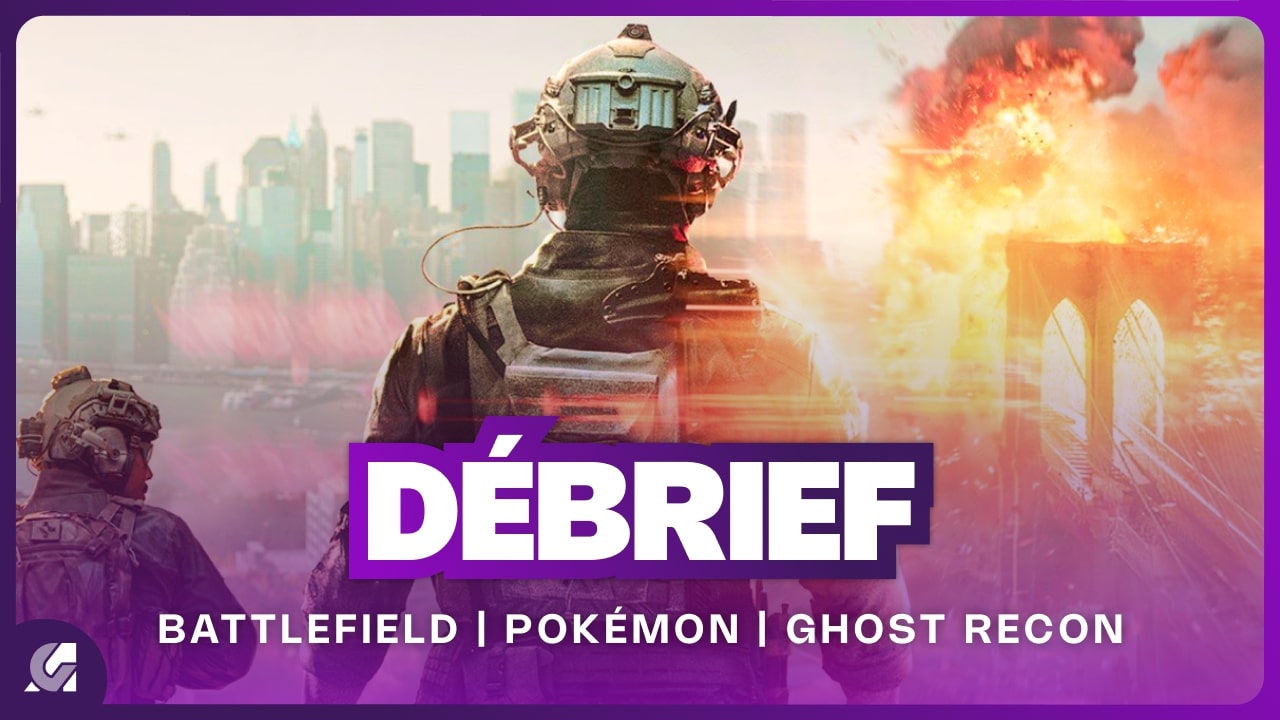
So, it’s the weekend again, and there’s not much going on. Just another ‘Débrief’ on Battlefield 6, Pokémon Presents, Hellraiser, Ghost Recon, and Grounded 2. Honestly, it feels like the same old news every week. You know, games come and go, but the excitement is just... not there. Maybe I’ll check it out later, or maybe I won’t. Who knows?
#Battlefield6 #PokémonPresents #Hellraiser #GhostRecon #Grounded2
#Battlefield6 #PokémonPresents #Hellraiser #GhostRecon #Grounded2
So, it’s the weekend again, and there’s not much going on. Just another ‘Débrief’ on Battlefield 6, Pokémon Presents, Hellraiser, Ghost Recon, and Grounded 2. Honestly, it feels like the same old news every week. You know, games come and go, but the excitement is just... not there. Maybe I’ll check it out later, or maybe I won’t. Who knows?
#Battlefield6 #PokémonPresents #Hellraiser #GhostRecon #Grounded2
1 Commentaires
·0 Parts
·0 Aperçu
