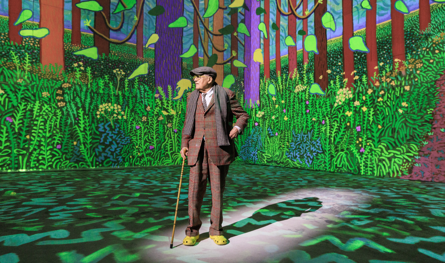
• 50 Preppy Fonts with Rich & Fancy Vibes

    In this article:See more ▼Post may contain affiliate links which give us commissions at no cost to you.Preppy fonts capture that quintessential East Coast elite vibe – think Nantucket summers, yacht clubs, and monogrammed everything. These typefaces embody the perfect balance of tradition and refinement that makes preppy design so timeless and aspirational.
    But here’s the thing: not all fonts can pull off that coveted preppy aesthetic. The best preppy fonts have a certain je ne sais quoi – they’re classic without being stuffy, elegant without being pretentious, and refined without being inaccessible.
    In this comprehensive guide, we’ll explore the most gorgeous preppy fonts that’ll have your designs looking like they belong in the pages of Town & Country magazine. So grab your pearls and let’s dive into this typographic treasure trove!
    Psst... Did you know you can get unlimited downloads of 59,000+ fonts and millions of other creative assets for just /mo? Learn more »The Preppiest Fonts That Define 2025
    Let’s start with the crème de la crème – the fonts that truly embody that preppy spirit. I’ve curated this list based on their ability to channel that classic New England charm while remaining versatile enough for modern design needs.

    Gatsby Prelude

    Gatsby Prelude is an elegant and modern Art Deco font duo. It combines sans-serif characters with decorative elements, perfect for creating sophisticated designs with a touch of vintage glamour.Burtuqol

    Burtuqol is a vintage slab serif font that exudes a retro charm. Its bold, chunky serifs and aged appearance make it ideal for projects requiring a nostalgic or timeworn aesthetic.Gafler

    Gafler is a classy vintage serif font with decorative elements. It combines elegance with a touch of old-world charm, making it perfect for high-end branding and classic design projects.Get 300+ Fonts for FREEEnter your email to download our 100% free "Font Lover's Bundle". For commercial & personal use. No royalties. No fees. No attribution. 100% free to use anywhere.

    Kagnue

    Kagnue is a modern and classy serif font. It offers a fresh take on traditional serif typefaces, blending contemporary design with timeless elegance for versatile use in various design contexts.The Blendinroom

    The Blendinroom is a retro serif typeface featuring luxurious ligatures. Its vintage-inspired design and intricate details make it ideal for creating sophisticated, old-world aesthetics in design projects.MODER BULES

    MODER BULES is a playful sans-serif font with a fun, childlike appeal. Its quirky design makes it perfect for kids-oriented projects or Halloween-themed designs, adding a touch of whimsy to typography.Nickey Vintage

    Nickey Vintage is a decorative display font with a strong vintage flair. Its bold, eye-catching characters make it ideal for headlines, logos, and designs that require a striking retro aesthetic.Ladger

    Ladger is a casual script font that exudes luxury and elegance. Its flowing lines and graceful curves make it perfect for logo designs, high-end branding, and projects requiring a touch of sophistication.Hadnich

    Hadnich is a modern script font with a brush-like quality. Its versatile design makes it suitable for various applications, from signage to branding, offering a contemporary take on handwritten typography.Belly and Park

    Belly and Park is a condensed beauty classic font family featuring both serif and sans-serif styles. Its vintage-inspired design and narrow characters make it ideal for creating elegant, space-efficient layouts.Loubag

    Loubag is a modern retro font family encompassing sans-serif, serif, and decorative styles. Its bold, fashion-forward design makes it perfect for creating eye-catching headlines and trendy branding materials.Petter And Sons

    Petter And Sons is a romantic beauty script font with decorative elements. Its elegant, flowing design makes it ideal for wedding invitations, luxury branding, and projects requiring a touch of refined beauty.Preteoria

    Preteoria is a modern cursive font with a sleek, contemporary feel. Its smooth curves and clean lines make it versatile for various design applications, from branding to digital media projects.Delauney

    Delauney is an Art Deco-inspired sans-serif font that captures the essence of the roaring twenties. Its geometric shapes and sleek lines make it perfect for creating designs with a bold, metropolitan flair.Amadi Vintage

    Amadi Vintage is a chic and beautiful serif font with a timeless appeal. Its elegant design and vintage-inspired details make it ideal for creating sophisticated, classic-looking designs and branding materials.LEDERSON

    LEDERSON is a vintage-inspired shadow font. Its weathered look and strong character make it perfect for designs requiring an authentic, aged aesthetic.Fancyou

    Fancyou is a versatile serif font with alternate characters. Its elegant design and customizable options make it suitable for a wide range of projects, from formal invitations to modern branding materials.Catterpie Font

    Catterpie is a handwritten script font that mimics natural handlettering. Its fluid, signature-like style makes it perfect for creating personal, authentic-looking designs and branding materials.Jemmy Wonder

    Jemmy Wonder is a Victorian-inspired serif font with a strong vintage character. Its ornate details and old-world charm make it ideal for creating designs with a classic, nostalgic feel.Monthey

    Monthey is a bold, elegant vintage display serif font. Its chunky characters and 70s-inspired design make it perfect for creating eye-catching headlines and retro-themed branding materials.Madville

    Madville is a classy script font with a versatile design. Its elegant curves and smooth transitions make it suitable for a wide range of projects, from formal invitations to modern branding materials.Crowk

    Crowk is a luxury serif font with a timeless, elegant appeal. Its refined design and classic proportions make it ideal for high-end branding, editorial layouts, and sophisticated design projects.Peachy Fantasy

    Peachy Fantasy is an Art Nouveau-inspired display font with decorative elements. Its vintage charm and unique character make it perfect for creating eye-catching headlines and artistic design projects.Cormier

    Cormier is a decorative sans-serif font with a strong artistic flair. Its unique design and fashion-forward aesthetic make it ideal for creating bold, attention-grabbing headlines and branding materials.Syntage

    Syntage is a decorative modern luxury font with both serif and ornamental elements. Its retro-inspired design and luxurious details make it perfect for high-end branding and sophisticated design projects.Jeniffer Selfies

    Jeniffer Selfies is a retro-inspired bold font combining sans-serif and script styles. Its playful design and vintage feel make it ideal for creating nostalgic, fun-loving designs and branding materials.The Rilman

    The Rilman is a ligature-rich rounded sans-serif font with a 90s-inspired design. Its retro charm and smooth edges make it perfect for creating playful, nostalgic designs and branding materials.Milky Croffle

    Milky Croffle is a classic beauty elegant serif font. Its refined design and timeless appeal make it ideal for creating sophisticated layouts, high-end branding, and projects requiring a touch of traditional elegance.
    What Makes a Font Feel Preppy?
    You might be wondering what exactly gives a font that unmistakable preppy vibe. After years of working with typography, I’ve identified several key characteristics that define the preppy aesthetic:
    Classic Serif Structure: Most preppy fonts are serifs, drawing inspiration from traditional typography used in prestigious publications and academic institutions. These serifs aren’t just decorative – they’re a nod to centuries of refined typographic tradition.
    Elegant Proportions: Preppy fonts tend to have well-balanced letterforms with moderate contrast between thick and thin strokes. They’re neither too delicate nor too bold – just perfectly poised, like a well-tailored blazer.
    Timeless Appeal: The best preppy fonts don’t scream “trendy.” Instead, they whisper “timeless.” They’re the typography equivalent of a strand of pearls – always appropriate, never out of style.
    Sophisticated Details: Look for subtle refinements in letterforms – graceful curves, well-crafted terminals, and thoughtful spacing. These details separate truly preppy fonts from their more pedestrian cousins.
    Heritage Inspiration: Many preppy fonts draw inspiration from historical typefaces used by Ivy League universities, prestigious publishing houses, and old-money families. This connection to tradition is what gives them their authentic preppy pedigree.
    Where to Use Preppy FontsPreppy fonts aren’t one-size-fits-all solutions, but when used appropriately, they’re absolutely magical. Here’s where they shine brightest:
    Wedding Invitations: Nothing says “elegant affair” quite like a beautifully chosen preppy serif. These fonts are perfect for formal invitations, save-the-dates, and wedding stationery that needs to feel sophisticated and timeless.
    Luxury Branding: Brands targeting affluent audiences or positioning themselves as premium often benefit from preppy typography. Think boutique hotels, high-end fashion, or artisanal goods.
    Editorial Design: Magazines, newsletters, and publications focusing on lifestyle, fashion, or culture can leverage preppy fonts to establish credibility and sophistication.
    Corporate Identity: Professional services, law firms, financial institutions, and consulting companies often choose preppy fonts to convey trustworthiness and establishment credibility.
    Academic Materials: Universities, prep schools, and educational institutions naturally gravitate toward preppy typography that reflects their traditional values and heritage.
    However, preppy fonts might not be the best choice for:
    Tech Startups: The traditional nature of preppy fonts can feel at odds with innovation and disruption. Modern sans serifs usually work better for tech companies.
    Children’s Brands: While elegant, preppy fonts might feel too formal for products targeting young children. Playful, rounded fonts are typically more appropriate.
    Casual Brands: If your brand personality is laid-back and approachable, overly formal preppy fonts might create distance between you and your audience.
    How to Choose the Perfect Preppy Font
    Selecting the right preppy font requires careful consideration of several factors. Here’s my tried-and-true process:
    Consider Your Audience: Are you designing for actual prep school alumni, or are you trying to capture that aspirational preppy aesthetic for a broader audience? Your target demographic should influence how traditional or accessible your font choice is.
    Evaluate the Context: A wedding invitation can handle more ornate details than a business card. Consider where your text will appear and how much personality the context can support.
    Test Readability: Preppy doesn’t mean hard to read. Always test your chosen font at various sizes to ensure it remains legible. Your typography should enhance communication, not hinder it.
    Think About Pairing: Will you be using this font alone or pairing it with others? Consider how your preppy serif will work alongside sans serifs for body text or script fonts for accents.
    Consider Your Medium: Some preppy fonts work beautifully in print but struggle on screens. Others are optimized for digital use but lose their charm in print. Choose accordingly.
    Pairing Preppy Fonts Like a Pro
    The magic of preppy typography often lies in thoughtful font pairing. Here are some winning combinations that never fail:
    Classic Serif + Clean Sans Serif: Pair your preppy serif headline font with a crisp, readable sans serif for body text. This creates hierarchy while maintaining sophistication.
    Traditional Serif + Script Accent: Use a refined script font sparingly for special elements like signatures or decorative text, balanced by a solid preppy serif for main content.
    Serif + Serif Variation: Sometimes pairing two serifs from the same family – perhaps a regular weight for body text and a bold condensed version for headlines – creates beautiful, cohesive designs.
    Remember, less is often more with preppy design. Stick to two or three fonts maximum, and let the inherent elegance of your chosen typefaces do the heavy lifting.
    The Psychology Behind Preppy Typography
    Understanding why preppy fonts work so well psychologically can help you use them more effectively. These typefaces tap into powerful associations:
    Trust and Reliability: The traditional nature of preppy fonts suggests stability and permanence. When people see these fonts, they subconsciously associate them with established institutions and time-tested values.
    Sophistication and Education: Preppy fonts are reminiscent of academic institutions and intellectual pursuits. They suggest refinement, education, and cultural awareness.
    Exclusivity and Status: Let’s be honest – part of the preppy aesthetic’s appeal is its association with privilege and exclusivity. These fonts can make designs feel more premium and aspirational.
    Quality and Craftsmanship: The careful attention to typographic detail in preppy fonts suggests similar attention to quality in whatever they’re representing.
    Modern Takes on Classic Preppy Style
    While preppy fonts are rooted in tradition, the best designers know how to give them contemporary flair. Here are some ways to modernize preppy typography:
    Unexpected Color Palettes: Pair traditional preppy fonts with modern colors. Think sage green and cream instead of navy and white, or soft blush tones for a fresh take.
    Generous White Space: Give your preppy fonts room to breathe with plenty of white space. This modern approach to layout keeps traditional fonts feeling fresh and uncluttered.
    Mixed Media Integration: Combine preppy typography with photography, illustrations, or graphic elements for a more contemporary feel while maintaining that sophisticated foundation.
    Strategic Contrast: Pair your refined preppy fonts with unexpected elements – maybe a bold geometric shape or modern photography – to create dynamic tension.
    Preppy Font Alternatives for Every Budget
    Not every preppy project has a premium font budget, and that’s okay! Here are some strategies for achieving that coveted preppy look without breaking the bank:
    Google Fonts Gems: Fonts like Playfair Display, Crimson Text, and Libre Baskerville offer sophisticated serif options that can work beautifully for preppy designs.
    Font Pairing Magic: Sometimes combining two free fonts thoughtfully can create a more expensive-looking result than using a single premium font poorly.
    Focus on Execution: A free font used with excellent spacing, hierarchy, and layout will always look better than an expensive font used carelessly.
    Common Preppy Font Mistakes to Avoid
    Even with the perfect preppy font, poor execution can ruin the effect. Here are the most common mistakes I see designers make:
    Overdoing the Decoration: Just because a font has elegant details doesn’t mean you need to add more flourishes. Let the typeface’s inherent sophistication speak for itself.
    Ignoring Hierarchy: Preppy design relies on clear, elegant hierarchy. Don’t make everything the same size or weight – create visual flow through thoughtful typography scaling.
    Poor Spacing: Cramped text kills the elegant feel of preppy fonts. Give your typography generous leading and appropriate margins.
    Wrong Context: Using an ultra-formal preppy font for a casual pizza restaurant’s menu will feel jarring and inappropriate. Match your font choice to your content and audience.
    The Future of Preppy Typography
    As we look ahead in 2025, preppy fonts continue to evolve while maintaining their classic appeal. We’re seeing interesting trends emerge:
    Variable Font Technology: Modern preppy fonts are increasingly available as variable fonts, allowing designers to fine-tune weight, width, and optical size for perfect customization.
    Screen Optimization: Classic preppy fonts are being redrawn and optimized for digital screens without losing their traditional charm.
    Inclusive Preppy: Designers are expanding the preppy aesthetic beyond its traditional boundaries, creating fonts that maintain sophistication while feeling more accessible and diverse.
    Sustainable Design: The timeless nature of preppy fonts aligns perfectly with sustainable design principles – these typefaces won’t look dated next year, making them environmentally responsible choices.
    Conclusion: Embracing Timeless Elegance
    Preppy fonts represent more than just letterforms – they’re a gateway to timeless elegance and sophisticated communication. Whether you’re designing wedding invitations for a Martha’s Vineyard ceremony or creating brand identity for a boutique law firm, the right preppy font can elevate your work from merely professional to genuinely distinguished.
    The beauty of preppy typography lies in its ability to feel both traditional and fresh, formal yet approachable. These fonts have stood the test of time because they tap into something fundamental about how we perceive quality, tradition, and sophistication.
    As you explore the world of preppy fonts, remember that the best typography choices support your message rather than overshadowing it. Choose fonts that enhance your content’s inherent qualities and speak to your audience’s aspirations and values.
    So whether you’re channeling that old-money aesthetic or simply want to add a touch of refined elegance to your designs, preppy fonts offer a wealth of possibilities. After all, good typography, like good manners, never goes out of style.
    #preppy #fonts #with #rich #ampamp
    50 Preppy Fonts with Rich & Fancy Vibes
    In this article:See more ▼Post may contain affiliate links which give us commissions at no cost to you.Preppy fonts capture that quintessential East Coast elite vibe – think Nantucket summers, yacht clubs, and monogrammed everything. These typefaces embody the perfect balance of tradition and refinement that makes preppy design so timeless and aspirational. But here’s the thing: not all fonts can pull off that coveted preppy aesthetic. The best preppy fonts have a certain je ne sais quoi – they’re classic without being stuffy, elegant without being pretentious, and refined without being inaccessible. In this comprehensive guide, we’ll explore the most gorgeous preppy fonts that’ll have your designs looking like they belong in the pages of Town & Country magazine. So grab your pearls and let’s dive into this typographic treasure trove! 👋 Psst... Did you know you can get unlimited downloads of 59,000+ fonts and millions of other creative assets for just /mo? Learn more »The Preppiest Fonts That Define 2025 Let’s start with the crème de la crème – the fonts that truly embody that preppy spirit. I’ve curated this list based on their ability to channel that classic New England charm while remaining versatile enough for modern design needs. Gatsby Prelude Gatsby Prelude is an elegant and modern Art Deco font duo. It combines sans-serif characters with decorative elements, perfect for creating sophisticated designs with a touch of vintage glamour.Burtuqol Burtuqol is a vintage slab serif font that exudes a retro charm. Its bold, chunky serifs and aged appearance make it ideal for projects requiring a nostalgic or timeworn aesthetic.Gafler Gafler is a classy vintage serif font with decorative elements. It combines elegance with a touch of old-world charm, making it perfect for high-end branding and classic design projects.Get 300+ Fonts for FREEEnter your email to download our 100% free "Font Lover's Bundle". For commercial & personal use. No royalties. No fees. No attribution. 100% free to use anywhere. Kagnue Kagnue is a modern and classy serif font. It offers a fresh take on traditional serif typefaces, blending contemporary design with timeless elegance for versatile use in various design contexts.The Blendinroom The Blendinroom is a retro serif typeface featuring luxurious ligatures. Its vintage-inspired design and intricate details make it ideal for creating sophisticated, old-world aesthetics in design projects.MODER BULES MODER BULES is a playful sans-serif font with a fun, childlike appeal. Its quirky design makes it perfect for kids-oriented projects or Halloween-themed designs, adding a touch of whimsy to typography.Nickey Vintage Nickey Vintage is a decorative display font with a strong vintage flair. Its bold, eye-catching characters make it ideal for headlines, logos, and designs that require a striking retro aesthetic.Ladger Ladger is a casual script font that exudes luxury and elegance. Its flowing lines and graceful curves make it perfect for logo designs, high-end branding, and projects requiring a touch of sophistication.Hadnich Hadnich is a modern script font with a brush-like quality. Its versatile design makes it suitable for various applications, from signage to branding, offering a contemporary take on handwritten typography.Belly and Park Belly and Park is a condensed beauty classic font family featuring both serif and sans-serif styles. Its vintage-inspired design and narrow characters make it ideal for creating elegant, space-efficient layouts.Loubag Loubag is a modern retro font family encompassing sans-serif, serif, and decorative styles. Its bold, fashion-forward design makes it perfect for creating eye-catching headlines and trendy branding materials.Petter And Sons Petter And Sons is a romantic beauty script font with decorative elements. Its elegant, flowing design makes it ideal for wedding invitations, luxury branding, and projects requiring a touch of refined beauty.Preteoria Preteoria is a modern cursive font with a sleek, contemporary feel. Its smooth curves and clean lines make it versatile for various design applications, from branding to digital media projects.Delauney Delauney is an Art Deco-inspired sans-serif font that captures the essence of the roaring twenties. Its geometric shapes and sleek lines make it perfect for creating designs with a bold, metropolitan flair.Amadi Vintage Amadi Vintage is a chic and beautiful serif font with a timeless appeal. Its elegant design and vintage-inspired details make it ideal for creating sophisticated, classic-looking designs and branding materials.LEDERSON LEDERSON is a vintage-inspired shadow font. Its weathered look and strong character make it perfect for designs requiring an authentic, aged aesthetic.Fancyou Fancyou is a versatile serif font with alternate characters. Its elegant design and customizable options make it suitable for a wide range of projects, from formal invitations to modern branding materials.Catterpie Font Catterpie is a handwritten script font that mimics natural handlettering. Its fluid, signature-like style makes it perfect for creating personal, authentic-looking designs and branding materials.Jemmy Wonder Jemmy Wonder is a Victorian-inspired serif font with a strong vintage character. Its ornate details and old-world charm make it ideal for creating designs with a classic, nostalgic feel.Monthey Monthey is a bold, elegant vintage display serif font. Its chunky characters and 70s-inspired design make it perfect for creating eye-catching headlines and retro-themed branding materials.Madville Madville is a classy script font with a versatile design. Its elegant curves and smooth transitions make it suitable for a wide range of projects, from formal invitations to modern branding materials.Crowk Crowk is a luxury serif font with a timeless, elegant appeal. Its refined design and classic proportions make it ideal for high-end branding, editorial layouts, and sophisticated design projects.Peachy Fantasy Peachy Fantasy is an Art Nouveau-inspired display font with decorative elements. Its vintage charm and unique character make it perfect for creating eye-catching headlines and artistic design projects.Cormier Cormier is a decorative sans-serif font with a strong artistic flair. Its unique design and fashion-forward aesthetic make it ideal for creating bold, attention-grabbing headlines and branding materials.Syntage Syntage is a decorative modern luxury font with both serif and ornamental elements. Its retro-inspired design and luxurious details make it perfect for high-end branding and sophisticated design projects.Jeniffer Selfies Jeniffer Selfies is a retro-inspired bold font combining sans-serif and script styles. Its playful design and vintage feel make it ideal for creating nostalgic, fun-loving designs and branding materials.The Rilman The Rilman is a ligature-rich rounded sans-serif font with a 90s-inspired design. Its retro charm and smooth edges make it perfect for creating playful, nostalgic designs and branding materials.Milky Croffle Milky Croffle is a classic beauty elegant serif font. Its refined design and timeless appeal make it ideal for creating sophisticated layouts, high-end branding, and projects requiring a touch of traditional elegance. What Makes a Font Feel Preppy? You might be wondering what exactly gives a font that unmistakable preppy vibe. After years of working with typography, I’ve identified several key characteristics that define the preppy aesthetic: Classic Serif Structure: Most preppy fonts are serifs, drawing inspiration from traditional typography used in prestigious publications and academic institutions. These serifs aren’t just decorative – they’re a nod to centuries of refined typographic tradition. Elegant Proportions: Preppy fonts tend to have well-balanced letterforms with moderate contrast between thick and thin strokes. They’re neither too delicate nor too bold – just perfectly poised, like a well-tailored blazer. Timeless Appeal: The best preppy fonts don’t scream “trendy.” Instead, they whisper “timeless.” They’re the typography equivalent of a strand of pearls – always appropriate, never out of style. Sophisticated Details: Look for subtle refinements in letterforms – graceful curves, well-crafted terminals, and thoughtful spacing. These details separate truly preppy fonts from their more pedestrian cousins. Heritage Inspiration: Many preppy fonts draw inspiration from historical typefaces used by Ivy League universities, prestigious publishing houses, and old-money families. This connection to tradition is what gives them their authentic preppy pedigree. Where to Use Preppy FontsPreppy fonts aren’t one-size-fits-all solutions, but when used appropriately, they’re absolutely magical. Here’s where they shine brightest: Wedding Invitations: Nothing says “elegant affair” quite like a beautifully chosen preppy serif. These fonts are perfect for formal invitations, save-the-dates, and wedding stationery that needs to feel sophisticated and timeless. Luxury Branding: Brands targeting affluent audiences or positioning themselves as premium often benefit from preppy typography. Think boutique hotels, high-end fashion, or artisanal goods. Editorial Design: Magazines, newsletters, and publications focusing on lifestyle, fashion, or culture can leverage preppy fonts to establish credibility and sophistication. Corporate Identity: Professional services, law firms, financial institutions, and consulting companies often choose preppy fonts to convey trustworthiness and establishment credibility. Academic Materials: Universities, prep schools, and educational institutions naturally gravitate toward preppy typography that reflects their traditional values and heritage. However, preppy fonts might not be the best choice for: Tech Startups: The traditional nature of preppy fonts can feel at odds with innovation and disruption. Modern sans serifs usually work better for tech companies. Children’s Brands: While elegant, preppy fonts might feel too formal for products targeting young children. Playful, rounded fonts are typically more appropriate. Casual Brands: If your brand personality is laid-back and approachable, overly formal preppy fonts might create distance between you and your audience. How to Choose the Perfect Preppy Font Selecting the right preppy font requires careful consideration of several factors. Here’s my tried-and-true process: Consider Your Audience: Are you designing for actual prep school alumni, or are you trying to capture that aspirational preppy aesthetic for a broader audience? Your target demographic should influence how traditional or accessible your font choice is. Evaluate the Context: A wedding invitation can handle more ornate details than a business card. Consider where your text will appear and how much personality the context can support. Test Readability: Preppy doesn’t mean hard to read. Always test your chosen font at various sizes to ensure it remains legible. Your typography should enhance communication, not hinder it. Think About Pairing: Will you be using this font alone or pairing it with others? Consider how your preppy serif will work alongside sans serifs for body text or script fonts for accents. Consider Your Medium: Some preppy fonts work beautifully in print but struggle on screens. Others are optimized for digital use but lose their charm in print. Choose accordingly. Pairing Preppy Fonts Like a Pro The magic of preppy typography often lies in thoughtful font pairing. Here are some winning combinations that never fail: Classic Serif + Clean Sans Serif: Pair your preppy serif headline font with a crisp, readable sans serif for body text. This creates hierarchy while maintaining sophistication. Traditional Serif + Script Accent: Use a refined script font sparingly for special elements like signatures or decorative text, balanced by a solid preppy serif for main content. Serif + Serif Variation: Sometimes pairing two serifs from the same family – perhaps a regular weight for body text and a bold condensed version for headlines – creates beautiful, cohesive designs. Remember, less is often more with preppy design. Stick to two or three fonts maximum, and let the inherent elegance of your chosen typefaces do the heavy lifting. The Psychology Behind Preppy Typography Understanding why preppy fonts work so well psychologically can help you use them more effectively. These typefaces tap into powerful associations: Trust and Reliability: The traditional nature of preppy fonts suggests stability and permanence. When people see these fonts, they subconsciously associate them with established institutions and time-tested values. Sophistication and Education: Preppy fonts are reminiscent of academic institutions and intellectual pursuits. They suggest refinement, education, and cultural awareness. Exclusivity and Status: Let’s be honest – part of the preppy aesthetic’s appeal is its association with privilege and exclusivity. These fonts can make designs feel more premium and aspirational. Quality and Craftsmanship: The careful attention to typographic detail in preppy fonts suggests similar attention to quality in whatever they’re representing. Modern Takes on Classic Preppy Style While preppy fonts are rooted in tradition, the best designers know how to give them contemporary flair. Here are some ways to modernize preppy typography: Unexpected Color Palettes: Pair traditional preppy fonts with modern colors. Think sage green and cream instead of navy and white, or soft blush tones for a fresh take. Generous White Space: Give your preppy fonts room to breathe with plenty of white space. This modern approach to layout keeps traditional fonts feeling fresh and uncluttered. Mixed Media Integration: Combine preppy typography with photography, illustrations, or graphic elements for a more contemporary feel while maintaining that sophisticated foundation. Strategic Contrast: Pair your refined preppy fonts with unexpected elements – maybe a bold geometric shape or modern photography – to create dynamic tension. Preppy Font Alternatives for Every Budget Not every preppy project has a premium font budget, and that’s okay! Here are some strategies for achieving that coveted preppy look without breaking the bank: Google Fonts Gems: Fonts like Playfair Display, Crimson Text, and Libre Baskerville offer sophisticated serif options that can work beautifully for preppy designs. Font Pairing Magic: Sometimes combining two free fonts thoughtfully can create a more expensive-looking result than using a single premium font poorly. Focus on Execution: A free font used with excellent spacing, hierarchy, and layout will always look better than an expensive font used carelessly. Common Preppy Font Mistakes to Avoid Even with the perfect preppy font, poor execution can ruin the effect. Here are the most common mistakes I see designers make: Overdoing the Decoration: Just because a font has elegant details doesn’t mean you need to add more flourishes. Let the typeface’s inherent sophistication speak for itself. Ignoring Hierarchy: Preppy design relies on clear, elegant hierarchy. Don’t make everything the same size or weight – create visual flow through thoughtful typography scaling. Poor Spacing: Cramped text kills the elegant feel of preppy fonts. Give your typography generous leading and appropriate margins. Wrong Context: Using an ultra-formal preppy font for a casual pizza restaurant’s menu will feel jarring and inappropriate. Match your font choice to your content and audience. The Future of Preppy Typography As we look ahead in 2025, preppy fonts continue to evolve while maintaining their classic appeal. We’re seeing interesting trends emerge: Variable Font Technology: Modern preppy fonts are increasingly available as variable fonts, allowing designers to fine-tune weight, width, and optical size for perfect customization. Screen Optimization: Classic preppy fonts are being redrawn and optimized for digital screens without losing their traditional charm. Inclusive Preppy: Designers are expanding the preppy aesthetic beyond its traditional boundaries, creating fonts that maintain sophistication while feeling more accessible and diverse. Sustainable Design: The timeless nature of preppy fonts aligns perfectly with sustainable design principles – these typefaces won’t look dated next year, making them environmentally responsible choices. Conclusion: Embracing Timeless Elegance Preppy fonts represent more than just letterforms – they’re a gateway to timeless elegance and sophisticated communication. Whether you’re designing wedding invitations for a Martha’s Vineyard ceremony or creating brand identity for a boutique law firm, the right preppy font can elevate your work from merely professional to genuinely distinguished. The beauty of preppy typography lies in its ability to feel both traditional and fresh, formal yet approachable. These fonts have stood the test of time because they tap into something fundamental about how we perceive quality, tradition, and sophistication. As you explore the world of preppy fonts, remember that the best typography choices support your message rather than overshadowing it. Choose fonts that enhance your content’s inherent qualities and speak to your audience’s aspirations and values. So whether you’re channeling that old-money aesthetic or simply want to add a touch of refined elegance to your designs, preppy fonts offer a wealth of possibilities. After all, good typography, like good manners, never goes out of style. #preppy #fonts #with #rich #ampamp
    DESIGNWORKLIFE.COM
    50 Preppy Fonts with Rich & Fancy Vibes
    In this article:See more ▼Post may contain affiliate links which give us commissions at no cost to you.Preppy fonts capture that quintessential East Coast elite vibe – think Nantucket summers, yacht clubs, and monogrammed everything. These typefaces embody the perfect balance of tradition and refinement that makes preppy design so timeless and aspirational. But here’s the thing: not all fonts can pull off that coveted preppy aesthetic. The best preppy fonts have a certain je ne sais quoi – they’re classic without being stuffy, elegant without being pretentious, and refined without being inaccessible. In this comprehensive guide, we’ll explore the most gorgeous preppy fonts that’ll have your designs looking like they belong in the pages of Town & Country magazine. So grab your pearls and let’s dive into this typographic treasure trove! 👋 Psst... Did you know you can get unlimited downloads of 59,000+ fonts and millions of other creative assets for just $16.95/mo? Learn more »The Preppiest Fonts That Define 2025 Let’s start with the crème de la crème – the fonts that truly embody that preppy spirit. I’ve curated this list based on their ability to channel that classic New England charm while remaining versatile enough for modern design needs. Gatsby Prelude Gatsby Prelude is an elegant and modern Art Deco font duo. It combines sans-serif characters with decorative elements, perfect for creating sophisticated designs with a touch of vintage glamour.Burtuqol Burtuqol is a vintage slab serif font that exudes a retro charm. Its bold, chunky serifs and aged appearance make it ideal for projects requiring a nostalgic or timeworn aesthetic.Gafler Gafler is a classy vintage serif font with decorative elements. It combines elegance with a touch of old-world charm, making it perfect for high-end branding and classic design projects.Get 300+ Fonts for FREEEnter your email to download our 100% free "Font Lover's Bundle". For commercial & personal use. No royalties. No fees. No attribution. 100% free to use anywhere. Kagnue Kagnue is a modern and classy serif font. It offers a fresh take on traditional serif typefaces, blending contemporary design with timeless elegance for versatile use in various design contexts.The Blendinroom The Blendinroom is a retro serif typeface featuring luxurious ligatures. Its vintage-inspired design and intricate details make it ideal for creating sophisticated, old-world aesthetics in design projects.MODER BULES MODER BULES is a playful sans-serif font with a fun, childlike appeal. Its quirky design makes it perfect for kids-oriented projects or Halloween-themed designs, adding a touch of whimsy to typography.Nickey Vintage Nickey Vintage is a decorative display font with a strong vintage flair. Its bold, eye-catching characters make it ideal for headlines, logos, and designs that require a striking retro aesthetic.Ladger Ladger is a casual script font that exudes luxury and elegance. Its flowing lines and graceful curves make it perfect for logo designs, high-end branding, and projects requiring a touch of sophistication.Hadnich Hadnich is a modern script font with a brush-like quality. Its versatile design makes it suitable for various applications, from signage to branding, offering a contemporary take on handwritten typography.Belly and Park Belly and Park is a condensed beauty classic font family featuring both serif and sans-serif styles. Its vintage-inspired design and narrow characters make it ideal for creating elegant, space-efficient layouts.Loubag Loubag is a modern retro font family encompassing sans-serif, serif, and decorative styles. Its bold, fashion-forward design makes it perfect for creating eye-catching headlines and trendy branding materials.Petter And Sons Petter And Sons is a romantic beauty script font with decorative elements. Its elegant, flowing design makes it ideal for wedding invitations, luxury branding, and projects requiring a touch of refined beauty.Preteoria Preteoria is a modern cursive font with a sleek, contemporary feel. Its smooth curves and clean lines make it versatile for various design applications, from branding to digital media projects.Delauney Delauney is an Art Deco-inspired sans-serif font that captures the essence of the roaring twenties. Its geometric shapes and sleek lines make it perfect for creating designs with a bold, metropolitan flair.Amadi Vintage Amadi Vintage is a chic and beautiful serif font with a timeless appeal. Its elegant design and vintage-inspired details make it ideal for creating sophisticated, classic-looking designs and branding materials.LEDERSON LEDERSON is a vintage-inspired shadow font. Its weathered look and strong character make it perfect for designs requiring an authentic, aged aesthetic.Fancyou Fancyou is a versatile serif font with alternate characters. Its elegant design and customizable options make it suitable for a wide range of projects, from formal invitations to modern branding materials.Catterpie Font Catterpie is a handwritten script font that mimics natural handlettering. Its fluid, signature-like style makes it perfect for creating personal, authentic-looking designs and branding materials.Jemmy Wonder Jemmy Wonder is a Victorian-inspired serif font with a strong vintage character. Its ornate details and old-world charm make it ideal for creating designs with a classic, nostalgic feel.Monthey Monthey is a bold, elegant vintage display serif font. Its chunky characters and 70s-inspired design make it perfect for creating eye-catching headlines and retro-themed branding materials.Madville Madville is a classy script font with a versatile design. Its elegant curves and smooth transitions make it suitable for a wide range of projects, from formal invitations to modern branding materials.Crowk Crowk is a luxury serif font with a timeless, elegant appeal. Its refined design and classic proportions make it ideal for high-end branding, editorial layouts, and sophisticated design projects.Peachy Fantasy Peachy Fantasy is an Art Nouveau-inspired display font with decorative elements. Its vintage charm and unique character make it perfect for creating eye-catching headlines and artistic design projects.Cormier Cormier is a decorative sans-serif font with a strong artistic flair. Its unique design and fashion-forward aesthetic make it ideal for creating bold, attention-grabbing headlines and branding materials.Syntage Syntage is a decorative modern luxury font with both serif and ornamental elements. Its retro-inspired design and luxurious details make it perfect for high-end branding and sophisticated design projects.Jeniffer Selfies Jeniffer Selfies is a retro-inspired bold font combining sans-serif and script styles. Its playful design and vintage feel make it ideal for creating nostalgic, fun-loving designs and branding materials.The Rilman The Rilman is a ligature-rich rounded sans-serif font with a 90s-inspired design. Its retro charm and smooth edges make it perfect for creating playful, nostalgic designs and branding materials.Milky Croffle Milky Croffle is a classic beauty elegant serif font. Its refined design and timeless appeal make it ideal for creating sophisticated layouts, high-end branding, and projects requiring a touch of traditional elegance. What Makes a Font Feel Preppy? You might be wondering what exactly gives a font that unmistakable preppy vibe. After years of working with typography, I’ve identified several key characteristics that define the preppy aesthetic: Classic Serif Structure: Most preppy fonts are serifs, drawing inspiration from traditional typography used in prestigious publications and academic institutions. These serifs aren’t just decorative – they’re a nod to centuries of refined typographic tradition. Elegant Proportions: Preppy fonts tend to have well-balanced letterforms with moderate contrast between thick and thin strokes. They’re neither too delicate nor too bold – just perfectly poised, like a well-tailored blazer. Timeless Appeal: The best preppy fonts don’t scream “trendy.” Instead, they whisper “timeless.” They’re the typography equivalent of a strand of pearls – always appropriate, never out of style. Sophisticated Details: Look for subtle refinements in letterforms – graceful curves, well-crafted terminals, and thoughtful spacing. These details separate truly preppy fonts from their more pedestrian cousins. Heritage Inspiration: Many preppy fonts draw inspiration from historical typefaces used by Ivy League universities, prestigious publishing houses, and old-money families. This connection to tradition is what gives them their authentic preppy pedigree. Where to Use Preppy Fonts (And Where Not To) Preppy fonts aren’t one-size-fits-all solutions, but when used appropriately, they’re absolutely magical. Here’s where they shine brightest: Wedding Invitations: Nothing says “elegant affair” quite like a beautifully chosen preppy serif. These fonts are perfect for formal invitations, save-the-dates, and wedding stationery that needs to feel sophisticated and timeless. Luxury Branding: Brands targeting affluent audiences or positioning themselves as premium often benefit from preppy typography. Think boutique hotels, high-end fashion, or artisanal goods. Editorial Design: Magazines, newsletters, and publications focusing on lifestyle, fashion, or culture can leverage preppy fonts to establish credibility and sophistication. Corporate Identity: Professional services, law firms, financial institutions, and consulting companies often choose preppy fonts to convey trustworthiness and establishment credibility. Academic Materials: Universities, prep schools, and educational institutions naturally gravitate toward preppy typography that reflects their traditional values and heritage. However, preppy fonts might not be the best choice for: Tech Startups: The traditional nature of preppy fonts can feel at odds with innovation and disruption. Modern sans serifs usually work better for tech companies. Children’s Brands: While elegant, preppy fonts might feel too formal for products targeting young children. Playful, rounded fonts are typically more appropriate. Casual Brands: If your brand personality is laid-back and approachable, overly formal preppy fonts might create distance between you and your audience. How to Choose the Perfect Preppy Font Selecting the right preppy font requires careful consideration of several factors. Here’s my tried-and-true process: Consider Your Audience: Are you designing for actual prep school alumni, or are you trying to capture that aspirational preppy aesthetic for a broader audience? Your target demographic should influence how traditional or accessible your font choice is. Evaluate the Context: A wedding invitation can handle more ornate details than a business card. Consider where your text will appear and how much personality the context can support. Test Readability: Preppy doesn’t mean hard to read. Always test your chosen font at various sizes to ensure it remains legible. Your typography should enhance communication, not hinder it. Think About Pairing: Will you be using this font alone or pairing it with others? Consider how your preppy serif will work alongside sans serifs for body text or script fonts for accents. Consider Your Medium: Some preppy fonts work beautifully in print but struggle on screens. Others are optimized for digital use but lose their charm in print. Choose accordingly. Pairing Preppy Fonts Like a Pro The magic of preppy typography often lies in thoughtful font pairing. Here are some winning combinations that never fail: Classic Serif + Clean Sans Serif: Pair your preppy serif headline font with a crisp, readable sans serif for body text. This creates hierarchy while maintaining sophistication. Traditional Serif + Script Accent: Use a refined script font sparingly for special elements like signatures or decorative text, balanced by a solid preppy serif for main content. Serif + Serif Variation: Sometimes pairing two serifs from the same family – perhaps a regular weight for body text and a bold condensed version for headlines – creates beautiful, cohesive designs. Remember, less is often more with preppy design. Stick to two or three fonts maximum, and let the inherent elegance of your chosen typefaces do the heavy lifting. The Psychology Behind Preppy Typography Understanding why preppy fonts work so well psychologically can help you use them more effectively. These typefaces tap into powerful associations: Trust and Reliability: The traditional nature of preppy fonts suggests stability and permanence. When people see these fonts, they subconsciously associate them with established institutions and time-tested values. Sophistication and Education: Preppy fonts are reminiscent of academic institutions and intellectual pursuits. They suggest refinement, education, and cultural awareness. Exclusivity and Status: Let’s be honest – part of the preppy aesthetic’s appeal is its association with privilege and exclusivity. These fonts can make designs feel more premium and aspirational. Quality and Craftsmanship: The careful attention to typographic detail in preppy fonts suggests similar attention to quality in whatever they’re representing. Modern Takes on Classic Preppy Style While preppy fonts are rooted in tradition, the best designers know how to give them contemporary flair. Here are some ways to modernize preppy typography: Unexpected Color Palettes: Pair traditional preppy fonts with modern colors. Think sage green and cream instead of navy and white, or soft blush tones for a fresh take. Generous White Space: Give your preppy fonts room to breathe with plenty of white space. This modern approach to layout keeps traditional fonts feeling fresh and uncluttered. Mixed Media Integration: Combine preppy typography with photography, illustrations, or graphic elements for a more contemporary feel while maintaining that sophisticated foundation. Strategic Contrast: Pair your refined preppy fonts with unexpected elements – maybe a bold geometric shape or modern photography – to create dynamic tension. Preppy Font Alternatives for Every Budget Not every preppy project has a premium font budget, and that’s okay! Here are some strategies for achieving that coveted preppy look without breaking the bank: Google Fonts Gems: Fonts like Playfair Display, Crimson Text, and Libre Baskerville offer sophisticated serif options that can work beautifully for preppy designs. Font Pairing Magic: Sometimes combining two free fonts thoughtfully can create a more expensive-looking result than using a single premium font poorly. Focus on Execution: A free font used with excellent spacing, hierarchy, and layout will always look better than an expensive font used carelessly. Common Preppy Font Mistakes to Avoid Even with the perfect preppy font, poor execution can ruin the effect. Here are the most common mistakes I see designers make: Overdoing the Decoration: Just because a font has elegant details doesn’t mean you need to add more flourishes. Let the typeface’s inherent sophistication speak for itself. Ignoring Hierarchy: Preppy design relies on clear, elegant hierarchy. Don’t make everything the same size or weight – create visual flow through thoughtful typography scaling. Poor Spacing: Cramped text kills the elegant feel of preppy fonts. Give your typography generous leading and appropriate margins. Wrong Context: Using an ultra-formal preppy font for a casual pizza restaurant’s menu will feel jarring and inappropriate. Match your font choice to your content and audience. The Future of Preppy Typography As we look ahead in 2025, preppy fonts continue to evolve while maintaining their classic appeal. We’re seeing interesting trends emerge: Variable Font Technology: Modern preppy fonts are increasingly available as variable fonts, allowing designers to fine-tune weight, width, and optical size for perfect customization. Screen Optimization: Classic preppy fonts are being redrawn and optimized for digital screens without losing their traditional charm. Inclusive Preppy: Designers are expanding the preppy aesthetic beyond its traditional boundaries, creating fonts that maintain sophistication while feeling more accessible and diverse. Sustainable Design: The timeless nature of preppy fonts aligns perfectly with sustainable design principles – these typefaces won’t look dated next year, making them environmentally responsible choices. Conclusion: Embracing Timeless Elegance Preppy fonts represent more than just letterforms – they’re a gateway to timeless elegance and sophisticated communication. Whether you’re designing wedding invitations for a Martha’s Vineyard ceremony or creating brand identity for a boutique law firm, the right preppy font can elevate your work from merely professional to genuinely distinguished. The beauty of preppy typography lies in its ability to feel both traditional and fresh, formal yet approachable. These fonts have stood the test of time because they tap into something fundamental about how we perceive quality, tradition, and sophistication. As you explore the world of preppy fonts, remember that the best typography choices support your message rather than overshadowing it. Choose fonts that enhance your content’s inherent qualities and speak to your audience’s aspirations and values. So whether you’re channeling that old-money aesthetic or simply want to add a touch of refined elegance to your designs, preppy fonts offer a wealth of possibilities. After all, good typography, like good manners, never goes out of style.
    Like
    Love
    Wow
    Sad
    Angry
    518
    0 Kommentare 0 Anteile
  • 8 Stunning Sunset Color Palettes

    8 Stunning Sunset Color Palettes
    Zoe Santoro • 

    In this article:See more ▼Post may contain affiliate links which give us commissions at no cost to you.There’s something absolutely magical about watching the sun dip below the horizon, painting the sky in breathtaking hues that seem almost too beautiful to be real. As a designer, I find myself constantly inspired by these natural masterpieces that unfold before us every evening. The way warm oranges melt into soft pinks, how deep purples blend seamlessly with golden yellows – it’s like nature’s own masterclass in color theory.
    If you’re looking to infuse your next project with the warmth, romance, and natural beauty of a perfect sunset, you’ve come to the right place. I’ve curated eight of the most captivating sunset color palettes that will bring that golden hour magic directly into your designs.
    Psst... Did you know you can get unlimited downloads of 59,000+ fonts and millions of other creative assets for just /mo? Learn more »The 8 Most Breathtaking Sunset Color Palettes
    1. Golden Hour Glow

    #FFD700

    #FF8C00

    #FF6347

    #CD5C5C

    Download this color palette

    735×1102
    Pinterest image

    2160×3840
    Vertical wallpaper

    900×900
    Square

    3840×2160
    4K Wallpaper

    This palette captures that perfect moment when everything seems to be touched by liquid gold. The warm yellows transition beautifully into rich oranges and soft coral reds, creating a sense of warmth and optimism that’s impossible to ignore. I find this combination works wonderfully for brands that want to evoke feelings of happiness, energy, and positivity.
    2. Tropical Paradise

    #FF69B4

    #FF1493

    #FF8C00

    #FFD700

    Download this color palette

    735×1102
    Pinterest image

    2160×3840
    Vertical wallpaper

    900×900
    Square

    3840×2160
    4K Wallpaper

    Inspired by those incredible sunsets you see in tropical destinations, this vibrant palette combines hot pinks with brilliant oranges and golden yellows. It’s bold, it’s energetic, and it’s perfect for projects that need to make a statement. I love using these colors for summer campaigns or anything that needs to capture that vacation feeling.
    3. Desert Dreams

    #CD853F

    #D2691E

    #B22222

    #8B0000

    Download this color palette

    735×1102
    Pinterest image

    2160×3840
    Vertical wallpaper

    900×900
    Square

    3840×2160
    4K Wallpaper

    Get 300+ Fonts for FREEEnter your email to download our 100% free "Font Lover's Bundle". For commercial & personal use. No royalties. No fees. No attribution. 100% free to use anywhere.

    The American Southwest produces some of the most spectacular sunsets on earth, and this palette pays homage to those incredible desert skies. The earthy browns blend into warm oranges before deepening into rich reds and burgundies. This combination brings a sense of grounding and authenticity that works beautifully for rustic or heritage brands.
    4. Pastel Evening

    #FFE4E1

    #FFA07A

    #F0E68C

    #DDA0DD

    Download this color palette

    735×1102
    Pinterest image

    2160×3840
    Vertical wallpaper

    900×900
    Square

    3840×2160
    4K Wallpaper

    Not every sunset needs to be bold and dramatic. This softer palette captures those gentle, dreamy evenings when the sky looks like it’s been painted with watercolors. The delicate pinks, peaches, and lavenders create a romantic, ethereal feeling that’s perfect for wedding designs, beauty brands, or any project that needs a touch of feminine elegance.
    5. Coastal Sunset

    #fae991

    #FF7F50

    #FF6347

    #4169E1

    #1E90FF

    Download this color palette

    735×1102
    Pinterest image

    2160×3840
    Vertical wallpaper

    900×900
    Square

    3840×2160
    4K Wallpaper

    There’s something special about watching the sun set over the ocean, where warm oranges and corals meet the deep blues of the sea and sky. This palette captures that perfect contrast between warm and cool tones. I find it creates a sense of adventure and wanderlust that’s ideal for travel brands or outdoor companies.
    6. Urban Twilight

    #ffeda3

    #fdad52

    #fc8a6e

    #575475

    #111f2a

    Download this color palette

    735×1102
    Pinterest image

    2160×3840
    Vertical wallpaper

    900×900
    Square

    3840×2160
    4K Wallpaper

    As the sun sets behind city skylines, you get these incredible contrasts between deep purples and vibrant oranges. This sophisticated palette brings together the mystery of twilight with the warmth of the setting sun. It’s perfect for creating designs that feel both modern and dramatic.
    7. Autumn Harvest

    #FF4500

    #FF8C00

    #DAA520

    #8B4513

    Download this color palette

    735×1102
    Pinterest image

    2160×3840
    Vertical wallpaper

    900×900
    Square

    3840×2160
    4K Wallpaper

    This palette captures those perfect fall evenings when the sunset seems to echo the changing leaves. The deep oranges and golden yellows create a cozy, inviting feeling that’s perfect for seasonal campaigns or brands that want to evoke comfort and tradition.
    8. Fire Sky

    #652220

    #DC143C

    #FF0000

    #FF4500

    #FF8C00

    Download this color palette

    735×1102
    Pinterest image

    2160×3840
    Vertical wallpaper

    900×900
    Square

    3840×2160
    4K Wallpaper

    Sometimes nature puts on a show that’s so intense it takes your breath away. This bold, fiery palette captures those dramatic sunsets that look like the sky is literally on fire. It’s not for the faint of heart, but when you need maximum impact and energy, these colors deliver in spades.
    Why Sunset Colors Never Go Out of Style
    Before we explore how to use these palettes effectively, let’s talk about why sunset colors have such enduring appeal in design. There’s something deeply ingrained in human psychology that responds to these warm, glowing hues. They remind us of endings and beginnings, of peaceful moments and natural beauty.
    From a design perspective, sunset colors offer incredible versatility. They can be bold and energetic or soft and romantic. They work equally well for corporate branding and personal projects. And perhaps most importantly, they’re inherently optimistic – they make people feel good.
    I’ve found that incorporating sunset-inspired colors into modern projects adds an instant sense of warmth and approachability that resonates with audiences across all demographics. Whether you’re working on packaging design, web interfaces, or environmental graphics, these palettes can help create an emotional connection that goes beyond mere aesthetics.
    How to Master Sunset Palettes in Contemporary Design
    Using sunset colors effectively requires more than just picking pretty hues and hoping for the best. Here are some strategies I’ve developed for incorporating these palettes into modern design work:
    Start with Temperature Balance
    One of the most important aspects of working with sunset palettes is understanding color temperature. Most sunset combinations naturally include both warm and cool elements – the warm oranges and yellows of the sun itself, balanced by the cooler purples and blues of the surrounding sky. Maintaining this temperature balance keeps your designs from feeling flat or monotonous.
    Layer for Depth
    Real sunsets have incredible depth and dimension, with colors layering and blending into each other. Try to recreate this in your designs by using gradients, overlays, or layered elements rather than flat blocks of color. This approach creates visual interest and mimics the natural way these colors appear in nature.
    Consider Context and Contrast
    While sunset colors are beautiful, they need to work within the context of your overall design. Pay attention to readability – text needs sufficient contrast against sunset backgrounds. Consider using neutrals like deep charcoal or cream to provide breathing room and ensure your message remains clear.
    Embrace Gradual Transitions
    The magic of a sunset lies in how colors flow seamlessly from one to another. Incorporate this principle into your designs through smooth gradients, subtle color shifts, or elements that bridge between different hues in your palette.
    The Science Behind Our Sunset Obsession
    As someone who’s spent years studying color psychology, I’m fascinated by why sunset colors have such universal appeal. Research suggests that warm colors like those found in sunsets trigger positive emotional responses and can even increase feelings of comfort and security.
    There’s also the association factor – sunsets are linked in our minds with relaxation, beauty, and positive experiences. When we see these colors in design, we unconsciously associate them with those same positive feelings. This makes sunset palettes particularly effective for brands that want to create emotional connections with their audiences.
    The cyclical nature of sunsets also plays a role. They happen every day, marking the transition from activity to rest, from work to leisure. This gives sunset colors a sense of familiarity and comfort that few other color combinations can match.
    Applying Sunset Palettes Across Design Disciplines
    One of the things I love most about sunset color palettes is how adaptable they are across different types of design work:
    Brand Identity Design
    Sunset colors can help brands convey warmth, optimism, and approachability. I’ve used variations of these palettes for everything from artisanal food companies to wellness brands. The key is choosing the right intensity level for your brand’s personality – softer palettes for more refined brands, bolder combinations for companies that want to make a statement.
    Digital Design
    In web and app design, sunset colors can create interfaces that feel warm and inviting rather than cold and clinical. I often use these palettes for backgrounds, accent elements, or call-to-action buttons. The natural flow between colors makes them perfect for creating smooth user experiences that guide the eye naturally through content.
    Print and Packaging
    Sunset palettes really shine in print applications where you can take advantage of rich, saturated colors. They work beautifully for packaging design, particularly for products associated with warmth, comfort, or natural ingredients. The key is ensuring your color reproduction is accurate – sunset colors can look muddy if not handled properly in print.
    Environmental Design
    In spaces, sunset colors can create incredibly welcoming environments. I’ve seen these palettes used effectively in restaurants, retail spaces, and even corporate offices where the goal is to create a sense of warmth and community.
    Seasonal Considerations and Trending Applications
    While sunset colors are timeless, they do have natural seasonal associations that smart designers can leverage. The warmer, more intense sunset palettes work beautifully for fall and winter campaigns, while the softer, more pastel variations are perfect for spring and summer applications.
    I’ve noticed a growing trend toward using sunset palettes in unexpected contexts – tech companies embracing warm gradients, financial services using sunset colors to appear more approachable, and healthcare brands incorporating these hues to create more comforting environments.
    Conclusion: Bringing Natural Beauty Into Modern Design
    As we’ve explored these eight stunning sunset color palettes, I hope you’ve gained new appreciation for the incredible design potential that nature provides us every single day. These colors aren’t just beautiful – they’re powerful tools for creating emotional connections, conveying brand values, and making designs that truly resonate with people.
    The secret to successfully using sunset palettes lies in understanding both their emotional impact and their technical requirements. Don’t be afraid to experiment with different combinations and intensities, but always keep your audience and context in mind.
    Remember, the best sunset colors aren’t just about picking the prettiest hues – they’re about capturing the feeling of those magical moments when day transitions to night. Whether you’re creating a logo that needs to convey warmth and trust, designing a website that should feel welcoming and approachable, or developing packaging that needs to stand out on crowded shelves, these sunset-inspired palettes offer endless possibilities.
    So the next time you catch yourself stopped in your tracks by a particularly stunning sunset, take a moment to really study those colors. Notice how they blend and flow, how they make you feel, and how they change as the light shifts. Then bring that natural magic into your next design project.
    After all, if nature can create such breathtaking color combinations every single day, imagine what we can achieve when we learn from the master. Happy designing!

    Zoe Santoro

    Zoe is an art student and graphic designer with a passion for creativity and adventure. Whether she’s sketching in a cozy café or capturing inspiration from vibrant cityscapes, she finds beauty in every corner of the world. With a love for bold colors, clean design, and storytelling through visuals, Zoe blends her artistic skills with her wanderlust to create stunning, travel-inspired designs. Follow her journey as she explores new places, discovers fresh inspiration, and shares her creative process along the way.

    10 Warm Color Palettes That’ll Brighten Your DayThere’s nothing quite like the embracing quality of warm colors to make a design feel inviting and alive. As someone...These 1920s Color Palettes are ‘Greater than Gatsby’There’s something undeniably captivating about the color schemes of the Roaring Twenties. As a designer with a passion for historical...How Fonts Influence Tone and Clarity in Animated VideosAudiences interact differently with messages based on which fonts designers choose to use within a text presentation. Fonts shape how...
    #stunning #sunset #color #palettes
    8 Stunning Sunset Color Palettes
    8 Stunning Sunset Color Palettes Zoe Santoro •  In this article:See more ▼Post may contain affiliate links which give us commissions at no cost to you.There’s something absolutely magical about watching the sun dip below the horizon, painting the sky in breathtaking hues that seem almost too beautiful to be real. As a designer, I find myself constantly inspired by these natural masterpieces that unfold before us every evening. The way warm oranges melt into soft pinks, how deep purples blend seamlessly with golden yellows – it’s like nature’s own masterclass in color theory. If you’re looking to infuse your next project with the warmth, romance, and natural beauty of a perfect sunset, you’ve come to the right place. I’ve curated eight of the most captivating sunset color palettes that will bring that golden hour magic directly into your designs. 👋 Psst... Did you know you can get unlimited downloads of 59,000+ fonts and millions of other creative assets for just /mo? Learn more »The 8 Most Breathtaking Sunset Color Palettes 1. Golden Hour Glow #FFD700 #FF8C00 #FF6347 #CD5C5C Download this color palette 735×1102 Pinterest image 2160×3840 Vertical wallpaper 900×900 Square 3840×2160 4K Wallpaper This palette captures that perfect moment when everything seems to be touched by liquid gold. The warm yellows transition beautifully into rich oranges and soft coral reds, creating a sense of warmth and optimism that’s impossible to ignore. I find this combination works wonderfully for brands that want to evoke feelings of happiness, energy, and positivity. 2. Tropical Paradise #FF69B4 #FF1493 #FF8C00 #FFD700 Download this color palette 735×1102 Pinterest image 2160×3840 Vertical wallpaper 900×900 Square 3840×2160 4K Wallpaper Inspired by those incredible sunsets you see in tropical destinations, this vibrant palette combines hot pinks with brilliant oranges and golden yellows. It’s bold, it’s energetic, and it’s perfect for projects that need to make a statement. I love using these colors for summer campaigns or anything that needs to capture that vacation feeling. 3. Desert Dreams #CD853F #D2691E #B22222 #8B0000 Download this color palette 735×1102 Pinterest image 2160×3840 Vertical wallpaper 900×900 Square 3840×2160 4K Wallpaper Get 300+ Fonts for FREEEnter your email to download our 100% free "Font Lover's Bundle". For commercial & personal use. No royalties. No fees. No attribution. 100% free to use anywhere. The American Southwest produces some of the most spectacular sunsets on earth, and this palette pays homage to those incredible desert skies. The earthy browns blend into warm oranges before deepening into rich reds and burgundies. This combination brings a sense of grounding and authenticity that works beautifully for rustic or heritage brands. 4. Pastel Evening #FFE4E1 #FFA07A #F0E68C #DDA0DD Download this color palette 735×1102 Pinterest image 2160×3840 Vertical wallpaper 900×900 Square 3840×2160 4K Wallpaper Not every sunset needs to be bold and dramatic. This softer palette captures those gentle, dreamy evenings when the sky looks like it’s been painted with watercolors. The delicate pinks, peaches, and lavenders create a romantic, ethereal feeling that’s perfect for wedding designs, beauty brands, or any project that needs a touch of feminine elegance. 5. Coastal Sunset #fae991 #FF7F50 #FF6347 #4169E1 #1E90FF Download this color palette 735×1102 Pinterest image 2160×3840 Vertical wallpaper 900×900 Square 3840×2160 4K Wallpaper There’s something special about watching the sun set over the ocean, where warm oranges and corals meet the deep blues of the sea and sky. This palette captures that perfect contrast between warm and cool tones. I find it creates a sense of adventure and wanderlust that’s ideal for travel brands or outdoor companies. 6. Urban Twilight #ffeda3 #fdad52 #fc8a6e #575475 #111f2a Download this color palette 735×1102 Pinterest image 2160×3840 Vertical wallpaper 900×900 Square 3840×2160 4K Wallpaper As the sun sets behind city skylines, you get these incredible contrasts between deep purples and vibrant oranges. This sophisticated palette brings together the mystery of twilight with the warmth of the setting sun. It’s perfect for creating designs that feel both modern and dramatic. 7. Autumn Harvest #FF4500 #FF8C00 #DAA520 #8B4513 Download this color palette 735×1102 Pinterest image 2160×3840 Vertical wallpaper 900×900 Square 3840×2160 4K Wallpaper This palette captures those perfect fall evenings when the sunset seems to echo the changing leaves. The deep oranges and golden yellows create a cozy, inviting feeling that’s perfect for seasonal campaigns or brands that want to evoke comfort and tradition. 8. Fire Sky #652220 #DC143C #FF0000 #FF4500 #FF8C00 Download this color palette 735×1102 Pinterest image 2160×3840 Vertical wallpaper 900×900 Square 3840×2160 4K Wallpaper Sometimes nature puts on a show that’s so intense it takes your breath away. This bold, fiery palette captures those dramatic sunsets that look like the sky is literally on fire. It’s not for the faint of heart, but when you need maximum impact and energy, these colors deliver in spades. Why Sunset Colors Never Go Out of Style Before we explore how to use these palettes effectively, let’s talk about why sunset colors have such enduring appeal in design. There’s something deeply ingrained in human psychology that responds to these warm, glowing hues. They remind us of endings and beginnings, of peaceful moments and natural beauty. From a design perspective, sunset colors offer incredible versatility. They can be bold and energetic or soft and romantic. They work equally well for corporate branding and personal projects. And perhaps most importantly, they’re inherently optimistic – they make people feel good. I’ve found that incorporating sunset-inspired colors into modern projects adds an instant sense of warmth and approachability that resonates with audiences across all demographics. Whether you’re working on packaging design, web interfaces, or environmental graphics, these palettes can help create an emotional connection that goes beyond mere aesthetics. How to Master Sunset Palettes in Contemporary Design Using sunset colors effectively requires more than just picking pretty hues and hoping for the best. Here are some strategies I’ve developed for incorporating these palettes into modern design work: Start with Temperature Balance One of the most important aspects of working with sunset palettes is understanding color temperature. Most sunset combinations naturally include both warm and cool elements – the warm oranges and yellows of the sun itself, balanced by the cooler purples and blues of the surrounding sky. Maintaining this temperature balance keeps your designs from feeling flat or monotonous. Layer for Depth Real sunsets have incredible depth and dimension, with colors layering and blending into each other. Try to recreate this in your designs by using gradients, overlays, or layered elements rather than flat blocks of color. This approach creates visual interest and mimics the natural way these colors appear in nature. Consider Context and Contrast While sunset colors are beautiful, they need to work within the context of your overall design. Pay attention to readability – text needs sufficient contrast against sunset backgrounds. Consider using neutrals like deep charcoal or cream to provide breathing room and ensure your message remains clear. Embrace Gradual Transitions The magic of a sunset lies in how colors flow seamlessly from one to another. Incorporate this principle into your designs through smooth gradients, subtle color shifts, or elements that bridge between different hues in your palette. The Science Behind Our Sunset Obsession As someone who’s spent years studying color psychology, I’m fascinated by why sunset colors have such universal appeal. Research suggests that warm colors like those found in sunsets trigger positive emotional responses and can even increase feelings of comfort and security. There’s also the association factor – sunsets are linked in our minds with relaxation, beauty, and positive experiences. When we see these colors in design, we unconsciously associate them with those same positive feelings. This makes sunset palettes particularly effective for brands that want to create emotional connections with their audiences. The cyclical nature of sunsets also plays a role. They happen every day, marking the transition from activity to rest, from work to leisure. This gives sunset colors a sense of familiarity and comfort that few other color combinations can match. Applying Sunset Palettes Across Design Disciplines One of the things I love most about sunset color palettes is how adaptable they are across different types of design work: Brand Identity Design Sunset colors can help brands convey warmth, optimism, and approachability. I’ve used variations of these palettes for everything from artisanal food companies to wellness brands. The key is choosing the right intensity level for your brand’s personality – softer palettes for more refined brands, bolder combinations for companies that want to make a statement. Digital Design In web and app design, sunset colors can create interfaces that feel warm and inviting rather than cold and clinical. I often use these palettes for backgrounds, accent elements, or call-to-action buttons. The natural flow between colors makes them perfect for creating smooth user experiences that guide the eye naturally through content. Print and Packaging Sunset palettes really shine in print applications where you can take advantage of rich, saturated colors. They work beautifully for packaging design, particularly for products associated with warmth, comfort, or natural ingredients. The key is ensuring your color reproduction is accurate – sunset colors can look muddy if not handled properly in print. Environmental Design In spaces, sunset colors can create incredibly welcoming environments. I’ve seen these palettes used effectively in restaurants, retail spaces, and even corporate offices where the goal is to create a sense of warmth and community. Seasonal Considerations and Trending Applications While sunset colors are timeless, they do have natural seasonal associations that smart designers can leverage. The warmer, more intense sunset palettes work beautifully for fall and winter campaigns, while the softer, more pastel variations are perfect for spring and summer applications. I’ve noticed a growing trend toward using sunset palettes in unexpected contexts – tech companies embracing warm gradients, financial services using sunset colors to appear more approachable, and healthcare brands incorporating these hues to create more comforting environments. Conclusion: Bringing Natural Beauty Into Modern Design As we’ve explored these eight stunning sunset color palettes, I hope you’ve gained new appreciation for the incredible design potential that nature provides us every single day. These colors aren’t just beautiful – they’re powerful tools for creating emotional connections, conveying brand values, and making designs that truly resonate with people. The secret to successfully using sunset palettes lies in understanding both their emotional impact and their technical requirements. Don’t be afraid to experiment with different combinations and intensities, but always keep your audience and context in mind. Remember, the best sunset colors aren’t just about picking the prettiest hues – they’re about capturing the feeling of those magical moments when day transitions to night. Whether you’re creating a logo that needs to convey warmth and trust, designing a website that should feel welcoming and approachable, or developing packaging that needs to stand out on crowded shelves, these sunset-inspired palettes offer endless possibilities. So the next time you catch yourself stopped in your tracks by a particularly stunning sunset, take a moment to really study those colors. Notice how they blend and flow, how they make you feel, and how they change as the light shifts. Then bring that natural magic into your next design project. After all, if nature can create such breathtaking color combinations every single day, imagine what we can achieve when we learn from the master. Happy designing! Zoe Santoro Zoe is an art student and graphic designer with a passion for creativity and adventure. Whether she’s sketching in a cozy café or capturing inspiration from vibrant cityscapes, she finds beauty in every corner of the world. With a love for bold colors, clean design, and storytelling through visuals, Zoe blends her artistic skills with her wanderlust to create stunning, travel-inspired designs. Follow her journey as she explores new places, discovers fresh inspiration, and shares her creative process along the way. 10 Warm Color Palettes That’ll Brighten Your DayThere’s nothing quite like the embracing quality of warm colors to make a design feel inviting and alive. As someone...These 1920s Color Palettes are ‘Greater than Gatsby’There’s something undeniably captivating about the color schemes of the Roaring Twenties. As a designer with a passion for historical...How Fonts Influence Tone and Clarity in Animated VideosAudiences interact differently with messages based on which fonts designers choose to use within a text presentation. Fonts shape how... #stunning #sunset #color #palettes
    DESIGNWORKLIFE.COM
    8 Stunning Sunset Color Palettes
    8 Stunning Sunset Color Palettes Zoe Santoro •  In this article:See more ▼Post may contain affiliate links which give us commissions at no cost to you.There’s something absolutely magical about watching the sun dip below the horizon, painting the sky in breathtaking hues that seem almost too beautiful to be real. As a designer, I find myself constantly inspired by these natural masterpieces that unfold before us every evening. The way warm oranges melt into soft pinks, how deep purples blend seamlessly with golden yellows – it’s like nature’s own masterclass in color theory. If you’re looking to infuse your next project with the warmth, romance, and natural beauty of a perfect sunset, you’ve come to the right place. I’ve curated eight of the most captivating sunset color palettes that will bring that golden hour magic directly into your designs. 👋 Psst... Did you know you can get unlimited downloads of 59,000+ fonts and millions of other creative assets for just $16.95/mo? Learn more »The 8 Most Breathtaking Sunset Color Palettes 1. Golden Hour Glow #FFD700 #FF8C00 #FF6347 #CD5C5C Download this color palette 735×1102 Pinterest image 2160×3840 Vertical wallpaper 900×900 Square 3840×2160 4K Wallpaper This palette captures that perfect moment when everything seems to be touched by liquid gold. The warm yellows transition beautifully into rich oranges and soft coral reds, creating a sense of warmth and optimism that’s impossible to ignore. I find this combination works wonderfully for brands that want to evoke feelings of happiness, energy, and positivity. 2. Tropical Paradise #FF69B4 #FF1493 #FF8C00 #FFD700 Download this color palette 735×1102 Pinterest image 2160×3840 Vertical wallpaper 900×900 Square 3840×2160 4K Wallpaper Inspired by those incredible sunsets you see in tropical destinations, this vibrant palette combines hot pinks with brilliant oranges and golden yellows. It’s bold, it’s energetic, and it’s perfect for projects that need to make a statement. I love using these colors for summer campaigns or anything that needs to capture that vacation feeling. 3. Desert Dreams #CD853F #D2691E #B22222 #8B0000 Download this color palette 735×1102 Pinterest image 2160×3840 Vertical wallpaper 900×900 Square 3840×2160 4K Wallpaper Get 300+ Fonts for FREEEnter your email to download our 100% free "Font Lover's Bundle". For commercial & personal use. No royalties. No fees. No attribution. 100% free to use anywhere. The American Southwest produces some of the most spectacular sunsets on earth, and this palette pays homage to those incredible desert skies. The earthy browns blend into warm oranges before deepening into rich reds and burgundies. This combination brings a sense of grounding and authenticity that works beautifully for rustic or heritage brands. 4. Pastel Evening #FFE4E1 #FFA07A #F0E68C #DDA0DD Download this color palette 735×1102 Pinterest image 2160×3840 Vertical wallpaper 900×900 Square 3840×2160 4K Wallpaper Not every sunset needs to be bold and dramatic. This softer palette captures those gentle, dreamy evenings when the sky looks like it’s been painted with watercolors. The delicate pinks, peaches, and lavenders create a romantic, ethereal feeling that’s perfect for wedding designs, beauty brands, or any project that needs a touch of feminine elegance. 5. Coastal Sunset #fae991 #FF7F50 #FF6347 #4169E1 #1E90FF Download this color palette 735×1102 Pinterest image 2160×3840 Vertical wallpaper 900×900 Square 3840×2160 4K Wallpaper There’s something special about watching the sun set over the ocean, where warm oranges and corals meet the deep blues of the sea and sky. This palette captures that perfect contrast between warm and cool tones. I find it creates a sense of adventure and wanderlust that’s ideal for travel brands or outdoor companies. 6. Urban Twilight #ffeda3 #fdad52 #fc8a6e #575475 #111f2a Download this color palette 735×1102 Pinterest image 2160×3840 Vertical wallpaper 900×900 Square 3840×2160 4K Wallpaper As the sun sets behind city skylines, you get these incredible contrasts between deep purples and vibrant oranges. This sophisticated palette brings together the mystery of twilight with the warmth of the setting sun. It’s perfect for creating designs that feel both modern and dramatic. 7. Autumn Harvest #FF4500 #FF8C00 #DAA520 #8B4513 Download this color palette 735×1102 Pinterest image 2160×3840 Vertical wallpaper 900×900 Square 3840×2160 4K Wallpaper This palette captures those perfect fall evenings when the sunset seems to echo the changing leaves. The deep oranges and golden yellows create a cozy, inviting feeling that’s perfect for seasonal campaigns or brands that want to evoke comfort and tradition. 8. Fire Sky #652220 #DC143C #FF0000 #FF4500 #FF8C00 Download this color palette 735×1102 Pinterest image 2160×3840 Vertical wallpaper 900×900 Square 3840×2160 4K Wallpaper Sometimes nature puts on a show that’s so intense it takes your breath away. This bold, fiery palette captures those dramatic sunsets that look like the sky is literally on fire. It’s not for the faint of heart, but when you need maximum impact and energy, these colors deliver in spades. Why Sunset Colors Never Go Out of Style Before we explore how to use these palettes effectively, let’s talk about why sunset colors have such enduring appeal in design. There’s something deeply ingrained in human psychology that responds to these warm, glowing hues. They remind us of endings and beginnings, of peaceful moments and natural beauty. From a design perspective, sunset colors offer incredible versatility. They can be bold and energetic or soft and romantic. They work equally well for corporate branding and personal projects. And perhaps most importantly, they’re inherently optimistic – they make people feel good. I’ve found that incorporating sunset-inspired colors into modern projects adds an instant sense of warmth and approachability that resonates with audiences across all demographics. Whether you’re working on packaging design, web interfaces, or environmental graphics, these palettes can help create an emotional connection that goes beyond mere aesthetics. How to Master Sunset Palettes in Contemporary Design Using sunset colors effectively requires more than just picking pretty hues and hoping for the best. Here are some strategies I’ve developed for incorporating these palettes into modern design work: Start with Temperature Balance One of the most important aspects of working with sunset palettes is understanding color temperature. Most sunset combinations naturally include both warm and cool elements – the warm oranges and yellows of the sun itself, balanced by the cooler purples and blues of the surrounding sky. Maintaining this temperature balance keeps your designs from feeling flat or monotonous. Layer for Depth Real sunsets have incredible depth and dimension, with colors layering and blending into each other. Try to recreate this in your designs by using gradients, overlays, or layered elements rather than flat blocks of color. This approach creates visual interest and mimics the natural way these colors appear in nature. Consider Context and Contrast While sunset colors are beautiful, they need to work within the context of your overall design. Pay attention to readability – text needs sufficient contrast against sunset backgrounds. Consider using neutrals like deep charcoal or cream to provide breathing room and ensure your message remains clear. Embrace Gradual Transitions The magic of a sunset lies in how colors flow seamlessly from one to another. Incorporate this principle into your designs through smooth gradients, subtle color shifts, or elements that bridge between different hues in your palette. The Science Behind Our Sunset Obsession As someone who’s spent years studying color psychology, I’m fascinated by why sunset colors have such universal appeal. Research suggests that warm colors like those found in sunsets trigger positive emotional responses and can even increase feelings of comfort and security. There’s also the association factor – sunsets are linked in our minds with relaxation, beauty, and positive experiences. When we see these colors in design, we unconsciously associate them with those same positive feelings. This makes sunset palettes particularly effective for brands that want to create emotional connections with their audiences. The cyclical nature of sunsets also plays a role. They happen every day, marking the transition from activity to rest, from work to leisure. This gives sunset colors a sense of familiarity and comfort that few other color combinations can match. Applying Sunset Palettes Across Design Disciplines One of the things I love most about sunset color palettes is how adaptable they are across different types of design work: Brand Identity Design Sunset colors can help brands convey warmth, optimism, and approachability. I’ve used variations of these palettes for everything from artisanal food companies to wellness brands. The key is choosing the right intensity level for your brand’s personality – softer palettes for more refined brands, bolder combinations for companies that want to make a statement. Digital Design In web and app design, sunset colors can create interfaces that feel warm and inviting rather than cold and clinical. I often use these palettes for backgrounds, accent elements, or call-to-action buttons. The natural flow between colors makes them perfect for creating smooth user experiences that guide the eye naturally through content. Print and Packaging Sunset palettes really shine in print applications where you can take advantage of rich, saturated colors. They work beautifully for packaging design, particularly for products associated with warmth, comfort, or natural ingredients. The key is ensuring your color reproduction is accurate – sunset colors can look muddy if not handled properly in print. Environmental Design In spaces, sunset colors can create incredibly welcoming environments. I’ve seen these palettes used effectively in restaurants, retail spaces, and even corporate offices where the goal is to create a sense of warmth and community. Seasonal Considerations and Trending Applications While sunset colors are timeless, they do have natural seasonal associations that smart designers can leverage. The warmer, more intense sunset palettes work beautifully for fall and winter campaigns, while the softer, more pastel variations are perfect for spring and summer applications. I’ve noticed a growing trend toward using sunset palettes in unexpected contexts – tech companies embracing warm gradients, financial services using sunset colors to appear more approachable, and healthcare brands incorporating these hues to create more comforting environments. Conclusion: Bringing Natural Beauty Into Modern Design As we’ve explored these eight stunning sunset color palettes, I hope you’ve gained new appreciation for the incredible design potential that nature provides us every single day. These colors aren’t just beautiful – they’re powerful tools for creating emotional connections, conveying brand values, and making designs that truly resonate with people. The secret to successfully using sunset palettes lies in understanding both their emotional impact and their technical requirements. Don’t be afraid to experiment with different combinations and intensities, but always keep your audience and context in mind. Remember, the best sunset colors aren’t just about picking the prettiest hues – they’re about capturing the feeling of those magical moments when day transitions to night. Whether you’re creating a logo that needs to convey warmth and trust, designing a website that should feel welcoming and approachable, or developing packaging that needs to stand out on crowded shelves, these sunset-inspired palettes offer endless possibilities. So the next time you catch yourself stopped in your tracks by a particularly stunning sunset, take a moment to really study those colors. Notice how they blend and flow, how they make you feel, and how they change as the light shifts. Then bring that natural magic into your next design project. After all, if nature can create such breathtaking color combinations every single day, imagine what we can achieve when we learn from the master. Happy designing! Zoe Santoro Zoe is an art student and graphic designer with a passion for creativity and adventure. Whether she’s sketching in a cozy café or capturing inspiration from vibrant cityscapes, she finds beauty in every corner of the world. With a love for bold colors, clean design, and storytelling through visuals, Zoe blends her artistic skills with her wanderlust to create stunning, travel-inspired designs. Follow her journey as she explores new places, discovers fresh inspiration, and shares her creative process along the way. 10 Warm Color Palettes That’ll Brighten Your DayThere’s nothing quite like the embracing quality of warm colors to make a design feel inviting and alive. As someone...These 1920s Color Palettes are ‘Greater than Gatsby’There’s something undeniably captivating about the color schemes of the Roaring Twenties. As a designer with a passion for historical...How Fonts Influence Tone and Clarity in Animated VideosAudiences interact differently with messages based on which fonts designers choose to use within a text presentation. Fonts shape how...
    0 Kommentare 0 Anteile
  • 8 Sage Green Color Palettes You’ve Got to Experience

    8 Sage Green Color Palettes You’ve Got to Experience

    In this article:See more ▼Post may contain affiliate links which give us commissions at no cost to you.There’s something undeniably calming about sage green that makes it one of my absolute favorite colors to work with as a designer. This muted, earthy hue has this incredible ability to ground a space while still feeling fresh and contemporary. Whether you’re working on a branding project, designing an interior space, or creating digital content, sage green offers a versatility that few colors can match.
    What I love most about sage green is how it bridges the gap between trendy and timeless. It’s not going anywhere anytime soon, and honestly, I don’t think it ever should. This sophisticated color has been quietly revolutionizing design palettes across every industry, and today I’m excited to share eight of my favorite sage green color combinations that will elevate your next project.
    Psst... Did you know you can get unlimited downloads of 59,000+ fonts and millions of other creative assets for just /mo? Learn more »The 8 Most Inspiring Sage Green Color Palettes
    1. Garden Fresh

    #D2E5C4

    #B2C69E

    #95B07B

    #79955D

    #5A743C

    Download this color palette

    735×1102
    Pinterest image

    2160×3840
    Vertical wallpaper

    900×900
    Square

    3840×2160
    4K Wallpaper

    This monochromatic sage palette is pure perfection for anyone wanting to create depth without complexity. I use this combination constantly in botanical-themed projects because it captures every shade of green you’d find in a thriving garden. The progression from light to dark creates natural hierarchy, making it incredibly functional for both print and digital work.
    2. Misty Morning

    #BDC9BB

    #ACBAA1

    #B2C1A2

    #A4B1A0

    #ADC3B7

    Download this color palette

    735×1102
    Pinterest image

    2160×3840
    Vertical wallpaper

    900×900
    Square

    3840×2160
    4K Wallpaper

    When I need something soft and ethereal, this is my go-to palette. These gentle sage tones remind me of early morning fog rolling over hills. It’s perfect for wellness brands, spa environments, or any project that needs to evoke tranquility and peace. The subtle variations create interest without ever feeling overwhelming.
    3. Harvest Moon

    #9AAB89

    #647056

    #D6C388

    #F8C565

    Download this color palette

    735×1102
    Pinterest image

    2160×3840
    Vertical wallpaper

    900×900
    Square

    3840×2160
    4K Wallpaper

    Get 300+ Fonts for FREEEnter your email to download our 100% free "Font Lover's Bundle". For commercial & personal use. No royalties. No fees. No attribution. 100% free to use anywhere.

    The combination of sage green with warm golds creates magic every single time. This palette captures that perfect autumn moment when the light hits everything just right. I love using this for brands that want to feel both grounded and optimistic – it’s earthy sophistication with a sunny disposition.
    4. Moody Botanical

    #4D5D42

    #6A894B

    #8DA67E

    #9B999A

    #C6B5DF

    Download this color palette

    735×1102
    Pinterest image

    2160×3840
    Vertical wallpaper

    900×900
    Square

    3840×2160
    4K Wallpaper

    For projects that need a bit more drama, this palette delivers beautifully. The deeper sage tones paired with that unexpected lavender create intrigue without losing the calming essence of green. I find this combination works wonderfully for upscale restaurants or luxury lifestyle brands that want to feel approachable yet refined.
    5. Countryside Charm

    #A3AC9A

    #8A9A5B

    #93A395

    #748B74

    #827D67

    Download this color palette

    735×1102
    Pinterest image

    2160×3840
    Vertical wallpaper

    900×900
    Square

    3840×2160
    4K Wallpaper

    This palette feels like a walk through the English countryside – all rolling hills and weathered stone walls. The mix of sage greens with those earthy undertones creates incredible depth. I use this combination for projects that need to feel established and trustworthy, like financial services or heritage brands.
    6. Industrial Farmhouse Zen

    #CED3D2

    #3F5054

    #6F675E

    #9CAB86

    #C8CAB5

    Download this color palette

    735×1102
    Pinterest image

    2160×3840
    Vertical wallpaper

    900×900
    Square

    3840×2160
    4K Wallpaper

    The marriage of sage green with industrial grays might seem unexpected, but it creates this incredibly sophisticated modern aesthetic. This palette is perfect for tech companies or architectural firms that want to feel innovative yet grounded. The sage adds warmth to what could otherwise be cold, sterile colors.
    7. Desert Sage

    #9AAB89

    #B2AC88

    #A06464

    #8C909C

    #C9AD99

    Download this color palette

    735×1102
    Pinterest image

    2160×3840
    Vertical wallpaper

    900×900
    Square

    3840×2160
    4K Wallpaper

    Inspired by the American Southwest, this palette combines sage with dusty terra cottas and warm beiges. There’s something so comforting about these colors together – they feel like sunset in the desert. I love using this for hospitality brands or any project that wants to evoke adventure and warmth.
    8. Forest Floor

    #B2C69E

    #ACB6A6

    #5B7553

    #745000

    #462800

    Download this color palette

    735×1102
    Pinterest image

    2160×3840
    Vertical wallpaper

    900×900
    Square

    3840×2160
    4K Wallpaper

    This rich, earthy combination takes sage green into deeper territory with those gorgeous chocolate browns. It reminds me of walking through an old-growth forest where the light filters through layers of leaves. Perfect for organic brands, outdoor companies, or any project that wants to feel authentic and connected to nature.
    Why Sage Green Is Having Its Moment
    As someone who’s been watching color trends for years, I can tell you that sage green’s popularity isn’t just a passing fad. This color speaks to our collective desire for calm in an increasingly chaotic world. It’s the visual equivalent of taking a deep breath – immediately soothing and centering.
    The rise of biophilic design has also played a huge role in sage green’s dominance. As we spend more time indoors, we’re craving those connections to nature, and sage green delivers that botanical feeling without being overly literal. It’s nature-inspired design at its most sophisticated.
    What makes sage green particularly special is its incredible adaptability. Unlike brighter greens that can feel overwhelming or dated, sage green has this chameleon-like quality that allows it to work in virtually any context. Pair it with warm woods and it feels rustic; combine it with metallics and it becomes luxurious; add some crisp whites and suddenly it’s Scandinavian minimalism.
    Mastering Sage Green in Your Design Work
    The key to working with sage green successfully is understanding its undertones. Some sage greens lean more yellow, others more blue or gray. Recognizing these subtle differences will help you create more cohesive palettes and avoid color clashes that can make your work feel off.
    I always recommend testing your sage green palettes in different lighting conditions. What looks perfect on your computer screen might feel completely different in natural light or under warm artificial lighting. This is especially crucial for interior design projects or any work that will be viewed in physical spaces.
    When building palettes around sage green, I like to think about the mood I’m trying to create. For calm, peaceful vibes, I’ll pair it with other muted tones and plenty of white space. For something more energetic, I might add unexpected pops of coral or sunny yellow. The beauty of sage green is that it’s such a diplomatic color – it plays well with almost everything.

    Sage Green Across Different Design Applications
    Branding and Logo Design In branding work, sage green communicates reliability, growth, and environmental consciousness without hitting people over the head with it. I love using it for wellness companies, sustainable brands, and professional services that want to feel approachable. The key is pairing it with typography that reinforces your brand personality – clean sans serifs for modern feels, or elegant serifs for more traditional approaches.
    Interior Spaces Sage green walls have become incredibly popular, and for good reason. The color creates an instant sense of calm while still feeling current. I particularly love using darker sage greens in dining rooms or bedrooms where you want that cozy, enveloping feeling. Lighter sages work beautifully in kitchens and bathrooms where you want freshness without the sterility of pure white.
    Digital Design For websites and apps, sage green offers a refreshing alternative to the blues and grays that dominate digital design. It’s easy on the eyes, which makes it perfect for apps focused on wellness, meditation, or any platform where users will spend extended time. Just be mindful of accessibility – always test your sage green backgrounds with various text colors to ensure proper contrast ratios.
    Product Design The natural, organic feeling of sage green makes it perfect for product packaging, especially in the beauty, food, and wellness sectors. It communicates quality and naturalness without feeling overly earthy or crunchy. I’ve seen it work beautifully on everything from skincare packaging to high-end kitchen appliances.
    The Psychology Behind Sage Green’s Appeal
    Color psychology tells us that green represents growth, harmony, and balance – all things we desperately need in our modern lives. But sage green takes these positive associations and adds sophistication. It’s green without the intensity, nature without the rawness.
    There’s also something inherently honest about sage green. It doesn’t try too hard or demand attention the way brighter colors do. This authenticity resonates with consumers who are increasingly skeptical of brands that feel forced or overly polished. Sage green whispers where other colors shout, and sometimes that’s exactly what your message needs.
    Looking Forward: Sage Green’s Staying Power
    While I can’t predict the future, I’m confident that sage green will remain relevant for years to come. It hits all the right notes for contemporary design – it’s calming without being boring, natural without being literal, and sophisticated without being pretentious.
    The color also photographs beautifully, which matters more than ever in our Instagram-driven world. Whether it’s a sage green accent wall or a product shot featuring sage packaging, this color translates perfectly to social media, helping brands create that coveted “aesthetic” that drives engagement.
    As we continue to prioritize wellness and sustainability in design, sage green offers the perfect visual shorthand for these values. It’s a color that makes people feel good, and in a world that often doesn’t, that’s incredibly powerful.
    Bringing It All Together
    These eight sage green palettes represent just the beginning of what’s possible with this incredible color. Whether you’re drawn to the monochromatic serenity of Garden Fresh or the unexpected sophistication of Industrial Zen, there’s a sage green palette that can elevate your next project.
    The secret to success with sage green is trusting its natural elegance. Don’t feel like you need to overstyling or complicate things – sage green’s beauty lies in its understated sophistication. Let it be the calm, confident foundation that allows other elements of your design to shine.
    So go ahead and embrace the sage green revolution. Your designswill thank you for it. After all, in a world full of visual noise, sometimes the most powerful statement you can make is a quiet one.

    Riley Morgan

    Riley Morgan is a globe-trotting graphic designer with a sharp eye for color, typography, and intuitive design. They are a color lover and blend creativity with culture, drawing inspiration from cities, landscapes, and stories around the world. When they’re not designing sleek visuals for clients, they’re blogging about trends, tools, and the art of making design feel like home—wherever that may be.

    8 Stunning Sunset Color PalettesThere’s something absolutely magical about watching the sun dip below the horizon, painting the sky in breathtaking hues that seem...10 Warm Color Palettes That’ll Brighten Your DayThere’s nothing quite like the embracing quality of warm colors to make a design feel inviting and alive. As someone...10 Luxurious Jewel Tone Color PalettesAs a designer who’s always searching for color combinations that exude sophistication and richness, I find myself constantly returning to...
    #sage #green #color #palettes #youve
    8 Sage Green Color Palettes You’ve Got to Experience
    8 Sage Green Color Palettes You’ve Got to Experience In this article:See more ▼Post may contain affiliate links which give us commissions at no cost to you.There’s something undeniably calming about sage green that makes it one of my absolute favorite colors to work with as a designer. This muted, earthy hue has this incredible ability to ground a space while still feeling fresh and contemporary. Whether you’re working on a branding project, designing an interior space, or creating digital content, sage green offers a versatility that few colors can match. What I love most about sage green is how it bridges the gap between trendy and timeless. It’s not going anywhere anytime soon, and honestly, I don’t think it ever should. This sophisticated color has been quietly revolutionizing design palettes across every industry, and today I’m excited to share eight of my favorite sage green color combinations that will elevate your next project. 👋 Psst... Did you know you can get unlimited downloads of 59,000+ fonts and millions of other creative assets for just /mo? Learn more »The 8 Most Inspiring Sage Green Color Palettes 1. Garden Fresh #D2E5C4 #B2C69E #95B07B #79955D #5A743C Download this color palette 735×1102 Pinterest image 2160×3840 Vertical wallpaper 900×900 Square 3840×2160 4K Wallpaper This monochromatic sage palette is pure perfection for anyone wanting to create depth without complexity. I use this combination constantly in botanical-themed projects because it captures every shade of green you’d find in a thriving garden. The progression from light to dark creates natural hierarchy, making it incredibly functional for both print and digital work. 2. Misty Morning #BDC9BB #ACBAA1 #B2C1A2 #A4B1A0 #ADC3B7 Download this color palette 735×1102 Pinterest image 2160×3840 Vertical wallpaper 900×900 Square 3840×2160 4K Wallpaper When I need something soft and ethereal, this is my go-to palette. These gentle sage tones remind me of early morning fog rolling over hills. It’s perfect for wellness brands, spa environments, or any project that needs to evoke tranquility and peace. The subtle variations create interest without ever feeling overwhelming. 3. Harvest Moon #9AAB89 #647056 #D6C388 #F8C565 Download this color palette 735×1102 Pinterest image 2160×3840 Vertical wallpaper 900×900 Square 3840×2160 4K Wallpaper Get 300+ Fonts for FREEEnter your email to download our 100% free "Font Lover's Bundle". For commercial & personal use. No royalties. No fees. No attribution. 100% free to use anywhere. The combination of sage green with warm golds creates magic every single time. This palette captures that perfect autumn moment when the light hits everything just right. I love using this for brands that want to feel both grounded and optimistic – it’s earthy sophistication with a sunny disposition. 4. Moody Botanical #4D5D42 #6A894B #8DA67E #9B999A #C6B5DF Download this color palette 735×1102 Pinterest image 2160×3840 Vertical wallpaper 900×900 Square 3840×2160 4K Wallpaper For projects that need a bit more drama, this palette delivers beautifully. The deeper sage tones paired with that unexpected lavender create intrigue without losing the calming essence of green. I find this combination works wonderfully for upscale restaurants or luxury lifestyle brands that want to feel approachable yet refined. 5. Countryside Charm #A3AC9A #8A9A5B #93A395 #748B74 #827D67 Download this color palette 735×1102 Pinterest image 2160×3840 Vertical wallpaper 900×900 Square 3840×2160 4K Wallpaper This palette feels like a walk through the English countryside – all rolling hills and weathered stone walls. The mix of sage greens with those earthy undertones creates incredible depth. I use this combination for projects that need to feel established and trustworthy, like financial services or heritage brands. 6. Industrial Farmhouse Zen #CED3D2 #3F5054 #6F675E #9CAB86 #C8CAB5 Download this color palette 735×1102 Pinterest image 2160×3840 Vertical wallpaper 900×900 Square 3840×2160 4K Wallpaper The marriage of sage green with industrial grays might seem unexpected, but it creates this incredibly sophisticated modern aesthetic. This palette is perfect for tech companies or architectural firms that want to feel innovative yet grounded. The sage adds warmth to what could otherwise be cold, sterile colors. 7. Desert Sage #9AAB89 #B2AC88 #A06464 #8C909C #C9AD99 Download this color palette 735×1102 Pinterest image 2160×3840 Vertical wallpaper 900×900 Square 3840×2160 4K Wallpaper Inspired by the American Southwest, this palette combines sage with dusty terra cottas and warm beiges. There’s something so comforting about these colors together – they feel like sunset in the desert. I love using this for hospitality brands or any project that wants to evoke adventure and warmth. 8. Forest Floor #B2C69E #ACB6A6 #5B7553 #745000 #462800 Download this color palette 735×1102 Pinterest image 2160×3840 Vertical wallpaper 900×900 Square 3840×2160 4K Wallpaper This rich, earthy combination takes sage green into deeper territory with those gorgeous chocolate browns. It reminds me of walking through an old-growth forest where the light filters through layers of leaves. Perfect for organic brands, outdoor companies, or any project that wants to feel authentic and connected to nature. Why Sage Green Is Having Its Moment As someone who’s been watching color trends for years, I can tell you that sage green’s popularity isn’t just a passing fad. This color speaks to our collective desire for calm in an increasingly chaotic world. It’s the visual equivalent of taking a deep breath – immediately soothing and centering. The rise of biophilic design has also played a huge role in sage green’s dominance. As we spend more time indoors, we’re craving those connections to nature, and sage green delivers that botanical feeling without being overly literal. It’s nature-inspired design at its most sophisticated. What makes sage green particularly special is its incredible adaptability. Unlike brighter greens that can feel overwhelming or dated, sage green has this chameleon-like quality that allows it to work in virtually any context. Pair it with warm woods and it feels rustic; combine it with metallics and it becomes luxurious; add some crisp whites and suddenly it’s Scandinavian minimalism. Mastering Sage Green in Your Design Work The key to working with sage green successfully is understanding its undertones. Some sage greens lean more yellow, others more blue or gray. Recognizing these subtle differences will help you create more cohesive palettes and avoid color clashes that can make your work feel off. I always recommend testing your sage green palettes in different lighting conditions. What looks perfect on your computer screen might feel completely different in natural light or under warm artificial lighting. This is especially crucial for interior design projects or any work that will be viewed in physical spaces. When building palettes around sage green, I like to think about the mood I’m trying to create. For calm, peaceful vibes, I’ll pair it with other muted tones and plenty of white space. For something more energetic, I might add unexpected pops of coral or sunny yellow. The beauty of sage green is that it’s such a diplomatic color – it plays well with almost everything. Sage Green Across Different Design Applications Branding and Logo Design In branding work, sage green communicates reliability, growth, and environmental consciousness without hitting people over the head with it. I love using it for wellness companies, sustainable brands, and professional services that want to feel approachable. The key is pairing it with typography that reinforces your brand personality – clean sans serifs for modern feels, or elegant serifs for more traditional approaches. Interior Spaces Sage green walls have become incredibly popular, and for good reason. The color creates an instant sense of calm while still feeling current. I particularly love using darker sage greens in dining rooms or bedrooms where you want that cozy, enveloping feeling. Lighter sages work beautifully in kitchens and bathrooms where you want freshness without the sterility of pure white. Digital Design For websites and apps, sage green offers a refreshing alternative to the blues and grays that dominate digital design. It’s easy on the eyes, which makes it perfect for apps focused on wellness, meditation, or any platform where users will spend extended time. Just be mindful of accessibility – always test your sage green backgrounds with various text colors to ensure proper contrast ratios. Product Design The natural, organic feeling of sage green makes it perfect for product packaging, especially in the beauty, food, and wellness sectors. It communicates quality and naturalness without feeling overly earthy or crunchy. I’ve seen it work beautifully on everything from skincare packaging to high-end kitchen appliances. The Psychology Behind Sage Green’s Appeal Color psychology tells us that green represents growth, harmony, and balance – all things we desperately need in our modern lives. But sage green takes these positive associations and adds sophistication. It’s green without the intensity, nature without the rawness. There’s also something inherently honest about sage green. It doesn’t try too hard or demand attention the way brighter colors do. This authenticity resonates with consumers who are increasingly skeptical of brands that feel forced or overly polished. Sage green whispers where other colors shout, and sometimes that’s exactly what your message needs. Looking Forward: Sage Green’s Staying Power While I can’t predict the future, I’m confident that sage green will remain relevant for years to come. It hits all the right notes for contemporary design – it’s calming without being boring, natural without being literal, and sophisticated without being pretentious. The color also photographs beautifully, which matters more than ever in our Instagram-driven world. Whether it’s a sage green accent wall or a product shot featuring sage packaging, this color translates perfectly to social media, helping brands create that coveted “aesthetic” that drives engagement. As we continue to prioritize wellness and sustainability in design, sage green offers the perfect visual shorthand for these values. It’s a color that makes people feel good, and in a world that often doesn’t, that’s incredibly powerful. Bringing It All Together These eight sage green palettes represent just the beginning of what’s possible with this incredible color. Whether you’re drawn to the monochromatic serenity of Garden Fresh or the unexpected sophistication of Industrial Zen, there’s a sage green palette that can elevate your next project. The secret to success with sage green is trusting its natural elegance. Don’t feel like you need to overstyling or complicate things – sage green’s beauty lies in its understated sophistication. Let it be the calm, confident foundation that allows other elements of your design to shine. So go ahead and embrace the sage green revolution. Your designswill thank you for it. After all, in a world full of visual noise, sometimes the most powerful statement you can make is a quiet one. Riley Morgan Riley Morgan is a globe-trotting graphic designer with a sharp eye for color, typography, and intuitive design. They are a color lover and blend creativity with culture, drawing inspiration from cities, landscapes, and stories around the world. When they’re not designing sleek visuals for clients, they’re blogging about trends, tools, and the art of making design feel like home—wherever that may be. 8 Stunning Sunset Color PalettesThere’s something absolutely magical about watching the sun dip below the horizon, painting the sky in breathtaking hues that seem...10 Warm Color Palettes That’ll Brighten Your DayThere’s nothing quite like the embracing quality of warm colors to make a design feel inviting and alive. As someone...10 Luxurious Jewel Tone Color PalettesAs a designer who’s always searching for color combinations that exude sophistication and richness, I find myself constantly returning to... #sage #green #color #palettes #youve
    DESIGNWORKLIFE.COM
    8 Sage Green Color Palettes You’ve Got to Experience
    8 Sage Green Color Palettes You’ve Got to Experience In this article:See more ▼Post may contain affiliate links which give us commissions at no cost to you.There’s something undeniably calming about sage green that makes it one of my absolute favorite colors to work with as a designer. This muted, earthy hue has this incredible ability to ground a space while still feeling fresh and contemporary. Whether you’re working on a branding project, designing an interior space, or creating digital content, sage green offers a versatility that few colors can match. What I love most about sage green is how it bridges the gap between trendy and timeless. It’s not going anywhere anytime soon, and honestly, I don’t think it ever should. This sophisticated color has been quietly revolutionizing design palettes across every industry, and today I’m excited to share eight of my favorite sage green color combinations that will elevate your next project. 👋 Psst... Did you know you can get unlimited downloads of 59,000+ fonts and millions of other creative assets for just $16.95/mo? Learn more »The 8 Most Inspiring Sage Green Color Palettes 1. Garden Fresh #D2E5C4 #B2C69E #95B07B #79955D #5A743C Download this color palette 735×1102 Pinterest image 2160×3840 Vertical wallpaper 900×900 Square 3840×2160 4K Wallpaper This monochromatic sage palette is pure perfection for anyone wanting to create depth without complexity. I use this combination constantly in botanical-themed projects because it captures every shade of green you’d find in a thriving garden. The progression from light to dark creates natural hierarchy, making it incredibly functional for both print and digital work. 2. Misty Morning #BDC9BB #ACBAA1 #B2C1A2 #A4B1A0 #ADC3B7 Download this color palette 735×1102 Pinterest image 2160×3840 Vertical wallpaper 900×900 Square 3840×2160 4K Wallpaper When I need something soft and ethereal, this is my go-to palette. These gentle sage tones remind me of early morning fog rolling over hills. It’s perfect for wellness brands, spa environments, or any project that needs to evoke tranquility and peace. The subtle variations create interest without ever feeling overwhelming. 3. Harvest Moon #9AAB89 #647056 #D6C388 #F8C565 Download this color palette 735×1102 Pinterest image 2160×3840 Vertical wallpaper 900×900 Square 3840×2160 4K Wallpaper Get 300+ Fonts for FREEEnter your email to download our 100% free "Font Lover's Bundle". For commercial & personal use. No royalties. No fees. No attribution. 100% free to use anywhere. The combination of sage green with warm golds creates magic every single time. This palette captures that perfect autumn moment when the light hits everything just right. I love using this for brands that want to feel both grounded and optimistic – it’s earthy sophistication with a sunny disposition. 4. Moody Botanical #4D5D42 #6A894B #8DA67E #9B999A #C6B5DF Download this color palette 735×1102 Pinterest image 2160×3840 Vertical wallpaper 900×900 Square 3840×2160 4K Wallpaper For projects that need a bit more drama, this palette delivers beautifully. The deeper sage tones paired with that unexpected lavender create intrigue without losing the calming essence of green. I find this combination works wonderfully for upscale restaurants or luxury lifestyle brands that want to feel approachable yet refined. 5. Countryside Charm #A3AC9A #8A9A5B #93A395 #748B74 #827D67 Download this color palette 735×1102 Pinterest image 2160×3840 Vertical wallpaper 900×900 Square 3840×2160 4K Wallpaper This palette feels like a walk through the English countryside – all rolling hills and weathered stone walls. The mix of sage greens with those earthy undertones creates incredible depth. I use this combination for projects that need to feel established and trustworthy, like financial services or heritage brands. 6. Industrial Farmhouse Zen #CED3D2 #3F5054 #6F675E #9CAB86 #C8CAB5 Download this color palette 735×1102 Pinterest image 2160×3840 Vertical wallpaper 900×900 Square 3840×2160 4K Wallpaper The marriage of sage green with industrial grays might seem unexpected, but it creates this incredibly sophisticated modern aesthetic. This palette is perfect for tech companies or architectural firms that want to feel innovative yet grounded. The sage adds warmth to what could otherwise be cold, sterile colors. 7. Desert Sage #9AAB89 #B2AC88 #A06464 #8C909C #C9AD99 Download this color palette 735×1102 Pinterest image 2160×3840 Vertical wallpaper 900×900 Square 3840×2160 4K Wallpaper Inspired by the American Southwest, this palette combines sage with dusty terra cottas and warm beiges. There’s something so comforting about these colors together – they feel like sunset in the desert. I love using this for hospitality brands or any project that wants to evoke adventure and warmth. 8. Forest Floor #B2C69E #ACB6A6 #5B7553 #745000 #462800 Download this color palette 735×1102 Pinterest image 2160×3840 Vertical wallpaper 900×900 Square 3840×2160 4K Wallpaper This rich, earthy combination takes sage green into deeper territory with those gorgeous chocolate browns. It reminds me of walking through an old-growth forest where the light filters through layers of leaves. Perfect for organic brands, outdoor companies, or any project that wants to feel authentic and connected to nature. Why Sage Green Is Having Its Moment As someone who’s been watching color trends for years, I can tell you that sage green’s popularity isn’t just a passing fad. This color speaks to our collective desire for calm in an increasingly chaotic world. It’s the visual equivalent of taking a deep breath – immediately soothing and centering. The rise of biophilic design has also played a huge role in sage green’s dominance. As we spend more time indoors, we’re craving those connections to nature, and sage green delivers that botanical feeling without being overly literal. It’s nature-inspired design at its most sophisticated. What makes sage green particularly special is its incredible adaptability. Unlike brighter greens that can feel overwhelming or dated, sage green has this chameleon-like quality that allows it to work in virtually any context. Pair it with warm woods and it feels rustic; combine it with metallics and it becomes luxurious; add some crisp whites and suddenly it’s Scandinavian minimalism. Mastering Sage Green in Your Design Work The key to working with sage green successfully is understanding its undertones. Some sage greens lean more yellow, others more blue or gray. Recognizing these subtle differences will help you create more cohesive palettes and avoid color clashes that can make your work feel off. I always recommend testing your sage green palettes in different lighting conditions. What looks perfect on your computer screen might feel completely different in natural light or under warm artificial lighting. This is especially crucial for interior design projects or any work that will be viewed in physical spaces. When building palettes around sage green, I like to think about the mood I’m trying to create. For calm, peaceful vibes, I’ll pair it with other muted tones and plenty of white space. For something more energetic, I might add unexpected pops of coral or sunny yellow. The beauty of sage green is that it’s such a diplomatic color – it plays well with almost everything. Sage Green Across Different Design Applications Branding and Logo Design In branding work, sage green communicates reliability, growth, and environmental consciousness without hitting people over the head with it. I love using it for wellness companies, sustainable brands, and professional services that want to feel approachable. The key is pairing it with typography that reinforces your brand personality – clean sans serifs for modern feels, or elegant serifs for more traditional approaches. Interior Spaces Sage green walls have become incredibly popular, and for good reason. The color creates an instant sense of calm while still feeling current. I particularly love using darker sage greens in dining rooms or bedrooms where you want that cozy, enveloping feeling. Lighter sages work beautifully in kitchens and bathrooms where you want freshness without the sterility of pure white. Digital Design For websites and apps, sage green offers a refreshing alternative to the blues and grays that dominate digital design. It’s easy on the eyes, which makes it perfect for apps focused on wellness, meditation, or any platform where users will spend extended time. Just be mindful of accessibility – always test your sage green backgrounds with various text colors to ensure proper contrast ratios. Product Design The natural, organic feeling of sage green makes it perfect for product packaging, especially in the beauty, food, and wellness sectors. It communicates quality and naturalness without feeling overly earthy or crunchy. I’ve seen it work beautifully on everything from skincare packaging to high-end kitchen appliances. The Psychology Behind Sage Green’s Appeal Color psychology tells us that green represents growth, harmony, and balance – all things we desperately need in our modern lives. But sage green takes these positive associations and adds sophistication. It’s green without the intensity, nature without the rawness. There’s also something inherently honest about sage green. It doesn’t try too hard or demand attention the way brighter colors do. This authenticity resonates with consumers who are increasingly skeptical of brands that feel forced or overly polished. Sage green whispers where other colors shout, and sometimes that’s exactly what your message needs. Looking Forward: Sage Green’s Staying Power While I can’t predict the future, I’m confident that sage green will remain relevant for years to come. It hits all the right notes for contemporary design – it’s calming without being boring, natural without being literal, and sophisticated without being pretentious. The color also photographs beautifully, which matters more than ever in our Instagram-driven world. Whether it’s a sage green accent wall or a product shot featuring sage packaging, this color translates perfectly to social media, helping brands create that coveted “aesthetic” that drives engagement. As we continue to prioritize wellness and sustainability in design, sage green offers the perfect visual shorthand for these values. It’s a color that makes people feel good, and in a world that often doesn’t, that’s incredibly powerful. Bringing It All Together These eight sage green palettes represent just the beginning of what’s possible with this incredible color. Whether you’re drawn to the monochromatic serenity of Garden Fresh or the unexpected sophistication of Industrial Zen, there’s a sage green palette that can elevate your next project. The secret to success with sage green is trusting its natural elegance. Don’t feel like you need to overstyling or complicate things – sage green’s beauty lies in its understated sophistication. Let it be the calm, confident foundation that allows other elements of your design to shine. So go ahead and embrace the sage green revolution. Your designs (and your stress levels) will thank you for it. After all, in a world full of visual noise, sometimes the most powerful statement you can make is a quiet one. Riley Morgan Riley Morgan is a globe-trotting graphic designer with a sharp eye for color, typography, and intuitive design. They are a color lover and blend creativity with culture, drawing inspiration from cities, landscapes, and stories around the world. When they’re not designing sleek visuals for clients, they’re blogging about trends, tools, and the art of making design feel like home—wherever that may be. 8 Stunning Sunset Color PalettesThere’s something absolutely magical about watching the sun dip below the horizon, painting the sky in breathtaking hues that seem...10 Warm Color Palettes That’ll Brighten Your DayThere’s nothing quite like the embracing quality of warm colors to make a design feel inviting and alive. As someone...10 Luxurious Jewel Tone Color PalettesAs a designer who’s always searching for color combinations that exude sophistication and richness, I find myself constantly returning to...
    0 Kommentare 0 Anteile
  • Premier Truck Rental: Inside Sales Representative - Remote Salt Lake Area

    Are you in search of a company that resonates with your proactive spirit and entrepreneurial mindset? Your search ends here with Premier Truck Rental! Company Overview At Premier Truck Rental, we provide customized commercial fleet rentals nationwide, helping businesses get the right trucks and equipment to get the job done. Headquartered in Fort Wayne, Indiana, PTR is a family-owned company built on a foundation of integrity, innovation, and exceptional service. We serve a wide range of industriesincluding construction, utilities, and infrastructureby delivering high-quality, ready-to-work trucks and trailers tailored to each customers needs. At PTR, we dont just rent truckswe partner with our customers to drive efficiency and success on every job site. Please keep reading Not sure if you meet every requirement? Thats okay! We encourage you to apply if youre passionate, hardworking, and eager to contribute. We know that diverse perspectives and experiences make us stronger, and we want you to be part of our journey. Inside Sales Representativeat PTR is a friendly, people-oriented, and persuasive steward of the sales process. This role will support our Territory Managers with their sales pipeline while also prospecting and cross-selling PTR products themselves. This support includes driving results by enrolling the commitment and buy-in of other internal departments to achieve sales initiatives. The Inside Sales Representative will also represent PTRs commitment to being our customers easy button by serving as the main point of contact. They will be the front-line hero by assisting them in making informed decisions, providing guidance on our rentals, and resolving any issues they might face. We are seeking someone eager to develop their sales skills and grow within our organization. This role is designed as a stepping stone to a Territory Sales Managerposition, providing hands-on experience with customer interactions, lead qualification, and sales process execution. Ideal candidates will demonstrate a strong drive for results, the ability to build relationships, and a proactive approach to learning and development. High-performing ISRs will have the opportunity to be mentored, trained, and considered for promotion into a TSM role as part of their career path at PTR. COMPENSATION This position offers a competitive compensation package of base salaryplus uncapped commissions =OTE annually. RESPONSIBILITIES Offer top-notch customer service and respond with a sense of urgency for goal achievement in a fast-paced sales environment. Build a strong pipeline of customers by qualifying potential leads in your territory. This includes strategic prospecting and sourcing. Develop creative ways to engage and build rapport with prospective customers by pitching the Premier Truck Rental value proposition. Partner with assigned Territory Managers by assisting with scheduling customer visits, trade shows, new customer hand-offs, and any other travel requested. Facilitate in-person meetings and set appointments with prospective customers. Qualify and quote inquiries for your prospective territories both online and from the Territory Manager. Input data into the system with accuracy and follow up in a timely fashion. Facilitate the onboarding of new customers through the credit process. Drive collaboration between customers, Territory Managers, Logistics, and internal teams to coordinate On-Rent and Off-Rent notices with excellent attention to detail. Identify and arrange the swap of equipment from customers meeting the PTR de-fleeting criteria. Manage the sales tools to organize, compile, and analyze data with accuracy for a variety of activities and multiple projects occurring simultaneously.Building and developing a new 3-4 state territory! REQUIREMENTS MUST HAVE2+ years of strategic prospecting or account manager/sales experience; or an advanced degree or equivalent experience converting prospects into closed sales. Tech-forward approach to sales strategy. Excellent prospecting, follow-up, and follow-through skills. Committed to seeing deals through completion. Accountability and ownership of the sales process and a strong commitment to results. Comfortable with a job that has a variety of tasks and is dynamic and changing. Proactive prospecting skills and can overcome objections; driven to establish relationships with new customers. Ability to communicate in a clear, logical manner in formal and informal situations. Proficiency in CRMs and sales tracking systems Hunters mindsetsomeone who thrives on pursuing new business, driving outbound sales, and generating qualified opportunities. Prospecting: Going on LinkedIn, Looking at Competitor data, grabbing contacts for the TM, may use technology like Apollo and LinkedIn Sales Navigator Partner closely with the Territory Manager to ensure a unified approach in managing customer relationships, pipeline development, and revenue growth. Maintain clear and consistent communication to align on sales strategies, customer needs, and market opportunities, fostering a seamless and collaborative partnership with the Territory Manager. Consistently meet and exceed key performance indicators, including rental revenue, upfit revenue, and conversion rates, by actively managing customer accounts and identifying growth opportunities. Support the saturation and maturation of the customer base through strategic outreach, relationship management, and alignment with the Territory Manager to drive long-term success. Remote in the United States with some travel to trade shows, quarterly travel up to a week at a time, and sales meetingsNICE TO HAVE Rental and/or sales experience in the industry. Proficiency in , Apollo.io , LinkedIn Sales Navigator, Power BI, MS Dynamics, Chat GPT. Established relationships within the marketplace or territory. Motivated to grow into outside territory management position with relocation On Target Earnings:EMPLOYEE BENEFITSWellness & Fitness: Take advantage of our on-site CrossFit-style gym, featuring a full-time personal trainer dedicated to helping you reach your fitness goals. Whether you're into group classes, virtual personal training, personalized workout plans, or nutrition coaching, weve got you covered!Exclusive Employee Perks: PTR Swag & a Uniform/Boot Allowance, On-site Micro-Markets stocked with snacks & essentials, discounts on phone plans, supplier vehicles, mobile detailing, tools, & equipmentand much more!Profit SharingYour Success, rewarded: At PTR, we believe in sharing success. Our Profit-SharingComprehensive BenefitsStarting Day One:Premium healthcare coverage401matching & long-term financial planning Paid time off that lets you recharge Life, accidental death, and disability coverage Ongoing learning & development opportunitiesTraining, Growth & RecognitionWe partner with Predictive Index to better understand your strengths, ensuring tailored coaching, structured training, and career development. Performance and attitude evaluations every 6 months keep you on track for growth.Culture & ConnectionMore Than Just a JobAt PTR, we dont just build relationships with our customerswe build them with each other. Our tech-forward, highly collaborative culture is rooted in our core values. Connect and engage through:PTR Field Days & Team EventsThe Extra Mile Recognition ProgramPTR Text Alerts & Open CommunicationPremier Truck Rental Is an Equal Opportunity Employer We are an equal opportunity employer and all qualified applicants will receive consideration for employment without regard to race, color, religion, sex, national origin, disability status, protected veteran status, or any other characteristic protected by law. If you need support or accommodation due to a disability, contact us at PI6e547fa1c5-
    #premier #truck #rental #inside #sales
    Premier Truck Rental: Inside Sales Representative - Remote Salt Lake Area
    Are you in search of a company that resonates with your proactive spirit and entrepreneurial mindset? Your search ends here with Premier Truck Rental! Company Overview At Premier Truck Rental, we provide customized commercial fleet rentals nationwide, helping businesses get the right trucks and equipment to get the job done. Headquartered in Fort Wayne, Indiana, PTR is a family-owned company built on a foundation of integrity, innovation, and exceptional service. We serve a wide range of industriesincluding construction, utilities, and infrastructureby delivering high-quality, ready-to-work trucks and trailers tailored to each customers needs. At PTR, we dont just rent truckswe partner with our customers to drive efficiency and success on every job site. Please keep reading Not sure if you meet every requirement? Thats okay! We encourage you to apply if youre passionate, hardworking, and eager to contribute. We know that diverse perspectives and experiences make us stronger, and we want you to be part of our journey. Inside Sales Representativeat PTR is a friendly, people-oriented, and persuasive steward of the sales process. This role will support our Territory Managers with their sales pipeline while also prospecting and cross-selling PTR products themselves. This support includes driving results by enrolling the commitment and buy-in of other internal departments to achieve sales initiatives. The Inside Sales Representative will also represent PTRs commitment to being our customers easy button by serving as the main point of contact. They will be the front-line hero by assisting them in making informed decisions, providing guidance on our rentals, and resolving any issues they might face. We are seeking someone eager to develop their sales skills and grow within our organization. This role is designed as a stepping stone to a Territory Sales Managerposition, providing hands-on experience with customer interactions, lead qualification, and sales process execution. Ideal candidates will demonstrate a strong drive for results, the ability to build relationships, and a proactive approach to learning and development. High-performing ISRs will have the opportunity to be mentored, trained, and considered for promotion into a TSM role as part of their career path at PTR. COMPENSATION This position offers a competitive compensation package of base salaryplus uncapped commissions =OTE annually. RESPONSIBILITIES Offer top-notch customer service and respond with a sense of urgency for goal achievement in a fast-paced sales environment. Build a strong pipeline of customers by qualifying potential leads in your territory. This includes strategic prospecting and sourcing. Develop creative ways to engage and build rapport with prospective customers by pitching the Premier Truck Rental value proposition. Partner with assigned Territory Managers by assisting with scheduling customer visits, trade shows, new customer hand-offs, and any other travel requested. Facilitate in-person meetings and set appointments with prospective customers. Qualify and quote inquiries for your prospective territories both online and from the Territory Manager. Input data into the system with accuracy and follow up in a timely fashion. Facilitate the onboarding of new customers through the credit process. Drive collaboration between customers, Territory Managers, Logistics, and internal teams to coordinate On-Rent and Off-Rent notices with excellent attention to detail. Identify and arrange the swap of equipment from customers meeting the PTR de-fleeting criteria. Manage the sales tools to organize, compile, and analyze data with accuracy for a variety of activities and multiple projects occurring simultaneously.Building and developing a new 3-4 state territory! REQUIREMENTS MUST HAVE2+ years of strategic prospecting or account manager/sales experience; or an advanced degree or equivalent experience converting prospects into closed sales. Tech-forward approach to sales strategy. Excellent prospecting, follow-up, and follow-through skills. Committed to seeing deals through completion. Accountability and ownership of the sales process and a strong commitment to results. Comfortable with a job that has a variety of tasks and is dynamic and changing. Proactive prospecting skills and can overcome objections; driven to establish relationships with new customers. Ability to communicate in a clear, logical manner in formal and informal situations. Proficiency in CRMs and sales tracking systems Hunters mindsetsomeone who thrives on pursuing new business, driving outbound sales, and generating qualified opportunities. Prospecting: Going on LinkedIn, Looking at Competitor data, grabbing contacts for the TM, may use technology like Apollo and LinkedIn Sales Navigator Partner closely with the Territory Manager to ensure a unified approach in managing customer relationships, pipeline development, and revenue growth. Maintain clear and consistent communication to align on sales strategies, customer needs, and market opportunities, fostering a seamless and collaborative partnership with the Territory Manager. Consistently meet and exceed key performance indicators, including rental revenue, upfit revenue, and conversion rates, by actively managing customer accounts and identifying growth opportunities. Support the saturation and maturation of the customer base through strategic outreach, relationship management, and alignment with the Territory Manager to drive long-term success. Remote in the United States with some travel to trade shows, quarterly travel up to a week at a time, and sales meetingsNICE TO HAVE Rental and/or sales experience in the industry. Proficiency in , Apollo.io , LinkedIn Sales Navigator, Power BI, MS Dynamics, Chat GPT. Established relationships within the marketplace or territory. Motivated to grow into outside territory management position with relocation On Target Earnings:EMPLOYEE BENEFITSWellness & Fitness: Take advantage of our on-site CrossFit-style gym, featuring a full-time personal trainer dedicated to helping you reach your fitness goals. Whether you're into group classes, virtual personal training, personalized workout plans, or nutrition coaching, weve got you covered!Exclusive Employee Perks: PTR Swag & a Uniform/Boot Allowance, On-site Micro-Markets stocked with snacks & essentials, discounts on phone plans, supplier vehicles, mobile detailing, tools, & equipmentand much more!Profit SharingYour Success, rewarded: At PTR, we believe in sharing success. Our Profit-SharingComprehensive BenefitsStarting Day One:Premium healthcare coverage401matching & long-term financial planning Paid time off that lets you recharge Life, accidental death, and disability coverage Ongoing learning & development opportunitiesTraining, Growth & RecognitionWe partner with Predictive Index to better understand your strengths, ensuring tailored coaching, structured training, and career development. Performance and attitude evaluations every 6 months keep you on track for growth.Culture & ConnectionMore Than Just a JobAt PTR, we dont just build relationships with our customerswe build them with each other. Our tech-forward, highly collaborative culture is rooted in our core values. Connect and engage through:PTR Field Days & Team EventsThe Extra Mile Recognition ProgramPTR Text Alerts & Open CommunicationPremier Truck Rental Is an Equal Opportunity Employer We are an equal opportunity employer and all qualified applicants will receive consideration for employment without regard to race, color, religion, sex, national origin, disability status, protected veteran status, or any other characteristic protected by law. If you need support or accommodation due to a disability, contact us at PI6e547fa1c5- #premier #truck #rental #inside #sales
    WEWORKREMOTELY.COM
    Premier Truck Rental: Inside Sales Representative - Remote Salt Lake Area
    Are you in search of a company that resonates with your proactive spirit and entrepreneurial mindset? Your search ends here with Premier Truck Rental! Company Overview At Premier Truck Rental (PTR), we provide customized commercial fleet rentals nationwide, helping businesses get the right trucks and equipment to get the job done. Headquartered in Fort Wayne, Indiana, PTR is a family-owned company built on a foundation of integrity, innovation, and exceptional service. We serve a wide range of industriesincluding construction, utilities, and infrastructureby delivering high-quality, ready-to-work trucks and trailers tailored to each customers needs. At PTR, we dont just rent truckswe partner with our customers to drive efficiency and success on every job site. Please keep reading Not sure if you meet every requirement? Thats okay! We encourage you to apply if youre passionate, hardworking, and eager to contribute. We know that diverse perspectives and experiences make us stronger, and we want you to be part of our journey. Inside Sales Representative (ISR) at PTR is a friendly, people-oriented, and persuasive steward of the sales process. This role will support our Territory Managers with their sales pipeline while also prospecting and cross-selling PTR products themselves. This support includes driving results by enrolling the commitment and buy-in of other internal departments to achieve sales initiatives. The Inside Sales Representative will also represent PTRs commitment to being our customers easy button by serving as the main point of contact. They will be the front-line hero by assisting them in making informed decisions, providing guidance on our rentals, and resolving any issues they might face. We are seeking someone eager to develop their sales skills and grow within our organization. This role is designed as a stepping stone to a Territory Sales Manager (TSM) position, providing hands-on experience with customer interactions, lead qualification, and sales process execution. Ideal candidates will demonstrate a strong drive for results, the ability to build relationships, and a proactive approach to learning and development. High-performing ISRs will have the opportunity to be mentored, trained, and considered for promotion into a TSM role as part of their career path at PTR. COMPENSATION This position offers a competitive compensation package of base salary ($50,000/yr) plus uncapped commissions =OTE $85,000 annually. RESPONSIBILITIES Offer top-notch customer service and respond with a sense of urgency for goal achievement in a fast-paced sales environment. Build a strong pipeline of customers by qualifying potential leads in your territory. This includes strategic prospecting and sourcing. Develop creative ways to engage and build rapport with prospective customers by pitching the Premier Truck Rental value proposition. Partner with assigned Territory Managers by assisting with scheduling customer visits, trade shows, new customer hand-offs, and any other travel requested. Facilitate in-person meetings and set appointments with prospective customers. Qualify and quote inquiries for your prospective territories both online and from the Territory Manager. Input data into the system with accuracy and follow up in a timely fashion. Facilitate the onboarding of new customers through the credit process. Drive collaboration between customers, Territory Managers, Logistics, and internal teams to coordinate On-Rent and Off-Rent notices with excellent attention to detail. Identify and arrange the swap of equipment from customers meeting the PTR de-fleeting criteria. Manage the sales tools to organize, compile, and analyze data with accuracy for a variety of activities and multiple projects occurring simultaneously.Building and developing a new 3-4 state territory! REQUIREMENTS MUST HAVE2+ years of strategic prospecting or account manager/sales experience; or an advanced degree or equivalent experience converting prospects into closed sales. Tech-forward approach to sales strategy. Excellent prospecting, follow-up, and follow-through skills. Committed to seeing deals through completion. Accountability and ownership of the sales process and a strong commitment to results. Comfortable with a job that has a variety of tasks and is dynamic and changing. Proactive prospecting skills and can overcome objections; driven to establish relationships with new customers. Ability to communicate in a clear, logical manner in formal and informal situations. Proficiency in CRMs and sales tracking systems Hunters mindsetsomeone who thrives on pursuing new business, driving outbound sales, and generating qualified opportunities. Prospecting: Going on LinkedIn, Looking at Competitor data, grabbing contacts for the TM, may use technology like Apollo and LinkedIn Sales Navigator Partner closely with the Territory Manager to ensure a unified approach in managing customer relationships, pipeline development, and revenue growth. Maintain clear and consistent communication to align on sales strategies, customer needs, and market opportunities, fostering a seamless and collaborative partnership with the Territory Manager. Consistently meet and exceed key performance indicators (KPIs), including rental revenue, upfit revenue, and conversion rates, by actively managing customer accounts and identifying growth opportunities. Support the saturation and maturation of the customer base through strategic outreach, relationship management, and alignment with the Territory Manager to drive long-term success. Remote in the United States with some travel to trade shows, quarterly travel up to a week at a time, and sales meetingsNICE TO HAVE Rental and/or sales experience in the industry. Proficiency in , Apollo.io , LinkedIn Sales Navigator, Power BI, MS Dynamics, Chat GPT. Established relationships within the marketplace or territory. Motivated to grow into outside territory management position with relocation On Target Earnings: ($85,000)EMPLOYEE BENEFITSWellness & Fitness: Take advantage of our on-site CrossFit-style gym, featuring a full-time personal trainer dedicated to helping you reach your fitness goals. Whether you're into group classes, virtual personal training, personalized workout plans, or nutrition coaching, weve got you covered!Exclusive Employee Perks: PTR Swag & a Uniform/Boot Allowance, On-site Micro-Markets stocked with snacks & essentials, discounts on phone plans, supplier vehicles, mobile detailing, tools, & equipmentand much more!Profit SharingYour Success, rewarded: At PTR, we believe in sharing success. Our Profit-SharingComprehensive BenefitsStarting Day One:Premium healthcare coverage (medical, dental, vision, mental health & virtual healthcare)401(k) matching & long-term financial planning Paid time off that lets you recharge Life, accidental death, and disability coverage Ongoing learning & development opportunitiesTraining, Growth & RecognitionWe partner with Predictive Index to better understand your strengths, ensuring tailored coaching, structured training, and career development. Performance and attitude evaluations every 6 months keep you on track for growth.Culture & ConnectionMore Than Just a JobAt PTR, we dont just build relationships with our customerswe build them with each other. Our tech-forward, highly collaborative culture is rooted in our core values. Connect and engage through:PTR Field Days & Team EventsThe Extra Mile Recognition ProgramPTR Text Alerts & Open CommunicationPremier Truck Rental Is an Equal Opportunity Employer We are an equal opportunity employer and all qualified applicants will receive consideration for employment without regard to race, color, religion, sex, national origin, disability status, protected veteran status, or any other characteristic protected by law. If you need support or accommodation due to a disability, contact us at PI6e547fa1c5-
    0 Kommentare 0 Anteile
  • A housing design catalogue for the 21st century

    The housing catalogue includes 50 low-rise home designs, including for garden suites, duplexes, four-plexes and six-plexes. Each design was developed by local architecture and engineering teams with the intent of aligning with regional building codes, planning rules, climate zones, construction methods and materials.

    TEXT John Lorinc
    RENDERINGS Office In Search Of
    During the spring election, the Liberals leaned into messaging that evoked a historic moment from the late 1940s, when Ottawa succeeded in confronting a severe housing crisis. 
    “We used to build things in this country,” begins Prime Minister Mark Carney in a nostalgic ad filled with archival images of streets lined with brand new post-World War II “strawberry box” bungalows, built for returning Canadian soldiers and their young families. 

    The video also includes montages from the now-iconic design “catalogues,” published by Canada Mortgage and Housing Corporation. These supplied floor plans and unlocked cheap mortgages for tens of thousands of simple suburban houses found in communities across the country. “The government built prefabricated homes that were easy to assemble and inexpensive,” Carney said in the voice-over. “And those homes are still here.” 
    Over the past year, CMHC has initiated a 21st century re-do of that design catalogue, and the first tranche of 50 plans—for garden suites, duplexes, four-plexes and six-plexes—went live in early March. A second tranche, with plans for small apartments, is under development. 
    Unlike the postwar versions, these focus on infill sites, not green fields. One of CMHC’s goals is to promote so-called gentle density to residential properties with easily constructed plans that reflect regional variations, local zoning and building-code regulations, accessibility features and low-carbon design. As with those postwar catalogues, CMHC’s other goal was to tamp down on soft costs for homeowners or small builders looking to develop these kinds of housing by providing no-cost designs that were effectively permit sets.
    The early reviews are generally positive. “I find the design really very compelling in a kind of understated way,” says SvN principal Sam Dufaux. By making available vetted plans that can be either pre-approved or approved as of right, CMHC will remove some of the friction that impedes this scale of housing. “One of the elements of the housing crisis has to do with how do we approve these kinds of projects,” Dufaux adds. “I’m hoping it is a bit of a new beginning.”
    Yet other observers offer cautions about the extent to which the CMHC program can blunt the housing crisis. “It’s a small piece and a positive one,” says missing middle advocate and economist Mike Moffatt, who is executive in residence at the Smart Prosperity Institute and an assistant professor at Western’s Ivey Business School. “Butone that probably captures a disproportionate amount of attention because it’s something people can visualize in a way that they can’t with an apartment tax credit.”
    This kind of new-build infill is unlikely to provide much in the way of affordable or deeply affordable housing, adds Carolyn Whitzman, housing and social policy researcher, and author of Home Truths: Fixing Canada’s Housing Crisis. She estimates Canada needs about three million new dwellings that can be rented for per month or less. The policies that will enable new housing at that scale, she says, involve financing subsidies, publicly owned land, and construction innovation, e.g., prefabricated or factory-built components, as well as “consistent and permissive zoning and consistent and permissive building codes.” 
    Indeed, the make-or-break question hovering over CMHC’s design catalogue is whether municipalities will green-light these plans or simply find new ways to hold up approvals.
     
    An axonometric of a rowhouse development from the Housing Catalogue, designed for Alberta.
    A team effort
    Janna Levitt, partner at LGA Architectural Partners, says that when CMHC issued an RFP for the design catalogue, her firm decided to pitch a team of architects and peer reviewers from across Canada, with LGA serving as project manager. After they were selected, Levitt says they had to quickly clarify a key detail, which was the assumption that the program could deliver pre-approved, permit-ready plans absent a piece of property to build on. “Even in 1947,” she says, “it wasn’t a permit set until you had a site.”
    LGA’s team and CMHC agreed to expand the scope of the assignment so that the finished product wasn’t just a catalogue of plans but also included details about local regulations and typical lot sizes. Re-Housing co-founder Michael Piper, an associate professor at U of T’s John H. Daniels Faculty of Architecture, Landscape, and Design, came on board to carry out research on similar programs, and found initiatives in places like Georgia, Indiana and Texas. “I have not found any that moved forward,” he says. “Canada’s national design catalogue is pretty novel in that regard, which is exciting.” The noteworthy exceptions are California, which has made significant advances in recent years in pre-approving ADUs across the state, and British Columbia, which last fall released its own standardized design catalogue. 
    He also carried out a scan of land use and zoning rules in Ontario for 15 to 20 municipalities. “We looked to seetheir zoning permitted and what the rules were, and as you might expect, they’re all over the place,” he says. “Hence the challenge with the standardized design.”
    At present, high-level overviews for the 50 designs are available, including basic floor plans, 3D axonometrics, and building dimensions. Full architectural design packages are expected to be released later this year.
    Levitt says the architects on the team set out to come up with designs that used wood frame construction, had no basements, and drew on vernacular architectural styles. They researched representative lot sizes in the various regions, and configured designs to suit small, medium and large properties. Some versions have accessibility features—CMHC’s remit included both accessible units and aging-in-place as objectives—or can be adapted later on. 
    As for climate and energy efficiency considerations, the recommended materials include low-carbon components and cladding. The designs do reflect geographical variations, but Levitt says there’s only so much her team could do in terms of energy modelling. “How do you do heat energy calculations when you don’t have a site? You don’t have north, south, east, westand you don’t have what zone are you in. In B.C. and Ontario, there are seven climatic regions. There was a lot of working through those kinds of very practical requirements, which were very complicated and actually fed into the design work quite significantly.” As Levitt adds, “in 1947, there were no heat loss models because the world wasn’t like that.”
    LGA provided the architects on the team with templates for interior elements, such as bathrooms, as well as standards for features such as bedroom sizes, dining areas, storage sufficient to hold strollers, and access to outdoor space, either at grade or via a balcony. “We gathered together these ideas about the quality of life that we wanted baked into each of the designs, so thatexpressed a really good quality of life—modest but good quality,” she says. “It’s not about the finishes. People had to be able to live there and live there well.”
    “This isn’t a boutique home solution,” Whitzman says. “This is a cheap and mass-produced solution. And compared to other cheap and mass-produced solutions, whether they be condos or suburban subdivisions,look fine to my untrained eye.”
    A selection of Housing Catalogue designs for the Atlantic region.
    Will it succeed? 
    With the plans now public, the other important variables, besides their conformity with local bylaws, have to do with cost and visibility to potential users, including homeowners, contractors and developers specializing in smaller-scale projects. 
    On the costing side, N. Barry Lyons Consultantshas been retained by CMHC to develop models to accompany the design catalogue, but those figures have yet to be released. While pricing is inevitably dynamic, the calculus behind the entire exercise turns on whether the savings on design outlays and the use of prefabricated components will make such small-scale projects pencil, particularly at a time when there are live concerns about tariffs, skilled labour shortages, and supply chain interruptions on building materials. 
    Finally, there’s the horse-to-water problem. While the design catalogue has received a reasonable amount of media attention since it launched, does CMHC need to find ways to market it more aggressively? “From my experience,” says Levitt, “they are extremely proactive, and have assembled a kind of dream team with a huge range of experience and expertise. They are doing very concerted and deep work with municipalities across the country.”
    Proper promotion, observes Moffatt, “is going to be important in particular, just for political reasons. The prime minister has made a lot of bold promises about500,000 homes.” Carney’s pledge to get Canada back into building will take time to ramp up, he adds. “I do think the federal government needs to visibly show progress, and if they can’t point to abuilding across the road, they could at least, `We’ve got this design catalogue. Here’s how it works. We’ve already got so many builders and developers looking at this.’” 
    While it’s far too soon to draw conclusions about the success of this ambitious program, Levitt is well aware of the long and rich legacy of the predecessor CMHC catalogues from the late 40s and the 1950s, all of which gave many young Canadian architects their earliest commissions and then left an enduring aesthetic on countless communities across Canada.  
    She hopes the updated 21st-century catalogue—fitted out as it is for 21st-century concerns about carbon, resilience and urban density—will acquire a similar cachet. 
    “These are architecturally designed houses for a group of people across the country who will have never lived in an architecturally designed house,” she muses. “I would love it if, 80 years from now, the consistent feedbackwas that they were able to live generously and well in those houses, and that everything was where it should be.”
    ARCHITECTURE FIRM COLLABORATORS Michael Green Architecture, Dub Architects, 5468796 Architecture Inc, Oxbow Architecture, LGA Architectural Partners, KANVA Architecture, Abbott Brown Architects, Taylor Architecture Group

     As appeared in the June 2025 issue of Canadian Architect magazine 

    The post A housing design catalogue for the 21st century appeared first on Canadian Architect.
    #housing #design #catalogue #21st #century
    A housing design catalogue for the 21st century
    The housing catalogue includes 50 low-rise home designs, including for garden suites, duplexes, four-plexes and six-plexes. Each design was developed by local architecture and engineering teams with the intent of aligning with regional building codes, planning rules, climate zones, construction methods and materials. TEXT John Lorinc RENDERINGS Office In Search Of During the spring election, the Liberals leaned into messaging that evoked a historic moment from the late 1940s, when Ottawa succeeded in confronting a severe housing crisis.  “We used to build things in this country,” begins Prime Minister Mark Carney in a nostalgic ad filled with archival images of streets lined with brand new post-World War II “strawberry box” bungalows, built for returning Canadian soldiers and their young families.  The video also includes montages from the now-iconic design “catalogues,” published by Canada Mortgage and Housing Corporation. These supplied floor plans and unlocked cheap mortgages for tens of thousands of simple suburban houses found in communities across the country. “The government built prefabricated homes that were easy to assemble and inexpensive,” Carney said in the voice-over. “And those homes are still here.”  Over the past year, CMHC has initiated a 21st century re-do of that design catalogue, and the first tranche of 50 plans—for garden suites, duplexes, four-plexes and six-plexes—went live in early March. A second tranche, with plans for small apartments, is under development.  Unlike the postwar versions, these focus on infill sites, not green fields. One of CMHC’s goals is to promote so-called gentle density to residential properties with easily constructed plans that reflect regional variations, local zoning and building-code regulations, accessibility features and low-carbon design. As with those postwar catalogues, CMHC’s other goal was to tamp down on soft costs for homeowners or small builders looking to develop these kinds of housing by providing no-cost designs that were effectively permit sets. The early reviews are generally positive. “I find the design really very compelling in a kind of understated way,” says SvN principal Sam Dufaux. By making available vetted plans that can be either pre-approved or approved as of right, CMHC will remove some of the friction that impedes this scale of housing. “One of the elements of the housing crisis has to do with how do we approve these kinds of projects,” Dufaux adds. “I’m hoping it is a bit of a new beginning.” Yet other observers offer cautions about the extent to which the CMHC program can blunt the housing crisis. “It’s a small piece and a positive one,” says missing middle advocate and economist Mike Moffatt, who is executive in residence at the Smart Prosperity Institute and an assistant professor at Western’s Ivey Business School. “Butone that probably captures a disproportionate amount of attention because it’s something people can visualize in a way that they can’t with an apartment tax credit.” This kind of new-build infill is unlikely to provide much in the way of affordable or deeply affordable housing, adds Carolyn Whitzman, housing and social policy researcher, and author of Home Truths: Fixing Canada’s Housing Crisis. She estimates Canada needs about three million new dwellings that can be rented for per month or less. The policies that will enable new housing at that scale, she says, involve financing subsidies, publicly owned land, and construction innovation, e.g., prefabricated or factory-built components, as well as “consistent and permissive zoning and consistent and permissive building codes.”  Indeed, the make-or-break question hovering over CMHC’s design catalogue is whether municipalities will green-light these plans or simply find new ways to hold up approvals.   An axonometric of a rowhouse development from the Housing Catalogue, designed for Alberta. A team effort Janna Levitt, partner at LGA Architectural Partners, says that when CMHC issued an RFP for the design catalogue, her firm decided to pitch a team of architects and peer reviewers from across Canada, with LGA serving as project manager. After they were selected, Levitt says they had to quickly clarify a key detail, which was the assumption that the program could deliver pre-approved, permit-ready plans absent a piece of property to build on. “Even in 1947,” she says, “it wasn’t a permit set until you had a site.” LGA’s team and CMHC agreed to expand the scope of the assignment so that the finished product wasn’t just a catalogue of plans but also included details about local regulations and typical lot sizes. Re-Housing co-founder Michael Piper, an associate professor at U of T’s John H. Daniels Faculty of Architecture, Landscape, and Design, came on board to carry out research on similar programs, and found initiatives in places like Georgia, Indiana and Texas. “I have not found any that moved forward,” he says. “Canada’s national design catalogue is pretty novel in that regard, which is exciting.” The noteworthy exceptions are California, which has made significant advances in recent years in pre-approving ADUs across the state, and British Columbia, which last fall released its own standardized design catalogue.  He also carried out a scan of land use and zoning rules in Ontario for 15 to 20 municipalities. “We looked to seetheir zoning permitted and what the rules were, and as you might expect, they’re all over the place,” he says. “Hence the challenge with the standardized design.” At present, high-level overviews for the 50 designs are available, including basic floor plans, 3D axonometrics, and building dimensions. Full architectural design packages are expected to be released later this year. Levitt says the architects on the team set out to come up with designs that used wood frame construction, had no basements, and drew on vernacular architectural styles. They researched representative lot sizes in the various regions, and configured designs to suit small, medium and large properties. Some versions have accessibility features—CMHC’s remit included both accessible units and aging-in-place as objectives—or can be adapted later on.  As for climate and energy efficiency considerations, the recommended materials include low-carbon components and cladding. The designs do reflect geographical variations, but Levitt says there’s only so much her team could do in terms of energy modelling. “How do you do heat energy calculations when you don’t have a site? You don’t have north, south, east, westand you don’t have what zone are you in. In B.C. and Ontario, there are seven climatic regions. There was a lot of working through those kinds of very practical requirements, which were very complicated and actually fed into the design work quite significantly.” As Levitt adds, “in 1947, there were no heat loss models because the world wasn’t like that.” LGA provided the architects on the team with templates for interior elements, such as bathrooms, as well as standards for features such as bedroom sizes, dining areas, storage sufficient to hold strollers, and access to outdoor space, either at grade or via a balcony. “We gathered together these ideas about the quality of life that we wanted baked into each of the designs, so thatexpressed a really good quality of life—modest but good quality,” she says. “It’s not about the finishes. People had to be able to live there and live there well.” “This isn’t a boutique home solution,” Whitzman says. “This is a cheap and mass-produced solution. And compared to other cheap and mass-produced solutions, whether they be condos or suburban subdivisions,look fine to my untrained eye.” A selection of Housing Catalogue designs for the Atlantic region. Will it succeed?  With the plans now public, the other important variables, besides their conformity with local bylaws, have to do with cost and visibility to potential users, including homeowners, contractors and developers specializing in smaller-scale projects.  On the costing side, N. Barry Lyons Consultantshas been retained by CMHC to develop models to accompany the design catalogue, but those figures have yet to be released. While pricing is inevitably dynamic, the calculus behind the entire exercise turns on whether the savings on design outlays and the use of prefabricated components will make such small-scale projects pencil, particularly at a time when there are live concerns about tariffs, skilled labour shortages, and supply chain interruptions on building materials.  Finally, there’s the horse-to-water problem. While the design catalogue has received a reasonable amount of media attention since it launched, does CMHC need to find ways to market it more aggressively? “From my experience,” says Levitt, “they are extremely proactive, and have assembled a kind of dream team with a huge range of experience and expertise. They are doing very concerted and deep work with municipalities across the country.” Proper promotion, observes Moffatt, “is going to be important in particular, just for political reasons. The prime minister has made a lot of bold promises about500,000 homes.” Carney’s pledge to get Canada back into building will take time to ramp up, he adds. “I do think the federal government needs to visibly show progress, and if they can’t point to abuilding across the road, they could at least, `We’ve got this design catalogue. Here’s how it works. We’ve already got so many builders and developers looking at this.’”  While it’s far too soon to draw conclusions about the success of this ambitious program, Levitt is well aware of the long and rich legacy of the predecessor CMHC catalogues from the late 40s and the 1950s, all of which gave many young Canadian architects their earliest commissions and then left an enduring aesthetic on countless communities across Canada.   She hopes the updated 21st-century catalogue—fitted out as it is for 21st-century concerns about carbon, resilience and urban density—will acquire a similar cachet.  “These are architecturally designed houses for a group of people across the country who will have never lived in an architecturally designed house,” she muses. “I would love it if, 80 years from now, the consistent feedbackwas that they were able to live generously and well in those houses, and that everything was where it should be.” ARCHITECTURE FIRM COLLABORATORS Michael Green Architecture, Dub Architects, 5468796 Architecture Inc, Oxbow Architecture, LGA Architectural Partners, KANVA Architecture, Abbott Brown Architects, Taylor Architecture Group  As appeared in the June 2025 issue of Canadian Architect magazine  The post A housing design catalogue for the 21st century appeared first on Canadian Architect. #housing #design #catalogue #21st #century
    WWW.CANADIANARCHITECT.COM
    A housing design catalogue for the 21st century
    The housing catalogue includes 50 low-rise home designs, including for garden suites, duplexes, four-plexes and six-plexes. Each design was developed by local architecture and engineering teams with the intent of aligning with regional building codes, planning rules, climate zones, construction methods and materials. TEXT John Lorinc RENDERINGS Office In Search Of During the spring election, the Liberals leaned into messaging that evoked a historic moment from the late 1940s, when Ottawa succeeded in confronting a severe housing crisis.  “We used to build things in this country,” begins Prime Minister Mark Carney in a nostalgic ad filled with archival images of streets lined with brand new post-World War II “strawberry box” bungalows, built for returning Canadian soldiers and their young families.  The video also includes montages from the now-iconic design “catalogues,” published by Canada Mortgage and Housing Corporation (CMHC). These supplied floor plans and unlocked cheap mortgages for tens of thousands of simple suburban houses found in communities across the country. “The government built prefabricated homes that were easy to assemble and inexpensive,” Carney said in the voice-over. “And those homes are still here.”  Over the past year, CMHC has initiated a 21st century re-do of that design catalogue, and the first tranche of 50 plans—for garden suites, duplexes, four-plexes and six-plexes—went live in early March. A second tranche, with plans for small apartments, is under development.  Unlike the postwar versions, these focus on infill sites, not green fields. One of CMHC’s goals is to promote so-called gentle density to residential properties with easily constructed plans that reflect regional variations, local zoning and building-code regulations, accessibility features and low-carbon design. As with those postwar catalogues, CMHC’s other goal was to tamp down on soft costs for homeowners or small builders looking to develop these kinds of housing by providing no-cost designs that were effectively permit sets. The early reviews are generally positive. “I find the design really very compelling in a kind of understated way,” says SvN principal Sam Dufaux. By making available vetted plans that can be either pre-approved or approved as of right, CMHC will remove some of the friction that impedes this scale of housing. “One of the elements of the housing crisis has to do with how do we approve these kinds of projects,” Dufaux adds. “I’m hoping it is a bit of a new beginning.” Yet other observers offer cautions about the extent to which the CMHC program can blunt the housing crisis. “It’s a small piece and a positive one,” says missing middle advocate and economist Mike Moffatt, who is executive in residence at the Smart Prosperity Institute and an assistant professor at Western’s Ivey Business School. “But [it’s] one that probably captures a disproportionate amount of attention because it’s something people can visualize in a way that they can’t with an apartment tax credit.” This kind of new-build infill is unlikely to provide much in the way of affordable or deeply affordable housing, adds Carolyn Whitzman, housing and social policy researcher, and author of Home Truths: Fixing Canada’s Housing Crisis (UBC Press, 2024). She estimates Canada needs about three million new dwellings that can be rented for $1,000 per month or less. The policies that will enable new housing at that scale, she says, involve financing subsidies, publicly owned land, and construction innovation, e.g., prefabricated or factory-built components, as well as “consistent and permissive zoning and consistent and permissive building codes.”  Indeed, the make-or-break question hovering over CMHC’s design catalogue is whether municipalities will green-light these plans or simply find new ways to hold up approvals.   An axonometric of a rowhouse development from the Housing Catalogue, designed for Alberta. A team effort Janna Levitt, partner at LGA Architectural Partners, says that when CMHC issued an RFP for the design catalogue, her firm decided to pitch a team of architects and peer reviewers from across Canada, with LGA serving as project manager. After they were selected, Levitt says they had to quickly clarify a key detail, which was the assumption that the program could deliver pre-approved, permit-ready plans absent a piece of property to build on. “Even in 1947,” she says, “it wasn’t a permit set until you had a site.” LGA’s team and CMHC agreed to expand the scope of the assignment so that the finished product wasn’t just a catalogue of plans but also included details about local regulations and typical lot sizes. Re-Housing co-founder Michael Piper, an associate professor at U of T’s John H. Daniels Faculty of Architecture, Landscape, and Design, came on board to carry out research on similar programs, and found initiatives in places like Georgia, Indiana and Texas. “I have not found any that moved forward,” he says. “Canada’s national design catalogue is pretty novel in that regard, which is exciting.” The noteworthy exceptions are California, which has made significant advances in recent years in pre-approving ADUs across the state, and British Columbia, which last fall released its own standardized design catalogue.  He also carried out a scan of land use and zoning rules in Ontario for 15 to 20 municipalities. “We looked to see [what] their zoning permitted and what the rules were, and as you might expect, they’re all over the place,” he says. “Hence the challenge with the standardized design.” At present, high-level overviews for the 50 designs are available, including basic floor plans, 3D axonometrics, and building dimensions. Full architectural design packages are expected to be released later this year. Levitt says the architects on the team set out to come up with designs that used wood frame construction, had no basements (to save on cost and reduce embodied carbon), and drew on vernacular architectural styles. They researched representative lot sizes in the various regions, and configured designs to suit small, medium and large properties. Some versions have accessibility features—CMHC’s remit included both accessible units and aging-in-place as objectives—or can be adapted later on.  As for climate and energy efficiency considerations, the recommended materials include low-carbon components and cladding. The designs do reflect geographical variations, but Levitt says there’s only so much her team could do in terms of energy modelling. “How do you do heat energy calculations when you don’t have a site? You don’t have north, south, east, west [orientations] and you don’t have what zone are you in. In B.C. and Ontario, there are seven climatic regions. There was a lot of working through those kinds of very practical requirements, which were very complicated and actually fed into the design work quite significantly.” As Levitt adds, “in 1947, there were no heat loss models because the world wasn’t like that.” LGA provided the architects on the team with templates for interior elements, such as bathrooms, as well as standards for features such as bedroom sizes, dining areas, storage sufficient to hold strollers, and access to outdoor space, either at grade or via a balcony. “We gathered together these ideas about the quality of life that we wanted baked into each of the designs, so that [they] expressed a really good quality of life—modest but good quality,” she says. “It’s not about the finishes. People had to be able to live there and live there well.” “This isn’t a boutique home solution,” Whitzman says. “This is a cheap and mass-produced solution. And compared to other cheap and mass-produced solutions, whether they be condos or suburban subdivisions, [the catalogue designs] look fine to my untrained eye.” A selection of Housing Catalogue designs for the Atlantic region. Will it succeed?  With the plans now public, the other important variables, besides their conformity with local bylaws, have to do with cost and visibility to potential users, including homeowners, contractors and developers specializing in smaller-scale projects.  On the costing side, N. Barry Lyons Consultants (NBLC) has been retained by CMHC to develop models to accompany the design catalogue, but those figures have yet to be released. While pricing is inevitably dynamic, the calculus behind the entire exercise turns on whether the savings on design outlays and the use of prefabricated components will make such small-scale projects pencil, particularly at a time when there are live concerns about tariffs, skilled labour shortages, and supply chain interruptions on building materials.  Finally, there’s the horse-to-water problem. While the design catalogue has received a reasonable amount of media attention since it launched, does CMHC need to find ways to market it more aggressively? “From my experience,” says Levitt, “they are extremely proactive, and have assembled a kind of dream team with a huge range of experience and expertise. They are doing very concerted and deep work with municipalities across the country.” Proper promotion, observes Moffatt, “is going to be important in particular, just for political reasons. The prime minister has made a lot of bold promises about [adding] 500,000 homes.” Carney’s pledge to get Canada back into building will take time to ramp up, he adds. “I do think the federal government needs to visibly show progress, and if they can’t point to a [new] building across the road, they could at least [say], `We’ve got this design catalogue. Here’s how it works. We’ve already got so many builders and developers looking at this.’”  While it’s far too soon to draw conclusions about the success of this ambitious program, Levitt is well aware of the long and rich legacy of the predecessor CMHC catalogues from the late 40s and the 1950s, all of which gave many young Canadian architects their earliest commissions and then left an enduring aesthetic on countless communities across Canada.   She hopes the updated 21st-century catalogue—fitted out as it is for 21st-century concerns about carbon, resilience and urban density—will acquire a similar cachet.  “These are architecturally designed houses for a group of people across the country who will have never lived in an architecturally designed house,” she muses. “I would love it if, 80 years from now, the consistent feedback [from occupants] was that they were able to live generously and well in those houses, and that everything was where it should be.” ARCHITECTURE FIRM COLLABORATORS Michael Green Architecture, Dub Architects, 5468796 Architecture Inc, Oxbow Architecture, LGA Architectural Partners, KANVA Architecture, Abbott Brown Architects, Taylor Architecture Group  As appeared in the June 2025 issue of Canadian Architect magazine  The post A housing design catalogue for the 21st century appeared first on Canadian Architect.
    0 Kommentare 0 Anteile
  • Customer feedback analysis: understanding the hidden truth

    Customer feedback analysis: understanding the hidden truth

    Customer feedback seems to reflect preferences, but deeper analysis reveals a different reality. While tools like surveys and focus groups provide structured insights, they frequently fail to capture real customer behaviour. Social desirability, hypothetical scenarios, and the gap between reported preferences and actual decisions create a misleading picture of customer needs and expectations.Take the case of an electronics company testing new colours for CD players in a focus group. Participants enthusiastically selected vibrant colours. But when they could take a CD player home, every participant chose the standard black or grey version.This example shows that what customers claim to want and what they actually choose, can be two different things. That is why the analysis of customer feedback needs to go beyond just listening to what people say.

    Pitfalls of NPS surveys

    Another example of customer feedback is Net Promoter Score. NPS is a widely used tool in customer feedback analysis, measuring satisfaction and loyalty. We strongly believe in the value of NPS, but only if customers share their scores voluntarily and without pressure.Sadly, many businesses aggressively push for high scores, sometimes even pressuring participants to rate them a 9 or 10, suggesting bonuses, commissions, and company targets depend on a great rating. This manipulation distorts the results and reduces the reliability of NPS. The real value of NPS lies in the follow-up question: Why did you give a certain score? A 3/10 rating without an explanation offers little actionable insight.Additionally, relying solely on NPS scores without any context can be misleading. A high score might indicate satisfaction, but does it correlate with repeat purchases or customer engagement? Similarly, a low score without behavioural context might not mean you’re losing customers. To get a clearer picture, effective customer feedback analysis should integrate multiple data sources.

    Beware of SINGLE-SOURCE FEEDBACK

    One of the most common mistakes in customer feedback analysis is relying on a single data source. Many companies base their insights exclusively on survey responses without integrating other crucial data points such as:Customer service interactionsPurchase history and brand engagementWebsite and app behaviourSocial media engagementFor example, consider survey participants who gave feedback but have not interacted with your brand in over a year. How valuable is their input? Without cross-referencing different sources, it is quite challenging to:Determine which research method is most appropriate for a specific questionIntegrate multiple insights into a coherent strategyTake meaningful action based on the feedbackPrioritise which feedback is truly valuableA thorough customer feedback analysis ensures that brands don’t make decisions based on isolated responses but instead consider real behavioural patterns and trends.

    "Customer feedback alone isn’t enough, you need behavioural data to truly understand what drives decisions and loyalty."

    Hans Palmers, Managing Partner and Digital & e-Commerce Strategist

    Keep it SIMPLE

    Traditional surveys often make respondents overthink their answers, leading to biased results. A smarter approach is to use implicit A/B testing or pairwise comparison to gather more reliable insights. For example: instead of asking customers to evaluate multiple options at once, you can present them two choices at a time. This makes decision-making easier and more instinctive while reducing the pressure of finding the ‘right’ answer.

    To much data, NOT ENOUGH INSIGHT

    The rise of new tools and methodologies, like eye tracking, behavioural data, feedback forms, and focus groups, has led to an overwhelming amount of data. However, more data does not automatically translate to better insights. Without structured customer feedback analysis, businesses often find themselves drowning in numbers without clear direction on how to act.The paradox is that in challenging times, the thirst for knowledge increases. Businesses collect more data in search of clarity, but all too often, they end up with noise instead of answers. That’s why it’s essential to refocus on the core of the brand and its true customer experience.

    "Collecting customer feedback is easy. The real challenge is turning it into meaningful actions."

    Hans Palmers, Managing Partner and Digital & e-Commerce Strategist

    How can June2O help you?

    At June20, we believe customer feedback can be a great source to drive growth. We like to focus on methodology and insight rather than just tools. The key to unlocking valuable feedback isn’t the tool you use, it’s in how you frame the question, interpret responses, and integrate findings into a broader strategy. Our approach ensures that:The right methodologies are applied to gather meaningful insightsData sources are integrated logically to form a complete pictureInsights are transformed into clear, actionable recommendations with maximum impactRather than getting lost in data overload, we help brands cut through the noise and make informed, strategic decisions.Want useful customer feedback? Let’s talk

    BiographyHans Palmers

    Hans began his professional journey as a Web Developer and Mentor. After three years, he joined TBWA, where he led a team in digital solutions for a decade. Following this, he shared his digital expertise at KUL, EHSAL and Thomas More for over ten years, as one of the founding partners. Embarking on a new venture, Hans founded Mundo Digitalis, specialised in digital solutions, and successfully led the agency for over 11 years. Over all these years, Hans did pioneering work in e-commerce and online banking. Recently Mundo Digitalis has integrated with June20, where Hans holds the position of Managing Partner & E-Commerce Strategist.

    The post Customer feedback analysis: understanding the hidden truth appeared first on June20.
    #customer #feedback #analysis #understanding #hidden
    Customer feedback analysis: understanding the hidden truth
    Customer feedback analysis: understanding the hidden truth Customer feedback seems to reflect preferences, but deeper analysis reveals a different reality. While tools like surveys and focus groups provide structured insights, they frequently fail to capture real customer behaviour. Social desirability, hypothetical scenarios, and the gap between reported preferences and actual decisions create a misleading picture of customer needs and expectations.Take the case of an electronics company testing new colours for CD players in a focus group. Participants enthusiastically selected vibrant colours. But when they could take a CD player home, every participant chose the standard black or grey version.This example shows that what customers claim to want and what they actually choose, can be two different things. That is why the analysis of customer feedback needs to go beyond just listening to what people say. Pitfalls of NPS surveys Another example of customer feedback is Net Promoter Score. NPS is a widely used tool in customer feedback analysis, measuring satisfaction and loyalty. We strongly believe in the value of NPS, but only if customers share their scores voluntarily and without pressure.Sadly, many businesses aggressively push for high scores, sometimes even pressuring participants to rate them a 9 or 10, suggesting bonuses, commissions, and company targets depend on a great rating. This manipulation distorts the results and reduces the reliability of NPS. The real value of NPS lies in the follow-up question: Why did you give a certain score? A 3/10 rating without an explanation offers little actionable insight.Additionally, relying solely on NPS scores without any context can be misleading. A high score might indicate satisfaction, but does it correlate with repeat purchases or customer engagement? Similarly, a low score without behavioural context might not mean you’re losing customers. To get a clearer picture, effective customer feedback analysis should integrate multiple data sources. Beware of SINGLE-SOURCE FEEDBACK One of the most common mistakes in customer feedback analysis is relying on a single data source. Many companies base their insights exclusively on survey responses without integrating other crucial data points such as:Customer service interactionsPurchase history and brand engagementWebsite and app behaviourSocial media engagementFor example, consider survey participants who gave feedback but have not interacted with your brand in over a year. How valuable is their input? Without cross-referencing different sources, it is quite challenging to:Determine which research method is most appropriate for a specific questionIntegrate multiple insights into a coherent strategyTake meaningful action based on the feedbackPrioritise which feedback is truly valuableA thorough customer feedback analysis ensures that brands don’t make decisions based on isolated responses but instead consider real behavioural patterns and trends. "Customer feedback alone isn’t enough, you need behavioural data to truly understand what drives decisions and loyalty." Hans Palmers, Managing Partner and Digital & e-Commerce Strategist Keep it SIMPLE Traditional surveys often make respondents overthink their answers, leading to biased results. A smarter approach is to use implicit A/B testing or pairwise comparison to gather more reliable insights. For example: instead of asking customers to evaluate multiple options at once, you can present them two choices at a time. This makes decision-making easier and more instinctive while reducing the pressure of finding the ‘right’ answer. To much data, NOT ENOUGH INSIGHT The rise of new tools and methodologies, like eye tracking, behavioural data, feedback forms, and focus groups, has led to an overwhelming amount of data. However, more data does not automatically translate to better insights. Without structured customer feedback analysis, businesses often find themselves drowning in numbers without clear direction on how to act.The paradox is that in challenging times, the thirst for knowledge increases. Businesses collect more data in search of clarity, but all too often, they end up with noise instead of answers. That’s why it’s essential to refocus on the core of the brand and its true customer experience. "Collecting customer feedback is easy. The real challenge is turning it into meaningful actions." Hans Palmers, Managing Partner and Digital & e-Commerce Strategist How can June2O help you? At June20, we believe customer feedback can be a great source to drive growth. We like to focus on methodology and insight rather than just tools. The key to unlocking valuable feedback isn’t the tool you use, it’s in how you frame the question, interpret responses, and integrate findings into a broader strategy. Our approach ensures that:The right methodologies are applied to gather meaningful insightsData sources are integrated logically to form a complete pictureInsights are transformed into clear, actionable recommendations with maximum impactRather than getting lost in data overload, we help brands cut through the noise and make informed, strategic decisions.Want useful customer feedback? Let’s talk BiographyHans Palmers Hans began his professional journey as a Web Developer and Mentor. After three years, he joined TBWA, where he led a team in digital solutions for a decade. Following this, he shared his digital expertise at KUL, EHSAL and Thomas More for over ten years, as one of the founding partners. Embarking on a new venture, Hans founded Mundo Digitalis, specialised in digital solutions, and successfully led the agency for over 11 years. Over all these years, Hans did pioneering work in e-commerce and online banking. Recently Mundo Digitalis has integrated with June20, where Hans holds the position of Managing Partner & E-Commerce Strategist. The post Customer feedback analysis: understanding the hidden truth appeared first on June20. #customer #feedback #analysis #understanding #hidden
    JUNE20.BE
    Customer feedback analysis: understanding the hidden truth
    Customer feedback analysis: understanding the hidden truth Customer feedback seems to reflect preferences, but deeper analysis reveals a different reality. While tools like surveys and focus groups provide structured insights, they frequently fail to capture real customer behaviour. Social desirability, hypothetical scenarios, and the gap between reported preferences and actual decisions create a misleading picture of customer needs and expectations.Take the case of an electronics company testing new colours for CD players in a focus group. Participants enthusiastically selected vibrant colours. But when they could take a CD player home, every participant chose the standard black or grey version.This example shows that what customers claim to want and what they actually choose, can be two different things. That is why the analysis of customer feedback needs to go beyond just listening to what people say. Pitfalls of NPS surveys Another example of customer feedback is Net Promoter Score. NPS is a widely used tool in customer feedback analysis, measuring satisfaction and loyalty. We strongly believe in the value of NPS, but only if customers share their scores voluntarily and without pressure.Sadly, many businesses aggressively push for high scores, sometimes even pressuring participants to rate them a 9 or 10, suggesting bonuses, commissions, and company targets depend on a great rating. This manipulation distorts the results and reduces the reliability of NPS. The real value of NPS lies in the follow-up question: Why did you give a certain score? A 3/10 rating without an explanation offers little actionable insight.Additionally, relying solely on NPS scores without any context can be misleading. A high score might indicate satisfaction, but does it correlate with repeat purchases or customer engagement? Similarly, a low score without behavioural context might not mean you’re losing customers. To get a clearer picture, effective customer feedback analysis should integrate multiple data sources. Beware of SINGLE-SOURCE FEEDBACK One of the most common mistakes in customer feedback analysis is relying on a single data source. Many companies base their insights exclusively on survey responses without integrating other crucial data points such as:Customer service interactionsPurchase history and brand engagementWebsite and app behaviourSocial media engagementFor example, consider survey participants who gave feedback but have not interacted with your brand in over a year. How valuable is their input? Without cross-referencing different sources, it is quite challenging to:Determine which research method is most appropriate for a specific questionIntegrate multiple insights into a coherent strategyTake meaningful action based on the feedbackPrioritise which feedback is truly valuableA thorough customer feedback analysis ensures that brands don’t make decisions based on isolated responses but instead consider real behavioural patterns and trends. "Customer feedback alone isn’t enough, you need behavioural data to truly understand what drives decisions and loyalty." Hans Palmers, Managing Partner and Digital & e-Commerce Strategist Keep it SIMPLE Traditional surveys often make respondents overthink their answers, leading to biased results. A smarter approach is to use implicit A/B testing or pairwise comparison to gather more reliable insights. For example: instead of asking customers to evaluate multiple options at once, you can present them two choices at a time (pairwise comparison). This makes decision-making easier and more instinctive while reducing the pressure of finding the ‘right’ answer. To much data, NOT ENOUGH INSIGHT The rise of new tools and methodologies, like eye tracking, behavioural data, feedback forms, and focus groups, has led to an overwhelming amount of data. However, more data does not automatically translate to better insights. Without structured customer feedback analysis, businesses often find themselves drowning in numbers without clear direction on how to act.The paradox is that in challenging times, the thirst for knowledge increases. Businesses collect more data in search of clarity, but all too often, they end up with noise instead of answers. That’s why it’s essential to refocus on the core of the brand and its true customer experience. "Collecting customer feedback is easy. The real challenge is turning it into meaningful actions." Hans Palmers, Managing Partner and Digital & e-Commerce Strategist How can June2O help you? At June20, we believe customer feedback can be a great source to drive growth. We like to focus on methodology and insight rather than just tools. The key to unlocking valuable feedback isn’t the tool you use, it’s in how you frame the question, interpret responses, and integrate findings into a broader strategy. Our approach ensures that:The right methodologies are applied to gather meaningful insightsData sources are integrated logically to form a complete pictureInsights are transformed into clear, actionable recommendations with maximum impactRather than getting lost in data overload, we help brands cut through the noise and make informed, strategic decisions.Want useful customer feedback? Let’s talk BiographyHans Palmers Hans began his professional journey as a Web Developer and Mentor. After three years, he joined TBWA, where he led a team in digital solutions for a decade. Following this, he shared his digital expertise at KUL, EHSAL and Thomas More for over ten years, as one of the founding partners. Embarking on a new venture, Hans founded Mundo Digitalis, specialised in digital solutions, and successfully led the agency for over 11 years. Over all these years, Hans did pioneering work in e-commerce and online banking. Recently Mundo Digitalis has integrated with June20, where Hans holds the position of Managing Partner & E-Commerce Strategist. The post Customer feedback analysis: understanding the hidden truth appeared first on June20.
    0 Kommentare 0 Anteile
  • 39 Summer Fonts That Really ‘Sizzle’

    39 Summer Fonts That Really ‘Sizzle’

    In this article:See more ▼Post may contain affiliate links which give us commissions at no cost to you.As a graphic designer who lives for those long, lazy summer days, I can’t help but get excited when it’s time to break out the summer fonts. There’s something absolutely magical about typography that captures the essence of sunshine, beach vibes, and endless possibilities.
    Summer fonts are more than just pretty letters on a screen – they’re visual vacation postcards that transport viewers straight to sandy beaches, backyard barbecues, and those perfect golden hour moments. I’ve spent countless hourscurating the perfect collection of typefaces that embody everything we love about the warmest season of the year.
    Whether you’re designing festival posters, ice cream shop branding, or social media graphics that scream “summer vibes,” the right font can make all the difference. It’s not just about looking good; it’s about evoking that carefree, sun-kissed feeling that makes summer so special.
    In this comprehensive guide, we’ll dive deep into the most sizzling summer fonts of 2025, explore what makes a font feel summery, and discover how to use these typefaces to bring that vacation energy to any project. So grab your favorite cold drink, find a spot in the shade, and let’s embark on this typographic summer adventure together!
    Psst... Did you know you can get unlimited downloads of 59,000+ fonts and millions of other creative assets for just /mo? Learn more »The Hottest Summer Fonts of 2025
    Not all fonts are created equal when it comes to capturing that perfect summer essence. I’ve handpicked the most vibrant, energetic typefaces that’ll make your designs feel like a breath of fresh ocean air. Here are my top picks:
    Summer Sunshine

    Summer Sunshine is a vibrant decorative font that exudes warmth and cheer. Its playful letterforms and sunny aesthetic make it perfect for summer-themed designs and joyful projects.Summer Days

    Summer Days is a lively script font that captures the essence of carefree summer vibes. Its fluid, handwritten style and energetic character make it ideal for creating designs with a fresh and vibrant feel.Get 300+ Fonts for FREEEnter your email to download our 100% free "Font Lover's Bundle". For commercial & personal use. No royalties. No fees. No attribution. 100% free to use anywhere.

    Summer Crab

    Summer Crab is a unique serif font with a handwritten twist, perfect for summer-themed typography. Its quirky design combines elegance with a touch of whimsy, making it suitable for both formal and casual summer projects.Sunrise Waves

    Sunrise Waves is a brushy sans-serif font that evokes the calm and beauty of a beach at dawn. Its smooth lines and balanced proportions make it versatile for various summer and coastal-themed designs.Summer Wednesday

    Summer Wednesday is a charming script font that captures the essence of lazy summer days. Its relaxed, handwritten style is perfect for creating designs with a casual, vacation-like atmosphere.Summers Typeface + BONUS vector

    Summers Typeface is a versatile script font that comes with bonus vector elements. Its flowing monoline letterforms and additional graphics make it an excellent choice for creating comprehensive summer-themed designs and branding materials.Sunroof & Summer

    Sunroof & Summer is a carefree handwritten font that embodies the spirit of summer road trips. Its natural, spontaneous style is perfect for creating designs with a laid-back and adventurous feel.Summerica Typeface

    Summerica Typeface is a playful serif font with a hint of nostalgia. Its unique blend of classic and whimsical elements makes it ideal for summer holiday designs and retro-inspired projects.Summer Heaven

    Summer Heaven is a delightful script font that radiates warmth and happiness. Its sunny disposition and fluid letterforms make it perfect for creating designs that evoke the joy of perfect summer days.Summer – Handwriting Font

    Summer is a versatile handwriting font that combines sans-serif elements with a script-like flow. Its natural, easy-going style makes it suitable for a wide range of summer-themed designs and personal projects.AL – Blue Season

    AL – Blue Season is a refreshing cursive font that captures the essence of cool summer breezes. Its flowing letterforms and subtle blue hues make it perfect for creating designs with a calm, seasonal atmosphere.Summer Fruits – Layered Font

    Summer Fruits is a playful layered font that adds depth and vibrancy to designs. Its fruity aesthetic and customizable layers make it ideal for creating eye-catching summer-themed typography and graphics.Sunburned Tropic – Summer Brush Font

    Sunburned Tropic is a bold brush font that exudes tropical summer vibes. Its rough, organic texture and energetic strokes make it perfect for creating designs with a beachy, sun-soaked feel.FLIES SUMMER

    FLIES SUMMER is a modern sans-serif display font with a unique twist. Its clean lines and subtle summer-inspired details make it versatile for various design projects, from branding to editorial layouts.Summer Festival

    Summer Festival is a lively decorative fun font that captures the excitement of outdoor events. Its playful letterforms and festive character make it ideal for creating designs for summer concerts, fairs, and celebrations.Summer Journey

    Summer Journey is a versatile font that combines decorative and sans-serif elements. Its unique design evokes a sense of adventure, making it perfect for travel-themed projects and summer vacation designs.Summer Times

    Summer Times is a chunky, fun script font that radiates positivity with its mid-century font style. Its bold letterforms and playful style make it excellent for creating eye-catching headlines and designs with a cheerful summer vibe.Summer Foliage Font

    Summer Foliage Font is a nature-inspired typeface that blends sans-serif and script elements. Its organic shapes and leafy details make it perfect for creating designs with a fresh, summery botanical theme.Summer Dust Font

    Summer Dust Font is a clean and airy typeface that combines sans-serif and handwritten styles. Its light, breezy character makes it ideal for creating designs with a soft, summery atmosphere.Summer Splash

    Summer Splash is a vibrant splashy water font with a decorative flair. Its energetic letterforms and splashy details make it perfect for creating designs that evoke the fun and excitement of summer water activities.Summer Vibes

    Summer Vibes is a relaxed sans-serif font with a handwritten feel. Its casual style and subtle imperfections make it ideal for creating designs with a laid-back, beachy atmosphere.Summer Dance

    Summer Dance is a lively script font with decorative elements. Its fluid, rhythmic letterforms make it perfect for creating designs that convey movement and joy, ideal for summer event promotions.Summer Show

    Summer Show is a bold display font that combines sans-serif and decorative features. Its striking design and summer-inspired details make it excellent for creating eye-catching headlines and promotional materials.Summer Tropics

    Summer Tropics is a fun and chunky script font that exudes tropical vibes. Its playful letterforms and bold character make it perfect for creating designs with a lively, vacation-like atmosphere.Summer Diary

    Summer Diary is a charming decorative font with a personal touch. Its handwritten-style letterforms and subtle embellishments make it ideal for creating designs that evoke memories of summer adventures.Salty Bash Handwriting Script

    Salty Bash is a carefree handwriting script with a beachy vibe. Its natural flow and slightly weathered appearance make it perfect for creating designs with a relaxed, coastal feel.Summer Flash

    Summer Flash is a dynamic decorative font with a sense of energy and movement. Its bold, eye-catching design makes it ideal for creating impactful summer-themed headlines and promotional materials.Summer Tropica – Playful Font

    Summer Tropica is a fun and vibrant font that combines script and sans-serif elements. Its playful character and tropical flair make it perfect for creating designs with a lively summer atmosphere.Ocean – Hand Writing Summer Font

    Ocean is a refreshing wavy font with a beachy feel. Its natural flow and subtle irregularities make it ideal for creating designs that evoke the relaxed atmosphere of seaside vacations.Summer Party

    Summer Party is an energetic script font that captures the excitement of summer festivities. Its lively letterforms and dynamic style make it perfect for creating designs for summer events and celebrations.Summer Funny – Summer Display Font

    Summer Funny is a quirky and playful display font with a chunky design. Its fun character and bold presence make it ideal for creating eye-catching headlines and designs with a lighthearted summer vibe.Summer Lemonade + Extras

    Summer Lemonade is a refreshing script font that comes with extra design elements. Its crisp, fluid letterforms and additional graphics make it perfect for creating comprehensive summer-themed branding and designs.Tropical Summer Font

    Tropical Summer Font is an exotic blend of script and decorative elements. Its lush, organic design and tropical motifs make it ideal for creating designs with a vibrant, paradise-like atmosphere.Fest Summer Font

    Fest Summer Font is a bold and chunky script that radiates fun and excitement. Its playful letterforms and energetic style make it perfect for creating designs for summer festivals and outdoor events.Fresh Kids – Fun Display Font

    Fresh Kids is a lively bubble font designed with children in mind. Its playful character and cheerful design make it ideal for creating kid-friendly summer designs and educational materials.Summer Blaze – Summer Brush Font

    Summer Blaze is an energetic brush font that captures the heat of summer. Its bold strokes and dynamic character make it perfect for creating designs with a sun-soaked, beachy vibe.Beach Vibe – Summer font

    Beach Vibe is a laid-back sans-serif font with a summer twist. Its relaxed style and subtle coastal elements make it ideal for creating designs with a cool, holiday atmosphere.SUMMER QUICK – Fun Font

    SUMMER QUICK is a lively sans-serif display font with a fun, casual feel. Its quirky letterforms and energetic style make it perfect for creating designs with a spontaneous summer vibe.Benji Holidas Summer Display Font

    Benji Holidas is a charming decorative font with a summery disposition. Its unique letterforms and playful design make it ideal for creating eye-catching headlines and designs for summer holidays and events.What Makes a Font Feel Like Summer?
    Ever wondered what gives certain fonts that unmistakable summer vibe? It’s not magic– there are specific design elements that trigger those warm, sunny associations in our minds.
    Relaxed, Flowing Letterforms
    Summer fonts often feature loose, organic shapes that mirror the laid-back nature of the season. Think flowing scripts that feel like ocean waves or casual handwritten styles that look like they were penned on a beach towel. These relaxed letterforms create an instant sense of ease and vacation mode.
    The beauty lies in their imperfection – slightly uneven baselines, varying letter sizes, and that wonderful hand-drawn quality that says “life’s too short to stress about perfect alignment.”
    Bright, Energetic Personality
    Summer fonts radiate energy and optimism. They’re the typographic equivalent of a sunny day – bold when they need to be, playful in their character variations, and always ready to put a smile on your face.
    Many summer fonts incorporate fun details like decorative flourishes, tropical motifs, or beach-inspired elements that add personality and charm. These little touches transform ordinary letters into summer storytelling devices.
    Vintage Beach Resort Vibes
    There’s something irresistibly nostalgic about classic summer typography. Fonts that reference vintage surf culture, retro vacation postcards, or mid-century beach resort signage tap into our collective summer memories.
    These typefaces often feature bold, confident letterforms with a touch of that authentic vintage wear – like sun-faded signs that have weathered countless summers and still look absolutely perfect.
    Where to Use Summer Fonts
    Summer fonts are incredibly versatile, bringing that vacation energy to a wide range of design applications. Their cheerful, relaxed nature makes them perfect for projects that want to feel approachable and fun.
    Event and Festival Branding
    Summer fonts are absolute stars when it comes to music festivals, beach parties, food truck events, and outdoor celebrations. Their energetic personality helps capture the excitement and community spirit of summer gatherings.
    From concert posters that need to grab attention from across a crowded street to wristbands that become summer souvenirs, the right summer font sets the perfect tone for memorable experiences.
    Hospitality and Tourism
    Beach resorts, vacation rentals, travel agencies, and tropical restaurants all benefit from summer fonts that instantly communicate relaxation and escape. These typefaces help potential guests imagine themselves already on vacation.
    Whether it’s a boutique hotel’s website, a restaurant’s poolside menu, or a travel blog’s header, summer fonts create that crucial emotional connection with wanderlust.
    Food and Beverage
    Ice cream shops, juice bars, beachside cafes, and summer pop-up stands rely on fonts that feel as refreshing as their offerings. Summer fonts help communicate that products are fresh, fun, and perfect for hot weather.
    From smoothie shop logos to popsicle packaging, these fonts add flavor before customers even take their first taste.
    Social Media and Digital Design
    Summer fonts absolutely shine in digital spaces where catching attention is crucial. Instagram posts, Pinterest graphics, blog headers, and email newsletters all benefit from typography that stops the scroll and says “summer!”
    Where to Avoid Summer Fonts
    While summer fonts bring joy and energy to many projects, there are definitely situations where their casual, playful nature might not be the best fit.
    Corporate and Professional Contexts
    Financial institutions, law firms, medical practices, and other professional services typically need fonts that convey trust, reliability, and expertise. Summer fonts, with their relaxed and playful nature, might undermine the serious tone these industries require.
    the beach vibes for beach-related projects, and opt for more traditional, authoritative typefaces when professionalism is paramount.
    Technical Documentation
    User manuals, software interfaces, scientific reports, and instructional materials need maximum clarity and readability. Summer fonts, while beautiful, can sometimes sacrifice legibility for personality – not ideal when clear communication is critical.
    Formal Occasions
    Wedding invitations, memorial services, graduation ceremonies, and other formal events typically call for more elegant, traditional typography that matches the occasion’s gravity and importance.
    How to Choose the Perfect Summer Font
    Selecting the ideal summer font involves balancing aesthetic appeal with practical considerations. Here’s how to nail that perfect summer typography choice:
    Consider Your Audience
    Think about who you’re designing for. A family beach resort might want fonts that feel welcoming to all ages, while a trendy rooftop bar could go for something more sophisticated and contemporary. Young festival-goers respond to different visual cues than luxury vacation travelers.
    Match the Summer Vibe
    Summer encompasses many different moods – from energetic beach parties to serene sunset dinners. Identify the specific summer feeling you want to evoke. Is it playful and energetic? Relaxed and tropical? Nostalgic and vintage? Let this guide your font selection.
    Test Readability
    Summer fonts often prioritize personality over perfection, but your message still needs to be clear. Test your chosen font at various sizes and in different contexts to ensure it maintains readability across all applications.
    Consider Seasonal Flexibility
    If you’re designing for a brand that operates year-round, consider how your summer font choice will work in off-season communications. Some fonts are specifically summery, while others have enough versatility to work across seasons with different color palettes or supporting elements.
    Alternatives to Traditional Summer Fonts
    While dedicated summer fonts are fantastic, there are other typographic approaches that can capture seasonal energy:
    Tropical Script Fonts
    Flowing scripts with exotic flair can evoke tropical paradise without being explicitly summer-themed. These work beautifully for destination weddings, luxury resorts, and high-end travel brands.
    Vintage Surf Typography
    Fonts inspired by classic surf culture bring authentic beach credibility to modern designs. These work especially well for brands that want to tap into surf and beach lifestyle culture.
    Hand-Lettered Styles
    Custom hand-lettered looks feel personal and authentic – perfect for small businesses, artisanal products, and brands that want to feel approachable and genuine.
    Common Summer Font Questions
    Let’s tackle some frequently asked questions about summer typography:
    What makes a font look summery?
    Summer fonts typically feature relaxed, flowing letterforms, bright energetic personalities, and often include decorative elements that reference beach, tropical, or vacation themes. They tend to feel casual, approachable, and optimistic.
    Can I use summer fonts year-round?
    While some summer fonts are specifically seasonal, many can work year-round with the right warm color palette and supporting design elements. The key is choosing fonts with enough versatility to adapt to different seasonal moods.
    Are summer fonts professional enough for business use?
    It depends on your business! Summer fonts are perfect for hospitality, food service, entertainment, and lifestyle brands. However, they might not be appropriate for more conservative industries like finance or healthcare.
    How do I pair summer fonts with other typefaces?
    Summer fonts often work well paired with clean, simple sans-serifs for body text. The contrast between a playful summer display font and a readable sans-serif creates visual hierarchy while maintaining that seasonal energy.
    Making Your Designs Sizzle
    Summer fonts are more than just typography – they’re instant mood boosters that transform ordinary designs into sunshine-filled experiences. Whether you’re creating a beach resort’s brand identity, designing the perfect festival poster, or crafting social media graphics that capture those golden hour vibes, the right summer font sets the stage for memorable design.
    Remember, the best summer font isn’t necessarily the most decorative or tropical-looking one. It’s the font that perfectly captures the specific summer mood you’re trying to create while still serving your project’s practical needs.
    So go ahead, embrace those warm-weather vibes in your next design project. Choose fonts that make people want to kick off their shoes, grab a cold drink, and soak up some vitamin D. After all, life’s too short for boring typography – especially in summer!
    What’s your favorite summer font? I’d love to hear about the typefaces that make you dream of beach days and endless sunshine!

    Riley Morgan

    Riley Morgan is a globe-trotting graphic designer with a sharp eye for color, typography, and intuitive design. They are a color lover and blend creativity with culture, drawing inspiration from cities, landscapes, and stories around the world. When they’re not designing sleek visuals for clients, they’re blogging about trends, tools, and the art of making design feel like home—wherever that may be.

    17 Cutest Kawaii Fonts That are So AdorableKawaii fonts are exactly what they sound like – typefaces that embody the Japanese concept of “kawaii”. These...26 Billboard Fonts You Can Read at 80 MPHWhen you’re racing down the highway at 80 mph, you’ve got about 3 seconds to grab someone’s attention with your...40 Christmas Fonts that are ‘Santa-Approved’As a designer with a serious case of Christmas spirit, I can’t help but get giddy when it’s time to...
    #summer #fonts #that #really #sizzle
    39 Summer Fonts That Really ‘Sizzle’
    39 Summer Fonts That Really ‘Sizzle’ In this article:See more ▼Post may contain affiliate links which give us commissions at no cost to you.As a graphic designer who lives for those long, lazy summer days, I can’t help but get excited when it’s time to break out the summer fonts. There’s something absolutely magical about typography that captures the essence of sunshine, beach vibes, and endless possibilities. Summer fonts are more than just pretty letters on a screen – they’re visual vacation postcards that transport viewers straight to sandy beaches, backyard barbecues, and those perfect golden hour moments. I’ve spent countless hourscurating the perfect collection of typefaces that embody everything we love about the warmest season of the year. Whether you’re designing festival posters, ice cream shop branding, or social media graphics that scream “summer vibes,” the right font can make all the difference. It’s not just about looking good; it’s about evoking that carefree, sun-kissed feeling that makes summer so special. In this comprehensive guide, we’ll dive deep into the most sizzling summer fonts of 2025, explore what makes a font feel summery, and discover how to use these typefaces to bring that vacation energy to any project. So grab your favorite cold drink, find a spot in the shade, and let’s embark on this typographic summer adventure together! 👋 Psst... Did you know you can get unlimited downloads of 59,000+ fonts and millions of other creative assets for just /mo? Learn more »The Hottest Summer Fonts of 2025 Not all fonts are created equal when it comes to capturing that perfect summer essence. I’ve handpicked the most vibrant, energetic typefaces that’ll make your designs feel like a breath of fresh ocean air. Here are my top picks: Summer Sunshine Summer Sunshine is a vibrant decorative font that exudes warmth and cheer. Its playful letterforms and sunny aesthetic make it perfect for summer-themed designs and joyful projects.Summer Days Summer Days is a lively script font that captures the essence of carefree summer vibes. Its fluid, handwritten style and energetic character make it ideal for creating designs with a fresh and vibrant feel.Get 300+ Fonts for FREEEnter your email to download our 100% free "Font Lover's Bundle". For commercial & personal use. No royalties. No fees. No attribution. 100% free to use anywhere. Summer Crab Summer Crab is a unique serif font with a handwritten twist, perfect for summer-themed typography. Its quirky design combines elegance with a touch of whimsy, making it suitable for both formal and casual summer projects.Sunrise Waves Sunrise Waves is a brushy sans-serif font that evokes the calm and beauty of a beach at dawn. Its smooth lines and balanced proportions make it versatile for various summer and coastal-themed designs.Summer Wednesday Summer Wednesday is a charming script font that captures the essence of lazy summer days. Its relaxed, handwritten style is perfect for creating designs with a casual, vacation-like atmosphere.Summers Typeface + BONUS vector Summers Typeface is a versatile script font that comes with bonus vector elements. Its flowing monoline letterforms and additional graphics make it an excellent choice for creating comprehensive summer-themed designs and branding materials.Sunroof & Summer Sunroof & Summer is a carefree handwritten font that embodies the spirit of summer road trips. Its natural, spontaneous style is perfect for creating designs with a laid-back and adventurous feel.Summerica Typeface Summerica Typeface is a playful serif font with a hint of nostalgia. Its unique blend of classic and whimsical elements makes it ideal for summer holiday designs and retro-inspired projects.Summer Heaven Summer Heaven is a delightful script font that radiates warmth and happiness. Its sunny disposition and fluid letterforms make it perfect for creating designs that evoke the joy of perfect summer days.Summer – Handwriting Font Summer is a versatile handwriting font that combines sans-serif elements with a script-like flow. Its natural, easy-going style makes it suitable for a wide range of summer-themed designs and personal projects.AL – Blue Season AL – Blue Season is a refreshing cursive font that captures the essence of cool summer breezes. Its flowing letterforms and subtle blue hues make it perfect for creating designs with a calm, seasonal atmosphere.Summer Fruits – Layered Font Summer Fruits is a playful layered font that adds depth and vibrancy to designs. Its fruity aesthetic and customizable layers make it ideal for creating eye-catching summer-themed typography and graphics.Sunburned Tropic – Summer Brush Font Sunburned Tropic is a bold brush font that exudes tropical summer vibes. Its rough, organic texture and energetic strokes make it perfect for creating designs with a beachy, sun-soaked feel.FLIES SUMMER FLIES SUMMER is a modern sans-serif display font with a unique twist. Its clean lines and subtle summer-inspired details make it versatile for various design projects, from branding to editorial layouts.Summer Festival Summer Festival is a lively decorative fun font that captures the excitement of outdoor events. Its playful letterforms and festive character make it ideal for creating designs for summer concerts, fairs, and celebrations.Summer Journey Summer Journey is a versatile font that combines decorative and sans-serif elements. Its unique design evokes a sense of adventure, making it perfect for travel-themed projects and summer vacation designs.Summer Times Summer Times is a chunky, fun script font that radiates positivity with its mid-century font style. Its bold letterforms and playful style make it excellent for creating eye-catching headlines and designs with a cheerful summer vibe.Summer Foliage Font Summer Foliage Font is a nature-inspired typeface that blends sans-serif and script elements. Its organic shapes and leafy details make it perfect for creating designs with a fresh, summery botanical theme.Summer Dust Font Summer Dust Font is a clean and airy typeface that combines sans-serif and handwritten styles. Its light, breezy character makes it ideal for creating designs with a soft, summery atmosphere.Summer Splash Summer Splash is a vibrant splashy water font with a decorative flair. Its energetic letterforms and splashy details make it perfect for creating designs that evoke the fun and excitement of summer water activities.Summer Vibes Summer Vibes is a relaxed sans-serif font with a handwritten feel. Its casual style and subtle imperfections make it ideal for creating designs with a laid-back, beachy atmosphere.Summer Dance Summer Dance is a lively script font with decorative elements. Its fluid, rhythmic letterforms make it perfect for creating designs that convey movement and joy, ideal for summer event promotions.Summer Show Summer Show is a bold display font that combines sans-serif and decorative features. Its striking design and summer-inspired details make it excellent for creating eye-catching headlines and promotional materials.Summer Tropics Summer Tropics is a fun and chunky script font that exudes tropical vibes. Its playful letterforms and bold character make it perfect for creating designs with a lively, vacation-like atmosphere.Summer Diary Summer Diary is a charming decorative font with a personal touch. Its handwritten-style letterforms and subtle embellishments make it ideal for creating designs that evoke memories of summer adventures.Salty Bash Handwriting Script Salty Bash is a carefree handwriting script with a beachy vibe. Its natural flow and slightly weathered appearance make it perfect for creating designs with a relaxed, coastal feel.Summer Flash Summer Flash is a dynamic decorative font with a sense of energy and movement. Its bold, eye-catching design makes it ideal for creating impactful summer-themed headlines and promotional materials.Summer Tropica – Playful Font Summer Tropica is a fun and vibrant font that combines script and sans-serif elements. Its playful character and tropical flair make it perfect for creating designs with a lively summer atmosphere.Ocean – Hand Writing Summer Font Ocean is a refreshing wavy font with a beachy feel. Its natural flow and subtle irregularities make it ideal for creating designs that evoke the relaxed atmosphere of seaside vacations.Summer Party Summer Party is an energetic script font that captures the excitement of summer festivities. Its lively letterforms and dynamic style make it perfect for creating designs for summer events and celebrations.Summer Funny – Summer Display Font Summer Funny is a quirky and playful display font with a chunky design. Its fun character and bold presence make it ideal for creating eye-catching headlines and designs with a lighthearted summer vibe.Summer Lemonade + Extras Summer Lemonade is a refreshing script font that comes with extra design elements. Its crisp, fluid letterforms and additional graphics make it perfect for creating comprehensive summer-themed branding and designs.Tropical Summer Font Tropical Summer Font is an exotic blend of script and decorative elements. Its lush, organic design and tropical motifs make it ideal for creating designs with a vibrant, paradise-like atmosphere.Fest Summer Font Fest Summer Font is a bold and chunky script that radiates fun and excitement. Its playful letterforms and energetic style make it perfect for creating designs for summer festivals and outdoor events.Fresh Kids – Fun Display Font Fresh Kids is a lively bubble font designed with children in mind. Its playful character and cheerful design make it ideal for creating kid-friendly summer designs and educational materials.Summer Blaze – Summer Brush Font Summer Blaze is an energetic brush font that captures the heat of summer. Its bold strokes and dynamic character make it perfect for creating designs with a sun-soaked, beachy vibe.Beach Vibe – Summer font Beach Vibe is a laid-back sans-serif font with a summer twist. Its relaxed style and subtle coastal elements make it ideal for creating designs with a cool, holiday atmosphere.SUMMER QUICK – Fun Font SUMMER QUICK is a lively sans-serif display font with a fun, casual feel. Its quirky letterforms and energetic style make it perfect for creating designs with a spontaneous summer vibe.Benji Holidas Summer Display Font Benji Holidas is a charming decorative font with a summery disposition. Its unique letterforms and playful design make it ideal for creating eye-catching headlines and designs for summer holidays and events.What Makes a Font Feel Like Summer? Ever wondered what gives certain fonts that unmistakable summer vibe? It’s not magic– there are specific design elements that trigger those warm, sunny associations in our minds. Relaxed, Flowing Letterforms Summer fonts often feature loose, organic shapes that mirror the laid-back nature of the season. Think flowing scripts that feel like ocean waves or casual handwritten styles that look like they were penned on a beach towel. These relaxed letterforms create an instant sense of ease and vacation mode. The beauty lies in their imperfection – slightly uneven baselines, varying letter sizes, and that wonderful hand-drawn quality that says “life’s too short to stress about perfect alignment.” Bright, Energetic Personality Summer fonts radiate energy and optimism. They’re the typographic equivalent of a sunny day – bold when they need to be, playful in their character variations, and always ready to put a smile on your face. Many summer fonts incorporate fun details like decorative flourishes, tropical motifs, or beach-inspired elements that add personality and charm. These little touches transform ordinary letters into summer storytelling devices. Vintage Beach Resort Vibes There’s something irresistibly nostalgic about classic summer typography. Fonts that reference vintage surf culture, retro vacation postcards, or mid-century beach resort signage tap into our collective summer memories. These typefaces often feature bold, confident letterforms with a touch of that authentic vintage wear – like sun-faded signs that have weathered countless summers and still look absolutely perfect. Where to Use Summer Fonts Summer fonts are incredibly versatile, bringing that vacation energy to a wide range of design applications. Their cheerful, relaxed nature makes them perfect for projects that want to feel approachable and fun. Event and Festival Branding Summer fonts are absolute stars when it comes to music festivals, beach parties, food truck events, and outdoor celebrations. Their energetic personality helps capture the excitement and community spirit of summer gatherings. From concert posters that need to grab attention from across a crowded street to wristbands that become summer souvenirs, the right summer font sets the perfect tone for memorable experiences. Hospitality and Tourism Beach resorts, vacation rentals, travel agencies, and tropical restaurants all benefit from summer fonts that instantly communicate relaxation and escape. These typefaces help potential guests imagine themselves already on vacation. Whether it’s a boutique hotel’s website, a restaurant’s poolside menu, or a travel blog’s header, summer fonts create that crucial emotional connection with wanderlust. Food and Beverage Ice cream shops, juice bars, beachside cafes, and summer pop-up stands rely on fonts that feel as refreshing as their offerings. Summer fonts help communicate that products are fresh, fun, and perfect for hot weather. From smoothie shop logos to popsicle packaging, these fonts add flavor before customers even take their first taste. Social Media and Digital Design Summer fonts absolutely shine in digital spaces where catching attention is crucial. Instagram posts, Pinterest graphics, blog headers, and email newsletters all benefit from typography that stops the scroll and says “summer!” Where to Avoid Summer Fonts While summer fonts bring joy and energy to many projects, there are definitely situations where their casual, playful nature might not be the best fit. Corporate and Professional Contexts Financial institutions, law firms, medical practices, and other professional services typically need fonts that convey trust, reliability, and expertise. Summer fonts, with their relaxed and playful nature, might undermine the serious tone these industries require. the beach vibes for beach-related projects, and opt for more traditional, authoritative typefaces when professionalism is paramount. Technical Documentation User manuals, software interfaces, scientific reports, and instructional materials need maximum clarity and readability. Summer fonts, while beautiful, can sometimes sacrifice legibility for personality – not ideal when clear communication is critical. Formal Occasions Wedding invitations, memorial services, graduation ceremonies, and other formal events typically call for more elegant, traditional typography that matches the occasion’s gravity and importance. How to Choose the Perfect Summer Font Selecting the ideal summer font involves balancing aesthetic appeal with practical considerations. Here’s how to nail that perfect summer typography choice: Consider Your Audience Think about who you’re designing for. A family beach resort might want fonts that feel welcoming to all ages, while a trendy rooftop bar could go for something more sophisticated and contemporary. Young festival-goers respond to different visual cues than luxury vacation travelers. Match the Summer Vibe Summer encompasses many different moods – from energetic beach parties to serene sunset dinners. Identify the specific summer feeling you want to evoke. Is it playful and energetic? Relaxed and tropical? Nostalgic and vintage? Let this guide your font selection. Test Readability Summer fonts often prioritize personality over perfection, but your message still needs to be clear. Test your chosen font at various sizes and in different contexts to ensure it maintains readability across all applications. Consider Seasonal Flexibility If you’re designing for a brand that operates year-round, consider how your summer font choice will work in off-season communications. Some fonts are specifically summery, while others have enough versatility to work across seasons with different color palettes or supporting elements. Alternatives to Traditional Summer Fonts While dedicated summer fonts are fantastic, there are other typographic approaches that can capture seasonal energy: Tropical Script Fonts Flowing scripts with exotic flair can evoke tropical paradise without being explicitly summer-themed. These work beautifully for destination weddings, luxury resorts, and high-end travel brands. Vintage Surf Typography Fonts inspired by classic surf culture bring authentic beach credibility to modern designs. These work especially well for brands that want to tap into surf and beach lifestyle culture. Hand-Lettered Styles Custom hand-lettered looks feel personal and authentic – perfect for small businesses, artisanal products, and brands that want to feel approachable and genuine. Common Summer Font Questions Let’s tackle some frequently asked questions about summer typography: What makes a font look summery? Summer fonts typically feature relaxed, flowing letterforms, bright energetic personalities, and often include decorative elements that reference beach, tropical, or vacation themes. They tend to feel casual, approachable, and optimistic. Can I use summer fonts year-round? While some summer fonts are specifically seasonal, many can work year-round with the right warm color palette and supporting design elements. The key is choosing fonts with enough versatility to adapt to different seasonal moods. Are summer fonts professional enough for business use? It depends on your business! Summer fonts are perfect for hospitality, food service, entertainment, and lifestyle brands. However, they might not be appropriate for more conservative industries like finance or healthcare. How do I pair summer fonts with other typefaces? Summer fonts often work well paired with clean, simple sans-serifs for body text. The contrast between a playful summer display font and a readable sans-serif creates visual hierarchy while maintaining that seasonal energy. Making Your Designs Sizzle Summer fonts are more than just typography – they’re instant mood boosters that transform ordinary designs into sunshine-filled experiences. Whether you’re creating a beach resort’s brand identity, designing the perfect festival poster, or crafting social media graphics that capture those golden hour vibes, the right summer font sets the stage for memorable design. Remember, the best summer font isn’t necessarily the most decorative or tropical-looking one. It’s the font that perfectly captures the specific summer mood you’re trying to create while still serving your project’s practical needs. So go ahead, embrace those warm-weather vibes in your next design project. Choose fonts that make people want to kick off their shoes, grab a cold drink, and soak up some vitamin D. After all, life’s too short for boring typography – especially in summer! What’s your favorite summer font? I’d love to hear about the typefaces that make you dream of beach days and endless sunshine! Riley Morgan Riley Morgan is a globe-trotting graphic designer with a sharp eye for color, typography, and intuitive design. They are a color lover and blend creativity with culture, drawing inspiration from cities, landscapes, and stories around the world. When they’re not designing sleek visuals for clients, they’re blogging about trends, tools, and the art of making design feel like home—wherever that may be. 17 Cutest Kawaii Fonts That are So AdorableKawaii fonts are exactly what they sound like – typefaces that embody the Japanese concept of “kawaii”. These...26 Billboard Fonts You Can Read at 80 MPHWhen you’re racing down the highway at 80 mph, you’ve got about 3 seconds to grab someone’s attention with your...40 Christmas Fonts that are ‘Santa-Approved’As a designer with a serious case of Christmas spirit, I can’t help but get giddy when it’s time to... #summer #fonts #that #really #sizzle
    DESIGNWORKLIFE.COM
    39 Summer Fonts That Really ‘Sizzle’
    39 Summer Fonts That Really ‘Sizzle’ In this article:See more ▼Post may contain affiliate links which give us commissions at no cost to you.As a graphic designer who lives for those long, lazy summer days, I can’t help but get excited when it’s time to break out the summer fonts. There’s something absolutely magical about typography that captures the essence of sunshine, beach vibes, and endless possibilities. Summer fonts are more than just pretty letters on a screen – they’re visual vacation postcards that transport viewers straight to sandy beaches, backyard barbecues, and those perfect golden hour moments. I’ve spent countless hours (probably too many!) curating the perfect collection of typefaces that embody everything we love about the warmest season of the year. Whether you’re designing festival posters, ice cream shop branding, or social media graphics that scream “summer vibes,” the right font can make all the difference. It’s not just about looking good (though these fonts absolutely do); it’s about evoking that carefree, sun-kissed feeling that makes summer so special. In this comprehensive guide, we’ll dive deep into the most sizzling summer fonts of 2025, explore what makes a font feel summery, and discover how to use these typefaces to bring that vacation energy to any project. So grab your favorite cold drink, find a spot in the shade, and let’s embark on this typographic summer adventure together! 👋 Psst... Did you know you can get unlimited downloads of 59,000+ fonts and millions of other creative assets for just $16.95/mo? Learn more »The Hottest Summer Fonts of 2025 Not all fonts are created equal when it comes to capturing that perfect summer essence. I’ve handpicked the most vibrant, energetic typefaces that’ll make your designs feel like a breath of fresh ocean air. Here are my top picks: Summer Sunshine Summer Sunshine is a vibrant decorative font that exudes warmth and cheer. Its playful letterforms and sunny aesthetic make it perfect for summer-themed designs and joyful projects.Summer Days Summer Days is a lively script font that captures the essence of carefree summer vibes. Its fluid, handwritten style and energetic character make it ideal for creating designs with a fresh and vibrant feel.Get 300+ Fonts for FREEEnter your email to download our 100% free "Font Lover's Bundle". For commercial & personal use. No royalties. No fees. No attribution. 100% free to use anywhere. Summer Crab Summer Crab is a unique serif font with a handwritten twist, perfect for summer-themed typography. Its quirky design combines elegance with a touch of whimsy, making it suitable for both formal and casual summer projects.Sunrise Waves Sunrise Waves is a brushy sans-serif font that evokes the calm and beauty of a beach at dawn. Its smooth lines and balanced proportions make it versatile for various summer and coastal-themed designs.Summer Wednesday Summer Wednesday is a charming script font that captures the essence of lazy summer days. Its relaxed, handwritten style is perfect for creating designs with a casual, vacation-like atmosphere.Summers Typeface + BONUS vector Summers Typeface is a versatile script font that comes with bonus vector elements. Its flowing monoline letterforms and additional graphics make it an excellent choice for creating comprehensive summer-themed designs and branding materials.Sunroof & Summer Sunroof & Summer is a carefree handwritten font that embodies the spirit of summer road trips. Its natural, spontaneous style is perfect for creating designs with a laid-back and adventurous feel.Summerica Typeface Summerica Typeface is a playful serif font with a hint of nostalgia. Its unique blend of classic and whimsical elements makes it ideal for summer holiday designs and retro-inspired projects.Summer Heaven Summer Heaven is a delightful script font that radiates warmth and happiness. Its sunny disposition and fluid letterforms make it perfect for creating designs that evoke the joy of perfect summer days.Summer – Handwriting Font Summer is a versatile handwriting font that combines sans-serif elements with a script-like flow. Its natural, easy-going style makes it suitable for a wide range of summer-themed designs and personal projects.AL – Blue Season AL – Blue Season is a refreshing cursive font that captures the essence of cool summer breezes. Its flowing letterforms and subtle blue hues make it perfect for creating designs with a calm, seasonal atmosphere.Summer Fruits – Layered Font Summer Fruits is a playful layered font that adds depth and vibrancy to designs. Its fruity aesthetic and customizable layers make it ideal for creating eye-catching summer-themed typography and graphics.Sunburned Tropic – Summer Brush Font Sunburned Tropic is a bold brush font that exudes tropical summer vibes. Its rough, organic texture and energetic strokes make it perfect for creating designs with a beachy, sun-soaked feel.FLIES SUMMER FLIES SUMMER is a modern sans-serif display font with a unique twist. Its clean lines and subtle summer-inspired details make it versatile for various design projects, from branding to editorial layouts.Summer Festival Summer Festival is a lively decorative fun font that captures the excitement of outdoor events. Its playful letterforms and festive character make it ideal for creating designs for summer concerts, fairs, and celebrations.Summer Journey Summer Journey is a versatile font that combines decorative and sans-serif elements. Its unique design evokes a sense of adventure, making it perfect for travel-themed projects and summer vacation designs.Summer Times Summer Times is a chunky, fun script font that radiates positivity with its mid-century font style. Its bold letterforms and playful style make it excellent for creating eye-catching headlines and designs with a cheerful summer vibe.Summer Foliage Font Summer Foliage Font is a nature-inspired typeface that blends sans-serif and script elements. Its organic shapes and leafy details make it perfect for creating designs with a fresh, summery botanical theme.Summer Dust Font Summer Dust Font is a clean and airy typeface that combines sans-serif and handwritten styles. Its light, breezy character makes it ideal for creating designs with a soft, summery atmosphere.Summer Splash Summer Splash is a vibrant splashy water font with a decorative flair. Its energetic letterforms and splashy details make it perfect for creating designs that evoke the fun and excitement of summer water activities.Summer Vibes Summer Vibes is a relaxed sans-serif font with a handwritten feel. Its casual style and subtle imperfections make it ideal for creating designs with a laid-back, beachy atmosphere.Summer Dance Summer Dance is a lively script font with decorative elements. Its fluid, rhythmic letterforms make it perfect for creating designs that convey movement and joy, ideal for summer event promotions.Summer Show Summer Show is a bold display font that combines sans-serif and decorative features. Its striking design and summer-inspired details make it excellent for creating eye-catching headlines and promotional materials.Summer Tropics Summer Tropics is a fun and chunky script font that exudes tropical vibes. Its playful letterforms and bold character make it perfect for creating designs with a lively, vacation-like atmosphere.Summer Diary Summer Diary is a charming decorative font with a personal touch. Its handwritten-style letterforms and subtle embellishments make it ideal for creating designs that evoke memories of summer adventures.Salty Bash Handwriting Script Salty Bash is a carefree handwriting script with a beachy vibe. Its natural flow and slightly weathered appearance make it perfect for creating designs with a relaxed, coastal feel.Summer Flash Summer Flash is a dynamic decorative font with a sense of energy and movement. Its bold, eye-catching design makes it ideal for creating impactful summer-themed headlines and promotional materials.Summer Tropica – Playful Font Summer Tropica is a fun and vibrant font that combines script and sans-serif elements. Its playful character and tropical flair make it perfect for creating designs with a lively summer atmosphere.Ocean – Hand Writing Summer Font Ocean is a refreshing wavy font with a beachy feel. Its natural flow and subtle irregularities make it ideal for creating designs that evoke the relaxed atmosphere of seaside vacations.Summer Party Summer Party is an energetic script font that captures the excitement of summer festivities. Its lively letterforms and dynamic style make it perfect for creating designs for summer events and celebrations.Summer Funny – Summer Display Font Summer Funny is a quirky and playful display font with a chunky design. Its fun character and bold presence make it ideal for creating eye-catching headlines and designs with a lighthearted summer vibe.Summer Lemonade + Extras Summer Lemonade is a refreshing script font that comes with extra design elements. Its crisp, fluid letterforms and additional graphics make it perfect for creating comprehensive summer-themed branding and designs.Tropical Summer Font Tropical Summer Font is an exotic blend of script and decorative elements. Its lush, organic design and tropical motifs make it ideal for creating designs with a vibrant, paradise-like atmosphere.Fest Summer Font Fest Summer Font is a bold and chunky script that radiates fun and excitement. Its playful letterforms and energetic style make it perfect for creating designs for summer festivals and outdoor events.Fresh Kids – Fun Display Font Fresh Kids is a lively bubble font designed with children in mind. Its playful character and cheerful design make it ideal for creating kid-friendly summer designs and educational materials.Summer Blaze – Summer Brush Font Summer Blaze is an energetic brush font that captures the heat of summer. Its bold strokes and dynamic character make it perfect for creating designs with a sun-soaked, beachy vibe.Beach Vibe – Summer font Beach Vibe is a laid-back sans-serif font with a summer twist. Its relaxed style and subtle coastal elements make it ideal for creating designs with a cool, holiday atmosphere.SUMMER QUICK – Fun Font SUMMER QUICK is a lively sans-serif display font with a fun, casual feel. Its quirky letterforms and energetic style make it perfect for creating designs with a spontaneous summer vibe.Benji Holidas Summer Display Font Benji Holidas is a charming decorative font with a summery disposition. Its unique letterforms and playful design make it ideal for creating eye-catching headlines and designs for summer holidays and events.What Makes a Font Feel Like Summer? Ever wondered what gives certain fonts that unmistakable summer vibe? It’s not magic (though it might feel like it) – there are specific design elements that trigger those warm, sunny associations in our minds. Relaxed, Flowing Letterforms Summer fonts often feature loose, organic shapes that mirror the laid-back nature of the season. Think flowing scripts that feel like ocean waves or casual handwritten styles that look like they were penned on a beach towel. These relaxed letterforms create an instant sense of ease and vacation mode. The beauty lies in their imperfection – slightly uneven baselines, varying letter sizes, and that wonderful hand-drawn quality that says “life’s too short to stress about perfect alignment.” Bright, Energetic Personality Summer fonts radiate energy and optimism. They’re the typographic equivalent of a sunny day – bold when they need to be, playful in their character variations, and always ready to put a smile on your face. Many summer fonts incorporate fun details like decorative flourishes, tropical motifs, or beach-inspired elements that add personality and charm. These little touches transform ordinary letters into summer storytelling devices. Vintage Beach Resort Vibes There’s something irresistibly nostalgic about classic summer typography. Fonts that reference vintage surf culture, retro vacation postcards, or mid-century beach resort signage tap into our collective summer memories. These typefaces often feature bold, confident letterforms with a touch of that authentic vintage wear – like sun-faded signs that have weathered countless summers and still look absolutely perfect. Where to Use Summer Fonts Summer fonts are incredibly versatile, bringing that vacation energy to a wide range of design applications. Their cheerful, relaxed nature makes them perfect for projects that want to feel approachable and fun. Event and Festival Branding Summer fonts are absolute stars when it comes to music festivals, beach parties, food truck events, and outdoor celebrations. Their energetic personality helps capture the excitement and community spirit of summer gatherings. From concert posters that need to grab attention from across a crowded street to wristbands that become summer souvenirs, the right summer font sets the perfect tone for memorable experiences. Hospitality and Tourism Beach resorts, vacation rentals, travel agencies, and tropical restaurants all benefit from summer fonts that instantly communicate relaxation and escape. These typefaces help potential guests imagine themselves already on vacation. Whether it’s a boutique hotel’s website, a restaurant’s poolside menu, or a travel blog’s header, summer fonts create that crucial emotional connection with wanderlust. Food and Beverage Ice cream shops, juice bars, beachside cafes, and summer pop-up stands rely on fonts that feel as refreshing as their offerings. Summer fonts help communicate that products are fresh, fun, and perfect for hot weather. From smoothie shop logos to popsicle packaging, these fonts add flavor before customers even take their first taste. Social Media and Digital Design Summer fonts absolutely shine in digital spaces where catching attention is crucial. Instagram posts, Pinterest graphics, blog headers, and email newsletters all benefit from typography that stops the scroll and says “summer!” Where to Avoid Summer Fonts While summer fonts bring joy and energy to many projects, there are definitely situations where their casual, playful nature might not be the best fit. Corporate and Professional Contexts Financial institutions, law firms, medical practices, and other professional services typically need fonts that convey trust, reliability, and expertise. Summer fonts, with their relaxed and playful nature, might undermine the serious tone these industries require. Save the beach vibes for beach-related projects, and opt for more traditional, authoritative typefaces when professionalism is paramount. Technical Documentation User manuals, software interfaces, scientific reports, and instructional materials need maximum clarity and readability. Summer fonts, while beautiful, can sometimes sacrifice legibility for personality – not ideal when clear communication is critical. Formal Occasions Wedding invitations (unless it’s a beach wedding!), memorial services, graduation ceremonies, and other formal events typically call for more elegant, traditional typography that matches the occasion’s gravity and importance. How to Choose the Perfect Summer Font Selecting the ideal summer font involves balancing aesthetic appeal with practical considerations. Here’s how to nail that perfect summer typography choice: Consider Your Audience Think about who you’re designing for. A family beach resort might want fonts that feel welcoming to all ages, while a trendy rooftop bar could go for something more sophisticated and contemporary. Young festival-goers respond to different visual cues than luxury vacation travelers. Match the Summer Vibe Summer encompasses many different moods – from energetic beach parties to serene sunset dinners. Identify the specific summer feeling you want to evoke. Is it playful and energetic? Relaxed and tropical? Nostalgic and vintage? Let this guide your font selection. Test Readability Summer fonts often prioritize personality over perfection, but your message still needs to be clear. Test your chosen font at various sizes and in different contexts to ensure it maintains readability across all applications. Consider Seasonal Flexibility If you’re designing for a brand that operates year-round, consider how your summer font choice will work in off-season communications. Some fonts are specifically summery, while others have enough versatility to work across seasons with different color palettes or supporting elements. Alternatives to Traditional Summer Fonts While dedicated summer fonts are fantastic, there are other typographic approaches that can capture seasonal energy: Tropical Script Fonts Flowing scripts with exotic flair can evoke tropical paradise without being explicitly summer-themed. These work beautifully for destination weddings, luxury resorts, and high-end travel brands. Vintage Surf Typography Fonts inspired by classic surf culture bring authentic beach credibility to modern designs. These work especially well for brands that want to tap into surf and beach lifestyle culture. Hand-Lettered Styles Custom hand-lettered looks feel personal and authentic – perfect for small businesses, artisanal products, and brands that want to feel approachable and genuine. Common Summer Font Questions Let’s tackle some frequently asked questions about summer typography: What makes a font look summery? Summer fonts typically feature relaxed, flowing letterforms, bright energetic personalities, and often include decorative elements that reference beach, tropical, or vacation themes. They tend to feel casual, approachable, and optimistic. Can I use summer fonts year-round? While some summer fonts are specifically seasonal, many can work year-round with the right warm color palette and supporting design elements. The key is choosing fonts with enough versatility to adapt to different seasonal moods. Are summer fonts professional enough for business use? It depends on your business! Summer fonts are perfect for hospitality, food service, entertainment, and lifestyle brands. However, they might not be appropriate for more conservative industries like finance or healthcare. How do I pair summer fonts with other typefaces? Summer fonts often work well paired with clean, simple sans-serifs for body text. The contrast between a playful summer display font and a readable sans-serif creates visual hierarchy while maintaining that seasonal energy. Making Your Designs Sizzle Summer fonts are more than just typography – they’re instant mood boosters that transform ordinary designs into sunshine-filled experiences. Whether you’re creating a beach resort’s brand identity, designing the perfect festival poster, or crafting social media graphics that capture those golden hour vibes, the right summer font sets the stage for memorable design. Remember, the best summer font isn’t necessarily the most decorative or tropical-looking one. It’s the font that perfectly captures the specific summer mood you’re trying to create while still serving your project’s practical needs. So go ahead, embrace those warm-weather vibes in your next design project. Choose fonts that make people want to kick off their shoes, grab a cold drink, and soak up some vitamin D. After all, life’s too short for boring typography – especially in summer! What’s your favorite summer font? I’d love to hear about the typefaces that make you dream of beach days and endless sunshine! Riley Morgan Riley Morgan is a globe-trotting graphic designer with a sharp eye for color, typography, and intuitive design. They are a color lover and blend creativity with culture, drawing inspiration from cities, landscapes, and stories around the world. When they’re not designing sleek visuals for clients, they’re blogging about trends, tools, and the art of making design feel like home—wherever that may be. 17 Cutest Kawaii Fonts That are So AdorableKawaii fonts are exactly what they sound like – typefaces that embody the Japanese concept of “kawaii” (meaning cute). These...26 Billboard Fonts You Can Read at 80 MPHWhen you’re racing down the highway at 80 mph, you’ve got about 3 seconds to grab someone’s attention with your...40 Christmas Fonts that are ‘Santa-Approved’As a designer with a serious case of Christmas spirit, I can’t help but get giddy when it’s time to...
    0 Kommentare 0 Anteile
  • 17 Cutest Kawaii Fonts That are So Adorable

    17 Cutest Kawaii Fonts That are So Adorable
    Zoe Santoro • May 30, 2025

    In this article:See more ▼Post may contain affiliate links which give us commissions at no cost to you.
    Kawaii fonts are exactly what they sound like – typefaces that embody the Japanese concept of “kawaii”. These fonts typically feature rounded letterforms, playful details, and that unmistakable charm that makes you want to squeeze them like a plushie.
    Whether you’re designing anime merchandise, creating content for social media, or just want to add a dash of cuteness to your projects, kawaii fonts are your secret weapon for instant adorability.

    Psst... Did you know you can get unlimited downloads of 59,000+ fonts and millions of other creative assets for just /mo? Learn more »The Most Adorable Kawaii Fonts of 2025
    Not all cute fonts are created equal, so I’ve curated a collection of the most genuinely kawaii typefaces that capture that authentic anime aesthetic. Here are my top picks:
    Bubble Bliss Bloom

    Bubble Bliss Bloom is a groovy font that exudes a cute and chunky aesthetic. Its playful design incorporates bubble-like elements, making it perfect for anime-inspired or youthful projects that require a fun and energetic typographic approach.Cute Lime

    Cute Lime is a charming bubble display font that brings a refreshing and lively feel to designs. Its rounded, inflated letterforms create a sweet and approachable look, ideal for projects targeting a younger audience or those aiming for a lighthearted vibe.Clefy

    Clefy is a delightful bubble font that combines cuteness with a touch of sophistication. Its inflated characters maintain a clean and legible appearance, making it versatile for both playful and moderately formal designs that require a friendly, approachable typeface.BLUM

    BLUM is a cute and lovely bubble font that blends script and handwritten styles with sans-serif elements. This decorative typeface is perfect for children’s products, as it captures a youthful spirit while maintaining readability and charm.Get 300+ Fonts for FREEEnter your email to download our 100% free "Font Lover's Bundle". For commercial & personal use. No royalties. No fees. No attribution. 100% free to use anywhere.

    Babel Gamee

    Babel Gamee is a playful and chunky bubble font that stands out with its bold, inflated characters. This decorative typeface is ideal for game designs, children’s products, or any project that requires a fun, chubby letterform with high visual impact.Fluffy Blitz

    Fluffy Blitz is a dynamic graffiti bubble font that brings street art flair to designs. With its playful and cartoon-like appearance, this font is perfect for urban-themed projects, youth-oriented designs, or any work that needs a bold, energetic typographic statement.Smothy Bubble Font

    Smothy Bubble Font combines retro charm with a modern bubble aesthetic. Its smooth, rounded forms create a nostalgic yet contemporary feel, making it suitable for vintage-inspired designs or projects that aim to blend old-school cool with current trends.Booba Candy

    Booba Candy is a bold and playful typeface that evokes the sweetness of confectionery. Its thick, rounded forms and lively character make it an excellent choice for candy packaging, children’s products, or any design that needs to convey a fun, indulgent feel.Dwangku

    Dwangku is a joyful display font that combines bubble-like qualities with a sans-serif structure. Its upbeat and fun design makes it perfect for headlines, logos, or any project that requires a cheerful and eye-catching typographic element.Baby Glaze

    Baby Glaze is a decorative font that captures the essence of cartoons and childhood. Its soft, rounded forms and playful design make it ideal for children’s books, nursery decor, or any project targeting a young audience or aiming for a whimsical touch.Wanbots

    Wanbots is a bubble font that combines pop culture appeal with retro aesthetics. This sans-serif typeface offers a unique blend of futuristic and vintage elements, making it suitable for tech-related designs, retro-futuristic themes, or modern projects with a nostalgic twist.Love You

    Love You is a funny and cute balloon font that includes both letters and symbols. This decorative sans-serif typeface is perfect for Valentine’s Day designs, love-themed projects, or any work that needs to convey affection with a lighthearted, playful approach.Daily Bubble Font

    Daily Bubble Font combines retro charm with modern bubble aesthetics. Its rounded, inflated characters offer a fresh take on vintage typography, making it suitable for nostalgic designs, casual branding, or projects that need a friendly, approachable typeface.Bloombang

    Bloombang is a bubble display font that offers a bold and eye-catching typographic solution. This decorative sans-serif typeface features inflated letterforms that create visual impact, making it ideal for headlines, logos, or any design that needs to make a strong statement.Love Bold

    Love Bold is a display font that combines cuteness with a strong visual presence. Its bold character and child-like charm make it perfect for children’s products, love-themed designs, or any project that needs to convey affection with a touch of playfulness and strength.Gumiec Urban

    Gumiec Urban is a graffiti bubble font that brings street art style to typography. Its punk and groovy aesthetic makes it perfect for urban-themed designs, music-related projects, or any work that needs to convey a rebellious, energetic vibe with a touch of street credibility.Bubblegum

    Bubblegum is a lively bubble font that captures the essence of its namesake. Its rounded, inflated characters suggest movement and fluidity, making it ideal for designs related to confectionery, children’s products, or any project that needs to convey a fun, bouncy aesthetic.What Makes Kawaii Fonts So Irresistibly Cute?
    The magic of kawaii fonts lies in several key design characteristics that trigger our natural “aww” response:
    Rounded, Soft Letterforms
    Just like how baby animals have rounded features that make us want to protect them, kawaii fonts feature soft, curved letterforms instead of sharp edges. These gentle curves create an immediate sense of friendliness and approachability.
    The rounded shapes mimic the aesthetic of anime character designs, where even tough characters often have softer, more appealing features than their realistic counterparts.
    Playful Character Details
    True kawaii fonts often incorporate delightful little details that give each letter personality. You might find hearts dotting the i’s, stars incorporated into letterforms, or tiny faces peeking out from within characters.
    These whimsical touches transform ordinary text into something that feels alive and full of character – just like the expressive details that make anime characters so memorable.
    Bouncy, Uneven Baselines
    Many kawaii fonts feature letters that don’t sit perfectly on the baseline. Instead, they bounce up and down slightly, creating a sense of movement and energy that feels spontaneous and joyful.
    This imperfection paradoxically makes the fonts more perfect for their intended purpose – conveying that carefree, happy energy that’s central to kawaii culture.
    Pastel-Friendly Proportions
    Kawaii fonts are designed to work beautifully with the soft, pastel color palettes that dominate anime and Japanese cute culture. Their proportions and spacing are optimized to look stunning in pinks, lavenders, mint greens, and other dreamy hues.
    Where Can You Use Kawaii Fonts?
    The adorable nature of kawaii fonts makes them perfect for specific design contexts where cuteness is not just welcome – it’s essential:
    Anime and Manga Projects
    Obviously, kawaii fonts are a natural fit for anything anime-related. Whether you’re designing covers for manga, creating promotional materials for anime conventions, or developing an anime-inspired app, these fonts help establish that authentic Japanese cute aesthetic.
    Gaming and Streaming Graphics
    The gaming community, especially fans of Japanese games and kawaii aesthetics, absolutely loves these fonts. They’re perfect for Twitch overlays, YouTube thumbnails, gaming logos, and streaming graphics where you want to convey a fun, approachable vibe.
    Social Media Content
    Instagram posts, TikTok graphics, and Pinterest pins often benefit from kawaii fonts, especially when targeting younger audiences or communities interested in anime, K-pop, or Japanese culture. These fonts help content stand out in crowded social feeds.
    Children’s Products and Brands
    The inherently friendly and non-threatening nature of kawaii fonts makes them excellent choices for children’s books, toy packaging, educational materials, and youth-oriented brands that want to feel welcoming and fun.
    Fashion and Lifestyle Brands
    Brands targeting the “kawaii fashion” market – think Harajuku street style, pastel goth, or fairy kei aesthetics – can use these fonts to immediately signal their alignment with cute culture and Japanese-inspired fashion trends.

    Pro Tip: When using kawaii fonts for branding, pair them with clean, simple layouts to let the font’s personality shine without overwhelming the design.

    Where to Avoid Kawaii Fonts
    While kawaii fonts are undeniably adorable, there are certain contexts where their cuteness works against your design goals:
    Professional Business Communications
    Unless you’re specifically in the kawaii/anime industry, using these fonts for business cards, corporate presentations, or formal communications can undermine your professional credibility. them for creative projects instead.
    Serious or Somber Content
    The cheerful nature of kawaii fonts makes them inappropriate for serious topics, news content, academic papers, or any context where gravity and respect are paramount.
    High-Information Density Designs
    While kawaii fonts excel at grabbing attention, they can become difficult to read in large blocks of text. Stick to using them for headlines, short phrases, or decorative elements rather than body text.
    Formal Design Contexts
    Museums, government websites, legal documents, and other formal institutions should generally avoid kawaii fonts unless they’re specifically creating content about Japanese culture or targeting younger audiences.
    How to Choose the Perfect Kawaii Font
    With so many adorable options available, here’s how to select the kawaii font that’s just right for your project:
    Consider Your Audience
    Are you designing for hardcore anime fans who will appreciate subtle references and authentic Japanese typography? Or are you targeting a broader audience that just enjoys cute aesthetics? More authentic kawaii fonts work better for anime enthusiasts, while more generally “cute” fonts appeal to wider audiences.
    Match the Energy Level
    Some kawaii fonts are quietly cute, while others are energetically adorable. Match your font choice to the energy level of your content. A gentle, soft kawaii font works for meditation apps or skincare brands, while a bouncy, energetic one suits gaming content or party invitations.
    Test Readability
    Always test your chosen kawaii font at the size it will be used. Some highly decorative kawaii fonts lose their charmwhen scaled down for mobile screens or small print applications.
    Consider Cultural Sensitivity
    Since kawaii culture originates from Japan, be mindful of using these fonts in ways that respectfully appreciate rather than appropriate the culture. Understanding the context and meaning behind kawaii aesthetics will help you use these fonts more thoughtfully.

    Remember: The best kawaii font is one that feels authentic to the kawaii aesthetic while serving your specific design needs. Don’t just pick the “cutest” one – pick the one that works best for your project.

    Kawaii Font Pairing and Color Tips
    To get the most out of your kawaii fonts, consider these design best practices:
    Color Palette Magic
    Kawaii fonts shine brightest when paired with the right colors. Think soft pastels, dreamy gradients, and colors inspired by Japanese aesthetics. Pink and lavender are classics, but don’t overlook mint green, peach, sky blue, and cream.
    For contrast, pair your kawaii fonts with pure white or very light backgrounds. This creates that clean, airy feel that’s essential to kawaii design.
    Smart Font Pairing
    When combining kawaii fonts with other typefaces, balance is key. Pair a highly decorative kawaii font with a clean, simple sans-serif for body text. This gives you the personality you want while maintaining readability.
    Never pair two competing kawaii fonts together – let one be the star while supporting fonts stay neutral and clean.
    Layout Considerations
    Kawaii fonts work best when they have room to breathe. Give them plenty of white space, use them for shorter text elements, and consider how they’ll look alongside images or illustrations in your kawaii aesthetic.
    The Psychology Behind Kawaii Typography
    Understanding why kawaii fonts are so effective can help you use them more strategically in your designs:
    The “Baby Schema” Effect
    Kawaii fonts trigger what scientists call the “baby schema” – our evolutionary response to infant-like features. The rounded shapes, soft edges, and playful proportions mimic characteristics that make us want to nurture and protect, creating an immediate positive emotional response.
    Cultural Comfort
    For audiences familiar with anime and Japanese culture, kawaii fonts provide cultural comfort and belonging. They signal that you understand and appreciate their interests, creating an instant connection.
    Stress Relief Through Design
    In our increasingly stressful world, kawaii aesthetics offer a form of visual stress relief. The gentle, non-threatening nature of kawaii fonts can actually help viewers feel more relaxed and positive.
    Expert Opinions: Designers on Kawaii Typography Trends
    I reached out to several typography experts and anime industry professionals to get their insights on kawaii font trends:
    Yuki Tanaka, Anime Production Designer: “Kawaii fonts have evolved beyond just being ‘cute.’ Today’s best kawaii typefaces understand the balance between authenticity and accessibility. They respect Japanese design principles while being readable for global audiences.”
    Maria Santos, Digital Brand Designer: “I’ve seen a huge increase in clients requesting kawaii-inspired fonts, even for non-anime brands. There’s something about that gentle, approachable aesthetic that resonates with people seeking comfort and positivity in design.”
    David Kim, Gaming Industry Designer: “The gaming community has fully embraced kawaii typography. We’re seeing these fonts used not just in obviously cute games, but in UI design for apps and platforms where user comfort and approachability are priorities.”
    Common Kawaii Font Questions
    Let’s address some frequently asked questions about kawaii fonts:
    What makes a font “kawaii” versus just “cute”?
    True kawaii fonts draw specifically from Japanese aesthetic principles and anime/manga typography traditions. While cute fonts might just be rounded or playful, kawaii fonts embody the specific cultural aesthetic of Japanese cuteness, often incorporating elements like asymmetry, soft imperfection, and emotionally expressive details.
    Can I use kawaii fonts for commercial projects?
    It depends on the specific font’s license. Many kawaii fonts are available for commercial use, but always check the licensing terms before using them in paid projects. Some require purchase of a commercial license, while others are free for all uses.
    Do kawaii fonts work in languages other than English?
    Most kawaii fonts are designed primarily for English and basic Latin characters. However, some include Japanese charactersor extended character sets for other languages. Check the font specifications to see what languages are supported.
    How do I make my own kawaii font?
    Creating a kawaii font requires understanding both typography basics and kawaii aesthetic principles. Start by studying authentic Japanese kawaii design, practice drawing rounded, expressive letterforms, and consider using font creation software like FontForge or Glyphs. Remember that cultural sensitivity is important when creating fonts inspired by Japanese aesthetics.
    The Future of Kawaii Typography
    As we look ahead to the rest of 2025 and beyond, kawaii fonts are evolving in exciting directions:
    Variable Font Technology
    New kawaii fonts are beginning to incorporate variable font technology, allowing designers to adjust cuteness levels, roundness, and playfulness on a sliding scale. This gives unprecedented control over the kawaii aesthetic.
    Cultural Fusion Styles
    We’re seeing kawaii fonts that blend Japanese cuteness with other cultural aesthetics – Korean-inspired kawaii fonts, Western cartoon influences, and even minimalist Scandinavian approaches to cute typography.
    Accessibility Improvements
    Newer kawaii fonts are being designed with better accessibility in mind, ensuring they remain cute while meeting readability standards for users with visual impairments or reading difficulties.
    Conclusion: Embracing the Kawaii Font Revolution
    Kawaii fonts represent more than just a design trend – they’re a bridge between cultures, a source of visual comfort, and a powerful tool for creating emotional connections with audiences. In a world that often feels harsh and overwhelming, these adorable typefaces offer a gentle reminder that design can be both beautiful and kind.
    Whether you’re a hardcore anime fan looking to create authentic Japanese-inspired designs, a brand seeking to connect with younger audiences, or simply someone who believes the world needs more cuteness, kawaii fonts have something special to offer.
    The key to using kawaii fonts successfully lies in understanding their cultural context, respecting their origins, and applying them thoughtfully to create designs that truly embody the spirit of kawaii – making the world a little brighter, a little softer, and a lot more adorable.
    So go ahead, embrace your cute side, and let these kawaii fonts add some much-needed sweetness to your next design project. After all, in a world that could always use more kindness, what could be more perfect than typography that makes people smile?

    Final Tip: Remember that the best kawaii font is one that feels authentic to both the aesthetic and your project’s needs. Choose with your heart, but design with your head, and you’ll create something truly magical.

    Zoe Santoro

    Zoe is an art student and graphic designer with a passion for creativity and adventure. Whether she’s sketching in a cozy café or capturing inspiration from vibrant cityscapes, she finds beauty in every corner of the world. With a love for bold colors, clean design, and storytelling through visuals, Zoe blends her artistic skills with her wanderlust to create stunning, travel-inspired designs. Follow her journey as she explores new places, discovers fresh inspiration, and shares her creative process along the way.

    10 Warm Color Palettes That’ll Brighten Your DayThere’s nothing quite like the embracing quality of warm colors to make a design feel inviting and alive. As someone...How to Upscale Photos Without Blurriness or PixelationMaking a small picture larger without it turning blurry or blocky is called ‘image upscaling’. Suppose you make a small...The Influence of Font Size and Weight on Cognitive LoadAs designers, we obsess over kerning, color palettes and grids, but how often do we stop to consider how our...
    #cutest #kawaii #fonts #that #are
    17 Cutest Kawaii Fonts That are So Adorable
    17 Cutest Kawaii Fonts That are So Adorable Zoe Santoro • May 30, 2025 In this article:See more ▼Post may contain affiliate links which give us commissions at no cost to you. Kawaii fonts are exactly what they sound like – typefaces that embody the Japanese concept of “kawaii”. These fonts typically feature rounded letterforms, playful details, and that unmistakable charm that makes you want to squeeze them like a plushie. Whether you’re designing anime merchandise, creating content for social media, or just want to add a dash of cuteness to your projects, kawaii fonts are your secret weapon for instant adorability. 👋 Psst... Did you know you can get unlimited downloads of 59,000+ fonts and millions of other creative assets for just /mo? Learn more »The Most Adorable Kawaii Fonts of 2025 Not all cute fonts are created equal, so I’ve curated a collection of the most genuinely kawaii typefaces that capture that authentic anime aesthetic. Here are my top picks: Bubble Bliss Bloom Bubble Bliss Bloom is a groovy font that exudes a cute and chunky aesthetic. Its playful design incorporates bubble-like elements, making it perfect for anime-inspired or youthful projects that require a fun and energetic typographic approach.Cute Lime Cute Lime is a charming bubble display font that brings a refreshing and lively feel to designs. Its rounded, inflated letterforms create a sweet and approachable look, ideal for projects targeting a younger audience or those aiming for a lighthearted vibe.Clefy Clefy is a delightful bubble font that combines cuteness with a touch of sophistication. Its inflated characters maintain a clean and legible appearance, making it versatile for both playful and moderately formal designs that require a friendly, approachable typeface.BLUM BLUM is a cute and lovely bubble font that blends script and handwritten styles with sans-serif elements. This decorative typeface is perfect for children’s products, as it captures a youthful spirit while maintaining readability and charm.Get 300+ Fonts for FREEEnter your email to download our 100% free "Font Lover's Bundle". For commercial & personal use. No royalties. No fees. No attribution. 100% free to use anywhere. Babel Gamee Babel Gamee is a playful and chunky bubble font that stands out with its bold, inflated characters. This decorative typeface is ideal for game designs, children’s products, or any project that requires a fun, chubby letterform with high visual impact.Fluffy Blitz Fluffy Blitz is a dynamic graffiti bubble font that brings street art flair to designs. With its playful and cartoon-like appearance, this font is perfect for urban-themed projects, youth-oriented designs, or any work that needs a bold, energetic typographic statement.Smothy Bubble Font Smothy Bubble Font combines retro charm with a modern bubble aesthetic. Its smooth, rounded forms create a nostalgic yet contemporary feel, making it suitable for vintage-inspired designs or projects that aim to blend old-school cool with current trends.Booba Candy Booba Candy is a bold and playful typeface that evokes the sweetness of confectionery. Its thick, rounded forms and lively character make it an excellent choice for candy packaging, children’s products, or any design that needs to convey a fun, indulgent feel.Dwangku Dwangku is a joyful display font that combines bubble-like qualities with a sans-serif structure. Its upbeat and fun design makes it perfect for headlines, logos, or any project that requires a cheerful and eye-catching typographic element.Baby Glaze Baby Glaze is a decorative font that captures the essence of cartoons and childhood. Its soft, rounded forms and playful design make it ideal for children’s books, nursery decor, or any project targeting a young audience or aiming for a whimsical touch.Wanbots Wanbots is a bubble font that combines pop culture appeal with retro aesthetics. This sans-serif typeface offers a unique blend of futuristic and vintage elements, making it suitable for tech-related designs, retro-futuristic themes, or modern projects with a nostalgic twist.Love You Love You is a funny and cute balloon font that includes both letters and symbols. This decorative sans-serif typeface is perfect for Valentine’s Day designs, love-themed projects, or any work that needs to convey affection with a lighthearted, playful approach.Daily Bubble Font Daily Bubble Font combines retro charm with modern bubble aesthetics. Its rounded, inflated characters offer a fresh take on vintage typography, making it suitable for nostalgic designs, casual branding, or projects that need a friendly, approachable typeface.Bloombang Bloombang is a bubble display font that offers a bold and eye-catching typographic solution. This decorative sans-serif typeface features inflated letterforms that create visual impact, making it ideal for headlines, logos, or any design that needs to make a strong statement.Love Bold Love Bold is a display font that combines cuteness with a strong visual presence. Its bold character and child-like charm make it perfect for children’s products, love-themed designs, or any project that needs to convey affection with a touch of playfulness and strength.Gumiec Urban Gumiec Urban is a graffiti bubble font that brings street art style to typography. Its punk and groovy aesthetic makes it perfect for urban-themed designs, music-related projects, or any work that needs to convey a rebellious, energetic vibe with a touch of street credibility.Bubblegum Bubblegum is a lively bubble font that captures the essence of its namesake. Its rounded, inflated characters suggest movement and fluidity, making it ideal for designs related to confectionery, children’s products, or any project that needs to convey a fun, bouncy aesthetic.What Makes Kawaii Fonts So Irresistibly Cute? The magic of kawaii fonts lies in several key design characteristics that trigger our natural “aww” response: Rounded, Soft Letterforms Just like how baby animals have rounded features that make us want to protect them, kawaii fonts feature soft, curved letterforms instead of sharp edges. These gentle curves create an immediate sense of friendliness and approachability. The rounded shapes mimic the aesthetic of anime character designs, where even tough characters often have softer, more appealing features than their realistic counterparts. Playful Character Details True kawaii fonts often incorporate delightful little details that give each letter personality. You might find hearts dotting the i’s, stars incorporated into letterforms, or tiny faces peeking out from within characters. These whimsical touches transform ordinary text into something that feels alive and full of character – just like the expressive details that make anime characters so memorable. Bouncy, Uneven Baselines Many kawaii fonts feature letters that don’t sit perfectly on the baseline. Instead, they bounce up and down slightly, creating a sense of movement and energy that feels spontaneous and joyful. This imperfection paradoxically makes the fonts more perfect for their intended purpose – conveying that carefree, happy energy that’s central to kawaii culture. Pastel-Friendly Proportions Kawaii fonts are designed to work beautifully with the soft, pastel color palettes that dominate anime and Japanese cute culture. Their proportions and spacing are optimized to look stunning in pinks, lavenders, mint greens, and other dreamy hues. Where Can You Use Kawaii Fonts? The adorable nature of kawaii fonts makes them perfect for specific design contexts where cuteness is not just welcome – it’s essential: Anime and Manga Projects Obviously, kawaii fonts are a natural fit for anything anime-related. Whether you’re designing covers for manga, creating promotional materials for anime conventions, or developing an anime-inspired app, these fonts help establish that authentic Japanese cute aesthetic. Gaming and Streaming Graphics The gaming community, especially fans of Japanese games and kawaii aesthetics, absolutely loves these fonts. They’re perfect for Twitch overlays, YouTube thumbnails, gaming logos, and streaming graphics where you want to convey a fun, approachable vibe. Social Media Content Instagram posts, TikTok graphics, and Pinterest pins often benefit from kawaii fonts, especially when targeting younger audiences or communities interested in anime, K-pop, or Japanese culture. These fonts help content stand out in crowded social feeds. Children’s Products and Brands The inherently friendly and non-threatening nature of kawaii fonts makes them excellent choices for children’s books, toy packaging, educational materials, and youth-oriented brands that want to feel welcoming and fun. Fashion and Lifestyle Brands Brands targeting the “kawaii fashion” market – think Harajuku street style, pastel goth, or fairy kei aesthetics – can use these fonts to immediately signal their alignment with cute culture and Japanese-inspired fashion trends. Pro Tip: When using kawaii fonts for branding, pair them with clean, simple layouts to let the font’s personality shine without overwhelming the design. Where to Avoid Kawaii Fonts While kawaii fonts are undeniably adorable, there are certain contexts where their cuteness works against your design goals: Professional Business Communications Unless you’re specifically in the kawaii/anime industry, using these fonts for business cards, corporate presentations, or formal communications can undermine your professional credibility. them for creative projects instead. Serious or Somber Content The cheerful nature of kawaii fonts makes them inappropriate for serious topics, news content, academic papers, or any context where gravity and respect are paramount. High-Information Density Designs While kawaii fonts excel at grabbing attention, they can become difficult to read in large blocks of text. Stick to using them for headlines, short phrases, or decorative elements rather than body text. Formal Design Contexts Museums, government websites, legal documents, and other formal institutions should generally avoid kawaii fonts unless they’re specifically creating content about Japanese culture or targeting younger audiences. How to Choose the Perfect Kawaii Font With so many adorable options available, here’s how to select the kawaii font that’s just right for your project: Consider Your Audience Are you designing for hardcore anime fans who will appreciate subtle references and authentic Japanese typography? Or are you targeting a broader audience that just enjoys cute aesthetics? More authentic kawaii fonts work better for anime enthusiasts, while more generally “cute” fonts appeal to wider audiences. Match the Energy Level Some kawaii fonts are quietly cute, while others are energetically adorable. Match your font choice to the energy level of your content. A gentle, soft kawaii font works for meditation apps or skincare brands, while a bouncy, energetic one suits gaming content or party invitations. Test Readability Always test your chosen kawaii font at the size it will be used. Some highly decorative kawaii fonts lose their charmwhen scaled down for mobile screens or small print applications. Consider Cultural Sensitivity Since kawaii culture originates from Japan, be mindful of using these fonts in ways that respectfully appreciate rather than appropriate the culture. Understanding the context and meaning behind kawaii aesthetics will help you use these fonts more thoughtfully. Remember: The best kawaii font is one that feels authentic to the kawaii aesthetic while serving your specific design needs. Don’t just pick the “cutest” one – pick the one that works best for your project. Kawaii Font Pairing and Color Tips To get the most out of your kawaii fonts, consider these design best practices: Color Palette Magic Kawaii fonts shine brightest when paired with the right colors. Think soft pastels, dreamy gradients, and colors inspired by Japanese aesthetics. Pink and lavender are classics, but don’t overlook mint green, peach, sky blue, and cream. For contrast, pair your kawaii fonts with pure white or very light backgrounds. This creates that clean, airy feel that’s essential to kawaii design. Smart Font Pairing When combining kawaii fonts with other typefaces, balance is key. Pair a highly decorative kawaii font with a clean, simple sans-serif for body text. This gives you the personality you want while maintaining readability. Never pair two competing kawaii fonts together – let one be the star while supporting fonts stay neutral and clean. Layout Considerations Kawaii fonts work best when they have room to breathe. Give them plenty of white space, use them for shorter text elements, and consider how they’ll look alongside images or illustrations in your kawaii aesthetic. The Psychology Behind Kawaii Typography Understanding why kawaii fonts are so effective can help you use them more strategically in your designs: The “Baby Schema” Effect Kawaii fonts trigger what scientists call the “baby schema” – our evolutionary response to infant-like features. The rounded shapes, soft edges, and playful proportions mimic characteristics that make us want to nurture and protect, creating an immediate positive emotional response. Cultural Comfort For audiences familiar with anime and Japanese culture, kawaii fonts provide cultural comfort and belonging. They signal that you understand and appreciate their interests, creating an instant connection. Stress Relief Through Design In our increasingly stressful world, kawaii aesthetics offer a form of visual stress relief. The gentle, non-threatening nature of kawaii fonts can actually help viewers feel more relaxed and positive. Expert Opinions: Designers on Kawaii Typography Trends I reached out to several typography experts and anime industry professionals to get their insights on kawaii font trends: Yuki Tanaka, Anime Production Designer: “Kawaii fonts have evolved beyond just being ‘cute.’ Today’s best kawaii typefaces understand the balance between authenticity and accessibility. They respect Japanese design principles while being readable for global audiences.” Maria Santos, Digital Brand Designer: “I’ve seen a huge increase in clients requesting kawaii-inspired fonts, even for non-anime brands. There’s something about that gentle, approachable aesthetic that resonates with people seeking comfort and positivity in design.” David Kim, Gaming Industry Designer: “The gaming community has fully embraced kawaii typography. We’re seeing these fonts used not just in obviously cute games, but in UI design for apps and platforms where user comfort and approachability are priorities.” Common Kawaii Font Questions Let’s address some frequently asked questions about kawaii fonts: What makes a font “kawaii” versus just “cute”? True kawaii fonts draw specifically from Japanese aesthetic principles and anime/manga typography traditions. While cute fonts might just be rounded or playful, kawaii fonts embody the specific cultural aesthetic of Japanese cuteness, often incorporating elements like asymmetry, soft imperfection, and emotionally expressive details. Can I use kawaii fonts for commercial projects? It depends on the specific font’s license. Many kawaii fonts are available for commercial use, but always check the licensing terms before using them in paid projects. Some require purchase of a commercial license, while others are free for all uses. Do kawaii fonts work in languages other than English? Most kawaii fonts are designed primarily for English and basic Latin characters. However, some include Japanese charactersor extended character sets for other languages. Check the font specifications to see what languages are supported. How do I make my own kawaii font? Creating a kawaii font requires understanding both typography basics and kawaii aesthetic principles. Start by studying authentic Japanese kawaii design, practice drawing rounded, expressive letterforms, and consider using font creation software like FontForge or Glyphs. Remember that cultural sensitivity is important when creating fonts inspired by Japanese aesthetics. The Future of Kawaii Typography As we look ahead to the rest of 2025 and beyond, kawaii fonts are evolving in exciting directions: Variable Font Technology New kawaii fonts are beginning to incorporate variable font technology, allowing designers to adjust cuteness levels, roundness, and playfulness on a sliding scale. This gives unprecedented control over the kawaii aesthetic. Cultural Fusion Styles We’re seeing kawaii fonts that blend Japanese cuteness with other cultural aesthetics – Korean-inspired kawaii fonts, Western cartoon influences, and even minimalist Scandinavian approaches to cute typography. Accessibility Improvements Newer kawaii fonts are being designed with better accessibility in mind, ensuring they remain cute while meeting readability standards for users with visual impairments or reading difficulties. Conclusion: Embracing the Kawaii Font Revolution Kawaii fonts represent more than just a design trend – they’re a bridge between cultures, a source of visual comfort, and a powerful tool for creating emotional connections with audiences. In a world that often feels harsh and overwhelming, these adorable typefaces offer a gentle reminder that design can be both beautiful and kind. Whether you’re a hardcore anime fan looking to create authentic Japanese-inspired designs, a brand seeking to connect with younger audiences, or simply someone who believes the world needs more cuteness, kawaii fonts have something special to offer. The key to using kawaii fonts successfully lies in understanding their cultural context, respecting their origins, and applying them thoughtfully to create designs that truly embody the spirit of kawaii – making the world a little brighter, a little softer, and a lot more adorable. So go ahead, embrace your cute side, and let these kawaii fonts add some much-needed sweetness to your next design project. After all, in a world that could always use more kindness, what could be more perfect than typography that makes people smile? Final Tip: Remember that the best kawaii font is one that feels authentic to both the aesthetic and your project’s needs. Choose with your heart, but design with your head, and you’ll create something truly magical. Zoe Santoro Zoe is an art student and graphic designer with a passion for creativity and adventure. Whether she’s sketching in a cozy café or capturing inspiration from vibrant cityscapes, she finds beauty in every corner of the world. With a love for bold colors, clean design, and storytelling through visuals, Zoe blends her artistic skills with her wanderlust to create stunning, travel-inspired designs. Follow her journey as she explores new places, discovers fresh inspiration, and shares her creative process along the way. 10 Warm Color Palettes That’ll Brighten Your DayThere’s nothing quite like the embracing quality of warm colors to make a design feel inviting and alive. As someone...How to Upscale Photos Without Blurriness or PixelationMaking a small picture larger without it turning blurry or blocky is called ‘image upscaling’. Suppose you make a small...The Influence of Font Size and Weight on Cognitive LoadAs designers, we obsess over kerning, color palettes and grids, but how often do we stop to consider how our... #cutest #kawaii #fonts #that #are
    DESIGNWORKLIFE.COM
    17 Cutest Kawaii Fonts That are So Adorable
    17 Cutest Kawaii Fonts That are So Adorable Zoe Santoro • May 30, 2025 In this article:See more ▼Post may contain affiliate links which give us commissions at no cost to you. Kawaii fonts are exactly what they sound like – typefaces that embody the Japanese concept of “kawaii” (meaning cute). These fonts typically feature rounded letterforms, playful details, and that unmistakable charm that makes you want to squeeze them like a plushie. Whether you’re designing anime merchandise, creating content for social media, or just want to add a dash of cuteness to your projects, kawaii fonts are your secret weapon for instant adorability. 👋 Psst... Did you know you can get unlimited downloads of 59,000+ fonts and millions of other creative assets for just $16.95/mo? Learn more »The Most Adorable Kawaii Fonts of 2025 Not all cute fonts are created equal, so I’ve curated a collection of the most genuinely kawaii typefaces that capture that authentic anime aesthetic. Here are my top picks: Bubble Bliss Bloom Bubble Bliss Bloom is a groovy font that exudes a cute and chunky aesthetic. Its playful design incorporates bubble-like elements, making it perfect for anime-inspired or youthful projects that require a fun and energetic typographic approach.Cute Lime Cute Lime is a charming bubble display font that brings a refreshing and lively feel to designs. Its rounded, inflated letterforms create a sweet and approachable look, ideal for projects targeting a younger audience or those aiming for a lighthearted vibe.Clefy Clefy is a delightful bubble font that combines cuteness with a touch of sophistication. Its inflated characters maintain a clean and legible appearance, making it versatile for both playful and moderately formal designs that require a friendly, approachable typeface.BLUM BLUM is a cute and lovely bubble font that blends script and handwritten styles with sans-serif elements. This decorative typeface is perfect for children’s products, as it captures a youthful spirit while maintaining readability and charm.Get 300+ Fonts for FREEEnter your email to download our 100% free "Font Lover's Bundle". For commercial & personal use. No royalties. No fees. No attribution. 100% free to use anywhere. Babel Gamee Babel Gamee is a playful and chunky bubble font that stands out with its bold, inflated characters. This decorative typeface is ideal for game designs, children’s products, or any project that requires a fun, chubby letterform with high visual impact.Fluffy Blitz Fluffy Blitz is a dynamic graffiti bubble font that brings street art flair to designs. With its playful and cartoon-like appearance, this font is perfect for urban-themed projects, youth-oriented designs, or any work that needs a bold, energetic typographic statement.Smothy Bubble Font Smothy Bubble Font combines retro charm with a modern bubble aesthetic. Its smooth, rounded forms create a nostalgic yet contemporary feel, making it suitable for vintage-inspired designs or projects that aim to blend old-school cool with current trends.Booba Candy Booba Candy is a bold and playful typeface that evokes the sweetness of confectionery. Its thick, rounded forms and lively character make it an excellent choice for candy packaging, children’s products, or any design that needs to convey a fun, indulgent feel.Dwangku Dwangku is a joyful display font that combines bubble-like qualities with a sans-serif structure. Its upbeat and fun design makes it perfect for headlines, logos, or any project that requires a cheerful and eye-catching typographic element.Baby Glaze Baby Glaze is a decorative font that captures the essence of cartoons and childhood. Its soft, rounded forms and playful design make it ideal for children’s books, nursery decor, or any project targeting a young audience or aiming for a whimsical touch.Wanbots Wanbots is a bubble font that combines pop culture appeal with retro aesthetics. This sans-serif typeface offers a unique blend of futuristic and vintage elements, making it suitable for tech-related designs, retro-futuristic themes, or modern projects with a nostalgic twist.Love You Love You is a funny and cute balloon font that includes both letters and symbols. This decorative sans-serif typeface is perfect for Valentine’s Day designs, love-themed projects, or any work that needs to convey affection with a lighthearted, playful approach.Daily Bubble Font Daily Bubble Font combines retro charm with modern bubble aesthetics. Its rounded, inflated characters offer a fresh take on vintage typography, making it suitable for nostalgic designs, casual branding, or projects that need a friendly, approachable typeface.Bloombang Bloombang is a bubble display font that offers a bold and eye-catching typographic solution. This decorative sans-serif typeface features inflated letterforms that create visual impact, making it ideal for headlines, logos, or any design that needs to make a strong statement.Love Bold Love Bold is a display font that combines cuteness with a strong visual presence. Its bold character and child-like charm make it perfect for children’s products, love-themed designs, or any project that needs to convey affection with a touch of playfulness and strength.Gumiec Urban Gumiec Urban is a graffiti bubble font that brings street art style to typography. Its punk and groovy aesthetic makes it perfect for urban-themed designs, music-related projects, or any work that needs to convey a rebellious, energetic vibe with a touch of street credibility.Bubblegum Bubblegum is a lively bubble font that captures the essence of its namesake. Its rounded, inflated characters suggest movement and fluidity, making it ideal for designs related to confectionery, children’s products, or any project that needs to convey a fun, bouncy aesthetic.What Makes Kawaii Fonts So Irresistibly Cute? The magic of kawaii fonts lies in several key design characteristics that trigger our natural “aww” response: Rounded, Soft Letterforms Just like how baby animals have rounded features that make us want to protect them, kawaii fonts feature soft, curved letterforms instead of sharp edges. These gentle curves create an immediate sense of friendliness and approachability. The rounded shapes mimic the aesthetic of anime character designs, where even tough characters often have softer, more appealing features than their realistic counterparts. Playful Character Details True kawaii fonts often incorporate delightful little details that give each letter personality. You might find hearts dotting the i’s, stars incorporated into letterforms, or tiny faces peeking out from within characters. These whimsical touches transform ordinary text into something that feels alive and full of character – just like the expressive details that make anime characters so memorable. Bouncy, Uneven Baselines Many kawaii fonts feature letters that don’t sit perfectly on the baseline. Instead, they bounce up and down slightly, creating a sense of movement and energy that feels spontaneous and joyful. This imperfection paradoxically makes the fonts more perfect for their intended purpose – conveying that carefree, happy energy that’s central to kawaii culture. Pastel-Friendly Proportions Kawaii fonts are designed to work beautifully with the soft, pastel color palettes that dominate anime and Japanese cute culture. Their proportions and spacing are optimized to look stunning in pinks, lavenders, mint greens, and other dreamy hues. Where Can You Use Kawaii Fonts? The adorable nature of kawaii fonts makes them perfect for specific design contexts where cuteness is not just welcome – it’s essential: Anime and Manga Projects Obviously, kawaii fonts are a natural fit for anything anime-related. Whether you’re designing covers for manga, creating promotional materials for anime conventions, or developing an anime-inspired app, these fonts help establish that authentic Japanese cute aesthetic. Gaming and Streaming Graphics The gaming community, especially fans of Japanese games and kawaii aesthetics, absolutely loves these fonts. They’re perfect for Twitch overlays, YouTube thumbnails, gaming logos, and streaming graphics where you want to convey a fun, approachable vibe. Social Media Content Instagram posts, TikTok graphics, and Pinterest pins often benefit from kawaii fonts, especially when targeting younger audiences or communities interested in anime, K-pop, or Japanese culture. These fonts help content stand out in crowded social feeds. Children’s Products and Brands The inherently friendly and non-threatening nature of kawaii fonts makes them excellent choices for children’s books, toy packaging, educational materials, and youth-oriented brands that want to feel welcoming and fun. Fashion and Lifestyle Brands Brands targeting the “kawaii fashion” market – think Harajuku street style, pastel goth, or fairy kei aesthetics – can use these fonts to immediately signal their alignment with cute culture and Japanese-inspired fashion trends. Pro Tip: When using kawaii fonts for branding, pair them with clean, simple layouts to let the font’s personality shine without overwhelming the design. Where to Avoid Kawaii Fonts While kawaii fonts are undeniably adorable, there are certain contexts where their cuteness works against your design goals: Professional Business Communications Unless you’re specifically in the kawaii/anime industry, using these fonts for business cards, corporate presentations, or formal communications can undermine your professional credibility. Save them for creative projects instead. Serious or Somber Content The cheerful nature of kawaii fonts makes them inappropriate for serious topics, news content, academic papers, or any context where gravity and respect are paramount. High-Information Density Designs While kawaii fonts excel at grabbing attention, they can become difficult to read in large blocks of text. Stick to using them for headlines, short phrases, or decorative elements rather than body text. Formal Design Contexts Museums, government websites, legal documents, and other formal institutions should generally avoid kawaii fonts unless they’re specifically creating content about Japanese culture or targeting younger audiences. How to Choose the Perfect Kawaii Font With so many adorable options available, here’s how to select the kawaii font that’s just right for your project: Consider Your Audience Are you designing for hardcore anime fans who will appreciate subtle references and authentic Japanese typography? Or are you targeting a broader audience that just enjoys cute aesthetics? More authentic kawaii fonts work better for anime enthusiasts, while more generally “cute” fonts appeal to wider audiences. Match the Energy Level Some kawaii fonts are quietly cute, while others are energetically adorable. Match your font choice to the energy level of your content. A gentle, soft kawaii font works for meditation apps or skincare brands, while a bouncy, energetic one suits gaming content or party invitations. Test Readability Always test your chosen kawaii font at the size it will be used. Some highly decorative kawaii fonts lose their charm (and legibility) when scaled down for mobile screens or small print applications. Consider Cultural Sensitivity Since kawaii culture originates from Japan, be mindful of using these fonts in ways that respectfully appreciate rather than appropriate the culture. Understanding the context and meaning behind kawaii aesthetics will help you use these fonts more thoughtfully. Remember: The best kawaii font is one that feels authentic to the kawaii aesthetic while serving your specific design needs. Don’t just pick the “cutest” one – pick the one that works best for your project. Kawaii Font Pairing and Color Tips To get the most out of your kawaii fonts, consider these design best practices: Color Palette Magic Kawaii fonts shine brightest when paired with the right colors. Think soft pastels, dreamy gradients, and colors inspired by Japanese aesthetics. Pink and lavender are classics, but don’t overlook mint green, peach, sky blue, and cream. For contrast, pair your kawaii fonts with pure white or very light backgrounds. This creates that clean, airy feel that’s essential to kawaii design. Smart Font Pairing When combining kawaii fonts with other typefaces, balance is key. Pair a highly decorative kawaii font with a clean, simple sans-serif for body text. This gives you the personality you want while maintaining readability. Never pair two competing kawaii fonts together – let one be the star while supporting fonts stay neutral and clean. Layout Considerations Kawaii fonts work best when they have room to breathe. Give them plenty of white space, use them for shorter text elements, and consider how they’ll look alongside images or illustrations in your kawaii aesthetic. The Psychology Behind Kawaii Typography Understanding why kawaii fonts are so effective can help you use them more strategically in your designs: The “Baby Schema” Effect Kawaii fonts trigger what scientists call the “baby schema” – our evolutionary response to infant-like features. The rounded shapes, soft edges, and playful proportions mimic characteristics that make us want to nurture and protect, creating an immediate positive emotional response. Cultural Comfort For audiences familiar with anime and Japanese culture, kawaii fonts provide cultural comfort and belonging. They signal that you understand and appreciate their interests, creating an instant connection. Stress Relief Through Design In our increasingly stressful world, kawaii aesthetics offer a form of visual stress relief. The gentle, non-threatening nature of kawaii fonts can actually help viewers feel more relaxed and positive. Expert Opinions: Designers on Kawaii Typography Trends I reached out to several typography experts and anime industry professionals to get their insights on kawaii font trends: Yuki Tanaka, Anime Production Designer: “Kawaii fonts have evolved beyond just being ‘cute.’ Today’s best kawaii typefaces understand the balance between authenticity and accessibility. They respect Japanese design principles while being readable for global audiences.” Maria Santos, Digital Brand Designer: “I’ve seen a huge increase in clients requesting kawaii-inspired fonts, even for non-anime brands. There’s something about that gentle, approachable aesthetic that resonates with people seeking comfort and positivity in design.” David Kim, Gaming Industry Designer: “The gaming community has fully embraced kawaii typography. We’re seeing these fonts used not just in obviously cute games, but in UI design for apps and platforms where user comfort and approachability are priorities.” Common Kawaii Font Questions Let’s address some frequently asked questions about kawaii fonts: What makes a font “kawaii” versus just “cute”? True kawaii fonts draw specifically from Japanese aesthetic principles and anime/manga typography traditions. While cute fonts might just be rounded or playful, kawaii fonts embody the specific cultural aesthetic of Japanese cuteness, often incorporating elements like asymmetry, soft imperfection, and emotionally expressive details. Can I use kawaii fonts for commercial projects? It depends on the specific font’s license. Many kawaii fonts are available for commercial use, but always check the licensing terms before using them in paid projects. Some require purchase of a commercial license, while others are free for all uses. Do kawaii fonts work in languages other than English? Most kawaii fonts are designed primarily for English and basic Latin characters. However, some include Japanese characters (hiragana, katakana, and basic kanji) or extended character sets for other languages. Check the font specifications to see what languages are supported. How do I make my own kawaii font? Creating a kawaii font requires understanding both typography basics and kawaii aesthetic principles. Start by studying authentic Japanese kawaii design, practice drawing rounded, expressive letterforms, and consider using font creation software like FontForge or Glyphs. Remember that cultural sensitivity is important when creating fonts inspired by Japanese aesthetics. The Future of Kawaii Typography As we look ahead to the rest of 2025 and beyond, kawaii fonts are evolving in exciting directions: Variable Font Technology New kawaii fonts are beginning to incorporate variable font technology, allowing designers to adjust cuteness levels, roundness, and playfulness on a sliding scale. This gives unprecedented control over the kawaii aesthetic. Cultural Fusion Styles We’re seeing kawaii fonts that blend Japanese cuteness with other cultural aesthetics – Korean-inspired kawaii fonts, Western cartoon influences, and even minimalist Scandinavian approaches to cute typography. Accessibility Improvements Newer kawaii fonts are being designed with better accessibility in mind, ensuring they remain cute while meeting readability standards for users with visual impairments or reading difficulties. Conclusion: Embracing the Kawaii Font Revolution Kawaii fonts represent more than just a design trend – they’re a bridge between cultures, a source of visual comfort, and a powerful tool for creating emotional connections with audiences. In a world that often feels harsh and overwhelming, these adorable typefaces offer a gentle reminder that design can be both beautiful and kind. Whether you’re a hardcore anime fan looking to create authentic Japanese-inspired designs, a brand seeking to connect with younger audiences, or simply someone who believes the world needs more cuteness, kawaii fonts have something special to offer. The key to using kawaii fonts successfully lies in understanding their cultural context, respecting their origins, and applying them thoughtfully to create designs that truly embody the spirit of kawaii – making the world a little brighter, a little softer, and a lot more adorable. So go ahead, embrace your cute side, and let these kawaii fonts add some much-needed sweetness to your next design project. After all, in a world that could always use more kindness, what could be more perfect than typography that makes people smile? Final Tip: Remember that the best kawaii font is one that feels authentic to both the aesthetic and your project’s needs. Choose with your heart, but design with your head, and you’ll create something truly magical. Zoe Santoro Zoe is an art student and graphic designer with a passion for creativity and adventure. Whether she’s sketching in a cozy café or capturing inspiration from vibrant cityscapes, she finds beauty in every corner of the world. With a love for bold colors, clean design, and storytelling through visuals, Zoe blends her artistic skills with her wanderlust to create stunning, travel-inspired designs. Follow her journey as she explores new places, discovers fresh inspiration, and shares her creative process along the way. 10 Warm Color Palettes That’ll Brighten Your DayThere’s nothing quite like the embracing quality of warm colors to make a design feel inviting and alive. As someone...How to Upscale Photos Without Blurriness or PixelationMaking a small picture larger without it turning blurry or blocky is called ‘image upscaling’. Suppose you make a small...The Influence of Font Size and Weight on Cognitive LoadAs designers, we obsess over kerning, color palettes and grids, but how often do we stop to consider how our...
    0 Kommentare 0 Anteile
  • June 2025 Opportunities: Open Calls, Residencies, and Grants for Artists

    Michalina Janoszanka, “Motyl”. Image courtesy of Public Domain Review
    June 2025 Opportunities: Open Calls, Residencies, and Grants for Artists
    May 30, 2025
    Opportunities
    Colossal

    Every month, we share opportunities for artists and designers, including open calls, grants, fellowships, and residencies. Make sure you never miss out by joining our monthly Opportunities Newsletter.
    Innovate Grant awards two grants each quarter to one visual artist and one photographer. In addition, twelve applicants will receive honorable mentions, be featured on the website, and join a growing community. International artists and photographers working in any medium are eligible.Deadline: 11:59 p.m. PST on June 26, 2025.Open Calls
    Artadia AwardsArtists receive unrestricted funds of and honoraria will also be provided to finalists.Deadline: June 1, 2025.Artists are welcome to submit proposals for temporary, site-specific public art projects to be showcased throughout Nashville during the Artville festival weekend, September 26 to 28, 2025. Selected artists will be invited to accept a grant to bring their creative visions to life, plus the chance for a cash prize. Total cash prizes equal Deadline: June 4, 2025.Women in Watercolor International Juried CompetitionDeadline: June 8, 2025.
    The Vilcek Foundation will award six prizes to young immigrants working in fashion curation, material innovation, makeup, hair, writing, curation, styling, design, and photography. on Colossal.Deadline: June 9, 2025.Art Renewal Center Salon CompetitionDeadline: 11:59 p.m. PST on June 12, 2025.
    Weather Photographer of the YearHosted by the Royal Meteorological Society, this competition showcases the world’s most striking weather and climate photographs and raises awareness about the environmental issues putting our planet at risk. Open to photographers of all ages and abilities, the contest offers a £5,000 cash prize.Deadline: June 19, 2025.AAP Magazine #49 B&W Photography Open CallThe contest is open to any interpretation of black-and-white photography. Winners will receive and their winning imageor full portfolio published in AAP Magazine, vol. 49, There is a entry fee for the first three images, plus for each additional image.Deadline: June 24, 2025.Midwest OpenThe Midwest Open is Woman Made Gallery’s annual exhibition highlighting women and nonbinary artists living in the Midwest. All media and subject matter are eligible, and cash prizes range from to There is a submission fee.Deadline: June 28, 2025.Makers, artists, and crafters are eligible to submit works that demonstrate technical mastery and a connection to cultural tradition through a singular, one-of-a-kind handcrafted piece. The winner will receive and four finalists will also receive grant funding.Deadline: June 30, 2025.16th Epson International Pano AwardsThis panoramic photography contest is open for entries and offering more than in cash and prizes. There is an entry fee.Deadline: July 21, 2025.Grants
    Art Fluent Evolution GrantArt Fluent awards a grant to one visual artist each cycle. The unrestricted funds may be applied toward any expense to enhance the artist’s ability to create work. There is a entry fee.Deadline: June 6, 2025.Get Ready Grants provide craft artists with up to for activities to safeguard their studios, protect their practices, and prepare for emergencies. Priority is given to applicants who have been underrepresented in the craft community, including BIPOC and folk/traditional artists.Deadline: June 10, 2025.Ian Potter Cultural Trust Emerging Artist GrantsTwo funding rounds annually are open to individual artists working across disciplines who can apply for grants of up to AUD This round funds travel or projects that commence after September 19, 2025.Deadline: June 17, 2025.Grants for Artists’ ProgressThis program offers 65 unrestricted grants of for artists working in all disciplines across Washington State.Deadline: June 23, 2025.This grant is designed to highlight an existing body of work by a Black trans woman visual artist. Four finalists will also receive Deadline: July 2, 2025.Liu Shiming Art Foundation’s Artist GrantsEach year, the Liu Shiming Art Foundation selects up to five artists to receive a grant. Visual artists working for at least two yearsare invited to apply for a grant in support of a current or new project.Deadline: August 21, 2025.Vital Impacts offers one grant to an established environmental photographer, along with six grants to emerging photographers from around the world. These funds are specifically earmarked for the development of documentary projects focusing on environmental stories.Deadline: September 15, 2025.The Adolf and Esther Gottlieb Emergency GrantThis program provides one-time financial assistance to qualified painters, printmakers, and sculptors whose needs resulted from an unforeseen catastrophic incident and who lack the resources to meet that situation. Awardees typically receive up to Deadline: Rolling.This fund commissions visual artists to create company projects on a rolling basis. Awardees will receive between and Deadline: Rolling.Pollock-Krasner Foundation GrantThe foundation welcomes applications from painters, sculptors, and artists working on paper, including printmakers. Grants are intended for one year and range up to The artist’s circumstances determine the size of the grant, and professional exhibition history will be considered.Deadline: Rolling.Residencies, Fellowships, & More
    The Farm Margaret River ResidencyThis five- to eight-week residency is geared toward site-responsive projects and engagement with the land. Residents receive a stipend, studio space, accommodations, and travel assistance.Deadline: 5 p.m. AWST on June 2, 2025.Wassaic Project 2026 Residency ProgramWassaic Project is accepting proposals for the 2026 summer and winter residencies. Artists receive a semi-private studio space; private room in a shared house; access to a wood shop, print shop, and kiln; staff support; and programming such as our visiting artist program, artist talks, studio visits, open studios, artist presentations, etc. The residency fee is and fellowships are available. There is a entry fee.Deadline: June 2, 2025.Headlands Center for the Art Artist-in-ResidenceResidencies of four to ten weeks include studio space, chef-prepared meals, housing, travel, and living expenses. Artists selected for this program are at all career stages and work in all media, including drawing, painting, sculpture, photography, film, video, new media, installation, fiction and nonfiction writing, poetry, dance, music, interdisciplinary, social practice, arts professions, and architecture. There is a application fee.Deadline: June 2, 2025.Banff Centre Artist in Residence – Winter 2026Individual and duo visual artists at any stage of their career are eligible for this residency, which offers focus in a supportive learning environment. During five weeks, participants are encouraged to self-direct their research and time and cultivate new directions. Studio space is provided.Deadline: June 11, 2025.Prairie Ronde Artist ResidencyThese five- to six-week residencies offer a stipend, travel grant, and housing to artists interested in interacting with the former Lee Paper Company mill in Vicksburg, Michigan. There is a application fee.Deadline: June 15, 2025.Stove Works ResidencyThis program invites eight residents for one to three months. Six studios are designed for artists who require significant space in their practice, while the other two are for writers, curators, and academics. There is a application fee. Deadline: June 15, 2025.Women’s Studio WorkshopWSW is accepting applications for two programs: A studio residency open to artists working in intaglio, letterpress, papermaking, screenprinting, darkroom photography, or ceramics; and an education residency for artists interested in working with local students. Both tracks offer studio space and housing.Deadline: June 15, 2025.Artists, ecological scientists, and scholars wanting to explore connections to nature, land conservation, historic preservation, agriculture, and community building are invited to apply for this program. Studio space, accommodations, a per week stipend, and more are provided.Deadline: 5 p.m. PST on June 20, 2025.Peters Valley School of Craft ResidencyThis program is open to artists working in blacksmithing, ceramics, fibers, jewelry and fine metals, wood, and printmaking. Residents spend two weeks or one month in fully equipped studios, receive a or stipend, and are offered housing. There is a application fee.Deadline: July 1, 2025.Penland School of CraftDeadline: July 2, 2025.
    The Kyoto RetreatArtists, curators, and writers are eligible for this four-week retreat in Kyoto for research, exploration, and inspiration. Chosen applicants receive a round-trip flight, a private bedroom, and to supplement meals and local transportation.Deadline: July 15, 2025.If you’d like to list an opportunity, please contact .
    Next article
    #june #opportunities #open #calls #residencies
    June 2025 Opportunities: Open Calls, Residencies, and Grants for Artists
    Michalina Janoszanka, “Motyl”. Image courtesy of Public Domain Review June 2025 Opportunities: Open Calls, Residencies, and Grants for Artists May 30, 2025 Opportunities Colossal Every month, we share opportunities for artists and designers, including open calls, grants, fellowships, and residencies. Make sure you never miss out by joining our monthly Opportunities Newsletter. Innovate Grant awards two grants each quarter to one visual artist and one photographer. In addition, twelve applicants will receive honorable mentions, be featured on the website, and join a growing community. International artists and photographers working in any medium are eligible.Deadline: 11:59 p.m. PST on June 26, 2025.Open Calls Artadia AwardsArtists receive unrestricted funds of and honoraria will also be provided to finalists.Deadline: June 1, 2025.Artists are welcome to submit proposals for temporary, site-specific public art projects to be showcased throughout Nashville during the Artville festival weekend, September 26 to 28, 2025. Selected artists will be invited to accept a grant to bring their creative visions to life, plus the chance for a cash prize. Total cash prizes equal Deadline: June 4, 2025.Women in Watercolor International Juried CompetitionDeadline: June 8, 2025. The Vilcek Foundation will award six prizes to young immigrants working in fashion curation, material innovation, makeup, hair, writing, curation, styling, design, and photography. on Colossal.Deadline: June 9, 2025.Art Renewal Center Salon CompetitionDeadline: 11:59 p.m. PST on June 12, 2025. Weather Photographer of the YearHosted by the Royal Meteorological Society, this competition showcases the world’s most striking weather and climate photographs and raises awareness about the environmental issues putting our planet at risk. Open to photographers of all ages and abilities, the contest offers a £5,000 cash prize.Deadline: June 19, 2025.AAP Magazine #49 B&W Photography Open CallThe contest is open to any interpretation of black-and-white photography. Winners will receive and their winning imageor full portfolio published in AAP Magazine, vol. 49, There is a entry fee for the first three images, plus for each additional image.Deadline: June 24, 2025.Midwest OpenThe Midwest Open is Woman Made Gallery’s annual exhibition highlighting women and nonbinary artists living in the Midwest. All media and subject matter are eligible, and cash prizes range from to There is a submission fee.Deadline: June 28, 2025.Makers, artists, and crafters are eligible to submit works that demonstrate technical mastery and a connection to cultural tradition through a singular, one-of-a-kind handcrafted piece. The winner will receive and four finalists will also receive grant funding.Deadline: June 30, 2025.16th Epson International Pano AwardsThis panoramic photography contest is open for entries and offering more than in cash and prizes. There is an entry fee.Deadline: July 21, 2025.Grants Art Fluent Evolution GrantArt Fluent awards a grant to one visual artist each cycle. The unrestricted funds may be applied toward any expense to enhance the artist’s ability to create work. There is a entry fee.Deadline: June 6, 2025.Get Ready Grants provide craft artists with up to for activities to safeguard their studios, protect their practices, and prepare for emergencies. Priority is given to applicants who have been underrepresented in the craft community, including BIPOC and folk/traditional artists.Deadline: June 10, 2025.Ian Potter Cultural Trust Emerging Artist GrantsTwo funding rounds annually are open to individual artists working across disciplines who can apply for grants of up to AUD This round funds travel or projects that commence after September 19, 2025.Deadline: June 17, 2025.Grants for Artists’ ProgressThis program offers 65 unrestricted grants of for artists working in all disciplines across Washington State.Deadline: June 23, 2025.This grant is designed to highlight an existing body of work by a Black trans woman visual artist. Four finalists will also receive Deadline: July 2, 2025.Liu Shiming Art Foundation’s Artist GrantsEach year, the Liu Shiming Art Foundation selects up to five artists to receive a grant. Visual artists working for at least two yearsare invited to apply for a grant in support of a current or new project.Deadline: August 21, 2025.Vital Impacts offers one grant to an established environmental photographer, along with six grants to emerging photographers from around the world. These funds are specifically earmarked for the development of documentary projects focusing on environmental stories.Deadline: September 15, 2025.The Adolf and Esther Gottlieb Emergency GrantThis program provides one-time financial assistance to qualified painters, printmakers, and sculptors whose needs resulted from an unforeseen catastrophic incident and who lack the resources to meet that situation. Awardees typically receive up to Deadline: Rolling.This fund commissions visual artists to create company projects on a rolling basis. Awardees will receive between and Deadline: Rolling.Pollock-Krasner Foundation GrantThe foundation welcomes applications from painters, sculptors, and artists working on paper, including printmakers. Grants are intended for one year and range up to The artist’s circumstances determine the size of the grant, and professional exhibition history will be considered.Deadline: Rolling.Residencies, Fellowships, & More The Farm Margaret River ResidencyThis five- to eight-week residency is geared toward site-responsive projects and engagement with the land. Residents receive a stipend, studio space, accommodations, and travel assistance.Deadline: 5 p.m. AWST on June 2, 2025.Wassaic Project 2026 Residency ProgramWassaic Project is accepting proposals for the 2026 summer and winter residencies. Artists receive a semi-private studio space; private room in a shared house; access to a wood shop, print shop, and kiln; staff support; and programming such as our visiting artist program, artist talks, studio visits, open studios, artist presentations, etc. The residency fee is and fellowships are available. There is a entry fee.Deadline: June 2, 2025.Headlands Center for the Art Artist-in-ResidenceResidencies of four to ten weeks include studio space, chef-prepared meals, housing, travel, and living expenses. Artists selected for this program are at all career stages and work in all media, including drawing, painting, sculpture, photography, film, video, new media, installation, fiction and nonfiction writing, poetry, dance, music, interdisciplinary, social practice, arts professions, and architecture. There is a application fee.Deadline: June 2, 2025.Banff Centre Artist in Residence – Winter 2026Individual and duo visual artists at any stage of their career are eligible for this residency, which offers focus in a supportive learning environment. During five weeks, participants are encouraged to self-direct their research and time and cultivate new directions. Studio space is provided.Deadline: June 11, 2025.Prairie Ronde Artist ResidencyThese five- to six-week residencies offer a stipend, travel grant, and housing to artists interested in interacting with the former Lee Paper Company mill in Vicksburg, Michigan. There is a application fee.Deadline: June 15, 2025.Stove Works ResidencyThis program invites eight residents for one to three months. Six studios are designed for artists who require significant space in their practice, while the other two are for writers, curators, and academics. There is a application fee. Deadline: June 15, 2025.Women’s Studio WorkshopWSW is accepting applications for two programs: A studio residency open to artists working in intaglio, letterpress, papermaking, screenprinting, darkroom photography, or ceramics; and an education residency for artists interested in working with local students. Both tracks offer studio space and housing.Deadline: June 15, 2025.Artists, ecological scientists, and scholars wanting to explore connections to nature, land conservation, historic preservation, agriculture, and community building are invited to apply for this program. Studio space, accommodations, a per week stipend, and more are provided.Deadline: 5 p.m. PST on June 20, 2025.Peters Valley School of Craft ResidencyThis program is open to artists working in blacksmithing, ceramics, fibers, jewelry and fine metals, wood, and printmaking. Residents spend two weeks or one month in fully equipped studios, receive a or stipend, and are offered housing. There is a application fee.Deadline: July 1, 2025.Penland School of CraftDeadline: July 2, 2025. The Kyoto RetreatArtists, curators, and writers are eligible for this four-week retreat in Kyoto for research, exploration, and inspiration. Chosen applicants receive a round-trip flight, a private bedroom, and to supplement meals and local transportation.Deadline: July 15, 2025.If you’d like to list an opportunity, please contact . Next article #june #opportunities #open #calls #residencies
    WWW.THISISCOLOSSAL.COM
    June 2025 Opportunities: Open Calls, Residencies, and Grants for Artists
    Michalina Janoszanka, “Motyl (Butterfly)” (ca. 1920s). Image courtesy of Public Domain Review June 2025 Opportunities: Open Calls, Residencies, and Grants for Artists May 30, 2025 Opportunities Colossal Every month, we share opportunities for artists and designers, including open calls, grants, fellowships, and residencies. Make sure you never miss out by joining our monthly Opportunities Newsletter. Innovate Grant awards two $1,800 grants each quarter to one visual artist and one photographer. In addition, twelve applicants will receive honorable mentions, be featured on the website, and join a growing community. International artists and photographers working in any medium are eligible.Deadline: 11:59 p.m. PST on June 26, 2025.Open Calls Artadia Awards (San Francisco Bay area) Artists receive unrestricted funds of $15,000, and honoraria will also be provided to finalists.Deadline: June 1, 2025.Artists are welcome to submit proposals for temporary, site-specific public art projects to be showcased throughout Nashville during the Artville festival weekend, September 26 to 28, 2025. Selected artists will be invited to accept a grant to bring their creative visions to life, plus the chance for a cash prize. Total cash prizes equal $10,000.Deadline: June 4, 2025.Women in Watercolor International Juried Competition (International)Deadline: June 8, 2025. The Vilcek Foundation will award six $50,000 prizes to young immigrants working in fashion curation, material innovation, makeup, hair, writing, curation, styling, design, and photography. Read more on Colossal.Deadline: June 9, 2025.Art Renewal Center Salon Competition (International)Deadline: 11:59 p.m. PST on June 12, 2025. Weather Photographer of the Year (International) Hosted by the Royal Meteorological Society, this competition showcases the world’s most striking weather and climate photographs and raises awareness about the environmental issues putting our planet at risk. Open to photographers of all ages and abilities, the contest offers a £5,000 cash prize.Deadline: June 19, 2025.AAP Magazine #49 B&W Photography Open Call (International) The contest is open to any interpretation of black-and-white photography. Winners will receive $1,000 and their winning image(s) or full portfolio published in AAP Magazine, vol. 49, There is a $35 entry fee for the first three images, plus $5 for each additional image.Deadline: June 24, 2025.Midwest Open (Illinois, Indiana, Michigan, Ohio, Wisconsin, Iowa, Kansas, Minnesota, Missouri, Nebraska, North Dakota, and South Dakota) The Midwest Open is Woman Made Gallery’s annual exhibition highlighting women and nonbinary artists living in the Midwest. All media and subject matter are eligible, and cash prizes range from $100 to $300. There is a $35 submission fee.Deadline: June 28, 2025.Makers, artists, and crafters are eligible to submit works that demonstrate technical mastery and a connection to cultural tradition through a singular, one-of-a-kind handcrafted piece. The winner will receive $25,000, and four finalists will also receive grant funding.Deadline: June 30, 2025.16th Epson International Pano Awards (International) This panoramic photography contest is open for entries and offering more than $50,000 in cash and prizes. There is an $18 entry fee.Deadline: July 21, 2025.Grants Art Fluent Evolution Grant (International) Art Fluent awards a $1,000 grant to one visual artist each cycle. The unrestricted funds may be applied toward any expense to enhance the artist’s ability to create work. There is a $35 entry fee.Deadline: June 6, 2025.Get Ready Grants provide craft artists with up to $1,000 for activities to safeguard their studios, protect their practices, and prepare for emergencies. Priority is given to applicants who have been underrepresented in the craft community, including BIPOC and folk/traditional artists.Deadline: June 10, 2025.Ian Potter Cultural Trust Emerging Artist Grants (Australia) Two funding rounds annually are open to individual artists working across disciplines who can apply for grants of up to AUD $15,000. This round funds travel or projects that commence after September 19, 2025.Deadline: June 17, 2025.Grants for Artists’ Progress (Washington State) This program offers 65 unrestricted grants of $1,500 for artists working in all disciplines across Washington State.Deadline: June 23, 2025.This $10,000 grant is designed to highlight an existing body of work by a Black trans woman visual artist. Four finalists will also receive $1,250.Deadline: July 2, 2025.Liu Shiming Art Foundation’s Artist Grants (International) Each year, the Liu Shiming Art Foundation selects up to five artists to receive a $5,000 grant. Visual artists working for at least two years (but not more than 10) are invited to apply for a grant in support of a current or new project.Deadline: August 21, 2025.Vital Impacts offers one $20,000 grant to an established environmental photographer, along with six $5,000 grants to emerging photographers from around the world. These funds are specifically earmarked for the development of documentary projects focusing on environmental stories.Deadline: September 15, 2025.The Adolf and Esther Gottlieb Emergency Grant (International) This program provides one-time financial assistance to qualified painters, printmakers, and sculptors whose needs resulted from an unforeseen catastrophic incident and who lack the resources to meet that situation. Awardees typically receive $5,000, up to $15,000.Deadline: Rolling.This fund commissions visual artists to create company projects on a rolling basis. Awardees will receive between $500 and $5,000.Deadline: Rolling.Pollock-Krasner Foundation Grant (International) The foundation welcomes applications from painters, sculptors, and artists working on paper, including printmakers. Grants are intended for one year and range up to $50,000. The artist’s circumstances determine the size of the grant, and professional exhibition history will be considered.Deadline: Rolling.Residencies, Fellowships, & More The Farm Margaret River Residency (International) This five- to eight-week residency is geared toward site-responsive projects and engagement with the land. Residents receive a $7,500 stipend, studio space, accommodations, and travel assistance.Deadline: 5 p.m. AWST on June 2, 2025.Wassaic Project 2026 Residency Program (International) Wassaic Project is accepting proposals for the 2026 summer and winter residencies. Artists receive a semi-private studio space; private room in a shared house (the Family program receives a private house); access to a wood shop, print shop, and kiln; staff support; and programming such as our visiting artist program, artist talks, studio visits, open studios, artist presentations, etc. The residency fee is $900, and fellowships are available. There is a $25 entry fee.Deadline: June 2, 2025.Headlands Center for the Art Artist-in-Residence (International) Residencies of four to ten weeks include studio space, chef-prepared meals, housing, travel, and living expenses. Artists selected for this program are at all career stages and work in all media, including drawing, painting, sculpture, photography, film, video, new media, installation, fiction and nonfiction writing, poetry, dance, music, interdisciplinary, social practice, arts professions, and architecture. There is a $45 application fee.Deadline: June 2, 2025.Banff Centre Artist in Residence – Winter 2026 (International) Individual and duo visual artists at any stage of their career are eligible for this residency, which offers focus in a supportive learning environment. During five weeks, participants are encouraged to self-direct their research and time and cultivate new directions. Studio space is provided.Deadline: June 11, 2025.Prairie Ronde Artist Residency (International) These five- to six-week residencies offer a $2,000 stipend, $500 travel grant, and housing to artists interested in interacting with the former Lee Paper Company mill in Vicksburg, Michigan. There is a $25 application fee.Deadline: June 15, 2025.Stove Works Residency (International) This program invites eight residents for one to three months. Six studios are designed for artists who require significant space in their practice, while the other two are for writers, curators, and academics. There is a $30 application fee. Deadline: June 15, 2025.Women’s Studio Workshop (International) WSW is accepting applications for two programs: A studio residency open to artists working in intaglio, letterpress, papermaking, screenprinting, darkroom photography, or ceramics; and an education residency for artists interested in working with local students. Both tracks offer studio space and housing.Deadline: June 15, 2025.Artists, ecological scientists, and scholars wanting to explore connections to nature, land conservation, historic preservation, agriculture, and community building are invited to apply for this program. Studio space, accommodations, a $200 per week stipend, and more are provided.Deadline: 5 p.m. PST on June 20, 2025.Peters Valley School of Craft Residency (International) This program is open to artists working in blacksmithing, ceramics, fibers, jewelry and fine metals, wood, and printmaking. Residents spend two weeks or one month in fully equipped studios, receive a $500 or $1,000 stipend, and are offered housing. There is a $10 application fee.Deadline: July 1, 2025.Penland School of Craft (International)Deadline: July 2, 2025. The Kyoto Retreat (International) Artists, curators, and writers are eligible for this four-week retreat in Kyoto for research, exploration, and inspiration. Chosen applicants receive a round-trip flight, a private bedroom, and $800 to supplement meals and local transportation.Deadline: July 15, 2025.If you’d like to list an opportunity, please contact [email protected]. Next article
    0 Kommentare 0 Anteile