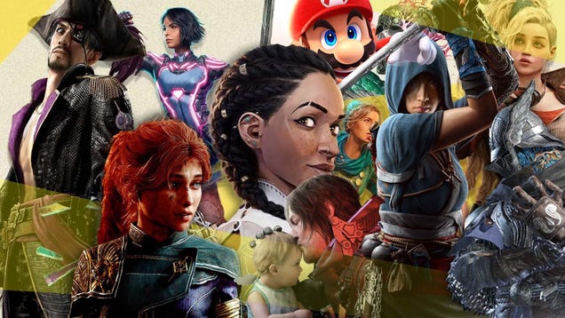
• Editorial Design: '100 Beste Plakate 24' Showcase

    06/12 — 2025

    by abduzeedo

    Explore "100 Beste Plakate 24," a stunning yearbook by Tristesse and Slanted Publishers. Dive into cutting-edge editorial design and visual identity.
    Design enthusiasts, get ready to dive into the latest from the German-speaking design scene. The "100 Beste Plakate 24" yearbook offers a compelling showcase of contemporary graphic design. It's more than just a collection; it's a deep exploration of visual identity and editorial design.
    This yearbook, published by Slanted Publishers and edited by 100 beste Plakate e. V. and Fons Hickmann, is a testament to the power of impactful poster design. The design studio Tristesse from Basel took the reins for the overall concept, delivering a fresh and cheeky aesthetic that makes the "100 best posters" feel like leading actors on a vibrant stage. Their in-house approach to layout, typography, and photography truly shines.
    Unpacking the Visuals
    The book's formatand 256 pages allow for large-format images, providing ample space to appreciate each poster's intricate details. It includes detailed credits, content descriptions, and creation contexts. This commitment to detail in the editorial design elevates the reading experience.
    One notable example within the yearbook is the "To-Do: Diplome 24" poster campaign by Atelier HKB. Designed under Marco Matti's project management, this series features twelve motifs for the Bern University of the Arts graduation events. These posters highlight effective graphic design and visual communication. Another standout is the "Rettungsplakate" by klotz-studio für gestaltung. These "rescue posters," printed on actual rescue blankets, address homelessness in Germany. The raw, impactful visual approach paired with a tangible medium demonstrates powerful design with a purpose.
    Beyond the Imagery
    Beyond the stunning visuals, the yearbook offers insightful essays and interviews on current poster design trends. The introductory section features jury members, their works, and statements on the selection process, alongside forewords from the association president and jury chair. This editorial content offers valuable context and insights into the evolving landscape of graphic design.
    The book’s concept playfully questions the seriousness and benevolence of the honorary certificates awarded to the winning designers. This subtle irony adds a unique layer to the publication, transforming it from a mere compilation into a thoughtful commentary on the design world itself. It's an inspiring showcase of the cutting edge of contemporary graphic design.
    The Art of Editorial Design
    "100 Beste Plakate 24" is a prime example of exceptional editorial design. It's not just about compiling images; it's about curating a narrative. The precise layout, thoughtful typography choices, and the deliberate flow of content all contribute to a cohesive and engaging experience. This book highlights how editorial design can transform a collection of works into a compelling story, inviting readers to delve deeper into each piece.
    The attention to detail, from the softcover with flaps to the thread-stitching and hot-foil embossing, speaks volumes about the dedication to craftsmanship. This is where illustration, graphic design, and branding converge to create a truly immersive experience.
    Final Thoughts
    This yearbook is a must-have for anyone passionate about graphic design and visual identity. It offers a fresh perspective on contemporary poster design, highlighting both aesthetic excellence and social relevance. The detailed insights into the design process and the designers' intentions make it an invaluable resource. Pick up a copy and see how impactful design can be.
    You can learn more about this incredible work and acquire your copy at slanted.de/product/100-beste-plakate-24.
    Editorial design artifacts

    Tags

    editorial design
    #editorial #design #beste #plakate #showcase
    Editorial Design: '100 Beste Plakate 24' Showcase
    06/12 — 2025 by abduzeedo Explore "100 Beste Plakate 24," a stunning yearbook by Tristesse and Slanted Publishers. Dive into cutting-edge editorial design and visual identity. Design enthusiasts, get ready to dive into the latest from the German-speaking design scene. The "100 Beste Plakate 24" yearbook offers a compelling showcase of contemporary graphic design. It's more than just a collection; it's a deep exploration of visual identity and editorial design. This yearbook, published by Slanted Publishers and edited by 100 beste Plakate e. V. and Fons Hickmann, is a testament to the power of impactful poster design. The design studio Tristesse from Basel took the reins for the overall concept, delivering a fresh and cheeky aesthetic that makes the "100 best posters" feel like leading actors on a vibrant stage. Their in-house approach to layout, typography, and photography truly shines. Unpacking the Visuals The book's formatand 256 pages allow for large-format images, providing ample space to appreciate each poster's intricate details. It includes detailed credits, content descriptions, and creation contexts. This commitment to detail in the editorial design elevates the reading experience. One notable example within the yearbook is the "To-Do: Diplome 24" poster campaign by Atelier HKB. Designed under Marco Matti's project management, this series features twelve motifs for the Bern University of the Arts graduation events. These posters highlight effective graphic design and visual communication. Another standout is the "Rettungsplakate" by klotz-studio für gestaltung. These "rescue posters," printed on actual rescue blankets, address homelessness in Germany. The raw, impactful visual approach paired with a tangible medium demonstrates powerful design with a purpose. Beyond the Imagery Beyond the stunning visuals, the yearbook offers insightful essays and interviews on current poster design trends. The introductory section features jury members, their works, and statements on the selection process, alongside forewords from the association president and jury chair. This editorial content offers valuable context and insights into the evolving landscape of graphic design. The book’s concept playfully questions the seriousness and benevolence of the honorary certificates awarded to the winning designers. This subtle irony adds a unique layer to the publication, transforming it from a mere compilation into a thoughtful commentary on the design world itself. It's an inspiring showcase of the cutting edge of contemporary graphic design. The Art of Editorial Design "100 Beste Plakate 24" is a prime example of exceptional editorial design. It's not just about compiling images; it's about curating a narrative. The precise layout, thoughtful typography choices, and the deliberate flow of content all contribute to a cohesive and engaging experience. This book highlights how editorial design can transform a collection of works into a compelling story, inviting readers to delve deeper into each piece. The attention to detail, from the softcover with flaps to the thread-stitching and hot-foil embossing, speaks volumes about the dedication to craftsmanship. This is where illustration, graphic design, and branding converge to create a truly immersive experience. Final Thoughts This yearbook is a must-have for anyone passionate about graphic design and visual identity. It offers a fresh perspective on contemporary poster design, highlighting both aesthetic excellence and social relevance. The detailed insights into the design process and the designers' intentions make it an invaluable resource. Pick up a copy and see how impactful design can be. You can learn more about this incredible work and acquire your copy at slanted.de/product/100-beste-plakate-24. Editorial design artifacts Tags editorial design #editorial #design #beste #plakate #showcase
    ABDUZEEDO.COM
    Editorial Design: '100 Beste Plakate 24' Showcase
    06/12 — 2025 by abduzeedo Explore "100 Beste Plakate 24," a stunning yearbook by Tristesse and Slanted Publishers. Dive into cutting-edge editorial design and visual identity. Design enthusiasts, get ready to dive into the latest from the German-speaking design scene. The "100 Beste Plakate 24" yearbook offers a compelling showcase of contemporary graphic design. It's more than just a collection; it's a deep exploration of visual identity and editorial design. This yearbook, published by Slanted Publishers and edited by 100 beste Plakate e. V. and Fons Hickmann, is a testament to the power of impactful poster design. The design studio Tristesse from Basel took the reins for the overall concept, delivering a fresh and cheeky aesthetic that makes the "100 best posters" feel like leading actors on a vibrant stage. Their in-house approach to layout, typography, and photography truly shines. Unpacking the Visuals The book's format (17×24 cm) and 256 pages allow for large-format images, providing ample space to appreciate each poster's intricate details. It includes detailed credits, content descriptions, and creation contexts. This commitment to detail in the editorial design elevates the reading experience. One notable example within the yearbook is the "To-Do: Diplome 24" poster campaign by Atelier HKB. Designed under Marco Matti's project management, this series features twelve motifs for the Bern University of the Arts graduation events. These posters highlight effective graphic design and visual communication. Another standout is the "Rettungsplakate" by klotz-studio für gestaltung. These "rescue posters," printed on actual rescue blankets, address homelessness in Germany. The raw, impactful visual approach paired with a tangible medium demonstrates powerful design with a purpose. Beyond the Imagery Beyond the stunning visuals, the yearbook offers insightful essays and interviews on current poster design trends. The introductory section features jury members, their works, and statements on the selection process, alongside forewords from the association president and jury chair. This editorial content offers valuable context and insights into the evolving landscape of graphic design. The book’s concept playfully questions the seriousness and benevolence of the honorary certificates awarded to the winning designers. This subtle irony adds a unique layer to the publication, transforming it from a mere compilation into a thoughtful commentary on the design world itself. It's an inspiring showcase of the cutting edge of contemporary graphic design. The Art of Editorial Design "100 Beste Plakate 24" is a prime example of exceptional editorial design. It's not just about compiling images; it's about curating a narrative. The precise layout, thoughtful typography choices, and the deliberate flow of content all contribute to a cohesive and engaging experience. This book highlights how editorial design can transform a collection of works into a compelling story, inviting readers to delve deeper into each piece. The attention to detail, from the softcover with flaps to the thread-stitching and hot-foil embossing, speaks volumes about the dedication to craftsmanship. This is where illustration, graphic design, and branding converge to create a truly immersive experience. Final Thoughts This yearbook is a must-have for anyone passionate about graphic design and visual identity. It offers a fresh perspective on contemporary poster design, highlighting both aesthetic excellence and social relevance. The detailed insights into the design process and the designers' intentions make it an invaluable resource. Pick up a copy and see how impactful design can be. You can learn more about this incredible work and acquire your copy at slanted.de/product/100-beste-plakate-24. Editorial design artifacts Tags editorial design
    0 Reacties 0 aandelen
  • How jam jars explain Apple’s success

    We are told to customize, expand, and provide more options, but that might be a silent killer for our conversion rate. Using behavioral psychology and modern product design, this piece explains why brands like Apple use fewer, smarter choices to convert better.Image generated using ChatgptJam-packed decisionsImagine standing in a supermarket aisle in front of the jam section. How do you decide which jam to buy? You could go for your usual jam, or maybe this is your first time buying jam. Either way, a choice has to be made. Or does it?You may have seen the vast number of choices, gotten overwhelmed, and walked away. The same scenario was reflected in the findings of a 2000 study by Iyengar and Lepper that explored how the number of choice options can affect decision-making.Iyengar and Lepper set up two scenarios; the first customers in a random supermarket being offered 24 jams for a free tasting. In another, they were offered only 6. One would expect that the first scenario would see more sales. After all, more variety means a happier customer. However:Image created using CanvaWhile 60% of customers stopped by for a tasting, only 3% ended up making a purchase.On the other hand, when faced with 6 options, 40% of customers stopped by, but 30% of this number ended up making a purchase.The implications of the study were evident. While one may think that more choices are better when faced with the same, decision-makers prefer fewer.This phenomenon is known as the Paradox of Choice. More choice leads to less satisfaction because one gets overwhelmed.This analysis paralysis results from humans being cognitive misers that is decisions that require deeper thinking feel exhausting and like they come at a cognitive cost. In such scenarios, we tend not to make a choice or choose a default option. Even after a decision has been made, in many cases, regret or the thought of whether you have made the ‘right’ choice can linger.A sticky situationHowever, a 2010 meta-analysis by Benjamin Scheibehenne was unable to replicate the findings. Scheibehenne questioned whether it was choice overload or information overload that was the issue. Other researchers have argued that it is the lack of meaningful choice that affects satisfaction. Additionally, Barry Schwartz, a renowned psychologist and the author of the book ‘The Paradox of Choice: Why Less Is More,’ also later suggested that the paradox of choice diminishes in the presence of a person’s knowledge of the options and if the choices have been presented well.Does that mean the paradox of choice was an overhyped notion? I conducted a mini-study to test this hypothesis.From shelves to spreadsheets: testing the jam jar theoryI created a simple scatterplot in R using a publicly available dataset from the Brazilian e-commerce site Olist. Olist is Brazil’s largest department store on marketplaces. After delivery, customers are asked to fill out a satisfaction survey with a rating or comment option. I analysed the relationship between the number of distinct products in a categoryand the average customer review.Scatterplot generated in R using the Olist datasetBased on the almost horizontal regression line on the plot above, it is evident that more choice does not lead to more satisfaction. Furthermore, categories with fewer than 200 products tend to have average review scores between 4.0 and 4.3. Whereas, categories with more than 1,000 products do not have a higher average satisfaction score, with some even falling below 4.0. This suggests that more choices do not equal more satisfaction and could also reduce satisfaction levels.These findings support the Paradox of Choice, and the dataset helps bring theory into real-world commerce. A curation of lesser, well-presented, and differentiated options could lead to more customer satisfaction.Image created using CanvaFurthermore, the plot could help suggest a more nuanced perspective; people want more choices, as this gives them autonomy. However, beyond a certain point, excessive choice overwhelms rather than empowers, leaving people dissatisfied. Many product strategies reflect this insight: the goal is to inspire confident decision-making rather than limiting freedom. A powerful example of this shift in thinking comes from Apple’s history.Simple tastes, sweeter decisionsImage source: Apple InsiderIt was 1997, and Steve Jobs had just made his return to Apple. The company at the time offered 40 different products; however, its sales were declining. Jobs made one question the company’s mantra,“What are the four products we should be building?”The following year, Apple saw itself return to profitability after introducing the iMac G3. While its success can be attributed to the introduction of a new product line and increased efficiency, one cannot deny that the reduction in the product line simplified the decision-making process for its consumers.To this day, Apple continues to implement this strategy by having a few SKUs and confident defaults.Apple does not just sell premium products; it sells a premium decision-making experience by reducing friction in decision-making for the consumer.Furthermore, a 2015 study based on analyzing scenarios where fewer choice options led to increased sales found the following mitigating factors in buying choices:Time Pressure: Easier and quicker choices led to more sales.Complexity of options: The easier it was to understand what a product was, the better the outcome.Clarity of Preference: How easy it was to compare alternatives and the clarity of one’s preferences.Motivation to Optimize: Whether the consumer wanted to put in the effort to find the ‘best’ option.Picking the right spreadWhile the extent of the validity of the Paradox of Choice is up for debate, its impact cannot be denied. It is still a helpful model that can be used to drive sales and boost customer satisfaction. So, how can one use it as a part of your business’s strategy?Remember, what people want isn’t 50 good choices. They want one confident, easy-to-understand decision that they think they will not regret.Here are some common mistakes that confuse consumers and how you can apply the Jam Jar strategy to curate choices instead:Image is created using CanvaToo many choices lead to decision fatigue.Offering many SKU options usually causes customers to get overwhelmed. Instead, try curating 2–3 strong options that will cover the majority of their needs.2. Being dependent on the users to use filters and specificationsWhen users have to compare specifications themselves, they usually end up doing nothing. Instead, it is better to replace filters with clear labels like “Best for beginners” or “Best for oily skin.”3. Leaving users to make comparisons by themselvesToo many options can make users overwhelmed. Instead, offer default options to show what you recommend. This instills within them a sense of confidence when making the final decision.4. More transparency does not always mean more trustInformation overload never leads to conversions. Instead, create a thoughtful flow that guides the users to the right choices.5. Users do not aim for optimizationAssuming that users will weigh every detail before making a decision is not rooted in reality. In most cases, they will go with their gut. Instead, highlight emotional outcomes, benefits, and uses instead of numbers.6. Not onboarding users is a critical mistakeHoping that users will easily navigate a sea of products without guidance is unrealistic. Instead, use onboarding tools like starter kits, quizzes, or bundles that act as starting points.7. Variety for the sake of varietyUsers crave clarity more than they crave variety. Instead, focus on simplicity when it comes to differentiation.And lastly, remember that while the paradox of choice is a helpful tool in your business strategy arsenal, more choice is not inherently bad. It is the lack of structure in the decision-making process that is the problem. Clear framing will always make decision-making a seamless experience for both your consumers and your business.How jam jars explain Apple’s success was originally published in UX Collective on Medium, where people are continuing the conversation by highlighting and responding to this story.
    #how #jam #jars #explain #apples
    How jam jars explain Apple’s success
    We are told to customize, expand, and provide more options, but that might be a silent killer for our conversion rate. Using behavioral psychology and modern product design, this piece explains why brands like Apple use fewer, smarter choices to convert better.Image generated using ChatgptJam-packed decisionsImagine standing in a supermarket aisle in front of the jam section. How do you decide which jam to buy? You could go for your usual jam, or maybe this is your first time buying jam. Either way, a choice has to be made. Or does it?You may have seen the vast number of choices, gotten overwhelmed, and walked away. The same scenario was reflected in the findings of a 2000 study by Iyengar and Lepper that explored how the number of choice options can affect decision-making.Iyengar and Lepper set up two scenarios; the first customers in a random supermarket being offered 24 jams for a free tasting. In another, they were offered only 6. One would expect that the first scenario would see more sales. After all, more variety means a happier customer. However:Image created using CanvaWhile 60% of customers stopped by for a tasting, only 3% ended up making a purchase.On the other hand, when faced with 6 options, 40% of customers stopped by, but 30% of this number ended up making a purchase.The implications of the study were evident. While one may think that more choices are better when faced with the same, decision-makers prefer fewer.This phenomenon is known as the Paradox of Choice. More choice leads to less satisfaction because one gets overwhelmed.This analysis paralysis results from humans being cognitive misers that is decisions that require deeper thinking feel exhausting and like they come at a cognitive cost. In such scenarios, we tend not to make a choice or choose a default option. Even after a decision has been made, in many cases, regret or the thought of whether you have made the ‘right’ choice can linger.A sticky situationHowever, a 2010 meta-analysis by Benjamin Scheibehenne was unable to replicate the findings. Scheibehenne questioned whether it was choice overload or information overload that was the issue. Other researchers have argued that it is the lack of meaningful choice that affects satisfaction. Additionally, Barry Schwartz, a renowned psychologist and the author of the book ‘The Paradox of Choice: Why Less Is More,’ also later suggested that the paradox of choice diminishes in the presence of a person’s knowledge of the options and if the choices have been presented well.Does that mean the paradox of choice was an overhyped notion? I conducted a mini-study to test this hypothesis.From shelves to spreadsheets: testing the jam jar theoryI created a simple scatterplot in R using a publicly available dataset from the Brazilian e-commerce site Olist. Olist is Brazil’s largest department store on marketplaces. After delivery, customers are asked to fill out a satisfaction survey with a rating or comment option. I analysed the relationship between the number of distinct products in a categoryand the average customer review.Scatterplot generated in R using the Olist datasetBased on the almost horizontal regression line on the plot above, it is evident that more choice does not lead to more satisfaction. Furthermore, categories with fewer than 200 products tend to have average review scores between 4.0 and 4.3. Whereas, categories with more than 1,000 products do not have a higher average satisfaction score, with some even falling below 4.0. This suggests that more choices do not equal more satisfaction and could also reduce satisfaction levels.These findings support the Paradox of Choice, and the dataset helps bring theory into real-world commerce. A curation of lesser, well-presented, and differentiated options could lead to more customer satisfaction.Image created using CanvaFurthermore, the plot could help suggest a more nuanced perspective; people want more choices, as this gives them autonomy. However, beyond a certain point, excessive choice overwhelms rather than empowers, leaving people dissatisfied. Many product strategies reflect this insight: the goal is to inspire confident decision-making rather than limiting freedom. A powerful example of this shift in thinking comes from Apple’s history.Simple tastes, sweeter decisionsImage source: Apple InsiderIt was 1997, and Steve Jobs had just made his return to Apple. The company at the time offered 40 different products; however, its sales were declining. Jobs made one question the company’s mantra,“What are the four products we should be building?”The following year, Apple saw itself return to profitability after introducing the iMac G3. While its success can be attributed to the introduction of a new product line and increased efficiency, one cannot deny that the reduction in the product line simplified the decision-making process for its consumers.To this day, Apple continues to implement this strategy by having a few SKUs and confident defaults.Apple does not just sell premium products; it sells a premium decision-making experience by reducing friction in decision-making for the consumer.Furthermore, a 2015 study based on analyzing scenarios where fewer choice options led to increased sales found the following mitigating factors in buying choices:Time Pressure: Easier and quicker choices led to more sales.Complexity of options: The easier it was to understand what a product was, the better the outcome.Clarity of Preference: How easy it was to compare alternatives and the clarity of one’s preferences.Motivation to Optimize: Whether the consumer wanted to put in the effort to find the ‘best’ option.Picking the right spreadWhile the extent of the validity of the Paradox of Choice is up for debate, its impact cannot be denied. It is still a helpful model that can be used to drive sales and boost customer satisfaction. So, how can one use it as a part of your business’s strategy?Remember, what people want isn’t 50 good choices. They want one confident, easy-to-understand decision that they think they will not regret.Here are some common mistakes that confuse consumers and how you can apply the Jam Jar strategy to curate choices instead:Image is created using CanvaToo many choices lead to decision fatigue.Offering many SKU options usually causes customers to get overwhelmed. Instead, try curating 2–3 strong options that will cover the majority of their needs.2. Being dependent on the users to use filters and specificationsWhen users have to compare specifications themselves, they usually end up doing nothing. Instead, it is better to replace filters with clear labels like “Best for beginners” or “Best for oily skin.”3. Leaving users to make comparisons by themselvesToo many options can make users overwhelmed. Instead, offer default options to show what you recommend. This instills within them a sense of confidence when making the final decision.4. More transparency does not always mean more trustInformation overload never leads to conversions. Instead, create a thoughtful flow that guides the users to the right choices.5. Users do not aim for optimizationAssuming that users will weigh every detail before making a decision is not rooted in reality. In most cases, they will go with their gut. Instead, highlight emotional outcomes, benefits, and uses instead of numbers.6. Not onboarding users is a critical mistakeHoping that users will easily navigate a sea of products without guidance is unrealistic. Instead, use onboarding tools like starter kits, quizzes, or bundles that act as starting points.7. Variety for the sake of varietyUsers crave clarity more than they crave variety. Instead, focus on simplicity when it comes to differentiation.And lastly, remember that while the paradox of choice is a helpful tool in your business strategy arsenal, more choice is not inherently bad. It is the lack of structure in the decision-making process that is the problem. Clear framing will always make decision-making a seamless experience for both your consumers and your business.How jam jars explain Apple’s success was originally published in UX Collective on Medium, where people are continuing the conversation by highlighting and responding to this story. #how #jam #jars #explain #apples
    UXDESIGN.CC
    How jam jars explain Apple’s success
    We are told to customize, expand, and provide more options, but that might be a silent killer for our conversion rate. Using behavioral psychology and modern product design, this piece explains why brands like Apple use fewer, smarter choices to convert better.Image generated using ChatgptJam-packed decisionsImagine standing in a supermarket aisle in front of the jam section. How do you decide which jam to buy? You could go for your usual jam, or maybe this is your first time buying jam. Either way, a choice has to be made. Or does it?You may have seen the vast number of choices, gotten overwhelmed, and walked away. The same scenario was reflected in the findings of a 2000 study by Iyengar and Lepper that explored how the number of choice options can affect decision-making.Iyengar and Lepper set up two scenarios; the first customers in a random supermarket being offered 24 jams for a free tasting. In another, they were offered only 6. One would expect that the first scenario would see more sales. After all, more variety means a happier customer. However:Image created using CanvaWhile 60% of customers stopped by for a tasting, only 3% ended up making a purchase.On the other hand, when faced with 6 options, 40% of customers stopped by, but 30% of this number ended up making a purchase.The implications of the study were evident. While one may think that more choices are better when faced with the same, decision-makers prefer fewer.This phenomenon is known as the Paradox of Choice. More choice leads to less satisfaction because one gets overwhelmed.This analysis paralysis results from humans being cognitive misers that is decisions that require deeper thinking feel exhausting and like they come at a cognitive cost. In such scenarios, we tend not to make a choice or choose a default option. Even after a decision has been made, in many cases, regret or the thought of whether you have made the ‘right’ choice can linger.A sticky situationHowever, a 2010 meta-analysis by Benjamin Scheibehenne was unable to replicate the findings. Scheibehenne questioned whether it was choice overload or information overload that was the issue. Other researchers have argued that it is the lack of meaningful choice that affects satisfaction. Additionally, Barry Schwartz, a renowned psychologist and the author of the book ‘The Paradox of Choice: Why Less Is More,’ also later suggested that the paradox of choice diminishes in the presence of a person’s knowledge of the options and if the choices have been presented well.Does that mean the paradox of choice was an overhyped notion? I conducted a mini-study to test this hypothesis.From shelves to spreadsheets: testing the jam jar theoryI created a simple scatterplot in R using a publicly available dataset from the Brazilian e-commerce site Olist. Olist is Brazil’s largest department store on marketplaces. After delivery, customers are asked to fill out a satisfaction survey with a rating or comment option. I analysed the relationship between the number of distinct products in a category (choices) and the average customer review (satisfaction).Scatterplot generated in R using the Olist datasetBased on the almost horizontal regression line on the plot above, it is evident that more choice does not lead to more satisfaction. Furthermore, categories with fewer than 200 products tend to have average review scores between 4.0 and 4.3. Whereas, categories with more than 1,000 products do not have a higher average satisfaction score, with some even falling below 4.0. This suggests that more choices do not equal more satisfaction and could also reduce satisfaction levels.These findings support the Paradox of Choice, and the dataset helps bring theory into real-world commerce. A curation of lesser, well-presented, and differentiated options could lead to more customer satisfaction.Image created using CanvaFurthermore, the plot could help suggest a more nuanced perspective; people want more choices, as this gives them autonomy. However, beyond a certain point, excessive choice overwhelms rather than empowers, leaving people dissatisfied. Many product strategies reflect this insight: the goal is to inspire confident decision-making rather than limiting freedom. A powerful example of this shift in thinking comes from Apple’s history.Simple tastes, sweeter decisionsImage source: Apple InsiderIt was 1997, and Steve Jobs had just made his return to Apple. The company at the time offered 40 different products; however, its sales were declining. Jobs made one question the company’s mantra,“What are the four products we should be building?”The following year, Apple saw itself return to profitability after introducing the iMac G3. While its success can be attributed to the introduction of a new product line and increased efficiency, one cannot deny that the reduction in the product line simplified the decision-making process for its consumers.To this day, Apple continues to implement this strategy by having a few SKUs and confident defaults.Apple does not just sell premium products; it sells a premium decision-making experience by reducing friction in decision-making for the consumer.Furthermore, a 2015 study based on analyzing scenarios where fewer choice options led to increased sales found the following mitigating factors in buying choices:Time Pressure: Easier and quicker choices led to more sales.Complexity of options: The easier it was to understand what a product was, the better the outcome.Clarity of Preference: How easy it was to compare alternatives and the clarity of one’s preferences.Motivation to Optimize: Whether the consumer wanted to put in the effort to find the ‘best’ option.Picking the right spreadWhile the extent of the validity of the Paradox of Choice is up for debate, its impact cannot be denied. It is still a helpful model that can be used to drive sales and boost customer satisfaction. So, how can one use it as a part of your business’s strategy?Remember, what people want isn’t 50 good choices. They want one confident, easy-to-understand decision that they think they will not regret.Here are some common mistakes that confuse consumers and how you can apply the Jam Jar strategy to curate choices instead:Image is created using CanvaToo many choices lead to decision fatigue.Offering many SKU options usually causes customers to get overwhelmed. Instead, try curating 2–3 strong options that will cover the majority of their needs.2. Being dependent on the users to use filters and specificationsWhen users have to compare specifications themselves, they usually end up doing nothing. Instead, it is better to replace filters with clear labels like “Best for beginners” or “Best for oily skin.”3. Leaving users to make comparisons by themselvesToo many options can make users overwhelmed. Instead, offer default options to show what you recommend. This instills within them a sense of confidence when making the final decision.4. More transparency does not always mean more trustInformation overload never leads to conversions. Instead, create a thoughtful flow that guides the users to the right choices.5. Users do not aim for optimizationAssuming that users will weigh every detail before making a decision is not rooted in reality. In most cases, they will go with their gut. Instead, highlight emotional outcomes, benefits, and uses instead of numbers.6. Not onboarding users is a critical mistakeHoping that users will easily navigate a sea of products without guidance is unrealistic. Instead, use onboarding tools like starter kits, quizzes, or bundles that act as starting points.7. Variety for the sake of varietyUsers crave clarity more than they crave variety. Instead, focus on simplicity when it comes to differentiation.And lastly, remember that while the paradox of choice is a helpful tool in your business strategy arsenal, more choice is not inherently bad. It is the lack of structure in the decision-making process that is the problem. Clear framing will always make decision-making a seamless experience for both your consumers and your business.How jam jars explain Apple’s success was originally published in UX Collective on Medium, where people are continuing the conversation by highlighting and responding to this story.
    0 Reacties 0 aandelen