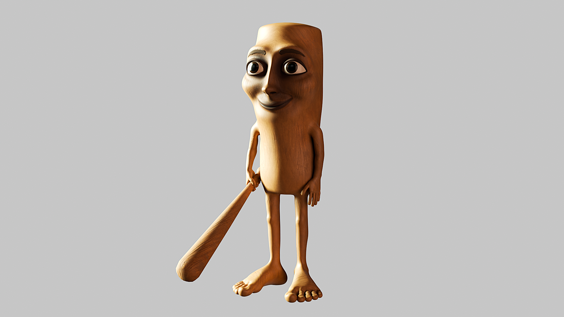
• The 25 creative studios inspiring us the most in 2025

    Which creative studio do you most admire right now, and why? This is a question we asked our community via an ongoing survey. With more than 700 responses so far, these are the top winners. What's striking about this year's results is the popularity of studios that aren't just producing beautiful work but are also actively shaping discussions and tackling the big challenges facing our industry and society.
    From the vibrant energy of Brazilian culture to the thoughtful minimalism of North European aesthetics, this list reflects a global creative landscape that's more connected, more conscious, and more collaborative than ever before.
    In short, these studios aren't just following trends; they're setting them. Read on to discover the 25 studios our community is most excited about right now.
    1. Porto Rocha
    Porto Rocha is a New York-based agency that unites strategy and design to create work that evolves with the world we live in. It continues to dominate conversations in 2025, and it's easy to see why. Founders Felipe Rocha and Leo Porto have built something truly special—a studio that not only creates visually stunning work but also actively celebrates and amplifies diverse voices in design.
    For instance, their recent bold new identity for the São Paulo art museum MASP nods to Brazilian modernist design traditions while reimagining them for a contemporary audience. The rebrand draws heavily on the museum's iconic modernist architecture by Lina Bo Bardi, using a red-and-black colour palette and strong typography to reflect the building's striking visual presence.
    As we write this article, Porto Rocha just shared a new partnership with Google to reimagine the visual and verbal identity of its revolutionary Gemini AI model. We can't wait to see what they come up with!

    2. DixonBaxi
    Simon Dixon and Aporva Baxi's London powerhouse specialises in creating brand strategies and design systems for "brave businesses" that want to challenge convention, including Hulu, Audible, and the Premier League. The studio had an exceptional start to 2025 by collaborating with Roblox on a brand new design system. At the heart of this major project is the Tilt: a 15-degree shift embedded in the logo that signals momentum, creativity, and anticipation.
    They've also continued to build their reputation as design thought leaders. At the OFFF Festival 2025, for instance, Simon and Aporva delivered a masterclass on running a successful brand design agency. Their core message centred on the importance of people and designing with intention, even in the face of global challenges. They also highlighted "Super Futures," their program that encourages employees to think freely and positively about brand challenges and audience desires, aiming to reclaim creative liberation.
    And if that wasn't enough, DixonBaxi has just launched its brand new website, one that's designed to be open in nature. As Simon explains: "It's not a shop window. It's a space to share the thinking and ethos that drive us. You'll find our work, but more importantly, what shapes it. No guff. Just us."

    3. Mother
    Mother is a renowned independent creative agency founded in London and now boasts offices in New York and Los Angeles as well. They've spent 2025 continuing to push the boundaries of what advertising can achieve. And they've made an especially big splash with their latest instalment of KFC's 'Believe' campaign, featuring a surreal and humorous take on KFC's gravy. As we wrote at the time: "Its balance between theatrical grandeur and self-awareness makes the campaign uniquely engaging."
    4. Studio Dumbar/DEPT®
    Based in Rotterdam, Studio Dumbar/DEPT® is widely recognised for its influential work in visual branding and identity, often incorporating creative coding and sound, for clients such as the Dutch Railways, Instagram, and the Van Gogh Museum.
    In 2025, we've especially admired their work for the Dutch football club Feyenoord, which brings the team under a single, cohesive vision that reflects its energy and prowess. This groundbreaking rebrand, unveiled at the start of May, moves away from nostalgia, instead emphasising the club's "measured ferocity, confidence, and ambition".
    5. HONDO
    Based between Palma de Mallorca, Spain and London, HONDO specialises in branding, editorial, typography and product design. We're particular fans of their rebranding of metal furniture makers Castil, based around clean and versatile designs that highlight Castil's vibrant and customisable products.
    This new system features a bespoke monospaced typeface and logo design that evokes Castil's adaptability and the precision of its craftsmanship.

    6. Smith & Diction
    Smith & Diction is a small but mighty design and copy studio founded by Mike and Chara Smith in Philadelphia. Born from dreams, late-night chats, and plenty of mistakes, the studio has grown into a creative force known for thoughtful, boundary-pushing branding.
    Starting out with Mike designing in a tiny apartment while Chara held down a day job, the pair learned the ropes the hard way—and now they're thriving. Recent highlights include their work with Gamma, an AI platform that lets you quickly get ideas out of your head and into a presentation deck or onto a website.
    Gamma wanted their brand update to feel "VERY fun and a little bit out there" with an AI-first approach. So Smith & Diction worked hard to "put weird to the test" while still developing responsible systems for logo, type and colour. The results, as ever, were exceptional.

    7. DNCO
    DNCO is a London and New York-based creative studio specialising in place branding. They are best known for shaping identities, digital tools, and wayfinding for museums, cultural institutions, and entire neighbourhoods, with clients including the Design Museum, V&A and Transport for London.
    Recently, DNCO has been making headlines again with its ambitious brand refresh for Dumbo, a New York neighbourhood struggling with misperceptions due to mass tourism. The goal was to highlight Dumbo's unconventional spirit and demonstrate it as "a different side of New York."
    DNCO preserved the original diagonal logo and introduced a flexible "tape graphic" system, inspired by the neighbourhood's history of inventing the cardboard box, to reflect its ingenuity and reveal new perspectives. The colour palette and typography were chosen to embody Dumbo's industrial and gritty character.

    8. Hey Studio
    Founded by Verònica Fuerte in Barcelona, Spain, Hey Studio is a small, all-female design agency celebrated for its striking use of geometry, bold colour, and playful yet refined visual language. With a focus on branding, illustration, editorial design, and typography, they combine joy with craft to explore issues with heart and purpose.
    A great example of their impact is their recent branding for Rainbow Wool. This German initiative is transforming wool from gay rams into fashion products to support the LGBT community.
    As is typical for Hey Studio, the project's identity is vibrant and joyful, utilising bright, curved shapes that will put a smile on everyone's face.

    9. Koto
    Koto is a London-based global branding and digital studio known for co-creation, strategic thinking, expressive design systems, and enduring partnerships. They're well-known in the industry for bringing warmth, optimism and clarity to complex brand challenges.
    Over the past 18 months, they've undertaken a significant project to refresh Amazon's global brand identity. This extensive undertaking has involved redesigning Amazon's master brand and over 50 of its sub-brands across 15 global markets.
    Koto's approach, described as "radical coherence", aims to refine and modernize Amazon's most recognizable elements rather than drastically changing them. You can read more about the project here.

    10. Robot Food
    Robot Food is a Leeds-based, brand-first creative studio recognised for its strategic and holistic approach. They're past masters at melding creative ideas with commercial rigour across packaging, brand strategy and campaign design.
    Recent Robot Food projects have included a bold rebrand for Hip Pop, a soft drinks company specializing in kombucha and alternative sodas. Their goal was to elevate Hip Pop from an indie challenger to a mainstream category leader, moving away from typical health drink aesthetics.
    The results are visually striking, with black backgrounds prominently featured, punctuated by vibrant fruit illustrations and flavour-coded colours. about the project here.

    11. Saffron Brand Consultants
    Saffron is an independent global consultancy with offices in London, Madrid, Vienna and Istanbul. With deep expertise in naming, strategy, identity, and design systems, they work with leading public and private-sector clients to develop confident, culturally intelligent brands.
    One 2025 highlight so far has been their work for Saudi National Bankto create NEO, a groundbreaking digital lifestyle bank in Saudi Arabia.
    Saffron integrated cultural and design trends, including Saudi neo-futurism, for its sonic identity to create a product that supports both individual and community connections. The design system strikes a balance between modern Saudi aesthetics and the practical demands of a fast-paced digital product, ensuring a consistent brand reflection across all interactions.
    12. Alright Studio
    Alright Studio is a full-service strategy, creative, production and technology agency based in Brooklyn, New York. It prides itself on a "no house style" approach for clients, including A24, Meta Platforms, and Post Malone. One of the most exciting of their recent projects has been Offball, a digital-first sports news platform that aims to provide more nuanced, positive sports storytelling.
    Alright Studio designed a clean, intuitive, editorial-style platform featuring a masthead-like logotype and universal sports iconography, creating a calmer user experience aligned with OffBall's positive content.
    13. Wolff Olins
    Wolff Olins is a global brand consultancy with four main offices: London, New York, San Francisco, and Los Angeles. Known for their courageous, culturally relevant branding and forward-thinking strategy, they collaborate with large corporations and trailblazing organisations to create bold, authentic brand identities that resonate emotionally.
    A particular highlight of 2025 so far has been their collaboration with Leo Burnett to refresh Sandals Resorts' global brand with the "Made of Caribbean" campaign. This strategic move positions Sandals not merely as a luxury resort but as a cultural ambassador for the Caribbean.
    Wolff Olins developed a new visual identity called "Natural Vibrancy," integrating local influences with modern design to reflect a genuine connection to the islands' culture. This rebrand speaks to a growing traveller demand for authenticity and meaningful experiences, allowing Sandals to define itself as an extension of the Caribbean itself.

    14. COLLINS
    Founded by Brian Collins, COLLINS is an independent branding and design consultancy based in the US, celebrated for its playful visual language, expressive storytelling and culturally rich identity systems. In the last few months, we've loved the new branding they designed for Barcelona's 25th Offf Festival, which departs from its usual consistent wordmark.
    The updated identity is inspired by the festival's role within the international creative community, and is rooted in the concept of 'Centre Offf Gravity'. This concept is visually expressed through the festival's name, which appears to exert a gravitational pull on the text boxes, causing them to "stick" to it.
    Additionally, the 'f's in the wordmark are merged into a continuous line reminiscent of a magnet, with the motion graphics further emphasising the gravitational pull as the name floats and other elements follow.
    15. Studio Spass
    Studio Spass is a creative studio based in Rotterdam, the Netherlands, focused on vibrant and dynamic identity systems that reflect the diverse and multifaceted nature of cultural institutions. One of their recent landmark projects was Bigger, a large-scale typographic installation created for the Shenzhen Art Book Fair.
    Inspired by tear-off calendars and the physical act of reading, Studio Spass used 264 A4 books, with each page displaying abstract details, to create an evolving grid of colour and type. Visitors were invited to interact with the installation by flipping pages, constantly revealing new layers of design and a hidden message: "Enjoy books!"

    16. Applied Design Works
    Applied Design Works is a New York studio that specialises in reshaping businesses through branding and design. They provide expertise in design, strategy, and implementation, with a focus on building long-term, collaborative relationships with their clients.
    We were thrilled by their recent work for Grand Central Madison, where they were instrumental in ushering in a new era for the transportation hub.
    Applied Design sought to create a commuter experience that imbued the spirit of New York, showcasing its diversity of thought, voice, and scale that befits one of the greatest cities in the world and one of the greatest structures in it.

    17. The Chase
    The Chase Creative Consultants is a Manchester-based independent creative consultancy with over 35 years of experience, known for blending humour, purpose, and strong branding to rejuvenate popular consumer campaigns. "We're not designers, writers, advertisers or brand strategists," they say, "but all of these and more. An ideas-based creative studio."
    Recently, they were tasked with shaping the identity of York Central, a major urban regeneration project set to become a new city quarter for York. The Chase developed the identity based on extensive public engagement, listening to residents of all ages about their perceptions of the city and their hopes for the new area. The resulting brand identity uses linear forms that subtly reference York's famous railway hub, symbolising the long-standing connections the city has fostered.

    18. A Practice for Everyday Life
    Based in London and founded by Kirsty Carter and Emma Thomas, A Practice for Everyday Life built a reputation as a sought-after collaborator with like-minded companies, galleries, institutions and individuals. Not to mention a conceptual rigour that ensures each design is meaningful and original.
    Recently, they've been working on the visual identity for Muzej Lah, a new international museum for contemporary art in Bled, Slovenia opening in 2026. This centres around a custom typeface inspired by the slanted geometry and square detailing of its concrete roof tiles. It also draws from European modernist typography and the experimental lettering of Jože Plečnik, one of Slovenia's most influential architects.⁠

    A Practice for Everyday Life. Photo: Carol Sachs

    Alexey Brodovitch: Astonish Me publication design by A Practice for Everyday Life, 2024. Photo: Ed Park

    La Biennale di Venezia identity by A Practice for Everyday Life, 2022. Photo: Thomas Adank

    CAM – Centro de Arte Moderna Gulbenkian identity by A Practice for Everyday Life, 2024. Photo: Sanda Vučković

    19. Studio Nari
    Studio Nari is a London-based creative and branding agency partnering with clients around the world to build "brands that truly connect with people". NARI stands, by the way, for Not Always Right Ideas. As they put it, "It's a name that might sound odd for a branding agency, but it reflects everything we believe."
    One landmark project this year has been a comprehensive rebrand for the electronic music festival Field Day. Studio Nari created a dynamic and evolving identity that reflects the festival's growth and its connection to the electronic music scene and community.
    The core idea behind the rebrand is a "reactive future", allowing the brand to adapt and grow with the festival and current trends while maintaining a strong foundation. A new, steadfast wordmark is at its centre, while a new marque has been introduced for the first time.
    20. Beetroot Design Group
    Beetroot is a 25‑strong creative studio celebrated for its bold identities and storytelling-led approach. Based in Thessaloniki, Greece, their work spans visual identity, print, digital and motion, and has earned international recognition, including Red Dot Awards. Recently, they also won a Wood Pencil at the D&AD Awards 2025 for a series of posters created to promote live jazz music events.
    The creative idea behind all three designs stems from improvisation as a key feature of jazz. Each poster communicates the artist's name and other relevant information through a typographical "improvisation".
    21. Kind Studio
    Kind Studio is an independent creative agency based in London that specialises in branding and digital design, as well as offering services in animation, creative and art direction, and print design. Their goal is to collaborate closely with clients to create impactful and visually appealing designs.
    One recent project that piqued our interest was a bilingual, editorially-driven digital platform for FC Como Women, a professional Italian football club. To reflect the club's ambition of promoting gender equality and driving positive social change within football, the new website employs bold typography, strong imagery, and an empowering tone of voice to inspire and disseminate its message.

    22. Slug Global
    Slug Global is a creative agency and art collective founded by artist and musician Bosco. Focused on creating immersive experiences "for both IRL and URL", their goal is to work with artists and brands to establish a sustainable media platform that embodies the values of young millennials, Gen Z and Gen Alpha.
    One of Slug Global's recent projects involved a collaboration with SheaMoisture and xoNecole for a three-part series called The Root of It. This series celebrates black beauty and hair, highlighting its significance as a connection to ancestry, tradition, blueprint and culture for black women.

    23. Little Troop
    New York studio Little Troop crafts expressive and intimate branding for lifestyle, fashion, and cultural clients. Led by creative directors Noemie Le Coz and Jeremy Elliot, they're known for their playful and often "kid-like" approach to design, drawing inspiration from their own experiences as 90s kids.
    One of their recent and highly acclaimed projects is the visual identity for MoMA's first-ever family festival, Another World. Little Troop was tasked with developing a comprehensive visual identity that would extend from small items, such as café placemats, to large billboards.
    Their designs were deliberately a little "dream-like" and relied purely on illustration to sell the festival without needing photography. Little Troop also carefully selected seven colours from MoMA's existing brand guidelines to strike a balance between timelessness, gender neutrality, and fun.

    24. Morcos Key
    Morcos Key is a Brooklyn-based design studio co-founded by Jon Key and Wael Morcos. Collaborating with a diverse range of clients, including arts and cultural institutions, non-profits and commercial enterprises, they're known for translating clients' stories into impactful visual systems through thoughtful conversation and formal expression.
    One notable project is their visual identity work for Hammer & Hope, a magazine that focuses on politics and culture within the black radical tradition. For this project, Morcos Key developed not only the visual identity but also a custom all-caps typeface to reflect the publication's mission and content.
    25. Thirst
    Thirst, also known as Thirst Craft, is an award-winning strategic drinks packaging design agency based in Glasgow, Scotland, with additional hubs in London and New York. Founded in 2015 by Matthew Stephen Burns and Christopher John Black, the company specializes in building creatively distinctive and commercially effective brands for the beverage industry.
    To see what they're capable of, check out their work for SKYY Vodka. The new global visual identity system, called Audacious Glamour', aims to unify SKYY under a singular, powerful idea. The visual identity benefits from bolder framing, patterns, and a flavour-forward colour palette to highlight each product's "juicy attitude", while the photography style employs macro shots and liquid highlights to convey a premium feel.
    #creative #studios #inspiring #most
    The 25 creative studios inspiring us the most in 2025
    Which creative studio do you most admire right now, and why? This is a question we asked our community via an ongoing survey. With more than 700 responses so far, these are the top winners. What's striking about this year's results is the popularity of studios that aren't just producing beautiful work but are also actively shaping discussions and tackling the big challenges facing our industry and society. From the vibrant energy of Brazilian culture to the thoughtful minimalism of North European aesthetics, this list reflects a global creative landscape that's more connected, more conscious, and more collaborative than ever before. In short, these studios aren't just following trends; they're setting them. Read on to discover the 25 studios our community is most excited about right now. 1. Porto Rocha Porto Rocha is a New York-based agency that unites strategy and design to create work that evolves with the world we live in. It continues to dominate conversations in 2025, and it's easy to see why. Founders Felipe Rocha and Leo Porto have built something truly special—a studio that not only creates visually stunning work but also actively celebrates and amplifies diverse voices in design. For instance, their recent bold new identity for the São Paulo art museum MASP nods to Brazilian modernist design traditions while reimagining them for a contemporary audience. The rebrand draws heavily on the museum's iconic modernist architecture by Lina Bo Bardi, using a red-and-black colour palette and strong typography to reflect the building's striking visual presence. As we write this article, Porto Rocha just shared a new partnership with Google to reimagine the visual and verbal identity of its revolutionary Gemini AI model. We can't wait to see what they come up with! 2. DixonBaxi Simon Dixon and Aporva Baxi's London powerhouse specialises in creating brand strategies and design systems for "brave businesses" that want to challenge convention, including Hulu, Audible, and the Premier League. The studio had an exceptional start to 2025 by collaborating with Roblox on a brand new design system. At the heart of this major project is the Tilt: a 15-degree shift embedded in the logo that signals momentum, creativity, and anticipation. They've also continued to build their reputation as design thought leaders. At the OFFF Festival 2025, for instance, Simon and Aporva delivered a masterclass on running a successful brand design agency. Their core message centred on the importance of people and designing with intention, even in the face of global challenges. They also highlighted "Super Futures," their program that encourages employees to think freely and positively about brand challenges and audience desires, aiming to reclaim creative liberation. And if that wasn't enough, DixonBaxi has just launched its brand new website, one that's designed to be open in nature. As Simon explains: "It's not a shop window. It's a space to share the thinking and ethos that drive us. You'll find our work, but more importantly, what shapes it. No guff. Just us." 3. Mother Mother is a renowned independent creative agency founded in London and now boasts offices in New York and Los Angeles as well. They've spent 2025 continuing to push the boundaries of what advertising can achieve. And they've made an especially big splash with their latest instalment of KFC's 'Believe' campaign, featuring a surreal and humorous take on KFC's gravy. As we wrote at the time: "Its balance between theatrical grandeur and self-awareness makes the campaign uniquely engaging." 4. Studio Dumbar/DEPT® Based in Rotterdam, Studio Dumbar/DEPT® is widely recognised for its influential work in visual branding and identity, often incorporating creative coding and sound, for clients such as the Dutch Railways, Instagram, and the Van Gogh Museum. In 2025, we've especially admired their work for the Dutch football club Feyenoord, which brings the team under a single, cohesive vision that reflects its energy and prowess. This groundbreaking rebrand, unveiled at the start of May, moves away from nostalgia, instead emphasising the club's "measured ferocity, confidence, and ambition". 5. HONDO Based between Palma de Mallorca, Spain and London, HONDO specialises in branding, editorial, typography and product design. We're particular fans of their rebranding of metal furniture makers Castil, based around clean and versatile designs that highlight Castil's vibrant and customisable products. This new system features a bespoke monospaced typeface and logo design that evokes Castil's adaptability and the precision of its craftsmanship. 6. Smith & Diction Smith & Diction is a small but mighty design and copy studio founded by Mike and Chara Smith in Philadelphia. Born from dreams, late-night chats, and plenty of mistakes, the studio has grown into a creative force known for thoughtful, boundary-pushing branding. Starting out with Mike designing in a tiny apartment while Chara held down a day job, the pair learned the ropes the hard way—and now they're thriving. Recent highlights include their work with Gamma, an AI platform that lets you quickly get ideas out of your head and into a presentation deck or onto a website. Gamma wanted their brand update to feel "VERY fun and a little bit out there" with an AI-first approach. So Smith & Diction worked hard to "put weird to the test" while still developing responsible systems for logo, type and colour. The results, as ever, were exceptional. 7. DNCO DNCO is a London and New York-based creative studio specialising in place branding. They are best known for shaping identities, digital tools, and wayfinding for museums, cultural institutions, and entire neighbourhoods, with clients including the Design Museum, V&A and Transport for London. Recently, DNCO has been making headlines again with its ambitious brand refresh for Dumbo, a New York neighbourhood struggling with misperceptions due to mass tourism. The goal was to highlight Dumbo's unconventional spirit and demonstrate it as "a different side of New York." DNCO preserved the original diagonal logo and introduced a flexible "tape graphic" system, inspired by the neighbourhood's history of inventing the cardboard box, to reflect its ingenuity and reveal new perspectives. The colour palette and typography were chosen to embody Dumbo's industrial and gritty character. 8. Hey Studio Founded by Verònica Fuerte in Barcelona, Spain, Hey Studio is a small, all-female design agency celebrated for its striking use of geometry, bold colour, and playful yet refined visual language. With a focus on branding, illustration, editorial design, and typography, they combine joy with craft to explore issues with heart and purpose. A great example of their impact is their recent branding for Rainbow Wool. This German initiative is transforming wool from gay rams into fashion products to support the LGBT community. As is typical for Hey Studio, the project's identity is vibrant and joyful, utilising bright, curved shapes that will put a smile on everyone's face. 9. Koto Koto is a London-based global branding and digital studio known for co-creation, strategic thinking, expressive design systems, and enduring partnerships. They're well-known in the industry for bringing warmth, optimism and clarity to complex brand challenges. Over the past 18 months, they've undertaken a significant project to refresh Amazon's global brand identity. This extensive undertaking has involved redesigning Amazon's master brand and over 50 of its sub-brands across 15 global markets. Koto's approach, described as "radical coherence", aims to refine and modernize Amazon's most recognizable elements rather than drastically changing them. You can read more about the project here. 10. Robot Food Robot Food is a Leeds-based, brand-first creative studio recognised for its strategic and holistic approach. They're past masters at melding creative ideas with commercial rigour across packaging, brand strategy and campaign design. Recent Robot Food projects have included a bold rebrand for Hip Pop, a soft drinks company specializing in kombucha and alternative sodas. Their goal was to elevate Hip Pop from an indie challenger to a mainstream category leader, moving away from typical health drink aesthetics. The results are visually striking, with black backgrounds prominently featured, punctuated by vibrant fruit illustrations and flavour-coded colours. about the project here. 11. Saffron Brand Consultants Saffron is an independent global consultancy with offices in London, Madrid, Vienna and Istanbul. With deep expertise in naming, strategy, identity, and design systems, they work with leading public and private-sector clients to develop confident, culturally intelligent brands. One 2025 highlight so far has been their work for Saudi National Bankto create NEO, a groundbreaking digital lifestyle bank in Saudi Arabia. Saffron integrated cultural and design trends, including Saudi neo-futurism, for its sonic identity to create a product that supports both individual and community connections. The design system strikes a balance between modern Saudi aesthetics and the practical demands of a fast-paced digital product, ensuring a consistent brand reflection across all interactions. 12. Alright Studio Alright Studio is a full-service strategy, creative, production and technology agency based in Brooklyn, New York. It prides itself on a "no house style" approach for clients, including A24, Meta Platforms, and Post Malone. One of the most exciting of their recent projects has been Offball, a digital-first sports news platform that aims to provide more nuanced, positive sports storytelling. Alright Studio designed a clean, intuitive, editorial-style platform featuring a masthead-like logotype and universal sports iconography, creating a calmer user experience aligned with OffBall's positive content. 13. Wolff Olins Wolff Olins is a global brand consultancy with four main offices: London, New York, San Francisco, and Los Angeles. Known for their courageous, culturally relevant branding and forward-thinking strategy, they collaborate with large corporations and trailblazing organisations to create bold, authentic brand identities that resonate emotionally. A particular highlight of 2025 so far has been their collaboration with Leo Burnett to refresh Sandals Resorts' global brand with the "Made of Caribbean" campaign. This strategic move positions Sandals not merely as a luxury resort but as a cultural ambassador for the Caribbean. Wolff Olins developed a new visual identity called "Natural Vibrancy," integrating local influences with modern design to reflect a genuine connection to the islands' culture. This rebrand speaks to a growing traveller demand for authenticity and meaningful experiences, allowing Sandals to define itself as an extension of the Caribbean itself. 14. COLLINS Founded by Brian Collins, COLLINS is an independent branding and design consultancy based in the US, celebrated for its playful visual language, expressive storytelling and culturally rich identity systems. In the last few months, we've loved the new branding they designed for Barcelona's 25th Offf Festival, which departs from its usual consistent wordmark. The updated identity is inspired by the festival's role within the international creative community, and is rooted in the concept of 'Centre Offf Gravity'. This concept is visually expressed through the festival's name, which appears to exert a gravitational pull on the text boxes, causing them to "stick" to it. Additionally, the 'f's in the wordmark are merged into a continuous line reminiscent of a magnet, with the motion graphics further emphasising the gravitational pull as the name floats and other elements follow. 15. Studio Spass Studio Spass is a creative studio based in Rotterdam, the Netherlands, focused on vibrant and dynamic identity systems that reflect the diverse and multifaceted nature of cultural institutions. One of their recent landmark projects was Bigger, a large-scale typographic installation created for the Shenzhen Art Book Fair. Inspired by tear-off calendars and the physical act of reading, Studio Spass used 264 A4 books, with each page displaying abstract details, to create an evolving grid of colour and type. Visitors were invited to interact with the installation by flipping pages, constantly revealing new layers of design and a hidden message: "Enjoy books!" 16. Applied Design Works Applied Design Works is a New York studio that specialises in reshaping businesses through branding and design. They provide expertise in design, strategy, and implementation, with a focus on building long-term, collaborative relationships with their clients. We were thrilled by their recent work for Grand Central Madison, where they were instrumental in ushering in a new era for the transportation hub. Applied Design sought to create a commuter experience that imbued the spirit of New York, showcasing its diversity of thought, voice, and scale that befits one of the greatest cities in the world and one of the greatest structures in it. 17. The Chase The Chase Creative Consultants is a Manchester-based independent creative consultancy with over 35 years of experience, known for blending humour, purpose, and strong branding to rejuvenate popular consumer campaigns. "We're not designers, writers, advertisers or brand strategists," they say, "but all of these and more. An ideas-based creative studio." Recently, they were tasked with shaping the identity of York Central, a major urban regeneration project set to become a new city quarter for York. The Chase developed the identity based on extensive public engagement, listening to residents of all ages about their perceptions of the city and their hopes for the new area. The resulting brand identity uses linear forms that subtly reference York's famous railway hub, symbolising the long-standing connections the city has fostered. 18. A Practice for Everyday Life Based in London and founded by Kirsty Carter and Emma Thomas, A Practice for Everyday Life built a reputation as a sought-after collaborator with like-minded companies, galleries, institutions and individuals. Not to mention a conceptual rigour that ensures each design is meaningful and original. Recently, they've been working on the visual identity for Muzej Lah, a new international museum for contemporary art in Bled, Slovenia opening in 2026. This centres around a custom typeface inspired by the slanted geometry and square detailing of its concrete roof tiles. It also draws from European modernist typography and the experimental lettering of Jože Plečnik, one of Slovenia's most influential architects.⁠ A Practice for Everyday Life. Photo: Carol Sachs Alexey Brodovitch: Astonish Me publication design by A Practice for Everyday Life, 2024. Photo: Ed Park La Biennale di Venezia identity by A Practice for Everyday Life, 2022. Photo: Thomas Adank CAM – Centro de Arte Moderna Gulbenkian identity by A Practice for Everyday Life, 2024. Photo: Sanda Vučković 19. Studio Nari Studio Nari is a London-based creative and branding agency partnering with clients around the world to build "brands that truly connect with people". NARI stands, by the way, for Not Always Right Ideas. As they put it, "It's a name that might sound odd for a branding agency, but it reflects everything we believe." One landmark project this year has been a comprehensive rebrand for the electronic music festival Field Day. Studio Nari created a dynamic and evolving identity that reflects the festival's growth and its connection to the electronic music scene and community. The core idea behind the rebrand is a "reactive future", allowing the brand to adapt and grow with the festival and current trends while maintaining a strong foundation. A new, steadfast wordmark is at its centre, while a new marque has been introduced for the first time. 20. Beetroot Design Group Beetroot is a 25‑strong creative studio celebrated for its bold identities and storytelling-led approach. Based in Thessaloniki, Greece, their work spans visual identity, print, digital and motion, and has earned international recognition, including Red Dot Awards. Recently, they also won a Wood Pencil at the D&AD Awards 2025 for a series of posters created to promote live jazz music events. The creative idea behind all three designs stems from improvisation as a key feature of jazz. Each poster communicates the artist's name and other relevant information through a typographical "improvisation". 21. Kind Studio Kind Studio is an independent creative agency based in London that specialises in branding and digital design, as well as offering services in animation, creative and art direction, and print design. Their goal is to collaborate closely with clients to create impactful and visually appealing designs. One recent project that piqued our interest was a bilingual, editorially-driven digital platform for FC Como Women, a professional Italian football club. To reflect the club's ambition of promoting gender equality and driving positive social change within football, the new website employs bold typography, strong imagery, and an empowering tone of voice to inspire and disseminate its message. 22. Slug Global Slug Global is a creative agency and art collective founded by artist and musician Bosco. Focused on creating immersive experiences "for both IRL and URL", their goal is to work with artists and brands to establish a sustainable media platform that embodies the values of young millennials, Gen Z and Gen Alpha. One of Slug Global's recent projects involved a collaboration with SheaMoisture and xoNecole for a three-part series called The Root of It. This series celebrates black beauty and hair, highlighting its significance as a connection to ancestry, tradition, blueprint and culture for black women. 23. Little Troop New York studio Little Troop crafts expressive and intimate branding for lifestyle, fashion, and cultural clients. Led by creative directors Noemie Le Coz and Jeremy Elliot, they're known for their playful and often "kid-like" approach to design, drawing inspiration from their own experiences as 90s kids. One of their recent and highly acclaimed projects is the visual identity for MoMA's first-ever family festival, Another World. Little Troop was tasked with developing a comprehensive visual identity that would extend from small items, such as café placemats, to large billboards. Their designs were deliberately a little "dream-like" and relied purely on illustration to sell the festival without needing photography. Little Troop also carefully selected seven colours from MoMA's existing brand guidelines to strike a balance between timelessness, gender neutrality, and fun. 24. Morcos Key Morcos Key is a Brooklyn-based design studio co-founded by Jon Key and Wael Morcos. Collaborating with a diverse range of clients, including arts and cultural institutions, non-profits and commercial enterprises, they're known for translating clients' stories into impactful visual systems through thoughtful conversation and formal expression. One notable project is their visual identity work for Hammer & Hope, a magazine that focuses on politics and culture within the black radical tradition. For this project, Morcos Key developed not only the visual identity but also a custom all-caps typeface to reflect the publication's mission and content. 25. Thirst Thirst, also known as Thirst Craft, is an award-winning strategic drinks packaging design agency based in Glasgow, Scotland, with additional hubs in London and New York. Founded in 2015 by Matthew Stephen Burns and Christopher John Black, the company specializes in building creatively distinctive and commercially effective brands for the beverage industry. To see what they're capable of, check out their work for SKYY Vodka. The new global visual identity system, called Audacious Glamour', aims to unify SKYY under a singular, powerful idea. The visual identity benefits from bolder framing, patterns, and a flavour-forward colour palette to highlight each product's "juicy attitude", while the photography style employs macro shots and liquid highlights to convey a premium feel. #creative #studios #inspiring #most
    WWW.CREATIVEBOOM.COM
    The 25 creative studios inspiring us the most in 2025
    Which creative studio do you most admire right now, and why? This is a question we asked our community via an ongoing survey. With more than 700 responses so far, these are the top winners. What's striking about this year's results is the popularity of studios that aren't just producing beautiful work but are also actively shaping discussions and tackling the big challenges facing our industry and society. From the vibrant energy of Brazilian culture to the thoughtful minimalism of North European aesthetics, this list reflects a global creative landscape that's more connected, more conscious, and more collaborative than ever before. In short, these studios aren't just following trends; they're setting them. Read on to discover the 25 studios our community is most excited about right now. 1. Porto Rocha Porto Rocha is a New York-based agency that unites strategy and design to create work that evolves with the world we live in. It continues to dominate conversations in 2025, and it's easy to see why. Founders Felipe Rocha and Leo Porto have built something truly special—a studio that not only creates visually stunning work but also actively celebrates and amplifies diverse voices in design. For instance, their recent bold new identity for the São Paulo art museum MASP nods to Brazilian modernist design traditions while reimagining them for a contemporary audience. The rebrand draws heavily on the museum's iconic modernist architecture by Lina Bo Bardi, using a red-and-black colour palette and strong typography to reflect the building's striking visual presence. As we write this article, Porto Rocha just shared a new partnership with Google to reimagine the visual and verbal identity of its revolutionary Gemini AI model. We can't wait to see what they come up with! 2. DixonBaxi Simon Dixon and Aporva Baxi's London powerhouse specialises in creating brand strategies and design systems for "brave businesses" that want to challenge convention, including Hulu, Audible, and the Premier League. The studio had an exceptional start to 2025 by collaborating with Roblox on a brand new design system. At the heart of this major project is the Tilt: a 15-degree shift embedded in the logo that signals momentum, creativity, and anticipation. They've also continued to build their reputation as design thought leaders. At the OFFF Festival 2025, for instance, Simon and Aporva delivered a masterclass on running a successful brand design agency. Their core message centred on the importance of people and designing with intention, even in the face of global challenges. They also highlighted "Super Futures," their program that encourages employees to think freely and positively about brand challenges and audience desires, aiming to reclaim creative liberation. And if that wasn't enough, DixonBaxi has just launched its brand new website, one that's designed to be open in nature. As Simon explains: "It's not a shop window. It's a space to share the thinking and ethos that drive us. You'll find our work, but more importantly, what shapes it. No guff. Just us." 3. Mother Mother is a renowned independent creative agency founded in London and now boasts offices in New York and Los Angeles as well. They've spent 2025 continuing to push the boundaries of what advertising can achieve. And they've made an especially big splash with their latest instalment of KFC's 'Believe' campaign, featuring a surreal and humorous take on KFC's gravy. As we wrote at the time: "Its balance between theatrical grandeur and self-awareness makes the campaign uniquely engaging." 4. Studio Dumbar/DEPT® Based in Rotterdam, Studio Dumbar/DEPT® is widely recognised for its influential work in visual branding and identity, often incorporating creative coding and sound, for clients such as the Dutch Railways, Instagram, and the Van Gogh Museum. In 2025, we've especially admired their work for the Dutch football club Feyenoord, which brings the team under a single, cohesive vision that reflects its energy and prowess. This groundbreaking rebrand, unveiled at the start of May, moves away from nostalgia, instead emphasising the club's "measured ferocity, confidence, and ambition". 5. HONDO Based between Palma de Mallorca, Spain and London, HONDO specialises in branding, editorial, typography and product design. We're particular fans of their rebranding of metal furniture makers Castil, based around clean and versatile designs that highlight Castil's vibrant and customisable products. This new system features a bespoke monospaced typeface and logo design that evokes Castil's adaptability and the precision of its craftsmanship. 6. Smith & Diction Smith & Diction is a small but mighty design and copy studio founded by Mike and Chara Smith in Philadelphia. Born from dreams, late-night chats, and plenty of mistakes, the studio has grown into a creative force known for thoughtful, boundary-pushing branding. Starting out with Mike designing in a tiny apartment while Chara held down a day job, the pair learned the ropes the hard way—and now they're thriving. Recent highlights include their work with Gamma, an AI platform that lets you quickly get ideas out of your head and into a presentation deck or onto a website. Gamma wanted their brand update to feel "VERY fun and a little bit out there" with an AI-first approach. So Smith & Diction worked hard to "put weird to the test" while still developing responsible systems for logo, type and colour. The results, as ever, were exceptional. 7. DNCO DNCO is a London and New York-based creative studio specialising in place branding. They are best known for shaping identities, digital tools, and wayfinding for museums, cultural institutions, and entire neighbourhoods, with clients including the Design Museum, V&A and Transport for London. Recently, DNCO has been making headlines again with its ambitious brand refresh for Dumbo, a New York neighbourhood struggling with misperceptions due to mass tourism. The goal was to highlight Dumbo's unconventional spirit and demonstrate it as "a different side of New York." DNCO preserved the original diagonal logo and introduced a flexible "tape graphic" system, inspired by the neighbourhood's history of inventing the cardboard box, to reflect its ingenuity and reveal new perspectives. The colour palette and typography were chosen to embody Dumbo's industrial and gritty character. 8. Hey Studio Founded by Verònica Fuerte in Barcelona, Spain, Hey Studio is a small, all-female design agency celebrated for its striking use of geometry, bold colour, and playful yet refined visual language. With a focus on branding, illustration, editorial design, and typography, they combine joy with craft to explore issues with heart and purpose. A great example of their impact is their recent branding for Rainbow Wool. This German initiative is transforming wool from gay rams into fashion products to support the LGBT community. As is typical for Hey Studio, the project's identity is vibrant and joyful, utilising bright, curved shapes that will put a smile on everyone's face. 9. Koto Koto is a London-based global branding and digital studio known for co-creation, strategic thinking, expressive design systems, and enduring partnerships. They're well-known in the industry for bringing warmth, optimism and clarity to complex brand challenges. Over the past 18 months, they've undertaken a significant project to refresh Amazon's global brand identity. This extensive undertaking has involved redesigning Amazon's master brand and over 50 of its sub-brands across 15 global markets. Koto's approach, described as "radical coherence", aims to refine and modernize Amazon's most recognizable elements rather than drastically changing them. You can read more about the project here. 10. Robot Food Robot Food is a Leeds-based, brand-first creative studio recognised for its strategic and holistic approach. They're past masters at melding creative ideas with commercial rigour across packaging, brand strategy and campaign design. Recent Robot Food projects have included a bold rebrand for Hip Pop, a soft drinks company specializing in kombucha and alternative sodas. Their goal was to elevate Hip Pop from an indie challenger to a mainstream category leader, moving away from typical health drink aesthetics. The results are visually striking, with black backgrounds prominently featured (a rarity in the health drink aisle), punctuated by vibrant fruit illustrations and flavour-coded colours. Read more about the project here. 11. Saffron Brand Consultants Saffron is an independent global consultancy with offices in London, Madrid, Vienna and Istanbul. With deep expertise in naming, strategy, identity, and design systems, they work with leading public and private-sector clients to develop confident, culturally intelligent brands. One 2025 highlight so far has been their work for Saudi National Bank (SNB) to create NEO, a groundbreaking digital lifestyle bank in Saudi Arabia. Saffron integrated cultural and design trends, including Saudi neo-futurism, for its sonic identity to create a product that supports both individual and community connections. The design system strikes a balance between modern Saudi aesthetics and the practical demands of a fast-paced digital product, ensuring a consistent brand reflection across all interactions. 12. Alright Studio Alright Studio is a full-service strategy, creative, production and technology agency based in Brooklyn, New York. It prides itself on a "no house style" approach for clients, including A24, Meta Platforms, and Post Malone. One of the most exciting of their recent projects has been Offball, a digital-first sports news platform that aims to provide more nuanced, positive sports storytelling. Alright Studio designed a clean, intuitive, editorial-style platform featuring a masthead-like logotype and universal sports iconography, creating a calmer user experience aligned with OffBall's positive content. 13. Wolff Olins Wolff Olins is a global brand consultancy with four main offices: London, New York, San Francisco, and Los Angeles. Known for their courageous, culturally relevant branding and forward-thinking strategy, they collaborate with large corporations and trailblazing organisations to create bold, authentic brand identities that resonate emotionally. A particular highlight of 2025 so far has been their collaboration with Leo Burnett to refresh Sandals Resorts' global brand with the "Made of Caribbean" campaign. This strategic move positions Sandals not merely as a luxury resort but as a cultural ambassador for the Caribbean. Wolff Olins developed a new visual identity called "Natural Vibrancy," integrating local influences with modern design to reflect a genuine connection to the islands' culture. This rebrand speaks to a growing traveller demand for authenticity and meaningful experiences, allowing Sandals to define itself as an extension of the Caribbean itself. 14. COLLINS Founded by Brian Collins, COLLINS is an independent branding and design consultancy based in the US, celebrated for its playful visual language, expressive storytelling and culturally rich identity systems. In the last few months, we've loved the new branding they designed for Barcelona's 25th Offf Festival, which departs from its usual consistent wordmark. The updated identity is inspired by the festival's role within the international creative community, and is rooted in the concept of 'Centre Offf Gravity'. This concept is visually expressed through the festival's name, which appears to exert a gravitational pull on the text boxes, causing them to "stick" to it. Additionally, the 'f's in the wordmark are merged into a continuous line reminiscent of a magnet, with the motion graphics further emphasising the gravitational pull as the name floats and other elements follow. 15. Studio Spass Studio Spass is a creative studio based in Rotterdam, the Netherlands, focused on vibrant and dynamic identity systems that reflect the diverse and multifaceted nature of cultural institutions. One of their recent landmark projects was Bigger, a large-scale typographic installation created for the Shenzhen Art Book Fair. Inspired by tear-off calendars and the physical act of reading, Studio Spass used 264 A4 books, with each page displaying abstract details, to create an evolving grid of colour and type. Visitors were invited to interact with the installation by flipping pages, constantly revealing new layers of design and a hidden message: "Enjoy books!" 16. Applied Design Works Applied Design Works is a New York studio that specialises in reshaping businesses through branding and design. They provide expertise in design, strategy, and implementation, with a focus on building long-term, collaborative relationships with their clients. We were thrilled by their recent work for Grand Central Madison (the station that connects Long Island to Grand Central Terminal), where they were instrumental in ushering in a new era for the transportation hub. Applied Design sought to create a commuter experience that imbued the spirit of New York, showcasing its diversity of thought, voice, and scale that befits one of the greatest cities in the world and one of the greatest structures in it. 17. The Chase The Chase Creative Consultants is a Manchester-based independent creative consultancy with over 35 years of experience, known for blending humour, purpose, and strong branding to rejuvenate popular consumer campaigns. "We're not designers, writers, advertisers or brand strategists," they say, "but all of these and more. An ideas-based creative studio." Recently, they were tasked with shaping the identity of York Central, a major urban regeneration project set to become a new city quarter for York. The Chase developed the identity based on extensive public engagement, listening to residents of all ages about their perceptions of the city and their hopes for the new area. The resulting brand identity uses linear forms that subtly reference York's famous railway hub, symbolising the long-standing connections the city has fostered. 18. A Practice for Everyday Life Based in London and founded by Kirsty Carter and Emma Thomas, A Practice for Everyday Life built a reputation as a sought-after collaborator with like-minded companies, galleries, institutions and individuals. Not to mention a conceptual rigour that ensures each design is meaningful and original. Recently, they've been working on the visual identity for Muzej Lah, a new international museum for contemporary art in Bled, Slovenia opening in 2026. This centres around a custom typeface inspired by the slanted geometry and square detailing of its concrete roof tiles. It also draws from European modernist typography and the experimental lettering of Jože Plečnik, one of Slovenia's most influential architects.⁠ A Practice for Everyday Life. Photo: Carol Sachs Alexey Brodovitch: Astonish Me publication design by A Practice for Everyday Life, 2024. Photo: Ed Park La Biennale di Venezia identity by A Practice for Everyday Life, 2022. Photo: Thomas Adank CAM – Centro de Arte Moderna Gulbenkian identity by A Practice for Everyday Life, 2024. Photo: Sanda Vučković 19. Studio Nari Studio Nari is a London-based creative and branding agency partnering with clients around the world to build "brands that truly connect with people". NARI stands, by the way, for Not Always Right Ideas. As they put it, "It's a name that might sound odd for a branding agency, but it reflects everything we believe." One landmark project this year has been a comprehensive rebrand for the electronic music festival Field Day. Studio Nari created a dynamic and evolving identity that reflects the festival's growth and its connection to the electronic music scene and community. The core idea behind the rebrand is a "reactive future", allowing the brand to adapt and grow with the festival and current trends while maintaining a strong foundation. A new, steadfast wordmark is at its centre, while a new marque has been introduced for the first time. 20. Beetroot Design Group Beetroot is a 25‑strong creative studio celebrated for its bold identities and storytelling-led approach. Based in Thessaloniki, Greece, their work spans visual identity, print, digital and motion, and has earned international recognition, including Red Dot Awards. Recently, they also won a Wood Pencil at the D&AD Awards 2025 for a series of posters created to promote live jazz music events. The creative idea behind all three designs stems from improvisation as a key feature of jazz. Each poster communicates the artist's name and other relevant information through a typographical "improvisation". 21. Kind Studio Kind Studio is an independent creative agency based in London that specialises in branding and digital design, as well as offering services in animation, creative and art direction, and print design. Their goal is to collaborate closely with clients to create impactful and visually appealing designs. One recent project that piqued our interest was a bilingual, editorially-driven digital platform for FC Como Women, a professional Italian football club. To reflect the club's ambition of promoting gender equality and driving positive social change within football, the new website employs bold typography, strong imagery, and an empowering tone of voice to inspire and disseminate its message. 22. Slug Global Slug Global is a creative agency and art collective founded by artist and musician Bosco (Brittany Bosco). Focused on creating immersive experiences "for both IRL and URL", their goal is to work with artists and brands to establish a sustainable media platform that embodies the values of young millennials, Gen Z and Gen Alpha. One of Slug Global's recent projects involved a collaboration with SheaMoisture and xoNecole for a three-part series called The Root of It. This series celebrates black beauty and hair, highlighting its significance as a connection to ancestry, tradition, blueprint and culture for black women. 23. Little Troop New York studio Little Troop crafts expressive and intimate branding for lifestyle, fashion, and cultural clients. Led by creative directors Noemie Le Coz and Jeremy Elliot, they're known for their playful and often "kid-like" approach to design, drawing inspiration from their own experiences as 90s kids. One of their recent and highly acclaimed projects is the visual identity for MoMA's first-ever family festival, Another World. Little Troop was tasked with developing a comprehensive visual identity that would extend from small items, such as café placemats, to large billboards. Their designs were deliberately a little "dream-like" and relied purely on illustration to sell the festival without needing photography. Little Troop also carefully selected seven colours from MoMA's existing brand guidelines to strike a balance between timelessness, gender neutrality, and fun. 24. Morcos Key Morcos Key is a Brooklyn-based design studio co-founded by Jon Key and Wael Morcos. Collaborating with a diverse range of clients, including arts and cultural institutions, non-profits and commercial enterprises, they're known for translating clients' stories into impactful visual systems through thoughtful conversation and formal expression. One notable project is their visual identity work for Hammer & Hope, a magazine that focuses on politics and culture within the black radical tradition. For this project, Morcos Key developed not only the visual identity but also a custom all-caps typeface to reflect the publication's mission and content. 25. Thirst Thirst, also known as Thirst Craft, is an award-winning strategic drinks packaging design agency based in Glasgow, Scotland, with additional hubs in London and New York. Founded in 2015 by Matthew Stephen Burns and Christopher John Black, the company specializes in building creatively distinctive and commercially effective brands for the beverage industry. To see what they're capable of, check out their work for SKYY Vodka. The new global visual identity system, called Audacious Glamour', aims to unify SKYY under a singular, powerful idea. The visual identity benefits from bolder framing, patterns, and a flavour-forward colour palette to highlight each product's "juicy attitude", while the photography style employs macro shots and liquid highlights to convey a premium feel.
    Like
    Love
    Wow
    Angry
    Sad
    478
    0 Σχόλια 0 Μοιράστηκε
  • Inside the Palazzo Durini Caproni di Taleido, Where the Past and Present Clash Harmoniously

    The 17th-century frescoes and antique mirrors should immediately tip visitors off: This showroom has something it needs to say. Palazzo Durini Caproni di Taliedo is a historic building in Milan, designed and built in the mid-1600s by Baroque architect Francesco Maria Richini. Among many other monumental works and churches, he also designed Milan’s Palazzo di Brera, which currently includes the Pinacoteca di Brera museum. The Palazzo Durini Caproni di Taliedo was commissioned by the heir to the Durinis, a wealthy merchant family.Today the palazzo is furniture showroom as palimpsest. Since 2021, Edra has exhibited collaborations with supremely contemporary designers, including the Campana brothers, Jacopo Foggini, and Francesco Binfaré, amid the restored Baroque grandeur.Courtesy Edra.Palazzo Durini in the 1920s, when the famed Italian aircraft designer and aeronautical engineer Giovanni Battista Caproni used it as an office.Walking through the rooms, one might imagine the visitors who could have lounged on an Edra “On the Rocks” sofa at one time or another in the history of this place: Giovanni Battista Caproni, the Italian count and aeronautical engineer who lived and worked in the building for more than 40 years? Soccer sensation Ronaldo, who caused a near riot when he visited the palazzo during its Inter Football Club era, when the sports association’s offices were located here? Or could it be iconic designer Gio Ponti, who is said to have drawn that gilded Art Deco bathroom with green terrazzo floors in the back?One palazzo, so many lives. Top Image: Palazzo Durini now, in its Edra showroom era. The frescoes may be 17th-century, but the furniture is the 2021 A’mare collection by Jacopo Foggini.This story originally appeared in the Summer 2025 issue of Elle Decor. SUBSCRIBEStellene VolandesEditor In ChiefEditor-in-Chief Stellene Volandes is a jewelry expert, and the author of Jeweler: Masters and Mavericks of Modern Design.
    #inside #palazzo #durini #caproni #taleido
    Inside the Palazzo Durini Caproni di Taleido, Where the Past and Present Clash Harmoniously
    The 17th-century frescoes and antique mirrors should immediately tip visitors off: This showroom has something it needs to say. Palazzo Durini Caproni di Taliedo is a historic building in Milan, designed and built in the mid-1600s by Baroque architect Francesco Maria Richini. Among many other monumental works and churches, he also designed Milan’s Palazzo di Brera, which currently includes the Pinacoteca di Brera museum. The Palazzo Durini Caproni di Taliedo was commissioned by the heir to the Durinis, a wealthy merchant family.Today the palazzo is furniture showroom as palimpsest. Since 2021, Edra has exhibited collaborations with supremely contemporary designers, including the Campana brothers, Jacopo Foggini, and Francesco Binfaré, amid the restored Baroque grandeur.Courtesy Edra.Palazzo Durini in the 1920s, when the famed Italian aircraft designer and aeronautical engineer Giovanni Battista Caproni used it as an office.Walking through the rooms, one might imagine the visitors who could have lounged on an Edra “On the Rocks” sofa at one time or another in the history of this place: Giovanni Battista Caproni, the Italian count and aeronautical engineer who lived and worked in the building for more than 40 years? Soccer sensation Ronaldo, who caused a near riot when he visited the palazzo during its Inter Football Club era, when the sports association’s offices were located here? Or could it be iconic designer Gio Ponti, who is said to have drawn that gilded Art Deco bathroom with green terrazzo floors in the back?One palazzo, so many lives. ◾Top Image: Palazzo Durini now, in its Edra showroom era. The frescoes may be 17th-century, but the furniture is the 2021 A’mare collection by Jacopo Foggini.This story originally appeared in the Summer 2025 issue of Elle Decor. SUBSCRIBEStellene VolandesEditor In ChiefEditor-in-Chief Stellene Volandes is a jewelry expert, and the author of Jeweler: Masters and Mavericks of Modern Design. #inside #palazzo #durini #caproni #taleido
    WWW.ELLEDECOR.COM
    Inside the Palazzo Durini Caproni di Taleido, Where the Past and Present Clash Harmoniously
    The 17th-century frescoes and antique mirrors should immediately tip visitors off: This showroom has something it needs to say. Palazzo Durini Caproni di Taliedo is a historic building in Milan, designed and built in the mid-1600s by Baroque architect Francesco Maria Richini. Among many other monumental works and churches, he also designed Milan’s Palazzo di Brera, which currently includes the Pinacoteca di Brera museum. The Palazzo Durini Caproni di Taliedo was commissioned by the heir to the Durinis, a wealthy merchant family.Today the palazzo is furniture showroom as palimpsest. Since 2021, Edra has exhibited collaborations with supremely contemporary designers, including the Campana brothers, Jacopo Foggini, and Francesco Binfaré, amid the restored Baroque grandeur.Courtesy Edra.Palazzo Durini in the 1920s, when the famed Italian aircraft designer and aeronautical engineer Giovanni Battista Caproni used it as an office.Walking through the rooms, one might imagine the visitors who could have lounged on an Edra “On the Rocks” sofa at one time or another in the history of this place: Giovanni Battista Caproni, the Italian count and aeronautical engineer who lived and worked in the building for more than 40 years? Soccer sensation Ronaldo, who caused a near riot when he visited the palazzo during its Inter Football Club era, when the sports association’s offices were located here? Or could it be iconic designer Gio Ponti, who is said to have drawn that gilded Art Deco bathroom with green terrazzo floors in the back?One palazzo, so many lives. ◾Top Image: Palazzo Durini now, in its Edra showroom era. The frescoes may be 17th-century, but the furniture is the 2021 A’mare collection by Jacopo Foggini.This story originally appeared in the Summer 2025 issue of Elle Decor. SUBSCRIBEStellene VolandesEditor In ChiefEditor-in-Chief Stellene Volandes is a jewelry expert, and the author of Jeweler: Masters and Mavericks of Modern Design (Rizzoli).
    Like
    Love
    Wow
    Sad
    Angry
    449
    0 Σχόλια 0 Μοιράστηκε
  • Nike Introduces the Air Max 1000 its First Fully 3D Printed Sneaker

    Global sportswear leader Nike is reportedly preparing to release the Air Max 1000 Oatmeal, its first fully 3D printed sneaker, with a launch tentatively scheduled for Summer 2025. While Nike has yet to confirm an official release date, industry sources suggest the debut may occur sometime between June and August. The retail price is expected to be approximately This model marks a step in Nike’s exploration of additive manufacturing, enabled through a collaboration with Zellerfeld, a German startup known for its work in fully 3D printed footwear.
    Building Buzz Online
    The “Oatmeal” colorway—a neutral blend of soft beige tones—has already attracted attention on social platforms like TikTok, Instagram, and X. In April, content creator Janelle C. Shuttlesworth described the shoes as “light as air” in a video preview. Sneaker-focused accounts such as JustFreshKicks and TikTok user @shoehefner5 have also offered early walkthroughs. Among fans, the nickname “Foamy Oat” has started to catch on.
    Nike’s 3D printed Air Max 1000 Oatmeal. Photo via Janelle C. Shuttlesworth.
    Before generating buzz online, the sneaker made a public appearance at ComplexCon Las Vegas in November 2024. There, its laceless, sculptural silhouette and smooth, seamless texture stood out—merging futuristic design with signature Air Max elements, such as the visible heel air unit.
    Reimagining the Air Max Legacy
    Drawing inspiration from the original Air Max 1, the Air Max 1000 retains the iconic air cushion in the heel while reinventing the rest of the structure using 3D printing. The shoe’s upper and outsole are formed as a single, continuous piece, produced from ZellerFoam, a proprietary flexible material developed by Zellerfeld.
    Zellerfeld’s fused filament fabricationprocess enables varied material densities throughout the shoe—resulting in a firm, supportive sole paired with a lightweight, breathable upper. The laceless, slip-on design prioritizes ease of wear while reinforcing a sleek, minimalist aesthetic.
    Nike’s Chief Innovation Officer, John Hoke, emphasized the broader impact of the design, noting that the Air Max 1000 “opens up new creative possibilities” and achieves levels of precision and contouring not possible with traditional footwear manufacturing. He also pointed to the sustainability benefits of AM, which produces minimal waste by fabricating only the necessary components.
    Expansion of 3D Printed Footwear Technology
    The Air Max 1000 joins a growing lineup of 3D printed footwear innovations from major brands. Gucci, the Italian luxury brand known for blending traditional craftsmanship with modern techniques, unveiled several Cub3d sneakers as part of its Spring Summer 2025collection. The brand developed Demetra, a material made from at least 70% plant-based ingredients, including viscose, wood pulp, and bio-based polyurethane. The bi-material sole combines an EVA-filled interior for cushioning and a TPU exterior, featuring an Interlocking G pattern that creates a 3D effect.
    Elsewhere, Syntilay, a footwear company combining artificial intelligence with 3D printing, launched a range of custom-fit slides. These slides are designed using AI-generated 3D models, starting with sketch-based concepts that are refined through AI platforms and then transformed into digital 3D designs. The company offers sizing adjustments based on smartphone foot scans, which are integrated into the manufacturing process.
    Join our Additive Manufacturing Advantageevent on July 10th, where AM leaders from Aerospace, Space, and Defense come together to share mission-critical insights. Online and free to attend.Secure your spot now.
    Who won the2024 3D Printing Industry Awards?
    Subscribe to the 3D Printing Industry newsletterto keep up with the latest 3D printing news.
    You can also follow us onLinkedIn, and subscribe to the 3D Printing Industry Youtube channel to access more exclusive content.
    Featured image shows Nike’s 3D printed Air Max 1000 Oatmeal. Photo via Janelle C. Shuttlesworth.

    Paloma Duran
    Paloma Duran holds a BA in International Relations and an MA in Journalism. Specializing in writing, podcasting, and content and event creation, she works across politics, energy, mining, and technology. With a passion for global trends, Paloma is particularly interested in the impact of technology like 3D printing on shaping our future.
    #nike #introduces #air #max #its
    Nike Introduces the Air Max 1000 its First Fully 3D Printed Sneaker
    Global sportswear leader Nike is reportedly preparing to release the Air Max 1000 Oatmeal, its first fully 3D printed sneaker, with a launch tentatively scheduled for Summer 2025. While Nike has yet to confirm an official release date, industry sources suggest the debut may occur sometime between June and August. The retail price is expected to be approximately This model marks a step in Nike’s exploration of additive manufacturing, enabled through a collaboration with Zellerfeld, a German startup known for its work in fully 3D printed footwear. Building Buzz Online The “Oatmeal” colorway—a neutral blend of soft beige tones—has already attracted attention on social platforms like TikTok, Instagram, and X. In April, content creator Janelle C. Shuttlesworth described the shoes as “light as air” in a video preview. Sneaker-focused accounts such as JustFreshKicks and TikTok user @shoehefner5 have also offered early walkthroughs. Among fans, the nickname “Foamy Oat” has started to catch on. Nike’s 3D printed Air Max 1000 Oatmeal. Photo via Janelle C. Shuttlesworth. Before generating buzz online, the sneaker made a public appearance at ComplexCon Las Vegas in November 2024. There, its laceless, sculptural silhouette and smooth, seamless texture stood out—merging futuristic design with signature Air Max elements, such as the visible heel air unit. Reimagining the Air Max Legacy Drawing inspiration from the original Air Max 1, the Air Max 1000 retains the iconic air cushion in the heel while reinventing the rest of the structure using 3D printing. The shoe’s upper and outsole are formed as a single, continuous piece, produced from ZellerFoam, a proprietary flexible material developed by Zellerfeld. Zellerfeld’s fused filament fabricationprocess enables varied material densities throughout the shoe—resulting in a firm, supportive sole paired with a lightweight, breathable upper. The laceless, slip-on design prioritizes ease of wear while reinforcing a sleek, minimalist aesthetic. Nike’s Chief Innovation Officer, John Hoke, emphasized the broader impact of the design, noting that the Air Max 1000 “opens up new creative possibilities” and achieves levels of precision and contouring not possible with traditional footwear manufacturing. He also pointed to the sustainability benefits of AM, which produces minimal waste by fabricating only the necessary components. Expansion of 3D Printed Footwear Technology The Air Max 1000 joins a growing lineup of 3D printed footwear innovations from major brands. Gucci, the Italian luxury brand known for blending traditional craftsmanship with modern techniques, unveiled several Cub3d sneakers as part of its Spring Summer 2025collection. The brand developed Demetra, a material made from at least 70% plant-based ingredients, including viscose, wood pulp, and bio-based polyurethane. The bi-material sole combines an EVA-filled interior for cushioning and a TPU exterior, featuring an Interlocking G pattern that creates a 3D effect. Elsewhere, Syntilay, a footwear company combining artificial intelligence with 3D printing, launched a range of custom-fit slides. These slides are designed using AI-generated 3D models, starting with sketch-based concepts that are refined through AI platforms and then transformed into digital 3D designs. The company offers sizing adjustments based on smartphone foot scans, which are integrated into the manufacturing process. Join our Additive Manufacturing Advantageevent on July 10th, where AM leaders from Aerospace, Space, and Defense come together to share mission-critical insights. Online and free to attend.Secure your spot now. Who won the2024 3D Printing Industry Awards? Subscribe to the 3D Printing Industry newsletterto keep up with the latest 3D printing news. You can also follow us onLinkedIn, and subscribe to the 3D Printing Industry Youtube channel to access more exclusive content. Featured image shows Nike’s 3D printed Air Max 1000 Oatmeal. Photo via Janelle C. Shuttlesworth. Paloma Duran Paloma Duran holds a BA in International Relations and an MA in Journalism. Specializing in writing, podcasting, and content and event creation, she works across politics, energy, mining, and technology. With a passion for global trends, Paloma is particularly interested in the impact of technology like 3D printing on shaping our future. #nike #introduces #air #max #its
    3DPRINTINGINDUSTRY.COM
    Nike Introduces the Air Max 1000 its First Fully 3D Printed Sneaker
    Global sportswear leader Nike is reportedly preparing to release the Air Max 1000 Oatmeal, its first fully 3D printed sneaker, with a launch tentatively scheduled for Summer 2025. While Nike has yet to confirm an official release date, industry sources suggest the debut may occur sometime between June and August. The retail price is expected to be approximately $210. This model marks a step in Nike’s exploration of additive manufacturing (AM), enabled through a collaboration with Zellerfeld, a German startup known for its work in fully 3D printed footwear. Building Buzz Online The “Oatmeal” colorway—a neutral blend of soft beige tones—has already attracted attention on social platforms like TikTok, Instagram, and X. In April, content creator Janelle C. Shuttlesworth described the shoes as “light as air” in a video preview. Sneaker-focused accounts such as JustFreshKicks and TikTok user @shoehefner5 have also offered early walkthroughs. Among fans, the nickname “Foamy Oat” has started to catch on. Nike’s 3D printed Air Max 1000 Oatmeal. Photo via Janelle C. Shuttlesworth. Before generating buzz online, the sneaker made a public appearance at ComplexCon Las Vegas in November 2024. There, its laceless, sculptural silhouette and smooth, seamless texture stood out—merging futuristic design with signature Air Max elements, such as the visible heel air unit. Reimagining the Air Max Legacy Drawing inspiration from the original Air Max 1 (1987), the Air Max 1000 retains the iconic air cushion in the heel while reinventing the rest of the structure using 3D printing. The shoe’s upper and outsole are formed as a single, continuous piece, produced from ZellerFoam, a proprietary flexible material developed by Zellerfeld. Zellerfeld’s fused filament fabrication (FFF) process enables varied material densities throughout the shoe—resulting in a firm, supportive sole paired with a lightweight, breathable upper. The laceless, slip-on design prioritizes ease of wear while reinforcing a sleek, minimalist aesthetic. Nike’s Chief Innovation Officer, John Hoke, emphasized the broader impact of the design, noting that the Air Max 1000 “opens up new creative possibilities” and achieves levels of precision and contouring not possible with traditional footwear manufacturing. He also pointed to the sustainability benefits of AM, which produces minimal waste by fabricating only the necessary components. Expansion of 3D Printed Footwear Technology The Air Max 1000 joins a growing lineup of 3D printed footwear innovations from major brands. Gucci, the Italian luxury brand known for blending traditional craftsmanship with modern techniques, unveiled several Cub3d sneakers as part of its Spring Summer 2025 (SS25) collection. The brand developed Demetra, a material made from at least 70% plant-based ingredients, including viscose, wood pulp, and bio-based polyurethane. The bi-material sole combines an EVA-filled interior for cushioning and a TPU exterior, featuring an Interlocking G pattern that creates a 3D effect. Elsewhere, Syntilay, a footwear company combining artificial intelligence with 3D printing, launched a range of custom-fit slides. These slides are designed using AI-generated 3D models, starting with sketch-based concepts that are refined through AI platforms and then transformed into digital 3D designs. The company offers sizing adjustments based on smartphone foot scans, which are integrated into the manufacturing process. Join our Additive Manufacturing Advantage (AMAA) event on July 10th, where AM leaders from Aerospace, Space, and Defense come together to share mission-critical insights. Online and free to attend.Secure your spot now. Who won the2024 3D Printing Industry Awards? Subscribe to the 3D Printing Industry newsletterto keep up with the latest 3D printing news. You can also follow us onLinkedIn, and subscribe to the 3D Printing Industry Youtube channel to access more exclusive content. Featured image shows Nike’s 3D printed Air Max 1000 Oatmeal. Photo via Janelle C. Shuttlesworth. Paloma Duran Paloma Duran holds a BA in International Relations and an MA in Journalism. Specializing in writing, podcasting, and content and event creation, she works across politics, energy, mining, and technology. With a passion for global trends, Paloma is particularly interested in the impact of technology like 3D printing on shaping our future.
    0 Σχόλια 0 Μοιράστηκε
  • Why Half Backsplashes Are Taking Over Kitchen Design, According to Experts

    Pictured Above: Designer Amber Lewis balances New England charm with old-world sophistication with a half Calacatta Vagli marble backsplash in the kitchen of this Martha's Vineyard home. To backsplash or not to backsplash? That is the question. Or is it? Because if anyone’s ever told you “you shouldn’t do anything halfway,” they clearly haven’t heard of the half backsplash. This twist on a design mainstay makes a compelling case for stopping short. So maybe the real question is: to backsplash or to half backsplash?Lately, we’ve seen more and more designers going for the latter. “A trend these days is to use 1/2 or 2/3 stone backsplashes with a six- to nine-inch ledge,” says designer Jennifer Gilmer. “This is typically used behind a range and adds interest as well as softening the overall look.” It’s not just aesthetic—it’s strategic functionality. “The ledge is useful for salt and pepper shakers, olive oil, and other items,” she adds. Ahead, we break down everything to know about half backsplashes and why this kitchen trend is gaining traction in the design world.Related StoriesWhat Is a Half Backsplash?Lisa PetroleMagnolia’s director of styling, Ashley Maddox, enlisted the help of designer Hilary Walker to create her midcentury-modern dream home in Waco, Texas. Complete with walnut kitchen cabinetry topped with a Topzstone countertop continued into a partial backsplash.“A half backsplash or 1/3 backsplash is when the material stops at a point on the wall determined by the design,” explains designer Isabella Patrick. This makes it distinct from a “built-out or existing element, such as upper cabinets, a ceiling, soffit, or some other inherent element of the space.” In other words, it’s intentional, not just the result of running out of tile.Courtesy of JN Interior SpacesTaking the ceiling height into consideration, JN Interior Spaces decided a half backsplash would be suitable for this sleek, modern kitchen.While traditional backsplashes typically reach the bottom of upper cabinetry or span the entire wall, partial backsplashes usually stop somewhere around four to 25 inches up, depending on the look you’re going for.And while it may sound like a design compromise, it’s actually quite the opposite.Related StoryWhy Designers Are Loving the Half-Height LookOpting for a half backsplash is a clever way to balance proportion, budget, and visual interest. “If the design does not have upper cabinets, we would opt for a half backsplash to create visual interest,” Patrick says. “A full wall of the same tile or stone could overwhelm the space and seem like an afterthought.”Shannon Dupre/DD RepsIsabella Patrick experimented with this concept in her own kitchen, mixing materials for a more layered half backsplash look.Instead, Patrick often mixes materials—like running Cambria quartzite up from the counter to a ledge, then switching to Fireclay tile above. “This is a great example of how a singular material would have overwhelmed the space but also may have felt like an afterthought,” she explains. “Mixing materials and adding in details and personal touches is what good design is.”Another bonus? It lets the rest of the kitchen sing. “In another design, we eliminated the upper cabinets in favor of a more open and airy look so that the windows were not blocked—and so you were not walking right into a side view of cabinetry,” Patrick says. “No upper cabinets also makes the kitchen feel more of a transitional space and decorative, especially since it opens right into a dining room.”krafty_photos
copyright 2021This kitchen from JN Interior Spaces proves that a partial backsplash can still make a big impact. They chose to use an iridescent, almost-patina tile in this Wyoming kitchen.For Jill Najinigier of JN Interior Spaces, the choice is just as much about form as it is function. “It's all about how the backsplash interacts with the architecture,” she explains. “Wall height, windows, the shape of the hood, upper cabinets, or open shelves—where do they start and terminate?”In one standout project, Najinigier used a luminous tile just tall enough to tuck under a tapered plaster hood, topped with a narrow stone ledge carved from the same slab as the counter. The result? “Clean lines that make a stunning statement.”Mixing materials and adding in details and personal touches is what good design is.It’s Decorative and FunctionalHeather TalbertDesigner Kate Pearce installed a statement-making marble backsplash. Bringing it only halfway up allows its beauty to be appreciated while giving the other aesthetic elements in the space room to breathe.Don’t underestimate what that ledge can do. Designer Kate Pearce swears by hers: “I love my little five-inch-deep marble shelf that allows me to style some vintage kitchenware in the space,” she says. “And I think the shelfis exactly what gives the kitchen an approachable feel—versus having a full backsplash of marble, which would have given the space a more serious vibe.”Stylish ProductionsPrioritizing visually continuity, Italian designer Federica Asack of Masseria Chic used the same leathered sandstone, a natural material that will develop a wonderful patina, for both the counters and the backsplash.Designer Federica Asack of Masseria Chic used a leathered sandstone for both her countertop and half backsplash, adding a ledge that’s just deep enough to style. “It allows for a splash-free decorating opportunity to layer artwork and favorite objects,” she says.Designer Molly Watson agrees: “The simple shelf is just deep enough for some special items to be on display,” she notes of a project where carrying the countertop stone up the wall helped keep things visually calm and scaled to the space. Related StoryThe Verdict on Half BacksplashesErin Kelly"Keeping materials simple in this kitchen was important for scale," says designer Molly Watson. "Carrying the countertop up the wall as a backsplash allowed the space to feel larger."Half backsplashes are having a major design moment, but not just because they’re practical. They’re a blank canvas for creativity. From floating ledges and mixed materials to budget-conscious decisions that don’t skimp on style, they’re a smartway to make your kitchen feel lighter, livelier, and totally considered.So, go ahead—do it halfway.Follow House Beautiful on Instagram and TikTok.
    #why #half #backsplashes #are #taking
    Why Half Backsplashes Are Taking Over Kitchen Design, According to Experts
    Pictured Above: Designer Amber Lewis balances New England charm with old-world sophistication with a half Calacatta Vagli marble backsplash in the kitchen of this Martha's Vineyard home. To backsplash or not to backsplash? That is the question. Or is it? Because if anyone’s ever told you “you shouldn’t do anything halfway,” they clearly haven’t heard of the half backsplash. This twist on a design mainstay makes a compelling case for stopping short. So maybe the real question is: to backsplash or to half backsplash?Lately, we’ve seen more and more designers going for the latter. “A trend these days is to use 1/2 or 2/3 stone backsplashes with a six- to nine-inch ledge,” says designer Jennifer Gilmer. “This is typically used behind a range and adds interest as well as softening the overall look.” It’s not just aesthetic—it’s strategic functionality. “The ledge is useful for salt and pepper shakers, olive oil, and other items,” she adds. Ahead, we break down everything to know about half backsplashes and why this kitchen trend is gaining traction in the design world.Related StoriesWhat Is a Half Backsplash?Lisa PetroleMagnolia’s director of styling, Ashley Maddox, enlisted the help of designer Hilary Walker to create her midcentury-modern dream home in Waco, Texas. Complete with walnut kitchen cabinetry topped with a Topzstone countertop continued into a partial backsplash.“A half backsplash or 1/3 backsplash is when the material stops at a point on the wall determined by the design,” explains designer Isabella Patrick. This makes it distinct from a “built-out or existing element, such as upper cabinets, a ceiling, soffit, or some other inherent element of the space.” In other words, it’s intentional, not just the result of running out of tile.Courtesy of JN Interior SpacesTaking the ceiling height into consideration, JN Interior Spaces decided a half backsplash would be suitable for this sleek, modern kitchen.While traditional backsplashes typically reach the bottom of upper cabinetry or span the entire wall, partial backsplashes usually stop somewhere around four to 25 inches up, depending on the look you’re going for.And while it may sound like a design compromise, it’s actually quite the opposite.Related StoryWhy Designers Are Loving the Half-Height LookOpting for a half backsplash is a clever way to balance proportion, budget, and visual interest. “If the design does not have upper cabinets, we would opt for a half backsplash to create visual interest,” Patrick says. “A full wall of the same tile or stone could overwhelm the space and seem like an afterthought.”Shannon Dupre/DD RepsIsabella Patrick experimented with this concept in her own kitchen, mixing materials for a more layered half backsplash look.Instead, Patrick often mixes materials—like running Cambria quartzite up from the counter to a ledge, then switching to Fireclay tile above. “This is a great example of how a singular material would have overwhelmed the space but also may have felt like an afterthought,” she explains. “Mixing materials and adding in details and personal touches is what good design is.”Another bonus? It lets the rest of the kitchen sing. “In another design, we eliminated the upper cabinets in favor of a more open and airy look so that the windows were not blocked—and so you were not walking right into a side view of cabinetry,” Patrick says. “No upper cabinets also makes the kitchen feel more of a transitional space and decorative, especially since it opens right into a dining room.”krafty_photos
copyright 2021This kitchen from JN Interior Spaces proves that a partial backsplash can still make a big impact. They chose to use an iridescent, almost-patina tile in this Wyoming kitchen.For Jill Najinigier of JN Interior Spaces, the choice is just as much about form as it is function. “It's all about how the backsplash interacts with the architecture,” she explains. “Wall height, windows, the shape of the hood, upper cabinets, or open shelves—where do they start and terminate?”In one standout project, Najinigier used a luminous tile just tall enough to tuck under a tapered plaster hood, topped with a narrow stone ledge carved from the same slab as the counter. The result? “Clean lines that make a stunning statement.”Mixing materials and adding in details and personal touches is what good design is.It’s Decorative and FunctionalHeather TalbertDesigner Kate Pearce installed a statement-making marble backsplash. Bringing it only halfway up allows its beauty to be appreciated while giving the other aesthetic elements in the space room to breathe.Don’t underestimate what that ledge can do. Designer Kate Pearce swears by hers: “I love my little five-inch-deep marble shelf that allows me to style some vintage kitchenware in the space,” she says. “And I think the shelfis exactly what gives the kitchen an approachable feel—versus having a full backsplash of marble, which would have given the space a more serious vibe.”Stylish ProductionsPrioritizing visually continuity, Italian designer Federica Asack of Masseria Chic used the same leathered sandstone, a natural material that will develop a wonderful patina, for both the counters and the backsplash.Designer Federica Asack of Masseria Chic used a leathered sandstone for both her countertop and half backsplash, adding a ledge that’s just deep enough to style. “It allows for a splash-free decorating opportunity to layer artwork and favorite objects,” she says.Designer Molly Watson agrees: “The simple shelf is just deep enough for some special items to be on display,” she notes of a project where carrying the countertop stone up the wall helped keep things visually calm and scaled to the space. Related StoryThe Verdict on Half BacksplashesErin Kelly"Keeping materials simple in this kitchen was important for scale," says designer Molly Watson. "Carrying the countertop up the wall as a backsplash allowed the space to feel larger."Half backsplashes are having a major design moment, but not just because they’re practical. They’re a blank canvas for creativity. From floating ledges and mixed materials to budget-conscious decisions that don’t skimp on style, they’re a smartway to make your kitchen feel lighter, livelier, and totally considered.So, go ahead—do it halfway.Follow House Beautiful on Instagram and TikTok. #why #half #backsplashes #are #taking
    WWW.HOUSEBEAUTIFUL.COM
    Why Half Backsplashes Are Taking Over Kitchen Design, According to Experts
    Pictured Above: Designer Amber Lewis balances New England charm with old-world sophistication with a half Calacatta Vagli marble backsplash in the kitchen of this Martha's Vineyard home. To backsplash or not to backsplash? That is the question. Or is it? Because if anyone’s ever told you “you shouldn’t do anything halfway,” they clearly haven’t heard of the half backsplash. This twist on a design mainstay makes a compelling case for stopping short. So maybe the real question is: to backsplash or to half backsplash?Lately, we’ve seen more and more designers going for the latter. “A trend these days is to use 1/2 or 2/3 stone backsplashes with a six- to nine-inch ledge,” says designer Jennifer Gilmer. “This is typically used behind a range and adds interest as well as softening the overall look.” It’s not just aesthetic—it’s strategic functionality. “The ledge is useful for salt and pepper shakers, olive oil, and other items,” she adds. Ahead, we break down everything to know about half backsplashes and why this kitchen trend is gaining traction in the design world.Related StoriesWhat Is a Half Backsplash?Lisa PetroleMagnolia’s director of styling, Ashley Maddox, enlisted the help of designer Hilary Walker to create her midcentury-modern dream home in Waco, Texas. Complete with walnut kitchen cabinetry topped with a Topzstone countertop continued into a partial backsplash.“A half backsplash or 1/3 backsplash is when the material stops at a point on the wall determined by the design,” explains designer Isabella Patrick. This makes it distinct from a “built-out or existing element, such as upper cabinets, a ceiling, soffit, or some other inherent element of the space.” In other words, it’s intentional, not just the result of running out of tile.Courtesy of JN Interior SpacesTaking the ceiling height into consideration, JN Interior Spaces decided a half backsplash would be suitable for this sleek, modern kitchen.While traditional backsplashes typically reach the bottom of upper cabinetry or span the entire wall, partial backsplashes usually stop somewhere around four to 25 inches up, depending on the look you’re going for.And while it may sound like a design compromise, it’s actually quite the opposite.Related StoryWhy Designers Are Loving the Half-Height LookOpting for a half backsplash is a clever way to balance proportion, budget, and visual interest. “If the design does not have upper cabinets, we would opt for a half backsplash to create visual interest,” Patrick says. “A full wall of the same tile or stone could overwhelm the space and seem like an afterthought.”Shannon Dupre/DD RepsIsabella Patrick experimented with this concept in her own kitchen, mixing materials for a more layered half backsplash look.Instead, Patrick often mixes materials—like running Cambria quartzite up from the counter to a ledge, then switching to Fireclay tile above. “This is a great example of how a singular material would have overwhelmed the space but also may have felt like an afterthought,” she explains. “Mixing materials and adding in details and personal touches is what good design is.”Another bonus? It lets the rest of the kitchen sing. “In another design, we eliminated the upper cabinets in favor of a more open and airy look so that the windows were not blocked—and so you were not walking right into a side view of cabinetry,” Patrick says. “No upper cabinets also makes the kitchen feel more of a transitional space and decorative, especially since it opens right into a dining room.”krafty_photos
copyright 2021This kitchen from JN Interior Spaces proves that a partial backsplash can still make a big impact. They chose to use an iridescent, almost-patina tile in this Wyoming kitchen.For Jill Najinigier of JN Interior Spaces, the choice is just as much about form as it is function. “It's all about how the backsplash interacts with the architecture,” she explains. “Wall height, windows, the shape of the hood, upper cabinets, or open shelves—where do they start and terminate?”In one standout project, Najinigier used a luminous tile just tall enough to tuck under a tapered plaster hood, topped with a narrow stone ledge carved from the same slab as the counter. The result? “Clean lines that make a stunning statement.”Mixing materials and adding in details and personal touches is what good design is.It’s Decorative and FunctionalHeather TalbertDesigner Kate Pearce installed a statement-making marble backsplash. Bringing it only halfway up allows its beauty to be appreciated while giving the other aesthetic elements in the space room to breathe.Don’t underestimate what that ledge can do. Designer Kate Pearce swears by hers: “I love my little five-inch-deep marble shelf that allows me to style some vintage kitchenware in the space,” she says. “And I think the shelf (and the pieces styled on it) is exactly what gives the kitchen an approachable feel—versus having a full backsplash of marble, which would have given the space a more serious vibe.”Stylish ProductionsPrioritizing visually continuity, Italian designer Federica Asack of Masseria Chic used the same leathered sandstone, a natural material that will develop a wonderful patina, for both the counters and the backsplash.Designer Federica Asack of Masseria Chic used a leathered sandstone for both her countertop and half backsplash, adding a ledge that’s just deep enough to style. “It allows for a splash-free decorating opportunity to layer artwork and favorite objects,” she says.Designer Molly Watson agrees: “The simple shelf is just deep enough for some special items to be on display,” she notes of a project where carrying the countertop stone up the wall helped keep things visually calm and scaled to the space. Related StoryThe Verdict on Half BacksplashesErin Kelly"Keeping materials simple in this kitchen was important for scale," says designer Molly Watson. "Carrying the countertop up the wall as a backsplash allowed the space to feel larger."Half backsplashes are having a major design moment, but not just because they’re practical. They’re a blank canvas for creativity. From floating ledges and mixed materials to budget-conscious decisions that don’t skimp on style, they’re a smart (and stylish) way to make your kitchen feel lighter, livelier, and totally considered.So, go ahead—do it halfway.Follow House Beautiful on Instagram and TikTok.
    0 Σχόλια 0 Μοιράστηκε
  • The Best Jaws Knockoffs of the Past 50 Years

    To this day, Jaws remains the best example of Steven Spielberg‘s genius as a filmmaker. He somehow took a middling pulp novel about a killer shark and turned it into a thrilling adventure about masculinity and economic desperation. And to the surprise of no one, the massive success of Jaws spawned a lot of knockoffs, a glut of movies about animals terrorizing communities. None of these reach the majesty of Jaws, of course. But here’s the thing—none of them had to be Jaws. Sure, it’s nice that Spielberg’s film has impeccably designed set pieces and compelling characters, but that’s not the main reason people go to animal attack movies. We really just want to watch people get attacked. And eaten.

    With such standards duly lowered, let’s take a look at the best animal attack movies that came out in the past half-century since Jaws first scared us out of the water. Of course this list doesn’t cover every movie inspired by Jaws, and some can argue that these movies were less inspired by Jaws than other nature revolts features, such as Alfred Hitchcock‘s The Birds. But every one of these flicks owes a debt to Jaws, either in inspiration or simply getting people interested in movies about animals eating people. Those warning aside, lets make like drunken revelers on Amity Island and dive right in!
    20. SharknadoSharknado almost doesn’t belong on this list because it’s less a movie and more of a meme, a precursor to Vines and TikTok trends. Yes, many fantastic movies have been made off of an incredibly high concept and a painfully low budget. Heck, that approach made Roger Corman’s career. But Sharknado‘s high concept—a tornado sweeps over the ocean and launches ravenous sharks into the mainland—comes with a self-satisfied smirk.
    Somehow, Sharknado managed to capture the imagination of the public, making it popular enough to launch five sequels. At the time, viewers defended it as a so bad it’s good-style movie like The Room. But today Sharknado‘s obvious attempts to be wacky are just bad, making the franchise one more embarrassing trend, ready to be forgotten.

    19. OrcaFor a long time, Orca had a reputation for being the most obvious Jaws ripoff, and with good reason—Italian producer Dino De Laurentiis, who would go on to support Flash Gordon, Manhunter, and truly launch David Lynch‘s career with Blue Velvet, wanted his own version of the Spielberg hit. On paper he had all the right ingredients, including a great cast with Richard Harris and Charlotte Rampling, and another oceanic threat, this time a killer whale.
    Orca boasts some impressive underwater cinematography, something that even Jaws largely lacks. But that’s the one thing Orca does better than Jaws. Everything else—character-building, suspense and scare scenes, basic plotting and storytelling—is done in such a haphazard manner that Orca plays more like an early mockbuster from the Asylum production companythan it does a product from a future Hollywood player.
    18. TentaclesAnother Italian cheapie riding off the success of Jaws, Tentacles at least manages to be fun in its ineptitude. A giant octopus feature, Tentacles is directed by Ovidio G. Assonitis, a man whose greatest claim to fame is that he annoyed first-time director James Cameron so much on Piranha II: The Spawning that he activated the future legend’s infamous refusal to compromise with studios and producers.
    Tentacles somehow has a pretty impressive cast, including John Huston, Shelly Winters, and Henry Fonda all picking up paychecks. None of them really do any hard work in Tentacles, but there’s something fun about watching these greats shake the the octopus limbs that are supposed to be attacking them, as if they’re in an Ed Wood picture.
    17. Kingdom of the SpidersSpielberg famously couldn’t get his mechanical shark to work, a happy accident that he overcame with incredibly tense scenes that merely suggested the monster’s presence. For his arachnids on the forgotten movie Kingdom of the Spiders, director John “Bud” Cardos has an even more formative tool to make up for the lack of effects magic: William Shatner.
    Shatner plays Rack Hansen, a veterinarian who discovers that the overuse of pesticides has killed off smaller insects and forced the tarantula population to seek larger prey, including humans. These types of ecological messages are common among creature features of the late ’70s, and they usually clang with hollow self-righteousness. But in Kingdom of the Spiders, Shatner delivers his lines with such blown out conviction that we enjoy his bluster, even if we don’t quite buy it.

    16. The MegThe idea of Jason Statham fighting a giant prehistoric shark is an idea so awesome, it’s shocking that his character from Spy didn’t already pitch it. And The Meg certainly does deliver when Statham’s character does commit to battle with the creature in the movie’s climax. The problem is that moment of absurd heroism comes only after a lot of long sappy nonsense.

    Join our mailing list
    Get the best of Den of Geek delivered right to your inbox!

    It’s hard to figure out who is to blame for The Meg‘s failure. Director Jon Turteltaub hails from well-remembered Disney classics Cool Runnings and National Treasure. But too often he forgets how to pace an adventure film and gives into his most saccharine instincts here. One of the many Chinese/Hollywood co-produced blockbusters of the 2010s, The Meg also suffers from trying to innocuously please too wide an audience. Whatever the source, The Meg only fleetingly delivers on the promise of big time peril, wasting too much time on thin character beats.
    15. Lake PlacidI know already some people reading this are taking exception to Lake Placid‘s low ranking, complaining that this list isn’t showing enough respect to what they consider a zippy, irreverent take on a creature feature, one written by Ally McBeal creator David E. Kelley and co-starring Betty White. To those people, I can only say, “Please rewatch Lake Placid and then consider its ranking.”
    Lake Placid certainly has its fun moments, helped along by White as a kindly grandmother who keeps feeding a giant croc, Bill Pullman as a dumbfounded simple sheriff, and Oliver Platt as a rich adventurer. Their various one-liners are a pleasure to remember. But within the context of a movie stuffed with late ’90s irony, the constant snark gets tiresome, sapping out all the fun of a killer crocodile film.
    14. Open WaterLike Sharknado, Open Water had its fans for a few years but has fallen in most moviegoers’ esteem. Unlike Sharknado, Open Water is a real movie, just one that can’t sustain its premise for its entire runtime.
    Writer and director Chris Kentis draws inspiration from a real-life story about a husband and wife who were accidentally abandoned in the middle of the ocean by their scuba excursion group. The same thing happens to the movie’s Susan Watkinsand Daniel Travis, who respond to their predicament by airing out their relationship grievances, even as sharks start to surround them. Kentis commits to the reality of the couple’s bleak situation, which sets Open Water apart from the thrill-a-minute movies that mostly make up this list. But even with some shocking set pieces, Open Water feels too much like being stuck in car with a couple who hates each other and not enough like a shark attack thriller.

    13. Eaten AliveSpielberg’s artful execution of Jaws led many of the filmmakers who followed to attempt some semblance of character development and prestige, even if done without enthusiasm. Not so with Tobe Hooper, who followed up the genre-defining The Texas Chainsaw Massacre with Eaten Alive.
    Then again, Hooper draws just as much from Psycho as he does Jaws. Neville Brand plays Judd, the proprietor of a sleazy hotel on the bayou where slimy yokels do horrible things to one another. Amity Island, this is not. But when one of the visitors annoy Judd, he feeds them to the pet croc kept in the back. Eaten Alive is a nasty bit of work, but like most of Hooper’s oeuvre, it’s a lot of fun.
    12. ProphecyDirected by John Frankenheimer of The Manchurian Candidate and Grand Prix fame, Prophecy is easily the best of the more high-minded animal attack movies that followed Jaws. This landlocked film, written by David Seltzer, stars Robert Foxworth as Dr. Robert Verne, a veterinarian hired by the EPA to investigate bear attacks against loggers on a mountain in Maine. Along with his wife Maggie, Verne finds himself thrown into a conflict between the mining company and the local Indigenous population who resist them.
    Prophecy drips with an American hippy mentality that reads as pretty conservative today, making its depictions of Native people, including the leader played by Italian American actor Armand Assante, pretty embarrassing. But there is a mutant bear on the loose and Frankenheimer knows how to stage an exciting sequence, which makes Prophecy a worthwhile watch.
    11. Piranha 3DPiranha 3D begins with a denim-wearing fisherman named Matt, played by Richard Dreyfuss no less, falling into the water and immediately getting devoured by the titular flesh-eaters. This weird nod to Matt Hooper and Jaws instead of Joe Dante’s Piranha, the movie Piranha 3D is supposed to be remaking, is just one of the many oddities at play yhere. Screenwriters Pete Goldfinger and Josh Stolberg have some of the wacky energy and social satire of the original film, but director Alexandre Aja, a veteran of the French Extreme movement, includes so much nastiness in Piranha 3D that we’re not sure if we want to laugh or throw up.
    Still, there’s no denying the power of Piranha 3D‘s set pieces, including a shocking sequence in which the titular beasties attack an MTV/Girls Gone Wild Spring Break party and chaos ensues. Furthermore, Piranha 3D benefits from a strong cast, which includes Elizabeth Shue, Adam Scott, and Ving Rhames.

    10. AnacondaWith its many scenes involving an animal attacking a ragtag group on a boat, Anaconda clearly owes a debt to Jaws. However, with its corny characters and shoddy late ’90s CGI, Anaconda feels today less like a Jaws knockoff and more like a forerunner to Sharknado and the boom of lazy Syfy and Redbox horror movies that followed.
    Whatever its influences and legacy, there’s no denying that Anaconda is, itself, a pretty fun movie. Giant snakes make for good movie monsters, and the special effects have become dated in a way that feels charming. Moreover, Anaconda boasts a enjoyably unlikely cast, including Eric Stoltz as a scientist, Owen Wilson and Ice Cube as members of a documentary crew, and Jon Voight as what might be the most unhinged character of his career, second only to his crossbow enthusiast from Megalopolis.
    9. The ShallowsThe Shallows isn’t the highest-ranking shark attack movie on this list but it’s definitely the most frightening shark attack thriller since Jaws. That’s high praise, indeed, but The Shallows benefits from a lean and mean premise and clear direction by Jaume Collet-Serra, who has made some solid modern thrillers. The Shallows focuses almost entirely on med student Nancy Adams, who gets caught far from shore after the tide comes in and is hunted by a shark.
    A lot of the pleasure of The Shallows comes from seeing how Collet-Serra and screenwriter Anthony Jaswinski avoid the problems that plague many of the movies on this list. Adams is an incredibly competent character, and we pull for her even after the mistake that leaves her stranded. Moreover, The Shallows perfectly balances thrill sequences with character moments, making for one of the more well-rounded creature features of the past decade.
    8. RazorbackJaws, of course, has a fantastic opening scene, a thrilling sequence in which the shark kills a drunken skinny dipper. Of the movies on this list, only Razorback comes close to matching the original’s power, and it does so because director Russell Mulcahy, who would make Highlander next, goes for glossy absurdity. In the Razorback‘s first three minutes, a hulking wild boar smashes through the rural home of an elderly man in the Australian outback, carrying away his young grandson. Over the sounds of a synth score, the old man stumbles away from his now-burning house, screaming up into the sky.
    Sadly, the rest of Razorback cannot top that moment. Mulcahy directs the picture with lots of glossy style, while retaining the grit of the Australian New Wave movement. But budget restrictions keep the titular beast from really looking as cool as one would hope, and the movie’s loud, crazy tone can’t rely on Jaws-like power of suggestion.

    7. CrawlAlexandre Aja’s second movie on this list earns its high rank precisely because it does away with the tonal inconsistencies that plagued Piranha 3D and leans into what the French filmmaker does so well: slicked down and mean horror. Set in the middle of a Florida hurricane, Crawl stars Kaya Scodelario as competitive swimmer Haley and always-welcome character actor Barry Pepper as her father Dave, who get trapped in a flooding basement that’s menaced by alligators.
    Yet as grimy as Crawl can get, Aja also executes the strong character work in the script by Michael Rasmussen and Shawn Rasmussen. Dave and Haley are real people, not just gator-bait, making their peril feel all the more real, and their triumphs all the sweeter.
    6. PiranhaPiranha is the only entry on this list to get a seal of approval from Stephen Spielberg himself, who not only praised the movie, even as Universal Pictures planned to sue the production, but also got director Joe Dante to later helm Gremlins. It’s not hard to see why Piranha charmed Spielberg, a man who loves wacky comedy. Dante’s Looney Tunes approach is on full display in some of the movie’s best set pieces.
    But Piranha is special because it also comes from legendary screenwriter John Sayles, who infuses the story with social satire and cynicism that somehow blends with Dante’s approach. The result is a film about piranha developed by the U.S. military to kill the Vietnamese getting unleashed into an American river and making their way to a children’s summer camp, a horrifying idea that Dante turns into good clean fun.
    5. SlugsIf we’re talking about well-made movies, then Slugs belongs way below any of the movies on this list, somewhere around the killer earthworm picture Squirm. But if we’re thinking about pure enjoyable spectacle, it’s hard to top Slugs, a movie about, yes, flesh-eating slugs.
    Yes, it’s very funny to think about people getting terrorized by creatures that are famous for moving very, very slowly. But Spanish director Juan Piquer Simón, perhaps best known for his equally bugnuts giallo Pieces, pays as little attention to realism as he does to good taste. Slugs is filled with insane and ghastly sequences of killer slugs ending up in unlikely places, swarming the floor of someone’s bedroom or inside a fancy restaurant, and then devouring people, one methodical bite at a time.

    4. Deep Blue SeaWhen it comes to goofy ’90s CGI action, it’s hard to top Deep Blue Sea, directed by Renny Harlin and featuring sharks with genetically enhanced brains. Deep Blue Sea doesn’t have a strong sense of pacing, it lacks any sort of believable character development, and the effects looked terrible even in 1999. But it’s also the only movie on this list that features LL Cool J as a cool chef who recites a violent version of the 23rd Psalm and almost gets cooked alive in an oven by a genius-level shark.
    It’s scenes like the oven sequence that makes Deep Blue Sea such a delight, despite its many, many flaws. The movie tries to do the most at every turn, whether that’s clearly reediting the movie in postproduction so that LL Cool J’s chef becomes a central character, stealing the spotlight form intended star Saffron Burrows, or a ridiculous Samuel L. Jackson monologue with a delightfully unexpected climax.
    3. AlligatorIn many ways, Alligator feels like screenwriter John Sayles’ rejoinder to Piranha. If Joe Dante sanded down Piranha‘s sharp edges with his goofy humor, then Alligator is so filled with mean-spiritedness that no director could dilute it. Not that Lewis Teague, a solid action helmer who we’ll talk about again shortly, would do that.
    Alligator transports the old adage about gators in the sewers from New York to Chicago where the titular beast, the subject of experiments to increase its size, begins preying on the innocent. And on the not so innocent. Alligator shows no respect for the good or the bad, and the film is filled with scenes of people getting devoured, whether it’s a young boy who becomes a snack during a birthday party prank or an elderly mafioso who tries to abandon his family during the gator’s rampage.
    2. GrizzlyGrizzly stands as the greatest of the movies obviously ripping off Jaws precisely because it understands its limitations. It takes what it can from Spielberg’s masterpiece, including the general premise of an animal hunting in a tourist location, and ignores what it can’t pull off, namely three-dimensional characters. This clear-eyed understanding of everyone’s abilities makes Grizzly a lean, mean, and satisfying thriller.
    Directed by blaxploitation vet William Girdler and written by Harvey Flaxman and David Sheldon, Grizzly stars ’70s low-budget king Christopher George as a park ranger investigating unusually vicious bear attacks on campers. That’s not the richest concept in the world, but Girdler and co. execute their ideas with such precision, and George plays his character with just the right amount of machismo, that Grizzly manages to deliver on everything you want from an animal attack.

    1. CujoTo some modern readers, it might seem absurd to put Cujo on a list of Jaws knockoffs. After all, Stephen King is a franchise unto himself and he certainly doesn’t need another movie’s success to get a greenlight for any of his projects. But you have to remember that Cujo came out in 1983 and was just the third of his works to get adapted theatrically, which makes its Jaws connection more valid. After all, the main section of the film—in which momand her son Tadare trapped in their car and menaced by the titular St. Bernard—replicates the isolation on Quint’s fishing vessel, the Orca, better than any other film on this list.
    However, it’s not just director Lewis Teague’s ability to create tension that puts Cujo at the top. Writers Don Carlos Dunaway and Lauren Currier key into the complicated familial dynamics of King’s story, giving the characters surprising depth. It’s no wonder that Spielberg would cast Wallace as another overwhelmed mom for E.T. The Extraterrestrial the very next year, proving that he still has a soft spot for animal attack movies—even if none of them came close to matching the power of Jaws.
    #best #jaws #knockoffs #past #years
    The Best Jaws Knockoffs of the Past 50 Years
    To this day, Jaws remains the best example of Steven Spielberg‘s genius as a filmmaker. He somehow took a middling pulp novel about a killer shark and turned it into a thrilling adventure about masculinity and economic desperation. And to the surprise of no one, the massive success of Jaws spawned a lot of knockoffs, a glut of movies about animals terrorizing communities. None of these reach the majesty of Jaws, of course. But here’s the thing—none of them had to be Jaws. Sure, it’s nice that Spielberg’s film has impeccably designed set pieces and compelling characters, but that’s not the main reason people go to animal attack movies. We really just want to watch people get attacked. And eaten. With such standards duly lowered, let’s take a look at the best animal attack movies that came out in the past half-century since Jaws first scared us out of the water. Of course this list doesn’t cover every movie inspired by Jaws, and some can argue that these movies were less inspired by Jaws than other nature revolts features, such as Alfred Hitchcock‘s The Birds. But every one of these flicks owes a debt to Jaws, either in inspiration or simply getting people interested in movies about animals eating people. Those warning aside, lets make like drunken revelers on Amity Island and dive right in! 20. SharknadoSharknado almost doesn’t belong on this list because it’s less a movie and more of a meme, a precursor to Vines and TikTok trends. Yes, many fantastic movies have been made off of an incredibly high concept and a painfully low budget. Heck, that approach made Roger Corman’s career. But Sharknado‘s high concept—a tornado sweeps over the ocean and launches ravenous sharks into the mainland—comes with a self-satisfied smirk. Somehow, Sharknado managed to capture the imagination of the public, making it popular enough to launch five sequels. At the time, viewers defended it as a so bad it’s good-style movie like The Room. But today Sharknado‘s obvious attempts to be wacky are just bad, making the franchise one more embarrassing trend, ready to be forgotten. 19. OrcaFor a long time, Orca had a reputation for being the most obvious Jaws ripoff, and with good reason—Italian producer Dino De Laurentiis, who would go on to support Flash Gordon, Manhunter, and truly launch David Lynch‘s career with Blue Velvet, wanted his own version of the Spielberg hit. On paper he had all the right ingredients, including a great cast with Richard Harris and Charlotte Rampling, and another oceanic threat, this time a killer whale. Orca boasts some impressive underwater cinematography, something that even Jaws largely lacks. But that’s the one thing Orca does better than Jaws. Everything else—character-building, suspense and scare scenes, basic plotting and storytelling—is done in such a haphazard manner that Orca plays more like an early mockbuster from the Asylum production companythan it does a product from a future Hollywood player. 18. TentaclesAnother Italian cheapie riding off the success of Jaws, Tentacles at least manages to be fun in its ineptitude. A giant octopus feature, Tentacles is directed by Ovidio G. Assonitis, a man whose greatest claim to fame is that he annoyed first-time director James Cameron so much on Piranha II: The Spawning that he activated the future legend’s infamous refusal to compromise with studios and producers. Tentacles somehow has a pretty impressive cast, including John Huston, Shelly Winters, and Henry Fonda all picking up paychecks. None of them really do any hard work in Tentacles, but there’s something fun about watching these greats shake the the octopus limbs that are supposed to be attacking them, as if they’re in an Ed Wood picture. 17. Kingdom of the SpidersSpielberg famously couldn’t get his mechanical shark to work, a happy accident that he overcame with incredibly tense scenes that merely suggested the monster’s presence. For his arachnids on the forgotten movie Kingdom of the Spiders, director John “Bud” Cardos has an even more formative tool to make up for the lack of effects magic: William Shatner. Shatner plays Rack Hansen, a veterinarian who discovers that the overuse of pesticides has killed off smaller insects and forced the tarantula population to seek larger prey, including humans. These types of ecological messages are common among creature features of the late ’70s, and they usually clang with hollow self-righteousness. But in Kingdom of the Spiders, Shatner delivers his lines with such blown out conviction that we enjoy his bluster, even if we don’t quite buy it. 16. The MegThe idea of Jason Statham fighting a giant prehistoric shark is an idea so awesome, it’s shocking that his character from Spy didn’t already pitch it. And The Meg certainly does deliver when Statham’s character does commit to battle with the creature in the movie’s climax. The problem is that moment of absurd heroism comes only after a lot of long sappy nonsense. Join our mailing list Get the best of Den of Geek delivered right to your inbox! It’s hard to figure out who is to blame for The Meg‘s failure. Director Jon Turteltaub hails from well-remembered Disney classics Cool Runnings and National Treasure. But too often he forgets how to pace an adventure film and gives into his most saccharine instincts here. One of the many Chinese/Hollywood co-produced blockbusters of the 2010s, The Meg also suffers from trying to innocuously please too wide an audience. Whatever the source, The Meg only fleetingly delivers on the promise of big time peril, wasting too much time on thin character beats. 15. Lake PlacidI know already some people reading this are taking exception to Lake Placid‘s low ranking, complaining that this list isn’t showing enough respect to what they consider a zippy, irreverent take on a creature feature, one written by Ally McBeal creator David E. Kelley and co-starring Betty White. To those people, I can only say, “Please rewatch Lake Placid and then consider its ranking.” Lake Placid certainly has its fun moments, helped along by White as a kindly grandmother who keeps feeding a giant croc, Bill Pullman as a dumbfounded simple sheriff, and Oliver Platt as a rich adventurer. Their various one-liners are a pleasure to remember. But within the context of a movie stuffed with late ’90s irony, the constant snark gets tiresome, sapping out all the fun of a killer crocodile film. 14. Open WaterLike Sharknado, Open Water had its fans for a few years but has fallen in most moviegoers’ esteem. Unlike Sharknado, Open Water is a real movie, just one that can’t sustain its premise for its entire runtime. Writer and director Chris Kentis draws inspiration from a real-life story about a husband and wife who were accidentally abandoned in the middle of the ocean by their scuba excursion group. The same thing happens to the movie’s Susan Watkinsand Daniel Travis, who respond to their predicament by airing out their relationship grievances, even as sharks start to surround them. Kentis commits to the reality of the couple’s bleak situation, which sets Open Water apart from the thrill-a-minute movies that mostly make up this list. But even with some shocking set pieces, Open Water feels too much like being stuck in car with a couple who hates each other and not enough like a shark attack thriller. 13. Eaten AliveSpielberg’s artful execution of Jaws led many of the filmmakers who followed to attempt some semblance of character development and prestige, even if done without enthusiasm. Not so with Tobe Hooper, who followed up the genre-defining The Texas Chainsaw Massacre with Eaten Alive. Then again, Hooper draws just as much from Psycho as he does Jaws. Neville Brand plays Judd, the proprietor of a sleazy hotel on the bayou where slimy yokels do horrible things to one another. Amity Island, this is not. But when one of the visitors annoy Judd, he feeds them to the pet croc kept in the back. Eaten Alive is a nasty bit of work, but like most of Hooper’s oeuvre, it’s a lot of fun. 12. ProphecyDirected by John Frankenheimer of The Manchurian Candidate and Grand Prix fame, Prophecy is easily the best of the more high-minded animal attack movies that followed Jaws. This landlocked film, written by David Seltzer, stars Robert Foxworth as Dr. Robert Verne, a veterinarian hired by the EPA to investigate bear attacks against loggers on a mountain in Maine. Along with his wife Maggie, Verne finds himself thrown into a conflict between the mining company and the local Indigenous population who resist them. Prophecy drips with an American hippy mentality that reads as pretty conservative today, making its depictions of Native people, including the leader played by Italian American actor Armand Assante, pretty embarrassing. But there is a mutant bear on the loose and Frankenheimer knows how to stage an exciting sequence, which makes Prophecy a worthwhile watch. 11. Piranha 3DPiranha 3D begins with a denim-wearing fisherman named Matt, played by Richard Dreyfuss no less, falling into the water and immediately getting devoured by the titular flesh-eaters. This weird nod to Matt Hooper and Jaws instead of Joe Dante’s Piranha, the movie Piranha 3D is supposed to be remaking, is just one of the many oddities at play yhere. Screenwriters Pete Goldfinger and Josh Stolberg have some of the wacky energy and social satire of the original film, but director Alexandre Aja, a veteran of the French Extreme movement, includes so much nastiness in Piranha 3D that we’re not sure if we want to laugh or throw up. Still, there’s no denying the power of Piranha 3D‘s set pieces, including a shocking sequence in which the titular beasties attack an MTV/Girls Gone Wild Spring Break party and chaos ensues. Furthermore, Piranha 3D benefits from a strong cast, which includes Elizabeth Shue, Adam Scott, and Ving Rhames. 10. AnacondaWith its many scenes involving an animal attacking a ragtag group on a boat, Anaconda clearly owes a debt to Jaws. However, with its corny characters and shoddy late ’90s CGI, Anaconda feels today less like a Jaws knockoff and more like a forerunner to Sharknado and the boom of lazy Syfy and Redbox horror movies that followed. Whatever its influences and legacy, there’s no denying that Anaconda is, itself, a pretty fun movie. Giant snakes make for good movie monsters, and the special effects have become dated in a way that feels charming. Moreover, Anaconda boasts a enjoyably unlikely cast, including Eric Stoltz as a scientist, Owen Wilson and Ice Cube as members of a documentary crew, and Jon Voight as what might be the most unhinged character of his career, second only to his crossbow enthusiast from Megalopolis. 9. The ShallowsThe Shallows isn’t the highest-ranking shark attack movie on this list but it’s definitely the most frightening shark attack thriller since Jaws. That’s high praise, indeed, but The Shallows benefits from a lean and mean premise and clear direction by Jaume Collet-Serra, who has made some solid modern thrillers. The Shallows focuses almost entirely on med student Nancy Adams, who gets caught far from shore after the tide comes in and is hunted by a shark. A lot of the pleasure of The Shallows comes from seeing how Collet-Serra and screenwriter Anthony Jaswinski avoid the problems that plague many of the movies on this list. Adams is an incredibly competent character, and we pull for her even after the mistake that leaves her stranded. Moreover, The Shallows perfectly balances thrill sequences with character moments, making for one of the more well-rounded creature features of the past decade. 8. RazorbackJaws, of course, has a fantastic opening scene, a thrilling sequence in which the shark kills a drunken skinny dipper. Of the movies on this list, only Razorback comes close to matching the original’s power, and it does so because director Russell Mulcahy, who would make Highlander next, goes for glossy absurdity. In the Razorback‘s first three minutes, a hulking wild boar smashes through the rural home of an elderly man in the Australian outback, carrying away his young grandson. Over the sounds of a synth score, the old man stumbles away from his now-burning house, screaming up into the sky. Sadly, the rest of Razorback cannot top that moment. Mulcahy directs the picture with lots of glossy style, while retaining the grit of the Australian New Wave movement. But budget restrictions keep the titular beast from really looking as cool as one would hope, and the movie’s loud, crazy tone can’t rely on Jaws-like power of suggestion. 7. CrawlAlexandre Aja’s second movie on this list earns its high rank precisely because it does away with the tonal inconsistencies that plagued Piranha 3D and leans into what the French filmmaker does so well: slicked down and mean horror. Set in the middle of a Florida hurricane, Crawl stars Kaya Scodelario as competitive swimmer Haley and always-welcome character actor Barry Pepper as her father Dave, who get trapped in a flooding basement that’s menaced by alligators. Yet as grimy as Crawl can get, Aja also executes the strong character work in the script by Michael Rasmussen and Shawn Rasmussen. Dave and Haley are real people, not just gator-bait, making their peril feel all the more real, and their triumphs all the sweeter. 6. PiranhaPiranha is the only entry on this list to get a seal of approval from Stephen Spielberg himself, who not only praised the movie, even as Universal Pictures planned to sue the production, but also got director Joe Dante to later helm Gremlins. It’s not hard to see why Piranha charmed Spielberg, a man who loves wacky comedy. Dante’s Looney Tunes approach is on full display in some of the movie’s best set pieces. But Piranha is special because it also comes from legendary screenwriter John Sayles, who infuses the story with social satire and cynicism that somehow blends with Dante’s approach. The result is a film about piranha developed by the U.S. military to kill the Vietnamese getting unleashed into an American river and making their way to a children’s summer camp, a horrifying idea that Dante turns into good clean fun. 5. SlugsIf we’re talking about well-made movies, then Slugs belongs way below any of the movies on this list, somewhere around the killer earthworm picture Squirm. But if we’re thinking about pure enjoyable spectacle, it’s hard to top Slugs, a movie about, yes, flesh-eating slugs. Yes, it’s very funny to think about people getting terrorized by creatures that are famous for moving very, very slowly. But Spanish director Juan Piquer Simón, perhaps best known for his equally bugnuts giallo Pieces, pays as little attention to realism as he does to good taste. Slugs is filled with insane and ghastly sequences of killer slugs ending up in unlikely places, swarming the floor of someone’s bedroom or inside a fancy restaurant, and then devouring people, one methodical bite at a time. 4. Deep Blue SeaWhen it comes to goofy ’90s CGI action, it’s hard to top Deep Blue Sea, directed by Renny Harlin and featuring sharks with genetically enhanced brains. Deep Blue Sea doesn’t have a strong sense of pacing, it lacks any sort of believable character development, and the effects looked terrible even in 1999. But it’s also the only movie on this list that features LL Cool J as a cool chef who recites a violent version of the 23rd Psalm and almost gets cooked alive in an oven by a genius-level shark. It’s scenes like the oven sequence that makes Deep Blue Sea such a delight, despite its many, many flaws. The movie tries to do the most at every turn, whether that’s clearly reediting the movie in postproduction so that LL Cool J’s chef becomes a central character, stealing the spotlight form intended star Saffron Burrows, or a ridiculous Samuel L. Jackson monologue with a delightfully unexpected climax. 3. AlligatorIn many ways, Alligator feels like screenwriter John Sayles’ rejoinder to Piranha. If Joe Dante sanded down Piranha‘s sharp edges with his goofy humor, then Alligator is so filled with mean-spiritedness that no director could dilute it. Not that Lewis Teague, a solid action helmer who we’ll talk about again shortly, would do that. Alligator transports the old adage about gators in the sewers from New York to Chicago where the titular beast, the subject of experiments to increase its size, begins preying on the innocent. And on the not so innocent. Alligator shows no respect for the good or the bad, and the film is filled with scenes of people getting devoured, whether it’s a young boy who becomes a snack during a birthday party prank or an elderly mafioso who tries to abandon his family during the gator’s rampage. 2. GrizzlyGrizzly stands as the greatest of the movies obviously ripping off Jaws precisely because it understands its limitations. It takes what it can from Spielberg’s masterpiece, including the general premise of an animal hunting in a tourist location, and ignores what it can’t pull off, namely three-dimensional characters. This clear-eyed understanding of everyone’s abilities makes Grizzly a lean, mean, and satisfying thriller. Directed by blaxploitation vet William Girdler and written by Harvey Flaxman and David Sheldon, Grizzly stars ’70s low-budget king Christopher George as a park ranger investigating unusually vicious bear attacks on campers. That’s not the richest concept in the world, but Girdler and co. execute their ideas with such precision, and George plays his character with just the right amount of machismo, that Grizzly manages to deliver on everything you want from an animal attack. 1. CujoTo some modern readers, it might seem absurd to put Cujo on a list of Jaws knockoffs. After all, Stephen King is a franchise unto himself and he certainly doesn’t need another movie’s success to get a greenlight for any of his projects. But you have to remember that Cujo came out in 1983 and was just the third of his works to get adapted theatrically, which makes its Jaws connection more valid. After all, the main section of the film—in which momand her son Tadare trapped in their car and menaced by the titular St. Bernard—replicates the isolation on Quint’s fishing vessel, the Orca, better than any other film on this list. However, it’s not just director Lewis Teague’s ability to create tension that puts Cujo at the top. Writers Don Carlos Dunaway and Lauren Currier key into the complicated familial dynamics of King’s story, giving the characters surprising depth. It’s no wonder that Spielberg would cast Wallace as another overwhelmed mom for E.T. The Extraterrestrial the very next year, proving that he still has a soft spot for animal attack movies—even if none of them came close to matching the power of Jaws. #best #jaws #knockoffs #past #years
    WWW.DENOFGEEK.COM
    The Best Jaws Knockoffs of the Past 50 Years
    To this day, Jaws remains the best example of Steven Spielberg‘s genius as a filmmaker. He somehow took a middling pulp novel about a killer shark and turned it into a thrilling adventure about masculinity and economic desperation. And to the surprise of no one, the massive success of Jaws spawned a lot of knockoffs, a glut of movies about animals terrorizing communities. None of these reach the majesty of Jaws, of course. But here’s the thing—none of them had to be Jaws. Sure, it’s nice that Spielberg’s film has impeccably designed set pieces and compelling characters, but that’s not the main reason people go to animal attack movies. We really just want to watch people get attacked. And eaten. With such standards duly lowered, let’s take a look at the best animal attack movies that came out in the past half-century since Jaws first scared us out of the water. Of course this list doesn’t cover every movie inspired by Jaws ( for example Godzilla Minus One, which devotes its middle act to a wonderful Jaws riff), and some can argue that these movies were less inspired by Jaws than other nature revolts features, such as Alfred Hitchcock‘s The Birds. But every one of these flicks owes a debt to Jaws, either in inspiration or simply getting people interested in movies about animals eating people. Those warning aside, lets make like drunken revelers on Amity Island and dive right in! 20. Sharknado (2013) Sharknado almost doesn’t belong on this list because it’s less a movie and more of a meme, a precursor to Vines and TikTok trends. Yes, many fantastic movies have been made off of an incredibly high concept and a painfully low budget. Heck, that approach made Roger Corman’s career. But Sharknado‘s high concept—a tornado sweeps over the ocean and launches ravenous sharks into the mainland—comes with a self-satisfied smirk. Somehow, Sharknado managed to capture the imagination of the public, making it popular enough to launch five sequels. At the time, viewers defended it as a so bad it’s good-style movie like The Room. But today Sharknado‘s obvious attempts to be wacky are just bad, making the franchise one more embarrassing trend, ready to be forgotten. 19. Orca (1977) For a long time, Orca had a reputation for being the most obvious Jaws ripoff, and with good reason—Italian producer Dino De Laurentiis, who would go on to support Flash Gordon, Manhunter, and truly launch David Lynch‘s career with Blue Velvet, wanted his own version of the Spielberg hit. On paper he had all the right ingredients, including a great cast with Richard Harris and Charlotte Rampling, and another oceanic threat, this time a killer whale. Orca boasts some impressive underwater cinematography, something that even Jaws largely lacks. But that’s the one thing Orca does better than Jaws. Everything else—character-building, suspense and scare scenes, basic plotting and storytelling—is done in such a haphazard manner that Orca plays more like an early mockbuster from the Asylum production company (makers of Sharknado) than it does a product from a future Hollywood player. 18. Tentacles (1977) Another Italian cheapie riding off the success of Jaws, Tentacles at least manages to be fun in its ineptitude. A giant octopus feature, Tentacles is directed by Ovidio G. Assonitis, a man whose greatest claim to fame is that he annoyed first-time director James Cameron so much on Piranha II: The Spawning that he activated the future legend’s infamous refusal to compromise with studios and producers. Tentacles somehow has a pretty impressive cast, including John Huston, Shelly Winters, and Henry Fonda all picking up paychecks. None of them really do any hard work in Tentacles, but there’s something fun about watching these greats shake the the octopus limbs that are supposed to be attacking them, as if they’re in an Ed Wood picture. 17. Kingdom of the Spiders (1977) Spielberg famously couldn’t get his mechanical shark to work, a happy accident that he overcame with incredibly tense scenes that merely suggested the monster’s presence. For his arachnids on the forgotten movie Kingdom of the Spiders, director John “Bud” Cardos has an even more formative tool to make up for the lack of effects magic: William Shatner. Shatner plays Rack Hansen, a veterinarian who discovers that the overuse of pesticides has killed off smaller insects and forced the tarantula population to seek larger prey, including humans. These types of ecological messages are common among creature features of the late ’70s, and they usually clang with hollow self-righteousness. But in Kingdom of the Spiders, Shatner delivers his lines with such blown out conviction that we enjoy his bluster, even if we don’t quite buy it. 16. The Meg (2018) The idea of Jason Statham fighting a giant prehistoric shark is an idea so awesome, it’s shocking that his character from Spy didn’t already pitch it. And The Meg certainly does deliver when Statham’s character does commit to battle with the creature in the movie’s climax. The problem is that moment of absurd heroism comes only after a lot of long sappy nonsense. Join our mailing list Get the best of Den of Geek delivered right to your inbox! It’s hard to figure out who is to blame for The Meg‘s failure. Director Jon Turteltaub hails from well-remembered Disney classics Cool Runnings and National Treasure. But too often he forgets how to pace an adventure film and gives into his most saccharine instincts here. One of the many Chinese/Hollywood co-produced blockbusters of the 2010s, The Meg also suffers from trying to innocuously please too wide an audience. Whatever the source, The Meg only fleetingly delivers on the promise of big time peril, wasting too much time on thin character beats. 15. Lake Placid (1999) I know already some people reading this are taking exception to Lake Placid‘s low ranking, complaining that this list isn’t showing enough respect to what they consider a zippy, irreverent take on a creature feature, one written by Ally McBeal creator David E. Kelley and co-starring Betty White. To those people, I can only say, “Please rewatch Lake Placid and then consider its ranking.” Lake Placid certainly has its fun moments, helped along by White as a kindly grandmother who keeps feeding a giant croc, Bill Pullman as a dumbfounded simple sheriff, and Oliver Platt as a rich adventurer. Their various one-liners are a pleasure to remember. But within the context of a movie stuffed with late ’90s irony, the constant snark gets tiresome, sapping out all the fun of a killer crocodile film. 14. Open Water (2003) Like Sharknado, Open Water had its fans for a few years but has fallen in most moviegoers’ esteem. Unlike Sharknado, Open Water is a real movie, just one that can’t sustain its premise for its entire runtime. Writer and director Chris Kentis draws inspiration from a real-life story about a husband and wife who were accidentally abandoned in the middle of the ocean by their scuba excursion group. The same thing happens to the movie’s Susan Watkins (Blanchard Ryan) and Daniel Travis (Daniel Kintner), who respond to their predicament by airing out their relationship grievances, even as sharks start to surround them. Kentis commits to the reality of the couple’s bleak situation, which sets Open Water apart from the thrill-a-minute movies that mostly make up this list. But even with some shocking set pieces, Open Water feels too much like being stuck in car with a couple who hates each other and not enough like a shark attack thriller. 13. Eaten Alive (1976) Spielberg’s artful execution of Jaws led many of the filmmakers who followed to attempt some semblance of character development and prestige, even if done without enthusiasm (see: Orca). Not so with Tobe Hooper, who followed up the genre-defining The Texas Chainsaw Massacre with Eaten Alive. Then again, Hooper draws just as much from Psycho as he does Jaws. Neville Brand plays Judd, the proprietor of a sleazy hotel on the bayou where slimy yokels do horrible things to one another. Amity Island, this is not. But when one of the visitors annoy Judd, he feeds them to the pet croc kept in the back. Eaten Alive is a nasty bit of work, but like most of Hooper’s oeuvre, it’s a lot of fun. 12. Prophecy (1979) Directed by John Frankenheimer of The Manchurian Candidate and Grand Prix fame, Prophecy is easily the best of the more high-minded animal attack movies that followed Jaws. This landlocked film, written by David Seltzer, stars Robert Foxworth as Dr. Robert Verne, a veterinarian hired by the EPA to investigate bear attacks against loggers on a mountain in Maine. Along with his wife Maggie (Talia Shire), Verne finds himself thrown into a conflict between the mining company and the local Indigenous population who resist them. Prophecy drips with an American hippy mentality that reads as pretty conservative today (“your body, your choice” one of Maggie’s friends tells her… to urge her against getting an abortion), making its depictions of Native people, including the leader played by Italian American actor Armand Assante, pretty embarrassing. But there is a mutant bear on the loose and Frankenheimer knows how to stage an exciting sequence, which makes Prophecy a worthwhile watch. 11. Piranha 3D (2010) Piranha 3D begins with a denim-wearing fisherman named Matt, played by Richard Dreyfuss no less, falling into the water and immediately getting devoured by the titular flesh-eaters. This weird nod to Matt Hooper and Jaws instead of Joe Dante’s Piranha, the movie Piranha 3D is supposed to be remaking, is just one of the many oddities at play yhere. Screenwriters Pete Goldfinger and Josh Stolberg have some of the wacky energy and social satire of the original film, but director Alexandre Aja, a veteran of the French Extreme movement, includes so much nastiness in Piranha 3D that we’re not sure if we want to laugh or throw up. Still, there’s no denying the power of Piranha 3D‘s set pieces, including a shocking sequence in which the titular beasties attack an MTV/Girls Gone Wild Spring Break party and chaos ensues. Furthermore, Piranha 3D benefits from a strong cast, which includes Elizabeth Shue, Adam Scott, and Ving Rhames. 10. Anaconda (1997) With its many scenes involving an animal attacking a ragtag group on a boat, Anaconda clearly owes a debt to Jaws. However, with its corny characters and shoddy late ’90s CGI, Anaconda feels today less like a Jaws knockoff and more like a forerunner to Sharknado and the boom of lazy Syfy and Redbox horror movies that followed. Whatever its influences and legacy, there’s no denying that Anaconda is, itself, a pretty fun movie. Giant snakes make for good movie monsters, and the special effects have become dated in a way that feels charming. Moreover, Anaconda boasts a enjoyably unlikely cast, including Eric Stoltz as a scientist, Owen Wilson and Ice Cube as members of a documentary crew, and Jon Voight as what might be the most unhinged character of his career, second only to his crossbow enthusiast from Megalopolis. 9. The Shallows (2016) The Shallows isn’t the highest-ranking shark attack movie on this list but it’s definitely the most frightening shark attack thriller since Jaws. That’s high praise, indeed, but The Shallows benefits from a lean and mean premise and clear direction by Jaume Collet-Serra, who has made some solid modern thrillers. The Shallows focuses almost entirely on med student Nancy Adams (Blake Lively), who gets caught far from shore after the tide comes in and is hunted by a shark. A lot of the pleasure of The Shallows comes from seeing how Collet-Serra and screenwriter Anthony Jaswinski avoid the problems that plague many of the movies on this list. Adams is an incredibly competent character, and we pull for her even after the mistake that leaves her stranded. Moreover, The Shallows perfectly balances thrill sequences with character moments, making for one of the more well-rounded creature features of the past decade. 8. Razorback (1984) Jaws, of course, has a fantastic opening scene, a thrilling sequence in which the shark kills a drunken skinny dipper. Of the movies on this list, only Razorback comes close to matching the original’s power, and it does so because director Russell Mulcahy, who would make Highlander next, goes for glossy absurdity. In the Razorback‘s first three minutes, a hulking wild boar smashes through the rural home of an elderly man in the Australian outback, carrying away his young grandson. Over the sounds of a synth score, the old man stumbles away from his now-burning house, screaming up into the sky. Sadly, the rest of Razorback cannot top that moment. Mulcahy directs the picture with lots of glossy style, while retaining the grit of the Australian New Wave movement. But budget restrictions keep the titular beast from really looking as cool as one would hope, and the movie’s loud, crazy tone can’t rely on Jaws-like power of suggestion. 7. Crawl (2019) Alexandre Aja’s second movie on this list earns its high rank precisely because it does away with the tonal inconsistencies that plagued Piranha 3D and leans into what the French filmmaker does so well: slicked down and mean horror. Set in the middle of a Florida hurricane, Crawl stars Kaya Scodelario as competitive swimmer Haley and always-welcome character actor Barry Pepper as her father Dave, who get trapped in a flooding basement that’s menaced by alligators. Yet as grimy as Crawl can get, Aja also executes the strong character work in the script by Michael Rasmussen and Shawn Rasmussen. Dave and Haley are real people, not just gator-bait, making their peril feel all the more real, and their triumphs all the sweeter. 6. Piranha (1978) Piranha is the only entry on this list to get a seal of approval from Stephen Spielberg himself, who not only praised the movie, even as Universal Pictures planned to sue the production, but also got director Joe Dante to later helm Gremlins. It’s not hard to see why Piranha charmed Spielberg, a man who loves wacky comedy. Dante’s Looney Tunes approach is on full display in some of the movie’s best set pieces. But Piranha is special because it also comes from legendary screenwriter John Sayles, who infuses the story with social satire and cynicism that somehow blends with Dante’s approach. The result is a film about piranha developed by the U.S. military to kill the Vietnamese getting unleashed into an American river and making their way to a children’s summer camp, a horrifying idea that Dante turns into good clean fun. 5. Slugs (1988) If we’re talking about well-made movies, then Slugs belongs way below any of the movies on this list, somewhere around the killer earthworm picture Squirm. But if we’re thinking about pure enjoyable spectacle, it’s hard to top Slugs, a movie about, yes, flesh-eating slugs. Yes, it’s very funny to think about people getting terrorized by creatures that are famous for moving very, very slowly. But Spanish director Juan Piquer Simón, perhaps best known for his equally bugnuts giallo Pieces (1982), pays as little attention to realism as he does to good taste. Slugs is filled with insane and ghastly sequences of killer slugs ending up in unlikely places, swarming the floor of someone’s bedroom or inside a fancy restaurant, and then devouring people, one methodical bite at a time. 4. Deep Blue Sea (1999) When it comes to goofy ’90s CGI action, it’s hard to top Deep Blue Sea, directed by Renny Harlin and featuring sharks with genetically enhanced brains. Deep Blue Sea doesn’t have a strong sense of pacing, it lacks any sort of believable character development, and the effects looked terrible even in 1999. But it’s also the only movie on this list that features LL Cool J as a cool chef who recites a violent version of the 23rd Psalm and almost gets cooked alive in an oven by a genius-level shark. It’s scenes like the oven sequence that makes Deep Blue Sea such a delight, despite its many, many flaws. The movie tries to do the most at every turn, whether that’s clearly reediting the movie in postproduction so that LL Cool J’s chef becomes a central character, stealing the spotlight form intended star Saffron Burrows, or a ridiculous Samuel L. Jackson monologue with a delightfully unexpected climax. 3. Alligator (1980) In many ways, Alligator feels like screenwriter John Sayles’ rejoinder to Piranha. If Joe Dante sanded down Piranha‘s sharp edges with his goofy humor, then Alligator is so filled with mean-spiritedness that no director could dilute it. Not that Lewis Teague, a solid action helmer who we’ll talk about again shortly, would do that. Alligator transports the old adage about gators in the sewers from New York to Chicago where the titular beast, the subject of experiments to increase its size, begins preying on the innocent. And on the not so innocent. Alligator shows no respect for the good or the bad, and the film is filled with scenes of people getting devoured, whether it’s a young boy who becomes a snack during a birthday party prank or an elderly mafioso who tries to abandon his family during the gator’s rampage. 2. Grizzly (1976) Grizzly stands as the greatest of the movies obviously ripping off Jaws precisely because it understands its limitations. It takes what it can from Spielberg’s masterpiece, including the general premise of an animal hunting in a tourist location, and ignores what it can’t pull off, namely three-dimensional characters. This clear-eyed understanding of everyone’s abilities makes Grizzly a lean, mean, and satisfying thriller. Directed by blaxploitation vet William Girdler and written by Harvey Flaxman and David Sheldon, Grizzly stars ’70s low-budget king Christopher George as a park ranger investigating unusually vicious bear attacks on campers. That’s not the richest concept in the world, but Girdler and co. execute their ideas with such precision, and George plays his character with just the right amount of machismo, that Grizzly manages to deliver on everything you want from an animal attack. 1. Cujo (1983) To some modern readers, it might seem absurd to put Cujo on a list of Jaws knockoffs. After all, Stephen King is a franchise unto himself and he certainly doesn’t need another movie’s success to get a greenlight for any of his projects. But you have to remember that Cujo came out in 1983 and was just the third of his works to get adapted theatrically, which makes its Jaws connection more valid. After all, the main section of the film—in which mom (Dee Wallace) and her son Tad (Danny Pintauro) are trapped in their car and menaced by the titular St. Bernard—replicates the isolation on Quint’s fishing vessel, the Orca, better than any other film on this list. However, it’s not just director Lewis Teague’s ability to create tension that puts Cujo at the top. Writers Don Carlos Dunaway and Lauren Currier key into the complicated familial dynamics of King’s story, giving the characters surprising depth. It’s no wonder that Spielberg would cast Wallace as another overwhelmed mom for E.T. The Extraterrestrial the very next year, proving that he still has a soft spot for animal attack movies—even if none of them came close to matching the power of Jaws.
    0 Σχόλια 0 Μοιράστηκε