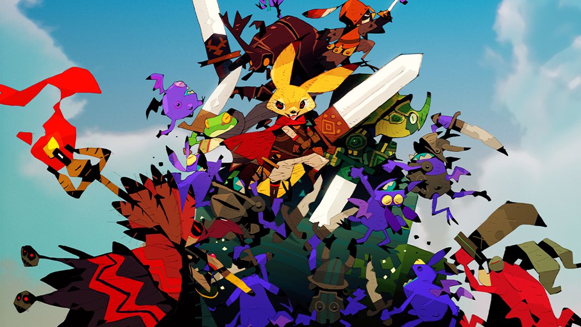
• Creating The “Moving Highlight” Navigation Bar With JavaScript And CSS

    I recently came across an old jQuery tutorial demonstrating a “moving highlight” navigation bar and decided the concept was due for a modern upgrade. With this pattern, the border around the active navigation item animates directly from one element to another as the user clicks on menu items. In 2025, we have much better tools to manipulate the DOM via vanilla JavaScript. New features like the View Transition API make progressive enhancement more easily achievable and handle a lot of the animation minutiae.In this tutorial, I will demonstrate two methods of creating the “moving highlight” navigation bar using plain JavaScript and CSS. The first example uses the getBoundingClientRect method to explicitly animate the border between navigation bar items when they are clicked. The second example achieves the same functionality using the new View Transition API.
    The Initial Markup
    Let’s assume that we have a single-page application where content changes without the page being reloaded. The starting HTML and CSS are your standard navigation bar with an additional div element containing an id of #highlight. We give the first navigation item a class of .active.
    See the Pen Moving Highlight Navbar Starting Markupby Blake Lundquist.
    For this version, we will position the #highlight element around the element with the .active class to create a border. We can utilize absolute positioning and animate the element across the navigation bar to create the desired effect. We’ll hide it off-screen initially by adding left: -200px and include transition styles for all properties so that any changes in the position and size of the element will happen gradually.
    #highlight {
    z-index: 0;
    position: absolute;
    height: 100%;
    width: 100px;
    left: -200px;
    border: 2px solid green;
    box-sizing: border-box;
    transition: all 0.2s ease;
    }

    Add A Boilerplate Event Handler For Click Interactions
    We want the highlight element to animate when a user changes the .active navigation item. Let’s add a click event handler to the nav element, then filter for events caused only by elements matching our desired selector. In this case, we only want to change the .active nav item if the user clicks on a link that does not already have the .active class.
    Initially, we can call console.log to ensure the handler fires only when expected:

    const navbar = document.querySelector;

    navbar.addEventListener{
    // return if the clicked element doesn't have the correct selector
    if')) {
    return;
    }

    console.log;
    });

    Open your browser console and try clicking different items in the navigation bar. You should only see "click" being logged when you select a new item in the navigation bar.
    Now that we know our event handler is working on the correct elements let’s add code to move the .active class to the navigation item that was clicked. We can use the object passed into the event handler to find the element that initialized the event and give that element a class of .active after removing it from the previously active item.

    const navbar = document.querySelector;

    navbar.addEventListener{
    // return if the clicked element doesn't have the correct selector
    if')) {
    return;
    }

    - console.log;
    + document.querySelector.classList.remove;
    + event.target.classList.add;

    });

    Our #highlight element needs to move across the navigation bar and position itself around the active item. Let’s write a function to calculate a new position and width. Since the #highlight selector has transition styles applied, it will move gradually when its position changes.
    Using getBoundingClientRect, we can get information about the position and size of an element. We calculate the width of the active navigation item and its offset from the left boundary of the parent element. Then, we assign styles to the highlight element so that its size and position match.

    // handler for moving the highlight
    const moveHighlight ==> {
    const activeNavItem = document.querySelector;
    const highlighterElement = document.querySelector;

    const width = activeNavItem.offsetWidth;

    const itemPos = activeNavItem.getBoundingClientRect;
    const navbarPos = navbar.getBoundingClientRectconst relativePosX = itemPos.left - navbarPos.left;

    const styles = {
    left: ${relativePosX}px,
    width: ${width}px,
    };

    Object.assign;
    }

    Let’s call our new function when the click event fires:

    navbar.addEventListener{
    // return if the clicked element doesn't have the correct selector
    if')) {
    return;
    }

    document.querySelector.classList.remove;
    event.target.classList.add;

    + moveHighlight;
    });

    Finally, let’s also call the function immediately so that the border moves behind our initial active item when the page first loads:
    // handler for moving the highlight
    const moveHighlight ==> {
    // ...
    }

    // display the highlight when the page loads
    moveHighlight;

    Now, the border moves across the navigation bar when a new item is selected. Try clicking the different navigation links to animate the navigation bar.
    See the Pen Moving Highlight Navbarby Blake Lundquist.
    That only took a few lines of vanilla JavaScript and could easily be extended to account for other interactions, like mouseover events. In the next section, we will explore refactoring this feature using the View Transition API.
    Using The View Transition API
    The View Transition API provides functionality to create animated transitions between website views. Under the hood, the API creates snapshots of “before” and “after” views and then handles transitioning between them. View transitions are useful for creating animations between documents, providing the native-app-like user experience featured in frameworks like Astro. However, the API also provides handlers meant for SPA-style applications. We will use it to reduce the JavaScript needed in our implementation and more easily create fallback functionality.
    For this approach, we no longer need a separate #highlight element. Instead, we can style the .active navigation item directly using pseudo-selectors and let the View Transition API handle the animation between the before-and-after UI states when a new navigation item is clicked.
    We’ll start by getting rid of the #highlight element and its associated CSS and replacing it with styles for the nav a::after pseudo-selector:
    <nav>
    - <div id="highlight"></div>
    <a href="#" class="active">Home</a>
    <a href="#services">Services</a>
    <a href="#about">About</a>
    <a href="#contact">Contact</a>
    </nav>

    - #highlight {
    - z-index: 0;
    - position: absolute;
    - height: 100%;
    - width: 0;
    - left: 0;
    - box-sizing: border-box;
    - transition: all 0.2s ease;
    - }

    + nav a::after {
    + content: " ";
    + position: absolute;
    + left: 0;
    + top: 0;
    + width: 100%;
    + height: 100%;
    + border: none;
    + box-sizing: border-box;
    + }

    For the .active class, we include the view-transition-name property, thus unlocking the magic of the View Transition API. Once we trigger the view transition and change the location of the .active navigation item in the DOM, “before” and “after” snapshots will be taken, and the browser will animate the border across the bar. We’ll give our view transition the name of highlight, but we could theoretically give it any name.
    nav a.active::after {
    border: 2px solid green;
    view-transition-name: highlight;
    }

    Once we have a selector that contains a view-transition-name property, the only remaining step is to trigger the transition using the startViewTransition method and pass in a callback function.

    const navbar = document.querySelector;

    // Change the active nav item on click
    navbar.addEventListener{

    if')) {
    return;
    }

    document.startViewTransition=> {
    document.querySelector.classList.remove;

    event.target.classList.add;
    });
    });

    Above is a revised version of the click handler. Instead of doing all the calculations for the size and position of the moving border ourselves, the View Transition API handles all of it for us. We only need to call document.startViewTransition and pass in a callback function to change the item that has the .active class!
    Adjusting The View Transition
    At this point, when clicking on a navigation link, you’ll notice that the transition works, but some strange sizing issues are visible.This sizing inconsistency is caused by aspect ratio changes during the course of the view transition. We won’t go into detail here, but Jake Archibald has a detailed explanation you can read for more information. In short, to ensure the height of the border stays uniform throughout the transition, we need to declare an explicit height for the ::view-transition-old and ::view-transition-new pseudo-selectors representing a static snapshot of the old and new view, respectively.
    ::view-transition-old{
    height: 100%;
    }

    ::view-transition-new{
    height: 100%;
    }

    Let’s do some final refactoring to tidy up our code by moving the callback to a separate function and adding a fallback for when view transitions aren’t supported:

    const navbar = document.querySelector;

    // change the item that has the .active class applied
    const setActiveElement ==> {
    document.querySelector.classList.remove;
    elem.classList.add;
    }

    // Start view transition and pass in a callback on click
    navbar.addEventListener{
    if')) {
    return;
    }

    // Fallback for browsers that don't support View Transitions:
    if{
    setActiveElement;
    return;
    }

    document.startViewTransition=> setActiveElement);
    });

    Here’s our view transition-powered navigation bar! Observe the smooth transition when you click on the different links.
    See the Pen Moving Highlight Navbar with View Transitionby Blake Lundquist.
    Conclusion
    Animations and transitions between website UI states used to require many kilobytes of external libraries, along with verbose, confusing, and error-prone code, but vanilla JavaScript and CSS have since incorporated features to achieve native-app-like interactions without breaking the bank. We demonstrated this by implementing the “moving highlight” navigation pattern using two approaches: CSS transitions combined with the getBoundingClientRectmethod and the View Transition API.
    Resources

    getBoundingClientRectmethod documentation
    View Transition API documentation
    “View Transitions: Handling Aspect Ratio Changes” by Jake Archibald
    #creating #ampampldquomoving #highlightampamprdquo #navigation #bar
    Creating The “Moving Highlight” Navigation Bar With JavaScript And CSS
    I recently came across an old jQuery tutorial demonstrating a “moving highlight” navigation bar and decided the concept was due for a modern upgrade. With this pattern, the border around the active navigation item animates directly from one element to another as the user clicks on menu items. In 2025, we have much better tools to manipulate the DOM via vanilla JavaScript. New features like the View Transition API make progressive enhancement more easily achievable and handle a lot of the animation minutiae.In this tutorial, I will demonstrate two methods of creating the “moving highlight” navigation bar using plain JavaScript and CSS. The first example uses the getBoundingClientRect method to explicitly animate the border between navigation bar items when they are clicked. The second example achieves the same functionality using the new View Transition API. The Initial Markup Let’s assume that we have a single-page application where content changes without the page being reloaded. The starting HTML and CSS are your standard navigation bar with an additional div element containing an id of #highlight. We give the first navigation item a class of .active. See the Pen Moving Highlight Navbar Starting Markupby Blake Lundquist. For this version, we will position the #highlight element around the element with the .active class to create a border. We can utilize absolute positioning and animate the element across the navigation bar to create the desired effect. We’ll hide it off-screen initially by adding left: -200px and include transition styles for all properties so that any changes in the position and size of the element will happen gradually. #highlight { z-index: 0; position: absolute; height: 100%; width: 100px; left: -200px; border: 2px solid green; box-sizing: border-box; transition: all 0.2s ease; } Add A Boilerplate Event Handler For Click Interactions We want the highlight element to animate when a user changes the .active navigation item. Let’s add a click event handler to the nav element, then filter for events caused only by elements matching our desired selector. In this case, we only want to change the .active nav item if the user clicks on a link that does not already have the .active class. Initially, we can call console.log to ensure the handler fires only when expected: const navbar = document.querySelector; navbar.addEventListener{ // return if the clicked element doesn't have the correct selector if')) { return; } console.log; }); Open your browser console and try clicking different items in the navigation bar. You should only see "click" being logged when you select a new item in the navigation bar. Now that we know our event handler is working on the correct elements let’s add code to move the .active class to the navigation item that was clicked. We can use the object passed into the event handler to find the element that initialized the event and give that element a class of .active after removing it from the previously active item. const navbar = document.querySelector; navbar.addEventListener{ // return if the clicked element doesn't have the correct selector if')) { return; } - console.log; + document.querySelector.classList.remove; + event.target.classList.add; }); Our #highlight element needs to move across the navigation bar and position itself around the active item. Let’s write a function to calculate a new position and width. Since the #highlight selector has transition styles applied, it will move gradually when its position changes. Using getBoundingClientRect, we can get information about the position and size of an element. We calculate the width of the active navigation item and its offset from the left boundary of the parent element. Then, we assign styles to the highlight element so that its size and position match. // handler for moving the highlight const moveHighlight ==> { const activeNavItem = document.querySelector; const highlighterElement = document.querySelector; const width = activeNavItem.offsetWidth; const itemPos = activeNavItem.getBoundingClientRect; const navbarPos = navbar.getBoundingClientRectconst relativePosX = itemPos.left - navbarPos.left; const styles = { left: ${relativePosX}px, width: ${width}px, }; Object.assign; } Let’s call our new function when the click event fires: navbar.addEventListener{ // return if the clicked element doesn't have the correct selector if')) { return; } document.querySelector.classList.remove; event.target.classList.add; + moveHighlight; }); Finally, let’s also call the function immediately so that the border moves behind our initial active item when the page first loads: // handler for moving the highlight const moveHighlight ==> { // ... } // display the highlight when the page loads moveHighlight; Now, the border moves across the navigation bar when a new item is selected. Try clicking the different navigation links to animate the navigation bar. See the Pen Moving Highlight Navbarby Blake Lundquist. That only took a few lines of vanilla JavaScript and could easily be extended to account for other interactions, like mouseover events. In the next section, we will explore refactoring this feature using the View Transition API. Using The View Transition API The View Transition API provides functionality to create animated transitions between website views. Under the hood, the API creates snapshots of “before” and “after” views and then handles transitioning between them. View transitions are useful for creating animations between documents, providing the native-app-like user experience featured in frameworks like Astro. However, the API also provides handlers meant for SPA-style applications. We will use it to reduce the JavaScript needed in our implementation and more easily create fallback functionality. For this approach, we no longer need a separate #highlight element. Instead, we can style the .active navigation item directly using pseudo-selectors and let the View Transition API handle the animation between the before-and-after UI states when a new navigation item is clicked. We’ll start by getting rid of the #highlight element and its associated CSS and replacing it with styles for the nav a::after pseudo-selector: <nav> - <div id="highlight"></div> <a href="#" class="active">Home</a> <a href="#services">Services</a> <a href="#about">About</a> <a href="#contact">Contact</a> </nav> - #highlight { - z-index: 0; - position: absolute; - height: 100%; - width: 0; - left: 0; - box-sizing: border-box; - transition: all 0.2s ease; - } + nav a::after { + content: " "; + position: absolute; + left: 0; + top: 0; + width: 100%; + height: 100%; + border: none; + box-sizing: border-box; + } For the .active class, we include the view-transition-name property, thus unlocking the magic of the View Transition API. Once we trigger the view transition and change the location of the .active navigation item in the DOM, “before” and “after” snapshots will be taken, and the browser will animate the border across the bar. We’ll give our view transition the name of highlight, but we could theoretically give it any name. nav a.active::after { border: 2px solid green; view-transition-name: highlight; } Once we have a selector that contains a view-transition-name property, the only remaining step is to trigger the transition using the startViewTransition method and pass in a callback function. const navbar = document.querySelector; // Change the active nav item on click navbar.addEventListener{ if')) { return; } document.startViewTransition=> { document.querySelector.classList.remove; event.target.classList.add; }); }); Above is a revised version of the click handler. Instead of doing all the calculations for the size and position of the moving border ourselves, the View Transition API handles all of it for us. We only need to call document.startViewTransition and pass in a callback function to change the item that has the .active class! Adjusting The View Transition At this point, when clicking on a navigation link, you’ll notice that the transition works, but some strange sizing issues are visible.This sizing inconsistency is caused by aspect ratio changes during the course of the view transition. We won’t go into detail here, but Jake Archibald has a detailed explanation you can read for more information. In short, to ensure the height of the border stays uniform throughout the transition, we need to declare an explicit height for the ::view-transition-old and ::view-transition-new pseudo-selectors representing a static snapshot of the old and new view, respectively. ::view-transition-old{ height: 100%; } ::view-transition-new{ height: 100%; } Let’s do some final refactoring to tidy up our code by moving the callback to a separate function and adding a fallback for when view transitions aren’t supported: const navbar = document.querySelector; // change the item that has the .active class applied const setActiveElement ==> { document.querySelector.classList.remove; elem.classList.add; } // Start view transition and pass in a callback on click navbar.addEventListener{ if')) { return; } // Fallback for browsers that don't support View Transitions: if{ setActiveElement; return; } document.startViewTransition=> setActiveElement); }); Here’s our view transition-powered navigation bar! Observe the smooth transition when you click on the different links. See the Pen Moving Highlight Navbar with View Transitionby Blake Lundquist. Conclusion Animations and transitions between website UI states used to require many kilobytes of external libraries, along with verbose, confusing, and error-prone code, but vanilla JavaScript and CSS have since incorporated features to achieve native-app-like interactions without breaking the bank. We demonstrated this by implementing the “moving highlight” navigation pattern using two approaches: CSS transitions combined with the getBoundingClientRectmethod and the View Transition API. Resources getBoundingClientRectmethod documentation View Transition API documentation “View Transitions: Handling Aspect Ratio Changes” by Jake Archibald #creating #ampampldquomoving #highlightampamprdquo #navigation #bar
    SMASHINGMAGAZINE.COM
    Creating The “Moving Highlight” Navigation Bar With JavaScript And CSS
    I recently came across an old jQuery tutorial demonstrating a “moving highlight” navigation bar and decided the concept was due for a modern upgrade. With this pattern, the border around the active navigation item animates directly from one element to another as the user clicks on menu items. In 2025, we have much better tools to manipulate the DOM via vanilla JavaScript. New features like the View Transition API make progressive enhancement more easily achievable and handle a lot of the animation minutiae. (Large preview) In this tutorial, I will demonstrate two methods of creating the “moving highlight” navigation bar using plain JavaScript and CSS. The first example uses the getBoundingClientRect method to explicitly animate the border between navigation bar items when they are clicked. The second example achieves the same functionality using the new View Transition API. The Initial Markup Let’s assume that we have a single-page application where content changes without the page being reloaded. The starting HTML and CSS are your standard navigation bar with an additional div element containing an id of #highlight. We give the first navigation item a class of .active. See the Pen Moving Highlight Navbar Starting Markup [forked] by Blake Lundquist. For this version, we will position the #highlight element around the element with the .active class to create a border. We can utilize absolute positioning and animate the element across the navigation bar to create the desired effect. We’ll hide it off-screen initially by adding left: -200px and include transition styles for all properties so that any changes in the position and size of the element will happen gradually. #highlight { z-index: 0; position: absolute; height: 100%; width: 100px; left: -200px; border: 2px solid green; box-sizing: border-box; transition: all 0.2s ease; } Add A Boilerplate Event Handler For Click Interactions We want the highlight element to animate when a user changes the .active navigation item. Let’s add a click event handler to the nav element, then filter for events caused only by elements matching our desired selector. In this case, we only want to change the .active nav item if the user clicks on a link that does not already have the .active class. Initially, we can call console.log to ensure the handler fires only when expected: const navbar = document.querySelector('nav'); navbar.addEventListener('click', function (event) { // return if the clicked element doesn't have the correct selector if (!event.target.matches('nav a:not(active)')) { return; } console.log('click'); }); Open your browser console and try clicking different items in the navigation bar. You should only see "click" being logged when you select a new item in the navigation bar. Now that we know our event handler is working on the correct elements let’s add code to move the .active class to the navigation item that was clicked. We can use the object passed into the event handler to find the element that initialized the event and give that element a class of .active after removing it from the previously active item. const navbar = document.querySelector('nav'); navbar.addEventListener('click', function (event) { // return if the clicked element doesn't have the correct selector if (!event.target.matches('nav a:not(active)')) { return; } - console.log('click'); + document.querySelector('nav a.active').classList.remove('active'); + event.target.classList.add('active'); }); Our #highlight element needs to move across the navigation bar and position itself around the active item. Let’s write a function to calculate a new position and width. Since the #highlight selector has transition styles applied, it will move gradually when its position changes. Using getBoundingClientRect, we can get information about the position and size of an element. We calculate the width of the active navigation item and its offset from the left boundary of the parent element. Then, we assign styles to the highlight element so that its size and position match. // handler for moving the highlight const moveHighlight = () => { const activeNavItem = document.querySelector('a.active'); const highlighterElement = document.querySelector('#highlight'); const width = activeNavItem.offsetWidth; const itemPos = activeNavItem.getBoundingClientRect(); const navbarPos = navbar.getBoundingClientRect() const relativePosX = itemPos.left - navbarPos.left; const styles = { left: ${relativePosX}px, width: ${width}px, }; Object.assign(highlighterElement.style, styles); } Let’s call our new function when the click event fires: navbar.addEventListener('click', function (event) { // return if the clicked element doesn't have the correct selector if (!event.target.matches('nav a:not(active)')) { return; } document.querySelector('nav a.active').classList.remove('active'); event.target.classList.add('active'); + moveHighlight(); }); Finally, let’s also call the function immediately so that the border moves behind our initial active item when the page first loads: // handler for moving the highlight const moveHighlight = () => { // ... } // display the highlight when the page loads moveHighlight(); Now, the border moves across the navigation bar when a new item is selected. Try clicking the different navigation links to animate the navigation bar. See the Pen Moving Highlight Navbar [forked] by Blake Lundquist. That only took a few lines of vanilla JavaScript and could easily be extended to account for other interactions, like mouseover events. In the next section, we will explore refactoring this feature using the View Transition API. Using The View Transition API The View Transition API provides functionality to create animated transitions between website views. Under the hood, the API creates snapshots of “before” and “after” views and then handles transitioning between them. View transitions are useful for creating animations between documents, providing the native-app-like user experience featured in frameworks like Astro. However, the API also provides handlers meant for SPA-style applications. We will use it to reduce the JavaScript needed in our implementation and more easily create fallback functionality. For this approach, we no longer need a separate #highlight element. Instead, we can style the .active navigation item directly using pseudo-selectors and let the View Transition API handle the animation between the before-and-after UI states when a new navigation item is clicked. We’ll start by getting rid of the #highlight element and its associated CSS and replacing it with styles for the nav a::after pseudo-selector: <nav> - <div id="highlight"></div> <a href="#" class="active">Home</a> <a href="#services">Services</a> <a href="#about">About</a> <a href="#contact">Contact</a> </nav> - #highlight { - z-index: 0; - position: absolute; - height: 100%; - width: 0; - left: 0; - box-sizing: border-box; - transition: all 0.2s ease; - } + nav a::after { + content: " "; + position: absolute; + left: 0; + top: 0; + width: 100%; + height: 100%; + border: none; + box-sizing: border-box; + } For the .active class, we include the view-transition-name property, thus unlocking the magic of the View Transition API. Once we trigger the view transition and change the location of the .active navigation item in the DOM, “before” and “after” snapshots will be taken, and the browser will animate the border across the bar. We’ll give our view transition the name of highlight, but we could theoretically give it any name. nav a.active::after { border: 2px solid green; view-transition-name: highlight; } Once we have a selector that contains a view-transition-name property, the only remaining step is to trigger the transition using the startViewTransition method and pass in a callback function. const navbar = document.querySelector('nav'); // Change the active nav item on click navbar.addEventListener('click', async function (event) { if (!event.target.matches('nav a:not(.active)')) { return; } document.startViewTransition(() => { document.querySelector('nav a.active').classList.remove('active'); event.target.classList.add('active'); }); }); Above is a revised version of the click handler. Instead of doing all the calculations for the size and position of the moving border ourselves, the View Transition API handles all of it for us. We only need to call document.startViewTransition and pass in a callback function to change the item that has the .active class! Adjusting The View Transition At this point, when clicking on a navigation link, you’ll notice that the transition works, but some strange sizing issues are visible. (Large preview) This sizing inconsistency is caused by aspect ratio changes during the course of the view transition. We won’t go into detail here, but Jake Archibald has a detailed explanation you can read for more information. In short, to ensure the height of the border stays uniform throughout the transition, we need to declare an explicit height for the ::view-transition-old and ::view-transition-new pseudo-selectors representing a static snapshot of the old and new view, respectively. ::view-transition-old(highlight) { height: 100%; } ::view-transition-new(highlight) { height: 100%; } Let’s do some final refactoring to tidy up our code by moving the callback to a separate function and adding a fallback for when view transitions aren’t supported: const navbar = document.querySelector('nav'); // change the item that has the .active class applied const setActiveElement = (elem) => { document.querySelector('nav a.active').classList.remove('active'); elem.classList.add('active'); } // Start view transition and pass in a callback on click navbar.addEventListener('click', async function (event) { if (!event.target.matches('nav a:not(.active)')) { return; } // Fallback for browsers that don't support View Transitions: if (!document.startViewTransition) { setActiveElement(event.target); return; } document.startViewTransition(() => setActiveElement(event.target)); }); Here’s our view transition-powered navigation bar! Observe the smooth transition when you click on the different links. See the Pen Moving Highlight Navbar with View Transition [forked] by Blake Lundquist. Conclusion Animations and transitions between website UI states used to require many kilobytes of external libraries, along with verbose, confusing, and error-prone code, but vanilla JavaScript and CSS have since incorporated features to achieve native-app-like interactions without breaking the bank. We demonstrated this by implementing the “moving highlight” navigation pattern using two approaches: CSS transitions combined with the getBoundingClientRect() method and the View Transition API. Resources getBoundingClientRect() method documentation View Transition API documentation “View Transitions: Handling Aspect Ratio Changes” by Jake Archibald
    0 Комментарии 0 Поделились 0 предпросмотр
  • These Australian Cockatoos Learned to Operate Drinking Fountains With Their Feet to Quench Their Thirst

    These Australian Cockatoos Learned to Operate Drinking Fountains With Their Feet to Quench Their Thirst
    Birds in Sydney’s western suburbs have figured out how to get a sip from the fountains, even though they have access to nearby streams

    Cockatoos in the western suburbs of Sydney, Australia, will wait in line for a taste of drinking fountain water.
    Klump et al., Biology Letters, 2025

    Australia’s suburban-dwelling cockatoos are adept at picking up new skills. The clever birds had already figured out how to open trash cans to access scraps in neighborhoods outside Sydney—and now, scientists have observed others using their claws to turn on drinking fountains.
    Barbara Klump, a behavioral ecologist now at the University of Vienna, first noticed the cockatoos drinking from public water fountains west of Sydney in 2018. She thought someone had forgotten to turn off the water, but video footage from her research project showed a bird operating the handle with its foot.
    “Then, of course, a million questions went through my mind,” she tells Gemma Conroy at the New York Times. “How the hell did it figure that out?”
    Now, after monitoring cockatoos with wildlife cameras placed near one drinking fountain in Sydney’s western suburbs, Klump and her research team have confirmed that the birds regularly do this in local parks—something local wildlife experts also told her, per the New York Times.
    Over 44 days, the team recorded nearly 14 hours of the cockatoos around the fountain. The birds made 525 drinking attempts, of which 41 percent were successful. The findings were published Wednesday in the journal Biology Letters.

    Smart cockatoos use their beaks and claws to drink from water fountain
    Watch on

    Turning on the water fountains takes skill, so it makes sense that not all attempts worked out. To quench their thirst, the birds would place one foot on the fountain’s stem and the other on the spring-loaded handle, twisting it clockwise by leaning their body weight.
    “It’s a bit of an awkward body position they have to hold, but it’s pretty impressive,” says Lucy Aplin, an ecologist at the Australian National University and a study co-author, to Peter de Kruijff at the Australian Broadcasting Corporation.
    The researchers don’t yet understand why the birds go through the effort of maneuvering the fountains when there are easily accessible streams and creeks nearby. At the fountains, meanwhile, the cockatoos will wait for as long as ten minutes to get a turn to drink. “They appear to be quite willing to queue for a considerable amount of time,” Aplin says to Science News’ Jake Buehler.
    One possibility is that the birds have gotten a taste for the purer water coming from the fountains, explains Klump to Jack Tamisiea at Science. Or, the birds may prefer the height of the fountain, as drinking from a ground source leaves them less able to see predators like eagles and falcons.
    Spending time at the fountains could also be a form of social cohesion for the birds. “I think all three are possible,” Aplin says to Science News.
    The cockatoos might also just enjoy turning on the fountains, adds Alice Auersperg, a cognitive biologist at the University of Veterinary Medicine, Vienna, who was not involved in the research, to the Australian Broadcasting Corporation.
    “If there is no super urgent need and you’re not dying of thirst, then why not do something you enjoy?” Klump says to the New York Times.
    For now, the fountain drinking behavior hasn’t spread widely among Sydney’s cockatoos. The researchers looked through the citizen science platform Big City Birds, but they didn’t find any evidence of the behavior happening outside of the western suburbs. That’s unlike the species’ trash bin-opening habit, which has inconvenienced homeowners across at least 44 different suburbs.
    Residents in Brisbane, Australia, however, have also spotted cockatoos drinking from water fountains, Alpin says to the New York Times. The birds don’t migrate, so the two populations couldn’t have learned the behavior from each other. This suggests there’s potential for the “independent invention of the behavior and local spread in other places,” Alpin adds.
    Given their cleverness, it might not be long until more cockatoos are drinking from Australia’s fountains. Klump tells Science that she believes the birds are likely to come up with more ways to operate them, even fountains that turn on in a different way. “They’re so innovative and good at problem solving that they seem to eventually figure out a solution,” says Klump. “In a weird way, cockatoos constantly surprise me, but I’m also never that surprised.”

    Get the latest stories in your inbox every weekday.
    #these #australian #cockatoos #learned #operate
    These Australian Cockatoos Learned to Operate Drinking Fountains With Their Feet to Quench Their Thirst
    These Australian Cockatoos Learned to Operate Drinking Fountains With Their Feet to Quench Their Thirst Birds in Sydney’s western suburbs have figured out how to get a sip from the fountains, even though they have access to nearby streams Cockatoos in the western suburbs of Sydney, Australia, will wait in line for a taste of drinking fountain water. Klump et al., Biology Letters, 2025 Australia’s suburban-dwelling cockatoos are adept at picking up new skills. The clever birds had already figured out how to open trash cans to access scraps in neighborhoods outside Sydney—and now, scientists have observed others using their claws to turn on drinking fountains. Barbara Klump, a behavioral ecologist now at the University of Vienna, first noticed the cockatoos drinking from public water fountains west of Sydney in 2018. She thought someone had forgotten to turn off the water, but video footage from her research project showed a bird operating the handle with its foot. “Then, of course, a million questions went through my mind,” she tells Gemma Conroy at the New York Times. “How the hell did it figure that out?” Now, after monitoring cockatoos with wildlife cameras placed near one drinking fountain in Sydney’s western suburbs, Klump and her research team have confirmed that the birds regularly do this in local parks—something local wildlife experts also told her, per the New York Times. Over 44 days, the team recorded nearly 14 hours of the cockatoos around the fountain. The birds made 525 drinking attempts, of which 41 percent were successful. The findings were published Wednesday in the journal Biology Letters. Smart cockatoos use their beaks and claws to drink from water fountain Watch on Turning on the water fountains takes skill, so it makes sense that not all attempts worked out. To quench their thirst, the birds would place one foot on the fountain’s stem and the other on the spring-loaded handle, twisting it clockwise by leaning their body weight. “It’s a bit of an awkward body position they have to hold, but it’s pretty impressive,” says Lucy Aplin, an ecologist at the Australian National University and a study co-author, to Peter de Kruijff at the Australian Broadcasting Corporation. The researchers don’t yet understand why the birds go through the effort of maneuvering the fountains when there are easily accessible streams and creeks nearby. At the fountains, meanwhile, the cockatoos will wait for as long as ten minutes to get a turn to drink. “They appear to be quite willing to queue for a considerable amount of time,” Aplin says to Science News’ Jake Buehler. One possibility is that the birds have gotten a taste for the purer water coming from the fountains, explains Klump to Jack Tamisiea at Science. Or, the birds may prefer the height of the fountain, as drinking from a ground source leaves them less able to see predators like eagles and falcons. Spending time at the fountains could also be a form of social cohesion for the birds. “I think all three are possible,” Aplin says to Science News. The cockatoos might also just enjoy turning on the fountains, adds Alice Auersperg, a cognitive biologist at the University of Veterinary Medicine, Vienna, who was not involved in the research, to the Australian Broadcasting Corporation. “If there is no super urgent need and you’re not dying of thirst, then why not do something you enjoy?” Klump says to the New York Times. For now, the fountain drinking behavior hasn’t spread widely among Sydney’s cockatoos. The researchers looked through the citizen science platform Big City Birds, but they didn’t find any evidence of the behavior happening outside of the western suburbs. That’s unlike the species’ trash bin-opening habit, which has inconvenienced homeowners across at least 44 different suburbs. Residents in Brisbane, Australia, however, have also spotted cockatoos drinking from water fountains, Alpin says to the New York Times. The birds don’t migrate, so the two populations couldn’t have learned the behavior from each other. This suggests there’s potential for the “independent invention of the behavior and local spread in other places,” Alpin adds. Given their cleverness, it might not be long until more cockatoos are drinking from Australia’s fountains. Klump tells Science that she believes the birds are likely to come up with more ways to operate them, even fountains that turn on in a different way. “They’re so innovative and good at problem solving that they seem to eventually figure out a solution,” says Klump. “In a weird way, cockatoos constantly surprise me, but I’m also never that surprised.” Get the latest stories in your inbox every weekday. #these #australian #cockatoos #learned #operate
    WWW.SMITHSONIANMAG.COM
    These Australian Cockatoos Learned to Operate Drinking Fountains With Their Feet to Quench Their Thirst
    These Australian Cockatoos Learned to Operate Drinking Fountains With Their Feet to Quench Their Thirst Birds in Sydney’s western suburbs have figured out how to get a sip from the fountains, even though they have access to nearby streams Cockatoos in the western suburbs of Sydney, Australia, will wait in line for a taste of drinking fountain water. Klump et al., Biology Letters, 2025 Australia’s suburban-dwelling cockatoos are adept at picking up new skills. The clever birds had already figured out how to open trash cans to access scraps in neighborhoods outside Sydney—and now, scientists have observed others using their claws to turn on drinking fountains. Barbara Klump, a behavioral ecologist now at the University of Vienna, first noticed the cockatoos drinking from public water fountains west of Sydney in 2018. She thought someone had forgotten to turn off the water, but video footage from her research project showed a bird operating the handle with its foot. “Then, of course, a million questions went through my mind,” she tells Gemma Conroy at the New York Times. “How the hell did it figure that out?” Now, after monitoring cockatoos with wildlife cameras placed near one drinking fountain in Sydney’s western suburbs, Klump and her research team have confirmed that the birds regularly do this in local parks—something local wildlife experts also told her, per the New York Times. Over 44 days, the team recorded nearly 14 hours of the cockatoos around the fountain. The birds made 525 drinking attempts, of which 41 percent were successful. The findings were published Wednesday in the journal Biology Letters. Smart cockatoos use their beaks and claws to drink from water fountain Watch on Turning on the water fountains takes skill, so it makes sense that not all attempts worked out. To quench their thirst, the birds would place one foot on the fountain’s stem and the other on the spring-loaded handle, twisting it clockwise by leaning their body weight. “It’s a bit of an awkward body position they have to hold, but it’s pretty impressive,” says Lucy Aplin, an ecologist at the Australian National University and a study co-author, to Peter de Kruijff at the Australian Broadcasting Corporation. The researchers don’t yet understand why the birds go through the effort of maneuvering the fountains when there are easily accessible streams and creeks nearby. At the fountains, meanwhile, the cockatoos will wait for as long as ten minutes to get a turn to drink. “They appear to be quite willing to queue for a considerable amount of time,” Aplin says to Science News’ Jake Buehler. One possibility is that the birds have gotten a taste for the purer water coming from the fountains, explains Klump to Jack Tamisiea at Science. Or, the birds may prefer the height of the fountain, as drinking from a ground source leaves them less able to see predators like eagles and falcons. Spending time at the fountains could also be a form of social cohesion for the birds. “I think all three are possible,” Aplin says to Science News. The cockatoos might also just enjoy turning on the fountains, adds Alice Auersperg, a cognitive biologist at the University of Veterinary Medicine, Vienna, who was not involved in the research, to the Australian Broadcasting Corporation. “If there is no super urgent need and you’re not dying of thirst, then why not do something you enjoy?” Klump says to the New York Times. For now, the fountain drinking behavior hasn’t spread widely among Sydney’s cockatoos. The researchers looked through the citizen science platform Big City Birds, but they didn’t find any evidence of the behavior happening outside of the western suburbs. That’s unlike the species’ trash bin-opening habit, which has inconvenienced homeowners across at least 44 different suburbs. Residents in Brisbane, Australia, however, have also spotted cockatoos drinking from water fountains, Alpin says to the New York Times. The birds don’t migrate, so the two populations couldn’t have learned the behavior from each other. This suggests there’s potential for the “independent invention of the behavior and local spread in other places,” Alpin adds. Given their cleverness, it might not be long until more cockatoos are drinking from Australia’s fountains. Klump tells Science that she believes the birds are likely to come up with more ways to operate them, even fountains that turn on in a different way. “They’re so innovative and good at problem solving that they seem to eventually figure out a solution,” says Klump. “In a weird way, cockatoos constantly surprise me, but I’m also never that surprised.” Get the latest stories in your inbox every weekday.
    Like
    Love
    Wow
    Sad
    Angry
    200
    0 Комментарии 0 Поделились 0 предпросмотр
  • Smashing Animations Part 4: Optimising SVGs

    SVG animations take me back to the Hanna-Barbera cartoons I watched as a kid. Shows like Wacky Races, The Perils of Penelope Pitstop, and, of course, Yogi Bear. They inspired me to lovingly recreate some classic Toon Titles using CSS, SVG, and SMIL animations.
    But getting animations to load quickly and work smoothly needs more than nostalgia. It takes clean design, lean code, and a process that makes complex SVGs easier to animate. Here’s how I do it.

    Start Clean And Design With Optimisation In Mind
    Keeping things simple is key to making SVGs that are optimised and ready to animate. Tools like Adobe Illustrator convert bitmap images to vectors, but the output often contains too many extraneous groups, layers, and masks. Instead, I start cleaning in Sketch, work from a reference image, and use the Pen tool to create paths.
    Tip: Affinity Designerand Sketchare alternatives to Adobe Illustrator and Figma. Both are independent and based in Europe. Sketch has been my default design app since Adobe killed Fireworks.

    Beginning With Outlines
    For these Toon Titles illustrations, I first use the Pen tool to draw black outlines with as few anchor points as possible. The more points a shape has, the bigger a file becomes, so simplifying paths and reducing the number of points makes an SVG much smaller, often with no discernible visual difference.

    Bearing in mind that parts of this Yogi illustration will ultimately be animated, I keep outlines for this Bewitched Bear’s body, head, collar, and tie separate so that I can move them independently. The head might nod, the tie could flap, and, like in those classic cartoons, Yogi’s collar will hide the joins between them.

    Drawing Simple Background Shapes
    With the outlines in place, I use the Pen tool again to draw new shapes, which fill the areas with colour. These colours sit behind the outlines, so they don’t need to match them exactly. The fewer anchor points, the smaller the file size.

    Sadly, neither Affinity Designer nor Sketch has tools that can simplify paths, but if you have it, using Adobe Illustrator can shave a few extra kilobytes off these background shapes.

    Optimising The Code
    It’s not just metadata that makes SVG bulkier. The way you export from your design app also affects file size.

    Exporting just those simple background shapes from Adobe Illustrator includes unnecessary groups, masks, and bloated path data by default. Sketch’s code is barely any better, and there’s plenty of room for improvement, even in its SVGO Compressor code. I rely on Jake Archibald’s SVGOMG, which uses SVGO v3 and consistently delivers the best optimised SVGs.

    Layering SVG Elements
    My process for preparing SVGs for animation goes well beyond drawing vectors and optimising paths — it also includes how I structure the code itself. When every visual element is crammed into a single SVG file, even optimised code can be a nightmare to navigate. Locating a specific path or group often feels like searching for a needle in a haystack.

    That’s why I develop my SVGs in layers, exporting and optimising one set of elements at a time — always in the order they’ll appear in the final file. This lets me build the master SVG gradually by pasting it in each cleaned-up section. For example, I start with backgrounds like this gradient and title graphic.

    Instead of facing a wall of SVG code, I can now easily identify the background gradient’s path and its associated linearGradient, and see the group containing the title graphic. I take this opportunity to add a comment to the code, which will make editing and adding animations to it easier in the future:
    <svg ...>
    <defs>
    <!-- ... -->
    </defs>
    <path fill="url" d="…"/>
    <!-- TITLE GRAPHIC -->
    <g>
    <path … />
    <!-- ... -->
    </g>
    </svg>

    Next, I add the blurred trail from Yogi’s airborne broom. This includes defining a Gaussian Blur filter and placing its path between the background and title layers:
    <svg ...>
    <defs>
    <linearGradient id="grad" …>…</linearGradient>
    <filter id="trail" …>…</filter>
    </defs>
    <!-- GRADIENT -->
    <!-- TRAIL -->
    <path filter="url" …/>
    <!-- TITLE GRAPHIC -->
    </svg>

    Then come the magical stars, added in the same sequential fashion:
    <svg ...>
    <!-- GRADIENT -->
    <!-- TRAIL -->
    <!-- STARS -->
    <!-- TITLE GRAPHIC -->
    </svg>

    To keep everything organised and animation-ready, I create an empty group that will hold all the parts of Yogi:
    <g id="yogi">...</g>

    Then I build Yogi from the ground up — starting with background props, like his broom:
    <g id="broom">...</g>

    Followed by grouped elements for his body, head, collar, and tie:
    <g id="yogi">
    <g id="broom">…</g>
    <g id="body">…</g>
    <g id="head">…</g>
    <g id="collar">…</g>
    <g id="tie">…</g>
    </g>

    Since I export each layer from the same-sized artboard, I don’t need to worry about alignment or positioning issues later on — they’ll all slot into place automatically. I keep my code clean, readable, and ordered logically by layering elements this way. It also makes animating smoother, as each component is easier to identify.
    Reusing Elements With <use>
    When duplicate shapes get reused repeatedly, SVG files can get bulky fast. My recreation of the “Bewitched Bear” title card contains 80 stars in three sizes. Combining all those shapes into one optimised path would bring the file size down to 3KB. But I want to animate individual stars, which would almost double that to 5KB:
    <g id="stars">
    <path class="star-small" fill="#eae3da" d="..."/>
    <path class="star-medium" fill="#eae3da" d="..."/>
    <path class="star-large" fill="#eae3da" d="..."/>
    <!-- ... -->
    </g>

    Moving the stars’ fill attribute values to their parent group reduces the overall weight a little:
    <g id="stars" fill="#eae3da">
    <path class="star-small" d="…"/>
    <path class="star-medium" d="…"/>
    <path class="star-large" d="…"/>
    <!-- ... -->
    </g>

    But a more efficient and manageable option is to define each star size as a reusable template:

    <defs>
    <path id="star-large" fill="#eae3da" fill-rule="evenodd" d="…"/>
    <path id="star-medium" fill="#eae3da" fill-rule="evenodd" d="…"/>
    <path id="star-small" fill="#eae3da" fill-rule="evenodd" d="…"/>
    </defs>

    With this setup, changing a star’s design only means updating its template once, and every instance updates automatically. Then, I reference each one using <use> and position them with x and y attributes:
    <g id="stars">
    <!-- Large stars -->
    <use href="#star-large" x="1575" y="495"/>
    <!-- ... -->
    <!-- Medium stars -->
    <use href="#star-medium" x="1453" y="696"/>
    <!-- ... -->
    <!-- Small stars -->
    <use href="#star-small" x="1287" y="741"/>
    <!-- ... -->
    </g>

    This approach makes the SVG easier to manage, lighter to load, and faster to iterate on, especially when working with dozens of repeating elements. Best of all, it keeps the markup clean without compromising on flexibility or performance.
    Adding Animations
    The stars trailing behind Yogi’s stolen broom bring so much personality to the animation. I wanted them to sparkle in a seemingly random pattern against the dark blue background, so I started by defining a keyframe animation that cycles through different opacity levels:
    @keyframes sparkle {
    0%, 100% { opacity: .1; }
    50% { opacity: 1; }
    }

    Next, I applied this looping animation to every use element inside my stars group:
    #stars use {
    animation: sparkle 10s ease-in-out infinite;
    }

    The secret to creating a convincing twinkle lies in variation. I staggered animation delays and durations across the stars using nth-child selectors, starting with the quickest and most frequent sparkle effects:
    /* Fast, frequent */
    #stars use:nth-child:nth-child{
    animation-delay: .1s;
    animation-duration: 2s;
    }

    From there, I layered in additional timings to mix things up. Some stars sparkle slowly and dramatically, others more randomly, with a variety of rhythms and pauses:
    /* Medium */
    #stars use:nth-child:nth-child{ ... }

    /* Slow, dramatic */
    #stars use:nth-child:nth-child{ ... }

    /* Random */
    #stars use:nth-child{ ... }

    /* Alternating */
    #stars use:nth-child{ ... }

    /* Scattered */
    #stars use:nth-child{ ... }

    By thoughtfully structuring the SVG and reusing elements, I can build complex-looking animations without bloated code, making even a simple effect like changing opacity sparkle.

    Then, for added realism, I make Yogi’s head wobble:

    @keyframes headWobble {
    0% { transform: rotatetranslateY; }
    100% { transform: rotatetranslateY; }
    }

    #head {
    animation: headWobble 0.8s cubic-bezierinfinite alternate;
    }

    His tie waves:

    @keyframes tieWave {
    0%, 100% { transform: rotateZrotateYscaleX; }
    33% { transform: rotateZrotateYscaleX; }
    66% { transform: rotateZrotateYscaleX; }
    }

    #tie {
    transform-style: preserve-3d;
    animation: tieWave 10s cubic-bezierinfinite;
    }

    His broom swings:

    @keyframes broomSwing {
    0%, 20% { transform: rotate; }
    30% { transform: rotate; }
    50%, 70% { transform: rotate; }
    80% { transform: rotate; }
    100% { transform: rotate; }
    }

    #broom {
    animation: broomSwing 4s cubic-bezierinfinite;
    }

    And, finally, Yogi himself gently rotates as he flies on his magical broom:

    @keyframes yogiWobble {
    0% { transform: rotatetranslateYscale; }
    30% { transform: rotatetranslateY; }
    100% { transform: rotatetranslateYscale; }
    }

    #yogi {
    animation: yogiWobble 3.5s cubic-bezierinfinite alternate;
    }

    All these subtle movements bring Yogi to life. By developing structured SVGs, I can create animations that feel full of character without writing a single line of JavaScript.
    Try this yourself:
    See the Pen Bewitched Bear CSS/SVG animationby Andy Clarke.
    Conclusion
    Whether you’re recreating a classic title card or animating icons for an interface, the principles are the same:

    Start clean,
    Optimise early, and
    Structure everything with animation in mind.

    SVGs offer incredible creative freedom, but only if kept lean and manageable. When you plan your process like a production cell — layer by layer, element by element — you’ll spend less time untangling code and more time bringing your work to life.
    #smashing #animations #part #optimising #svgs
    Smashing Animations Part 4: Optimising SVGs
    SVG animations take me back to the Hanna-Barbera cartoons I watched as a kid. Shows like Wacky Races, The Perils of Penelope Pitstop, and, of course, Yogi Bear. They inspired me to lovingly recreate some classic Toon Titles using CSS, SVG, and SMIL animations. But getting animations to load quickly and work smoothly needs more than nostalgia. It takes clean design, lean code, and a process that makes complex SVGs easier to animate. Here’s how I do it. Start Clean And Design With Optimisation In Mind Keeping things simple is key to making SVGs that are optimised and ready to animate. Tools like Adobe Illustrator convert bitmap images to vectors, but the output often contains too many extraneous groups, layers, and masks. Instead, I start cleaning in Sketch, work from a reference image, and use the Pen tool to create paths. Tip: Affinity Designerand Sketchare alternatives to Adobe Illustrator and Figma. Both are independent and based in Europe. Sketch has been my default design app since Adobe killed Fireworks. Beginning With Outlines For these Toon Titles illustrations, I first use the Pen tool to draw black outlines with as few anchor points as possible. The more points a shape has, the bigger a file becomes, so simplifying paths and reducing the number of points makes an SVG much smaller, often with no discernible visual difference. Bearing in mind that parts of this Yogi illustration will ultimately be animated, I keep outlines for this Bewitched Bear’s body, head, collar, and tie separate so that I can move them independently. The head might nod, the tie could flap, and, like in those classic cartoons, Yogi’s collar will hide the joins between them. Drawing Simple Background Shapes With the outlines in place, I use the Pen tool again to draw new shapes, which fill the areas with colour. These colours sit behind the outlines, so they don’t need to match them exactly. The fewer anchor points, the smaller the file size. Sadly, neither Affinity Designer nor Sketch has tools that can simplify paths, but if you have it, using Adobe Illustrator can shave a few extra kilobytes off these background shapes. Optimising The Code It’s not just metadata that makes SVG bulkier. The way you export from your design app also affects file size. Exporting just those simple background shapes from Adobe Illustrator includes unnecessary groups, masks, and bloated path data by default. Sketch’s code is barely any better, and there’s plenty of room for improvement, even in its SVGO Compressor code. I rely on Jake Archibald’s SVGOMG, which uses SVGO v3 and consistently delivers the best optimised SVGs. Layering SVG Elements My process for preparing SVGs for animation goes well beyond drawing vectors and optimising paths — it also includes how I structure the code itself. When every visual element is crammed into a single SVG file, even optimised code can be a nightmare to navigate. Locating a specific path or group often feels like searching for a needle in a haystack. That’s why I develop my SVGs in layers, exporting and optimising one set of elements at a time — always in the order they’ll appear in the final file. This lets me build the master SVG gradually by pasting it in each cleaned-up section. For example, I start with backgrounds like this gradient and title graphic. Instead of facing a wall of SVG code, I can now easily identify the background gradient’s path and its associated linearGradient, and see the group containing the title graphic. I take this opportunity to add a comment to the code, which will make editing and adding animations to it easier in the future: <svg ...> <defs> <!-- ... --> </defs> <path fill="url" d="…"/> <!-- TITLE GRAPHIC --> <g> <path … /> <!-- ... --> </g> </svg> Next, I add the blurred trail from Yogi’s airborne broom. This includes defining a Gaussian Blur filter and placing its path between the background and title layers: <svg ...> <defs> <linearGradient id="grad" …>…</linearGradient> <filter id="trail" …>…</filter> </defs> <!-- GRADIENT --> <!-- TRAIL --> <path filter="url" …/> <!-- TITLE GRAPHIC --> </svg> Then come the magical stars, added in the same sequential fashion: <svg ...> <!-- GRADIENT --> <!-- TRAIL --> <!-- STARS --> <!-- TITLE GRAPHIC --> </svg> To keep everything organised and animation-ready, I create an empty group that will hold all the parts of Yogi: <g id="yogi">...</g> Then I build Yogi from the ground up — starting with background props, like his broom: <g id="broom">...</g> Followed by grouped elements for his body, head, collar, and tie: <g id="yogi"> <g id="broom">…</g> <g id="body">…</g> <g id="head">…</g> <g id="collar">…</g> <g id="tie">…</g> </g> Since I export each layer from the same-sized artboard, I don’t need to worry about alignment or positioning issues later on — they’ll all slot into place automatically. I keep my code clean, readable, and ordered logically by layering elements this way. It also makes animating smoother, as each component is easier to identify. Reusing Elements With <use> When duplicate shapes get reused repeatedly, SVG files can get bulky fast. My recreation of the “Bewitched Bear” title card contains 80 stars in three sizes. Combining all those shapes into one optimised path would bring the file size down to 3KB. But I want to animate individual stars, which would almost double that to 5KB: <g id="stars"> <path class="star-small" fill="#eae3da" d="..."/> <path class="star-medium" fill="#eae3da" d="..."/> <path class="star-large" fill="#eae3da" d="..."/> <!-- ... --> </g> Moving the stars’ fill attribute values to their parent group reduces the overall weight a little: <g id="stars" fill="#eae3da"> <path class="star-small" d="…"/> <path class="star-medium" d="…"/> <path class="star-large" d="…"/> <!-- ... --> </g> But a more efficient and manageable option is to define each star size as a reusable template: <defs> <path id="star-large" fill="#eae3da" fill-rule="evenodd" d="…"/> <path id="star-medium" fill="#eae3da" fill-rule="evenodd" d="…"/> <path id="star-small" fill="#eae3da" fill-rule="evenodd" d="…"/> </defs> With this setup, changing a star’s design only means updating its template once, and every instance updates automatically. Then, I reference each one using <use> and position them with x and y attributes: <g id="stars"> <!-- Large stars --> <use href="#star-large" x="1575" y="495"/> <!-- ... --> <!-- Medium stars --> <use href="#star-medium" x="1453" y="696"/> <!-- ... --> <!-- Small stars --> <use href="#star-small" x="1287" y="741"/> <!-- ... --> </g> This approach makes the SVG easier to manage, lighter to load, and faster to iterate on, especially when working with dozens of repeating elements. Best of all, it keeps the markup clean without compromising on flexibility or performance. Adding Animations The stars trailing behind Yogi’s stolen broom bring so much personality to the animation. I wanted them to sparkle in a seemingly random pattern against the dark blue background, so I started by defining a keyframe animation that cycles through different opacity levels: @keyframes sparkle { 0%, 100% { opacity: .1; } 50% { opacity: 1; } } Next, I applied this looping animation to every use element inside my stars group: #stars use { animation: sparkle 10s ease-in-out infinite; } The secret to creating a convincing twinkle lies in variation. I staggered animation delays and durations across the stars using nth-child selectors, starting with the quickest and most frequent sparkle effects: /* Fast, frequent */ #stars use:nth-child:nth-child{ animation-delay: .1s; animation-duration: 2s; } From there, I layered in additional timings to mix things up. Some stars sparkle slowly and dramatically, others more randomly, with a variety of rhythms and pauses: /* Medium */ #stars use:nth-child:nth-child{ ... } /* Slow, dramatic */ #stars use:nth-child:nth-child{ ... } /* Random */ #stars use:nth-child{ ... } /* Alternating */ #stars use:nth-child{ ... } /* Scattered */ #stars use:nth-child{ ... } By thoughtfully structuring the SVG and reusing elements, I can build complex-looking animations without bloated code, making even a simple effect like changing opacity sparkle. Then, for added realism, I make Yogi’s head wobble: @keyframes headWobble { 0% { transform: rotatetranslateY; } 100% { transform: rotatetranslateY; } } #head { animation: headWobble 0.8s cubic-bezierinfinite alternate; } His tie waves: @keyframes tieWave { 0%, 100% { transform: rotateZrotateYscaleX; } 33% { transform: rotateZrotateYscaleX; } 66% { transform: rotateZrotateYscaleX; } } #tie { transform-style: preserve-3d; animation: tieWave 10s cubic-bezierinfinite; } His broom swings: @keyframes broomSwing { 0%, 20% { transform: rotate; } 30% { transform: rotate; } 50%, 70% { transform: rotate; } 80% { transform: rotate; } 100% { transform: rotate; } } #broom { animation: broomSwing 4s cubic-bezierinfinite; } And, finally, Yogi himself gently rotates as he flies on his magical broom: @keyframes yogiWobble { 0% { transform: rotatetranslateYscale; } 30% { transform: rotatetranslateY; } 100% { transform: rotatetranslateYscale; } } #yogi { animation: yogiWobble 3.5s cubic-bezierinfinite alternate; } All these subtle movements bring Yogi to life. By developing structured SVGs, I can create animations that feel full of character without writing a single line of JavaScript. Try this yourself: See the Pen Bewitched Bear CSS/SVG animationby Andy Clarke. Conclusion Whether you’re recreating a classic title card or animating icons for an interface, the principles are the same: Start clean, Optimise early, and Structure everything with animation in mind. SVGs offer incredible creative freedom, but only if kept lean and manageable. When you plan your process like a production cell — layer by layer, element by element — you’ll spend less time untangling code and more time bringing your work to life. #smashing #animations #part #optimising #svgs
    SMASHINGMAGAZINE.COM
    Smashing Animations Part 4: Optimising SVGs
    SVG animations take me back to the Hanna-Barbera cartoons I watched as a kid. Shows like Wacky Races, The Perils of Penelope Pitstop, and, of course, Yogi Bear. They inspired me to lovingly recreate some classic Toon Titles using CSS, SVG, and SMIL animations. But getting animations to load quickly and work smoothly needs more than nostalgia. It takes clean design, lean code, and a process that makes complex SVGs easier to animate. Here’s how I do it. Start Clean And Design With Optimisation In Mind Keeping things simple is key to making SVGs that are optimised and ready to animate. Tools like Adobe Illustrator convert bitmap images to vectors, but the output often contains too many extraneous groups, layers, and masks. Instead, I start cleaning in Sketch, work from a reference image, and use the Pen tool to create paths. Tip: Affinity Designer (UK) and Sketch (Netherlands) are alternatives to Adobe Illustrator and Figma. Both are independent and based in Europe. Sketch has been my default design app since Adobe killed Fireworks. Beginning With Outlines For these Toon Titles illustrations, I first use the Pen tool to draw black outlines with as few anchor points as possible. The more points a shape has, the bigger a file becomes, so simplifying paths and reducing the number of points makes an SVG much smaller, often with no discernible visual difference. Bearing in mind that parts of this Yogi illustration will ultimately be animated, I keep outlines for this Bewitched Bear’s body, head, collar, and tie separate so that I can move them independently. The head might nod, the tie could flap, and, like in those classic cartoons, Yogi’s collar will hide the joins between them. Drawing Simple Background Shapes With the outlines in place, I use the Pen tool again to draw new shapes, which fill the areas with colour. These colours sit behind the outlines, so they don’t need to match them exactly. The fewer anchor points, the smaller the file size. Sadly, neither Affinity Designer nor Sketch has tools that can simplify paths, but if you have it, using Adobe Illustrator can shave a few extra kilobytes off these background shapes. Optimising The Code It’s not just metadata that makes SVG bulkier. The way you export from your design app also affects file size. Exporting just those simple background shapes from Adobe Illustrator includes unnecessary groups, masks, and bloated path data by default. Sketch’s code is barely any better, and there’s plenty of room for improvement, even in its SVGO Compressor code. I rely on Jake Archibald’s SVGOMG, which uses SVGO v3 and consistently delivers the best optimised SVGs. Layering SVG Elements My process for preparing SVGs for animation goes well beyond drawing vectors and optimising paths — it also includes how I structure the code itself. When every visual element is crammed into a single SVG file, even optimised code can be a nightmare to navigate. Locating a specific path or group often feels like searching for a needle in a haystack. That’s why I develop my SVGs in layers, exporting and optimising one set of elements at a time — always in the order they’ll appear in the final file. This lets me build the master SVG gradually by pasting it in each cleaned-up section. For example, I start with backgrounds like this gradient and title graphic. Instead of facing a wall of SVG code, I can now easily identify the background gradient’s path and its associated linearGradient, and see the group containing the title graphic. I take this opportunity to add a comment to the code, which will make editing and adding animations to it easier in the future: <svg ...> <defs> <!-- ... --> </defs> <path fill="url(#grad)" d="…"/> <!-- TITLE GRAPHIC --> <g> <path … /> <!-- ... --> </g> </svg> Next, I add the blurred trail from Yogi’s airborne broom. This includes defining a Gaussian Blur filter and placing its path between the background and title layers: <svg ...> <defs> <linearGradient id="grad" …>…</linearGradient> <filter id="trail" …>…</filter> </defs> <!-- GRADIENT --> <!-- TRAIL --> <path filter="url(#trail)" …/> <!-- TITLE GRAPHIC --> </svg> Then come the magical stars, added in the same sequential fashion: <svg ...> <!-- GRADIENT --> <!-- TRAIL --> <!-- STARS --> <!-- TITLE GRAPHIC --> </svg> To keep everything organised and animation-ready, I create an empty group that will hold all the parts of Yogi: <g id="yogi">...</g> Then I build Yogi from the ground up — starting with background props, like his broom: <g id="broom">...</g> Followed by grouped elements for his body, head, collar, and tie: <g id="yogi"> <g id="broom">…</g> <g id="body">…</g> <g id="head">…</g> <g id="collar">…</g> <g id="tie">…</g> </g> Since I export each layer from the same-sized artboard, I don’t need to worry about alignment or positioning issues later on — they’ll all slot into place automatically. I keep my code clean, readable, and ordered logically by layering elements this way. It also makes animating smoother, as each component is easier to identify. Reusing Elements With <use> When duplicate shapes get reused repeatedly, SVG files can get bulky fast. My recreation of the “Bewitched Bear” title card contains 80 stars in three sizes. Combining all those shapes into one optimised path would bring the file size down to 3KB. But I want to animate individual stars, which would almost double that to 5KB: <g id="stars"> <path class="star-small" fill="#eae3da" d="..."/> <path class="star-medium" fill="#eae3da" d="..."/> <path class="star-large" fill="#eae3da" d="..."/> <!-- ... --> </g> Moving the stars’ fill attribute values to their parent group reduces the overall weight a little: <g id="stars" fill="#eae3da"> <path class="star-small" d="…"/> <path class="star-medium" d="…"/> <path class="star-large" d="…"/> <!-- ... --> </g> But a more efficient and manageable option is to define each star size as a reusable template: <defs> <path id="star-large" fill="#eae3da" fill-rule="evenodd" d="…"/> <path id="star-medium" fill="#eae3da" fill-rule="evenodd" d="…"/> <path id="star-small" fill="#eae3da" fill-rule="evenodd" d="…"/> </defs> With this setup, changing a star’s design only means updating its template once, and every instance updates automatically. Then, I reference each one using <use> and position them with x and y attributes: <g id="stars"> <!-- Large stars --> <use href="#star-large" x="1575" y="495"/> <!-- ... --> <!-- Medium stars --> <use href="#star-medium" x="1453" y="696"/> <!-- ... --> <!-- Small stars --> <use href="#star-small" x="1287" y="741"/> <!-- ... --> </g> This approach makes the SVG easier to manage, lighter to load, and faster to iterate on, especially when working with dozens of repeating elements. Best of all, it keeps the markup clean without compromising on flexibility or performance. Adding Animations The stars trailing behind Yogi’s stolen broom bring so much personality to the animation. I wanted them to sparkle in a seemingly random pattern against the dark blue background, so I started by defining a keyframe animation that cycles through different opacity levels: @keyframes sparkle { 0%, 100% { opacity: .1; } 50% { opacity: 1; } } Next, I applied this looping animation to every use element inside my stars group: #stars use { animation: sparkle 10s ease-in-out infinite; } The secret to creating a convincing twinkle lies in variation. I staggered animation delays and durations across the stars using nth-child selectors, starting with the quickest and most frequent sparkle effects: /* Fast, frequent */ #stars use:nth-child(n + 1):nth-child(-n + 10) { animation-delay: .1s; animation-duration: 2s; } From there, I layered in additional timings to mix things up. Some stars sparkle slowly and dramatically, others more randomly, with a variety of rhythms and pauses: /* Medium */ #stars use:nth-child(n + 11):nth-child(-n + 20) { ... } /* Slow, dramatic */ #stars use:nth-child(n + 21):nth-child(-n + 30) { ... } /* Random */ #stars use:nth-child(3n + 2) { ... } /* Alternating */ #stars use:nth-child(4n + 1) { ... } /* Scattered */ #stars use:nth-child(n + 31) { ... } By thoughtfully structuring the SVG and reusing elements, I can build complex-looking animations without bloated code, making even a simple effect like changing opacity sparkle. Then, for added realism, I make Yogi’s head wobble: @keyframes headWobble { 0% { transform: rotate(-0.8deg) translateY(-0.5px); } 100% { transform: rotate(0.9deg) translateY(0.3px); } } #head { animation: headWobble 0.8s cubic-bezier(0.5, 0.15, 0.5, 0.85) infinite alternate; } His tie waves: @keyframes tieWave { 0%, 100% { transform: rotateZ(-4deg) rotateY(15deg) scaleX(0.96); } 33% { transform: rotateZ(5deg) rotateY(-10deg) scaleX(1.05); } 66% { transform: rotateZ(-2deg) rotateY(5deg) scaleX(0.98); } } #tie { transform-style: preserve-3d; animation: tieWave 10s cubic-bezier(0.68, -0.55, 0.27, 1.55) infinite; } His broom swings: @keyframes broomSwing { 0%, 20% { transform: rotate(-5deg); } 30% { transform: rotate(-4deg); } 50%, 70% { transform: rotate(5deg); } 80% { transform: rotate(4deg); } 100% { transform: rotate(-5deg); } } #broom { animation: broomSwing 4s cubic-bezier(0.5, 0.05, 0.5, 0.95) infinite; } And, finally, Yogi himself gently rotates as he flies on his magical broom: @keyframes yogiWobble { 0% { transform: rotate(-2.8deg) translateY(-0.8px) scale(0.998); } 30% { transform: rotate(1.5deg) translateY(0.3px); } 100% { transform: rotate(3.2deg) translateY(1.2px) scale(1.002); } } #yogi { animation: yogiWobble 3.5s cubic-bezier(.37, .14, .3, .86) infinite alternate; } All these subtle movements bring Yogi to life. By developing structured SVGs, I can create animations that feel full of character without writing a single line of JavaScript. Try this yourself: See the Pen Bewitched Bear CSS/SVG animation [forked] by Andy Clarke. Conclusion Whether you’re recreating a classic title card or animating icons for an interface, the principles are the same: Start clean, Optimise early, and Structure everything with animation in mind. SVGs offer incredible creative freedom, but only if kept lean and manageable. When you plan your process like a production cell — layer by layer, element by element — you’ll spend less time untangling code and more time bringing your work to life.
    Like
    Love
    Wow
    Angry
    Sad
    273
    0 Комментарии 0 Поделились 0 предпросмотр
  • Invisible Need, Visible Care: Beaverton Heights, Beaverton, Ontario

    Standard modular construction was given a softened appearance with the addition of residential wood truss roofs and the introduction of shorter modules in select locations to create courtyards. Photo by doublespace photography
    PROJECT Durham Modular Transitional Housing, Beaverton, Ontario
    ARCHITECT Montgomery Sisam Architects Inc.
    In cities, homelessness can be painfully visible, in the form of encampments or people sleeping rough. But in rural areas, people experiencing homelessness are often hidden away.
    It’s this largely invisible but clearly present need that led to the construction of Beaverton Heights, a 47-unit transitional housing residence about 100 kilometres from Toronto that serves the northern part of the Regional Municipality of Durham. The region had run a pilot project for transitional housing in Durham during the Covid pandemic, out of a summer camp property—so when provincial and federal funding became available for modular, rapidly delivered transitional housing, they were quick to apply.
    Montgomery Sisam Architects is no stranger to modular supportive housing, or to the site, for that matter. 15 years ago, they designed Lakeview Manor, a 200-bed long-term care facility for the region, on an adjoining parcel of land. At the time that they took on Beaverton Heights, they had completed two modular supportive housing projects for the City of Toronto. 
    The initial Toronto projects were done on a massively compressed timeline—a mere eight months from design to the move-in date for the first, and nine months for the second. “So we knew that’s as tight as you can crunch it—and that’s with all the stars aligned,” says Montgomery Sisam principal Daniel Ling. 
    As transitional housing, the Beaverton facility is designed to help residents overcome their barriers to housing. To achieve this, the program not only includes residential units, but communal spaces, including a double-height dining room and lounge that occupy the western half of the project. This part of the complex can also be used independently, such as for community activities and health supports. To create the needed volume, Montgomery Sisam decided to prefabricate the community structure in steel: the entire west half of the project was constructed and assembled in a factory to ensure that it would fit together as intended, then disassembled and reassembled on site.
    The double-height community space includes a reading room, terrace, administrative areas, and communal dining room served by a full commercial kitchen. The building can also be used for community-wide functions, such as medical clinics. A cluster of columns marks the area where the dining area’s eight steel modular units join together. Photo by Tom Ridout
    For both the steel community structure and its wood residential counterpart, the prefabrication process was extensive, and included the in-factory installation of plumbing, electrical and mechanical systems, interior and exterior finishes, and even furnishings in each module. “Basically, just remove the plastic from the mattress and take the microwave from the box that’s already in the unit,” says Jacek Sochacki, manager of facilities design, construction, and asset management at the works department of the Regional Municipality of Durham. Within the building, the most extensive on-site work was in the hallways, where the modules met: building systems needed to connect up, and flooring and finishes needed to be completed over the joints after the modules were installed.
    One of the most surprising aspects of the project is how un-modular it looks. Montgomery Sisam’s previous experience with modular construction allowed them to find leeway in the process—small tweaks that would change the look of the project, without affecting the construction cost. The long site allowed the architects to use a single module as a glazed hallway, connecting the two buildings, and creating generous courtyards on its two sides. In two other areas, shorter modules are specified to transform the massing of the building. The resulting cut-outs serve as an entry forecourt and as a dining terrace. Instead of flat roofs, the team used residential trusses—“the same wood trusses you would see in subdivisions,” says Ling—to create sloped roof forms. From the outside, the windows of the residential units are slightly recessed behind a frame of wood cladding, adding further dimension to the façade. 
    Photo by doublespace photography
    Since it was a design-build process, all of these decisions were vetted through the builder for their cost effectiveness. “It wasn’t hard to convince them, we’re going to use some shorter modules—you are going to build less there,” recalls Ling. “These are things that actually don’t cost a lot of money.”
    The resulting massing is intentionally lower towards the front of the property, where the community space faces residential neighbours, and doubles to four storeys towards the back. As you approach the project, the courtyards and cut-outs give it the appearance of smaller discrete masses, rather than a single volume.
    Topping the project is the region’s largest solar panel array, which provides 35 to 40 percent of the all-electric building’s energy needs. Modular construction aided in airtightness and performance—in its first months of operation, it delivered an EUI of 102 kWh/m2/year.  
    Balancing between independence and community was an important principle for the program, and for the design. To this end, each studio is designed to function as a self-sufficient dwelling, with its own kitchen, full washroom, and heat pump with independent temperature control. Small spatial nudges—like daylight at both ends of corridors, seating nooks with built-in benches throughout the project, and generous common rooms—aim to coax residents outside of their units. The property is bracketed by the dining area at the front, and an outdoor basketball court at the rear. A long storage shed holds some of the facility’s mechanical equipment along with bikes—an easy way to get into town for residents who may not have cars. 
    Located between the residences and the community building, a semi-private courtyard offers a quiet place for clients to rest or socialize with others. Photo by doublespace photography
    The building looks so good that, had the finishes be chosen for luxury rather than durability, it could easily pass as a family resort. But is that too nice? Often, government-funded buildings—especially for a stigmatized program such as transitional housing—come under criticism if they appear to be too fancy. 
    I put this to Sochacki, who replies: “There’s this misnomer that if the building looks good or unique, it costs a lot of money. I think we proved that it doesn’t.” Apart from a wood surround for the fireplace, the components of the building are utilitarian and basic, he says. “It’s just like: how do you make the most out of common materials? It costs us exactly the same, but we’re doing things that are actually nice.”
    Screenshot
    That niceness is not just a perk, but essential to the core purpose of helping people experiencing homelessness to make their way back into society. “Making it nice is important,” says Sochacki. “Nice lighting, nice windows, nice places to sit, nice spaces that people enjoy being at—because that’s what’s going to make the difference.” 
    “If you build a place that people just want to spend all their time in their room and they don’t come out, that’s not going to help them with transitioning back to a sustainable, permanent housing lifestyle,” he adds. “You’ve got to create a place where they feel welcome and that they want to spend time in—they want to meet other people and they want to get the support, because there’s a place and space for it, and it’s successful for them to get the support.”
    A terrace adjoins the reading lounge and dining area, inviting outdoor barbecues and gatherings in warm weather. The cut-out was created by using a shorter module in this section of the building, minimizing the impact to construction costs and logistics. Photo by Tom Ridout
    CLIENT Regional Municipality of Durham | ARCHITECT TEAM Daniel Ling, Enda McDonagh, Kevin Hutchinson, Sonja Storey-Fleming, Mateusz Nowacki, Zheng Li, Grace Chang, Jake Pauls Wolf, Mustafa Munawar, Paul Kurti, William Tink, Victoria Ngai, Kavitha Jayakrishnan, Max Veneracion, Megan Lowes | STRUCTURAL/MECHANICAL/ELECTRICAL Design Works Engineering | LANDSCAPE Baker Turner | INTERIORS Montgomery Sisam Architects | CONTRACTOR NRB Modular Solutions | CIVIL Design Works Engineering | CODE Vortex Fire | FOOD SERVICES Kaizen Foodservice Planning & Design | ENERGY MODELlING Design Work Engineering | SPECIFICATIONS DGS Consulting Services | AREA 3,550 m2 | COMPLETION October 2024
    ENERGY USE INTENSITY101.98 kWh/m2/year 

     As appeared in the June 2025 issue of Canadian Architect magazine 

    The post Invisible Need, Visible Care: Beaverton Heights, Beaverton, Ontario appeared first on Canadian Architect.
    #invisible #need #visible #care #beaverton
    Invisible Need, Visible Care: Beaverton Heights, Beaverton, Ontario
    Standard modular construction was given a softened appearance with the addition of residential wood truss roofs and the introduction of shorter modules in select locations to create courtyards. Photo by doublespace photography PROJECT Durham Modular Transitional Housing, Beaverton, Ontario ARCHITECT Montgomery Sisam Architects Inc. In cities, homelessness can be painfully visible, in the form of encampments or people sleeping rough. But in rural areas, people experiencing homelessness are often hidden away. It’s this largely invisible but clearly present need that led to the construction of Beaverton Heights, a 47-unit transitional housing residence about 100 kilometres from Toronto that serves the northern part of the Regional Municipality of Durham. The region had run a pilot project for transitional housing in Durham during the Covid pandemic, out of a summer camp property—so when provincial and federal funding became available for modular, rapidly delivered transitional housing, they were quick to apply. Montgomery Sisam Architects is no stranger to modular supportive housing, or to the site, for that matter. 15 years ago, they designed Lakeview Manor, a 200-bed long-term care facility for the region, on an adjoining parcel of land. At the time that they took on Beaverton Heights, they had completed two modular supportive housing projects for the City of Toronto.  The initial Toronto projects were done on a massively compressed timeline—a mere eight months from design to the move-in date for the first, and nine months for the second. “So we knew that’s as tight as you can crunch it—and that’s with all the stars aligned,” says Montgomery Sisam principal Daniel Ling.  As transitional housing, the Beaverton facility is designed to help residents overcome their barriers to housing. To achieve this, the program not only includes residential units, but communal spaces, including a double-height dining room and lounge that occupy the western half of the project. This part of the complex can also be used independently, such as for community activities and health supports. To create the needed volume, Montgomery Sisam decided to prefabricate the community structure in steel: the entire west half of the project was constructed and assembled in a factory to ensure that it would fit together as intended, then disassembled and reassembled on site. The double-height community space includes a reading room, terrace, administrative areas, and communal dining room served by a full commercial kitchen. The building can also be used for community-wide functions, such as medical clinics. A cluster of columns marks the area where the dining area’s eight steel modular units join together. Photo by Tom Ridout For both the steel community structure and its wood residential counterpart, the prefabrication process was extensive, and included the in-factory installation of plumbing, electrical and mechanical systems, interior and exterior finishes, and even furnishings in each module. “Basically, just remove the plastic from the mattress and take the microwave from the box that’s already in the unit,” says Jacek Sochacki, manager of facilities design, construction, and asset management at the works department of the Regional Municipality of Durham. Within the building, the most extensive on-site work was in the hallways, where the modules met: building systems needed to connect up, and flooring and finishes needed to be completed over the joints after the modules were installed. One of the most surprising aspects of the project is how un-modular it looks. Montgomery Sisam’s previous experience with modular construction allowed them to find leeway in the process—small tweaks that would change the look of the project, without affecting the construction cost. The long site allowed the architects to use a single module as a glazed hallway, connecting the two buildings, and creating generous courtyards on its two sides. In two other areas, shorter modules are specified to transform the massing of the building. The resulting cut-outs serve as an entry forecourt and as a dining terrace. Instead of flat roofs, the team used residential trusses—“the same wood trusses you would see in subdivisions,” says Ling—to create sloped roof forms. From the outside, the windows of the residential units are slightly recessed behind a frame of wood cladding, adding further dimension to the façade.  Photo by doublespace photography Since it was a design-build process, all of these decisions were vetted through the builder for their cost effectiveness. “It wasn’t hard to convince them, we’re going to use some shorter modules—you are going to build less there,” recalls Ling. “These are things that actually don’t cost a lot of money.” The resulting massing is intentionally lower towards the front of the property, where the community space faces residential neighbours, and doubles to four storeys towards the back. As you approach the project, the courtyards and cut-outs give it the appearance of smaller discrete masses, rather than a single volume. Topping the project is the region’s largest solar panel array, which provides 35 to 40 percent of the all-electric building’s energy needs. Modular construction aided in airtightness and performance—in its first months of operation, it delivered an EUI of 102 kWh/m2/year.   Balancing between independence and community was an important principle for the program, and for the design. To this end, each studio is designed to function as a self-sufficient dwelling, with its own kitchen, full washroom, and heat pump with independent temperature control. Small spatial nudges—like daylight at both ends of corridors, seating nooks with built-in benches throughout the project, and generous common rooms—aim to coax residents outside of their units. The property is bracketed by the dining area at the front, and an outdoor basketball court at the rear. A long storage shed holds some of the facility’s mechanical equipment along with bikes—an easy way to get into town for residents who may not have cars.  Located between the residences and the community building, a semi-private courtyard offers a quiet place for clients to rest or socialize with others. Photo by doublespace photography The building looks so good that, had the finishes be chosen for luxury rather than durability, it could easily pass as a family resort. But is that too nice? Often, government-funded buildings—especially for a stigmatized program such as transitional housing—come under criticism if they appear to be too fancy.  I put this to Sochacki, who replies: “There’s this misnomer that if the building looks good or unique, it costs a lot of money. I think we proved that it doesn’t.” Apart from a wood surround for the fireplace, the components of the building are utilitarian and basic, he says. “It’s just like: how do you make the most out of common materials? It costs us exactly the same, but we’re doing things that are actually nice.” Screenshot That niceness is not just a perk, but essential to the core purpose of helping people experiencing homelessness to make their way back into society. “Making it nice is important,” says Sochacki. “Nice lighting, nice windows, nice places to sit, nice spaces that people enjoy being at—because that’s what’s going to make the difference.”  “If you build a place that people just want to spend all their time in their room and they don’t come out, that’s not going to help them with transitioning back to a sustainable, permanent housing lifestyle,” he adds. “You’ve got to create a place where they feel welcome and that they want to spend time in—they want to meet other people and they want to get the support, because there’s a place and space for it, and it’s successful for them to get the support.” A terrace adjoins the reading lounge and dining area, inviting outdoor barbecues and gatherings in warm weather. The cut-out was created by using a shorter module in this section of the building, minimizing the impact to construction costs and logistics. Photo by Tom Ridout CLIENT Regional Municipality of Durham | ARCHITECT TEAM Daniel Ling, Enda McDonagh, Kevin Hutchinson, Sonja Storey-Fleming, Mateusz Nowacki, Zheng Li, Grace Chang, Jake Pauls Wolf, Mustafa Munawar, Paul Kurti, William Tink, Victoria Ngai, Kavitha Jayakrishnan, Max Veneracion, Megan Lowes | STRUCTURAL/MECHANICAL/ELECTRICAL Design Works Engineering | LANDSCAPE Baker Turner | INTERIORS Montgomery Sisam Architects | CONTRACTOR NRB Modular Solutions | CIVIL Design Works Engineering | CODE Vortex Fire | FOOD SERVICES Kaizen Foodservice Planning & Design | ENERGY MODELlING Design Work Engineering | SPECIFICATIONS DGS Consulting Services | AREA 3,550 m2 | COMPLETION October 2024 ENERGY USE INTENSITY101.98 kWh/m2/year   As appeared in the June 2025 issue of Canadian Architect magazine  The post Invisible Need, Visible Care: Beaverton Heights, Beaverton, Ontario appeared first on Canadian Architect. #invisible #need #visible #care #beaverton
    WWW.CANADIANARCHITECT.COM
    Invisible Need, Visible Care: Beaverton Heights, Beaverton, Ontario
    Standard modular construction was given a softened appearance with the addition of residential wood truss roofs and the introduction of shorter modules in select locations to create courtyards. Photo by doublespace photography PROJECT Durham Modular Transitional Housing, Beaverton, Ontario ARCHITECT Montgomery Sisam Architects Inc. In cities, homelessness can be painfully visible, in the form of encampments or people sleeping rough. But in rural areas, people experiencing homelessness are often hidden away. It’s this largely invisible but clearly present need that led to the construction of Beaverton Heights, a 47-unit transitional housing residence about 100 kilometres from Toronto that serves the northern part of the Regional Municipality of Durham. The region had run a pilot project for transitional housing in Durham during the Covid pandemic, out of a summer camp property—so when provincial and federal funding became available for modular, rapidly delivered transitional housing, they were quick to apply. Montgomery Sisam Architects is no stranger to modular supportive housing, or to the site, for that matter. 15 years ago, they designed Lakeview Manor, a 200-bed long-term care facility for the region, on an adjoining parcel of land. At the time that they took on Beaverton Heights, they had completed two modular supportive housing projects for the City of Toronto. (They have since completed four more.)  The initial Toronto projects were done on a massively compressed timeline—a mere eight months from design to the move-in date for the first, and nine months for the second. “So we knew that’s as tight as you can crunch it—and that’s with all the stars aligned,” says Montgomery Sisam principal Daniel Ling.  As transitional housing, the Beaverton facility is designed to help residents overcome their barriers to housing. To achieve this, the program not only includes residential units, but communal spaces, including a double-height dining room and lounge that occupy the western half of the project. This part of the complex can also be used independently, such as for community activities and health supports. To create the needed volume, Montgomery Sisam decided to prefabricate the community structure in steel: the entire west half of the project was constructed and assembled in a factory to ensure that it would fit together as intended, then disassembled and reassembled on site. The double-height community space includes a reading room, terrace, administrative areas, and communal dining room served by a full commercial kitchen. The building can also be used for community-wide functions, such as medical clinics. A cluster of columns marks the area where the dining area’s eight steel modular units join together. Photo by Tom Ridout For both the steel community structure and its wood residential counterpart, the prefabrication process was extensive, and included the in-factory installation of plumbing, electrical and mechanical systems, interior and exterior finishes, and even furnishings in each module. “Basically, just remove the plastic from the mattress and take the microwave from the box that’s already in the unit,” says Jacek Sochacki, manager of facilities design, construction, and asset management at the works department of the Regional Municipality of Durham. Within the building, the most extensive on-site work was in the hallways, where the modules met: building systems needed to connect up, and flooring and finishes needed to be completed over the joints after the modules were installed. One of the most surprising aspects of the project is how un-modular it looks. Montgomery Sisam’s previous experience with modular construction allowed them to find leeway in the process—small tweaks that would change the look of the project, without affecting the construction cost. The long site allowed the architects to use a single module as a glazed hallway, connecting the two buildings, and creating generous courtyards on its two sides. In two other areas, shorter modules are specified to transform the massing of the building. The resulting cut-outs serve as an entry forecourt and as a dining terrace. Instead of flat roofs, the team used residential trusses—“the same wood trusses you would see in subdivisions,” says Ling—to create sloped roof forms. From the outside, the windows of the residential units are slightly recessed behind a frame of wood cladding, adding further dimension to the façade.  Photo by doublespace photography Since it was a design-build process, all of these decisions were vetted through the builder for their cost effectiveness. “It wasn’t hard to convince them, we’re going to use some shorter modules—you are going to build less there,” recalls Ling. “These are things that actually don’t cost a lot of money.” The resulting massing is intentionally lower towards the front of the property, where the community space faces residential neighbours, and doubles to four storeys towards the back. As you approach the project, the courtyards and cut-outs give it the appearance of smaller discrete masses, rather than a single volume. Topping the project is the region’s largest solar panel array, which provides 35 to 40 percent of the all-electric building’s energy needs. Modular construction aided in airtightness and performance—in its first months of operation, it delivered an EUI of 102 kWh/m2/year.   Balancing between independence and community was an important principle for the program, and for the design. To this end, each studio is designed to function as a self-sufficient dwelling, with its own kitchen, full washroom, and heat pump with independent temperature control. Small spatial nudges—like daylight at both ends of corridors, seating nooks with built-in benches throughout the project, and generous common rooms—aim to coax residents outside of their units. The property is bracketed by the dining area at the front, and an outdoor basketball court at the rear. A long storage shed holds some of the facility’s mechanical equipment along with bikes—an easy way to get into town for residents who may not have cars.  Located between the residences and the community building, a semi-private courtyard offers a quiet place for clients to rest or socialize with others. Photo by doublespace photography The building looks so good that, had the finishes be chosen for luxury rather than durability, it could easily pass as a family resort. But is that too nice? Often, government-funded buildings—especially for a stigmatized program such as transitional housing—come under criticism if they appear to be too fancy.  I put this to Sochacki, who replies: “There’s this misnomer that if the building looks good or unique, it costs a lot of money. I think we proved that it doesn’t.” Apart from a wood surround for the fireplace, the components of the building are utilitarian and basic, he says. “It’s just like: how do you make the most out of common materials? It costs us exactly the same, but we’re doing things that are actually nice.” Screenshot That niceness is not just a perk, but essential to the core purpose of helping people experiencing homelessness to make their way back into society. “Making it nice is important,” says Sochacki. “Nice lighting, nice windows, nice places to sit, nice spaces that people enjoy being at—because that’s what’s going to make the difference.”  “If you build a place that people just want to spend all their time in their room and they don’t come out, that’s not going to help them with transitioning back to a sustainable, permanent housing lifestyle,” he adds. “You’ve got to create a place where they feel welcome and that they want to spend time in—they want to meet other people and they want to get the support, because there’s a place and space for it, and it’s successful for them to get the support.” A terrace adjoins the reading lounge and dining area, inviting outdoor barbecues and gatherings in warm weather. The cut-out was created by using a shorter module in this section of the building, minimizing the impact to construction costs and logistics. Photo by Tom Ridout CLIENT Regional Municipality of Durham | ARCHITECT TEAM Daniel Ling (FRAIC), Enda McDonagh, Kevin Hutchinson, Sonja Storey-Fleming, Mateusz Nowacki, Zheng Li, Grace Chang, Jake Pauls Wolf, Mustafa Munawar, Paul Kurti, William Tink, Victoria Ngai, Kavitha Jayakrishnan, Max Veneracion, Megan Lowes | STRUCTURAL/MECHANICAL/ELECTRICAL Design Works Engineering | LANDSCAPE Baker Turner | INTERIORS Montgomery Sisam Architects | CONTRACTOR NRB Modular Solutions | CIVIL Design Works Engineering | CODE Vortex Fire | FOOD SERVICES Kaizen Foodservice Planning & Design | ENERGY MODELlING Design Work Engineering | SPECIFICATIONS DGS Consulting Services | AREA 3,550 m2 | COMPLETION October 2024 ENERGY USE INTENSITY (operational) 101.98 kWh/m2/year   As appeared in the June 2025 issue of Canadian Architect magazine  The post Invisible Need, Visible Care: Beaverton Heights, Beaverton, Ontario appeared first on Canadian Architect.
    0 Комментарии 0 Поделились 0 предпросмотр
  • ‘Stranger Things’ Season 5 Teaser Reveals Premiere Date

    Stranger Things 5 — the final season of Netflix’s blockbuster sci-fi series — has its official release date.Or make that release dates. The final season of the series consists of eight episodes spread out across three chunks that will be available at different points during the fall and winter of 2025. They are..Four episodes on November 26.Three episodes on Christmas Day.The series finale on New Year’s Eve.All of these episodes for all of these different parts will be available at 5PM PT on their respective release dates. Here is the new teaser for the final season of Stranger Things:READ MORE: Everything New on Netflix Next MonthAnd here is the new season’s official synopsis:The fall of 1987. Hawkins is scarred by the opening of the Rifts, and our heroes are united by a single goal: find and kill Vecna. But he has vanished — his whereabouts and plans unknown. Complicating their mission, the government has placed the town under military quarantine and intensified its hunt for Eleven, forcing her back into hiding. As the anniversary of Will’s disappearance approaches, so does a heavy, familiar dread. The final battle is looming — and with it, a darkness more powerful and more deadly than anything they’ve faced before. To end this nightmare, they’ll need everyone — the full party — standing together, one last time.The final season cast of Stranger Things includes Winona Ryder, David Harbour, Millie Bobby Brown, Finn Wolfhard, Gaten Matarazzo, Caleb McLaughlin, Noah Schnapp, Sadie Sink, Natalia Dyer, Charlie Heaton, Joe Keery, Maya Hawke, Priah Ferguson, Brett Gelman, Jamie Campbell Bower, Cara Buono, Amybeth McNulty, Nell Fisher, Jake Connelly, Alex Breaux, and Linda Hamilton.STRANGER THINGSNetflixloading...STRANGER THINGSNetflixloading...Get our free mobile appThe Best Sci-Fi Films of the Last 10 YearsThese science-fiction films redefined a great genre for our modern world.Filed Under: Netflix, Stranger ThingsCategories: Trailers, TV News
    #stranger #things #season #teaser #reveals
    ‘Stranger Things’ Season 5 Teaser Reveals Premiere Date
    Stranger Things 5 — the final season of Netflix’s blockbuster sci-fi series — has its official release date.Or make that release dates. The final season of the series consists of eight episodes spread out across three chunks that will be available at different points during the fall and winter of 2025. They are..Four episodes on November 26.Three episodes on Christmas Day.The series finale on New Year’s Eve.All of these episodes for all of these different parts will be available at 5PM PT on their respective release dates. Here is the new teaser for the final season of Stranger Things:READ MORE: Everything New on Netflix Next MonthAnd here is the new season’s official synopsis:The fall of 1987. Hawkins is scarred by the opening of the Rifts, and our heroes are united by a single goal: find and kill Vecna. But he has vanished — his whereabouts and plans unknown. Complicating their mission, the government has placed the town under military quarantine and intensified its hunt for Eleven, forcing her back into hiding. As the anniversary of Will’s disappearance approaches, so does a heavy, familiar dread. The final battle is looming — and with it, a darkness more powerful and more deadly than anything they’ve faced before. To end this nightmare, they’ll need everyone — the full party — standing together, one last time.The final season cast of Stranger Things includes Winona Ryder, David Harbour, Millie Bobby Brown, Finn Wolfhard, Gaten Matarazzo, Caleb McLaughlin, Noah Schnapp, Sadie Sink, Natalia Dyer, Charlie Heaton, Joe Keery, Maya Hawke, Priah Ferguson, Brett Gelman, Jamie Campbell Bower, Cara Buono, Amybeth McNulty, Nell Fisher, Jake Connelly, Alex Breaux, and Linda Hamilton.STRANGER THINGSNetflixloading...STRANGER THINGSNetflixloading...Get our free mobile appThe Best Sci-Fi Films of the Last 10 YearsThese science-fiction films redefined a great genre for our modern world.Filed Under: Netflix, Stranger ThingsCategories: Trailers, TV News #stranger #things #season #teaser #reveals
    SCREENCRUSH.COM
    ‘Stranger Things’ Season 5 Teaser Reveals Premiere Date
    Stranger Things 5 — the final season of Netflix’s blockbuster sci-fi series — has its official release date.Or make that release dates. The final season of the series consists of eight episodes spread out across three chunks that will be available at different points during the fall and winter of 2025. They are..Four episodes on November 26.Three episodes on Christmas Day.The series finale on New Year’s Eve.All of these episodes for all of these different parts will be available at 5PM PT on their respective release dates. Here is the new teaser for the final season of Stranger Things:READ MORE: Everything New on Netflix Next MonthAnd here is the new season’s official synopsis:The fall of 1987. Hawkins is scarred by the opening of the Rifts, and our heroes are united by a single goal: find and kill Vecna. But he has vanished — his whereabouts and plans unknown. Complicating their mission, the government has placed the town under military quarantine and intensified its hunt for Eleven, forcing her back into hiding. As the anniversary of Will’s disappearance approaches, so does a heavy, familiar dread. The final battle is looming — and with it, a darkness more powerful and more deadly than anything they’ve faced before. To end this nightmare, they’ll need everyone — the full party — standing together, one last time.The final season cast of Stranger Things includes Winona Ryder (Joyce Byers), David Harbour (Jim Hopper), Millie Bobby Brown (Eleven), Finn Wolfhard (Mike Wheeler), Gaten Matarazzo (Dustin Henderson), Caleb McLaughlin (Lucas Sinclair), Noah Schnapp (Will Byers), Sadie Sink (Max Mayfield), Natalia Dyer (Nancy Wheeler), Charlie Heaton (Jonathan Byers), Joe Keery (Steve Harrington), Maya Hawke (Robin Buckley), Priah Ferguson (Erica Sinclair), Brett Gelman (Murray), Jamie Campbell Bower (Vecna), Cara Buono (Karen Wheeler), Amybeth McNulty (Vickie), Nell Fisher (Holly Wheeler), Jake Connelly (Derek Turnbow), Alex Breaux (Lt. Akers), and Linda Hamilton (Dr. Kay).STRANGER THINGS (2025)Netflixloading...STRANGER THINGS (2025)Netflixloading...Get our free mobile appThe Best Sci-Fi Films of the Last 10 Years (2015-2024)These science-fiction films redefined a great genre for our modern world.Filed Under: Netflix, Stranger ThingsCategories: Trailers, TV News
    0 Комментарии 0 Поделились 0 предпросмотр
  • Kotaku’s Biggest Gaming Culture News For The Week May 31, 2025

    Start SlideshowStart SlideshowImage: Nintendo / Kotaku / Jake Randall / Burndumb, Nintendo / Kotaku, Fox / Disney / Kotaku, Sandfall Interactive, Nintendo / Kotaku, Arrowhead Game Studios / Kotaku, Screenshot: Подкаст «Пóпы и культура» / YouTube / Switch 2, a2dubai / YouTube / KotakuFrom mergers to memes, the landscape of interactive entertainment is always in motion. Here’s your cheat sheet for the week’s most important stories in gaming.Previous SlideNext SlideList slidesTarget Leaves Dozens Of Switch 2 Consoles Locked In A Cage On The Store FloorNintendo’s next big console, the Switch 2, is set to arrive on store shelves in just 10 days. So it’s not surprising to see photos showing dozens of Switch 2 consoles sitting in store warehouses and back areas. However, I wasn’t expecting a bunch of Switch 2 consoles to be sitting in a metal cage in the middle of a Target already. - Zack Zwiezen Read MorePrevious SlideNext SlideList slidesSwitch 2 Leaker Explains How He Got The Console Early And Why He's Not Afraid Of NintendoImage: Nintendo / KotakuIt was the middle of the night when Fedor Volkov found himself anxiously waiting on the streets of Moscow for a ride back home. In his arms he held a Switch 2 box and nestled within was the console fans had been waiting years to get their hands on, but which still didn’t officially go on sale for more than a week. He was too nervous and excited to remember to bring something to hide it in. - Ethan Gach Read MorePrevious SlideNext SlideList slidesSomeone Take Away Randy Pitchford's PhoneImage: Fox / Disney / KotakuSometimes you just gotta walk away. And this might be one of those times. Earlier this month, Gearbox co-founder and CEO Randy Pitchford replied to someone on social media about the studio’s next game, Borderlands 4, possibly receiving an price tag. He said it wasn’t his call and then infamously added, “If you’re a real fan, you’ll find a way to make it happen.” This didn’t go over well with people online. A few days later, on May 22, he said he didn’t intend to sound like an asshole. - Zack Zwiezen Read MorePrevious SlideNext SlideList slidesSwitch 2 Startup And Menu Settings Appear Online As Early Player Shows Off Console In 'Code Red' Leak For NintendoScreenshot: Подкаст «Пóпы и культура» / YouTube / Switch 2The Switch 2 is just days away from its official June 5 launch, but already footage is beginning to spread online of people going hands-on with Nintendo’s next console. One fan based in Russia recently uploaded a nearly 10-minute video that includes the Switch 2's startup sequence and a tour through its menu settings. “Respects to this man for sacrificing his life to unbox the console a week before launch,” reads the top comment on YouTube. - Ethan Gach Read MorePrevious SlideNext SlideList slidesClair Obscur: Expedition 33 Publisher Says Fans Would Never Guess The Hit RPG's Budget: 'I'm Sure Mirror's Edge And Vanquish Cost More'Image: Sandfall InteractiveClair Obscur: Expedition 33 is one of the top-rated games of the year and has sold over 3.3 million copies. And it did it all with a very small budget, according to publisher Kelpler Interactive. How small? Portfolio director Matthew Handrahan isn’t saying, but he thinks everyone’s guesses are probably wrong. - Ethan Gach Read MorePrevious SlideNext SlideList slidesOnly One First-Party Nintendo Game Won't Work On Switch 2Image: Nintendo / KotakuThe Nintendo Switch 2 will be able to play most original Switch games without any issues when it launches on June 5. According to an update from Nintendo, most big games and all first-party titleswill work on Switch 2, though you might need an update or an old Joy-Con. - Zack Zwiezen Read MorePrevious SlideNext SlideList slidesHelldivers 2 Players Are Pulling Off Incredible Feats In A Last-Ditch Effort To Super EarthImage: Arrowhead Game Studios / KotakuHelldivers 2's Galactic War has come to Super Earth and it’s going very, very badly. Players have lost every major city on the planet save for two, but are making a triumphant last stand against the Illuminate as fans from across the real world band together to hold the line. - Ethan Gach Read MorePrevious SlideNext SlideList slidesSomeone's Unboxing A Switch 2 But Claims It Needs A Day-One Patch To WorkScreenshot: a2dubai / YouTube / KotakuSwitch 2 hardware appears to be officially out in the wild, but it doesn’t sound like anyone will be able to play the console early. A day-one patch is needed for it to fully work, according to someone who uploaded a brief unboxing video of the new Nintendo console to YouTube. - Ethan Gach Read MorePrevious SlideNext SlideList slidesGameStop Doubles Down On Crypto With Massive Bitcoin Purchase As Stores CloseGameStop Doubles Down On Crypto With Massive Bitcoin Purchase As Stores Close

    Share SubtitlesOffEnglishThe company continues its pivot away from selling games and toward doing anything else to stay afloatPrevious SlideNext SlideList slidesPlayStation’s Days of Play Brings Bomb Rush Cyberfunk, NBA 2K25 & More To PS PlusPlayStation’s Days of Play Brings Bomb Rush Cyberfunk, NBA 2K25 & More To PS Plus

    Share SubtitlesOffEnglishBomb Rush Cyberfunk is hitting PS Plus alongside NBA 2K25 and a Destiny 2 takeover in June
    #kotakus #biggest #gaming #culture #news
    Kotaku’s Biggest Gaming Culture News For The Week May 31, 2025
    Start SlideshowStart SlideshowImage: Nintendo / Kotaku / Jake Randall / Burndumb, Nintendo / Kotaku, Fox / Disney / Kotaku, Sandfall Interactive, Nintendo / Kotaku, Arrowhead Game Studios / Kotaku, Screenshot: Подкаст «Пóпы и культура» / YouTube / Switch 2, a2dubai / YouTube / KotakuFrom mergers to memes, the landscape of interactive entertainment is always in motion. Here’s your cheat sheet for the week’s most important stories in gaming.Previous SlideNext SlideList slidesTarget Leaves Dozens Of Switch 2 Consoles Locked In A Cage On The Store FloorNintendo’s next big console, the Switch 2, is set to arrive on store shelves in just 10 days. So it’s not surprising to see photos showing dozens of Switch 2 consoles sitting in store warehouses and back areas. However, I wasn’t expecting a bunch of Switch 2 consoles to be sitting in a metal cage in the middle of a Target already. - Zack Zwiezen Read MorePrevious SlideNext SlideList slidesSwitch 2 Leaker Explains How He Got The Console Early And Why He's Not Afraid Of NintendoImage: Nintendo / KotakuIt was the middle of the night when Fedor Volkov found himself anxiously waiting on the streets of Moscow for a ride back home. In his arms he held a Switch 2 box and nestled within was the console fans had been waiting years to get their hands on, but which still didn’t officially go on sale for more than a week. He was too nervous and excited to remember to bring something to hide it in. - Ethan Gach Read MorePrevious SlideNext SlideList slidesSomeone Take Away Randy Pitchford's PhoneImage: Fox / Disney / KotakuSometimes you just gotta walk away. And this might be one of those times. Earlier this month, Gearbox co-founder and CEO Randy Pitchford replied to someone on social media about the studio’s next game, Borderlands 4, possibly receiving an price tag. He said it wasn’t his call and then infamously added, “If you’re a real fan, you’ll find a way to make it happen.” This didn’t go over well with people online. A few days later, on May 22, he said he didn’t intend to sound like an asshole. - Zack Zwiezen Read MorePrevious SlideNext SlideList slidesSwitch 2 Startup And Menu Settings Appear Online As Early Player Shows Off Console In 'Code Red' Leak For NintendoScreenshot: Подкаст «Пóпы и культура» / YouTube / Switch 2The Switch 2 is just days away from its official June 5 launch, but already footage is beginning to spread online of people going hands-on with Nintendo’s next console. One fan based in Russia recently uploaded a nearly 10-minute video that includes the Switch 2's startup sequence and a tour through its menu settings. “Respects to this man for sacrificing his life to unbox the console a week before launch,” reads the top comment on YouTube. - Ethan Gach Read MorePrevious SlideNext SlideList slidesClair Obscur: Expedition 33 Publisher Says Fans Would Never Guess The Hit RPG's Budget: 'I'm Sure Mirror's Edge And Vanquish Cost More'Image: Sandfall InteractiveClair Obscur: Expedition 33 is one of the top-rated games of the year and has sold over 3.3 million copies. And it did it all with a very small budget, according to publisher Kelpler Interactive. How small? Portfolio director Matthew Handrahan isn’t saying, but he thinks everyone’s guesses are probably wrong. - Ethan Gach Read MorePrevious SlideNext SlideList slidesOnly One First-Party Nintendo Game Won't Work On Switch 2Image: Nintendo / KotakuThe Nintendo Switch 2 will be able to play most original Switch games without any issues when it launches on June 5. According to an update from Nintendo, most big games and all first-party titleswill work on Switch 2, though you might need an update or an old Joy-Con. - Zack Zwiezen Read MorePrevious SlideNext SlideList slidesHelldivers 2 Players Are Pulling Off Incredible Feats In A Last-Ditch Effort To Super EarthImage: Arrowhead Game Studios / KotakuHelldivers 2's Galactic War has come to Super Earth and it’s going very, very badly. Players have lost every major city on the planet save for two, but are making a triumphant last stand against the Illuminate as fans from across the real world band together to hold the line. - Ethan Gach Read MorePrevious SlideNext SlideList slidesSomeone's Unboxing A Switch 2 But Claims It Needs A Day-One Patch To WorkScreenshot: a2dubai / YouTube / KotakuSwitch 2 hardware appears to be officially out in the wild, but it doesn’t sound like anyone will be able to play the console early. A day-one patch is needed for it to fully work, according to someone who uploaded a brief unboxing video of the new Nintendo console to YouTube. - Ethan Gach Read MorePrevious SlideNext SlideList slidesGameStop Doubles Down On Crypto With Massive Bitcoin Purchase As Stores CloseGameStop Doubles Down On Crypto With Massive Bitcoin Purchase As Stores Close Share SubtitlesOffEnglishThe company continues its pivot away from selling games and toward doing anything else to stay afloatPrevious SlideNext SlideList slidesPlayStation’s Days of Play Brings Bomb Rush Cyberfunk, NBA 2K25 & More To PS PlusPlayStation’s Days of Play Brings Bomb Rush Cyberfunk, NBA 2K25 & More To PS Plus Share SubtitlesOffEnglishBomb Rush Cyberfunk is hitting PS Plus alongside NBA 2K25 and a Destiny 2 takeover in June #kotakus #biggest #gaming #culture #news
    KOTAKU.COM
    Kotaku’s Biggest Gaming Culture News For The Week May 31, 2025
    Start SlideshowStart SlideshowImage: Nintendo / Kotaku / Jake Randall / Burndumb, Nintendo / Kotaku, Fox / Disney / Kotaku, Sandfall Interactive, Nintendo / Kotaku, Arrowhead Game Studios / Kotaku, Screenshot: Подкаст «Пóпы и культура» / YouTube / Switch 2, a2dubai / YouTube / KotakuFrom mergers to memes, the landscape of interactive entertainment is always in motion. Here’s your cheat sheet for the week’s most important stories in gaming.Previous SlideNext SlideList slidesTarget Leaves Dozens Of Switch 2 Consoles Locked In A Cage On The Store FloorNintendo’s next big console, the Switch 2, is set to arrive on store shelves in just 10 days. So it’s not surprising to see photos showing dozens of Switch 2 consoles sitting in store warehouses and back areas. However, I wasn’t expecting a bunch of Switch 2 consoles to be sitting in a metal cage in the middle of a Target already. - Zack Zwiezen Read MorePrevious SlideNext SlideList slidesSwitch 2 Leaker Explains How He Got The Console Early And Why He's Not Afraid Of NintendoImage: Nintendo / KotakuIt was the middle of the night when Fedor Volkov found himself anxiously waiting on the streets of Moscow for a ride back home. In his arms he held a Switch 2 box and nestled within was the console fans had been waiting years to get their hands on, but which still didn’t officially go on sale for more than a week. He was too nervous and excited to remember to bring something to hide it in. - Ethan Gach Read MorePrevious SlideNext SlideList slidesSomeone Take Away Randy Pitchford's PhoneImage: Fox / Disney / KotakuSometimes you just gotta walk away. And this might be one of those times. Earlier this month, Gearbox co-founder and CEO Randy Pitchford replied to someone on social media about the studio’s next game, Borderlands 4, possibly receiving an $80 price tag. He said it wasn’t his call and then infamously added, “If you’re a real fan, you’ll find a way to make it happen.” This didn’t go over well with people online. A few days later, on May 22, he said he didn’t intend to sound like an asshole. - Zack Zwiezen Read MorePrevious SlideNext SlideList slidesSwitch 2 Startup And Menu Settings Appear Online As Early Player Shows Off Console In 'Code Red' Leak For NintendoScreenshot: Подкаст «Пóпы и культура» / YouTube / Switch 2The Switch 2 is just days away from its official June 5 launch, but already footage is beginning to spread online of people going hands-on with Nintendo’s next console. One fan based in Russia recently uploaded a nearly 10-minute video that includes the Switch 2's startup sequence and a tour through its menu settings. “Respects to this man for sacrificing his life to unbox the console a week before launch,” reads the top comment on YouTube. - Ethan Gach Read MorePrevious SlideNext SlideList slidesClair Obscur: Expedition 33 Publisher Says Fans Would Never Guess The Hit RPG's Budget: 'I'm Sure Mirror's Edge And Vanquish Cost More'Image: Sandfall InteractiveClair Obscur: Expedition 33 is one of the top-rated games of the year and has sold over 3.3 million copies. And it did it all with a very small budget, according to publisher Kelpler Interactive. How small? Portfolio director Matthew Handrahan isn’t saying, but he thinks everyone’s guesses are probably wrong. - Ethan Gach Read MorePrevious SlideNext SlideList slidesOnly One First-Party Nintendo Game Won't Work On Switch 2Image: Nintendo / KotakuThe Nintendo Switch 2 will be able to play most original Switch games without any issues when it launches on June 5. According to an update from Nintendo, most big games and all first-party titles (with one tiny exception) will work on Switch 2, though you might need an update or an old Joy-Con. - Zack Zwiezen Read MorePrevious SlideNext SlideList slidesHelldivers 2 Players Are Pulling Off Incredible Feats In A Last-Ditch Effort To Save Super EarthImage: Arrowhead Game Studios / KotakuHelldivers 2's Galactic War has come to Super Earth and it’s going very, very badly. Players have lost every major city on the planet save for two, but are making a triumphant last stand against the Illuminate as fans from across the real world band together to hold the line. - Ethan Gach Read MorePrevious SlideNext SlideList slidesSomeone's Unboxing A Switch 2 But Claims It Needs A Day-One Patch To WorkScreenshot: a2dubai / YouTube / KotakuSwitch 2 hardware appears to be officially out in the wild, but it doesn’t sound like anyone will be able to play the console early. A day-one patch is needed for it to fully work, according to someone who uploaded a brief unboxing video of the new Nintendo console to YouTube. - Ethan Gach Read MorePrevious SlideNext SlideList slidesGameStop Doubles Down On Crypto With Massive Bitcoin Purchase As Stores CloseGameStop Doubles Down On Crypto With Massive Bitcoin Purchase As Stores Close Share SubtitlesOffEnglishThe company continues its pivot away from selling games and toward doing anything else to stay afloatPrevious SlideNext SlideList slidesPlayStation’s Days of Play Brings Bomb Rush Cyberfunk, NBA 2K25 & More To PS PlusPlayStation’s Days of Play Brings Bomb Rush Cyberfunk, NBA 2K25 & More To PS Plus Share SubtitlesOffEnglishBomb Rush Cyberfunk is hitting PS Plus alongside NBA 2K25 and a Destiny 2 takeover in June
    0 Комментарии 0 Поделились 0 предпросмотр
  • Phil Tippett Bringing ‘Star Wars’ to VIEW Conference 2025

    Legendary director, animator and VFX supervisor Phil Tippett is set to host two panels at VIEW Conference 2025.
    First up is “Stop Motion: Bring the Goods,” in which Phil will join forces with Tippett Studio colleagues Tom Gibbons, Mark Dubeau and Gary Mundell to present their work on Star Wars projects such as The Force Awakens, The Rise of Skywalker, Solo, The Mandalorian, and Skeleton Crew. Next is “SENTINEL and AI:  Brave New World,” VFX supervisor Marc Morissette joining the team to present a sneak peek of Sentinel, the latest slice of irreverent horror from Tippett, which features a combination of CG, analog, and AI techniques.
    VIEW Conference 2025 runs from October 12-17 in Turin, Italy. A lineup of film directors, animators, artists, and game designers will deliver a program of keynotes, panels, talks, workshops, and masterclasses. The cast of speakers includes Elio directors Domee Shi and Madeline Sharafian, and creatives such as Jamie Umpherson, Alexis Wanneroy, Jake Maymudes, Sandro Blattner, Maciej Kuciara, and Ted Ty. More speakers will be announced soon.
    Registration is now open.
    Source: VIEW 2025

    Journalist, antique shop owner, aspiring gemologist—L'Wren brings a diverse perspective to animation, where every frame reflects her varied passions.
    #phil #tippett #bringing #star #wars
    Phil Tippett Bringing ‘Star Wars’ to VIEW Conference 2025
    Legendary director, animator and VFX supervisor Phil Tippett is set to host two panels at VIEW Conference 2025. First up is “Stop Motion: Bring the Goods,” in which Phil will join forces with Tippett Studio colleagues Tom Gibbons, Mark Dubeau and Gary Mundell to present their work on Star Wars projects such as The Force Awakens, The Rise of Skywalker, Solo, The Mandalorian, and Skeleton Crew. Next is “SENTINEL and AI:  Brave New World,” VFX supervisor Marc Morissette joining the team to present a sneak peek of Sentinel, the latest slice of irreverent horror from Tippett, which features a combination of CG, analog, and AI techniques. VIEW Conference 2025 runs from October 12-17 in Turin, Italy. A lineup of film directors, animators, artists, and game designers will deliver a program of keynotes, panels, talks, workshops, and masterclasses. The cast of speakers includes Elio directors Domee Shi and Madeline Sharafian, and creatives such as Jamie Umpherson, Alexis Wanneroy, Jake Maymudes, Sandro Blattner, Maciej Kuciara, and Ted Ty. More speakers will be announced soon. Registration is now open. Source: VIEW 2025 Journalist, antique shop owner, aspiring gemologist—L'Wren brings a diverse perspective to animation, where every frame reflects her varied passions. #phil #tippett #bringing #star #wars
    WWW.AWN.COM
    Phil Tippett Bringing ‘Star Wars’ to VIEW Conference 2025
    Legendary director, animator and VFX supervisor Phil Tippett is set to host two panels at VIEW Conference 2025. First up is “Stop Motion: Bring the Goods,” in which Phil will join forces with Tippett Studio colleagues Tom Gibbons, Mark Dubeau and Gary Mundell to present their work on Star Wars projects such as The Force Awakens, The Rise of Skywalker, Solo, The Mandalorian, and Skeleton Crew. Next is “SENTINEL and AI:  Brave New World,” VFX supervisor Marc Morissette joining the team to present a sneak peek of Sentinel, the latest slice of irreverent horror from Tippett, which features a combination of CG, analog, and AI techniques. VIEW Conference 2025 runs from October 12-17 in Turin, Italy. A lineup of film directors, animators, artists, and game designers will deliver a program of keynotes, panels, talks, workshops, and masterclasses. The cast of speakers includes Elio directors Domee Shi and Madeline Sharafian, and creatives such as Jamie Umpherson, Alexis Wanneroy, Jake Maymudes, Sandro Blattner, Maciej Kuciara, and Ted Ty. More speakers will be announced soon. Registration is now open. Source: VIEW 2025 Journalist, antique shop owner, aspiring gemologist—L'Wren brings a diverse perspective to animation, where every frame reflects her varied passions.
    0 Комментарии 0 Поделились 0 предпросмотр
  • Giant Sloths the Size of Elephants Once Walked Along the Ground. Here's How the Massive Animals Evolved and Declined

    Giant Sloths the Size of Elephants Once Walked Along the Ground. Here’s How the Massive Animals Evolved and Declined
    Researchers analyzed fossils and DNA to get a big-picture view of sloth evolution and determine what drove their immense size variation

    Researchers revealed that differences in sloth habitats drove the wide variation in size seen in extinct species.
    Diego Barletta

    Today, sloths are slow-moving, tree-dwelling creatures that live in Central and South America and can grow up to 2.5 feet long. Thousands of years ago, however, some sloths walked along the ground, weighed around 8,000 pounds and were as big as Asian elephants. Some of these now-extinct species were “like grizzly bears, but five times larger,” as Rachel Narducci, collection manager of vertebrate paleontology at the Florida Museum of Natural History, says in a statement.
    In a study published last week in the journal Science, Narducci and her colleagues studied ancient and modern sloth DNA along with more than 400 sloth fossils to shed light on the shocking differences in their ancient sizes—from the elephant-sized Megatherium ground sloth to its 14-pound relatives living in trees. While it’s clear that tree-dwelling lifestyles necessitate small bodies, scientists weren’t sure why ground sloths specifically demonstrated such vast size diversity.
    To investigate this, the team used their genetic and fossil analyses to reconstruct a sloth tree of life that reaches back to the animals’ emergence more than 35 million years ago. They integrated data on sloths’ habitats, diets and mobility that had been gathered in previous research. With a computer model, they processed this information, which ultimately indicated that sloths’ size diversity was mostly driven by their habitats and climates.
    “When we look at what comes out in the literature, a lot of it is description of individual finds, or new taxa,” Greg McDonald, a retired regional paleontologist with the U.S. Bureau of Land Management who was not involved with the study, tells Science News’ Carolyn Gramling. The new work is “more holistic in terms of looking at a long-term pattern. Often, we don’t get a chance to step back and get the big picture of what’s going on.”
    The big picture suggests that since the emergence of the oldest known sloths—ground animals around the size of a Great Dane—the creatures evolved into and out of tree living a number of times. Around 14 million to 16 million years ago, however, a time of global warming called the Mid-Miocene Climatic Optimum pushed sloths to become smaller, which is a known way for animals to respond to heat stress.
    Warmer temperatures might have also seen more rain, which would have created more forest habitats ideal for tree-dwelling sloths. Around a million years later, however, ground sloths grew bigger as the planet’s temperature cooled. “Gigantism is more closely associated with cold and dry climates,” Daniel Casali, a co-author of the paper and a researcher of mammalian evolution at the University of São Paulo, tells New Scientist’s Jake Buehler.
    A larger body mass would have helped the animals traverse environments with few resources more efficiently, Narducci says in the statement. In fact, these large ground sloths spread out across diverse habitats and thrived in different regions. The aquatic sloth Thalassocnus even evolved marine adaptations similar to manatees.
    Ground sloths achieved their greatest size during the last ice age—right before starting to disappear around 15,000 years ago. Given that humans arrived in North America around the same time, some scientists say humans are the obvious cause of the sloths’ demise. While tree-dwelling sloths were out of reach to our ancestors, the large and slow ground animals would have made easy targets. Even still, two species of tree sloths in the Caribbean disappeared around 4,500 years ago—also shortly after humans first arrived in the region, according to the statement.
    While the study joins a host of research indicating that humans drove various large Ice Age animals to extinction, “in science, we need several lines of evidence to reinforce our hypotheses, especially in unresolved and highly debated issues such as the extinction of megafauna,” says Thaís Rabito Pansani, a paleontologist from the University of New Mexico who did not participate in the study, to New Scientist.
    The International Union for Conservation of Nature currently recognizes seven—following a recent species discovery—and three are endangered. As such, “one take-home message is that we need to act now to avoid a total extinction of the group,” says lead author Alberto Boscaini, a vertebrate paleontologist from the University of Buenos Aires, to the BBC’s Helen Briggs.

    Get the latest stories in your inbox every weekday.
    #giant #sloths #size #elephants #once
    Giant Sloths the Size of Elephants Once Walked Along the Ground. Here's How the Massive Animals Evolved and Declined
    Giant Sloths the Size of Elephants Once Walked Along the Ground. Here’s How the Massive Animals Evolved and Declined Researchers analyzed fossils and DNA to get a big-picture view of sloth evolution and determine what drove their immense size variation Researchers revealed that differences in sloth habitats drove the wide variation in size seen in extinct species. Diego Barletta Today, sloths are slow-moving, tree-dwelling creatures that live in Central and South America and can grow up to 2.5 feet long. Thousands of years ago, however, some sloths walked along the ground, weighed around 8,000 pounds and were as big as Asian elephants. Some of these now-extinct species were “like grizzly bears, but five times larger,” as Rachel Narducci, collection manager of vertebrate paleontology at the Florida Museum of Natural History, says in a statement. In a study published last week in the journal Science, Narducci and her colleagues studied ancient and modern sloth DNA along with more than 400 sloth fossils to shed light on the shocking differences in their ancient sizes—from the elephant-sized Megatherium ground sloth to its 14-pound relatives living in trees. While it’s clear that tree-dwelling lifestyles necessitate small bodies, scientists weren’t sure why ground sloths specifically demonstrated such vast size diversity. To investigate this, the team used their genetic and fossil analyses to reconstruct a sloth tree of life that reaches back to the animals’ emergence more than 35 million years ago. They integrated data on sloths’ habitats, diets and mobility that had been gathered in previous research. With a computer model, they processed this information, which ultimately indicated that sloths’ size diversity was mostly driven by their habitats and climates. “When we look at what comes out in the literature, a lot of it is description of individual finds, or new taxa,” Greg McDonald, a retired regional paleontologist with the U.S. Bureau of Land Management who was not involved with the study, tells Science News’ Carolyn Gramling. The new work is “more holistic in terms of looking at a long-term pattern. Often, we don’t get a chance to step back and get the big picture of what’s going on.” The big picture suggests that since the emergence of the oldest known sloths—ground animals around the size of a Great Dane—the creatures evolved into and out of tree living a number of times. Around 14 million to 16 million years ago, however, a time of global warming called the Mid-Miocene Climatic Optimum pushed sloths to become smaller, which is a known way for animals to respond to heat stress. Warmer temperatures might have also seen more rain, which would have created more forest habitats ideal for tree-dwelling sloths. Around a million years later, however, ground sloths grew bigger as the planet’s temperature cooled. “Gigantism is more closely associated with cold and dry climates,” Daniel Casali, a co-author of the paper and a researcher of mammalian evolution at the University of São Paulo, tells New Scientist’s Jake Buehler. A larger body mass would have helped the animals traverse environments with few resources more efficiently, Narducci says in the statement. In fact, these large ground sloths spread out across diverse habitats and thrived in different regions. The aquatic sloth Thalassocnus even evolved marine adaptations similar to manatees. Ground sloths achieved their greatest size during the last ice age—right before starting to disappear around 15,000 years ago. Given that humans arrived in North America around the same time, some scientists say humans are the obvious cause of the sloths’ demise. While tree-dwelling sloths were out of reach to our ancestors, the large and slow ground animals would have made easy targets. Even still, two species of tree sloths in the Caribbean disappeared around 4,500 years ago—also shortly after humans first arrived in the region, according to the statement. While the study joins a host of research indicating that humans drove various large Ice Age animals to extinction, “in science, we need several lines of evidence to reinforce our hypotheses, especially in unresolved and highly debated issues such as the extinction of megafauna,” says Thaís Rabito Pansani, a paleontologist from the University of New Mexico who did not participate in the study, to New Scientist. The International Union for Conservation of Nature currently recognizes seven—following a recent species discovery—and three are endangered. As such, “one take-home message is that we need to act now to avoid a total extinction of the group,” says lead author Alberto Boscaini, a vertebrate paleontologist from the University of Buenos Aires, to the BBC’s Helen Briggs. Get the latest stories in your inbox every weekday. #giant #sloths #size #elephants #once
    WWW.SMITHSONIANMAG.COM
    Giant Sloths the Size of Elephants Once Walked Along the Ground. Here's How the Massive Animals Evolved and Declined
    Giant Sloths the Size of Elephants Once Walked Along the Ground. Here’s How the Massive Animals Evolved and Declined Researchers analyzed fossils and DNA to get a big-picture view of sloth evolution and determine what drove their immense size variation Researchers revealed that differences in sloth habitats drove the wide variation in size seen in extinct species. Diego Barletta Today, sloths are slow-moving, tree-dwelling creatures that live in Central and South America and can grow up to 2.5 feet long. Thousands of years ago, however, some sloths walked along the ground, weighed around 8,000 pounds and were as big as Asian elephants. Some of these now-extinct species were “like grizzly bears, but five times larger,” as Rachel Narducci, collection manager of vertebrate paleontology at the Florida Museum of Natural History, says in a statement. In a study published last week in the journal Science, Narducci and her colleagues studied ancient and modern sloth DNA along with more than 400 sloth fossils to shed light on the shocking differences in their ancient sizes—from the elephant-sized Megatherium ground sloth to its 14-pound relatives living in trees. While it’s clear that tree-dwelling lifestyles necessitate small bodies, scientists weren’t sure why ground sloths specifically demonstrated such vast size diversity. To investigate this, the team used their genetic and fossil analyses to reconstruct a sloth tree of life that reaches back to the animals’ emergence more than 35 million years ago. They integrated data on sloths’ habitats, diets and mobility that had been gathered in previous research. With a computer model, they processed this information, which ultimately indicated that sloths’ size diversity was mostly driven by their habitats and climates. “When we look at what comes out in the literature, a lot of it is description of individual finds, or new taxa,” Greg McDonald, a retired regional paleontologist with the U.S. Bureau of Land Management who was not involved with the study, tells Science News’ Carolyn Gramling. The new work is “more holistic in terms of looking at a long-term pattern. Often, we don’t get a chance to step back and get the big picture of what’s going on.” The big picture suggests that since the emergence of the oldest known sloths—ground animals around the size of a Great Dane—the creatures evolved into and out of tree living a number of times. Around 14 million to 16 million years ago, however, a time of global warming called the Mid-Miocene Climatic Optimum pushed sloths to become smaller, which is a known way for animals to respond to heat stress. Warmer temperatures might have also seen more rain, which would have created more forest habitats ideal for tree-dwelling sloths. Around a million years later, however, ground sloths grew bigger as the planet’s temperature cooled. “Gigantism is more closely associated with cold and dry climates,” Daniel Casali, a co-author of the paper and a researcher of mammalian evolution at the University of São Paulo, tells New Scientist’s Jake Buehler. A larger body mass would have helped the animals traverse environments with few resources more efficiently, Narducci says in the statement. In fact, these large ground sloths spread out across diverse habitats and thrived in different regions. The aquatic sloth Thalassocnus even evolved marine adaptations similar to manatees. Ground sloths achieved their greatest size during the last ice age—right before starting to disappear around 15,000 years ago. Given that humans arrived in North America around the same time (though recent research indicates they may have arrived as far back as 20,000 years ago), some scientists say humans are the obvious cause of the sloths’ demise. While tree-dwelling sloths were out of reach to our ancestors, the large and slow ground animals would have made easy targets. Even still, two species of tree sloths in the Caribbean disappeared around 4,500 years ago—also shortly after humans first arrived in the region, according to the statement. While the study joins a host of research indicating that humans drove various large Ice Age animals to extinction, “in science, we need several lines of evidence to reinforce our hypotheses, especially in unresolved and highly debated issues such as the extinction of megafauna,” says Thaís Rabito Pansani, a paleontologist from the University of New Mexico who did not participate in the study, to New Scientist. The International Union for Conservation of Nature currently recognizes seven—following a recent species discovery—and three are endangered. As such, “one take-home message is that we need to act now to avoid a total extinction of the group,” says lead author Alberto Boscaini, a vertebrate paleontologist from the University of Buenos Aires, to the BBC’s Helen Briggs. Get the latest stories in your inbox every weekday.
    0 Комментарии 0 Поделились 0 предпросмотр
CGShares https://cgshares.com