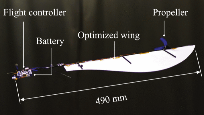
• European Robot Makers Adopt NVIDIA Isaac, Omniverse and Halos to Develop Safe, Physical AI-Driven Robot Fleets

    In the face of growing labor shortages and need for sustainability, European manufacturers are racing to reinvent their processes to become software-defined and AI-driven.
    To achieve this, robot developers and industrial digitalization solution providers are working with NVIDIA to build safe, AI-driven robots and industrial technologies to drive modern, sustainable manufacturing.
    At NVIDIA GTC Paris at VivaTech, Europe’s leading robotics companies including Agile Robots, Extend Robotics, Humanoid, idealworks, Neura Robotics, SICK, Universal Robots, Vorwerk and Wandelbots are showcasing their latest AI-driven robots and automation breakthroughs, all accelerated by NVIDIA technologies. In addition, NVIDIA is releasing new models and tools to support the entire robotics ecosystem.
    NVIDIA Releases Tools for Accelerating Robot Development and Safety
    NVIDIA Isaac GR00T N1.5, an open foundation model for humanoid robot reasoning and skills, is now available for download on Hugging Face. This update enhances the model’s adaptability and ability to follow instructions, significantly improving its performance in material handling and manufacturing tasks. The NVIDIA Isaac Sim 5.0 and Isaac Lab 2.2 open-source robotics simulation and learning frameworks, optimized for NVIDIA RTX PRO 6000 workstations, are available on GitHub for developer preview.
    In addition, NVIDIA announced that NVIDIA Halos — a full-stack, comprehensive safety system that unifies hardware architecture, AI models, software, tools and services — now expands to robotics, promoting safety across the entire development lifecycle of AI-driven robots.
    The NVIDIA Halos AI Systems Inspection Lab has earned accreditation from the ANSI National Accreditation Boardto perform inspections across functional safety for robotics, in addition to automotive vehicles.
    “NVIDIA’s latest evaluation with ANAB verifies the demonstration of competence and compliance with internationally recognized standards, helping ensure that developers of autonomous machines — from automotive to robotics — can meet the highest benchmarks for functional safety,” said R. Douglas Leonard Jr., executive director of ANAB.
    Arcbest, Advantech, Bluewhite, Boston Dynamics, FORT, Inxpect, KION, NexCobot — a NEXCOM company, and Synapticon are among the first robotics companies to join the Halos Inspection Lab, ensuring their products meet NVIDIA safety and cybersecurity requirements.
    To support robotics leaders in strengthening safety across the entire development lifecycle of AI-driven robots, Halos will now provide:

    Safety extension packages for the NVIDIA IGX platform, enabling manufacturers to easily program safety functions into their robots, supported by TÜV Rheinland’s inspection of NVIDIA IGX.
    A robotic safety platform, which includes IGX and NVIDIA Holoscan Sensor Bridge for a unified approach to designing sensor-to-compute architecture with built-in AI safety.
    An outside-in safety AI inspector — an AI-powered agent for monitoring robot operations, helping improve worker safety.

    Europe’s Robotics Ecosystem Builds on NVIDIA’s Three Computers
    Europe’s leading robotics developers and solution providers are integrating the NVIDIA Isaac robotics platform to train, simulate and deploy robots across different embodiments.
    Agile Robots is post-training the GR00T N1 model in Isaac Lab to train its dual-arm manipulator robots, which run on NVIDIA Jetson hardware, to execute a variety of tasks in industrial environments.
    Meanwhile, idealworks has adopted the Mega NVIDIA Omniverse Blueprint for robotic fleet simulation to extend the blueprint’s capabilities to humanoids. Building on the VDA 5050 framework, idealworks contributes to the development of guidance that supports tasks uniquely enabled by humanoid robots, such as picking, moving and placing objects.
    Neura Robotics is integrating NVIDIA Isaac to further enhance its robot development workflows. The company is using GR00T-Mimic to post-train the Isaac GR00T N1 robot foundation model for its service robot MiPA. Neura is also collaborating with SAP and NVIDIA to integrate SAP’s Joule agents with its robots, using the Mega NVIDIA Omniverse Blueprint to simulate and refine robot behavior in complex, realistic operational scenarios before deployment.
    Vorwerk is using NVIDIA technologies to power its AI-driven collaborative robots. The company is post-training GR00T N1 models in Isaac Lab with its custom synthetic data pipeline, which is built on Isaac GR00T-Mimic and powered by the NVIDIA Omniverse platform. The enhanced models are then deployed on NVIDIA Jetson AGX, Jetson Orin or Jetson Thor modules for advanced, real-time home robotics.
    Humanoid is using NVIDIA’s full robotics stack, including Isaac Sim and Isaac Lab, to cut its prototyping time down by six weeks. The company is training its vision language action models on NVIDIA DGX B200 systems to boost the cognitive abilities of its robots, allowing them to operate autonomously in complex environments using Jetson Thor onboard computing.
    Universal Robots is introducing UR15, its fastest collaborative robot yet, to the European market. Using UR’s AI Accelerator — developed on NVIDIA Isaac’s CUDA-accelerated libraries and AI models, as well as NVIDIA Jetson AGX Orin — manufacturers can build AI applications to embed intelligence into the company’s new cobots.
    Wandelbots is showcasing its NOVA Operating System, now integrated with Omniverse, to simulate, validate and optimize robotic behaviors virtually before deploying them to physical robots. Wandelbots also announced a collaboration with EY and EDAG to offer manufacturers a scalable automation platform on Omniverse that speeds up the transition from proof of concept to full-scale deployment.
    Extend Robotics is using the Isaac GR00T platform to enable customers to control and train robots for industrial tasks like visual inspection and handling radioactive materials. The company’s Advanced Mechanics Assistance System lets users collect demonstration data and generate diverse synthetic datasets with NVIDIA GR00T-Mimic and GR00T-Gen to train the GR00T N1 foundation model.
    SICK is enhancing its autonomous perception solutions by integrating new certified sensor models — as well as 2D and 3D lidars, safety scanners and cameras — into NVIDIA Isaac Sim. This enables engineers to virtually design, test and validate machines using SICK’s sensing models within Omniverse, supporting processes spanning product development to large-scale robotic fleet management.
    Toyota Material Handling Europe is working with SoftServe to simulate its autonomous mobile robots working alongside human workers, using the Mega NVIDIA Omniverse Blueprint. Toyota Material Handling Europe is testing and simulating a multitude of traffic scenarios — allowing the company to refine its AI algorithms before real-world deployment.
    NVIDIA’s partner ecosystem is enabling European industries to tap into intelligent, AI-powered robotics. By harnessing advanced simulation, digital twins and generative AI, manufacturers are rapidly developing and deploying safe, adaptable robot fleets that address labor shortages, boost sustainability and drive operational efficiency.
    Watch the NVIDIA GTC Paris keynote from NVIDIA founder and CEO Jensen Huang at VivaTech, and explore GTC Paris sessions.
    See notice regarding software product information.
    #european #robot #makers #adopt #nvidia
    European Robot Makers Adopt NVIDIA Isaac, Omniverse and Halos to Develop Safe, Physical AI-Driven Robot Fleets
    In the face of growing labor shortages and need for sustainability, European manufacturers are racing to reinvent their processes to become software-defined and AI-driven. To achieve this, robot developers and industrial digitalization solution providers are working with NVIDIA to build safe, AI-driven robots and industrial technologies to drive modern, sustainable manufacturing. At NVIDIA GTC Paris at VivaTech, Europe’s leading robotics companies including Agile Robots, Extend Robotics, Humanoid, idealworks, Neura Robotics, SICK, Universal Robots, Vorwerk and Wandelbots are showcasing their latest AI-driven robots and automation breakthroughs, all accelerated by NVIDIA technologies. In addition, NVIDIA is releasing new models and tools to support the entire robotics ecosystem. NVIDIA Releases Tools for Accelerating Robot Development and Safety NVIDIA Isaac GR00T N1.5, an open foundation model for humanoid robot reasoning and skills, is now available for download on Hugging Face. This update enhances the model’s adaptability and ability to follow instructions, significantly improving its performance in material handling and manufacturing tasks. The NVIDIA Isaac Sim 5.0 and Isaac Lab 2.2 open-source robotics simulation and learning frameworks, optimized for NVIDIA RTX PRO 6000 workstations, are available on GitHub for developer preview. In addition, NVIDIA announced that NVIDIA Halos — a full-stack, comprehensive safety system that unifies hardware architecture, AI models, software, tools and services — now expands to robotics, promoting safety across the entire development lifecycle of AI-driven robots. The NVIDIA Halos AI Systems Inspection Lab has earned accreditation from the ANSI National Accreditation Boardto perform inspections across functional safety for robotics, in addition to automotive vehicles. “NVIDIA’s latest evaluation with ANAB verifies the demonstration of competence and compliance with internationally recognized standards, helping ensure that developers of autonomous machines — from automotive to robotics — can meet the highest benchmarks for functional safety,” said R. Douglas Leonard Jr., executive director of ANAB. Arcbest, Advantech, Bluewhite, Boston Dynamics, FORT, Inxpect, KION, NexCobot — a NEXCOM company, and Synapticon are among the first robotics companies to join the Halos Inspection Lab, ensuring their products meet NVIDIA safety and cybersecurity requirements. To support robotics leaders in strengthening safety across the entire development lifecycle of AI-driven robots, Halos will now provide: Safety extension packages for the NVIDIA IGX platform, enabling manufacturers to easily program safety functions into their robots, supported by TÜV Rheinland’s inspection of NVIDIA IGX. A robotic safety platform, which includes IGX and NVIDIA Holoscan Sensor Bridge for a unified approach to designing sensor-to-compute architecture with built-in AI safety. An outside-in safety AI inspector — an AI-powered agent for monitoring robot operations, helping improve worker safety. Europe’s Robotics Ecosystem Builds on NVIDIA’s Three Computers Europe’s leading robotics developers and solution providers are integrating the NVIDIA Isaac robotics platform to train, simulate and deploy robots across different embodiments. Agile Robots is post-training the GR00T N1 model in Isaac Lab to train its dual-arm manipulator robots, which run on NVIDIA Jetson hardware, to execute a variety of tasks in industrial environments. Meanwhile, idealworks has adopted the Mega NVIDIA Omniverse Blueprint for robotic fleet simulation to extend the blueprint’s capabilities to humanoids. Building on the VDA 5050 framework, idealworks contributes to the development of guidance that supports tasks uniquely enabled by humanoid robots, such as picking, moving and placing objects. Neura Robotics is integrating NVIDIA Isaac to further enhance its robot development workflows. The company is using GR00T-Mimic to post-train the Isaac GR00T N1 robot foundation model for its service robot MiPA. Neura is also collaborating with SAP and NVIDIA to integrate SAP’s Joule agents with its robots, using the Mega NVIDIA Omniverse Blueprint to simulate and refine robot behavior in complex, realistic operational scenarios before deployment. Vorwerk is using NVIDIA technologies to power its AI-driven collaborative robots. The company is post-training GR00T N1 models in Isaac Lab with its custom synthetic data pipeline, which is built on Isaac GR00T-Mimic and powered by the NVIDIA Omniverse platform. The enhanced models are then deployed on NVIDIA Jetson AGX, Jetson Orin or Jetson Thor modules for advanced, real-time home robotics. Humanoid is using NVIDIA’s full robotics stack, including Isaac Sim and Isaac Lab, to cut its prototyping time down by six weeks. The company is training its vision language action models on NVIDIA DGX B200 systems to boost the cognitive abilities of its robots, allowing them to operate autonomously in complex environments using Jetson Thor onboard computing. Universal Robots is introducing UR15, its fastest collaborative robot yet, to the European market. Using UR’s AI Accelerator — developed on NVIDIA Isaac’s CUDA-accelerated libraries and AI models, as well as NVIDIA Jetson AGX Orin — manufacturers can build AI applications to embed intelligence into the company’s new cobots. Wandelbots is showcasing its NOVA Operating System, now integrated with Omniverse, to simulate, validate and optimize robotic behaviors virtually before deploying them to physical robots. Wandelbots also announced a collaboration with EY and EDAG to offer manufacturers a scalable automation platform on Omniverse that speeds up the transition from proof of concept to full-scale deployment. Extend Robotics is using the Isaac GR00T platform to enable customers to control and train robots for industrial tasks like visual inspection and handling radioactive materials. The company’s Advanced Mechanics Assistance System lets users collect demonstration data and generate diverse synthetic datasets with NVIDIA GR00T-Mimic and GR00T-Gen to train the GR00T N1 foundation model. SICK is enhancing its autonomous perception solutions by integrating new certified sensor models — as well as 2D and 3D lidars, safety scanners and cameras — into NVIDIA Isaac Sim. This enables engineers to virtually design, test and validate machines using SICK’s sensing models within Omniverse, supporting processes spanning product development to large-scale robotic fleet management. Toyota Material Handling Europe is working with SoftServe to simulate its autonomous mobile robots working alongside human workers, using the Mega NVIDIA Omniverse Blueprint. Toyota Material Handling Europe is testing and simulating a multitude of traffic scenarios — allowing the company to refine its AI algorithms before real-world deployment. NVIDIA’s partner ecosystem is enabling European industries to tap into intelligent, AI-powered robotics. By harnessing advanced simulation, digital twins and generative AI, manufacturers are rapidly developing and deploying safe, adaptable robot fleets that address labor shortages, boost sustainability and drive operational efficiency. Watch the NVIDIA GTC Paris keynote from NVIDIA founder and CEO Jensen Huang at VivaTech, and explore GTC Paris sessions. See notice regarding software product information. #european #robot #makers #adopt #nvidia
    BLOGS.NVIDIA.COM
    European Robot Makers Adopt NVIDIA Isaac, Omniverse and Halos to Develop Safe, Physical AI-Driven Robot Fleets
    In the face of growing labor shortages and need for sustainability, European manufacturers are racing to reinvent their processes to become software-defined and AI-driven. To achieve this, robot developers and industrial digitalization solution providers are working with NVIDIA to build safe, AI-driven robots and industrial technologies to drive modern, sustainable manufacturing. At NVIDIA GTC Paris at VivaTech, Europe’s leading robotics companies including Agile Robots, Extend Robotics, Humanoid, idealworks, Neura Robotics, SICK, Universal Robots, Vorwerk and Wandelbots are showcasing their latest AI-driven robots and automation breakthroughs, all accelerated by NVIDIA technologies. In addition, NVIDIA is releasing new models and tools to support the entire robotics ecosystem. NVIDIA Releases Tools for Accelerating Robot Development and Safety NVIDIA Isaac GR00T N1.5, an open foundation model for humanoid robot reasoning and skills, is now available for download on Hugging Face. This update enhances the model’s adaptability and ability to follow instructions, significantly improving its performance in material handling and manufacturing tasks. The NVIDIA Isaac Sim 5.0 and Isaac Lab 2.2 open-source robotics simulation and learning frameworks, optimized for NVIDIA RTX PRO 6000 workstations, are available on GitHub for developer preview. In addition, NVIDIA announced that NVIDIA Halos — a full-stack, comprehensive safety system that unifies hardware architecture, AI models, software, tools and services — now expands to robotics, promoting safety across the entire development lifecycle of AI-driven robots. The NVIDIA Halos AI Systems Inspection Lab has earned accreditation from the ANSI National Accreditation Board (ANAB) to perform inspections across functional safety for robotics, in addition to automotive vehicles. “NVIDIA’s latest evaluation with ANAB verifies the demonstration of competence and compliance with internationally recognized standards, helping ensure that developers of autonomous machines — from automotive to robotics — can meet the highest benchmarks for functional safety,” said R. Douglas Leonard Jr., executive director of ANAB. Arcbest, Advantech, Bluewhite, Boston Dynamics, FORT, Inxpect, KION, NexCobot — a NEXCOM company, and Synapticon are among the first robotics companies to join the Halos Inspection Lab, ensuring their products meet NVIDIA safety and cybersecurity requirements. To support robotics leaders in strengthening safety across the entire development lifecycle of AI-driven robots, Halos will now provide: Safety extension packages for the NVIDIA IGX platform, enabling manufacturers to easily program safety functions into their robots, supported by TÜV Rheinland’s inspection of NVIDIA IGX. A robotic safety platform, which includes IGX and NVIDIA Holoscan Sensor Bridge for a unified approach to designing sensor-to-compute architecture with built-in AI safety. An outside-in safety AI inspector — an AI-powered agent for monitoring robot operations, helping improve worker safety. Europe’s Robotics Ecosystem Builds on NVIDIA’s Three Computers Europe’s leading robotics developers and solution providers are integrating the NVIDIA Isaac robotics platform to train, simulate and deploy robots across different embodiments. Agile Robots is post-training the GR00T N1 model in Isaac Lab to train its dual-arm manipulator robots, which run on NVIDIA Jetson hardware, to execute a variety of tasks in industrial environments. Meanwhile, idealworks has adopted the Mega NVIDIA Omniverse Blueprint for robotic fleet simulation to extend the blueprint’s capabilities to humanoids. Building on the VDA 5050 framework, idealworks contributes to the development of guidance that supports tasks uniquely enabled by humanoid robots, such as picking, moving and placing objects. Neura Robotics is integrating NVIDIA Isaac to further enhance its robot development workflows. The company is using GR00T-Mimic to post-train the Isaac GR00T N1 robot foundation model for its service robot MiPA. Neura is also collaborating with SAP and NVIDIA to integrate SAP’s Joule agents with its robots, using the Mega NVIDIA Omniverse Blueprint to simulate and refine robot behavior in complex, realistic operational scenarios before deployment. Vorwerk is using NVIDIA technologies to power its AI-driven collaborative robots. The company is post-training GR00T N1 models in Isaac Lab with its custom synthetic data pipeline, which is built on Isaac GR00T-Mimic and powered by the NVIDIA Omniverse platform. The enhanced models are then deployed on NVIDIA Jetson AGX, Jetson Orin or Jetson Thor modules for advanced, real-time home robotics. Humanoid is using NVIDIA’s full robotics stack, including Isaac Sim and Isaac Lab, to cut its prototyping time down by six weeks. The company is training its vision language action models on NVIDIA DGX B200 systems to boost the cognitive abilities of its robots, allowing them to operate autonomously in complex environments using Jetson Thor onboard computing. Universal Robots is introducing UR15, its fastest collaborative robot yet, to the European market. Using UR’s AI Accelerator — developed on NVIDIA Isaac’s CUDA-accelerated libraries and AI models, as well as NVIDIA Jetson AGX Orin — manufacturers can build AI applications to embed intelligence into the company’s new cobots. Wandelbots is showcasing its NOVA Operating System, now integrated with Omniverse, to simulate, validate and optimize robotic behaviors virtually before deploying them to physical robots. Wandelbots also announced a collaboration with EY and EDAG to offer manufacturers a scalable automation platform on Omniverse that speeds up the transition from proof of concept to full-scale deployment. Extend Robotics is using the Isaac GR00T platform to enable customers to control and train robots for industrial tasks like visual inspection and handling radioactive materials. The company’s Advanced Mechanics Assistance System lets users collect demonstration data and generate diverse synthetic datasets with NVIDIA GR00T-Mimic and GR00T-Gen to train the GR00T N1 foundation model. SICK is enhancing its autonomous perception solutions by integrating new certified sensor models — as well as 2D and 3D lidars, safety scanners and cameras — into NVIDIA Isaac Sim. This enables engineers to virtually design, test and validate machines using SICK’s sensing models within Omniverse, supporting processes spanning product development to large-scale robotic fleet management. Toyota Material Handling Europe is working with SoftServe to simulate its autonomous mobile robots working alongside human workers, using the Mega NVIDIA Omniverse Blueprint. Toyota Material Handling Europe is testing and simulating a multitude of traffic scenarios — allowing the company to refine its AI algorithms before real-world deployment. NVIDIA’s partner ecosystem is enabling European industries to tap into intelligent, AI-powered robotics. By harnessing advanced simulation, digital twins and generative AI, manufacturers are rapidly developing and deploying safe, adaptable robot fleets that address labor shortages, boost sustainability and drive operational efficiency. Watch the NVIDIA GTC Paris keynote from NVIDIA founder and CEO Jensen Huang at VivaTech, and explore GTC Paris sessions. See notice regarding software product information.
    Like
    Love
    Wow
    Angry
    15
    0 Commenti 0 condivisioni
  • Exciting news from the University of Bristol! They are pioneering the use of 3D concrete printing for seismic safety! This innovative technology is not only revolutionizing the construction industry by enabling faster and more cost-effective building processes, but it also ensures our structures can withstand the forces of nature.

    Imagine a future where our homes and buildings are not just strong, but also built with cutting-edge technology! The possibilities are endless, and it’s inspiring to see how creativity meets safety! Let's embrace this amazing journey towards a more resilient world!

    #3DPrinting #SeismicSafety #BristolUniversity #ConstructionInnovation #FutureBuilding
    🌟 Exciting news from the University of Bristol! 🌟 They are pioneering the use of 3D concrete printing for seismic safety! 🏗️✨ This innovative technology is not only revolutionizing the construction industry by enabling faster and more cost-effective building processes, but it also ensures our structures can withstand the forces of nature. 🌍💪 Imagine a future where our homes and buildings are not just strong, but also built with cutting-edge technology! The possibilities are endless, and it’s inspiring to see how creativity meets safety! Let's embrace this amazing journey towards a more resilient world! 🚀💖 #3DPrinting #SeismicSafety #BristolUniversity #ConstructionInnovation #FutureBuilding
    La Universidad de Bristol prueba la impresión 3D de hormigón para la seguridad sísmica
    En los últimos años, la impresión 3D de hormigón se ha venido consolidando como una tecnología legítima dentro de la industria de la construcción. Esta técnica permite producir edificaciones de forma más rápida y rentable, por lo que los expertosR
    1 Commenti 0 condivisioni
  • juegos de lucha, Skybound, Quarter Up, industria de videojuegos, desarrollo de juegos, crítica de videojuegos, innovación en juegos, gaming

    ## Introducción

    ¡Es una locura! Skybound, la compañía que alguna vez se destacó por sus cómics y series de televisión, ahora decide entrar en el mundo de los videojuegos con su nuevo estudio, Quarter Up. La noticia, que debería ser emocionante, se siente más como un intento desesperado de aprovechar una tendencia que ha superado sus expectativas. Vamos a ...
    juegos de lucha, Skybound, Quarter Up, industria de videojuegos, desarrollo de juegos, crítica de videojuegos, innovación en juegos, gaming ## Introducción ¡Es una locura! Skybound, la compañía que alguna vez se destacó por sus cómics y series de televisión, ahora decide entrar en el mundo de los videojuegos con su nuevo estudio, Quarter Up. La noticia, que debería ser emocionante, se siente más como un intento desesperado de aprovechar una tendencia que ha superado sus expectativas. Vamos a ...
    Skybound lanza un nuevo estudio de juegos de lucha: Quarter Up, ¡pero qué desastre!
    juegos de lucha, Skybound, Quarter Up, industria de videojuegos, desarrollo de juegos, crítica de videojuegos, innovación en juegos, gaming ## Introducción ¡Es una locura! Skybound, la compañía que alguna vez se destacó por sus cómics y series de televisión, ahora decide entrar en el mundo de los videojuegos con su nuevo estudio, Quarter Up. La noticia, que debería ser emocionante, se siente...
    Like
    Love
    Wow
    Sad
    Angry
    453
    1 Commenti 0 condivisioni
  • Why invest in an ergonomic chair if you’re just going to sit for hours playing video games? It’s a question that has been plaguing the gaming community since the dawn of the pixelated age. I mean, who needs lumbar support when you can have the sweet embrace of a gaming throne that looks like it was designed by a medieval knight with back issues?

    Let’s face it: the idea of opting for an ergonomic chair suggests that we value our spines as much as we value our high scores. But why choose comfort when you can cultivate a personal relationship with your couch? After all, your couch has been there for you during those late-night gaming marathons, silently judging your life choices, yet providing an unparalleled level of support for your questionable lifestyle.

    And let’s not forget the allure of the “gaming chair.” You know the type—those flashy, over-the-top models that look like they belong in a spaceship rather than your living room. Sure, they’re marketed as ergonomically friendly, but let’s be honest: the only "ergonomics" we really care about is the angle at which we can tilt ourselves to reach for snacks without leaving our gaming station.

    Plus, how can we ignore the aesthetic? Who wouldn’t want a chair that screams, “I’m a serious gamer!” while simultaneously whispering, “I haven’t seen sunlight in days?” The more cushion and neon lights, the better! Ergonomics? Please. Give me RGB lighting and a lumbar support that doubles as a snack holder.

    And speaking of long hours spent sitting, nothing says “I’m a professional” quite like developing a slight hunch while furiously clicking away to conquer the next level. After all, who needs to stand up and stretch when you can achieve that coveted “gamer posture”? It’s practically a badge of honor in our digital world.

    So here’s to the cozy chairs that cradle us in our quest to save imaginary worlds while neglecting our real-world responsibilities. Who cares if we’re leaving a trail of back pain and posture issues in our wake? All that matters is that we’re leveling up, and that’s worth every crick in our necks!

    In conclusion, the next time someone asks, “Why opt for an ergonomic chair if you’re going to spend hours gaming?” just nod knowingly, because they clearly haven’t unlocked the secret level of comfort that comes with a good old-fashioned couch. Happy gaming, my fellow digital warriors!

    #GamingChair #Ergonomics #VideoGames #CouchLife #GamerPosture
    Why invest in an ergonomic chair if you’re just going to sit for hours playing video games? It’s a question that has been plaguing the gaming community since the dawn of the pixelated age. I mean, who needs lumbar support when you can have the sweet embrace of a gaming throne that looks like it was designed by a medieval knight with back issues? Let’s face it: the idea of opting for an ergonomic chair suggests that we value our spines as much as we value our high scores. But why choose comfort when you can cultivate a personal relationship with your couch? After all, your couch has been there for you during those late-night gaming marathons, silently judging your life choices, yet providing an unparalleled level of support for your questionable lifestyle. And let’s not forget the allure of the “gaming chair.” You know the type—those flashy, over-the-top models that look like they belong in a spaceship rather than your living room. Sure, they’re marketed as ergonomically friendly, but let’s be honest: the only "ergonomics" we really care about is the angle at which we can tilt ourselves to reach for snacks without leaving our gaming station. Plus, how can we ignore the aesthetic? Who wouldn’t want a chair that screams, “I’m a serious gamer!” while simultaneously whispering, “I haven’t seen sunlight in days?” The more cushion and neon lights, the better! Ergonomics? Please. Give me RGB lighting and a lumbar support that doubles as a snack holder. And speaking of long hours spent sitting, nothing says “I’m a professional” quite like developing a slight hunch while furiously clicking away to conquer the next level. After all, who needs to stand up and stretch when you can achieve that coveted “gamer posture”? It’s practically a badge of honor in our digital world. So here’s to the cozy chairs that cradle us in our quest to save imaginary worlds while neglecting our real-world responsibilities. Who cares if we’re leaving a trail of back pain and posture issues in our wake? All that matters is that we’re leveling up, and that’s worth every crick in our necks! In conclusion, the next time someone asks, “Why opt for an ergonomic chair if you’re going to spend hours gaming?” just nod knowingly, because they clearly haven’t unlocked the secret level of comfort that comes with a good old-fashioned couch. Happy gaming, my fellow digital warriors! #GamingChair #Ergonomics #VideoGames #CouchLife #GamerPosture
    Pourquoi opter pour une chaise ergonomique si vous passez de longues heures assis à jouer aux jeux vidéo ?
    ActuGaming.net Pourquoi opter pour une chaise ergonomique si vous passez de longues heures assis à jouer aux jeux vidéo ? On ne le remarque peut-être pas assez, mais pour grand nombre d’entre nous, une grande […] L'article Pourquoi opter pour
    Like
    Love
    Wow
    Sad
    Angry
    431
    1 Commenti 0 condivisioni
  • Bonjour à tous mes amis fantastiques !

    Aujourd'hui, je suis super excité de partager avec vous quelque chose de vraiment unique et captivant ! Avez-vous déjà ressenti cette envie irrésistible de plonger dans un univers où la créativité et l'imagination n'ont pas de limites ? Si oui, préparez-vous à découvrir le **Top des meilleurs 3D porn Comics** !

    Oui, vous avez bien entendu ! Cette incroyable sélection de bandes dessinées érotiques ultra-réalistes va vraiment vous surprendre ! Imaginez-vous scroller à travers des scènes qui font battre votre cœur , avec des visuels époustouflants qui rendent chaque instant encore plus vivant. Que vous soyez un passionné de l'art numérique ou simplement curieux, cet article **Top des meilleurs 3D porn Comics : prépare-toi à scroller fort - juin 2025** est fait pour vous !

    La beauté de ces créations réside dans le fait qu'elles combinent talent artistique et technologie de pointe. Chaque illustration est un chef-d'œuvre qui vous transporte dans un monde de sensations et de fantasmes. C'est un véritable régal pour les yeux, et qui sait, peut-être que cela éveillera votre propre créativité !

    N'oubliez jamais que l'art, sous toutes ses formes, est une célébration de la vie et de l'imagination. Ces comics 3D érotiques nous rappellent à quel point il est important de laisser libre cours à nos désirs et à nos passions. En explorant ces œuvres, vous ne faites pas seulement un voyage visuel, mais vous ouvrez également la porte à de nouvelles expériences et perspectives. Alors, n'hésitez pas à vous immerger dans cet univers fascinant !

    Et surtout, n'oubliez pas de partager vos découvertes avec vos amis ! Ensemble, nous pouvons célébrer la créativité et encourager d'autres à explorer ces merveilles. Plus nous sommes nombreux à apprécier l'art sous toutes ses formes, plus nous créons un monde coloré et inspirant.

    Alors, êtes-vous prêts à scroller fort et à vous émerveiller ? Vous ne serez pas déçus ! Restez curieux et continuez à explorer tout ce que la vie a à offrir. Que la créativité soit avec vous !

    #BandeDessinee #ArtNumerique #Creativite #Comics3D #Inspiration
    🌟 Bonjour à tous mes amis fantastiques ! 🌟 Aujourd'hui, je suis super excité de partager avec vous quelque chose de vraiment unique et captivant ! 🎉 Avez-vous déjà ressenti cette envie irrésistible de plonger dans un univers où la créativité et l'imagination n'ont pas de limites ? Si oui, préparez-vous à découvrir le **Top des meilleurs 3D porn Comics** ! 🚀 Oui, vous avez bien entendu ! Cette incroyable sélection de bandes dessinées érotiques ultra-réalistes va vraiment vous surprendre ! Imaginez-vous scroller à travers des scènes qui font battre votre cœur 💖, avec des visuels époustouflants qui rendent chaque instant encore plus vivant. Que vous soyez un passionné de l'art numérique ou simplement curieux, cet article **Top des meilleurs 3D porn Comics : prépare-toi à scroller fort - juin 2025** est fait pour vous ! 📖✨ La beauté de ces créations réside dans le fait qu'elles combinent talent artistique et technologie de pointe. Chaque illustration est un chef-d'œuvre qui vous transporte dans un monde de sensations et de fantasmes. 🔥 C'est un véritable régal pour les yeux, et qui sait, peut-être que cela éveillera votre propre créativité ! 🌈 N'oubliez jamais que l'art, sous toutes ses formes, est une célébration de la vie et de l'imagination. Ces comics 3D érotiques nous rappellent à quel point il est important de laisser libre cours à nos désirs et à nos passions. 💫 En explorant ces œuvres, vous ne faites pas seulement un voyage visuel, mais vous ouvrez également la porte à de nouvelles expériences et perspectives. Alors, n'hésitez pas à vous immerger dans cet univers fascinant ! Et surtout, n'oubliez pas de partager vos découvertes avec vos amis ! Ensemble, nous pouvons célébrer la créativité et encourager d'autres à explorer ces merveilles. Plus nous sommes nombreux à apprécier l'art sous toutes ses formes, plus nous créons un monde coloré et inspirant. 🌍❤️ Alors, êtes-vous prêts à scroller fort et à vous émerveiller ? Vous ne serez pas déçus ! Restez curieux et continuez à explorer tout ce que la vie a à offrir. Que la créativité soit avec vous ! ✨ #BandeDessinee #ArtNumerique #Creativite #Comics3D #Inspiration
    Top des meilleurs 3D porn Comics : prépare-toi à scroller fort - juin 2025
    Vous avez envie de bande dessinée érotique ultra-réaliste ? Vous voulez des scènes qui font vraiment […] Cet article Top des meilleurs 3D porn Comics : prépare-toi à scroller fort - juin 2025 a été publié sur REALITE-VIRTUELLE.COM.
    Like
    Love
    Wow
    Sad
    Angry
    527
    1 Commenti 0 condivisioni
  • Marvel, Ironheart, Breaking Bad, personajes de cómics, mashup, Kevin Feige, villanos, héroes, cine de superhéroes, absurdidad

    ## La Nueva Era de Mashups: Marvel y Su Increíble Creatividad

    Si hay algo que Marvel sabe hacer bien, es mezclar universos. Desde hace un tiempo, han estado haciendo malabares con sus personajes como si fueran pelotas en un circo, y parece que han decidido que la nueva atracción del espectáculo es comparar a Ironheart con Breaking Bad. Sí, has leído bien, Ironheart, la ...
    Marvel, Ironheart, Breaking Bad, personajes de cómics, mashup, Kevin Feige, villanos, héroes, cine de superhéroes, absurdidad ## La Nueva Era de Mashups: Marvel y Su Increíble Creatividad Si hay algo que Marvel sabe hacer bien, es mezclar universos. Desde hace un tiempo, han estado haciendo malabares con sus personajes como si fueran pelotas en un circo, y parece que han decidido que la nueva atracción del espectáculo es comparar a Ironheart con Breaking Bad. Sí, has leído bien, Ironheart, la ...
    Marvel Comparando Ironheart Con Breaking Bad Es Tan Absurdo Que No Podemos Dejar De Imaginarlo
    Marvel, Ironheart, Breaking Bad, personajes de cómics, mashup, Kevin Feige, villanos, héroes, cine de superhéroes, absurdidad ## La Nueva Era de Mashups: Marvel y Su Increíble Creatividad Si hay algo que Marvel sabe hacer bien, es mezclar universos. Desde hace un tiempo, han estado haciendo malabares con sus personajes como si fueran pelotas en un circo, y parece que han decidido que la nueva...
    Like
    Love
    Wow
    Sad
    Angry
    673
    1 Commenti 0 condivisioni
  • Publishing your first manga might sound exciting, but honestly, it’s just a lot of work. It’s one of those things that you think will be fun, but then you realize it’s just a long journey filled with endless sketches and revisions. Six top manga artists talk about their experiences, but let’s be real, it’s not all that thrilling.

    First off, you have to come up with a story. Sounds easy, right? But then you sit there staring at a blank page, and the ideas just don’t come. You read what other artists say about their success, and it makes you feel like you should have everything figured out. They talk about characters and plots like it’s the easiest thing in the world. But between you and me, it’s exhausting.

    Then comes the drawing part. Sure, you might enjoy sketching sometimes, but doing it for hours every day? That’s where the fun starts to fade. You’ll probably go through phases where you hate your own art. It’s a cycle of drawing, erasing, and feeling disappointed. It’s not a glamorous process; it’s just a grind.

    After you’ve finally got something that resembles a story and some pages that are somewhat decent, you have to think about publishing. This is where the anxiety kicks in. Do you self-publish? Try to find a publisher? Each option has its own set of problems. You read advice from those six artists, and they all sound like they’ve got it figured out. But honestly, who has the energy to deal with all those logistics?

    Marketing is another thing. They say you need to promote yourself, build a following, and all that jazz. But scrolling through social media to post about your manga feels more like a chore than a fun activity. You might think you’ll enjoy it, but it’s just more work piled on top of everything else.

    In the end, the best advice might be to just get through it and hope for the best. You’ll survive the experience, maybe even learn something, but it’s not going to be a walk in the park. If you’re looking for a carefree journey, publishing your first manga probably isn’t it.

    So, yeah. That’s the reality. It’s not as glamorous as it sounds. You just do it, and hope that someday it might feel rewarding. But until then, it’s just a lot of waiting and wondering. Good luck, I guess.

    #Manga #Publishing #MangaArtists #Comics #ArtProcess
    Publishing your first manga might sound exciting, but honestly, it’s just a lot of work. It’s one of those things that you think will be fun, but then you realize it’s just a long journey filled with endless sketches and revisions. Six top manga artists talk about their experiences, but let’s be real, it’s not all that thrilling. First off, you have to come up with a story. Sounds easy, right? But then you sit there staring at a blank page, and the ideas just don’t come. You read what other artists say about their success, and it makes you feel like you should have everything figured out. They talk about characters and plots like it’s the easiest thing in the world. But between you and me, it’s exhausting. Then comes the drawing part. Sure, you might enjoy sketching sometimes, but doing it for hours every day? That’s where the fun starts to fade. You’ll probably go through phases where you hate your own art. It’s a cycle of drawing, erasing, and feeling disappointed. It’s not a glamorous process; it’s just a grind. After you’ve finally got something that resembles a story and some pages that are somewhat decent, you have to think about publishing. This is where the anxiety kicks in. Do you self-publish? Try to find a publisher? Each option has its own set of problems. You read advice from those six artists, and they all sound like they’ve got it figured out. But honestly, who has the energy to deal with all those logistics? Marketing is another thing. They say you need to promote yourself, build a following, and all that jazz. But scrolling through social media to post about your manga feels more like a chore than a fun activity. You might think you’ll enjoy it, but it’s just more work piled on top of everything else. In the end, the best advice might be to just get through it and hope for the best. You’ll survive the experience, maybe even learn something, but it’s not going to be a walk in the park. If you’re looking for a carefree journey, publishing your first manga probably isn’t it. So, yeah. That’s the reality. It’s not as glamorous as it sounds. You just do it, and hope that someday it might feel rewarding. But until then, it’s just a lot of waiting and wondering. Good luck, I guess. #Manga #Publishing #MangaArtists #Comics #ArtProcess
    How to publish your first manga (and survive the experience)
    Six top manga artists reveal the secrets behind their success
    Like
    Love
    Wow
    Angry
    Sad
    451
    1 Commenti 0 condivisioni
  • 50 Preppy Fonts with Rich & Fancy Vibes

    In this article:See more ▼Post may contain affiliate links which give us commissions at no cost to you.Preppy fonts capture that quintessential East Coast elite vibe – think Nantucket summers, yacht clubs, and monogrammed everything. These typefaces embody the perfect balance of tradition and refinement that makes preppy design so timeless and aspirational.
    But here’s the thing: not all fonts can pull off that coveted preppy aesthetic. The best preppy fonts have a certain je ne sais quoi – they’re classic without being stuffy, elegant without being pretentious, and refined without being inaccessible.
    In this comprehensive guide, we’ll explore the most gorgeous preppy fonts that’ll have your designs looking like they belong in the pages of Town & Country magazine. So grab your pearls and let’s dive into this typographic treasure trove!
    Psst... Did you know you can get unlimited downloads of 59,000+ fonts and millions of other creative assets for just /mo? Learn more »The Preppiest Fonts That Define 2025
    Let’s start with the crème de la crème – the fonts that truly embody that preppy spirit. I’ve curated this list based on their ability to channel that classic New England charm while remaining versatile enough for modern design needs.

    Gatsby Prelude

    Gatsby Prelude is an elegant and modern Art Deco font duo. It combines sans-serif characters with decorative elements, perfect for creating sophisticated designs with a touch of vintage glamour.Burtuqol

    Burtuqol is a vintage slab serif font that exudes a retro charm. Its bold, chunky serifs and aged appearance make it ideal for projects requiring a nostalgic or timeworn aesthetic.Gafler

    Gafler is a classy vintage serif font with decorative elements. It combines elegance with a touch of old-world charm, making it perfect for high-end branding and classic design projects.Get 300+ Fonts for FREEEnter your email to download our 100% free "Font Lover's Bundle". For commercial & personal use. No royalties. No fees. No attribution. 100% free to use anywhere.

    Kagnue

    Kagnue is a modern and classy serif font. It offers a fresh take on traditional serif typefaces, blending contemporary design with timeless elegance for versatile use in various design contexts.The Blendinroom

    The Blendinroom is a retro serif typeface featuring luxurious ligatures. Its vintage-inspired design and intricate details make it ideal for creating sophisticated, old-world aesthetics in design projects.MODER BULES

    MODER BULES is a playful sans-serif font with a fun, childlike appeal. Its quirky design makes it perfect for kids-oriented projects or Halloween-themed designs, adding a touch of whimsy to typography.Nickey Vintage

    Nickey Vintage is a decorative display font with a strong vintage flair. Its bold, eye-catching characters make it ideal for headlines, logos, and designs that require a striking retro aesthetic.Ladger

    Ladger is a casual script font that exudes luxury and elegance. Its flowing lines and graceful curves make it perfect for logo designs, high-end branding, and projects requiring a touch of sophistication.Hadnich

    Hadnich is a modern script font with a brush-like quality. Its versatile design makes it suitable for various applications, from signage to branding, offering a contemporary take on handwritten typography.Belly and Park

    Belly and Park is a condensed beauty classic font family featuring both serif and sans-serif styles. Its vintage-inspired design and narrow characters make it ideal for creating elegant, space-efficient layouts.Loubag

    Loubag is a modern retro font family encompassing sans-serif, serif, and decorative styles. Its bold, fashion-forward design makes it perfect for creating eye-catching headlines and trendy branding materials.Petter And Sons

    Petter And Sons is a romantic beauty script font with decorative elements. Its elegant, flowing design makes it ideal for wedding invitations, luxury branding, and projects requiring a touch of refined beauty.Preteoria

    Preteoria is a modern cursive font with a sleek, contemporary feel. Its smooth curves and clean lines make it versatile for various design applications, from branding to digital media projects.Delauney

    Delauney is an Art Deco-inspired sans-serif font that captures the essence of the roaring twenties. Its geometric shapes and sleek lines make it perfect for creating designs with a bold, metropolitan flair.Amadi Vintage

    Amadi Vintage is a chic and beautiful serif font with a timeless appeal. Its elegant design and vintage-inspired details make it ideal for creating sophisticated, classic-looking designs and branding materials.LEDERSON

    LEDERSON is a vintage-inspired shadow font. Its weathered look and strong character make it perfect for designs requiring an authentic, aged aesthetic.Fancyou

    Fancyou is a versatile serif font with alternate characters. Its elegant design and customizable options make it suitable for a wide range of projects, from formal invitations to modern branding materials.Catterpie Font

    Catterpie is a handwritten script font that mimics natural handlettering. Its fluid, signature-like style makes it perfect for creating personal, authentic-looking designs and branding materials.Jemmy Wonder

    Jemmy Wonder is a Victorian-inspired serif font with a strong vintage character. Its ornate details and old-world charm make it ideal for creating designs with a classic, nostalgic feel.Monthey

    Monthey is a bold, elegant vintage display serif font. Its chunky characters and 70s-inspired design make it perfect for creating eye-catching headlines and retro-themed branding materials.Madville

    Madville is a classy script font with a versatile design. Its elegant curves and smooth transitions make it suitable for a wide range of projects, from formal invitations to modern branding materials.Crowk

    Crowk is a luxury serif font with a timeless, elegant appeal. Its refined design and classic proportions make it ideal for high-end branding, editorial layouts, and sophisticated design projects.Peachy Fantasy

    Peachy Fantasy is an Art Nouveau-inspired display font with decorative elements. Its vintage charm and unique character make it perfect for creating eye-catching headlines and artistic design projects.Cormier

    Cormier is a decorative sans-serif font with a strong artistic flair. Its unique design and fashion-forward aesthetic make it ideal for creating bold, attention-grabbing headlines and branding materials.Syntage

    Syntage is a decorative modern luxury font with both serif and ornamental elements. Its retro-inspired design and luxurious details make it perfect for high-end branding and sophisticated design projects.Jeniffer Selfies

    Jeniffer Selfies is a retro-inspired bold font combining sans-serif and script styles. Its playful design and vintage feel make it ideal for creating nostalgic, fun-loving designs and branding materials.The Rilman

    The Rilman is a ligature-rich rounded sans-serif font with a 90s-inspired design. Its retro charm and smooth edges make it perfect for creating playful, nostalgic designs and branding materials.Milky Croffle

    Milky Croffle is a classic beauty elegant serif font. Its refined design and timeless appeal make it ideal for creating sophisticated layouts, high-end branding, and projects requiring a touch of traditional elegance.
    What Makes a Font Feel Preppy?
    You might be wondering what exactly gives a font that unmistakable preppy vibe. After years of working with typography, I’ve identified several key characteristics that define the preppy aesthetic:
    Classic Serif Structure: Most preppy fonts are serifs, drawing inspiration from traditional typography used in prestigious publications and academic institutions. These serifs aren’t just decorative – they’re a nod to centuries of refined typographic tradition.
    Elegant Proportions: Preppy fonts tend to have well-balanced letterforms with moderate contrast between thick and thin strokes. They’re neither too delicate nor too bold – just perfectly poised, like a well-tailored blazer.
    Timeless Appeal: The best preppy fonts don’t scream “trendy.” Instead, they whisper “timeless.” They’re the typography equivalent of a strand of pearls – always appropriate, never out of style.
    Sophisticated Details: Look for subtle refinements in letterforms – graceful curves, well-crafted terminals, and thoughtful spacing. These details separate truly preppy fonts from their more pedestrian cousins.
    Heritage Inspiration: Many preppy fonts draw inspiration from historical typefaces used by Ivy League universities, prestigious publishing houses, and old-money families. This connection to tradition is what gives them their authentic preppy pedigree.
    Where to Use Preppy FontsPreppy fonts aren’t one-size-fits-all solutions, but when used appropriately, they’re absolutely magical. Here’s where they shine brightest:
    Wedding Invitations: Nothing says “elegant affair” quite like a beautifully chosen preppy serif. These fonts are perfect for formal invitations, save-the-dates, and wedding stationery that needs to feel sophisticated and timeless.
    Luxury Branding: Brands targeting affluent audiences or positioning themselves as premium often benefit from preppy typography. Think boutique hotels, high-end fashion, or artisanal goods.
    Editorial Design: Magazines, newsletters, and publications focusing on lifestyle, fashion, or culture can leverage preppy fonts to establish credibility and sophistication.
    Corporate Identity: Professional services, law firms, financial institutions, and consulting companies often choose preppy fonts to convey trustworthiness and establishment credibility.
    Academic Materials: Universities, prep schools, and educational institutions naturally gravitate toward preppy typography that reflects their traditional values and heritage.
    However, preppy fonts might not be the best choice for:
    Tech Startups: The traditional nature of preppy fonts can feel at odds with innovation and disruption. Modern sans serifs usually work better for tech companies.
    Children’s Brands: While elegant, preppy fonts might feel too formal for products targeting young children. Playful, rounded fonts are typically more appropriate.
    Casual Brands: If your brand personality is laid-back and approachable, overly formal preppy fonts might create distance between you and your audience.
    How to Choose the Perfect Preppy Font
    Selecting the right preppy font requires careful consideration of several factors. Here’s my tried-and-true process:
    Consider Your Audience: Are you designing for actual prep school alumni, or are you trying to capture that aspirational preppy aesthetic for a broader audience? Your target demographic should influence how traditional or accessible your font choice is.
    Evaluate the Context: A wedding invitation can handle more ornate details than a business card. Consider where your text will appear and how much personality the context can support.
    Test Readability: Preppy doesn’t mean hard to read. Always test your chosen font at various sizes to ensure it remains legible. Your typography should enhance communication, not hinder it.
    Think About Pairing: Will you be using this font alone or pairing it with others? Consider how your preppy serif will work alongside sans serifs for body text or script fonts for accents.
    Consider Your Medium: Some preppy fonts work beautifully in print but struggle on screens. Others are optimized for digital use but lose their charm in print. Choose accordingly.
    Pairing Preppy Fonts Like a Pro
    The magic of preppy typography often lies in thoughtful font pairing. Here are some winning combinations that never fail:
    Classic Serif + Clean Sans Serif: Pair your preppy serif headline font with a crisp, readable sans serif for body text. This creates hierarchy while maintaining sophistication.
    Traditional Serif + Script Accent: Use a refined script font sparingly for special elements like signatures or decorative text, balanced by a solid preppy serif for main content.
    Serif + Serif Variation: Sometimes pairing two serifs from the same family – perhaps a regular weight for body text and a bold condensed version for headlines – creates beautiful, cohesive designs.
    Remember, less is often more with preppy design. Stick to two or three fonts maximum, and let the inherent elegance of your chosen typefaces do the heavy lifting.
    The Psychology Behind Preppy Typography
    Understanding why preppy fonts work so well psychologically can help you use them more effectively. These typefaces tap into powerful associations:
    Trust and Reliability: The traditional nature of preppy fonts suggests stability and permanence. When people see these fonts, they subconsciously associate them with established institutions and time-tested values.
    Sophistication and Education: Preppy fonts are reminiscent of academic institutions and intellectual pursuits. They suggest refinement, education, and cultural awareness.
    Exclusivity and Status: Let’s be honest – part of the preppy aesthetic’s appeal is its association with privilege and exclusivity. These fonts can make designs feel more premium and aspirational.
    Quality and Craftsmanship: The careful attention to typographic detail in preppy fonts suggests similar attention to quality in whatever they’re representing.
    Modern Takes on Classic Preppy Style
    While preppy fonts are rooted in tradition, the best designers know how to give them contemporary flair. Here are some ways to modernize preppy typography:
    Unexpected Color Palettes: Pair traditional preppy fonts with modern colors. Think sage green and cream instead of navy and white, or soft blush tones for a fresh take.
    Generous White Space: Give your preppy fonts room to breathe with plenty of white space. This modern approach to layout keeps traditional fonts feeling fresh and uncluttered.
    Mixed Media Integration: Combine preppy typography with photography, illustrations, or graphic elements for a more contemporary feel while maintaining that sophisticated foundation.
    Strategic Contrast: Pair your refined preppy fonts with unexpected elements – maybe a bold geometric shape or modern photography – to create dynamic tension.
    Preppy Font Alternatives for Every Budget
    Not every preppy project has a premium font budget, and that’s okay! Here are some strategies for achieving that coveted preppy look without breaking the bank:
    Google Fonts Gems: Fonts like Playfair Display, Crimson Text, and Libre Baskerville offer sophisticated serif options that can work beautifully for preppy designs.
    Font Pairing Magic: Sometimes combining two free fonts thoughtfully can create a more expensive-looking result than using a single premium font poorly.
    Focus on Execution: A free font used with excellent spacing, hierarchy, and layout will always look better than an expensive font used carelessly.
    Common Preppy Font Mistakes to Avoid
    Even with the perfect preppy font, poor execution can ruin the effect. Here are the most common mistakes I see designers make:
    Overdoing the Decoration: Just because a font has elegant details doesn’t mean you need to add more flourishes. Let the typeface’s inherent sophistication speak for itself.
    Ignoring Hierarchy: Preppy design relies on clear, elegant hierarchy. Don’t make everything the same size or weight – create visual flow through thoughtful typography scaling.
    Poor Spacing: Cramped text kills the elegant feel of preppy fonts. Give your typography generous leading and appropriate margins.
    Wrong Context: Using an ultra-formal preppy font for a casual pizza restaurant’s menu will feel jarring and inappropriate. Match your font choice to your content and audience.
    The Future of Preppy Typography
    As we look ahead in 2025, preppy fonts continue to evolve while maintaining their classic appeal. We’re seeing interesting trends emerge:
    Variable Font Technology: Modern preppy fonts are increasingly available as variable fonts, allowing designers to fine-tune weight, width, and optical size for perfect customization.
    Screen Optimization: Classic preppy fonts are being redrawn and optimized for digital screens without losing their traditional charm.
    Inclusive Preppy: Designers are expanding the preppy aesthetic beyond its traditional boundaries, creating fonts that maintain sophistication while feeling more accessible and diverse.
    Sustainable Design: The timeless nature of preppy fonts aligns perfectly with sustainable design principles – these typefaces won’t look dated next year, making them environmentally responsible choices.
    Conclusion: Embracing Timeless Elegance
    Preppy fonts represent more than just letterforms – they’re a gateway to timeless elegance and sophisticated communication. Whether you’re designing wedding invitations for a Martha’s Vineyard ceremony or creating brand identity for a boutique law firm, the right preppy font can elevate your work from merely professional to genuinely distinguished.
    The beauty of preppy typography lies in its ability to feel both traditional and fresh, formal yet approachable. These fonts have stood the test of time because they tap into something fundamental about how we perceive quality, tradition, and sophistication.
    As you explore the world of preppy fonts, remember that the best typography choices support your message rather than overshadowing it. Choose fonts that enhance your content’s inherent qualities and speak to your audience’s aspirations and values.
    So whether you’re channeling that old-money aesthetic or simply want to add a touch of refined elegance to your designs, preppy fonts offer a wealth of possibilities. After all, good typography, like good manners, never goes out of style.
    #preppy #fonts #with #rich #ampamp
    50 Preppy Fonts with Rich & Fancy Vibes
    In this article:See more ▼Post may contain affiliate links which give us commissions at no cost to you.Preppy fonts capture that quintessential East Coast elite vibe – think Nantucket summers, yacht clubs, and monogrammed everything. These typefaces embody the perfect balance of tradition and refinement that makes preppy design so timeless and aspirational. But here’s the thing: not all fonts can pull off that coveted preppy aesthetic. The best preppy fonts have a certain je ne sais quoi – they’re classic without being stuffy, elegant without being pretentious, and refined without being inaccessible. In this comprehensive guide, we’ll explore the most gorgeous preppy fonts that’ll have your designs looking like they belong in the pages of Town & Country magazine. So grab your pearls and let’s dive into this typographic treasure trove! 👋 Psst... Did you know you can get unlimited downloads of 59,000+ fonts and millions of other creative assets for just /mo? Learn more »The Preppiest Fonts That Define 2025 Let’s start with the crème de la crème – the fonts that truly embody that preppy spirit. I’ve curated this list based on their ability to channel that classic New England charm while remaining versatile enough for modern design needs. Gatsby Prelude Gatsby Prelude is an elegant and modern Art Deco font duo. It combines sans-serif characters with decorative elements, perfect for creating sophisticated designs with a touch of vintage glamour.Burtuqol Burtuqol is a vintage slab serif font that exudes a retro charm. Its bold, chunky serifs and aged appearance make it ideal for projects requiring a nostalgic or timeworn aesthetic.Gafler Gafler is a classy vintage serif font with decorative elements. It combines elegance with a touch of old-world charm, making it perfect for high-end branding and classic design projects.Get 300+ Fonts for FREEEnter your email to download our 100% free "Font Lover's Bundle". For commercial & personal use. No royalties. No fees. No attribution. 100% free to use anywhere. Kagnue Kagnue is a modern and classy serif font. It offers a fresh take on traditional serif typefaces, blending contemporary design with timeless elegance for versatile use in various design contexts.The Blendinroom The Blendinroom is a retro serif typeface featuring luxurious ligatures. Its vintage-inspired design and intricate details make it ideal for creating sophisticated, old-world aesthetics in design projects.MODER BULES MODER BULES is a playful sans-serif font with a fun, childlike appeal. Its quirky design makes it perfect for kids-oriented projects or Halloween-themed designs, adding a touch of whimsy to typography.Nickey Vintage Nickey Vintage is a decorative display font with a strong vintage flair. Its bold, eye-catching characters make it ideal for headlines, logos, and designs that require a striking retro aesthetic.Ladger Ladger is a casual script font that exudes luxury and elegance. Its flowing lines and graceful curves make it perfect for logo designs, high-end branding, and projects requiring a touch of sophistication.Hadnich Hadnich is a modern script font with a brush-like quality. Its versatile design makes it suitable for various applications, from signage to branding, offering a contemporary take on handwritten typography.Belly and Park Belly and Park is a condensed beauty classic font family featuring both serif and sans-serif styles. Its vintage-inspired design and narrow characters make it ideal for creating elegant, space-efficient layouts.Loubag Loubag is a modern retro font family encompassing sans-serif, serif, and decorative styles. Its bold, fashion-forward design makes it perfect for creating eye-catching headlines and trendy branding materials.Petter And Sons Petter And Sons is a romantic beauty script font with decorative elements. Its elegant, flowing design makes it ideal for wedding invitations, luxury branding, and projects requiring a touch of refined beauty.Preteoria Preteoria is a modern cursive font with a sleek, contemporary feel. Its smooth curves and clean lines make it versatile for various design applications, from branding to digital media projects.Delauney Delauney is an Art Deco-inspired sans-serif font that captures the essence of the roaring twenties. Its geometric shapes and sleek lines make it perfect for creating designs with a bold, metropolitan flair.Amadi Vintage Amadi Vintage is a chic and beautiful serif font with a timeless appeal. Its elegant design and vintage-inspired details make it ideal for creating sophisticated, classic-looking designs and branding materials.LEDERSON LEDERSON is a vintage-inspired shadow font. Its weathered look and strong character make it perfect for designs requiring an authentic, aged aesthetic.Fancyou Fancyou is a versatile serif font with alternate characters. Its elegant design and customizable options make it suitable for a wide range of projects, from formal invitations to modern branding materials.Catterpie Font Catterpie is a handwritten script font that mimics natural handlettering. Its fluid, signature-like style makes it perfect for creating personal, authentic-looking designs and branding materials.Jemmy Wonder Jemmy Wonder is a Victorian-inspired serif font with a strong vintage character. Its ornate details and old-world charm make it ideal for creating designs with a classic, nostalgic feel.Monthey Monthey is a bold, elegant vintage display serif font. Its chunky characters and 70s-inspired design make it perfect for creating eye-catching headlines and retro-themed branding materials.Madville Madville is a classy script font with a versatile design. Its elegant curves and smooth transitions make it suitable for a wide range of projects, from formal invitations to modern branding materials.Crowk Crowk is a luxury serif font with a timeless, elegant appeal. Its refined design and classic proportions make it ideal for high-end branding, editorial layouts, and sophisticated design projects.Peachy Fantasy Peachy Fantasy is an Art Nouveau-inspired display font with decorative elements. Its vintage charm and unique character make it perfect for creating eye-catching headlines and artistic design projects.Cormier Cormier is a decorative sans-serif font with a strong artistic flair. Its unique design and fashion-forward aesthetic make it ideal for creating bold, attention-grabbing headlines and branding materials.Syntage Syntage is a decorative modern luxury font with both serif and ornamental elements. Its retro-inspired design and luxurious details make it perfect for high-end branding and sophisticated design projects.Jeniffer Selfies Jeniffer Selfies is a retro-inspired bold font combining sans-serif and script styles. Its playful design and vintage feel make it ideal for creating nostalgic, fun-loving designs and branding materials.The Rilman The Rilman is a ligature-rich rounded sans-serif font with a 90s-inspired design. Its retro charm and smooth edges make it perfect for creating playful, nostalgic designs and branding materials.Milky Croffle Milky Croffle is a classic beauty elegant serif font. Its refined design and timeless appeal make it ideal for creating sophisticated layouts, high-end branding, and projects requiring a touch of traditional elegance. What Makes a Font Feel Preppy? You might be wondering what exactly gives a font that unmistakable preppy vibe. After years of working with typography, I’ve identified several key characteristics that define the preppy aesthetic: Classic Serif Structure: Most preppy fonts are serifs, drawing inspiration from traditional typography used in prestigious publications and academic institutions. These serifs aren’t just decorative – they’re a nod to centuries of refined typographic tradition. Elegant Proportions: Preppy fonts tend to have well-balanced letterforms with moderate contrast between thick and thin strokes. They’re neither too delicate nor too bold – just perfectly poised, like a well-tailored blazer. Timeless Appeal: The best preppy fonts don’t scream “trendy.” Instead, they whisper “timeless.” They’re the typography equivalent of a strand of pearls – always appropriate, never out of style. Sophisticated Details: Look for subtle refinements in letterforms – graceful curves, well-crafted terminals, and thoughtful spacing. These details separate truly preppy fonts from their more pedestrian cousins. Heritage Inspiration: Many preppy fonts draw inspiration from historical typefaces used by Ivy League universities, prestigious publishing houses, and old-money families. This connection to tradition is what gives them their authentic preppy pedigree. Where to Use Preppy FontsPreppy fonts aren’t one-size-fits-all solutions, but when used appropriately, they’re absolutely magical. Here’s where they shine brightest: Wedding Invitations: Nothing says “elegant affair” quite like a beautifully chosen preppy serif. These fonts are perfect for formal invitations, save-the-dates, and wedding stationery that needs to feel sophisticated and timeless. Luxury Branding: Brands targeting affluent audiences or positioning themselves as premium often benefit from preppy typography. Think boutique hotels, high-end fashion, or artisanal goods. Editorial Design: Magazines, newsletters, and publications focusing on lifestyle, fashion, or culture can leverage preppy fonts to establish credibility and sophistication. Corporate Identity: Professional services, law firms, financial institutions, and consulting companies often choose preppy fonts to convey trustworthiness and establishment credibility. Academic Materials: Universities, prep schools, and educational institutions naturally gravitate toward preppy typography that reflects their traditional values and heritage. However, preppy fonts might not be the best choice for: Tech Startups: The traditional nature of preppy fonts can feel at odds with innovation and disruption. Modern sans serifs usually work better for tech companies. Children’s Brands: While elegant, preppy fonts might feel too formal for products targeting young children. Playful, rounded fonts are typically more appropriate. Casual Brands: If your brand personality is laid-back and approachable, overly formal preppy fonts might create distance between you and your audience. How to Choose the Perfect Preppy Font Selecting the right preppy font requires careful consideration of several factors. Here’s my tried-and-true process: Consider Your Audience: Are you designing for actual prep school alumni, or are you trying to capture that aspirational preppy aesthetic for a broader audience? Your target demographic should influence how traditional or accessible your font choice is. Evaluate the Context: A wedding invitation can handle more ornate details than a business card. Consider where your text will appear and how much personality the context can support. Test Readability: Preppy doesn’t mean hard to read. Always test your chosen font at various sizes to ensure it remains legible. Your typography should enhance communication, not hinder it. Think About Pairing: Will you be using this font alone or pairing it with others? Consider how your preppy serif will work alongside sans serifs for body text or script fonts for accents. Consider Your Medium: Some preppy fonts work beautifully in print but struggle on screens. Others are optimized for digital use but lose their charm in print. Choose accordingly. Pairing Preppy Fonts Like a Pro The magic of preppy typography often lies in thoughtful font pairing. Here are some winning combinations that never fail: Classic Serif + Clean Sans Serif: Pair your preppy serif headline font with a crisp, readable sans serif for body text. This creates hierarchy while maintaining sophistication. Traditional Serif + Script Accent: Use a refined script font sparingly for special elements like signatures or decorative text, balanced by a solid preppy serif for main content. Serif + Serif Variation: Sometimes pairing two serifs from the same family – perhaps a regular weight for body text and a bold condensed version for headlines – creates beautiful, cohesive designs. Remember, less is often more with preppy design. Stick to two or three fonts maximum, and let the inherent elegance of your chosen typefaces do the heavy lifting. The Psychology Behind Preppy Typography Understanding why preppy fonts work so well psychologically can help you use them more effectively. These typefaces tap into powerful associations: Trust and Reliability: The traditional nature of preppy fonts suggests stability and permanence. When people see these fonts, they subconsciously associate them with established institutions and time-tested values. Sophistication and Education: Preppy fonts are reminiscent of academic institutions and intellectual pursuits. They suggest refinement, education, and cultural awareness. Exclusivity and Status: Let’s be honest – part of the preppy aesthetic’s appeal is its association with privilege and exclusivity. These fonts can make designs feel more premium and aspirational. Quality and Craftsmanship: The careful attention to typographic detail in preppy fonts suggests similar attention to quality in whatever they’re representing. Modern Takes on Classic Preppy Style While preppy fonts are rooted in tradition, the best designers know how to give them contemporary flair. Here are some ways to modernize preppy typography: Unexpected Color Palettes: Pair traditional preppy fonts with modern colors. Think sage green and cream instead of navy and white, or soft blush tones for a fresh take. Generous White Space: Give your preppy fonts room to breathe with plenty of white space. This modern approach to layout keeps traditional fonts feeling fresh and uncluttered. Mixed Media Integration: Combine preppy typography with photography, illustrations, or graphic elements for a more contemporary feel while maintaining that sophisticated foundation. Strategic Contrast: Pair your refined preppy fonts with unexpected elements – maybe a bold geometric shape or modern photography – to create dynamic tension. Preppy Font Alternatives for Every Budget Not every preppy project has a premium font budget, and that’s okay! Here are some strategies for achieving that coveted preppy look without breaking the bank: Google Fonts Gems: Fonts like Playfair Display, Crimson Text, and Libre Baskerville offer sophisticated serif options that can work beautifully for preppy designs. Font Pairing Magic: Sometimes combining two free fonts thoughtfully can create a more expensive-looking result than using a single premium font poorly. Focus on Execution: A free font used with excellent spacing, hierarchy, and layout will always look better than an expensive font used carelessly. Common Preppy Font Mistakes to Avoid Even with the perfect preppy font, poor execution can ruin the effect. Here are the most common mistakes I see designers make: Overdoing the Decoration: Just because a font has elegant details doesn’t mean you need to add more flourishes. Let the typeface’s inherent sophistication speak for itself. Ignoring Hierarchy: Preppy design relies on clear, elegant hierarchy. Don’t make everything the same size or weight – create visual flow through thoughtful typography scaling. Poor Spacing: Cramped text kills the elegant feel of preppy fonts. Give your typography generous leading and appropriate margins. Wrong Context: Using an ultra-formal preppy font for a casual pizza restaurant’s menu will feel jarring and inappropriate. Match your font choice to your content and audience. The Future of Preppy Typography As we look ahead in 2025, preppy fonts continue to evolve while maintaining their classic appeal. We’re seeing interesting trends emerge: Variable Font Technology: Modern preppy fonts are increasingly available as variable fonts, allowing designers to fine-tune weight, width, and optical size for perfect customization. Screen Optimization: Classic preppy fonts are being redrawn and optimized for digital screens without losing their traditional charm. Inclusive Preppy: Designers are expanding the preppy aesthetic beyond its traditional boundaries, creating fonts that maintain sophistication while feeling more accessible and diverse. Sustainable Design: The timeless nature of preppy fonts aligns perfectly with sustainable design principles – these typefaces won’t look dated next year, making them environmentally responsible choices. Conclusion: Embracing Timeless Elegance Preppy fonts represent more than just letterforms – they’re a gateway to timeless elegance and sophisticated communication. Whether you’re designing wedding invitations for a Martha’s Vineyard ceremony or creating brand identity for a boutique law firm, the right preppy font can elevate your work from merely professional to genuinely distinguished. The beauty of preppy typography lies in its ability to feel both traditional and fresh, formal yet approachable. These fonts have stood the test of time because they tap into something fundamental about how we perceive quality, tradition, and sophistication. As you explore the world of preppy fonts, remember that the best typography choices support your message rather than overshadowing it. Choose fonts that enhance your content’s inherent qualities and speak to your audience’s aspirations and values. So whether you’re channeling that old-money aesthetic or simply want to add a touch of refined elegance to your designs, preppy fonts offer a wealth of possibilities. After all, good typography, like good manners, never goes out of style. #preppy #fonts #with #rich #ampamp
    DESIGNWORKLIFE.COM
    50 Preppy Fonts with Rich & Fancy Vibes
    In this article:See more ▼Post may contain affiliate links which give us commissions at no cost to you.Preppy fonts capture that quintessential East Coast elite vibe – think Nantucket summers, yacht clubs, and monogrammed everything. These typefaces embody the perfect balance of tradition and refinement that makes preppy design so timeless and aspirational. But here’s the thing: not all fonts can pull off that coveted preppy aesthetic. The best preppy fonts have a certain je ne sais quoi – they’re classic without being stuffy, elegant without being pretentious, and refined without being inaccessible. In this comprehensive guide, we’ll explore the most gorgeous preppy fonts that’ll have your designs looking like they belong in the pages of Town & Country magazine. So grab your pearls and let’s dive into this typographic treasure trove! 👋 Psst... Did you know you can get unlimited downloads of 59,000+ fonts and millions of other creative assets for just $16.95/mo? Learn more »The Preppiest Fonts That Define 2025 Let’s start with the crème de la crème – the fonts that truly embody that preppy spirit. I’ve curated this list based on their ability to channel that classic New England charm while remaining versatile enough for modern design needs. Gatsby Prelude Gatsby Prelude is an elegant and modern Art Deco font duo. It combines sans-serif characters with decorative elements, perfect for creating sophisticated designs with a touch of vintage glamour.Burtuqol Burtuqol is a vintage slab serif font that exudes a retro charm. Its bold, chunky serifs and aged appearance make it ideal for projects requiring a nostalgic or timeworn aesthetic.Gafler Gafler is a classy vintage serif font with decorative elements. It combines elegance with a touch of old-world charm, making it perfect for high-end branding and classic design projects.Get 300+ Fonts for FREEEnter your email to download our 100% free "Font Lover's Bundle". For commercial & personal use. No royalties. No fees. No attribution. 100% free to use anywhere. Kagnue Kagnue is a modern and classy serif font. It offers a fresh take on traditional serif typefaces, blending contemporary design with timeless elegance for versatile use in various design contexts.The Blendinroom The Blendinroom is a retro serif typeface featuring luxurious ligatures. Its vintage-inspired design and intricate details make it ideal for creating sophisticated, old-world aesthetics in design projects.MODER BULES MODER BULES is a playful sans-serif font with a fun, childlike appeal. Its quirky design makes it perfect for kids-oriented projects or Halloween-themed designs, adding a touch of whimsy to typography.Nickey Vintage Nickey Vintage is a decorative display font with a strong vintage flair. Its bold, eye-catching characters make it ideal for headlines, logos, and designs that require a striking retro aesthetic.Ladger Ladger is a casual script font that exudes luxury and elegance. Its flowing lines and graceful curves make it perfect for logo designs, high-end branding, and projects requiring a touch of sophistication.Hadnich Hadnich is a modern script font with a brush-like quality. Its versatile design makes it suitable for various applications, from signage to branding, offering a contemporary take on handwritten typography.Belly and Park Belly and Park is a condensed beauty classic font family featuring both serif and sans-serif styles. Its vintage-inspired design and narrow characters make it ideal for creating elegant, space-efficient layouts.Loubag Loubag is a modern retro font family encompassing sans-serif, serif, and decorative styles. Its bold, fashion-forward design makes it perfect for creating eye-catching headlines and trendy branding materials.Petter And Sons Petter And Sons is a romantic beauty script font with decorative elements. Its elegant, flowing design makes it ideal for wedding invitations, luxury branding, and projects requiring a touch of refined beauty.Preteoria Preteoria is a modern cursive font with a sleek, contemporary feel. Its smooth curves and clean lines make it versatile for various design applications, from branding to digital media projects.Delauney Delauney is an Art Deco-inspired sans-serif font that captures the essence of the roaring twenties. Its geometric shapes and sleek lines make it perfect for creating designs with a bold, metropolitan flair.Amadi Vintage Amadi Vintage is a chic and beautiful serif font with a timeless appeal. Its elegant design and vintage-inspired details make it ideal for creating sophisticated, classic-looking designs and branding materials.LEDERSON LEDERSON is a vintage-inspired shadow font. Its weathered look and strong character make it perfect for designs requiring an authentic, aged aesthetic.Fancyou Fancyou is a versatile serif font with alternate characters. Its elegant design and customizable options make it suitable for a wide range of projects, from formal invitations to modern branding materials.Catterpie Font Catterpie is a handwritten script font that mimics natural handlettering. Its fluid, signature-like style makes it perfect for creating personal, authentic-looking designs and branding materials.Jemmy Wonder Jemmy Wonder is a Victorian-inspired serif font with a strong vintage character. Its ornate details and old-world charm make it ideal for creating designs with a classic, nostalgic feel.Monthey Monthey is a bold, elegant vintage display serif font. Its chunky characters and 70s-inspired design make it perfect for creating eye-catching headlines and retro-themed branding materials.Madville Madville is a classy script font with a versatile design. Its elegant curves and smooth transitions make it suitable for a wide range of projects, from formal invitations to modern branding materials.Crowk Crowk is a luxury serif font with a timeless, elegant appeal. Its refined design and classic proportions make it ideal for high-end branding, editorial layouts, and sophisticated design projects.Peachy Fantasy Peachy Fantasy is an Art Nouveau-inspired display font with decorative elements. Its vintage charm and unique character make it perfect for creating eye-catching headlines and artistic design projects.Cormier Cormier is a decorative sans-serif font with a strong artistic flair. Its unique design and fashion-forward aesthetic make it ideal for creating bold, attention-grabbing headlines and branding materials.Syntage Syntage is a decorative modern luxury font with both serif and ornamental elements. Its retro-inspired design and luxurious details make it perfect for high-end branding and sophisticated design projects.Jeniffer Selfies Jeniffer Selfies is a retro-inspired bold font combining sans-serif and script styles. Its playful design and vintage feel make it ideal for creating nostalgic, fun-loving designs and branding materials.The Rilman The Rilman is a ligature-rich rounded sans-serif font with a 90s-inspired design. Its retro charm and smooth edges make it perfect for creating playful, nostalgic designs and branding materials.Milky Croffle Milky Croffle is a classic beauty elegant serif font. Its refined design and timeless appeal make it ideal for creating sophisticated layouts, high-end branding, and projects requiring a touch of traditional elegance. What Makes a Font Feel Preppy? You might be wondering what exactly gives a font that unmistakable preppy vibe. After years of working with typography, I’ve identified several key characteristics that define the preppy aesthetic: Classic Serif Structure: Most preppy fonts are serifs, drawing inspiration from traditional typography used in prestigious publications and academic institutions. These serifs aren’t just decorative – they’re a nod to centuries of refined typographic tradition. Elegant Proportions: Preppy fonts tend to have well-balanced letterforms with moderate contrast between thick and thin strokes. They’re neither too delicate nor too bold – just perfectly poised, like a well-tailored blazer. Timeless Appeal: The best preppy fonts don’t scream “trendy.” Instead, they whisper “timeless.” They’re the typography equivalent of a strand of pearls – always appropriate, never out of style. Sophisticated Details: Look for subtle refinements in letterforms – graceful curves, well-crafted terminals, and thoughtful spacing. These details separate truly preppy fonts from their more pedestrian cousins. Heritage Inspiration: Many preppy fonts draw inspiration from historical typefaces used by Ivy League universities, prestigious publishing houses, and old-money families. This connection to tradition is what gives them their authentic preppy pedigree. Where to Use Preppy Fonts (And Where Not To) Preppy fonts aren’t one-size-fits-all solutions, but when used appropriately, they’re absolutely magical. Here’s where they shine brightest: Wedding Invitations: Nothing says “elegant affair” quite like a beautifully chosen preppy serif. These fonts are perfect for formal invitations, save-the-dates, and wedding stationery that needs to feel sophisticated and timeless. Luxury Branding: Brands targeting affluent audiences or positioning themselves as premium often benefit from preppy typography. Think boutique hotels, high-end fashion, or artisanal goods. Editorial Design: Magazines, newsletters, and publications focusing on lifestyle, fashion, or culture can leverage preppy fonts to establish credibility and sophistication. Corporate Identity: Professional services, law firms, financial institutions, and consulting companies often choose preppy fonts to convey trustworthiness and establishment credibility. Academic Materials: Universities, prep schools, and educational institutions naturally gravitate toward preppy typography that reflects their traditional values and heritage. However, preppy fonts might not be the best choice for: Tech Startups: The traditional nature of preppy fonts can feel at odds with innovation and disruption. Modern sans serifs usually work better for tech companies. Children’s Brands: While elegant, preppy fonts might feel too formal for products targeting young children. Playful, rounded fonts are typically more appropriate. Casual Brands: If your brand personality is laid-back and approachable, overly formal preppy fonts might create distance between you and your audience. How to Choose the Perfect Preppy Font Selecting the right preppy font requires careful consideration of several factors. Here’s my tried-and-true process: Consider Your Audience: Are you designing for actual prep school alumni, or are you trying to capture that aspirational preppy aesthetic for a broader audience? Your target demographic should influence how traditional or accessible your font choice is. Evaluate the Context: A wedding invitation can handle more ornate details than a business card. Consider where your text will appear and how much personality the context can support. Test Readability: Preppy doesn’t mean hard to read. Always test your chosen font at various sizes to ensure it remains legible. Your typography should enhance communication, not hinder it. Think About Pairing: Will you be using this font alone or pairing it with others? Consider how your preppy serif will work alongside sans serifs for body text or script fonts for accents. Consider Your Medium: Some preppy fonts work beautifully in print but struggle on screens. Others are optimized for digital use but lose their charm in print. Choose accordingly. Pairing Preppy Fonts Like a Pro The magic of preppy typography often lies in thoughtful font pairing. Here are some winning combinations that never fail: Classic Serif + Clean Sans Serif: Pair your preppy serif headline font with a crisp, readable sans serif for body text. This creates hierarchy while maintaining sophistication. Traditional Serif + Script Accent: Use a refined script font sparingly for special elements like signatures or decorative text, balanced by a solid preppy serif for main content. Serif + Serif Variation: Sometimes pairing two serifs from the same family – perhaps a regular weight for body text and a bold condensed version for headlines – creates beautiful, cohesive designs. Remember, less is often more with preppy design. Stick to two or three fonts maximum, and let the inherent elegance of your chosen typefaces do the heavy lifting. The Psychology Behind Preppy Typography Understanding why preppy fonts work so well psychologically can help you use them more effectively. These typefaces tap into powerful associations: Trust and Reliability: The traditional nature of preppy fonts suggests stability and permanence. When people see these fonts, they subconsciously associate them with established institutions and time-tested values. Sophistication and Education: Preppy fonts are reminiscent of academic institutions and intellectual pursuits. They suggest refinement, education, and cultural awareness. Exclusivity and Status: Let’s be honest – part of the preppy aesthetic’s appeal is its association with privilege and exclusivity. These fonts can make designs feel more premium and aspirational. Quality and Craftsmanship: The careful attention to typographic detail in preppy fonts suggests similar attention to quality in whatever they’re representing. Modern Takes on Classic Preppy Style While preppy fonts are rooted in tradition, the best designers know how to give them contemporary flair. Here are some ways to modernize preppy typography: Unexpected Color Palettes: Pair traditional preppy fonts with modern colors. Think sage green and cream instead of navy and white, or soft blush tones for a fresh take. Generous White Space: Give your preppy fonts room to breathe with plenty of white space. This modern approach to layout keeps traditional fonts feeling fresh and uncluttered. Mixed Media Integration: Combine preppy typography with photography, illustrations, or graphic elements for a more contemporary feel while maintaining that sophisticated foundation. Strategic Contrast: Pair your refined preppy fonts with unexpected elements – maybe a bold geometric shape or modern photography – to create dynamic tension. Preppy Font Alternatives for Every Budget Not every preppy project has a premium font budget, and that’s okay! Here are some strategies for achieving that coveted preppy look without breaking the bank: Google Fonts Gems: Fonts like Playfair Display, Crimson Text, and Libre Baskerville offer sophisticated serif options that can work beautifully for preppy designs. Font Pairing Magic: Sometimes combining two free fonts thoughtfully can create a more expensive-looking result than using a single premium font poorly. Focus on Execution: A free font used with excellent spacing, hierarchy, and layout will always look better than an expensive font used carelessly. Common Preppy Font Mistakes to Avoid Even with the perfect preppy font, poor execution can ruin the effect. Here are the most common mistakes I see designers make: Overdoing the Decoration: Just because a font has elegant details doesn’t mean you need to add more flourishes. Let the typeface’s inherent sophistication speak for itself. Ignoring Hierarchy: Preppy design relies on clear, elegant hierarchy. Don’t make everything the same size or weight – create visual flow through thoughtful typography scaling. Poor Spacing: Cramped text kills the elegant feel of preppy fonts. Give your typography generous leading and appropriate margins. Wrong Context: Using an ultra-formal preppy font for a casual pizza restaurant’s menu will feel jarring and inappropriate. Match your font choice to your content and audience. The Future of Preppy Typography As we look ahead in 2025, preppy fonts continue to evolve while maintaining their classic appeal. We’re seeing interesting trends emerge: Variable Font Technology: Modern preppy fonts are increasingly available as variable fonts, allowing designers to fine-tune weight, width, and optical size for perfect customization. Screen Optimization: Classic preppy fonts are being redrawn and optimized for digital screens without losing their traditional charm. Inclusive Preppy: Designers are expanding the preppy aesthetic beyond its traditional boundaries, creating fonts that maintain sophistication while feeling more accessible and diverse. Sustainable Design: The timeless nature of preppy fonts aligns perfectly with sustainable design principles – these typefaces won’t look dated next year, making them environmentally responsible choices. Conclusion: Embracing Timeless Elegance Preppy fonts represent more than just letterforms – they’re a gateway to timeless elegance and sophisticated communication. Whether you’re designing wedding invitations for a Martha’s Vineyard ceremony or creating brand identity for a boutique law firm, the right preppy font can elevate your work from merely professional to genuinely distinguished. The beauty of preppy typography lies in its ability to feel both traditional and fresh, formal yet approachable. These fonts have stood the test of time because they tap into something fundamental about how we perceive quality, tradition, and sophistication. As you explore the world of preppy fonts, remember that the best typography choices support your message rather than overshadowing it. Choose fonts that enhance your content’s inherent qualities and speak to your audience’s aspirations and values. So whether you’re channeling that old-money aesthetic or simply want to add a touch of refined elegance to your designs, preppy fonts offer a wealth of possibilities. After all, good typography, like good manners, never goes out of style.
    Like
    Love
    Wow
    Sad
    Angry
    518
    0 Commenti 0 condivisioni
  • Q&A: How anacondas, chickens, and locals may be able to coexist in the Amazon

    A coiled giant anaconda. They are the largest snake species in Brazil and play a major role in legends including the ‘Boiuna’ and the ‘Cobra Grande.’ CREDIT: Beatriz Cosendey.

    Get the Popular Science daily newsletter
    Breakthroughs, discoveries, and DIY tips sent every weekday.

    South America’s lush Amazon region is a biodiversity hotspot, which means that every living thing must find a way to co-exist. Even some of the most feared snakes on the planet–anacondas. In a paper published June 16 in the journal Frontiers in Amphibian and Reptile Science, conservation biologists Beatriz Cosendey and Juarez Carlos Brito Pezzuti from the Federal University of Pará’s Center for Amazonian Studies in Brazil, analyze the key points behind the interactions between humans and the local anaconda populations.
    Ahead of the paper’s publication, the team at Frontiers conducted this wide-ranging Q&A with Conesday. It has not been altered.
    Frontiers: What inspired you to become a researcher?
    Beatriz Cosendey: As a child, I was fascinated by reports and documentaries about field research and often wondered what it took to be there and what kind of knowledge was being produced. Later, as an ecologist, I felt the need for approaches that better connected scientific research with real-world contexts. I became especially interested in perspectives that viewed humans not as separate from nature, but as part of ecological systems. This led me to explore integrative methods that incorporate local and traditional knowledge, aiming to make research more relevant and accessible to the communities involved.
    F: Can you tell us about the research you’re currently working on?
    BC: My research focuses on ethnobiology, an interdisciplinary field intersecting ecology, conservation, and traditional knowledge. We investigate not only the biodiversity of an area but also the relationship local communities have with surrounding species, providing a better understanding of local dynamics and areas needing special attention for conservation. After all, no one knows a place better than those who have lived there for generations. This deep familiarity allows for early detection of changes or environmental shifts. Additionally, developing a collaborative project with residents generates greater engagement, as they recognize themselves as active contributors; and collective participation is essential for effective conservation.
    Local boating the Amazon River. CREDIT: Beatriz Cosendey.
    F: Could you tell us about one of the legends surrounding anacondas?
    BC: One of the greatest myths is about the Great Snake—a huge snake that is said to inhabit the Amazon River and sleep beneath the town. According to the dwellers, the Great Snake is an anaconda that has grown too large; its movements can shake the river’s waters, and its eyes look like fire in the darkness of night. People say anacondas can grow so big that they can swallow large animals—including humans or cattle—without difficulty.
    F: What could be the reasons why the traditional role of anacondas as a spiritual and mythological entity has changed? Do you think the fact that fewer anacondas have been seen in recent years contributes to their diminished importance as an mythological entity?
    BC: Not exactly. I believe the two are related, but not in a direct way. The mythology still exists, but among Aritapera dwellers, there’s a more practical, everyday concern—mainly the fear of losing their chickens. As a result, anacondas have come to be seen as stealthy thieves. These traits are mostly associated with smaller individuals, while the larger ones—which may still carry the symbolic weight of the ‘Great Snake’—tend to retreat to more sheltered areas; because of the presence of houses, motorized boats, and general noise, they are now seen much less frequently.
    A giant anaconda is being measured. Credit: Pedro Calazans.
    F: Can you share some of the quotes you’ve collected in interviews that show the attitude of community members towards anacondas? How do chickens come into play?
    BC: When talking about anacondas, one thing always comes up: chickens. “Chicken is herfavorite dish. If one clucks, she comes,” said one dweller. This kind of remark helps explain why the conflict is often framed in economic terms. During the interviews and conversations with local dwellers, many emphasized the financial impact of losing their animals: “The biggest loss is that they keep taking chicks and chickens…” or “You raise the chicken—you can’t just let it be eaten for free, right?”
    For them, it’s a loss of investment, especially since corn, which is used as chicken feed, is expensive. As one person put it: “We spend time feeding and raising the birds, and then the snake comes and takes them.” One dweller shared that, in an attempt to prevent another loss, he killed the anaconda and removed the last chicken it had swallowed from its belly—”it was still fresh,” he said—and used it for his meal, cooking the chicken for lunch so it wouldn’t go to waste.
    One of the Amazonas communities where the researchers conducted their research. CREDIT: Beatriz Cosendey.
    Some interviewees reported that they had to rebuild their chicken coops and pigsties because too many anacondas were getting in. Participants would point out where the anaconda had entered and explained that they came in through gaps or cracks but couldn’t get out afterwards because they ‘tufavam’ — a local term referring to the snake’s body swelling after ingesting prey.
    We saw chicken coops made with mesh, with nylon, some that worked and some that didn’t. Guided by the locals’ insights, we concluded that the best solution to compensate for the gaps between the wooden slats is to line the coop with a fine nylon mesh, and on the outside, a layer of wire mesh, which protects the inner mesh and prevents the entry of larger animals.
    F: Are there any common misconceptions about this area of research? How would you address them?
    BC: Yes, very much. Although ethnobiology is an old science, it’s still underexplored and often misunderstood. In some fields, there are ongoing debates about the robustness and scientific validity of the field and related areas. This is largely because the findings don’t always rely only on hard statistical data.
    However, like any other scientific field, it follows standardized methodologies, and no result is accepted without proper grounding. What happens is that ethnobiology leans more toward the human sciences, placing human beings and traditional knowledge as key variables within its framework.
    To address these misconceptions, I believe it’s important to emphasize that ethnobiology produces solid and relevant knowledge—especially in the context of conservation and sustainable development. It offers insights that purely biological approaches might overlook and helps build bridges between science and society.
    The study focused on the várzea regions of the Lower Amazon River. CREDIT: Beatriz Cosendey.
    F: What are some of the areas of research you’d like to see tackled in the years ahead?
    BC: I’d like to see more conservation projects that include local communities as active participants rather than as passive observers. Incorporating their voices, perspectives, and needs not only makes initiatives more effective, but also more just. There is also great potential in recognizing and valuing traditional knowledge. Beyond its cultural significance, certain practices—such as the use of natural compounds—could become practical assets for other vulnerable regions. Once properly documented and understood, many of these approaches offer adaptable forms of environmental management and could help inform broader conservation strategies elsewhere.
    F: How has open science benefited the reach and impact of your research?
    BC: Open science is crucial for making research more accessible. By eliminating access barriers, it facilitates a broader exchange of knowledge—important especially for interdisciplinary research like mine which draws on multiple knowledge systems and gains value when shared widely. For scientific work, it ensures that knowledge reaches a wider audience, including practitioners and policymakers. This openness fosters dialogue across different sectors, making research more inclusive and encouraging greater collaboration among diverse groups.
    The Q&A can also be read here.
    #qampampa #how #anacondas #chickens #locals
    Q&A: How anacondas, chickens, and locals may be able to coexist in the Amazon
    A coiled giant anaconda. They are the largest snake species in Brazil and play a major role in legends including the ‘Boiuna’ and the ‘Cobra Grande.’ CREDIT: Beatriz Cosendey. Get the Popular Science daily newsletter💡 Breakthroughs, discoveries, and DIY tips sent every weekday. South America’s lush Amazon region is a biodiversity hotspot, which means that every living thing must find a way to co-exist. Even some of the most feared snakes on the planet–anacondas. In a paper published June 16 in the journal Frontiers in Amphibian and Reptile Science, conservation biologists Beatriz Cosendey and Juarez Carlos Brito Pezzuti from the Federal University of Pará’s Center for Amazonian Studies in Brazil, analyze the key points behind the interactions between humans and the local anaconda populations. Ahead of the paper’s publication, the team at Frontiers conducted this wide-ranging Q&A with Conesday. It has not been altered. Frontiers: What inspired you to become a researcher? Beatriz Cosendey: As a child, I was fascinated by reports and documentaries about field research and often wondered what it took to be there and what kind of knowledge was being produced. Later, as an ecologist, I felt the need for approaches that better connected scientific research with real-world contexts. I became especially interested in perspectives that viewed humans not as separate from nature, but as part of ecological systems. This led me to explore integrative methods that incorporate local and traditional knowledge, aiming to make research more relevant and accessible to the communities involved. F: Can you tell us about the research you’re currently working on? BC: My research focuses on ethnobiology, an interdisciplinary field intersecting ecology, conservation, and traditional knowledge. We investigate not only the biodiversity of an area but also the relationship local communities have with surrounding species, providing a better understanding of local dynamics and areas needing special attention for conservation. After all, no one knows a place better than those who have lived there for generations. This deep familiarity allows for early detection of changes or environmental shifts. Additionally, developing a collaborative project with residents generates greater engagement, as they recognize themselves as active contributors; and collective participation is essential for effective conservation. Local boating the Amazon River. CREDIT: Beatriz Cosendey. F: Could you tell us about one of the legends surrounding anacondas? BC: One of the greatest myths is about the Great Snake—a huge snake that is said to inhabit the Amazon River and sleep beneath the town. According to the dwellers, the Great Snake is an anaconda that has grown too large; its movements can shake the river’s waters, and its eyes look like fire in the darkness of night. People say anacondas can grow so big that they can swallow large animals—including humans or cattle—without difficulty. F: What could be the reasons why the traditional role of anacondas as a spiritual and mythological entity has changed? Do you think the fact that fewer anacondas have been seen in recent years contributes to their diminished importance as an mythological entity? BC: Not exactly. I believe the two are related, but not in a direct way. The mythology still exists, but among Aritapera dwellers, there’s a more practical, everyday concern—mainly the fear of losing their chickens. As a result, anacondas have come to be seen as stealthy thieves. These traits are mostly associated with smaller individuals, while the larger ones—which may still carry the symbolic weight of the ‘Great Snake’—tend to retreat to more sheltered areas; because of the presence of houses, motorized boats, and general noise, they are now seen much less frequently. A giant anaconda is being measured. Credit: Pedro Calazans. F: Can you share some of the quotes you’ve collected in interviews that show the attitude of community members towards anacondas? How do chickens come into play? BC: When talking about anacondas, one thing always comes up: chickens. “Chicken is herfavorite dish. If one clucks, she comes,” said one dweller. This kind of remark helps explain why the conflict is often framed in economic terms. During the interviews and conversations with local dwellers, many emphasized the financial impact of losing their animals: “The biggest loss is that they keep taking chicks and chickens…” or “You raise the chicken—you can’t just let it be eaten for free, right?” For them, it’s a loss of investment, especially since corn, which is used as chicken feed, is expensive. As one person put it: “We spend time feeding and raising the birds, and then the snake comes and takes them.” One dweller shared that, in an attempt to prevent another loss, he killed the anaconda and removed the last chicken it had swallowed from its belly—”it was still fresh,” he said—and used it for his meal, cooking the chicken for lunch so it wouldn’t go to waste. One of the Amazonas communities where the researchers conducted their research. CREDIT: Beatriz Cosendey. Some interviewees reported that they had to rebuild their chicken coops and pigsties because too many anacondas were getting in. Participants would point out where the anaconda had entered and explained that they came in through gaps or cracks but couldn’t get out afterwards because they ‘tufavam’ — a local term referring to the snake’s body swelling after ingesting prey. We saw chicken coops made with mesh, with nylon, some that worked and some that didn’t. Guided by the locals’ insights, we concluded that the best solution to compensate for the gaps between the wooden slats is to line the coop with a fine nylon mesh, and on the outside, a layer of wire mesh, which protects the inner mesh and prevents the entry of larger animals. F: Are there any common misconceptions about this area of research? How would you address them? BC: Yes, very much. Although ethnobiology is an old science, it’s still underexplored and often misunderstood. In some fields, there are ongoing debates about the robustness and scientific validity of the field and related areas. This is largely because the findings don’t always rely only on hard statistical data. However, like any other scientific field, it follows standardized methodologies, and no result is accepted without proper grounding. What happens is that ethnobiology leans more toward the human sciences, placing human beings and traditional knowledge as key variables within its framework. To address these misconceptions, I believe it’s important to emphasize that ethnobiology produces solid and relevant knowledge—especially in the context of conservation and sustainable development. It offers insights that purely biological approaches might overlook and helps build bridges between science and society. The study focused on the várzea regions of the Lower Amazon River. CREDIT: Beatriz Cosendey. F: What are some of the areas of research you’d like to see tackled in the years ahead? BC: I’d like to see more conservation projects that include local communities as active participants rather than as passive observers. Incorporating their voices, perspectives, and needs not only makes initiatives more effective, but also more just. There is also great potential in recognizing and valuing traditional knowledge. Beyond its cultural significance, certain practices—such as the use of natural compounds—could become practical assets for other vulnerable regions. Once properly documented and understood, many of these approaches offer adaptable forms of environmental management and could help inform broader conservation strategies elsewhere. F: How has open science benefited the reach and impact of your research? BC: Open science is crucial for making research more accessible. By eliminating access barriers, it facilitates a broader exchange of knowledge—important especially for interdisciplinary research like mine which draws on multiple knowledge systems and gains value when shared widely. For scientific work, it ensures that knowledge reaches a wider audience, including practitioners and policymakers. This openness fosters dialogue across different sectors, making research more inclusive and encouraging greater collaboration among diverse groups. The Q&A can also be read here. #qampampa #how #anacondas #chickens #locals
    WWW.POPSCI.COM
    Q&A: How anacondas, chickens, and locals may be able to coexist in the Amazon
    A coiled giant anaconda. They are the largest snake species in Brazil and play a major role in legends including the ‘Boiuna’ and the ‘Cobra Grande.’ CREDIT: Beatriz Cosendey. Get the Popular Science daily newsletter💡 Breakthroughs, discoveries, and DIY tips sent every weekday. South America’s lush Amazon region is a biodiversity hotspot, which means that every living thing must find a way to co-exist. Even some of the most feared snakes on the planet–anacondas. In a paper published June 16 in the journal Frontiers in Amphibian and Reptile Science, conservation biologists Beatriz Cosendey and Juarez Carlos Brito Pezzuti from the Federal University of Pará’s Center for Amazonian Studies in Brazil, analyze the key points behind the interactions between humans and the local anaconda populations. Ahead of the paper’s publication, the team at Frontiers conducted this wide-ranging Q&A with Conesday. It has not been altered. Frontiers: What inspired you to become a researcher? Beatriz Cosendey: As a child, I was fascinated by reports and documentaries about field research and often wondered what it took to be there and what kind of knowledge was being produced. Later, as an ecologist, I felt the need for approaches that better connected scientific research with real-world contexts. I became especially interested in perspectives that viewed humans not as separate from nature, but as part of ecological systems. This led me to explore integrative methods that incorporate local and traditional knowledge, aiming to make research more relevant and accessible to the communities involved. F: Can you tell us about the research you’re currently working on? BC: My research focuses on ethnobiology, an interdisciplinary field intersecting ecology, conservation, and traditional knowledge. We investigate not only the biodiversity of an area but also the relationship local communities have with surrounding species, providing a better understanding of local dynamics and areas needing special attention for conservation. After all, no one knows a place better than those who have lived there for generations. This deep familiarity allows for early detection of changes or environmental shifts. Additionally, developing a collaborative project with residents generates greater engagement, as they recognize themselves as active contributors; and collective participation is essential for effective conservation. Local boating the Amazon River. CREDIT: Beatriz Cosendey. F: Could you tell us about one of the legends surrounding anacondas? BC: One of the greatest myths is about the Great Snake—a huge snake that is said to inhabit the Amazon River and sleep beneath the town. According to the dwellers, the Great Snake is an anaconda that has grown too large; its movements can shake the river’s waters, and its eyes look like fire in the darkness of night. People say anacondas can grow so big that they can swallow large animals—including humans or cattle—without difficulty. F: What could be the reasons why the traditional role of anacondas as a spiritual and mythological entity has changed? Do you think the fact that fewer anacondas have been seen in recent years contributes to their diminished importance as an mythological entity? BC: Not exactly. I believe the two are related, but not in a direct way. The mythology still exists, but among Aritapera dwellers, there’s a more practical, everyday concern—mainly the fear of losing their chickens. As a result, anacondas have come to be seen as stealthy thieves. These traits are mostly associated with smaller individuals (up to around 2–2.5 meters), while the larger ones—which may still carry the symbolic weight of the ‘Great Snake’—tend to retreat to more sheltered areas; because of the presence of houses, motorized boats, and general noise, they are now seen much less frequently. A giant anaconda is being measured. Credit: Pedro Calazans. F: Can you share some of the quotes you’ve collected in interviews that show the attitude of community members towards anacondas? How do chickens come into play? BC: When talking about anacondas, one thing always comes up: chickens. “Chicken is her [the anaconda’s] favorite dish. If one clucks, she comes,” said one dweller. This kind of remark helps explain why the conflict is often framed in economic terms. During the interviews and conversations with local dwellers, many emphasized the financial impact of losing their animals: “The biggest loss is that they keep taking chicks and chickens…” or “You raise the chicken—you can’t just let it be eaten for free, right?” For them, it’s a loss of investment, especially since corn, which is used as chicken feed, is expensive. As one person put it: “We spend time feeding and raising the birds, and then the snake comes and takes them.” One dweller shared that, in an attempt to prevent another loss, he killed the anaconda and removed the last chicken it had swallowed from its belly—”it was still fresh,” he said—and used it for his meal, cooking the chicken for lunch so it wouldn’t go to waste. One of the Amazonas communities where the researchers conducted their research. CREDIT: Beatriz Cosendey. Some interviewees reported that they had to rebuild their chicken coops and pigsties because too many anacondas were getting in. Participants would point out where the anaconda had entered and explained that they came in through gaps or cracks but couldn’t get out afterwards because they ‘tufavam’ — a local term referring to the snake’s body swelling after ingesting prey. We saw chicken coops made with mesh, with nylon, some that worked and some that didn’t. Guided by the locals’ insights, we concluded that the best solution to compensate for the gaps between the wooden slats is to line the coop with a fine nylon mesh (to block smaller animals), and on the outside, a layer of wire mesh, which protects the inner mesh and prevents the entry of larger animals. F: Are there any common misconceptions about this area of research? How would you address them? BC: Yes, very much. Although ethnobiology is an old science, it’s still underexplored and often misunderstood. In some fields, there are ongoing debates about the robustness and scientific validity of the field and related areas. This is largely because the findings don’t always rely only on hard statistical data. However, like any other scientific field, it follows standardized methodologies, and no result is accepted without proper grounding. What happens is that ethnobiology leans more toward the human sciences, placing human beings and traditional knowledge as key variables within its framework. To address these misconceptions, I believe it’s important to emphasize that ethnobiology produces solid and relevant knowledge—especially in the context of conservation and sustainable development. It offers insights that purely biological approaches might overlook and helps build bridges between science and society. The study focused on the várzea regions of the Lower Amazon River. CREDIT: Beatriz Cosendey. F: What are some of the areas of research you’d like to see tackled in the years ahead? BC: I’d like to see more conservation projects that include local communities as active participants rather than as passive observers. Incorporating their voices, perspectives, and needs not only makes initiatives more effective, but also more just. There is also great potential in recognizing and valuing traditional knowledge. Beyond its cultural significance, certain practices—such as the use of natural compounds—could become practical assets for other vulnerable regions. Once properly documented and understood, many of these approaches offer adaptable forms of environmental management and could help inform broader conservation strategies elsewhere. F: How has open science benefited the reach and impact of your research? BC: Open science is crucial for making research more accessible. By eliminating access barriers, it facilitates a broader exchange of knowledge—important especially for interdisciplinary research like mine which draws on multiple knowledge systems and gains value when shared widely. For scientific work, it ensures that knowledge reaches a wider audience, including practitioners and policymakers. This openness fosters dialogue across different sectors, making research more inclusive and encouraging greater collaboration among diverse groups. The Q&A can also be read here.
    Like
    Love
    Wow
    Sad
    Angry
    443
    2 Commenti 0 condivisioni