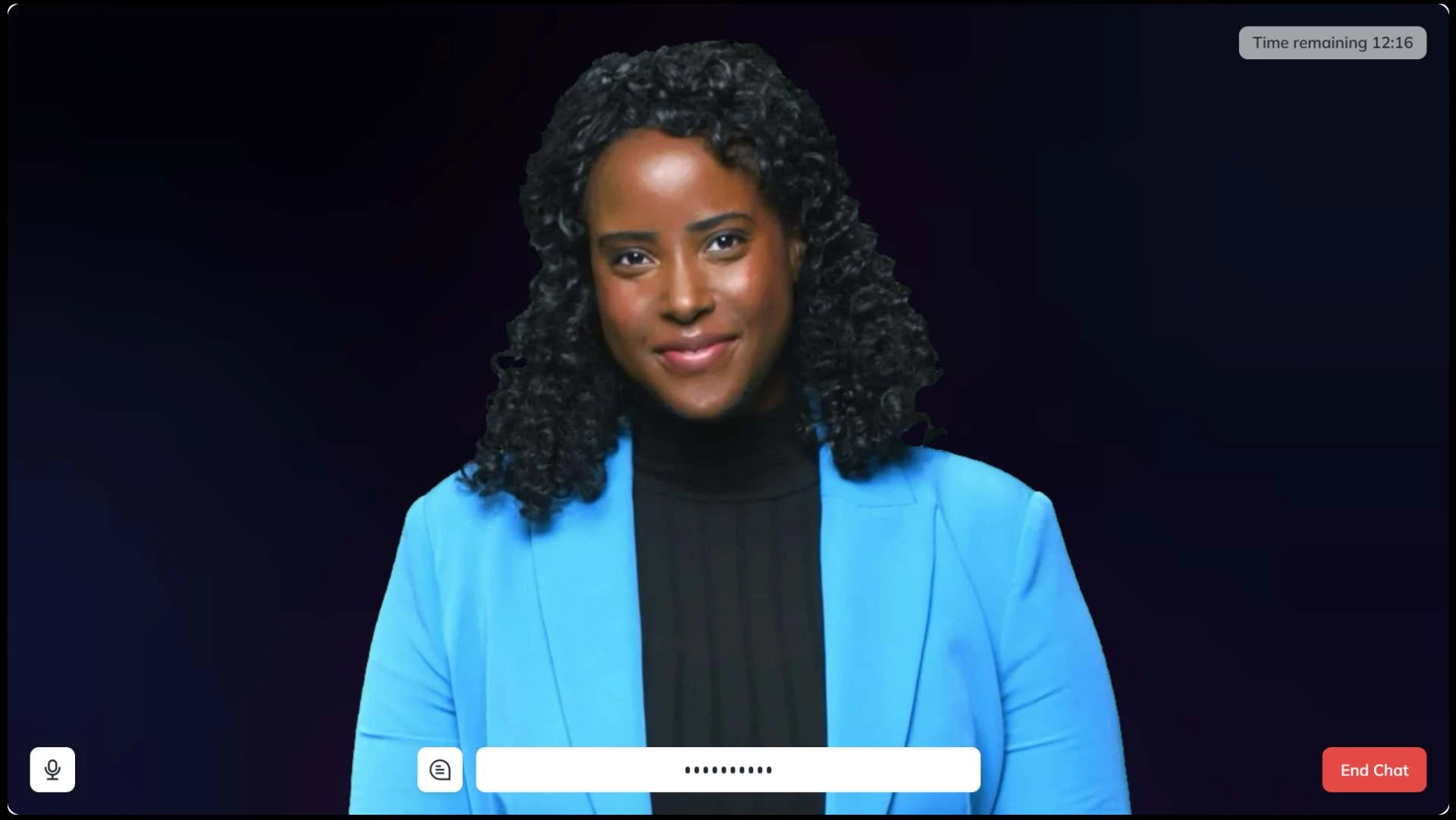
• 5 Best Google Assistant Speakers (2025): Speakers, Displays, Soundbars

    From smart displays to soundbars, Google’s voice assistant comes in all shapes and sizes. Here are our favorites.
    5 Best Google Assistant Speakers (2025): Speakers, Displays, Soundbars From smart displays to soundbars, Google’s voice assistant comes in all shapes and sizes. Here are our favorites.
    5 Best Google Assistant Speakers (2025): Speakers, Displays, Soundbars
    From smart displays to soundbars, Google’s voice assistant comes in all shapes and sizes. Here are our favorites.
    2 Commentaires 0 Parts
  • BOUNCING FROM RUBBER DUCKIES AND FLYING SHEEP TO CLONES FOR THE BOYS SEASON 4

    By TREVOR HOGG
    Images courtesy of Prime Video.

    For those seeking an alternative to the MCU, Prime Video has two offerings of the live-action and animated variety that take the superhero genre into R-rated territory where the hands of the god-like figures get dirty, bloodied and severed. “The Boys is about the intersection of celebrity and politics using superheroes,” states Stephan Fleet, VFX Supervisor on The Boys. “Sometimes I see the news and I don’t even know we can write to catch up to it! But we try. Invincible is an intense look at an alternate DC Universe that has more grit to the superhero side of it all. On one hand, I was jealous watching Season 1 of Invincible because in animation you can do things that you can’t do in real life on a budget.” Season 4 does not tone down the blood, gore and body count. Fleet notes, “The writers almost have this dialogue with us. Sometimes, they’ll write in the script, ‘And Fleet will come up with a cool visual effect for how to kill this person.’ Or, ‘Chhiu, our fight coordinator, will make an awesome fight.’ It is a frequent topic of conversation. We’re constantly trying to be inventive and create new ways to kill people!”

    When Splintersplits in two, the cloning effect was inspired by cellular mitosis.

    “The writers almost have this dialogue with us. Sometimes, they’ll write in the script, ‘And Fleet will come up with a cool visual effect for how to kill this person.’ Or, ‘Chhiu, our fight coordinator, will make an awesome fight.’ It is a frequent topic of conversation. We’re constantly trying to be inventive and create new ways to kill people!”
    —Stephan Fleet, VFX Supervisor

    A total of 1,600 visual effects shots were created for the eight episodes by ILM, Pixomondo, MPC Toronto, Spin VFX, DNEG, Untold Studios, Luma Pictures and Rocket Science VFX. Previs was a critical part of the process. “We have John Griffith, who owns a small company called CNCPT out of Texas, and he does wonderful Unreal Engine level previs,” Fleet remarks. “On set, we have a cartoon of what is going to be done, and you’ll be amazed, specifically for action and heavy visual effects stuff, how close those shots are to the previs when we finish.” Founding Director of Federal Bureau of Superhuman Affairs, Victoria Neuman, literally gets ripped in half by two tendrils coming out of Compound V-enhanced Billy Butcher, the leader of superhero resistance group The Boys. “The word that we like to use on this show is ‘grounded,’ and I like to say ‘grounded’ with an asterisk in this day and age because we’re grounded until we get to killing people in the craziest ways. In this case, having someone floating in the air and being ripped in half by two tendrils was all CG.”

    Multiple plates were shot to enable Simon Pegg to phase through the actor laying in a hospital bed.

    Testing can get rather elaborate. “For that end scene with Butcher’s tendrils, the room was two stories, and we were able to put the camera up high along with a bunch of blood cannons,” Fleet recalls. “When the body rips in half and explodes, there is a practical component. We rained down a bunch of real blood and guts right in front of Huey. It’s a known joke that we like to douse Jack Quaid with blood as much as possible! In this case, the special effects team led by Hudson Kenny needed to test it the day before, and I said, “I’ll be the guinea pig for the test.’ They covered the whole place with plastic like it was a Dexter kill room because you don’t want to destroy the set. I’m standing there in a white hazmat suit with goggles on, covered from head to toe in plastic and waiting as they’re tweaking all of these things. It sounds like World War II going on. They’re on walkie talkies to each other, and then all of a sudden, it’s ‘Five, four, three, two, one…’  And I get exploded with blood. I wanted to see what it was like, and it’s intense.”

    “On set, we have a cartoon of what is going to be done, and you’ll be amazed, specifically for action and heavy visual effects stuff, how close those shots are to the previs when we finish.”
    —Stephan Fleet, VFX Supervisor

    The Deep has a love affair with an octopus called Ambrosius, voiced by Tilda Swinton. “It’s implied bestiality!” Fleet laughs. “I would call it more of a romance. What was fun from my perspective is that I knew what the look was going to be, so then it’s about putting in the details and the animation. One of the instincts that you always have when you’re making a sea creature that talks to a humanyou tend to want to give it human gestures and eyebrows. Erik Kripkesaid, ‘No. We have to find things that an octopus could do that conveys the same emotion.’ That’s when ideas came in, such as putting a little The Deep toy inside the water tank. When Ambrosius is trying to have an intimate moment or connect with him, she can wrap a tentacle around that. My favorite experience doing Ambrosius was when The Deep is reading poetry to her on a bed. CG creatures touching humans is one of the more complicated things to do and make look real. Ambrosius’ tentacles reach for his arm, and it becomes an intimate moment. More than touching the skin, displacing the bedsheet as Ambrosius moved ended up becoming a lot of CG, and we had to go back and forth a few times to get that looking right; that turned out to be tricky.”

    A building is replaced by a massive crowd attending a rally being held by Homelander.

    In a twisted form of sexual foreplay, Sister Sage has The Deep perform a transorbital lobotomy on her. “Thank you, Amazon for selling lobotomy tools as novelty items!” Fleet chuckles. “We filmed it with a lobotomy tool on set. There is a lot of safety involved in doing something like that. Obviously, you don’t want to put any performer in any situation where they come close to putting anything real near their eye. We created this half lobotomy tool and did this complicated split screen with the lobotomy tool on a teeter totter. The Deep wasin one shot and Sister Sage reacted in the other shot. To marry the two ended up being a lot of CG work. Then there are these close-ups which are full CG. I always keep a dummy head that is painted gray that I use all of the time for reference. In macrophotography I filmed this lobotomy tool going right into the eye area. I did that because the tool is chrome, so it’s reflective and has ridges. It has an interesting reflective property. I was able to see how and what part of the human eye reflects onto the tool. A lot of that shot became about realistic reflections and lighting on the tool. Then heavy CG for displacing the eye and pushing the lobotomy tool into it. That was one of the more complicated sequences that we had to achieve.”

    In order to create an intimate moment between Ambrosius and The Deep, a toy version of the superhero was placed inside of the water tank that she could wrap a tentacle around.

    “The word that we like to use on this show is ‘grounded,’ and I like to say ‘grounded’ with an asterisk in this day and age because we’re grounded until we get to killing people in the craziest ways. In this case, having someone floating in the air and being ripped in half by two tendrils was all CG.”
    —Stephan Fleet, VFX Supervisor

    Sheep and chickens embark on a violent rampage courtesy of Compound V with the latter piercing the chest of a bodyguard belonging to Victoria Neuman. “Weirdly, that was one of our more traditional shots,’ Fleet states. “What is fun about that one is I asked for real chickens as reference. The chicken flying through his chest is real. It’s our chicken wrangler in green suit gently tossing a chicken. We blended two real plates together with some CG in the middle.” A connection was made with a sci-fi classic. “The sheep kill this bull, and we shot it is in this narrow corridor of fencing. When they run, I always equated it as the Trench Run in Star Wars and looked at the sheep as TIE fighters or X-wings coming at them.” The scene was one of the scarier moments for the visual effects team. Fleet explains, “When I read the script, I thought this could be the moment where we jump the shark. For the shots where the sheep are still and scream to the camera, Untold Studios did a bunch of R&D and came up with baboon teeth. I tried to keep anything real as much as possible, but, obviously, when sheep are flying, they have to be CG. I call it the Battlestar Galactica theory, where I like to shake the camera, overshoot shots and make it sloppy when they’re in the air so you can add motion blur. Comedy also helps sell visual effects.”

    The sheep injected with Compound V develop the ability to fly and were shot in an imperfect manner to help ground the scenes.

    Once injected with Compound V, Hugh Campbell Sr.develops the ability to phase through objects, including human beings. “We called it the Bro-nut because his name in the script is Wall Street Bro,” Fleet notes. “That was a complicated motion control shot, repeating the move over and over again. We had to shoot multiple plates of Simon Pegg and the guy in the bed. Special effects and prosthetics created a dummy guy with a hole in his chest with practical blood dripping down. It was meshing it together and getting the timing right in post. On top of that, there was the CG blood immediately around Simon Pegg.” The phasing effect had to avoid appearing as a dissolve. “I had this idea of doing high-frequency vibration on the X axis loosely based on how The Flash vibrates through walls. You want everything to have a loose motivation that then helps trigger the visuals. We tried not to overcomplicate that because, ultimately, you want something like that to be quick. If you spend too much time on phasing, it can look cheesy. In our case, it was a lot of false walls. Simon Pegg is running into a greenscreen hole which we plug in with a wall or coming out of one. I went off the actor’s action, and we added a light opacity mix with some X-axis shake.”

    Providing a different twist to the fights was the replacement of spurting blood with photoreal rubber duckies during a drug-induced hallucination.

    Homelanderbreaks a mirror which emphasizes his multiple personality disorder. “The original plan was that special effects was going to pre-break a mirror, and we were going to shoot Anthony Starr moving his head doing all of the performances in the different parts of the mirror,” Fleet reveals. “This was all based on a photo that my ex-brother-in-law sent me. He was walking down a street in Glendale, California, came across a broken mirror that someone had thrown out, and took a photo of himself where he had five heads in the mirror. We get there on the day, and I’m realizing that this is really complicated. Anthony has to do these five different performances, and we have to deal with infinite mirrors. At the last minute, I said, ‘We have to do this on a clean mirror.’ We did it on a clear mirror and gave Anthony different eyelines. The mirror break was all done in post, and we were able to cheat his head slightly and art-direct where the break crosses his chin. Editorial was able to do split screens for the timing of the dialogue.”

    “For the shots where the sheep are still and scream to the camera, Untold Studios did a bunch of R&D and came up with baboon teeth. I tried to keep anything real as much as possible, but, obviously, when sheep are flying, they have to be CG. I call it the Battlestar Galactica theory, where I like to shake the camera, overshoot shots and make it sloppy when they’re in the air so you can add motion blur. Comedy also helps sell visual effects.”
    —Stephan Fleet, VFX Supervisor

    Initially, the plan was to use a practical mirror, but creating a digital version proved to be the more effective solution.

    A different spin on the bloodbath occurs during a fight when a drugged Frenchiehallucinates as Kimiko Miyashirogoes on a killing spree. “We went back and forth with a lot of different concepts for what this hallucination would be,” Fleet remarks. “When we filmed it, we landed on Frenchie having a synesthesia moment where he’s seeing a lot of abstract colors flying in the air. We started getting into that in post and it wasn’t working. We went back to the rubber duckies, which goes back to the story of him in the bathtub. What’s in the bathtub? Rubber duckies, bubbles and water. There was a lot of physics and logic required to figure out how these rubber duckies could float out of someone’s neck. We decided on bubbles when Kimiko hits people’s heads. At one point, we had water when she got shot, but it wasn’t working, so we killed it. We probably did about 100 different versions. We got really detailed with our rubber duckie modeling because we didn’t want it to look cartoony. That took a long time.”

    Ambrosius, voiced by Tilda Swinton, gets a lot more screentime in Season 4.

    When Splintersplits in two was achieved heavily in CG. “Erik threw out the words ‘cellular mitosis’ early on as something he wanted to use,” Fleet states. “We shot Rob Benedict on a greenscreen doing all of the different performances for the clones that pop out. It was a crazy amount of CG work with Houdini and particle and skin effects. We previs’d the sequence so we had specific actions. One clone comes out to the right and the other pulls backwards.” What tends to go unnoticed by many is Splinter’s clones setting up for a press conference being held by Firecracker. “It’s funny how no one brings up the 22-hour motion control shot that we had to do with Splinter on the stage, which was the most complicated shot!” Fleet observes. “We have this sweeping long shot that brings you into the room and follows Splinter as he carries a container to the stage and hands it off to a clone, and then you reveal five more of them interweaving each other and interacting with all of these objects. It’s like a minute-long dance. First off, you have to choreograph it. We previs’d it, but then you need to get people to do it. We hired dancers and put different colored armbands on them. The camera is like another performer, and a metronome is going, which enables you to find a pace. That took about eight hours of rehearsal. Then Rob has to watch each one of their performances and mimic it to the beat. When he is handing off a box of cables, it’s to a double who is going to have to be erased and be him on the other side. They have to be almost perfect in their timing and lineup in order to take it over in visual effects and make it work.”
    #bouncing #rubber #duckies #flying #sheep
    BOUNCING FROM RUBBER DUCKIES AND FLYING SHEEP TO CLONES FOR THE BOYS SEASON 4
    By TREVOR HOGG Images courtesy of Prime Video. For those seeking an alternative to the MCU, Prime Video has two offerings of the live-action and animated variety that take the superhero genre into R-rated territory where the hands of the god-like figures get dirty, bloodied and severed. “The Boys is about the intersection of celebrity and politics using superheroes,” states Stephan Fleet, VFX Supervisor on The Boys. “Sometimes I see the news and I don’t even know we can write to catch up to it! But we try. Invincible is an intense look at an alternate DC Universe that has more grit to the superhero side of it all. On one hand, I was jealous watching Season 1 of Invincible because in animation you can do things that you can’t do in real life on a budget.” Season 4 does not tone down the blood, gore and body count. Fleet notes, “The writers almost have this dialogue with us. Sometimes, they’ll write in the script, ‘And Fleet will come up with a cool visual effect for how to kill this person.’ Or, ‘Chhiu, our fight coordinator, will make an awesome fight.’ It is a frequent topic of conversation. We’re constantly trying to be inventive and create new ways to kill people!” When Splintersplits in two, the cloning effect was inspired by cellular mitosis. “The writers almost have this dialogue with us. Sometimes, they’ll write in the script, ‘And Fleet will come up with a cool visual effect for how to kill this person.’ Or, ‘Chhiu, our fight coordinator, will make an awesome fight.’ It is a frequent topic of conversation. We’re constantly trying to be inventive and create new ways to kill people!” —Stephan Fleet, VFX Supervisor A total of 1,600 visual effects shots were created for the eight episodes by ILM, Pixomondo, MPC Toronto, Spin VFX, DNEG, Untold Studios, Luma Pictures and Rocket Science VFX. Previs was a critical part of the process. “We have John Griffith, who owns a small company called CNCPT out of Texas, and he does wonderful Unreal Engine level previs,” Fleet remarks. “On set, we have a cartoon of what is going to be done, and you’ll be amazed, specifically for action and heavy visual effects stuff, how close those shots are to the previs when we finish.” Founding Director of Federal Bureau of Superhuman Affairs, Victoria Neuman, literally gets ripped in half by two tendrils coming out of Compound V-enhanced Billy Butcher, the leader of superhero resistance group The Boys. “The word that we like to use on this show is ‘grounded,’ and I like to say ‘grounded’ with an asterisk in this day and age because we’re grounded until we get to killing people in the craziest ways. In this case, having someone floating in the air and being ripped in half by two tendrils was all CG.” Multiple plates were shot to enable Simon Pegg to phase through the actor laying in a hospital bed. Testing can get rather elaborate. “For that end scene with Butcher’s tendrils, the room was two stories, and we were able to put the camera up high along with a bunch of blood cannons,” Fleet recalls. “When the body rips in half and explodes, there is a practical component. We rained down a bunch of real blood and guts right in front of Huey. It’s a known joke that we like to douse Jack Quaid with blood as much as possible! In this case, the special effects team led by Hudson Kenny needed to test it the day before, and I said, “I’ll be the guinea pig for the test.’ They covered the whole place with plastic like it was a Dexter kill room because you don’t want to destroy the set. I’m standing there in a white hazmat suit with goggles on, covered from head to toe in plastic and waiting as they’re tweaking all of these things. It sounds like World War II going on. They’re on walkie talkies to each other, and then all of a sudden, it’s ‘Five, four, three, two, one…’  And I get exploded with blood. I wanted to see what it was like, and it’s intense.” “On set, we have a cartoon of what is going to be done, and you’ll be amazed, specifically for action and heavy visual effects stuff, how close those shots are to the previs when we finish.” —Stephan Fleet, VFX Supervisor The Deep has a love affair with an octopus called Ambrosius, voiced by Tilda Swinton. “It’s implied bestiality!” Fleet laughs. “I would call it more of a romance. What was fun from my perspective is that I knew what the look was going to be, so then it’s about putting in the details and the animation. One of the instincts that you always have when you’re making a sea creature that talks to a humanyou tend to want to give it human gestures and eyebrows. Erik Kripkesaid, ‘No. We have to find things that an octopus could do that conveys the same emotion.’ That’s when ideas came in, such as putting a little The Deep toy inside the water tank. When Ambrosius is trying to have an intimate moment or connect with him, she can wrap a tentacle around that. My favorite experience doing Ambrosius was when The Deep is reading poetry to her on a bed. CG creatures touching humans is one of the more complicated things to do and make look real. Ambrosius’ tentacles reach for his arm, and it becomes an intimate moment. More than touching the skin, displacing the bedsheet as Ambrosius moved ended up becoming a lot of CG, and we had to go back and forth a few times to get that looking right; that turned out to be tricky.” A building is replaced by a massive crowd attending a rally being held by Homelander. In a twisted form of sexual foreplay, Sister Sage has The Deep perform a transorbital lobotomy on her. “Thank you, Amazon for selling lobotomy tools as novelty items!” Fleet chuckles. “We filmed it with a lobotomy tool on set. There is a lot of safety involved in doing something like that. Obviously, you don’t want to put any performer in any situation where they come close to putting anything real near their eye. We created this half lobotomy tool and did this complicated split screen with the lobotomy tool on a teeter totter. The Deep wasin one shot and Sister Sage reacted in the other shot. To marry the two ended up being a lot of CG work. Then there are these close-ups which are full CG. I always keep a dummy head that is painted gray that I use all of the time for reference. In macrophotography I filmed this lobotomy tool going right into the eye area. I did that because the tool is chrome, so it’s reflective and has ridges. It has an interesting reflective property. I was able to see how and what part of the human eye reflects onto the tool. A lot of that shot became about realistic reflections and lighting on the tool. Then heavy CG for displacing the eye and pushing the lobotomy tool into it. That was one of the more complicated sequences that we had to achieve.” In order to create an intimate moment between Ambrosius and The Deep, a toy version of the superhero was placed inside of the water tank that she could wrap a tentacle around. “The word that we like to use on this show is ‘grounded,’ and I like to say ‘grounded’ with an asterisk in this day and age because we’re grounded until we get to killing people in the craziest ways. In this case, having someone floating in the air and being ripped in half by two tendrils was all CG.” —Stephan Fleet, VFX Supervisor Sheep and chickens embark on a violent rampage courtesy of Compound V with the latter piercing the chest of a bodyguard belonging to Victoria Neuman. “Weirdly, that was one of our more traditional shots,’ Fleet states. “What is fun about that one is I asked for real chickens as reference. The chicken flying through his chest is real. It’s our chicken wrangler in green suit gently tossing a chicken. We blended two real plates together with some CG in the middle.” A connection was made with a sci-fi classic. “The sheep kill this bull, and we shot it is in this narrow corridor of fencing. When they run, I always equated it as the Trench Run in Star Wars and looked at the sheep as TIE fighters or X-wings coming at them.” The scene was one of the scarier moments for the visual effects team. Fleet explains, “When I read the script, I thought this could be the moment where we jump the shark. For the shots where the sheep are still and scream to the camera, Untold Studios did a bunch of R&D and came up with baboon teeth. I tried to keep anything real as much as possible, but, obviously, when sheep are flying, they have to be CG. I call it the Battlestar Galactica theory, where I like to shake the camera, overshoot shots and make it sloppy when they’re in the air so you can add motion blur. Comedy also helps sell visual effects.” The sheep injected with Compound V develop the ability to fly and were shot in an imperfect manner to help ground the scenes. Once injected with Compound V, Hugh Campbell Sr.develops the ability to phase through objects, including human beings. “We called it the Bro-nut because his name in the script is Wall Street Bro,” Fleet notes. “That was a complicated motion control shot, repeating the move over and over again. We had to shoot multiple plates of Simon Pegg and the guy in the bed. Special effects and prosthetics created a dummy guy with a hole in his chest with practical blood dripping down. It was meshing it together and getting the timing right in post. On top of that, there was the CG blood immediately around Simon Pegg.” The phasing effect had to avoid appearing as a dissolve. “I had this idea of doing high-frequency vibration on the X axis loosely based on how The Flash vibrates through walls. You want everything to have a loose motivation that then helps trigger the visuals. We tried not to overcomplicate that because, ultimately, you want something like that to be quick. If you spend too much time on phasing, it can look cheesy. In our case, it was a lot of false walls. Simon Pegg is running into a greenscreen hole which we plug in with a wall or coming out of one. I went off the actor’s action, and we added a light opacity mix with some X-axis shake.” Providing a different twist to the fights was the replacement of spurting blood with photoreal rubber duckies during a drug-induced hallucination. Homelanderbreaks a mirror which emphasizes his multiple personality disorder. “The original plan was that special effects was going to pre-break a mirror, and we were going to shoot Anthony Starr moving his head doing all of the performances in the different parts of the mirror,” Fleet reveals. “This was all based on a photo that my ex-brother-in-law sent me. He was walking down a street in Glendale, California, came across a broken mirror that someone had thrown out, and took a photo of himself where he had five heads in the mirror. We get there on the day, and I’m realizing that this is really complicated. Anthony has to do these five different performances, and we have to deal with infinite mirrors. At the last minute, I said, ‘We have to do this on a clean mirror.’ We did it on a clear mirror and gave Anthony different eyelines. The mirror break was all done in post, and we were able to cheat his head slightly and art-direct where the break crosses his chin. Editorial was able to do split screens for the timing of the dialogue.” “For the shots where the sheep are still and scream to the camera, Untold Studios did a bunch of R&D and came up with baboon teeth. I tried to keep anything real as much as possible, but, obviously, when sheep are flying, they have to be CG. I call it the Battlestar Galactica theory, where I like to shake the camera, overshoot shots and make it sloppy when they’re in the air so you can add motion blur. Comedy also helps sell visual effects.” —Stephan Fleet, VFX Supervisor Initially, the plan was to use a practical mirror, but creating a digital version proved to be the more effective solution. A different spin on the bloodbath occurs during a fight when a drugged Frenchiehallucinates as Kimiko Miyashirogoes on a killing spree. “We went back and forth with a lot of different concepts for what this hallucination would be,” Fleet remarks. “When we filmed it, we landed on Frenchie having a synesthesia moment where he’s seeing a lot of abstract colors flying in the air. We started getting into that in post and it wasn’t working. We went back to the rubber duckies, which goes back to the story of him in the bathtub. What’s in the bathtub? Rubber duckies, bubbles and water. There was a lot of physics and logic required to figure out how these rubber duckies could float out of someone’s neck. We decided on bubbles when Kimiko hits people’s heads. At one point, we had water when she got shot, but it wasn’t working, so we killed it. We probably did about 100 different versions. We got really detailed with our rubber duckie modeling because we didn’t want it to look cartoony. That took a long time.” Ambrosius, voiced by Tilda Swinton, gets a lot more screentime in Season 4. When Splintersplits in two was achieved heavily in CG. “Erik threw out the words ‘cellular mitosis’ early on as something he wanted to use,” Fleet states. “We shot Rob Benedict on a greenscreen doing all of the different performances for the clones that pop out. It was a crazy amount of CG work with Houdini and particle and skin effects. We previs’d the sequence so we had specific actions. One clone comes out to the right and the other pulls backwards.” What tends to go unnoticed by many is Splinter’s clones setting up for a press conference being held by Firecracker. “It’s funny how no one brings up the 22-hour motion control shot that we had to do with Splinter on the stage, which was the most complicated shot!” Fleet observes. “We have this sweeping long shot that brings you into the room and follows Splinter as he carries a container to the stage and hands it off to a clone, and then you reveal five more of them interweaving each other and interacting with all of these objects. It’s like a minute-long dance. First off, you have to choreograph it. We previs’d it, but then you need to get people to do it. We hired dancers and put different colored armbands on them. The camera is like another performer, and a metronome is going, which enables you to find a pace. That took about eight hours of rehearsal. Then Rob has to watch each one of their performances and mimic it to the beat. When he is handing off a box of cables, it’s to a double who is going to have to be erased and be him on the other side. They have to be almost perfect in their timing and lineup in order to take it over in visual effects and make it work.” #bouncing #rubber #duckies #flying #sheep
    WWW.VFXVOICE.COM
    BOUNCING FROM RUBBER DUCKIES AND FLYING SHEEP TO CLONES FOR THE BOYS SEASON 4
    By TREVOR HOGG Images courtesy of Prime Video. For those seeking an alternative to the MCU, Prime Video has two offerings of the live-action and animated variety that take the superhero genre into R-rated territory where the hands of the god-like figures get dirty, bloodied and severed. “The Boys is about the intersection of celebrity and politics using superheroes,” states Stephan Fleet, VFX Supervisor on The Boys. “Sometimes I see the news and I don’t even know we can write to catch up to it! But we try. Invincible is an intense look at an alternate DC Universe that has more grit to the superhero side of it all. On one hand, I was jealous watching Season 1 of Invincible because in animation you can do things that you can’t do in real life on a budget.” Season 4 does not tone down the blood, gore and body count. Fleet notes, “The writers almost have this dialogue with us. Sometimes, they’ll write in the script, ‘And Fleet will come up with a cool visual effect for how to kill this person.’ Or, ‘Chhiu, our fight coordinator, will make an awesome fight.’ It is a frequent topic of conversation. We’re constantly trying to be inventive and create new ways to kill people!” When Splinter (Rob Benedict) splits in two, the cloning effect was inspired by cellular mitosis. “The writers almost have this dialogue with us. Sometimes, they’ll write in the script, ‘And Fleet will come up with a cool visual effect for how to kill this person.’ Or, ‘Chhiu, our fight coordinator, will make an awesome fight.’ It is a frequent topic of conversation. We’re constantly trying to be inventive and create new ways to kill people!” —Stephan Fleet, VFX Supervisor A total of 1,600 visual effects shots were created for the eight episodes by ILM, Pixomondo, MPC Toronto, Spin VFX, DNEG, Untold Studios, Luma Pictures and Rocket Science VFX. Previs was a critical part of the process. “We have John Griffith [Previs Director], who owns a small company called CNCPT out of Texas, and he does wonderful Unreal Engine level previs,” Fleet remarks. “On set, we have a cartoon of what is going to be done, and you’ll be amazed, specifically for action and heavy visual effects stuff, how close those shots are to the previs when we finish.” Founding Director of Federal Bureau of Superhuman Affairs, Victoria Neuman, literally gets ripped in half by two tendrils coming out of Compound V-enhanced Billy Butcher, the leader of superhero resistance group The Boys. “The word that we like to use on this show is ‘grounded,’ and I like to say ‘grounded’ with an asterisk in this day and age because we’re grounded until we get to killing people in the craziest ways. In this case, having someone floating in the air and being ripped in half by two tendrils was all CG.” Multiple plates were shot to enable Simon Pegg to phase through the actor laying in a hospital bed. Testing can get rather elaborate. “For that end scene with Butcher’s tendrils, the room was two stories, and we were able to put the camera up high along with a bunch of blood cannons,” Fleet recalls. “When the body rips in half and explodes, there is a practical component. We rained down a bunch of real blood and guts right in front of Huey. It’s a known joke that we like to douse Jack Quaid with blood as much as possible! In this case, the special effects team led by Hudson Kenny needed to test it the day before, and I said, “I’ll be the guinea pig for the test.’ They covered the whole place with plastic like it was a Dexter kill room because you don’t want to destroy the set. I’m standing there in a white hazmat suit with goggles on, covered from head to toe in plastic and waiting as they’re tweaking all of these things. It sounds like World War II going on. They’re on walkie talkies to each other, and then all of a sudden, it’s ‘Five, four, three, two, one…’  And I get exploded with blood. I wanted to see what it was like, and it’s intense.” “On set, we have a cartoon of what is going to be done, and you’ll be amazed, specifically for action and heavy visual effects stuff, how close those shots are to the previs when we finish.” —Stephan Fleet, VFX Supervisor The Deep has a love affair with an octopus called Ambrosius, voiced by Tilda Swinton. “It’s implied bestiality!” Fleet laughs. “I would call it more of a romance. What was fun from my perspective is that I knew what the look was going to be [from Season 3], so then it’s about putting in the details and the animation. One of the instincts that you always have when you’re making a sea creature that talks to a human [is] you tend to want to give it human gestures and eyebrows. Erik Kripke [Creator, Executive Producer, Showrunner, Director, Writer] said, ‘No. We have to find things that an octopus could do that conveys the same emotion.’ That’s when ideas came in, such as putting a little The Deep toy inside the water tank. When Ambrosius is trying to have an intimate moment or connect with him, she can wrap a tentacle around that. My favorite experience doing Ambrosius was when The Deep is reading poetry to her on a bed. CG creatures touching humans is one of the more complicated things to do and make look real. Ambrosius’ tentacles reach for his arm, and it becomes an intimate moment. More than touching the skin, displacing the bedsheet as Ambrosius moved ended up becoming a lot of CG, and we had to go back and forth a few times to get that looking right; that turned out to be tricky.” A building is replaced by a massive crowd attending a rally being held by Homelander. In a twisted form of sexual foreplay, Sister Sage has The Deep perform a transorbital lobotomy on her. “Thank you, Amazon for selling lobotomy tools as novelty items!” Fleet chuckles. “We filmed it with a lobotomy tool on set. There is a lot of safety involved in doing something like that. Obviously, you don’t want to put any performer in any situation where they come close to putting anything real near their eye. We created this half lobotomy tool and did this complicated split screen with the lobotomy tool on a teeter totter. The Deep was [acting in a certain way] in one shot and Sister Sage reacted in the other shot. To marry the two ended up being a lot of CG work. Then there are these close-ups which are full CG. I always keep a dummy head that is painted gray that I use all of the time for reference. In macrophotography I filmed this lobotomy tool going right into the eye area. I did that because the tool is chrome, so it’s reflective and has ridges. It has an interesting reflective property. I was able to see how and what part of the human eye reflects onto the tool. A lot of that shot became about realistic reflections and lighting on the tool. Then heavy CG for displacing the eye and pushing the lobotomy tool into it. That was one of the more complicated sequences that we had to achieve.” In order to create an intimate moment between Ambrosius and The Deep, a toy version of the superhero was placed inside of the water tank that she could wrap a tentacle around. “The word that we like to use on this show is ‘grounded,’ and I like to say ‘grounded’ with an asterisk in this day and age because we’re grounded until we get to killing people in the craziest ways. In this case, having someone floating in the air and being ripped in half by two tendrils was all CG.” —Stephan Fleet, VFX Supervisor Sheep and chickens embark on a violent rampage courtesy of Compound V with the latter piercing the chest of a bodyguard belonging to Victoria Neuman. “Weirdly, that was one of our more traditional shots,’ Fleet states. “What is fun about that one is I asked for real chickens as reference. The chicken flying through his chest is real. It’s our chicken wrangler in green suit gently tossing a chicken. We blended two real plates together with some CG in the middle.” A connection was made with a sci-fi classic. “The sheep kill this bull, and we shot it is in this narrow corridor of fencing. When they run, I always equated it as the Trench Run in Star Wars and looked at the sheep as TIE fighters or X-wings coming at them.” The scene was one of the scarier moments for the visual effects team. Fleet explains, “When I read the script, I thought this could be the moment where we jump the shark. For the shots where the sheep are still and scream to the camera, Untold Studios did a bunch of R&D and came up with baboon teeth. I tried to keep anything real as much as possible, but, obviously, when sheep are flying, they have to be CG. I call it the Battlestar Galactica theory, where I like to shake the camera, overshoot shots and make it sloppy when they’re in the air so you can add motion blur. Comedy also helps sell visual effects.” The sheep injected with Compound V develop the ability to fly and were shot in an imperfect manner to help ground the scenes. Once injected with Compound V, Hugh Campbell Sr. (Simon Pegg) develops the ability to phase through objects, including human beings. “We called it the Bro-nut because his name in the script is Wall Street Bro,” Fleet notes. “That was a complicated motion control shot, repeating the move over and over again. We had to shoot multiple plates of Simon Pegg and the guy in the bed. Special effects and prosthetics created a dummy guy with a hole in his chest with practical blood dripping down. It was meshing it together and getting the timing right in post. On top of that, there was the CG blood immediately around Simon Pegg.” The phasing effect had to avoid appearing as a dissolve. “I had this idea of doing high-frequency vibration on the X axis loosely based on how The Flash vibrates through walls. You want everything to have a loose motivation that then helps trigger the visuals. We tried not to overcomplicate that because, ultimately, you want something like that to be quick. If you spend too much time on phasing, it can look cheesy. In our case, it was a lot of false walls. Simon Pegg is running into a greenscreen hole which we plug in with a wall or coming out of one. I went off the actor’s action, and we added a light opacity mix with some X-axis shake.” Providing a different twist to the fights was the replacement of spurting blood with photoreal rubber duckies during a drug-induced hallucination. Homelander (Anthony Starr) breaks a mirror which emphasizes his multiple personality disorder. “The original plan was that special effects was going to pre-break a mirror, and we were going to shoot Anthony Starr moving his head doing all of the performances in the different parts of the mirror,” Fleet reveals. “This was all based on a photo that my ex-brother-in-law sent me. He was walking down a street in Glendale, California, came across a broken mirror that someone had thrown out, and took a photo of himself where he had five heads in the mirror. We get there on the day, and I’m realizing that this is really complicated. Anthony has to do these five different performances, and we have to deal with infinite mirrors. At the last minute, I said, ‘We have to do this on a clean mirror.’ We did it on a clear mirror and gave Anthony different eyelines. The mirror break was all done in post, and we were able to cheat his head slightly and art-direct where the break crosses his chin. Editorial was able to do split screens for the timing of the dialogue.” “For the shots where the sheep are still and scream to the camera, Untold Studios did a bunch of R&D and came up with baboon teeth. I tried to keep anything real as much as possible, but, obviously, when sheep are flying, they have to be CG. I call it the Battlestar Galactica theory, where I like to shake the camera, overshoot shots and make it sloppy when they’re in the air so you can add motion blur. Comedy also helps sell visual effects.” —Stephan Fleet, VFX Supervisor Initially, the plan was to use a practical mirror, but creating a digital version proved to be the more effective solution. A different spin on the bloodbath occurs during a fight when a drugged Frenchie (Tomer Capone) hallucinates as Kimiko Miyashiro (Karen Fukuhara) goes on a killing spree. “We went back and forth with a lot of different concepts for what this hallucination would be,” Fleet remarks. “When we filmed it, we landed on Frenchie having a synesthesia moment where he’s seeing a lot of abstract colors flying in the air. We started getting into that in post and it wasn’t working. We went back to the rubber duckies, which goes back to the story of him in the bathtub. What’s in the bathtub? Rubber duckies, bubbles and water. There was a lot of physics and logic required to figure out how these rubber duckies could float out of someone’s neck. We decided on bubbles when Kimiko hits people’s heads. At one point, we had water when she got shot, but it wasn’t working, so we killed it. We probably did about 100 different versions. We got really detailed with our rubber duckie modeling because we didn’t want it to look cartoony. That took a long time.” Ambrosius, voiced by Tilda Swinton, gets a lot more screentime in Season 4. When Splinter (Rob Benedict) splits in two was achieved heavily in CG. “Erik threw out the words ‘cellular mitosis’ early on as something he wanted to use,” Fleet states. “We shot Rob Benedict on a greenscreen doing all of the different performances for the clones that pop out. It was a crazy amount of CG work with Houdini and particle and skin effects. We previs’d the sequence so we had specific actions. One clone comes out to the right and the other pulls backwards.” What tends to go unnoticed by many is Splinter’s clones setting up for a press conference being held by Firecracker (Valorie Curry). “It’s funny how no one brings up the 22-hour motion control shot that we had to do with Splinter on the stage, which was the most complicated shot!” Fleet observes. “We have this sweeping long shot that brings you into the room and follows Splinter as he carries a container to the stage and hands it off to a clone, and then you reveal five more of them interweaving each other and interacting with all of these objects. It’s like a minute-long dance. First off, you have to choreograph it. We previs’d it, but then you need to get people to do it. We hired dancers and put different colored armbands on them. The camera is like another performer, and a metronome is going, which enables you to find a pace. That took about eight hours of rehearsal. Then Rob has to watch each one of their performances and mimic it to the beat. When he is handing off a box of cables, it’s to a double who is going to have to be erased and be him on the other side. They have to be almost perfect in their timing and lineup in order to take it over in visual effects and make it work.”
    0 Commentaires 0 Parts
  • 50 Preppy Fonts with Rich & Fancy Vibes

    In this article:See more ▼Post may contain affiliate links which give us commissions at no cost to you.Preppy fonts capture that quintessential East Coast elite vibe – think Nantucket summers, yacht clubs, and monogrammed everything. These typefaces embody the perfect balance of tradition and refinement that makes preppy design so timeless and aspirational.
    But here’s the thing: not all fonts can pull off that coveted preppy aesthetic. The best preppy fonts have a certain je ne sais quoi – they’re classic without being stuffy, elegant without being pretentious, and refined without being inaccessible.
    In this comprehensive guide, we’ll explore the most gorgeous preppy fonts that’ll have your designs looking like they belong in the pages of Town & Country magazine. So grab your pearls and let’s dive into this typographic treasure trove!
    Psst... Did you know you can get unlimited downloads of 59,000+ fonts and millions of other creative assets for just /mo? Learn more »The Preppiest Fonts That Define 2025
    Let’s start with the crème de la crème – the fonts that truly embody that preppy spirit. I’ve curated this list based on their ability to channel that classic New England charm while remaining versatile enough for modern design needs.

    Gatsby Prelude

    Gatsby Prelude is an elegant and modern Art Deco font duo. It combines sans-serif characters with decorative elements, perfect for creating sophisticated designs with a touch of vintage glamour.Burtuqol

    Burtuqol is a vintage slab serif font that exudes a retro charm. Its bold, chunky serifs and aged appearance make it ideal for projects requiring a nostalgic or timeworn aesthetic.Gafler

    Gafler is a classy vintage serif font with decorative elements. It combines elegance with a touch of old-world charm, making it perfect for high-end branding and classic design projects.Get 300+ Fonts for FREEEnter your email to download our 100% free "Font Lover's Bundle". For commercial & personal use. No royalties. No fees. No attribution. 100% free to use anywhere.

    Kagnue

    Kagnue is a modern and classy serif font. It offers a fresh take on traditional serif typefaces, blending contemporary design with timeless elegance for versatile use in various design contexts.The Blendinroom

    The Blendinroom is a retro serif typeface featuring luxurious ligatures. Its vintage-inspired design and intricate details make it ideal for creating sophisticated, old-world aesthetics in design projects.MODER BULES

    MODER BULES is a playful sans-serif font with a fun, childlike appeal. Its quirky design makes it perfect for kids-oriented projects or Halloween-themed designs, adding a touch of whimsy to typography.Nickey Vintage

    Nickey Vintage is a decorative display font with a strong vintage flair. Its bold, eye-catching characters make it ideal for headlines, logos, and designs that require a striking retro aesthetic.Ladger

    Ladger is a casual script font that exudes luxury and elegance. Its flowing lines and graceful curves make it perfect for logo designs, high-end branding, and projects requiring a touch of sophistication.Hadnich

    Hadnich is a modern script font with a brush-like quality. Its versatile design makes it suitable for various applications, from signage to branding, offering a contemporary take on handwritten typography.Belly and Park

    Belly and Park is a condensed beauty classic font family featuring both serif and sans-serif styles. Its vintage-inspired design and narrow characters make it ideal for creating elegant, space-efficient layouts.Loubag

    Loubag is a modern retro font family encompassing sans-serif, serif, and decorative styles. Its bold, fashion-forward design makes it perfect for creating eye-catching headlines and trendy branding materials.Petter And Sons

    Petter And Sons is a romantic beauty script font with decorative elements. Its elegant, flowing design makes it ideal for wedding invitations, luxury branding, and projects requiring a touch of refined beauty.Preteoria

    Preteoria is a modern cursive font with a sleek, contemporary feel. Its smooth curves and clean lines make it versatile for various design applications, from branding to digital media projects.Delauney

    Delauney is an Art Deco-inspired sans-serif font that captures the essence of the roaring twenties. Its geometric shapes and sleek lines make it perfect for creating designs with a bold, metropolitan flair.Amadi Vintage

    Amadi Vintage is a chic and beautiful serif font with a timeless appeal. Its elegant design and vintage-inspired details make it ideal for creating sophisticated, classic-looking designs and branding materials.LEDERSON

    LEDERSON is a vintage-inspired shadow font. Its weathered look and strong character make it perfect for designs requiring an authentic, aged aesthetic.Fancyou

    Fancyou is a versatile serif font with alternate characters. Its elegant design and customizable options make it suitable for a wide range of projects, from formal invitations to modern branding materials.Catterpie Font

    Catterpie is a handwritten script font that mimics natural handlettering. Its fluid, signature-like style makes it perfect for creating personal, authentic-looking designs and branding materials.Jemmy Wonder

    Jemmy Wonder is a Victorian-inspired serif font with a strong vintage character. Its ornate details and old-world charm make it ideal for creating designs with a classic, nostalgic feel.Monthey

    Monthey is a bold, elegant vintage display serif font. Its chunky characters and 70s-inspired design make it perfect for creating eye-catching headlines and retro-themed branding materials.Madville

    Madville is a classy script font with a versatile design. Its elegant curves and smooth transitions make it suitable for a wide range of projects, from formal invitations to modern branding materials.Crowk

    Crowk is a luxury serif font with a timeless, elegant appeal. Its refined design and classic proportions make it ideal for high-end branding, editorial layouts, and sophisticated design projects.Peachy Fantasy

    Peachy Fantasy is an Art Nouveau-inspired display font with decorative elements. Its vintage charm and unique character make it perfect for creating eye-catching headlines and artistic design projects.Cormier

    Cormier is a decorative sans-serif font with a strong artistic flair. Its unique design and fashion-forward aesthetic make it ideal for creating bold, attention-grabbing headlines and branding materials.Syntage

    Syntage is a decorative modern luxury font with both serif and ornamental elements. Its retro-inspired design and luxurious details make it perfect for high-end branding and sophisticated design projects.Jeniffer Selfies

    Jeniffer Selfies is a retro-inspired bold font combining sans-serif and script styles. Its playful design and vintage feel make it ideal for creating nostalgic, fun-loving designs and branding materials.The Rilman

    The Rilman is a ligature-rich rounded sans-serif font with a 90s-inspired design. Its retro charm and smooth edges make it perfect for creating playful, nostalgic designs and branding materials.Milky Croffle

    Milky Croffle is a classic beauty elegant serif font. Its refined design and timeless appeal make it ideal for creating sophisticated layouts, high-end branding, and projects requiring a touch of traditional elegance.
    What Makes a Font Feel Preppy?
    You might be wondering what exactly gives a font that unmistakable preppy vibe. After years of working with typography, I’ve identified several key characteristics that define the preppy aesthetic:
    Classic Serif Structure: Most preppy fonts are serifs, drawing inspiration from traditional typography used in prestigious publications and academic institutions. These serifs aren’t just decorative – they’re a nod to centuries of refined typographic tradition.
    Elegant Proportions: Preppy fonts tend to have well-balanced letterforms with moderate contrast between thick and thin strokes. They’re neither too delicate nor too bold – just perfectly poised, like a well-tailored blazer.
    Timeless Appeal: The best preppy fonts don’t scream “trendy.” Instead, they whisper “timeless.” They’re the typography equivalent of a strand of pearls – always appropriate, never out of style.
    Sophisticated Details: Look for subtle refinements in letterforms – graceful curves, well-crafted terminals, and thoughtful spacing. These details separate truly preppy fonts from their more pedestrian cousins.
    Heritage Inspiration: Many preppy fonts draw inspiration from historical typefaces used by Ivy League universities, prestigious publishing houses, and old-money families. This connection to tradition is what gives them their authentic preppy pedigree.
    Where to Use Preppy FontsPreppy fonts aren’t one-size-fits-all solutions, but when used appropriately, they’re absolutely magical. Here’s where they shine brightest:
    Wedding Invitations: Nothing says “elegant affair” quite like a beautifully chosen preppy serif. These fonts are perfect for formal invitations, save-the-dates, and wedding stationery that needs to feel sophisticated and timeless.
    Luxury Branding: Brands targeting affluent audiences or positioning themselves as premium often benefit from preppy typography. Think boutique hotels, high-end fashion, or artisanal goods.
    Editorial Design: Magazines, newsletters, and publications focusing on lifestyle, fashion, or culture can leverage preppy fonts to establish credibility and sophistication.
    Corporate Identity: Professional services, law firms, financial institutions, and consulting companies often choose preppy fonts to convey trustworthiness and establishment credibility.
    Academic Materials: Universities, prep schools, and educational institutions naturally gravitate toward preppy typography that reflects their traditional values and heritage.
    However, preppy fonts might not be the best choice for:
    Tech Startups: The traditional nature of preppy fonts can feel at odds with innovation and disruption. Modern sans serifs usually work better for tech companies.
    Children’s Brands: While elegant, preppy fonts might feel too formal for products targeting young children. Playful, rounded fonts are typically more appropriate.
    Casual Brands: If your brand personality is laid-back and approachable, overly formal preppy fonts might create distance between you and your audience.
    How to Choose the Perfect Preppy Font
    Selecting the right preppy font requires careful consideration of several factors. Here’s my tried-and-true process:
    Consider Your Audience: Are you designing for actual prep school alumni, or are you trying to capture that aspirational preppy aesthetic for a broader audience? Your target demographic should influence how traditional or accessible your font choice is.
    Evaluate the Context: A wedding invitation can handle more ornate details than a business card. Consider where your text will appear and how much personality the context can support.
    Test Readability: Preppy doesn’t mean hard to read. Always test your chosen font at various sizes to ensure it remains legible. Your typography should enhance communication, not hinder it.
    Think About Pairing: Will you be using this font alone or pairing it with others? Consider how your preppy serif will work alongside sans serifs for body text or script fonts for accents.
    Consider Your Medium: Some preppy fonts work beautifully in print but struggle on screens. Others are optimized for digital use but lose their charm in print. Choose accordingly.
    Pairing Preppy Fonts Like a Pro
    The magic of preppy typography often lies in thoughtful font pairing. Here are some winning combinations that never fail:
    Classic Serif + Clean Sans Serif: Pair your preppy serif headline font with a crisp, readable sans serif for body text. This creates hierarchy while maintaining sophistication.
    Traditional Serif + Script Accent: Use a refined script font sparingly for special elements like signatures or decorative text, balanced by a solid preppy serif for main content.
    Serif + Serif Variation: Sometimes pairing two serifs from the same family – perhaps a regular weight for body text and a bold condensed version for headlines – creates beautiful, cohesive designs.
    Remember, less is often more with preppy design. Stick to two or three fonts maximum, and let the inherent elegance of your chosen typefaces do the heavy lifting.
    The Psychology Behind Preppy Typography
    Understanding why preppy fonts work so well psychologically can help you use them more effectively. These typefaces tap into powerful associations:
    Trust and Reliability: The traditional nature of preppy fonts suggests stability and permanence. When people see these fonts, they subconsciously associate them with established institutions and time-tested values.
    Sophistication and Education: Preppy fonts are reminiscent of academic institutions and intellectual pursuits. They suggest refinement, education, and cultural awareness.
    Exclusivity and Status: Let’s be honest – part of the preppy aesthetic’s appeal is its association with privilege and exclusivity. These fonts can make designs feel more premium and aspirational.
    Quality and Craftsmanship: The careful attention to typographic detail in preppy fonts suggests similar attention to quality in whatever they’re representing.
    Modern Takes on Classic Preppy Style
    While preppy fonts are rooted in tradition, the best designers know how to give them contemporary flair. Here are some ways to modernize preppy typography:
    Unexpected Color Palettes: Pair traditional preppy fonts with modern colors. Think sage green and cream instead of navy and white, or soft blush tones for a fresh take.
    Generous White Space: Give your preppy fonts room to breathe with plenty of white space. This modern approach to layout keeps traditional fonts feeling fresh and uncluttered.
    Mixed Media Integration: Combine preppy typography with photography, illustrations, or graphic elements for a more contemporary feel while maintaining that sophisticated foundation.
    Strategic Contrast: Pair your refined preppy fonts with unexpected elements – maybe a bold geometric shape or modern photography – to create dynamic tension.
    Preppy Font Alternatives for Every Budget
    Not every preppy project has a premium font budget, and that’s okay! Here are some strategies for achieving that coveted preppy look without breaking the bank:
    Google Fonts Gems: Fonts like Playfair Display, Crimson Text, and Libre Baskerville offer sophisticated serif options that can work beautifully for preppy designs.
    Font Pairing Magic: Sometimes combining two free fonts thoughtfully can create a more expensive-looking result than using a single premium font poorly.
    Focus on Execution: A free font used with excellent spacing, hierarchy, and layout will always look better than an expensive font used carelessly.
    Common Preppy Font Mistakes to Avoid
    Even with the perfect preppy font, poor execution can ruin the effect. Here are the most common mistakes I see designers make:
    Overdoing the Decoration: Just because a font has elegant details doesn’t mean you need to add more flourishes. Let the typeface’s inherent sophistication speak for itself.
    Ignoring Hierarchy: Preppy design relies on clear, elegant hierarchy. Don’t make everything the same size or weight – create visual flow through thoughtful typography scaling.
    Poor Spacing: Cramped text kills the elegant feel of preppy fonts. Give your typography generous leading and appropriate margins.
    Wrong Context: Using an ultra-formal preppy font for a casual pizza restaurant’s menu will feel jarring and inappropriate. Match your font choice to your content and audience.
    The Future of Preppy Typography
    As we look ahead in 2025, preppy fonts continue to evolve while maintaining their classic appeal. We’re seeing interesting trends emerge:
    Variable Font Technology: Modern preppy fonts are increasingly available as variable fonts, allowing designers to fine-tune weight, width, and optical size for perfect customization.
    Screen Optimization: Classic preppy fonts are being redrawn and optimized for digital screens without losing their traditional charm.
    Inclusive Preppy: Designers are expanding the preppy aesthetic beyond its traditional boundaries, creating fonts that maintain sophistication while feeling more accessible and diverse.
    Sustainable Design: The timeless nature of preppy fonts aligns perfectly with sustainable design principles – these typefaces won’t look dated next year, making them environmentally responsible choices.
    Conclusion: Embracing Timeless Elegance
    Preppy fonts represent more than just letterforms – they’re a gateway to timeless elegance and sophisticated communication. Whether you’re designing wedding invitations for a Martha’s Vineyard ceremony or creating brand identity for a boutique law firm, the right preppy font can elevate your work from merely professional to genuinely distinguished.
    The beauty of preppy typography lies in its ability to feel both traditional and fresh, formal yet approachable. These fonts have stood the test of time because they tap into something fundamental about how we perceive quality, tradition, and sophistication.
    As you explore the world of preppy fonts, remember that the best typography choices support your message rather than overshadowing it. Choose fonts that enhance your content’s inherent qualities and speak to your audience’s aspirations and values.
    So whether you’re channeling that old-money aesthetic or simply want to add a touch of refined elegance to your designs, preppy fonts offer a wealth of possibilities. After all, good typography, like good manners, never goes out of style.
    #preppy #fonts #with #rich #ampamp
    50 Preppy Fonts with Rich & Fancy Vibes
    In this article:See more ▼Post may contain affiliate links which give us commissions at no cost to you.Preppy fonts capture that quintessential East Coast elite vibe – think Nantucket summers, yacht clubs, and monogrammed everything. These typefaces embody the perfect balance of tradition and refinement that makes preppy design so timeless and aspirational. But here’s the thing: not all fonts can pull off that coveted preppy aesthetic. The best preppy fonts have a certain je ne sais quoi – they’re classic without being stuffy, elegant without being pretentious, and refined without being inaccessible. In this comprehensive guide, we’ll explore the most gorgeous preppy fonts that’ll have your designs looking like they belong in the pages of Town & Country magazine. So grab your pearls and let’s dive into this typographic treasure trove! 👋 Psst... Did you know you can get unlimited downloads of 59,000+ fonts and millions of other creative assets for just /mo? Learn more »The Preppiest Fonts That Define 2025 Let’s start with the crème de la crème – the fonts that truly embody that preppy spirit. I’ve curated this list based on their ability to channel that classic New England charm while remaining versatile enough for modern design needs. Gatsby Prelude Gatsby Prelude is an elegant and modern Art Deco font duo. It combines sans-serif characters with decorative elements, perfect for creating sophisticated designs with a touch of vintage glamour.Burtuqol Burtuqol is a vintage slab serif font that exudes a retro charm. Its bold, chunky serifs and aged appearance make it ideal for projects requiring a nostalgic or timeworn aesthetic.Gafler Gafler is a classy vintage serif font with decorative elements. It combines elegance with a touch of old-world charm, making it perfect for high-end branding and classic design projects.Get 300+ Fonts for FREEEnter your email to download our 100% free "Font Lover's Bundle". For commercial & personal use. No royalties. No fees. No attribution. 100% free to use anywhere. Kagnue Kagnue is a modern and classy serif font. It offers a fresh take on traditional serif typefaces, blending contemporary design with timeless elegance for versatile use in various design contexts.The Blendinroom The Blendinroom is a retro serif typeface featuring luxurious ligatures. Its vintage-inspired design and intricate details make it ideal for creating sophisticated, old-world aesthetics in design projects.MODER BULES MODER BULES is a playful sans-serif font with a fun, childlike appeal. Its quirky design makes it perfect for kids-oriented projects or Halloween-themed designs, adding a touch of whimsy to typography.Nickey Vintage Nickey Vintage is a decorative display font with a strong vintage flair. Its bold, eye-catching characters make it ideal for headlines, logos, and designs that require a striking retro aesthetic.Ladger Ladger is a casual script font that exudes luxury and elegance. Its flowing lines and graceful curves make it perfect for logo designs, high-end branding, and projects requiring a touch of sophistication.Hadnich Hadnich is a modern script font with a brush-like quality. Its versatile design makes it suitable for various applications, from signage to branding, offering a contemporary take on handwritten typography.Belly and Park Belly and Park is a condensed beauty classic font family featuring both serif and sans-serif styles. Its vintage-inspired design and narrow characters make it ideal for creating elegant, space-efficient layouts.Loubag Loubag is a modern retro font family encompassing sans-serif, serif, and decorative styles. Its bold, fashion-forward design makes it perfect for creating eye-catching headlines and trendy branding materials.Petter And Sons Petter And Sons is a romantic beauty script font with decorative elements. Its elegant, flowing design makes it ideal for wedding invitations, luxury branding, and projects requiring a touch of refined beauty.Preteoria Preteoria is a modern cursive font with a sleek, contemporary feel. Its smooth curves and clean lines make it versatile for various design applications, from branding to digital media projects.Delauney Delauney is an Art Deco-inspired sans-serif font that captures the essence of the roaring twenties. Its geometric shapes and sleek lines make it perfect for creating designs with a bold, metropolitan flair.Amadi Vintage Amadi Vintage is a chic and beautiful serif font with a timeless appeal. Its elegant design and vintage-inspired details make it ideal for creating sophisticated, classic-looking designs and branding materials.LEDERSON LEDERSON is a vintage-inspired shadow font. Its weathered look and strong character make it perfect for designs requiring an authentic, aged aesthetic.Fancyou Fancyou is a versatile serif font with alternate characters. Its elegant design and customizable options make it suitable for a wide range of projects, from formal invitations to modern branding materials.Catterpie Font Catterpie is a handwritten script font that mimics natural handlettering. Its fluid, signature-like style makes it perfect for creating personal, authentic-looking designs and branding materials.Jemmy Wonder Jemmy Wonder is a Victorian-inspired serif font with a strong vintage character. Its ornate details and old-world charm make it ideal for creating designs with a classic, nostalgic feel.Monthey Monthey is a bold, elegant vintage display serif font. Its chunky characters and 70s-inspired design make it perfect for creating eye-catching headlines and retro-themed branding materials.Madville Madville is a classy script font with a versatile design. Its elegant curves and smooth transitions make it suitable for a wide range of projects, from formal invitations to modern branding materials.Crowk Crowk is a luxury serif font with a timeless, elegant appeal. Its refined design and classic proportions make it ideal for high-end branding, editorial layouts, and sophisticated design projects.Peachy Fantasy Peachy Fantasy is an Art Nouveau-inspired display font with decorative elements. Its vintage charm and unique character make it perfect for creating eye-catching headlines and artistic design projects.Cormier Cormier is a decorative sans-serif font with a strong artistic flair. Its unique design and fashion-forward aesthetic make it ideal for creating bold, attention-grabbing headlines and branding materials.Syntage Syntage is a decorative modern luxury font with both serif and ornamental elements. Its retro-inspired design and luxurious details make it perfect for high-end branding and sophisticated design projects.Jeniffer Selfies Jeniffer Selfies is a retro-inspired bold font combining sans-serif and script styles. Its playful design and vintage feel make it ideal for creating nostalgic, fun-loving designs and branding materials.The Rilman The Rilman is a ligature-rich rounded sans-serif font with a 90s-inspired design. Its retro charm and smooth edges make it perfect for creating playful, nostalgic designs and branding materials.Milky Croffle Milky Croffle is a classic beauty elegant serif font. Its refined design and timeless appeal make it ideal for creating sophisticated layouts, high-end branding, and projects requiring a touch of traditional elegance. What Makes a Font Feel Preppy? You might be wondering what exactly gives a font that unmistakable preppy vibe. After years of working with typography, I’ve identified several key characteristics that define the preppy aesthetic: Classic Serif Structure: Most preppy fonts are serifs, drawing inspiration from traditional typography used in prestigious publications and academic institutions. These serifs aren’t just decorative – they’re a nod to centuries of refined typographic tradition. Elegant Proportions: Preppy fonts tend to have well-balanced letterforms with moderate contrast between thick and thin strokes. They’re neither too delicate nor too bold – just perfectly poised, like a well-tailored blazer. Timeless Appeal: The best preppy fonts don’t scream “trendy.” Instead, they whisper “timeless.” They’re the typography equivalent of a strand of pearls – always appropriate, never out of style. Sophisticated Details: Look for subtle refinements in letterforms – graceful curves, well-crafted terminals, and thoughtful spacing. These details separate truly preppy fonts from their more pedestrian cousins. Heritage Inspiration: Many preppy fonts draw inspiration from historical typefaces used by Ivy League universities, prestigious publishing houses, and old-money families. This connection to tradition is what gives them their authentic preppy pedigree. Where to Use Preppy FontsPreppy fonts aren’t one-size-fits-all solutions, but when used appropriately, they’re absolutely magical. Here’s where they shine brightest: Wedding Invitations: Nothing says “elegant affair” quite like a beautifully chosen preppy serif. These fonts are perfect for formal invitations, save-the-dates, and wedding stationery that needs to feel sophisticated and timeless. Luxury Branding: Brands targeting affluent audiences or positioning themselves as premium often benefit from preppy typography. Think boutique hotels, high-end fashion, or artisanal goods. Editorial Design: Magazines, newsletters, and publications focusing on lifestyle, fashion, or culture can leverage preppy fonts to establish credibility and sophistication. Corporate Identity: Professional services, law firms, financial institutions, and consulting companies often choose preppy fonts to convey trustworthiness and establishment credibility. Academic Materials: Universities, prep schools, and educational institutions naturally gravitate toward preppy typography that reflects their traditional values and heritage. However, preppy fonts might not be the best choice for: Tech Startups: The traditional nature of preppy fonts can feel at odds with innovation and disruption. Modern sans serifs usually work better for tech companies. Children’s Brands: While elegant, preppy fonts might feel too formal for products targeting young children. Playful, rounded fonts are typically more appropriate. Casual Brands: If your brand personality is laid-back and approachable, overly formal preppy fonts might create distance between you and your audience. How to Choose the Perfect Preppy Font Selecting the right preppy font requires careful consideration of several factors. Here’s my tried-and-true process: Consider Your Audience: Are you designing for actual prep school alumni, or are you trying to capture that aspirational preppy aesthetic for a broader audience? Your target demographic should influence how traditional or accessible your font choice is. Evaluate the Context: A wedding invitation can handle more ornate details than a business card. Consider where your text will appear and how much personality the context can support. Test Readability: Preppy doesn’t mean hard to read. Always test your chosen font at various sizes to ensure it remains legible. Your typography should enhance communication, not hinder it. Think About Pairing: Will you be using this font alone or pairing it with others? Consider how your preppy serif will work alongside sans serifs for body text or script fonts for accents. Consider Your Medium: Some preppy fonts work beautifully in print but struggle on screens. Others are optimized for digital use but lose their charm in print. Choose accordingly. Pairing Preppy Fonts Like a Pro The magic of preppy typography often lies in thoughtful font pairing. Here are some winning combinations that never fail: Classic Serif + Clean Sans Serif: Pair your preppy serif headline font with a crisp, readable sans serif for body text. This creates hierarchy while maintaining sophistication. Traditional Serif + Script Accent: Use a refined script font sparingly for special elements like signatures or decorative text, balanced by a solid preppy serif for main content. Serif + Serif Variation: Sometimes pairing two serifs from the same family – perhaps a regular weight for body text and a bold condensed version for headlines – creates beautiful, cohesive designs. Remember, less is often more with preppy design. Stick to two or three fonts maximum, and let the inherent elegance of your chosen typefaces do the heavy lifting. The Psychology Behind Preppy Typography Understanding why preppy fonts work so well psychologically can help you use them more effectively. These typefaces tap into powerful associations: Trust and Reliability: The traditional nature of preppy fonts suggests stability and permanence. When people see these fonts, they subconsciously associate them with established institutions and time-tested values. Sophistication and Education: Preppy fonts are reminiscent of academic institutions and intellectual pursuits. They suggest refinement, education, and cultural awareness. Exclusivity and Status: Let’s be honest – part of the preppy aesthetic’s appeal is its association with privilege and exclusivity. These fonts can make designs feel more premium and aspirational. Quality and Craftsmanship: The careful attention to typographic detail in preppy fonts suggests similar attention to quality in whatever they’re representing. Modern Takes on Classic Preppy Style While preppy fonts are rooted in tradition, the best designers know how to give them contemporary flair. Here are some ways to modernize preppy typography: Unexpected Color Palettes: Pair traditional preppy fonts with modern colors. Think sage green and cream instead of navy and white, or soft blush tones for a fresh take. Generous White Space: Give your preppy fonts room to breathe with plenty of white space. This modern approach to layout keeps traditional fonts feeling fresh and uncluttered. Mixed Media Integration: Combine preppy typography with photography, illustrations, or graphic elements for a more contemporary feel while maintaining that sophisticated foundation. Strategic Contrast: Pair your refined preppy fonts with unexpected elements – maybe a bold geometric shape or modern photography – to create dynamic tension. Preppy Font Alternatives for Every Budget Not every preppy project has a premium font budget, and that’s okay! Here are some strategies for achieving that coveted preppy look without breaking the bank: Google Fonts Gems: Fonts like Playfair Display, Crimson Text, and Libre Baskerville offer sophisticated serif options that can work beautifully for preppy designs. Font Pairing Magic: Sometimes combining two free fonts thoughtfully can create a more expensive-looking result than using a single premium font poorly. Focus on Execution: A free font used with excellent spacing, hierarchy, and layout will always look better than an expensive font used carelessly. Common Preppy Font Mistakes to Avoid Even with the perfect preppy font, poor execution can ruin the effect. Here are the most common mistakes I see designers make: Overdoing the Decoration: Just because a font has elegant details doesn’t mean you need to add more flourishes. Let the typeface’s inherent sophistication speak for itself. Ignoring Hierarchy: Preppy design relies on clear, elegant hierarchy. Don’t make everything the same size or weight – create visual flow through thoughtful typography scaling. Poor Spacing: Cramped text kills the elegant feel of preppy fonts. Give your typography generous leading and appropriate margins. Wrong Context: Using an ultra-formal preppy font for a casual pizza restaurant’s menu will feel jarring and inappropriate. Match your font choice to your content and audience. The Future of Preppy Typography As we look ahead in 2025, preppy fonts continue to evolve while maintaining their classic appeal. We’re seeing interesting trends emerge: Variable Font Technology: Modern preppy fonts are increasingly available as variable fonts, allowing designers to fine-tune weight, width, and optical size for perfect customization. Screen Optimization: Classic preppy fonts are being redrawn and optimized for digital screens without losing their traditional charm. Inclusive Preppy: Designers are expanding the preppy aesthetic beyond its traditional boundaries, creating fonts that maintain sophistication while feeling more accessible and diverse. Sustainable Design: The timeless nature of preppy fonts aligns perfectly with sustainable design principles – these typefaces won’t look dated next year, making them environmentally responsible choices. Conclusion: Embracing Timeless Elegance Preppy fonts represent more than just letterforms – they’re a gateway to timeless elegance and sophisticated communication. Whether you’re designing wedding invitations for a Martha’s Vineyard ceremony or creating brand identity for a boutique law firm, the right preppy font can elevate your work from merely professional to genuinely distinguished. The beauty of preppy typography lies in its ability to feel both traditional and fresh, formal yet approachable. These fonts have stood the test of time because they tap into something fundamental about how we perceive quality, tradition, and sophistication. As you explore the world of preppy fonts, remember that the best typography choices support your message rather than overshadowing it. Choose fonts that enhance your content’s inherent qualities and speak to your audience’s aspirations and values. So whether you’re channeling that old-money aesthetic or simply want to add a touch of refined elegance to your designs, preppy fonts offer a wealth of possibilities. After all, good typography, like good manners, never goes out of style. #preppy #fonts #with #rich #ampamp
    DESIGNWORKLIFE.COM
    50 Preppy Fonts with Rich & Fancy Vibes
    In this article:See more ▼Post may contain affiliate links which give us commissions at no cost to you.Preppy fonts capture that quintessential East Coast elite vibe – think Nantucket summers, yacht clubs, and monogrammed everything. These typefaces embody the perfect balance of tradition and refinement that makes preppy design so timeless and aspirational. But here’s the thing: not all fonts can pull off that coveted preppy aesthetic. The best preppy fonts have a certain je ne sais quoi – they’re classic without being stuffy, elegant without being pretentious, and refined without being inaccessible. In this comprehensive guide, we’ll explore the most gorgeous preppy fonts that’ll have your designs looking like they belong in the pages of Town & Country magazine. So grab your pearls and let’s dive into this typographic treasure trove! 👋 Psst... Did you know you can get unlimited downloads of 59,000+ fonts and millions of other creative assets for just $16.95/mo? Learn more »The Preppiest Fonts That Define 2025 Let’s start with the crème de la crème – the fonts that truly embody that preppy spirit. I’ve curated this list based on their ability to channel that classic New England charm while remaining versatile enough for modern design needs. Gatsby Prelude Gatsby Prelude is an elegant and modern Art Deco font duo. It combines sans-serif characters with decorative elements, perfect for creating sophisticated designs with a touch of vintage glamour.Burtuqol Burtuqol is a vintage slab serif font that exudes a retro charm. Its bold, chunky serifs and aged appearance make it ideal for projects requiring a nostalgic or timeworn aesthetic.Gafler Gafler is a classy vintage serif font with decorative elements. It combines elegance with a touch of old-world charm, making it perfect for high-end branding and classic design projects.Get 300+ Fonts for FREEEnter your email to download our 100% free "Font Lover's Bundle". For commercial & personal use. No royalties. No fees. No attribution. 100% free to use anywhere. Kagnue Kagnue is a modern and classy serif font. It offers a fresh take on traditional serif typefaces, blending contemporary design with timeless elegance for versatile use in various design contexts.The Blendinroom The Blendinroom is a retro serif typeface featuring luxurious ligatures. Its vintage-inspired design and intricate details make it ideal for creating sophisticated, old-world aesthetics in design projects.MODER BULES MODER BULES is a playful sans-serif font with a fun, childlike appeal. Its quirky design makes it perfect for kids-oriented projects or Halloween-themed designs, adding a touch of whimsy to typography.Nickey Vintage Nickey Vintage is a decorative display font with a strong vintage flair. Its bold, eye-catching characters make it ideal for headlines, logos, and designs that require a striking retro aesthetic.Ladger Ladger is a casual script font that exudes luxury and elegance. Its flowing lines and graceful curves make it perfect for logo designs, high-end branding, and projects requiring a touch of sophistication.Hadnich Hadnich is a modern script font with a brush-like quality. Its versatile design makes it suitable for various applications, from signage to branding, offering a contemporary take on handwritten typography.Belly and Park Belly and Park is a condensed beauty classic font family featuring both serif and sans-serif styles. Its vintage-inspired design and narrow characters make it ideal for creating elegant, space-efficient layouts.Loubag Loubag is a modern retro font family encompassing sans-serif, serif, and decorative styles. Its bold, fashion-forward design makes it perfect for creating eye-catching headlines and trendy branding materials.Petter And Sons Petter And Sons is a romantic beauty script font with decorative elements. Its elegant, flowing design makes it ideal for wedding invitations, luxury branding, and projects requiring a touch of refined beauty.Preteoria Preteoria is a modern cursive font with a sleek, contemporary feel. Its smooth curves and clean lines make it versatile for various design applications, from branding to digital media projects.Delauney Delauney is an Art Deco-inspired sans-serif font that captures the essence of the roaring twenties. Its geometric shapes and sleek lines make it perfect for creating designs with a bold, metropolitan flair.Amadi Vintage Amadi Vintage is a chic and beautiful serif font with a timeless appeal. Its elegant design and vintage-inspired details make it ideal for creating sophisticated, classic-looking designs and branding materials.LEDERSON LEDERSON is a vintage-inspired shadow font. Its weathered look and strong character make it perfect for designs requiring an authentic, aged aesthetic.Fancyou Fancyou is a versatile serif font with alternate characters. Its elegant design and customizable options make it suitable for a wide range of projects, from formal invitations to modern branding materials.Catterpie Font Catterpie is a handwritten script font that mimics natural handlettering. Its fluid, signature-like style makes it perfect for creating personal, authentic-looking designs and branding materials.Jemmy Wonder Jemmy Wonder is a Victorian-inspired serif font with a strong vintage character. Its ornate details and old-world charm make it ideal for creating designs with a classic, nostalgic feel.Monthey Monthey is a bold, elegant vintage display serif font. Its chunky characters and 70s-inspired design make it perfect for creating eye-catching headlines and retro-themed branding materials.Madville Madville is a classy script font with a versatile design. Its elegant curves and smooth transitions make it suitable for a wide range of projects, from formal invitations to modern branding materials.Crowk Crowk is a luxury serif font with a timeless, elegant appeal. Its refined design and classic proportions make it ideal for high-end branding, editorial layouts, and sophisticated design projects.Peachy Fantasy Peachy Fantasy is an Art Nouveau-inspired display font with decorative elements. Its vintage charm and unique character make it perfect for creating eye-catching headlines and artistic design projects.Cormier Cormier is a decorative sans-serif font with a strong artistic flair. Its unique design and fashion-forward aesthetic make it ideal for creating bold, attention-grabbing headlines and branding materials.Syntage Syntage is a decorative modern luxury font with both serif and ornamental elements. Its retro-inspired design and luxurious details make it perfect for high-end branding and sophisticated design projects.Jeniffer Selfies Jeniffer Selfies is a retro-inspired bold font combining sans-serif and script styles. Its playful design and vintage feel make it ideal for creating nostalgic, fun-loving designs and branding materials.The Rilman The Rilman is a ligature-rich rounded sans-serif font with a 90s-inspired design. Its retro charm and smooth edges make it perfect for creating playful, nostalgic designs and branding materials.Milky Croffle Milky Croffle is a classic beauty elegant serif font. Its refined design and timeless appeal make it ideal for creating sophisticated layouts, high-end branding, and projects requiring a touch of traditional elegance. What Makes a Font Feel Preppy? You might be wondering what exactly gives a font that unmistakable preppy vibe. After years of working with typography, I’ve identified several key characteristics that define the preppy aesthetic: Classic Serif Structure: Most preppy fonts are serifs, drawing inspiration from traditional typography used in prestigious publications and academic institutions. These serifs aren’t just decorative – they’re a nod to centuries of refined typographic tradition. Elegant Proportions: Preppy fonts tend to have well-balanced letterforms with moderate contrast between thick and thin strokes. They’re neither too delicate nor too bold – just perfectly poised, like a well-tailored blazer. Timeless Appeal: The best preppy fonts don’t scream “trendy.” Instead, they whisper “timeless.” They’re the typography equivalent of a strand of pearls – always appropriate, never out of style. Sophisticated Details: Look for subtle refinements in letterforms – graceful curves, well-crafted terminals, and thoughtful spacing. These details separate truly preppy fonts from their more pedestrian cousins. Heritage Inspiration: Many preppy fonts draw inspiration from historical typefaces used by Ivy League universities, prestigious publishing houses, and old-money families. This connection to tradition is what gives them their authentic preppy pedigree. Where to Use Preppy Fonts (And Where Not To) Preppy fonts aren’t one-size-fits-all solutions, but when used appropriately, they’re absolutely magical. Here’s where they shine brightest: Wedding Invitations: Nothing says “elegant affair” quite like a beautifully chosen preppy serif. These fonts are perfect for formal invitations, save-the-dates, and wedding stationery that needs to feel sophisticated and timeless. Luxury Branding: Brands targeting affluent audiences or positioning themselves as premium often benefit from preppy typography. Think boutique hotels, high-end fashion, or artisanal goods. Editorial Design: Magazines, newsletters, and publications focusing on lifestyle, fashion, or culture can leverage preppy fonts to establish credibility and sophistication. Corporate Identity: Professional services, law firms, financial institutions, and consulting companies often choose preppy fonts to convey trustworthiness and establishment credibility. Academic Materials: Universities, prep schools, and educational institutions naturally gravitate toward preppy typography that reflects their traditional values and heritage. However, preppy fonts might not be the best choice for: Tech Startups: The traditional nature of preppy fonts can feel at odds with innovation and disruption. Modern sans serifs usually work better for tech companies. Children’s Brands: While elegant, preppy fonts might feel too formal for products targeting young children. Playful, rounded fonts are typically more appropriate. Casual Brands: If your brand personality is laid-back and approachable, overly formal preppy fonts might create distance between you and your audience. How to Choose the Perfect Preppy Font Selecting the right preppy font requires careful consideration of several factors. Here’s my tried-and-true process: Consider Your Audience: Are you designing for actual prep school alumni, or are you trying to capture that aspirational preppy aesthetic for a broader audience? Your target demographic should influence how traditional or accessible your font choice is. Evaluate the Context: A wedding invitation can handle more ornate details than a business card. Consider where your text will appear and how much personality the context can support. Test Readability: Preppy doesn’t mean hard to read. Always test your chosen font at various sizes to ensure it remains legible. Your typography should enhance communication, not hinder it. Think About Pairing: Will you be using this font alone or pairing it with others? Consider how your preppy serif will work alongside sans serifs for body text or script fonts for accents. Consider Your Medium: Some preppy fonts work beautifully in print but struggle on screens. Others are optimized for digital use but lose their charm in print. Choose accordingly. Pairing Preppy Fonts Like a Pro The magic of preppy typography often lies in thoughtful font pairing. Here are some winning combinations that never fail: Classic Serif + Clean Sans Serif: Pair your preppy serif headline font with a crisp, readable sans serif for body text. This creates hierarchy while maintaining sophistication. Traditional Serif + Script Accent: Use a refined script font sparingly for special elements like signatures or decorative text, balanced by a solid preppy serif for main content. Serif + Serif Variation: Sometimes pairing two serifs from the same family – perhaps a regular weight for body text and a bold condensed version for headlines – creates beautiful, cohesive designs. Remember, less is often more with preppy design. Stick to two or three fonts maximum, and let the inherent elegance of your chosen typefaces do the heavy lifting. The Psychology Behind Preppy Typography Understanding why preppy fonts work so well psychologically can help you use them more effectively. These typefaces tap into powerful associations: Trust and Reliability: The traditional nature of preppy fonts suggests stability and permanence. When people see these fonts, they subconsciously associate them with established institutions and time-tested values. Sophistication and Education: Preppy fonts are reminiscent of academic institutions and intellectual pursuits. They suggest refinement, education, and cultural awareness. Exclusivity and Status: Let’s be honest – part of the preppy aesthetic’s appeal is its association with privilege and exclusivity. These fonts can make designs feel more premium and aspirational. Quality and Craftsmanship: The careful attention to typographic detail in preppy fonts suggests similar attention to quality in whatever they’re representing. Modern Takes on Classic Preppy Style While preppy fonts are rooted in tradition, the best designers know how to give them contemporary flair. Here are some ways to modernize preppy typography: Unexpected Color Palettes: Pair traditional preppy fonts with modern colors. Think sage green and cream instead of navy and white, or soft blush tones for a fresh take. Generous White Space: Give your preppy fonts room to breathe with plenty of white space. This modern approach to layout keeps traditional fonts feeling fresh and uncluttered. Mixed Media Integration: Combine preppy typography with photography, illustrations, or graphic elements for a more contemporary feel while maintaining that sophisticated foundation. Strategic Contrast: Pair your refined preppy fonts with unexpected elements – maybe a bold geometric shape or modern photography – to create dynamic tension. Preppy Font Alternatives for Every Budget Not every preppy project has a premium font budget, and that’s okay! Here are some strategies for achieving that coveted preppy look without breaking the bank: Google Fonts Gems: Fonts like Playfair Display, Crimson Text, and Libre Baskerville offer sophisticated serif options that can work beautifully for preppy designs. Font Pairing Magic: Sometimes combining two free fonts thoughtfully can create a more expensive-looking result than using a single premium font poorly. Focus on Execution: A free font used with excellent spacing, hierarchy, and layout will always look better than an expensive font used carelessly. Common Preppy Font Mistakes to Avoid Even with the perfect preppy font, poor execution can ruin the effect. Here are the most common mistakes I see designers make: Overdoing the Decoration: Just because a font has elegant details doesn’t mean you need to add more flourishes. Let the typeface’s inherent sophistication speak for itself. Ignoring Hierarchy: Preppy design relies on clear, elegant hierarchy. Don’t make everything the same size or weight – create visual flow through thoughtful typography scaling. Poor Spacing: Cramped text kills the elegant feel of preppy fonts. Give your typography generous leading and appropriate margins. Wrong Context: Using an ultra-formal preppy font for a casual pizza restaurant’s menu will feel jarring and inappropriate. Match your font choice to your content and audience. The Future of Preppy Typography As we look ahead in 2025, preppy fonts continue to evolve while maintaining their classic appeal. We’re seeing interesting trends emerge: Variable Font Technology: Modern preppy fonts are increasingly available as variable fonts, allowing designers to fine-tune weight, width, and optical size for perfect customization. Screen Optimization: Classic preppy fonts are being redrawn and optimized for digital screens without losing their traditional charm. Inclusive Preppy: Designers are expanding the preppy aesthetic beyond its traditional boundaries, creating fonts that maintain sophistication while feeling more accessible and diverse. Sustainable Design: The timeless nature of preppy fonts aligns perfectly with sustainable design principles – these typefaces won’t look dated next year, making them environmentally responsible choices. Conclusion: Embracing Timeless Elegance Preppy fonts represent more than just letterforms – they’re a gateway to timeless elegance and sophisticated communication. Whether you’re designing wedding invitations for a Martha’s Vineyard ceremony or creating brand identity for a boutique law firm, the right preppy font can elevate your work from merely professional to genuinely distinguished. The beauty of preppy typography lies in its ability to feel both traditional and fresh, formal yet approachable. These fonts have stood the test of time because they tap into something fundamental about how we perceive quality, tradition, and sophistication. As you explore the world of preppy fonts, remember that the best typography choices support your message rather than overshadowing it. Choose fonts that enhance your content’s inherent qualities and speak to your audience’s aspirations and values. So whether you’re channeling that old-money aesthetic or simply want to add a touch of refined elegance to your designs, preppy fonts offer a wealth of possibilities. After all, good typography, like good manners, never goes out of style.
    Like
    Love
    Wow
    Sad
    Angry
    518
    0 Commentaires 0 Parts
  • Best bulk sms provider in kenya, uganda, rwanda and tanzania | Advanta Africa

    Best bulk sms provider in kenya, uganda, rwanda and tanzania | Advanta Africa

    Started by

    advantaafrica

    June 16, 2025 05:30 AM

    0
    comments, last by advantaafrica 2 hours, 45 minutes ago

    Author

    Advanta is the best bulk SMS provider in Kenya, offering businesses an effective platform to reach their audience with high delivery rates and reliable services. Whether you need bulk SMS messages in Kenya or reliable messaging solutions in other East African countries, Advanta ensures high-quality service and seamless communication for businesses of all sizes. With its top-tier solutions, Advanta also stands as the best bulk SMS provider in Uganda, ensuring seamless communication through personalized and automated SMS campaigns. Expanding its reach across East Africa, Advanta is the top bulk SMS company in Rwanda, delivering tailored services for businesses to boost customer engagement and increase conversions. For companies in Rwanda seeking efficient communication, Advanta's bulk SMS services in Rwanda are second to none, providing cost-effective and timely solutions. Additionally, Advanta is a leading bulk SMS provider in Tanzania, offering businesses in the region advanced features that support both marketing and transactional messages. With robust bulk SMS services in Tanzania, Advanta helps businesses deliver targeted campaigns and maintain strong customer relationships across the country.
    #best #bulk #sms #provider #kenya
    Best bulk sms provider in kenya, uganda, rwanda and tanzania | Advanta Africa
    Best bulk sms provider in kenya, uganda, rwanda and tanzania | Advanta Africa Started by advantaafrica June 16, 2025 05:30 AM 0 comments, last by advantaafrica 2 hours, 45 minutes ago Author Advanta is the best bulk SMS provider in Kenya, offering businesses an effective platform to reach their audience with high delivery rates and reliable services. Whether you need bulk SMS messages in Kenya or reliable messaging solutions in other East African countries, Advanta ensures high-quality service and seamless communication for businesses of all sizes. With its top-tier solutions, Advanta also stands as the best bulk SMS provider in Uganda, ensuring seamless communication through personalized and automated SMS campaigns. Expanding its reach across East Africa, Advanta is the top bulk SMS company in Rwanda, delivering tailored services for businesses to boost customer engagement and increase conversions. For companies in Rwanda seeking efficient communication, Advanta's bulk SMS services in Rwanda are second to none, providing cost-effective and timely solutions. Additionally, Advanta is a leading bulk SMS provider in Tanzania, offering businesses in the region advanced features that support both marketing and transactional messages. With robust bulk SMS services in Tanzania, Advanta helps businesses deliver targeted campaigns and maintain strong customer relationships across the country. #best #bulk #sms #provider #kenya
    Best bulk sms provider in kenya, uganda, rwanda and tanzania | Advanta Africa
    Best bulk sms provider in kenya, uganda, rwanda and tanzania | Advanta Africa Started by advantaafrica June 16, 2025 05:30 AM 0 comments, last by advantaafrica 2 hours, 45 minutes ago Author Advanta is the best bulk SMS provider in Kenya, offering businesses an effective platform to reach their audience with high delivery rates and reliable services. Whether you need bulk SMS messages in Kenya or reliable messaging solutions in other East African countries, Advanta ensures high-quality service and seamless communication for businesses of all sizes. With its top-tier solutions, Advanta also stands as the best bulk SMS provider in Uganda, ensuring seamless communication through personalized and automated SMS campaigns. Expanding its reach across East Africa, Advanta is the top bulk SMS company in Rwanda, delivering tailored services for businesses to boost customer engagement and increase conversions. For companies in Rwanda seeking efficient communication, Advanta's bulk SMS services in Rwanda are second to none, providing cost-effective and timely solutions. Additionally, Advanta is a leading bulk SMS provider in Tanzania, offering businesses in the region advanced features that support both marketing and transactional messages. With robust bulk SMS services in Tanzania, Advanta helps businesses deliver targeted campaigns and maintain strong customer relationships across the country.
    Like
    Love
    Wow
    Sad
    Angry
    399
    0 Commentaires 0 Parts
  • Casa Sofia by Mário Martins Atelier: A Contemporary Urban Infill in Lagos

    Casa Sofia | © Fernando Guerra / FG+SG
    Located in the historic heart of Lagos, Portugal, Casa Sofia by Mário Martins Atelier is a thoughtful exercise in urban integration and contemporary reinterpretation. Occupying a site once held by a modest two-story house, the project is situated on the corner of a block facing the Church of St Sebastião. With its commanding presence, this national monument set a formidable challenge for the architects: introducing a new residence that respects the weight of history while offering a clear, contemporary expression.

    Casa Sofia Technical Information

    Architects1-4: Mário Martins Atelier
    Location: Lagos, Portugal
    Project Completion Years: 2023
    Photographs: © Fernando Guerra / FG+SG

    It is therefore important to design a building to fit into and complete the block. A house that is quiet and solid, with rhythmic metrics, whose new design brings an identity, with the weight and scent of the times, to a city that has existed for many centuries.
    – Mário Martins Atelier

    Casa Sofia Photographs

    © Fernando Guerra / FG+SG

    © Fernando Guerra / FG+SG

    © Fernando Guerra / FG+SG

    © Fernando Guerra / FG+SG

    © Fernando Guerra / FG+SG

    © Fernando Guerra / FG+SG

    © Fernando Guerra / FG+SG

    © Fernando Guerra / FG+SG

    © Fernando Guerra / FG+SG

    © Fernando Guerra / FG+SG

    © Fernando Guerra / FG+SG
    Spatial Organization and Circulation
    The design’s ambition is anchored in reconciling modern residential needs with the dense urban fabric that defines the walled city. Rather than imposing a bold or disruptive form, the project embraces the existing rhythms and textures of the surrounding architecture. The result is a building that both defers to and elevates the neighborhood’s character. Its restrained profile and carefully modulated facade echo the massing and articulation of the original house while introducing an identity that is clearly of its time.
    At the core of Casa Sofia’s spatial organization is a deliberate hierarchy of spaces that transitions seamlessly between public, semi-public, and private domains. Entry from the street occurs through a modest set of steps leading to an exterior atrium. This threshold mediates the relationship between the public realm and the interior, grounding the house in its urban context. Once inside, an open hall reveals the vertical flow of the building, dominated by a staircase that appears to float, linking the house’s various levels while maintaining visual continuity throughout.
    The ground floor houses three bedrooms, each with an ensuite bathroom, radiating from the central hall. This level also contains a small basement for technical support, reinforcing the discreet layering of functional and domestic spaces. Midway up the staircase, the house opens onto a garage, a laundry room, and an intimate courtyard. These areas, essential for daily life, are seamlessly integrated into the overall composition, contributing to a spatial richness that is both pragmatic and sensorial.
    On the first floor, an open-plan arrangement accommodates the main living spaces. Around a central void, the living and dining areas, kitchen, and master suite are arranged to encourage visual interplay and shared light. This configuration enhances the spatial porosity, ensuring that despite the density of the historic center, the house retains a sense of openness and fluidity. Above, a recessed roof level recedes from the street, culminating in a panoramic terrace with a swimming pool. Here, the building dissolves into the sky, offering expansive views and light-filled leisure spaces that contrast with the more enclosed lower floors.
    Materiality and Craftsmanship
    Materiality plays a decisive role in mediating the building’s relationship with its context. White-painted plaster, a familiar element in the region, is punctuated by deep limestone moldings. These details create a play of light and shadow that emphasizes the facade’s verticality and rhythm. The generous thickness of the walls, carried over from the site’s earlier construction, lends a sense of solidity and permanence to the house, recalling the tactile traditions of the Algarve’s architecture.
    The interior and exterior detailing is characterized by an economy of means, where each material is selected for its ability to reinforce the house’s quiet presence. Local materials and craftsmanship ground the project in its immediate context while responding to environmental imperatives. High thermal comfort is achieved through careful orientation and passive design strategies, complemented by the integration of solar control and water conservation measures. These considerations underscore the project’s commitment to sustainability without resorting to superficial gestures.
    Broader Urban and Cultural Implications
    Beyond its immediate function as a family home, Casa Sofia engages in a broader dialogue with its urban and cultural surroundings. The project exemplifies a measured response to the question of how to build within a historical setting without resorting to nostalgia or pastiche. It demonstrates that contemporary architecture can find resonance within heritage contexts by prioritizing the values of continuity, scale, and material authenticity.
    In its measured dialogue with the Church of St Sebastião and the centuries-old urban landscape of Lagos, Casa Sofia illustrates the potential for architecture to enrich the experience of place through quiet, rigorous interventions. It is a project that reaffirms architecture’s capacity to negotiate between past and present, crafting spaces that are at once deeply contextual and unambiguously of their moment.
    Casa Sofia Plans

    Sketch | © Mário Martins Atelier

    Ground Level | © Mário Martins Atelier

    Level 1 | © Mário Martins Atelier

    Level 2 | © Mário Martins Atelier

    Roof Plan | © Mário Martins Atelier

    Section | © Mário Martins Atelier
    Casa Sofia Image Gallery

    About Mário Martins Atelier
    Mário Martins Atelier is a Portuguese architecture and urbanism practice founded in 2000 by architect Mário Martins, who holds a degree from the Faculty of Architecture at the Technical University of Lisbon. Headquartered in Lagos with a secondary office in Lisbon, the firm operates with a dedicated multidisciplinary team. The office has developed a broad spectrum of work, from single-family homes and collective housing to public buildings and urban regeneration, distinguished by technical precision, contextual sensitivity, and sustainable strategies.
    Credits and Additional Notes

    Lead Architect: Mário Martins, arq.
    Project Team: Rita Rocha, Sónia Fialho, Susana Caetano, Susana Jóia, Ana Graça
    Engineering: Nuno Grave Engenharia
    Building: Marques Antunes Engenharia Lda
    #casa #sofia #mário #martins #atelier
    Casa Sofia by Mário Martins Atelier: A Contemporary Urban Infill in Lagos
    Casa Sofia | © Fernando Guerra / FG+SG Located in the historic heart of Lagos, Portugal, Casa Sofia by Mário Martins Atelier is a thoughtful exercise in urban integration and contemporary reinterpretation. Occupying a site once held by a modest two-story house, the project is situated on the corner of a block facing the Church of St Sebastião. With its commanding presence, this national monument set a formidable challenge for the architects: introducing a new residence that respects the weight of history while offering a clear, contemporary expression. Casa Sofia Technical Information Architects1-4: Mário Martins Atelier Location: Lagos, Portugal Project Completion Years: 2023 Photographs: © Fernando Guerra / FG+SG It is therefore important to design a building to fit into and complete the block. A house that is quiet and solid, with rhythmic metrics, whose new design brings an identity, with the weight and scent of the times, to a city that has existed for many centuries. – Mário Martins Atelier Casa Sofia Photographs © Fernando Guerra / FG+SG © Fernando Guerra / FG+SG © Fernando Guerra / FG+SG © Fernando Guerra / FG+SG © Fernando Guerra / FG+SG © Fernando Guerra / FG+SG © Fernando Guerra / FG+SG © Fernando Guerra / FG+SG © Fernando Guerra / FG+SG © Fernando Guerra / FG+SG © Fernando Guerra / FG+SG Spatial Organization and Circulation The design’s ambition is anchored in reconciling modern residential needs with the dense urban fabric that defines the walled city. Rather than imposing a bold or disruptive form, the project embraces the existing rhythms and textures of the surrounding architecture. The result is a building that both defers to and elevates the neighborhood’s character. Its restrained profile and carefully modulated facade echo the massing and articulation of the original house while introducing an identity that is clearly of its time. At the core of Casa Sofia’s spatial organization is a deliberate hierarchy of spaces that transitions seamlessly between public, semi-public, and private domains. Entry from the street occurs through a modest set of steps leading to an exterior atrium. This threshold mediates the relationship between the public realm and the interior, grounding the house in its urban context. Once inside, an open hall reveals the vertical flow of the building, dominated by a staircase that appears to float, linking the house’s various levels while maintaining visual continuity throughout. The ground floor houses three bedrooms, each with an ensuite bathroom, radiating from the central hall. This level also contains a small basement for technical support, reinforcing the discreet layering of functional and domestic spaces. Midway up the staircase, the house opens onto a garage, a laundry room, and an intimate courtyard. These areas, essential for daily life, are seamlessly integrated into the overall composition, contributing to a spatial richness that is both pragmatic and sensorial. On the first floor, an open-plan arrangement accommodates the main living spaces. Around a central void, the living and dining areas, kitchen, and master suite are arranged to encourage visual interplay and shared light. This configuration enhances the spatial porosity, ensuring that despite the density of the historic center, the house retains a sense of openness and fluidity. Above, a recessed roof level recedes from the street, culminating in a panoramic terrace with a swimming pool. Here, the building dissolves into the sky, offering expansive views and light-filled leisure spaces that contrast with the more enclosed lower floors. Materiality and Craftsmanship Materiality plays a decisive role in mediating the building’s relationship with its context. White-painted plaster, a familiar element in the region, is punctuated by deep limestone moldings. These details create a play of light and shadow that emphasizes the facade’s verticality and rhythm. The generous thickness of the walls, carried over from the site’s earlier construction, lends a sense of solidity and permanence to the house, recalling the tactile traditions of the Algarve’s architecture. The interior and exterior detailing is characterized by an economy of means, where each material is selected for its ability to reinforce the house’s quiet presence. Local materials and craftsmanship ground the project in its immediate context while responding to environmental imperatives. High thermal comfort is achieved through careful orientation and passive design strategies, complemented by the integration of solar control and water conservation measures. These considerations underscore the project’s commitment to sustainability without resorting to superficial gestures. Broader Urban and Cultural Implications Beyond its immediate function as a family home, Casa Sofia engages in a broader dialogue with its urban and cultural surroundings. The project exemplifies a measured response to the question of how to build within a historical setting without resorting to nostalgia or pastiche. It demonstrates that contemporary architecture can find resonance within heritage contexts by prioritizing the values of continuity, scale, and material authenticity. In its measured dialogue with the Church of St Sebastião and the centuries-old urban landscape of Lagos, Casa Sofia illustrates the potential for architecture to enrich the experience of place through quiet, rigorous interventions. It is a project that reaffirms architecture’s capacity to negotiate between past and present, crafting spaces that are at once deeply contextual and unambiguously of their moment. Casa Sofia Plans Sketch | © Mário Martins Atelier Ground Level | © Mário Martins Atelier Level 1 | © Mário Martins Atelier Level 2 | © Mário Martins Atelier Roof Plan | © Mário Martins Atelier Section | © Mário Martins Atelier Casa Sofia Image Gallery About Mário Martins Atelier Mário Martins Atelier is a Portuguese architecture and urbanism practice founded in 2000 by architect Mário Martins, who holds a degree from the Faculty of Architecture at the Technical University of Lisbon. Headquartered in Lagos with a secondary office in Lisbon, the firm operates with a dedicated multidisciplinary team. The office has developed a broad spectrum of work, from single-family homes and collective housing to public buildings and urban regeneration, distinguished by technical precision, contextual sensitivity, and sustainable strategies. Credits and Additional Notes Lead Architect: Mário Martins, arq. Project Team: Rita Rocha, Sónia Fialho, Susana Caetano, Susana Jóia, Ana Graça Engineering: Nuno Grave Engenharia Building: Marques Antunes Engenharia Lda #casa #sofia #mário #martins #atelier
    ARCHEYES.COM
    Casa Sofia by Mário Martins Atelier: A Contemporary Urban Infill in Lagos
    Casa Sofia | © Fernando Guerra / FG+SG Located in the historic heart of Lagos, Portugal, Casa Sofia by Mário Martins Atelier is a thoughtful exercise in urban integration and contemporary reinterpretation. Occupying a site once held by a modest two-story house, the project is situated on the corner of a block facing the Church of St Sebastião. With its commanding presence, this national monument set a formidable challenge for the architects: introducing a new residence that respects the weight of history while offering a clear, contemporary expression. Casa Sofia Technical Information Architects1-4: Mário Martins Atelier Location: Lagos, Portugal Project Completion Years: 2023 Photographs: © Fernando Guerra / FG+SG It is therefore important to design a building to fit into and complete the block. A house that is quiet and solid, with rhythmic metrics, whose new design brings an identity, with the weight and scent of the times, to a city that has existed for many centuries. – Mário Martins Atelier Casa Sofia Photographs © Fernando Guerra / FG+SG © Fernando Guerra / FG+SG © Fernando Guerra / FG+SG © Fernando Guerra / FG+SG © Fernando Guerra / FG+SG © Fernando Guerra / FG+SG © Fernando Guerra / FG+SG © Fernando Guerra / FG+SG © Fernando Guerra / FG+SG © Fernando Guerra / FG+SG © Fernando Guerra / FG+SG Spatial Organization and Circulation The design’s ambition is anchored in reconciling modern residential needs with the dense urban fabric that defines the walled city. Rather than imposing a bold or disruptive form, the project embraces the existing rhythms and textures of the surrounding architecture. The result is a building that both defers to and elevates the neighborhood’s character. Its restrained profile and carefully modulated facade echo the massing and articulation of the original house while introducing an identity that is clearly of its time. At the core of Casa Sofia’s spatial organization is a deliberate hierarchy of spaces that transitions seamlessly between public, semi-public, and private domains. Entry from the street occurs through a modest set of steps leading to an exterior atrium. This threshold mediates the relationship between the public realm and the interior, grounding the house in its urban context. Once inside, an open hall reveals the vertical flow of the building, dominated by a staircase that appears to float, linking the house’s various levels while maintaining visual continuity throughout. The ground floor houses three bedrooms, each with an ensuite bathroom, radiating from the central hall. This level also contains a small basement for technical support, reinforcing the discreet layering of functional and domestic spaces. Midway up the staircase, the house opens onto a garage, a laundry room, and an intimate courtyard. These areas, essential for daily life, are seamlessly integrated into the overall composition, contributing to a spatial richness that is both pragmatic and sensorial. On the first floor, an open-plan arrangement accommodates the main living spaces. Around a central void, the living and dining areas, kitchen, and master suite are arranged to encourage visual interplay and shared light. This configuration enhances the spatial porosity, ensuring that despite the density of the historic center, the house retains a sense of openness and fluidity. Above, a recessed roof level recedes from the street, culminating in a panoramic terrace with a swimming pool. Here, the building dissolves into the sky, offering expansive views and light-filled leisure spaces that contrast with the more enclosed lower floors. Materiality and Craftsmanship Materiality plays a decisive role in mediating the building’s relationship with its context. White-painted plaster, a familiar element in the region, is punctuated by deep limestone moldings. These details create a play of light and shadow that emphasizes the facade’s verticality and rhythm. The generous thickness of the walls, carried over from the site’s earlier construction, lends a sense of solidity and permanence to the house, recalling the tactile traditions of the Algarve’s architecture. The interior and exterior detailing is characterized by an economy of means, where each material is selected for its ability to reinforce the house’s quiet presence. Local materials and craftsmanship ground the project in its immediate context while responding to environmental imperatives. High thermal comfort is achieved through careful orientation and passive design strategies, complemented by the integration of solar control and water conservation measures. These considerations underscore the project’s commitment to sustainability without resorting to superficial gestures. Broader Urban and Cultural Implications Beyond its immediate function as a family home, Casa Sofia engages in a broader dialogue with its urban and cultural surroundings. The project exemplifies a measured response to the question of how to build within a historical setting without resorting to nostalgia or pastiche. It demonstrates that contemporary architecture can find resonance within heritage contexts by prioritizing the values of continuity, scale, and material authenticity. In its measured dialogue with the Church of St Sebastião and the centuries-old urban landscape of Lagos, Casa Sofia illustrates the potential for architecture to enrich the experience of place through quiet, rigorous interventions. It is a project that reaffirms architecture’s capacity to negotiate between past and present, crafting spaces that are at once deeply contextual and unambiguously of their moment. Casa Sofia Plans Sketch | © Mário Martins Atelier Ground Level | © Mário Martins Atelier Level 1 | © Mário Martins Atelier Level 2 | © Mário Martins Atelier Roof Plan | © Mário Martins Atelier Section | © Mário Martins Atelier Casa Sofia Image Gallery About Mário Martins Atelier Mário Martins Atelier is a Portuguese architecture and urbanism practice founded in 2000 by architect Mário Martins, who holds a degree from the Faculty of Architecture at the Technical University of Lisbon (1988). Headquartered in Lagos with a secondary office in Lisbon, the firm operates with a dedicated multidisciplinary team. The office has developed a broad spectrum of work, from single-family homes and collective housing to public buildings and urban regeneration, distinguished by technical precision, contextual sensitivity, and sustainable strategies. Credits and Additional Notes Lead Architect: Mário Martins, arq. Project Team: Rita Rocha, Sónia Fialho, Susana Caetano, Susana Jóia, Ana Graça Engineering: Nuno Grave Engenharia Building: Marques Antunes Engenharia Lda
    Like
    Love
    Wow
    Sad
    Angry
    395
    2 Commentaires 0 Parts
  • 8 Best Sateen Sheets for a Polished Bedscape, Tested by AD (2025)

    All products featured on Architectural Digest are independently selected by our editors. However, we may receive compensation from retailers and/or from purchases of products through these links.Featured in this articleBest Overall Sateen SheetsBoll & Branch Signature Hemmed Sheet SetFor a Romantic DrapeEttitude CleanBamboo Sheet Set The Affordable PickGood Sleep Bedding Egyptian Cotton Sateen SheetsShow more3 / 8A close cousin to percale and silk, the best sateen sheets offer a happy medium of refinement and softness, all in one durability, and an easy-to-clean fabric.Sateen is known for having a polished appearance because of its lustrous sheen and wrinkle-resistant material. This comes from a tight satin weave that leaves a shiny look without compromising a smooth hand feel. While you can find this bedding in elevated spaces like this vibrant West Village town house thanks to embroidered touches and traditional prints, they’re surprisingly versatile and come in many forms. Here, our editors dive into their favorites for their bedrooms. Since you can find many in higher thread counts though, these are durable enough for any room in the house—as seen in this family-friendly getaway.Inside this ArticleBest Overall Sateen Sheets1/8Boll & Branch Signature Hemmed Sheet SetBoll & Branch caught commerce director Rachel Fletcher’s attention when she was browsing for new sheets for a few reasons. One: The brand makes organic and fair trade sheets: Two: She loves a sateen weave, and the retailer mentioned that this set was their bestseller and she wanted to see what the hype was about. “Boll & Branch claims that these cotton sateen sheets are buttery soft, and I definitely agree,” Fletcher says. “That extra-soft feel paired with the lovely, cooling properties make them feel like the luxury sheets that they are.” Along with an earthy color paletteand thoughtful hem detailing, this set stood out to be our top pick. These do have a higher price point, but as some of the plushest sheets she’s slept on, Fletcher thinks they’re worth it.Specs:Material: 100% organic cottonThread count: N/ASizes: Twin, Twin XL, Full, Queen, King, King With Std. Cases, California King, Split KingColors: 18 colors; 8 printsUpsides & DownsidesUpsidesSustainable materialBreathableOrganic colorwaysDownsidesExpensiveFor a Romantic DrapePhoto: Yelena Moroz AlpertPhoto: Yelena Moroz Alpert2/8Ettitude CleanBamboo Sheet Set “These sheets are buttery—pun intended,” says senior commerce editor Nashia Baker, who has the set in the butter yellow hue and loves the fabric’s delicate yet durable feel. Contributor Yelena Moroz Alpert also has this set and says that the cooling lyocell fabric set takes the bamboo sheets category up a notch. “Somehow they feel substantial but incredibly light and smooth,” she says of this splurge-worthy set. “The site says that the silky-soft sateen weave is comparable to 1,000 thread count cotton—and I believe it. I’ve never touched a baby alpaca, but I imagine that it’s as soft as these sheets.”Specs:Material: 100% CleanBamboo lyocellThread count: 1,000 thread countSizes: Twin, Twin XL, Full, Queen, King, California KingColors: 8Upsides & DownsidesUpsidesPearly appearanceLightweightUltra softDownsidesPriceyThe Affordable Pick3/8Good Sleep Bedding Egyptian Cotton Sateen SheetsDon’t overlook the best Amazon sheets for high-end sateen bedding. Contributor Erika Owen says these are a great option: “After a single night, they became my favorite set, and a few more nights and a wash only locked in this opinion.” She says they’re sumptuous, cool, and durable—and their qualityhasn’t changed after many rounds through the washer and dryer. “I would buy these as a gift for my best friend, if that tells you anything about how much I recommend these,” says Owen. “There’s nothing better than feeling really good as you hit the hay—who doesn’t want a luxury bed situation—and I felt that way every time I dug into these silky sheets. Let it also be known that I’m no stranger to night sweats and these kept me cool every single night.” The finishing touches are the deep pockets and sturdy elastic on the fitted sheet to fit a grand mattress.Specs:Material: 100% Egyptian cottonThread count: 1,000 thread countSizes: Twin, Twin XL, Full, Queen, King, California King, Split KingColors: 13Upsides & DownsidesUpsidesHigher thread countCoolingSturdy after several washesDownsidesSome shoppers found the fabric weightyA Vibrant Print4/8Rifle Paper Co. Peacock Sateen Bed Sheet SetThese are some of the softest bed sheets out there, just take it from Alpert. Not only are they comfortable to sink into night after night thanks to the plush 300 thread count, but they also veer away from traditional patterns and solid colorways. “I was originally drawn to the peacock print because it is just so whimsical and livens up my guest bedroom,” Alpert says. “But these are also buttery soft. Maybe too soft—my guests never want to leave.” If it wasn’t for the true-to-Rifle print, she would mistake these for hotel sheets because of their supple feel.Specs:Material: 100% combed cotton sateenThread count: 300 thread countSizes: Twin, Full, Queen, KingColors: 3Upsides & DownsidesUpsidesUnique patternsSuppleAiry materialDownsidesNot as ideal for minimalistsClassic Core Set5/8Brooklinen Luxe Sateen Core Sheet SetIf you want sheets with unparalleled quality, durability, and softness that gets better with every wash, multiple AD staff members say you can’t go wrong with these Brooklinen sheets. Fletcher shares that this sateen set is “super classic, smooth, and has a crisp feel.” Sleepers with sensitive skin will also be happy to know that they’re “not at all scratchy or harsh on my skin, like some of the less expensive options I’ve tried in the past,” Fletcher adds.Specs:Material: 100% long-staple cottonThread count: 480 thread countSizes: Twin, Twin XL, Full, Queen, King, California KingColors: 22Upsides & DownsidesUpsidesStructured fabric like a press shirtWrinkle-free designAffordableDownsidesLimited-edition colors sell out fastMore AD-Approved Sateen Sheets6/8Hill House Home Fitted Sheet“For a top sheet and fitted sheet, I truly didn’t know what to expect from a brand as new to the decor game as Hill House Home, but was delightfully surprised at the quality and attention to detail that was put into making these products,” contributor Katarina Kovac says of these Hill House Home sheets.“I wanted something that was crisp yet elevated, and the colored trim in the Savile Sheets was my answer.” Since she’s had her fair share of sheets that have a sandpaper-like texture, she paid close attention to how well these felt after the first wash. To her delight, these “felt soft, velvety, and breathable against my skin, leaving me truly struggling to get out of bed in the morning.”Specs:Material: 100% brushed cotton sateenThread count: N/ASizes: Twin, Full, Queen, King, California KingColors: 6Upsides & DownsidesUpsidesTraditional printsLushSmooth feelThoughtful trimDownsidesFlat sheet, fitted sheet, and pillowcases are sold separately7/8Homebird Sateen Fitted SheetsFletcher loves an ethically made, slippery sateen weave, and it took just one night of sleep to be sold on this Homebird set. “They’re very high quality and everything you want in a sateen sheet: incredibly soft to the touch and slightly silky, with a sturdiness to them that you can tell is the result of a high thread count,” she says. “They fit my bed perfectly and also have the most useful feature that, in my opinion, every set of sheets ever made should have: a long-side and short-side label.”Specs:Material: 100% GOTS-certified, long-staple organic cottonThread count: 300 thread countSizes: Full, Queen, KingColors: 7Upsides & DownsidesUpsidesSilky smoothHelpful labels to make the bedDeep pocketsDownsidesOnly available in muted tones
    #best #sateen #sheets #polished #bedscape
    8 Best Sateen Sheets for a Polished Bedscape, Tested by AD (2025)
    All products featured on Architectural Digest are independently selected by our editors. However, we may receive compensation from retailers and/or from purchases of products through these links.Featured in this articleBest Overall Sateen SheetsBoll & Branch Signature Hemmed Sheet SetFor a Romantic DrapeEttitude CleanBamboo Sheet Set The Affordable PickGood Sleep Bedding Egyptian Cotton Sateen SheetsShow more3 / 8A close cousin to percale and silk, the best sateen sheets offer a happy medium of refinement and softness, all in one durability, and an easy-to-clean fabric.Sateen is known for having a polished appearance because of its lustrous sheen and wrinkle-resistant material. This comes from a tight satin weave that leaves a shiny look without compromising a smooth hand feel. While you can find this bedding in elevated spaces like this vibrant West Village town house thanks to embroidered touches and traditional prints, they’re surprisingly versatile and come in many forms. Here, our editors dive into their favorites for their bedrooms. Since you can find many in higher thread counts though, these are durable enough for any room in the house—as seen in this family-friendly getaway.Inside this ArticleBest Overall Sateen Sheets1/8Boll & Branch Signature Hemmed Sheet SetBoll & Branch caught commerce director Rachel Fletcher’s attention when she was browsing for new sheets for a few reasons. One: The brand makes organic and fair trade sheets: Two: She loves a sateen weave, and the retailer mentioned that this set was their bestseller and she wanted to see what the hype was about. “Boll & Branch claims that these cotton sateen sheets are buttery soft, and I definitely agree,” Fletcher says. “That extra-soft feel paired with the lovely, cooling properties make them feel like the luxury sheets that they are.” Along with an earthy color paletteand thoughtful hem detailing, this set stood out to be our top pick. These do have a higher price point, but as some of the plushest sheets she’s slept on, Fletcher thinks they’re worth it.Specs:Material: 100% organic cottonThread count: N/ASizes: Twin, Twin XL, Full, Queen, King, King With Std. Cases, California King, Split KingColors: 18 colors; 8 printsUpsides & DownsidesUpsidesSustainable materialBreathableOrganic colorwaysDownsidesExpensiveFor a Romantic DrapePhoto: Yelena Moroz AlpertPhoto: Yelena Moroz Alpert2/8Ettitude CleanBamboo Sheet Set “These sheets are buttery—pun intended,” says senior commerce editor Nashia Baker, who has the set in the butter yellow hue and loves the fabric’s delicate yet durable feel. Contributor Yelena Moroz Alpert also has this set and says that the cooling lyocell fabric set takes the bamboo sheets category up a notch. “Somehow they feel substantial but incredibly light and smooth,” she says of this splurge-worthy set. “The site says that the silky-soft sateen weave is comparable to 1,000 thread count cotton—and I believe it. I’ve never touched a baby alpaca, but I imagine that it’s as soft as these sheets.”Specs:Material: 100% CleanBamboo lyocellThread count: 1,000 thread countSizes: Twin, Twin XL, Full, Queen, King, California KingColors: 8Upsides & DownsidesUpsidesPearly appearanceLightweightUltra softDownsidesPriceyThe Affordable Pick3/8Good Sleep Bedding Egyptian Cotton Sateen SheetsDon’t overlook the best Amazon sheets for high-end sateen bedding. Contributor Erika Owen says these are a great option: “After a single night, they became my favorite set, and a few more nights and a wash only locked in this opinion.” She says they’re sumptuous, cool, and durable—and their qualityhasn’t changed after many rounds through the washer and dryer. “I would buy these as a gift for my best friend, if that tells you anything about how much I recommend these,” says Owen. “There’s nothing better than feeling really good as you hit the hay—who doesn’t want a luxury bed situation—and I felt that way every time I dug into these silky sheets. Let it also be known that I’m no stranger to night sweats and these kept me cool every single night.” The finishing touches are the deep pockets and sturdy elastic on the fitted sheet to fit a grand mattress.Specs:Material: 100% Egyptian cottonThread count: 1,000 thread countSizes: Twin, Twin XL, Full, Queen, King, California King, Split KingColors: 13Upsides & DownsidesUpsidesHigher thread countCoolingSturdy after several washesDownsidesSome shoppers found the fabric weightyA Vibrant Print4/8Rifle Paper Co. Peacock Sateen Bed Sheet SetThese are some of the softest bed sheets out there, just take it from Alpert. Not only are they comfortable to sink into night after night thanks to the plush 300 thread count, but they also veer away from traditional patterns and solid colorways. “I was originally drawn to the peacock print because it is just so whimsical and livens up my guest bedroom,” Alpert says. “But these are also buttery soft. Maybe too soft—my guests never want to leave.” If it wasn’t for the true-to-Rifle print, she would mistake these for hotel sheets because of their supple feel.Specs:Material: 100% combed cotton sateenThread count: 300 thread countSizes: Twin, Full, Queen, KingColors: 3Upsides & DownsidesUpsidesUnique patternsSuppleAiry materialDownsidesNot as ideal for minimalistsClassic Core Set5/8Brooklinen Luxe Sateen Core Sheet SetIf you want sheets with unparalleled quality, durability, and softness that gets better with every wash, multiple AD staff members say you can’t go wrong with these Brooklinen sheets. Fletcher shares that this sateen set is “super classic, smooth, and has a crisp feel.” Sleepers with sensitive skin will also be happy to know that they’re “not at all scratchy or harsh on my skin, like some of the less expensive options I’ve tried in the past,” Fletcher adds.Specs:Material: 100% long-staple cottonThread count: 480 thread countSizes: Twin, Twin XL, Full, Queen, King, California KingColors: 22Upsides & DownsidesUpsidesStructured fabric like a press shirtWrinkle-free designAffordableDownsidesLimited-edition colors sell out fastMore AD-Approved Sateen Sheets6/8Hill House Home Fitted Sheet“For a top sheet and fitted sheet, I truly didn’t know what to expect from a brand as new to the decor game as Hill House Home, but was delightfully surprised at the quality and attention to detail that was put into making these products,” contributor Katarina Kovac says of these Hill House Home sheets.“I wanted something that was crisp yet elevated, and the colored trim in the Savile Sheets was my answer.” Since she’s had her fair share of sheets that have a sandpaper-like texture, she paid close attention to how well these felt after the first wash. To her delight, these “felt soft, velvety, and breathable against my skin, leaving me truly struggling to get out of bed in the morning.”Specs:Material: 100% brushed cotton sateenThread count: N/ASizes: Twin, Full, Queen, King, California KingColors: 6Upsides & DownsidesUpsidesTraditional printsLushSmooth feelThoughtful trimDownsidesFlat sheet, fitted sheet, and pillowcases are sold separately7/8Homebird Sateen Fitted SheetsFletcher loves an ethically made, slippery sateen weave, and it took just one night of sleep to be sold on this Homebird set. “They’re very high quality and everything you want in a sateen sheet: incredibly soft to the touch and slightly silky, with a sturdiness to them that you can tell is the result of a high thread count,” she says. “They fit my bed perfectly and also have the most useful feature that, in my opinion, every set of sheets ever made should have: a long-side and short-side label.”Specs:Material: 100% GOTS-certified, long-staple organic cottonThread count: 300 thread countSizes: Full, Queen, KingColors: 7Upsides & DownsidesUpsidesSilky smoothHelpful labels to make the bedDeep pocketsDownsidesOnly available in muted tones #best #sateen #sheets #polished #bedscape
    WWW.ARCHITECTURALDIGEST.COM
    8 Best Sateen Sheets for a Polished Bedscape, Tested by AD (2025)
    All products featured on Architectural Digest are independently selected by our editors. However, we may receive compensation from retailers and/or from purchases of products through these links.Featured in this articleBest Overall Sateen SheetsBoll & Branch Signature Hemmed Sheet SetRead moreFor a Romantic DrapeEttitude CleanBamboo Sheet Set Read moreThe Affordable PickGood Sleep Bedding Egyptian Cotton Sateen SheetsRead moreShow more3 / 8A close cousin to percale and silk, the best sateen sheets offer a happy medium of refinement and softness, all in one durability, and an easy-to-clean fabric.Sateen is known for having a polished appearance because of its lustrous sheen and wrinkle-resistant material. This comes from a tight satin weave that leaves a shiny look without compromising a smooth hand feel. While you can find this bedding in elevated spaces like this vibrant West Village town house thanks to embroidered touches and traditional prints, they’re surprisingly versatile and come in many forms. Here, our editors dive into their favorites for their bedrooms. Since you can find many in higher thread counts though (which we dive into more below), these are durable enough for any room in the house—as seen in this family-friendly getaway.Inside this ArticleBest Overall Sateen Sheets1/8Boll & Branch Signature Hemmed Sheet SetBoll & Branch caught commerce director Rachel Fletcher’s attention when she was browsing for new sheets for a few reasons. One: The brand makes organic and fair trade sheets: Two: She loves a sateen weave, and the retailer mentioned that this set was their bestseller and she wanted to see what the hype was about. “Boll & Branch claims that these cotton sateen sheets are buttery soft, and I definitely agree,” Fletcher says. “That extra-soft feel paired with the lovely, cooling properties make them feel like the luxury sheets that they are.” Along with an earthy color palette (Fletcher has her set in mineral) and thoughtful hem detailing, this set stood out to be our top pick. These do have a higher price point, but as some of the plushest sheets she’s slept on, Fletcher thinks they’re worth it.Specs:Material: 100% organic cottonThread count: N/ASizes: Twin, Twin XL, Full, Queen, King, King With Std. Cases, California King, Split KingColors: 18 colors; 8 printsUpsides & DownsidesUpsidesSustainable materialBreathableOrganic colorwaysDownsidesExpensiveFor a Romantic DrapePhoto: Yelena Moroz AlpertPhoto: Yelena Moroz Alpert2/8Ettitude CleanBamboo Sheet Set “These sheets are buttery—pun intended,” says senior commerce editor Nashia Baker, who has the set in the butter yellow hue and loves the fabric’s delicate yet durable feel. Contributor Yelena Moroz Alpert also has this set and says that the cooling lyocell fabric set takes the bamboo sheets category up a notch. “Somehow they feel substantial but incredibly light and smooth,” she says of this splurge-worthy set. “The site says that the silky-soft sateen weave is comparable to 1,000 thread count cotton—and I believe it. I’ve never touched a baby alpaca, but I imagine that it’s as soft as these sheets.”Specs:Material: 100% CleanBamboo lyocellThread count: 1,000 thread countSizes: Twin, Twin XL, Full, Queen, King, California KingColors: 8Upsides & DownsidesUpsidesPearly appearanceLightweightUltra softDownsidesPriceyThe Affordable Pick3/8Good Sleep Bedding Egyptian Cotton Sateen SheetsDon’t overlook the best Amazon sheets for high-end sateen bedding. Contributor Erika Owen says these are a great option: “After a single night, they became my favorite set, and a few more nights and a wash only locked in this opinion.” She says they’re sumptuous, cool, and durable—and their quality (think texture, weight, and comfort) hasn’t changed after many rounds through the washer and dryer. “I would buy these as a gift for my best friend, if that tells you anything about how much I recommend these,” says Owen. “There’s nothing better than feeling really good as you hit the hay—who doesn’t want a luxury bed situation—and I felt that way every time I dug into these silky sheets. Let it also be known that I’m no stranger to night sweats and these kept me cool every single night.” The finishing touches are the deep pockets and sturdy elastic on the fitted sheet to fit a grand mattress.Specs:Material: 100% Egyptian cottonThread count: 1,000 thread countSizes: Twin, Twin XL, Full, Queen, King, California King, Split KingColors: 13Upsides & DownsidesUpsidesHigher thread countCoolingSturdy after several washesDownsidesSome shoppers found the fabric weightyA Vibrant Print4/8Rifle Paper Co. Peacock Sateen Bed Sheet SetThese are some of the softest bed sheets out there, just take it from Alpert. Not only are they comfortable to sink into night after night thanks to the plush 300 thread count, but they also veer away from traditional patterns and solid colorways. “I was originally drawn to the peacock print because it is just so whimsical and livens up my guest bedroom,” Alpert says. “But these are also buttery soft. Maybe too soft—my guests never want to leave.” If it wasn’t for the true-to-Rifle print, she would mistake these for hotel sheets because of their supple feel.Specs:Material: 100% combed cotton sateenThread count: 300 thread countSizes: Twin, Full, Queen, KingColors: 3Upsides & DownsidesUpsidesUnique patternsSuppleAiry materialDownsidesNot as ideal for minimalistsClassic Core Set5/8Brooklinen Luxe Sateen Core Sheet SetIf you want sheets with unparalleled quality, durability, and softness that gets better with every wash, multiple AD staff members say you can’t go wrong with these Brooklinen sheets. Fletcher shares that this sateen set is “super classic, smooth, and has a crisp feel.” Sleepers with sensitive skin will also be happy to know that they’re “not at all scratchy or harsh on my skin, like some of the less expensive options I’ve tried in the past,” Fletcher adds.Specs:Material: 100% long-staple cottonThread count: 480 thread countSizes: Twin, Twin XL, Full, Queen, King, California KingColors: 22Upsides & DownsidesUpsidesStructured fabric like a press shirtWrinkle-free designAffordableDownsidesLimited-edition colors sell out fastMore AD-Approved Sateen Sheets6/8Hill House Home Fitted Sheet“For a $100 top sheet and $125 fitted sheet, I truly didn’t know what to expect from a brand as new to the decor game as Hill House Home, but was delightfully surprised at the quality and attention to detail that was put into making these products,” contributor Katarina Kovac says of these Hill House Home sheets.“I wanted something that was crisp yet elevated, and the colored trim in the Savile Sheets was my answer.” Since she’s had her fair share of sheets that have a sandpaper-like texture, she paid close attention to how well these felt after the first wash. To her delight, these “felt soft, velvety, and breathable against my skin, leaving me truly struggling to get out of bed in the morning.”Specs:Material: 100% brushed cotton sateenThread count: N/ASizes: Twin, Full, Queen, King, California KingColors: 6Upsides & DownsidesUpsidesTraditional printsLushSmooth feelThoughtful trimDownsidesFlat sheet, fitted sheet, and pillowcases are sold separately7/8Homebird Sateen Fitted Sheets (Set of 3)Fletcher loves an ethically made, slippery sateen weave, and it took just one night of sleep to be sold on this Homebird set. “They’re very high quality and everything you want in a sateen sheet: incredibly soft to the touch and slightly silky, with a sturdiness to them that you can tell is the result of a high thread count,” she says. “They fit my bed perfectly and also have the most useful feature that, in my opinion, every set of sheets ever made should have: a long-side and short-side label.”Specs:Material: 100% GOTS-certified, long-staple organic cottonThread count: 300 thread countSizes: Full, Queen, KingColors: 7Upsides & DownsidesUpsidesSilky smoothHelpful labels to make the bedDeep pocketsDownsidesOnly available in muted tones
    Like
    Love
    Wow
    Sad
    Angry
    398
    2 Commentaires 0 Parts
  • Stanford Doctors Invent Device That Appears to Be Able to Save Tons of Stroke Patients Before They Die

    Image by Andrew BrodheadResearchers have developed a novel device that literally spins away the clots that block blood flow to the brain and cause strokes.As Stanford explains in a blurb, the novel milli-spinner device may be able to save the lives of patients who experience "ischemic stroke" from brain stem clotting.Traditional clot removal, a process known as thrombectomy, generally uses a catheter that either vacuums up the blood blockage or uses a wire mesh to ensnare it — a procedure that's as rough and imprecise as it sounds. Conventional thrombectomy has a very low efficacy rate because of this imprecision, and the procedure can result in pieces of the clot breaking off and moving to more difficult-to-reach regions.Thrombectomy via milli-spinner also enters the brain with a catheter, but instead of using a normal vacuum device, it employs a spinning tube outfitted with fins and slits that can suck up the clot much more meticulously.Stanford neuroimaging expert Jeremy Heit, who also coauthored a new paper about the device in the journal Nature, explained in the school's press release that the efficacy of the milli-spinner is "unbelievable.""For most cases, we’re more than doubling the efficacy of current technology, and for the toughest clots — which we’re only removing about 11 percent of the time with current devices — we’re getting the artery open on the first try 90 percent of the time," Heit said. "This is a sea-change technology that will drastically improve our ability to help people."Renee Zhao, the senior author of the Nature paper who teaches mechanical engineering at Stanford and creates what she calls "millirobots," said that conventional thrombectomies just aren't cutting it."With existing technology, there’s no way to reduce the size of the clot," Zhao said. "They rely on deforming and rupturing the clot to remove it.""What’s unique about the milli-spinner is that it applies compression and shear forces to shrink the entire clot," she continued, "dramatically reducing the volume without causing rupture."Indeed, as the team discovered, the device can cut and vacuum up to five percent of its original size."It works so well, for a wide range of clot compositions and sizes," Zhao said. "Even for tough... clots, which are impossible to treat with current technologies, our milli-spinner can treat them using this simple yet powerful mechanics concept to densify the fibrin network and shrink the clot."Though its main experimental use case is brain clot removal, Zhao is excited about its other uses, too."We’re exploring other biomedical applications for the milli-spinner design, and even possibilities beyond medicine," the engineer said. "There are some very exciting opportunities ahead."More on brains: The Microplastics in Your Brain May Be Causing Mental Health IssuesShare This Article
    #stanford #doctors #invent #device #that
    Stanford Doctors Invent Device That Appears to Be Able to Save Tons of Stroke Patients Before They Die
    Image by Andrew BrodheadResearchers have developed a novel device that literally spins away the clots that block blood flow to the brain and cause strokes.As Stanford explains in a blurb, the novel milli-spinner device may be able to save the lives of patients who experience "ischemic stroke" from brain stem clotting.Traditional clot removal, a process known as thrombectomy, generally uses a catheter that either vacuums up the blood blockage or uses a wire mesh to ensnare it — a procedure that's as rough and imprecise as it sounds. Conventional thrombectomy has a very low efficacy rate because of this imprecision, and the procedure can result in pieces of the clot breaking off and moving to more difficult-to-reach regions.Thrombectomy via milli-spinner also enters the brain with a catheter, but instead of using a normal vacuum device, it employs a spinning tube outfitted with fins and slits that can suck up the clot much more meticulously.Stanford neuroimaging expert Jeremy Heit, who also coauthored a new paper about the device in the journal Nature, explained in the school's press release that the efficacy of the milli-spinner is "unbelievable.""For most cases, we’re more than doubling the efficacy of current technology, and for the toughest clots — which we’re only removing about 11 percent of the time with current devices — we’re getting the artery open on the first try 90 percent of the time," Heit said. "This is a sea-change technology that will drastically improve our ability to help people."Renee Zhao, the senior author of the Nature paper who teaches mechanical engineering at Stanford and creates what she calls "millirobots," said that conventional thrombectomies just aren't cutting it."With existing technology, there’s no way to reduce the size of the clot," Zhao said. "They rely on deforming and rupturing the clot to remove it.""What’s unique about the milli-spinner is that it applies compression and shear forces to shrink the entire clot," she continued, "dramatically reducing the volume without causing rupture."Indeed, as the team discovered, the device can cut and vacuum up to five percent of its original size."It works so well, for a wide range of clot compositions and sizes," Zhao said. "Even for tough... clots, which are impossible to treat with current technologies, our milli-spinner can treat them using this simple yet powerful mechanics concept to densify the fibrin network and shrink the clot."Though its main experimental use case is brain clot removal, Zhao is excited about its other uses, too."We’re exploring other biomedical applications for the milli-spinner design, and even possibilities beyond medicine," the engineer said. "There are some very exciting opportunities ahead."More on brains: The Microplastics in Your Brain May Be Causing Mental Health IssuesShare This Article #stanford #doctors #invent #device #that
    FUTURISM.COM
    Stanford Doctors Invent Device That Appears to Be Able to Save Tons of Stroke Patients Before They Die
    Image by Andrew BrodheadResearchers have developed a novel device that literally spins away the clots that block blood flow to the brain and cause strokes.As Stanford explains in a blurb, the novel milli-spinner device may be able to save the lives of patients who experience "ischemic stroke" from brain stem clotting.Traditional clot removal, a process known as thrombectomy, generally uses a catheter that either vacuums up the blood blockage or uses a wire mesh to ensnare it — a procedure that's as rough and imprecise as it sounds. Conventional thrombectomy has a very low efficacy rate because of this imprecision, and the procedure can result in pieces of the clot breaking off and moving to more difficult-to-reach regions.Thrombectomy via milli-spinner also enters the brain with a catheter, but instead of using a normal vacuum device, it employs a spinning tube outfitted with fins and slits that can suck up the clot much more meticulously.Stanford neuroimaging expert Jeremy Heit, who also coauthored a new paper about the device in the journal Nature, explained in the school's press release that the efficacy of the milli-spinner is "unbelievable.""For most cases, we’re more than doubling the efficacy of current technology, and for the toughest clots — which we’re only removing about 11 percent of the time with current devices — we’re getting the artery open on the first try 90 percent of the time," Heit said. "This is a sea-change technology that will drastically improve our ability to help people."Renee Zhao, the senior author of the Nature paper who teaches mechanical engineering at Stanford and creates what she calls "millirobots," said that conventional thrombectomies just aren't cutting it."With existing technology, there’s no way to reduce the size of the clot," Zhao said. "They rely on deforming and rupturing the clot to remove it.""What’s unique about the milli-spinner is that it applies compression and shear forces to shrink the entire clot," she continued, "dramatically reducing the volume without causing rupture."Indeed, as the team discovered, the device can cut and vacuum up to five percent of its original size."It works so well, for a wide range of clot compositions and sizes," Zhao said. "Even for tough... clots, which are impossible to treat with current technologies, our milli-spinner can treat them using this simple yet powerful mechanics concept to densify the fibrin network and shrink the clot."Though its main experimental use case is brain clot removal, Zhao is excited about its other uses, too."We’re exploring other biomedical applications for the milli-spinner design, and even possibilities beyond medicine," the engineer said. "There are some very exciting opportunities ahead."More on brains: The Microplastics in Your Brain May Be Causing Mental Health IssuesShare This Article
    Like
    Love
    Wow
    Sad
    Angry
    478
    2 Commentaires 0 Parts
  • The Best Hidden-Gem Etsy Shops for Fans of Farmhouse Style

    Becky Luigart-Stayner for Country LivingCountry Living editors select each product featured. If you buy from a link, we may earn a commission. Why Trust Us?Like a well-made quilt, a classic farmhouse aesthetic comes together gradually—a little bit of this, a touch of that. Each addition is purposeful and personal—and isn’t that what home is all about, really? If this type of slowed-down style speaks to you, you're probably already well aware that Etsy is a treasure trove of finds both new and old to fit your timeless farmhouse aesthetic. But with more than eight million active sellers on its marketplace, sometimes the possibilities—vintage feed sacks! primitive pie safes! galvanized grain scoops!—can quickly go from enticing to overwhelming.To better guide your search for the finest farmhouse furnishings, we’ve gathered a go-to list of editor-and designer-beloved Etsy shops which, time and again, turn out hardworking, homespun pieces of heirloom quality. From beautiful antique bureaus to hand-block-printed table linens, the character-rich wares from these sellers will help you design the farmhouse of your dreams, piece by precious piece. Related Stories For Antique AmericanaAcorn and Alice Every good old-fashioned farmhouse could use some traditional Americana to set the tone, and this Pennsylvania salvage shop offers rustic touches loaded with authentic antique allure. Aged wooden wares abound, as well as a grab bag of cotton and burlap feed sacks, perfect for framing as sets or crafting into footstool covers or throw pillows. For French Country TextilesForest and LinenThere’s nothing quite like breezy natural fabrics to make you want to throw open all the windows and let that country air in while the pie cools. Unfussy and lightweight, the hand-crafted curtains, bedding, and table linens from these Lithuanian textile experts have a classic understated quality that would be right at home in the coziest guest room or most bustling kitchen. Warm, welcoming hues range from marigold yellow to cornflower blue, but soft gingham checkers and timeless French ticking feel especially farm-fresh. Our current favorite? These cherry-striped country cafe curtains. Becky Luigart-Stayner for Country LivingVintage red torchons feel right at home in a farmhouse kitchenFor Rustic RugsOld New HouseWhether or not you’re lucky enough to have gorgeous wide-plank floors, an antique area rug or runner can work wonders for giving a room instant character and warmth. This fifth-generation family-run retailer specializes in importing heirloom hand-knotted carpets dating back to the 1800s, with a focus on traditional designs from the masters in Turkey, India, Persia, and more. Their vast variety of sizes and styles offers something for every aesthetic, with one-of-a-kind patterns ranging from distressed neutrals to chain-stitched florals to ornate arabesques. For Pillows and ProvisionsHabitation BohemeIn true farmhouse fashion, this Indiana shop has curated an enticing blend of handcrafted and vintage homewares that work effortlessly well together. A line of cozy hand-stitched linen pillow coverssits prettily alongside a mix of found objects, from patinated brass candlesticks and etched cloisonné vases to sturdy stoneware crockery and woven wicker baskets. For Elegant Everyday DishwareConvivial ProductionSimple, yet undeniably stunning, the handcrafted dinnerware from this Missouri-based ceramist is designed with durability in mind. Produced in a single, time-tested shade of ivory white glaze, these practical stoneware cups, bowls, and plates make the perfect place settings for lively farm-to-table feasts with friends and family. Beautifully balancing softness and heft, each dish is meant to feel comfortable when being held and passed, but also to look attractive when stacked upon open shelving. For English Country Antiques1100 West Co.This Illinois antiques shop is stocked with all manner of versatile vintage vessels culled from the English countryside, from massive stoneware crocks to charming little escargot pots. Their collection of neutral containers can be adapted for nearly any provincial purpose, but we especially love their assortment of old advertising—from toothpaste pots to marmalade jars and ginger beer bottles galore—for a nice little nod to the quintessential country practice of repurposing what you’ve got. Brian Woodcock/Country LivingPretty English ironstone will always have our heart.For a Cozy GlowOlde Brick LightingConstructed by hand from cord to shade, the vintage-inspired lighting produced by this Pennsylvania retailer is a tribute to the iconic quality and character of old American fixtures. Nostalgic design elements include hand-blown glassand finishes ranging from matte black to brushed nickel and antique brass. To create an authentic farmhouse ambiance, check out their gooseneck sconces, enameled red and blue barn lights, and milky white striped schoolhouse flush mounts. For Enduring ArtifactsThrough the PortholeThe weathered, artisan-made wares curated by this California husband-and-wife duo have been hand-selected from around the globe for their time-etched character. From gorgeous gray-black terracotta vases and rust-colored Turkish clay pots to patinated brass cow bells and rustic reclaimed elm stools, each item is a testament to the lasting beauty of classic materials, with storied sun-bleaching and scratches befitting the most beloved, lived-in rooms. For Winsome Wall ArtEugenia Ciotola ArtThrough graceful brushstrokes and textural swirls of paint, Maryland-based artist Eugenia Ciotola has captured the natural joy of a life that’s simple and sweet. Her pieces celebrate quiet scenes of bucolic beauty, from billowing bouquets of peonies to stoic red barns sitting in fields of wavy green. For a parlor gallery or gathering space, we gravitate toward her original oils on canvas—an impasto still life, perhaps, or a plainly frocked maiden carrying a bountiful bowl of lemons—while her stately farm animal portraitswould look lovely in a child’s nursery.For Time-Tested Storage SolutionsMaterials DivisionFunction is forefront for this farmhouse supplier operating out of New York, whose specialized selection of vintage provisions have lived out dutiful lives of purpose. Standouts include a curated offering of trusty antique tool boxes and sturdy steel-clad trunks whose rugged patina tells the story of many-a household project. Meanwhile, a hardworking mix of industrial wire and woven wood gathering baskets sits handsomely alongside heavy-duty galvanized garbage bins and antique fireplace andirons.For Pastoral PrimitivesComfort Work RoomFull of history and heritage, the old, hand-fabricated furnishings and primitive wooden tools in this unique Ukrainian antique shop are rural remnants of simpler times gone by. Quaint kitchen staples like chippy chiseled spoons, scoops, and cutting boards make an accessible entry point for the casual collector, while scuffed up dough troughs, butter churns, washboards, and barrels are highly desirable conversation pieces for any antique enthusiast who’s dedicated to authentic detail. Becky Luigart-Stayner for Country LivingAntique washboards make for on-theme wall art in a laundry roomFor Heirloom-Quality CoverletsBluegrass QuiltsNo layered farmhouse look would be complete without the homey, tactile touch of a hand-pieced quilt or two draped intentionally about the room. From harvest-hued sawtooth stars to playful patchwork pinwheels, each exquisite blanket from this Kentucky-based artisan is slow-crafted in traditional fashion from 100% cotton materials, and can even be custom stitched from scratch to match your personal color palette and decorative purpose. For a classic country aesthetic, try a log cabin, double diamond, or star patch pattern. For Hand-Crafted GiftsSelselaFeaturing a busy barnyard’s worth of plucky chickens, cuddly sheep, and happy little Holstein cows, this Illinois woodworker’s whimsical line of farm figurines and other giftable goodiesis chock-full of hand-carved charm. Crafted from 100% recycled birch and painted in loving detail, each creature has a deliberately rough-hewn look and feel worthy of any cozy and collected home. For Open-Concept CabinetryFolkhausA hallmark of many modern farmhouses, open-concept shelving has become a stylish way to show that the practical wares you use everyday are the same ones you’re proud to put on display. With their signature line of bracketed wall shelves, Shaker-style peg shelves, and raw steel kitchen rails, the team at Folkhaus has created a range of open storage solutions that beautifully balances elevated design and rustic utility. Rounding out their collection is a selection of open-shelved accent pieces like bookcases, benches, and console tables—each crafted from character-rich kiln-dried timber and finished in your choice of stain.Related StoryFor Antique Farmhouse FurnitureCottage Treasures LVThe foundation of a well-furnished farmhouse often begins with a single prized piece. Whether it’s a slant-front desk, a primitive jelly cabinet, or a punched-tin pie safe, this established New York-based dealer has a knack for sourcing vintage treasures with the personality and presence to anchor an entire space. Distressed cupboards and cabinets may be their bread and butterbut you’ll also find a robust roundup of weathered farm tables, Windsor chairs, and blanket chests—and currently, even a rare 1500s English bench. For Lively Table LinensMoontea StudioAs any devotee of slow decorating knows, sometimes it’s the little details that really bring a look home. For a spot of cheer along with your afternoon tea, we love the hand-stamped table linens from this Washington-based printmaker, which put a peppy, modern spin on farm-fresh produce. Patterned with lush illustrations of bright red tomatoes, crisp green apples, and golden sunflowers—then neatly finished with a color-coordinated hand-stitched trim—each tea towel, placemat, and napkin pays homage to the hours we spend doting over our gardens. For Traditional TransferwarePrior TimeThere’s lots to love about this Massachusetts antiques shop, which admittedly skews slightly cottagecorebut the standout, for us, is the seller’s superior selection of dinner and serving ware. In addition to a lovely lot of mottled white ironstone platters and pitchers, you’ll find a curated mix of Ridgeway and Wedgwood transferware dishes in not only classic cobalt blue, but beautiful browns, greens, and purples, too.Becky Luigart-Stayner for Country LivingPretty brown transferware could be yours with one quick "add to cart."For Folk Art for Your FloorsKinFolk ArtworkDesigned by a West Virginia watercolor and oils artist with a penchant for painting the past, these silky chenille floor mats feature an original cast of colonial characters and folksy scenes modeled after heirloom textiles from the 18th and 19th centuries. Expect lots of early American and patriotic motifs, including old-fashioned flags, Pennsylvania Dutch fraktur, equestrian vignettes, and colonial house samplers—each made to mimic a vintage hooked rug for that cozy, homespun feeling.For Historical ReproductionsSchooner Bay Co.Even in the most painstakingly appointed interior, buying antique originals isn’t always an option. And that’s where this trusted Pennsylvania-based retailer for historical reproductions comes in. Offering a colossal collection of framed art prints, decorative trays, and brass objects, these connoisseurs of the classics have decor for every old-timey aesthetic, whether it’s fox hunt prints for your cabin, Dutch landscapes for your cottage, or primitive animal portraits for your farmstead.For General Store StaplesFarmhouse EclecticsHand-plucked from New England antique shops, estate sales, and auctions, the salvaged sundries from this Massachusetts-based supplierare the type you might spy in an old country store—wooden crates emblazoned with the names of local dairies, antique apple baskets, seed displays, signs, and scales. Whether you’re setting up your farmstand or styling your entryway, you’ll have plenty of storage options and authentic accents to pick from here. Becky Luigart-Stayner for Country LivingSo many food scales, so little time.Related StoriesJackie BuddieJackie Buddie is a freelance writer with more than a decade of editorial experience covering lifestyle topics including home decor how-tos, fashion trend deep dives, seasonal gift guides, and in-depth profiles of artists and creatives around the globe. She holds a degree in journalism from the University of North Carolina at Chapel Hill and received her M.F.A. in creative writing from Boston University. Jackie is, among other things, a collector of curiosities, Catskills land caretaker, dabbling DIYer, day hiker, and mom. She lives in the hills of Bovina, New York, with her family and her sweet-as-pie rescue dog.
    #best #hiddengem #etsy #shops #fans
    The Best Hidden-Gem Etsy Shops for Fans of Farmhouse Style
    Becky Luigart-Stayner for Country LivingCountry Living editors select each product featured. If you buy from a link, we may earn a commission. Why Trust Us?Like a well-made quilt, a classic farmhouse aesthetic comes together gradually—a little bit of this, a touch of that. Each addition is purposeful and personal—and isn’t that what home is all about, really? If this type of slowed-down style speaks to you, you're probably already well aware that Etsy is a treasure trove of finds both new and old to fit your timeless farmhouse aesthetic. But with more than eight million active sellers on its marketplace, sometimes the possibilities—vintage feed sacks! primitive pie safes! galvanized grain scoops!—can quickly go from enticing to overwhelming.To better guide your search for the finest farmhouse furnishings, we’ve gathered a go-to list of editor-and designer-beloved Etsy shops which, time and again, turn out hardworking, homespun pieces of heirloom quality. From beautiful antique bureaus to hand-block-printed table linens, the character-rich wares from these sellers will help you design the farmhouse of your dreams, piece by precious piece. Related Stories For Antique AmericanaAcorn and Alice Every good old-fashioned farmhouse could use some traditional Americana to set the tone, and this Pennsylvania salvage shop offers rustic touches loaded with authentic antique allure. Aged wooden wares abound, as well as a grab bag of cotton and burlap feed sacks, perfect for framing as sets or crafting into footstool covers or throw pillows. For French Country TextilesForest and LinenThere’s nothing quite like breezy natural fabrics to make you want to throw open all the windows and let that country air in while the pie cools. Unfussy and lightweight, the hand-crafted curtains, bedding, and table linens from these Lithuanian textile experts have a classic understated quality that would be right at home in the coziest guest room or most bustling kitchen. Warm, welcoming hues range from marigold yellow to cornflower blue, but soft gingham checkers and timeless French ticking feel especially farm-fresh. Our current favorite? These cherry-striped country cafe curtains. Becky Luigart-Stayner for Country LivingVintage red torchons feel right at home in a farmhouse kitchenFor Rustic RugsOld New HouseWhether or not you’re lucky enough to have gorgeous wide-plank floors, an antique area rug or runner can work wonders for giving a room instant character and warmth. This fifth-generation family-run retailer specializes in importing heirloom hand-knotted carpets dating back to the 1800s, with a focus on traditional designs from the masters in Turkey, India, Persia, and more. Their vast variety of sizes and styles offers something for every aesthetic, with one-of-a-kind patterns ranging from distressed neutrals to chain-stitched florals to ornate arabesques. For Pillows and ProvisionsHabitation BohemeIn true farmhouse fashion, this Indiana shop has curated an enticing blend of handcrafted and vintage homewares that work effortlessly well together. A line of cozy hand-stitched linen pillow coverssits prettily alongside a mix of found objects, from patinated brass candlesticks and etched cloisonné vases to sturdy stoneware crockery and woven wicker baskets. For Elegant Everyday DishwareConvivial ProductionSimple, yet undeniably stunning, the handcrafted dinnerware from this Missouri-based ceramist is designed with durability in mind. Produced in a single, time-tested shade of ivory white glaze, these practical stoneware cups, bowls, and plates make the perfect place settings for lively farm-to-table feasts with friends and family. Beautifully balancing softness and heft, each dish is meant to feel comfortable when being held and passed, but also to look attractive when stacked upon open shelving. For English Country Antiques1100 West Co.This Illinois antiques shop is stocked with all manner of versatile vintage vessels culled from the English countryside, from massive stoneware crocks to charming little escargot pots. Their collection of neutral containers can be adapted for nearly any provincial purpose, but we especially love their assortment of old advertising—from toothpaste pots to marmalade jars and ginger beer bottles galore—for a nice little nod to the quintessential country practice of repurposing what you’ve got. Brian Woodcock/Country LivingPretty English ironstone will always have our heart.For a Cozy GlowOlde Brick LightingConstructed by hand from cord to shade, the vintage-inspired lighting produced by this Pennsylvania retailer is a tribute to the iconic quality and character of old American fixtures. Nostalgic design elements include hand-blown glassand finishes ranging from matte black to brushed nickel and antique brass. To create an authentic farmhouse ambiance, check out their gooseneck sconces, enameled red and blue barn lights, and milky white striped schoolhouse flush mounts. For Enduring ArtifactsThrough the PortholeThe weathered, artisan-made wares curated by this California husband-and-wife duo have been hand-selected from around the globe for their time-etched character. From gorgeous gray-black terracotta vases and rust-colored Turkish clay pots to patinated brass cow bells and rustic reclaimed elm stools, each item is a testament to the lasting beauty of classic materials, with storied sun-bleaching and scratches befitting the most beloved, lived-in rooms. For Winsome Wall ArtEugenia Ciotola ArtThrough graceful brushstrokes and textural swirls of paint, Maryland-based artist Eugenia Ciotola has captured the natural joy of a life that’s simple and sweet. Her pieces celebrate quiet scenes of bucolic beauty, from billowing bouquets of peonies to stoic red barns sitting in fields of wavy green. For a parlor gallery or gathering space, we gravitate toward her original oils on canvas—an impasto still life, perhaps, or a plainly frocked maiden carrying a bountiful bowl of lemons—while her stately farm animal portraitswould look lovely in a child’s nursery.For Time-Tested Storage SolutionsMaterials DivisionFunction is forefront for this farmhouse supplier operating out of New York, whose specialized selection of vintage provisions have lived out dutiful lives of purpose. Standouts include a curated offering of trusty antique tool boxes and sturdy steel-clad trunks whose rugged patina tells the story of many-a household project. Meanwhile, a hardworking mix of industrial wire and woven wood gathering baskets sits handsomely alongside heavy-duty galvanized garbage bins and antique fireplace andirons.For Pastoral PrimitivesComfort Work RoomFull of history and heritage, the old, hand-fabricated furnishings and primitive wooden tools in this unique Ukrainian antique shop are rural remnants of simpler times gone by. Quaint kitchen staples like chippy chiseled spoons, scoops, and cutting boards make an accessible entry point for the casual collector, while scuffed up dough troughs, butter churns, washboards, and barrels are highly desirable conversation pieces for any antique enthusiast who’s dedicated to authentic detail. Becky Luigart-Stayner for Country LivingAntique washboards make for on-theme wall art in a laundry roomFor Heirloom-Quality CoverletsBluegrass QuiltsNo layered farmhouse look would be complete without the homey, tactile touch of a hand-pieced quilt or two draped intentionally about the room. From harvest-hued sawtooth stars to playful patchwork pinwheels, each exquisite blanket from this Kentucky-based artisan is slow-crafted in traditional fashion from 100% cotton materials, and can even be custom stitched from scratch to match your personal color palette and decorative purpose. For a classic country aesthetic, try a log cabin, double diamond, or star patch pattern. For Hand-Crafted GiftsSelselaFeaturing a busy barnyard’s worth of plucky chickens, cuddly sheep, and happy little Holstein cows, this Illinois woodworker’s whimsical line of farm figurines and other giftable goodiesis chock-full of hand-carved charm. Crafted from 100% recycled birch and painted in loving detail, each creature has a deliberately rough-hewn look and feel worthy of any cozy and collected home. For Open-Concept CabinetryFolkhausA hallmark of many modern farmhouses, open-concept shelving has become a stylish way to show that the practical wares you use everyday are the same ones you’re proud to put on display. With their signature line of bracketed wall shelves, Shaker-style peg shelves, and raw steel kitchen rails, the team at Folkhaus has created a range of open storage solutions that beautifully balances elevated design and rustic utility. Rounding out their collection is a selection of open-shelved accent pieces like bookcases, benches, and console tables—each crafted from character-rich kiln-dried timber and finished in your choice of stain.Related StoryFor Antique Farmhouse FurnitureCottage Treasures LVThe foundation of a well-furnished farmhouse often begins with a single prized piece. Whether it’s a slant-front desk, a primitive jelly cabinet, or a punched-tin pie safe, this established New York-based dealer has a knack for sourcing vintage treasures with the personality and presence to anchor an entire space. Distressed cupboards and cabinets may be their bread and butterbut you’ll also find a robust roundup of weathered farm tables, Windsor chairs, and blanket chests—and currently, even a rare 1500s English bench. For Lively Table LinensMoontea StudioAs any devotee of slow decorating knows, sometimes it’s the little details that really bring a look home. For a spot of cheer along with your afternoon tea, we love the hand-stamped table linens from this Washington-based printmaker, which put a peppy, modern spin on farm-fresh produce. Patterned with lush illustrations of bright red tomatoes, crisp green apples, and golden sunflowers—then neatly finished with a color-coordinated hand-stitched trim—each tea towel, placemat, and napkin pays homage to the hours we spend doting over our gardens. For Traditional TransferwarePrior TimeThere’s lots to love about this Massachusetts antiques shop, which admittedly skews slightly cottagecorebut the standout, for us, is the seller’s superior selection of dinner and serving ware. In addition to a lovely lot of mottled white ironstone platters and pitchers, you’ll find a curated mix of Ridgeway and Wedgwood transferware dishes in not only classic cobalt blue, but beautiful browns, greens, and purples, too.Becky Luigart-Stayner for Country LivingPretty brown transferware could be yours with one quick "add to cart."For Folk Art for Your FloorsKinFolk ArtworkDesigned by a West Virginia watercolor and oils artist with a penchant for painting the past, these silky chenille floor mats feature an original cast of colonial characters and folksy scenes modeled after heirloom textiles from the 18th and 19th centuries. Expect lots of early American and patriotic motifs, including old-fashioned flags, Pennsylvania Dutch fraktur, equestrian vignettes, and colonial house samplers—each made to mimic a vintage hooked rug for that cozy, homespun feeling.For Historical ReproductionsSchooner Bay Co.Even in the most painstakingly appointed interior, buying antique originals isn’t always an option. And that’s where this trusted Pennsylvania-based retailer for historical reproductions comes in. Offering a colossal collection of framed art prints, decorative trays, and brass objects, these connoisseurs of the classics have decor for every old-timey aesthetic, whether it’s fox hunt prints for your cabin, Dutch landscapes for your cottage, or primitive animal portraits for your farmstead.For General Store StaplesFarmhouse EclecticsHand-plucked from New England antique shops, estate sales, and auctions, the salvaged sundries from this Massachusetts-based supplierare the type you might spy in an old country store—wooden crates emblazoned with the names of local dairies, antique apple baskets, seed displays, signs, and scales. Whether you’re setting up your farmstand or styling your entryway, you’ll have plenty of storage options and authentic accents to pick from here. Becky Luigart-Stayner for Country LivingSo many food scales, so little time.Related StoriesJackie BuddieJackie Buddie is a freelance writer with more than a decade of editorial experience covering lifestyle topics including home decor how-tos, fashion trend deep dives, seasonal gift guides, and in-depth profiles of artists and creatives around the globe. She holds a degree in journalism from the University of North Carolina at Chapel Hill and received her M.F.A. in creative writing from Boston University. Jackie is, among other things, a collector of curiosities, Catskills land caretaker, dabbling DIYer, day hiker, and mom. She lives in the hills of Bovina, New York, with her family and her sweet-as-pie rescue dog. #best #hiddengem #etsy #shops #fans
    WWW.COUNTRYLIVING.COM
    The Best Hidden-Gem Etsy Shops for Fans of Farmhouse Style
    Becky Luigart-Stayner for Country LivingCountry Living editors select each product featured. If you buy from a link, we may earn a commission. Why Trust Us?Like a well-made quilt, a classic farmhouse aesthetic comes together gradually—a little bit of this, a touch of that. Each addition is purposeful and personal—and isn’t that what home is all about, really? If this type of slowed-down style speaks to you, you're probably already well aware that Etsy is a treasure trove of finds both new and old to fit your timeless farmhouse aesthetic. But with more than eight million active sellers on its marketplace, sometimes the possibilities—vintage feed sacks! primitive pie safes! galvanized grain scoops!—can quickly go from enticing to overwhelming.To better guide your search for the finest farmhouse furnishings, we’ve gathered a go-to list of editor-and designer-beloved Etsy shops which, time and again, turn out hardworking, homespun pieces of heirloom quality. From beautiful antique bureaus to hand-block-printed table linens, the character-rich wares from these sellers will help you design the farmhouse of your dreams, piece by precious piece. Related Stories For Antique AmericanaAcorn and Alice Every good old-fashioned farmhouse could use some traditional Americana to set the tone, and this Pennsylvania salvage shop offers rustic touches loaded with authentic antique allure. Aged wooden wares abound (think vintage milk crates, orchard fruit baskets, and berry boxes), as well as a grab bag of cotton and burlap feed sacks, perfect for framing as sets or crafting into footstool covers or throw pillows. For French Country TextilesForest and LinenThere’s nothing quite like breezy natural fabrics to make you want to throw open all the windows and let that country air in while the pie cools. Unfussy and lightweight, the hand-crafted curtains, bedding, and table linens from these Lithuanian textile experts have a classic understated quality that would be right at home in the coziest guest room or most bustling kitchen. Warm, welcoming hues range from marigold yellow to cornflower blue, but soft gingham checkers and timeless French ticking feel especially farm-fresh. Our current favorite? These cherry-striped country cafe curtains. Becky Luigart-Stayner for Country LivingVintage red torchons feel right at home in a farmhouse kitchenFor Rustic RugsOld New HouseWhether or not you’re lucky enough to have gorgeous wide-plank floors, an antique area rug or runner can work wonders for giving a room instant character and warmth. This fifth-generation family-run retailer specializes in importing heirloom hand-knotted carpets dating back to the 1800s, with a focus on traditional designs from the masters in Turkey, India, Persia, and more. Their vast variety of sizes and styles offers something for every aesthetic, with one-of-a-kind patterns ranging from distressed neutrals to chain-stitched florals to ornate arabesques. For Pillows and ProvisionsHabitation BohemeIn true farmhouse fashion, this Indiana shop has curated an enticing blend of handcrafted and vintage homewares that work effortlessly well together. A line of cozy hand-stitched linen pillow covers (patterned with everything from block-printed blossoms to provincial pinstripes) sits prettily alongside a mix of found objects, from patinated brass candlesticks and etched cloisonné vases to sturdy stoneware crockery and woven wicker baskets. For Elegant Everyday DishwareConvivial ProductionSimple, yet undeniably stunning, the handcrafted dinnerware from this Missouri-based ceramist is designed with durability in mind. Produced in a single, time-tested shade of ivory white glaze, these practical stoneware cups, bowls, and plates make the perfect place settings for lively farm-to-table feasts with friends and family. Beautifully balancing softness and heft, each dish is meant to feel comfortable when being held and passed, but also to look attractive when stacked upon open shelving. For English Country Antiques1100 West Co.This Illinois antiques shop is stocked with all manner of versatile vintage vessels culled from the English countryside, from massive stoneware crocks to charming little escargot pots. Their collection of neutral containers can be adapted for nearly any provincial purpose (envision white ironstone pitchers piled high with fresh-picked hyacinths, or glass canning jars holding your harvest grains), but we especially love their assortment of old advertising—from toothpaste pots to marmalade jars and ginger beer bottles galore—for a nice little nod to the quintessential country practice of repurposing what you’ve got. Brian Woodcock/Country LivingPretty English ironstone will always have our heart.For a Cozy GlowOlde Brick LightingConstructed by hand from cord to shade, the vintage-inspired lighting produced by this Pennsylvania retailer is a tribute to the iconic quality and character of old American fixtures. Nostalgic design elements include hand-blown glass (crafted using cast-iron molds from over 80 years ago) and finishes ranging from matte black to brushed nickel and antique brass. To create an authentic farmhouse ambiance, check out their gooseneck sconces, enameled red and blue barn lights, and milky white striped schoolhouse flush mounts. For Enduring ArtifactsThrough the PortholeThe weathered, artisan-made wares curated by this California husband-and-wife duo have been hand-selected from around the globe for their time-etched character. From gorgeous gray-black terracotta vases and rust-colored Turkish clay pots to patinated brass cow bells and rustic reclaimed elm stools, each item is a testament to the lasting beauty of classic materials, with storied sun-bleaching and scratches befitting the most beloved, lived-in rooms. For Winsome Wall ArtEugenia Ciotola ArtThrough graceful brushstrokes and textural swirls of paint, Maryland-based artist Eugenia Ciotola has captured the natural joy of a life that’s simple and sweet. Her pieces celebrate quiet scenes of bucolic beauty, from billowing bouquets of peonies to stoic red barns sitting in fields of wavy green. For a parlor gallery or gathering space, we gravitate toward her original oils on canvas—an impasto still life, perhaps, or a plainly frocked maiden carrying a bountiful bowl of lemons—while her stately farm animal portraits (regal roosters! ruff collared geese!) would look lovely in a child’s nursery.For Time-Tested Storage SolutionsMaterials DivisionFunction is forefront for this farmhouse supplier operating out of New York, whose specialized selection of vintage provisions have lived out dutiful lives of purpose. Standouts include a curated offering of trusty antique tool boxes and sturdy steel-clad trunks whose rugged patina tells the story of many-a household project. Meanwhile, a hardworking mix of industrial wire and woven wood gathering baskets sits handsomely alongside heavy-duty galvanized garbage bins and antique fireplace andirons.For Pastoral PrimitivesComfort Work RoomFull of history and heritage, the old, hand-fabricated furnishings and primitive wooden tools in this unique Ukrainian antique shop are rural remnants of simpler times gone by. Quaint kitchen staples like chippy chiseled spoons, scoops, and cutting boards make an accessible entry point for the casual collector, while scuffed up dough troughs, butter churns, washboards, and barrels are highly desirable conversation pieces for any antique enthusiast who’s dedicated to authentic detail. Becky Luigart-Stayner for Country LivingAntique washboards make for on-theme wall art in a laundry roomFor Heirloom-Quality CoverletsBluegrass QuiltsNo layered farmhouse look would be complete without the homey, tactile touch of a hand-pieced quilt or two draped intentionally about the room. From harvest-hued sawtooth stars to playful patchwork pinwheels, each exquisite blanket from this Kentucky-based artisan is slow-crafted in traditional fashion from 100% cotton materials, and can even be custom stitched from scratch to match your personal color palette and decorative purpose. For a classic country aesthetic, try a log cabin, double diamond, or star patch pattern. For Hand-Crafted GiftsSelselaFeaturing a busy barnyard’s worth of plucky chickens, cuddly sheep, and happy little Holstein cows, this Illinois woodworker’s whimsical line of farm figurines and other giftable goodies (think animal wine stoppers, keychains, fridge magnets, and cake toppers) is chock-full of hand-carved charm. Crafted from 100% recycled birch and painted in loving detail, each creature has a deliberately rough-hewn look and feel worthy of any cozy and collected home. For Open-Concept CabinetryFolkhausA hallmark of many modern farmhouses, open-concept shelving has become a stylish way to show that the practical wares you use everyday are the same ones you’re proud to put on display. With their signature line of bracketed wall shelves, Shaker-style peg shelves, and raw steel kitchen rails, the team at Folkhaus has created a range of open storage solutions that beautifully balances elevated design and rustic utility. Rounding out their collection is a selection of open-shelved accent pieces like bookcases, benches, and console tables—each crafted from character-rich kiln-dried timber and finished in your choice of stain.Related StoryFor Antique Farmhouse FurnitureCottage Treasures LVThe foundation of a well-furnished farmhouse often begins with a single prized piece. Whether it’s a slant-front desk, a primitive jelly cabinet, or a punched-tin pie safe, this established New York-based dealer has a knack for sourcing vintage treasures with the personality and presence to anchor an entire space. Distressed cupboards and cabinets may be their bread and butter (just look at this two-piece pine hutch!) but you’ll also find a robust roundup of weathered farm tables, Windsor chairs, and blanket chests—and currently, even a rare 1500s English bench. For Lively Table LinensMoontea StudioAs any devotee of slow decorating knows, sometimes it’s the little details that really bring a look home. For a spot of cheer along with your afternoon tea, we love the hand-stamped table linens from this Washington-based printmaker, which put a peppy, modern spin on farm-fresh produce. Patterned with lush illustrations of bright red tomatoes, crisp green apples, and golden sunflowers—then neatly finished with a color-coordinated hand-stitched trim—each tea towel, placemat, and napkin pays homage to the hours we spend doting over our gardens. For Traditional TransferwarePrior TimeThere’s lots to love about this Massachusetts antiques shop, which admittedly skews slightly cottagecore (the pink Baccarat perfume bottles! the hobnail milk glass vases! the huge primitive bread boards!) but the standout, for us, is the seller’s superior selection of dinner and serving ware. In addition to a lovely lot of mottled white ironstone platters and pitchers, you’ll find a curated mix of Ridgeway and Wedgwood transferware dishes in not only classic cobalt blue, but beautiful browns, greens, and purples, too.Becky Luigart-Stayner for Country LivingPretty brown transferware could be yours with one quick "add to cart."For Folk Art for Your FloorsKinFolk ArtworkDesigned by a West Virginia watercolor and oils artist with a penchant for painting the past, these silky chenille floor mats feature an original cast of colonial characters and folksy scenes modeled after heirloom textiles from the 18th and 19th centuries. Expect lots of early American and patriotic motifs, including old-fashioned flags, Pennsylvania Dutch fraktur, equestrian vignettes, and colonial house samplers—each made to mimic a vintage hooked rug for that cozy, homespun feeling. (We have to admit, the folk art-inspired cow and chicken is our favorite.)For Historical ReproductionsSchooner Bay Co.Even in the most painstakingly appointed interior, buying antique originals isn’t always an option (don’t ask how many times we’ve been outbid at an estate auction). And that’s where this trusted Pennsylvania-based retailer for historical reproductions comes in. Offering a colossal collection of framed art prints, decorative trays, and brass objects (think magnifying glasses, compasses, paperweights, and letter openers), these connoisseurs of the classics have decor for every old-timey aesthetic, whether it’s fox hunt prints for your cabin, Dutch landscapes for your cottage, or primitive animal portraits for your farmstead.For General Store StaplesFarmhouse EclecticsHand-plucked from New England antique shops, estate sales, and auctions, the salvaged sundries from this Massachusetts-based supplier (who grew up in an 1850s farmhouse himself) are the type you might spy in an old country store—wooden crates emblazoned with the names of local dairies, antique apple baskets, seed displays, signs, and scales. Whether you’re setting up your farmstand or styling your entryway, you’ll have plenty of storage options and authentic accents to pick from here. Becky Luigart-Stayner for Country LivingSo many food scales, so little time.Related StoriesJackie BuddieJackie Buddie is a freelance writer with more than a decade of editorial experience covering lifestyle topics including home decor how-tos, fashion trend deep dives, seasonal gift guides, and in-depth profiles of artists and creatives around the globe. She holds a degree in journalism from the University of North Carolina at Chapel Hill and received her M.F.A. in creative writing from Boston University. Jackie is, among other things, a collector of curiosities, Catskills land caretaker, dabbling DIYer, day hiker, and mom. She lives in the hills of Bovina, New York, with her family and her sweet-as-pie rescue dog.
    Like
    Love
    Wow
    Sad
    Angry
    603
    0 Commentaires 0 Parts
  • Anker’s Soundcore Sleep earbuds finally feature active noise canceling

    Anker has announced a new version of its wireless sleep buds that could be even more effective at delivering a peaceful slumber by blocking out disturbing noises using active noise cancellation. Previous versions of the Soundcore Sleep earbuds blocked external sounds passively using just a snug fit inside the ear, but the new Sleep A30 finally add ANC while still offering enough battery life to last the night.As with previous versions, Anker is making its new Soundcore Sleep A30 available for preorder through a Kickstarter crowdfunding campaign that’s launching today, while full availability of the earbuds is expected sometime in August 2025 through Amazon and Soundcore’s online store. At the Sleep A30 are quite a bit more expensive than last year’s Sleep A20, but the earliest Kickstarter backers can get the A30 discounted to The Sleep A30 are slimmer and smaller than previous versions, potentially making them more comfortable to wear overnight. Image: AnkerThe Sleep A30 earbuds are now 7 percent slimmer and feature a smaller design that ensures they don’t protrude from your ears so there’s reduced pressure while wearing them and laying on a pillow if you’re a side sleeper. To help you find a snug fit, Anker includes four sizes of silicone ear tips, three sizes of memory foam tips, and three sizes of ear wings.Anker claims the new Sleep A30 block up to 30dB of external noise, but the added ANC, which uses two mics positioned inside and outside your ears, does result in reduced battery life. The A20 could run for up to 14 hours on a single charge, but the A30 max out at up to nine hours on their own, or up to 45 hours with their charging case. However, that’s only when listening to white noise or other sounds designed to help you fall asleep that are stored on the buds themselves. When streaming music or podcasts from a phone, battery life is further reduced to up to 6.5 hours or 35 hours with the case.The Sleep A30’s charging case has been upgraded to detect snoring sounds and generate audio to mask them. Image: AnkerThe Sleep A30’s charging case has been upgraded with what Anker is calling “Adaptive Snore Masking technology.” If it detects the sounds of snoring from another person nearby, it analyzes the volume and frequency of the sounds and generates “noise masking audio” that’s sent to the buds to help block it out.The new earbuds also feature sleep monitoring and sleep position tracking, allowing you to see how restful or eventful your night was through the Soundcore mobile app; a private repeatable alarm with snooze functionality; and a Find My Earbud feature should they fall out in the night and get lost in the sheets.See More:
    #ankers #soundcore #sleep #earbuds #finally
    Anker’s Soundcore Sleep earbuds finally feature active noise canceling
    Anker has announced a new version of its wireless sleep buds that could be even more effective at delivering a peaceful slumber by blocking out disturbing noises using active noise cancellation. Previous versions of the Soundcore Sleep earbuds blocked external sounds passively using just a snug fit inside the ear, but the new Sleep A30 finally add ANC while still offering enough battery life to last the night.As with previous versions, Anker is making its new Soundcore Sleep A30 available for preorder through a Kickstarter crowdfunding campaign that’s launching today, while full availability of the earbuds is expected sometime in August 2025 through Amazon and Soundcore’s online store. At the Sleep A30 are quite a bit more expensive than last year’s Sleep A20, but the earliest Kickstarter backers can get the A30 discounted to The Sleep A30 are slimmer and smaller than previous versions, potentially making them more comfortable to wear overnight. Image: AnkerThe Sleep A30 earbuds are now 7 percent slimmer and feature a smaller design that ensures they don’t protrude from your ears so there’s reduced pressure while wearing them and laying on a pillow if you’re a side sleeper. To help you find a snug fit, Anker includes four sizes of silicone ear tips, three sizes of memory foam tips, and three sizes of ear wings.Anker claims the new Sleep A30 block up to 30dB of external noise, but the added ANC, which uses two mics positioned inside and outside your ears, does result in reduced battery life. The A20 could run for up to 14 hours on a single charge, but the A30 max out at up to nine hours on their own, or up to 45 hours with their charging case. However, that’s only when listening to white noise or other sounds designed to help you fall asleep that are stored on the buds themselves. When streaming music or podcasts from a phone, battery life is further reduced to up to 6.5 hours or 35 hours with the case.The Sleep A30’s charging case has been upgraded to detect snoring sounds and generate audio to mask them. Image: AnkerThe Sleep A30’s charging case has been upgraded with what Anker is calling “Adaptive Snore Masking technology.” If it detects the sounds of snoring from another person nearby, it analyzes the volume and frequency of the sounds and generates “noise masking audio” that’s sent to the buds to help block it out.The new earbuds also feature sleep monitoring and sleep position tracking, allowing you to see how restful or eventful your night was through the Soundcore mobile app; a private repeatable alarm with snooze functionality; and a Find My Earbud feature should they fall out in the night and get lost in the sheets.See More: #ankers #soundcore #sleep #earbuds #finally
    WWW.THEVERGE.COM
    Anker’s Soundcore Sleep earbuds finally feature active noise canceling
    Anker has announced a new version of its wireless sleep buds that could be even more effective at delivering a peaceful slumber by blocking out disturbing noises using active noise cancellation. Previous versions of the Soundcore Sleep earbuds blocked external sounds passively using just a snug fit inside the ear, but the new Sleep A30 finally add ANC while still offering enough battery life to last the night.As with previous versions, Anker is making its new Soundcore Sleep A30 available for preorder through a Kickstarter crowdfunding campaign that’s launching today, while full availability of the earbuds is expected sometime in August 2025 through Amazon and Soundcore’s online store. At $229.99, the Sleep A30 are quite a bit more expensive than last year’s $149.99 Sleep A20, but the earliest Kickstarter backers can get the A30 discounted to $139.The Sleep A30 are slimmer and smaller than previous versions, potentially making them more comfortable to wear overnight. Image: AnkerThe Sleep A30 earbuds are now 7 percent slimmer and feature a smaller design that ensures they don’t protrude from your ears so there’s reduced pressure while wearing them and laying on a pillow if you’re a side sleeper. To help you find a snug fit, Anker includes four sizes of silicone ear tips, three sizes of memory foam tips, and three sizes of ear wings.Anker claims the new Sleep A30 block up to 30dB of external noise, but the added ANC, which uses two mics positioned inside and outside your ears, does result in reduced battery life. The A20 could run for up to 14 hours on a single charge, but the A30 max out at up to nine hours on their own, or up to 45 hours with their charging case. However, that’s only when listening to white noise or other sounds designed to help you fall asleep that are stored on the buds themselves. When streaming music or podcasts from a phone, battery life is further reduced to up to 6.5 hours or 35 hours with the case.The Sleep A30’s charging case has been upgraded to detect snoring sounds and generate audio to mask them. Image: AnkerThe Sleep A30’s charging case has been upgraded with what Anker is calling “Adaptive Snore Masking technology.” If it detects the sounds of snoring from another person nearby, it analyzes the volume and frequency of the sounds and generates “noise masking audio” that’s sent to the buds to help block it out.The new earbuds also feature sleep monitoring and sleep position tracking, allowing you to see how restful or eventful your night was through the Soundcore mobile app; a private repeatable alarm with snooze functionality; and a Find My Earbud feature should they fall out in the night and get lost in the sheets.See More:
    Like
    Love
    Wow
    Sad
    Angry
    350
    0 Commentaires 0 Parts
  • F5: Leta Sobierajski Talks Giant Pandas, Sculptural Clothing + More

    When Leta Sobierajski enrolled in college, she already knew what she was meant to do, and she didn’t settle for anything less. “When I went to school for graphic design, I really didn’t have a backup plan – it was this, or nothing,” she says. “My work is a constantly evolving practice, and from the beginning, I have always convinced myself that if I put in the time and experimentation, I would grow and evolve.”
    After graduation, Sobierajski took on a range of projects, which included animation, print, and branding elements. She collaborated with corporate clients, but realized that she wouldn’t feel comfortable following anyone else’s rules in a 9-to-5 environment.
    Leta Sobierajskiand Wade Jeffree\\\ Photo: Matt Dutile
    Sobierajski eventually decided to team up with fellow artist and kindred spirit Wade Jeffree. In 2016 they launched their Brooklyn-based studio, Wade and Leta. The duo, who share a taste for quirky aesthetics, produces sculpture, installations, or anything else they can dream up. Never static in thinking or method, they are constantly searching for another medium to try that will complement their shared vision of the moment.
    The pair is currently interested in permanency, and they want to utilize more metal, a strong material that will stand the test of time. Small architectural pieces are also on tap, and on a grander scale, they’d like to focus on a park or communal area that everyone can enjoy.
    With so many ideas swirling around, Sobierajski will record a concept in at least three different ways so that she’s sure to unearth it at a later date. “In some ways, I like to think I’m impeccably organized, as I have countless spreadsheets tracking our work, our lives, and our well-being,” she explains. “The reality is that I am great at over-complicating situations with my intensified list-making and note-taking. The only thing to do is to trust the process.”
    Today, Leta Sobierajski joins us for Friday Five!
    Photo: Melitta Baumeister and Michał Plata
    1. Melitta Baumeister and Michał Plata
    The work of Melitta Baumeister and Michał Plata has been a constant inspiration to me for their innovative, artful, and architectural silhouettes. By a practice of draping and arduous pattern-making, the garments that they develop season after season feel like they could be designed for existence in another universe. I’m a person who likes to dress up for anything when I’m not in the studio, and every time I opt to wear one of their looks, I feel like I can take on the world. The best part about their pieces is that they’re extremely functional, so whether I need to hop on a bicycle or show up at an opening, I’m still able to make a statement – these garments even have the ability to strike up conversations on their own.
    Photo: Wade and Leta
    2. Pandas!
    I was recently in Chengdu to launch a new project and we took half the day to visit the Chengdu Research Base of Giant Pandas and I am a new panda convert. Yes, they’re docile and cute, but their lifestyles are utterly chill and deeply enviable for us adults with responsibilities. Giant pandas primarily eat bamboo and can consume 20-40 kilograms per day. When they’re not doing that, they’re sleeping. When we visited, many could be seen reclining on their backs, feasting on some of the finest bamboo they could select within arm’s reach. While not necessarily playful in appearance, they do seem quite cheeky in their agendas and will do as little as they can to make the most of their meals. It felt like I was watching a mirrored image of myself on a Sunday afternoon while trying to make the most of my last hours of the weekend.
    Photo: Courtesy of Aoiro
    3. Aoiro
    I’m not really a candle personbut I love the luxurious subtlety of a fragrant space. It’s an intangible feeling that really can only be experienced in the present. Some of the best people to create these fragrances, in my opinion, are Shizuko and Manuel, the masterminds behind Aoiro, a Japanese and Austrian duo who have developed a keen sense for embodying the fragrances of some of the most intriguing and captivating olfactory atmospheres – earthy forest floors with crackling pine needles, blue cypress tickling the moon in an indigo sky, and rainfall on a spirited Japanese island. Despite living in an urban city, Aoiro’s olfactory design is capable of transporting me to the deepest forests of misty Yakushima island.
    Photo: Wade and Leta
    4. Takuro Kuwata
    A few months ago, I saw the work of Japanese ceramicist Takuro Kuwata at an exhibition at Salon94 and have been having trouble getting it out of my head. Kuwata’s work exemplifies someone who has worked with a medium so much to completely use the medium as a medium – if that makes sense. His ability to manipulate clay and glaze and use it to create gravity-defying effects within the kiln are exceptionally mysterious to me and feel like they could only be accomplished with years and years of experimentation with the material. I’m equally impressed seeing how he’s grown his work with scale, juxtaposing it with familiar iconography like the fuzzy peach, but sculpting it from materials like bronze.
    Photo: Wade and Leta
    5. The Site of Reversible Destiny, a park built by artists Arakawa and Gins, in Yoro Japan
    The park is a testament to their career as writers, architects, and their idea of reversible destiny, which in its most extreme form, eliminates death. For all that are willing to listen, Arakawa and Gins’ Reversible Destiny mentality aims to make our lives a little more youthful by encouraging us to reevaluate our relationship with architecture and our surroundings. The intention of “reversible destiny” is not to prolong death, postpone it, grow older alongside it, but to entirely not acknowledge and surpass it. Wadeand I have spent the last ten years traveling to as many of their remaining sites as possible to further understand this notion of creating spaces to extend our lives and question how conventional living spaces can become detrimental to our longevity.
     
    Works by Wade and Leta:
    Photo: Wade and Leta and Matt Alexander
    Now You See Me is a large-scale installation in the heart of Shoreditch, London, that explores the relationship between positive and negative space through bold color, geometry, and light. Simple, familiar shapes are embedded within monolithic forms, creating a layered visual experience that shifts throughout the day. As sunlight passes through the structures, shadows and silhouettes stretch and connect, forming dynamic compositions on the surrounding concrete.
    Photo: Wade and Leta and John Wylie
    Paint Your Own Path is series of five towering sculptures, ranging from 10 to 15 feet tall, invites viewers to explore balance, tension, and perspective through bold color and form. Inspired by the delicate, often precarious act of stacking objects, the sculptures appear as if they might topple – yet each one holds steady, challenging perceptions of stability. Created in partnership with the Corolla Cross, the installation transforms its environment into a pop-colored landscape.
    Photo: Millenia Walk and Outer Edit, Eurthe Studio
    Monument to Movement is a 14-meter-tall kinetic sculpture that celebrates the spirit of the holiday season through rhythm, motion, and color. Rising skyward in layered compositions, the work symbolizes collective joy, renewal, and the shared energy of celebrations that span cultures and traditions. Powered by motors and constructed from metal beams and cardboard forms, the sculpture continuously shifts, inviting viewers to reflect on the passage of time and the cycles that connect us all.
    Photo: Wade and Leta and Erika Hara, Piotr Maslanka, and Jeremy Renault
    Falling Into Place is a vibrant rooftop installation at Ginza Six that explores themes of alignment, adaptability, and perspective. Six colorful structures – each with a void like a missing puzzle piece – serve as spaces for reflection, inviting visitors to consider their place within a greater whole. Rather than focusing on absence, the design transforms emptiness into opportunity, encouraging people to embrace spontaneity and the unfolding nature of life. Playful yet contemplative, the work emphasizes that only through connection and participation can the full picture come into view.
    Photo: Wade and Leta and Erika Hara, Piotr Maslanka, and Jeremy Renault
    Photo: Wade and Leta
    Stop, Listen, Look is a 7-meter-tall interactive artwork atop IFS Chengdu that captures the vibrant rhythm of the city through movement, sound, and form. Blending motorized and wind-powered elements with seesaws and sound modulation, it invites people of all ages to engage, play, and reflect. Inspired by Chengdu’s balance of tradition and modernity, the piece incorporates circular motifs from local symbolism alongside bold, geometric forms to create a dialogue between past and present. With light, motion, and community at its core, the work invites visitors to connect with the city – and each other – through shared interaction.

    The Cloud is a permanent sculptural kiosk in Burlington, Vermont’s historic City Hall Park, created in collaboration with Brooklyn-based Studio RENZ+OEI. Designed to reinterpret the ephemeral nature of clouds through architecture, it blends art, air, and imagination into a light, fluid structure that defies traditional rigidity. Originally born from a creative exchange between longtime friends and collaborators, the design challenges expectations of permanence by embodying movement and openness. Now home to a local food vendor, The Cloud brings a playful, uplifting presence to the park, inviting reflection and interaction rain or shine..
    #leta #sobierajski #talks #giant #pandas
    F5: Leta Sobierajski Talks Giant Pandas, Sculptural Clothing + More
    When Leta Sobierajski enrolled in college, she already knew what she was meant to do, and she didn’t settle for anything less. “When I went to school for graphic design, I really didn’t have a backup plan – it was this, or nothing,” she says. “My work is a constantly evolving practice, and from the beginning, I have always convinced myself that if I put in the time and experimentation, I would grow and evolve.” After graduation, Sobierajski took on a range of projects, which included animation, print, and branding elements. She collaborated with corporate clients, but realized that she wouldn’t feel comfortable following anyone else’s rules in a 9-to-5 environment. Leta Sobierajskiand Wade Jeffree\\\ Photo: Matt Dutile Sobierajski eventually decided to team up with fellow artist and kindred spirit Wade Jeffree. In 2016 they launched their Brooklyn-based studio, Wade and Leta. The duo, who share a taste for quirky aesthetics, produces sculpture, installations, or anything else they can dream up. Never static in thinking or method, they are constantly searching for another medium to try that will complement their shared vision of the moment. The pair is currently interested in permanency, and they want to utilize more metal, a strong material that will stand the test of time. Small architectural pieces are also on tap, and on a grander scale, they’d like to focus on a park or communal area that everyone can enjoy. With so many ideas swirling around, Sobierajski will record a concept in at least three different ways so that she’s sure to unearth it at a later date. “In some ways, I like to think I’m impeccably organized, as I have countless spreadsheets tracking our work, our lives, and our well-being,” she explains. “The reality is that I am great at over-complicating situations with my intensified list-making and note-taking. The only thing to do is to trust the process.” Today, Leta Sobierajski joins us for Friday Five! Photo: Melitta Baumeister and Michał Plata 1. Melitta Baumeister and Michał Plata The work of Melitta Baumeister and Michał Plata has been a constant inspiration to me for their innovative, artful, and architectural silhouettes. By a practice of draping and arduous pattern-making, the garments that they develop season after season feel like they could be designed for existence in another universe. I’m a person who likes to dress up for anything when I’m not in the studio, and every time I opt to wear one of their looks, I feel like I can take on the world. The best part about their pieces is that they’re extremely functional, so whether I need to hop on a bicycle or show up at an opening, I’m still able to make a statement – these garments even have the ability to strike up conversations on their own. Photo: Wade and Leta 2. Pandas! I was recently in Chengdu to launch a new project and we took half the day to visit the Chengdu Research Base of Giant Pandas and I am a new panda convert. Yes, they’re docile and cute, but their lifestyles are utterly chill and deeply enviable for us adults with responsibilities. Giant pandas primarily eat bamboo and can consume 20-40 kilograms per day. When they’re not doing that, they’re sleeping. When we visited, many could be seen reclining on their backs, feasting on some of the finest bamboo they could select within arm’s reach. While not necessarily playful in appearance, they do seem quite cheeky in their agendas and will do as little as they can to make the most of their meals. It felt like I was watching a mirrored image of myself on a Sunday afternoon while trying to make the most of my last hours of the weekend. Photo: Courtesy of Aoiro 3. Aoiro I’m not really a candle personbut I love the luxurious subtlety of a fragrant space. It’s an intangible feeling that really can only be experienced in the present. Some of the best people to create these fragrances, in my opinion, are Shizuko and Manuel, the masterminds behind Aoiro, a Japanese and Austrian duo who have developed a keen sense for embodying the fragrances of some of the most intriguing and captivating olfactory atmospheres – earthy forest floors with crackling pine needles, blue cypress tickling the moon in an indigo sky, and rainfall on a spirited Japanese island. Despite living in an urban city, Aoiro’s olfactory design is capable of transporting me to the deepest forests of misty Yakushima island. Photo: Wade and Leta 4. Takuro Kuwata A few months ago, I saw the work of Japanese ceramicist Takuro Kuwata at an exhibition at Salon94 and have been having trouble getting it out of my head. Kuwata’s work exemplifies someone who has worked with a medium so much to completely use the medium as a medium – if that makes sense. His ability to manipulate clay and glaze and use it to create gravity-defying effects within the kiln are exceptionally mysterious to me and feel like they could only be accomplished with years and years of experimentation with the material. I’m equally impressed seeing how he’s grown his work with scale, juxtaposing it with familiar iconography like the fuzzy peach, but sculpting it from materials like bronze. Photo: Wade and Leta 5. The Site of Reversible Destiny, a park built by artists Arakawa and Gins, in Yoro Japan The park is a testament to their career as writers, architects, and their idea of reversible destiny, which in its most extreme form, eliminates death. For all that are willing to listen, Arakawa and Gins’ Reversible Destiny mentality aims to make our lives a little more youthful by encouraging us to reevaluate our relationship with architecture and our surroundings. The intention of “reversible destiny” is not to prolong death, postpone it, grow older alongside it, but to entirely not acknowledge and surpass it. Wadeand I have spent the last ten years traveling to as many of their remaining sites as possible to further understand this notion of creating spaces to extend our lives and question how conventional living spaces can become detrimental to our longevity.   Works by Wade and Leta: Photo: Wade and Leta and Matt Alexander Now You See Me is a large-scale installation in the heart of Shoreditch, London, that explores the relationship between positive and negative space through bold color, geometry, and light. Simple, familiar shapes are embedded within monolithic forms, creating a layered visual experience that shifts throughout the day. As sunlight passes through the structures, shadows and silhouettes stretch and connect, forming dynamic compositions on the surrounding concrete. Photo: Wade and Leta and John Wylie Paint Your Own Path is series of five towering sculptures, ranging from 10 to 15 feet tall, invites viewers to explore balance, tension, and perspective through bold color and form. Inspired by the delicate, often precarious act of stacking objects, the sculptures appear as if they might topple – yet each one holds steady, challenging perceptions of stability. Created in partnership with the Corolla Cross, the installation transforms its environment into a pop-colored landscape. Photo: Millenia Walk and Outer Edit, Eurthe Studio Monument to Movement is a 14-meter-tall kinetic sculpture that celebrates the spirit of the holiday season through rhythm, motion, and color. Rising skyward in layered compositions, the work symbolizes collective joy, renewal, and the shared energy of celebrations that span cultures and traditions. Powered by motors and constructed from metal beams and cardboard forms, the sculpture continuously shifts, inviting viewers to reflect on the passage of time and the cycles that connect us all. Photo: Wade and Leta and Erika Hara, Piotr Maslanka, and Jeremy Renault Falling Into Place is a vibrant rooftop installation at Ginza Six that explores themes of alignment, adaptability, and perspective. Six colorful structures – each with a void like a missing puzzle piece – serve as spaces for reflection, inviting visitors to consider their place within a greater whole. Rather than focusing on absence, the design transforms emptiness into opportunity, encouraging people to embrace spontaneity and the unfolding nature of life. Playful yet contemplative, the work emphasizes that only through connection and participation can the full picture come into view. Photo: Wade and Leta and Erika Hara, Piotr Maslanka, and Jeremy Renault Photo: Wade and Leta Stop, Listen, Look is a 7-meter-tall interactive artwork atop IFS Chengdu that captures the vibrant rhythm of the city through movement, sound, and form. Blending motorized and wind-powered elements with seesaws and sound modulation, it invites people of all ages to engage, play, and reflect. Inspired by Chengdu’s balance of tradition and modernity, the piece incorporates circular motifs from local symbolism alongside bold, geometric forms to create a dialogue between past and present. With light, motion, and community at its core, the work invites visitors to connect with the city – and each other – through shared interaction. The Cloud is a permanent sculptural kiosk in Burlington, Vermont’s historic City Hall Park, created in collaboration with Brooklyn-based Studio RENZ+OEI. Designed to reinterpret the ephemeral nature of clouds through architecture, it blends art, air, and imagination into a light, fluid structure that defies traditional rigidity. Originally born from a creative exchange between longtime friends and collaborators, the design challenges expectations of permanence by embodying movement and openness. Now home to a local food vendor, The Cloud brings a playful, uplifting presence to the park, inviting reflection and interaction rain or shine.. #leta #sobierajski #talks #giant #pandas
    DESIGN-MILK.COM
    F5: Leta Sobierajski Talks Giant Pandas, Sculptural Clothing + More
    When Leta Sobierajski enrolled in college, she already knew what she was meant to do, and she didn’t settle for anything less. “When I went to school for graphic design, I really didn’t have a backup plan – it was this, or nothing,” she says. “My work is a constantly evolving practice, and from the beginning, I have always convinced myself that if I put in the time and experimentation, I would grow and evolve.” After graduation, Sobierajski took on a range of projects, which included animation, print, and branding elements. She collaborated with corporate clients, but realized that she wouldn’t feel comfortable following anyone else’s rules in a 9-to-5 environment. Leta Sobierajski (standing) and Wade Jeffree (on ladder) \\\ Photo: Matt Dutile Sobierajski eventually decided to team up with fellow artist and kindred spirit Wade Jeffree. In 2016 they launched their Brooklyn-based studio, Wade and Leta. The duo, who share a taste for quirky aesthetics, produces sculpture, installations, or anything else they can dream up. Never static in thinking or method, they are constantly searching for another medium to try that will complement their shared vision of the moment. The pair is currently interested in permanency, and they want to utilize more metal, a strong material that will stand the test of time. Small architectural pieces are also on tap, and on a grander scale, they’d like to focus on a park or communal area that everyone can enjoy. With so many ideas swirling around, Sobierajski will record a concept in at least three different ways so that she’s sure to unearth it at a later date. “In some ways, I like to think I’m impeccably organized, as I have countless spreadsheets tracking our work, our lives, and our well-being,” she explains. “The reality is that I am great at over-complicating situations with my intensified list-making and note-taking. The only thing to do is to trust the process.” Today, Leta Sobierajski joins us for Friday Five! Photo: Melitta Baumeister and Michał Plata 1. Melitta Baumeister and Michał Plata The work of Melitta Baumeister and Michał Plata has been a constant inspiration to me for their innovative, artful, and architectural silhouettes. By a practice of draping and arduous pattern-making, the garments that they develop season after season feel like they could be designed for existence in another universe. I’m a person who likes to dress up for anything when I’m not in the studio, and every time I opt to wear one of their looks, I feel like I can take on the world. The best part about their pieces is that they’re extremely functional, so whether I need to hop on a bicycle or show up at an opening, I’m still able to make a statement – these garments even have the ability to strike up conversations on their own. Photo: Wade and Leta 2. Pandas! I was recently in Chengdu to launch a new project and we took half the day to visit the Chengdu Research Base of Giant Pandas and I am a new panda convert. Yes, they’re docile and cute, but their lifestyles are utterly chill and deeply enviable for us adults with responsibilities. Giant pandas primarily eat bamboo and can consume 20-40 kilograms per day. When they’re not doing that, they’re sleeping. When we visited, many could be seen reclining on their backs, feasting on some of the finest bamboo they could select within arm’s reach. While not necessarily playful in appearance, they do seem quite cheeky in their agendas and will do as little as they can to make the most of their meals. It felt like I was watching a mirrored image of myself on a Sunday afternoon while trying to make the most of my last hours of the weekend. Photo: Courtesy of Aoiro 3. Aoiro I’m not really a candle person (I forget to light it, and then I forget it’s lit, and then I panic when it’s been lit for too long) but I love the luxurious subtlety of a fragrant space. It’s an intangible feeling that really can only be experienced in the present. Some of the best people to create these fragrances, in my opinion, are Shizuko and Manuel, the masterminds behind Aoiro, a Japanese and Austrian duo who have developed a keen sense for embodying the fragrances of some of the most intriguing and captivating olfactory atmospheres – earthy forest floors with crackling pine needles, blue cypress tickling the moon in an indigo sky, and rainfall on a spirited Japanese island. Despite living in an urban city, Aoiro’s olfactory design is capable of transporting me to the deepest forests of misty Yakushima island. Photo: Wade and Leta 4. Takuro Kuwata A few months ago, I saw the work of Japanese ceramicist Takuro Kuwata at an exhibition at Salon94 and have been having trouble getting it out of my head. Kuwata’s work exemplifies someone who has worked with a medium so much to completely use the medium as a medium – if that makes sense. His ability to manipulate clay and glaze and use it to create gravity-defying effects within the kiln are exceptionally mysterious to me and feel like they could only be accomplished with years and years of experimentation with the material. I’m equally impressed seeing how he’s grown his work with scale, juxtaposing it with familiar iconography like the fuzzy peach, but sculpting it from materials like bronze. Photo: Wade and Leta 5. The Site of Reversible Destiny, a park built by artists Arakawa and Gins, in Yoro Japan The park is a testament to their career as writers, architects, and their idea of reversible destiny, which in its most extreme form, eliminates death. For all that are willing to listen, Arakawa and Gins’ Reversible Destiny mentality aims to make our lives a little more youthful by encouraging us to reevaluate our relationship with architecture and our surroundings. The intention of “reversible destiny” is not to prolong death, postpone it, grow older alongside it, but to entirely not acknowledge and surpass it. Wade (my partner) and I have spent the last ten years traveling to as many of their remaining sites as possible to further understand this notion of creating spaces to extend our lives and question how conventional living spaces can become detrimental to our longevity.   Works by Wade and Leta: Photo: Wade and Leta and Matt Alexander Now You See Me is a large-scale installation in the heart of Shoreditch, London, that explores the relationship between positive and negative space through bold color, geometry, and light. Simple, familiar shapes are embedded within monolithic forms, creating a layered visual experience that shifts throughout the day. As sunlight passes through the structures, shadows and silhouettes stretch and connect, forming dynamic compositions on the surrounding concrete. Photo: Wade and Leta and John Wylie Paint Your Own Path is series of five towering sculptures, ranging from 10 to 15 feet tall, invites viewers to explore balance, tension, and perspective through bold color and form. Inspired by the delicate, often precarious act of stacking objects, the sculptures appear as if they might topple – yet each one holds steady, challenging perceptions of stability. Created in partnership with the Corolla Cross, the installation transforms its environment into a pop-colored landscape. Photo: Millenia Walk and Outer Edit, Eurthe Studio Monument to Movement is a 14-meter-tall kinetic sculpture that celebrates the spirit of the holiday season through rhythm, motion, and color. Rising skyward in layered compositions, the work symbolizes collective joy, renewal, and the shared energy of celebrations that span cultures and traditions. Powered by motors and constructed from metal beams and cardboard forms, the sculpture continuously shifts, inviting viewers to reflect on the passage of time and the cycles that connect us all. Photo: Wade and Leta and Erika Hara, Piotr Maslanka, and Jeremy Renault Falling Into Place is a vibrant rooftop installation at Ginza Six that explores themes of alignment, adaptability, and perspective. Six colorful structures – each with a void like a missing puzzle piece – serve as spaces for reflection, inviting visitors to consider their place within a greater whole. Rather than focusing on absence, the design transforms emptiness into opportunity, encouraging people to embrace spontaneity and the unfolding nature of life. Playful yet contemplative, the work emphasizes that only through connection and participation can the full picture come into view. Photo: Wade and Leta and Erika Hara, Piotr Maslanka, and Jeremy Renault Photo: Wade and Leta Stop, Listen, Look is a 7-meter-tall interactive artwork atop IFS Chengdu that captures the vibrant rhythm of the city through movement, sound, and form. Blending motorized and wind-powered elements with seesaws and sound modulation, it invites people of all ages to engage, play, and reflect. Inspired by Chengdu’s balance of tradition and modernity, the piece incorporates circular motifs from local symbolism alongside bold, geometric forms to create a dialogue between past and present. With light, motion, and community at its core, the work invites visitors to connect with the city – and each other – through shared interaction. The Cloud is a permanent sculptural kiosk in Burlington, Vermont’s historic City Hall Park, created in collaboration with Brooklyn-based Studio RENZ+OEI. Designed to reinterpret the ephemeral nature of clouds through architecture, it blends art, air, and imagination into a light, fluid structure that defies traditional rigidity. Originally born from a creative exchange between longtime friends and collaborators, the design challenges expectations of permanence by embodying movement and openness. Now home to a local food vendor, The Cloud brings a playful, uplifting presence to the park, inviting reflection and interaction rain or shine..
    Like
    Love
    Wow
    Sad
    Angry
    502
    0 Commentaires 0 Parts
Plus de résultats