• DOGEs completely wrong USAID termination noticesput staffers pay and pensions at risk
    www.fastcompany.com
    Termination notices sent by billionaire Elon Musks cost-cutting team to U.S. Agency for International Development staff were so rife with errors that corrected versions are being issued to avoid affecting pensions and pay, according to five sources familiar with the issue.The Department of Government Efficiency did this so quickly that they screwed lots of stuff up, said a U.S. official, who requested anonymity, as did all of those who spoke to Reuters.The State Department, which is assuming some of USAIDs functions under the Trump administrations plan to cut U.S. foreign aid, did not immediately respond to requests for comment.USAIDs human resources staff, most of whom have been on paid administrative leave and face termination, have been brought back to the office to send out accurate notices, said the U.S. official and a person familiar with the matter.My letter was completely wrong, one USAID worker told Reuters on condition of anonymity. The only thing correct was my name.It is not the first time that inaccurate termination notices have upended the lives of USAID workers since U.S. President Donald Trump and Musk began in February to dismember Americas main conduit of foreign aid.A first round set April 21 as the final employment day for most personnel and May 30 for those tapped to help shutter the agency. Those dates were reset to July 1 or September 2 in the notices sent to some 3,500 USAID workers last Friday, two sources and workers said.Other errors included inaccurate start dates, lengths of service, and salaries, according to the person familiar with the matter, the U.S. official, two former senior USAID officials, a congressional aide, and four workers who received notices.Unless fixed, those mistakes could result in reduced or canceled pensions or inaccurate severance pay, the sources said.Several of the sources pointed to the U.S. Office of Personnel Managements retirement website that says federal workers annual pension annuity is based on their lengths of service and three highest average annual salaries.Reuters could not learn how many USAID personnel were issued faulty notices last Friday.SOME STAFF RECEIVED THREE INACCURATE NOTICESSeveral workers told Reuters that they and other colleagues received a third termination letter on Monday night still containing inaccurate information on promotions, tenure, and other data.One worker said the total federal service listed in their notice on Friday was short by three years and by six years in the notice they received on Monday.I actually have federal service dating to June 2008, said the worker. There doesnt seem to be any logic to the RIF (reduction in force) process.Weve got people who have served for 25 years and their notices are showing they served for only three, said the U.S. official. It affects their severance. It affects their future ability to retire.Trump assigned Musk, a major contributor to his 2024 election campaign whose companies have federal contracts worth billions of dollars, and DOGE to ferret out waste and fraud across the U.S. government.According to its website, the only official window into its operations, DOGE estimates it has saved U.S. taxpayers $140 billion as of April 2 through a series of actions including massive workforce cuts, asset sales, and contract cancellations.Its savings total is unverifiable and its calculations have contained errors and corrections. Musk has said DOGE will correct mistakes when it finds them.Since February, most USAID staff have been put on administrative leave, hundreds of contractors were fired and more than 5,000 programs terminated, disrupting global humanitarian aid operations on which millions depend.Some termination notices sent on Friday to USAID personnel did not account for requests to waive the July 1 termination date, including from overseas staff whose children still would be in school, according to three sources.Others had applied for waivers because they need more time to pack their homes and relocate to the U.S., the sources said.Some people have the wrong dates. Others have the wrong information, said the person with knowledge of the matter, adding that people given the wrong termination date cant return home unless their notices are reissued with the correct date.The person said that the error-filled notices were sent under the supervision of USAID acting administrators Jeremy Lewin, a DOGE operative, and Kenneth Jackson, who have been overseeing the agencys dismantlement.They report to Secretary of State Marco Rubio, who Trump tapped as acting USAID administrator.Jonathan Landay and Patricia Zengerle, Reuters
    0 Commenti ·0 condivisioni ·8 Views
  • New York Citys simpler new subway map is designed to help you not get lost
    www.fastcompany.com
    One of the worlds most iconic and controversial maps just got a major redesign. The Metropolitan Transportation Authority (MTA) in New York has unveiled the final version of an updated map of its subway system, marking the first time the map has had a full redesign since 1979. Its a visually bold, user-centric design that, according to the MTA, will make it easier for people to understand where theyre going and how to use the system. The new maps are expected to be installed in train cars and stations over the next few weeks.The map features bright, color-coded lines for each train line, which criss-cross a stylized map of the city in horizontal, vertical, and diagonal orientations. More abstract than the previous geographically representative map, the new map prioritizes visual clarity and accessible design over pure accuracy. With single-lined black text on a largely white background and black dots representing stations on bright colored route lines, the new map was designed to be easily read by people with varying levels of vision and color perception. Our approach was to make this map inclusive to all, said MTA chief customer officer Shanifah Rieara at a recent press conference unveiling the new design.[Image: MTA]A big part of the inclusivity is managed by simplifying the geography of the map, using abstracted forms to represent the boroughs and straight lines to represent subway routes that are in fact much more sinuous. Its an approach that was unveiled in the now-famous 1972 subway map designed by Massimo Vignelli and the design firm Unimark International. It was a minimalist design that became a source of controversy, and one literal debate. In 1978, Vignelli was pitted on stage against John Tauranac, then chair of the MTAs Subway Map committee, who wanted the system to have a more geographically representative map. Tauranacs approach won out, and the so-called spaghetti version of the map with winding routes and geographically accurate depictions became the map that has been used from 1979 until now.Though the printed map is being put into service as of this week, this design was first piloted back in 2021, and builds on Work & Cos live, interactive digital map of the system that has a similar Vignelli-inspired aesthetic. When the pilot design was first launched, an MTA official told Fast Company a final version of the map was expected within months.Four years later, the printed maps are finished. Part of the long gestation has to do with the way the MTA vetted the design, conducting rider surveys to learn more about how people use the map, and the ways some maps make using the system more difficult. Based on this feedback, the maps design evolved.[Photo: Marc A. Hermann/MTA]The biggest changes relate to some of the most challenging parts of riding a complicated, multi-lined subway system: the transfer. Steven Flamm, manager of mapping for MTAs Creative Services department, says the maps design was tweaked to improve the way the map visually explains how to transfer train lines, whether on the other side of a platform, through a tunnel, or across a street.Youll see a different treatment for hubs and complexes that make it more obvious, so people know they can get their trains in that station, says Flamm.The MTA sees the new map as a mix of the Vignelli designs minimalist simplicity and a more geographically accurate approach from the Tauranac version that helps people to navigate the system more easily. Design-minded riders may see more of the Vignelli in this new map, but that doesnt mean the Tauranac version in use for the last four decades has disappeared, according to MTA chair and CEO Janno Lieber. The real superfans out there will recognize the colors that were established in the famous Tauranac map, he said.
    0 Commenti ·0 condivisioni ·9 Views
  • Blackwing's Overbuilt Pencil Sharpener Cuts a Curved Point
    www.core77.com
    This amusingly overbuilt Long Point Pencil Sharpener is by California-based stationery company Blackwing. Rather than sharpening your pencil point into a mere cone, it cuts a curved taper into it; this shape, the company claims, "resists breakage."The sharpener is made of machined aluminum, and the blade is German steel. Comes in three colors, and runs $22.
    0 Commenti ·0 condivisioni ·21 Views
  • Fanttik's Mini Chainsaw: A MoMA-esque Version of Stihl's?
    www.core77.com
    This is my Stihl GTA 26, a battery-powered mini chainsaw with a 4" blade. While it can be used for spot pruning, I've found it extremely useful for trimming the dozens branches off of a fallen Cedar before bucking it into rounds with a proper chainsaw. The tool is reasonably ergonomic, but I have two issues with the design. One is that the hinged blade guard (shown in the product photo below) is flimsy and the connection point is weak; during use, the chain cuts into the guard and stresses it. You'll notice that in my photos above, the chain guard is absentit broke off after repeated stress. My second gripe is the battery life indicator. In order to see how much charge you have left, you have to press this membrane-switch-style button, which then illuminates the LEDs. This tiny button is difficult to precisely register on and press, even bare-handed; with gloves on, it's nearly impossible. On top of that it's inconveniently located on the side. When I bought the Stihl a few years ago, there was only one competitor on the market, Milwaukee's M12 Hatchet. I didn't care for the ergonomics of it (the battery is on the handle butt, shifting weight that way) and chose the Stihl. Today I was surprised to learn that Fanttika Chinese manufacturer of designey toolshas launched a competing product. Their W10 mimics the ergonomic shape of Stihl's offering, while greatly improving (in my opinion) on the battery indicator.At $150 it's 30 bucks cheaper than Stihl's current pricing. That said, while it's also better-looking than the GTA 26, I don't much care about the way an outdoor tool looks. I also think the black color is a mistake--what are we doing, pruning branches at the Karl Lagerfeld estate? I often set the GTA 26 down on the forest floor as I toggle between it and the real chainsaw. Stihl's bright orange and white colorway is easy to spot. Lastly, Stihl has a reputation measured in decades, whereas I never even heard of Fanttik until a couple of years ago. For now I'll stick with brands I know. But I wouldn't be surprised to see Fanttik gaining traction in this space. If they're still around in 10 years and my Stihl ever fully breaks, I'd consider them then.
    0 Commenti ·0 condivisioni ·21 Views
  • Portable scented candle warmer concept takes inspiration from an iconic Russian doll
    www.yankodesign.com
    The call of the wild has grown stronger in recent years, with more people seeking solace in natural surroundings. Whether its a day trip to a local park or a weekend camping under star-filled skies, these outdoor escapes offer a refreshing break from our digital lives. The sensory experience of nature the sights, sounds, and textures creates a powerful connection that many find healing and rejuvenating.Yet for all the beauty of outdoor spaces, not everyone appreciates all the natural aromas that come with them. Campfire smoke, damp earth, and woodland scents can sometimes be overwhelming or simply not to everyones taste. Traditional solutions like air fresheners often smell artificial, while lighting scented candles creates fire hazards in outdoor settings, something no responsible camper wants to risk in natural environments.Designers: Juhyeon Kwon, Gagyeong MinEnter the Matryona, a thoughtfully designed concept that merges functionality with cultural symbolism. This portable scented candle warmer draws inspiration from the iconic Russian nesting doll, known as the Matryoshka. These traditional wooden dolls, with their nested design where smaller figures fit inside larger ones, have captivated people worldwide for centuries with their playful yet meaningful representation of family lineage and nurturing protection.The concept works through a simple yet clever mechanism. Lifting the upper half of the jar-shaped lamp activates a gentle light that slowly warms and melts scented candles placed in the basin below. This flameless approach eliminates fire risks while still releasing fragrant aromas into your camping area. The warming process is gradual and controlled, allowing the scents to disperse naturally without the harsh chemical notes often found in spray fresheners.What makes this concept truly special is how it incorporates the nested design philosophy of Matryoshka dolls. The scented candles themselves are shaped like miniature versions of the lamp, creating a delightful visual harmony when arranged inside. The design features soft, rounded contours and soothing pastel colors that complement natural surroundings rather than competing with them. The lamps warm glow adds a comforting ambiance to evening gatherings around camp, creating a cozy atmosphere without the dangers of open flames.The candles come in various natural scents that can be combined in different ratios, allowing outdoor enthusiasts to create custom aromas suited to their preferences. Pine, cedar, lavender, and citrus options might help enhance the woodland experience or mask less pleasant natural odors without introducing artificial-smelling chemicals into pristine environments. For those seeking to create a personal sanctuary within natures vast spaces, this concept offers a way to gently customize your sensory experience without disrupting the natural environment or risking safety.The post Portable scented candle warmer concept takes inspiration from an iconic Russian doll first appeared on Yanko Design.
    0 Commenti ·0 condivisioni ·6 Views
  • Magnetic panels lets kids explore creativity with fun
    www.yankodesign.com
    For kids who are not glued to their screens, one of their favorite activities is building things on their own. Whether its creating forts made from pillows and blankets or putting together their own Lego build, they spend many an afternoon just having fun exploring things that they have built on their own. This timeless childhood joy of building things is getting a modern, magnetic upgrade with this new toy set from a Chinese creative company. Designer: Hangzhou AsweetsThis company is tapping into this universal play pattern with innovative magnetic building panels designed specifically for constructing sturdy, creative forts and structures. While traditional magnetic tiles have been popular for years, fostering STEM skills and creativity through smaller-scale constructions, dedicated magnetic fort building panels take this concept to the next level. These panels are typically larger than standard tiles, allowing children to build bigger, more robust structures they can actually play inside.The parts have strong magnets embedded safely within the edge of durable plastic panels so you can snap them together easily. Whether the child is young or a bit older, they will be able to design and build these structures easily and they can have more interactive play inside and around them. The modular nature of the panels (often including squares, triangles, and potentially window or door pieces) encourages limitless designs from classic forts and castles to tunnels, rockets, playhouses, and abstract creations. The rounded edges and translucent material adds to the aesthetic appeal and also ensures that they are safe to use. The vibrant color schemes and matte finish with lighting features adds to the light and shadow effects when they are assembled. In essence, these magnetic panels offers a safe, intuitive, and visually stimulating way for children to engage in large-scale creative construction. These magnetic building panels bridge the gap between simple tabletop toys and immersive play environments, making the cherished activity of building bigger, brighter, and more accessible than ever. The educational benefits are significant. As children connect the panels to build, they enhance their hands-on skills, spatial awareness, and logical thinking. Each building session becomes a creative adventure, offering a sense of achievement and discovery. The toy integrates sleek design with functionality, providing a stimulating platform for STEM (Science, Technology, Engineering, Math) related learning through play.The post Magnetic panels lets kids explore creativity with fun first appeared on Yanko Design.
    0 Commenti ·0 condivisioni ·6 Views
  • A Century Reimagined in this Three-Room Apartment
    www.home-designing.com
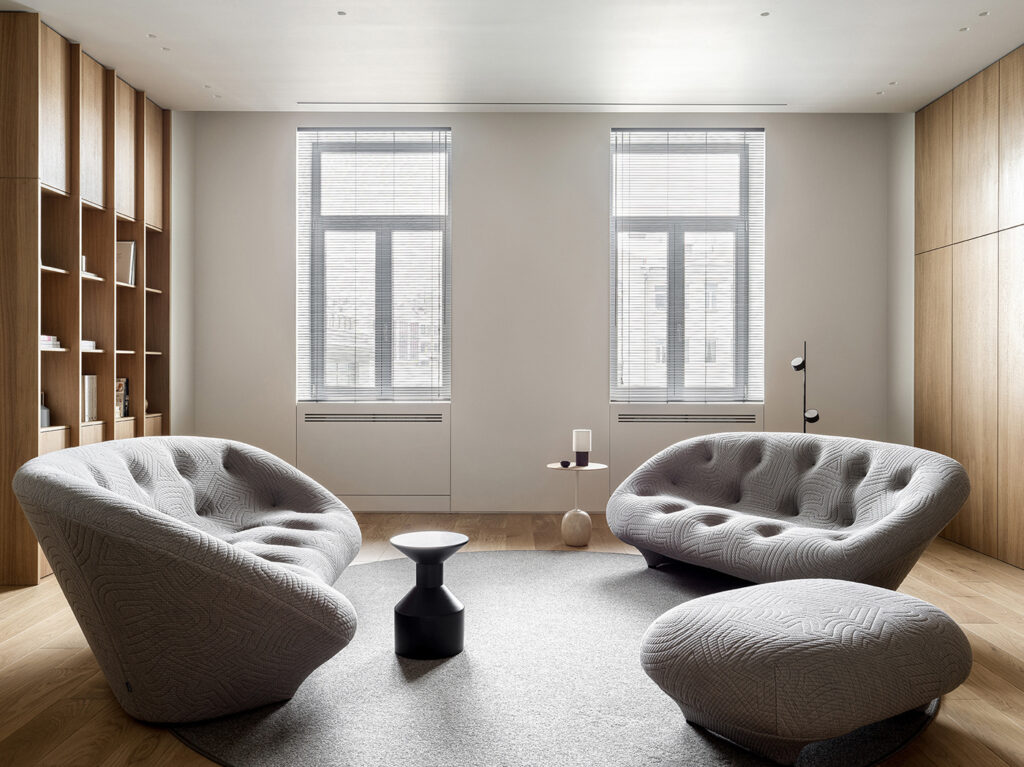
    Some spaces tell stories from the pastothers must have them coaxed gently back to life. AR09, a project by Kodd Bureau, is one such revival. This project, a three-bedroom apartment, is tucked inside a century-old building. It had been stripped of its soul by time and transformation. What remained was a structure begging for meaningone that could honor its history without being bound by it.Rather than replicate the past, AR09 reimagines it. The apartment now lives in quiet dialogue with its origins. The result is a space where legacy meets modern life and where stillness coexists with strength.In AR09, the living room, dining area, and kitchen arent segregated using walls. Instead, textures and tonal transitions do the job.The living area is softly sculptural. A pair of gray tufted sofas curve gently around a low table. The muted palette allows the tactile richness of the textiles to shine, while the rounded shapes bring a sense of movement to an otherwise linear space. The oak-clad walls that envelop the room feel less like panels and more like architecture in conversation with history.Flowing effortlessly into the dining space, a minimalist oak table anchors the room with its quiet confidence. Surrounding it, mid-century inspired gray chairs add elegance. Above, a trio of smoky glass pendant lights adds depth.Tucked just beyond is the kitchen, where we again see wooden tones. Here, minimalist cabinetry conceals function behind flat oak fronts. A gray stone countertop adds weight and texture. There are no unnecessary flourishesjust honest materials doing what they do best. Even the fixtures, like the muted brass tap, are understated.The staircase in this apartment is wooden and sleek. On the bottom floor, the vacant space next to the staircase is used for a workstation. On the upper floor, we see a barrel vault ceiling perfectly tying the space to its history.The main bedroom uses a wooden headboard, which also doubles as a partition for the dressing area. Within the sleek cabinetry is a television, paired with comfy seats, creating a gaming zone. Theres also a wooden wall-mounted desk for working the day away.In another bedroom, we see a single bed paired with a terrazzo nightstand. Perfect for a little ones use.Finally, a special mention for the sleek gray bathroom. There are no tiles, no ornate finishesjust surfaces that flow uninterrupted, creating a meditative, almost sculptural feel.
    0 Commenti ·0 condivisioni ·6 Views
  • 0 Commenti ·0 condivisioni ·5 Views
  • 0 Commenti ·0 condivisioni ·4 Views
  • The Blunt Force Trauma of the Trump Tariffs
    www.wired.com
    The US is barreling toward a recession for no good reason, and dragging the worldand a few thousand penguins on remote Antarctic islandsdown with it.
    0 Commenti ·0 condivisioni ·9 Views