0 Commentarii
0 Distribuiri

Director
Director
-
Vă rugăm să vă autentificați pentru a vă dori, partaja și comenta!
-
 WWW.DEZEEN.COMPura joins forces with Pantone to release Mocha Mousse scents and diffuserPromotion: home fragrance brand Pura has collaborated with colour specialist Pantone to launch home fragrances informed by Mocha Mousse, Pantone's colour of the year for 2025. For the Pura x Pantone collaboration, the brands have released two fragrances Mocha Suede and Mocha Moments alongside the Pura 4 diffuser in the Mocha Mousse colourway.Pura has collaborated with Pantone to release two scents informed by the 2025 colour of the yearThe brand is keen to emphasise the interplay of smell and colour for its latest home fragrance.Pantone announced 17-1230 Mocha Mousse as its colour of the year at the end of 2024, selecting the chocolatey shade to reflect the importance of "little treat culture". The comforting scent was chosen to align with the warm and homely feeling Pantone's colour aims to evoke.The Mocha Mousse-inspired scents are sold as a set, including the smart Pura 4 diffuser in the limited edition soft brown shade.The brand has also launched the Pura 4 diffuser in Pantone's Mocha Mousse shadeDesigned to be used in bedrooms, kitchens and living rooms, Pura 4 has a circular shape that releases fragrance based on the temperature of the room it is in and the user's preferred settings.The smart plug-in diffuser is controlled by the Pura app, where users can adjust the fragrance intensity, set timed schedules and track fragrance usage, allowing them to create their own "fragrance experience".Pura 4 is a smart diffuser that can be controlled in an appBy combining the Mocha Mousse colour with its fragrances, Pura hopes to offer people a multi-sensory experience in their homes."The Pura x Pantone collaboration is a creative exploration of colour experienced as scent and the roles these two elements play in design," said Pura.The plug-in diffuser has a circular shape"At first glance, colour and scent might not seem very connected," the brand continued. "But as we dig into these two elements and the senses that enable us to perceive them, it becomes clear that they're more related than initially thought.""To translate Pantone 17-1230 Mocha Mousse into fragrances Mocha Moments and Mocha Suede involved collaboration between expert perfumers and designers thinking in unconventional, multisensory ways."Mocha Mousse is a soft chocolatey brown hueFounded in 2014, Pura has over a decade of expertise in scent creation and believes fragrance is an essential part of interior design."Using scent in design should be a skilful part of the creative and design process, on par with colour, texture, furniture, fixtures, sound, and lighting," said the brand.For more information, see Pura's website here.Partnership contentThis article was written by Dezeen forPura as part of a partnership.Find out more about Dezeen partnership contenthere.The post Pura joins forces with Pantone to release Mocha Mousse scents and diffuser appeared first on Dezeen.0 Commentarii 0 Distribuiri
 -
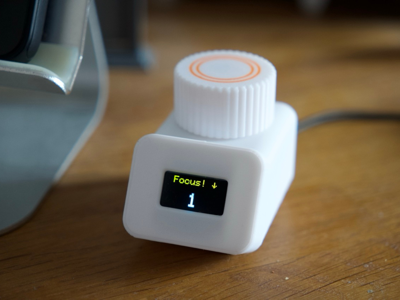 WWW.YANKODESIGN.COMCute Rams-inspired DIY focus timer is a simple, distraction-free productivity assistantIt is becoming more and more difficult to keep our focus these days, with so many stimuli and distractions flooding our way. There is no shortage of advice on how to improve our ability to focus, and most of them involve putting away most if not all of our gadgets. Some tips also include keeping track of our time and how long we keep that undisturbed focus, but we ironically try to reach for our phones first to download some focus timer app to do just that.We could always use an old-school kitchen timer, probably even one shaped like a tomato, but wheres the fun in that? Knowing that we will need every motivational boost we can get, this homemade productivity assistant helps you keep tabs on your focus streaks with a simple and tactile interface, while also offering a fun way to personalize the experience without the dangers of using a mobile app.Designer: Peter (Urban Circles)An analog timer can only count down the time, but it cant really help you keep track of how much of those pockets of productive time you already had unless you note them down by hand. Conversely, a phone app will offer a wide number of features, capabilities, and themes, but at the expense of potentially getting you distracted from the task at hand. Fortunately, it doesnt have to be an either-or situation where you can pick only one or the other, as this DIY timer proves.Made using off-the-shelf electronics and a few 3D printed parts, IGOR is billed as a loyal, cheerful assistant that helps you keep track of your focus time. Its intentionally made to be rather dumb, only counting up or down, depending on your need, and displaying a short animation when youve achieved an unbroken period of focus. It can count the number of your uninterrupted flows but it doesnt remember them. A simple reset or power outage starts you back at zero, which is also by design.What makes IGOR unique is how it mixes simple elements to create an experience that is more than the sum of its parts. It has a very minimalist design, inspired by the Braun DN 40 clock designed by Dieter Rams, and its small LCD screen displays just enough to give you only the information you need. The centerpiece, however, is actually the knob on top that lets you navigate a simple menu by turning it, or confirm selections by pressing it down.Despite its simplicity, IGOR also offers almost unlimited customization if youre willing to do the work. The rotary dials can be replaced by any 3D-printed shape you desire, allowing you to give the timer a bit of personality. If you also have some programming chops, you can even modify the software to add more flair, but hopefully without ruining its simplicity. All of these, from the design to the program, are thankfully available to the public free of charge, allowing anyone with the tools and skills to create their own distraction-free and cheerful focus assistant.The post Cute Rams-inspired DIY focus timer is a simple, distraction-free productivity assistant first appeared on Yanko Design.0 Commentarii 0 Distribuiri
 -
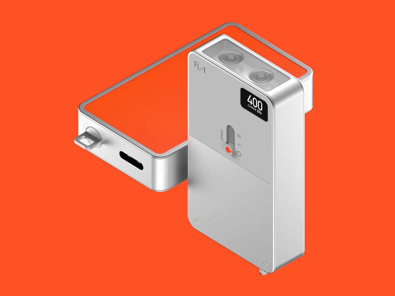 WWW.YANKODESIGN.COMTeenage Engineering-inspired flashlight concept breaks the mold with a boxy designIn the course of using some everyday products, we probably seldom stop to question why things are designed the way they are. Why are appliances like speakers and air purifiers traditionally rectangular and boxy while flashlights and lamps are cylindrical? Sometimes, the answers lie in history and practicality, but other times its just a matter of convention and the lack of motivation to think outside the box.This flashlight design concept, however, isnt afraid to dare to be different, perhaps even to the point of sacrificing some ergonomics. Embracing a trending design aesthetic, it isnt just breaking the mold by throwing out most conventions. It is also challenging those conventions to see whats possible if were not afraid to ask What if?Designer: Nikhil KapoorIndustrial design aesthetics has carried a rather negative connotation of being cold and impersonal, but recent trends have cast a more positive light on modern renditions of the design language. Teenage Engineerings products, in particular, have presented a certain flavor of minimalism that embraced the cold surface of metal, the angular and sharp edges of boxes, and an intentionally limited color palette.The FL-1 flashlight concept embraces these design elements to shock and confound. Instead of the conventional barrel form, it comes in a box that will admittedly be cumbersome to hold for long periods of time, at least depending on the size. It could easily fit in the palm of your hand, as many EDC flashlights do these days, but the sharp edges could bite into your skin over time.The design does have a few interesting features beyond its industrial aesthetic. The rectangular shape gives it enough room to fit two LED lights, which can be turned on individually or together with a simple sliding switch mechanism. Theres also a display to show the remaining battery charge so youre never caught unaware. The flashlight is charged via USB-C, which is the only reference to the correct scale of the object.Like Teenage Engineerings designs, the FL-1 practically uses only two colors, or three if you count the contrasting shade of gray. A vibrant orange backside increases its visibility, but only if its upside down, while theres no method for seeing the flashlight in the dark if its right side up. The concept definitely has its flaws, but it is still a worthwhile thought experiment on how we can challenge the status quo and come up with designs that arent just different but also even better.The post Teenage Engineering-inspired flashlight concept breaks the mold with a boxy design first appeared on Yanko Design.0 Commentarii 0 Distribuiri
 -
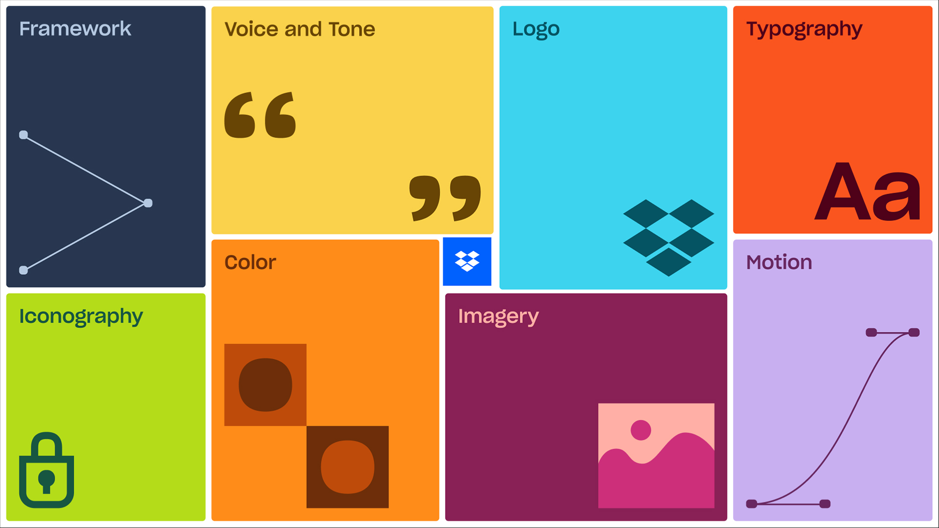 WWW.CREATIVEBLOQ.COMDropbox's new brand identity website puts boring style guides to shameStatic style guides are no more.0 Commentarii 0 Distribuiri
 -
 WWW.CREATIVEBLOQ.COMThe Super Bowl logo conspiracy just got even more ridiculousChiefs vs Eagles confirms the theory (kind of).0 Commentarii 0 Distribuiri
 -
 WWW.MACWORLD.COMThis MacBook Pro was too busted for even AppleCare+ to repairMacworldCustomers often debate whether its worth getting AppleCare+ coverage for their Apple products. This represents a substantial additional cost, but in the event that your device suffers accidental damage, the policy will cover most of the cost of repairs. On balance our advice tends to be that taking out third-party insurance instead, or simply saving your money, using a case and being careful, is a better option. But its really a personal decision.Your decision may, however, be influenced by a case that surfaced on social media recently. A Redditor going by frk1974 (possibly not their real name) says they were involved in a serious car accident in which their MacBook Pro was severely damaged: an accompanying photo shows a machine that is catastrophically bent and buckled. Worse still, when they went to Apple to ask for this to be covered by AppleCare+, they were told that it could not be replaced because it was too damaged.Needless to say, frk1974 was displeased by this decision, describing it as a sad story and money wasted. It does seem odd since the entire purpose of taking out AppleCare+ coverage is to guard against accidental damage. Damage such as this, one would imagine.Ive just looked through the terms and conditions [pdf] for current AppleCare+ policies, and be warned that its 17 pages long; for this reason, as well as my lack of legal expertise, please dont take my analysis as watertight. (Its also possible that the Redditor has left out important aspects of the case, or is misreporting Apples actions and/or statements.) But while I can see a few reasons why Apple may have made this decision, none fit with the description too damaged.In the T&Cs, there is a list of 14 exclusions: circumstances under which Apple will not cover accidental damage. And of these, I think two could apply here.(d) To repair damage caused by reckless, abusive, willful or intentional conduct, or any use of the Covered Equipment in a manner not normal or intended by Apple: Being involved in a car accident where the Redditor acknowledges they were at fault (I was the driver that caused the accident) could potentially be argued to be reckless conduct, and certainly wouldnt be intended usage.(k) To repair damage caused by fire, earthquake or other external causes: It doesnt appear that the accident caused any fire damage, but perhaps that vague phrase other external causes could be argued to include major accidents like this.But the Redditor describes the conversation differently: [They] immediately pointed me to a paragraph in the [AppleCare+] terms where they state: folded and crushed devices are not covered This is not advertised at all of course, but its there.Ive run a search for the words folded and crushed and cant see them anywhere in the T&Cs Im looking at. Perhaps this means the Redditor signed up at an earlier date and consequently has a different set of conditions. Or perhaps they, or the member of staff they spoke to, became confused at some point in the conversation.AppleCare+ for Mac costs $299 for three years of coverage and is supposed to cost $99 for screen damage or external enclosure damage or $299 for other accidental damage. Apple also sells AppleCare+ with Theft and Loss but only for iPhones.Nevertheless, it seems that we should update our advice to say that you should carefully check the terms of your AppleCare+ policy to see if unusual situations like this are covered. And be prepared to, as one commenter suggests, take a hammer and make it straighter.0 Commentarii 0 Distribuiri
 -
 APPLEINSIDER.COMApple's iPad mini 7 is back on sale for $399 in month-end price warApple's latest iPad mini 7, released in Oct. 2024, is back on sale for $399, reflecting a $100 discount at Amazon and Best Buy.Save $100 on Apple's iPad mini 7 - Image credit: AppleNumerous models are $100 off today at Amazon and Best Buy, with iPad mini 7 prices starting at $399 after the discounts.Buy from $399 Continue Reading on AppleInsider | Discuss on our Forums0 Commentarii 0 Distribuiri
 -
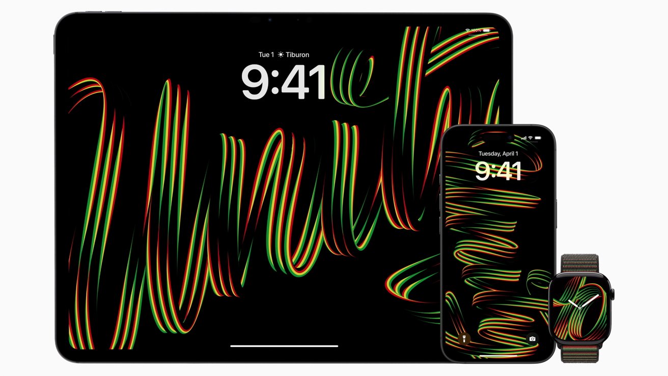 APPLEINSIDER.COMApple's Black Unity Apple Watch band uses a color-changing loop effectApple has launched its 2025 edition of the Black Unity Sport Loop for Apple Watch and device wallpapers, as the company once again honors Black History Month.The Black Unity collection for 2025Apple marks Black History Month every year with an Apple Watch band made for the occasion. While 2024 involved a flower motif and a mosaic pattern was used for 2023, the 2025 effort employs a line and handwriting-based design.Subscribe to AppleInsider on YouTube Continue Reading on AppleInsider | Discuss on our Forums0 Commentarii 0 Distribuiri
 -
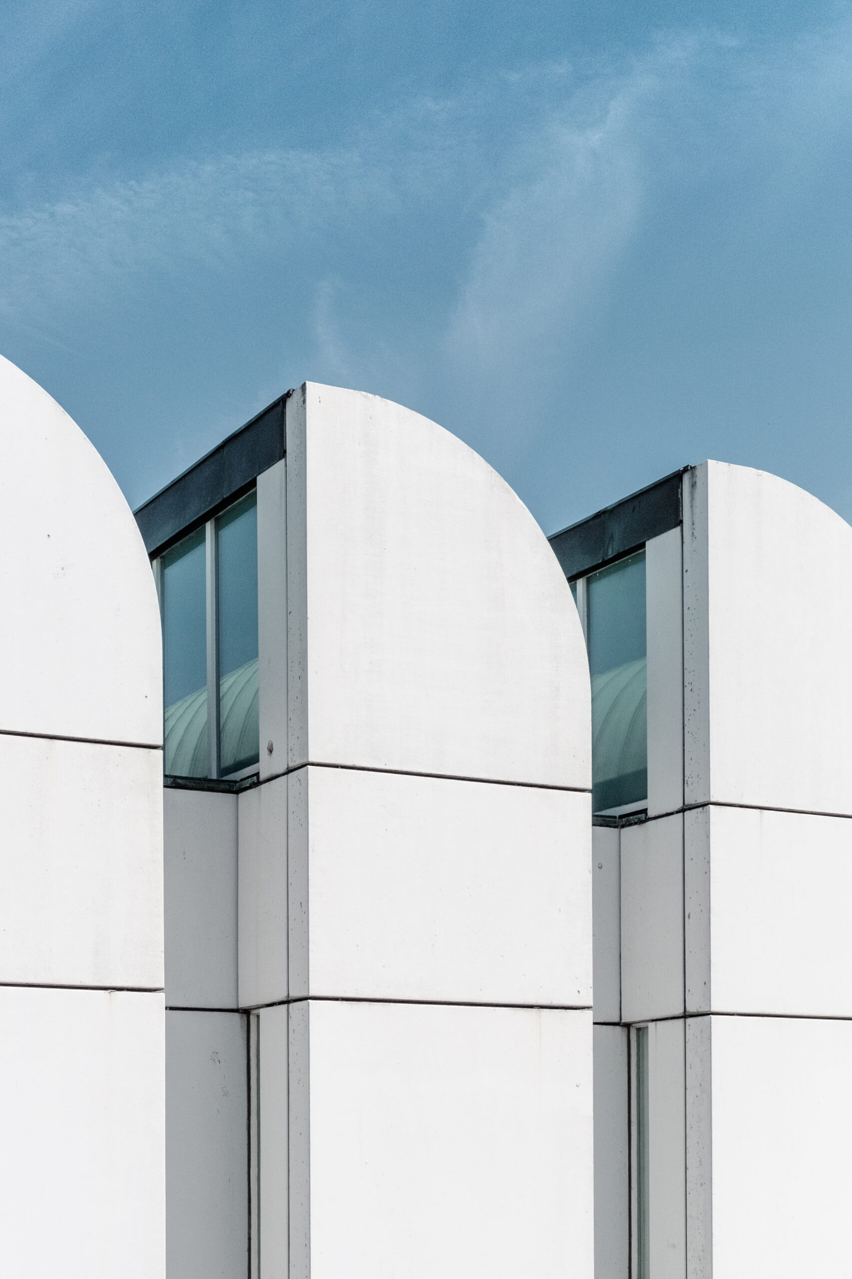 ARCHITIZER.COMBauhaus Beyond Buildings: The Architectural Movements Impact on Modern Art and DesignCalling all architects, landscape architects and interior designers: Architizer's A+Awards allows firms of all sizes to showcase their practice and vie for the title of Worlds Best Architecture Firm. Start an A+Firm Award Application today. The word interdisciplinarity has gained immense traction in the contemporary world, especially in the field of arts and humanities, where these disciplines continuously intertwine. A recent article in QS Insights Magazine revealed that even though interdisciplinary collaboration is indispensable and common in modern university research, only now are postgraduate and undergraduate degrees becoming established and advocating for a more inclusive education.In the case of architecture, the discipline has always been covertly or rather quietly interdisciplinary, with architects studying art, physics, philosophy, craft, sociology etc. along with design, theory and construction. Although today this is well recognized, so far there has only been one school, founded more than a century ago, that acknowledged the value of interdisciplinarity so strongly and advocated for an innovative way of thinking in the field of architecture and design. This article investigates the particular schools educational model, focusing on everything apart from architecture, in an attempt to view the specific discipline through the lens of its immediate (and maybe not so immediate) influences.Samuel Zeller samuelzeller, White Bauhaus architecture (Unsplash), CC0 1.0 (marked as Public Domain)The famous Bauhaus school was founded in 1919 and remained operational until 1933. Even though it functioned for merely fourteen years, the school introduced a new approach to design that has steered the direction of art, design and architecture throughout the 20th and 21st centuries. Its core philosophy was to integrate art, craft and technology to produce works that were based on functionality and simplicity, promoting a holistic approach to creative education, while contrasting the eras flamboyant and highly decorative movements.Walter Gropius, the schools founder, dreamed of a union between art and design and developed a craft-based curriculum that combined architecture, sculpture and painting along with craft-based workshops into a single creative expression.Visual Arts in the BauhausPaul Klee creator QS:P170,Q44007, Postkarte Bauhaus Paul Klee Die erhabene Seite, marked as public domain, more details on Wikimedia CommonsUpon entering the school, students were immediately exposed to color theory, material studies and formal relationships, taught by visual artists like Paul Klee, Vasily Kandinsky and Josef Albers. Translucent geometric shapes and a never-ending dance between the abstract and the figurative, characterized the paintings produced by the Bauhaus school. Instead of representing the real, the work reveled esoteric symbolisms and complex narratives that captured the imagination.The Bauhaus Cabinet-Making WorkshopDaderot, Wassily Chair by Marcel Breuer, reproduction, 1925, chrome covered steel and belting leather University of Arizona Museum of Art University of Arizona Tucson, AZ DSC08026, CC0 1.0 (Public Domain)After completing the preliminary curriculum, students entered specialized workshops, where practical arts (architecture, interior design, textiles) were suddenly combined with the pure and rather idealistic nature of the fine arts (painting and sculpture). The cabinet making workshop, run by Marcel Breuer, practically reconceived the essence of furniture, challenging the form of the chair, for instance, and reducing it to its most basic existence.The Bauhaus Textile WorkshopArt is a word, Anni Albers (18991994), Design for Wall Hanging, 1925, marked as public domain, more details on Wikimedia CommonsThe textiles workshop delved into the study and experimentation of unorthodox materials. Especially, under the guidance of Gunta Stlzl, students were encouraged to weave using cellophane, fiberglass and metal, eventually producing works that had tremendous commercial success and even contributed to the schools funds.The Bauhaus Metalworking WorkshopChristos Vittoratos, Christian-dell molitor-office-work-lamp-light, CC BY-SA 3.0Metalworking produced perhaps the most famous design work, after architecture. Through the employment of sculptural principles and a philosophy of mass production, students developed prototypes for lighting fixtures and tableware, becoming the first pioneers of industrial design. The objects focused on functionality and ease of use, without however sacrificing the slim and pure design aesthetics promoted by the school.The Bauhaus Typography WorkshopHerbert Bayer / Unibib Weimar, StaatlichesBauhaus Vorderdeckel, CC BY-SA 4.0The typography workshop slowly gained popularity, especially under figures such as the graphic designer Herbert Bayer. Typography was gradually conceived as both the means of communication and artistic expression. In fact, the promotional material featuring the famous sans serif typefaces and photography, shaped the commercial identity of the school.Functional Design and Mass ProductionThe Bauhaus movement emerged during a time when the world envisioned a utopian future, focusing on functional design and leveraging mass production to realize that dream. While architecture was arguably the discipline most closely associated with the movement largely due to the significant influence of its products the movements success is fundamentally tied to the interdisciplinary nature of the schools curriculum. Without this integration of diverse fields, the Bauhaus architectural principles would not have achieved such a revolutionary impact.One last question remains: if we were to establish a new school of architecture and design now, a century later, what type of interdisciplinary curriculum would scholars and practitioners suggest? What does the current world lack and what type of synergy between architecture, art and design is required to once again shake the field for the next 100 years?Calling all architects, landscape architects and interior designers: Architizer's A+Awards allows firms of all sizes to showcase their practice and vie for the title of Worlds Best Architecture Firm. Start an A+Firm Award Application today.Featured Image: Paul Klee creator QS:P170,Q44007, Paul Klee Laternenfest Bauhaus 1922, marked as public domain, more details on Wikimedia CommonsThe post Bauhaus Beyond Buildings: The Architectural Movements Impact on Modern Art and Design appeared first on Journal.0 Commentarii 0 Distribuiri


