Core77
Core77
Design Magazine & Resource www.core77.com
  • 1 Bu gibi insanlar
  • 273 Yazı
  • 2 Fotoğraflar
  • 0 Videolar
  • 0 önizleme
  • Design & Architecture
Site içinde arama yapın
Son Güncellemeler
  • WWW.CORE77.COM
    Industrial Design Case Study: The PureTorque Training Aid
    "An elite physical trainer came to us with a prototype of what would become the PureTorque, a scientifically proven tool for more effectively targeting the muscles in your torso," writes industrial design firm The Metcalfe Group. "We were able to refine his original idea to create something that was light, easy to use, strong, visually compelling, and, most importantly, incredibly effective." Early prototypes removed mass from the inventor's prototype and focused how the device should be held and contact the body. This prototype sought to replicate the final materials for the pads and was adjustable to make sure we got the size, shape, and ergonomics just right. Once this was approved through testing with users, we 3D scanned the prototype for use in the next phase. Once the function and ergonomics were worked out, we created concepts to explore aesthetics and manufacturing methods. These started with hand sketches then were developed further in CAD iterations. In order to keep the device as light as possible while ensuring it was robust enough to handle the toughest workouts from professional athletes, we ran numerous finite element analysis (FEA) simulations that tested its strength digitally. This allowed us to iterate quickly and fix any potential trouble spots before moving to more expensive and time intensive CNC prototypes and production tooling. EMG testing (used to measure muscle activity) was done using a CNC machined prototype to measure the PureTorque's effectiveness. These scientific tests showed a 40%-75% increase in utilization of core muscle groups, leading to a more effective workout. After the design was thoroughly vetted, we moved to production using die-cast aluminum. The Metcalfe Group was relied on to take the product all the way from sketches and rough prototypes through manufacturing sourcing.Tyreek Hill, one of the fastest players in NFL, endorsed the product, saying "The very first moment I used PureTorque I thought, 'Damn, this thing is different.' I have been hooked ever since." You can see more of The Metcalfe Group's work here.
    0 Yorumlar 0 hisse senetleri 3 Views
  • WWW.CORE77.COM
    Core77 Weekly Roundup (11-18-24 to 11-22-24)
    Here's what we looked at this week:LG develops a stretchable display that can follow compound curves.Material science + fear-based marketing: The Armor-Tex is a stab-proof jacket. Nike showed off their 3D-printed Air Max 1000s.Industrial Design student work: Maoxin Yuan's therapeutic eyewear.Transportation designer Alan Derosier got the chance to turn his Xmas card concept sketch into a real electric motorcycle, the Rocket One.Accessories for your sneakers, courtesy of Adidas and AvAvAv.Industrial Design student work: The multiple-award-winning Community Gravestones project, by Cameron Brentlinger of Pratt Institute.This eBarrow Kit, an easily retrofittable electric-powered wheelbarrow wheel, was invented by a medical device expert.Peak Design's Tech Pouch: An organizing bag with better UX. Sadly it's now being knocked off by design pirates.Subversive design: The Robin Clip was designed to let you sneak an Apple Watch Into competitions.A modernist coffee grinder designed with obsessive attention to UX.A new furniture category: Bateman Labs' modular armchair-based workstations / gaming stations.Objects to satisfy the "slow life" desire for cozy: Rolife's miniature reading nooks.Harley-Davidson's LiveWire to release designey electric scooters.Base Case: A portable dual-monitor set-up in a luggage form factor.To celebrate their 50th anniversary, Casio is releasing these functional ring-sized watches.This cordless C1 Ultrasonic Cutter is like a power X-acto knife.Industrial design case study: The PureTorque training aid, by industrial design firm The Metcalfe Group.
    0 Yorumlar 0 hisse senetleri 3 Views
  • WWW.CORE77.COM
    Harley-Davidson's LiveWire to Release Designey Electric Scooters
    Harley-Davidson has pivoted with the times. Once known for producing heavy, gas-powered, ear-splitting hogs, the company released its Livewire electric motorcycle in 2019; it then spun Livewire off as its own electric motorcycle brand. And Livewire is now reaching downmarket to target consumers you'd never associate with H-D: The scooter crowd."LiveWire is excited to announce the expansion of our strategic partnership with globally recognized powersports company KYMCO, in creating LiveWire's debut maxi-scooter."As you can see, they're planning both an off-road version and a city version. Both will be powered by the company's S2 electric powertrain. And while these are just concept images, the company says "We intend to enter this category in a way that only LiveWire can, with products that stand apart visually, technically, and experientially." The company says these will hit the market in 2026.
    0 Yorumlar 0 hisse senetleri 4 Views
  • WWW.CORE77.COM
    Base Case: A Portable Dual-Monitor Set-Up in a Luggage Form Factor
    A company called Base Case has crammed two 24" monitors into a rolling carry-on form factor:It's got built-in telescoping legs and a built-in power cable, giving you one less thing to pack.Other than these teaser images, there's virtually no information on either the product or the company; they only say they're launching it "soon."
    0 Yorumlar 0 hisse senetleri 5 Views
  • WWW.CORE77.COM
    Another Retrofittable Electric-Powered Wheelbarrow Wheel
    I've drooled over Makita's battery-powered wheelbarrows, which would make yardwork and homesteading far easier. But they run about $5,000, and they're Japanese-market only. Another Japanese company, CuboRex, designed this E-Cat. It's a retrofittable electric wheel that can be added to any wheelbarrow. However, it costs $1,261. The latest competitor in this category is the eBarrow Kit, designed by American engineer Dr. Ivan Vesely. It's easy to retrofit, by design; the brackets can be lined up with the existing mounting holes on standard one-wheel wheelbarrows commonly sold in the U.S. After bolting it on, you run the wire back to one of the handles, attaching the thumb throttle with an included strap. Dr. Vesely reckons installation can be done in four minutes. The installation does indeed look easy:Dr. Vesely held a successful Kickstarter for the eBarrow Kit, where they sold for $350. Alas, now the campaign's over and these are up to their market price: $500. Which just about matches a similar object designed for baby strollers, the $495 Easy-Way.One concern with buying such a pricey add-on is longevity: How long will this thing last for? If Dr. Vesely's other work is any indication, hopefully a long time: Though his first degree was in Electrical Engineering, Dr. Vesely has a PhD in Biophysics, and invented/developed a successful exchangeable heart valve.
    0 Yorumlar 0 hisse senetleri 22 Views
  • WWW.CORE77.COM
    Peak Design's Tech Pouch: An Organizing Bag with Better UX
    Rooting around in a bag for small objects gets irritating fast. This handsome Tech Pouch, by Peak Design, solves that UX problem: The sides are designed to open like a clamshell, allowing you to clearly see the contents in the compartments within. The bag proved to be a hit with consumers. Even still, after some customers opined that the bag was too big, Peak Design listened and subsequently designed a smaller version.It's a great designand pirates have taken notice. The Tech Pouch is currently being knocked off by an overseas company on Kickstarter. Buyer beware.
    0 Yorumlar 0 hisse senetleri 24 Views
  • WWW.CORE77.COM
    Subversive Design: A Clip Designed to Let You Sneak an Apple Watch Into Competitions
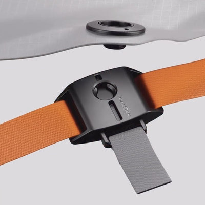
    The United States Tennis Association (USTA) bans the wearing of Apple Watches during competition. The thinking is that you could be coached from afar, providing an unfair advantage. But Florida-based inventor Peter Springer reckons that a competitive event is precisely when a serious athlete would want their physical stats tracked. He thus designed this Robin Clip, which allows you to secret an Apple Watch on your body, with the sensor pressed against your skin (and the face not visible). The Robin Clip is also handy for tracking one's fitness in situations where you don't want to, or cannot, wear a watch (combat sports, for example). The gizmo is made out of silicone, with a steel spring clip. Springer is currently running a Kickstarter, with 10 days left to pledge at press time. The Robin Clip runs $25.
    0 Yorumlar 0 hisse senetleri 5 Views
  • WWW.CORE77.COM
    A Modernist Coffee Grinder Designed with Obsessive Attention to UX
    As a (lapsed) industrial designer, this object is fascinating to me, in the same way certain EDC objects are. This Geimori GU Series coffee grinder, by a Chinese startup called Wirsh, has been designed with both modernist looks and an obsessive attention to UX.Targeted at true coffee nerds, the machine promises to grind beans with repeatable precision and accuracy, without scattering any of the grinds during the transfer process, and is easy to clean. Take a look at its operation:It comes in two variants, the GU64 and the GU78, with the numbers referring to the diameter fo the grinder. Running $300 and $600, respectively, they've been successfully Kickstarted with nearly $150K in pledges at press time, with 7 days left to pledge. Part of me does miss the early days of Kickstarter, when individual design entrepreneurs were trying to get their stuff out there. This project follows the pattern we've seen from a lot of (presumably deep-pocketed, possibly state-backed?) Chinese manufacturers, which is to first flood the Western influencer market with free samples, having them build up buzz with their YouTube channels, then kicking off the campaign. Seems to work every time.
    0 Yorumlar 0 hisse senetleri 5 Views
  • WWW.CORE77.COM
    Transportation Designer Turns Xmas Card Concept Sketch into Real Electric Motorcycle
    Alan Derosier is a French transportation designer. (We looked at his excellent work here.) Derosier has a quirky habit of sending out family Christmas cards with fanciful concept renderings on them, like this one:Derosier got a chance to realize that concept, albeit with wheels. He was contacted by Eyelights, a French company that makes heads-up displays for motorcycle helmets, to help them produce a prototype electric motorcycle. The resultant design is called the Rocket One: Derosier provides some background info:"This is my first motorcycle project, and what a fun project it was! As it was something new for me and I had no experience in that field, I decided to approach it exactly the same way as with cars. I started with the proportions and silhouettes research, then balancing the masses and refining the surfaces, to finish with all the tech details." "The tricky part was to try to make it feel as light as possible even though it carries these huge batteries." "Done in a record time of 3 months from 1st sketch to working prototype! Supported by a team of incredibly skilled people from @l2concept (Alain Grandjean & David Carvalho) : 3D modeling (@_clara_rt_ , Anthony & Bernard), electronic specialist to setup all the lighting animations on the prototype (Jerome & Anthony), the team of assemblers (Manon, Julie & Jeff) the painters (Christian & BenJ) . But also video makers (Julien & Quentin) and photographer/retoucher (@tomwheatley.eu). This project is called ROCKET ONE and was initiated by Romain Duflot @duff.ro for his company EYELIGHTS @eyelightsfr." Eyelights says the bike is production-ready, and has started an e-mail notification list. No prices have been announced.
    0 Yorumlar 0 hisse senetleri 5 Views
  • WWW.CORE77.COM
    Adidas' Superfinger Superstar Sneaker Accessories
    Well folks, our society has "advanced" to the point where you can now buy accessories for your sneakers. These Superfinger Superstar kicks are a collaboration between Adidas Originals and Italian fashion brand AvAvAv: The strap-ons are a nod to AvAvAv's Finger Boots: Am not sure what's crazier: The fact that these run $280, or that they're sold out.
    0 Yorumlar 0 hisse senetleri 5 Views
  • WWW.CORE77.COM
    Industrial Design Student Work: Community Gravestones for Potter's Fields
    This Community Gravestones project is by Cameron Brentlinger, an Industrial Design student at Pratt Institute. Brentlinger put an incredible amount of thought and research into the work, which seeks to destigmatize a taboo subject: NYC's anonymous mass graves. The goal was to create "dignified memorials and ceremonies for unidentified or unclaimed people at the end of life."COMMUNITY GRAVESTONE is an equitable gravestone design for Potter's Fields. It is an impermanent memorial made from local adobe for individuals who are interred in mass graves. The ritual seeks to provide dignity, remove the stigma of these cemeteries, and create a space for collective grief by creating gravestones and arrangements for a communal burial space. Nature is used as a tool to acknowledge the cyclical quality of life and the interconnectedness of all beings to create a welcoming space for the living and the dead. ResearchHart Island is New York City's Potter's Field for the unclaimed and unidentified located off the Bronx. There are over a million unidentified New Yorkers buried on the island. Design Values How It WorksAfter identifying the core values for the design, I started storyboarding a concept for an interactive making ceremony and memorial that allows the public to acknowledge and pay respects to those who are buried. MaterialsHart Island is a burial site that goes through immense change. It felt necessary to find a material that also goes through change to symbolize the impermanence of these memorial spaces, our memories, our lives, and the change of our grief cycles. For this reason I decided to use local adobe (clay, sand, silt, and hay) which with break down into the soil overtime. Mold PrototypeThe mold was designed as simple and intuitive as possible to allow the grave making process to be easy for the cemeteries to output. Gravestone Prototypes and ArrangementsThe gravestones are laid out in the field with suggested pattern arrangements. People as well as plants and insects are invited to come and appreciate the forms and pay tribute to the members of the community who are buried there. ConclusionAnd so, For a moment's time these physical bricks will exist above the mass graves, slowly evolving as hints of lichen and bugs inhabit its crevices. Eventually, the brick will combine with the soil that is made up of those who were buried before. New life grows from the soil and the pattern continues. Interestingly enough, Brentlinger started out studying Photography at Pratt, but was drawn to Industrial Design after creating her own photography sets. "I realized Industrial Design was much more than just making things," she told Pratt News, citing the extensive research, problem-solving, and collaboration required in ID. "I fell in love with the design process. I feel like I can design or make anything as long as I go through these steps that I was taught."Community Gravestones won both a 2024 Change Agent and Activism in Sustainability Award and a Material Lab Prize.
    0 Yorumlar 0 hisse senetleri 5 Views
  • WWW.CORE77.COM
    LG Develops a Stretchable Display
    This month LG showed off a prototype of their stretchable display, which can be expanded up to 50%, stretching from 12" to 18". The micro-LED display has a 100ppI resolution and displays RGB.The company was able to achieve the feat by using silicon substrate and a proprietary wiring structure. It presumably wasn't cheap to develop, but the company didn't do it alone: With the backing of South Korea's Ministry of Trade, Industry and Energy (MOTIE) and the Korea Planning & Evaluation Institute of Industrial Technology, LG did joint R&D on the project with 19 different domestic industry and research institutes. So what's the actual application? "Stretchable displays are not only thin and lightweight but also capable of adhering to irregularly curved surfaces like clothing and skin," the company writes. "They are expected to be widely applied in various industries, from fashion and wearables to mobility." Additionally, they released a press image of the screen having been stretched over a contoured automotive interior panel, below, and they mention (but don't show) that it could be integrated with firefighters' uniforms to provide communications.
    0 Yorumlar 0 hisse senetleri 5 Views
  • WWW.CORE77.COM
    Nike's 3D-Printed Air Max 1000s
    This past weekend at ComplexCon in Las Vegas, Nike unveiled their 3D-printed Air Max 1000. The kicks were created in collaboration with Zellerfeld, a German manufacturer of 3D-printed footwear. Zellerfeld's process means you can create different densities of cushioning in different parts of the shoe as shown below, with a non-Nike example: Nike Chief Innovation Officer John Hoke calls the production method of the Air Max 1000s as "control, times precision, times expression all of which are vital to sport and to design." That said, as with a concept car, no production plans have been announced.
    0 Yorumlar 0 hisse senetleri 4 Views
  • WWW.CORE77.COM
    Industrial Design Student Work: Therapeutic Eyewear
    This Sooze project is by Maoxin Yuan, done while studying Industrial Design at Australia's UNSW Sydney. Yuan tackled a degenerative eye disease:"Keratoconus is a progressive eye disease that leads to thinning and protrusion of the cornea. It further results in irregular astigmatism and serious eye discomfort."Sooze provides comfort and vision support for keratoconus patients through a modular system of a neural stimulating headband and detachable visor module." "The visor module and the light engine in the headband work together to capture and deliver clear images directly to patients' retinas, regardless of their cornea shape. The electrode on the headband sends low-intensity electricity to the patient's upper eye and forehead area through a conductive textile strap, increasing patients' tear production and easing their eye pain when they are awake and asleep. The light engine emits red light at night when the visor is off, further improving keratoconus patients' sleep quality." Yuan's project won him an Australian Graduate of the Year Award.
    0 Yorumlar 0 hisse senetleri 4 Views
  • WWW.CORE77.COM
    Material Science + Fear-Based Marketing: A Stab-Proof Jacket
    Material science combines with fear-based marketing in this Armor-Tex jacket. The Chinese-made garment is said to be stab-proof, and needed because "violent crimes are lurking in the hidden alleys of society." The nondescript black windbreaker features an intergrated 3.9mm-thick carbon fiber vest, which provides "complete torso protection against stab, spike, and cut threats in any direction" (but doesn't protect your arms, naturally). Unsurprisingly in our current climate, the jacket has gone gangbusters on Kickstarter, landing $160K in pledges at press time, with 16 days left to pledge. Prices start at $269.
    0 Yorumlar 0 hisse senetleri 6 Views
  • WWW.CORE77.COM
    Industrial Design Case Study: Nike's Accessible Backpack
    We don't get many softgoods case studies, and here's a great one: Nike's Elite EasyOn backpack, originally designed for Paralympians. When Richard Ramsay was a basketball-obsessed teenager, he remembers how his dad would periodically chase him down the court during games to help him retie his shoelaces. Ramsay was born without his left arm, and while his disability didn't stop him from excelling in sports like basketball and football, the challenge to complete dexterous tasks like retying a shoelace was real, and it motivated him to study the human body's interaction with the physical world. He'd go on to study kinesiology at university, compete on his program's basketball practice squad, and graduate into a footwear creation career at Nike, where he eventually joined the Universal Ease team in creating more accessible performance products. He's both a practitioner of, and a validator for, the gear that makes daily life more useful for all athletes. In the spring of 2022, Nike Lead Equipment Designer Brent Radewald met with Ramsay now a Senior Footwear Developer to show him a prototype of a new backpack developed for the brand's Paralympic athletes ahead of Paris 2024.The goal: take maybe the most purely functional piece of equipment that exists, the backpack, and make it easy for all athletes to use. Easy to open. Easy to close. Easy to stay secure.Richard Ramsay, Nike Sr. Footwear Developer, wears the Ease Backpack, a Paralympic innovation that is now available for all athletes."A comment we were frequently hearing from adaptive athletes was how difficult it was to open and close traditional backpacks without a high-dexterity anchor point, like a hand," says Radewald. "If they don't have full use of both hands, small features like zippers and pull tags can be hard to grip."Once athletes opened the bag, the contents needed to be accessible from the very top. Someone with low dexterity, like a quadriplegic, can't easily rummage around the base of their bag and expect to grab what they need. Each component of the bag, down to the circumference of a zipper loop, had to be efficient for athletes of all abilities to use. The product benefits couldn't be particular, but universal.With that in mind, Radewald and his team got to work.Rethinking the BackpackThe first step for Radewald's team was to rethink the traditional opening system. Relying completely on a zipper to close the bag requires the zipper to travel a continuous, winding path from start to finish, which can be challenging for athletes with low motor skills. Radewald and his team brainstormed alternative ways to open the bag. Radewald began the process of testing different sizes, strengths and orientations of magnets and hook and loop. Eventually, the team landed on a patented magnetic closure system that was backed against a TPU-reinforced lining, using the magnetic pull to "swing" the top flap shut and secure it in place. "Magnets and hook and loops have different strengths based on the direction of the opening force, says Radewald. "Magnets have great vertical power in keeping something tight up and down, but they don't hold up as well to shearing forces, side to side. Hook and loops have nice shearing strength, but less vertical strength. If there was some combination of those elements that we put together, we might have something special." By design, the top flap can be opened using one hand when the user applies light force from on top, requiring much lower dexterity than with a traditional backpack. For added security, a G-hook on the back of the bag loops through the top flap, keeping it sealed tight. The team would develop three more prototypes after rolling out the first EasyOn bag for testing, consulting many of Nike's product experts like Ramsay for their observations. The log book describing the bag's updates over the course of two years is filled with precise, meticulous changes: Move top zipper pocket by 1.5 centimeters. Make bottle pocket finger loop 2 centimeters wide. Of course, these improvements couldn't just remain concepts on a product diagram; they had to be practically tested in real conditions that were comparable for athletes with low dexterity. In review sessions, Radewald and his team would attempt to open and close the bag using oven mitts and kitchen utensils like salad tongs. They also held lengthy product feedback conversations with a local wheelchair rugby team, the Portland Pounders.The designs for the EasyOn bag prototypes spanned over two years. Each update needed to make the backpack more intuitive and reliable for daily use. The beauty of the prototype reviews, says Radewald, was how cosmetic variables like colorways common to footwear are secondary to equipment like backpacks. Is this backpack easy for you to use? That's the simple question they presented to the Pounders. Based on the feedback, all signs were pointing to yes.At the same time, the adaptive athletes' feedback revealed new opportunities. One of them, echoed by Ramsey during his feedback sessions, was creating a modular strap system."If we can create a better bag for our adaptive athletes, we create a better product for every athlete." --Brent Radewald, Nike Lead Equipment Designer"Many of the wheelchair athletes we worked with didn't have a bag that worked well with their wheelchairs," says Ramsay. "If you didn't have wheelchair handles that were a standard width, you were out of luck in securing your bag. You'd have to move around with it on your lap."Patented clasps on the backpack's straps allow the user to widen or narrow the bag's fit across wheelchair handlebars, not to mention across the athlete's shoulders a helpful feature that Ramsey witnessed when showing the prototype to his brother."My brother is close to 100 pounds heavier than me, and he adjusted the same EasyOn backpack I have and wear it comfortably," says Ramsay. "The backpack isn't just a better bag for disabled athletes. It's a better bag for everyone."The backpack's modular strap system allow the bag to be carried in many different ways. The straps can be widened or narrowed to fit over wheelchair handlebars. This universality is what excites Radewald ahead of the bag's debut on nike.com this season. Beyond Paralympians, any athlete from pros to weekend warriors to students can benefit from a more efficient, more intuitive backpack."Universal design helps all athletes perform at their best," says Radewald. "If we can create a better bag for our adaptive athletes, we create a better product for every athlete."The Elite EasyOn Backpack is designed to be a more intuitive backpack for all athletes. "The backpack isn't just a better bag for disabled athletes," says Ramsay. "It's a better bag for everyone."
    0 Yorumlar 0 hisse senetleri 5 Views
  • WWW.CORE77.COM
    Furniture Design History: Willy Guhl's Loop Chair
    "If we succeed in finding solutions that correspond to each material, it will result in completely different design methods and formal characters."Those words were written by Willy Guhl, one of Switzerland's first industrial designers, in 1950. He backed up that philosophy with action. In 1951, he was teaching at the Zurich University of the Arts when he learned of an interesting opportunity: Eternit, a Swiss company whose eponymous product was fiber cement produced in sheets, contacted the school, inviting them to think of applications for their stuff.Eternit, the product, was a composite sheet of material containing cement and fibers. It could be molded, and it was durable and weatherproof; up until then it had been used to make siding and roofing.Image: Harald Weber, CC BY-SA 3.0 Guhl saw another possibility. He created a wooden mold with the exact same surface area as a single sheet of Eternit. He then laid the sheet over the mold, and after the cement set up, he had what would be known as the Loop chair.There was zero waste in Guhl's production process. Each Loop chair uses a single sheet of Eternit, and Guhl hid the seam skillfully (to this day I have no idea where the seam is, at least on the originals). Guhl's use of Eternit could be likened to what the Eameses did with plywood, which was to turn a building material into an elegant piece of furniture. Eternit, the company, was thrilled; the chair became a hit, and stayed in production for decades. There was just one problem, which wouldn't come to light for some time. One of the fibers in Eternit is asbestos; part of what made Eternit popular was its fire-resistance. But asbestos of course causes lung cancer, and as awareness of the material's harmful nature grew, the Loop chair was discontinued in 1980.Guhl subsequently redesigned the chair, and in 1997 an asbestos-free variant went into production. The redesigned version has two telltale grooves in the back, allowing any collector to easily tell it apart from the asbestos-containing classic. And the production was a little sloppier; with the modern version, you can clearly see the seam on the front of the chair, which I consider kind of traitorous to the original design. Health concerns aside, today the original sells for around $8,000 on auction sites.
    0 Yorumlar 0 hisse senetleri 8 Views
  • WWW.CORE77.COM
    Competition: Design a Tiny Home for a Young Couple
    Got an idea for a tiny home? Kingspan, an Irish company that specializes in insulation products, is sponsoring a design competition for a home no larger than 269 square feet. The MICROHOME Kingspan Edition 2024/25 invites participants to conceptualize an off-grid modular dwelling that would accommodate a hypothetical young professional couple. This scenario serves as the benchmark family size for the competition. The total floor area of the structure should not exceed 25 m2 (269 sq. ft.), thereby encouraging participants to push their creativity and innovate within these parameters. The competition challenges participants to radically rethink spatial organization, to introduce distinctive aesthetics, and to implement state-of-the-art technologies and materials. The end objective is to propel the micro home from a mere architectural form to a revolutionary genre in its own right. There are no geographical restrictions on the hypothetical sites for these designs, allowing for unlimited creativity. Whether urban or rural, any location worldwide can be the backdrop for these micro homes. Designs that prioritize sustainability and present solutions to economic, social, and cultural challenges through fresh architectural methods will receive preference. You can enter as an individual, or as part of a team with a maximum of four members. The registration deadline is 13 February 2025. Design proposals can be developed individually or by teams (4 team members maximum). The winnings on offer:1st Place: 40,000 (USD $42,215)2nd Place: 20,000 (USD $21,107)3rd Place: 10,000 (USD $10,553)Buildner Student Award: 10,000 (USD $10,553)You can learn more here.
    0 Yorumlar 0 hisse senetleri 7 Views
  • WWW.CORE77.COM
    Industrial Design Case Study: A Backpack for Carrying Odd-Shaped Items
    Here's something all of us could've used at ID school: This Sherman Backpack, by industrial designer Fernando A. Robert (a/k/a StudioFAR) was designed to carry odd-shaped objects. Our drawing boards, acrylic sheets, portfolios, blueprint tubes etc. would've fit perfectly in here. (I'm dating myself with those last two references.) The bag was designed for client Chrome. The Sherman backpack is a one-of-a-kind, utilitarian bike bag. Made to haul anything from a spare set of wheels, to a bike frame, to an artist's portfolio, and all the spare tools and equipment you need, the Sherman is unique and highly functional. Its unique tri-fold design gives you all the room to pack your gear, clothes, an extra wheel set, even an extra frame along with you. Chrome's Sherman pack is a real tool bag.Pedaling to a race or event has never been easier with Chrome's Sherman Pro Race Bag. Its unique tri-fold design gives you all the room to pack your gear, clothes, an extra wheelset, even an extra frame along with you. Sketch, CAD, refine.Taking in the brief, we provided Chrome with various options for this utilitarian backpack. The design needed to be flexible but also provide secure tie downs for bike wheels, riding tools, but also various sizes packages. You can see more of Robert's work here.
    0 Yorumlar 0 hisse senetleri 6 Views
  • WWW.CORE77.COM
    Core77 Weekly Roundup (11-12-24 to 11-15-24)
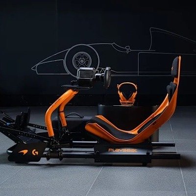
    Here's what we looked at this week:Luxury screwdriver, anyone? Arrowmax's designey hand tools. The Brabus Big Boy 1200, a luxury motorhome, is vanlife for the 1%.The Bikerguard: a windshield wiper for motorcycle helmet visors.Silence Corner's versatile Mambapod is a mini tripod with an F-style clamp in one leg.A genetically-engineered spider silk scarf, by industrial designer Sruli Recht.Nice design touches in Cathay-Pacific's Premium Economy seats, upgraded by design firm JPA.A compact rearview mirror for bikes, hidden in the handle.Formlabs held their annual 3D printing user conference.Industrial design case study: Nike's accessible backpack, originally designed for Paralympians.This week Otherlab unveiled Lightfoot, a solar-powered scooter.Steelcase and Logitech's Ocular View videoconferencing solution.Furniture design history: Willy Guhl's Loop chair. What the Eameses did with plywood, Guhl did with fiber cement.Kingspan's Microhome design competition.Industrial design case study: This Sherman bag, designed by StudioFAR, is a backpack for carrying odd-shaped items.
    0 Yorumlar 0 hisse senetleri 6 Views
  • WWW.CORE77.COM
    A Compact Rearview Mirror for Bikes Hidden in the Handle
    This little Corky gizmo was designed for cyclists with drop bars. It's so named because you install it by "corking up" the end of the bar, and now you've got a handy rearview mirror (polycarbonate, not glass) you can flip out. It's attached via a ball joint, so you can dial in the angle. Made by French bike accessories company The Beam, these run $38. They also sell a Corky Urban variant for ordinary handles. (Same price.)
    0 Yorumlar 0 hisse senetleri 8 Views
  • WWW.CORE77.COM
    Steelcase and Logitech's Ocular View Videoconferencing Solution
    Videochats have become indispensable for businesses, but they're no substitute for a face-to-face meeting. The lack of accurate eye contact is jarring, and it's a lot harder to read visual cues when staring at a tiny head in a laptop screen. Additionally, Steelcase learned during user research, people find videoconferencing mentally exhausting."People need better hybrid collaboration options -- especially in a time where we are spending so much of our day on video -- so we wanted to create a more realistic experience that would help combat digital fatigue," says Steelcase's Christina Vernon, general manager of distributed collaboration and tech partners. "Project Ghost was an experiment to see if people could connect virtually in the same way they might over a cup of coffee. What we found through all of our conversations and in-person demonstrations was that people were craving this kind of immersive and distraction-free experience to really improve their connections with their colleagues."Project Ghost, which was undertaken in collaboration with Logitech, was a trial to see if the companies could jointly create a better videoconferencing experience. The project's experimental prototypes have grown into a finished product, Ocular View. This dedicated videoconferencing booth seats two and, the companies reckon, provides multiple advantages over computer-based Zooms:Ocular View includes a comfortable lounge, small table and soft lighting to help participants look and feel their best. The space was intentionally designed to eliminate distractions, placing the technology secondary to the physical environment. Participants simply tap to join to start the realistic conversation. [The system uses] an effect that removes the remote participant from their background and displays a life-size rendering. The camera also creates eye-to-eye contact by connecting sight lines to create a natural gaze, so people feel as though they are engaging in-person. "When starting on this project, we asked ourselves how we could create a more human connection where technology fades into the background and people are front-and-center," says Alex Mooney, Logitech manager. The goal was to remove "the obvious presence of technology to focus on the engagement between two people." The units come in three different footprints, including a wheelchair-accessible one, and you can spec a variety of panel options. You can learn more here.
    0 Yorumlar 0 hisse senetleri 9 Views
  • WWW.CORE77.COM
    Tomorrow: Tune In to Formlabs 3D Printing User Conference
    The Formlabs User Summit, the company's annual 3D printing user conference, starts tomorrow at 9am ET. The company's SLS and SLA printers will be on-show, along with industry folks discussing the impact of 3D printing across a variety of industries. The event will feature a keynote presentation with Formlabs CEO Maxim Lobovsky and aerospace engineer and renowned YouTube influencer Tom Stanton. Other key speakers will include:- Nihat Isitman, Senior Materials Engineer at Apple- Matthais Shulz, Technologist for AM Polymer Series Manufacturing at Brose- Patrick Marr, Senior Director of Prototype Development at HasbroThe free event will be livestreamed on YouTube. You can register to watch it here.
    0 Yorumlar 0 hisse senetleri 9 Views
  • WWW.CORE77.COM
    A Genetically-Engineered Spider Silk Scarf
    Sruli Recht, the Reyjavik-based industrial designer with a penchant for the unusual, may have topped himself. His ATOR scarf, made of spider silk, was created with the help of both a spider and a goat:"Our knit originates from the silk gland DNA of a spider, carefully placed in the milk ducts of a goat. A single filament is reeled out of the goat millimetres at a time to produce the most unobtainable fibre in the world." "It takes several weeks to hand-loom the filament into this fabric quality, a further week gently coaxing the textile into the knotted web of this ghostly veil. [The scarf is] is woven, its proteins color treated with hot acid, then cured. After cutting it is twisted into a Mbius strip, and a flat felled seam is backstitched by hand with lengths of the same yarn, a holistic approach just short of felting, closing the loop." "The edges are folded and pressed with agonizing slowness, before being bound with a Japanese thermally activated tape, a frosted, almost invisible finish." "ATOR is made from one of the rarest multi-hyphenated materials in the world genetically engineered spider-goat silk filament, hand-loomed, hand-dyed, hand-stitched, and hand-bound."Considering that Recht could only get enough material to produce three of these, the 2,200 (USD $2,337) price doesn't seem that high.
    0 Yorumlar 0 hisse senetleri 9 Views
  • WWW.CORE77.COM
    Nice Design Touches in Cathay-Pacific's New Premium Economy Seats
    For those of us who can't afford to fly Business Class, design studio JPA has designed a better Premium Economy seat. The new design takes cues from a wingback chair, providing greater privacy on either side of your head. A nice, unexpectedly elegant design touch is this reading light integrated into the headrest. Thigh support is offered when the seats recline. There's also a footrest you can fold down. The seatback monitors are gigantic, and the seatback tray has been replaced with a phone/tablet tray, in case you want to supplant the onboard programming with your own. The trays are now located in the armrests. The non-tray armrests of each seat feature a storage compartment with a light and a USB-C port. Between the seats, on the center console are conventional power outlets. The new seat designs are slated for Cathay-Pacific's 777-300ER wide-body planes.
    0 Yorumlar 0 hisse senetleri 8 Views
  • WWW.CORE77.COM
    Lightfoot: A Solar-Powered Scooter
    Today Otherlab, a sort of incubator/skunkworks, unveiled this aluminum-framed Lightfoot scooter. It's got a 48-volt, 1.1kWh battery that provides up to 37 miles (60 km) of range, and which can be charged at a standard wall socket. But as you've undoubtedly noticed, the scooter has rather a lot of solar panels. Otherlab says you can use the sun to get up to 18 miles (28 km) of additional range. "Each hour of sunbathing recharges Lightfoot with 3 miles of solar-powered freedom," the firm writes.I can't imagine why they've not photographed this, but the Lightfoot reportedly sports a lockable storage compartment that can hold "more than 1.5 cubic feet (45.2 liters)comparable in size to a carry-on suitcase," Otherlab writes. "This compartment can comfortably fit up to 33 lbs. (15kg) of cargo, enough space for three large grocery bags, a work bag, a helmet or anything else you need to stash on your travels. Its weatherproof design and sturdy lock protect your stuff from prying eyes and the elements, ensuring your belongings arrive as safely as you do." The Lightfoot is retailing for $4,995, and is expected to ship in January.
    0 Yorumlar 0 hisse senetleri 8 Views
  • WWW.CORE77.COM
    A Windshield Wiper for Motorcycle Helmet Visors
    A motorcyclist riding through rainy weather might coat their visor with a water repellent spray. However, they then have to travel fast enough for wind resistance to blow their visor clear. At slower speeds, their visibility remains compromised.This Bikerguard invention, created by two engineers in Slovenia, is a remote-controlled wiper blade for motorcycle helmet visors. You do have to drive two screws through the top of your visor to attach the mounting base, and you can then pop the Bikerguard on and off as needed. A wireless remote control attaches to your bike's handlebars. The POV demonstration does seem convincing:The developers claim that motorcycle police bodies in Slovenia, Hungary and Germany "are in the process of evaluating BIKERGUARD for potential integration into their motorcycle fleet." In the meantime, they sell these online for 319 (USD $339) a pop. A three-pack of replacement wiper blades runs 25 (USD $27). I wouldn't be surprised if, in the future Oakley develops a visor for runners with one of these attached.
    0 Yorumlar 0 hisse senetleri 7 Views
  • WWW.CORE77.COM
    Celebrating NOOKA: "Designing Time" Book
    The work of long-time Core77-fave NOOKAfounded by Matthew Waldmanis the subject of a newly-released book, Designing Time, a lavish and time-travel-y chronicle of the brand's evolution and its efforts to make us rethink how we perceive the formal intersection of time and design. "The Future Should Not Look Like the Past" offers a deep dive into NOOKA's journey, from its inception to its impact on the design landscape. Established in the late 1990s, NOOKA was a pioneer in creating timepieces that employed a unique visual language, "making the concept of time more intuitive and accessible." The brand's partnership with Seiko marked the beginning of a new era in watch design, introducing passive intelligent interfaces that enriched the user experience.With ambitions ahead of their time, Waldman's vision was "to promote a universal language through design that transcends cultural and geopolitical boundaries." He created a shorthand for the conceptMindstylewhich "merges interface design with lifestyle aspirations, aiming to foster a better future."Inside the BookSpanning 200+ pages, Designing Time is an absolute treasure trove for design enthusiasts, and an incredible pleasure to meander through. It features an array of contentincluding sketches, renders, and photographsaccompanied by inside stories and process images of unrealized projects. (Always some of the most ambitious!) The book not only highlights NOOKA's groundbreaking products (such as the iconic STRIP belt and futuristic sunglasses), but also delves into the brand's cultural impact during the 2000s. Anyone in the design world at that time will be taking a very enjoyable trip down memory lane with this thing.Launched on Kickstarter Japan in 2022, the book quickly reached its funding goal, reflecting the enduring interest in NOOKA's innovative approach. The first print run sold out, and a second edition [Hard cover only] is set to ship in November 2024, so more of us will be able to get ouir hands on one.Find more info here: https://www.nooka.com/nooka-book/
    0 Yorumlar 0 hisse senetleri 6 Views
  • WWW.CORE77.COM
    <b>More Love, Less Labor: AI Powers Productivity at AutodeskUniversity</b><o:p></o:p>
    The message from Autodesk and the many companies that presented and exhibited at Autodesk University (AU) last month in San Diego was clear: for the product design and manufacturing (D&M), architecture, engineering, construction and operations (AECO), and media and entertainment (M&E) industries, AI is a driving force behind productivity.Autodesk University MainstageData, data, dataAI-driven productivity is customized to the specific needs of each industry, with various generative and multimodal AI models providing solutions for tasks like workflow optimization, manufacturing quality assurance, regulatory compliance, and design visualization. However, the value of AI across these sectorsand beyondis determined by the quantity and quality of data used.Quantity matters because more data enables AI systems to learn and improve. Quality, however, is more complex. It requires obtaining relevant data, ensuring data accuracy, and verifying that data usage complies with ethical standards.Dell demonstrated how their workstations can run generative AI 3D content with NVIDIA Edify trained on Shutterstock ethically sourced content.Customers are keyThe importance of AI and data was evident throughout AU, with presentations and product demonstrations highlighting customer-centric solutions. Hardware providers showcased high-performance workstations equipped with powerful processors, optimized to support AI workloads. Meanwhile, data and asset management providers emphasized AIs capabilities in extracting valuable information, managing metadata, and monitoring workflows in real time.Lenovo displayed next generation workstations designed with a customer-centric focus. Partnering with Intel, NVIDIA and Aston Martin, they offer high-end graphics, memory and processing power.Autodesks Design & Manufacturing team showcased how they are addressing their customers' needs by delivering AI-powered efficiencies through Fusion, a cloud-based, unified platform for design and manufacturing. They also introduced Project Bernini, a research initiative focused on a new approach to generative AI. Unlike many generative models that prioritize the appearance of 3D objects, Bernini emphasizes generating structural 3D data from the inside out, which aligns closely with real-world production needs.Experimental research project Berninimodel generates shape and texture separately and does not confuse or meld those variables.AI provides a wide range of possibilities based on industry-specific needs. For entertainment and gaming, AI can generate lifelike product and character models, while in manufacturing and design, it lays the foundation for real-world production. With tools like Fusion and research projects like Bernini, Autodesk aims to empower creators and makers to leverage AI for both efficiency and innovation.
    0 Yorumlar 0 hisse senetleri 6 Views
  • WWW.CORE77.COM
    A Mini Tripod with an F-Style Clamp in One Leg
    This Mambapod was invented by Taiwanese photography accessory company Silence Corner. It's a mini tripod that can also be used on non-flat surfaces, thanks to an innovative feature in one of the legs. Two small jaws can be unfolded from the leg, and dialed towards each other by rotating a handle at the bottom of the leg, essentially becoming an F-style clamp.Alternately, just one of the jaws can be flipped out and used as a hook. The clamping arrangement provides a lot more security than bendy legs, allowing you to hang your expensive SLR or smartphone in precarious places. The Mambapod is a hit on Kickstarter, with over $200K in pledges at press time and 25 days left to pledge. Pricing starts at $129.
    0 Yorumlar 0 hisse senetleri 6 Views
  • WWW.CORE77.COM
    No One Agrees on What a True Flying Car Should Look Like
    When it comes to a true flying carI don't mean just a VTOL vehicle, I mean something that can both drive and flywe've seen a lot of wild forms over the years.The AeroMobil 4.0 The Xpeng AeroHT The Alef Model A The LuftCar The GAC GoveNotably, one that actually flew was the KleinVision Aircar, which had folding wings: Another vehicle that successfully flew last year was the Samson Sky Switchblade. However, Samson Sky reckons that in order to make the design production-ready, both the wings and the massive rear stabilizer, which contains the propellers, must be folded into the body for driving mode. So their latest design envisions this arrangement:I hate to be skeptical, but gosh that looks like a lot of moving parts! I wonder what the maintenance will look like.
    0 Yorumlar 0 hisse senetleri 11 Views
  • WWW.CORE77.COM
    Airback: Backpacks and Luggage That Can Shrink Their Contents with a Vacuum
    Dutch company Airback has invented a backpack that can shrink its contents. Their eponymous backpack ($185) features a zippered airtight compartment with a port; once you've stuffed this compartment full, you attach either a household vacuum cleaner, or the company's small electric pump, to the port. All of the air gets sucked out of the compartment, compressing the clothing within. The company reckons this allows you to cram in 50% more stuff. The backpack also has a scale built into the handle, so you can avoid exceeding airline weight limits and being forced to check it at the airport. The overall design is quite intelligent, featuring a passport stash pocket, a locking laptop compartment, bottle holder and more:Following the popularity of the backpackwhich was Kickstarted to the tune of 350,000 (USD ~$380,000), they designed a smaller Airback Go ($152) which fits beneath an airplane seat. This design lacks the scale in the handle. There's also a larger Airback Max ($361), which boasts rollers and a telescoping handle as well as the Airback Next ($416), a hard-sided carry-on roller. All of the bags feature a built-in USB-C port, to which you can connect your own powerbank. The company's separately-sold pump runs $52. One does wonder what to do if either that or the handle scale breaks. For their part, the company says "we've committed to a circular system - allowing you to send your bag back to us when it's lived its life, whereupon we, along with our partners, will give it a new purpose." However, what I'd prefer to see is some mention of repair options.
    0 Yorumlar 0 hisse senetleri 10 Views
  • WWW.CORE77.COM
    Kia's EV Camper Van Concept
    Kia Design Center America unveiled a funky concept EV van at this week's SEMA show. This PV5 WKNDR is intended to be "an ideal escape pod for extended weekends in nature." Among its unusual features are a steering wheel that pivots out of the way (sort of), a pivoting passenger seat and a pull-out unit they're calling a "Gear Head:"The PV5 WKNDR EV VAN features a highly flexible and adaptable modular interior that can be easily and efficiently customized to maximize space and function akin to a Swiss Army Knife on wheels. The van's "Gear Head" feature is the first-of-its-kind storage solution that provides an off-board, sheltered storage space for gear when the vehicle is stationary, allowing for maximum utilization of interior space while still offering easy access to gear outside. The "Gear Head" can also be transformed into a mobile pantry for cooking afficionados that want to "Cook with a View". Truly self-sufficient, the PV5 WKNDR EV VAN features solar panels and unique hydro turbine wheels that can recharge the batteries for many uses. As an example, Kia installed an onboard compressor to handle needs for inflation, from adjusting tire pressure when out on the trail to inflating space efficient mattresses when setting up camp for the night. Kia's clear that this is purely a concept. "Our vehicles already help people live their active and adventurous lifestyles and it was fun to see just how far we could go with these latest concepts. The SEMA Show acts as a blank canvas for creativity and offers a glimpse into what Kia's automotive future may hold."
    0 Yorumlar 0 hisse senetleri 10 Views
  • WWW.CORE77.COM
    Industrial Design Case Study: An Infant Car Seat by DesignThink
    Dorel Juvenile is the world's leading juvenile products company. When they wanted to develop a new infant car seat, they turned to Pennsylvania-based ID firm DesignThink.DesignThink as the Innovation Incubator for the Ultra Lightweight Maxi Cosi Coral XP A Cold January Day in 2017The team at DesignThink was asked to visit Dorel Juvenile Group USA to review a "Special Project". The development team at Dorel JG wasted no time introducing us to their latest infant car seat (ICS) project. They were experimenting with the idea of developing a seat that would reduce the struggles parents faced when trying to transition their baby from the car and carry their baby in the removable seat portion of the ICS. The team at DesignThink has designed several car seats over the years and we instantly recognized the unique opportunity, as well as the challenge that this project offered, and were eager and excited to get started.Our Role as the Innovation IncubatorWe partnered with Dorel to act as the innovation incubator to lead the project team through the fuzzy front-end and define the product's overall features and characteristics of use. Upon successful concept definition, the project would be positioned under the Maxi Cosi brand and ultimately transferred to the Maxi Cosi team in Europe and a European design group to carry the innovation to production. The Problem at HandBy removing the seat from the base that is installed in the car, parents can take the baby with them while running errands or visiting people and places. However, a problem associated with this system is that some removable seats can weigh up to 16 lbs. and the baby can weigh up to 35 lbs. for a combined arm-crushing weight of 50+lbs.!! We established two primary goals: 1) reduce the overall weight of the seat to lighten the load, while maintaining structural integrity as to achieve a top crash test rating, and 2) develop new methods that enable parents to more easily lift the seat when moving in and out of the vehicle and when transporting the child in the seat. Our Approach (Decades of Experience and User Understanding Put to Test)DesignThink is one of the leading firms in car seat development having brought several seats to the market and has a long history of creating break-through innovation, but this project pushed our team in new ways. The structure for the project utilized DesignThink's simplified "DEEP" process;Define that for which we will solveExpress possible solutions as quick thumbnail storiesExplain the "what why wow" related to user needsPrototype to demonstrate the merits of the idea How the Project UnfoldedA series of innovation workshops were hosted at our studio to enable the team to think and problem solve with product at hand. The objective was to think in the "ideal" (do not worry about cost and construction initially) and to "fail fast" (explore, evaluate, and evolve). The following provided the high-level framework for how the team identified and pursued their ideas.Established Design TargetsLed by our usability team, along with team members from Dorel, we hosted a several day innovation workshop at our studio. We began with a collaborative defining of the design targets based on use, expectations, pain points, and opportunities, which we affinitized and moved directly into physical prototyping to address and evaluate how well the concepts improved the user experience during day-to-day interactions.DEEP: Innovation Workshops to prototype your idea. You are encouraged to be chaotic and messy! Fail fast! Dorel made sure plenty of product was on hand to fuel the innovation.Inutitive Carry Enhanced Confidence Improved Transitions Development of Design Targets Role-Play is the Best WayTo truly understand and empathize with users, we role-played, exploring typical use-case scenarios to inform our ideation. Placing ourselves in the same situations helps us quickly evaluate and improve our concepts.Handle-Carry:Evolution for improved ease when attaching the seat to the base and removing the child from the vehicle Cradle-Carry:Exploration to improve how parents can bond with the baby in a more natural holding position Cross-Body Strap:Exploration to provide alternate ways to carry the baby while reducing the effects of weight and fatigue on the parent Iterative User Evaluation CycleOur early thoughts and ideas were evaluated by the team and with parents in our research lab. These ideas were then refined to strengthen the evolving direction. The learnings obtained through this method enabled the team to focus on the most meaningful directions and build their value. Listening, understanding, and empathizing allowed our team to develop new ideas in this category that were previously unexplored.DesignThink presents the refined design direction. A series of prototypes and user evaluations enabled us to reach a stage of concept definition for an ultra lightweight car seat that provides parents with improved ways to carry, hold, and secure their baby. Our ResultsUser-Centered Insights lead to Market Defining SolutionsHaving developed many juvenile products such as car seats, strollers, and highchairs, DesignThink understands the day-to-day challenges parents face, both physically and emotionally. We embarked on this project with Dorel to define a new car seat with features that take into account those challenges and offer relevant and meaningful solutions. Exploring innovation that is rooted in user insights enabled our team to quickly define those solutions and overcome technical hurdles to deliver new experiences to address real problems faced by parents when using an ICS.Defining the DirectionAs mentioned, DesignThink was hired as the innovation incubator in the fuzzy front-end to develop and define a new architecture for this seat. Our work was documented and handed off to the Maxi-Cosi team in Europe. The output of our innovation incubation became the driving framework used by the teams in Europe to create a truly meaningful and relevant solution for parents in this category. The DesignThink team is very proud to have been selected by Dorel to play such an important "behind the scenes" role in setting the direction for, and contributing to the success of, the Maxi Cosi Coral XP. It takes a Village to Design a Car SeatSnapshot of the iterative concept development that led to the final product You can see more of DesignThink's work here.
    0 Yorumlar 0 hisse senetleri 14 Views
  • WWW.CORE77.COM
    Core77 Weekly Roundup (11-4-24 to 11-8-24)
    Here's what we looked at this week:Why do humanoid robots move like humans? For efficiency's sake, oughtn't they have their own movement style? In Amsterdam, a hotel room with an airplane inside of it.KraussMaffei's ColorForm production method: Injection molding and painting in one production process.When bad UX is the point: A no-handle coffee mug for rock climbers.Trusscore: This user-friendly DIY sheetrock alternative requires no heavy lifting, taping, mudding, priming and painting.This Jetlaser strips finishes in seconds. No chemicals, no mess.Registration is open for Buildner's Architect's Chair Design Competition.Industrial design case study: Minimal's solution to combat single-use package design.Kazuya Shibata's Smartphone Face Shield provides in-bed emergency protection for when you drop your phone on your face.CycloTech's form evolution of a new type of flying vehicle, designed around six enclosed "CycloRotors."No one agrees on what a true flying car should look like. But if the folding-wing crowd wins out, these will be complicated to maintain.The Elitech Protean is a gamer's desktop platform designed for swappable user interfaces.The Onion's magical election touchscreen provides unique insights.Two striking urban vehicles: The Duo and the Bento, by Mobilize.Olight's Baton 4 is a tiny LED flashlight with its own charging case.Airback: Backpacks and luggage that can shrink their contents with a vacuum.Kia's funky PV5 WKNDR, an EV camper van concept.Industrial design case study: An infant car seat by DesignThink.
    0 Yorumlar 0 hisse senetleri 13 Views
  • WWW.CORE77.COM
    Two Striking Urban Vehicles: The Duo and the Bento, by Mobilize
    A French mobility company called Mobilize has designed a new type of vehicle from scratch. Two, actually: The Duo, an enclosed two-seater electric quadricycle, and its sibling the Bento, which ditches the back seat for a large storage box.Both vehicles were meant to be strong urban design statements, and to not draw on outdated references. "The Duo's greatest strength is its unique design," says Jean-Philippe Salar, Mobilize's Design Director. "What we wanted for this vehicle was to avoid imitating a car. It's in effect a little spaceship, a little lunar capsule on 4 wheels."Not being a car, the diminutive Duo can be driven by folks as young as 14 in France. The tandem seating arrangement, rather than side-by-side, is to make the vehicle as narrow as possible, the better to slip through traffic. The gullwing doors allow ingress and egress even in tight spaces. The charging cable sits in a dedicated compartment in the vehicle's nose. And, surprisingly, the vehicle features an airbag for safety. The company refers to the single-seater Bento as a micro utility vehicle; it boasts a cargo box on the back that can swallow nearly a cubic meter. The Bento requires a proper driver's license, as its more powerful electric motor can top out at 80 km/h (50 mph). It's targeted at last-mile delivery services and tradespeople who travel with tools. Intriguingly, the dashboard of both vehicle was inspired by an icon of 1980s urban culture: The boombox. "The design of Duo et Bento, both on the outside and inside with its dashboard that refers to boomboxes deliberately goes against the grain of classic automotive language," says Salar. The designers also decided not to include a screen, reckoning that most people are already carrying one these days.Both vehicles require half the space to park as a car. The construction of the vehicles is decidedly un-car-like: "It's based on a metal birdcage structure to which we simply glue plastic panels," says Benoit Abadie, Mobilize's Director of Engineering. "We have around 300 parts in Duo, that's 5 times less than in a normal car, which has around 1,500." Mobilize is a subsidiary of Renault, and both vehicles are manufactured at Renault's factory in Tangiers. "It's an ISO 14001 plant that's working towards carbon neutrality," says Wafa Boujguenna, the company's Industrial Project Manager. "Duo and Bento are eco-designed vehicles, made from 40% recycled materials, battery included, and are 95% recyclable, including the battery."The vehicles will be sold in France, Spain, Italy and the Netherlands. No word on if these will come to the U.S.There's a great interview with the design team below, explaining what they were going for:
    0 Yorumlar 0 hisse senetleri 32 Views
  • WWW.CORE77.COM
    A Tiny LED Flashlight with Its Own Charging Case
    Here's a strange pairing of objects, from Chinese manufacturer Olight. Their Baton 4 Premium Edition is a tiny LED flashlightless than 2.5" long--that comes with its own charging case. Despite its tiny size, the Baton 4 has a 1,300-lumen output, and the company claims it can throw its beam 170 meters (558'). Though the press image isn't so aspirational. The charging case, which can double as a powerbank, has a built-in 5000mAh battery; the company says it can fully charge the Baton 4 up to five times, providing 190 days of runtime.The fanatical EDC crowd loves flashlights, stashing stuff inside other stuff, and charging longevity. This object seems tailor-made to scratch all three of those itches. These run $95.
    0 Yorumlar 0 hisse senetleri 33 Views
  • WWW.CORE77.COM
    The Onion's Magical Election Touchscreen Provides Unique Insights
    With America split in half,The Onion finds a way to poke fun at the election by reimagining how it's presented to viewers. Here the company's comedy scribes have envisioned how technology could provide us with election coverage that's easier to grasp:
    0 Yorumlar 0 hisse senetleri 30 Views
  • WWW.CORE77.COM
    The Form Evolution of a New Type of Flying Vehicle
    The images below look like an ArtCenter grad's portfolio, but apparently the development of these machines is being pursued.An Austrian startup called CycloTech is working on a novel propulsion style for electric flying vehicles. Rather than using conventional rotors or propellors, they're using what they call CycloRotors, which are an array of adjustable fins contained within a cylindrical package. These CycloRotors can provide thrust in 360 degrees around their circumference. With six of them around the vehiclefour in a transverse orientation, two in a longitudinal orientationa unique benefit is gained: The arrangement "enables high-precision sideways and backward flight, as well as mid-air braking all without tilting or banking the vehicle."While the test vehicle looks fairly prosaic the forms they're envisioning for the finished product are socks-knocking: If you can't get your head around how the 360-degree thrust thing works, see the video below:CycloTech says their planned production vehicle, to be called CruiseUp, will be safe; the six CycloRotors "provide a high level of redundancy, allowing [one] to fly and land safely, even in the event of a rotor failure." The company envisions these being used not as an air taxi service, but as privately-owned vehicles that will take the place of cars. The design of the CruiseUp is intended to fit within our existing domestic environment. "While the 20th century taught mankind to fly with fossil fuels," they write, "the 21st century will see emission-free 'Flying Cars/Air Cars' become part of a new normality."
    0 Yorumlar 0 hisse senetleri 13 Views
  • WWW.CORE77.COM
    In-Bed Emergency Protection From Phone-on-Face Drops
    Inventor Kazuya Shibata, who creates "marginally useful things," presents this Smartphone Face Shield. It's designed for those who use their phone in bed. A lessor inventor might simply have created an arm to hold the phone in place, but Shibata knows that greater phone engagement comes from holding the phone yourself. What's urgently needed, then, is emergency protection for when you drop it. If you want to 3D print your own, he's got the Fusion files here. Along with a caveat: "Face protection will fail about once in 10 times."
    0 Yorumlar 0 hisse senetleri 13 Views
Daha Hikayeler