


 map
map


Smashing Magazine delivers useful and innovative information to Web designers and developers.
181 people like this
28 Posts
0 Photos
0 Videos
Share
Share this page
News
Recent Updates
-
 How To Make Your UX Research Hard To Ignoresmashingmagazine.comIn the early days of my career, I believed that nothing wins an argument more effectively than strong and unbiased research. Surely facts speak for themselves, I thought.If I just get enough data, just enough evidence, just enough clarity on where users struggle well, once I have it all and I present it all, it alone will surely change peoples minds, hearts, and beliefs. And, most importantly, it will help everyone see, understand, and perhaps even appreciate and commit to what needs to be done.Well, its not quite like that. In fact, the stronger and louder the data, the more likely it is to be questioned. And there is a good reason for that, which is often left between the lines.Research Amplifies Internal FlawsThroughout the years, Ive often seen data speaking volumes about where the business is failing, where customers are struggling, where the team is faltering and where an urgent turnaround is necessary. It was right there, in plain sight: clear, loud, and obvious.But because its so clear, it reflects back, often amplifying all the sharp edges and all the cut corners in all the wrong places. It reflects internal flaws, wrong assumptions, and failing projects some of them signed off years ago, with secured budgets, big promotions, and approved headcounts. Questioning them means questioning authority, and often its a tough path to take.As it turns out, strong data is very, very good at raising uncomfortable truths that most companies dont really want to acknowledge. Thats why, at times, research is deemed unnecessary, or why we dont get access to users, or why loud voices always win big arguments.So even if data is presented with a lot of eagerness, gravity, and passion in that big meeting, it will get questioned, doubted, and explained away. Not because of its flaws, but because of hope, reluctance to change, and layers of internal politics.This shows up most vividly in situations when someone raises concerns about the validity and accuracy of research. Frankly, its not that somebody is wrong and somebody is right. Both parties just happen to be right in a different way.What To Do When Data DisagreesWeve all heard that data always tells a story. However, its never just a single story. People are complex, and pointing out a specific truth about them just by looking at numbers is rarely enough.When data disagrees, it doesnt mean that either is wrong. Its just that different perspectives reveal different parts of a whole story that isnt completed yet.In digital products, most stories have 2 sides:Quantitative data What/When: behavior patterns at scale.Qualitative data Why/How: user needs and motivations. Quant usually comes from analytics, surveys, and experiments. Qual comes from tests, observations, and open-ended surveys.Risk-averse teams overestimate the weight of big numbers in quantitative research. Users exaggerate the frequency and severity of issues that are critical for them. As Archana Shah noted, designers get carried away by users confident responses and often overestimate what people say and do.And so, eventually, data coming from different teams paints a different picture. And when it happens, we need to reconcile and triangulate. With the former, we track whats missing, omitted, or overlooked. With the latter, we cross-validate data e.g., finding pairings of qual/quant streams of data, then clustering them together to see whats there and whats missing, and exploring from there.And even with all of it in place and data conflicts resolved, we still need to do one more thing to make a strong argument: we need to tell a damn good story.Facts Dont Win Arguments, Stories DoResearch isnt everything. Facts dont win arguments powerful stories do. But a story that starts with a spreadsheet isnt always inspiring or effective. Perhaps it brings a problem into the spotlight, but it doesnt lead to a resolution.The very first thing I try to do in that big boardroom meeting is to emphasize what unites us shared goals, principles, and commitments that are relevant to the topic at hand. Then, I show how new data confirms or confronts our commitments, with specific problems we believe we need to address.When a question about the quality of data comes in, I need to show that it has been reconciled and triangulated already and discussed with other teams as well.A good story has a poignant ending. People need to see an alternative future to trust and accept the data and a clear and safe path forward to commit to it. So I always try to present options and solutions that we believe will drive change and explain our decision-making behind that.They also need to believe that this distant future is within reach, and that they can pull it off, albeit under a tough timeline or with limited resources.And: a good story also presents a viable, compelling, shared goal that people can rally around and commit to. Ideally, its something that has a direct benefit for them and their teams.These are the ingredients of the story that I always try to keep in my mind when working on that big presentation. And in fact, data is a starting point, but it does need a story wrapped around it to be effective.Wrapping UpThere is nothing more disappointing than finding a real problem that real people struggle with and facing the harsh reality of research not being trusted or valued.Weve all been there before. The best thing you can do is to be prepared: have strong data to back you up, include both quantitative and qualitative research preferably with video clips from real customers but also paint a viable future which seems within reach.And sometimes nothing changes until something breaks. And at times, there isnt much you can do about it unless you are prepared when it happens.Data doesnt change minds, and facts dont settle fights. Having answers isnt the same as learning, and it for sure isnt the same as making evidence-based decisions. Erika HallMeet How To Measure UX And Design ImpactYou can find more details on UX Research in Measure UX & Design Impact (8h), a practical guide for designers and UX leads to measure and show your UX impact on business. Use the code IMPACT to save 20% off today. Jump to the details. Video + UX TrainingVideo onlyVideo + UX Training$495.00 $799.00Get Video + UX Training25 video lessons (8h) + Live UX Training.100 days money-back-guarantee.Video only$250.00$395.00Get the video course25 video lessons (8h). Updated yearly.Also available as a UX Bundle with 2 video courses.Useful ResourcesHow to Present Research So Stakeholders Sit Up and Take Action, by Nikki AndersonWhat To Do When Data Disagrees, by Subhasree Chatterjee, Archana Shah, Sanket Shukl, and Jason BresslerMixed-Method UX Research, by Raschin FatemiA Step-by-Step Framework For Mixed-Method Research, by Jeremy WilliamsThe Ultimate Guide To Mixed Methods, by Ben WiedmaierSurvey Design Cheatsheet, by yours trulyUseful Calculators For UX Research, by yours trulyBeyond Measure, by Erika HallUseful BooksJust Enough Research, by Erika HallDesigning Surveys That Work, by Caroline JarrettDesigning Quality Survey Questions, by Sheila B. Robinson0 Comments ·0 SharesPlease log in to like, share and comment!
 -
 AI In UX: Achieve More With Lesssmashingmagazine.comI have made a lot of mistakes with AI over the past couple of years. I have wasted hours trying to get it to do things it simply cannot do. I have fed it terrible prompts and received terrible output. And I have definitely spent more time fighting with it than I care to admit.But I have also discovered that when you stop treating AI like magic and start treating it like what it actually is (a very enthusiastic intern with zero life experience), things start to make more sense.Let me share what I have learned from working with AI on real client projects across user research, design, development, and content creation.How To Work With AIHere is the mental model that has been most helpful for me. Treat AI like an intern with zero experience.An intern fresh out of university has lots of enthusiasm and qualifications, but no real-world experience. You would not trust them to do anything unsupervised. You would explain tasks in detail. You would expect to review their work multiple times. You would give feedback and ask them to try again.This is exactly how you should work with AI.The Basics Of PromptingI am not going to pretend to be an expert. I have just spent way too much time playing with this stuff because I like anything shiny and new. But here is what works for me.Define the role.Start with something like Act as a user researcher or Act as a copywriter. This gives the AI context for how to respond.Break it into steps.Do not just say Analyze these interview transcripts. Instead, say I want you to complete the following steps. One, identify recurring themes. Two, look for questions users are trying to answer. Three, note any objections that come up. Four, output a summary of each.Define success.Tell it what good looks like. I am looking for a report that gives a clear indication of recurring themes and questions in a format I can send to stakeholders. Do not use research terminology because they will not understand it.Make it think.Tell it to think deeply about its approach before responding. Get it to create a way to test for success (known as a rubric) and iterate on its work until it passes that test.Here is a real prompt I use for online research:Act as a user researcher. I would like you to carry out deep research online into [brand name]. In particular, I would like you to focus on what people are saying about the brand, what the overall sentiment is, what questions people have, and what objections people mention. The goal is to create a detailed report that helps me better understand the brand perception.Think deeply about your approach before carrying out the research. Create a rubric for the report to ensure it is as useful as possible. Keep iterating until the report scores extremely high on the rubric. Only then, output the report.That second paragraph (the bit about thinking deeply and creating a rubric), I basically copy and paste into everything now. It is a universal way to get better output.Learn When To Trust ItYou should never fully trust AI. Just like you would never fully trust an intern you have only just met.To begin with, double-check absolutely everything. Over time, you will get a sense of when it is losing its way. You will spot the patterns. You will know when to start a fresh conversation because the current one has gone off the rails.But even after months of working with it daily, I still check its work. I still challenge it. I still make it cite sources and explain its reasoning.The key is that even with all that checking, it is still faster than doing it yourself. Much faster.Using AI For User ResearchThis is where AI has genuinely transformed my work. I use it constantly for five main things.Online ResearchI love AI for this. I can ask it to go and research a brand online. What people are saying about it, what questions they have, what they like, and what frustrates them. Then do the same for competitors and compare.This would have taken me days of trawling through social media and review sites. Now it takes minutes.I recently did this for an e-commerce client. I wanted to understand what annoyed people about the brand and what they loved. I got detailed insights that shaped the entire conversion optimization strategy. All from one prompt.Analyzing Interviews And SurveysI used to avoid open-ended questions in surveys. They were such a pain to review. Now I use them all the time because AI can analyze hundreds of text responses in seconds.For interviews, I upload the transcripts and ask it to identify recurring themes, questions, and requests. I always get it to quote directly from the transcripts so I can verify it is not making things up.The quality is good. Really good. As long as you give it clear instructions about what you want.Making Sense Of DataI am terrible with spreadsheets. Put me in front of a person and I can understand them. Put me in front of data, and my eyes glaze over.AI has changed that. I upload spreadsheets to ChatGPT and just ask questions. What patterns do you see? Can you reformat this? Show me this data in a different way.Microsoft Clarity now has Copilot built in, so you can ask it questions about your analytics data. Triple Whale does the same for e-commerce sites. These tools are game changers if you struggle with data like I do.Research ProjectsThis is probably my favorite technique. In ChatGPT and Claude, you can create projects. In other tools, they are called spaces. Think of them as self-contained folders where everything you put in is available to every conversation in that project.When I start working with a new client, I create a project and throw everything in. Old user research. Personas. Survey results. Interview transcripts. Documentation. Background information. Site copy. Anything I can find.Then I give it custom instructions. Here is one I use for my own business:Act as a business consultant and marketing strategy expert with good copywriting skills. Your role is to help me define the future of my UX consultant business and better articulate it, especially via my website. When I ask for your help, ask questions to improve your answers and challenge my assumptions where appropriate.I have even uploaded a virtual board of advisors (people I wish I had on my board) and asked AI to research how they think and respond as they would.Now I have this project that knows everything about my business. I can ask it questions. Get it to review my work. Challenge my thinking. It is like having a co-worker who never gets tired and has a perfect memory.I do this for every client project now. It is invaluable.Creating PersonasAI has reinvigorated my interest in personas. I had lost heart in them a bit. They took too long to create, and clients always said they already had marketing personas and did not want to pay to do them again.Now I can create what I call functional personas. Personas that are actually useful to people who work in UX. Not marketing fluff about what brands people like, but real information about what questions they have and what tasks they are trying to complete.I upload all my research to a project and say:Act as a user researcher. Create a persona for [audience type]. For this persona, research the following information: questions they have, tasks they want to complete, goals, states of mind, influences, and success metrics. It is vital that all six criteria are addressed in depth and with equal vigor.The output is really good. Detailed. Useful. Based on actual data rather than pulled out of thin air.Here is my challenge to anyone who thinks AI-generated personas are somehow fake. What makes you think your personas are so much better? Every persona is a story of a hypothetical user. You make judgment calls when you create personas, too. At least AI can process far more information than you can and is brilliant at pattern recognition.My only concern is that relying too heavily on AI could disconnect us from real users. We still need to talk to people. We still need that empathy. But as a tool to synthesize research and create reference points? It is excellent.Using AI For Design And DevelopmentLet me start with a warning. AI is not production-ready. Not yet. Not for the kind of client work I do, anyway.Three reasons why:It is slow if you want something specific or complicated.It can be frustrating because it gets close but not quite there.And the quality is often subpar. Unpolished code, questionable design choices, that kind of thing.But that does not mean it is not useful. It absolutely is. Just not for final production work.Functional PrototypesIf you are not too concerned with matching a specific design, AI can quickly prototype functionality in ways that are hard to match in Figma. Because Figma is terrible at prototyping functionality. You cannot even create an active form field in a Figma prototype. Its the biggest thing people do online other than click links and you cannot test it.Tools like Relume and Bolt can create quick functional mockups that show roughly how things work. They are great for non-designers who just need to throw together a prototype quickly. For designers, they can be useful for showing developers how you want something to work.But you can spend ages getting them to put a hamburger menu on the right side of the screen. So use them for quick iteration, not pixel-perfect design.Small Coding TasksI use AI constantly for small, low-risk coding work. I am not a developer anymore. I used to be, back when dinosaurs roamed the earth, but not for years.AI lets me create the little tools I need. A calculator that calculates the ROI of my UX work. An app for running top task analysis. Bits of JavaScript for hiding elements on a page. WordPress plugins for updating dates automatically.Just before running my workshop on this topic, I needed a tool to create calendar invites for multiple events. All the online services wanted 16 a month. I asked ChatGPT to build me one. One prompt. It worked. It looked rubbish, but I did not care. It did what I needed.If you are a developer, you should absolutely be using tools like Cursor by now. They are invaluable for pair programming with AI. But if you are not a developer, just stick with Claude or Bolt for quick throwaway tools.Reviewing Existing ServicesThere are some great tools for getting quick feedback on existing websites when budget and time are tight.If you need to conduct a UX audit, Wevo Pulse is an excellent starting point. It automatically reviews a website based on personas and provides visual attention heatmaps, friction scores, and specific improvement recommendations. It generates insights in minutes rather than days.Now, let me be clear. This does not replace having an experienced person conduct a proper UX audit. You still need that human expertise to understand context, make judgment calls, and spot issues that AI might miss. But as a starting point to identify obvious problems quickly? It is a great tool. Particularly when budget or time constraints mean a full audit is not on the table.For e-commerce sites, Baymard has UX Ray, which analyzes flaws based on their massive database of user research.Checking Your DesignsAttention Insight has taken thousands of hours of eye-tracking studies and trained AI on it to predict where people will look on a page. It has about 90 to 96 percent accuracy.You upload a screenshot of your design, and it shows you where attention is going. Then you can play around with your imagery and layout to guide attention to the right place.It is great for dealing with stakeholders who say, People wont see that. You can prove they will. Or equally, when stakeholders try to crowd the interface with too much stuff, you can show them attention shooting everywhere.I use this constantly. Here is a real example from a pet insurance company. They had photos of a dog, cat, and rabbit for different types of advice. The dog was far from the camera. The cat was looking directly at the camera, pulling all the attention. The rabbit was half off-frame. Most attention went to the cats face.I redesigned it using AI-generated images, where I could control exactly where each animal looked. Dog looking at the camera. Cat looking right. Rabbit looking left. All the attention drawn into the center. Made a massive difference.Creating The Perfect ImageI use AI all the time for creating images that do a specific job. My preferred tools are Midjourney and Gemini.I like Midjourney because, visually, it creates stunning imagery. You can dial in the tone and style you want. The downside is that it is not great at following specific instructions.So I produce an image in Midjourney that is close, then upload it to Gemini. Gemini is not as good at visual style, but it is much better at following instructions. Make the guy reach here or Add glasses to this person. I can get pretty much exactly what I want.The other thing I love about Midjourney is that you can upload a photograph and say, Replicate this style. This keeps consistency across a website. I have a master image I use as a reference for all my site imagery to keep the style consistent.Using AI For ContentMost clients give you terrible copy. Our job is to improve the user experience or conversion rate, and anything we do gets utterly undermined by bad copy.I have completely stopped asking clients for copy since AI came along. Here is my process.Build Everything Around QuestionsOnce I have my information architecture, I get AI to generate a massive list of questions users will ask. Then I run a top task analysis where people vote on which questions matter most.I assign those questions to pages on the site. Every page gets a list of the questions it needs to answer.Get Bullet Point Answers From StakeholdersI spin up the content management system with a really basic theme. Just HTML with very basic formatting. I go through every page and assign the questions.Then I go to my clients and say: I do not want you to write copy. Just go through every page and bullet point answers to the questions. If the answer exists on the old site, copy and paste some text or link to it. But just bullet points.That is their job done. Pretty much.Let AI Draft The CopyNow I take control. I feed ChatGPT the questions and bullet points and say:Act as an online copywriter. Write copy for a webpage that answers the question [question]. Use the following bullet points to answer that question: [bullet points]. Use the following guidelines: Aim for a ninth-grade reading level or below. Sentences should be short. Use plain language. Avoid jargon. Refer to the reader as you. Refer to the writer as us. Ensure the tone is friendly, approachable, and reassuring. The goal is to [goal]. Think deeply about your approach. Create a rubric and iterate until the copy is excellent. Only then, output it.I often upload a full style guide as well, with details about how I want it to be written.The output is genuinely good. As a first draft, it is excellent. Far better than what most stakeholders would give me.Stakeholders Review And Provide FeedbackThat goes into the website, and stakeholders can comment on it. Once I get their feedback, I take the original copy and all their comments back into ChatGPT and say, Rewrite using these comments.Job done.The great thing about this approach is that even if stakeholders make loads of changes, they are making changes to a good foundation. The overall quality still comes out better than if they started with a blank sheet.It also makes things go smoother because you are not criticizing their content, where they get defensive. They are criticizing AI content.Tools That HelpIf your stakeholders are still giving you content, Hemingway Editor is brilliant. Copy and paste text in, and it tells you how readable and scannable it is. It highlights long sentences and jargon. You can use this to prove to clients that their content is not good web copy.If you pay for the pro version, you get AI tools that will rewrite the copy to be more readable. It is excellent.What This Means for YouLet me be clear about something. None of this is perfect. AI makes mistakes. It hallucinates. It produces bland output if you do not push it hard enough. It requires constant checking and challenging.But here is what I know from two years of using this stuff daily. It has made me faster. It has made me better. It has freed me up to do more strategic thinking and less grunt work.A report that would have taken me five days now takes three hours. That is not an exaggeration. That is real.Overall, AI probably gives me a 25 to 33 percent increase in what I can do. That is significant.Your value as a UX professional lies in your ideas, your questions, and your thinking. Not your ability to use Figma. Not your ability to manually review transcripts. Not your ability to write reports from scratch.AI cannot innovate. It cannot make creative leaps. It cannot know whether its output is good. It cannot understand what it is like to be human.That is where you come in. That is where you will always come in.Start small. Do not try to learn everything at once. Just ask yourself throughout your day: Could I do this with AI? Try it. See what happens. Double-check everything. Learn what works and what does not.Treat it like an enthusiastic intern with zero life experience. Give it clear instructions. Check its work. Make it try again. Challenge it. Push it further.And remember, it is not going to take your job. It is going to change it. For the better, I think. As long as we learn to work with it rather than against it.0 Comments ·0 Shares
 -
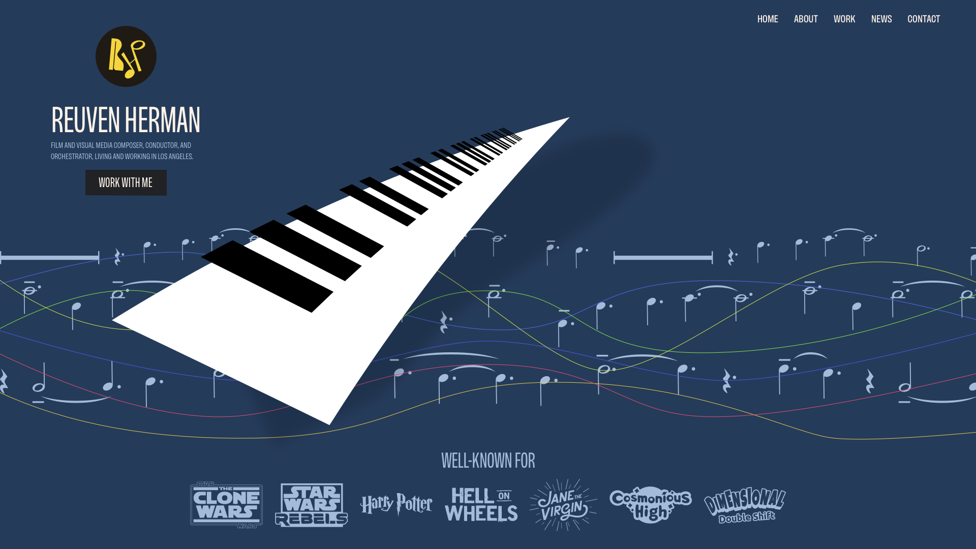 Ambient Animations In Web Design: Practical Applications (Part 2)smashingmagazine.comFirst, a recap:Ambient animations are the kind of passive movements you might not notice at first. However, they bring a design to life in subtle ways. Elements might subtly transition between colours, move slowly, or gradually shift position. Elements can appear and disappear, change size, or they could rotate slowly, adding depth to a brands personality.In Part 1, I illustrated the concept of ambient animations by recreating the cover of a Quick Draw McGraw comic book as a CSS/SVG animation. But I know not everyone needs to animate cartoon characters, so in Part 2, Ill share how ambient animation works in three very different projects: Reuven Herman, Mike Worth, and EPD. Each demonstrates how motion can enhance brand identity, personality, and storytelling without dominating a page.Reuven HermanLos Angeles-based composer Reuven Herman didnt just want a website to showcase his work. He wanted it to convey his personality and the experience clients have when working with him. Working with musicians is always creatively stimulating: theyre critical, engaged, and full of ideas.Reuvens classical and jazz background reminded me of the work of album cover designer Alex Steinweiss.I was inspired by the depth and texture that Alex brought to his designs for over 2,500 unique covers, and I wanted to incorporate his techniques into my illustrations for Reuven.To bring Reuvens illustrations to life, I followed a few core ambient animation principles:Keep animations slow and smooth.Loop seamlessly and avoid abrupt changes.Use layering to build complexity.Avoid distractions.Consider accessibility and performance.followed by their straight state:The first step in my animation is to morph the stave lines between states. Theyre made up of six paths with multi-coloured strokes. I started with the wavy lines:<!-- Wavy state --><g fill="none" stroke-width="2" stroke-linecap="round"><path id="p1" stroke="#D2AB99" d="[]"/><path id="p2" stroke="#BDBEA9" d="[]"/><path id="p3" stroke="#E0C852" d="[]"/><path id="p4" stroke="#8DB38B" d="[]"/><path id="p5" stroke="#43616F" d="[]"/><path id="p6" stroke="#A13D63" d="[]"/></g>Although CSS now enables animation between path points, the number of points in each state needs to match. GSAP doesnt have that limitation and can animate between states that have different numbers of points, making it ideal for this type of animation. I defined the new set of straight paths:<!-- Straight state -->const Waves = { p1: "[]", p2: "[]", p3: "[]", p4: "[]", p5: "[]", p6: "[]"};Then, I created a GSAP timeline that repeats backwards and forwards over six seconds:const waveTimeline = gsap.timeline({ repeat: -1, yoyo: true, defaults: { duration: 6, ease: "sine.inOut" }});Object.entries(Waves).forEach(([id, d]) => { waveTimeline.to(`#${id}`, { morphSVG: d }, 0);});Another ambient animation principle is to use layering to build complexity. Think of it like building a sound mix. You want variation in rhythm, tone, and timing. In my animation, three rows of musical notes move at different speeds:<path id="notes-row-1"/><path id="notes-row-2"/><path id="notes-row-3"/>The duration of each rows animation is also defined using GSAP, from 100 to 400 seconds to give the overall animation a parallax-style effect:const noteRows = [ { id: "#notes-row-1", duration: 300, y: 100 }, // slowest { id: "#notes-row-2", duration: 200, y: 250 }, // medium { id: "#notes-row-3", duration: 100, y: 400 } // fastest];[]The next layer contains a shadow cast by the piano keys, which slowly rotates around its centre:gsap.to("shadow", { y: -10, rotation: -2, transformOrigin: "50% 50%", duration: 3, ease: "sine.inOut", yoyo: true, repeat: -1});And finally, the piano keys themselves, which rotate at the same time but in the opposite direction to the shadow:gsap.to("#g3-keys", { y: 10, rotation: 2, transformOrigin: "50% 50%", duration: 3, ease: "sine.inOut", yoyo: true, repeat: -1});The complete animation can be viewed in my lab. By layering motion thoughtfully, the site feels alive without ever dominating the content, which is a perfect match for Reuvens energy.Mike WorthAs I mentioned earlier, not everyone needs to animate cartoon characters, but I do occasionally. Mike Worth is an Emmy award-winning film, video game, and TV composer who asked me to design his website. For the project, I created and illustrated the character of orangutan adventurer Orango Jones.Orango proved to be the perfect subject for ambient animations and features on every page of Mikes website. He takes the reader on an adventure, and along the way, they get to experience Mikes music.For Mikes About page, I wanted to combine ambient animations with interactions. Orango is in a cave where he has found a stone tablet with faint markings that serve as a navigation aid to elsewhere on Mikes website. The illustration contains a hidden feature, an easter egg, as when someone presses Orangos magnifying glass, moving shafts of light stream into the cave and onto the tablet.I also added an anchor around a hidden circle, which I positioned over Orangos magnifying glass, as a large tap target to toggle the light shafts on and off by changing the data-lights value on the SVG:<a href="javascript:void(0);" id="light-switch" title="Lights on/off"> <circle cx="700" cy="1000" r="100" opacity="0" /></a>Then, I added two descendant selectors to my CSS, which adjust the opacity of the light shafts depending on the data-lights value:[data-lights="lights-off"] .light-shaft { opacity: .05; transition: opacity .25s linear;}[data-lights="lights-on"] .light-shaft { opacity: .25; transition: opacity .25s linear;}A slow and subtle rotation adds natural movement to the light shafts:@keyframes shaft-rotate { 0% { rotate: 2deg; } 50% { rotate: -2deg; } 100% { rotate: 2deg; }}Which is only visible when the light toggle is active:[data-lights="lights-on"] .light-shaft { animation: shaft-rotate 20s infinite; transform-origin: 100% 0;}When developing any ambient animation, considering performance is crucial, as even though CSS animations are lightweight, features like blur filters and drop shadows can still strain lower-powered devices. Its also critical to consider accessibility, so respect someones prefers-reduced-motion preferences:@media screen and (prefers-reduced-motion: reduce) { html { scroll-behavior: auto; animation-duration: 1ms !important; animation-iteration-count: 1 !important; transition-duration: 1ms !important; }}When an animation feature is purely decorative, consider adding aria-hidden="true" to keep it from cluttering up the accessibility tree:<a href="javascript:void(0);" id="light-switch" aria-hidden="true"> []</a>With Mikes Orango Jones, ambient animation shifts from subtle atmosphere to playful storytelling. Light shafts and soft interactions weave narrative into the design without stealing focus, proving that animation can support both brand identity and user experience. See this animation in my lab.EPDMoving away from composers, EPD is a property investment company. They commissioned me to design creative concepts for a new website. A quick search for property investment companies will usually leave you feeling underwhelmed by their interchangeable website designs. They include full-width banners with faded stock photos of generic city skylines or ethnically diverse people shaking hands.For EPD, I wanted to develop a distinctive visual style that the company could own, so I proposed graphic, stylised skylines that reflect both EPDs brand and its global portfolio. I made them using various-sized circles that recall the companys logo mark.The point of an ambient animation is that it doesnt dominate. Its a background element and not a call to action. If someones eyes are drawn to it, its probably too much, so I dial back the animation until it feels like something youd only catch if youre really looking. I created three skyline designs, including Dubai, London, and Manchester.In each of these ambient animations, the wheels rotate and the large circles change colour at random intervals.Next, I exported a layer containing the circle elements I want to change colour.<g id="banner-dots"> <circle class="data-theme-fill" []/> <circle class="data-theme-fill" []/> <circle class="data-theme-fill" []/> []</g>Once again, I used GSAP to select groups of circles that flicker like lights across the skyline:function animateRandomDots() { const circles = gsap.utils.toArray("#banner-dots circle") const numberToAnimate = gsap.utils.random(3, 6, 1) const selected = gsap.utils.shuffle(circles).slice(0, numberToAnimate)}Then, at two-second intervals, the fill colour of those circles changes from the teal accent to the same off-white colour as the rest of my illustration:gsap.to(selected, { fill: "color(display-p3 .439 .761 .733)", duration: 0.3, stagger: 0.05, onComplete: () => { gsap.to(selected, { fill: "color(display-p3 .949 .949 .949)", duration: 0.5, delay: 2 }) }})gsap.delayedCall(gsap.utils.random(1, 3), animateRandomDots) }animateRandomDots()The result is a skyline that gently flickers, as if the city itself is alive. Finally, I rotated the wheel. Here, there was no need to use GSAP as this is possible using CSS rotate alone:<g id="banner-wheel"> <path stroke="#F2F2F2" stroke-linecap="round" stroke-width="4" d="[]"/> <path fill="#D8F76E" d="[]"/></g>#banner-wheel { transform-box: fill-box; transform-origin: 50% 50%; animation: rotateWheel 30s linear infinite;}@keyframes rotateWheel { to { transform: rotate(360deg); }}CSS animations are lightweight and ideal for simple, repetitive effects, like fades and rotations. Theyre easy to implement and dont require libraries. GSAP, on the other hand, offers far more control as it can handle path morphing and sequence timelines. The choice of which to use depends on whether I need the precision of GSAP or the simplicity of CSS.By keeping the wheel turning and the circles glowing, the skyline animations stay in the background yet give the design a distinctive feel. They avoid stock photo clichs while reinforcing EPDs brand identity and are proof that, even in a conservative sector like property investment, ambient animation can add atmosphere without detracting from the message.Wrapping upFrom Reuvens musical textures to Mikes narrative-driven Orango Jones and EPDs glowing skylines, these projects show how ambient animation adapts to context. Sometimes its purely atmospheric, like drifting notes or rotating wheels; other times, it blends seamlessly with interaction, rewarding curiosity without getting in the way. Whether it echoes a composers improvisation, serves as a playful narrative device, or adds subtle distinction to a conservative industry, the same principles hold true:Keep motion slow, seamless, and purposeful so that it enhances, rather than distracts from, the design.0 Comments ·0 Shares
 -
 From Prompt To Partner: Designing Your Custom AI Assistantsmashingmagazine.comIn A Week In The Life Of An AI-Augmented Designer, Kate stumbled her way through an AI-augmented sprint (coffee was chugged, mistakes were made). In Prompting Is A Design Act, we introduced WIRE+FRAME, a framework to structure prompts like designers structure creative briefs. Now well take the next step: packaging those structured prompts into AI assistants you can design, reuse, and share.AI assistants go by different names: CustomGPTs (ChatGPT), Agents (Copilot), and Gems (Gemini). But they all serve the same function allowing you to customize the default AI model for your unique needs. If we carry over our smart intern analogy, think of these as interns trained to assist you with specific tasks, eliminating the need for repeated instructions or information, and who can support not just you, but your entire team. Why Build Your Own Assistant?If youve ever copied and pasted the same mega-prompt for the nth time, youve experienced the pain. An AI assistant turns a one-off great prompt into a dependable teammate. And if youve used any of the publicly available AI Assistants, youve realized quickly that theyre usually generic and not tailored for your use.Public AI assistants are great for inspiration, but nothing beats an assistant that solves a repeated problem for you and your team, in your voice, with your context and constraints baked in. Instead of reinventing the wheel by writing new prompts each time, or repeatedly copy-pasting your structured prompts every time, or spending cycles trying to make a public AI Assistant work the way you need it to, your own AI Assistant allows you and others to easily get better, repeatable, consistent results faster.Benefits Of Reusing Prompts, Even Your OwnSome of the benefits of building your own AI Assistant over writing or reusing your prompts include:Focused on a real repeating problemA good AI Assistant isnt a general-purpose do everything bot that you need to keep tweaking. It focuses on a single, recurring problem that takes a long time to complete manually and often results in varying quality depending on whos doing it (e.g., analyzing customer feedback). Customized for your contextMost large language models (LLMs, such as ChatGPT) are designed to be everything to everyone. An AI Assistant changes that by allowing you to customize it to automatically work like you want it to, instead of a generic AI. Consistency at scaleYou can use the WIRE+FRAME prompt framework to create structured, reusable prompts. An AI Assistant is the next logical step: instead of copy-pasting that fine-tuned prompt and sharing contextual information and examples each time, you can bake it into the assistant itself, allowing you and others achieve the same consistent results every time.Codifying expertiseEvery time you turn a great prompt into an AI Assistant, youre essentially bottling your expertise. Your assistant becomes a living design guide that outlasts projects (and even job changes).Faster ramp-up for teammatesInstead of new designers starting from a blank slate, they can use pre-tuned assistants. Think of it as knowledge transfer without the long onboarding lecture.Reasons For Your Own AI Assistant Instead Of Public AI AssistantsPublic AI assistants are like stock templates. While they serve a specific purpose compared to the generic AI platform, and are useful starting points, if you want something tailored to your needs and team, you should really build your own.A few reasons for building your AI Assistant instead of using a public assistant someone else created include: Fit: Public assistants are built for the masses. Your work has quirks, tone, and processes theyll never quite match.Trust & Security: You dont control what instructions or hidden guardrails someone else baked in. With your own assistant, you know exactly what it will (and wont) do.Evolution: An AI Assistant you design and build can grow with your team. You can update files, tweak prompts, and maintain a changelog things a public bot wont do for you.Your own AI Assistants allow you to take your successful ways of interacting with AI and make them repeatable and shareable. And while they are tailored to your and your teams way of working, remember that they are still based on generic AI models, so the usual AI disclaimers apply:Dont share anything you wouldnt want screenshotted in the next company all-hands. Keep it safe, private, and user-respecting. A shared AI Assistant can potentially reveal its inner workings or data.Note: We will be building an AI assistant using ChatGPT, aka a CustomGPT, but you can try the same process with any decent LLM sidekick. As of publication, a paid account is required to create CustomGPTs, but once created, they can be shared and used by anyone, regardless of whether they have a paid or free account. Similar limitations apply to the other platforms. Just remember that outputs can vary depending on the LLM model used, the models training, mood, and flair for creative hallucinations.When Not to Build An AI Assistant (Yet)An AI Assistant is great when the same audience has the same problem often. When the fit isnt there, the risk is high; you should skip building an AI Assistant for now, as explained below:One-off or rare tasksIf it wont be reused at least monthly, Id recommend keeping it as a saved WIRE+FRAME prompt. For example, something for a one-time audit or creating placeholder content for a specific screen. Sensitive or regulated dataIf you need to build in personally identifiable information (PII), health, finance, legal, or trade secrets, err on the side of not building an AI Assistant. Even if the AI platform promises not to use your data, Id strongly suggest using redaction or an approved enterprise tool with necessary safeguards in place (company-approved enterprise versions of Microsoft Copilot, for instance). Heavy orchestration or logicMulti-step workflows, API calls, database writes, and approvals go beyond the scope of an AI Assistant into Agentic territory (as of now). Id recommend not trying to build an AI Assistant for these cases.Real-time informationAI Assistants may not be able to access real-time data like prices, live metrics, or breaking news. If you need these, you can upload near-real-time data (as we do below) or connect with data sources that you or your company controls, rather than relying on the open web.High-stakes outputsFor cases related to compliance, legal, medical, or any other area requiring auditability, consider implementing process guardrails and training to keep humans in the loop for proper review and accountability.No measurable winIf you cant name a success metric (such as time saved, first-draft quality, or fewer re-dos), Id recommend keeping it as a saved WIRE+FRAME prompt.Just because these are signs that you should not build your AI Assistant now, doesnt mean you shouldnt ever. Revisit this decision when you notice that youre starting to repeatedly use the same prompt weekly, multiple teammates ask for it, or manual time copy-pasting and refining start exceeding ~15 minutes. Those are some signs that an AI Assistant will pay back quickly.In a nutshell, build an AI Assistant when you can name the problem, the audience, frequency, and the win. The rest of this article shows how to turn your successful WIRE+FRAME prompt into a CustomGPT that you and your team can actually use. No advanced knowledge, coding skills, or hacks needed. As Always, Start with the UserThis should go without saying to UX professionals, but its worth a reminder: if youre building an AI assistant for anyone besides yourself, start with the user and their needs before you build anything.Who will use this assistant?Whats the specific pain or task they struggle with today?What language, tone, and examples will feel natural to them?Building without doing this first is a sure way to end up with clever assistants nobody actually wants to use. Think of it like any other product: before you build features, you understand your audience. The same rule applies here, even more so, because AI assistants are only as helpful as they are useful and usable.From Prompt To AssistantYouve already done the heavy lifting with WIRE+FRAME. Now youre just turning that refined and reliable prompt into a CustomGPT you can reuse and share. You can use MATCH as a checklist to go from a great prompt to a useful AI assistant. M: Map your promptPort your successful WIRE+FRAME prompt into the AI assistant.A: Add knowledge and trainingGround the assistant in your world. Upload knowledge files, examples, or guides that make it uniquely yours.T: Tailor for audienceMake it feel natural to the people who will use it. Give it the right capabilities, but also adjust its settings, tone, examples, and conversation starters so they land with your audience.C: Check, test, and refineTest the preview with different inputs and refine until you get the results you expect.H: Hand off and maintainSet sharing options and permissions, share the link, and maintain it.A few weeks ago, we invited readers to share their ideas for AI assistants they wished they had. The top contenders were: Prototype Prodigy: Transform rough ideas into prototypes and export them into Figma to refine.Critique Coach: Review wireframes or mockups and point out accessibility and usability gaps.But the favorite was an AI assistant to turn tons of customer feedback into actionable insights. Readers replied with variations of: An assistant that can quickly sort through piles of survey responses, app reviews, or open-ended comments and turn them into themes we can act on.And thats the one we will build in this article say hello to Insight Interpreter.Walkthrough: Insight InterpreterHaving lots of customer feedback is a nice problem to have. Companies actively seek out customer feedback through surveys and studies (solicited), but also receive feedback that may not have been asked for through social media or public reviews (unsolicited). This is a goldmine of information, but it can be messy and overwhelming trying to make sense of it all, and its nobodys idea of fun. Heres where an AI assistant like the Insight Interpreter can help. Well turn the example prompt created using the WIRE+FRAME framework in Prompting Is A Design Act into a CustomGPT. When you start building a CustomGPT by visiting https://chat.openai.com/gpts/editor, youll see two paths:Conversational interfaceVibe-chat your way its easy and quick, but similar to unstructured prompts, your inputs get baked in a little messily, so you may end up with vague or inconsistent instructions.Configure interfaceThe structured form where you type instructions, upload files, and toggle capabilities. Less instant gratification, less winging it, but more control. This is the option youll want for assistants you plan to share or depend on regularly.The good news is that MATCH works for both. In conversational mode, you can use it as a mental checklist, and well walk through using it in configure mode as a more formal checklist in this article.M: Map Your PromptPaste your full WIRE+FRAME prompt into the Instructions section exactly as written. As a refresher, Ive included the mapping and snippets of the detailed prompt from before:Who & What: The AI persona and the core deliverable (senior UX researcher and customer insights analyst specialize in synthesizing qualitative data from diverse sources).Input Context: Background or data scope to frame the task (analyzing customer feedback uploaded from sources such as).Rules & Constraints: Boundaries (do not fabricate pain points, representative quotes, journey stages, or patterns).Expected Output: Format and fields of the deliverable (a structured list of themes. For each theme, include).Flow: Explicit, ordered sub-tasks (Recommended flow of tasks: Step 1).Reference Voice: Tone, mood, or reference (concise, pattern-driven, and objective).Ask for Clarification: Ask questions if unclear (if data is missing or unclear, ask before continuing). Memory: Memory to recall earlier definitions (Unless explicitly instructed otherwise, keep using this process).Evaluate & Iterate: Have the AI self-critique outputs (critically evaluatesuggest improvements).If youre building Copilot Agents or Gemini Gems instead of CustomGPTs, you still paste your WIRE+FRAME prompt into their respective Instructions sections. A: Add Knowledge And TrainingIn the knowledge section, upload up to 20 files, clearly labeled, that will help the CustomGPT respond effectively. Keep files small and versioned: reviews_Q2_2025.csv beats latestfile_final2.csv. For this prompt for analyzing customer feedback, generating themes organized by customer journey, rating them by severity and effort, files could include:Taxonomy of themes;Instructions on parsing uploaded data;Examples of real UX research reports using this structure;Scoring guidelines for severity and effort, e.g., what makes something a 3 vs. a 5 in severity;Customer journey map stages;Customer feedback file templates (not actual data).An example of a file to help it parse uploaded data is shown below: T: Tailor For AudienceAudience tailoringIf you are building this for others, your prompt should have addressed tone in the Reference Voice section. If you didnt, do it now, so the CustomGPT can be tailored to the tone and expertise level of users who will use it. In addition, use the Conversation starters section to add a few examples or common prompts for users to start using the CustomGPT, again, worded for your users. For instance, we could use Analyze feedback from the attached file for our Insights Interpreter to make it more self-explanatory for anyone, instead of Analyze data, which may be good enough if you were using it alone. For my Designerly Curiosity GPT, assuming that users may not know what it could do, I use What are the types of curiosity? and Give me a micro-practice to spark curiosity. Functional tailoringFill in the CustomGPT name, icon, description, and capabilities. Name: Pick one that will make it clear what the CustomGPT does. Lets use Insights Interpreter Customer Feedback Analyzer. If needed, you can also add a version number. This name will show up in the sidebar when people use it or pin it, so make the first part memorable and easily identifiable. Icon: Upload an image or generate one. Keep it simple so it can be easily recognized in a smaller dimension when people pin it in their sidebar.Description: A brief, yet clear description of what the CustomGPT can do. If you plan to list it in the GPT store, this will help people decide if they should pick yours over something similar. Recommended Model: If your CustomGPT needs the capabilities of a particular model (e.g., needs GPT-5 thinking for detailed analysis), select it. In most cases, you can safely leave it up to the user or select the most common model. Capabilities: Turn off anything you wont need. Well turn off Web Search to allow the CustomGPT to focus only on uploaded data, without expanding the search online, and we will turn on Code Interpreter & Data Analysis to allow it to understand and process uploaded files. Canvas allows users to work on a shared canvas with the GPT to edit writing tasks; Image generation - if the CustomGPT needs to create images. Actions: Making third-party APIs available to the CustomGPT, advanced functionality we dont need. Additional Settings: Sneakily hidden and opted in by default, I opt out of training OpenAIs models.C: Check, Test & RefineDo one last visual check to make sure youve filled in all applicable fields and the basics are in place: is the concept sharp and clear (not a do-everything bot)? Are the roles, goals, and tone clear? Do we have the right assets (docs, guides) to support it? Is the flow simple enough that others can get started easily? Once those boxes are checked, move into testing.Use the Preview panel to verify that your CustomGPT performs as well, or better, than your original WIRE+FRAME prompt, and that it works for your intended audience. Try a few representative inputs and compare the results to what you expected. If something worked before but doesnt now, check whether new instructions or knowledge files are overriding it.When things dont look right, here are quick debugging fixes:Generic answers?Tighten Input Context or update the knowledge files.Hallucinations?Revisit your Rules section. Turn off web browsing if you dont need external data.Wrong tone?Strengthen Reference Voice or swap in clearer examples.Inconsistent?Test across models in preview and set the most reliable one as Recommended.H: Hand Off And MaintainWhen your CustomGPT is ready, you can publish it via the Create option. Select the appropriate access option:Only me: Private use. Perfect if youre still experimenting or keeping it personal. Anyone with the link: Exactly what it means. Shareable but not searchable. Great for pilots with a team or small group. Just remember that links can be reshared, so treat them as semi-public. GPT Store: Fully public. Your assistant is listed and findable by anyone browsing the store. (This is the option well use.)Business workspace (if youre on GPT Business): Share with others within your business account only the easiest way to keep it in-house and controlled.But hand off doesnt end with hitting publish, you should maintain it to keep it relevant and useful: Collect feedback: Ask teammates what worked, what didnt, and what they had to fix manually.Iterate: Apply changes directly or duplicate the GPT if you want multiple versions in play. You can find all your CustomGPTs at: https://chatgpt.com/gpts/mine Track changes: Keep a simple changelog (date, version, updates) for traceability.Refresh knowledge: Update knowledge files and examples on a regular cadence so answers dont go stale.And thats it! Our Insights Interpreter is now live! Since we used the WIRE+FRAME prompt from the previous article to create the Insights Interpreter CustomGPT, I compared the outputs:The results are similar, with slight differences, and thats expected. If you compare the results carefully, the themes, issues, journey stages, frequency, severity, and estimated effort match with some differences in wording of the theme, issue summary, and problem statement. The opportunities and quotes have more visible differences. Most of it is because of the CustomGPT knowledge and training files, including instructions, examples, and guardrails, now live as always-on guidance. Keep in mind that in reality, Generative AI is by nature generative, so outputs will vary. Even with the same data, you wont get identical wording every time. In addition, underlying models and their capabilities rapidly change. If you want to keep things as consistent as possible, recommend a model (though people can change it), track versions of your data, and compare for structure, priorities, and evidence rather than exact wording.While Id love for you to use Insights Interpreter, I strongly recommend taking 15 minutes to follow the steps above and create your own. That is exactly what you or your team needs including the tone, context, output formats, and get the real AI Assistant you need!Inspiration For Other AI AssistantsWe just built the Insight Interpreter and mentioned two contenders: Critique Coach and Prototype Prodigy. Here are a few other realistic uses that can spark ideas for your own AI Assistant:Workshop Wizard: Generates workshop agendas, produces icebreaker questions, and follows up survey drafts.Research Roundup Buddy: Summarizes raw transcripts into key themes, then creates highlight reels (quotes + visuals) for team share-outs.Persona Refresher: Updates stale personas with the latest customer feedback, then rewrites them in different tones (boardroom formal vs. design-team casual).Content Checker: Proofs copy for tone, accessibility, and reading level before it ever hits your site.Trend Tamer: Scans competitor reviews and identifies emerging patterns you can act on before they reach your roadmap.Microcopy Provocateur: Tests alternate copy options by injecting different tones (sassy, calm, ironic, nurturing) and role-playing how users might react, especially useful for error states or Call to Actions.Ethical UX Debater: Challenges your design decisions and deceptive designs by simulating the voice of an ethics board or concerned user. The best AI Assistants come from carefully inspecting your workflow and looking for areas where AI can augment your work regularly and repetitively. Then follow the steps above to build a team of customized AI assistants.Ask Me Anything About AssistantsWhat are some limitations of a CustomGPT?Right now, the best parallels for AI are a very smart intern with access to a lot of information. CustomGPTs are still running on LLM models that are basically trained on a lot of information and programmed to predictively generate responses based on that data, including possible bias, misinformation, or incomplete information. Keeping that in mind, you can make that intern provide better and more relevant results by using your uploads as onboarding docs, your guardrails as a job description, and your updates as retraining.Can I copy someone elses public CustomGPT and tweak it?Not directly, but if you get inspired by another CustomGPT, you can look at how its framed and rebuild your own using WIRE+FRAME & MATCH. That way, you make it your own and have full control of the instructions, files, and updates. But you can do that with Googles equivalent Gemini Gems. Shared Gems behave similarly to shared Google Docs, so once shared, any Gem instructions and files that you have uploaded can be viewed by any user with access to the Gem. Any user with edit access to the Gem can also update and delete the Gem.How private are my uploaded files?The files you upload are stored and used to answer prompts to your CustomGPT. If your CustomGPT is not private or you didnt disable the hidden setting to allow CustomGPT conversations to improve the model, that data could be referenced. Dont upload sensitive, confidential, or personal data you wouldnt want circulating. Enterprise accounts do have some protections, so check with your company. How many files can I upload, and does size matter?Limits vary by platform, but smaller, specific files usually perform better than giant docs. Think chapter instead of entire book. At the time of publishing, CustomGPTs allow up to 20 files, Copilot Agents up to 200 (if you need anywhere near that many, chances are your agent is not focused enough), and Gemini Gems up to 10. Whats the difference between a CustomGPT and a Project?A CustomGPT is a focused assistant, like an intern trained to do one role well (like Insight Interpreter). A Project is more like a workspace where you can group multiple prompts, files, and conversations together for a broader effort. CustomGPTs are specialists. Projects are containers. If you want something reusable, shareable, and role-specific, go to CustomGPT. If you want to organize broader work with multiple tools and outputs, and shared knowledge, Projects are the better fit.From Reading To BuildingIn this AI x Design series, weve gone from messy prompting (A Week In The Life Of An AI-Augmented Designer) to a structured prompt framework, WIRE+FRAME (Prompting Is A Design Act). And now, in this article, your very own reusable AI sidekick.CustomGPTs dont replace designers but augment them. The real magic isnt in the tool itself, but in how you design and manage it. You can use public CustomGPTs for inspiration, but the ones that truly fit your workflow are the ones you design yourself. They extend your craft, codify your expertise, and give your team leverage that generic AI models cant.Build one this week. Even better, today. Train it, share it, stress-test it, and refine it into an AI assistant that can augment your team.0 Comments ·0 Shares
 -
 Shades Of October (2025 Wallpapers Edition)smashingmagazine.comAs September comes to a close and October takes over, we are in the midst of a time of transition. The air in the morning feels crisper, the leaves are changing colors, and winding down with a warm cup of tea regains its almost-forgotten appeal after a busy summer. When we look closely, October is full of little moments that have the power to inspire, and whatever your secret to finding new inspiration might be, our monthly wallpapers series is bound to give you a little inspiration boost, too.For this October edition, artists and designers from across the globe once again challenged their creative skills and designed wallpapers to spark your imagination. You find them compiled below, along with a selection of timeless October treasures from our wallpapers archives that are just too good to gather dust.A huge thank you to everyone who shared their designs with us this month this post wouldnt exist without your creativity and kind support! Happy October!You can click on every image to see a larger preview.We respect and carefully consider the ideas and motivation behind each and every artists work. This is why we give all artists the full freedom to explore their creativity and express emotions and experience through their works. This is also why the themes of the wallpapers werent anyhow influenced by us but rather designed from scratch by the artists themselves.Submit your wallpaper design! Feeling inspired? We are always looking for creative talent and would love to feature your desktop wallpaper in one of our upcoming posts. Join inMidnight MischiefDesigned by Libra Fire from Serbia.previewwith calendar: 320x480, 640x480, 800x480, 800x600, 1024x768, 1024x1024, 1152x864, 1280x720, 1280x800, 1280x960, 1280x1024, 1400x1050, 1440x900, 1600x1200, 1680x1050, 1680x1200, 1920x1080, 1920x1200, 1920x1440, 2560x1440without calendar: 320x480, 640x480, 800x480, 800x600, 1024x768, 1024x1024, 1152x864, 1280x720, 1280x800, 1280x960, 1280x1024, 1400x1050, 1440x900, 1600x1200, 1680x1050, 1680x1200, 1920x1080, 1920x1200, 1920x1440, 2560x1440AIDesigned by Ricardo Gimenes from Spain.previewwith calendar: 640x480, 800x480, 800x600, 1024x768, 1024x1024, 1152x864, 1280x720, 1280x800, 1280x960, 1280x1024, 1366x768, 1400x1050, 1440x900, 1600x1200, 1680x1050, 1680x1200, 1920x1080, 1920x1200, 1920x1440, 2560x1440, 3840x2160without calendar: 640x480, 800x480, 800x600, 1024x768, 1024x1024, 1152x864, 1280x720, 1280x800, 1280x960, 1280x1024, 1366x768, 1400x1050, 1440x900, 1600x1200, 1680x1050, 1680x1200, 1920x1080, 1920x1200, 1920x1440, 2560x1440, 3840x2160Glowing Pumpkin LanternsI was inspired by the classic orange and purple colors of October and Halloween, and wanted to combine those two themes to create a fun pumpkin lantern background. Designed by Melissa Bostjancic from New Jersey, United States.previewwith calendar: 320x480, 640x480, 800x480, 800x600, 1024x768, 1024x1024, 1152x864, 1280x720, 1280x800, 1280x960, 1280x1024, 1400x1050, 1440x900, 1600x1200, 1680x1050, 1680x1200, 1920x1080, 1920x1200, 1920x1440, 2560x1440without calendar: 320x480, 640x480, 800x480, 800x600, 1024x768, 1024x1024, 1152x864, 1280x720, 1280x800, 1280x960, 1280x1024, 1400x1050, 1440x900, 1600x1200, 1680x1050, 1680x1200, 1920x1080, 1920x1200, 1920x1440, 2560x1440Halloween 2040Designed by Ricardo Gimenes from Spain.previewwith calendar: 640x480, 800x600, 1024x768, 1024x1024, 1152x864, 1280x720, 1280x800, 1280x960, 1280x1024, 1366x768, 1400x1050, 1440x900, 1600x1200, 1680x1050, 1680x1200, 1920x1080, 1920x1200, 1920x1440, 2560x1440, 3840x2160without calendar: 640x480, 800x600, 1024x768, 1024x1024, 1152x864, 1280x720, 1280x800, 1280x960, 1280x1024, 1366x768, 1400x1050, 1440x900, 1600x1200, 1680x1050, 1680x1200, 1920x1080, 1920x1200, 1920x1440, 2560x1440, 3840x2160When The Mind OpensIn October, we observe World Mental Health Day. The open window in the head symbolizes light and fresh thoughts, the plant represents quiet inner growth and resilience, and the bird brings freedom and connection with the world. Together, they create an image of a mind that breathes, grows, and remains open to new beginnings. Designed by Ginger IT Solutions from Serbia.previewwith calendar: 320x480, 640x480, 800x480, 800x600, 1024x768, 1024x1024, 1152x864, 1280x720, 1280x800, 1280x960, 1280x1024, 1400x1050, 1440x900, 1600x1200, 1680x1050, 1680x1200, 1920x1080, 1920x1200, 1920x1440, 2560x1440without calendar: 320x480, 640x480, 800x480, 800x600, 1024x768, 1024x1024, 1152x864, 1280x720, 1280x800, 1280x960, 1280x1024, 1400x1050, 1440x900, 1600x1200, 1680x1050, 1680x1200, 1920x1080, 1920x1200, 1920x1440, 2560x1440Enter The FactoryI took this photo while visiting an old factory. The red light was astonishing. Designed by Philippe Brouard from France.previewwith calendar: 1024x768, 1366x768, 1600x1200, 1920x1080, 1920x1200, 1920x1440, 2560x1440, 2560x1600, 2880x1800, 3840x2160without calendar: 1024x768, 1366x768, 1600x1200, 1920x1080, 1920x1200, 1920x1440, 2560x1440, 2560x1600, 2880x1800, 3840x2160The Crow And The GhostsIf my heart were a season, it would be autumn. Designed by Lvia Lnrt from Hungary.previewwithout calendar: 320x480, 1024x1024, 1280x1024, 1600x1200, 1680x1200, 1920x1080, 1920x1200, 1920x1440, 2560x1440, 3840x2160The Night DriveDesigned by Vlad Gerasimov from Georgia.previewwithout calendar: 800x480, 800x600, 1024x600, 1024x768, 1152x864, 1280x720, 1280x800, 1280x960, 1280x1024, 1366x768, 1440x900, 1440x960, 1400x1050, 1600x900, 1600x1200, 1680x1050, 1680x1200, 1920x1080, 1920x1200, 1920x1440, 2560x1440, 2560x1600, 2880x1800, 3072x1920, 3840x2160, 5120x2880 Spooky TownDesigned by Xenia Latii from Germany.previewwithout calendar: 320x480, 640x480, 800x480, 800x600, 1024x768, 1152x864, 1280x720, 1280x800, 1280x960, 1280x1024, 1366x768, 1400x1050, 1440x900, 1600x1200, 1680x1050, 1680x1200, 1920x1080, 1920x1200, 1920x1440, 2560x1440Bird Migration PortalWhen I was young, I had a birds nest not so far from my room window. I watched the birds almost every day; because those swallows always left their nests in October. As a child, I dreamt that they all flew together to a nicer place, where they were not so cold. Designed by Eline Claeys from Belgium.previewwithout calendar: 1280x1024, 1440x900, 1600x1200, 1680x1050, 1680x1200, 1920x1080, 1920x1200, 1920x1440, 2560x1440HanluThe term Hanlu literally translates as Cold Dew. The cold dew brings brisk mornings and evenings. Eventually the briskness will turn cold, as winter is coming soon. And chrysanthemum is the iconic flower of Cold Dew. Designed by Hong, ZI-Qing from Taiwan.previewwithout calendar: 640x480, 800x600, 1024x768, 1080x1920, 1152x864, 1280x720, 1280x960, 1366x768, 1400x1050, 1600x1200, 1920x1080, 1920x1440, 2560x1440Autumns SplendorThe transition to autumn brings forth a rich visual tapestry of warm colors and falling leaves, making it a natural choice for a wallpaper theme. Designed by Farhan Srambiyan from India.previewwithout calendar: 1280x960, 1280x1024, 1400x1050, 1440x900, 1600x1200, 1680x1050, 1680x1200, 1920x1080, 1920x1200, 1920x1440, 2560x1440GhostbustersDesigned by Ricardo Gimenes from Spain.previewwithout calendar: 320x480, 640x480, 800x480, 800x600, 1024x768, 1024x1024, 1152x864, 1280x720, 1280x800, 1280x960, 1280x1024, 1366x768, 1400x1050, 1440x900, 1600x1200, 1680x1050, 1680x1200, 1920x1080, 1920x1200, 1920x1440, 2560x1440Hello AutumnDid you know that squirrels dont just eat nuts? They really like to eat fruit, too. Since apples are the seasonal fruit of October, I decided to combine both things into a beautiful image. Designed by Erin Troch from Belgium.previewwithout calendar: 320x480, 800x480, 1024x1024, 1280x800, 1366x768, 1600x1200, 1680x1050, 1680x1200, 1920x1440, 2560x1440Discovering The UniverseAutumn is the best moment for discovering the universe. I am looking for a new galaxy or maybe a UFO! Designed by Vernica Valenzuela from Spain.previewwithout calendar: 800x480, 1024x768, 1152x864, 1280x800, 1280x960, 1440x900, 1680x1200, 1920x1080, 2560x1440The Return Of The Living DeadDesigned by Ricardo Gimenes from Spain.previewwithout calendar: 640x480, 800x480, 800x600, 1024x768, 1024x1024, 1152x864, 1280x720, 1280x800, 1280x960, 1280x1024, 1366x768, 1400x1050, 1440x900, 1600x1200, 1680x1050, 1680x1200, 1920x1080, 1920x1200, 1920x1440, 2560x1440, 3840x2160Goddess MakoshAt the end of the kolodar, as everything begins to ripen, the village sets out to harvesting. Together with the farmers goes Makosh, the Goddess of fields and crops, ensuring a prosperous harvest. What she gave her life and health all year round is now mature and rich, thus, as a sign of gratitude, the girls bring her bread and wine. The beautiful game of the goddess makes the hard harvest easier, while the song of the farmer permeates the field. Designed by PopArt Studio from Serbia.previewwithout calendar: 320x480, 640x480, 800x480, 800x600, 1024x768, 1024x1024, 1152x864, 1280x720, 1280x800, 1280x960, 1280x1024, 1366x768, 1400x1050, 1440x900, 1600x1200, 1680x1050, 1680x1200, 1920x1080, 1920x1200, 1920x1440, 2560x1440Strange October JourneyOctober makes the leaves fall to cover the land with lovely auburn colors and brings out all types of weird with them. Designed by Mi Ni Studio from Serbia.previewwithout calendar: 320x480, 640x480, 800x480, 800x600, 1024x768, 1024x1024, 1152x864, 1280x720, 1280x800, 1280x960, 1280x1024, 1400x1050, 1440x900, 1600x1200, 1680x1050, 1680x1200, 1920x1080, 1920x1200, 1920x1440, 2560x1440Autumn DeerDesigned by Amy Hamilton from Canada.previewwithout calendar: 1024x768, 1280x720, 1280x800, 1280x960, 1280x1024, 1400x1050, 1440x900, 1600x1200, 1680x1050, 1920x1080, 1920x1200, 2048x1536, 2560x1440, 2880x1800TransitionsTo me, October is a transitional month. We gradually slide from summer to autumn. Thats why I chose to use a lot of gradients. I also wanted to work with simple shapes, because I think of October as the back to nature/back to basics month. Designed by Jelle Denturck from Belgium.previewwithout calendar: 1600x1200, 1680x1050, 1680x1200, 1920x1080, 1920x1200, 1920x1440, 2560x1440, 2880x1800Happy Fall!Fall is my favorite season! Designed by Thuy Truong from the United States.previewwithout calendar: 320x480, 640x480, 800x600, 1024x768, 1152x864, 1280x720, 1280x800, 1366x768, 1440x900, 1680x1050, 1680x1200, 1920x1080, 1920x1200, 1920x1440, 2560x1440Roger That Rogue RoverThe story is a mash-up of retro science fiction and zombie infection. What would happen if a Mars rover came into contact with an unknown Martian material and got infected with a virus? What if it reversed its intended purpose of research and exploration? Instead choosing a life of chaos and evil. What if they all ran rogue on Mars? Would humans ever dare to voyage to the red planet? Designed by Frank Candamil from the United States.previewwithout calendar: 1024x768, 1024x1024, 1280x800, 1680x1050, 1920x1080, 1920x1200, 2560x1440Turtles In SpaceFinished September, with October comes the month of routines. This year we share it with turtles that explore space. Designed by Veronica Valenzuela from Spain.previewwithout calendar: 640x480, 800x480, 1024x768, 1280x720, 1280x800, 1440x900, 1600x1200, 1920x1080, 1920x1440, 2560x1440First Scarf And The BeachWhen I was little, my parents always took me and my sister for a walk at the beach in Nieuwpoort. We didn't really do those beach walks in the summer but always when the sky started to turn gray and the days became colder. My sister and I always took out our warmest scarfs and played in the sand while my parents walked behind us. I really loved those Saturday or Sunday mornings where we were all together. I think October (when its not raining) is the perfect month to go to the beach for uitwaaien (to blow out), to walk in the wind and take a break and clear your head, relieve the stress or forget ones problems. Designed by Gwen Bogaert from Belgium.previewwithout calendar: 320x480, 1280x1024, 2560x1440, 2880x1800Shades Of GoldWe are about to experience the magical imagery of nature, with all the yellows, ochers, oranges, and reds coming our way this fall. With all the subtle sunrises and the burning sunsets before us, we feel so joyful that we are going to shout it out to the world from the top of the mountains. Designed by PopArt Studio from Serbia.previewwithout calendar: 320x480, 640x480, 800x480, 800x600, 1024x768, 1024x1024, 1152x864, 1280x720, 1280x800, 1280x960, 1280x1024, 1366x768, 1400x1050, 1440x900, 1600x1200, 1680x1050, 1680x1200, 1920x1080, 1920x1200, 1920x1440, 2560x1440Autumn VibesAutumn has come, the time of long walks in the rain, weekends spent with loved ones, with hot drinks, and a lot of tenderness. Enjoy. Designed by LibraFire from Serbia.previewwithout calendar: 320x480, 640x480, 800x480, 800x600, 1024x768, 1024x1024, 1152x864, 1280x720, 1280x800, 1280x960, 1280x1024, 1366x768, 1400x1050, 1440x900, 1600x1200, 1680x1050, 1680x1200, 1920x1080, 1920x1200, 1920x1440, 2560x1440Game Night And Hot ChocolateTo me, October is all about cozy evenings with hot chocolate, freshly baked cookies, and a game night with friends or family. Designed by Lieselot Geirnaert from Belgium.previewwithout calendar: 320x480, 1024x1024, 1280x1024, 2560x1440Haunted HouseLove all the Halloween costumes and decorations! Designed by Tazi from Australia.previewwithout calendar: 320x480, 640x480, 800x600, 1024x768, 1152x864, 1280x720, 1280x960, 1600x1200, 1920x1080, 1920x1440, 2560x1440Say Bye To SummerAnd hello to autumn! The summer heat and high season is over. Its time to pack our backpacks and head for the mountains there are many treasures waiting to be discovered! Designed by Agnes Sobon from Poland.previewwithout calendar: 1280x800, 1440x900, 1680x1050, 1920x1080, 1920x1200, 2560x1440Tea And CookiesAs it gets colder outside, all I want to do is stay inside with a big pot of tea, eat cookies and read or watch a movie, wrapped in a blanket. Is it just me? Designed by Miruna Sfia from Romania.previewwithout calendar: 320x480, 640x480, 800x480, 800x600, 1024x768, 1024x1024, 1152x864, 1280x720, 1280x800, 1280x960, 1280x1024, 1440x900, 1440x1050, 1600x1200, 1680x1050, 1680x1200, 1920x1080, 1920x1200, 1920x1440, 2560x1440The ReturnDesigned by Ricardo Gimenes from Spain.previewwithout calendar: 320x480, 640x480, 800x480, 800x600, 1024x768, 1024x1024, 1152x864, 1280x720, 1280x800, 1280x960, 1280x1024, 1366x768, 1400x1050, 1440x900, 1600x1200, 1680x1050, 1680x1200, 1920x1080, 1920x1200, 1920x1440, 2560x1440Boo!Designed by Mad Fish Digital from Portland, OR.previewwithout calendar: 320x480, 1024x1024, 1280x720, 1680x1200, 1920x1080, 2560x1440Trick Or TreatHave you ever wondered if all the little creatures of the animal kingdom celebrate Halloween as humans do? My answer is definitely YES! They do! They use acorns as baskets to collect all the treats, pastry brushes as brooms for the spookiest witches and hats made from the tips set of your pastry bag. So, if you happen to miss something from your kitchen or from your tool box, it may be one of them, trying to get ready for All Hallows Eve. Designed by Carla Dipasquale from Italy.previewwithout calendar: 640x480, 800x600, 1024x768, 1280x960, 1440x900, 1600x1200, 1680x1200, 1920x1080, 1920x1440, 2560x1440Dope CodeOctober is the month when the weather in Poland starts to get colder, and it gets very rainy, too. You cant always spend your free time outside, so its the perfect opportunity to get some hot coffee and work on your next cool web project! Designed by Robert Brodziak from Poland.previewwithout calendar: 1024x768, 1024x1024, 1152x864, 1280x720, 1280x800, 1280x960, 1280x1024, 1400x1050, 1440x900, 1600x1200, 1680x1050, 1680x1200, 1920x1080, 1920x1200, 1920x1440, 2560x1440Happy HalloweenDesigned by Ricardo Gimenes from Spain.previewwithout calendar: 640x480, 800x480, 800x600, 1024x768, 1024x1024, 1152x864, 1280x720, 1280x800, 1280x960, 1280x1024, 1366x768, 1400x1050, 1440x900, 1600x1200, 1680x1050, 1680x1200, 1920x1080, 1920x1200, 1920x1440, 2560x1440, 3840x2160GhostoberDesigned by Ricardo Delgado from Mexico City.previewwithout calendar: 1024x768, 1024x1024, 1280x800, 1280x1024, 2560x1440Get Featured Next MonthWould you like to get featured in our next wallpapers post? Well publish the November wallpapers on October 31, so if youd like to be a part of the collection, please dont hesitate to submit your design. We cant wait to see what youll come up with!0 Comments ·0 Shares
 -
 Creating Elastic And Bounce Effects With Expressive Animatorsmashingmagazine.comThis article is a sponsored by ExpressiveIn the world of modern web design, SVG images are used everywhere, from illustrations to icons to background effects, and are universally prized for their crispness and lightweight size. While static SVG images play an important role in web design, most of the time their true potential is unlocked only when they are combined with motion.Few things add more life and personality to a website than a well-executed SVG animation. But not all animations have the same impact in terms of digital experience. For example, elastic and bounce effects have a unique appeal in motion design because they bring a sense of realism into movement, making animations more engaging and memorable. (Large preview)However, anyone who has dived into animating SVGs knows the technical hurdles involved. Creating a convincing elastic or bounce effect traditionally requires handling complex CSS keyframes or wrestling with JavaScript animation libraries. Even when using an SVG animation editor, it will most likely require you to manually add the keyframes and adjust the easing functions between them, which can become a time-consuming process of trial and error, no matter the level of experience you have.This is where Expressive Animator shines. It allows creators to apply elastic and bounce effects in seconds, bypassing the tedious work of manual keyframe editing. And the result is always exceptional: animations that feel alive, produced with a fraction of the effort.Using Expressive Animator To Create An Elastic EffectCreating an elastic effect in Expressive Animator is remarkably simple, fast, and intuitive, since the effect is built right into the software as an easing function. This means you only need two keyframes (start and end) to make the effect, and the software will automatically handle the springy motion in between. Even better, the elastic easing can be applied to any animatable property (e.g., position, scale, rotation, opacity, morph, etc.), giving you a consistent way to add it to your animations. Before we dive into the tutorial, take a look at the video below to see what you will learn to create and the entire process from start to finish.Once you hit the Create project button, you can use the Pen and Ellipse tools to create the artwork that will be animated, or you can simply copy and paste the artwork below.Press the A key on your keyboard to switch to the Node tool, then select the String object and move its handle to the center-right point of the artboard. Dont worry about precision, as the snapping will do all the heavy lifting for you. This will bend the shape and add keyframes for the Morph animator.Next, press the V key on your keyboard to switch to the Selection tool. With this tool enabled, select the Ball, move it to the right, and place it in the middle of the string. Once again, snapping will do all the hard work, allowing you to position the ball exactly where you want to, while auto-recording automatically adds the appropriate keyframes.You can now replay the animation and disable auto-recording by clicking on the Auto-Record button again.As you can see when replaying, the direction in which the String and Ball objects are moving is wrong. Fortunately, we can fix this extremely easily just by reversing the keyframes. To do this, select the keyframes in the timeline and right-click to open the context menu and choose Reverse. This will reverse the keyframes, and if you replay the animation, you will see that the direction is now correct.With this out of the way, we can finally add the elastic effect. Select all the keyframes in the timeline and click on the Custom easing button to open a dialog with easing options. From the dialog, choose Elastic and set the oscillations to 4 and the stiffness to 2.5.Thats it! Click anywhere outside the easing dialog to close it and replay the animation to see the result.The animation can be exported as well. Press Cmd/Ctrl + E on your keyboard to open the export dialog and choose from various export options, ranging from vectorized formats, such as SVG and Lottie, to rasterized formats, such as GIF and video.For this specific animation, were going to choose the SVG export format. Expressive Animator allows you to choose between three different types of SVG, depending on the technology used for animation: SMIL, CSS, or JavaScript.Each of these technologies has different strengths and weaknesses, but for this tutorial, we are going to choose SMIL. This is because SMIL-based animations are widely supported, even on Safari browsers, and can be used as background images or embedded in HTML pages using the <img> tag. In fact, Andy Clarke recently wrote all about SMIL animations here at Smashing Magazine if you want a full explanation of how it works.You can visualize the exported SVG in the following CodePen demo:ConclusionElastic and bounce effects have long been among the most desirable but time-consuming techniques in motion design. By integrating them directly into its easing functions, Expressive Animator removes the complexity of manual keyframe manipulation and transforms what used to be a technical challenge into a creative opportunity.The best part is that getting started with Expressive Animator comes with zero risk. The software offers a full 7day free trial without requiring an account, so you can download it instantly and begin experimenting with your own designs right away. After the trial ends, you can buy Expressive Animator with a one-time payment, no subscription required. This will give you a perpetual license covering both Windows and macOS.To help you get started even faster, Ive prepared some extra resources for you. Youll find the source files for the animations created in this tutorial, along with a curated list of useful links that will guide you further in exploring Expressive Animator and SVG animation. These materials are meant to give you a solid starting point so you can learn, experiment, and build on your own with confidence.Grumpy Egg: The .eaf source file for the sample animation presented at the beginning of this article.Elastic Effect: Another .eaf file, this time for the animation we made in this tutorial.Get started with Expressive AnimatorExpressive Animator Documentation0 Comments ·0 Shares
 -
 Functional Personas With AI: A Lean, Practical Workflowsmashingmagazine.comTraditional personas suck for UX work. They obsess over marketing metrics like age, income, and job titles while missing what actually matters in design: what people are trying to accomplish. Functional personas, on the other hand, focus on what people are trying to do, not who they are on paper. With a simple AIassisted workflow, you can build and maintain personas that actually guide design, content, and conversion decisions.Keep users front of mind with taskdriven personas,Skip fragile demographics; center on goals, questions, and blockers,Use AI to process your messy inputs fast and fill research gaps,Validate lightly, ship confidently, and keep them updated.In this article, I want to breathe new life into a stale UX asset.For too long, personas have been something that many of us just created, despite the considerable work that goes into them, only to find they have limited usefulness.I know that many of you may have given up on them entirely, but I am hoping in this post to encourage you that it is possible to create truly useful personas in a lightweight way.Why Personas Still MatterPersonas give you a shared lens. When everyone uses the same reference point, you cut debate and make better calls. For UX designers, developers, and digital teams, that shared lens keeps you from designing in silos and helps you prioritize work that genuinely improves the experience.I use personas as a quick test: Would this change help this user complete their task faster, with fewer doubts? If the answer is no (or a shrug), its probably a sign the idea isnt worth pursuing.From Demographics To FunctionTraditional personas tell you someones age, job title, or favorite brand. That makes a nice poster, but it rarely changes design or copy.Functional personas flip the script. They describe:Goals & tasks: What the person is here to achieve.Questions & objections: What they need to know before they act.Touchpoints: How the person interacts with the organization.Service gaps: How the company might be letting this persona down.When you center on tasks and friction, you get direct lines from user needs to UI decisions, content, and conversion paths. But remember, this list isnt set in stone adapt it to whats actually useful in your specific situation.One of the biggest problems with traditional personas was following a rigid template regardless of whether it made sense for your project. We must not fall into that same mistake with functional personas.The Benefits of Functional PersonasFor small startups, functional personas reduce wasted effort. For enterprise teams, they keep sprawling projects grounded in what matters most. However, because of the way we are going to produce our personas, they provide certain benefits in either case:Lighten the load: Theyre easier to update without large research cycles.Stay current: Because they are easy to produce, we can update them more often.Tie to outcomes: Tasks, objections, and proof points map straight to funnels, flows, and product decisions.We can deliver these benefits because we are going to use AI to help us, rather than carrying out a lot of time-consuming new research.How AI Helps Us Get ThereOf course, doing fresh research is always preferable. But in many cases, it is not feasible due to time or budget constraints. I would argue that using AI to help us create personas based on existing assets is preferable to having no focus on user attention at all.AI tools can chew through the inputs you already have (surveys, analytics, chat logs, reviews) and surface patterns you can act on. They also help you scan public conversations around your product category to fill gaps. I therefore recommend using AI to:Synthesize inputs: Turn scattered notes into clean themes.Spot segments by need: Group people by jobstobedone, not demographics.Draft quickly: Produce firstpass personas and sample journeys in minutes.Iterate with stakeholders: Update on the fly as you get feedback.AI doesnt remove the need for traditional research. Rather, it is a way of extracting more value from the scattered insights into users that already exist within an organization or online.The WorkflowHeres how to move from scattered inputs to usable personas. Each step builds on the last, so treat it as a cycle you can repeat as projects evolve.1. Set Up A Dedicated WorkspaceCreate a dedicated space within your AI tool for this work. Most AI platforms offer project management features that let you organize files and conversations:In ChatGPT and Claude, use Projects to store context and instructions.In Perplexity, Gemini and CoPilot similar functionality is referred to as Spaces.This project space becomes your central repository where all uploaded documents, research data, and generated personas live together. The AI will maintain context between sessions, so you wont have to re-upload materials each time you iterate. This structured approach makes your workflow more efficient and helps the AI deliver more consistent results.2. Write Clear InstructionsNext, you can brief your AI project so that it understands what it wants from you. For example:Act as a user researcher. Create realistic, functional personas using the project files and public research. Segment by needs, tasks, questions, pain points, and goals. Show your reasoning.Asking for a rationale gives you a paper trail you can defend to stakeholders.3. Upload What Youve Got (Even If Its Messy)This is where things get really powerful. Upload everything (and I mean everything) you can put your hands on relating to the user. Old surveys, past personas, analytics screenshots, FAQs, support tickets, review snippets; dump them all in. The more varied the sources, the stronger the triangulation.4. Run Focused External ResearchOnce you have done that, you can supplement that data by getting AI to carry out deep research about your brand. Have AI scan recent (I often focus on the last year) public conversations for your brand, product space, or competitors. Look for:Whos talking and what theyre trying to do;Common questions and blockers;Phrases people use (great for copywriting).Save the report you get back into your project.5. Propose Segments By NeedOnce you have done that, ask AI to suggest segments based on tasks and friction points (not demographics). Push back until each segment is distinct, observable, and actionable. If two would behave the same way in your flow, merge them.This takes a little bit of trial and error and is where your experience really comes into play. 6. Generate Draft PersonasNow you have your segments, the next step is to draft your personas. Use a simple template so the document is read and used. If your personas become too complicated, people will not read them. Each persona should:State goals and tasks,List objections and blockers,Highlight pain points,Show touchpoints,Identify service gaps.Below is a sample template you can work with:# Persona Title: e.g. Savvy Shopper- Person's Name: e.g. John Smith.- Age: e.g. 24- Job: e.g. Social Media Manager"A quote that sums up the persona's general attitude"## Primary GoalWhat theyre here to achieve (12 lines).## Key Tasks Task 1 Task 2 Task 3## Questions & Objections What do they need to know before they act? What might make them hesitate?## Pain Points Where do they get stuck? What feels risky, slow, or confusing?## Touchpoints What channels are they most commonly interacting with?## Service Gaps How is the organization currently failing this persona?Remember, you should customize this to reflect what will prove useful within your organization.7. ValidateIt is important to validate that what the AI has produced is realistic. Obviously, no persona is a true representation as it is a snapshot in time of a Hypothetical user. However, we do want it to be as accurate as possible. Share your drafts with colleagues who interact regularly with real users people in support cells or research teams. Where possible, test with a handful of users. Then cut anything that you cant defend or correct any errors that are identified.Troubleshooting & GuardrailsAs you work through the above process, you will encounter problems. Here are common pitfalls and how to avoid them:Too many personas?Merge until each one changes a design or copy decision. Three strong personas beat seven weak ones.Stakeholder wants demographics?Only include details that affect behavior. Otherwise, leave them out. Suggest separate personas for other functions (such as marketing).AI hallucinations?Always ask for a rationale or sources. Crosscheck with your own data and customerfacing teams.Not enough data?Mark assumptions clearly, then validate with quick interviews, surveys, or usability tests.Making Personas Useful In PracticeThe most important thing to remember is to actually use your personas once theyve been created. They can easily become forgotten PDFs rather than active tools. Instead, personas should shape your work and be referenced regularly. Here are some ways you can put personas to work:Navigation & IA: Structure menus by top tasks.Content & Proof: Map objections to FAQs, case studies, and microcopy.Flows & UI: Streamline steps to match how people think.Conversion: Match CTAs to personas readiness, goals, and pain points.Measurement: Track KPIs that map to personas, not vanity metrics.With this approach, personas evolve from static deliverables into dynamic reference points your whole team can rely on.Keep Them AliveTreat personas as a living toolkit. Schedule a refresh every quarter or after major product changes. Rerun the research pass, regenerate summaries, and archive outdated assumptions. The goal isnt perfection; its keeping them relevant enough to guide decisions.Bottom LineFunctional personas are faster to build, easier to maintain, and better aligned with real user behavior. By combining AIs speed with human judgment, you can create personas that dont just sit in a slide deck; they actively shape better products, clearer interfaces, and smoother experiences.0 Comments ·0 Shares
 -
 Intent Prototyping: The Allure And Danger Of Pure Vibe Coding In Enterprise UX (Part 1)smashingmagazine.comThere is a spectrum of opinions on how dramatically all creative professions will be changed by the coming wave of agentic AI, from the very skeptical to the wildly optimistic and even apocalyptic. I think that even if you are on the skeptical end of the spectrum, it makes sense to explore ways this new technology can help with your everyday work. As for my everyday work, Ive been doing UX and product design for about 25 years now, and Im always keen to learn new tricks and share them with colleagues. Right now, Im interested in AI-assisted prototyping, and Im here to share my thoughts on how it can change the process of designing digital products.To set your expectations up front: this exploration focuses on a specific part of the product design lifecycle. Many people know about the Double Diamond framework, which shows the path from problem to solution. However, I think its the Triple Diamond model that makes an important point for our needs. It explicitly separates the solution space into two phases: Solution Discovery (ideating and validating the right concept) and Solution Delivery (engineering the validated concept into a final product). This article is focused squarely on that middle diamond: Solution Discovery.How AI can help with the preceding (Problem Discovery) and the following (Solution Delivery) stages is out of the scope of this article. Problem Discovery is less about prototyping and more about research, and while I believe AI can revolutionize the research process as well, Ill leave that to people more knowledgeable in the field. As for Solution Delivery, it is more about engineering optimization. Theres no doubt that software engineering in the AI era is undergoing dramatic changes, but Im not an engineer Im a designer, so let me focus on my sweet spot.And my sweet spot has a specific flavor: designing enterprise applications. In this world, the main challenge is taming complexity: dealing with complicated data models and guiding users through non-linear workflows. This background has had a big impact on my approach to design, putting a lot of emphasis on the underlying logic and structure. This article explores the potential of AI through this lens.Ill start by outlining the typical artifacts designers create during Solution Discovery. Then, Ill examine the problems with how this part of the process often plays out in practice. Finally, well explore whether AI-powered prototyping can offer a better approach, and if so, whether it aligns with what people call vibe coding, or calls for a more deliberate and disciplined way of working.What We Create During Solution DiscoveryThe Solution Discovery phase begins with the key output from the preceding research: a well-defined problem and a core hypothesis for a solution. This is our starting point. The artifacts we create from here are all aimed at turning that initial hypothesis into a tangible, testable concept.Traditionally, at this stage, designers can produce artifacts of different kinds, progressively increasing fidelity: from napkin sketches, boxes-and-arrows, and conceptual diagrams to hi-fi mockups, then to interactive prototypes, and in some cases even live prototypes. Artifacts of lower fidelity allow fast iteration and enable the exploration of many alternatives, while artifacts of higher fidelity help to understand, explain, and validate the concept in all its details.Its important to think holistically, considering different aspects of the solution. I would highlight three dimensions:Conceptual model: Objects, relations, attributes, actions;Visualization: Screens, from rough sketches to hi-fi mockups;Flow: From the very high-level user journeys to more detailed ones.One can argue that those are layers rather than dimensions, and each of them builds on the previous ones (for example, according to Semantic IxD by Daniel Rosenberg), but I see them more as different facets of the same thing, so the design process through them is not necessarily linear: you may need to switch from one perspective to another many times. This is how different types of design artifacts map to these dimensions:As Solution Discovery progresses, designers move from the left part of this map to the right, from low-fidelity to high-fidelity, from ideating to validating, from diverging to converging.Note that at the beginning of the process, different dimensions are supported by artifacts of different types (boxes-and-arrows, sketches, class diagrams, etc.), and only closer to the end can you build a live prototype that encompasses all three dimensions: conceptual model, visualization, and flow.This progression shows a classic trade-off, like the difference between a pencil drawing and an oil painting. The drawing lets you explore ideas in the most flexible way, whereas the painting has a lot of detail and overall looks much more realistic, but is hard to adjust. Similarly, as we go towards artifacts that integrate all three dimensions at higher fidelity, our ability to iterate quickly and explore divergent ideas goes down. This inverse relationship has long been an accepted, almost unchallenged, limitation of the design process.The Problem With The Mockup-Centric ApproachFaced with this difficult trade-off, often teams opt for the easiest way out. On the one hand, they need to show that they are making progress and create things that appear detailed. On the other hand, they rarely can afford to build interactive or live prototypes. This leads them to over-invest in one type of artifact that seems to offer the best of both worlds. As a result, the neatly organized bento box of design artifacts we saw previously gets shrunk down to just one compartment: creating static high-fidelity mockups.This choice is understandable, as several forces push designers in this direction. Stakeholders are always eager to see nice pictures, while artifacts representing user flows and conceptual models receive much less attention and priority. They are too high-level and hardly usable for validation, and usually, not everyone can understand them.On the other side of the fidelity spectrum, interactive prototypes require too much effort to create and maintain, and creating live prototypes in code used to require special skills (and again, effort). And even when teams make this investment, they do so at the end of Solution Discovery, during the convergence stage, when it is often too late to experiment with fundamentally different ideas. With so much effort already sunk, there is little appetite to go back to the drawing board.Its no surprise, then, that many teams default to the perceived safety of static mockups, seeing them as a middle ground between the roughness of the sketches and the overwhelming complexity and fragility that prototypes can have.As a result, validation with users doesnt provide enough confidence that the solution will actually solve the problem, and teams are forced to make a leap of faith to start building. To make matters worse, they do so without a clear understanding of the conceptual model, the user flows, and the interactions, because from the very beginning, designers attention has been heavily skewed toward visualization.The result is often a design artifact that resembles the famous horse drawing meme: beautifully rendered in the parts everyone sees first (the mockups), but dangerously underdeveloped in its underlying structure (the conceptual model and flows).While this is a familiar problem across the industry, its severity depends on the nature of the project. If your core challenge is to optimize a well-understood, linear flow (like many B2C products), a mockup-centric approach can be perfectly adequate. The risks are contained, and the lopsided horse problem is unlikely to be fatal.However, its different for the systems I specialize in: complex applications defined by intricate data models and non-linear, interconnected user flows. Here, the biggest risks are not on the surface but in the underlying structure, and a lack of attention to the latter would be a recipe for disaster.Transforming The Design ProcessThis situation makes me wonder:How might we close the gap between our design intent and a live prototype, so that we can iterate on real functionality from day one?If we were able to answer this question, we would:Learn faster.By going straight from intent to a testable artifact, we cut the feedback loop from weeks to days.Gain more confidence.Users interact with real logic, which gives us more proof that the idea works.Enforce conceptual clarity.A live prototype cannot hide a flawed or ambiguous conceptual model. Establish a clear and lasting source of truth.A live prototype, combined with a clearly documented design intent, provides the engineering team with an unambiguous specification.Of course, the desire for such a process is not new. This vision of a truly prototype-driven workflow is especially compelling for enterprise applications, where the benefits of faster learning and forced conceptual clarity are the best defense against costly structural flaws. But this ideal was still out of reach because prototyping in code took so much work and specialized talents. Now, the rise of powerful AI coding assistants changes this equation in a big way.The Seductive Promise Of Vibe CodingAnd the answer seems to be obvious: vibe coding!Vibe coding is an artificial intelligence-assisted software development style popularized by Andrej Karpathy in early 2025. It describes a fast, improvisational, collaborative approach to creating software where the developer and a large language model (LLM) tuned for coding is acting rather like pair programmers in a conversational loop. WikipediaThe original tweet by Andrej Karpathy:The allure of this approach is undeniable. If you are not a developer, you are bound to feel awe when you describe a solution in plain language, and moments later, you can interact with it. This seems to be the ultimate fulfillment of our goal: a direct, frictionless path from an idea to a live prototype. But is this method reliable enough to build our new design process around it?The Trap: A Process Without A BlueprintVibe coding mixes up a description of the UI with a description of the system itself, resulting in a prototype based on changing assumptions rather than a clear, solid model.The pitfall of vibe coding is that it encourages us to express our intent in the most ambiguous way possible: by having a conversation.This is like hiring a builder and telling them what to do one sentence at a time without ever presenting them a blueprint. They could make a wall that looks great, but you cant be sure that it can hold weight.Ill give you one example illustrating problems you may face if you try to jump over the chasm between your idea and a live prototype relying on pure vibe coding in the spirit of Andrej Karpathys tweet. Imagine I want to prototype a solution to keep track of tests to validate product ideas. I open my vibe coding tool of choice (I intentionally dont disclose its name, as I believe they all are awesome yet prone to similar pitfalls) and start with the following prompt:I need an app to track tests. For every test, I need to fill out the following data:- Hypothesis (we believe that...) - Experiment (to verify that, we will...)- When (a single date, or a period) - Status (New/Planned/In Progress/Proven/Disproven)And in a minute or so, I get a working prototype:Inspired by success, I go further:Please add the ability to specify a product idea for every test. Also, I want to filter tests by product ideas and see how many tests each product idea has in each status.And the result is still pretty good:But then I want to extend the functionality related to product ideas:Okay, one more thing. For every product idea, I want to assess the impact score, the confidence score, and the ease score, and get the overall ICE score. Perhaps I need a separate page focused on the product idea, with all the relevant information and related tests.And from this point on, the results are getting more and more confusing.The flow of creating tests hasnt changed much. I can still create a bunch of tests, and they seem to be organized by product ideas. But when I click Product Ideas in the top navigation, I see nothing:I need to create my ideas from scratch, and they are not connected to the tests I created before:Moreover, when I go back to Tests, I see that they are all gone. Clearly something went wrong, and my AI assistant confirms that:No, this is not expected behavior its a bug! The issue is that tests are being stored in two separate places (local state in the Index page and App state), so tests created on the main page dont sync with the product ideas page.Sure, eventually it fixed that bug, but note that we encountered this just on the third step, when we asked to slightly extend the functionality of a very simple app. The more layers of complexity we add, the more roadblocks of this sort we are bound to face.Also note that this specific problem of a not fully thought-out relationship between two entities (product ideas and tests) is not isolated at the technical level, and therefore, it didnt go away once the technical bug was fixed. The underlying conceptual model is still broken, and it manifests in the UI as well.For example, you can still create orphan tests that are not connected to any item from the Product Ideas page. As a result, you may end up with different numbers of ideas and tests on different pages of the app:Lets diagnose what really happened here. The AIs response that this is a bug is only half the story. The true root cause is a conceptual model failure. My prompts never explicitly defined the relationship between product ideas and tests. The AI was forced to guess, which led to the broken experience. For a simple demo, this might be a fixable annoyance. But for a data-heavy enterprise application, this kind of structural ambiguity is fatal. It demonstrates the fundamental weakness of building without a blueprint, which is precisely what vibe coding encourages.Dont take this as a criticism of vibe coding tools. They are creating real magic. However, the fundamental truth about garbage in, garbage out is still valid. If you dont express your intent clearly enough, chances are the result wont fulfill your expectations.Another problem worth mentioning is that even if you wrestle it into a state that works, the artifact is a black box that can hardly serve as reliable specifications for the final product. The initial meaning is lost in the conversation, and all thats left is the end result. This makes the development team code archaeologists, who have to figure out what the designer was thinking by reverse-engineering the AIs code, which is frequently very complicated. Any speed gained at the start is lost right away because of this friction and uncertainty.From Fast Magic To A Solid FoundationPure vibe coding, for all its allure, encourages building without a blueprint. As weve seen, this results in structural ambiguity, which is not acceptable when designing complex applications. We are left with a seemingly quick but fragile process that creates a black box that is difficult to iterate on and even more so to hand off.This leads us back to our main question: how might we close the gap between our design intent and a live prototype, so that we can iterate on real functionality from day one, without getting caught in the ambiguity trap? The answer lies in a more methodical, disciplined, and therefore trustworthy process.In Part 2 of this series, A Practical Guide to Building with Clarity, I will outline the entire workflow for Intent Prototyping. This method places the explicit intent of the designer at the forefront of the process while embracing the potential of AI-assisted coding.Thank you for reading, and I look forward to seeing you in Part 2.0 Comments ·0 Shares
 -
 SerpApi: A Complete API For Fetching Search Engine Datasmashingmagazine.comThis article is a sponsored by SerpApiSerpApi leverages the power of search engine giants, like Google, DuckDuckGo, Baidu, and more, to put together the most pertinent and accurate search result data for your users from the comfort of your app or website. Its customizable, adaptable, and offers an easy integration into any project.What do you want to put together?Search information on a brand or business for SEO purposes;Input data to train AI models, such as the Large Language Model, for a customer service chatbot;Top news and websites to pick from for a subscriber newsletter;Google Flights API: collect flight information for your travel app;Price comparisons for the same product across different platforms;Extra definitions and examples for words that can be offered along a language learning app.The list goes on. In other words, you get to leverage the most comprehensive source of data on the internet for any number of needs, from competitive SEO research and tracking news to parsing local geographic data and even completing personal background checks for employment.Start With A Simple GET RequestThe results from the search API are only a URL request away for those who want a super quick start. Just add your search details in the URL parameters. Say you need the search result for Stone Henge from the location Westminster, England, United Kingdom in language en-GB, and country of search origin uk from the domain google.co.uk. Heres how simple it is to put the GET request together:https://serpapi.com/search.json?q=Stone+Henge&location=Westminster,+England,+United+Kingdom&hl=en-GB&gl=uk&google_domain=google.co.uk&api_key=your_api_keyThen theres the impressive list of libraries that seamlessly integrate the APIs into mainstream programming languages and frameworks such as JavaScript, Ruby, .NET, and more. Give It A Quick TryWant to give it a spin? Sign up and start for free, or tinker with the SerpApis live playground without signing up. The playground allows you to choose which search engine to target, and you can fill in the values for all the basic parameters available in the chosen API to customize your search. On clicking Search, you get the search result page and its extracted JSON data.If you need to get a feel for the full API first, you can explore their easy-to-grasp web documentation before making any decision. You have the chance to work with all of the APIs to your satisfaction before committing to it, and when that time comes, SerpApis multiple price plans tackle anywhere between an economic few hundred searches a month and bulk queries fit for large corporations. What Data Do You Need?Beyond the rudimentary search scraping, SerpApi provides a range of configurations, features, and additional APIs worth considering. GeolocationCapture the global trends, or refine down to more localized particulars by names of locations or Googles place identifiers. SerpApis optimized routing of requests ensures accurate retrieval of search result data from any location worldwide. If locations themselves are the answers to your queries say, a cycle trail to be suggested in a fitness app those can be extracted and presented as maps using SerpApis Google Maps API.Structured JSONAlthough search engines reveal results in a tidy user interface, deriving data into your application could cause you to end up with a large data dump to be sifted through but not if youre using SerpApi.SerpApi pulls data in a well-structured JSON format, even for the popular kinds of enriched search results, such as knowledge graphs, review snippets, sports league stats, ratings, product listings, AI overview, and more.Speedy ResultsSerpApis baseline performance can take care of timely search data for real-time requirements. But what if you need more? SerpApis Ludicrous Speed option, easily enabled from the dashboard with an upgrade, provides a super-fast response time. More than twice as fast as usual, thanks to twice the server power. Theres also Ludicrous Speed Max, which allocates four times more server resources for your data retrieval. Data that is time-sensitive and for monitoring things in real-time, such as sports scores and tracking product prices, will lose its value if it is not handled in a timely manner. Ludicrous Speed Max guarantees no delays, even for a large-scale enterprise haul.You can also use a relevant SerpApi API to hone in on your relevant category, like Google Flights API, Amazon API, Google News API, etc., to get fresh and apt results. If you dont need the full depth of the search API, theres a Light version available for Google Search, Google Images, Google Videos, Google News, and DuckDuckGo Search APIs. Search Controls & PrivacyNeed the results asynchronously picked up? Want a refined output using advanced search API parameters and a JSON Restrictor? Looking for search outcomes for specific devices? Dont want auto-corrected query results? Theres no shortage of ways to configure SerpApi to get exactly what you need.Additionally, if you prefer not to have your search metadata on their servers, simply turn on the ZeroTrace mode thats available for selected plans. The X-RaySave yourself a headache, literally, trying to play match between what you see on a search result page and its extracted data in JSON. SerpApis X-Ray tool shows you where what comes from. Its available and free in all plans.Inclusive SupportIf you dont have the expertise or resources for tackling the validity of scraping search results, heres what SerpApi says:SerpApi, LLC assumes scraping and parsing liabilities for both domestic and foreign companies unless your usage is otherwise illegal.You can reach out and have a conversation with them regarding the legal protections they offer, as well as inquire about anything else you might want to know about, including SerpApi in your project, such as pricing, performance expected, on-demand options, and technical support. Just drop a message at their contact page.In other words, the SerpApi team has your back with the support and expertise to get the most from your fetched data.Try SerpApi FreeThats right, you can get your hands on SerpApi today and start fetching data with absolutely no commitment, thanks to a free starter plan that gives you up to 250 free search queries. Give it a try and then bump up to one of the reasonably-priced monthly subscription plans with generous search limits.Try SerpApi0 Comments ·0 Shares
 -
 The Psychology Of Trust In AI: A Guide To Measuring And Designing For User Confidencesmashingmagazine.comMisuse and misplaced trust of AI is becoming an unfortunate common event. For example, lawyers trying to leverage the power of generative AI for research submit court filings citing multiple compelling legal precedents. The problem? The AI had confidently, eloquently, and completely fabricated the cases cited. The resulting sanctions and public embarrassment can become a viral cautionary tale, shared across social media as a stark example of AIs fallibility.This goes beyond a technical glitch; its a catastrophic failure of trust in AI tools in an industry where accuracy and trust are critical. The trust issue here is twofold the law firms are submitting briefs in which they have blindly over-trusted the AI tool to return accurate information. The subsequent fallout can lead to a strong distrust in AI tools, to the point where platforms featuring AI might not be considered for use until trust is reestablished. Issues with trusting AI arent limited to the legal field. We are seeing the impact of fictional AI-generated information in critical fields such as healthcare and education. On a more personal scale, many of us have had the experience of asking Siri or Alexa to perform a task, only to have it done incorrectly or not at all, for no apparent reason. Im guilty of sending more than one out-of-context hands-free text to an unsuspecting contact after Siri mistakenly pulls up a completely different name than the one Id requested.With digital products moving to incorporate generative and agentic AI at an increasingly frequent rate, trust has become the invisible user interface. When it works, our interactions are seamless and powerful. When it breaks, the entire experience collapses, with potentially devastating consequences. As UX professionals, were on the front lines of a new twist on a common challenge. How do we build products that users can rely on? And how do we even begin to measure something as ephemeral as trust in AI?Trust isnt a mystical quality. It is a psychological construct built on predictable factors. I wont dive deep into academic literature on trust in this article. However, it is important to understand that trust is a concept that can be understood, measured, and designed for. This article will provide a practical guide for UX researchers and designers. We will briefly explore the psychological anatomy of trust, offer concrete methods for measuring it, and provide actionable strategies for designing more trustworthy and ethical AI systems.The Anatomy of Trust: A Psychological Framework for AITo build trust, we must first understand its components. Think of trust like a four-legged stool. If any one leg is weak, the whole thing becomes unstable. Based on classic psychological models, we can adapt these legs for the AI context.1. Ability (or Competence)This is the most straightforward pillar: Does the AI have the skills to perform its function accurately and effectively? If a weather app is consistently wrong, you stop trusting it. If an AI legal assistant creates fictitious cases, it has failed the basic test of ability. This is the functional, foundational layer of trust.2. BenevolenceThis moves from function to intent. Does the user believe the AI is acting in their best interest? A GPS that suggests a toll-free route even if its a few minutes longer might be perceived as benevolent. Conversely, an AI that aggressively pushes sponsored products feels self-serving, eroding this sense of benevolence. This is where user fears, such as concerns about job displacement, directly challenge trustthe user starts to believe the AI is not on their side.3. IntegrityDoes AI operate on predictable and ethical principles? This is about transparency, fairness, and honesty. An AI that clearly states how it uses personal data demonstrates integrity. A system that quietly changes its terms of service or uses dark patterns to get users to agree to something violates integrity. An AI job recruiting tool that has subtle yet extremely harmful social biases, existing in the algorithm, violates integrity.4. Predictability & ReliabilityCan the user form a stable and accurate mental model of how the AI will behave? Unpredictability, even if the outcomes are occasionally good, creates anxiety. A user needs to know, roughly, what to expect. An AI that gives a radically different answer to the same question asked twice is unpredictable and, therefore, hard to trust.The Trust Spectrum: The Goal of a Well-Calibrated RelationshipOur goal as UX professionals shouldnt be to maximize trust at all costs. An employee who blindly trusts every email they receive is a security risk. Likewise, a user who blindly trusts every AI output can be led into dangerous situations, such as the legal briefs referenced at the beginning of this article. The goal is well-calibrated trust.Think of it as a spectrum where the upper-mid level is the ideal state for a truly trustworthy product to achieve:Active DistrustThe user believes the AI is incompetent or malicious. They will avoid it or actively work against it.Suspicion & ScrutinyThe user interacts cautiously, constantly verifying the AIs outputs. This is a common and often healthy state for users of new AI.Calibrated Trust (The Ideal State)This is the sweet spot. The user has an accurate understanding of the AIs capabilitiesits strengths and, crucially, its weaknesses. They know when to rely on it and when to be skeptical.Over-trust & Automation BiasThe user unquestioningly accepts the AIs outputs. This is where users follow flawed AI navigation into a field or accept a fictional legal brief as fact.Our job is to design experiences that guide users away from the dangerous poles of Active Distrust and Over-trust and toward that healthy, realistic middle ground of Calibrated Trust.The Researchers Toolkit: How to Measure Trust In AITrust feels abstract, but it leaves measurable fingerprints. Academics in the social sciences have done much to define both what trust looks like and how it might be measured. As researchers, we can capture these signals through a mix of qualitative, quantitative, and behavioral methods.Qualitative Probes: Listening For The Language Of TrustDuring interviews and usability tests, go beyond Was that easy to use? and listen for the underlying psychology. Here are some questions you can start using tomorrow:To measure Ability:Tell me about a time this tools performance surprised you, either positively or negatively.To measure Benevolence:Do you feel this system is on your side? What gives you that impression?To measure Integrity:If this AI made a mistake, how would you expect it to handle it? What would be a fair response?To measure Predictability:Before you clicked that button, what did you expect the AI to do? How closely did it match your expectation?Investigating Existential Fears (The Job Displacement Scenario)One of the most potent challenges to an AIs Benevolence is the fear of job displacement. When a participant expresses this, it is a critical research finding. It requires a specific, ethical probing technique.Imagine a participant says, Wow, it does that part of my job pretty well. I guess I should be worried.An untrained researcher might get defensive or dismiss the comment. An ethical, trained researcher validates and explores:Thank you for sharing that; its a vital perspective, and its exactly the kind of feedback we need to hear. Can you tell me more about what aspects of this tool make you feel that way? In an ideal world, how would a tool like this work with you to make your job better, not to replace it?This approach respects the participant, validates their concern, and reframes the feedback into an actionable insight about designing a collaborative, augmenting tool rather than a replacement. Similarly, your findings should reflect the concern users expressed about replacement. We shouldnt pretend this fear doesnt exist, nor should we pretend that every AI feature is being implemented with pure intention. Users know better than that, and we should be prepared to argue on their behalf for how the technology might best co-exist within their roles.Quantitative Measures: Putting A Number On ConfidenceYou can quantify trust without needing a data science degree. After a user completes a task with an AI, supplement your standard usability questions with a few simple Likert-scale items:The AIs suggestion was reliable. (1-7, Strongly Disagree to Strongly Agree)I am confident in the AIs output. (1-7)I understood why the AI made that recommendation. (1-7)The AI responded in a way that I expected. (1-7)The AI provided consistent responses over time. (1-7)Over time, these metrics can track how trust is changing as your product evolves.Note: If you want to go beyond these simple questions that Ive made up, there are numerous scales (measurements) of trust in technology that exist in academic literature. It might be an interesting endeavor to measure some relevant psychographic and demographic characteristics of your users and see how that correlates with trust in AI/your product. Table 1 at the end of the article contains four examples of current scales you might consider using to measure trust. You can decide which is best for your application, or you might pull some of the items from any of the scales if you arent looking to publish your findings in an academic journal, yet want to use items that have been subjected to some level of empirical scrutiny.Behavioral Metrics: Observing What Users Do, Not Just What They SayPeoples true feelings are often revealed in their actions. You can use behaviors that reflect the specific context of use for your product. Here are a few general metrics that might apply to most AI tools that give insight into users behavior and the trust they place in your tool.Correction RateHow often do users manually edit, undo, or ignore the AIs output? A high correction rate is a powerful signal of low trust in its Ability.Verification BehaviorDo users switch to Google or open another application to double-check the AIs work? This indicates they dont trust it as a standalone source of truth. It can also potentially be positive that they are calibrating their trust in the system when they use it up front.DisengagementDo users turn the AI feature off? Do they stop using it entirely after one bad experience? This is the ultimate behavioral vote of no confidence.Designing For Trust: From Principles to PixelsOnce youve researched and measured trust, you can begin to design for it. This means translating psychological principles into tangible interface elements and user flows.Designing for Competence and PredictabilitySet Clear ExpectationsUse onboarding, tooltips, and empty states to honestly communicate what the AI is good at and where it might struggle. A simple Im still learning about [topic X], so please double-check my answers can work wonders.Show Confidence LevelsInstead of just giving an answer, have the AI signal its own uncertainty. A weather app that says 70% chance of rain is more trustworthy than one that just says It will rain and is wrong. An AI could say, Im 85% confident in this summary, or highlight sentences its less sure about.The Role of Explainability (XAI) and TransparencyExplainability isnt about showing users the code. Its about providing a useful, human-understandable rationale for a decision.Instead of:Here is your recommendation.Try:Because you frequently read articles about UX research methods, Im recommending this new piece on measuring trust in AI.This addition transforms AI from an opaque oracle to a transparent logical partner.Many of the popular AI tools (e.g., ChatGPT and Gemini) show the thinking that went into the response they provide to a user. Figure 3 shows the steps Gemini went through to provide me with a non-response when I asked it to help me generate the masterpiece displayed above in Figure 2. While this might be more information than most users care to see, it provides a useful resource for a user to audit how the response came to be, and it has provided me with instructions on how I might proceed to address my task.Figure 4 shows an example of a scorecard OpenAI makes available as an attempt to increase users trust. These scorecards are available for each ChatGPT model and go into the specifics of how the models perform as it relates to key areas such as hallucinations, health-based conversations, and much more. In reading the scorecards closely, you will see that no AI model is perfect in any area. The user must remain in a trust but verify mode to make the relationship between human reality and AI work in a way that avoids potential catastrophe. There should never be blind trust in an LLM.Designing For Trust Repair (Graceful Error Handling) And Not Knowing an AnswerYour AI will make mistakes.Trust is not determined by the absence of errors, but by how those errors are handled.Acknowledge Errors Humbly.When the AI is wrong, it should be able to state that clearly. My apologies, I misunderstood that request. Could you please rephrase it? is far better than silence or a nonsensical answer.Provide an Easy Path to Correction.Make feedback mechanisms (like thumbs up/down or a correction box) obvious. More importantly, show that the feedback is being used. A Thank you, Im learning from your correction can help rebuild trust after a failure. As long as this is true.Likewise, your AI cant know everything. You should acknowledge this to your users.UX practitioners should work with the product team to ensure that honesty about limitations is a core product principle.This can include the following:Establish User-Centric Metrics: Instead of only measuring engagement or task completion, UXers can work with product managers to define and track metrics like:Hallucination Rate: The frequency with which the AI provides verifiably false information.Successful Fallback Rate: How often the AI correctly identifies its inability to answer and provides a helpful, honest alternative.Prioritize the I Dont Know Experience: UXers should frame the I dont know response not as an error state, but as a critical feature. They must lobby for the engineering and content resources needed to design a high-quality, helpful fallback experience.UX Writing And TrustAll of these considerations highlight the critical role of UX writing in the development of trustworthy AI. UX writers are the architects of the AIs voice and tone, ensuring that its communication is clear, honest, and empathetic. They translate complex technical processes into user-friendly explanations, craft helpful error messages, and design conversational flows that build confidence and rapport. Without thoughtful UX writing, even the most technologically advanced AI can feel opaque and untrustworthy.The words and phrases an AI uses are its primary interface with users. UX writers are uniquely positioned to shape this interaction, ensuring that every tooltip, prompt, and response contributes to a positive and trust-building experience. Their expertise in human-centered language and design is indispensable for creating AI systems that not only perform well but also earn and maintain the trust of their users.A few key areas for UX writers to focus on when writing for AI include:Prioritize TransparencyClearly communicate the AIs capabilities and limitations, especially when its still learning or if its responses are generated rather than factual. Use phrases that indicate the AIs nature, such as As an AI, I can... or This is a generated response.Design for ExplainabilityWhen the AI provides a recommendation, decision, or complex output, strive to explain the reasoning behind it in an understandable way. This builds trust by showing the user how the AI arrived at its conclusion.Emphasize User ControlEmpower users by providing clear ways to provide feedback, correct errors, or opt out of certain AI features. This reinforces the idea that the user is in control and the AI is a tool to assist them.The Ethical Tightrope: The Researchers ResponsibilityAs the people responsible for understanding and advocating for users, we walk an ethical tightrope. Our work comes with profound responsibilities.The Danger Of TrustwashingWe must draw a hard line between designing for calibrated trust and designing to manipulate users into trusting a flawed, biased, or harmful system. For example, if an AI system designed for loan approvals consistently discriminates against certain demographics but presents a user interface that implies fairness and transparency, this would be an instance of trustwashing. Another example of trustwashing would be if an AI medical diagnostic tool occasionally misdiagnoses conditions, but the user interface makes it seem infallible. To avoid trustwashing, the system should clearly communicate the potential for error and the need for human oversight.Our goal must be to create genuinely trustworthy systems, not just the perception of trust. Using these principles to lull users into a false sense of security is a betrayal of our professional ethics.To avoid and prevent trustwashing, researchers and UX teams should:Prioritize genuine transparency.Clearly communicate the limitations, biases, and uncertainties of AI systems. Dont overstate capabilities or obscure potential risks.Conduct rigorous, independent evaluations.Go beyond internal testing and seek external validation of system performance, fairness, and robustness.Engage with diverse stakeholders.Involve users, ethics experts, and impacted communities in the design, development, and evaluation processes to identify potential harms and build genuine trust.Be accountable for outcomes.Take responsibility for the societal impact of AI systems, even if unintended. Establish mechanisms for redress and continuous improvement.Be accountable for outcomes.Establish clear and accessible mechanisms for redress when harm occurs, ensuring that individuals and communities affected by AI decisions have avenues for recourse and compensation.Educate the public.Help users understand how AI works, its limitations, and what to look for when evaluating AI products.Advocate for ethical guidelines and regulations.Support the development and implementation of industry standards and policies that promote responsible AI development and prevent deceptive practices.Be wary of marketing hype.Critically assess claims made about AI systems, especially those that emphasize trustworthiness without clear evidence or detailed explanations. Publish negative findings.Dont shy away from reporting challenges, failures, or ethical dilemmas encountered during research. Transparency about limitations is crucial for building long-term trust.Focus on user empowerment.Design systems that give users control, agency, and understanding rather than just passively accepting AI outputs.The Duty To AdvocateWhen our research uncovers deep-seated distrust or potential harm like the fear of job displacement our job has only just begun. We have an ethical duty to advocate for that user. In my experience directing research teams, Ive seen that the hardest part of our job is often carrying these uncomfortable truths into rooms where decisions are made. We must champion these findings and advocate for design and strategy shifts that prioritize user well-being, even when it challenges the product roadmap.I personally try to approach presenting this information as an opportunity for growth and improvement, rather than a negative challenge.For example, instead of stating Users dont trust our AI because they fear job displacement, I might frame it as Addressing user concerns about job displacement presents a significant opportunity to build deeper trust and long-term loyalty by demonstrating our commitment to responsible AI development and exploring features that enhance human capabilities rather than replace them. This reframing can shift the conversation from a defensive posture to a proactive, problem-solving mindset, encouraging collaboration and innovative solutions that ultimately benefit both the user and the business.Its no secret that one of the more appealing areas for businesses to use AI is in workforce reduction. In reality, there will be many cases where businesses look to cut 1020% of a particular job family due to the perceived efficiency gains of AI. However, giving users the opportunity to shape the product may steer it in a direction that makes them feel safer than if they do not provide feedback. We should not attempt to convince users they are wrong if they are distrustful of AI. We should appreciate that they are willing to provide feedback, creating an experience that is informed by the human experts who have long been doing the task being automated.Conclusion: Building Our Digital Future On A Foundation Of TrustThe rise of AI is not the first major technological shift our field has faced. However, it presents one of the most significant psychological challenges of our current time. Building products that are not just usable but also responsible, humane, and trustworthy is our obligation as UX professionals.Trust is not a soft metric. It is the fundamental currency of any successful human-technology relationship. By understanding its psychological roots, measuring it with rigor, and designing for it with intent and integrity, we can move from creating intelligent products to building a future where users can place their confidence in the tools they use every day. A trust that is earned and deserved.Table 1: Published Academic Scales Measuring Trust In Automated Systems Survey Tool Name Focus Key Dimensions of Trust Citation Trust in Automation Scale 12-item questionnaire to assess trust between people and automated systems. Measures a general level of trust, including reliability, predictability, and confidence. Jian, J. Y., Bisantz, A. M., & Drury, C. G. (2000). Foundations for an empirically determined scale of trust in automated systems. International Journal of Cognitive Ergonomics, 4(1), 5371. Trust of Automated Systems Test (TOAST) 9-items used to measure user trust in a variety of automated systems, designed for quick administration. Divided into two main subscales: Understanding (users comprehension of the system) and Performance (belief in the systems effectiveness). Wojton, H. M., Porter, D., Lane, S. T., Bieber, C., & Madhavan, P. (2020). Initial validation of the trust of automated systems test (TOAST). (PDF) The Journal of Social Psychology, 160(6), 735750. Trust in Automation Questionnaire A 19-item questionnaire capable of predicting user reliance on automated systems. A 2-item subscale is available for quick assessments; the full tool is recommended for a more thorough analysis. Measures 6 factors: Reliability, Understandability, Propensity to trust, Intentions of developers, Familiarity, Trust in automation Krber, M. (2018). Theoretical considerations and development of a questionnaire to measure trust in automation. In Proceedings 20th Triennial Congress of the IEA. Springer. Human Computer Trust Scale 12-item questionnaire created to provide an empirically sound tool for assessing user trust in technology. Divided into two key factors:Benevolence and Competence: This dimension captures the positive attributes of the technologyPerceived Risk: This factor measures the users subjective assessment of the potential for negative consequences when using a technical artifact. Siddharth Gulati, Sonia Sousa & David Lamas (2019): Design, development and evaluation of a human-computer trust scale, (PDF) Behaviour & Information Technology Appendix A: Trust-Building Tactics ChecklistTo design for calibrated trust, consider implementing the following tactics, organized by the four pillars of trust:1. Ability (Competence) & Predictability Set Clear Expectations: Use onboarding, tooltips, and empty states to honestly communicate the AIs strengths and weaknesses. Show Confidence Levels: Display the AIs uncertainty (e.g., 70% chance, 85% confident) or highlight less certain parts of its output. Provide Explainability (XAI): Offer useful, human-understandable rationales for the AIs decisions or recommendations (e.g., Because you frequently read X, Im recommending Y). Design for Graceful Error Handling: Acknowledge errors humbly (e.g., My apologies, I misunderstood that request.). Provide easy paths to correction (e. ] g., prominent feedback mechanisms like thumbs up/down). Show that feedback is being used (e.g., Thank you, Im learning from your correction). Design for I Dont Know Responses: Acknowledge limitations honestly. Prioritize a high-quality, helpful fallback experience when the AI cannot answer. Prioritize Transparency: Clearly communicate the AIs capabilities and limitations, especially if responses are generated.2. Benevolence Address Existential Fears: When users express concerns (e.g., job displacement), validate their concerns and reframe the feedback into actionable insights about collaborative tools. Prioritize User Well-being: Advocate for design and strategy shifts that prioritize user well-being, even if it challenges the product roadmap. Emphasize User Control: Provide clear ways for users to give feedback, correct errors, or opt out of AI features.3. Integrity Adhere to Ethical Principles: Ensure the AI operates on predictable, ethical principles, demonstrating fairness and honesty. Prioritize Genuine Transparency: Clearly communicate the limitations, biases, and uncertainties of AI systems; avoid overstating capabilities or obscuring risks. Conduct Rigorous, Independent Evaluations: Seek external validation of system performance, fairness, and robustness to mitigate bias. Engage Diverse Stakeholders: Involve users, ethics experts, and impacted communities in the design and evaluation processes. Be Accountable for Outcomes: Establish clear mechanisms for redress and continuous improvement for societal impacts, even if unintended. Educate the Public: Help users understand how AI works, its limitations, and how to evaluate AI products. Advocate for Ethical Guidelines: Support the development and implementation of industry standards and policies that promote responsible AI. Be Wary of Marketing Hype: Critically assess claims about AI trustworthiness and demand verifiable data. Publish Negative Findings: Be transparent about challenges, failures, or ethical dilemmas encountered during research.4. Predictability & Reliability Set Clear Expectations: Use onboarding, tooltips, and empty states to honestly communicate what the AI is good at and where it might struggle. Show Confidence Levels: Instead of just giving an answer, have the AI signal its own uncertainty. Provide Explainability (XAI) and Transparency: Offer a useful, human-understandable rationale for AI decisions. Design for Graceful Error Handling: Acknowledge errors humbly and provide easy paths to correction. Prioritize the I Dont Know Experience: Frame I dont know as a feature and design a high-quality fallback experience. Prioritize Transparency (UX Writing): Clearly communicate the AIs capabilities and limitations, especially when its still learning or if responses are generated. Design for Explainability (UX Writing): Explain the reasoning behind AI recommendations, decisions, or complex outputs.0 Comments ·0 Shares
 -
 AmbientAnimationsInWeb Design: Principles And Implementation (Part1)smashingmagazine.comUnlike timeline-based animations, which tell stories across a sequence of events, or interaction animations that are triggered when someone touches something, ambient animations are the kind of passive movements you might not notice at first. But, they make a design look alive in subtle ways.In an ambient animation, elements might subtly transition between colours, move slowly, or gradually shift position. Elements can appear and disappear, change size, or they could rotate slowly.Ambient animations arent intrusive; they dont demand attention, arent distracting, and dont interfere with what someones trying to achieve when they use a product or website. They can be playful, too, making someone smile when they catch sight of them. That way, ambient animations add depth to a brands personality.To illustrate the concept of ambient animations, Ive recreated the cover of a Quick Draw McGraw comic book (PDF) as a CSS/SVG animation. The comic was published by Charlton Comics in 1971, and, being printed, these characters didnt move, making them ideal candidates to transform into ambient animations.FYI: Original cover artist Ray Dirgo was best known for his work drawing Hanna-Barbera characters for Charlton Comics during the 1970s. Ray passed away in 2000 at the age of 92. He outlived Charlton Comics, which went out of business in 1986, and DC Comics acquired its characters.Tip: You can view the complete ambient animation code on CodePen.Choosing Elements To AnimateNot everything on a page or in a graphic needs to move, and part of designing an ambient animation is knowing when to stop. The trick is to pick elements that lend themselves naturally to subtle movement, rather than forcing motion into places where it doesnt belong.Natural Motion CuesWhen Im deciding what to animate, I look for natural motion cues and think about when something would move naturally in the real world. I ask myself: Does this thing have weight?, Is it flexible?, and Would it move in real life? If the answers yes, itll probably feel right if it moves. There are several motion cues in Ray Dirgos cover artwork.For example, the peace pipe Quick Draws puffing on has two feathers hanging from it. They swing slightly left and right by three degrees as the pipe moves, just like real feathers would.#quick-draw-pipe { animation: quick-draw-pipe-rotate 6s ease-in-out infinite alternate;}@keyframes quick-draw-pipe-rotate { 0% { transform: rotate(3deg); } 100% { transform: rotate(-3deg); }}#quick-draw-feather-1 { animation: quick-draw-feather-1-rotate 3s ease-in-out infinite alternate;}#quick-draw-feather-2 { animation: quick-draw-feather-2-rotate 3s ease-in-out infinite alternate;}@keyframes quick-draw-feather-1-rotate { 0% { transform: rotate(3deg); } 100% { transform: rotate(-3deg); }}@keyframes quick-draw-feather-2-rotate { 0% { transform: rotate(-3deg); } 100% { transform: rotate(3deg); }}Atmosphere, Not ActionI often choose elements or decorative details that add to the vibe but dont fight for attention.Ambient animations arent about signalling to someone where they should look; theyre about creating a mood. Here, the chief slowly and subtly rises and falls as he puffs on his pipe.#chief { animation: chief-rise-fall 3s ease-in-out infinite alternate;}@keyframes chief-group-rise-fall { 0% { transform: translateY(0); } 100% { transform: translateY(-20px); }}For added effect, the feather on his head also moves in time with his rise and fall:#chief-feather-1 { animation: chief-feather-1-rotate 3s ease-in-out infinite alternate;}#chief-feather-2 { animation: chief-feather-2-rotate 3s ease-in-out infinite alternate;}@keyframes chief-feather-1-rotate { 0% { transform: rotate(0deg); } 100% { transform: rotate(-9deg); }}@keyframes chief-feather-2-rotate { 0% { transform: rotate(0deg); } 100% { transform: rotate(9deg); }}Playfulness And FunOne of the things I love most about ambient animations is how they bring fun into a design. Theyre an opportunity to demonstrate personality through playful details that make people smile when they notice them. Take a closer look at the chief, and you might spot his eyebrows raising and his eyes crossing as he puffs hard on his pipe. Quick Draws eyebrows also bounce at what look like random intervals.#quick-draw-eyebrow { animation: quick-draw-eyebrow-raise 5s ease-in-out infinite;}@keyframes quick-draw-eyebrow-raise { 0%, 20%, 60%, 100% { transform: translateY(0); } 10%, 50%, 80% { transform: translateY(-10px); }}Keep Hierarchy In MindMotion draws the eye, and even subtle movements have a visual weight. So, I reserve the most obvious animations for elements that I need to create the biggest impact. Smoking his pipe clearly has a big effect on Quick Draw McGraw, so to demonstrate this, I wrapped his elements including his pipe and its feathers within a new SVG group, and then I made that wobble.#quick-draw-group { animation: quick-draw-group-wobble 6s ease-in-out infinite;}@keyframes quick-draw-group-wobble { 0% { transform: rotate(0deg); } 15% { transform: rotate(2deg); } 30% { transform: rotate(-2deg); } 45% { transform: rotate(1deg); } 60% { transform: rotate(-1deg); } 75% { transform: rotate(0.5deg); } 100% { transform: rotate(0deg); }}Then, to emphasise this motion, I mirrored those values to wobble his shadow:#quick-draw-shadow { animation: quick-draw-shadow-wobble 6s ease-in-out infinite;}@keyframes quick-draw-shadow-wobble { 0% { transform: rotate(0deg); } 15% { transform: rotate(-2deg); } 30% { transform: rotate(2deg); } 45% { transform: rotate(-1deg); } 60% { transform: rotate(1deg); } 75% { transform: rotate(-0.5deg); } 100% { transform: rotate(0deg); }}Apply RestraintJust because something can be animated doesnt mean it should be. When creating an ambient animation, I study the image and note the elements where subtle motion might add life. I keep in mind the questions: Whats the story Im telling? Where does movement help, and when might it become distracting?Remember, restraint isnt just about doing less; its about doing the right things less often.Layering SVGs For ExportIn Smashing Animations Part 4: Optimising SVGs, I wrote about the process I rely on to prepare, optimise, and structure SVGs for animation. When elements are crammed into a single SVG file, they can be a nightmare to navigate. Locating a specific path or group can feel like searching for a needle in a haystack.Thats why I develop my SVGs in layers, exporting and optimising one set of elements at a time always in the order theyll appear in the final file. This lets me build the master SVG gradually by pasting it in each cleaned-up section.I start by exporting background elements, optimising them, adding class and ID attributes, and pasting their code into my SVG file.Then, I export elements that often stay static or move as groups, like the chief and Quick Draw McGraw.Before finally exporting, naming, and adding details, like Quick Draws pipe, eyes, and his stoned sparkles.Since I export each layer from the same-sized artboard, I dont need to worry about alignment or positioning issues as they all slot into place automatically.Implementing Ambient AnimationsYou dont need an animation framework or library to add ambient animations to a project. Most of the time, all youll need is a well-prepared SVG and some thoughtful CSS.But, lets start with the SVG. The key is to group elements logically and give them meaningful class or ID attributes, which act as animation hooks in the CSS. For this animation, I gave every moving part its own identifier like #quick-draw-tail or #chief-smoke-2. That way, I could target exactly what I needed without digging through the DOM like a raccoon in a trash can.Once the SVG is set up, CSS does most of the work. I can use @keyframes for more expressive movement, or animation-delay to simulate randomness and stagger timings. The trick is to keep everything subtle and remember Im not animating for attention, Im animating for atmosphere.Remember that most ambient animations loop continuously, so they should be lightweight and performance-friendly. And of course, its good practice to respect users whove asked for less motion. You can wrap your animations in an @media prefers-reduced-motion query so they only run when theyre welcome.@media (prefers-reduced-motion: no-preference) { #quick-draw-shadow { animation: quick-draw-shadow-wobble 6s ease-in-out infinite; }}Its a small touch thats easy to implement, and it makes your designs more inclusive.Ambient Animation Design PrinciplesIf you want your animations to feel ambient, more like atmosphere than action, it helps to follow a few principles. These arent hard and fast rules, but rather things Ive learned while animating smoke, sparkles, eyeballs, and eyebrows.Keep Animations Slow And SmoothAmbient animations should feel relaxed, so use longer durations and choose easing curves that feel organic. I often use ease-in-out, but cubic Bzier curves can also be helpful when you want a more relaxed feel and the kind of movements you might find in nature.Loop Seamlessly And Avoid Abrupt ChangesHard resets or sudden jumps can ruin the mood, so if an animation loops, ensure it cycles smoothly. You can do this by matching start and end keyframes, or by setting the animation-direction to alternate the value so the animation plays forward, then back.Use Layering To Build ComplexityA single animation might be boring. Five subtle animations, each on separate layers, can feel rich and alive. Think of it like building a sound mix you want variation in rhythm, tone, and timing. In my animation, sparkles twinkle at varying intervals, smoke curls upward, feathers sway, and eyes boggle. Nothing dominates, and each motion plays its small part in the scene.Avoid DistractionsThe point of an ambient animation is that it doesnt dominate. Its a background element and not a call to action. If someones eyes are drawn to a raised eyebrow, its probably too much, so dial back the animation until it feels like something youd only catch if youre really looking.Consider Accessibility And PerformanceCheck prefers-reduced-motion, and dont assume everyones device can handle complex animations. SVG and CSS are light, but things like blur filters and drop shadows, and complex CSS animations can still tax lower-powered devices. When an animation is purely decorative, consider adding aria-hidden="true" to keep it from cluttering up the accessibility tree.Quick On The DrawAmbient animation is like seasoning on a great dish. Its the pinch of salt you barely notice, but youd miss when its gone. It doesnt shout, it whispers. It doesnt lead, it lingers. Its floating smoke, swaying feathers, and sparkles you catch in the corner of your eye. And when its done well, ambient animation adds personality to a design without asking for applause.Now, I realise that not everyone needs to animate cartoon characters. So, in part two, Ill share how I created animations for several recent client projects. Until next time, if youre crafting an illustration or working with SVG, ask yourself: What would move if this were real? Then animate just that. Make it slow and soft. Keep it ambient.You can view the complete ambient animation code on CodePen.0 Comments ·0 Shares
 -
 How To Minimize The Environmental Impact Of Your Websitesmashingmagazine.comClimate change is the single biggest health threat to humanity, accelerated by human activities such as the burning of fossil fuels, which generate greenhouse gases that trap the suns heat.The average temperature of the earths surface is now 1.2C warmer than it was in the late 1800s, and projected to more than double by the end of the century. The consequences of climate change include intense droughts, water shortages, severe fires, melting polar ice, catastrophic storms, and declining biodiversity. The Internet Is A Significant Part Of The ProblemShockingly, the internet is responsible for higher global greenhouse emissions than the aviation industry, and is projected to be responsible for 14% of all global greenhouse gas emissions by 2040.If the internet were a country, it would be the 4th largest polluter in the world and represents the largest coal-powered machine on the planet.But how can something digital like the internet produce harmful emissions?Internet emissions come from powering the infrastructure that drives the internet, such as the vast data centres and data transmission networks that consume huge amounts of electricity.Internet emissions also come from the global manufacturing, distribution, and usage of the estimated 30.5 billion devices (phones, laptops, etc.) that we use to access the internet.Unsurprisingly, internet related emissions are increasing, given that 60% of the worlds population spend, on average, 40% of their waking hours online.We Must Urgently Reduce The Environmental Impact Of The InternetAs responsible digital professionals, we must act quickly to minimise the environmental impact of our work. It is encouraging to see the UK government encourage action by adding Minimise environmental impact to their best practice design principles, but there is still too much talking and not enough corrective action taking place within our industry.The reality of many tightly constrained, fast-paced, and commercially driven web projects is that minimising environmental impact is far from the agenda.So how can we make the environment more of a priority and talk about it in ways that stakeholders will listen to?A eureka moment on a recent web optimisation project gave me an idea.My Eureka MomentI led a project to optimise the mobile performance of www.talktofrank.com, a government drug advice website that aims to keep everyone safe from harm.Mobile performance is critically important for the success of this service to ensure that users with older mobile devices and those using slower network connections can still access the information they need.Our work to minimise page weights focused on purely technical changes that our developer made following recommendations from tools such as Google Lighthouse that reduced the size of the webpages of a key user journey by up to 80%. This resulted in pages downloading up to 30% faster and the carbon footprint of the journey being reduced by 80%.We hadnt set out to reduce the carbon footprint, but seeing these results led to my eureka moment. I realised that by minimising page weights, you improve performance (which is a win for users and service owners) and also consume less energy (due to needing to transfer and store less data), creating additional benefits for the planet so everyone wins.This felt like a breakthrough because business, user, and environmental requirements are often at odds with one another. By focussing on minimising websites to be as simple, lightweight and easy to use as possible you get benefits that extend beyond the triple bottom line of people, planet and profit to include performance and purpose.So why is minimising such a great digital sustainability strategy?ProfitWebsite providers win because their website becomes more efficient and more likely to meet its intended outcomes, and a lighter site should also lead to lower hosting bills.PeoplePeople win because they get to use a website that downloads faster, is quick and easy to use because it's been intentionally designed to be as simple as possible, enabling them to complete their tasks with the minimum amount of effort and mental energy.PerformanceLightweight webpages download faster so perform better for users, particularly those on older devices and on slower network connections. PlanetThe planet wins because the amount of energy (and associated emissions) that is required to deliver the website is reduced.PurposeWe know that we do our best work when we feel a sense of purpose. It is hugely gratifying as a digital professional to know that our work is doing good in the world and contributing to making things better for people and the environment.In order to prioritise the environment, we need to be able to speak confidently in a language that will resonate with the business and ensure that any investment in time and resources yields the widest range of benefits possible.So even if you feel that the environment is a very low priority on your projects, focusing on minimising page weights to improve performance (which is generally high on the agenda) presents the perfect trojan horse for an environmental agenda (should you need one).Doing the right thing isnt always easy, but weve done it before when managing to prioritise issues such as usability, accessibility, and inclusion on digital projects. Many of the things that make websites easier to use, more accessible, and more effective also help to minimise their environmental impact, so the things you need to do will feel familiar and achievable, so dont worry about it all being another new thing to learn about!So this all makes sense in theory, but whats the master plan to use when putting it into practice?The MasterplanThe masterplan for creating websites that have minimal environmental impact is to focus on offering the maximum value from the minimum input of energy.Its an adaptation of Buckminister Fullers Dymaxion principle, which is one of his many progressive and groundbreaking sustainability strategies for living and surviving on a planet with finite resources.Inputs of energy include both the electrical energy that is required to operate websites and also the mental energy that is required to use them. You can achieve this by minimising websites to their core content, features, and functionality, ensuring that everything can be justified from the perspective of meeting a business or user need. This means that anything that isnt adding a proportional amount of value to the amount of energy it requires to provide it should be removed.So thats the masterplan, but how do you put it into practice?Decarbonise Your Highest Value User JourneysIve developed a new approach called Decarbonising User Journeys that will help you to minimise the environmental impact of your website and maximise its performance.Note: The approach deliberately focuses on optimising key user journeys and not entire websites to keep things manageable and to make it easier to get started. The secret here is to start small, demonstrate improvements, and then scale.The approach consists of five simple steps:Identify your highest value user journey,Benchmark your user journey,Set targets,Decarbonise your user journey,Track and share your progress.Heres how it works.Step 1: Identify Your Highest Value User JourneyYour highest value user journey might be the one that your users value the most, the one that brings you the highest revenue, or the one that is fundamental to the success of your organisation. You could also focus on a user journey that you know is performing particularly badly and has the potential to deliver significant business and user benefits if improved.You may have lots of important user journeys, and its fine to decarbonise multiple journeys in parallel if you have the resources, but Id recommend starting with one first to keep things simple.To bring this to life, lets consider a hypothetical example of a premiership football club trying to decarbonise its online ticket-buying journey that receives high levels of traffic and is responsible for a significant proportion of its weekly income.Step 2: Benchmark Your User JourneyOnce youve selected your user journey, you need to benchmark it in terms of how well it meets user needs, the value it offers your organisation, and its carbon footprint. It is vital that you understand the job it needs to do and how well it is doing it before you start to decarbonise it. There is no point in removing elements of the journey in an effort to reduce its carbon footprint, for example, if you compromise its ability to meet a key user or business need.You can benchmark how well your user journey is meeting user needs by conducting user research alongside analysing existing customer feedback. Interviews with business stakeholders will help you to understand the value that your journey is providing the organisation and how well business needs are being met.You can benchmark the carbon footprint and performance of your user journey using online tools such as Cardamon, Ecograder, Website Carbon Calculator, Google Lighthouse, and Bioscore. Make sure you have your analytics data to hand to help get the most accurate estimate of your footprint.To use these tools, simply add the URL of each page of your journey, and they will give you a range of information such as page weight, energy rating, and carbon emissions. Google Lighthouse works slightly differently via a browser plugin and generates a really useful and detailed performance report as opposed to giving you a carbon rating. A great way to bring your benchmarking scores to life is to visualise them in a similar way to how you would present a customer journey map or service blueprint. This example focuses on just communicating the carbon footprint of the user journey, but you can also add more swimlanes to communicate how well the journey is performing from a user and business perspective, too, adding user pain points, quotes, and business metrics where appropriate. Ive found that adding the energy efficiency ratings is really effective because its an approach that people recognise from their household appliances. This adds a useful context to just showing the weights (such as grams or kilograms) of CO2, which are generally meaningless to people.Within my benchmarking reports, I also add a set of benchmarking data for every page within the user journey. This gives your stakeholders a more detailed breakdown and a simple summary alongside a snapshot of the benchmarked page.Your benchmarking activities will give you a really clear picture of where remedial work is required from an environmental, user, and business point of view. In our football user journey example, its clear that the News and Tickets pages need some attention to reduce their carbon footprint, so they would be a sensible priority for decarbonising.Step 3: Set TargetsUse your benchmarking results to help you set targets to aim for, such as a carbon budget, energy efficiency, maximum page weight, and minimum Google Lighthouse performance targets for each individual page, in addition to your existing UX metrics and business KPIs. There is no right or wrong way to set targets. Choose what you think feels achievable and viable for your business, and youll only learn how reasonable and achievable they are when you begin to decarbonise your user journeys.Setting targets is important because it gives you something to aim for and keeps you focused and accountable. The quantitative nature of this work is great because it gives you the ability to quickly demonstrate the positive impact of your work, making it easier to justify the time and resources you are dedicating to it.Step 4: Decarbonise Your User JourneyYour objective now is to decarbonise your user journey by minimising page weights, improving your Lighthouse performance rating, and minimising pages so that they meet both user and business needs in the most efficient, simple, and effective way possible.Its up to you how you approach this depending on the resources and skills that you have, you can focus on specific pages or addressing a specific problem area such as heavyweight images or videos across the entire user journey.Heres a list of activities that will all help to reduce the carbon footprint of your user journey:Work through the recommendations in the diagnostics section of your Google Lighthouse report to help optimise page performance.Switch to a green hosting provider if you are not already using one. Use the Green Web Directory to help you choose one.Work through the W3C Web Sustainability Guidelines, implementing the most relevant guidelines to your specific user journey.Remove anything that is not adding any user or business value.Reduce the amount of information on your webpages to make them easier to read and less overwhelming for people.Replace content with a lighter-weight alternative (such as swapping a video for text) if the lighter-weight alternative provides the same value.Optimise assets such as photos, videos, and code to reduce file sizes.Remove any barriers to accessing your website and any distractions that are getting in the way.Re-use familiar components and design patterns to make your websites quicker and easier to use. Write simply and clearly in plain English to help people get the most value from your website and to help them avoid making mistakes that waste time and energy to resolve.Fix any usability issues you identified during your benchmarking to ensure that your website is as easy to use and useful as possible.Ensure your user journey is as accessible as possible so the widest possible audience can benefit from using it, offsetting the environmental cost of providing the website.Step 5: Track And Share Your ProgressAs you decarbonise your user journeys, use the benchmarking tools from step 2 to track your progress against the targets you set in step 3 and share your progress as part of your wider sustainability reporting initiatives.All being well at this point, you will have the numbers to demonstrate how the performance of your user journey has improved and also how you have managed to reduce its carbon footprint. Share these results with the business as soon as you have them to help you secure the resources to continue the work and initiate similar work on other high-value user journeys.You should also start to communicate your progress with your users.Its important that they are made aware of the carbon footprint of their digital activity and empowered to make informed choices about the environmental impact of the websites that they use. Ideally, every website should communicate the emissions generated from viewing their pages to help people make these informed choices and also to encourage website providers to minimise their emissions if they are being displayed publicly. Often, people will have no choice but to use a specific website to complete a specific task, so it is the responsibility of the website provider to ensure the environmental impact of using their website is as small as possible.You can also help to raise awareness of the environmental impact of websites and what you are doing to minimise your own impact by publishing a digital sustainability statement, such as Unilevers, as shown below. A good digital sustainability statement should acknowledge the environmental impact of your website, what you have done to reduce it, and what you plan to do next to minimise it further.As an industry, we should normalise publishing digital sustainability statements in the same way that accessibility statements have become a standard addition to website footers.Useful Decarbonising PrinciplesKeep these principles in mind to help you decarbonise your user journeys:More doing and less talking.Start decarbonising your user journeys as soon as possible to accelerate your learning and positive change.Start small.Starting small by decarbonising an individual journey makes it easier to get started and generates results to demonstrate value faster.Aim to do more with less.Minimise what you offer to ensure you are providing the maximum amount of value for the energy you are consuming.Make your website as useful and as easy to use as possible.Useful websites can justify the energy they consume to provide them, ensuring they are net positive in terms of doing more good than harm.Focus on progress over perfection.Websites are never finished or perfect but they can always be improved, every small improvement you make will make a difference.Start Decarbonising Your User Journeys TodayDecarbonising user journeys shouldnt be done as a one-off, reserved for the next time that you decide to redesign or replatform your website; it should happen on a continual basis as part of your broader digital sustainability strategy.We know that websites are never finished and that the best websites continually improve as both user and business needs change. Id like to encourage people to adopt the same mindset when it comes to minimising the environmental impact of their websites.Decarbonising will happen most effectively when digital professionals challenge themselves on a daily basis to minimise the things they are working on.This avoids building carbon debt that consists of compounding technical and design debt within our websites, which is always harder to retrospectively remove than avoid in the first place.By taking a pragmatic approach, such as optimising high-value user journeys and aligning with business metrics such as performance, we stand the best possible chance of making digital sustainability a priority. Youll have noticed that, other than using website carbon calculator tools, this approach doesnt require any skills that dont already exist within typical digital teams today. This is great because it means youve already got the skills that you need to do this important work.I would encourage everyone to raise the issue of the environmental impact of the internet in their next team meeting and to try this decarbonising approach to create better outcomes for people, profit, performance, purpose, and the planet.Good luck!0 Comments ·0 Shares
 -
 Designing For TV: The Evergreen Pattern That Shapes TV Experiences (Part 1)smashingmagazine.comTelevision sets have been the staple of our living rooms for decades. We watch, we interact, and we control, but how often do we design for them? TV design flew under my radar for years, until one day I found myself in the deep, designing TV-specific user interfaces. Now, after gathering quite a bit of experience in the area, I would like to share my knowledge on this rather rare topic. If youre interested in learning more about the user experience and user interfaces of television, this article should be a good starting point.Just like any other device or use case, TV has its quirks, specifics, and guiding principles. Before getting started, it will be beneficial to understand the core ins and outs. In Part 1, well start with a bit of history, take a close look at the fundamentals, and review the evolution of television. In Part 2, well dive into the depths of practical aspects of designing for TV, including its key principles and patterns.Lets start with the two key paradigms that dictate the process of designing TV interfaces.Mind The Gap, Or The 10-foot-experienceFirstly, we have the so-called 10-foot experience, referring to the fact that interaction and consumption on TV happens from a distance of roughly three or more meters. This is significantly different than interacting with a phone or a computer and implies having some specific approaches in the TV user interface design. For example, well need to make text and user interface (UI) elements larger on TV to account for the bigger distance to the screen.Furthermore, well take extra care to adhere to contrast standards, primarily relying on dark interfaces, as light ones may be too blinding in darker surroundings. And finally, considering the laid-back nature of the device, well simplify the interactions.But the 10-foot experience is only one part of the equation. There wouldnt be a 10-foot experience in the first place if there were no mediator between the user and the device, and if we didnt have something to interact through from a distance.There would be no 10-foot experience if there were no remote controllers.The MediatorThe remote, the second half of the equation, is what allows us to interact with the TV from the comfort of the couch. Slower and more deliberate, this conglomerate of buttons lacks the fluid motion of a mouse, or the dexterity of fingers against a touchscreen yet the capabilities of the remote should not be underestimated.Rudimentary as it is and with a limited set of functions, the remote allows for some interesting design approaches and can carry the weight of the modern TV along with its ever-growing requirements for interactivity. It underwent a handful of overhauls during the seventy years since its inception and was refined and made more ergonomic; however, there is a 40-year-old pattern so deeply ingrained in its foundation that nothing can change it.What if I told you that you could navigate TV interfaces and apps with a basic controller from the 1980s just as well as with the latest remote from Apple? Not only that, but any experience built around the six core buttons of a remote will be system-agnostic and will easily translate across platforms.This is the main point I will focus on for the rest of this article.Birth Of A PatternAs television sets were taking over peoples living rooms in the 1950s, manufacturers sought to upgrade and improve the user experience. The effort of walking up to the device to manually adjust some settings was eventually identified as an area for improvement, and as a result, the first television remote controllers were introduced to the market.Early DevelopmentsPreliminary iterations of the remotes were rather unique, and it took some divergence before we finally settled on a rectangular shape and sprinkled buttons on top. Take a look at the Zenith Flash-Matic, for example. Designed in the mid-1950s, this standout device featured a single button that triggered a directional lamp; by pointing it at specific corners of the TV set, viewers could control various functions, such as changing channels or adjusting the volume.While they were a far cry compared to their modern counterparts, devices like the Flash-Matic set the scene for further developments, and we were off to the races!As the designs evolved, the core functionality of the remote solidified. Gradually, remote controls became more than just simple channel changers, evolving into command centers for the expanding territory of home entertainment.Note: I will not go too much into history here aside from some specific points that are of importance to the matter at hand but if you have some time to spare, do look into the developmental history of television sets and remotes, its quite a fascinating topic.However, practical as they may have been, they were still considered a luxury, significantly increasing the prices of TV sets. As the 1970s were coming to a close, only around 17% of United States households had a remote controller for their TVs. Yet, things would change as the new decade rolled in.Button Mania Of The 1980sThe eighties brought with them the Apple Macintosh, MTV, and Star Wars. It was a time of cultural shifts and technological innovation. Videocassette recorders (VCRs) and a multitude of other consumer electronics found their place in the living rooms of the world, along with TVs.These new devices, while enriching our media experiences, also introduced a few new design problems. Where there was once a single remote, now there were multiple remotes, and things were getting slowly out of hand.This marked the advent of universal remotes.Trying to hit many targets with one stone, the unwieldy universal remotes were humanitys best solution for controlling a wider array of devices. And they did solve some of these problems, albeit in an awkward way. The complexity of universal remotes was a trade-off for versatility, allowing them to be programmed and used as a command center for controlling multiple devices. This meant transforming the relatively simple design of their predecessors into a beehive of buttons, prioritizing broader compatibility over elegance.On the other hand, almost as a response to the inconvenience of the universal remote, a different type of controller was conceived in the 1980s one with a very basic layout and set of buttons, and which would leave its mark in both how we interact with the TV, and how our remotes are laid out. A device that would, knowingly or not, give birth to a navigational pattern that is yet to be broken the NES controller.D-pad DominanceReleased in 1985, the Nintendo Entertainment System (NES) was an instant hit. Having sold sixty million units around the world, it left an undeniable mark on the gaming console industry.The NES controller (which was not truly remote, as it ran a cable to the central unit) introduced the world to a deceptively simple control scheme. Consisting of six primary actions, it gave us the directional pad (the D-pad), along with two action buttons (A and B). Made in response to the bulky joystick, the cross-shaped cluster allowed for easy movement along two axes (up, down, left, and right).Charmingly intuitive, this navigational pattern would produce countless hours of gaming fun, but more importantly, its elementary design would seep over into the wider industry the D-pad, along with the two action buttons, would become the very basis on which future remotes would be constructed.The world continued spinning madly on, and what was once a luxury became commonplace. By the end of the decade, TV remotes were more integral to the standard television experience, and more than two-thirds of American TV owners had some sort of a remote.The nineties rolled in with further technological advancements. TV sets became more robust, allowing for finer tuning of their settings. This meant creating interfaces through which such tasks could be accomplished, and along with their master sets, remotes got updated as well.Gone were the bulky rectangular behemoths of the eighties. As ergonomics took precedence, they got replaced by comfortably contoured devices that better fit their users hands. Once conglomerations of dozens of uniform buttons, these contemporary remotes introduced different shapes and sizes, allowing for recognition simply through touch. Commands were being clustered into sensible groups along the body of the remote, and within those button groups, a familiar shape started to emerge.Gradually, the D-pad found its spot on our TV remotes. As the evolution of these devices progressed, it became even more deeply embedded at the core of their interactivity.Set-top boxes and smart features emerged in the 2000s and 2010s, and TV technology continued to advance. Along the way, many bells and whistles were introduced. TVs got bigger, brighter, thinner, yet their essence remained unchanged.In the years since their inception, remotes were innovated upon, but all the undertakings circle back to the core principles of the NES controller. Future endeavours never managed to replace, but only to augment and reinforce the pattern.The Evergreen PatternIn 2013, LG introduced their Magic remote (So magically simple, the kids will be showing you how to use it!). This uniquely shaped device enabled motion controls on LG TV sets, allowing users to point and click similar to a computer mouse. Having a pointer on the screen allowed for much more flexibility and speed within the system, and the remote was well-received and praised as one of the best smart TV remotes.Innovating on tradition, this device introduced new features and fresh perspectives to the world of TV. But if we look at the device itself, well see that, despite its differences, it still retains the D-pad as a means of interaction. It may be argued that LG never set out to replace the directional pad, and as it stands, regardless of their intent, they only managed to augment it.For an even better example, lets examine Apple TVs second-generation remotes (the first-generation Siri remote). Being the industry disruptors, Apple introduced a touchpad to the top half of the remote. The glass surface provided briskness and precision to the experience, enabling multi-touch gestures, swipe navigation, and quick scrolling. This quality of life upgrade was most noticeable when typing with the horizontal on-screen keyboards, as it allowed for smoother and quicker scrolling from A to Z, making for a more refined experience.While at first glance it may seem Apple removed the directional buttons, the fact is that the touchpad is simply a modernised take on the pattern, still abiding by the same four directions a classic D-pad does. You could say its a D-pad with an extra layer of gimmick.Furthermore, the touchpad didnt really sit well with the user base, along with the fact that the remotes ergonomics were a bit iffy. So instead of pushing the boundaries even further with their third generation of remotes, Apple did a complete 180, re-introducing the classic D-pad cluster while keeping the touch capabilities from the previous generation (the touch-enabled clickpad lets you select titles, swipe through playlists, and use a circular gesture on the outer ring to find just the scene youre looking for).Now, why cant we figure out a better way to navigate TVs? Does that mean we shouldnt try to innovate? We can argue that using motion controls and gestures is an obvious upgrade to interacting with a TV. And wed be right in principle. These added features are more complex and costly to produce, but more importantly, while it has been upgraded with bits and bobs, the TV is essentially a legacy system. And its not only that.While touch controls are a staple of interaction these days, adding them without thorough consideration can reduce the usability of a remote.Pitfalls Of Touch ControlsModern car dashboards are increasingly being dominated by touchscreens. While they may impress at auto shows, their real-world usability is often compromised. Driving demands constant focus and the ability to adapt and respond to ever-changing conditions. Any interface that requires taking your eyes off the road for more than a moment increases the risk of accidents. Thats exactly where touch controls fall short. While they may be more practical (and likely cheaper) for manufacturers to implement, theyre often the opposite for the end user.Unlike physical buttons, knobs, and levers, which offer tactile landmarks and feedback, touch interfaces lack the ability to be used by feeling alone. Even simple tasks like adjusting the volume of the radio or the climate controls often involve gestures and nested menus, all performed on a smooth glass surface that demands visual attention, especially when fine-tuning.Fortunately, the upcoming 2026 Euro NCAP regulations will encourage car manufacturers to reintroduce physical controls for core functions, reducing driver distraction and promoting safer interaction.Similarly (though far less critically), sleek, buttonless TV remote controls may feel modern, but they introduce unnecessary abstraction to a familiar set of controls.Physical buttons with distinct shapes and positioning allow users to navigate by memory and touch, even in the dark. Thats not outdated its a deeper layer of usability that modern design should respect, not discard.And this is precisely why Apple reworked the Apple TV third-generation remote the way it is now, where the touch area at the top disappeared. Instead, the D-pad again had clearly defined buttons, and at the same time, the D-pad could also be extended (not replaced) to accept some touch gestures.The Legacy Of TVLets take a look at an old on-screen keyboard.The Legend of Zelda, released in 1986, allowed players to register their names in-game. There are even older games with the same feature, but thats beside the point. Using the NES controller, the players would move around the keyboard, entering their moniker character by character. Now lets take a look at a modern iteration of the on-screen keyboard.Notice the difference? Or, to phrase it better: do you notice the similarities? Throughout the years, weve introduced quality of life improvements, but the core is exactly the same as it was forty years ago. And it is not the lack of innovation or bad remotes that keep TV deeply ingrained in its beginnings. Its simply that its the most optimal way to interact given the circumstances.Laying It All OutJust like phones and computers, TV layouts are based on a grid system. However, this system is a lot more apparent and rudimentary on TV. Taking a look at a standard TV interface, well see that it consists mainly of horizontal and vertical lists, also known as shelves.These grids may be populated with cards, characters of the alphabet, or anything else, essentially, and upon closer examination, well notice that our movement is restricted by a few factors:There is no pointer for our eyes to follow, like there would be on a computer.There is no way to interact directly with the display like we would with a touchscreen.For the purposes of navigating with a remote, a focus state is introduced. This means that an element will always be highlighted for our eyes to anchor, and it will be the starting point for any subsequent movement within the interface.Simplified TV UI demonstrating a focus state along with sequential movement from item to item within a column.Moreover, starting from the focused element, we can notice that the movement is restricted to one item at a time, almost like skipping stones. Navigating linearly in such a manner, if we wanted to move within a list of elements from element #1 to element #5, wed have to press a directional button four times.Simplified TV UI demonstrating a focus state along with sequential movement from item to item within a row.To successfully navigate such an interface, we need the ability to move left, right, up, and down we need a D-pad. And once weve landed on our desired item, there needs to be a way to select it or make a confirmation, and in the case of a mistake, we need to be able to go back. For the purposes of those two additional interactions, wed need two more buttons, OK and back, or to make it more abstract, wed need buttons A and B.So, to successfully navigate a TV interface, we need only a NES controller.Yes, we can enhance it with touchpads and motion gestures, augment it with voice controls, but this unshakeable foundation of interaction will remain as the very basic level of inherent complexity in a TV interface. Reducing it any further would significantly impair the experience, so all weve managed to do throughout the years is to only build upon it.The D-pad and buttons A and B survived decades of innovation and technological shifts, and chances are theyll survive many more. By understanding and respecting this principle, you can design intuitive, system-agnostic experiences and easily translate them across platforms. Knowing you cant go simpler than these six buttons, youll easily build from the ground up and attach any additional framework-bound functionality to the time-tested core.And once you get the grip of these paradigms, youll get into mapping and re-mapping buttons depending on context, and understand just how far you can go when designing for TV. Youll be able to invent new experiences, conduct experiments, and challenge the patterns. But that is a topic for a different article.Closing ThoughtsWhile designing for TV almost exclusively during the past few years, I was also often educating the stakeholders on the very principles outlined in this article. Trying to address their concerns about different remotes working slightly differently, I found respite in the simplicity of the NES controller and how it got the point across in an understandable way. Eventually, I expanded my knowledge by looking into the developmental history of the remote and was surprised that my analogy had backing in history. This is a fascinating niche, and theres a lot more to share on the topic. Im glad we started!Its vital to understand the fundamental ins and outs of any venture before getting practical, and TV is no different. Now that you understand the basics, go, dig in, and break some ground.Having covered the underlying interaction patterns of TV experiences in detail, its time to get practical.In Part 2, well explore the building blocks of the 10-foot experience and how to best utilize them in your designs. Well review the TV design fundamentals (the screen, layout, typography, color, and focus/focus styles), and the common TV UI components (menus, shelves, spotlights, search, and more). I will also show you how to start thinking beyond the basics and to work with and around the constraints which we abide by when designing for TV. Stay tuned!Further ReadingThe 10 Foot Experience, by Robert Stulle (Edenspiekermann)Every user interface should offer effortless navigation and control. For the 10-foot experience, this is twice as important; with only up, down, left, right, OK and back as your input vocabulary, things had better be crystal clear. You want to sit back and enjoy without having to look at your remote your thumb should fly over the buttons to navigate, select, and activate.Introduction to the 10-Foot Experience for Windows Game Developers (Microsoft Learn)A growing number of people are using their personal computers in a completely new way. When you think of typical interaction with a Windows-based computer, you probably envision sitting at a desk with a monitor, and using a mouse and keyboard (or perhaps a joystick device); this is referred to as the 2-foot experience. But there's another trend which you'll probably start hearing more about: the 10-foot experience, which describes using your computer as an entertainment device with output to a TV. This article introduces the 10-foot experience and explores the list of things that you should consider first about this new interaction pattern, even if you aren't expecting your game to be played this way.10-foot user interface (Wikipedia)In computing, a 10-foot user interface, or 3-meter UI, is a graphical user interface designed for televisions (TV). Compared to desktop computer and smartphone user interfaces, it uses text and other interface elements that are much larger in order to accommodate a typical television viewing distance of 10 feet (3.0 meters); in reality, this distance varies greatly between households, and additionally, the limitations of a television's remote control necessitate extra user experience considerations to minimize user effort.The Television Remote Control: A Brief History, by Mary Bellis (ThoughtCo)The first TV remote, the Lazy Bone, was made in 1950 and used a cable. In 1955, the Flash-matic was the first wireless remote, but it had issues with sunlight. Zenith's Space Command in 1956 used ultrasound and became the popular choice for over 25 years.The History of The TV Remote, by Remy Millisky (Grunge)The first person to create and patent the remote control was none other than Nikola Tesla, inventor of the Tesla coil and numerous electronic systems. He patented the idea in 1893 to drive boats remotely, far before televisions were invented. Since then, remotes have come a long way, especially for the television, changing from small boxes with long wires to the wireless universal remotes that many people have today. How has the remote evolved over time?Nintendo Entertainment System controller (Nintendo Wiki)The Nintendo Entertainment System controller is the main controller for the NES. While previous systems had used joysticks, the NES controller provided a directional pad (the D-pad was introduced in the Game & Watch version of Donkey Kong).Why Touchscreens In Cars Dont Work, by Jacky Li (published in June 2018)Observing the behaviour of 21 drivers has made me realize whats wrong with automotive UX. [...] While I was excited to learn more about the Tesla Model X, it slowly became apparent to me that the drivers eyes were more glued to the screen than the road. Something about interacting with a touchscreen when driving made me curious to know: just how distracting are they?Europe Is Requiring Physical Buttons For Cars To Get Top Safety Marks, by Jason Torchinsky (published in March 2024)The overuse of touchscreens is an industry-wide problem, with almost every vehicle-maker moving key controls onto central touchscreens, obliging drivers to take their eyes off the road and raising the risk of distraction crashes. New Euro NCAP tests due in 2026 will encourage manufacturers to use separate, physical controls for basic functions in an intuitive manner, limiting eyes-off-road time and therefore promoting safer driving.0 Comments ·0 Shares
 -
 Integrating CSS Cascade Layers To An Existing Projectsmashingmagazine.comYou can always get a fantastic overview of things in Stephenie Eckles article, Getting Started With CSS Cascade Layers. But lets talk about the experience of integrating cascade layers into real-world code, the good, the bad, and the spaghetti.I could have created a sample project for a classic walkthrough, but nah, thats not how things work in the real world. I want to get our hands dirty, like inheriting code with styles that work and no one knows why.Finding projects without cascade layers was easy. The tricky part was finding one that was messy enough to have specificity and organisation issues, but broad enough to illustrate different parts of cascade layers integration.Ladies and gentlemen, I present you with this Discord bot website by Drishtant Ghosh. Im deeply grateful to Drishtant for allowing me to use his work as an example. This project is a typical landing page with a navigation bar, a hero section, a few buttons, and a mobile menu.You see how it looks perfect on the outside. Things get interesting, however, when we look at the CSS styles under the hood.Understanding The ProjectBefore we start throwing @layers around, lets get a firm understanding of what were working with. I cloned the GitHub repo, and since our focus is working with CSS Cascade Layers, Ill focus only on the main page, which consists of three files: index.html, index.css, and index.js.Note: I didnt include other pages of this project as itd make this tutorial too verbose. However, you can refactor the other pages as an experiment.The index.css file is over 450 lines of code, and skimming through it, I can see some red flags right off the bat:Theres a lot of code repetition with the same selectors pointing to the same HTML element.There are quite a few #id selectors, which one might argue shouldnt be used in CSS (and I am one of those people).#botLogo is defined twice and over 70 lines apart.The !important keyword is used liberally throughout the code.And yet the site works. There is nothing technically wrong here, which is another reason CSS is a big, beautiful monster errors are silent!Planning The Layer StructureNow, some might be thinking, Cant we simply move all of the styles into a single layer, like @layer legacy and call it a day?You could but I dont think you should.Think about it: If more layers are added after the legacy layer, they should override the styles contained in the legacy layer because the specificity of layers is organized by priority, where the layers declared later carry higher priority./* new is more specific */@layer legacy, new;/* legacy is more specific */@layer new, legacy;That said, we must remember that the sites existing styles make liberal use of the !important keyword. And when that happens, the order of cascade layers gets reversed. So, even though the layers are outlined like this:@layer legacy, new;any styles with an !important declaration suddenly shake things up. In this case, the priority order becomes:!important styles in the legacy layer (most powerful),!important styles in the new layer,Normal styles in the new layer,Normal styles in the legacy layer (least powerful).I just wanted to clear that part up. Lets continue.We know that cascade layers handle specificity by creating an explicit order where each layer has a clear responsibility, and later layers always win. So, I decided to split things up into five distinct layers:reset: Browser default resets like box-sizing, margins, and paddings.base: Default styles of HTML elements, like body, h1, p, a, etc., including default typography and colours.layout: Major page structure stuff for controlling how elements are positioned.components: Reusable UI segments, like buttons, cards, and menus.utilities: Single helper modifiers that do just one thing and do it well.This is merely how I like to break things out and organize styles. Zell Liew, for example, has a different set of four buckets that could be defined as layers.Theres also the concept of dividing things up even further into sublayers:@layer components { /* sub-layers */ @layer buttons, cards, menus;}/* or this: */@layer components.buttons, components.cards, components.menus;That might come in handy, but I also dont want to overly abstract things. That might be a better strategy for a project thats scoped to a well-defined design system.Another thing we could leverage is unlayered styles and the fact that any styles not contained in a cascade layer get the highest priority:@layer legacy { a { color: red !important; } }@layer reset { a { color: orange !important; } }@layer base { a { color: yellow !important; } }/* unlayered */a { color: green !important; } /* highest priority */But I like the idea of keeping all styles organized in explicit layers because it keeps things modular and maintainable, at least in this context.Lets move on to adding cascade layers to this project.Integrating Cascade LayersWe need to define the layer order at the top of the file:@layer reset, base, layout, components, utilities;This makes it easy to tell which layer takes precedence over which (they get more priority from left to right), and now we can think in terms of layer responsibility instead of selector weight. Moving forward, Ill proceed through the stylesheet from top to bottom.First, I noticed that the Poppins font was imported in both the HTML and CSS files, so I removed the CSS import and left the one in index.html, as thats generally recommended for quickly loading fonts.Next is the universal selector (*) styles, which include classic reset styles that are perfect for @layer reset:@layer reset { * { margin: 0; padding: 0; box-sizing: border-box; }}With that out of the way, the body selector is next. Im putting this into @layer base because it contains core styles for the project, like backgrounds and fonts:@layer base { body { background-image: url("bg.svg"); /* Renamed to bg.svg for clarity */ font-family: "Poppins", sans-serif; /* ... other styles */ }}The way Im tackling this is that styles in the base layer should generally affect the whole document. So far, no page breaks or anything.Swapping IDs For ClassesFollowing the body element selector is the page loader, which is defined as an ID selector, #loader.Im a firm believer in using class selectors over ID selectors as much as possible. It keeps specificity low by default, which prevents specificity battles and makes the code a lot more maintainable.So, I went into the index.html file and refactored elements with id="loader" to class="loader". In the process, I saw another element with id="page" and changed that at the same time.While still in the index.html file, I noticed a few div elements missing closing tags. It is astounding how permissive browsers are with that. Anyways, I cleaned those up and moved the <script> tag out of the .heading element to be a direct child of body. Lets not make it any tougher to load our scripts.Now that weve levelled the specificity playing field by moving IDs to classes, we can drop them into the components layer since a loader is indeed a reusable component:@layer components { .loader { width: 100%; height: 100vh; /* ... */ } .loader .loading { /* ... */ } .loader .loading span { /* ... */ } .loader .loading span:before { /* ... */ }}AnimationsNext are keyframes, and this was a bit tricky, but I eventually chose to isolate animations in their own new fifth layer and updated the layer order to include it:@layer reset, base, layout, components, utilities, animations;But why place animations as the last layer? Because animations are generally the last to run and shouldnt be affected by style conflicts.I searched the projects styles for @keyframes and dumped them into the new layer:@layer animations { @keyframes loading { /* ... */ } @keyframes loading2 { /* ... */ } @keyframes pageShow { /* ... */ }}This gives a clear distinction of static styles from dynamic ones while also enforcing reusability.LayoutsThe #page selector also has the same issue as #id, and since we fixed it in the HTML earlier, we can modify it to .page and drop it in the layout layer, as its main purpose is to control the initial visibility of the content:@layer layout { .page { display: none; }}Custom ScrollbarsWhere do we put these? Scrollbars are global elements that persist across the site. This might be a gray area, but Id say it fits perfectly in @layer base since its a global, default feature.@layer base { /* ... */ ::-webkit-scrollbar { width: 8px; } ::-webkit-scrollbar-track { background: #0e0e0f; } ::-webkit-scrollbar-thumb { background: #5865f2; border-radius: 100px; } ::-webkit-scrollbar-thumb:hover { background: #202225; }}I also removed the !important keywords as I came across them.NavigationThe nav element is pretty straightforward, as it is the main structure container that defines the position and dimensions of the navigation bar. It should definitely go in the layout layer:@layer layout { /* ... */ nav { display: flex; height: 55px; width: 100%; padding: 0 50px; /* Consistent horizontal padding */ /* ... */ }}LogoWe have three style blocks that are tied to the logo: nav .logo, .logo img, and #botLogo. These names are redundant and could benefit from inheritance component reusability.Heres how Im approaching it:The nav .logo is overly specific since the logo can be reused in other places. I dropped the nav so that the selector is just .logo. There was also an !important keyword in there, so I removed it.I updated .logo to be a Flexbox container to help position .logo img, which was previously set with less flexible absolute positioning.The #botLogo ID is declared twice, so I merged the two rulesets into one and lowered its specificity by making it a .botLogo class. And, of course, I updated the HTML to replace the ID with the class.The .logo img selector becomes .botLogo, making it the base class for styling all instances of the logo.Now, were left with this:/* initially .logo img */.botLogo { border-radius: 50%; height: 40px; border: 2px solid #5865f2;}/* initially #botLogo */.botLogo { border-radius: 50%; width: 180px; /* ... */}The difference is that one is used in the navigation and the other in the hero section heading. We can transform the second .botLogo by slightly increasing the specificity with a .heading .botLogo selector. We may as well clean up any duplicated styles as we go.Lets place the entire code in the components layer as weve successfully turned the logo into a reusable component:@layer components { /* ... */ .logo { font-size: 30px; font-weight: bold; color: #fff; display: flex; align-items: center; gap: 10px; } .botLogo { aspect-ratio: 1; /* maintains square dimensions with width */ border-radius: 50%; width: 40px; border: 2px solid #5865f2; } .heading .botLogo { width: 180px; height: 180px; background-color: #5865f2; box-shadow: 0px 0px 8px 2px rgba(88, 101, 242, 0.5); /* ... */ }}This was a bit of work! But now the logo is properly set up as a component that fits perfectly in the new layer architecture.Navigation ListThis is a typical navigation pattern. Take an unordered list (<ul>) and turn it into a flexible container that displays all of the list items horizontally on the same row (with wrapping allowed). Its a type of navigation that can be reused, which belongs in the components layer. But theres a little refactoring to do before we add it.Theres already a .mainMenu class, so lets lean into that. Well swap out any nav ul selectors with that class. Again, it keeps specificity low while making it clearer what that element does.@layer components { /* ... */ .mainMenu { display: flex; flex-wrap: wrap; list-style: none; } .mainMenu li { margin: 0 4px; } .mainMenu li a { color: #fff; text-decoration: none; font-size: 16px; /* ... */ } .mainMenu li a:where(.active, .hover) { color: #fff; background: #1d1e21; } .mainMenu li a.active:hover { background-color: #5865f2; }}There are also two buttons in the code that are used to toggle the navigation between open and closed states when the navigation is collapsed on smaller screens. Its tied specifically to the .mainMenu component, so well keep everything together in the components layer. We can combine and simplify the selectors in the process for cleaner, more readable styles:@layer components { /* ... */ nav:is(.openMenu, .closeMenu) { font-size: 25px; display: none; cursor: pointer; color: #fff; }}I also noticed that several other selectors in the CSS were not used anywhere in the HTML. So, I removed those styles to keep things trim. There are automated ways to go about this, too.Media QueriesShould media queries have a dedicated layer (@layer responsive), or should they be in the same layer as their target elements? I really struggled with that question while refactoring the styles for this project. I did some research and testing, and my verdict is the latter, that media queries ought to be in the same layer as the elements they affect.My reasoning is that keeping them together:Maintains responsive styles with their base element styles,Makes overrides predictable, andFlows well with component-based architecture common in modern web development.However, it also means responsive logic is scattered across layers. But it beats the one with a gap between the layer where elements are styled and the layer where their responsive behaviors are managed. Thats a deal-breaker for me because its way too easy to update styles in one layer and forget to update their corresponding responsive style in the responsive layer.The other big point is that media queries in the same layer have the same priority as their elements. This is consistent with my overall goal of keeping the CSS Cascade simple and predictable, free of style conflicts.Plus, the CSS nesting syntax makes the relationship between media queries and elements super clear. Heres an abbreviated example of how things look when we nest media queries in the components layer:@layer components { .mainMenu { display: flex; flex-wrap: wrap; list-style: none; } @media (max-width: 900px) { .mainMenu { width: 100%; text-align: center; height: 100vh; display: none; } }}This also allows me to nest a components child element styles (e.g., nav .openMenu and nav .closeMenu).@layer components { nav { &.openMenu { display: none; @media (max-width: 900px) { &.openMenu { display: block; } } } }}Typography & ButtonsThe .title and .subtitle can be seen as typography components, so they and their responsive associates go into you guessed it the components layer:@layer components { .title { font-size: 40px; font-weight: 700; /* etc. */ } .subtitle { color: rgba(255, 255, 255, 0.75); font-size: 15px; /* etc.. */ } @media (max-width: 420px) { .title { font-size: 30px; } .subtitle { font-size: 12px; } }}What about buttons? Like many websites this one has a class, .btn, for that component, so we can chuck those in there as well:@layer components { .btn { color: #fff; background-color: #1d1e21; font-size: 18px; /* etc. */ } .btn-primary { background-color: #5865f2; } .btn-secondary { transition: all 0.3s ease-in-out; } .btn-primary:hover { background-color: #5865f2; box-shadow: 0px 0px 8px 2px rgba(88, 101, 242, 0.5); /* etc. */ } .btn-secondary:hover { background-color: #1d1e21; background-color: rgba(88, 101, 242, 0.7); } @media (max-width: 420px) { .btn { font-size: 14px; margin: 2px; padding: 8px 13px; } } @media (max-width: 335px) { .btn { display: flex; flex-direction: column; } }}The Final LayerWe havent touched the utilities layer yet! Ive reserved this layer for helper classes that are designed for specific purposes, like hiding content or, in this case, theres a .noselect class that fits right in. It has a single reusable purpose: to disable selection on an element.So, thats going to be the only style rule in our utilities layer:@layer utilities { .noselect { -webkit-touch-callout: none; -webkit-user-select: none; -khtml-user-select: none; -webkit-user-drag: none; -moz-user-select: none; -ms-user-select: none; user-select: none; }}And thats it! Weve completely refactored the CSS of a real-world project to use CSS Cascade Layers. You can compare where we started with the final code.It Wasnt All EasyThats not to say that working with Cascade Layers was challenging, but there were some sticky points in the process that forced me to pause and carefully think through what I was doing.I kept some notes as I worked:Its tough to determine where to start with an existing project.However, by defining the layers first and setting their priority levels, I had a framework for deciding how and where to move specific styles, even though I was not totally familiar with the existing CSS. That helped me avoid situations where I might second-guess myself or define extra, unnecessary layers.Browser support is still a thing!I mean, Cascade Layers enjoy 94% support coverage as Im writing this, but you might be one of those sites that needs to accommodate legacy browsers that are unable to support layered styles.It wasnt clear where media queries fit into the process.Media queries put me on the spot to find where they work best: nested in the same layers as their selectors, or in a completely separate layer? I went with the former, as you know.The !important keyword is a juggling act.They invert the entire layering priority system, and this project was littered with instances. Once you start chipping away at those, the existing CSS architecture erodes and requires a balance between refactoring the code and fixing whats already there to know exactly how styles cascade.Overall, refactoring a codebase for CSS Cascade Layers is a bit daunting at first glance. The important thing, though, is to acknowledge that it isnt really the layers that complicate things, but the existing codebase.Its tough to completely overhaul someones existing approach for a new one, even if the new approach is elegant.Where Cascade Layers Helped (And Didnt)Establishing layers improved the code, no doubt. Im sure there are some performance benchmarks in there since we were able to remove unused and conflicting styles, but the real win is in a more maintainable set of styles. Its easier to find what you need, know what specific style rules are doing, and where to insert new styles moving forward.At the same time, I wouldnt say that Cascade Layers are a silver bullet solution. Remember, CSS is intrinsically tied to the HTML structure it queries. If the HTML youre working with is unstructured and suffers from div-itus, then you can safely bet that the effort to untangle that mess is higher and involves rewriting markup at the same time.Refactoring CSS for cascade layers is most certainly worth the maintenance enhancements alone.It may be easier to start from scratch and define layers as you work from the ground up because theres less inherited overhead and technical debt to sort through. But if you have to start from an existing codebase, you might need to de-tangle the complexity of your styles first to determine exactly how much refactoring youre looking at.0 Comments ·0 Shares
 -
 From Data To Decisions: UX Strategies For Real-Time Dashboardssmashingmagazine.comI once worked with a fleet operations team that monitored dozens of vehicles in multiple cities. Their dashboard showed fuel consumption, live GPS locations, and real-time driver updates. Yet the team struggled to see what needed urgent attention. The problem was not a lack of data but a lack of clear indicators to support decision-making. There were no priorities, alerts, or context to highlight what mattered most at any moment.Real-time dashboards are now critical decision-making tools in industries like logistics, manufacturing, finance, and healthcare. However, many of them fail to help users make timely and confident decisions, even when they show live data.Designing for real-time use is very different from designing static dashboards. The challenge is not only presenting metrics but enabling decisions under pressure. Real-time users face limited time and a high cognitive load. They need clarity on actions, not just access to raw data.This requires interface elements that support quick scanning, pattern recognition, and guided attention. Layout hierarchy, alert colors, grouping, and motion cues all help, but they must be driven by a deeper strategy: understanding what the user must decide in that moment.This article explores practical UX strategies for real-time dashboards that enable real decisions. Instead of focusing only on visual best practices, it looks at how user intent, personalization, and cognitive flow can turn raw data into meaningful, timely insights.Designing for Real-Time Comprehension: Helping Users Stay Focused Under PressureA GPS app not only shows users their location but also helps them decide where to go next. In the same way, a real-time dashboard should go beyond displaying the latest data. Its purpose is to help users quickly understand complex information and make informed decisions, especially in fast-paced environments with short attention spans.How Users Process Real-Time UpdatesHumans have limited cognitive capacity, so they can only process a small amount of data at once. Without proper context or visual cues, rapidly updating dashboards can overwhelm users and shift attention away from key information.To address this, I use the following approaches:Delta Indicators and Trend SparklinesDelta indicators show value changes at a glance, while sparklines are small line charts that reveal trends over time in a compact space. For example, a sales dashboard might show a green upward arrow next to revenue to indicate growth, along with a sparkline displaying sales trends over the past week.Subtle Micro-AnimationsSmall animations highlight changes without distracting users. Research in cognitive psychology shows that such animations effectively draw attention, helping users notice updates while staying focused. For instance, a soft pulse around a changing metric can signal activity without overwhelming the viewer.Mini-History ViewsShowing a short history of recent changes reduces reliance on memory. For example, a dashboard might let users scroll back a few minutes to review updates, supporting better understanding and verification of data trends.Common Challenges In Real-Time DashboardsMany live dashboards fail when treated as static reports instead of dynamic tools for quick decision-making.In my early projects, I made this mistake, resulting in cluttered layouts, distractions, and frustrated users.Typical errors include the following:Overcrowded Interfaces: Presenting too many metrics competes for users attention, making it hard to focus.Flat Visual Hierarchy: Without clear emphasis on critical data, users might focus on less important information.No Record of Changes: When numbers update instantly with no explanation, users can feel lost or confused.Excessive Refresh Rates: Not all data needs constant updates. Updating too frequently can create unnecessary motion and cognitive strain.Managing Stress And Cognitive OverloadUnder stress, users depend on intuition and focus only on immediately relevant information. If a dashboard updates too quickly or shows conflicting alerts, users may delay actions or make mistakes. It is important to:Prioritize the most important data first to avoid overwhelming the user.Offer snapshot or pause options so users can take time to process information.Use clear indicators to show if an action is required or if everything is operating normally.In real-time environments, the best dashboards balance speed with calmness and clarity. They are not just data displays but tools that promote live thinking and better decisions.Enabling Personalization For Effective Data ConsumptionMany analytics tools let users build custom dashboards, but these design principles guide layouts that support decision-making. Personalization options such as custom metric selection, alert preferences, and update pacing help manage cognitive load and improve data interpretation. Cognitive Challenge UX Risk in Real-Time Dashboards Design Strategy to Mitigate Users cant track rapid changes Confusion, missed updates, second-guessing Use delta indicators, change animations, and trend sparklines Limited working memory Overload from too many metrics at once Prioritize key KPIs, apply progressive disclosure Visual clutter under stress Tunnel vision or misprioritized focus Apply a clear visual hierarchy, minimize non-critical elements Unclear triggers or alerts Decision delays, incorrect responses Use thresholds, binary status indicators, and plain language Lack of context/history Misinterpretation of sudden shifts Provide micro-history, snapshot freeze, or hover reveal Common Cognitive Challenges in Real-Time Dashboards and UX Strategies to Overcome Them.Designing For Focus: Using Layout, Color, And Animation To Drive Real-Time DecisionsLayout, color, and animation do more than improve appearance. They help users interpret live data quickly and make decisions under time pressure. Since users respond to rapidly changing information, these elements must reduce cognitive load and highlight key insights immediately.Creating a Visual Hierarchy to Guide Attention.A clear hierarchy directs users eyes to key metrics. Arrange elements so the most important data stands out. For example, place critical figures like sales volume or system health in the upper left corner to match common scanning patterns. Limit visible elements to about five to prevent overload and ease processinggroup related data into cards to improve scannability and help users focus without distraction.Using Color Purposefully to Convey Meaning.Color communicates meaning in data visualization. Red or orange indicates critical alerts or negative trends, signaling urgency. Blue and green represent positive or stable states, offering reassurance. Neutral tones like gray support background data and make key colors stand out. Ensure accessibility with strong contrast and pair colors with icons or labels. For example, bright red can highlight outages while muted gray marks historical logs, keeping attention on urgent issues.Supporting Comprehension with Subtle Animation.Animation should clarify, not distract. Smooth transitions of 200 to 400 milliseconds communicate changes effectively. For instance, upward motion in a line chart reinforces growth. Hover effects and quick animations provide feedback and improve interaction. Thoughtful motion makes changes noticeable while maintaining focus.Layout, color, and animation create an experience that enables fast, accurate interpretation of live data. Real-time dashboards support continuous monitoring and decision-making by reducing mental effort and highlighting anomalies or trends. Personalization allows users to tailor dashboards to their roles, improving relevance and efficiency. For example, operations managers may focus on system health metrics while sales directors prioritize revenue KPIs. This adaptability makes dashboards dynamic, strategic tools. Element Placement & Visual Weight Purpose & Suggested Colors Animation Use Case & Effect Primary KPIs Center or top-left; bold, large font Highlight critical metrics; typically stable states Value updates: smooth increase (200400 ms) Controls Top or left panel; light, minimal visual weight Provide navigation/filtering; neutral color schemes User actions: subtle feedback (100150 ms) Charts Middle or right; medium emphasis Show trends and comparisons; use blue/green for positives, grey for neutral Chart trends: trail or fade (300600 ms) Alerts Edge of dashboard or floating; high contrast (bold) Signal critical issues; red/orange for alerts, yellow/amber for warnings Quick animations for appearance; highlight changes Design Elements, Placement, Color, and Motion Strategies for Effective Real-Time Dashboards.Clarity In Motion: Designing Dashboards That Make Change UnderstandableIf users cannot interpret changes quickly, the dashboard fails regardless of its visual design. Over time, I have developed methods that reduce confusion and make change feel intuitive rather than overwhelming.One of the most effective tools I use is the sparkline, a compact line chart that shows a trend over time and is typically placed next to a key performance indicator. Unlike full charts, sparklines omit axes and labels. Their simplicity makes them powerful, since they instantly show whether a metric is trending up, down, or steady. For example, placing a sparkline next to monthly revenue immediately reveals if performance is improving or declining, even before the viewer interprets the number.When using sparklines effectively, follow these principles:Pair sparklines with metrics such as revenue, churn rate, or user activity so users can see both the value and its trajectory at a glance.Simplify by removing clutter like axis lines or legends unless they add real value.Highlight the latest data point with a dot or accent color since current performance often matters more than historical context.Limit the time span. Too many data points compress the sparkline and hurt readability. A focused window, such as the last 7 or 30 days, keeps the trend clear.Use sparklines in comparative tables. When placed in rows (for example, across product lines or regions), they reveal anomalies or emerging patterns that static numbers may hide.Interactive P&L Performance Dashboard with Forecast and Variance Tracking. (Large preview)I combine sparklines with directional indicators like arrows and percentage deltas to support quick interpretation.For example, pairing +3.2% with a rising sparkline shows both the direction and scale of change. I do not rely only on color to convey meaning.Since 1 in 12 men is color-blind, using red and green alone can exclude some users. To ensure accessibility, I add shapes and icons alongside color cues.Micro-animations provide subtle but effective signals. This counters change blindness our tendency to miss non-salient changes.When numbers update, I use fade-ins or count-up transitions to indicate change without distraction.If a list reorders, such as when top-performing teams shift positions, a smooth slide animation under 300 milliseconds helps users maintain spatial memory. These animations reduce cognitive friction and prevent disorientation.Layout is critical for clarifying change:I use modular cards with consistent spacing, alignment, and hierarchy to highlight key metrics.Cards are arranged in a sortable grid, allowing filtering by severity, recency, or relevance.Collapsible sections manage dense information while keeping important data visible for quick scanning and deeper exploration.For instance, in a logistics dashboard, a card labeled On-Time Deliveries may display a weekly sparkline. If performance dips, the line flattens or turns slightly red, a downward arrow appears with a 1.8% delta, and the updated number fades in. This gives instant clarity without requiring users to open a detailed chart.All these design choices support fast, informed decision-making. In high-velocity environments like product analytics, logistics, or financial operations, dashboards must do more than present data. They must reduce ambiguity and help teams quickly detect change, understand its impact, and take action.Making Reliability Visible: Designing for Trust In Real-Time Data InterfacesIn real-time data environments, reliability is not just a technical feature. It is the foundation of user trust. Dashboards are used in high-stakes, fast-moving contexts where decisions depend on timely, accurate data. Yet these systems often face less-than-ideal conditions such as unreliable networks, API delays, and incomplete datasets. Designing for these realities is not just damage control. It is essential for making data experiences usable and trustworthy.When data lags or fails to load, it can mislead users in serious ways:A dip in a trendline may look like a market decline when it is only a delay in the stream.Missing categories in a bar chart, if not clearly signaled, can lead to flawed decisions.To mitigate this:Every data point should be paired with its condition.Interfaces must show not only what the data says but also how current or complete it is.One effective strategy is replacing traditional spinners with skeleton UIs. These are greyed-out, animated placeholders that suggest the structure of incoming data. They set expectations, reduce anxiety, and show that the system is actively working. For example, in a financial dashboard, users might see the outline of a candlestick chart filling in as new prices arrive. This signals that data is being refreshed, not stalled.Handling Data UnavailabilityWhen data is unavailable, I show cached snapshots from the most recent successful load, labeled with timestamps such as Data as of 10:42 AM. This keeps users aware of what they are viewing.In operational dashboards such as logistics or monitoring systems, this approach lets users act confidently even when real-time updates are temporarily out of sync.Managing Connectivity FailuresTo handle connectivity failures, I use auto-retry mechanisms with exponential backoff, giving the system several chances to recover quietly before notifying the user.If retries fail, I maintain transparency with clear banners such as Offline Reconnecting In one product, this approach prevented users from reloading entire dashboards unnecessarily, especially in areas with unreliable Wi-Fi.Ensuring Reliability with AccessibilityReliability strongly connects with accessibility:Real-time interfaces must announce updates without disrupting user focus, beyond just screen reader compatibility.ARIA live regions quietly narrate significant changes in the background, giving screen reader users timely updates without confusion.All controls remain keyboard-accessible.Animations follow motion-reduction preferences to support users with vestibular sensitivities.Data Freshness IndicatorA compact but powerful pattern I often implement is the Data Freshness Indicator, a small widget that:Shows sync status,Displays the last updated time,Includes a manual refresh button.This improves transparency and reinforces user control. Since different users interpret these cues differently, advanced systems allow personalization. For example:Analysts may prefer detailed logs of update attempts.Business users might see a simple status such as Live, Stale, or Paused.Reliability in data visualization is not about promising perfection. It is about creating a resilient, informative experience that supports human judgment by revealing the true state of the system.When users understand what the dashboard knows, what it does not, and what actions it is taking, they are more likely to trust the data and make smarter decisions.Real-World Case StudyIn my work across logistics, hospitality, and healthcare, the challenge has always been to distill complexity into clarity. A well-designed dashboard is more than functional; it serves as a trusted companion in decision-making, embedding clarity, speed, and confidence from the start.1. Fleet Management DashboardA client in the car rental industry struggled with fragmented operational data. Critical details like vehicle locations, fuel usage, maintenance schedules, and downtime alerts were scattered across static reports, spreadsheets, and disconnected systems. Fleet operators had to manually cross-reference data sources, even for basic dispatch tasks, which caused missed warnings, inefficient routing, and delays in response.We solved these issues by redesigning the dashboard strategically, focusing on both layout improvements and how users interpret and act on information.Strategic Design Improvements and Outcomes:Instant visibility of KPIsHigh-contrast cards at the top of the dashboard made key performance indicators instantly visible.Example: Fuel consumption anomalies that previously went unnoticed for days were flagged within hours, enabling quick corrective action.Clear trend and pattern visualizationBooking forecasts, utilization graphs, and city-by-city comparisons highlighted performance trends.Example: A weekday-weekend booking chart helped a regional manager spot underperformance in one city and plan targeted vehicle redistribution.Unified operational snapshotCost, downtime, and service schedules were grouped into one view.Result: The operations team could assess fleet health in under five minutes each morning instead of using multiple tools.Predictive context for planningVisual cues showed peak usage periods and historical demand curves.Result: Dispatchers prepared for forecasted spikes, reducing customer wait times and improving resource availability.Live map with real-time statusA color-coded map displays vehicle status: green for active, red for urgent attention, gray for idle.Result: Supervisors quickly identified inactive or delayed vehicles and rerouted resources as needed.Role-based personalizationPersonalization options were built in, allowing each role to customize dashboard views.Example: Fleet managers prioritized financial KPIs, while technicians filtered for maintenance alerts and overdue service reports.Strategic Impact: The dashboard redesign was not only about improving visuals. It changed how teams interacted with data. Operators no longer needed to search for insights, as the system presented them in line with tasks and decision-making. The dashboard became a shared reference for teams with different goals, enabling real-time problem solving, fewer manual checks, and stronger alignment across roles. Every element was designed to build both understanding and confidence in action.2. Hospitality Revenue DashboardOne of our clients, a hospitality group with 11 hotels in the UAE, faced a growing strategic gap. They had data from multiple departments, including bookings, events, food and beverage, and profit and loss, but it was spread across disconnected dashboards. Strategic Design Improvements and Outcomes:All revenue streams (rooms, restaurants, bars, and profit and loss) were consolidated into a single filterable dashboard.Example: A revenue manager could filter by property to see if a drop in restaurant revenue was tied to lower occupancy or was an isolated issue. The structure supported daily operations, weekly reviews, and quarterly planning.Disconnected charts and metrics were replaced with a unified visual narrative showing how revenue streams interacted.Example: The dashboard revealed how event bookings influenced bar sales or staffing. This shifted teams from passive data consumption to active interpretation.AI modules for demand forecasting, spend prediction, and pricing recommendations were embedded in the dashboard.Result: Managers could test rate changes with interactive sliders and instantly view effects on occupancy, revenue per available room, and food and beverage income. This enabled proactive scenario planning.Compact, color-coded sparklines were placed next to each key metric to show short- and long-term trends.Result: These visuals made it easy to spot seasonal shifts or channel-specific patterns without switching views or opening separate reports.Predictive overlays such as forecast bands and seasonality markers were added to performance graphs.Example: If occupancy rose but lagged behind seasonal forecasts, the dashboard surfaced the gap, prompting early action such as promotions or issue checks.Strategic Impact: By aligning the dashboard structure with real pricing and revenue strategies, the client shifted from static reporting to forward-looking decision-making. This was not a cosmetic interface update. It was a complete rethinking of how data could support business goals. The result enabled every team, from finance to operations, to interpret data based on their specific roles and responsibilities.3. Healthcare Interoperability DashboardIn healthcare, timely and accurate access to patient information is essential. A multi-specialist hospital client struggled with fragmented data. Doctors had to consult separate platforms such as electronic health records, lab results, and pharmacy systems to understand a patients condition. This fragmented process slowed decision-making and increased risks to patient safety.Strategic Design Improvements and Outcomes:Patient medical history was integrated to unify lab reports, medications, and allergy information in one view.Example: A cardiologist, for example, could review recent cardiac markers with active medications and allergy alerts in the same place, enabling faster diagnosis and treatment.Lab report tracking was upgraded to show test type, date, status, and a clear summary with labels such as Pending, Completed, and Awaiting Review.Result: Trends were displayed with sparklines and color-coded indicators, helping clinicians quickly spot abnormalities or improvements.A medication management module was added for prescription entry, viewing, and exporting. It included dosage, frequency, and prescribing physician details.Example: Specialists could customize it to highlight drugs relevant to their practice, reducing overload and focusing on critical treatments.Rapid filtering options were introduced to search by patient name, medical record number, date of birth, gender, last visit, insurance company, or policy number.Example: Billing staff could locate patients by insurance details, while clinicians filtered records by visits or demographics.Visual transparency was provided through interactive tooltips explaining alert rationales and flagged data points.Result: Clinicians gained immediate context, such as the reason a lab value was marked as critical, supporting informed and timely decisions.Strategic Impact: Our design encourages active decision-making instead of passive data review. Interactive tooltips ensure visual transparency by explaining the rationale behind alerts and flagged data points. These information boxes give clinicians immediate context, such as why a lab value is marked critical, helping them understand implications and next steps without delay.Key UX Insights from the Above 3 ExamplesDesign should drive conclusions, not just display data.Contextualized data enabled faster and more confident decisions. For example, a logistics dashboard flagged high-risk delays so dispatchers could act immediately.Complexity should be structured, not eliminated.Tools used timelines, layering, and progressive disclosure to handle dense information. A financial tool groups transactions by time blocks, easing cognitive load without losing detail.Trust requires clear system logic.Users trusted predictive alerts only after understanding their triggers. A healthcare interface added a "Why this alert?" option that explained the reasoning.The aim is clarity and action, not visual polish.Redesigns improved speed, confidence, and decision-making. In real-time contexts, confusion delays are more harmful than design flaws.Final TakeawaysReal-time dashboards are not about overwhelming users with data. They are about helping them act quickly and confidently. The most effective dashboards reduce noise, highlight the most important metrics, and support decision-making in complex environments. Success lies in balancing visual clarity with cognitive ease while accounting for human limits like memory, stress, and attention alongside technical needs.Do:Prioritize key metrics in a clear order so priorities are obvious. For instance, a support manager may track open tickets before response times.Use subtle micro-animations and small visual cues to indicate changes, helping users spot trends without distraction.Display data freshness and sync status to build trust.Plan for edge cases like incomplete or offline data to keep the experience consistent.Ensure accessibility with high contrast, ARIA labels, and keyboard navigation.Dont:Overcrowd the interface with too many metrics.Rely only on color to communicate critical information.Update all data at once or too often, which can cause overload.Hide failures or delays; transparency helps users adapt.Over time, Ive come to see real-time dashboards as decision assistants rather than control panels. When users say, This helps me stay in control, it reflects a design built on empathy that respects cognitive limits and enhances decision-making. That is the true measure of success.0 Comments ·0 Shares
 -
 Prompting Is A Design Act: How To Brief, Guide And Iterate With AIsmashingmagazine.comIn A Week In The Life Of An AI-Augmented Designer, we followed Kates weeklong journey of her first AI-augmented design sprint. She had three realizations through the process:AI isnt a co-pilot (yet); its more like a smart, eager intern.One with access to a lot of information, good recall, fast execution, but no context. That mindset defined how she approached every interaction with AI: not as magic, but as management. Dont trust; guide, coach, and always verify.Like any intern, AI needs coaching and supervision, and thats where her designerly skills kicked in. Kate relied on curiosity to explore, observation to spot bias, empathy to humanize the output, and critical thinking to challenge what didnt feel right. Her learning mindset helped her keep up with advances, and experimentation helped her learn by doing.Prompting is part creative brief, and part conversation design, just with an AI instead of a person.When you prompt an AI, youre not just giving instructions, but designing how it responds, behaves, and outputs information. If AI is like an intern, then the prompt is your creative brief that frames the task, sets the tone, and clarifies what good looks like. Its also your conversation script that guides how it responds, how the interaction flows, and how ambiguity is handled.As designers, were used to designing interactions for people. Prompting is us designing our own interactions with machines it uses the same mindset with a new medium. It shapes an AIs behavior the same way youd guide a user with structure, clarity, and intent. If youve bookmarked, downloaded, or saved prompts from others, youre not alone. Weve all done that during our AI journeys. But while someone elses prompts are a good starting point, you will get better and more relevant results if you can write your own prompts tailored to your goals, context, and style. Using someone elses prompt is like using a Figma template. It gets the job done, but mastery comes from understanding and applying the fundamentals of design, including layout, flow, and reasoning. Prompts have a structure too. And when you learn it, you stop guessing and start designing.Note: All prompts in this article were tested using ChatGPT not because its the only game in town, but because its friendly, flexible, and lets you talk like a person, yes, even after the recent GPT-5 update. That said, any LLM with a decent attention span will work. Results for the same prompt may vary based on the AI model you use, the AIs training, mood, and how confidently it can hallucinate.Privacy PSA: As always, dont share anything you wouldnt want leaked, logged, or accidentally included in the next AI-generated meme. Keep it safe, legal, and user-respecting.With that out of the way, lets dive into the mindset, anatomy, and methods of effective prompting as another tool in your design toolkit.Mindset: Prompt Like A DesignerAs designers, we storyboard journeys, wireframe interfaces to guide users, and write UX copy with intention. However, when prompting AI, we treat it differently: Summarize these insights, Make this better, Write copy for this screen, and then wonder why the output feels generic, off-brand, or just meh. Its like expecting a creative team to deliver great work from a one-line Slack message. We wouldnt brief a freelancer, much less an intern, with Design a landing page, so why brief AI that way?Prompting Is A Creative Brief For A MachineThink of a good prompt as a creative brief, just for a non-human collaborator. It needs similar elements, including a clear role, defined goal, relevant context, tone guidance, and output expectations. Just as a well-written creative brief unlocks alignment and quality from your team, a well-structured prompt helps the AI meet your expectations, even though it doesnt have real instincts or opinions. Prompting Is Also Conversation DesignA good prompt goes beyond defining the task and sets the tone for the exchange by designing a conversation: guiding how the AI interprets, sequences, and responds. You shape the flow of tasks, how ambiguity is handled, and how refinement happens thats conversation design. Anatomy: Structure It Like A DesignerSo how do you write a designer-quality prompt? Thats where the W.I.R.E.+F.R.A.M.E. prompt design framework comes in a UX-inspired framework for writing intentional, structured, and reusable prompts. Each letter represents a key design direction, grounded in the way UX designers already think: Just as a wireframe doesnt dictate final visuals, this WIRE+FRAME framework doesnt constrain creativity, but guides the AI with structured information it needs. Why not just use a series of back-and-forth chats with AI?You can, and many people do. But without structure, AI fills in the gaps on its own, often with vague or generic results. A good prompt upfront saves time, reduces trial and error, and improves consistency. And whether youre working on your own or across a team, a framework means youre not reinventing a prompt every time but reusing what works to get better results faster.Just as we build wireframes before adding layers of fidelity, the WIRE+FRAME framework has two parts:WIRE is the must-have skeleton. It gives the prompt its shape.FRAME is the set of enhancements that bring polish, logic, tone, and reusability like building a high-fidelity interface from the wireframe.Lets improve Kates original research synthesis prompt (Read this customer feedback and tell me how we can improve financial literacy for Gen Z in our app). To better reflect how people actually prompt in practice, lets tweak it to a more broadly applicable version: Read this customer feedback and tell me how we can improve our app for Gen Z users. This one-liner mirrors the kinds of prompts we often throw at AI tools: short, simple, and often lacking structure. Now, well take that prompt and rebuild it using the first four elements of the W.I.R.E. framework the core building blocks that provide AI with the main information it needs to deliver useful results.W: Who & WhatDefine who the AI should be, and what its being asked to deliver.A creative brief starts with assigning the right hat. Are you briefing a copywriter? A strategist? A product designer? The same logic applies here. Give the AI a clear identity and task. Treat AI like a trusted freelancer or intern. Instead of saying help me, tell it who it should act as and whats expected.Example: You are a senior UX researcher and customer insights analyst. You specialize in synthesizing qualitative data from diverse sources to identify patterns, surface user pain points, and map them across customer journey stages. Your outputs directly inform product, UX, and service priorities.I: Input ContextProvide background that frames the task.Creative partners dont work in a vacuum. They need context: the audience, goals, product, competitive landscape, and whats been tried already. This is the What you need to know before you start section of the brief. Think: key insights, friction points, business objectives. The same goes for your prompt. Example: You are analyzing customer feedback for Fintech Brands app, targeting Gen Z users. Feedback will be uploaded from sources such as app store reviews, survey feedback, and usability test transcripts.R: Rules & ConstraintsClarify any limitations, boundaries, and exclusions.Good creative briefs always include boundaries what to avoid, whats off-brand, or whats non-negotiable. Things like brand voice guidelines, legal requirements, or time and word count limits. Constraints dont limit creativity they focus it. AI needs the same constraints to avoid going off the rails.Example: Only analyze the uploaded customer feedback data. Do not fabricate pain points, representative quotes, journey stages, or patterns. Do not supplement with prior knowledge or hypothetical examples. Use clear, neutral, stakeholder-facing language.E: Expected OutputSpell out what the deliverable should look like.This is the deliverable spec: What does the finished product look like? What tone, format, or channel is it for? Even if the task is clear, the format often isnt. Do you want bullet points or a story? A table or a headline? If you dont say, the AI will guess, and probably guess wrong. Even better, include an example of the output you want, an effective way to help AI know what youre expecting. If youre using GPT-5, you can also mix examples across formats (text, images, tables) together. Example: Return a structured list of themes. For each theme, include:Theme TitleSummary of the IssueProblem StatementOpportunityRepresentative Quotes (from data only)Journey Stage(s)Frequency (count from data)Severity Score (15) where 1 = Minor inconvenience or annoyance; 3 = Frustrating but workaround exists; 5 = Blocking issueEstimated Effort (Low / Medium / High), where Low = Copy or content tweak; Medium = Logic/UX/UI change; High = Significant changes.WIRE gives you everything you need to stop guessing and start designing your prompts with purpose. When you start with WIRE, your prompting is like a briefing, treating AI like a collaborator. Once youve mastered this core structure, you can layer in additional fidelity, like tone, step-by-step flow, or iterative feedback, using the FRAME elements. These five elements provide additional guidance and clarity to your prompt by layering clear deliverables, thoughtful tone, reusable structure, and space for creative iteration. F: Flow of TasksBreak complex prompts into clear, ordered steps.This is your project plan or creative workflow that lays out the stages, dependencies, or sequence of execution. When the task has multiple parts, dont just throw it all into one sentence. You are doing the thinking and guiding AI. Structure it like steps in a user journey or modules in a storyboard. In this example, it fits as the blueprint for the AI to use to generate the table described in E: Expected OutputExample: Recommended flow of tasks:Step 1: Parse the uploaded data and extract discrete pain points.Step 2: Group them into themes based on pattern similarity.Step 3: Score each theme by frequency (from data), severity (based on content), and estimated effort.Step 4: Map each theme to the appropriate customer journey stage(s).Step 5: For each theme, write a clear problem statement and opportunity based only on whats in the data.R: Reference Voice or StyleName the desired tone, mood, or reference brand.This is the brand voice section or style mood board reference points that shape the creative feel. Sometimes you want buttoned-up. Other times, you want conversational. Dont assume the AI knows your tone, so spell it out.Example: Use the tone of a UX insights deck or product research report. Be concise, pattern-driven, and objective. Make summaries easy to scan by product managers and design leads.A: Ask for ClarificationInvite the AI to ask questions before generating, if anything is unclear.This is your Any questions before we begin? moment a key step in collaborative creative work. You wouldnt want a freelancer to guess what you meant if the brief was fuzzy, so why expect AI to do better? Ask AI to reflect or clarify before jumping into output mode.Example: If the uploaded data is missing or unclear, ask for it before continuing. Also, ask for clarification if the feedback format is unstructured or inconsistent, or if the scoring criteria need refinement.M: Memory (Within The Conversation)Reference earlier parts of the conversation and reuse whats working.This is similar to keeping visual tone or campaign language consistent across deliverables in a creative brief. Prompts are rarely one-shot tasks, so this reminds AI of the tone, audience, or structure already in play. GPT-5 got better with memory, but this still remains a useful element, especially if you switch topics or jump around.Example: Unless I say otherwise, keep using this process: analyze the data, group into themes, rank by importance, then suggest an action for each.E: Evaluate & IterateInvite the AI to critique, improve, or generate variations.This is your revision loop your way of prompting for creative direction, exploration, and refinement. Just like creatives expect feedback, your AI partner can handle review cycles if you ask for them. Build iteration into the brief to get closer to what you actually need. Sometimes, you may see ChatGPT test two versions of a response on its own by asking for your preference. Example: After listing all themes, identify the one with the highest combined priority score (based on frequency, severity, and effort).For that top-priority theme:Critically evaluate its framing: Is the title clear? Are the quotes strong and representative? Is the journey mapping appropriate?Suggest one improvement (e.g., improved title, more actionable implication, clearer quote, tighter summary).Rewrite the theme entry with that improvement applied.Briefly explain why the revision is stronger and more useful for product or design teams.Heres a quick recap of the WIRE+FRAME framework: Framework Component Description W: Who & What Define the AI persona and the core deliverable. I: Input Context Provide background or data scope to frame the task. R: Rules & Constraints Set boundaries E: Expected Output Spell out the format and fields of the deliverable. F: Flow of Tasks Break the work into explicit, ordered sub-tasks. R: Reference Voice/Style Name the tone, mood, or reference brand to ensure consistency. A: Ask for Clarification Invite AI to pause and ask questions if any instructions or data are unclear before proceeding. M: Memory Leverage in-conversation memory to recall earlier definitions, examples, or phrasing without restating them. E: Evaluate & Iterate After generation, have the AI self-critique the top outputs and refine them. And heres the full WIRE+FRAME prompt: (W) You are a senior UX researcher and customer insights analyst. You specialize in synthesizing qualitative data from diverse sources to identify patterns, surface user pain points, and map them across customer journey stages. Your outputs directly inform product, UX, and service priorities.(I) You are analyzing customer feedback for Fintech Brands app, targeting Gen Z users. Feedback will be uploaded from sources such as app store reviews, survey feedback, and usability test transcripts.(R) Only analyze the uploaded customer feedback data. Do not fabricate pain points, representative quotes, journey stages, or patterns. Do not supplement with prior knowledge or hypothetical examples. Use clear, neutral, stakeholder-facing language.(E) Return a structured list of themes. For each theme, include:Theme TitleSummary of the IssueProblem StatementOpportunityRepresentative Quotes (from data only)Journey Stage(s)Frequency (count from data)Severity Score (15) where 1 = Minor inconvenience or annoyance; 3 = Frustrating but workaround exists; 5 = Blocking issueEstimated Effort (Low / Medium / High), where Low = Copy or content tweak; Medium = Logic/UX/UI change; High = Significant changes(F) Recommended flow of tasks:Step 1: Parse the uploaded data and extract discrete pain points.Step 2: Group them into themes based on pattern similarity.Step 3: Score each theme by frequency (from data), severity (based on content), and estimated effort.Step 4: Map each theme to the appropriate customer journey stage(s).Step 5: For each theme, write a clear problem statement and opportunity based only on whats in the data.(R) Use the tone of a UX insights deck or product research report. Be concise, pattern-driven, and objective. Make summaries easy to scan by product managers and design leads.(A) If the uploaded data is missing or unclear, ask for it before continuing. Also, ask for clarification if the feedback format is unstructured or inconsistent, or if the scoring criteria need refinement.(M) Unless I say otherwise, keep using this process: analyze the data, group into themes, rank by importance, then suggest an action for each.(E) After listing all themes, identify the one with the highest combined priority score (based on frequency, severity, and effort).For that top-priority theme:Critically evaluate its framing: Is the title clear? Are the quotes strong and representative? Is the journey mapping appropriate?Suggest one improvement (e.g., improved title, more actionable implication, clearer quote, tighter summary).Rewrite the theme entry with that improvement applied.Briefly explain why the revision is stronger and more useful for product or design teams.You could use ## to label the sections (e.g., ##FLOW) more for your readability than for AI. At over 400 words, this Insights Synthesis prompt example is a detailed, structured prompt, but it isnt customized for you and your work. The intent wasnt to give you a specific prompt (the proverbial fish), but to show how you can use a prompt framework like WIRE+FRAME to create a customized, relevant prompt that will help AI augment your work (teaching you to fish).Keep in mind that prompt length isnt a common concern, but rather a lack of quality and structure is. As of the time of writing, AI models can easily process prompts that are thousands of words long.Not every prompt needs all the FRAME components; WIRE is often enough to get the job done. But when the work is strategic or highly contextual, pick components from FRAME the extra details can make a difference. Together, WIRE+FRAME give you a detailed framework for creating a well-structured prompt, with the crucial components first, followed by optional components:WIRE builds a clear, focused prompt with role, input, rules, and expected output.FRAME adds refinement like tone, reusability, and iteration. Here are some scenarios and recommendations for using WIRE or WIRE+FRAME: Scenarios Description Recommended Simple, One-Off Analyses Quick prompting with minimal setup and no need for detailed process transparency. WIRE Tight Sprints or Hackathons Rapid turnarounds, and times you dont need embedded review and iteration loops. WIRE Highly Iterative Exploratory Work You expect to tweak results constantly and prefer manual control over each step. WIRE Complex Multi-Step Playbooks Detailed workflows that benefit from a standardized, repeatable, visible sequence. WIRE+FRAME Shared or Hand-Off Projects When different teams will rely on embedded clarification, memory, and consistent task flows for recurring analyses. WIRE+FRAME Built-In Quality Control You want the AI to flag top issues, self-critique, and refine, minimizing manual QC steps. WIRE+FRAME Prompting isnt about getting it right the first time. Its about designing the interaction and redesigning when needed. With WIRE+FRAME, youre going beyond basic prompting and designing the interaction between you and AI.From Gut Feel To Framework: A Prompt MakeoverLets compare the results of Kates first AI-augmented design sprint prompt (to synthesize customer feedback into design insights) with one based on the WIRE+FRAME prompt framework, with the same data and focusing on the top results:Original prompt: Read this customer feedback and tell me how we can improve our app for Gen Z users.Initial ChatGPT Results:Improve app reliability to reduce crashes and freezing.Provide better guidance or tutorials for financial tools like budgeting or goal setting.Enhance the transparency of Zelle transfers by showing confirmation messages.Speed up app loading and reduce lag on key actions.With this version, youd likely need to go back and forth with follow-up questions, rewrite the output for clarity, and add structure before sharing with your team.WIRE+FRAME prompt above (with defined role, scope, rules, expected format, tone, flow, and evaluation loop).Initial ChatGPT Results:You can clearly see the very different results from the two prompts, both using the exact same data. While the first prompt returns a quick list of ideas, the detailed WIRE+FRAME version doesnt just summarize feedback but structures it. Themes are clearly labeled, supported by user quotes, mapped to customer journey stages, and prioritized by frequency, severity, and effort. The structured prompt results can be used as-is or shared without needing to reformat, rewrite, or explain them (see disclaimer below). The first prompt output needs massaging: its not detailed, lacks evidence, and would require several rounds of clarification to be actionable. The first prompt may work when the stakes are low and you are exploring. But when your prompt is feeding design, product, or strategy, structure comes to the rescue.Disclaimer: Know Your DataA well-structured prompt can make AI output more useful, but it shouldnt be the final word, or your single source of truth. AI models are powerful pattern predictors, not fact-checkers. If your data is unclear or poorly referenced, even the best prompt may return confident nonsense. Dont blindly trust what you see. Treat AI like a bright intern: fast, eager, and occasionally delusional. You should always be familiar with your data and validate what AI spits out. For example, in the WIRE+FRAME results above, AI rated the effort as low for financial tool onboarding. That could easily be a medium or high. Good prompting should be backed by good judgment.Try This NowStart by using the WIRE+FRAME framework to create a prompt that will help AI augment your work. You could also rewrite the last prompt you were not satisfied with, using the WIRE+FRAME, and compare the output.Feel free to use this simple tool to guide you through the framework.Methods: From Lone Prompts to a Prompt SystemJust as design systems have reusable components, your prompts can too. You can use the WIRE+FRAME framework to write detailed prompts, but you can also use the structure to create reusable components that are pre-tested, plug-and-play pieces you can assemble to build high-quality prompts faster. Each part of WIRE+FRAME can be transformed into a prompt component: small, reusable modules that reflect your teams standards, voice, and strategy.For instance, if you find yourself repeatedly using the same content for different parts of the WIRE+FRAME framework, you could save them as reusable components for you and your team. In the example below, we have two different reusable components for W: Who & What an insights analyst and an information architect.W: Who & WhatYou are a senior UX researcher and customer insights analyst. You specialize in synthesizing qualitative data from diverse sources to identify patterns, surface user pain points, and map them across customer journey stages. Your outputs directly inform product, UX, and service priorities.You are an experienced information architect specializing in organizing enterprise content on intranets. Your task is to reorganize the content and features into categories that reflect user goals, reduce cognitive load, and increase findability.Create and save prompt components and variations for each part of the WIRE+FRAME framework, allowing your team to quickly assemble new prompts by combining components when available, rather than starting from scratch each time. Behind The Prompts: Questions About PromptingQ: If I use a prompt framework like WIRE+FRAME every time, will the results be predictable?A: Yes and no. Yes, your outputs will be guided by a consistent set of instructions (e.g., Rules, Examples, Reference Voice / Style) that will guide the AI to give you a predictable format and style of results. And no, while the framework provides structure, it doesnt flatten the generative nature of AI, but focuses it on whats important to you. In the next article, we will look at how you can use this to your advantage to quickly reuse your best repeatable prompts as we build your AI assistant.Q: Could changes to AI models break the WIRE+FRAME framework?A: AI models are evolving more rapidly than any other technology weve seen before in fact, ChatGPT was recently updated to GPT-5 to mixed reviews. The update didnt change the core principles of prompting or the WIRE+FRAME prompt framework. With future releases, some elements of how we write prompts today may change, but the need to communicate clearly with AI wont. Think of how you delegate work to an intern vs. someone with a few years experience: you still need detailed instructions the first time either is doing a task, but the level of detail may change. WIRE+FRAME isnt built only for todays models; the components help you clarify your intent, share relevant context, define constraints, and guide tone and format all timeless elements, no matter how smart the model becomes. The skill of shaping clear, structured interactions with non-human AI systems will remain valuable.Q: Can prompts be more than text? What about images or sketches?A: Absolutely. With tools like GPT-5 and other multimodal models, you can upload screenshots, pictures, whiteboard sketches, or wireframes. These visuals become part of your Input Context or help define the Expected Output. The same WIRE+FRAME principles still apply: youre setting context, tone, and format, just using images and text together. Whether your input is a paragraph or an image and text, youre still designing the interaction.Have a prompt-related question of your own? Share it in the comments, and Ill either respond there or explore it further in the next article in this series.From Designerly Prompting To Custom AssistantsGood prompts and results dont come from using others prompts, but from writing prompts that are customized for you and your context. The WIRE+FRAME framework helps with that and makes prompting a tool you can use to guide AI models like a creative partner instead of hoping for magic from a one-line request.Prompting uses the designerly skills you already use every day to collaborate with AI:Curiosity to explore what the AI can do and frame better prompts.Observation to detect bias or blind spots.Empathy to make machine outputs human.Critical thinking to verify and refine.Experiment & Iteration to learn by doing and improve the interaction over time.Growth Mindset to keep up with new technology like AI and prompting.Once you create and refine prompt components and prompts that work for you, make them reusable by documenting them. But wait, theres more what if your best prompts, or the elements of your prompts, could live inside your own AI assistant, available on demand, fluent in your voice, and trained on your context? Thats where were headed next.In the next article, Design Your Own Design Assistant, well take what youve learned so far and turn it into a Custom AI assistant (aka Custom GPT), a design-savvy, context-aware assistant that works like you do. Well walk through that exact build, from defining the assistants job description to uploading knowledge, testing, and sharing it with others. ResourcesGPT-5 Prompting GuideGPT-4.1 Prompting GuideAnthropic Prompt Engineering Prompt Engineering by GooglePerplexity Webapp to guide you through the WIRE+FRAME framework0 Comments ·0 Shares
 -
 A Breeze Of Inspiration In September (2025 Wallpapers Edition)smashingmagazine.comSeptember is just around the corner, and that means its time for some new wallpapers! For more than 14 years already, our monthly wallpapers series has been the perfect occasion for artists and designers to challenge their creative skills and take on a little just-for-fun project telling the stories they want to tell, using their favorite tools. This always makes for a unique and inspiring collection of wallpapers month after month, and, of course, this September is no exception.In this post, youll find desktop wallpapers for September 2025, created with love by the community for the community. As a bonus, weve also added some oldies but goodies from our archives to the collection, so maybe youll spot one of your almost-forgotten favorites in here, too? A huge thank-you to everyone who shared their artworks with us this month this post wouldnt exist without your creativity and support!By the way, if youd like to get featured in one of our upcoming wallpapers editions, please dont hesitate to submit your design. We are always looking for creative talent and cant wait to see your story come to life!You can click on every image to see a larger preview.We respect and carefully consider the ideas and motivation behind each and every artists work. This is why we give all artists the full freedom to explore their creativity and express emotions and experience through their works. This is also why the themes of the wallpapers werent anyhow influenced by us but rather designed from scratch by the artists themselves.21st Night Of SeptemberOn the 21st night of September, the world danced in perfect harmony. Earth, Wind & Fire set the tone and now its your turn to keep the rhythm alive. Designed by Ginger IT Solutions from Serbia.previewwith calendar: 320x480, 640x480, 800x480, 800x600, 1024x768, 1024x1024, 1152x864, 1280x720, 1280x800, 1280x960, 1280x1024, 1400x1050, 1440x900, 1600x1200, 1680x1050, 1680x1200, 1920x1080, 1920x1200, 1920x1440, 2560x1440without calendar: 320x480, 640x480, 800x480, 800x600, 1024x768, 1024x1024, 1152x864, 1280x720, 1280x800, 1280x960, 1280x1024, 1400x1050, 1440x900, 1600x1200, 1680x1050, 1680x1200, 1920x1080, 1920x1200, 1920x1440, 2560x1440WhoDesigned by Ricardo Gimenes from Spain.previewwith calendar: 640x480, 800x480, 800x600, 1024x768, 1024x1024, 1152x864, 1280x720, 1280x800, 1280x960, 1280x1024, 1366x768, 1400x1050, 1440x900, 1600x1200, 1680x1050, 1680x1200, 1920x1080, 1920x1200, 1920x1440, 2560x1440, 3840x2160without calendar: 640x480, 800x480, 800x600, 1024x768, 1024x1024, 1152x864, 1280x720, 1280x800, 1280x960, 1280x1024, 1366x768, 1400x1050, 1440x900, 1600x1200, 1680x1050, 1680x1200, 1920x1080, 1920x1200, 1920x1440, 2560x1440, 3840x2160Skating Through Chocolate Milk DayCelebrate Chocolate Milk Day with a perfect blend of fun and flavor. From smooth sips to smooth rides, its all about enjoying the simple moments that make the day unforgettable. Designed by PopArt Studio from Serbia.previewwith calendar: 320x480, 640x480, 800x480, 800x600, 1024x768, 1024x1024, 1152x864, 1280x720, 1280x800, 1280x960, 1280x1024, 1400x1050, 1440x900, 1600x1200, 1680x1050, 1680x1200, 1920x1080, 1920x1200, 1920x1440, 2560x1440without calendar: 320x480, 640x480, 800x480, 800x600, 1024x768, 1024x1024, 1152x864, 1280x720, 1280x800, 1280x960, 1280x1024, 1400x1050, 1440x900, 1600x1200, 1680x1050, 1680x1200, 1920x1080, 1920x1200, 1920x1440, 2560x1440MoodDesigned by Ricardo Gimenes from Spain.previewwith calendar: 640x480, 800x480, 800x600, 1024x768, 1024x1024, 1152x864, 1280x720, 1280x800, 1280x960, 1280x1024, 1366x768, 1400x1050, 1440x900, 1600x1200, 1680x1050, 1680x1200, 1920x1080, 1920x1200, 1920x1440, 2560x1440, 3840x2160without calendar: 640x480, 800x480, 800x600, 1024x768, 1024x1024, 1152x864, 1280x720, 1280x800, 1280x960, 1280x1024, 1366x768, 1400x1050, 1440x900, 1600x1200, 1680x1050, 1680x1200, 1920x1080, 1920x1200, 1920x1440, 2560x1440, 3840x2160Funny CatsCats are beautiful animals. Theyre quiet, clean, and warm. Theyre funny and can become an endless source of love and entertainment. Here for the cats! Designed by UrbanUI from India.previewwithout calendar: 360x640, 1024x768, 1280x720, 1280x800, 1280x960, 1280x1024, 1366x768, 1400x1050, 1440x900, 1680x1200, 1920x1080Pigman And RobinDesigned by Ricardo Gimenes from Spain.previewwithout calendar: 640x480, 800x480, 800x600, 1024x768, 1024x1024, 1152x864, 1280x720, 1280x800, 1280x960, 1280x1024, 1366x768, 1400x1050, 1440x900, 1600x1200, 1680x1050, 1680x1200, 1920x1080, 1920x1200, 1920x1440, 2560x1440, 3840x2160Autumn RainsThis autumn, we expect to see a lot of rainy days and blues, so we wanted to change the paradigm and wish a warm welcome to the new season. After all, if you come to think of it: rain is not so bad if you have an umbrella and a raincoat. Come autumn, we welcome you! Designed by PopArt Studio from Serbia.previewwithout calendar: 320x480, 640x480, 800x480, 800x600, 1024x768, 1024x1024, 1152x864, 1280x720, 1280x800, 1280x960, 1280x1024, 1366x768, 1400x1050, 1440x900, 1600x1200, 1680x1050, 1680x1200, 1920x1080, 1920x1200, 1920x1440, 2560x1440TerrazzoWith the end of summer and fall coming soon, I created this terrazzo pattern wallpaper to brighten up your desktop. Enjoy the month! Designed by Melissa Bogemans from Belgium.previewwithout calendar: 320x480, 640x480, 800x480, 800x600, 1024x768, 1024x1024, 1152x864, 1280x720, 1280x800, 1280x960, 1280x1024, 1400x1050, 1440x900, 1600x1200, 1680x1050, 1680x1200, 1920x1080, 1920x1200, 1920x1440, 2560x1440Summer EndingAs summer comes to an end, all the creatures pull back to their hiding places, searching for warmth within themselves and dreaming of neverending adventures under the tinted sky of closing dog days. Designed by Ana Masnikosa from Belgrade, Serbia.previewwithout calendar: 320x480, 640x480, 800x480, 800x600, 1024x768, 1024x1024, 1152x864, 1280x720, 1280x800, 1280x960, 1280x1024, 1400x1050, 1440x900, 1600x1200, 1680x1050, 1680x1200, 1920x1080, 1920x1200, 1920x1440, 2560x1440Cacti EverywhereSeasons come and go, but our brave cactuses still stand. Summer is almost over and autumn is coming, but the beloved plants dont care. Designed by Lvia Lnrt from Hungary.previewwithout calendar: 320x480, 800x480, 1024x768, 1024x1024, 1280x1024, 1400x1050, 1920x1080, 1920x1200, 1920x1440, 2560x1440Flower SoulThe earth has music for those who listen. Take a break and relax and while you drive out the stress, catch a glimpse of the beautiful nature around you. Can you hear the rhythm of the breeze blowing, the flowers singing, and the butterflies fluttering to cheer you up? We dedicate flowers which symbolize happiness and love to one and all. Designed by Krishnankutty from India.previewwithout calendar: 320x480, 640x480, 800x480, 800x600, 1024x768, 1024x1024, 1152x864, 1280x720, 1280x960, 1280x1024, 1366x768, 1400x1050, 1440x900, 1600x1200, 1680x1050, 1680x1200, 1920x1080, 1920x1200, 1920x1440, 2560x1440Stay Or Leave?Designed by Ricardo Gimenes from Spain.previewwithout calendar: 320x480, 640x480, 800x480, 800x600, 1024x768, 1024x1024, 1152x864, 1280x720, 1280x800, 1280x960, 1280x1024, 1366x768, 1400x1050, 1440x900, 1600x1200, 1680x1050, 1680x1200, 1920x1080, 1920x1200, 1920x1440, 2560x1440Rainy FlowersDesigned by Teodora Vasileva from Bulgaria.previewwithout calendar: 640x480, 800x480, 800x600, 1024x768, 1280x720, 1280x960, 1280x1024, 1400x1050, 1680x1050, 1680x1200, 1920x1080, 1920x1200, 1920x1440, 2560x1440Listen Closer The Mushrooms Are GrowingIts this time of the year when children go to school and grown-ups go to collect mushrooms. Designed by Igor Izhik from Canada.previewwithout calendar: 640x480, 800x480, 800x600, 1024x768, 1024x1024, 1152x864, 1280x720, 1280x800, 1280x960, 1280x1024, 1400x1050, 1440x900, 1600x1200, 1680x1050, 1680x1200, 1920x1080, 1920x1200, 1920x1440, 2560x1440, 2560x1600Weekend RelaxDesigned by Robert from the United States.previewwithout calendar: 320x480, 1024x1024, 1280x720, 1680x1200, 1920x1080, 2560x1440HungryDesigned by Elise Vanoorbeek from Belgium.previewwithout calendar: 640x480, 800x480, 800x600, 1024x768, 1024x1024, 1152x864, 1280x720, 1280x800, 1280x960, 1280x1024, 1366x768, 1440x1050, 1440x900, 1600x1200, 1680x1050, 1680x1200, 1920x1080, 1920x1200, 1920x1440, 2560x1440National Video Games Day DelightSeptember 12th brings us National Video Games Day. US-based video game players love this day and celebrate with huge gaming tournaments. What was once a 2D experience in the home is now a global phenomenon with players playing against each other across statelines and national borders via the internet. National Video Games Day gives gamers the perfect chance to celebrate and socialize! So grab your controller, join online, and let the games begin! Designed by Ever Increasing Circles from the United Kingdom.previewwithout calendar: 320x480, 640x480, 800x480, 800x600, 1024x768, 1024x1024, 1152x864, 1280x720, 1280x800, 1280x960, 1280x1024, 1366x768, 1400x1050, 1440x900, 1600x1200, 1680x1050, 1680x1200, 1920x1080, 1920x1200, 1920x1440, 2560x1440More BananasDesigned by Ricardo Gimenes from Spain.previewwithout calendar: 640x480, 800x480, 800x600, 1024x768, 1024x1024, 1152x864, 1280x720, 1280x800, 1280x960, 1280x1024, 1366x768, 1400x1050, 1440x900, 1600x1200, 1680x1050, 1680x1200, 1920x1080, 1920x1200, 1920x1440, 2560x1440, 3840x2160National Elephant Appreciation DayToday, we celebrate these magnificent creatures who play such a vital role in our ecosystems and cultures. Elephants are symbols of wisdom, strength, and loyalty. Their social bonds are strong, and their playful nature, especially in the young ones, reminds us of the importance of joy and connection in our lives. Designed by PopArt Studio from Serbia.previewwithout calendar: 320x480, 640x480, 800x480, 800x600, 1024x768, 1024x1024, 1152x864, 1280x720, 1280x800, 1280x960, 1280x1024, 1400x1050, 1440x900, 1600x1200, 1680x1050, 1680x1200, 1920x1080, 1920x1200, 1920x1440, 2560x1440Long Live SummerWhile Septembers Autumnal Equinox technically signifies the end of the summer season, this wallpaper is for all those summer lovers, like me, who dont want the sunshine, warm weather, and lazy days to end. Designed by Vicki Grunewald from Washington.previewwithout calendar: 320x480, 640x480, 800x480, 800x600, 1024x768, 1024x1024, 1152x864, 1280x720, 1280x800, 1280x960, 1280x1024, 1366x768, 1400x1050, 1440x900, 1600x1200, 1680x1050, 1680x1200, 1920x1080, 1920x1200, 1920x1440, 2560x1440Bear TimeDesigned by Bojana Stojanovic from Serbia.previewwithout calendar: 320x480, 640x480, 800x480, 800x600, 1024x768, 1024x1024, 1152x864, 1280x720, 1280x800, 1280x960, 1280x1080, 1366x768, 1400x1050, 1440x990, 1600x1200, 1680x1050, 1680x1200, 1920x1080, 1920x1200, 1920x1440, 2560x1440Still In Vacation MoodIts officially the end of summer and Im still in vacation mood, dreaming about all the amazing places Ive seen. This illustration is inspired by a small town in France, on the Atlantic coast, right by the beach. Designed by Miruna Sfia from Romania.previewwithout calendar: 320x480, 640x480, 800x480, 800x600, 1024x768, 1024x1024, 1152x864, 1280x720, 1280x800, 1280x960, 1280x1024, 1440x900, 1440x1050, 1600x1200, 1680x1050, 1680x1200, 1920x1080, 1920x1200, 1920x1440, 2560x1440Maryland PrideAs summer comes to a close, so does the end of blue crab season in Maryland. Blue crabs have been a regional delicacy since the 1700s and have become Marylands most valuable fishing industry, adding millions of dollars to the Maryland economy each year. The blue crab has contributed so much to the states regional culture and economy, in 1989 it was named the State Crustacean, cementing its importance in Maryland history. Designed by The Hannon Group from Washington DC.previewwithout calendar: 320x480, 640x480, 800x600, 1024x768, 1280x960, 1440x900, 1600x1200, 1680x1050, 1680x1200, 1920x1080, 1920x1440, 2560x1440Summer In Costa RicaWe continue in tropical climates. In this case, we travel to Costa Rica to observe the Arenal volcano from the lake while we use a kayak. Designed by Veronica Valenzuela from Spain.previewwithout calendar: 640x480, 800x480, 1024x768, 1280x720, 1280x800, 1440x900, 1600x1200, 1920x1080, 1920x1440, 2560x1440Wine Harvest SeasonWelcome to the wine harvest season in Serbia. Its September, and the hazy sunshine bathes the vines on the slopes of Fruka Gora. Everything is ready for the making of Bermet, the most famous wine from Serbia. This spiced wine was a favorite of the Austro-Hungarian elite and was served even on the Titanic. Bermets recipe is a closely guarded secret, and the wine is produced by just a handful of families in the town of Sremski Karlovci, near Novi Sad. On the other side of Novi Sad, plains of corn and sunflower fields blend in with the horizon, catching the last warm sun rays of this year. Designed by PopArt Studio from Serbia.previewwithout calendar: 320x480, 640x480, 800x480, 800x600, 1024x768, 1024x1024, 1152x864, 1280x720, 1280x800, 1280x960, 1280x1024, 1366x768, 1400x1050, 1440x900, 1600x1200, 1680x1050, 1680x1200, 1920x1080, 1920x1200, 1920x1440, 2560x1440OfficeClean, minimalistic office for a productive day. Designed by Antun Hirman from Croatia.previewwithout calendar: 320x480, 800x600, 1280x720, 1280x1024, 1440x900, 1680x1050, 1920x1080, 1920x1440, 2560x1440Colors Of SeptemberI love September. Its colors and smells. Designed by Juliagav from Ukraine.previewwithout calendar: 320x480, 1024x768, 1024x1024, 1280x800, 1280x1024, 1440x900, 1680x1050, 1920x1080, 2560x1440Never Stop ExploringDesigned by Ricardo Gimenes from Spain.previewwithout calendar: 640x480, 800x480, 800x600, 1024x768, 1024x1024, 1152x864, 1280x720, 1280x800, 1280x960, 1280x1024, 1366x768, 1400x1050, 1440x900, 1600x1200, 1680x1050, 1680x1200, 1920x1080, 1920x1200, 1920x1440, 2560x1440, 3840x21600 Comments ·0 Shares
 -
 Designing For TV: Principles, Patterns And Practical Guidance (Part 2)smashingmagazine.comHaving covered the developmental history and legacy of TV in Part 1, lets now delve into more practical matters. As a quick reminder, the 10-foot experience and its reliance on the six core buttons of any remote form the basis of our efforts, and as youll see, most principles outlined simply reinforce the unshakeable foundations.In this article, well sift through the systems, account for layout constraints, and distill the guidelines to understand the essence of TV interfaces. Once weve collected all the main ingredients, well see what we can do to elevate these inherently simplistic experiences.Lets dig in, and lets get practical!The SystemsWhen it comes to hardware, TVs and set-top boxes are usually a few generations behind phones and computers. Their components are made to run lightweight systems optimised for viewing, energy efficiency, and longevity. Yet even within these constraints, different platforms offer varying performance profiles, conventions, and price points.Some notable platforms/systems of today are:Roku, the most affordable and popular, but severely bottlenecked by weak hardware. WebOS, most common on LG devices, relies on web standards and runs well on modest hardware.Android TV, considered very flexible and customisable, but relatively demanding hardware-wise.Amazon Fire, based on Android but with a separate ecosystem. It offers great smooth performance, but is slightly more limited than stock Android.tvOS, by Apple, offering a high-end experience followed by a high-end price with extremely low customizability.Despite their differences, all of the platforms above share something in common, and by now youve probably guessed that it has to do with the remote. Lets take a closer look:If these remotes were stripped down to just the D-pad, OK, and BACK buttons, they would still be capable of successfully navigating any TV interface. It is this shared control scheme that allows for the agnostic approach of this article with broadly applicable guidelines, regardless of the manufacturer. Having already discussed the TV remote in detail in Part 1, lets turn to the second part of the equation: the TV screen, its layout, and the fundamental building blocks of TV-bound experiences.TV Design FundamentalsThe ScreenWith almost one hundred years of legacy, TV has accumulated quite some baggage. One recurring topic in modern articles on TV design is the concept of overscan a legacy concept from the era of cathode ray tube (CRT) screens. Back then, the lack of standards in production meant that television sets would often crop the projected image at its edges. To address this inconsistency, broadcasters created guidelines to keep important content from being cut off.While overscan gets mentioned occasionally, we should call it what it really is a thing of the past. Modern panels display content with greater precision, making thinking in terms of title and action safe areas rather archaic. Today, we can simply consider the margins and get the same results.Google calls for a 5% margin layout and Apple advises a 60-point margin top and bottom, and 80 points on the sides in their Layout guidelines. The standard is not exactly clear, but the takeaway is simple: leave some breathing room between screen edge and content, like you would in any thoughtful layout.Having left some baggage behind, we can start considering what to put within and outside the defined bounds.The LayoutConsidering the device is made for content consumption, streaming apps such as Netflix naturally come to mind. Broadly speaking, all these interfaces share a common layout structure where a vast collection of content is laid out in a simple grid.These horizontally scrolling groups (sometimes referred to as shelves) resemble rows of a bookcase. Typically, theyll contain dozens of items that dont fit into the initial fold, so well make sure the last visible item peeks from the edge, subtly indicating to the viewer theres more content available if they continue scrolling.If we were to define a standard 12-column layout grid, with a 2-column-wide item, wed end up with something like this:As you can see, the last item falls outside the safe zone. Tip: A useful trick I discovered when designing TV interfaces was to utilise an odd number of columns. This allows the last item to fall within the defined margins and be more prominent while having little effect on the entire layout. Weve concluded that overscan is not a prominent issue these days, yet an additional column in the layout helps completely circumvent it. Food for thought!TypographyTV design requires us to practice restraint, and this becomes very apparent when working with type. All good typography practices apply to TV design too, but Id like to point out two specific takeaways.First, accounting for the distance, everything (including type) needs to scale up. Where 1618px might suffice for web baseline text, 24px should be your starting point on TV, with the rest of the scale increasing proportionally. Typography can become especially tricky in 10-ft experiences. When in doubt, go larger. Molly Lafferty (Marvel Blog)With that in mind, the second piece of advice would be to start with a small 56 size scale and adjust if necessary. The simplicity of a TV experience can, and should, be reflected in the typography itself, and while small, such a scale will do all the heavy lifting if set correctly.What you see in the example above is a scale I reduced from Google and Apple guidelines, with a few size adjustments. Simple as it is, this scale served me well for years, and I have no doubt it could do the same for you.FreebieIf youd like to use my basic reduced type scale Figma design file for kicking off your own TV project, feel free to do so! ColorImagine watching TV at night with the device being the only source of light in the room. You open up the app drawer and select a new streaming app; it loads into a pretty splash screen, and bam! a bright interface opens up, which, amplified by the dark surroundings, blinds you for a fraction of a second. That right there is our main consideration when using color on TV.Built for cinematic experiences and often used in dimly lit environments, TVs lend themselves perfectly to darker and more subdued interfaces. Bright colours, especially pure white (#ffffff), will translate to maximum luminance and may be straining on the eyes. As a general principle, you should rely on a more muted color palette. Slightly tinting brighter elements with your brand color, or undertones of yellow to imitate natural light, will produce less visually unsettling results.Finally, without a pointer or touch capabilities, its crucial to clearly highlight interactive elements. While using bright colors as backdrops may be overwhelming, using them sparingly to highlight element states in a highly contrasting way will work perfectly.A focus state is the underlying principle of TV navigation. Most commonly, it relies on creating high contrast between the focused and unfocused elements. (Large preview)This highlighting of UI elements is what TV leans on heavily and it is what well discuss next.FocusIn Part 1, we have covered how interacting through a remote implies a certain detachment from the interface, mandating reliance on a focus state to carry the burden of TV interaction. This is done by visually accenting elements to anchor the users eyes and map any subsequent movement within the interface.If you have ever written HTML/CSS, you might recall the use of the :focus CSS pseudo-class. While its primarily an accessibility feature on the web, its the core of interaction on TV, with more flexibility added in the form of two additional directions thanks to a dedicated D-pad.Focus StylesThere are a few standard ways to style a focus state. Firstly, theres scaling enlarging the focused element, which creates the illusion of depth by moving it closer to the viewer.Example of scaling elements on focus. This is especially common in cases where only images are used for focusable elements. (Large preview)Another common approach is to invert background and text colors.Color inversion on focus, common for highlighting cards. (Large preview)Finally, a border may be added around the highlighted element.Example of border highlights on focus. (Large preview)These styles, used independently or in various combinations, appear in all TV interfaces. While execution may be constrained by the specific system, the purpose remains the same: clear and intuitive feedback, even from across the room.The three basic styles can be combined to produce more focus state variants. (Large preview)Having set the foundations of interaction, layout, and movement, we can start building on top of them. The next chapter will cover the most common elements of a TV interface, their variations, and a few tips and tricks for button-bound navigation.Common TV UI ComponentsNowadays, the core user journey on television revolves around browsing (or searching through) a content library, selecting an item, and opening a dedicated screen to watch or listen.This translates into a few fundamental screens:Library (or Home) for content browsing,Search for specific queries, andA player screen focused on content playback.These screens are built with a handful of components optimized for the 10-foot experience, and while they are often found on other platforms too, its worth examining how they differ on TV.MenusAppearing as a horizontal bar along the top edge of the screen, or as a vertical sidebar, the menu helps move between the different screens of an app. While its orientation mostly depends on the specific system, it does seem TV favors the side menu a bit more.Both menu types share a common issue: the farther the user navigates away from the menu (vertically, toward the bottom for top-bars; and horizontally, toward the right for sidebars), the more button presses are required to get back to it. Fortunately, usually a Back button shortcut is added to allow for immediate menu focus, which greatly improves usability.16:9 posters abide by the same principles but with a horizontal orientation. They are often paired with text labels, which effectively turn them into cards, commonly seen on platforms like YouTube. In the absence of dedicated poster art, they show stills or playback from the videos, matching the aspect ratio of the media itself.1:1 posters are often found in music apps like Spotify, their shape reminiscent of album art and vinyl sleeves. These squares often get used in other instances, like representing channel links or profile tiles, giving more visual variety to the interface.All of the above can co-exist within a single app, allowing for richer interfaces and breaking up otherwise uniform content libraries. And speaking of breaking up content, lets see what we can do with spotlights!SpotlightsTypically taking up the entire width of the screen, these eye-catching components will highlight a new feature or a promoted piece of media. In a sea of uniform shelves, they can be placed strategically to introduce aesthetic diversity and disrupt the monotony.A spotlight can be a focusable element by itself, or it could expose several actions thanks to its generous space. In my ventures into TV design, I relied on a few different spotlight sizes, which allowed me to place multiples into a single row, all with the purpose of highlighting different aspects of the app, without breaking the form to which viewers were used.Posters, cards, and spotlights shape the bulk of the visual experience and content presentation, but viewers still need a way to find specific titles. Lets see how search and input are handled on TV.Search And Entering TextManually browsing through content libraries can yield results, but having the ability to search will speed things up though not without some hiccups.TVs allow for text input in the form of on-screen keyboards, similar to the ones found in modern smartphones. However, inputting text with a remote control is quite inefficient given the restrictiveness of its control scheme. For example, typing hey there on a mobile keyboard requires 9 keystrokes, but about 38 on a TV (!) due to the movement between characters and their selection. Typing with a D-pad may be an arduous task, but at the same time, having the ability to search is unquestionably useful.Luckily for us, keyboards are accounted for in all systems and usually come in two varieties. Weve got the grid layouts used by most platforms and a horizontal layout in support of the touch-enabled and gesture-based controls on tvOS. Swiping between characters is significantly faster, but this is yet another pattern that can only be enhanced, not replaced.Modernization has made things significantly easier, with search autocomplete suggestions, device pairing, voice controls, and remotes with physical keyboards, but on-screen keyboards will likely remain a necessary fallback for quite a while. And no matter how cumbersome this fallback may be, we as designers need to consider it when building for TV.Players And Progress BarsWhile all the different sections of a TV app serve a purpose, the Player takes center stage. Its where all the roads eventually lead to, and where viewers will spend the most time. Its also one of the rare instances where focus gets lost, allowing for the interface to get out of the way of enjoying a piece of content.Arguably, players are the most complex features of TV apps, compacting all the different functionalities into a single screen. Take YouTube, for example, its player doesnt just handle expected playback controls but also supports content browsing, searching, reading comments, reacting, and navigating to channels, all within a single screen.Compared to YouTube, Netflix offers a very lightweight experience guided by the nature of the app. Still, every player has a basic set of controls, the foundation of which is the progress bar.The progress bar UI element serves as a visual indicator for content duration. During interaction, focus doesnt get placed on the bar itself, but on a movable knob known as the scrubber. It is by moving the scrubber left and right, or stopping it in its tracks, that we can control playback. Another indirect method of invoking the progress bar is with the good old Play and Pause buttons. Rooted in the mechanical era of tape players, the universally understood triangle and two vertical bars are as integral to the TV legacy as the D-pad. No matter how minimalist and sleek the modern player interface may be, these symbols remain a staple of the viewing experience.The presence of a scrubber may also indicate the type of content. Video on demand allows for the full set of playback controls, while live streams (unless DVR is involved) will do away with the scrubber since viewers wont be able to rewind or fast-forward.Earlier iterations of progress bars often came bundled with a set of playback control buttons, but as viewers got used to the tools available, these controls often got consolidated into the progress bar and scrubber themselves.Bringing It All TogetherWith the building blocks out of the box, weve got everything necessary for a basic but functional TV app. Just as the six core buttons make remote navigation possible, the components and principles outlined above help guide purposeful TV design. The more context you bring, the more youll be able to expand and combine these basic principles, creating an experience unique to your needs. Before we wrap things up, Id like to share a few tips and tricks I discovered along the way tips and tricks which I wish I had known from the start. Regardless of how simple or complex your idea may be, these may serve you as useful tools to help add depth, polish, and finesse to any TV experience.Thinking Beyond The BasicsLike any platform, TV has a set of constraints that we abide by when designing. But sometimes these norms are applied without question, making the already limited capabilities feel even more restraining. Below are a handful of less obvious ideas that can help you design more thoughtfully and flexibly for the big screen.Long PressMost modern remotes support press-and-hold gestures as a subtle way to enhance the functionality, especially on remotes with fewer buttons available.For example, holding directional buttons when browsing content speeds up scrolling, while holding Left/Right during playback speeds up timeline seeking. In many apps, a single press of the OK button opens a video, but holding it for longer opens a contextual menu with additional actions.With limited input, context becomes a powerful tool. It not only declutters the interface to allow for more focus on specific tasks, but also enables the same set of buttons to trigger different actions based on the viewers location within an app.Another great example is YouTubes scrubber interaction. Once the scrubber is moved, every other UI element fades. This cleans up the viewers working area, so to speak, narrowing the interface to a single task. In this state and only in this state pressing Up one more time moves away from scrubbing and into browsing by chapter.This is such an elegant example of expanding restraint, and adding more only when necessary. I hope it inspires similar interactions in your TV app designs.Efficient Movement On TVAt its best, every action on TV costs at least one click. Theres no such thing as aimless cursor movement if you want to move, you must press a button. Weve seen how cumbersome it can be inside a keyboard, but theres also something we can learn about efficient movement in these restrained circumstances.Going back to the Homescreen, we can note that vertical and horizontal movement serve two distinct roles. Vertical movement switches between groups, while horizontal movement switches items within these groups. No matter how far youve gone inside a group, a single vertical click will move you into another.Every step on TV costs an action, so we might as well optimize movement. (Large preview)This subtle difference two axes with separate roles is the most efficient way of moving in a TV interface. Reversing the pattern: horizontal to switch groups, and vertical to drill down, will work like a charm as long as you keep the role of each axis well defined.Properly applied in a vertical layout, the principles of optimal movement remain the same. (Large preview)Quietly brilliant and easy to overlook, this pattern powers almost every step of the TV experience. Remember it, and use it well.Thinking Beyond JPGsAfter covering in detail many of the technicalities, lets finish with some visual polish. Most TV interfaces are driven by tightly packed rows of cover and poster art. While often beautifully designed, this type of content and layouts leave little room for visual flair. For years, the flat JPG, with its small file size, has been a go-to format, though contemporary alternatives like WebP are slowly taking its place. Meanwhile, we can rely on the tried and tested PNG to give a bit more shine to our TV interfaces. The simple fact that it supports transparency can help the often-rigid UIs feel more sophisticated. Used strategically and paired with simple focus effects such as background color changes, PNGs can bring subtle moments of delight to the interface. Having a transparent background blends well with surface color changes common in TV interfaces. (Large preview)And dont forget, transparency doesnt have to mean that there shouldn't be any background at all. (Large preview)Moreover, if transformations like scaling and rotating are supported, you can really make those rectangular shapes come alive with layering multiple assets. Combining multiple images along with a background color change can liven up certain sections. (Large preview)As you probably understand by now, these little touches of finesse dont go out of bounds of possibility. They simply find more room to breathe within it. But with such limited capabilities, its best to learn all the different tricks that can help make your TV experiences stand out.Closing ThoughtsRooted in legacy, with a limited control scheme and a rather shallow interface, TV design reminds us to do the best with what we have at our disposal. The restraints I outlined are not meant to induce claustrophobia and make you feel limited in your design choices, but rather to serve you as guides. It is by accepting that fact that we can find freedom and new avenues to explore.This two-part series of articles, just like my experience designing for TV, was not about reinventing the wheel with radical ideas. It was about understanding its nuances and contributing to whats already there with my personal touch.If you find yourself working in this design field, I hope my guide will serve as a warm welcome and will help you do your finest work. And if you have any questions, do leave a comment, and I will do my best to reply and help.Good luck!Further ReadingDesign for TV, by Android DevelopersGreat TV design is all about putting content front and center. It's about creating an interface that's easier to use and navigate, even from a distance. It's about making it easier to find the content you love, and to enjoy it in the best possible quality.TV Guidelines: A quick kick-off on designing for Television Experiences, by Andrea PachecoJust like designing a mobile app, designing a TV application can be a fun and complex thing to do, due to the numerous guidelines and best practices to follow. Below, I have listed the main best practices to keep in mind when designing an app for a 10-foot screen.Designing for Television TV Ui design, by Molly LaffertyWere no longer limited to a remote and cable box to control our TVs; were using Smart TVs, or streaming from set-top boxes like Roku and Apple TV, or using video game consoles like Xbox and PlayStation. And each of these devices allows a user interface thats much more powerful than your old-fashioned on-screen guide.Rethinking User Interface Design for the TV Platform, by Pascal PotvinDesigning for television has become part of the continuum of devices that require a rethink of how we approach user interfaces and user experiences.Typography for TV, by Android DevelopersAs television screens are typically viewed from a distance, interfaces that use larger typography are more legible and comfortable for users. TV Design's default type scale includes contrasting and flexible type styles to support a wide range of use cases.Typography, by Apple Developer docsYour typographic choices can help you display legible text, convey an information hierarchy, communicate important content, and express your brand or style.Color on TV, by Android DevelopersColor on TV design can inspire, set the mood, and even drive users to make decisions. It's a powerful and tangible element that users notice first. As a rich way to connect with a wide audience, it's no wonder color is an important step in crafting a high-quality TV interface.Designing for Television TV UI Design, by Molly Lafferty (Marvel Blog)Today, were no longer limited to a remote and cable box to control our TVs; were using Smart TVs, or streaming from set-top boxes like Roku and Apple TV, or using video game consoles like Xbox and PlayStation. And each of these devices allows a user interface thats much more powerful than your old-fashioned on-screen guide.0 Comments ·0 Shares
 -
 UX Job Interview Helperssmashingmagazine.comWhen talking about job interviews for a UX position, we often discuss how to leave an incredible impression and how to negotiate the right salary. But its only one part of the story. The other part is to be prepared, to ask questions, and to listen carefully.Below, Ive put together a few useful resources on UX job interviews from job boards to Notion templates and practical guides. I hope you or your colleagues will find it helpful.The Design Interview KitAs you are preparing for that interview, get ready with the Design Interview Kit (Figma), a helpful practical guide that covers how to craft case studies, solve design challenges, write cover letters, present your portfolio, and negotiate your offer. Kindly shared by Oliver Engel.The Product Designers (Job) Interview Playbook (PDF)The Product Designers (Job) Interview Playbook (PDF) is a practical little guide for designers through each interview phase, with helpful tips and strategies on things to keep in mind, talking points, questions to ask, red flags to watch out for and how to tell a compelling story about yourself and your work. Kindly put together by Meghan Logan.From my side, I can only wholeheartedly recommend to not only speak about your design process. Tell stories about the impact that your design work has produced. Frame your design work as an enabler of business goals and user needs. And include insights about the impact youve produced on business goals, processes, team culture, planning, estimates, and testing.Also, be very clear about the position that you are applying for. In many companies, titles do matter. There are vast differences in responsibilities and salaries between various levels for designers, so if you see yourself as a senior, review whether it actually reflects in the position.A Guide To Successful UX Job Interviews (+ Notion template)Catt Smalls Guide To Successful UX Job Interviews, a wonderful practical series on how to build a referral pipeline, apply for an opening, prepare for screening and interviews, present your work, and manage salary expectations. You can also download a Notion template.30 Useful Questions To Ask In UX Job InterviewsIn her wonderful article, Nati Asher has suggested many useful questions to ask in a job interview when you are applying as a UX candidate. Ive taken the liberty of revising some of them and added a few more questions that might be worth considering for your next job interview.What are the biggest challenges the team faces at the moment?What are the teams main strengths and weaknesses?What are the traits and skills that will make me successful in this position?Where is the company going in the next 5 years?What are the achievements I should aim for over the first 90 days?What would make you think Im so happy we hired X!?Do you have any doubts or concerns regarding my fit for this position?Does the team have any budget for education, research, etc.?What is the process of onboarding in the team?Who is in the team, and how long have they been in that team?Who are the main stakeholders I will work with on a day-to-day basis?Which options do you have for user research and accessing users or data?Are there analytics, recordings, or other data sources to review?How do you measure the impact of design work in your company?To what extent does management understand the ROI of good UX?How does UX contribute strategically to the companys success?Who has the final say on design, and who decides what gets shipped?What part of the design process does the team spend most time on?How many projects do designers work on simultaneously?How has the organization overcome challenges with remote work?Do we have a design system, and in what state is it currently?Why does a company want to hire a UX designer?How would you describe the ideal candidate for this position?What does a career path look like for this role?How will my performance be evaluated in this role?How long do projects take to launch? Can you give me some examples?What are the most immediate projects that need to be addressed?How do you see the design team growing in the future?What traits make someone successful in this team?Whats the most challenging part of leading the design team?How does the company ensure its upholding its values?Before a job interview, have your questions ready. Not only will they convey a message that you care about the process and the culture, but also that you understand what is required to be successful. And this fine detail might go a long way.Dont Forget About The STAR MethodInterviewers closer to business will expect you to present examples of your work using the STAR method (Situation Task Action Result), and might be utterly confused if you delve into all the fine details of your ideation process or the choice of UX methods youve used.Situation: Set the scene and give necessary details.Task: Explain your responsibilities in that situation.Action: Explain what steps you took to address it.Result: Share the outcomes your actions achieved.As Meghan suggests, the interview is all about how your skills add value to the problem the company is currently solving. So ask about the current problems and tasks. Interview the person who interviews you, too but also explain who you are, your focus areas, your passion points, and how you and your expertise would fit in a product and in the organization.Wrapping UpA final note on my end: never take a rejection personally. Very often, the reasons you are given for rejection are only a small part of a much larger picture and have almost nothing to do with you. It might be that a job description wasnt quite accurate, or the company is undergoing restructuring, or the finances are too tight after all.Dont despair and keep going. Write down your expectations. Job titles matter: be deliberate about them and your level of seniority. Prepare good references. Have your questions ready for that job interview. As Catt Small says, once you have a foot in the door, youve got to kick it wide open.You are a bright shining star dont you ever forget that.Job BoardsRemote + In-personIXDAWho Is Still Hiring?UXPA Job BankOttaBoooomBlack Creatives Job BoardUX Research JobsUX Content JobsUX Content Collective JobsUX Writing JobsUseful ResourcesHow To Be Prepared For UX Job Interviews, by yours trulyUX Job Search Strategies and Templates, by yours trulyHow To Ace Your Next Job Interview, by Startup.jobsCracking The UX Job Interview, by Artiom DashinskyThe Product Design Interview Process, by Tanner Christensen10 Questions To Ask in a UX Interview, by Ryan ScottSix questions to ask after a UX designer job interview, by Nick BabichMeet Smart Interface Design PatternsYou can find more details on design patterns and UX in Smart Interface Design Patterns, our 15h-video course with 100s of practical examples from real-life projects with a live UX training later this year. Everything from mega-dropdowns to complex enterprise tables with 5 new segments added every year. Jump to a free preview. Use code BIRDIE to save 15% off.Meet Smart Interface Design Patterns, our video course on interface design & UX.Video + UX TrainingVideo onlyVideo + UX Training$495.00 $699.00Get Video + UX Training25 video lessons (15h) + Live UX Training.100 days money-back-guarantee.Video only$300.00$395.00Get the video course40 video lessons (15h). Updated yearly.Also available as a UX Bundle with 2 video courses.· 0 Comments ·0 Shares


 1K
1K
-
 Automating Design Systems: Tips And Resources For Getting Startedsmashingmagazine.comA design system is more than just a set of colors and buttons. Its a shared language that helps designers and developers build good products together. At its core, a design system includes tokens (like colors, spacing, fonts), components (such as buttons, forms, navigation), plus the rules and documentation that tie all together across projects.If youve ever used systems like Google Material Design or Shopify Polaris, for example, then youve seen how design systems set clear expectations for structure and behavior, making teamwork smoother and faster. But while design systems promote consistency, keeping everything in sync is the hard part. Update a token in Figma, like a color or spacing value, and that change has to show up in the code, the documentation, and everywhere else its used.The same thing goes for components: when a buttons behavior changes, it needs to update across the whole system. Thats where the right tools and a bit of automation can make the difference. They help reduce repetitive work and keep the system easier to manage as it grows.In this article, well cover a variety of tools and techniques for syncing tokens, updating components, and keeping docs up to date, showing how automation can make all of it easier.The Building Blocks Of AutomationLets start with the basics. Color, typography, spacing, radii, shadows, and all the tiny values that make up your visual language are known as design tokens, and theyre meant to be the single source of truth for the UI. Youll see them in design software like Figma, in code, in style guides, and in documentation. Smashing Magazine has covered them before in great detail.The problem is that they often go out of sync, such as when a color or component changes in design but doesnt get updated in the code. The more your team grows or changes, the more these mismatches show up; not because people arent paying attention, but because manual syncing just doesnt scale. Thats why automating tokens is usually the first thing teams should consider doing when they start building a design system. That way, instead of writing the same color value in Figma and then again in a configuration file, you pull from a shared token source and let that drive both design and development.There are a few tools that are designed to help make this easier.Token StudioToken Studio is a Figma plugin that lets you manage design tokens directly in your file, export them to different formats, and sync them to code.SpecifySpecify lets you collect tokens from Figma and push them to different targets, including GitHub repositories, continuous integration pipelines, documentation, and more.NameDesignTokens.guideNamedDesignTokens.guide helps with naming conventions, which is honestly a common pain point, especially when youre working with a large number of tokens.Once your tokens are set and connected, youll spend way less time fixing inconsistencies. It also gives you a solid base to scale, whether thats adding themes, switching brands, or even building systems for multiple products.Thats also when naming really starts to count. If your tokens or components arent clearly named, things can get confusing quickly.Note: Vitaly Friedmans How to Name Things is worth checking out if youre working with larger systems.From there, its all about components. Tokens define the values, but components are what people actually use, e.g., buttons, inputs, cards, dropdowns you name it. In a perfect setup, you build a component once and reuse it everywhere. But without structure, its easy for things to drift out of scope. Its easy to end up with five versions of the same button, and whats in code doesnt match whats in Figma, for example.Automation doesnt replace design, but rather, it connects everything to one source.The Figma component matches the one in production, the documentation updates when the component changes, and the whole team is pulling from the same library instead of rebuilding their own version. This is where real collaboration happens.Here are a few tools that help make that happen: Tool What It Does UXPin Merge Lets you design using real code components. What you prototype is what gets built. Supernova Helps you publish a design system, sync design and code sources, and keep documentation up-to-date. Zeroheight Turns your Figma components into a central, browsable, and documented system for your whole team. How Does Everything Connect?A lot of the work starts right inside your design application. Once your tokens and components are in place, tools like Supernova help you take it further by extracting design data, syncing it across platforms, and generating production-ready code. You dont need to write custom scripts or use the Figma API to get value from automation; these tools handle most of it for you.But for teams that want full control, Figma does offer an API. It lets you do things like the following:Pull token values (like colors, spacing, typography) directly from Figma files,Track changes to components and variants,Tead metadata (like style names, structure, or usage patterns), andMap which components are used where in the design.The Figma API is REST-based, so it works well with custom scripts and automations. You dont need a huge setup, just the right pieces. On the development side, teams usually use Node.js or Python to handle automation. For example:Fetch styles from Figma.Convert them into JSON.Push the values to a design token repo or directly into the codebase.You wont need that level of setup for most use cases, but its helpful to know its there if your team outgrows no-code tools.Where do your tokens and components come from?How do updates happen?What tools keep everything connected?The workflow becomes easier to manage once thats clear, and you spend less time trying to fix changes or mismatches. When tokens, components, and documentation stay in sync, your team moves faster and spends less time fixing the same issues.Extracting Design DataFigma is a collaborative design tool used to create UIs: buttons, layouts, styles, components, everything that makes up the visual language of the product. Its also where all your design data lives, which includes the tokens we talked about earlier. This data is what well extract and eventually connect to your codebase. But first, youll need a setup. To follow along:Go to figma.com and create a free account.Download the Figma desktop app if you prefer working locally, but keep an eye on system requirements if youre on an older device.Once youre in, youll see a home screen that looks something like the following: From here, its time to set up your design tokens. You can either create everything from scratch or use a template from the Figma community to save time. Templates are a great option if you dont want to build everything yourself. But if you prefer full control, creating your setup totally works too.There are other ways to get tokens as well. For example, a site like namedesigntokens.guide lets you generate and download tokens in formats like JSON. The only catch is that Figma doesnt let you import JSON directly, so if you go that route, youll need to bring in a middle tool like Specify to bridge that gap. It helps sync tokens between Figma, GitHub, and other places.For this article, though, well keep it simple and stick with Figma. Pick any design system template from the Figma community to get started; there are plenty to choose from.Depending on the template you choose, youll get a pre-defined set of tokens that includes colors, typography, spacing, components, and more. These templates come in all types: website, e-commerce, portfolio, app UI kits, you name it. For this article, well be using the /Design-System-Template--Community because it includes most of the tokens youll need right out of the box. But feel free to pick a different one if you want to try something else.Once youve picked your template, its time to download the tokens. Well use Supernova, a tool that connects directly to your Figma file and pulls out design tokens, styles, and components. It makes the design-to-code process a lot smoother.Step 1: Sign Up on SupernovaGo to supernova.io and create an account. Once youre in, youll land on a dashboard that looks like this: Step 2: Connect Your Figma FileTo pull in the tokens, head over to the Data Sources section in Supernova and choose Figma from the list of available sources. (Youll also see other options like Storybook or Figma variables, but were focusing on Figma.) Next, click on Connect a new file, paste the link to your Figma template, and click Import.Supernova will load the full design system from your template. From your dashboard, youll now be able to see all the tokens.Turning Tokens Into CodeDesign tokens are great inside Figma, but the real value shows when you turn them into code. Thats how the developers on your team actually get to use them.Heres the problem: Many teams default to copying values manually for things like color, spacing, and typography. But when you make a change to them in Figma, the code is instantly out of sync. Thats why automating this process is such a big win.Instead of rewriting the same theme setup for every project, you generate it, constantly translating designs into dev-ready assets, and keep everything in sync from one source of truth.Now that weve got all our tokens in Supernova, lets turn them into code. First, go to the Code Automation tab, then click New Pipeline. Youll see different options depending on what you want to generate: React Native, CSS-in-JS, Flutter, Godot, and a few others.Lets go with the CSS-in-JS option for the sake of demonstration:After that, youll land on a setup screen with three sections: Data, Configuration, and Delivery.DataHere, you can pick a theme. At first, it might only give you Black as the option; you can select that or leave it empty. It really doesnt matter for the time being.ConfigurationThis is where you control how the code is structured. I picked PascalCase for how token names are formatted. You can also update how things like spacing, colors, or font styles are grouped and saved.DeliveryThis is where you choose how you want the output delivered. I chose Build Only, which builds the code for you to download.Once youre done, click Save. The pipeline is created, and youll see it listed in your dashboard. From here, you can download your token code, which is already generated.Automating DocumentationSo, whats the point of documentation in a design system?You can think of it as the instruction manual for your team. It explains what each token or component is, why it exists, and how to use it. Designers, developers, and anyone else on your team can stay on the same page no guessing, no back-and-forth. Just clear context.Lets continue from where we stopped. Supernova is capable of handling your documentation. Head over to the Documentation tab. This is where you can start editing everything about your design system docs, all from the same place.You can:Add descriptions to your tokens,Define what each base token is for (as well as what its not for),Organize sections by colors, typography, spacing, or components, andDrop in images, code snippets, or examples.Youre building the documentation inside the same tool where your tokens live. In other words, theres no jumping between tools and no additional setup. Thats where the automation kicks in. You edit once, and your docs stay synced with your design source. It all stays in one environment.Once youre done, click Publish and you will be presented with a new window asking you to sign in. After that, youre able to access your live documentation site.Practical Tips For AutomationsAutomation is great. It saves hours of manual work and keeps your design system tight across design and code. The trick is knowing when to automate and how to make sure it keeps working over time. You dont need to automate everything right away. But if youre doing the same thing over and over again, thats a kind of red flag.A few signs that its time to consider using automation:Youre using the same styles across multiple platforms (like web and mobile).You have a shared design system used by more than one team.Design tokens change often, and you want updates to flow into code automatically.Youre tired of manual updates every time the brand team tweaks a color. There are three steps you need to consider. Lets look at each one.Step 1: Keep An Eye On Tools And API UpdatesIf your pipeline depends on design tools, like Figma, or platforms, like Supernova, youll want to know when changes are made and evaluate how they impact your work, because even small updates can quietly affect your exports.Its a good idea to check Figmas API changelog now and then, especially if something feels off with your token syncing. They often update how variables and components are structured, and that can impact your pipeline. Theres also an RSS feed for product updates.The same goes for Supernovas product updates. They regularly roll out improvements that might tweak how your tokens are handled or exported. If youre using open-source tools like Style Dictionary, keeping an eye on the GitHub repo (particularly the Issues tab) can save you from debugging weird token name changes later.All of this isnt about staying glued to release notes, but having a system to check if something suddenly stops working. That way, youll catch things before they reach production.Step 2: Break Your Pipeline Into Smaller StepsA common trap teams fall into is trying to automate everything in one big run: colors, spacing, themes, components, and docs, all processed in a single click. It sounds convenient, but its hard to maintain, and even harder to debug.Its much more manageable to split your automation into pieces. For example, having a single workflow that handles your core design tokens (e.g., colors, spacing, and font sizes), another for theme variations (e.g., light and dark themes), and one more for component mapping (e.g., buttons, inputs, and cards). This way, if your team changes how spacing tokens are named in Figma, you only need to update one part of the workflow, not the entire system. Its also easier to test and reuse smaller steps.Step 3: Test The Output Every TimeEven if everything runs fine, always take a moment to check the exported output. It doesnt need to be complicated. A few key things:Are the token names clean and readable?If you see something like PrimaryColorColorText, thats a red flag.Did anything disappear or get renamed unexpectedly?It happens more often than you think, especially with typography or spacing tokens after design changes.Does the UI still work?If youre using something like Tailwind, CSS variables, or custom themes, double-check that the new token values arent breaking anything in the design or build process.To catch issues early, it helps to run tools like ESLint or Stylelint right after the pipeline completes. Theyll flag odd syntax or naming problems before things get shipped.How AI Can HelpOnce your automation is stable, theres a next layer that can boost your workflow: AI. Its not just for writing code or generating mockups, but for helping with the small, repetitive things that eat up time in design systems. When used right, AI can assist without replacing your control over the system.Heres where it might fit into your workflow:Naming SuggestionsWhen youre dealing with hundreds of tokens, naming them clearly and consistently is a real challenge. Some AI tools can help by suggesting clean, readable names for your tokens or components based on patterns in your design. Its not perfect, but its a good way to kickstart naming, especially for large teams.Pattern RecognitionAI can also spot repeated styles or usage patterns across your design files. If multiple buttons or cards share similar spacing, shadows, or typography, tools powered by AI can group or suggest components for systemization even before a human notices.Automated DocumentationInstead of writing everything from scratch, AI can generate first drafts of documentation based on your tokens, styles, and usage. You still need to review and refine, but it takes away the blank-page problem and saves hours.Here are a few tools that already bring AI into the design and development space in practical ways:Uizard: Uizard uses AI to turn wireframes into designs automatically. You can sketch something by hand, and it transforms that into a usable mockup.Anima: Anima can convert Figma designs into responsive React code. It also helps fill in real content or layout structures, making it a powerful bridge between design and development, with some AI assistance under the hood.Builder.io: Builder uses AI to help generate and edit components visually. It's especially useful for marketers or non-developers who need to build pages fast. AI helps streamline layout, content blocks, and design rules.ConclusionThis article is not about achieving complete automation in the technical sense, but more about using smart tools to streamline the menial and manual aspects of working with design systems. Exporting tokens, generating docs, and syncing design with code can be automated, making your process quicker and more reliable with the right setup.Instead of rebuilding everything from scratch every time, you now have a way to keep things consistent, stay organized, and save time.Further ReadingDesign System Guide by Romina KavcicDesign System In 90 Days by Vitaly Friedman· 0 Comments ·0 Shares
1K
Automating Design Systems: Tips And Resources For Getting Startedsmashingmagazine.comA design system is more than just a set of colors and buttons. Its a shared language that helps designers and developers build good products together. At its core, a design system includes tokens (like colors, spacing, fonts), components (such as buttons, forms, navigation), plus the rules and documentation that tie all together across projects.If youve ever used systems like Google Material Design or Shopify Polaris, for example, then youve seen how design systems set clear expectations for structure and behavior, making teamwork smoother and faster. But while design systems promote consistency, keeping everything in sync is the hard part. Update a token in Figma, like a color or spacing value, and that change has to show up in the code, the documentation, and everywhere else its used.The same thing goes for components: when a buttons behavior changes, it needs to update across the whole system. Thats where the right tools and a bit of automation can make the difference. They help reduce repetitive work and keep the system easier to manage as it grows.In this article, well cover a variety of tools and techniques for syncing tokens, updating components, and keeping docs up to date, showing how automation can make all of it easier.The Building Blocks Of AutomationLets start with the basics. Color, typography, spacing, radii, shadows, and all the tiny values that make up your visual language are known as design tokens, and theyre meant to be the single source of truth for the UI. Youll see them in design software like Figma, in code, in style guides, and in documentation. Smashing Magazine has covered them before in great detail.The problem is that they often go out of sync, such as when a color or component changes in design but doesnt get updated in the code. The more your team grows or changes, the more these mismatches show up; not because people arent paying attention, but because manual syncing just doesnt scale. Thats why automating tokens is usually the first thing teams should consider doing when they start building a design system. That way, instead of writing the same color value in Figma and then again in a configuration file, you pull from a shared token source and let that drive both design and development.There are a few tools that are designed to help make this easier.Token StudioToken Studio is a Figma plugin that lets you manage design tokens directly in your file, export them to different formats, and sync them to code.SpecifySpecify lets you collect tokens from Figma and push them to different targets, including GitHub repositories, continuous integration pipelines, documentation, and more.NameDesignTokens.guideNamedDesignTokens.guide helps with naming conventions, which is honestly a common pain point, especially when youre working with a large number of tokens.Once your tokens are set and connected, youll spend way less time fixing inconsistencies. It also gives you a solid base to scale, whether thats adding themes, switching brands, or even building systems for multiple products.Thats also when naming really starts to count. If your tokens or components arent clearly named, things can get confusing quickly.Note: Vitaly Friedmans How to Name Things is worth checking out if youre working with larger systems.From there, its all about components. Tokens define the values, but components are what people actually use, e.g., buttons, inputs, cards, dropdowns you name it. In a perfect setup, you build a component once and reuse it everywhere. But without structure, its easy for things to drift out of scope. Its easy to end up with five versions of the same button, and whats in code doesnt match whats in Figma, for example.Automation doesnt replace design, but rather, it connects everything to one source.The Figma component matches the one in production, the documentation updates when the component changes, and the whole team is pulling from the same library instead of rebuilding their own version. This is where real collaboration happens.Here are a few tools that help make that happen: Tool What It Does UXPin Merge Lets you design using real code components. What you prototype is what gets built. Supernova Helps you publish a design system, sync design and code sources, and keep documentation up-to-date. Zeroheight Turns your Figma components into a central, browsable, and documented system for your whole team. How Does Everything Connect?A lot of the work starts right inside your design application. Once your tokens and components are in place, tools like Supernova help you take it further by extracting design data, syncing it across platforms, and generating production-ready code. You dont need to write custom scripts or use the Figma API to get value from automation; these tools handle most of it for you.But for teams that want full control, Figma does offer an API. It lets you do things like the following:Pull token values (like colors, spacing, typography) directly from Figma files,Track changes to components and variants,Tead metadata (like style names, structure, or usage patterns), andMap which components are used where in the design.The Figma API is REST-based, so it works well with custom scripts and automations. You dont need a huge setup, just the right pieces. On the development side, teams usually use Node.js or Python to handle automation. For example:Fetch styles from Figma.Convert them into JSON.Push the values to a design token repo or directly into the codebase.You wont need that level of setup for most use cases, but its helpful to know its there if your team outgrows no-code tools.Where do your tokens and components come from?How do updates happen?What tools keep everything connected?The workflow becomes easier to manage once thats clear, and you spend less time trying to fix changes or mismatches. When tokens, components, and documentation stay in sync, your team moves faster and spends less time fixing the same issues.Extracting Design DataFigma is a collaborative design tool used to create UIs: buttons, layouts, styles, components, everything that makes up the visual language of the product. Its also where all your design data lives, which includes the tokens we talked about earlier. This data is what well extract and eventually connect to your codebase. But first, youll need a setup. To follow along:Go to figma.com and create a free account.Download the Figma desktop app if you prefer working locally, but keep an eye on system requirements if youre on an older device.Once youre in, youll see a home screen that looks something like the following: From here, its time to set up your design tokens. You can either create everything from scratch or use a template from the Figma community to save time. Templates are a great option if you dont want to build everything yourself. But if you prefer full control, creating your setup totally works too.There are other ways to get tokens as well. For example, a site like namedesigntokens.guide lets you generate and download tokens in formats like JSON. The only catch is that Figma doesnt let you import JSON directly, so if you go that route, youll need to bring in a middle tool like Specify to bridge that gap. It helps sync tokens between Figma, GitHub, and other places.For this article, though, well keep it simple and stick with Figma. Pick any design system template from the Figma community to get started; there are plenty to choose from.Depending on the template you choose, youll get a pre-defined set of tokens that includes colors, typography, spacing, components, and more. These templates come in all types: website, e-commerce, portfolio, app UI kits, you name it. For this article, well be using the /Design-System-Template--Community because it includes most of the tokens youll need right out of the box. But feel free to pick a different one if you want to try something else.Once youve picked your template, its time to download the tokens. Well use Supernova, a tool that connects directly to your Figma file and pulls out design tokens, styles, and components. It makes the design-to-code process a lot smoother.Step 1: Sign Up on SupernovaGo to supernova.io and create an account. Once youre in, youll land on a dashboard that looks like this: Step 2: Connect Your Figma FileTo pull in the tokens, head over to the Data Sources section in Supernova and choose Figma from the list of available sources. (Youll also see other options like Storybook or Figma variables, but were focusing on Figma.) Next, click on Connect a new file, paste the link to your Figma template, and click Import.Supernova will load the full design system from your template. From your dashboard, youll now be able to see all the tokens.Turning Tokens Into CodeDesign tokens are great inside Figma, but the real value shows when you turn them into code. Thats how the developers on your team actually get to use them.Heres the problem: Many teams default to copying values manually for things like color, spacing, and typography. But when you make a change to them in Figma, the code is instantly out of sync. Thats why automating this process is such a big win.Instead of rewriting the same theme setup for every project, you generate it, constantly translating designs into dev-ready assets, and keep everything in sync from one source of truth.Now that weve got all our tokens in Supernova, lets turn them into code. First, go to the Code Automation tab, then click New Pipeline. Youll see different options depending on what you want to generate: React Native, CSS-in-JS, Flutter, Godot, and a few others.Lets go with the CSS-in-JS option for the sake of demonstration:After that, youll land on a setup screen with three sections: Data, Configuration, and Delivery.DataHere, you can pick a theme. At first, it might only give you Black as the option; you can select that or leave it empty. It really doesnt matter for the time being.ConfigurationThis is where you control how the code is structured. I picked PascalCase for how token names are formatted. You can also update how things like spacing, colors, or font styles are grouped and saved.DeliveryThis is where you choose how you want the output delivered. I chose Build Only, which builds the code for you to download.Once youre done, click Save. The pipeline is created, and youll see it listed in your dashboard. From here, you can download your token code, which is already generated.Automating DocumentationSo, whats the point of documentation in a design system?You can think of it as the instruction manual for your team. It explains what each token or component is, why it exists, and how to use it. Designers, developers, and anyone else on your team can stay on the same page no guessing, no back-and-forth. Just clear context.Lets continue from where we stopped. Supernova is capable of handling your documentation. Head over to the Documentation tab. This is where you can start editing everything about your design system docs, all from the same place.You can:Add descriptions to your tokens,Define what each base token is for (as well as what its not for),Organize sections by colors, typography, spacing, or components, andDrop in images, code snippets, or examples.Youre building the documentation inside the same tool where your tokens live. In other words, theres no jumping between tools and no additional setup. Thats where the automation kicks in. You edit once, and your docs stay synced with your design source. It all stays in one environment.Once youre done, click Publish and you will be presented with a new window asking you to sign in. After that, youre able to access your live documentation site.Practical Tips For AutomationsAutomation is great. It saves hours of manual work and keeps your design system tight across design and code. The trick is knowing when to automate and how to make sure it keeps working over time. You dont need to automate everything right away. But if youre doing the same thing over and over again, thats a kind of red flag.A few signs that its time to consider using automation:Youre using the same styles across multiple platforms (like web and mobile).You have a shared design system used by more than one team.Design tokens change often, and you want updates to flow into code automatically.Youre tired of manual updates every time the brand team tweaks a color. There are three steps you need to consider. Lets look at each one.Step 1: Keep An Eye On Tools And API UpdatesIf your pipeline depends on design tools, like Figma, or platforms, like Supernova, youll want to know when changes are made and evaluate how they impact your work, because even small updates can quietly affect your exports.Its a good idea to check Figmas API changelog now and then, especially if something feels off with your token syncing. They often update how variables and components are structured, and that can impact your pipeline. Theres also an RSS feed for product updates.The same goes for Supernovas product updates. They regularly roll out improvements that might tweak how your tokens are handled or exported. If youre using open-source tools like Style Dictionary, keeping an eye on the GitHub repo (particularly the Issues tab) can save you from debugging weird token name changes later.All of this isnt about staying glued to release notes, but having a system to check if something suddenly stops working. That way, youll catch things before they reach production.Step 2: Break Your Pipeline Into Smaller StepsA common trap teams fall into is trying to automate everything in one big run: colors, spacing, themes, components, and docs, all processed in a single click. It sounds convenient, but its hard to maintain, and even harder to debug.Its much more manageable to split your automation into pieces. For example, having a single workflow that handles your core design tokens (e.g., colors, spacing, and font sizes), another for theme variations (e.g., light and dark themes), and one more for component mapping (e.g., buttons, inputs, and cards). This way, if your team changes how spacing tokens are named in Figma, you only need to update one part of the workflow, not the entire system. Its also easier to test and reuse smaller steps.Step 3: Test The Output Every TimeEven if everything runs fine, always take a moment to check the exported output. It doesnt need to be complicated. A few key things:Are the token names clean and readable?If you see something like PrimaryColorColorText, thats a red flag.Did anything disappear or get renamed unexpectedly?It happens more often than you think, especially with typography or spacing tokens after design changes.Does the UI still work?If youre using something like Tailwind, CSS variables, or custom themes, double-check that the new token values arent breaking anything in the design or build process.To catch issues early, it helps to run tools like ESLint or Stylelint right after the pipeline completes. Theyll flag odd syntax or naming problems before things get shipped.How AI Can HelpOnce your automation is stable, theres a next layer that can boost your workflow: AI. Its not just for writing code or generating mockups, but for helping with the small, repetitive things that eat up time in design systems. When used right, AI can assist without replacing your control over the system.Heres where it might fit into your workflow:Naming SuggestionsWhen youre dealing with hundreds of tokens, naming them clearly and consistently is a real challenge. Some AI tools can help by suggesting clean, readable names for your tokens or components based on patterns in your design. Its not perfect, but its a good way to kickstart naming, especially for large teams.Pattern RecognitionAI can also spot repeated styles or usage patterns across your design files. If multiple buttons or cards share similar spacing, shadows, or typography, tools powered by AI can group or suggest components for systemization even before a human notices.Automated DocumentationInstead of writing everything from scratch, AI can generate first drafts of documentation based on your tokens, styles, and usage. You still need to review and refine, but it takes away the blank-page problem and saves hours.Here are a few tools that already bring AI into the design and development space in practical ways:Uizard: Uizard uses AI to turn wireframes into designs automatically. You can sketch something by hand, and it transforms that into a usable mockup.Anima: Anima can convert Figma designs into responsive React code. It also helps fill in real content or layout structures, making it a powerful bridge between design and development, with some AI assistance under the hood.Builder.io: Builder uses AI to help generate and edit components visually. It's especially useful for marketers or non-developers who need to build pages fast. AI helps streamline layout, content blocks, and design rules.ConclusionThis article is not about achieving complete automation in the technical sense, but more about using smart tools to streamline the menial and manual aspects of working with design systems. Exporting tokens, generating docs, and syncing design with code can be automated, making your process quicker and more reliable with the right setup.Instead of rebuilding everything from scratch every time, you now have a way to keep things consistent, stay organized, and save time.Further ReadingDesign System Guide by Romina KavcicDesign System In 90 Days by Vitaly Friedman· 0 Comments ·0 Shares
1K
More Stories
