


20 Ideas for Your Small Entryway
www.elledecor.com
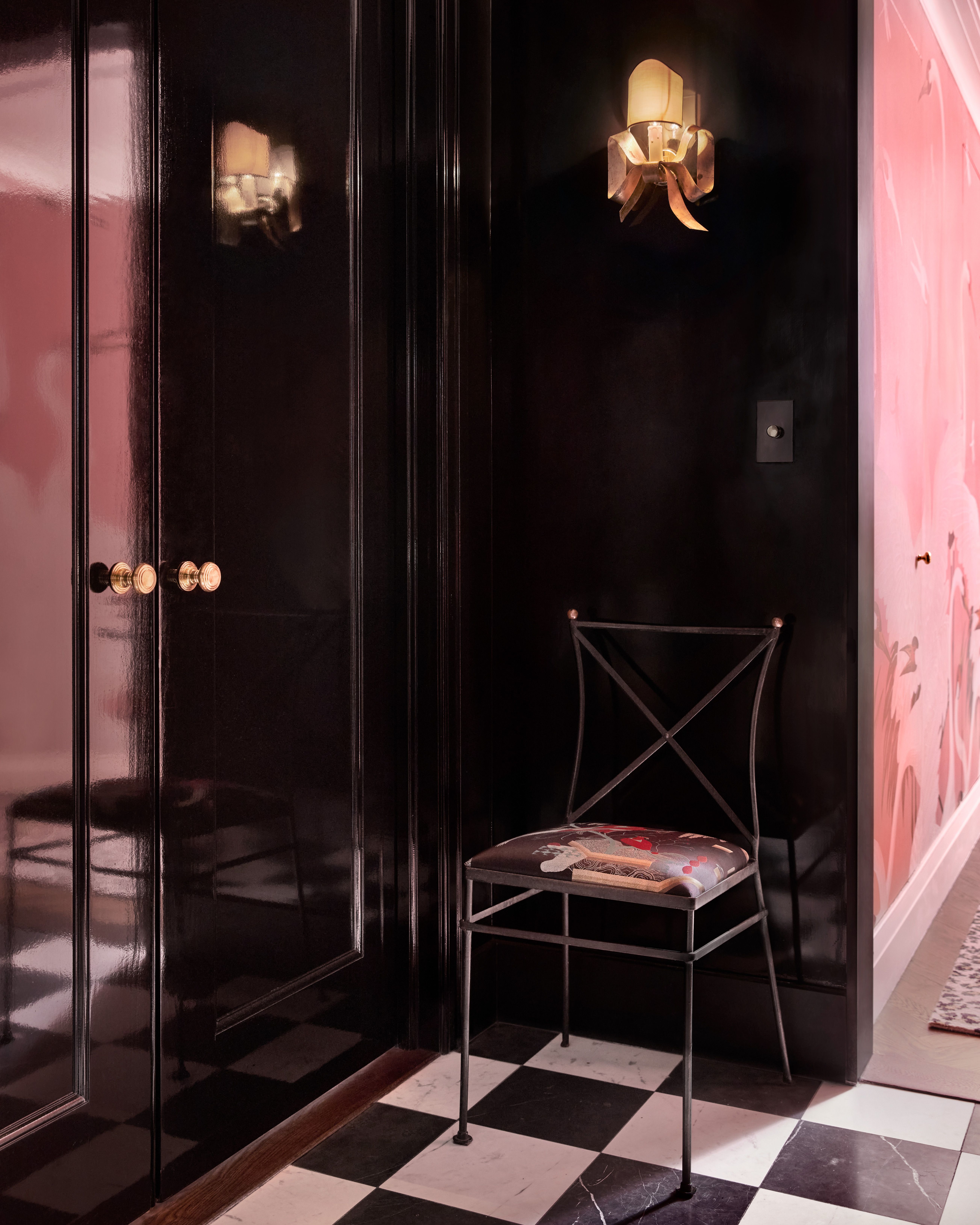
Ethan HerringtonFor centuries, palaces had anterooms everywhere: before reception rooms, state bedrooms, dining rooms, you name it. There were anterooms for anterooms. Now, most of us are lucky to have a small rotunda within which to take off our shoes or hang up our coats. But that hasn't stopped designers from making these tiny spaces full of wonder (and function!). Read on for 20 ideas, culled from our archives, on how to decorate your small entryway. 1Stick to the ClassicsKelly MarshallIn this Nate Berkus-designed home, a predictable palette does wonders. Gray and white tiles cover the entryway's floor and and a black metal chair with a white artwork hung above it make the space functional. Rather than a traditional console, the designer placed a black chest of drawers on one wall (more storage for your tiny space!) with a gilt mirror above it to bring out the gold hardware on the chest. 2Keep It SimpleRead McKendreeModern wisdom says we all need a console, stool, and coat rack in our entryway for keys, wallets, headphones, coats and other paraphernalia. But with limited space some long held traditions must be reconsidered. In this minimal entryway by Workshop APD a simple console and circular mirror do the trick. A small box and dish provide storage for those keys and wallets. Advertisement - Continue Reading Below3Cool BlueEric PetschekIn this entryway designed by Bachman Brown Design one color was enough to make the room. Benjamin Moores Brilliant Blue paint was used on the walls. The decor follows a consistent complimentary palette, with a 1960s Swedish mirror by Uno & sten Kristiansson, a pair of Giuseppe Pagano Pogatschnig rope stools, a vintage walnut hanging cabinet, and a carpet from Inigo Elizalde Rugs all in the same soft caramel hue. The Art Deco pendant light is from the '30s and the mixed media artwork on the right is by Sophie Grant. A '60s table lamp by Gerald Thurston for Lightolier perfectly matches the walls. 4Go Big!Tim LenzIn this small entryway designed by Pappas Miron, oversized art hands only inches above a black sideboard. The effect is clean and minimal and, paradoxically, makes the small wall that anchors it feel monumental. Advertisement - Continue Reading Below5Make it Multi-useTim LenzThis entry in an Augusta Hoffman-designed home has slightly literary references. One wall features built-in bookcases and, just around the corner, a corner chairreminiscent of those in early schoolhouses and the libraries of landed English estatessits in front of a wood paneled wall (another literary tradition). The effect is cerebral without sacrificing function. 6Block It OutTim LenzIf you have several walls to activate in your entry, try keeping decorative accessories to a minimum and letting the surfaces speak for themselves. Another angle of the entry in this Pappas Miron-designed home shows how the designers color blocked the space. The wood paneled walls are one decorative element, the tiled floors another, and the burgundy wall off the room yet another. Large art hung around this space act as color blocks themselves. Advertisement - Continue Reading Below7Your Entry as Art GalleryChris MotalliniIn the entry of this Crina Arghirescu Rogard-designed townhouse, the space is treated almost like an art gallery. Two sconces by Mr. Liz Hopkins look like sculpture themselves, as does the ceiling light in a vaguely Ruth Asawa-esque shape. Wrapped in cord by Nathalie Sann Regnault, the baluster has become sculpture too. 8Go GraphicNickGlimenakisIn this home designed by Delia Kenza, graphic forms can be found everywhere. If you are pressed for space in your home, try sticking to one unifying decorative theme. The art hung above the sideboard in this entry mimics the colors and shapes below. The slanted, almond-shaped openings on the wall to the left continue the theme. Not much else is needed!Advertisement - Continue Reading Below9Try an Untraditional HangTim LenzWho says gallery walls should be relegated to large living areas? In this Nicholas Obeid-designed entry the decorator hung several works of art in a gallery wall format. Keep the furniture simple if you try this, so as not to overwhelm the space.10Off the FloorDaniel ScheferSometimes having furniture with feet can make a small space feel even more cramped. In Elad Yifrach's home, a wall console is hung in lieu of a table with legs. Besides that surface, a sconce and mirror are all that is needed to make this entry functional. Advertisement - Continue Reading Below11Storage FirstNoe DeWittIf your entry is small, then the rest of your home probably is too. And if that is the case, every inch of space counts. Entries are often overlooked as opportunities for smart storage, but in this Patrick Mele-designed home, the entry doubles as a library. Use a console or chest of drawers as a bookcase and stack more on top. Mele went further by hanging art that mimics bookbindings above.12Mix Art with Function Roger DaviesIn the entryway of Nathan Turner and Eric Hughes Ojai house, the designer pair spliced a gallery wall with a coat rack. By hanging dog portraits above a series of iron hooks, they've made their coats and hats into art as well! Advertisement - Continue Reading Below13Home in a HotelTrevor TondroMarc Valeanu treats an entry like a hotel room, utilizing hospitality tricks and efficiencies in a domestic setting. For example, instead of a luggage rack for your suitcase, how about a campaign stool for your work bag? 14Use Materials from Elsewhere in the HouseGieves AndersonIn this Frederick Tang-designed house, the entryway was outfitted with black tiles that match a towering fireplace (opposite the door). The move unifies the home, drawing you in as soon as you step over the threshold. Advertisement - Continue Reading Below15Use Wallpaper as a Decorative Statement Max BurkhalterIn this entryway designed by Georgia Tapert Howe, very little furniture was needed to make the space feel warm and complete. That's because the designer opted for a richly detailed Artichoke wallpaper from Brier & Byrd that provides the eye with more than enough visual stimulation. A vintage console from 1stDibs and mirror by Lulu and Georgia complete the scene.16Highlight VerticalityGieves AndersonIn this Frederick Tang project, the homes verticality is highlighted by fluted wood on the staircase and a nearby door, and again with the textile work hanging above a bench. As you sit and take off or put on your shoes, you can't help but looking up, as the vertical lines around you encourage. Advertisement - Continue Reading Below17Keep It CurvyNicole FranzenIn a Chelsea apartment designed by Le Whit the entryway follows a trend represented throughout the home: arched thresholds. Arches celestial connotations make a space feel lighter and higher. Here a custom mural depicting the client's family and pets by Maine-based artist Dean Barger pushes the bucolic narrative further.18Texturize ItRaz KerenIn the entry of a Hollywood Hills house designed by Luis Fernandez, dramatic graphic shapes and textures enliven the white-walled space. A blue-black Cassina Hayama console by Patricia Urquiola anchors the space and provides a surface for those out-the-door knick-knacks and essentials. Andrew Farriss Heaven in Blue from Tappan Collective hangs above it. A wool and silk Geode rug by Temple from Twentieth Gallery brings the texture, creating a navy pool to sink into as you come back from a long day of work. A vintage frosted-glass Star pendant by Kalmar from 1stDibs and a painting by Wes Aderhold bring in more material interest.Advertisement - Continue Reading Below19Lead with LightDavid LandIn this Nina Barnieh-Blair-designed West Village apartment, light is the main attraction. All of the walls were painted the same shade of white, with light oak floors contributing their own levity. A mirror by Ben and Aja Blanc from the Future Perfect reflects the sun over a stool from Matter.20Lacquer It UpEthan HerringtonInstead of the usual mounted mirror, consider reflective surfaces as your wall treatment instead. In this New York City home, design firm Alton Bechara painted the walls in a black lacquer from Fine Paints of Europe. Carrara marble floor tiles add to the drama while a vintage ribbon sconce pushes things still further on the theatrical scale. The thin lines of the vintage chair beneath it do not overwhelm the space.
0 Comments
·0 Shares
·16 Views