ARSTECHNICA.COM
Google accidentally reveals Android’s Material 3 Expressive interface ahead of I/O
Materially different
Google accidentally reveals Android’s Material 3 Expressive interface ahead of I/O
Google published and then deleted details of the new Material 3 Expressive theme.
Ryan Whitwam
–
May 5, 2025 3:54 pm
|
91
Credit:
Google
Credit:
Google
Story text
Size
Small
Standard
Large
Width
*
Standard
Wide
Links
Standard
Orange
* Subscribers only
Learn more
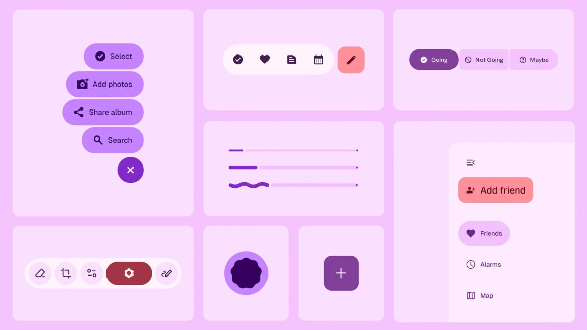
Google's accelerated Android release cycle will soon deliver a new version of the software, and it might look quite different from what you'd expect. Amid rumors of a major UI overhaul, Google seems to have accidentally published a blog post detailing "Material 3 Expressive," which we expect to see revealed at I/O later this month. Google quickly removed the post from its design site, but not before the Internet Archive saved it.
It has been a few years since Google introduced any major changes to its Material theming, but the design team wasn't just sitting idly this whole time. According to the leaked blog post, Google has spent the past three years working on a more emotionally engaging vision for Android design. While the original Material Design did an admirable job of leveraging colors and consistent theming, it could make apps look too similar. The answer to that, apparently, is Material 3 Expressive.
Material 3 Expressive aims to make the most important things easier to see and tap.
Credit:
Google
Material 3 Expressive aims to make the most important things easier to see and tap.
Credit:
Google
Google says this is "the most-researched update to Google’s design system, ever." The effort reportedly included 46 separate studies with hundreds of sample designs. The team showed these designs to more than 18,000 study participants to understand how the user experience would work. In these studies, the design team used a variety of metrics, including the following:
Eye tracking: Analyzing where users focus their attention
Surveys and focus groups: Gauging emotional responses to different designs
Experiments: Gathering sentiment and preferences
Usability: Seeing how quickly participants could understand and use an interface
The result of all this is an interface that appears much more varied than the previous Material Design. The Internet Archive didn't snag most of the blog post's visuals, but 9to5Google saved them. The images include interesting elements, like a floating toolbar and larger, easier to tap buttons in certain areas where they won't interfere with other UI elements.
There are a lot of attention-grabbing shapes and bold colors throughout the interface, but there's a reason it's like that. The experimental approach led to theming that reduces the time it takes people to notice and interact with important UI elements by as much as four times. On the flip side, not everyone uses apps the same way—if you are interested in different UI elements than Google, this could be frustrating.
The youths love it.
Credit:
Google
The youths love it.
Credit:
Google
All those studies allegedly revealed that people prefer Material 3 Expressive to the old version. However, that preference varies greatly with age. Zoomers apparently like Material 3 Expressive a lot, with over 80 percent of younger folks saying it was better than the non-expressive design. That drops to 52 percent by the time you get to the 55-plus age group. Yeah, change can be scary. Google also says Material 3 Expressive was rated as subjectively "cooler" than old designs.
One of many
This leak confirms Android will get a stylish overhaul in version 16, but the benefits (and drawbacks) won't be shared equally. Android is open source, and other OEMs have their own priorities. They can choose to adopt elements of expressive design or not. Just because Google decrees it does not mean it is so.
Depending on the phone you have, the update to Android 16 might not look all that visually different from Android 15. Google creates the open source code and closed-source Google bits, but licensees like Samsung and OnePlus take that and run with it to produce custom versions of the OS with their own branding. It's common to hear Samsung and OnePlus talk about One UI and Oxygen OS, respectively, but not so much about Android itself.
Material 3 Expressive may bleed into these modified versions of Android, but you'll need a Google Pixel device for the full effect. Google's Pixel devices will have system elements attached to this theming system, and most of Google's apps will be updated to the new system at some point. If you've got another phone, you'll probably see much less of the expressive style. However, Motorola's Hello UI usually sticks pretty close to Google's material theming.
Material 3 Expressive isn't just about the system UI or preloaded apps. Google will also make these design templates available to app developers who can support the bright, energetic theming for all phones. However, uptake of material design in apps has been modest so far. It's common to see apps that use a few material UI elements or color theming, but almost no one is running the full Google style.
Google struggled for years to unify Android design aesthetics, but it never made much progress. While Material 3 Expressive looks very thoughtfully designed, it's unlikely it will see any more take-up than the company's previous attempts. Google's contracts with OEMs and its management of the Play Store have both come under legal scrutiny, so the company won't be able to use any heavy-handed tactics to encourage the adoption of Material 3 Expressive.
Ryan Whitwam
Senior Technology Reporter
Ryan Whitwam
Senior Technology Reporter
Ryan Whitwam is a senior technology reporter at Ars Technica, covering the ways Google, AI, and mobile technology continue to change the world. Over his 20-year career, he's written for Android Police, ExtremeTech, Wirecutter, NY Times, and more. He has reviewed more phones than most people will ever own. You can follow him on Bluesky, where you will see photos of his dozens of mechanical keyboards.
91 Comments