www.fastcompany.com
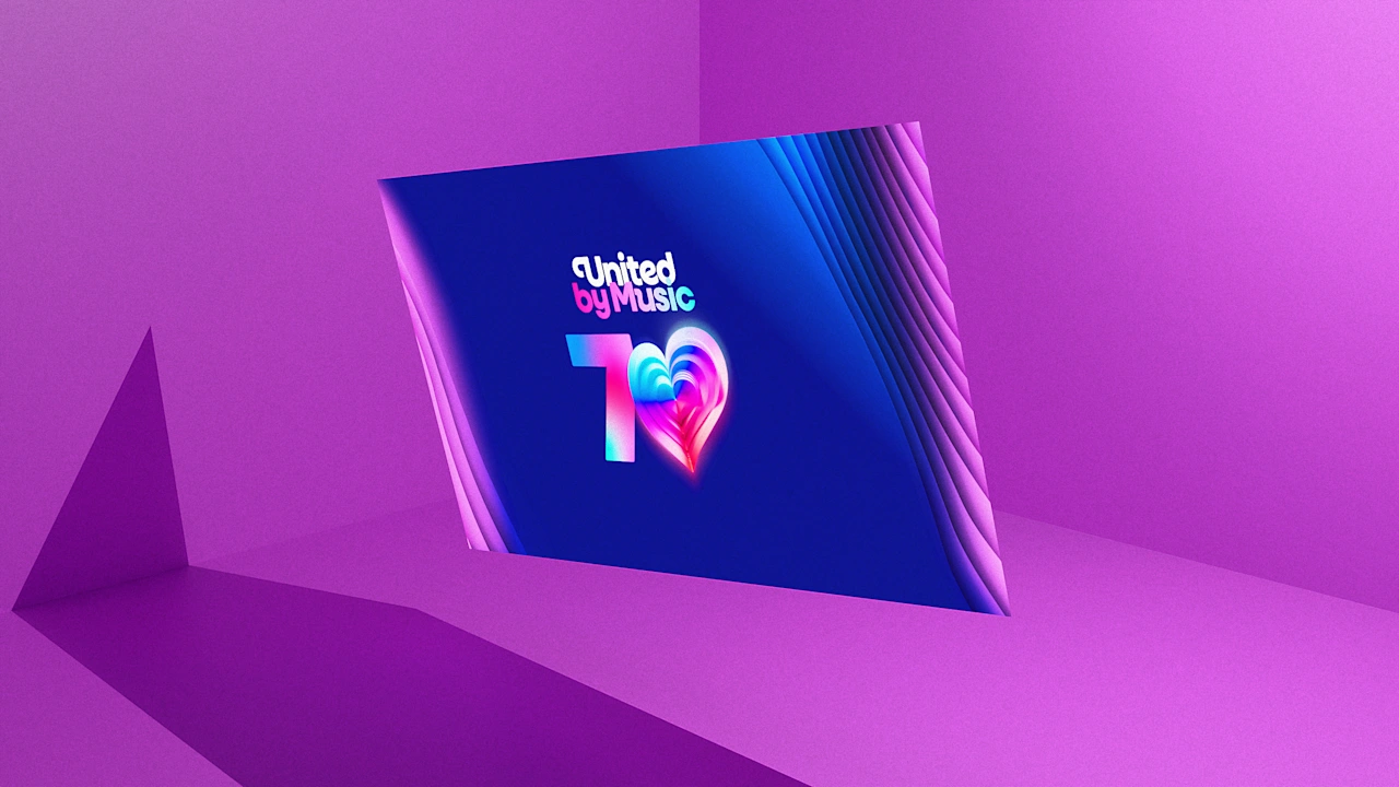
The Eurovision Song Contest, the European musical showdown known for its glittery outfits, unusual performances, and over-the-top fanfare, is returning in 2026 for its 70th year. To usher in the anniversary, the competition just unveiled a rebrand, and fans arent thrilled.Next May, Eurovision (which moves to a new city every year) will be held in Vienna, according to a recent Instagram announcement. There, it will officially roll out its new logo, custom font, and brand symbol, all of which were revealed on August 18 and have since begun to appear on the contests social media accounts.[Image: Eurovision]The new look, which apparently was designed to bring more cohesion to Eurovisions look and make the brand more versatile on digital platforms, has attracted droves of negative feedback from fans. Commenters across social media say the branding has veered into cartoonish territory, with some even implying that the new wordmark and logo were generated by AI rather than human artists.Martin Green, director of Eurovision, says he was not at all surprised by the negative fan reaction, given that Eurovision has such a massive fanbase and any form of creativity is ultimately subjective. While he says that none of the rebrand was generated by AI, hes actually encouraged to see fans advocating for artists over AI.Its really good to see the fans on this, actually, because from a personal and professional point of view, I agree with a lot of them, Green says.Inside Eurovisions new brandingThe new Eurovision branding was designed through a collaboration between the European Broadcasting Unions in-house design team and the British branding studio Pals. Green says there were a few reasons for Eurovision to rebrand in 2026, starting with the fact that the competitions branding has remained largely unchanged for close to 15 years.We deal in pop music, and that pop music keeps us young and tells us whats going on in the world, he says. As a brand, we want to keep refreshed as well.Pals took the main Eurovision logoa hand-drawn script that launched in 2004 and was later refined in 2014and plumped it up with chunkier, curvier letters. Its a typographic choice thats been popular among companies across categories in recent months, from Burger King to Goodreads and Glossier.The former capital E in Eurovision has been swapped for a lowercase version, and the words song contest are now a more prominent part of the logo rendered in the same custom script.In addition, a bespoke typeface called Singing Sans will serve as the Eurovision brands main font. Its a sans serif that can be used for day-to-day needs like press releases, but its also available in an iteration with exaggerated curls for out-of-home messaging and social media. Adapting the brand for digital uses was another of Greens main goals with the new look.I think the last time we refreshed was about 14 years ago, Green says. Even back then, digital was still relatively early. Now we are enormously digital: We reach billions through our social media and our digital activity.To make Eurovisions identity more versatile online, Pals broke out the main logos heart symbol into its own asset called the Chameleon Heart, which can adapt to reflect the host nations identity, a performers individuality, or a particular theme, a press release reads. It can also stand alone in places like the competitions app icons.The key thing was that it really was a refresh and an evolutionwe didnt want to rip up the page, Green says. The brand obviously has great connectivity. Its got great recognition, but it felt a little too informal and laid-back. We wanted to boost it forward.Eurovisions director addresses AI accusationsSo far, the fan reception to the new branding on social media has been overwhelmingly negative. On Instagram and TikTok combined, the reveal has received nearly 5,000 comments, ranging from fans accusing the designers of using AI to generate the new assets to comparing it to the Pampers logo and Picsarts color gradient.[H]ey chat gpt, can you generate a new logo for eurovision, make it look childish, close to the old one but [Junior Eurovision Song Contest] coded, one Instagram commenter said. [I]ts like comic sans ms lol, another on TikTok added. This font came straight out of ChatGPT, a third said.Green has a long career history of working in major events, including serving as head of ceremonies for the 2012 London Olympics, which received massive criticism at the time for its abstract logo. He says the fan backlash did not come as a shock.Its like the songs in the show: People love them, they hate them, they comment on them, he says. You always have to accept when youre refreshing anything that the fans are going to have an opinion. All we ever ask is, Be kind, but you can be criticalits absolutely fine. As fans begin to see more of the new branding, Green adds, hes confident that it will ultimately become more familiar and less controversial.To those speculating that the team used AI to generate Eurovisions branding, Green says that AI may have been used in the very early stages to brainstorm initial concepts, but none of the final branding was generated by AI in any way.A lot of this was hand-drawn by great artists, Green says. We havent used AI to create this. The fact that people feel it might be reminiscent of it, I think, is more about how AI is influencing design subconsciously, if you like. Thats the same thing as looking at the way that digital has influenced design, in terms of how legible and clear it is. The influence might be there, but it wasnt used to create it.