New Brush Thumbnails
code.blender.org
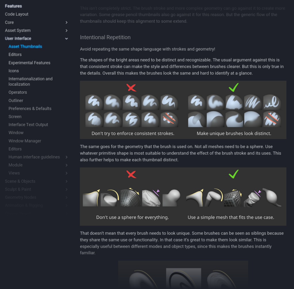
html PUBLIC "-//W3C//DTD HTML 4.0 Transitional//EN" "http://www.w3.org/TR/REC-html40/loose.dtd"Since the start of 2023 when the Brush Asset project went into full force, the goal was also to overhaul the brush thumbnails. A lot of thought went into the new design to make it future proof and fit into the current UI.This ended up as an active community effort to find a coherent and clear visual language. A big thanks to everyone who gave feedback and helped shape the thumbnails that will now be part of Blender 4.3!Style Guides & Example FilesTo make the process fully transparent and easy, a detailed style guide can be found in the developer documentation. Even though no elaborate setups are needed to create authentic looking thumbnails, it also links to the repository where the thumbnails were created.A short snippet of the style guide pageAn Open & Future Proof StyleFor about 15 years since Blender 2.5 the previous brush thumbnails have been added and were built upon. Unfortunately each new addition and iteration created more inconsistencies.A collage of previous brush thumbnails from Blender 2.5 4.2A primary goal was to create a recognizable and consistent design language for all Blender brushes. For all modes and object types. The thumbnails had to seamlessly fit into the themes of the UI and reuse similar accent colors.With the addition of Brush Assets its easier to create huge brush libraries than ever. This exposed a big issue.Previously it was quite difficult to expand the set of brush thumbnails and icons. The files were not accessible to recreate the original thumbnails or create new ones and the process was opaque. Because of this many brushes that were added over the years were lacking a thumbnail or were reused existing ones. Even the process of creating new toolbar icons had a limit to how much variation is possible.Thats why the the creation of Blender 4.3s new thumbnails had to be easy to reproduce and that they seamlessly fit in with all other brushes. The built-in set of Essentials brushes was expanded quite a bit with useful presets, all with new recognizable thumbnails. Users and asset authors should find it just as easy to expand it further.Various early concepts and ideasWe also explored the idea of automatically generated brush previews during the development of Blender 2.8. But covering all possible 2D and 3D brush types and stroke effects is too complex for a procedural system. Instead the creation should be in the hands of the user and as straight forward as possible.Node asset thumbnails for the new hair curves were also created at the same time and the look was directly affected by this. Ideally all official Essentials assets should fit into a similarly coherent look.Iteration Towards Ease of CreationOver the past two years the style of the thumbnails kept being shifted and refined. Many aspects were simplified or dropped in favor for making the creation and visuals simpler.In the original design the thumbnails were supposed to make use of a set of unique icons in the corner to communicate an otherwise obscure meaning or behavior or the brush types. This idea slowly evolved into the flat colored arrows and lines on most of the thumbnails, which are much easier to create and be creative with.Colors also stayed a very secondary element for identifying brushes to keep the thumbnails color-blind friendly.All thumbnails were also supposed to utilize colors, but to keep them clear and focused eventually any regular draw brushes were left without unnecessary colors or strokes.An example of iteration over the Draw and Snake Hook brushes from start to final result.There was also testing of different shaders and lighting effects but the final look always came back to the idea that anybody should be able to create a perfect brush thumbnail on the fly. Some thumbnails are a bit more specific and involved but the key look of Blender thumbnails should be accessible. Simple use of Matcap/flat shading is all you need.To put a direct comparison to the old thumbnails above, here is the collage of the final thumbnail selection that was used as a base reference to create all remaining thumbnails. Many more new brushes and existing brushes with missing thumbnails were added since then.A focused selection of key brushes from every mode and object typeTry it Out!More features can be added for future releases to make the creation of custom thumbnails much faster. For example by making screenshots directly within Blender to assign asset thumbnails. And by adding the exact same Matcap as part of the default selection.We look forward to how the community will be able to expand the brush selection far more than ever before and share distinct looking brushes. Download the Blender 4.3 Beta now to test it out.For feedback and contributing to the Essentials brushes, visit the Call for Content: Default Brushes.Support the Future of BlenderDonate to Blender by joining the Development Fund to support the Blender Foundations work on core development, maintenance, and new releases. Donate to Blender
0 Yorumlar
·0 hisse senetleri
·879 Views


