How to Use the Benjamin Moore Color Trends 2025 Palette
www.elledecor.com
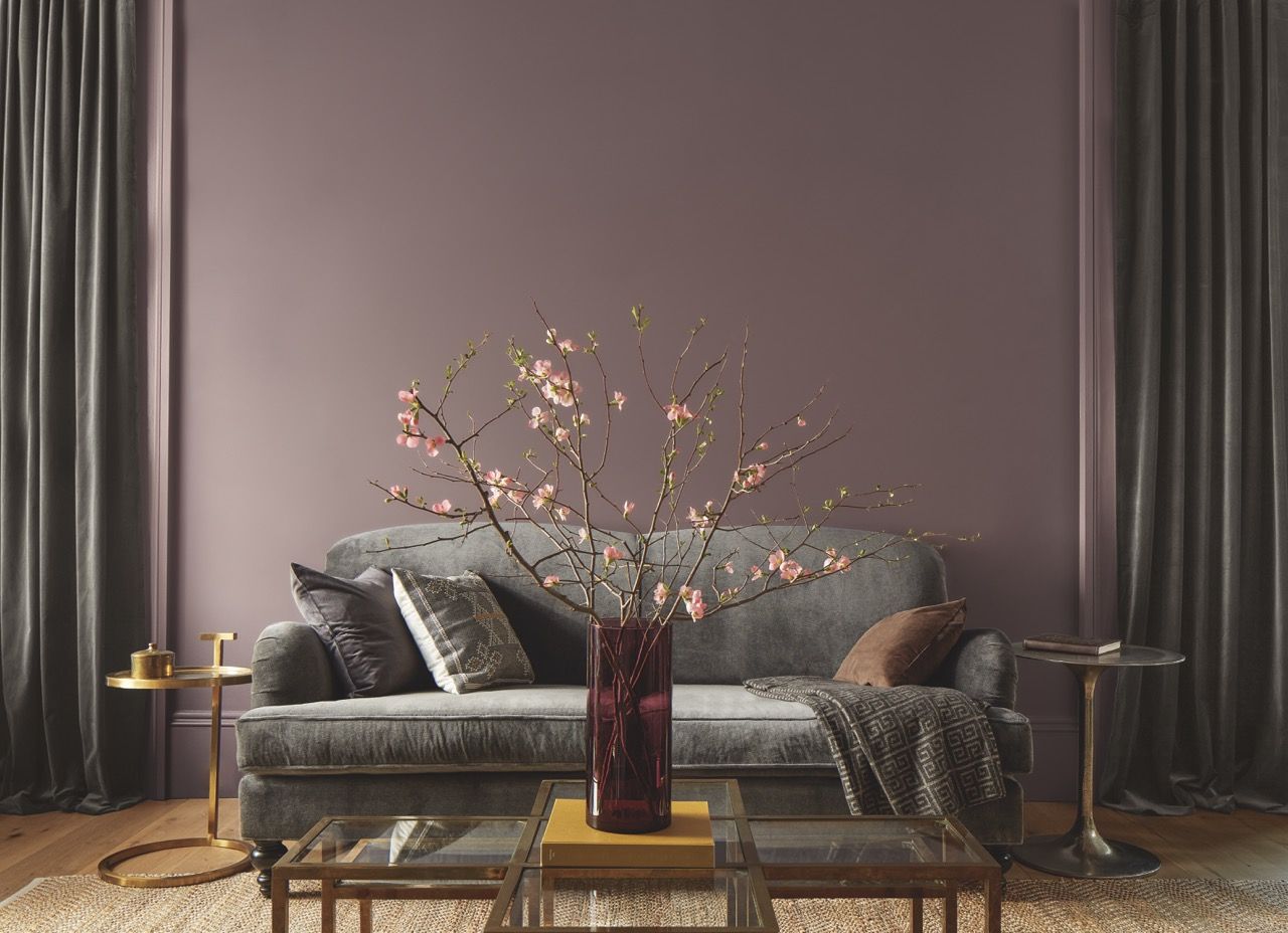
Paint colors get a lot of attention in the interior-design world. It's one of the easiest ways to make a dramatic change in any room. Its no wonder, then, that Benjamin Moores annual Color of the Year announcementalong with the corresponding palette of trending hues itself, is always hotly anticipated. This year is no different: For 2025, the brand crowned Cinnamon Slate 2113-40, a heathered plum and velvety brown, for the top honor, supported by nine other soothing colors with rich undertones. They feel very grounded in the past, says Atlanta-based interior designer Jessica Davis. A lot of historical colors are made from natural pigments, and this whole palette has that vibe. These muted, approachable colors act as the perfect gateway shades for those ready to embrace color without straying too far from safe neutrals. Color gives a space life and personality, says Davis. When I see an interior that uses color, especially in an interesting and unusual way, the space is way more charismatic. Inspired to give your own living room a cozy makeover, or refresh your kitchen cabinets with a fresh coat? We spoke to Davis and other top designers for their suggestions on incorporating the Benjamin Moore Color Trends 2025 Palette into your homes.Benjamin MooreCinnamon Slate 2113-40, Regal Select InteriorColor-Drench ItLately, San Francisco-based interior designer Jon de la Cruz is all about color drenching, he says: Its a fresher take on applying color to a room. This is all the more true with a bolder hue like Cinnamon Slate, which he calls really calming and welcoming. To pull off the monochromatic look, de la Cruz recommends that you pick your wall color and then, staying in that color family, go a bit lighter and a bit darker with furniture and accents to create visual interest. Another key to nailing the trend: Play with textures. Add silk-trimmed curtains, a plush pile rug, nubby pillows, and the like. Let the color be the main character, and all the textures are the supporting cast to enhance it, he says.Benjamin MooreRosepine 461, Regal Select InteriorPaint Your MillworkEmily Barry, an interior designer based in the Northeast, picks Rosepine 461 as perfect for cabinetry. She recently used the medium green color herself for built-ins in a family room, in fact. We didnt want the room to feel too dark, and we also knew that we wanted a more neutral space for the family, because it was open off the kitchen, she says. The soothing yet playful green was just the right touch. To complete the room, Barry used warm wood tones, including a light oak desk and door handles, a rattan chair, and pillows with earthy brown tones.Focus on Trim and Molding There are more ways to paint a room than just doing the walls and having white trim, says Barry. Were kind of bored by that solution. Her go-to trick is to add color through the trim itself: If youre afraid to commit to a full paint job, painting the trim immediately adds character. And while Barry feels any hue from the Benjamin Moore Color Trends 2025 Palette would work well for a contrast trim, her favorite is, again, Rosepine. You could put it on your baseboard, your crown, your window trimyou could even paint your windows and doors and leave the walls white, she says. Its a really beautiful way to bring in color.Benjamin MooreLeather Saddle Brown 2100-20, Regal Select InteriorGo Bold With BrownThis shade is one of the biggest paint trends of the year, and if youre ready for a vibe shift, Barry suggests finding a way to use the velvety Leather Saddle Brown 2100-20 in your home. The designer recently presented the comforting color for a mudroom in a project shes working on. Its going to be so pretty, she says of the space, which will use the shade on partial-wall panels and on the cabinetry. The top of the wall and ceiling will be white, and to round out the space shell include a cool black slate floor, brass fixtures, and a wooden bench. I'm not scared of a brown room, says Barry. But if youre more hesitant about going full-on with the color, she has another suggestion, too: Leave the walls white and simply paint the cabinetry brown.Benjamin MooreTissue Pink 1163, Regal Select InteriorPlay With Color DuosWhy stop at one paint color when you can step up the interest level by using two to create a truly unique room. When I pair colors together in a space, I like to make sure theyre not the same value, and by that I mean not the same lightness or darkness, says Davis. One match-up she likes from the Benjamin Moore trends palette is the deep blue Stained Glass CSP-685 with the beige-y blush Tissue Pink 1163 for a pretty, feminine space. I could see doing it in a primary bedroom, with Stained Glass on the walls and the subtle pink on the ceiling, she says. Pink accents like blush bedding and curtains would be key to tying the room together, she adds. Layer Paint and PaperReigning Color of the Year Cinnamon Slate, with its easygoing plum and brown tones, can work in many different spaces and styles. While many designers are loving the idea of the versatile neutral drenched in a dining room with beautiful wood and brass accents, Barry is excited to use the color in a more unusual way: to create a showstopping laundry room. I would paint the lower half of the wall in Cinnamon Slate, and then wallpaper the top in a paper with touches of the same shade, she says. And while Benjamin Moore does crown a new Color of the Year annually, Cinnamon Slate is meant to last.
0 Comments
·0 Shares
·127 Views


