Farrow & Ball Just Released 12 New Colors. Here's What They Are
www.elledecor.com
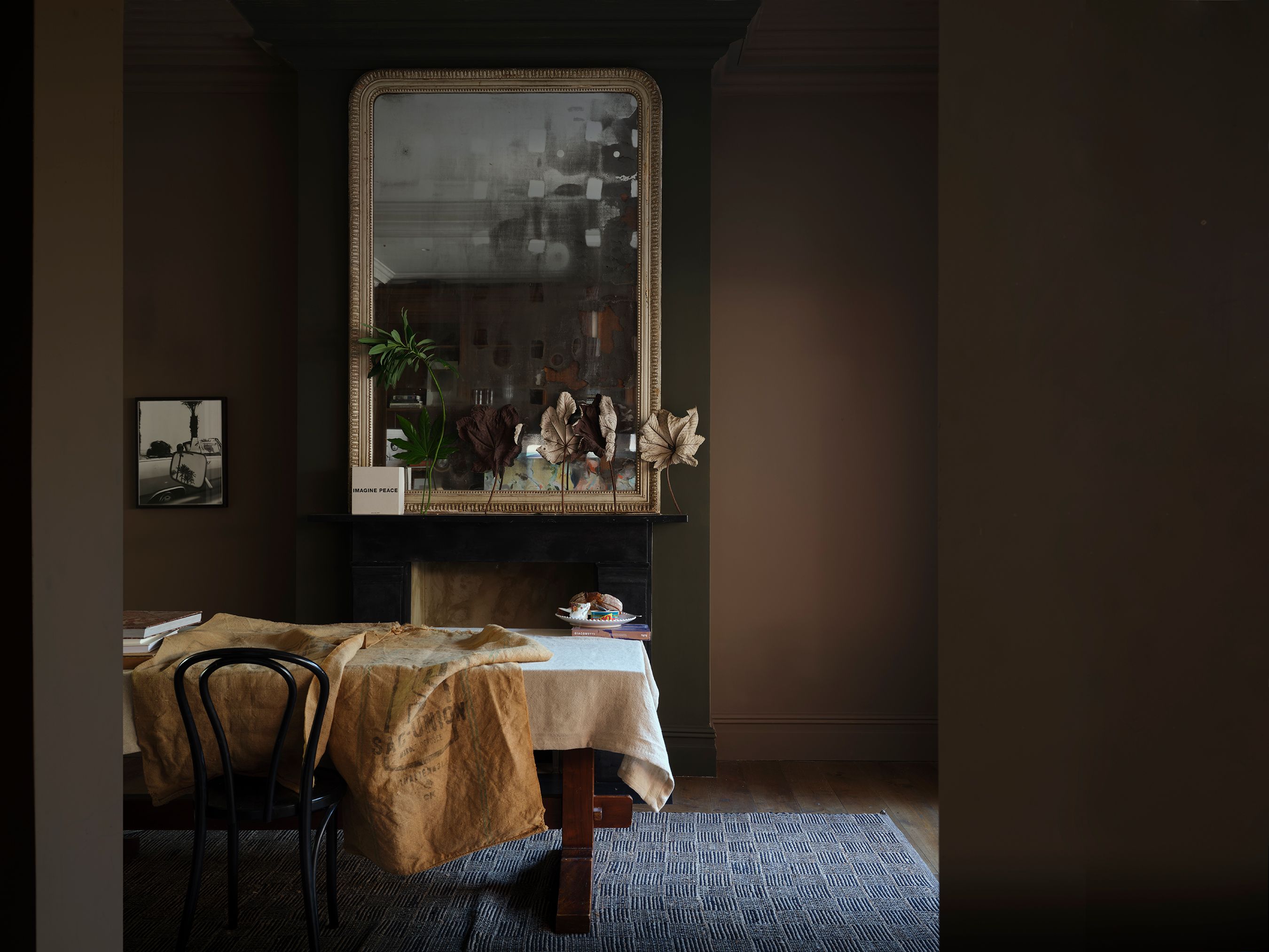
Every item on this page was chosen by an ELLE Decor editor. We may earn commission on some of the items you choose to buy.Farrow & Ball is adding 12 gorgeous new paint colors to its paletteand were rethinking every room in our house. Three of the colors were pulled from the Farrow & Ball archive and nine are entirely new shades, ranging from deep terracottas to crisp blues, earthy greens to delicate pinks. These new additions, the first batch of new colors since 2022, will be available February 27. The storied British paint manufacturer is known for its carefully curated palette of 132 rich paint colors. Their decision to add a dozen additional shades to that list (retiring 12 older colors to make room) is definitely worth the wait. Theyre sultry, theyre earthy, and they shouldnt feel all that foreign. Thats because when looking for a muse, Farrow & Ball color curator Joa Studholme and creative director Charlotte Cosby went right back to the basics: Everyday household items. Whether its a dependable garden tool, a run-of-the-mill clothes starch, folkloric fireplaces, a humble duster, or a fresh batch of sweet marmalade, quotidian things provided infinite inspiration. James MerrellScallop is a soft salmon hue (a lighter interpretation of Dead Salmon) that was inspired by the gentle curved shape of shellfish. Take Scallop, a soft salmon hue (a lighter interpretation of Dead Salmon) that was inspired by the gentle curved shape of shellfish. Then theres Dipper, a down-to-earth green that got its name from a tool beloved by gardeners to create holes for planting seeds or bulbs. We especially love Douter, a smoky gray-green tone that was inspired by the soot and tarnished brass of a traditional candle snuffer. And yes, they really did name one color after starch: Sizing, a crisp, blue-based neutral with blue undertones, is proof that Farrow & Ball can make anything sophisticated. You can almost smell clean laundry when you look at this color, Studholme laughs. James MerrellKakelugn is a light blue that was named after the folkloric fires of Sweden. Now that we spend more time in our homes, I felt it was time to celebrate the more commonplace colors, to find joy in the familiar, often from the world of utility and function, Studholme says. These colors are ordinary treasures to me, often overlooked in our busy day to day lives. Her favorite? Marmelo, a grounded orange hue named after the marmelo quince. I cant help but think about the bountiful shelves of a larder bursting with jars of pickles and jams when I look at it, Studholme adds. Its warming and restorative.As the brand is known for its cheerfully quirky paint names and whimsical word play (our favorites are Mole's Breath, Arsenic, and Sulking Pink Room), they havent disappointed in this new color round-up. We especially love Kakelugn, which was named after the folkloric fires of Sweden; and Duster, a deep ochre inspired by the familiar yellow cloth used to clean homes worldwide. The three colors that have been resurrected from the brands archive reflect the growing trend towards earthy hues and more muted tones achievable with natural dyes. Sap Green, is a deep olive; Etruscan Red is a deep brown-red; and Broccoli Brown is a dark stone. Despite being rich, they have a quietness which sits particularly well alongside many natural materials, Studholme says. James MerrellDouter, a smoky grey-green tone, was inspired by the soot and tarnished brass of a traditional candle snuffer.While Studholme and Cosby delight in seeing their colors come to life in their customers various creative interpretations, they particularly look forward to seeing how designers are no longer inhibited by painting walls in one color with a white trim. Nothing can give more pleasure than the bottom half of a wall painted in earthy Etruscan Red, with gentle Scallop on the top halfand perhaps the ceiling in Douter, Full Gloss, Studholme says. We consider this permission to throw the color rulebook out the window and lean into your inner marmalade-loving heart. Rachel SilvaAssociate Digital EditorRachel Silva is the associate digital editor at ELLE DECOR, where she covers all things design, architecture, and lifestyle. She also oversees the publications feature article coverage, and is, at any moment, knee-deep in an investigation on everything from the best spa gifts to the best faux florals on the internet right now. She has more than 16 years of experience in editorial, working as a photo assignment editor at Time and acting as the president of Women in Media in NYC. She went to Columbia Journalism School, and her work has been nominated for awards from ASME, the Society of Publication Designers, and World Press Photo.
0 Comments
·0 Shares
·142 Views


