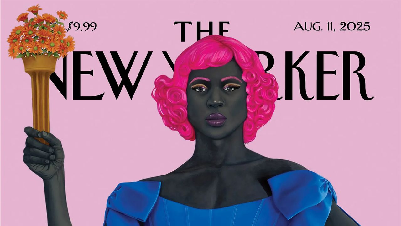
• Four science-based rules that will make your conversations flow

    One of the four pillars of good conversation is levity. You needn’t be a comedian, you can but have some funTetra Images, LLC/Alamy
    Conversation lies at the heart of our relationships – yet many of us find it surprisingly hard to talk to others. We may feel anxious at the thought of making small talk with strangers and struggle to connect with the people who are closest to us. If that sounds familiar, Alison Wood Brooks hopes to help. She is a professor at Harvard Business School, where she teaches an oversubscribed course called “TALK: How to talk gooder in business and life”, and the author of a new book, Talk: The science of conversation and the art of being ourselves. Both offer four key principles for more meaningful exchanges. Conversations are inherently unpredictable, says Wood Brooks, but they follow certain rules – and knowing their architecture makes us more comfortable with what is outside of our control. New Scientist asked her about the best ways to apply this research to our own chats.
    David Robson: Talking about talking feels quite meta. Do you ever find yourself critiquing your own performance?
    Alison Wood Brooks: There are so many levels of “meta-ness”. I have often felt like I’m floating over the room, watching conversations unfold, even as I’m involved in them myself. I teach a course at Harvard, andall get to experience this feeling as well. There can be an uncomfortable period of hypervigilance, but I hope that dissipates over time as they develop better habits. There is a famous quote from Charlie Parker, who was a jazz saxophonist. He said something like, “Practise, practise, practise, and then when you get on stage, let it all go and just wail.” I think that’s my approach to conversation. Even when you’re hyper-aware of conversation dynamics, you have to remember the true delight of being with another human mind, and never lose the magic of being together. Think ahead, but once you’re talking, let it all go and just wail.

    Reading your book, I learned that a good way to enliven a conversation is to ask someone why they are passionate about what they do. So, where does your passion for conversation come from?
    I have two answers to this question. One is professional. Early in my professorship at Harvard, I had been studying emotions by exploring how people talk about their feelings and the balance between what we feel inside and how we express that to others. And I realised I just had this deep, profound interest in figuring out how people talk to each other about everything, not just their feelings. We now have scientific tools that allow us to capture conversations and analyse them at large scale. Natural language processing, machine learning, the advent of AI – all this allows us to take huge swathes of transcript data and process it much more efficiently.

    Receive a weekly dose of discovery in your inbox.

    Sign up to newsletter

    The personal answer is that I’m an identical twin, and I spent my whole life, from the moment I opened my newborn eyes, existing next to a person who’s an exact copy of myself. It was like observing myself at very close range, interacting with the world, interacting with other people. I could see when she said and did things well, and I could try to do that myself. And I saw when her jokes failed, or she stumbled over her words – I tried to avoid those mistakes. It was a very fortunate form of feedback that not a lot of people get. And then, as a twin, you’ve got this person sharing a bedroom, sharing all your clothes, going to all the same parties and playing on the same sports teams, so we were just constantly in conversation with each other. You reached this level of shared reality that is so incredible, and I’ve spent the rest of my life trying to help other people get there in their relationships, too.
    “TALK” cleverly captures your framework for better conversations: topics, asking, levity and kindness. Let’s start at the beginning. How should we decide what to talk about?
    My first piece of advice is to prepare. Some people do this naturally. They already think about the things that they should talk about with somebody before they see them. They should lean into this habit. Some of my students, however, think it’s crazy. They think preparation will make the conversation seem rigid and forced and overly scripted. But just because you’ve thought ahead about what you might talk about doesn’t mean you have to talk about those things once the conversation is underway. It does mean, however, that you always have an idea waiting for you when you’re not sure what to talk about next. Having just one topic in your back pocket can help you in those anxiety-ridden moments. It makes things more fluent, which is important for establishing a connection. Choosing a topic is not only important at the start of a conversation. We’re constantly making decisions about whether we should stay on one subject, drift to something else or totally shift gears and go somewhere wildly different.
    Sometimes the topic of conversation is obvious. Even then, knowing when to switch to a new one can be trickyMartin Parr/Magnum Photos
    What’s your advice when making these decisions?
    There are three very clear signs that suggest that it’s time to switch topics. The first is longer mutual pauses. The second is more uncomfortable laughter, which we use to fill the space that we would usually fill excitedly with good content. And the third sign is redundancy. Once you start repeating things that have already been said on the topic, it’s a sign that you should move to something else.
    After an average conversation, most people feel like they’ve covered the right number of topics. But if you ask people after conversations that didn’t go well, they’ll more often say that they didn’t talk about enough things, rather than that they talked about too many things. This suggests that a common mistake is lingering too long on a topic after you’ve squeezed all the juice out of it.
    The second element of TALK is asking questions. I think a lot of us have heard the advice to ask more questions, yet many people don’t apply it. Why do you think that is?
    Many years of research have shown that the human mind is remarkably egocentric. Often, we are so focused on our own perspective that we forget to even ask someone else to share what’s in their mind. Another reason is fear. You’re interested in the other person, and you know you should ask them questions, but you’re afraid of being too intrusive, or that you will reveal your own incompetence, because you feel you should know the answer already.

    What kinds of questions should we be asking – and avoiding?
    In the book, I talk about the power of follow-up questions that build on anything that your partner has just said. It shows that you heard them, that you care and that you want to know more. Even one follow-up question can springboard us away from shallow talk into something deeper and more meaningful.
    There are, however, some bad patterns of question asking, such as “boomerasking”. Michael Yeomansand I have a recent paper about this, and oh my gosh, it’s been such fun to study. It’s a play on the word boomerang: it comes back to the person who threw it. If I ask you what you had for breakfast, and you tell me you had Special K and banana, and then I say, “Well, let me tell you about my breakfast, because, boy, was it delicious” – that’s boomerasking. Sometimes it’s a thinly veiled way of bragging or complaining, but sometimes I think people are genuinely interested to hear from their partner, but then the partner’s answer reminds them so much of their own life that they can’t help but start sharing their perspective. In our research, we have found that this makes your partner feel like you weren’t interested in their perspective, so it seems very insincere. Sharing your own perspective is important. It’s okay at some point to bring the conversation back to yourself. But don’t do it so soon that it makes your partner feel like you didn’t hear their answer or care about it.
    Research by Alison Wood Brooks includes a recent study on “boomerasking”, a pitfall you should avoid to make conversations flowJanelle Bruno
    What are the benefits of levity?
    When we think of conversations that haven’t gone well, we often think of moments of hostility, anger or disagreement, but a quiet killer of conversation is boredom. Levity is the antidote. These small moments of sparkle or fizz can pull us back in and make us feel engaged with each other again.
    Our research has shown that we give status and respect to people who make us feel good, so much so that in a group of people, a person who can land even one appropriate joke is more likely to be voted as the leader. And the joke doesn’t even need to be very funny! It’s the fact that they were confident enough to try it and competent enough to read the room.
    Do you have any practical steps that people can apply to generate levity, even if they’re not a natural comedian?
    Levity is not just about being funny. In fact, aiming to be a comedian is not the right goal. When we watch stand-up on Netflix, comedians have rehearsed those jokes and honed them and practised them for a long time, and they’re delivering them in a monologue to an audience. It’s a completely different task from a live conversation. In real dialogue, what everybody is looking for is to feel engaged, and that doesn’t require particularly funny jokes or elaborate stories. When you see opportunities to make it fun or lighten the mood, that’s what you need to grab. It can come through a change to a new, fresh topic, or calling back to things that you talked about earlier in the conversation or earlier in your relationship. These callbacks – which sometimes do refer to something funny – are such a nice way of showing that you’ve listened and remembered. A levity move could also involve giving sincere compliments to other people. When you think nice things, when you admire someone, make sure you say it out loud.

    This brings us to the last element of TALK: kindness. Why do we so often fail to be as kind as we would like?
    Wobbles in kindness often come back to our egocentrism. Research shows that we underestimate how much other people’s perspectives differ from our own, and we forget that we have the tools to ask other people directly in conversation for their perspective. Being a kinder conversationalist is about trying to focus on your partner’s perspective and then figuring what they need and helping them to get it.
    Finally, what is your number one tip for readers to have a better conversation the next time they speak to someone?
    Every conversation is surprisingly tricky and complex. When things don’t go perfectly, give yourself and others more grace. There will be trips and stumbles and then a little grace can go very, very far.
    Topics:
    #four #sciencebased #rules #that #will
    Four science-based rules that will make your conversations flow
    One of the four pillars of good conversation is levity. You needn’t be a comedian, you can but have some funTetra Images, LLC/Alamy Conversation lies at the heart of our relationships – yet many of us find it surprisingly hard to talk to others. We may feel anxious at the thought of making small talk with strangers and struggle to connect with the people who are closest to us. If that sounds familiar, Alison Wood Brooks hopes to help. She is a professor at Harvard Business School, where she teaches an oversubscribed course called “TALK: How to talk gooder in business and life”, and the author of a new book, Talk: The science of conversation and the art of being ourselves. Both offer four key principles for more meaningful exchanges. Conversations are inherently unpredictable, says Wood Brooks, but they follow certain rules – and knowing their architecture makes us more comfortable with what is outside of our control. New Scientist asked her about the best ways to apply this research to our own chats. David Robson: Talking about talking feels quite meta. Do you ever find yourself critiquing your own performance? Alison Wood Brooks: There are so many levels of “meta-ness”. I have often felt like I’m floating over the room, watching conversations unfold, even as I’m involved in them myself. I teach a course at Harvard, andall get to experience this feeling as well. There can be an uncomfortable period of hypervigilance, but I hope that dissipates over time as they develop better habits. There is a famous quote from Charlie Parker, who was a jazz saxophonist. He said something like, “Practise, practise, practise, and then when you get on stage, let it all go and just wail.” I think that’s my approach to conversation. Even when you’re hyper-aware of conversation dynamics, you have to remember the true delight of being with another human mind, and never lose the magic of being together. Think ahead, but once you’re talking, let it all go and just wail. Reading your book, I learned that a good way to enliven a conversation is to ask someone why they are passionate about what they do. So, where does your passion for conversation come from? I have two answers to this question. One is professional. Early in my professorship at Harvard, I had been studying emotions by exploring how people talk about their feelings and the balance between what we feel inside and how we express that to others. And I realised I just had this deep, profound interest in figuring out how people talk to each other about everything, not just their feelings. We now have scientific tools that allow us to capture conversations and analyse them at large scale. Natural language processing, machine learning, the advent of AI – all this allows us to take huge swathes of transcript data and process it much more efficiently. Receive a weekly dose of discovery in your inbox. Sign up to newsletter The personal answer is that I’m an identical twin, and I spent my whole life, from the moment I opened my newborn eyes, existing next to a person who’s an exact copy of myself. It was like observing myself at very close range, interacting with the world, interacting with other people. I could see when she said and did things well, and I could try to do that myself. And I saw when her jokes failed, or she stumbled over her words – I tried to avoid those mistakes. It was a very fortunate form of feedback that not a lot of people get. And then, as a twin, you’ve got this person sharing a bedroom, sharing all your clothes, going to all the same parties and playing on the same sports teams, so we were just constantly in conversation with each other. You reached this level of shared reality that is so incredible, and I’ve spent the rest of my life trying to help other people get there in their relationships, too. “TALK” cleverly captures your framework for better conversations: topics, asking, levity and kindness. Let’s start at the beginning. How should we decide what to talk about? My first piece of advice is to prepare. Some people do this naturally. They already think about the things that they should talk about with somebody before they see them. They should lean into this habit. Some of my students, however, think it’s crazy. They think preparation will make the conversation seem rigid and forced and overly scripted. But just because you’ve thought ahead about what you might talk about doesn’t mean you have to talk about those things once the conversation is underway. It does mean, however, that you always have an idea waiting for you when you’re not sure what to talk about next. Having just one topic in your back pocket can help you in those anxiety-ridden moments. It makes things more fluent, which is important for establishing a connection. Choosing a topic is not only important at the start of a conversation. We’re constantly making decisions about whether we should stay on one subject, drift to something else or totally shift gears and go somewhere wildly different. Sometimes the topic of conversation is obvious. Even then, knowing when to switch to a new one can be trickyMartin Parr/Magnum Photos What’s your advice when making these decisions? There are three very clear signs that suggest that it’s time to switch topics. The first is longer mutual pauses. The second is more uncomfortable laughter, which we use to fill the space that we would usually fill excitedly with good content. And the third sign is redundancy. Once you start repeating things that have already been said on the topic, it’s a sign that you should move to something else. After an average conversation, most people feel like they’ve covered the right number of topics. But if you ask people after conversations that didn’t go well, they’ll more often say that they didn’t talk about enough things, rather than that they talked about too many things. This suggests that a common mistake is lingering too long on a topic after you’ve squeezed all the juice out of it. The second element of TALK is asking questions. I think a lot of us have heard the advice to ask more questions, yet many people don’t apply it. Why do you think that is? Many years of research have shown that the human mind is remarkably egocentric. Often, we are so focused on our own perspective that we forget to even ask someone else to share what’s in their mind. Another reason is fear. You’re interested in the other person, and you know you should ask them questions, but you’re afraid of being too intrusive, or that you will reveal your own incompetence, because you feel you should know the answer already. What kinds of questions should we be asking – and avoiding? In the book, I talk about the power of follow-up questions that build on anything that your partner has just said. It shows that you heard them, that you care and that you want to know more. Even one follow-up question can springboard us away from shallow talk into something deeper and more meaningful. There are, however, some bad patterns of question asking, such as “boomerasking”. Michael Yeomansand I have a recent paper about this, and oh my gosh, it’s been such fun to study. It’s a play on the word boomerang: it comes back to the person who threw it. If I ask you what you had for breakfast, and you tell me you had Special K and banana, and then I say, “Well, let me tell you about my breakfast, because, boy, was it delicious” – that’s boomerasking. Sometimes it’s a thinly veiled way of bragging or complaining, but sometimes I think people are genuinely interested to hear from their partner, but then the partner’s answer reminds them so much of their own life that they can’t help but start sharing their perspective. In our research, we have found that this makes your partner feel like you weren’t interested in their perspective, so it seems very insincere. Sharing your own perspective is important. It’s okay at some point to bring the conversation back to yourself. But don’t do it so soon that it makes your partner feel like you didn’t hear their answer or care about it. Research by Alison Wood Brooks includes a recent study on “boomerasking”, a pitfall you should avoid to make conversations flowJanelle Bruno What are the benefits of levity? When we think of conversations that haven’t gone well, we often think of moments of hostility, anger or disagreement, but a quiet killer of conversation is boredom. Levity is the antidote. These small moments of sparkle or fizz can pull us back in and make us feel engaged with each other again. Our research has shown that we give status and respect to people who make us feel good, so much so that in a group of people, a person who can land even one appropriate joke is more likely to be voted as the leader. And the joke doesn’t even need to be very funny! It’s the fact that they were confident enough to try it and competent enough to read the room. Do you have any practical steps that people can apply to generate levity, even if they’re not a natural comedian? Levity is not just about being funny. In fact, aiming to be a comedian is not the right goal. When we watch stand-up on Netflix, comedians have rehearsed those jokes and honed them and practised them for a long time, and they’re delivering them in a monologue to an audience. It’s a completely different task from a live conversation. In real dialogue, what everybody is looking for is to feel engaged, and that doesn’t require particularly funny jokes or elaborate stories. When you see opportunities to make it fun or lighten the mood, that’s what you need to grab. It can come through a change to a new, fresh topic, or calling back to things that you talked about earlier in the conversation or earlier in your relationship. These callbacks – which sometimes do refer to something funny – are such a nice way of showing that you’ve listened and remembered. A levity move could also involve giving sincere compliments to other people. When you think nice things, when you admire someone, make sure you say it out loud. This brings us to the last element of TALK: kindness. Why do we so often fail to be as kind as we would like? Wobbles in kindness often come back to our egocentrism. Research shows that we underestimate how much other people’s perspectives differ from our own, and we forget that we have the tools to ask other people directly in conversation for their perspective. Being a kinder conversationalist is about trying to focus on your partner’s perspective and then figuring what they need and helping them to get it. Finally, what is your number one tip for readers to have a better conversation the next time they speak to someone? Every conversation is surprisingly tricky and complex. When things don’t go perfectly, give yourself and others more grace. There will be trips and stumbles and then a little grace can go very, very far. Topics: #four #sciencebased #rules #that #will
    WWW.NEWSCIENTIST.COM
    Four science-based rules that will make your conversations flow
    One of the four pillars of good conversation is levity. You needn’t be a comedian, you can but have some funTetra Images, LLC/Alamy Conversation lies at the heart of our relationships – yet many of us find it surprisingly hard to talk to others. We may feel anxious at the thought of making small talk with strangers and struggle to connect with the people who are closest to us. If that sounds familiar, Alison Wood Brooks hopes to help. She is a professor at Harvard Business School, where she teaches an oversubscribed course called “TALK: How to talk gooder in business and life”, and the author of a new book, Talk: The science of conversation and the art of being ourselves. Both offer four key principles for more meaningful exchanges. Conversations are inherently unpredictable, says Wood Brooks, but they follow certain rules – and knowing their architecture makes us more comfortable with what is outside of our control. New Scientist asked her about the best ways to apply this research to our own chats. David Robson: Talking about talking feels quite meta. Do you ever find yourself critiquing your own performance? Alison Wood Brooks: There are so many levels of “meta-ness”. I have often felt like I’m floating over the room, watching conversations unfold, even as I’m involved in them myself. I teach a course at Harvard, and [my students] all get to experience this feeling as well. There can be an uncomfortable period of hypervigilance, but I hope that dissipates over time as they develop better habits. There is a famous quote from Charlie Parker, who was a jazz saxophonist. He said something like, “Practise, practise, practise, and then when you get on stage, let it all go and just wail.” I think that’s my approach to conversation. Even when you’re hyper-aware of conversation dynamics, you have to remember the true delight of being with another human mind, and never lose the magic of being together. Think ahead, but once you’re talking, let it all go and just wail. Reading your book, I learned that a good way to enliven a conversation is to ask someone why they are passionate about what they do. So, where does your passion for conversation come from? I have two answers to this question. One is professional. Early in my professorship at Harvard, I had been studying emotions by exploring how people talk about their feelings and the balance between what we feel inside and how we express that to others. And I realised I just had this deep, profound interest in figuring out how people talk to each other about everything, not just their feelings. We now have scientific tools that allow us to capture conversations and analyse them at large scale. Natural language processing, machine learning, the advent of AI – all this allows us to take huge swathes of transcript data and process it much more efficiently. Receive a weekly dose of discovery in your inbox. Sign up to newsletter The personal answer is that I’m an identical twin, and I spent my whole life, from the moment I opened my newborn eyes, existing next to a person who’s an exact copy of myself. It was like observing myself at very close range, interacting with the world, interacting with other people. I could see when she said and did things well, and I could try to do that myself. And I saw when her jokes failed, or she stumbled over her words – I tried to avoid those mistakes. It was a very fortunate form of feedback that not a lot of people get. And then, as a twin, you’ve got this person sharing a bedroom, sharing all your clothes, going to all the same parties and playing on the same sports teams, so we were just constantly in conversation with each other. You reached this level of shared reality that is so incredible, and I’ve spent the rest of my life trying to help other people get there in their relationships, too. “TALK” cleverly captures your framework for better conversations: topics, asking, levity and kindness. Let’s start at the beginning. How should we decide what to talk about? My first piece of advice is to prepare. Some people do this naturally. They already think about the things that they should talk about with somebody before they see them. They should lean into this habit. Some of my students, however, think it’s crazy. They think preparation will make the conversation seem rigid and forced and overly scripted. But just because you’ve thought ahead about what you might talk about doesn’t mean you have to talk about those things once the conversation is underway. It does mean, however, that you always have an idea waiting for you when you’re not sure what to talk about next. Having just one topic in your back pocket can help you in those anxiety-ridden moments. It makes things more fluent, which is important for establishing a connection. Choosing a topic is not only important at the start of a conversation. We’re constantly making decisions about whether we should stay on one subject, drift to something else or totally shift gears and go somewhere wildly different. Sometimes the topic of conversation is obvious. Even then, knowing when to switch to a new one can be trickyMartin Parr/Magnum Photos What’s your advice when making these decisions? There are three very clear signs that suggest that it’s time to switch topics. The first is longer mutual pauses. The second is more uncomfortable laughter, which we use to fill the space that we would usually fill excitedly with good content. And the third sign is redundancy. Once you start repeating things that have already been said on the topic, it’s a sign that you should move to something else. After an average conversation, most people feel like they’ve covered the right number of topics. But if you ask people after conversations that didn’t go well, they’ll more often say that they didn’t talk about enough things, rather than that they talked about too many things. This suggests that a common mistake is lingering too long on a topic after you’ve squeezed all the juice out of it. The second element of TALK is asking questions. I think a lot of us have heard the advice to ask more questions, yet many people don’t apply it. Why do you think that is? Many years of research have shown that the human mind is remarkably egocentric. Often, we are so focused on our own perspective that we forget to even ask someone else to share what’s in their mind. Another reason is fear. You’re interested in the other person, and you know you should ask them questions, but you’re afraid of being too intrusive, or that you will reveal your own incompetence, because you feel you should know the answer already. What kinds of questions should we be asking – and avoiding? In the book, I talk about the power of follow-up questions that build on anything that your partner has just said. It shows that you heard them, that you care and that you want to know more. Even one follow-up question can springboard us away from shallow talk into something deeper and more meaningful. There are, however, some bad patterns of question asking, such as “boomerasking”. Michael Yeomans [at Imperial College London] and I have a recent paper about this, and oh my gosh, it’s been such fun to study. It’s a play on the word boomerang: it comes back to the person who threw it. If I ask you what you had for breakfast, and you tell me you had Special K and banana, and then I say, “Well, let me tell you about my breakfast, because, boy, was it delicious” – that’s boomerasking. Sometimes it’s a thinly veiled way of bragging or complaining, but sometimes I think people are genuinely interested to hear from their partner, but then the partner’s answer reminds them so much of their own life that they can’t help but start sharing their perspective. In our research, we have found that this makes your partner feel like you weren’t interested in their perspective, so it seems very insincere. Sharing your own perspective is important. It’s okay at some point to bring the conversation back to yourself. But don’t do it so soon that it makes your partner feel like you didn’t hear their answer or care about it. Research by Alison Wood Brooks includes a recent study on “boomerasking”, a pitfall you should avoid to make conversations flowJanelle Bruno What are the benefits of levity? When we think of conversations that haven’t gone well, we often think of moments of hostility, anger or disagreement, but a quiet killer of conversation is boredom. Levity is the antidote. These small moments of sparkle or fizz can pull us back in and make us feel engaged with each other again. Our research has shown that we give status and respect to people who make us feel good, so much so that in a group of people, a person who can land even one appropriate joke is more likely to be voted as the leader. And the joke doesn’t even need to be very funny! It’s the fact that they were confident enough to try it and competent enough to read the room. Do you have any practical steps that people can apply to generate levity, even if they’re not a natural comedian? Levity is not just about being funny. In fact, aiming to be a comedian is not the right goal. When we watch stand-up on Netflix, comedians have rehearsed those jokes and honed them and practised them for a long time, and they’re delivering them in a monologue to an audience. It’s a completely different task from a live conversation. In real dialogue, what everybody is looking for is to feel engaged, and that doesn’t require particularly funny jokes or elaborate stories. When you see opportunities to make it fun or lighten the mood, that’s what you need to grab. It can come through a change to a new, fresh topic, or calling back to things that you talked about earlier in the conversation or earlier in your relationship. These callbacks – which sometimes do refer to something funny – are such a nice way of showing that you’ve listened and remembered. A levity move could also involve giving sincere compliments to other people. When you think nice things, when you admire someone, make sure you say it out loud. This brings us to the last element of TALK: kindness. Why do we so often fail to be as kind as we would like? Wobbles in kindness often come back to our egocentrism. Research shows that we underestimate how much other people’s perspectives differ from our own, and we forget that we have the tools to ask other people directly in conversation for their perspective. Being a kinder conversationalist is about trying to focus on your partner’s perspective and then figuring what they need and helping them to get it. Finally, what is your number one tip for readers to have a better conversation the next time they speak to someone? Every conversation is surprisingly tricky and complex. When things don’t go perfectly, give yourself and others more grace. There will be trips and stumbles and then a little grace can go very, very far. Topics:
    Like
    Love
    Wow
    Sad
    Angry
    522
    2 Comments 0 Shares
  • Turning Points: Accept & Proceed

    12 June, 2025

    In our turning points series, design studios share some of the key moments that shaped their business. This week, we meet Accept & Proceed.

    Accept & Proceed is a London based brand and design studio that works with clients like NASA, Nike and LEGO.
    Founder David Johnston talks us through some of the decisions that defined his business.
    In 2006, Johnston took the leap to start his own business, armed with a good name and a willingness to bend the truth about his team…
    I’d gone through my career learning from big organisations, and one small organisation, and I felt like I wasn’t happy where I was. It was my dad who encouraged me to take a leap of faith and try and go it alone. With nothing more than a month’s wages in the bank and a lot of energy, I decided to go and set up an agency.
    That really just means giving yourself a name and starting to promote yourself in the world.
    Accept & Proceed founder David Johnston
    I think the name itself is a very important thing. I wanted something that was memorable but also layered in meaning. A name that starts with an “a” is very beneficial when you’re being listed in the index of books and things like that.
    But it became a bit of a compass for the way that we wanted to create work, around accepting the status quo for what it is, but with a continual commitment to proceed nonetheless.
    Because I didn’t have anyone to work with, in those early months I just made up email addresses of people that didn’t exist. That allowed me to cost projects up for multiple people. That’s obviously a degree of hustle I wouldn’t encourage in everyone, but it meant I was able to charge multiple day rates for projects where I was playing the role of four or five people.
    Self-initiated projects have long been part of the studio’s DNA and played a key role in building key client relationships.
    A&P by… was a brief to explore these letterforms without any commercial intent apart from the joy of creative expression. I started reaching out to illustrators and artists and photographers and designers that I really rated, and the things that started coming back were incredible.
    I was overwhelmed by the amount of energy and passion that people like Mr Bingo and Jason Evans were bringing to this.
    I think in so many ways, the answer to everything is community. I’ve gone on to work with a lot of the people that created these, and they also became friends. It was an early example of dissolving these illusionary boundaries around what an agency might be, but also expanding and amplifying your potential.
    The first of Accept & Proceed’s Light Calendars
    Then in 2006, I was trying to establish our portfolio and I wanted something to send out into the world that would also be an example of how Accept & Proceed thinks about design. I landed on these data visualisations that show the amount of light and darkness that would happen in London in the year ahead.
    I worked with a freelance designer called Stephen Heath on the first one – he is now our creative director.
    This kickstarted a 10-year exploration, and they became a rite of passage for new designers that came into the studio, to take that very similar data and express it in completely new ways. It culminated in an exhibition in London in 2016, showing ten years’ of prints.
    They were a labour of love, but they also meant that every single year we had a number of prints that we could send out to new potential contacts. Still when I go to the global headquarters of Nike in Beaverton in Portland, I’m amazed at how many of these sit in leaders’ offices there.
    When we first got a finance director, they couldn’t believe how much we’d invested as a business in things like this – we even had our own gallery for a while. It doesn’t make sense from a purely numbers mindset, but if you put things out there for authentic reasons, there are ripple effects over time.
    In 2017, the studio became a B-corp, the fourth creative agency in the UK to get this accreditation.
    Around 2016, I couldn’t help but look around – as we probably all have at varying points over the last 10 years – and wondered, what the fuck is going on?
    All these systems are not fit for purpose for the future – financial systems, food systems, relationship systems, energy systems. They’re not working. And I was like shit, are we part of the problem?
    Accept & Proceed’s work for the NASA Jet Propulsion Laboratory
    I’ve always thought of brand as a piece of technology that can fundamentally change our actions and the world around us. That comes with a huge responsibility.
    We probably paid four months’ wages of two people full-time just to get accredited, so it’s quite a high bar. But I like that the programme shackles you to this idea of improvement. You can’t rest on your laurels if you want to be re-accredited. It’s like the way design works as an iterative process – you have to keep getting better.
    In 2019, Johnston and his team started thinking seriously about the studio’s own brand, and created a punchy, nuanced new positioning.
    We got to a point where we’d proven we could help brands achieve their commercial aims. But we wanted to hold a position ourselves, not just be a conduit between a brand and its audience.
    It still amazes me that so few agencies actually stand for anything. We realised that all the things – vision, mission, principles – that we’ve been creating for brands for years, we hadn’t done for ourselves.
    It’s a bit like when you see a hairdresser with a really dodgy haircut. But it’s hard to cut your own hair.
    So we went through that process, which was really difficult, and we landed on “Design for the future” as our promise to the world.
    And if you’re going to have that as a promise, you better be able to describe the world you’re creating through your work, which we call “the together world.”
    Accept & Proceed’s work for Second Sea
    We stand at this most incredible moment in history where the latest technology and science is catching up with ancient wisdom, to know that we must become more entangled, more together, more whole.
    And we’ve assessed five global shifts that are happening in order to be able to take us towards a more together world through our work – interbeing, reciprocity, healing, resilience and liberation.
    The year before last, we lost three global rebrand projects based on our positioning. Every one of them said to me, “You’re right but we’re not ready.”
    But this year, I think the product market fit of what we’ve been saying for the last five years is really starting to mesh. We’re working with Arc’teryx on their 2030 landscape, evolving Nike’s move to zero, and working with LEGO on what their next 100 years might look like, which is mind-boggling work.
    I don’t think we could have won any of those opportunities had we not been talking for quite a long time about design for the future.
    In 2023, Johnston started a sunrise gathering on Hackney Marshes, which became a very significant part of his life.
    I had the flu and I had a vision in my dreamy fluey state of a particular spot on Hackney Marshes where people were gathering and watching the sunrise. I happened to tell my friend, the poet Thomas Sharp this, and he said, “That’s a premonition. You have to make it happen.”
    The first year there were five of us – this year there were 300 people for the spring equinox in March.
    I don’t fully know what these gatherings will lead to. Will Accept & Proceed start to introduce the seasons to the way we operate as a business? It’s a thought I’ve had percolating, but I don’t know. Will it be something else?
    One of the 2024 sunrise gatherings organised by Accept & Proceed founder David Johnston
    I do know that there’s major learnings around authentic community building for brands. We should do away with these buckets we put people into, of age group and location. They aren’t very true. It’s fascinating to see the breadth of people who come to these gatherings.
    Me and Laura were thinking at some point of moving out of London, but I think these sunrise gatherings are now my reason to stay. It’s the thing I didn’t know I needed until I had it. They have made London complete for me.
    There’s something so ancient about watching our star rise, and the reminder that we are actually just animals crawling upon the surface of a planet of mud. That’s what’s real. But it can be hard to remember that when you’re sitting at your computer in the studio.
    These gatherings help me better understand creativity’s true potential, for brands, for the world, and for us.

    Design disciplines in this article

    Brands in this article

    What to read next

    Features

    Turning Points: Cultural branding agency EDIT

    Brand Identity
    20 Nov, 2024
    #turning #points #accept #ampamp #proceed
    Turning Points: Accept & Proceed
    12 June, 2025 In our turning points series, design studios share some of the key moments that shaped their business. This week, we meet Accept & Proceed. Accept & Proceed is a London based brand and design studio that works with clients like NASA, Nike and LEGO. Founder David Johnston talks us through some of the decisions that defined his business. In 2006, Johnston took the leap to start his own business, armed with a good name and a willingness to bend the truth about his team… I’d gone through my career learning from big organisations, and one small organisation, and I felt like I wasn’t happy where I was. It was my dad who encouraged me to take a leap of faith and try and go it alone. With nothing more than a month’s wages in the bank and a lot of energy, I decided to go and set up an agency. That really just means giving yourself a name and starting to promote yourself in the world. Accept & Proceed founder David Johnston I think the name itself is a very important thing. I wanted something that was memorable but also layered in meaning. A name that starts with an “a” is very beneficial when you’re being listed in the index of books and things like that. But it became a bit of a compass for the way that we wanted to create work, around accepting the status quo for what it is, but with a continual commitment to proceed nonetheless. Because I didn’t have anyone to work with, in those early months I just made up email addresses of people that didn’t exist. That allowed me to cost projects up for multiple people. That’s obviously a degree of hustle I wouldn’t encourage in everyone, but it meant I was able to charge multiple day rates for projects where I was playing the role of four or five people. Self-initiated projects have long been part of the studio’s DNA and played a key role in building key client relationships. A&P by… was a brief to explore these letterforms without any commercial intent apart from the joy of creative expression. I started reaching out to illustrators and artists and photographers and designers that I really rated, and the things that started coming back were incredible. I was overwhelmed by the amount of energy and passion that people like Mr Bingo and Jason Evans were bringing to this. I think in so many ways, the answer to everything is community. I’ve gone on to work with a lot of the people that created these, and they also became friends. It was an early example of dissolving these illusionary boundaries around what an agency might be, but also expanding and amplifying your potential. The first of Accept & Proceed’s Light Calendars Then in 2006, I was trying to establish our portfolio and I wanted something to send out into the world that would also be an example of how Accept & Proceed thinks about design. I landed on these data visualisations that show the amount of light and darkness that would happen in London in the year ahead. I worked with a freelance designer called Stephen Heath on the first one – he is now our creative director. This kickstarted a 10-year exploration, and they became a rite of passage for new designers that came into the studio, to take that very similar data and express it in completely new ways. It culminated in an exhibition in London in 2016, showing ten years’ of prints. They were a labour of love, but they also meant that every single year we had a number of prints that we could send out to new potential contacts. Still when I go to the global headquarters of Nike in Beaverton in Portland, I’m amazed at how many of these sit in leaders’ offices there. When we first got a finance director, they couldn’t believe how much we’d invested as a business in things like this – we even had our own gallery for a while. It doesn’t make sense from a purely numbers mindset, but if you put things out there for authentic reasons, there are ripple effects over time. In 2017, the studio became a B-corp, the fourth creative agency in the UK to get this accreditation. Around 2016, I couldn’t help but look around – as we probably all have at varying points over the last 10 years – and wondered, what the fuck is going on? All these systems are not fit for purpose for the future – financial systems, food systems, relationship systems, energy systems. They’re not working. And I was like shit, are we part of the problem? Accept & Proceed’s work for the NASA Jet Propulsion Laboratory I’ve always thought of brand as a piece of technology that can fundamentally change our actions and the world around us. That comes with a huge responsibility. We probably paid four months’ wages of two people full-time just to get accredited, so it’s quite a high bar. But I like that the programme shackles you to this idea of improvement. You can’t rest on your laurels if you want to be re-accredited. It’s like the way design works as an iterative process – you have to keep getting better. In 2019, Johnston and his team started thinking seriously about the studio’s own brand, and created a punchy, nuanced new positioning. We got to a point where we’d proven we could help brands achieve their commercial aims. But we wanted to hold a position ourselves, not just be a conduit between a brand and its audience. It still amazes me that so few agencies actually stand for anything. We realised that all the things – vision, mission, principles – that we’ve been creating for brands for years, we hadn’t done for ourselves. It’s a bit like when you see a hairdresser with a really dodgy haircut. But it’s hard to cut your own hair. So we went through that process, which was really difficult, and we landed on “Design for the future” as our promise to the world. And if you’re going to have that as a promise, you better be able to describe the world you’re creating through your work, which we call “the together world.” Accept & Proceed’s work for Second Sea We stand at this most incredible moment in history where the latest technology and science is catching up with ancient wisdom, to know that we must become more entangled, more together, more whole. And we’ve assessed five global shifts that are happening in order to be able to take us towards a more together world through our work – interbeing, reciprocity, healing, resilience and liberation. The year before last, we lost three global rebrand projects based on our positioning. Every one of them said to me, “You’re right but we’re not ready.” But this year, I think the product market fit of what we’ve been saying for the last five years is really starting to mesh. We’re working with Arc’teryx on their 2030 landscape, evolving Nike’s move to zero, and working with LEGO on what their next 100 years might look like, which is mind-boggling work. I don’t think we could have won any of those opportunities had we not been talking for quite a long time about design for the future. In 2023, Johnston started a sunrise gathering on Hackney Marshes, which became a very significant part of his life. I had the flu and I had a vision in my dreamy fluey state of a particular spot on Hackney Marshes where people were gathering and watching the sunrise. I happened to tell my friend, the poet Thomas Sharp this, and he said, “That’s a premonition. You have to make it happen.” The first year there were five of us – this year there were 300 people for the spring equinox in March. I don’t fully know what these gatherings will lead to. Will Accept & Proceed start to introduce the seasons to the way we operate as a business? It’s a thought I’ve had percolating, but I don’t know. Will it be something else? One of the 2024 sunrise gatherings organised by Accept & Proceed founder David Johnston I do know that there’s major learnings around authentic community building for brands. We should do away with these buckets we put people into, of age group and location. They aren’t very true. It’s fascinating to see the breadth of people who come to these gatherings. Me and Laura were thinking at some point of moving out of London, but I think these sunrise gatherings are now my reason to stay. It’s the thing I didn’t know I needed until I had it. They have made London complete for me. There’s something so ancient about watching our star rise, and the reminder that we are actually just animals crawling upon the surface of a planet of mud. That’s what’s real. But it can be hard to remember that when you’re sitting at your computer in the studio. These gatherings help me better understand creativity’s true potential, for brands, for the world, and for us. Design disciplines in this article Brands in this article What to read next Features Turning Points: Cultural branding agency EDIT Brand Identity 20 Nov, 2024 #turning #points #accept #ampamp #proceed
    WWW.DESIGNWEEK.CO.UK
    Turning Points: Accept & Proceed
    12 June, 2025 In our turning points series, design studios share some of the key moments that shaped their business. This week, we meet Accept & Proceed. Accept & Proceed is a London based brand and design studio that works with clients like NASA, Nike and LEGO. Founder David Johnston talks us through some of the decisions that defined his business. In 2006, Johnston took the leap to start his own business, armed with a good name and a willingness to bend the truth about his team… I’d gone through my career learning from big organisations, and one small organisation, and I felt like I wasn’t happy where I was. It was my dad who encouraged me to take a leap of faith and try and go it alone. With nothing more than a month’s wages in the bank and a lot of energy, I decided to go and set up an agency. That really just means giving yourself a name and starting to promote yourself in the world. Accept & Proceed founder David Johnston I think the name itself is a very important thing. I wanted something that was memorable but also layered in meaning. A name that starts with an “a” is very beneficial when you’re being listed in the index of books and things like that. But it became a bit of a compass for the way that we wanted to create work, around accepting the status quo for what it is, but with a continual commitment to proceed nonetheless. Because I didn’t have anyone to work with, in those early months I just made up email addresses of people that didn’t exist. That allowed me to cost projects up for multiple people. That’s obviously a degree of hustle I wouldn’t encourage in everyone, but it meant I was able to charge multiple day rates for projects where I was playing the role of four or five people. Self-initiated projects have long been part of the studio’s DNA and played a key role in building key client relationships. A&P by… was a brief to explore these letterforms without any commercial intent apart from the joy of creative expression. I started reaching out to illustrators and artists and photographers and designers that I really rated, and the things that started coming back were incredible. I was overwhelmed by the amount of energy and passion that people like Mr Bingo and Jason Evans were bringing to this. I think in so many ways, the answer to everything is community. I’ve gone on to work with a lot of the people that created these, and they also became friends. It was an early example of dissolving these illusionary boundaries around what an agency might be, but also expanding and amplifying your potential. The first of Accept & Proceed’s Light Calendars Then in 2006, I was trying to establish our portfolio and I wanted something to send out into the world that would also be an example of how Accept & Proceed thinks about design. I landed on these data visualisations that show the amount of light and darkness that would happen in London in the year ahead. I worked with a freelance designer called Stephen Heath on the first one – he is now our creative director. This kickstarted a 10-year exploration, and they became a rite of passage for new designers that came into the studio, to take that very similar data and express it in completely new ways. It culminated in an exhibition in London in 2016, showing ten years’ of prints. They were a labour of love, but they also meant that every single year we had a number of prints that we could send out to new potential contacts. Still when I go to the global headquarters of Nike in Beaverton in Portland, I’m amazed at how many of these sit in leaders’ offices there. When we first got a finance director, they couldn’t believe how much we’d invested as a business in things like this – we even had our own gallery for a while. It doesn’t make sense from a purely numbers mindset, but if you put things out there for authentic reasons, there are ripple effects over time. In 2017, the studio became a B-corp, the fourth creative agency in the UK to get this accreditation. Around 2016, I couldn’t help but look around – as we probably all have at varying points over the last 10 years – and wondered, what the fuck is going on? All these systems are not fit for purpose for the future – financial systems, food systems, relationship systems, energy systems. They’re not working. And I was like shit, are we part of the problem? Accept & Proceed’s work for the NASA Jet Propulsion Laboratory I’ve always thought of brand as a piece of technology that can fundamentally change our actions and the world around us. That comes with a huge responsibility. We probably paid four months’ wages of two people full-time just to get accredited, so it’s quite a high bar. But I like that the programme shackles you to this idea of improvement. You can’t rest on your laurels if you want to be re-accredited. It’s like the way design works as an iterative process – you have to keep getting better. In 2019, Johnston and his team started thinking seriously about the studio’s own brand, and created a punchy, nuanced new positioning. We got to a point where we’d proven we could help brands achieve their commercial aims. But we wanted to hold a position ourselves, not just be a conduit between a brand and its audience. It still amazes me that so few agencies actually stand for anything. We realised that all the things – vision, mission, principles – that we’ve been creating for brands for years, we hadn’t done for ourselves. It’s a bit like when you see a hairdresser with a really dodgy haircut. But it’s hard to cut your own hair. So we went through that process, which was really difficult, and we landed on “Design for the future” as our promise to the world. And if you’re going to have that as a promise, you better be able to describe the world you’re creating through your work, which we call “the together world.” Accept & Proceed’s work for Second Sea We stand at this most incredible moment in history where the latest technology and science is catching up with ancient wisdom, to know that we must become more entangled, more together, more whole. And we’ve assessed five global shifts that are happening in order to be able to take us towards a more together world through our work – interbeing, reciprocity, healing, resilience and liberation. The year before last, we lost three global rebrand projects based on our positioning. Every one of them said to me, “You’re right but we’re not ready.” But this year, I think the product market fit of what we’ve been saying for the last five years is really starting to mesh. We’re working with Arc’teryx on their 2030 landscape, evolving Nike’s move to zero, and working with LEGO on what their next 100 years might look like, which is mind-boggling work. I don’t think we could have won any of those opportunities had we not been talking for quite a long time about design for the future. In 2023, Johnston started a sunrise gathering on Hackney Marshes, which became a very significant part of his life. I had the flu and I had a vision in my dreamy fluey state of a particular spot on Hackney Marshes where people were gathering and watching the sunrise. I happened to tell my friend, the poet Thomas Sharp this, and he said, “That’s a premonition. You have to make it happen.” The first year there were five of us – this year there were 300 people for the spring equinox in March. I don’t fully know what these gatherings will lead to. Will Accept & Proceed start to introduce the seasons to the way we operate as a business? It’s a thought I’ve had percolating, but I don’t know. Will it be something else? One of the 2024 sunrise gatherings organised by Accept & Proceed founder David Johnston I do know that there’s major learnings around authentic community building for brands. We should do away with these buckets we put people into, of age group and location. They aren’t very true. It’s fascinating to see the breadth of people who come to these gatherings. Me and Laura were thinking at some point of moving out of London, but I think these sunrise gatherings are now my reason to stay. It’s the thing I didn’t know I needed until I had it. They have made London complete for me. There’s something so ancient about watching our star rise, and the reminder that we are actually just animals crawling upon the surface of a planet of mud. That’s what’s real. But it can be hard to remember that when you’re sitting at your computer in the studio. These gatherings help me better understand creativity’s true potential, for brands, for the world, and for us. Design disciplines in this article Brands in this article What to read next Features Turning Points: Cultural branding agency EDIT Brand Identity 20 Nov, 2024
    0 Comments 0 Shares
  • 8 Stunning Sunset Color Palettes

    8 Stunning Sunset Color Palettes
    Zoe Santoro • 

    In this article:See more ▼Post may contain affiliate links which give us commissions at no cost to you.There’s something absolutely magical about watching the sun dip below the horizon, painting the sky in breathtaking hues that seem almost too beautiful to be real. As a designer, I find myself constantly inspired by these natural masterpieces that unfold before us every evening. The way warm oranges melt into soft pinks, how deep purples blend seamlessly with golden yellows – it’s like nature’s own masterclass in color theory.
    If you’re looking to infuse your next project with the warmth, romance, and natural beauty of a perfect sunset, you’ve come to the right place. I’ve curated eight of the most captivating sunset color palettes that will bring that golden hour magic directly into your designs.
    Psst... Did you know you can get unlimited downloads of 59,000+ fonts and millions of other creative assets for just /mo? Learn more »The 8 Most Breathtaking Sunset Color Palettes
    1. Golden Hour Glow

    #FFD700

    #FF8C00

    #FF6347

    #CD5C5C

    Download this color palette

    735×1102
    Pinterest image

    2160×3840
    Vertical wallpaper

    900×900
    Square

    3840×2160
    4K Wallpaper

    This palette captures that perfect moment when everything seems to be touched by liquid gold. The warm yellows transition beautifully into rich oranges and soft coral reds, creating a sense of warmth and optimism that’s impossible to ignore. I find this combination works wonderfully for brands that want to evoke feelings of happiness, energy, and positivity.
    2. Tropical Paradise

    #FF69B4

    #FF1493

    #FF8C00

    #FFD700

    Download this color palette

    735×1102
    Pinterest image

    2160×3840
    Vertical wallpaper

    900×900
    Square

    3840×2160
    4K Wallpaper

    Inspired by those incredible sunsets you see in tropical destinations, this vibrant palette combines hot pinks with brilliant oranges and golden yellows. It’s bold, it’s energetic, and it’s perfect for projects that need to make a statement. I love using these colors for summer campaigns or anything that needs to capture that vacation feeling.
    3. Desert Dreams

    #CD853F

    #D2691E

    #B22222

    #8B0000

    Download this color palette

    735×1102
    Pinterest image

    2160×3840
    Vertical wallpaper

    900×900
    Square

    3840×2160
    4K Wallpaper

    Get 300+ Fonts for FREEEnter your email to download our 100% free "Font Lover's Bundle". For commercial & personal use. No royalties. No fees. No attribution. 100% free to use anywhere.

    The American Southwest produces some of the most spectacular sunsets on earth, and this palette pays homage to those incredible desert skies. The earthy browns blend into warm oranges before deepening into rich reds and burgundies. This combination brings a sense of grounding and authenticity that works beautifully for rustic or heritage brands.
    4. Pastel Evening

    #FFE4E1

    #FFA07A

    #F0E68C

    #DDA0DD

    Download this color palette

    735×1102
    Pinterest image

    2160×3840
    Vertical wallpaper

    900×900
    Square

    3840×2160
    4K Wallpaper

    Not every sunset needs to be bold and dramatic. This softer palette captures those gentle, dreamy evenings when the sky looks like it’s been painted with watercolors. The delicate pinks, peaches, and lavenders create a romantic, ethereal feeling that’s perfect for wedding designs, beauty brands, or any project that needs a touch of feminine elegance.
    5. Coastal Sunset

    #fae991

    #FF7F50

    #FF6347

    #4169E1

    #1E90FF

    Download this color palette

    735×1102
    Pinterest image

    2160×3840
    Vertical wallpaper

    900×900
    Square

    3840×2160
    4K Wallpaper

    There’s something special about watching the sun set over the ocean, where warm oranges and corals meet the deep blues of the sea and sky. This palette captures that perfect contrast between warm and cool tones. I find it creates a sense of adventure and wanderlust that’s ideal for travel brands or outdoor companies.
    6. Urban Twilight

    #ffeda3

    #fdad52

    #fc8a6e

    #575475

    #111f2a

    Download this color palette

    735×1102
    Pinterest image

    2160×3840
    Vertical wallpaper

    900×900
    Square

    3840×2160
    4K Wallpaper

    As the sun sets behind city skylines, you get these incredible contrasts between deep purples and vibrant oranges. This sophisticated palette brings together the mystery of twilight with the warmth of the setting sun. It’s perfect for creating designs that feel both modern and dramatic.
    7. Autumn Harvest

    #FF4500

    #FF8C00

    #DAA520

    #8B4513

    Download this color palette

    735×1102
    Pinterest image

    2160×3840
    Vertical wallpaper

    900×900
    Square

    3840×2160
    4K Wallpaper

    This palette captures those perfect fall evenings when the sunset seems to echo the changing leaves. The deep oranges and golden yellows create a cozy, inviting feeling that’s perfect for seasonal campaigns or brands that want to evoke comfort and tradition.
    8. Fire Sky

    #652220

    #DC143C

    #FF0000

    #FF4500

    #FF8C00

    Download this color palette

    735×1102
    Pinterest image

    2160×3840
    Vertical wallpaper

    900×900
    Square

    3840×2160
    4K Wallpaper

    Sometimes nature puts on a show that’s so intense it takes your breath away. This bold, fiery palette captures those dramatic sunsets that look like the sky is literally on fire. It’s not for the faint of heart, but when you need maximum impact and energy, these colors deliver in spades.
    Why Sunset Colors Never Go Out of Style
    Before we explore how to use these palettes effectively, let’s talk about why sunset colors have such enduring appeal in design. There’s something deeply ingrained in human psychology that responds to these warm, glowing hues. They remind us of endings and beginnings, of peaceful moments and natural beauty.
    From a design perspective, sunset colors offer incredible versatility. They can be bold and energetic or soft and romantic. They work equally well for corporate branding and personal projects. And perhaps most importantly, they’re inherently optimistic – they make people feel good.
    I’ve found that incorporating sunset-inspired colors into modern projects adds an instant sense of warmth and approachability that resonates with audiences across all demographics. Whether you’re working on packaging design, web interfaces, or environmental graphics, these palettes can help create an emotional connection that goes beyond mere aesthetics.
    How to Master Sunset Palettes in Contemporary Design
    Using sunset colors effectively requires more than just picking pretty hues and hoping for the best. Here are some strategies I’ve developed for incorporating these palettes into modern design work:
    Start with Temperature Balance
    One of the most important aspects of working with sunset palettes is understanding color temperature. Most sunset combinations naturally include both warm and cool elements – the warm oranges and yellows of the sun itself, balanced by the cooler purples and blues of the surrounding sky. Maintaining this temperature balance keeps your designs from feeling flat or monotonous.
    Layer for Depth
    Real sunsets have incredible depth and dimension, with colors layering and blending into each other. Try to recreate this in your designs by using gradients, overlays, or layered elements rather than flat blocks of color. This approach creates visual interest and mimics the natural way these colors appear in nature.
    Consider Context and Contrast
    While sunset colors are beautiful, they need to work within the context of your overall design. Pay attention to readability – text needs sufficient contrast against sunset backgrounds. Consider using neutrals like deep charcoal or cream to provide breathing room and ensure your message remains clear.
    Embrace Gradual Transitions
    The magic of a sunset lies in how colors flow seamlessly from one to another. Incorporate this principle into your designs through smooth gradients, subtle color shifts, or elements that bridge between different hues in your palette.
    The Science Behind Our Sunset Obsession
    As someone who’s spent years studying color psychology, I’m fascinated by why sunset colors have such universal appeal. Research suggests that warm colors like those found in sunsets trigger positive emotional responses and can even increase feelings of comfort and security.
    There’s also the association factor – sunsets are linked in our minds with relaxation, beauty, and positive experiences. When we see these colors in design, we unconsciously associate them with those same positive feelings. This makes sunset palettes particularly effective for brands that want to create emotional connections with their audiences.
    The cyclical nature of sunsets also plays a role. They happen every day, marking the transition from activity to rest, from work to leisure. This gives sunset colors a sense of familiarity and comfort that few other color combinations can match.
    Applying Sunset Palettes Across Design Disciplines
    One of the things I love most about sunset color palettes is how adaptable they are across different types of design work:
    Brand Identity Design
    Sunset colors can help brands convey warmth, optimism, and approachability. I’ve used variations of these palettes for everything from artisanal food companies to wellness brands. The key is choosing the right intensity level for your brand’s personality – softer palettes for more refined brands, bolder combinations for companies that want to make a statement.
    Digital Design
    In web and app design, sunset colors can create interfaces that feel warm and inviting rather than cold and clinical. I often use these palettes for backgrounds, accent elements, or call-to-action buttons. The natural flow between colors makes them perfect for creating smooth user experiences that guide the eye naturally through content.
    Print and Packaging
    Sunset palettes really shine in print applications where you can take advantage of rich, saturated colors. They work beautifully for packaging design, particularly for products associated with warmth, comfort, or natural ingredients. The key is ensuring your color reproduction is accurate – sunset colors can look muddy if not handled properly in print.
    Environmental Design
    In spaces, sunset colors can create incredibly welcoming environments. I’ve seen these palettes used effectively in restaurants, retail spaces, and even corporate offices where the goal is to create a sense of warmth and community.
    Seasonal Considerations and Trending Applications
    While sunset colors are timeless, they do have natural seasonal associations that smart designers can leverage. The warmer, more intense sunset palettes work beautifully for fall and winter campaigns, while the softer, more pastel variations are perfect for spring and summer applications.
    I’ve noticed a growing trend toward using sunset palettes in unexpected contexts – tech companies embracing warm gradients, financial services using sunset colors to appear more approachable, and healthcare brands incorporating these hues to create more comforting environments.
    Conclusion: Bringing Natural Beauty Into Modern Design
    As we’ve explored these eight stunning sunset color palettes, I hope you’ve gained new appreciation for the incredible design potential that nature provides us every single day. These colors aren’t just beautiful – they’re powerful tools for creating emotional connections, conveying brand values, and making designs that truly resonate with people.
    The secret to successfully using sunset palettes lies in understanding both their emotional impact and their technical requirements. Don’t be afraid to experiment with different combinations and intensities, but always keep your audience and context in mind.
    Remember, the best sunset colors aren’t just about picking the prettiest hues – they’re about capturing the feeling of those magical moments when day transitions to night. Whether you’re creating a logo that needs to convey warmth and trust, designing a website that should feel welcoming and approachable, or developing packaging that needs to stand out on crowded shelves, these sunset-inspired palettes offer endless possibilities.
    So the next time you catch yourself stopped in your tracks by a particularly stunning sunset, take a moment to really study those colors. Notice how they blend and flow, how they make you feel, and how they change as the light shifts. Then bring that natural magic into your next design project.
    After all, if nature can create such breathtaking color combinations every single day, imagine what we can achieve when we learn from the master. Happy designing!

    Zoe Santoro

    Zoe is an art student and graphic designer with a passion for creativity and adventure. Whether she’s sketching in a cozy café or capturing inspiration from vibrant cityscapes, she finds beauty in every corner of the world. With a love for bold colors, clean design, and storytelling through visuals, Zoe blends her artistic skills with her wanderlust to create stunning, travel-inspired designs. Follow her journey as she explores new places, discovers fresh inspiration, and shares her creative process along the way.

    10 Warm Color Palettes That’ll Brighten Your DayThere’s nothing quite like the embracing quality of warm colors to make a design feel inviting and alive. As someone...These 1920s Color Palettes are ‘Greater than Gatsby’There’s something undeniably captivating about the color schemes of the Roaring Twenties. As a designer with a passion for historical...How Fonts Influence Tone and Clarity in Animated VideosAudiences interact differently with messages based on which fonts designers choose to use within a text presentation. Fonts shape how...
    #stunning #sunset #color #palettes
    8 Stunning Sunset Color Palettes
    8 Stunning Sunset Color Palettes Zoe Santoro •  In this article:See more ▼Post may contain affiliate links which give us commissions at no cost to you.There’s something absolutely magical about watching the sun dip below the horizon, painting the sky in breathtaking hues that seem almost too beautiful to be real. As a designer, I find myself constantly inspired by these natural masterpieces that unfold before us every evening. The way warm oranges melt into soft pinks, how deep purples blend seamlessly with golden yellows – it’s like nature’s own masterclass in color theory. If you’re looking to infuse your next project with the warmth, romance, and natural beauty of a perfect sunset, you’ve come to the right place. I’ve curated eight of the most captivating sunset color palettes that will bring that golden hour magic directly into your designs. 👋 Psst... Did you know you can get unlimited downloads of 59,000+ fonts and millions of other creative assets for just /mo? Learn more »The 8 Most Breathtaking Sunset Color Palettes 1. Golden Hour Glow #FFD700 #FF8C00 #FF6347 #CD5C5C Download this color palette 735×1102 Pinterest image 2160×3840 Vertical wallpaper 900×900 Square 3840×2160 4K Wallpaper This palette captures that perfect moment when everything seems to be touched by liquid gold. The warm yellows transition beautifully into rich oranges and soft coral reds, creating a sense of warmth and optimism that’s impossible to ignore. I find this combination works wonderfully for brands that want to evoke feelings of happiness, energy, and positivity. 2. Tropical Paradise #FF69B4 #FF1493 #FF8C00 #FFD700 Download this color palette 735×1102 Pinterest image 2160×3840 Vertical wallpaper 900×900 Square 3840×2160 4K Wallpaper Inspired by those incredible sunsets you see in tropical destinations, this vibrant palette combines hot pinks with brilliant oranges and golden yellows. It’s bold, it’s energetic, and it’s perfect for projects that need to make a statement. I love using these colors for summer campaigns or anything that needs to capture that vacation feeling. 3. Desert Dreams #CD853F #D2691E #B22222 #8B0000 Download this color palette 735×1102 Pinterest image 2160×3840 Vertical wallpaper 900×900 Square 3840×2160 4K Wallpaper Get 300+ Fonts for FREEEnter your email to download our 100% free "Font Lover's Bundle". For commercial & personal use. No royalties. No fees. No attribution. 100% free to use anywhere. The American Southwest produces some of the most spectacular sunsets on earth, and this palette pays homage to those incredible desert skies. The earthy browns blend into warm oranges before deepening into rich reds and burgundies. This combination brings a sense of grounding and authenticity that works beautifully for rustic or heritage brands. 4. Pastel Evening #FFE4E1 #FFA07A #F0E68C #DDA0DD Download this color palette 735×1102 Pinterest image 2160×3840 Vertical wallpaper 900×900 Square 3840×2160 4K Wallpaper Not every sunset needs to be bold and dramatic. This softer palette captures those gentle, dreamy evenings when the sky looks like it’s been painted with watercolors. The delicate pinks, peaches, and lavenders create a romantic, ethereal feeling that’s perfect for wedding designs, beauty brands, or any project that needs a touch of feminine elegance. 5. Coastal Sunset #fae991 #FF7F50 #FF6347 #4169E1 #1E90FF Download this color palette 735×1102 Pinterest image 2160×3840 Vertical wallpaper 900×900 Square 3840×2160 4K Wallpaper There’s something special about watching the sun set over the ocean, where warm oranges and corals meet the deep blues of the sea and sky. This palette captures that perfect contrast between warm and cool tones. I find it creates a sense of adventure and wanderlust that’s ideal for travel brands or outdoor companies. 6. Urban Twilight #ffeda3 #fdad52 #fc8a6e #575475 #111f2a Download this color palette 735×1102 Pinterest image 2160×3840 Vertical wallpaper 900×900 Square 3840×2160 4K Wallpaper As the sun sets behind city skylines, you get these incredible contrasts between deep purples and vibrant oranges. This sophisticated palette brings together the mystery of twilight with the warmth of the setting sun. It’s perfect for creating designs that feel both modern and dramatic. 7. Autumn Harvest #FF4500 #FF8C00 #DAA520 #8B4513 Download this color palette 735×1102 Pinterest image 2160×3840 Vertical wallpaper 900×900 Square 3840×2160 4K Wallpaper This palette captures those perfect fall evenings when the sunset seems to echo the changing leaves. The deep oranges and golden yellows create a cozy, inviting feeling that’s perfect for seasonal campaigns or brands that want to evoke comfort and tradition. 8. Fire Sky #652220 #DC143C #FF0000 #FF4500 #FF8C00 Download this color palette 735×1102 Pinterest image 2160×3840 Vertical wallpaper 900×900 Square 3840×2160 4K Wallpaper Sometimes nature puts on a show that’s so intense it takes your breath away. This bold, fiery palette captures those dramatic sunsets that look like the sky is literally on fire. It’s not for the faint of heart, but when you need maximum impact and energy, these colors deliver in spades. Why Sunset Colors Never Go Out of Style Before we explore how to use these palettes effectively, let’s talk about why sunset colors have such enduring appeal in design. There’s something deeply ingrained in human psychology that responds to these warm, glowing hues. They remind us of endings and beginnings, of peaceful moments and natural beauty. From a design perspective, sunset colors offer incredible versatility. They can be bold and energetic or soft and romantic. They work equally well for corporate branding and personal projects. And perhaps most importantly, they’re inherently optimistic – they make people feel good. I’ve found that incorporating sunset-inspired colors into modern projects adds an instant sense of warmth and approachability that resonates with audiences across all demographics. Whether you’re working on packaging design, web interfaces, or environmental graphics, these palettes can help create an emotional connection that goes beyond mere aesthetics. How to Master Sunset Palettes in Contemporary Design Using sunset colors effectively requires more than just picking pretty hues and hoping for the best. Here are some strategies I’ve developed for incorporating these palettes into modern design work: Start with Temperature Balance One of the most important aspects of working with sunset palettes is understanding color temperature. Most sunset combinations naturally include both warm and cool elements – the warm oranges and yellows of the sun itself, balanced by the cooler purples and blues of the surrounding sky. Maintaining this temperature balance keeps your designs from feeling flat or monotonous. Layer for Depth Real sunsets have incredible depth and dimension, with colors layering and blending into each other. Try to recreate this in your designs by using gradients, overlays, or layered elements rather than flat blocks of color. This approach creates visual interest and mimics the natural way these colors appear in nature. Consider Context and Contrast While sunset colors are beautiful, they need to work within the context of your overall design. Pay attention to readability – text needs sufficient contrast against sunset backgrounds. Consider using neutrals like deep charcoal or cream to provide breathing room and ensure your message remains clear. Embrace Gradual Transitions The magic of a sunset lies in how colors flow seamlessly from one to another. Incorporate this principle into your designs through smooth gradients, subtle color shifts, or elements that bridge between different hues in your palette. The Science Behind Our Sunset Obsession As someone who’s spent years studying color psychology, I’m fascinated by why sunset colors have such universal appeal. Research suggests that warm colors like those found in sunsets trigger positive emotional responses and can even increase feelings of comfort and security. There’s also the association factor – sunsets are linked in our minds with relaxation, beauty, and positive experiences. When we see these colors in design, we unconsciously associate them with those same positive feelings. This makes sunset palettes particularly effective for brands that want to create emotional connections with their audiences. The cyclical nature of sunsets also plays a role. They happen every day, marking the transition from activity to rest, from work to leisure. This gives sunset colors a sense of familiarity and comfort that few other color combinations can match. Applying Sunset Palettes Across Design Disciplines One of the things I love most about sunset color palettes is how adaptable they are across different types of design work: Brand Identity Design Sunset colors can help brands convey warmth, optimism, and approachability. I’ve used variations of these palettes for everything from artisanal food companies to wellness brands. The key is choosing the right intensity level for your brand’s personality – softer palettes for more refined brands, bolder combinations for companies that want to make a statement. Digital Design In web and app design, sunset colors can create interfaces that feel warm and inviting rather than cold and clinical. I often use these palettes for backgrounds, accent elements, or call-to-action buttons. The natural flow between colors makes them perfect for creating smooth user experiences that guide the eye naturally through content. Print and Packaging Sunset palettes really shine in print applications where you can take advantage of rich, saturated colors. They work beautifully for packaging design, particularly for products associated with warmth, comfort, or natural ingredients. The key is ensuring your color reproduction is accurate – sunset colors can look muddy if not handled properly in print. Environmental Design In spaces, sunset colors can create incredibly welcoming environments. I’ve seen these palettes used effectively in restaurants, retail spaces, and even corporate offices where the goal is to create a sense of warmth and community. Seasonal Considerations and Trending Applications While sunset colors are timeless, they do have natural seasonal associations that smart designers can leverage. The warmer, more intense sunset palettes work beautifully for fall and winter campaigns, while the softer, more pastel variations are perfect for spring and summer applications. I’ve noticed a growing trend toward using sunset palettes in unexpected contexts – tech companies embracing warm gradients, financial services using sunset colors to appear more approachable, and healthcare brands incorporating these hues to create more comforting environments. Conclusion: Bringing Natural Beauty Into Modern Design As we’ve explored these eight stunning sunset color palettes, I hope you’ve gained new appreciation for the incredible design potential that nature provides us every single day. These colors aren’t just beautiful – they’re powerful tools for creating emotional connections, conveying brand values, and making designs that truly resonate with people. The secret to successfully using sunset palettes lies in understanding both their emotional impact and their technical requirements. Don’t be afraid to experiment with different combinations and intensities, but always keep your audience and context in mind. Remember, the best sunset colors aren’t just about picking the prettiest hues – they’re about capturing the feeling of those magical moments when day transitions to night. Whether you’re creating a logo that needs to convey warmth and trust, designing a website that should feel welcoming and approachable, or developing packaging that needs to stand out on crowded shelves, these sunset-inspired palettes offer endless possibilities. So the next time you catch yourself stopped in your tracks by a particularly stunning sunset, take a moment to really study those colors. Notice how they blend and flow, how they make you feel, and how they change as the light shifts. Then bring that natural magic into your next design project. After all, if nature can create such breathtaking color combinations every single day, imagine what we can achieve when we learn from the master. Happy designing! Zoe Santoro Zoe is an art student and graphic designer with a passion for creativity and adventure. Whether she’s sketching in a cozy café or capturing inspiration from vibrant cityscapes, she finds beauty in every corner of the world. With a love for bold colors, clean design, and storytelling through visuals, Zoe blends her artistic skills with her wanderlust to create stunning, travel-inspired designs. Follow her journey as she explores new places, discovers fresh inspiration, and shares her creative process along the way. 10 Warm Color Palettes That’ll Brighten Your DayThere’s nothing quite like the embracing quality of warm colors to make a design feel inviting and alive. As someone...These 1920s Color Palettes are ‘Greater than Gatsby’There’s something undeniably captivating about the color schemes of the Roaring Twenties. As a designer with a passion for historical...How Fonts Influence Tone and Clarity in Animated VideosAudiences interact differently with messages based on which fonts designers choose to use within a text presentation. Fonts shape how... #stunning #sunset #color #palettes
    DESIGNWORKLIFE.COM
    8 Stunning Sunset Color Palettes
    8 Stunning Sunset Color Palettes Zoe Santoro •  In this article:See more ▼Post may contain affiliate links which give us commissions at no cost to you.There’s something absolutely magical about watching the sun dip below the horizon, painting the sky in breathtaking hues that seem almost too beautiful to be real. As a designer, I find myself constantly inspired by these natural masterpieces that unfold before us every evening. The way warm oranges melt into soft pinks, how deep purples blend seamlessly with golden yellows – it’s like nature’s own masterclass in color theory. If you’re looking to infuse your next project with the warmth, romance, and natural beauty of a perfect sunset, you’ve come to the right place. I’ve curated eight of the most captivating sunset color palettes that will bring that golden hour magic directly into your designs. 👋 Psst... Did you know you can get unlimited downloads of 59,000+ fonts and millions of other creative assets for just $16.95/mo? Learn more »The 8 Most Breathtaking Sunset Color Palettes 1. Golden Hour Glow #FFD700 #FF8C00 #FF6347 #CD5C5C Download this color palette 735×1102 Pinterest image 2160×3840 Vertical wallpaper 900×900 Square 3840×2160 4K Wallpaper This palette captures that perfect moment when everything seems to be touched by liquid gold. The warm yellows transition beautifully into rich oranges and soft coral reds, creating a sense of warmth and optimism that’s impossible to ignore. I find this combination works wonderfully for brands that want to evoke feelings of happiness, energy, and positivity. 2. Tropical Paradise #FF69B4 #FF1493 #FF8C00 #FFD700 Download this color palette 735×1102 Pinterest image 2160×3840 Vertical wallpaper 900×900 Square 3840×2160 4K Wallpaper Inspired by those incredible sunsets you see in tropical destinations, this vibrant palette combines hot pinks with brilliant oranges and golden yellows. It’s bold, it’s energetic, and it’s perfect for projects that need to make a statement. I love using these colors for summer campaigns or anything that needs to capture that vacation feeling. 3. Desert Dreams #CD853F #D2691E #B22222 #8B0000 Download this color palette 735×1102 Pinterest image 2160×3840 Vertical wallpaper 900×900 Square 3840×2160 4K Wallpaper Get 300+ Fonts for FREEEnter your email to download our 100% free "Font Lover's Bundle". For commercial & personal use. No royalties. No fees. No attribution. 100% free to use anywhere. The American Southwest produces some of the most spectacular sunsets on earth, and this palette pays homage to those incredible desert skies. The earthy browns blend into warm oranges before deepening into rich reds and burgundies. This combination brings a sense of grounding and authenticity that works beautifully for rustic or heritage brands. 4. Pastel Evening #FFE4E1 #FFA07A #F0E68C #DDA0DD Download this color palette 735×1102 Pinterest image 2160×3840 Vertical wallpaper 900×900 Square 3840×2160 4K Wallpaper Not every sunset needs to be bold and dramatic. This softer palette captures those gentle, dreamy evenings when the sky looks like it’s been painted with watercolors. The delicate pinks, peaches, and lavenders create a romantic, ethereal feeling that’s perfect for wedding designs, beauty brands, or any project that needs a touch of feminine elegance. 5. Coastal Sunset #fae991 #FF7F50 #FF6347 #4169E1 #1E90FF Download this color palette 735×1102 Pinterest image 2160×3840 Vertical wallpaper 900×900 Square 3840×2160 4K Wallpaper There’s something special about watching the sun set over the ocean, where warm oranges and corals meet the deep blues of the sea and sky. This palette captures that perfect contrast between warm and cool tones. I find it creates a sense of adventure and wanderlust that’s ideal for travel brands or outdoor companies. 6. Urban Twilight #ffeda3 #fdad52 #fc8a6e #575475 #111f2a Download this color palette 735×1102 Pinterest image 2160×3840 Vertical wallpaper 900×900 Square 3840×2160 4K Wallpaper As the sun sets behind city skylines, you get these incredible contrasts between deep purples and vibrant oranges. This sophisticated palette brings together the mystery of twilight with the warmth of the setting sun. It’s perfect for creating designs that feel both modern and dramatic. 7. Autumn Harvest #FF4500 #FF8C00 #DAA520 #8B4513 Download this color palette 735×1102 Pinterest image 2160×3840 Vertical wallpaper 900×900 Square 3840×2160 4K Wallpaper This palette captures those perfect fall evenings when the sunset seems to echo the changing leaves. The deep oranges and golden yellows create a cozy, inviting feeling that’s perfect for seasonal campaigns or brands that want to evoke comfort and tradition. 8. Fire Sky #652220 #DC143C #FF0000 #FF4500 #FF8C00 Download this color palette 735×1102 Pinterest image 2160×3840 Vertical wallpaper 900×900 Square 3840×2160 4K Wallpaper Sometimes nature puts on a show that’s so intense it takes your breath away. This bold, fiery palette captures those dramatic sunsets that look like the sky is literally on fire. It’s not for the faint of heart, but when you need maximum impact and energy, these colors deliver in spades. Why Sunset Colors Never Go Out of Style Before we explore how to use these palettes effectively, let’s talk about why sunset colors have such enduring appeal in design. There’s something deeply ingrained in human psychology that responds to these warm, glowing hues. They remind us of endings and beginnings, of peaceful moments and natural beauty. From a design perspective, sunset colors offer incredible versatility. They can be bold and energetic or soft and romantic. They work equally well for corporate branding and personal projects. And perhaps most importantly, they’re inherently optimistic – they make people feel good. I’ve found that incorporating sunset-inspired colors into modern projects adds an instant sense of warmth and approachability that resonates with audiences across all demographics. Whether you’re working on packaging design, web interfaces, or environmental graphics, these palettes can help create an emotional connection that goes beyond mere aesthetics. How to Master Sunset Palettes in Contemporary Design Using sunset colors effectively requires more than just picking pretty hues and hoping for the best. Here are some strategies I’ve developed for incorporating these palettes into modern design work: Start with Temperature Balance One of the most important aspects of working with sunset palettes is understanding color temperature. Most sunset combinations naturally include both warm and cool elements – the warm oranges and yellows of the sun itself, balanced by the cooler purples and blues of the surrounding sky. Maintaining this temperature balance keeps your designs from feeling flat or monotonous. Layer for Depth Real sunsets have incredible depth and dimension, with colors layering and blending into each other. Try to recreate this in your designs by using gradients, overlays, or layered elements rather than flat blocks of color. This approach creates visual interest and mimics the natural way these colors appear in nature. Consider Context and Contrast While sunset colors are beautiful, they need to work within the context of your overall design. Pay attention to readability – text needs sufficient contrast against sunset backgrounds. Consider using neutrals like deep charcoal or cream to provide breathing room and ensure your message remains clear. Embrace Gradual Transitions The magic of a sunset lies in how colors flow seamlessly from one to another. Incorporate this principle into your designs through smooth gradients, subtle color shifts, or elements that bridge between different hues in your palette. The Science Behind Our Sunset Obsession As someone who’s spent years studying color psychology, I’m fascinated by why sunset colors have such universal appeal. Research suggests that warm colors like those found in sunsets trigger positive emotional responses and can even increase feelings of comfort and security. There’s also the association factor – sunsets are linked in our minds with relaxation, beauty, and positive experiences. When we see these colors in design, we unconsciously associate them with those same positive feelings. This makes sunset palettes particularly effective for brands that want to create emotional connections with their audiences. The cyclical nature of sunsets also plays a role. They happen every day, marking the transition from activity to rest, from work to leisure. This gives sunset colors a sense of familiarity and comfort that few other color combinations can match. Applying Sunset Palettes Across Design Disciplines One of the things I love most about sunset color palettes is how adaptable they are across different types of design work: Brand Identity Design Sunset colors can help brands convey warmth, optimism, and approachability. I’ve used variations of these palettes for everything from artisanal food companies to wellness brands. The key is choosing the right intensity level for your brand’s personality – softer palettes for more refined brands, bolder combinations for companies that want to make a statement. Digital Design In web and app design, sunset colors can create interfaces that feel warm and inviting rather than cold and clinical. I often use these palettes for backgrounds, accent elements, or call-to-action buttons. The natural flow between colors makes them perfect for creating smooth user experiences that guide the eye naturally through content. Print and Packaging Sunset palettes really shine in print applications where you can take advantage of rich, saturated colors. They work beautifully for packaging design, particularly for products associated with warmth, comfort, or natural ingredients. The key is ensuring your color reproduction is accurate – sunset colors can look muddy if not handled properly in print. Environmental Design In spaces, sunset colors can create incredibly welcoming environments. I’ve seen these palettes used effectively in restaurants, retail spaces, and even corporate offices where the goal is to create a sense of warmth and community. Seasonal Considerations and Trending Applications While sunset colors are timeless, they do have natural seasonal associations that smart designers can leverage. The warmer, more intense sunset palettes work beautifully for fall and winter campaigns, while the softer, more pastel variations are perfect for spring and summer applications. I’ve noticed a growing trend toward using sunset palettes in unexpected contexts – tech companies embracing warm gradients, financial services using sunset colors to appear more approachable, and healthcare brands incorporating these hues to create more comforting environments. Conclusion: Bringing Natural Beauty Into Modern Design As we’ve explored these eight stunning sunset color palettes, I hope you’ve gained new appreciation for the incredible design potential that nature provides us every single day. These colors aren’t just beautiful – they’re powerful tools for creating emotional connections, conveying brand values, and making designs that truly resonate with people. The secret to successfully using sunset palettes lies in understanding both their emotional impact and their technical requirements. Don’t be afraid to experiment with different combinations and intensities, but always keep your audience and context in mind. Remember, the best sunset colors aren’t just about picking the prettiest hues – they’re about capturing the feeling of those magical moments when day transitions to night. Whether you’re creating a logo that needs to convey warmth and trust, designing a website that should feel welcoming and approachable, or developing packaging that needs to stand out on crowded shelves, these sunset-inspired palettes offer endless possibilities. So the next time you catch yourself stopped in your tracks by a particularly stunning sunset, take a moment to really study those colors. Notice how they blend and flow, how they make you feel, and how they change as the light shifts. Then bring that natural magic into your next design project. After all, if nature can create such breathtaking color combinations every single day, imagine what we can achieve when we learn from the master. Happy designing! Zoe Santoro Zoe is an art student and graphic designer with a passion for creativity and adventure. Whether she’s sketching in a cozy café or capturing inspiration from vibrant cityscapes, she finds beauty in every corner of the world. With a love for bold colors, clean design, and storytelling through visuals, Zoe blends her artistic skills with her wanderlust to create stunning, travel-inspired designs. Follow her journey as she explores new places, discovers fresh inspiration, and shares her creative process along the way. 10 Warm Color Palettes That’ll Brighten Your DayThere’s nothing quite like the embracing quality of warm colors to make a design feel inviting and alive. As someone...These 1920s Color Palettes are ‘Greater than Gatsby’There’s something undeniably captivating about the color schemes of the Roaring Twenties. As a designer with a passion for historical...How Fonts Influence Tone and Clarity in Animated VideosAudiences interact differently with messages based on which fonts designers choose to use within a text presentation. Fonts shape how...
    0 Comments 0 Shares
  • Game Dev Digest Issue #286 - Design Tricks, Deep Dives, and more

    This article was originally published on GameDevDigest.comEnjoy!What was Radiant AI, anyway? - A ridiculously deep dive into Oblivion's controversial AI system and its legacyblog.paavo.meConsider The Horse Game - No I don’t think every dev should make a horse game. But I do think every developer should at least look at them, maybe even play one because, it is very important that you understand the importance of genre, fandom, and how visibility works. Even if you are not making a horse game, the lessons you can learn by looking at this sub genre are very similar to other genres, just not as blatantly clear as they are with horse games.howtomarketagame.comMaking a killing: The playful 2D terror of Psycasso® - I sat down with lead developer Benjamin Lavender and Omni, designer and producer, to talk about this playfully gory game that gives a classic retro style and a freshtwist.UnityIntroduction to Asset Manager transfer methods in Unity - Unity's Asset Manager is a user-friendly digital asset management platform supporting over 70 file formats to help teams centralize, organize, discover, and use assets seamlessly across projects. It reduces redundant work by design, making cross-team collaboration smoother and accelerating production workflows.UnityVideosRules of the Game: Five Tricks of Highly Effective Designers - Every working designer has them: unique techniques or "tricks" that they use when crafting gameplay. Sure, there's the general game design wisdom that everyone agrees on and can be found in many a game design book, but experienced game designers often have very specific rules that are personal to them, techniques that not everyone knows about or even agrees with. In this GDC 2015 session, five experienced game designers join the stage for 10 minutes each to share one game design "trick" that they use.Game Developers ConferenceBinding of Isaac Style Room Generator in Unity- Our third part in the series - making the rooms!Game Dev GarnetIntroduction to Unity Behavior | Unity Tutorial - In this video you'll become familiar with the core concepts of Unity Behavior, including a live example.LlamAcademyHow I got my demo ready for Steam Next Fest - It's Steam Next Fest, and I've got a game in the showcase. So here are 7 tips for making the most of this demo sharing festival.Game Maker's ToolkitOptimizing lighting in Projekt Z: Beyond Order - 314 Arts studio lead and founder Justin Miersch discuss how the team used the Screen Space Global Illumination feature in Unity’s High Definition Render Pipeline, along with the Unity Profiler and Timeline to overcome the lighting challenges they faced in building Projekt Z: Beyond Order.UnityMemory Arenas in Unity: Heap Allocation Without the GC - In this video, we explore how to build a custom memory arena in Unity using unsafe code and manual heap allocation. You’ll learn how to allocate raw memory for temporary graph-like structures—such as crafting trees or decision planners—without triggering the garbage collector. We’ll walk through the concept of stack frames, translate that to heap-based arena allocation, and implement a fast, disposable system that gives you full control over memory layout and lifetime. Perfect for performance-critical systems where GC spikes aren’t acceptable.git-amendCloth Animation Using The Compute Shader - In this video, we dive into cloth simulation using OpenGL compute shaders. By applying simple mathematical equations, we’ll achieve smooth, dynamic movement. We'll explore particle-based simulation, tackle synchronization challenges with double buffering, and optimize rendering using triangle strips for efficient memory usage. Whether you're familiar with compute shaders or just getting started, this is the perfect way to step up your real-time graphics skills!OGLDEVHow we're designing games for a broader audience - Our games are too hardBiteMe GamesAssetsLearn Game Dev - Unity, Godot, Unreal, Gamemaker, Blender & C# - Make games like a pro.Passionate about video games? Then start making your own! Our latest bundle will help you learn vital game development skills. Master the most popular creation platforms like Unity, Godot, Unreal, GameMaker, Blender, and C#—now that’s a sharp-lookin’ bundle! Build a 2.5D farming RPG with Unreal Engine, create a micro turn-based RPG in Godot, explore game optimization, and so much more.__Big Bang Unreal & Unity Asset Packs Bundle - 5000+ unrivaled assets in one bundle. Calling all game devs—build your worlds with this gigantic bundle of over 5000 assets, including realistic and stylized environments, SFX packs, and powerful tools. Perfect for hobbyists, beginners, and professional developers alike, you'll gain access to essential resources, tutorials, and beta-testing–ready content to start building immediately. The experts at Leartes Studios have curated an amazing library packed with value, featuring environments, VFX packs, and tutorial courses on Unreal Engine, Blender, Substance Painter, and ZBrush. Get the assets you need to bring your game to life—and help support One Tree Planted with your purchase! This bundle provides Unity Asset Store keys directly with your purchase, and FAB keys via redemption through Cosmos, if the product is available on those platforms.Humble Bundle AffiliateGameplay Tools 50% Off - Core systems, half the price. Get pro-grade tools to power your gameplay—combat, cutscenes, UI, and more. Including: HTrace: World Space Global Illumination, VFX Graph - Ultra Mega Pack - Vol.1, Magic Animation Blend, Utility Intelligence: Utility AI Framework for Unity 6, Build for iOS/macOS on Windows>?Unity AffiliateHi guys, I created a website about 6 years in which I host all my field recordings and foley sounds. All free to download and use CC0. There is currently 50+ packs with 1000's of sounds and hours of field recordings all perfect for game SFX and UI. - I think game designers can benefit from a wide range of sounds on the site, especially those that enhance immersion and atmosphere.signaturesounds.orgSmartAddresser - Automate Addressing, Labeling, and Version Control for Unity's Addressable Asset System.CyberAgentGameEntertainment Open SourceEasyCS - EasyCS is an easy-to-use and flexible framework for Unity, adopting a Data-Driven Entity & Actor-Component approach. It bridges Unity's classic OOP with powerful data-oriented patterns, without forcing a complete ECS paradigm shift or a mindset change. Build smarter, not harder.Watcher3056 Open SourceBinding-Of-Isaac_Map-Generator - Binding of Isaac map generator for Unity2DGarnetKane99 Open SourceHelion - A modern fast paced Doom FPS engineHelion-Engine Open SourcePixelationFx - Pixelation post effect for Unity UrpNullTale Open SourceExtreme Add-Ons Bundle For Blender & ZBrush - Extraordinary quality—Extreme add-ons Get quality add-ons for Blender and ZBrush with our latest bundle! We’ve teamed up with the pros at FlippedNormals to deliver a gigantic library of powerful tools for your next game development project. Add new life to your creative work with standout assets like Real-time Hair ZBrush Plugin, Physical Starlight and Atmosphere, Easy Mesh ZBrush Plugin, and more. Get the add-ons you need to bring color and individuality to your next project—and help support Extra Life with your purchase!Humble Bundle AffiliateShop up to 50% off Gabriel Aguiar Prod - Publisher Sale - Gabriel Aguiar Prod. is best known for his extensive VFX assets that help many developers prototype and ship games with special effects. His support and educational material are also invaluable resources for the game dev community. PLUS get VFX Graph - Stylized Fire - Vol. 1 for FREE with code GAP2025Unity AffiliateSpotlightDream Garden - Dream Garden is a simulation game about building tiny cute garden dioramas. A large selection of tools, plants, decorations and customization awaits you. Try all of them and create your dream garden.Campfire StudioMy game, Call Of Dookie. Demo available on SteamYou can subscribe to the free weekly newsletter on GameDevDigest.comThis post includes affiliate links; I may receive compensation if you purchase products or services from the different links provided in this article.
    #game #dev #digest #issue #design
    Game Dev Digest Issue #286 - Design Tricks, Deep Dives, and more
    This article was originally published on GameDevDigest.comEnjoy!What was Radiant AI, anyway? - A ridiculously deep dive into Oblivion's controversial AI system and its legacyblog.paavo.meConsider The Horse Game - No I don’t think every dev should make a horse game. But I do think every developer should at least look at them, maybe even play one because, it is very important that you understand the importance of genre, fandom, and how visibility works. Even if you are not making a horse game, the lessons you can learn by looking at this sub genre are very similar to other genres, just not as blatantly clear as they are with horse games.howtomarketagame.comMaking a killing: The playful 2D terror of Psycasso® - I sat down with lead developer Benjamin Lavender and Omni, designer and producer, to talk about this playfully gory game that gives a classic retro style and a freshtwist.UnityIntroduction to Asset Manager transfer methods in Unity - Unity's Asset Manager is a user-friendly digital asset management platform supporting over 70 file formats to help teams centralize, organize, discover, and use assets seamlessly across projects. It reduces redundant work by design, making cross-team collaboration smoother and accelerating production workflows.UnityVideosRules of the Game: Five Tricks of Highly Effective Designers - Every working designer has them: unique techniques or "tricks" that they use when crafting gameplay. Sure, there's the general game design wisdom that everyone agrees on and can be found in many a game design book, but experienced game designers often have very specific rules that are personal to them, techniques that not everyone knows about or even agrees with. In this GDC 2015 session, five experienced game designers join the stage for 10 minutes each to share one game design "trick" that they use.Game Developers ConferenceBinding of Isaac Style Room Generator in Unity- Our third part in the series - making the rooms!Game Dev GarnetIntroduction to Unity Behavior | Unity Tutorial - In this video you'll become familiar with the core concepts of Unity Behavior, including a live example.LlamAcademyHow I got my demo ready for Steam Next Fest - It's Steam Next Fest, and I've got a game in the showcase. So here are 7 tips for making the most of this demo sharing festival.Game Maker's ToolkitOptimizing lighting in Projekt Z: Beyond Order - 314 Arts studio lead and founder Justin Miersch discuss how the team used the Screen Space Global Illumination feature in Unity’s High Definition Render Pipeline, along with the Unity Profiler and Timeline to overcome the lighting challenges they faced in building Projekt Z: Beyond Order.UnityMemory Arenas in Unity: Heap Allocation Without the GC - In this video, we explore how to build a custom memory arena in Unity using unsafe code and manual heap allocation. You’ll learn how to allocate raw memory for temporary graph-like structures—such as crafting trees or decision planners—without triggering the garbage collector. We’ll walk through the concept of stack frames, translate that to heap-based arena allocation, and implement a fast, disposable system that gives you full control over memory layout and lifetime. Perfect for performance-critical systems where GC spikes aren’t acceptable.git-amendCloth Animation Using The Compute Shader - In this video, we dive into cloth simulation using OpenGL compute shaders. By applying simple mathematical equations, we’ll achieve smooth, dynamic movement. We'll explore particle-based simulation, tackle synchronization challenges with double buffering, and optimize rendering using triangle strips for efficient memory usage. Whether you're familiar with compute shaders or just getting started, this is the perfect way to step up your real-time graphics skills!OGLDEVHow we're designing games for a broader audience - Our games are too hardBiteMe GamesAssetsLearn Game Dev - Unity, Godot, Unreal, Gamemaker, Blender & C# - Make games like a pro.Passionate about video games? Then start making your own! Our latest bundle will help you learn vital game development skills. Master the most popular creation platforms like Unity, Godot, Unreal, GameMaker, Blender, and C#—now that’s a sharp-lookin’ bundle! Build a 2.5D farming RPG with Unreal Engine, create a micro turn-based RPG in Godot, explore game optimization, and so much more.__Big Bang Unreal & Unity Asset Packs Bundle - 5000+ unrivaled assets in one bundle. Calling all game devs—build your worlds with this gigantic bundle of over 5000 assets, including realistic and stylized environments, SFX packs, and powerful tools. Perfect for hobbyists, beginners, and professional developers alike, you'll gain access to essential resources, tutorials, and beta-testing–ready content to start building immediately. The experts at Leartes Studios have curated an amazing library packed with value, featuring environments, VFX packs, and tutorial courses on Unreal Engine, Blender, Substance Painter, and ZBrush. Get the assets you need to bring your game to life—and help support One Tree Planted with your purchase! This bundle provides Unity Asset Store keys directly with your purchase, and FAB keys via redemption through Cosmos, if the product is available on those platforms.Humble Bundle AffiliateGameplay Tools 50% Off - Core systems, half the price. Get pro-grade tools to power your gameplay—combat, cutscenes, UI, and more. Including: HTrace: World Space Global Illumination, VFX Graph - Ultra Mega Pack - Vol.1, Magic Animation Blend, Utility Intelligence: Utility AI Framework for Unity 6, Build for iOS/macOS on Windows>?Unity AffiliateHi guys, I created a website about 6 years in which I host all my field recordings and foley sounds. All free to download and use CC0. There is currently 50+ packs with 1000's of sounds and hours of field recordings all perfect for game SFX and UI. - I think game designers can benefit from a wide range of sounds on the site, especially those that enhance immersion and atmosphere.signaturesounds.orgSmartAddresser - Automate Addressing, Labeling, and Version Control for Unity's Addressable Asset System.CyberAgentGameEntertainment Open SourceEasyCS - EasyCS is an easy-to-use and flexible framework for Unity, adopting a Data-Driven Entity & Actor-Component approach. It bridges Unity's classic OOP with powerful data-oriented patterns, without forcing a complete ECS paradigm shift or a mindset change. Build smarter, not harder.Watcher3056 Open SourceBinding-Of-Isaac_Map-Generator - Binding of Isaac map generator for Unity2DGarnetKane99 Open SourceHelion - A modern fast paced Doom FPS engineHelion-Engine Open SourcePixelationFx - Pixelation post effect for Unity UrpNullTale Open SourceExtreme Add-Ons Bundle For Blender & ZBrush - Extraordinary quality—Extreme add-ons Get quality add-ons for Blender and ZBrush with our latest bundle! We’ve teamed up with the pros at FlippedNormals to deliver a gigantic library of powerful tools for your next game development project. Add new life to your creative work with standout assets like Real-time Hair ZBrush Plugin, Physical Starlight and Atmosphere, Easy Mesh ZBrush Plugin, and more. Get the add-ons you need to bring color and individuality to your next project—and help support Extra Life with your purchase!Humble Bundle AffiliateShop up to 50% off Gabriel Aguiar Prod - Publisher Sale - Gabriel Aguiar Prod. is best known for his extensive VFX assets that help many developers prototype and ship games with special effects. His support and educational material are also invaluable resources for the game dev community. PLUS get VFX Graph - Stylized Fire - Vol. 1 for FREE with code GAP2025Unity AffiliateSpotlightDream Garden - Dream Garden is a simulation game about building tiny cute garden dioramas. A large selection of tools, plants, decorations and customization awaits you. Try all of them and create your dream garden.Campfire StudioMy game, Call Of Dookie. Demo available on SteamYou can subscribe to the free weekly newsletter on GameDevDigest.comThis post includes affiliate links; I may receive compensation if you purchase products or services from the different links provided in this article. #game #dev #digest #issue #design
    GAMEDEV.NET
    Game Dev Digest Issue #286 - Design Tricks, Deep Dives, and more
    This article was originally published on GameDevDigest.comEnjoy!What was Radiant AI, anyway? - A ridiculously deep dive into Oblivion's controversial AI system and its legacyblog.paavo.meConsider The Horse Game - No I don’t think every dev should make a horse game (unlike horror, which I still think everyone should at least one). But I do think every developer should at least look at them, maybe even play one because, it is very important that you understand the importance of genre, fandom, and how visibility works. Even if you are not making a horse game, the lessons you can learn by looking at this sub genre are very similar to other genres, just not as blatantly clear as they are with horse games.howtomarketagame.comMaking a killing: The playful 2D terror of Psycasso® - I sat down with lead developer Benjamin Lavender and Omni, designer and producer, to talk about this playfully gory game that gives a classic retro style and a fresh (if gruesome) twist.UnityIntroduction to Asset Manager transfer methods in Unity - Unity's Asset Manager is a user-friendly digital asset management platform supporting over 70 file formats to help teams centralize, organize, discover, and use assets seamlessly across projects. It reduces redundant work by design, making cross-team collaboration smoother and accelerating production workflows.UnityVideosRules of the Game: Five Tricks of Highly Effective Designers - Every working designer has them: unique techniques or "tricks" that they use when crafting gameplay. Sure, there's the general game design wisdom that everyone agrees on and can be found in many a game design book, but experienced game designers often have very specific rules that are personal to them, techniques that not everyone knows about or even agrees with. In this GDC 2015 session, five experienced game designers join the stage for 10 minutes each to share one game design "trick" that they use.Game Developers ConferenceBinding of Isaac Style Room Generator in Unity [Full Tutorial] - Our third part in the series - making the rooms!Game Dev GarnetIntroduction to Unity Behavior | Unity Tutorial - In this video you'll become familiar with the core concepts of Unity Behavior, including a live example.LlamAcademyHow I got my demo ready for Steam Next Fest - It's Steam Next Fest, and I've got a game in the showcase. So here are 7 tips for making the most of this demo sharing festival.Game Maker's ToolkitOptimizing lighting in Projekt Z: Beyond Order - 314 Arts studio lead and founder Justin Miersch discuss how the team used the Screen Space Global Illumination feature in Unity’s High Definition Render Pipeline (HDRP), along with the Unity Profiler and Timeline to overcome the lighting challenges they faced in building Projekt Z: Beyond Order.UnityMemory Arenas in Unity: Heap Allocation Without the GC - In this video, we explore how to build a custom memory arena in Unity using unsafe code and manual heap allocation. You’ll learn how to allocate raw memory for temporary graph-like structures—such as crafting trees or decision planners—without triggering the garbage collector. We’ll walk through the concept of stack frames, translate that to heap-based arena allocation, and implement a fast, disposable system that gives you full control over memory layout and lifetime. Perfect for performance-critical systems where GC spikes aren’t acceptable.git-amendCloth Animation Using The Compute Shader - In this video, we dive into cloth simulation using OpenGL compute shaders. By applying simple mathematical equations, we’ll achieve smooth, dynamic movement. We'll explore particle-based simulation, tackle synchronization challenges with double buffering, and optimize rendering using triangle strips for efficient memory usage. Whether you're familiar with compute shaders or just getting started, this is the perfect way to step up your real-time graphics skills!OGLDEVHow we're designing games for a broader audience - Our games are too hardBiteMe GamesAssetsLearn Game Dev - Unity, Godot, Unreal, Gamemaker, Blender & C# - Make games like a pro.Passionate about video games? Then start making your own! Our latest bundle will help you learn vital game development skills. Master the most popular creation platforms like Unity, Godot, Unreal, GameMaker, Blender, and C#—now that’s a sharp-lookin’ bundle! Build a 2.5D farming RPG with Unreal Engine, create a micro turn-based RPG in Godot, explore game optimization, and so much more.__Big Bang Unreal & Unity Asset Packs Bundle - 5000+ unrivaled assets in one bundle. Calling all game devs—build your worlds with this gigantic bundle of over 5000 assets, including realistic and stylized environments, SFX packs, and powerful tools. Perfect for hobbyists, beginners, and professional developers alike, you'll gain access to essential resources, tutorials, and beta-testing–ready content to start building immediately. The experts at Leartes Studios have curated an amazing library packed with value, featuring environments, VFX packs, and tutorial courses on Unreal Engine, Blender, Substance Painter, and ZBrush. Get the assets you need to bring your game to life—and help support One Tree Planted with your purchase! This bundle provides Unity Asset Store keys directly with your purchase, and FAB keys via redemption through Cosmos, if the product is available on those platforms.Humble Bundle AffiliateGameplay Tools 50% Off - Core systems, half the price. Get pro-grade tools to power your gameplay—combat, cutscenes, UI, and more. Including: HTrace: World Space Global Illumination, VFX Graph - Ultra Mega Pack - Vol.1, Magic Animation Blend, Utility Intelligence (v2): Utility AI Framework for Unity 6, Build for iOS/macOS on Windows>?Unity AffiliateHi guys, I created a website about 6 years in which I host all my field recordings and foley sounds. All free to download and use CC0. There is currently 50+ packs with 1000's of sounds and hours of field recordings all perfect for game SFX and UI. - I think game designers can benefit from a wide range of sounds on the site, especially those that enhance immersion and atmosphere.signaturesounds.orgSmartAddresser - Automate Addressing, Labeling, and Version Control for Unity's Addressable Asset System.CyberAgentGameEntertainment Open SourceEasyCS - EasyCS is an easy-to-use and flexible framework for Unity, adopting a Data-Driven Entity & Actor-Component approach. It bridges Unity's classic OOP with powerful data-oriented patterns, without forcing a complete ECS paradigm shift or a mindset change. Build smarter, not harder.Watcher3056 Open SourceBinding-Of-Isaac_Map-Generator - Binding of Isaac map generator for Unity2DGarnetKane99 Open SourceHelion - A modern fast paced Doom FPS engineHelion-Engine Open SourcePixelationFx - Pixelation post effect for Unity UrpNullTale Open SourceExtreme Add-Ons Bundle For Blender & ZBrush - Extraordinary quality—Extreme add-ons Get quality add-ons for Blender and ZBrush with our latest bundle! We’ve teamed up with the pros at FlippedNormals to deliver a gigantic library of powerful tools for your next game development project. Add new life to your creative work with standout assets like Real-time Hair ZBrush Plugin, Physical Starlight and Atmosphere, Easy Mesh ZBrush Plugin, and more. Get the add-ons you need to bring color and individuality to your next project—and help support Extra Life with your purchase!Humble Bundle AffiliateShop up to 50% off Gabriel Aguiar Prod - Publisher Sale - Gabriel Aguiar Prod. is best known for his extensive VFX assets that help many developers prototype and ship games with special effects. His support and educational material are also invaluable resources for the game dev community. PLUS get VFX Graph - Stylized Fire - Vol. 1 for FREE with code GAP2025Unity AffiliateSpotlightDream Garden - Dream Garden is a simulation game about building tiny cute garden dioramas. A large selection of tools, plants, decorations and customization awaits you. Try all of them and create your dream garden.[You can find it on Steam]Campfire StudioMy game, Call Of Dookie. Demo available on SteamYou can subscribe to the free weekly newsletter on GameDevDigest.comThis post includes affiliate links; I may receive compensation if you purchase products or services from the different links provided in this article.
    0 Comments 0 Shares
  • My unexpected Pride icon: Link from the Zelda games, a non-binary hero who helped me work out who I was

    Growing up steeped in the aggressive gender stereotypes of the 1990s was a real trip for most queer millennials, but I think gamers had it especially hard. Almost all video game characters were hypermasculine military men, unrealistically curvaceous fantasy women wearing barely enough armour to cover their nipples, or cartoon animals. Most of these characters catered exclusively to straight teenage boys; overt queer representation in games was pretty much nonexistent until the mid 2010s. Before that, we had to take what we could get. And what I had was Link, from The Legend of Zelda.Link. Composite: Guardian Design; Zuma Press/AlamyLink is a boy, but he didn’t really look like one. He wore a green tunic and a serious expression under a mop of blond hair. He is the adventurous, mostly silent hero of the Zelda games, unassuming and often vulnerable, but also resourceful, daring and handy with a sword. In most of the early Zelda games, he is a kid of about 10, but even when he grew into a teenager in 1998’s Ocarina of Time on the Nintendo 64, he didn’t become a furious lump of muscle. He stayed androgynous, in his tunic and tights. As a kid, I would dress up like him for Halloween, carefully centre-parting my blond fringe. Link may officially be a boy, but for me he has always been a non-binary icon.As time has gone on and game graphics have evolved, Link has stayed somewhat gender-ambiguous. Gay guys and gender-fluid types alike appreciate his ageless twink energy. And given the total lack of thought that most game developers gave to players who weren’t straight and male, I felt vindicated when I found out that this was intentional. In 2016, the Zelda series’ producer Eiji Aonuma told Time magazine that the development team had experimented a little with Link’s gender presentation over the years, but that he felt that the character’s androgyny was part of who he was.“back during the Ocarina of Time days, I wanted Link to be gender neutral,” he said. “I wanted the player to think: ‘Maybe Link is a boy or a girl.’ If you saw Link as a guy, he’d have more of a feminine touch. Or vice versa … I’ve always thought that for either female or male players, I wanted them to be able to relate to Link.”As it turns out, Link appeals perhaps most of all to those of us somewhere in between. In 2023, the tech blog io9 spoke to many transgender and non-binary people who saw something of themselves in Link: he has acquired a reputation as an egg-cracker, a fictional character who prompts a realisation about your own gender identity.Despite their outdated reputation as a pursuit for adolescent boys, video games have always been playgrounds for gender experimentation and expression. There are legions of trans, non-binary and gender non-conforming people who first started exploring their identity with customisable game characters in World of Warcraft, or gender-swapping themselves in The Sims – the digital equivalent of dressing up. Video games are the closest you can come to stepping into a new body for a bit and seeing how it feels.It is no surprise to me that a lot of queer people are drawn to video games. A 2024 survey by GLAAD found that 17% of gamers identify as LGBTQ+, a huge number compared with the general population. It may be because people who play games skew younger – 40 and below – but I also think it’s because gender is all about play. What fun it is to mess with the rules, subvert people’s expectations and create your own character. It is as empowering as any world-saving quest.
    #unexpected #pride #icon #link #zelda
    My unexpected Pride icon: Link from the Zelda games, a non-binary hero who helped me work out who I was
    Growing up steeped in the aggressive gender stereotypes of the 1990s was a real trip for most queer millennials, but I think gamers had it especially hard. Almost all video game characters were hypermasculine military men, unrealistically curvaceous fantasy women wearing barely enough armour to cover their nipples, or cartoon animals. Most of these characters catered exclusively to straight teenage boys; overt queer representation in games was pretty much nonexistent until the mid 2010s. Before that, we had to take what we could get. And what I had was Link, from The Legend of Zelda.Link. Composite: Guardian Design; Zuma Press/AlamyLink is a boy, but he didn’t really look like one. He wore a green tunic and a serious expression under a mop of blond hair. He is the adventurous, mostly silent hero of the Zelda games, unassuming and often vulnerable, but also resourceful, daring and handy with a sword. In most of the early Zelda games, he is a kid of about 10, but even when he grew into a teenager in 1998’s Ocarina of Time on the Nintendo 64, he didn’t become a furious lump of muscle. He stayed androgynous, in his tunic and tights. As a kid, I would dress up like him for Halloween, carefully centre-parting my blond fringe. Link may officially be a boy, but for me he has always been a non-binary icon.As time has gone on and game graphics have evolved, Link has stayed somewhat gender-ambiguous. Gay guys and gender-fluid types alike appreciate his ageless twink energy. And given the total lack of thought that most game developers gave to players who weren’t straight and male, I felt vindicated when I found out that this was intentional. In 2016, the Zelda series’ producer Eiji Aonuma told Time magazine that the development team had experimented a little with Link’s gender presentation over the years, but that he felt that the character’s androgyny was part of who he was.“back during the Ocarina of Time days, I wanted Link to be gender neutral,” he said. “I wanted the player to think: ‘Maybe Link is a boy or a girl.’ If you saw Link as a guy, he’d have more of a feminine touch. Or vice versa … I’ve always thought that for either female or male players, I wanted them to be able to relate to Link.”As it turns out, Link appeals perhaps most of all to those of us somewhere in between. In 2023, the tech blog io9 spoke to many transgender and non-binary people who saw something of themselves in Link: he has acquired a reputation as an egg-cracker, a fictional character who prompts a realisation about your own gender identity.Despite their outdated reputation as a pursuit for adolescent boys, video games have always been playgrounds for gender experimentation and expression. There are legions of trans, non-binary and gender non-conforming people who first started exploring their identity with customisable game characters in World of Warcraft, or gender-swapping themselves in The Sims – the digital equivalent of dressing up. Video games are the closest you can come to stepping into a new body for a bit and seeing how it feels.It is no surprise to me that a lot of queer people are drawn to video games. A 2024 survey by GLAAD found that 17% of gamers identify as LGBTQ+, a huge number compared with the general population. It may be because people who play games skew younger – 40 and below – but I also think it’s because gender is all about play. What fun it is to mess with the rules, subvert people’s expectations and create your own character. It is as empowering as any world-saving quest. #unexpected #pride #icon #link #zelda
    WWW.THEGUARDIAN.COM
    My unexpected Pride icon: Link from the Zelda games, a non-binary hero who helped me work out who I was
    Growing up steeped in the aggressive gender stereotypes of the 1990s was a real trip for most queer millennials, but I think gamers had it especially hard. Almost all video game characters were hypermasculine military men, unrealistically curvaceous fantasy women wearing barely enough armour to cover their nipples, or cartoon animals. Most of these characters catered exclusively to straight teenage boys (or, I guess, furries); overt queer representation in games was pretty much nonexistent until the mid 2010s. Before that, we had to take what we could get. And what I had was Link, from The Legend of Zelda.Link. Composite: Guardian Design; Zuma Press/AlamyLink is a boy, but he didn’t really look like one. He wore a green tunic and a serious expression under a mop of blond hair. He is the adventurous, mostly silent hero of the Zelda games, unassuming and often vulnerable, but also resourceful, daring and handy with a sword. In most of the early Zelda games, he is a kid of about 10, but even when he grew into a teenager in 1998’s Ocarina of Time on the Nintendo 64, he didn’t become a furious lump of muscle. He stayed androgynous, in his tunic and tights. As a kid, I would dress up like him for Halloween, carefully centre-parting my blond fringe. Link may officially be a boy, but for me he has always been a non-binary icon.As time has gone on and game graphics have evolved, Link has stayed somewhat gender-ambiguous. Gay guys and gender-fluid types alike appreciate his ageless twink energy. And given the total lack of thought that most game developers gave to players who weren’t straight and male, I felt vindicated when I found out that this was intentional. In 2016, the Zelda series’ producer Eiji Aonuma told Time magazine that the development team had experimented a little with Link’s gender presentation over the years, but that he felt that the character’s androgyny was part of who he was.“[Even] back during the Ocarina of Time days, I wanted Link to be gender neutral,” he said. “I wanted the player to think: ‘Maybe Link is a boy or a girl.’ If you saw Link as a guy, he’d have more of a feminine touch. Or vice versa … I’ve always thought that for either female or male players, I wanted them to be able to relate to Link.”As it turns out, Link appeals perhaps most of all to those of us somewhere in between. In 2023, the tech blog io9 spoke to many transgender and non-binary people who saw something of themselves in Link: he has acquired a reputation as an egg-cracker, a fictional character who prompts a realisation about your own gender identity.Despite their outdated reputation as a pursuit for adolescent boys, video games have always been playgrounds for gender experimentation and expression. There are legions of trans, non-binary and gender non-conforming people who first started exploring their identity with customisable game characters in World of Warcraft, or gender-swapping themselves in The Sims – the digital equivalent of dressing up. Video games are the closest you can come to stepping into a new body for a bit and seeing how it feels.It is no surprise to me that a lot of queer people are drawn to video games. A 2024 survey by GLAAD found that 17% of gamers identify as LGBTQ+, a huge number compared with the general population. It may be because people who play games skew younger – 40 and below – but I also think it’s because gender is all about play. What fun it is to mess with the rules, subvert people’s expectations and create your own character. It is as empowering as any world-saving quest.
    0 Comments 0 Shares
  • A short history of the roadblock

    Barricades, as we know them today, are thought to date back to the European wars of religion. According to most historians, the first barricade went up in Paris in 1588; the word derives from the French barriques, or barrels, spontaneously put together. They have been assembled from the most diverse materials, from cobblestones, tyres, newspapers, dead horses and bags of ice, to omnibuses and e‑scooters. Their tactical logic is close to that of guerrilla warfare: the authorities have to take the barricades in order to claim victory; all that those manning them have to do to prevail is to hold them. 
    The 19th century was the golden age for blocking narrow, labyrinthine streets. Paris had seen barricades go up nine times in the period before the Second Empire; during the July 1830 Revolution alone, 4,000 barricades had been erected. These barricades would not only stop, but also trap troops; people would then throw stones from windows or pour boiling water onto the streets. Georges‑Eugène Haussmann, Napoleon III’s prefect of Paris, famously created wide boulevards to make blocking by barricade more difficult and moving the military easier, and replaced cobblestones with macadam – a surface of crushed stone. As Flaubert observed in his Dictionary of Accepted Ideas: ‘Macadam: has cancelled revolutions. No more means to make barricades. Nevertheless rather inconvenient.’  
    Lead image: Barricades, as we know them today, are thought to have originated in early modern France. A colour engraving attributed to Achille‑Louis Martinet depicts the defence of a barricade during the 1830 July Revolution. Credit: Paris Musées / Musée Carnavalet – Histoire de Paris. Above: the socialist political thinker and activist Louis Auguste Blanqui – who was imprisoned by every regime that ruled France between 1815 and 1880 – drew instructions for how to build an effective barricade

    Under Napoleon III, Baron Haussmann widened Paris’s streets in his 1853–70 renovation of the city, making barricading more difficult
    Credit: Old Books Images / Alamy
    ‘On one hand,wanted to favour the circulation of ideas,’ reactionary intellectual Louis Veuillot observed apropos the ambiguous liberalism of the latter period of Napoleon III’s Second Empire. ‘On the other, to ensure the circulation of regiments.’ But ‘anti‑insurgency hardware’, as Justinien Tribillon has called it, also served to chase the working class out of the city centre: Haussmann’s projects amounted to a gigantic form of real-estate speculation, and the 1871 Paris Commune that followed constituted not just a short‑lived anarchist experiment featuring enormous barricades; it also signalled the return of the workers to the centre and, arguably, revenge for their dispossession.   
    By the mid‑19th century, observers questioned whether barricades still had practical meaning. Gottfried Semper’s barricade, constructed for the 1849 Dresden uprising, had proved unconquerable, but Friedrich Engels, one‑time ‘inspector of barricades’ in the Elberfeld insurrection of the same year, already suggested that the barricades’ primary meaning was now moral rather than military – a point to be echoed by Leon Trotsky in the subsequent century. Barricades symbolised bravery and the will to hold out among insurrectionists, and, not least, determination rather to destroy one’s possessions – and one’s neighbourhood – than put up with further oppression.  
    Not only self‑declared revolutionaries viewed things this way: the reformist Social Democrat leader Eduard Bernstein observed that ‘the barricade fight as a political weapon of the people has been completely eliminated due to changes in weapon technology and cities’ structures’. Bernstein was also picking up on the fact that, in the era of industrialisation, contention happened at least as much on the factory floor as on the streets. The strike, not the food riot or the defence of workers’ quartiers, became the paradigmatic form of conflict. Joshua Clover has pointed out in his 2016 book Riot. Strike. Riot: The New Era of Uprisings, that the price of labour, rather than the price of goods, caused people to confront the powerful. Blocking production grew more important than blocking the street.
    ‘The only weapons we have are our bodies, and we need to tuck them in places so wheels don’t turn’
    Today, it is again blocking – not just people streaming along the streets in large marches – that is prominently associated with protests. Disrupting circulation is not only an important gesture in the face of climate emergency; blocking transport is a powerful form of protest in an economic system focused on logistics and just‑in‑time distribution. Members of Insulate Britain and Germany’s Last Generation super‑glue themselves to streets to stop car traffic to draw attention to the climate emergency; they have also attached themselves to airport runways. They form a human barricade of sorts, immobilising traffic by making themselves immovable.  
    Today’s protesters have made themselves consciously vulnerable. They in fact follow the advice of US civil rights’ Bayard Rustin who explained: ‘The only weapons we have are our bodies, and we need to tuck them in places so wheels don’t turn.’ Making oneself vulnerable might increase the chances of a majority of citizens seeing the importance of the cause which those engaged in civil disobedience are pursuing. Demonstrations – even large, unpredictable ones – are no longer sufficient. They draw too little attention and do not compel a reaction. Naomi Klein proposed the term ‘blockadia’ as ‘a roving transnational conflict zone’ in which people block extraction – be it open‑pit mines, fracking sites or tar sands pipelines – with their bodies. More often than not, these blockades are organised by local people opposing the fossil fuel industry, not environmental activists per se. Blockadia came to denote resistance to the Keystone XL pipeline as well as Canada’s First Nations‑led movement Idle No More.
    In cities, blocking can be accomplished with highly mobile structures. Like the barricade of the 19th century, they can be quickly assembled, yet are difficult to move; unlike old‑style barricades, they can also be quickly disassembled, removed and hidden. Think of super tripods, intricate ‘protest beacons’ based on tensegrity principles, as well as inflatable cobblestones, pioneered by the artist‑activists of Tools for Action.  
    As recently as 1991, newly independent Latvia defended itself against Soviet tanks with the popular construction of barricades, in a series of confrontations that became known as the Barikādes
    Credit: Associated Press / Alamy
    Inversely, roadblocks can be used by police authorities to stop demonstrations and gatherings from taking place – protesters are seen removing such infrastructure in Dhaka during a general strike in 1999
    Credit: REUTERS / Rafiqur Rahman / Bridgeman
    These inflatable objects are highly flexible, but can also be protective against police batons. They pose an awkward challenge to the authorities, who often end up looking ridiculous when dealing with them, and, as one of the inventors pointed out, they are guaranteed to create a media spectacle. This was also true of the 19th‑century barricade: people posed for pictures in front of them. As Wolfgang Scheppe, a curator of Architecture of the Barricade, explains, these images helped the police to find Communards and mete out punishments after the end of the anarchist experiment.
    Much simpler structures can also be highly effective. In 2019, protesters in Hong Kong filled streets with little archways made from just three ordinary bricks: two standing upright, one resting on top. When touched, the falling top one would buttress the other two, and effectively block traffic. In line with their imperative of ‘be water’, protesters would retreat when the police appeared, but the ‘mini‑Stonehenges’ would remain and slow down the authorities.
    Today, elaborate architectures of protest, such as Extinction Rebellion’s ‘tensegrity towers’, are used to blockade roads and distribution networks – in this instance, Rupert Murdoch’s News UK printworks in Broxbourne, for the media group’s failure to report the climate emergency accurately
    Credit: Extinction Rebellion
    In June 2025, protests erupted in Los Angeles against the Trump administration’s deportation policies. Demonstrators barricaded downtown streets using various objects, including the pink public furniture designed by design firm Rios for Gloria Molina Grand Park. LAPD are seen advancing through tear gas
    Credit: Gina Ferazzi / Los Angeles Times via Getty Images
    Roads which radicals might want to target are not just ones in major metropoles and fancy post‑industrial downtowns. Rather, they might block the arteries leading to ‘fulfilment centres’ and harbours with container shipping. The model is not only Occupy Wall Street, which had initially called for the erection of ‘peaceful barricades’, but also the Occupy that led to the Oakland port shutdown in 2011. In short, such roadblocks disrupt what Phil Neel has called a ‘hinterland’ that is often invisible, yet crucial for contemporary capitalism. More recently, Extinction Rebellion targeted Amazon distribution centres in three European countries in November 2021; in the UK, they aimed to disrupt half of all deliveries on a Black Friday.  
    Will such blockades just anger consumers who, after all, are not present but are impatiently waiting for packages at home? One of the hopes associated with the traditional barricade was always that they might create spaces where protesters, police and previously indifferent citizens get talking; French theorists even expected them to become ‘a machine to produce the people’. That could be why military technology has evolved so that the authorities do not have to get close to the barricade: tear gas was first deployed against those on barricades before it was used in the First World War; so‑called riot control vehicles can ever more easily crush barricades. The challenge, then, for anyone who wishes to block is also how to get in other people’s faces – in order to have a chance to convince them of their cause.       

    2025-06-11
    Kristina Rapacki

    Share
    #short #history #roadblock
    A short history of the roadblock
    Barricades, as we know them today, are thought to date back to the European wars of religion. According to most historians, the first barricade went up in Paris in 1588; the word derives from the French barriques, or barrels, spontaneously put together. They have been assembled from the most diverse materials, from cobblestones, tyres, newspapers, dead horses and bags of ice, to omnibuses and e‑scooters. Their tactical logic is close to that of guerrilla warfare: the authorities have to take the barricades in order to claim victory; all that those manning them have to do to prevail is to hold them.  The 19th century was the golden age for blocking narrow, labyrinthine streets. Paris had seen barricades go up nine times in the period before the Second Empire; during the July 1830 Revolution alone, 4,000 barricades had been erected. These barricades would not only stop, but also trap troops; people would then throw stones from windows or pour boiling water onto the streets. Georges‑Eugène Haussmann, Napoleon III’s prefect of Paris, famously created wide boulevards to make blocking by barricade more difficult and moving the military easier, and replaced cobblestones with macadam – a surface of crushed stone. As Flaubert observed in his Dictionary of Accepted Ideas: ‘Macadam: has cancelled revolutions. No more means to make barricades. Nevertheless rather inconvenient.’   Lead image: Barricades, as we know them today, are thought to have originated in early modern France. A colour engraving attributed to Achille‑Louis Martinet depicts the defence of a barricade during the 1830 July Revolution. Credit: Paris Musées / Musée Carnavalet – Histoire de Paris. Above: the socialist political thinker and activist Louis Auguste Blanqui – who was imprisoned by every regime that ruled France between 1815 and 1880 – drew instructions for how to build an effective barricade Under Napoleon III, Baron Haussmann widened Paris’s streets in his 1853–70 renovation of the city, making barricading more difficult Credit: Old Books Images / Alamy ‘On one hand,wanted to favour the circulation of ideas,’ reactionary intellectual Louis Veuillot observed apropos the ambiguous liberalism of the latter period of Napoleon III’s Second Empire. ‘On the other, to ensure the circulation of regiments.’ But ‘anti‑insurgency hardware’, as Justinien Tribillon has called it, also served to chase the working class out of the city centre: Haussmann’s projects amounted to a gigantic form of real-estate speculation, and the 1871 Paris Commune that followed constituted not just a short‑lived anarchist experiment featuring enormous barricades; it also signalled the return of the workers to the centre and, arguably, revenge for their dispossession.    By the mid‑19th century, observers questioned whether barricades still had practical meaning. Gottfried Semper’s barricade, constructed for the 1849 Dresden uprising, had proved unconquerable, but Friedrich Engels, one‑time ‘inspector of barricades’ in the Elberfeld insurrection of the same year, already suggested that the barricades’ primary meaning was now moral rather than military – a point to be echoed by Leon Trotsky in the subsequent century. Barricades symbolised bravery and the will to hold out among insurrectionists, and, not least, determination rather to destroy one’s possessions – and one’s neighbourhood – than put up with further oppression.   Not only self‑declared revolutionaries viewed things this way: the reformist Social Democrat leader Eduard Bernstein observed that ‘the barricade fight as a political weapon of the people has been completely eliminated due to changes in weapon technology and cities’ structures’. Bernstein was also picking up on the fact that, in the era of industrialisation, contention happened at least as much on the factory floor as on the streets. The strike, not the food riot or the defence of workers’ quartiers, became the paradigmatic form of conflict. Joshua Clover has pointed out in his 2016 book Riot. Strike. Riot: The New Era of Uprisings, that the price of labour, rather than the price of goods, caused people to confront the powerful. Blocking production grew more important than blocking the street. ‘The only weapons we have are our bodies, and we need to tuck them in places so wheels don’t turn’ Today, it is again blocking – not just people streaming along the streets in large marches – that is prominently associated with protests. Disrupting circulation is not only an important gesture in the face of climate emergency; blocking transport is a powerful form of protest in an economic system focused on logistics and just‑in‑time distribution. Members of Insulate Britain and Germany’s Last Generation super‑glue themselves to streets to stop car traffic to draw attention to the climate emergency; they have also attached themselves to airport runways. They form a human barricade of sorts, immobilising traffic by making themselves immovable.   Today’s protesters have made themselves consciously vulnerable. They in fact follow the advice of US civil rights’ Bayard Rustin who explained: ‘The only weapons we have are our bodies, and we need to tuck them in places so wheels don’t turn.’ Making oneself vulnerable might increase the chances of a majority of citizens seeing the importance of the cause which those engaged in civil disobedience are pursuing. Demonstrations – even large, unpredictable ones – are no longer sufficient. They draw too little attention and do not compel a reaction. Naomi Klein proposed the term ‘blockadia’ as ‘a roving transnational conflict zone’ in which people block extraction – be it open‑pit mines, fracking sites or tar sands pipelines – with their bodies. More often than not, these blockades are organised by local people opposing the fossil fuel industry, not environmental activists per se. Blockadia came to denote resistance to the Keystone XL pipeline as well as Canada’s First Nations‑led movement Idle No More. In cities, blocking can be accomplished with highly mobile structures. Like the barricade of the 19th century, they can be quickly assembled, yet are difficult to move; unlike old‑style barricades, they can also be quickly disassembled, removed and hidden. Think of super tripods, intricate ‘protest beacons’ based on tensegrity principles, as well as inflatable cobblestones, pioneered by the artist‑activists of Tools for Action.   As recently as 1991, newly independent Latvia defended itself against Soviet tanks with the popular construction of barricades, in a series of confrontations that became known as the Barikādes Credit: Associated Press / Alamy Inversely, roadblocks can be used by police authorities to stop demonstrations and gatherings from taking place – protesters are seen removing such infrastructure in Dhaka during a general strike in 1999 Credit: REUTERS / Rafiqur Rahman / Bridgeman These inflatable objects are highly flexible, but can also be protective against police batons. They pose an awkward challenge to the authorities, who often end up looking ridiculous when dealing with them, and, as one of the inventors pointed out, they are guaranteed to create a media spectacle. This was also true of the 19th‑century barricade: people posed for pictures in front of them. As Wolfgang Scheppe, a curator of Architecture of the Barricade, explains, these images helped the police to find Communards and mete out punishments after the end of the anarchist experiment. Much simpler structures can also be highly effective. In 2019, protesters in Hong Kong filled streets with little archways made from just three ordinary bricks: two standing upright, one resting on top. When touched, the falling top one would buttress the other two, and effectively block traffic. In line with their imperative of ‘be water’, protesters would retreat when the police appeared, but the ‘mini‑Stonehenges’ would remain and slow down the authorities. Today, elaborate architectures of protest, such as Extinction Rebellion’s ‘tensegrity towers’, are used to blockade roads and distribution networks – in this instance, Rupert Murdoch’s News UK printworks in Broxbourne, for the media group’s failure to report the climate emergency accurately Credit: Extinction Rebellion In June 2025, protests erupted in Los Angeles against the Trump administration’s deportation policies. Demonstrators barricaded downtown streets using various objects, including the pink public furniture designed by design firm Rios for Gloria Molina Grand Park. LAPD are seen advancing through tear gas Credit: Gina Ferazzi / Los Angeles Times via Getty Images Roads which radicals might want to target are not just ones in major metropoles and fancy post‑industrial downtowns. Rather, they might block the arteries leading to ‘fulfilment centres’ and harbours with container shipping. The model is not only Occupy Wall Street, which had initially called for the erection of ‘peaceful barricades’, but also the Occupy that led to the Oakland port shutdown in 2011. In short, such roadblocks disrupt what Phil Neel has called a ‘hinterland’ that is often invisible, yet crucial for contemporary capitalism. More recently, Extinction Rebellion targeted Amazon distribution centres in three European countries in November 2021; in the UK, they aimed to disrupt half of all deliveries on a Black Friday.   Will such blockades just anger consumers who, after all, are not present but are impatiently waiting for packages at home? One of the hopes associated with the traditional barricade was always that they might create spaces where protesters, police and previously indifferent citizens get talking; French theorists even expected them to become ‘a machine to produce the people’. That could be why military technology has evolved so that the authorities do not have to get close to the barricade: tear gas was first deployed against those on barricades before it was used in the First World War; so‑called riot control vehicles can ever more easily crush barricades. The challenge, then, for anyone who wishes to block is also how to get in other people’s faces – in order to have a chance to convince them of their cause.        2025-06-11 Kristina Rapacki Share #short #history #roadblock
    WWW.ARCHITECTURAL-REVIEW.COM
    A short history of the roadblock
    Barricades, as we know them today, are thought to date back to the European wars of religion. According to most historians, the first barricade went up in Paris in 1588; the word derives from the French barriques, or barrels, spontaneously put together. They have been assembled from the most diverse materials, from cobblestones, tyres, newspapers, dead horses and bags of ice (during Kyiv’s Euromaidan in 2013–14), to omnibuses and e‑scooters. Their tactical logic is close to that of guerrilla warfare: the authorities have to take the barricades in order to claim victory; all that those manning them have to do to prevail is to hold them.  The 19th century was the golden age for blocking narrow, labyrinthine streets. Paris had seen barricades go up nine times in the period before the Second Empire; during the July 1830 Revolution alone, 4,000 barricades had been erected (roughly one for every 200 Parisians). These barricades would not only stop, but also trap troops; people would then throw stones from windows or pour boiling water onto the streets. Georges‑Eugène Haussmann, Napoleon III’s prefect of Paris, famously created wide boulevards to make blocking by barricade more difficult and moving the military easier, and replaced cobblestones with macadam – a surface of crushed stone. As Flaubert observed in his Dictionary of Accepted Ideas: ‘Macadam: has cancelled revolutions. No more means to make barricades. Nevertheless rather inconvenient.’   Lead image: Barricades, as we know them today, are thought to have originated in early modern France. A colour engraving attributed to Achille‑Louis Martinet depicts the defence of a barricade during the 1830 July Revolution. Credit: Paris Musées / Musée Carnavalet – Histoire de Paris. Above: the socialist political thinker and activist Louis Auguste Blanqui – who was imprisoned by every regime that ruled France between 1815 and 1880 – drew instructions for how to build an effective barricade Under Napoleon III, Baron Haussmann widened Paris’s streets in his 1853–70 renovation of the city, making barricading more difficult Credit: Old Books Images / Alamy ‘On one hand, [the authorities] wanted to favour the circulation of ideas,’ reactionary intellectual Louis Veuillot observed apropos the ambiguous liberalism of the latter period of Napoleon III’s Second Empire. ‘On the other, to ensure the circulation of regiments.’ But ‘anti‑insurgency hardware’, as Justinien Tribillon has called it, also served to chase the working class out of the city centre: Haussmann’s projects amounted to a gigantic form of real-estate speculation, and the 1871 Paris Commune that followed constituted not just a short‑lived anarchist experiment featuring enormous barricades; it also signalled the return of the workers to the centre and, arguably, revenge for their dispossession.    By the mid‑19th century, observers questioned whether barricades still had practical meaning. Gottfried Semper’s barricade, constructed for the 1849 Dresden uprising, had proved unconquerable, but Friedrich Engels, one‑time ‘inspector of barricades’ in the Elberfeld insurrection of the same year, already suggested that the barricades’ primary meaning was now moral rather than military – a point to be echoed by Leon Trotsky in the subsequent century. Barricades symbolised bravery and the will to hold out among insurrectionists, and, not least, determination rather to destroy one’s possessions – and one’s neighbourhood – than put up with further oppression.   Not only self‑declared revolutionaries viewed things this way: the reformist Social Democrat leader Eduard Bernstein observed that ‘the barricade fight as a political weapon of the people has been completely eliminated due to changes in weapon technology and cities’ structures’. Bernstein was also picking up on the fact that, in the era of industrialisation, contention happened at least as much on the factory floor as on the streets. The strike, not the food riot or the defence of workers’ quartiers, became the paradigmatic form of conflict. Joshua Clover has pointed out in his 2016 book Riot. Strike. Riot: The New Era of Uprisings, that the price of labour, rather than the price of goods, caused people to confront the powerful. Blocking production grew more important than blocking the street. ‘The only weapons we have are our bodies, and we need to tuck them in places so wheels don’t turn’ Today, it is again blocking – not just people streaming along the streets in large marches – that is prominently associated with protests. Disrupting circulation is not only an important gesture in the face of climate emergency; blocking transport is a powerful form of protest in an economic system focused on logistics and just‑in‑time distribution. Members of Insulate Britain and Germany’s Last Generation super‑glue themselves to streets to stop car traffic to draw attention to the climate emergency; they have also attached themselves to airport runways. They form a human barricade of sorts, immobilising traffic by making themselves immovable.   Today’s protesters have made themselves consciously vulnerable. They in fact follow the advice of US civil rights’ Bayard Rustin who explained: ‘The only weapons we have are our bodies, and we need to tuck them in places so wheels don’t turn.’ Making oneself vulnerable might increase the chances of a majority of citizens seeing the importance of the cause which those engaged in civil disobedience are pursuing. Demonstrations – even large, unpredictable ones – are no longer sufficient. They draw too little attention and do not compel a reaction. Naomi Klein proposed the term ‘blockadia’ as ‘a roving transnational conflict zone’ in which people block extraction – be it open‑pit mines, fracking sites or tar sands pipelines – with their bodies. More often than not, these blockades are organised by local people opposing the fossil fuel industry, not environmental activists per se. Blockadia came to denote resistance to the Keystone XL pipeline as well as Canada’s First Nations‑led movement Idle No More. In cities, blocking can be accomplished with highly mobile structures. Like the barricade of the 19th century, they can be quickly assembled, yet are difficult to move; unlike old‑style barricades, they can also be quickly disassembled, removed and hidden (by those who have the engineering and architectural know‑how). Think of super tripods, intricate ‘protest beacons’ based on tensegrity principles, as well as inflatable cobblestones, pioneered by the artist‑activists of Tools for Action (and as analysed in Nick Newman’s recent volume Protest Architecture).   As recently as 1991, newly independent Latvia defended itself against Soviet tanks with the popular construction of barricades, in a series of confrontations that became known as the Barikādes Credit: Associated Press / Alamy Inversely, roadblocks can be used by police authorities to stop demonstrations and gatherings from taking place – protesters are seen removing such infrastructure in Dhaka during a general strike in 1999 Credit: REUTERS / Rafiqur Rahman / Bridgeman These inflatable objects are highly flexible, but can also be protective against police batons. They pose an awkward challenge to the authorities, who often end up looking ridiculous when dealing with them, and, as one of the inventors pointed out, they are guaranteed to create a media spectacle. This was also true of the 19th‑century barricade: people posed for pictures in front of them. As Wolfgang Scheppe, a curator of Architecture of the Barricade (currently on display at the Arsenale Institute for Politics of Representation in Venice), explains, these images helped the police to find Communards and mete out punishments after the end of the anarchist experiment. Much simpler structures can also be highly effective. In 2019, protesters in Hong Kong filled streets with little archways made from just three ordinary bricks: two standing upright, one resting on top. When touched, the falling top one would buttress the other two, and effectively block traffic. In line with their imperative of ‘be water’, protesters would retreat when the police appeared, but the ‘mini‑Stonehenges’ would remain and slow down the authorities. Today, elaborate architectures of protest, such as Extinction Rebellion’s ‘tensegrity towers’, are used to blockade roads and distribution networks – in this instance, Rupert Murdoch’s News UK printworks in Broxbourne, for the media group’s failure to report the climate emergency accurately Credit: Extinction Rebellion In June 2025, protests erupted in Los Angeles against the Trump administration’s deportation policies. Demonstrators barricaded downtown streets using various objects, including the pink public furniture designed by design firm Rios for Gloria Molina Grand Park. LAPD are seen advancing through tear gas Credit: Gina Ferazzi / Los Angeles Times via Getty Images Roads which radicals might want to target are not just ones in major metropoles and fancy post‑industrial downtowns. Rather, they might block the arteries leading to ‘fulfilment centres’ and harbours with container shipping. The model is not only Occupy Wall Street, which had initially called for the erection of ‘peaceful barricades’, but also the Occupy that led to the Oakland port shutdown in 2011. In short, such roadblocks disrupt what Phil Neel has called a ‘hinterland’ that is often invisible, yet crucial for contemporary capitalism. More recently, Extinction Rebellion targeted Amazon distribution centres in three European countries in November 2021; in the UK, they aimed to disrupt half of all deliveries on a Black Friday.   Will such blockades just anger consumers who, after all, are not present but are impatiently waiting for packages at home? One of the hopes associated with the traditional barricade was always that they might create spaces where protesters, police and previously indifferent citizens get talking; French theorists even expected them to become ‘a machine to produce the people’. That could be why military technology has evolved so that the authorities do not have to get close to the barricade: tear gas was first deployed against those on barricades before it was used in the First World War; so‑called riot control vehicles can ever more easily crush barricades. The challenge, then, for anyone who wishes to block is also how to get in other people’s faces – in order to have a chance to convince them of their cause.        2025-06-11 Kristina Rapacki Share
    0 Comments 0 Shares
  • Nike Introduces the Air Max 1000 its First Fully 3D Printed Sneaker

    Global sportswear leader Nike is reportedly preparing to release the Air Max 1000 Oatmeal, its first fully 3D printed sneaker, with a launch tentatively scheduled for Summer 2025. While Nike has yet to confirm an official release date, industry sources suggest the debut may occur sometime between June and August. The retail price is expected to be approximately This model marks a step in Nike’s exploration of additive manufacturing, enabled through a collaboration with Zellerfeld, a German startup known for its work in fully 3D printed footwear.
    Building Buzz Online
    The “Oatmeal” colorway—a neutral blend of soft beige tones—has already attracted attention on social platforms like TikTok, Instagram, and X. In April, content creator Janelle C. Shuttlesworth described the shoes as “light as air” in a video preview. Sneaker-focused accounts such as JustFreshKicks and TikTok user @shoehefner5 have also offered early walkthroughs. Among fans, the nickname “Foamy Oat” has started to catch on.
    Nike’s 3D printed Air Max 1000 Oatmeal. Photo via Janelle C. Shuttlesworth.
    Before generating buzz online, the sneaker made a public appearance at ComplexCon Las Vegas in November 2024. There, its laceless, sculptural silhouette and smooth, seamless texture stood out—merging futuristic design with signature Air Max elements, such as the visible heel air unit.
    Reimagining the Air Max Legacy
    Drawing inspiration from the original Air Max 1, the Air Max 1000 retains the iconic air cushion in the heel while reinventing the rest of the structure using 3D printing. The shoe’s upper and outsole are formed as a single, continuous piece, produced from ZellerFoam, a proprietary flexible material developed by Zellerfeld.
    Zellerfeld’s fused filament fabricationprocess enables varied material densities throughout the shoe—resulting in a firm, supportive sole paired with a lightweight, breathable upper. The laceless, slip-on design prioritizes ease of wear while reinforcing a sleek, minimalist aesthetic.
    Nike’s Chief Innovation Officer, John Hoke, emphasized the broader impact of the design, noting that the Air Max 1000 “opens up new creative possibilities” and achieves levels of precision and contouring not possible with traditional footwear manufacturing. He also pointed to the sustainability benefits of AM, which produces minimal waste by fabricating only the necessary components.
    Expansion of 3D Printed Footwear Technology
    The Air Max 1000 joins a growing lineup of 3D printed footwear innovations from major brands. Gucci, the Italian luxury brand known for blending traditional craftsmanship with modern techniques, unveiled several Cub3d sneakers as part of its Spring Summer 2025collection. The brand developed Demetra, a material made from at least 70% plant-based ingredients, including viscose, wood pulp, and bio-based polyurethane. The bi-material sole combines an EVA-filled interior for cushioning and a TPU exterior, featuring an Interlocking G pattern that creates a 3D effect.
    Elsewhere, Syntilay, a footwear company combining artificial intelligence with 3D printing, launched a range of custom-fit slides. These slides are designed using AI-generated 3D models, starting with sketch-based concepts that are refined through AI platforms and then transformed into digital 3D designs. The company offers sizing adjustments based on smartphone foot scans, which are integrated into the manufacturing process.
    Join our Additive Manufacturing Advantageevent on July 10th, where AM leaders from Aerospace, Space, and Defense come together to share mission-critical insights. Online and free to attend.Secure your spot now.
    Who won the2024 3D Printing Industry Awards?
    Subscribe to the 3D Printing Industry newsletterto keep up with the latest 3D printing news.
    You can also follow us onLinkedIn, and subscribe to the 3D Printing Industry Youtube channel to access more exclusive content.
    Featured image shows Nike’s 3D printed Air Max 1000 Oatmeal. Photo via Janelle C. Shuttlesworth.

    Paloma Duran
    Paloma Duran holds a BA in International Relations and an MA in Journalism. Specializing in writing, podcasting, and content and event creation, she works across politics, energy, mining, and technology. With a passion for global trends, Paloma is particularly interested in the impact of technology like 3D printing on shaping our future.
    #nike #introduces #air #max #its
    Nike Introduces the Air Max 1000 its First Fully 3D Printed Sneaker
    Global sportswear leader Nike is reportedly preparing to release the Air Max 1000 Oatmeal, its first fully 3D printed sneaker, with a launch tentatively scheduled for Summer 2025. While Nike has yet to confirm an official release date, industry sources suggest the debut may occur sometime between June and August. The retail price is expected to be approximately This model marks a step in Nike’s exploration of additive manufacturing, enabled through a collaboration with Zellerfeld, a German startup known for its work in fully 3D printed footwear. Building Buzz Online The “Oatmeal” colorway—a neutral blend of soft beige tones—has already attracted attention on social platforms like TikTok, Instagram, and X. In April, content creator Janelle C. Shuttlesworth described the shoes as “light as air” in a video preview. Sneaker-focused accounts such as JustFreshKicks and TikTok user @shoehefner5 have also offered early walkthroughs. Among fans, the nickname “Foamy Oat” has started to catch on. Nike’s 3D printed Air Max 1000 Oatmeal. Photo via Janelle C. Shuttlesworth. Before generating buzz online, the sneaker made a public appearance at ComplexCon Las Vegas in November 2024. There, its laceless, sculptural silhouette and smooth, seamless texture stood out—merging futuristic design with signature Air Max elements, such as the visible heel air unit. Reimagining the Air Max Legacy Drawing inspiration from the original Air Max 1, the Air Max 1000 retains the iconic air cushion in the heel while reinventing the rest of the structure using 3D printing. The shoe’s upper and outsole are formed as a single, continuous piece, produced from ZellerFoam, a proprietary flexible material developed by Zellerfeld. Zellerfeld’s fused filament fabricationprocess enables varied material densities throughout the shoe—resulting in a firm, supportive sole paired with a lightweight, breathable upper. The laceless, slip-on design prioritizes ease of wear while reinforcing a sleek, minimalist aesthetic. Nike’s Chief Innovation Officer, John Hoke, emphasized the broader impact of the design, noting that the Air Max 1000 “opens up new creative possibilities” and achieves levels of precision and contouring not possible with traditional footwear manufacturing. He also pointed to the sustainability benefits of AM, which produces minimal waste by fabricating only the necessary components. Expansion of 3D Printed Footwear Technology The Air Max 1000 joins a growing lineup of 3D printed footwear innovations from major brands. Gucci, the Italian luxury brand known for blending traditional craftsmanship with modern techniques, unveiled several Cub3d sneakers as part of its Spring Summer 2025collection. The brand developed Demetra, a material made from at least 70% plant-based ingredients, including viscose, wood pulp, and bio-based polyurethane. The bi-material sole combines an EVA-filled interior for cushioning and a TPU exterior, featuring an Interlocking G pattern that creates a 3D effect. Elsewhere, Syntilay, a footwear company combining artificial intelligence with 3D printing, launched a range of custom-fit slides. These slides are designed using AI-generated 3D models, starting with sketch-based concepts that are refined through AI platforms and then transformed into digital 3D designs. The company offers sizing adjustments based on smartphone foot scans, which are integrated into the manufacturing process. Join our Additive Manufacturing Advantageevent on July 10th, where AM leaders from Aerospace, Space, and Defense come together to share mission-critical insights. Online and free to attend.Secure your spot now. Who won the2024 3D Printing Industry Awards? Subscribe to the 3D Printing Industry newsletterto keep up with the latest 3D printing news. You can also follow us onLinkedIn, and subscribe to the 3D Printing Industry Youtube channel to access more exclusive content. Featured image shows Nike’s 3D printed Air Max 1000 Oatmeal. Photo via Janelle C. Shuttlesworth. Paloma Duran Paloma Duran holds a BA in International Relations and an MA in Journalism. Specializing in writing, podcasting, and content and event creation, she works across politics, energy, mining, and technology. With a passion for global trends, Paloma is particularly interested in the impact of technology like 3D printing on shaping our future. #nike #introduces #air #max #its
    3DPRINTINGINDUSTRY.COM
    Nike Introduces the Air Max 1000 its First Fully 3D Printed Sneaker
    Global sportswear leader Nike is reportedly preparing to release the Air Max 1000 Oatmeal, its first fully 3D printed sneaker, with a launch tentatively scheduled for Summer 2025. While Nike has yet to confirm an official release date, industry sources suggest the debut may occur sometime between June and August. The retail price is expected to be approximately $210. This model marks a step in Nike’s exploration of additive manufacturing (AM), enabled through a collaboration with Zellerfeld, a German startup known for its work in fully 3D printed footwear. Building Buzz Online The “Oatmeal” colorway—a neutral blend of soft beige tones—has already attracted attention on social platforms like TikTok, Instagram, and X. In April, content creator Janelle C. Shuttlesworth described the shoes as “light as air” in a video preview. Sneaker-focused accounts such as JustFreshKicks and TikTok user @shoehefner5 have also offered early walkthroughs. Among fans, the nickname “Foamy Oat” has started to catch on. Nike’s 3D printed Air Max 1000 Oatmeal. Photo via Janelle C. Shuttlesworth. Before generating buzz online, the sneaker made a public appearance at ComplexCon Las Vegas in November 2024. There, its laceless, sculptural silhouette and smooth, seamless texture stood out—merging futuristic design with signature Air Max elements, such as the visible heel air unit. Reimagining the Air Max Legacy Drawing inspiration from the original Air Max 1 (1987), the Air Max 1000 retains the iconic air cushion in the heel while reinventing the rest of the structure using 3D printing. The shoe’s upper and outsole are formed as a single, continuous piece, produced from ZellerFoam, a proprietary flexible material developed by Zellerfeld. Zellerfeld’s fused filament fabrication (FFF) process enables varied material densities throughout the shoe—resulting in a firm, supportive sole paired with a lightweight, breathable upper. The laceless, slip-on design prioritizes ease of wear while reinforcing a sleek, minimalist aesthetic. Nike’s Chief Innovation Officer, John Hoke, emphasized the broader impact of the design, noting that the Air Max 1000 “opens up new creative possibilities” and achieves levels of precision and contouring not possible with traditional footwear manufacturing. He also pointed to the sustainability benefits of AM, which produces minimal waste by fabricating only the necessary components. Expansion of 3D Printed Footwear Technology The Air Max 1000 joins a growing lineup of 3D printed footwear innovations from major brands. Gucci, the Italian luxury brand known for blending traditional craftsmanship with modern techniques, unveiled several Cub3d sneakers as part of its Spring Summer 2025 (SS25) collection. The brand developed Demetra, a material made from at least 70% plant-based ingredients, including viscose, wood pulp, and bio-based polyurethane. The bi-material sole combines an EVA-filled interior for cushioning and a TPU exterior, featuring an Interlocking G pattern that creates a 3D effect. Elsewhere, Syntilay, a footwear company combining artificial intelligence with 3D printing, launched a range of custom-fit slides. These slides are designed using AI-generated 3D models, starting with sketch-based concepts that are refined through AI platforms and then transformed into digital 3D designs. The company offers sizing adjustments based on smartphone foot scans, which are integrated into the manufacturing process. Join our Additive Manufacturing Advantage (AMAA) event on July 10th, where AM leaders from Aerospace, Space, and Defense come together to share mission-critical insights. Online and free to attend.Secure your spot now. Who won the2024 3D Printing Industry Awards? Subscribe to the 3D Printing Industry newsletterto keep up with the latest 3D printing news. You can also follow us onLinkedIn, and subscribe to the 3D Printing Industry Youtube channel to access more exclusive content. Featured image shows Nike’s 3D printed Air Max 1000 Oatmeal. Photo via Janelle C. Shuttlesworth. Paloma Duran Paloma Duran holds a BA in International Relations and an MA in Journalism. Specializing in writing, podcasting, and content and event creation, she works across politics, energy, mining, and technology. With a passion for global trends, Paloma is particularly interested in the impact of technology like 3D printing on shaping our future.
    0 Comments 0 Shares
  • How a US agriculture agency became key in the fight against bird flu

    A dangerous strain of bird flu is spreading in US livestockMediaMedium/Alamy
    Since Donald Trump assumed office in January, the leading US public health agency has pulled back preparations for a potential bird flu pandemic. But as it steps back, another government agency is stepping up.

    While the US Department of Health and Human Servicespreviously held regular briefings on its efforts to prevent a wider outbreak of a deadly bird flu virus called H5N1 in people, it largely stopped once Trump took office. It has also cancelled funding for a vaccine that would have targeted the virus. In contrast, the US Department of Agriculturehas escalated its fight against H5N1’s spread in poultry flocks and dairy herds, including by funding the development of livestock vaccines.
    This particular virus – a strain of avian influenza called H5N1 – poses a significant threat to humans, having killed about half of the roughly 1000 people worldwide who tested positive for it since 2003. While the pathogen spreads rapidly in birds, it is poorly adapted to infecting humans and isn’t known to transmit between people. But that could change if it acquires mutations that allow it to spread more easily among mammals – a risk that increases with each mammalian infection.
    The possibility of H5N1 evolving to become more dangerous to people has grown significantly since March 2024, when the virus jumped from migratory birds to dairy cows in Texas. More than 1,070 herds across 17 states have been affected since then.
    H5N1 also infects poultry, placing the virus in closer proximity to people. Since 2022, nearly 175 million domestic birds have been culled in the US due to H5N1, and almost all of the 71 people who have tested positive for it had direct contact with livestock.

    Get the most essential health and fitness news in your inbox every Saturday.

    Sign up to newsletter

    “We need to take this seriously because whenconstantly is spreading, it’s constantly spilling over into humans,” says Seema Lakdawala at Emory University in Georgia. The virus has already killed a person in the US and a child in Mexico this year.
    Still, cases have declined under Trump. The last recorded human case was in February, and the number of affected poultry flocks fell 95 per cent between then and June. Outbreaks in dairy herds have also stabilised.
    It isn’t clear what is behind the decline. Lakdawala believes it is partly due to a lull in bird migration, which reduces opportunities for the virus to spread from wild birds to livestock. It may also reflect efforts by the USDA to contain outbreaks on farms. In February, the USDA unveiled a billion plan for tackling H5N1, including strengthening farmers’ defences against the virus, such as through free biosecurity assessments. Of the 150 facilities that have undergone assessment, only one has experienced an H5N1 outbreak.
    Under Trump, the USDA also continued its National Milk Testing Strategy, which mandates farms provide raw milk samples for influenza testing. If a farm is positive for H5N1, it must allow the USDA to monitor livestock and implement measures to contain the virus. The USDA launched the programme in December and has since ramped up participation to 45 states.
    “The National Milk Testing Strategy is a fantastic system,” says Erin Sorrell at Johns Hopkins University in Maryland. Along with the USDA’s efforts to improve biosecurity measures on farms, milk testing is crucial for containing the outbreak, says Sorrell.

    But while the USDA has bolstered its efforts against H5N1, the HHS doesn’t appear to have followed suit. In fact, the recent drop in human cases may reflect decreased surveillance due to workforce cuts, says Sorrell. In April, the HHS laid off about 10,000 employees, including 90 per cent of staff at the National Institute for Occupational Safety and Health, an office that helps investigate H5N1 outbreaks in farm workers.
    “There is an old saying that if you don’t test for something, you can’t find it,” says Sorrell. Yet a spokesperson for the US Centers for Disease Control and Preventionsays its guidance and surveillance efforts have not changed. “State and local health departments continue to monitor for illness in persons exposed to sick animals,” they told New Scientist. “CDC remains committed to rapidly communicating information as needed about H5N1.”
    The USDA and HHS also diverge on vaccination. While the USDA has allocated million toward developing vaccines and other solutions for preventing H5N1’s spread in livestock, the HHS cancelled million in contracts for influenza vaccine development. The contracts – terminated on 28 May – were with the pharmaceutical company Moderna to develop vaccines targeting flu subtypes, including H5N1, that could cause future pandemics. The news came the same day Moderna reported nearly 98 per cent of the roughly 300 participants who received two doses of the H5 vaccine in a clinical trial had antibody levels believed to be protective against the virus.
    The US has about five million H5N1 vaccine doses stockpiled, but these are made using eggs and cultured cells, which take longer to produce than mRNA-based vaccines like Moderna’s. The Moderna vaccine would have modernised the stockpile and enabled the government to rapidly produce vaccines in the event of a pandemic, says Sorrell. “It seems like a very effective platform and would have positioned the US and others to be on good footing if and when we needed a vaccine for our general public,” she says.

    The HHS cancelled the contracts due to concerns about mRNA vaccines, which Robert F Kennedy Jr – the country’s highest-ranking public health official – has previously cast doubt on. “The reality is that mRNA technology remains under-tested, and we are not going to spend taxpayer dollars repeating the mistakes of the last administration,” said HHS communications director Andrew Nixon in a statement to New Scientist.
    However, mRNA technology isn’t new. It has been in development for more than half a century and numerous clinical trials have shown mRNA vaccines are safe. While they do carry the risk of side effects – the majority of which are mild – this is true of almost every medical treatment. In a press release, Moderna said it would explore alternative funding paths for the programme.
    “My stance is that we should not be looking to take anything off the table, and that includes any type of vaccine regimen,” says Lakdawala.
    “Vaccines are the most effective way to counter an infectious disease,” says Sorrell. “And so having that in your arsenal and ready to go just give you more options.”
    Topics:
    #how #agriculture #agency #became #key
    How a US agriculture agency became key in the fight against bird flu
    A dangerous strain of bird flu is spreading in US livestockMediaMedium/Alamy Since Donald Trump assumed office in January, the leading US public health agency has pulled back preparations for a potential bird flu pandemic. But as it steps back, another government agency is stepping up. While the US Department of Health and Human Servicespreviously held regular briefings on its efforts to prevent a wider outbreak of a deadly bird flu virus called H5N1 in people, it largely stopped once Trump took office. It has also cancelled funding for a vaccine that would have targeted the virus. In contrast, the US Department of Agriculturehas escalated its fight against H5N1’s spread in poultry flocks and dairy herds, including by funding the development of livestock vaccines. This particular virus – a strain of avian influenza called H5N1 – poses a significant threat to humans, having killed about half of the roughly 1000 people worldwide who tested positive for it since 2003. While the pathogen spreads rapidly in birds, it is poorly adapted to infecting humans and isn’t known to transmit between people. But that could change if it acquires mutations that allow it to spread more easily among mammals – a risk that increases with each mammalian infection. The possibility of H5N1 evolving to become more dangerous to people has grown significantly since March 2024, when the virus jumped from migratory birds to dairy cows in Texas. More than 1,070 herds across 17 states have been affected since then. H5N1 also infects poultry, placing the virus in closer proximity to people. Since 2022, nearly 175 million domestic birds have been culled in the US due to H5N1, and almost all of the 71 people who have tested positive for it had direct contact with livestock. Get the most essential health and fitness news in your inbox every Saturday. Sign up to newsletter “We need to take this seriously because whenconstantly is spreading, it’s constantly spilling over into humans,” says Seema Lakdawala at Emory University in Georgia. The virus has already killed a person in the US and a child in Mexico this year. Still, cases have declined under Trump. The last recorded human case was in February, and the number of affected poultry flocks fell 95 per cent between then and June. Outbreaks in dairy herds have also stabilised. It isn’t clear what is behind the decline. Lakdawala believes it is partly due to a lull in bird migration, which reduces opportunities for the virus to spread from wild birds to livestock. It may also reflect efforts by the USDA to contain outbreaks on farms. In February, the USDA unveiled a billion plan for tackling H5N1, including strengthening farmers’ defences against the virus, such as through free biosecurity assessments. Of the 150 facilities that have undergone assessment, only one has experienced an H5N1 outbreak. Under Trump, the USDA also continued its National Milk Testing Strategy, which mandates farms provide raw milk samples for influenza testing. If a farm is positive for H5N1, it must allow the USDA to monitor livestock and implement measures to contain the virus. The USDA launched the programme in December and has since ramped up participation to 45 states. “The National Milk Testing Strategy is a fantastic system,” says Erin Sorrell at Johns Hopkins University in Maryland. Along with the USDA’s efforts to improve biosecurity measures on farms, milk testing is crucial for containing the outbreak, says Sorrell. But while the USDA has bolstered its efforts against H5N1, the HHS doesn’t appear to have followed suit. In fact, the recent drop in human cases may reflect decreased surveillance due to workforce cuts, says Sorrell. In April, the HHS laid off about 10,000 employees, including 90 per cent of staff at the National Institute for Occupational Safety and Health, an office that helps investigate H5N1 outbreaks in farm workers. “There is an old saying that if you don’t test for something, you can’t find it,” says Sorrell. Yet a spokesperson for the US Centers for Disease Control and Preventionsays its guidance and surveillance efforts have not changed. “State and local health departments continue to monitor for illness in persons exposed to sick animals,” they told New Scientist. “CDC remains committed to rapidly communicating information as needed about H5N1.” The USDA and HHS also diverge on vaccination. While the USDA has allocated million toward developing vaccines and other solutions for preventing H5N1’s spread in livestock, the HHS cancelled million in contracts for influenza vaccine development. The contracts – terminated on 28 May – were with the pharmaceutical company Moderna to develop vaccines targeting flu subtypes, including H5N1, that could cause future pandemics. The news came the same day Moderna reported nearly 98 per cent of the roughly 300 participants who received two doses of the H5 vaccine in a clinical trial had antibody levels believed to be protective against the virus. The US has about five million H5N1 vaccine doses stockpiled, but these are made using eggs and cultured cells, which take longer to produce than mRNA-based vaccines like Moderna’s. The Moderna vaccine would have modernised the stockpile and enabled the government to rapidly produce vaccines in the event of a pandemic, says Sorrell. “It seems like a very effective platform and would have positioned the US and others to be on good footing if and when we needed a vaccine for our general public,” she says. The HHS cancelled the contracts due to concerns about mRNA vaccines, which Robert F Kennedy Jr – the country’s highest-ranking public health official – has previously cast doubt on. “The reality is that mRNA technology remains under-tested, and we are not going to spend taxpayer dollars repeating the mistakes of the last administration,” said HHS communications director Andrew Nixon in a statement to New Scientist. However, mRNA technology isn’t new. It has been in development for more than half a century and numerous clinical trials have shown mRNA vaccines are safe. While they do carry the risk of side effects – the majority of which are mild – this is true of almost every medical treatment. In a press release, Moderna said it would explore alternative funding paths for the programme. “My stance is that we should not be looking to take anything off the table, and that includes any type of vaccine regimen,” says Lakdawala. “Vaccines are the most effective way to counter an infectious disease,” says Sorrell. “And so having that in your arsenal and ready to go just give you more options.” Topics: #how #agriculture #agency #became #key
    WWW.NEWSCIENTIST.COM
    How a US agriculture agency became key in the fight against bird flu
    A dangerous strain of bird flu is spreading in US livestockMediaMedium/Alamy Since Donald Trump assumed office in January, the leading US public health agency has pulled back preparations for a potential bird flu pandemic. But as it steps back, another government agency is stepping up. While the US Department of Health and Human Services (HHS) previously held regular briefings on its efforts to prevent a wider outbreak of a deadly bird flu virus called H5N1 in people, it largely stopped once Trump took office. It has also cancelled funding for a vaccine that would have targeted the virus. In contrast, the US Department of Agriculture (USDA) has escalated its fight against H5N1’s spread in poultry flocks and dairy herds, including by funding the development of livestock vaccines. This particular virus – a strain of avian influenza called H5N1 – poses a significant threat to humans, having killed about half of the roughly 1000 people worldwide who tested positive for it since 2003. While the pathogen spreads rapidly in birds, it is poorly adapted to infecting humans and isn’t known to transmit between people. But that could change if it acquires mutations that allow it to spread more easily among mammals – a risk that increases with each mammalian infection. The possibility of H5N1 evolving to become more dangerous to people has grown significantly since March 2024, when the virus jumped from migratory birds to dairy cows in Texas. More than 1,070 herds across 17 states have been affected since then. H5N1 also infects poultry, placing the virus in closer proximity to people. Since 2022, nearly 175 million domestic birds have been culled in the US due to H5N1, and almost all of the 71 people who have tested positive for it had direct contact with livestock. Get the most essential health and fitness news in your inbox every Saturday. Sign up to newsletter “We need to take this seriously because when [H5N1] constantly is spreading, it’s constantly spilling over into humans,” says Seema Lakdawala at Emory University in Georgia. The virus has already killed a person in the US and a child in Mexico this year. Still, cases have declined under Trump. The last recorded human case was in February, and the number of affected poultry flocks fell 95 per cent between then and June. Outbreaks in dairy herds have also stabilised. It isn’t clear what is behind the decline. Lakdawala believes it is partly due to a lull in bird migration, which reduces opportunities for the virus to spread from wild birds to livestock. It may also reflect efforts by the USDA to contain outbreaks on farms. In February, the USDA unveiled a $1 billion plan for tackling H5N1, including strengthening farmers’ defences against the virus, such as through free biosecurity assessments. Of the 150 facilities that have undergone assessment, only one has experienced an H5N1 outbreak. Under Trump, the USDA also continued its National Milk Testing Strategy, which mandates farms provide raw milk samples for influenza testing. If a farm is positive for H5N1, it must allow the USDA to monitor livestock and implement measures to contain the virus. The USDA launched the programme in December and has since ramped up participation to 45 states. “The National Milk Testing Strategy is a fantastic system,” says Erin Sorrell at Johns Hopkins University in Maryland. Along with the USDA’s efforts to improve biosecurity measures on farms, milk testing is crucial for containing the outbreak, says Sorrell. But while the USDA has bolstered its efforts against H5N1, the HHS doesn’t appear to have followed suit. In fact, the recent drop in human cases may reflect decreased surveillance due to workforce cuts, says Sorrell. In April, the HHS laid off about 10,000 employees, including 90 per cent of staff at the National Institute for Occupational Safety and Health, an office that helps investigate H5N1 outbreaks in farm workers. “There is an old saying that if you don’t test for something, you can’t find it,” says Sorrell. Yet a spokesperson for the US Centers for Disease Control and Prevention (CDC) says its guidance and surveillance efforts have not changed. “State and local health departments continue to monitor for illness in persons exposed to sick animals,” they told New Scientist. “CDC remains committed to rapidly communicating information as needed about H5N1.” The USDA and HHS also diverge on vaccination. While the USDA has allocated $100 million toward developing vaccines and other solutions for preventing H5N1’s spread in livestock, the HHS cancelled $776 million in contracts for influenza vaccine development. The contracts – terminated on 28 May – were with the pharmaceutical company Moderna to develop vaccines targeting flu subtypes, including H5N1, that could cause future pandemics. The news came the same day Moderna reported nearly 98 per cent of the roughly 300 participants who received two doses of the H5 vaccine in a clinical trial had antibody levels believed to be protective against the virus. The US has about five million H5N1 vaccine doses stockpiled, but these are made using eggs and cultured cells, which take longer to produce than mRNA-based vaccines like Moderna’s. The Moderna vaccine would have modernised the stockpile and enabled the government to rapidly produce vaccines in the event of a pandemic, says Sorrell. “It seems like a very effective platform and would have positioned the US and others to be on good footing if and when we needed a vaccine for our general public,” she says. The HHS cancelled the contracts due to concerns about mRNA vaccines, which Robert F Kennedy Jr – the country’s highest-ranking public health official – has previously cast doubt on. “The reality is that mRNA technology remains under-tested, and we are not going to spend taxpayer dollars repeating the mistakes of the last administration,” said HHS communications director Andrew Nixon in a statement to New Scientist. However, mRNA technology isn’t new. It has been in development for more than half a century and numerous clinical trials have shown mRNA vaccines are safe. While they do carry the risk of side effects – the majority of which are mild – this is true of almost every medical treatment. In a press release, Moderna said it would explore alternative funding paths for the programme. “My stance is that we should not be looking to take anything off the table, and that includes any type of vaccine regimen,” says Lakdawala. “Vaccines are the most effective way to counter an infectious disease,” says Sorrell. “And so having that in your arsenal and ready to go just give you more options.” Topics:
    0 Comments 0 Shares
  • Cape to Cairo: the making and unmaking of colonial road networks

    In 2024, Egypt completed its 1,155km stretch of the Cairo–Cape Town Highway, a 10,228km‑long road connecting 10 African countries – Egypt, Sudan, South Sudan, Ethiopia, Kenya, Tanzania, Zambia, Zimbabwe, Botswana and South Africa.  
    The imaginary of ‘Cape to Cairo’ is not new. In 1874, editor of the Daily Telegraph Edwin Arnold proposed a plan to connect the African continent by rail, a project that came to be known as the Cape to Cairo Railway project. Cecil Rhodes expressed his support for the project, seeing it as a means to connect the various ‘possessions’ of the British Empire across Africa, facilitating the movement of troops and natural resources. This railway project was never completed, and in 1970 was overlaid by a very different attempt at connecting the Cape to Cairo, as part of the Trans‑African Highway network. This 56,683km‑long system of highways – some dating from the colonial era, some built as part of the 1970s project, and some only recently built – aimed to create lines of connection across the African continent, from north to south as well as east to west. 
    Here, postcolonial state power invested in ‘moving the continent’s people and economies from past to future’, as architectural historians Kenny Cupers and Prita Meier write in their 2020 essay ‘Infrastructure between Statehood and Selfhood: The Trans‑African Highway’. The highways were to be built with the support of Kenya’s president Jomo Kenyatta, Ghana’s president Kwame Nkrumah and Ghana’s director of social welfare Robert Gardiner, as well as the United Nations Economic Commission for Africa. This project was part of a particular historical moment during which anticolonial ideas animated most of the African continent; alongside trade, this iteration of Cape to Cairo centred social and cultural connection between African peoples. But though largely socialist in ambition, the project nevertheless engaged modernist developmentalist logics that cemented capitalism. 
    Lead image: Over a century in the making, the final stretches of the Cairo–Cape Town Highway are being finished. Egypt completed the section within its borders last year and a section over the dry Merille River in Kenya was constructed in 2019. Credit: Allan Muturi / SOPA / ZUMA / Alamy. Above: The route from Cairo to Cape Town, outlined in red, belongs to the Trans‑African Highway network, which comprises nine routes, here in black

    The project failed to fully materialise at the time, but efforts to complete the Trans‑African Highway network have been revived in the last 20 years; large parts are now complete though some links remain unbuilt and many roads are unpaved or hazardous. The most recent attempts to realise this project coincide with a new continental free trade agreement, the agreement on African Continental Free Trade Area, established in 2019, to increase trade within the continent. The contemporary manifestation of the Cairo–Cape Town Highway – also known as Trans‑African Highway4 – is marked by deepening neoliberal politics. Represented as an opportunity to boost trade and exports, connecting Egypt to African markets that the Egyptian government view as ‘untapped’, the project invokes notions of trade steeped in extraction, reflecting the neoliberal logic underpinning contemporary Egyptian governance; today, the country’s political project, led by Abdel Fattah El Sisi, is oriented towards Egyptian dominance and extraction in relation to the rest of the continent. 
    Through an allusion to markets ripe for extraction, this language brings to the fore historical forms of domination that have shaped the connections between Egypt and the rest of the continent; previous iterations of connection across the continent often reproduced forms of domination stretching from the north of the African continent to the south, including the Trans‑Saharan slave trade routes across Africa that ended in various North African and Middle Eastern territories. These networks, beginning in the 8th century and lasting until the 20th, produced racialised hierarchies across the continent, shaping North Africa into a comparably privileged space proximate to ‘Arabness’. This was a racialised division based on a civilisational narrative that saw Arabs as superior, but more importantly a political economic division resulting from the slave trade routes that produced huge profits for North Africa and the Middle East. In the contemporary moment, these racialised hierarchies are bound up in political economic dependency on the Arab Gulf states, who are themselves dependent on resource extraction, land grabbing and privatisation across the entire African continent. 
    ‘The Cairo–Cape Town Highway connects Egypt to African markets viewed as “untapped”, invoking notions steeped in extraction’
    However, this imaginary conjured by the Cairo–Cape Town Highway is countered by a network of streets scattered across Africa that traces the web of Egyptian Pan‑African solidarity across the continent. In Lusaka in Zambia, you might find yourself on Nasser Road, as you might in Mwanza in Tanzania or Luanda in Angola. In Mombasa in Kenya, you might be driving down Abdel Nasser Road; in Kampala in Uganda, you might find yourself at Nasser Road University; and in Tunis in Tunisia, you might end up on Gamal Abdel Nasser Street. These street names are a reference to Gamal Abdel Nasser, Egypt’s first postcolonial leader and president between 1956 and 1970. 
    Read against the contemporary Cairo–Cape Town Highway, these place names signal a different form of connection that brings to life Egyptian Pan‑Africanism, when solidarity was the hegemonic force connecting the continent, coming up against the notion of a natural or timeless ‘great divide’ within Africa. From the memoirs of Egyptian officials who were posted around Africa as conduits of solidarity, to the broadcasts of Radio Cairo that were heard across the continent, to the various conferences attended by anticolonial movements and postcolonial states, Egypt’s orientation towards Pan‑Africanism, beginning in the early 20th century and lasting until the 1970s, was both material and ideological. Figures and movements forged webs of solidarity with their African comrades, imagining an Africa that was united through shared commitments to ending colonialism and capitalist extraction. 
    The route between Cape Town in South Africa and Cairo in Egypt has long occupied the colonial imaginary. In 1930, Margaret Belcher and Ellen Budgell made the journey, sponsored by car brand Morris and oil company Shell
    Credit: Fox Photos / Getty
    The pair made use of the road built by British colonisers in the 19th century, and which forms the basis for the current Cairo–Cape Town Highway. The road was preceded by the 1874 Cape to Cairo Railway project, which connected the colonies of the British Empire
    Credit: Library of Congress, Geography and Map Division
    This network of eponymous streets represents attempts to inscribe anticolonial power into the materiality of the city. Street‑naming practices are one way in which the past comes into the present, ‘weaving history into the geographic fabric of everyday life’, as geographer Derek Alderman wrote in his 2002 essay ‘Street Names as Memorial Arenas’. In this vein, the renaming of streets during decolonisation marked a practice of contesting the production of colonial space. In the newly postcolonial city, renaming was a way of ‘claiming the city back’, Alderman continues. While these changes may appear discursive, it is their embedding in material spaces, through signs and maps, that make the names come to life; place names become a part of the everyday through sharing addresses or giving directions. This quality makes them powerful; consciously or unconsciously, they form part of how the spaces of the city are navigated. 
    These are traces that were once part of a dominant historical narrative; yet when they are encountered in the present, during a different historical moment, they no longer act as expressions of power but instead conjure up a moment that has long passed. A street in Lusaka named after an Egyptian general made more sense 60 years ago than it does today, yet contextualising it recovers a marginalised history of Egyptian Pan‑Africanism. 
    Markers such as street names or monuments are simultaneously markers of anticolonial struggle as well as expressions of state power – part of an attempt, by political projects such as Nasser’s, to exert their own dominance over cities, towns and villages. That such traces are expressions of both anticolonial hopes and postcolonial state power produces a sense of tension within them. For instance, Nasser’s postcolonial project in Egypt was a contradictory one; it gave life to anticolonial hopes – for instance by breaking away from European capitalism and embracing anticolonial geopolitics – while crushing many parts of the left through repression, censorship and imprisonment. Traces of Nasser found today inscribe both anticolonial promises – those that came to life and those that did not – while reproducing postcolonial power that in most instances ended in dictatorship. 
    Recent efforts to complete the route build on those of the post‑independence era – work on a section north of Nairobi started in 1968
    Credit: Associated Press / Alamy
    The Trans‑African Highway network was conceived in 1970 in the spirit of Pan‑Africanism

    At that time, the routes did not extend into South Africa, which was in the grip of apartheid. The Trans‑African Highway initiative was motivated by a desire to improve trade and centre cultural links across the continent – an ambition that was even celebrated on postage stamps

    There have been long‑standing debates about the erasure of the radical anticolonial spirit from the more conservative postcolonial states that emerged; the promises and hopes of anticolonialism, not least among them socialism and a world free of white supremacy, remain largely unrealised. Instead, by the 1970s neoliberalism emerged as a new hegemonic project. The contemporary instantiation of Cape to Cairo highlights just how pervasive neoliberal logics continue to be, despite multiple global financial crises and the 2011 Egyptian revolution demanding ‘bread, freedom, social justice’. 
    But the network of streets named after anticolonial figures and events across the world is testament to the immense power and promise of anticolonial revolution. Most of the 20th century was characterised by anticolonial struggle, decolonisation and postcolonial nation‑building, as nations across the global south gained independence from European empire and founded their own political projects. Anticolonial traces, present in street and place names, point to the possibility of solidarity as a means of reorienting colonial geographies. They are a reminder that there have been other imaginings of Cape to Cairo, and that things can be – and have been – otherwise.

    2025-06-13
    Kristina Rapacki

    Share
    #cape #cairo #making #unmaking #colonial
    Cape to Cairo: the making and unmaking of colonial road networks
    In 2024, Egypt completed its 1,155km stretch of the Cairo–Cape Town Highway, a 10,228km‑long road connecting 10 African countries – Egypt, Sudan, South Sudan, Ethiopia, Kenya, Tanzania, Zambia, Zimbabwe, Botswana and South Africa.   The imaginary of ‘Cape to Cairo’ is not new. In 1874, editor of the Daily Telegraph Edwin Arnold proposed a plan to connect the African continent by rail, a project that came to be known as the Cape to Cairo Railway project. Cecil Rhodes expressed his support for the project, seeing it as a means to connect the various ‘possessions’ of the British Empire across Africa, facilitating the movement of troops and natural resources. This railway project was never completed, and in 1970 was overlaid by a very different attempt at connecting the Cape to Cairo, as part of the Trans‑African Highway network. This 56,683km‑long system of highways – some dating from the colonial era, some built as part of the 1970s project, and some only recently built – aimed to create lines of connection across the African continent, from north to south as well as east to west.  Here, postcolonial state power invested in ‘moving the continent’s people and economies from past to future’, as architectural historians Kenny Cupers and Prita Meier write in their 2020 essay ‘Infrastructure between Statehood and Selfhood: The Trans‑African Highway’. The highways were to be built with the support of Kenya’s president Jomo Kenyatta, Ghana’s president Kwame Nkrumah and Ghana’s director of social welfare Robert Gardiner, as well as the United Nations Economic Commission for Africa. This project was part of a particular historical moment during which anticolonial ideas animated most of the African continent; alongside trade, this iteration of Cape to Cairo centred social and cultural connection between African peoples. But though largely socialist in ambition, the project nevertheless engaged modernist developmentalist logics that cemented capitalism.  Lead image: Over a century in the making, the final stretches of the Cairo–Cape Town Highway are being finished. Egypt completed the section within its borders last year and a section over the dry Merille River in Kenya was constructed in 2019. Credit: Allan Muturi / SOPA / ZUMA / Alamy. Above: The route from Cairo to Cape Town, outlined in red, belongs to the Trans‑African Highway network, which comprises nine routes, here in black The project failed to fully materialise at the time, but efforts to complete the Trans‑African Highway network have been revived in the last 20 years; large parts are now complete though some links remain unbuilt and many roads are unpaved or hazardous. The most recent attempts to realise this project coincide with a new continental free trade agreement, the agreement on African Continental Free Trade Area, established in 2019, to increase trade within the continent. The contemporary manifestation of the Cairo–Cape Town Highway – also known as Trans‑African Highway4 – is marked by deepening neoliberal politics. Represented as an opportunity to boost trade and exports, connecting Egypt to African markets that the Egyptian government view as ‘untapped’, the project invokes notions of trade steeped in extraction, reflecting the neoliberal logic underpinning contemporary Egyptian governance; today, the country’s political project, led by Abdel Fattah El Sisi, is oriented towards Egyptian dominance and extraction in relation to the rest of the continent.  Through an allusion to markets ripe for extraction, this language brings to the fore historical forms of domination that have shaped the connections between Egypt and the rest of the continent; previous iterations of connection across the continent often reproduced forms of domination stretching from the north of the African continent to the south, including the Trans‑Saharan slave trade routes across Africa that ended in various North African and Middle Eastern territories. These networks, beginning in the 8th century and lasting until the 20th, produced racialised hierarchies across the continent, shaping North Africa into a comparably privileged space proximate to ‘Arabness’. This was a racialised division based on a civilisational narrative that saw Arabs as superior, but more importantly a political economic division resulting from the slave trade routes that produced huge profits for North Africa and the Middle East. In the contemporary moment, these racialised hierarchies are bound up in political economic dependency on the Arab Gulf states, who are themselves dependent on resource extraction, land grabbing and privatisation across the entire African continent.  ‘The Cairo–Cape Town Highway connects Egypt to African markets viewed as “untapped”, invoking notions steeped in extraction’ However, this imaginary conjured by the Cairo–Cape Town Highway is countered by a network of streets scattered across Africa that traces the web of Egyptian Pan‑African solidarity across the continent. In Lusaka in Zambia, you might find yourself on Nasser Road, as you might in Mwanza in Tanzania or Luanda in Angola. In Mombasa in Kenya, you might be driving down Abdel Nasser Road; in Kampala in Uganda, you might find yourself at Nasser Road University; and in Tunis in Tunisia, you might end up on Gamal Abdel Nasser Street. These street names are a reference to Gamal Abdel Nasser, Egypt’s first postcolonial leader and president between 1956 and 1970.  Read against the contemporary Cairo–Cape Town Highway, these place names signal a different form of connection that brings to life Egyptian Pan‑Africanism, when solidarity was the hegemonic force connecting the continent, coming up against the notion of a natural or timeless ‘great divide’ within Africa. From the memoirs of Egyptian officials who were posted around Africa as conduits of solidarity, to the broadcasts of Radio Cairo that were heard across the continent, to the various conferences attended by anticolonial movements and postcolonial states, Egypt’s orientation towards Pan‑Africanism, beginning in the early 20th century and lasting until the 1970s, was both material and ideological. Figures and movements forged webs of solidarity with their African comrades, imagining an Africa that was united through shared commitments to ending colonialism and capitalist extraction.  The route between Cape Town in South Africa and Cairo in Egypt has long occupied the colonial imaginary. In 1930, Margaret Belcher and Ellen Budgell made the journey, sponsored by car brand Morris and oil company Shell Credit: Fox Photos / Getty The pair made use of the road built by British colonisers in the 19th century, and which forms the basis for the current Cairo–Cape Town Highway. The road was preceded by the 1874 Cape to Cairo Railway project, which connected the colonies of the British Empire Credit: Library of Congress, Geography and Map Division This network of eponymous streets represents attempts to inscribe anticolonial power into the materiality of the city. Street‑naming practices are one way in which the past comes into the present, ‘weaving history into the geographic fabric of everyday life’, as geographer Derek Alderman wrote in his 2002 essay ‘Street Names as Memorial Arenas’. In this vein, the renaming of streets during decolonisation marked a practice of contesting the production of colonial space. In the newly postcolonial city, renaming was a way of ‘claiming the city back’, Alderman continues. While these changes may appear discursive, it is their embedding in material spaces, through signs and maps, that make the names come to life; place names become a part of the everyday through sharing addresses or giving directions. This quality makes them powerful; consciously or unconsciously, they form part of how the spaces of the city are navigated.  These are traces that were once part of a dominant historical narrative; yet when they are encountered in the present, during a different historical moment, they no longer act as expressions of power but instead conjure up a moment that has long passed. A street in Lusaka named after an Egyptian general made more sense 60 years ago than it does today, yet contextualising it recovers a marginalised history of Egyptian Pan‑Africanism.  Markers such as street names or monuments are simultaneously markers of anticolonial struggle as well as expressions of state power – part of an attempt, by political projects such as Nasser’s, to exert their own dominance over cities, towns and villages. That such traces are expressions of both anticolonial hopes and postcolonial state power produces a sense of tension within them. For instance, Nasser’s postcolonial project in Egypt was a contradictory one; it gave life to anticolonial hopes – for instance by breaking away from European capitalism and embracing anticolonial geopolitics – while crushing many parts of the left through repression, censorship and imprisonment. Traces of Nasser found today inscribe both anticolonial promises – those that came to life and those that did not – while reproducing postcolonial power that in most instances ended in dictatorship.  Recent efforts to complete the route build on those of the post‑independence era – work on a section north of Nairobi started in 1968 Credit: Associated Press / Alamy The Trans‑African Highway network was conceived in 1970 in the spirit of Pan‑Africanism At that time, the routes did not extend into South Africa, which was in the grip of apartheid. The Trans‑African Highway initiative was motivated by a desire to improve trade and centre cultural links across the continent – an ambition that was even celebrated on postage stamps There have been long‑standing debates about the erasure of the radical anticolonial spirit from the more conservative postcolonial states that emerged; the promises and hopes of anticolonialism, not least among them socialism and a world free of white supremacy, remain largely unrealised. Instead, by the 1970s neoliberalism emerged as a new hegemonic project. The contemporary instantiation of Cape to Cairo highlights just how pervasive neoliberal logics continue to be, despite multiple global financial crises and the 2011 Egyptian revolution demanding ‘bread, freedom, social justice’.  But the network of streets named after anticolonial figures and events across the world is testament to the immense power and promise of anticolonial revolution. Most of the 20th century was characterised by anticolonial struggle, decolonisation and postcolonial nation‑building, as nations across the global south gained independence from European empire and founded their own political projects. Anticolonial traces, present in street and place names, point to the possibility of solidarity as a means of reorienting colonial geographies. They are a reminder that there have been other imaginings of Cape to Cairo, and that things can be – and have been – otherwise. 2025-06-13 Kristina Rapacki Share #cape #cairo #making #unmaking #colonial
    WWW.ARCHITECTURAL-REVIEW.COM
    Cape to Cairo: the making and unmaking of colonial road networks
    In 2024, Egypt completed its 1,155km stretch of the Cairo–Cape Town Highway, a 10,228km‑long road connecting 10 African countries – Egypt, Sudan, South Sudan, Ethiopia, Kenya, Tanzania, Zambia, Zimbabwe, Botswana and South Africa.   The imaginary of ‘Cape to Cairo’ is not new. In 1874, editor of the Daily Telegraph Edwin Arnold proposed a plan to connect the African continent by rail, a project that came to be known as the Cape to Cairo Railway project. Cecil Rhodes expressed his support for the project, seeing it as a means to connect the various ‘possessions’ of the British Empire across Africa, facilitating the movement of troops and natural resources. This railway project was never completed, and in 1970 was overlaid by a very different attempt at connecting the Cape to Cairo, as part of the Trans‑African Highway network. This 56,683km‑long system of highways – some dating from the colonial era, some built as part of the 1970s project, and some only recently built – aimed to create lines of connection across the African continent, from north to south as well as east to west.  Here, postcolonial state power invested in ‘moving the continent’s people and economies from past to future’, as architectural historians Kenny Cupers and Prita Meier write in their 2020 essay ‘Infrastructure between Statehood and Selfhood: The Trans‑African Highway’. The highways were to be built with the support of Kenya’s president Jomo Kenyatta, Ghana’s president Kwame Nkrumah and Ghana’s director of social welfare Robert Gardiner, as well as the United Nations Economic Commission for Africa (UNECA). This project was part of a particular historical moment during which anticolonial ideas animated most of the African continent; alongside trade, this iteration of Cape to Cairo centred social and cultural connection between African peoples. But though largely socialist in ambition, the project nevertheless engaged modernist developmentalist logics that cemented capitalism.  Lead image: Over a century in the making, the final stretches of the Cairo–Cape Town Highway are being finished. Egypt completed the section within its borders last year and a section over the dry Merille River in Kenya was constructed in 2019. Credit: Allan Muturi / SOPA / ZUMA / Alamy. Above: The route from Cairo to Cape Town, outlined in red, belongs to the Trans‑African Highway network, which comprises nine routes, here in black The project failed to fully materialise at the time, but efforts to complete the Trans‑African Highway network have been revived in the last 20 years; large parts are now complete though some links remain unbuilt and many roads are unpaved or hazardous. The most recent attempts to realise this project coincide with a new continental free trade agreement, the agreement on African Continental Free Trade Area (AfCFTA), established in 2019, to increase trade within the continent. The contemporary manifestation of the Cairo–Cape Town Highway – also known as Trans‑African Highway (TAH) 4 – is marked by deepening neoliberal politics. Represented as an opportunity to boost trade and exports, connecting Egypt to African markets that the Egyptian government view as ‘untapped’, the project invokes notions of trade steeped in extraction, reflecting the neoliberal logic underpinning contemporary Egyptian governance; today, the country’s political project, led by Abdel Fattah El Sisi, is oriented towards Egyptian dominance and extraction in relation to the rest of the continent.  Through an allusion to markets ripe for extraction, this language brings to the fore historical forms of domination that have shaped the connections between Egypt and the rest of the continent; previous iterations of connection across the continent often reproduced forms of domination stretching from the north of the African continent to the south, including the Trans‑Saharan slave trade routes across Africa that ended in various North African and Middle Eastern territories. These networks, beginning in the 8th century and lasting until the 20th, produced racialised hierarchies across the continent, shaping North Africa into a comparably privileged space proximate to ‘Arabness’. This was a racialised division based on a civilisational narrative that saw Arabs as superior, but more importantly a political economic division resulting from the slave trade routes that produced huge profits for North Africa and the Middle East. In the contemporary moment, these racialised hierarchies are bound up in political economic dependency on the Arab Gulf states, who are themselves dependent on resource extraction, land grabbing and privatisation across the entire African continent.  ‘The Cairo–Cape Town Highway connects Egypt to African markets viewed as “untapped”, invoking notions steeped in extraction’ However, this imaginary conjured by the Cairo–Cape Town Highway is countered by a network of streets scattered across Africa that traces the web of Egyptian Pan‑African solidarity across the continent. In Lusaka in Zambia, you might find yourself on Nasser Road, as you might in Mwanza in Tanzania or Luanda in Angola. In Mombasa in Kenya, you might be driving down Abdel Nasser Road; in Kampala in Uganda, you might find yourself at Nasser Road University; and in Tunis in Tunisia, you might end up on Gamal Abdel Nasser Street. These street names are a reference to Gamal Abdel Nasser, Egypt’s first postcolonial leader and president between 1956 and 1970.  Read against the contemporary Cairo–Cape Town Highway, these place names signal a different form of connection that brings to life Egyptian Pan‑Africanism, when solidarity was the hegemonic force connecting the continent, coming up against the notion of a natural or timeless ‘great divide’ within Africa. From the memoirs of Egyptian officials who were posted around Africa as conduits of solidarity, to the broadcasts of Radio Cairo that were heard across the continent, to the various conferences attended by anticolonial movements and postcolonial states, Egypt’s orientation towards Pan‑Africanism, beginning in the early 20th century and lasting until the 1970s, was both material and ideological. Figures and movements forged webs of solidarity with their African comrades, imagining an Africa that was united through shared commitments to ending colonialism and capitalist extraction.  The route between Cape Town in South Africa and Cairo in Egypt has long occupied the colonial imaginary. In 1930, Margaret Belcher and Ellen Budgell made the journey, sponsored by car brand Morris and oil company Shell Credit: Fox Photos / Getty The pair made use of the road built by British colonisers in the 19th century, and which forms the basis for the current Cairo–Cape Town Highway. The road was preceded by the 1874 Cape to Cairo Railway project, which connected the colonies of the British Empire Credit: Library of Congress, Geography and Map Division This network of eponymous streets represents attempts to inscribe anticolonial power into the materiality of the city. Street‑naming practices are one way in which the past comes into the present, ‘weaving history into the geographic fabric of everyday life’, as geographer Derek Alderman wrote in his 2002 essay ‘Street Names as Memorial Arenas’. In this vein, the renaming of streets during decolonisation marked a practice of contesting the production of colonial space. In the newly postcolonial city, renaming was a way of ‘claiming the city back’, Alderman continues. While these changes may appear discursive, it is their embedding in material spaces, through signs and maps, that make the names come to life; place names become a part of the everyday through sharing addresses or giving directions. This quality makes them powerful; consciously or unconsciously, they form part of how the spaces of the city are navigated.  These are traces that were once part of a dominant historical narrative; yet when they are encountered in the present, during a different historical moment, they no longer act as expressions of power but instead conjure up a moment that has long passed. A street in Lusaka named after an Egyptian general made more sense 60 years ago than it does today, yet contextualising it recovers a marginalised history of Egyptian Pan‑Africanism.  Markers such as street names or monuments are simultaneously markers of anticolonial struggle as well as expressions of state power – part of an attempt, by political projects such as Nasser’s, to exert their own dominance over cities, towns and villages. That such traces are expressions of both anticolonial hopes and postcolonial state power produces a sense of tension within them. For instance, Nasser’s postcolonial project in Egypt was a contradictory one; it gave life to anticolonial hopes – for instance by breaking away from European capitalism and embracing anticolonial geopolitics – while crushing many parts of the left through repression, censorship and imprisonment. Traces of Nasser found today inscribe both anticolonial promises – those that came to life and those that did not – while reproducing postcolonial power that in most instances ended in dictatorship.  Recent efforts to complete the route build on those of the post‑independence era – work on a section north of Nairobi started in 1968 Credit: Associated Press / Alamy The Trans‑African Highway network was conceived in 1970 in the spirit of Pan‑Africanism At that time, the routes did not extend into South Africa, which was in the grip of apartheid. The Trans‑African Highway initiative was motivated by a desire to improve trade and centre cultural links across the continent – an ambition that was even celebrated on postage stamps There have been long‑standing debates about the erasure of the radical anticolonial spirit from the more conservative postcolonial states that emerged; the promises and hopes of anticolonialism, not least among them socialism and a world free of white supremacy, remain largely unrealised. Instead, by the 1970s neoliberalism emerged as a new hegemonic project. The contemporary instantiation of Cape to Cairo highlights just how pervasive neoliberal logics continue to be, despite multiple global financial crises and the 2011 Egyptian revolution demanding ‘bread, freedom, social justice’.  But the network of streets named after anticolonial figures and events across the world is testament to the immense power and promise of anticolonial revolution. Most of the 20th century was characterised by anticolonial struggle, decolonisation and postcolonial nation‑building, as nations across the global south gained independence from European empire and founded their own political projects. Anticolonial traces, present in street and place names, point to the possibility of solidarity as a means of reorienting colonial geographies. They are a reminder that there have been other imaginings of Cape to Cairo, and that things can be – and have been – otherwise. 2025-06-13 Kristina Rapacki Share
    0 Comments 0 Shares