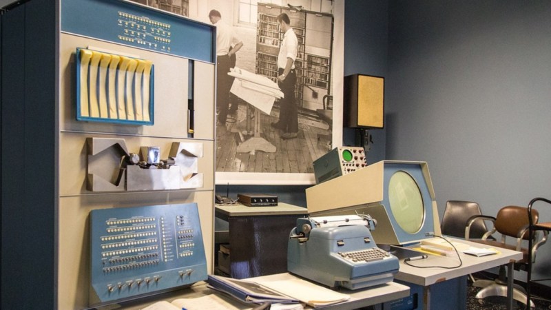
• The 25 creative studios inspiring us the most in 2025

    Which creative studio do you most admire right now, and why? This is a question we asked our community via an ongoing survey. With more than 700 responses so far, these are the top winners. What's striking about this year's results is the popularity of studios that aren't just producing beautiful work but are also actively shaping discussions and tackling the big challenges facing our industry and society.
    From the vibrant energy of Brazilian culture to the thoughtful minimalism of North European aesthetics, this list reflects a global creative landscape that's more connected, more conscious, and more collaborative than ever before.
    In short, these studios aren't just following trends; they're setting them. Read on to discover the 25 studios our community is most excited about right now.
    1. Porto Rocha
    Porto Rocha is a New York-based agency that unites strategy and design to create work that evolves with the world we live in. It continues to dominate conversations in 2025, and it's easy to see why. Founders Felipe Rocha and Leo Porto have built something truly special—a studio that not only creates visually stunning work but also actively celebrates and amplifies diverse voices in design.
    For instance, their recent bold new identity for the São Paulo art museum MASP nods to Brazilian modernist design traditions while reimagining them for a contemporary audience. The rebrand draws heavily on the museum's iconic modernist architecture by Lina Bo Bardi, using a red-and-black colour palette and strong typography to reflect the building's striking visual presence.
    As we write this article, Porto Rocha just shared a new partnership with Google to reimagine the visual and verbal identity of its revolutionary Gemini AI model. We can't wait to see what they come up with!

    2. DixonBaxi
    Simon Dixon and Aporva Baxi's London powerhouse specialises in creating brand strategies and design systems for "brave businesses" that want to challenge convention, including Hulu, Audible, and the Premier League. The studio had an exceptional start to 2025 by collaborating with Roblox on a brand new design system. At the heart of this major project is the Tilt: a 15-degree shift embedded in the logo that signals momentum, creativity, and anticipation.
    They've also continued to build their reputation as design thought leaders. At the OFFF Festival 2025, for instance, Simon and Aporva delivered a masterclass on running a successful brand design agency. Their core message centred on the importance of people and designing with intention, even in the face of global challenges. They also highlighted "Super Futures," their program that encourages employees to think freely and positively about brand challenges and audience desires, aiming to reclaim creative liberation.
    And if that wasn't enough, DixonBaxi has just launched its brand new website, one that's designed to be open in nature. As Simon explains: "It's not a shop window. It's a space to share the thinking and ethos that drive us. You'll find our work, but more importantly, what shapes it. No guff. Just us."

    3. Mother
    Mother is a renowned independent creative agency founded in London and now boasts offices in New York and Los Angeles as well. They've spent 2025 continuing to push the boundaries of what advertising can achieve. And they've made an especially big splash with their latest instalment of KFC's 'Believe' campaign, featuring a surreal and humorous take on KFC's gravy. As we wrote at the time: "Its balance between theatrical grandeur and self-awareness makes the campaign uniquely engaging."
    4. Studio Dumbar/DEPT®
    Based in Rotterdam, Studio Dumbar/DEPT® is widely recognised for its influential work in visual branding and identity, often incorporating creative coding and sound, for clients such as the Dutch Railways, Instagram, and the Van Gogh Museum.
    In 2025, we've especially admired their work for the Dutch football club Feyenoord, which brings the team under a single, cohesive vision that reflects its energy and prowess. This groundbreaking rebrand, unveiled at the start of May, moves away from nostalgia, instead emphasising the club's "measured ferocity, confidence, and ambition".
    5. HONDO
    Based between Palma de Mallorca, Spain and London, HONDO specialises in branding, editorial, typography and product design. We're particular fans of their rebranding of metal furniture makers Castil, based around clean and versatile designs that highlight Castil's vibrant and customisable products.
    This new system features a bespoke monospaced typeface and logo design that evokes Castil's adaptability and the precision of its craftsmanship.

    6. Smith & Diction
    Smith & Diction is a small but mighty design and copy studio founded by Mike and Chara Smith in Philadelphia. Born from dreams, late-night chats, and plenty of mistakes, the studio has grown into a creative force known for thoughtful, boundary-pushing branding.
    Starting out with Mike designing in a tiny apartment while Chara held down a day job, the pair learned the ropes the hard way—and now they're thriving. Recent highlights include their work with Gamma, an AI platform that lets you quickly get ideas out of your head and into a presentation deck or onto a website.
    Gamma wanted their brand update to feel "VERY fun and a little bit out there" with an AI-first approach. So Smith & Diction worked hard to "put weird to the test" while still developing responsible systems for logo, type and colour. The results, as ever, were exceptional.

    7. DNCO
    DNCO is a London and New York-based creative studio specialising in place branding. They are best known for shaping identities, digital tools, and wayfinding for museums, cultural institutions, and entire neighbourhoods, with clients including the Design Museum, V&A and Transport for London.
    Recently, DNCO has been making headlines again with its ambitious brand refresh for Dumbo, a New York neighbourhood struggling with misperceptions due to mass tourism. The goal was to highlight Dumbo's unconventional spirit and demonstrate it as "a different side of New York."
    DNCO preserved the original diagonal logo and introduced a flexible "tape graphic" system, inspired by the neighbourhood's history of inventing the cardboard box, to reflect its ingenuity and reveal new perspectives. The colour palette and typography were chosen to embody Dumbo's industrial and gritty character.

    8. Hey Studio
    Founded by Verònica Fuerte in Barcelona, Spain, Hey Studio is a small, all-female design agency celebrated for its striking use of geometry, bold colour, and playful yet refined visual language. With a focus on branding, illustration, editorial design, and typography, they combine joy with craft to explore issues with heart and purpose.
    A great example of their impact is their recent branding for Rainbow Wool. This German initiative is transforming wool from gay rams into fashion products to support the LGBT community.
    As is typical for Hey Studio, the project's identity is vibrant and joyful, utilising bright, curved shapes that will put a smile on everyone's face.

    9. Koto
    Koto is a London-based global branding and digital studio known for co-creation, strategic thinking, expressive design systems, and enduring partnerships. They're well-known in the industry for bringing warmth, optimism and clarity to complex brand challenges.
    Over the past 18 months, they've undertaken a significant project to refresh Amazon's global brand identity. This extensive undertaking has involved redesigning Amazon's master brand and over 50 of its sub-brands across 15 global markets.
    Koto's approach, described as "radical coherence", aims to refine and modernize Amazon's most recognizable elements rather than drastically changing them. You can read more about the project here.

    10. Robot Food
    Robot Food is a Leeds-based, brand-first creative studio recognised for its strategic and holistic approach. They're past masters at melding creative ideas with commercial rigour across packaging, brand strategy and campaign design.
    Recent Robot Food projects have included a bold rebrand for Hip Pop, a soft drinks company specializing in kombucha and alternative sodas. Their goal was to elevate Hip Pop from an indie challenger to a mainstream category leader, moving away from typical health drink aesthetics.
    The results are visually striking, with black backgrounds prominently featured, punctuated by vibrant fruit illustrations and flavour-coded colours. about the project here.

    11. Saffron Brand Consultants
    Saffron is an independent global consultancy with offices in London, Madrid, Vienna and Istanbul. With deep expertise in naming, strategy, identity, and design systems, they work with leading public and private-sector clients to develop confident, culturally intelligent brands.
    One 2025 highlight so far has been their work for Saudi National Bankto create NEO, a groundbreaking digital lifestyle bank in Saudi Arabia.
    Saffron integrated cultural and design trends, including Saudi neo-futurism, for its sonic identity to create a product that supports both individual and community connections. The design system strikes a balance between modern Saudi aesthetics and the practical demands of a fast-paced digital product, ensuring a consistent brand reflection across all interactions.
    12. Alright Studio
    Alright Studio is a full-service strategy, creative, production and technology agency based in Brooklyn, New York. It prides itself on a "no house style" approach for clients, including A24, Meta Platforms, and Post Malone. One of the most exciting of their recent projects has been Offball, a digital-first sports news platform that aims to provide more nuanced, positive sports storytelling.
    Alright Studio designed a clean, intuitive, editorial-style platform featuring a masthead-like logotype and universal sports iconography, creating a calmer user experience aligned with OffBall's positive content.
    13. Wolff Olins
    Wolff Olins is a global brand consultancy with four main offices: London, New York, San Francisco, and Los Angeles. Known for their courageous, culturally relevant branding and forward-thinking strategy, they collaborate with large corporations and trailblazing organisations to create bold, authentic brand identities that resonate emotionally.
    A particular highlight of 2025 so far has been their collaboration with Leo Burnett to refresh Sandals Resorts' global brand with the "Made of Caribbean" campaign. This strategic move positions Sandals not merely as a luxury resort but as a cultural ambassador for the Caribbean.
    Wolff Olins developed a new visual identity called "Natural Vibrancy," integrating local influences with modern design to reflect a genuine connection to the islands' culture. This rebrand speaks to a growing traveller demand for authenticity and meaningful experiences, allowing Sandals to define itself as an extension of the Caribbean itself.

    14. COLLINS
    Founded by Brian Collins, COLLINS is an independent branding and design consultancy based in the US, celebrated for its playful visual language, expressive storytelling and culturally rich identity systems. In the last few months, we've loved the new branding they designed for Barcelona's 25th Offf Festival, which departs from its usual consistent wordmark.
    The updated identity is inspired by the festival's role within the international creative community, and is rooted in the concept of 'Centre Offf Gravity'. This concept is visually expressed through the festival's name, which appears to exert a gravitational pull on the text boxes, causing them to "stick" to it.
    Additionally, the 'f's in the wordmark are merged into a continuous line reminiscent of a magnet, with the motion graphics further emphasising the gravitational pull as the name floats and other elements follow.
    15. Studio Spass
    Studio Spass is a creative studio based in Rotterdam, the Netherlands, focused on vibrant and dynamic identity systems that reflect the diverse and multifaceted nature of cultural institutions. One of their recent landmark projects was Bigger, a large-scale typographic installation created for the Shenzhen Art Book Fair.
    Inspired by tear-off calendars and the physical act of reading, Studio Spass used 264 A4 books, with each page displaying abstract details, to create an evolving grid of colour and type. Visitors were invited to interact with the installation by flipping pages, constantly revealing new layers of design and a hidden message: "Enjoy books!"

    16. Applied Design Works
    Applied Design Works is a New York studio that specialises in reshaping businesses through branding and design. They provide expertise in design, strategy, and implementation, with a focus on building long-term, collaborative relationships with their clients.
    We were thrilled by their recent work for Grand Central Madison, where they were instrumental in ushering in a new era for the transportation hub.
    Applied Design sought to create a commuter experience that imbued the spirit of New York, showcasing its diversity of thought, voice, and scale that befits one of the greatest cities in the world and one of the greatest structures in it.

    17. The Chase
    The Chase Creative Consultants is a Manchester-based independent creative consultancy with over 35 years of experience, known for blending humour, purpose, and strong branding to rejuvenate popular consumer campaigns. "We're not designers, writers, advertisers or brand strategists," they say, "but all of these and more. An ideas-based creative studio."
    Recently, they were tasked with shaping the identity of York Central, a major urban regeneration project set to become a new city quarter for York. The Chase developed the identity based on extensive public engagement, listening to residents of all ages about their perceptions of the city and their hopes for the new area. The resulting brand identity uses linear forms that subtly reference York's famous railway hub, symbolising the long-standing connections the city has fostered.

    18. A Practice for Everyday Life
    Based in London and founded by Kirsty Carter and Emma Thomas, A Practice for Everyday Life built a reputation as a sought-after collaborator with like-minded companies, galleries, institutions and individuals. Not to mention a conceptual rigour that ensures each design is meaningful and original.
    Recently, they've been working on the visual identity for Muzej Lah, a new international museum for contemporary art in Bled, Slovenia opening in 2026. This centres around a custom typeface inspired by the slanted geometry and square detailing of its concrete roof tiles. It also draws from European modernist typography and the experimental lettering of Jože Plečnik, one of Slovenia's most influential architects.⁠

    A Practice for Everyday Life. Photo: Carol Sachs

    Alexey Brodovitch: Astonish Me publication design by A Practice for Everyday Life, 2024. Photo: Ed Park

    La Biennale di Venezia identity by A Practice for Everyday Life, 2022. Photo: Thomas Adank

    CAM – Centro de Arte Moderna Gulbenkian identity by A Practice for Everyday Life, 2024. Photo: Sanda Vučković

    19. Studio Nari
    Studio Nari is a London-based creative and branding agency partnering with clients around the world to build "brands that truly connect with people". NARI stands, by the way, for Not Always Right Ideas. As they put it, "It's a name that might sound odd for a branding agency, but it reflects everything we believe."
    One landmark project this year has been a comprehensive rebrand for the electronic music festival Field Day. Studio Nari created a dynamic and evolving identity that reflects the festival's growth and its connection to the electronic music scene and community.
    The core idea behind the rebrand is a "reactive future", allowing the brand to adapt and grow with the festival and current trends while maintaining a strong foundation. A new, steadfast wordmark is at its centre, while a new marque has been introduced for the first time.
    20. Beetroot Design Group
    Beetroot is a 25‑strong creative studio celebrated for its bold identities and storytelling-led approach. Based in Thessaloniki, Greece, their work spans visual identity, print, digital and motion, and has earned international recognition, including Red Dot Awards. Recently, they also won a Wood Pencil at the D&AD Awards 2025 for a series of posters created to promote live jazz music events.
    The creative idea behind all three designs stems from improvisation as a key feature of jazz. Each poster communicates the artist's name and other relevant information through a typographical "improvisation".
    21. Kind Studio
    Kind Studio is an independent creative agency based in London that specialises in branding and digital design, as well as offering services in animation, creative and art direction, and print design. Their goal is to collaborate closely with clients to create impactful and visually appealing designs.
    One recent project that piqued our interest was a bilingual, editorially-driven digital platform for FC Como Women, a professional Italian football club. To reflect the club's ambition of promoting gender equality and driving positive social change within football, the new website employs bold typography, strong imagery, and an empowering tone of voice to inspire and disseminate its message.

    22. Slug Global
    Slug Global is a creative agency and art collective founded by artist and musician Bosco. Focused on creating immersive experiences "for both IRL and URL", their goal is to work with artists and brands to establish a sustainable media platform that embodies the values of young millennials, Gen Z and Gen Alpha.
    One of Slug Global's recent projects involved a collaboration with SheaMoisture and xoNecole for a three-part series called The Root of It. This series celebrates black beauty and hair, highlighting its significance as a connection to ancestry, tradition, blueprint and culture for black women.

    23. Little Troop
    New York studio Little Troop crafts expressive and intimate branding for lifestyle, fashion, and cultural clients. Led by creative directors Noemie Le Coz and Jeremy Elliot, they're known for their playful and often "kid-like" approach to design, drawing inspiration from their own experiences as 90s kids.
    One of their recent and highly acclaimed projects is the visual identity for MoMA's first-ever family festival, Another World. Little Troop was tasked with developing a comprehensive visual identity that would extend from small items, such as café placemats, to large billboards.
    Their designs were deliberately a little "dream-like" and relied purely on illustration to sell the festival without needing photography. Little Troop also carefully selected seven colours from MoMA's existing brand guidelines to strike a balance between timelessness, gender neutrality, and fun.

    24. Morcos Key
    Morcos Key is a Brooklyn-based design studio co-founded by Jon Key and Wael Morcos. Collaborating with a diverse range of clients, including arts and cultural institutions, non-profits and commercial enterprises, they're known for translating clients' stories into impactful visual systems through thoughtful conversation and formal expression.
    One notable project is their visual identity work for Hammer & Hope, a magazine that focuses on politics and culture within the black radical tradition. For this project, Morcos Key developed not only the visual identity but also a custom all-caps typeface to reflect the publication's mission and content.
    25. Thirst
    Thirst, also known as Thirst Craft, is an award-winning strategic drinks packaging design agency based in Glasgow, Scotland, with additional hubs in London and New York. Founded in 2015 by Matthew Stephen Burns and Christopher John Black, the company specializes in building creatively distinctive and commercially effective brands for the beverage industry.
    To see what they're capable of, check out their work for SKYY Vodka. The new global visual identity system, called Audacious Glamour', aims to unify SKYY under a singular, powerful idea. The visual identity benefits from bolder framing, patterns, and a flavour-forward colour palette to highlight each product's "juicy attitude", while the photography style employs macro shots and liquid highlights to convey a premium feel.
    #creative #studios #inspiring #most
    The 25 creative studios inspiring us the most in 2025
    Which creative studio do you most admire right now, and why? This is a question we asked our community via an ongoing survey. With more than 700 responses so far, these are the top winners. What's striking about this year's results is the popularity of studios that aren't just producing beautiful work but are also actively shaping discussions and tackling the big challenges facing our industry and society. From the vibrant energy of Brazilian culture to the thoughtful minimalism of North European aesthetics, this list reflects a global creative landscape that's more connected, more conscious, and more collaborative than ever before. In short, these studios aren't just following trends; they're setting them. Read on to discover the 25 studios our community is most excited about right now. 1. Porto Rocha Porto Rocha is a New York-based agency that unites strategy and design to create work that evolves with the world we live in. It continues to dominate conversations in 2025, and it's easy to see why. Founders Felipe Rocha and Leo Porto have built something truly special—a studio that not only creates visually stunning work but also actively celebrates and amplifies diverse voices in design. For instance, their recent bold new identity for the São Paulo art museum MASP nods to Brazilian modernist design traditions while reimagining them for a contemporary audience. The rebrand draws heavily on the museum's iconic modernist architecture by Lina Bo Bardi, using a red-and-black colour palette and strong typography to reflect the building's striking visual presence. As we write this article, Porto Rocha just shared a new partnership with Google to reimagine the visual and verbal identity of its revolutionary Gemini AI model. We can't wait to see what they come up with! 2. DixonBaxi Simon Dixon and Aporva Baxi's London powerhouse specialises in creating brand strategies and design systems for "brave businesses" that want to challenge convention, including Hulu, Audible, and the Premier League. The studio had an exceptional start to 2025 by collaborating with Roblox on a brand new design system. At the heart of this major project is the Tilt: a 15-degree shift embedded in the logo that signals momentum, creativity, and anticipation. They've also continued to build their reputation as design thought leaders. At the OFFF Festival 2025, for instance, Simon and Aporva delivered a masterclass on running a successful brand design agency. Their core message centred on the importance of people and designing with intention, even in the face of global challenges. They also highlighted "Super Futures," their program that encourages employees to think freely and positively about brand challenges and audience desires, aiming to reclaim creative liberation. And if that wasn't enough, DixonBaxi has just launched its brand new website, one that's designed to be open in nature. As Simon explains: "It's not a shop window. It's a space to share the thinking and ethos that drive us. You'll find our work, but more importantly, what shapes it. No guff. Just us." 3. Mother Mother is a renowned independent creative agency founded in London and now boasts offices in New York and Los Angeles as well. They've spent 2025 continuing to push the boundaries of what advertising can achieve. And they've made an especially big splash with their latest instalment of KFC's 'Believe' campaign, featuring a surreal and humorous take on KFC's gravy. As we wrote at the time: "Its balance between theatrical grandeur and self-awareness makes the campaign uniquely engaging." 4. Studio Dumbar/DEPT® Based in Rotterdam, Studio Dumbar/DEPT® is widely recognised for its influential work in visual branding and identity, often incorporating creative coding and sound, for clients such as the Dutch Railways, Instagram, and the Van Gogh Museum. In 2025, we've especially admired their work for the Dutch football club Feyenoord, which brings the team under a single, cohesive vision that reflects its energy and prowess. This groundbreaking rebrand, unveiled at the start of May, moves away from nostalgia, instead emphasising the club's "measured ferocity, confidence, and ambition". 5. HONDO Based between Palma de Mallorca, Spain and London, HONDO specialises in branding, editorial, typography and product design. We're particular fans of their rebranding of metal furniture makers Castil, based around clean and versatile designs that highlight Castil's vibrant and customisable products. This new system features a bespoke monospaced typeface and logo design that evokes Castil's adaptability and the precision of its craftsmanship. 6. Smith & Diction Smith & Diction is a small but mighty design and copy studio founded by Mike and Chara Smith in Philadelphia. Born from dreams, late-night chats, and plenty of mistakes, the studio has grown into a creative force known for thoughtful, boundary-pushing branding. Starting out with Mike designing in a tiny apartment while Chara held down a day job, the pair learned the ropes the hard way—and now they're thriving. Recent highlights include their work with Gamma, an AI platform that lets you quickly get ideas out of your head and into a presentation deck or onto a website. Gamma wanted their brand update to feel "VERY fun and a little bit out there" with an AI-first approach. So Smith & Diction worked hard to "put weird to the test" while still developing responsible systems for logo, type and colour. The results, as ever, were exceptional. 7. DNCO DNCO is a London and New York-based creative studio specialising in place branding. They are best known for shaping identities, digital tools, and wayfinding for museums, cultural institutions, and entire neighbourhoods, with clients including the Design Museum, V&A and Transport for London. Recently, DNCO has been making headlines again with its ambitious brand refresh for Dumbo, a New York neighbourhood struggling with misperceptions due to mass tourism. The goal was to highlight Dumbo's unconventional spirit and demonstrate it as "a different side of New York." DNCO preserved the original diagonal logo and introduced a flexible "tape graphic" system, inspired by the neighbourhood's history of inventing the cardboard box, to reflect its ingenuity and reveal new perspectives. The colour palette and typography were chosen to embody Dumbo's industrial and gritty character. 8. Hey Studio Founded by Verònica Fuerte in Barcelona, Spain, Hey Studio is a small, all-female design agency celebrated for its striking use of geometry, bold colour, and playful yet refined visual language. With a focus on branding, illustration, editorial design, and typography, they combine joy with craft to explore issues with heart and purpose. A great example of their impact is their recent branding for Rainbow Wool. This German initiative is transforming wool from gay rams into fashion products to support the LGBT community. As is typical for Hey Studio, the project's identity is vibrant and joyful, utilising bright, curved shapes that will put a smile on everyone's face. 9. Koto Koto is a London-based global branding and digital studio known for co-creation, strategic thinking, expressive design systems, and enduring partnerships. They're well-known in the industry for bringing warmth, optimism and clarity to complex brand challenges. Over the past 18 months, they've undertaken a significant project to refresh Amazon's global brand identity. This extensive undertaking has involved redesigning Amazon's master brand and over 50 of its sub-brands across 15 global markets. Koto's approach, described as "radical coherence", aims to refine and modernize Amazon's most recognizable elements rather than drastically changing them. You can read more about the project here. 10. Robot Food Robot Food is a Leeds-based, brand-first creative studio recognised for its strategic and holistic approach. They're past masters at melding creative ideas with commercial rigour across packaging, brand strategy and campaign design. Recent Robot Food projects have included a bold rebrand for Hip Pop, a soft drinks company specializing in kombucha and alternative sodas. Their goal was to elevate Hip Pop from an indie challenger to a mainstream category leader, moving away from typical health drink aesthetics. The results are visually striking, with black backgrounds prominently featured, punctuated by vibrant fruit illustrations and flavour-coded colours. about the project here. 11. Saffron Brand Consultants Saffron is an independent global consultancy with offices in London, Madrid, Vienna and Istanbul. With deep expertise in naming, strategy, identity, and design systems, they work with leading public and private-sector clients to develop confident, culturally intelligent brands. One 2025 highlight so far has been their work for Saudi National Bankto create NEO, a groundbreaking digital lifestyle bank in Saudi Arabia. Saffron integrated cultural and design trends, including Saudi neo-futurism, for its sonic identity to create a product that supports both individual and community connections. The design system strikes a balance between modern Saudi aesthetics and the practical demands of a fast-paced digital product, ensuring a consistent brand reflection across all interactions. 12. Alright Studio Alright Studio is a full-service strategy, creative, production and technology agency based in Brooklyn, New York. It prides itself on a "no house style" approach for clients, including A24, Meta Platforms, and Post Malone. One of the most exciting of their recent projects has been Offball, a digital-first sports news platform that aims to provide more nuanced, positive sports storytelling. Alright Studio designed a clean, intuitive, editorial-style platform featuring a masthead-like logotype and universal sports iconography, creating a calmer user experience aligned with OffBall's positive content. 13. Wolff Olins Wolff Olins is a global brand consultancy with four main offices: London, New York, San Francisco, and Los Angeles. Known for their courageous, culturally relevant branding and forward-thinking strategy, they collaborate with large corporations and trailblazing organisations to create bold, authentic brand identities that resonate emotionally. A particular highlight of 2025 so far has been their collaboration with Leo Burnett to refresh Sandals Resorts' global brand with the "Made of Caribbean" campaign. This strategic move positions Sandals not merely as a luxury resort but as a cultural ambassador for the Caribbean. Wolff Olins developed a new visual identity called "Natural Vibrancy," integrating local influences with modern design to reflect a genuine connection to the islands' culture. This rebrand speaks to a growing traveller demand for authenticity and meaningful experiences, allowing Sandals to define itself as an extension of the Caribbean itself. 14. COLLINS Founded by Brian Collins, COLLINS is an independent branding and design consultancy based in the US, celebrated for its playful visual language, expressive storytelling and culturally rich identity systems. In the last few months, we've loved the new branding they designed for Barcelona's 25th Offf Festival, which departs from its usual consistent wordmark. The updated identity is inspired by the festival's role within the international creative community, and is rooted in the concept of 'Centre Offf Gravity'. This concept is visually expressed through the festival's name, which appears to exert a gravitational pull on the text boxes, causing them to "stick" to it. Additionally, the 'f's in the wordmark are merged into a continuous line reminiscent of a magnet, with the motion graphics further emphasising the gravitational pull as the name floats and other elements follow. 15. Studio Spass Studio Spass is a creative studio based in Rotterdam, the Netherlands, focused on vibrant and dynamic identity systems that reflect the diverse and multifaceted nature of cultural institutions. One of their recent landmark projects was Bigger, a large-scale typographic installation created for the Shenzhen Art Book Fair. Inspired by tear-off calendars and the physical act of reading, Studio Spass used 264 A4 books, with each page displaying abstract details, to create an evolving grid of colour and type. Visitors were invited to interact with the installation by flipping pages, constantly revealing new layers of design and a hidden message: "Enjoy books!" 16. Applied Design Works Applied Design Works is a New York studio that specialises in reshaping businesses through branding and design. They provide expertise in design, strategy, and implementation, with a focus on building long-term, collaborative relationships with their clients. We were thrilled by their recent work for Grand Central Madison, where they were instrumental in ushering in a new era for the transportation hub. Applied Design sought to create a commuter experience that imbued the spirit of New York, showcasing its diversity of thought, voice, and scale that befits one of the greatest cities in the world and one of the greatest structures in it. 17. The Chase The Chase Creative Consultants is a Manchester-based independent creative consultancy with over 35 years of experience, known for blending humour, purpose, and strong branding to rejuvenate popular consumer campaigns. "We're not designers, writers, advertisers or brand strategists," they say, "but all of these and more. An ideas-based creative studio." Recently, they were tasked with shaping the identity of York Central, a major urban regeneration project set to become a new city quarter for York. The Chase developed the identity based on extensive public engagement, listening to residents of all ages about their perceptions of the city and their hopes for the new area. The resulting brand identity uses linear forms that subtly reference York's famous railway hub, symbolising the long-standing connections the city has fostered. 18. A Practice for Everyday Life Based in London and founded by Kirsty Carter and Emma Thomas, A Practice for Everyday Life built a reputation as a sought-after collaborator with like-minded companies, galleries, institutions and individuals. Not to mention a conceptual rigour that ensures each design is meaningful and original. Recently, they've been working on the visual identity for Muzej Lah, a new international museum for contemporary art in Bled, Slovenia opening in 2026. This centres around a custom typeface inspired by the slanted geometry and square detailing of its concrete roof tiles. It also draws from European modernist typography and the experimental lettering of Jože Plečnik, one of Slovenia's most influential architects.⁠ A Practice for Everyday Life. Photo: Carol Sachs Alexey Brodovitch: Astonish Me publication design by A Practice for Everyday Life, 2024. Photo: Ed Park La Biennale di Venezia identity by A Practice for Everyday Life, 2022. Photo: Thomas Adank CAM – Centro de Arte Moderna Gulbenkian identity by A Practice for Everyday Life, 2024. Photo: Sanda Vučković 19. Studio Nari Studio Nari is a London-based creative and branding agency partnering with clients around the world to build "brands that truly connect with people". NARI stands, by the way, for Not Always Right Ideas. As they put it, "It's a name that might sound odd for a branding agency, but it reflects everything we believe." One landmark project this year has been a comprehensive rebrand for the electronic music festival Field Day. Studio Nari created a dynamic and evolving identity that reflects the festival's growth and its connection to the electronic music scene and community. The core idea behind the rebrand is a "reactive future", allowing the brand to adapt and grow with the festival and current trends while maintaining a strong foundation. A new, steadfast wordmark is at its centre, while a new marque has been introduced for the first time. 20. Beetroot Design Group Beetroot is a 25‑strong creative studio celebrated for its bold identities and storytelling-led approach. Based in Thessaloniki, Greece, their work spans visual identity, print, digital and motion, and has earned international recognition, including Red Dot Awards. Recently, they also won a Wood Pencil at the D&AD Awards 2025 for a series of posters created to promote live jazz music events. The creative idea behind all three designs stems from improvisation as a key feature of jazz. Each poster communicates the artist's name and other relevant information through a typographical "improvisation". 21. Kind Studio Kind Studio is an independent creative agency based in London that specialises in branding and digital design, as well as offering services in animation, creative and art direction, and print design. Their goal is to collaborate closely with clients to create impactful and visually appealing designs. One recent project that piqued our interest was a bilingual, editorially-driven digital platform for FC Como Women, a professional Italian football club. To reflect the club's ambition of promoting gender equality and driving positive social change within football, the new website employs bold typography, strong imagery, and an empowering tone of voice to inspire and disseminate its message. 22. Slug Global Slug Global is a creative agency and art collective founded by artist and musician Bosco. Focused on creating immersive experiences "for both IRL and URL", their goal is to work with artists and brands to establish a sustainable media platform that embodies the values of young millennials, Gen Z and Gen Alpha. One of Slug Global's recent projects involved a collaboration with SheaMoisture and xoNecole for a three-part series called The Root of It. This series celebrates black beauty and hair, highlighting its significance as a connection to ancestry, tradition, blueprint and culture for black women. 23. Little Troop New York studio Little Troop crafts expressive and intimate branding for lifestyle, fashion, and cultural clients. Led by creative directors Noemie Le Coz and Jeremy Elliot, they're known for their playful and often "kid-like" approach to design, drawing inspiration from their own experiences as 90s kids. One of their recent and highly acclaimed projects is the visual identity for MoMA's first-ever family festival, Another World. Little Troop was tasked with developing a comprehensive visual identity that would extend from small items, such as café placemats, to large billboards. Their designs were deliberately a little "dream-like" and relied purely on illustration to sell the festival without needing photography. Little Troop also carefully selected seven colours from MoMA's existing brand guidelines to strike a balance between timelessness, gender neutrality, and fun. 24. Morcos Key Morcos Key is a Brooklyn-based design studio co-founded by Jon Key and Wael Morcos. Collaborating with a diverse range of clients, including arts and cultural institutions, non-profits and commercial enterprises, they're known for translating clients' stories into impactful visual systems through thoughtful conversation and formal expression. One notable project is their visual identity work for Hammer & Hope, a magazine that focuses on politics and culture within the black radical tradition. For this project, Morcos Key developed not only the visual identity but also a custom all-caps typeface to reflect the publication's mission and content. 25. Thirst Thirst, also known as Thirst Craft, is an award-winning strategic drinks packaging design agency based in Glasgow, Scotland, with additional hubs in London and New York. Founded in 2015 by Matthew Stephen Burns and Christopher John Black, the company specializes in building creatively distinctive and commercially effective brands for the beverage industry. To see what they're capable of, check out their work for SKYY Vodka. The new global visual identity system, called Audacious Glamour', aims to unify SKYY under a singular, powerful idea. The visual identity benefits from bolder framing, patterns, and a flavour-forward colour palette to highlight each product's "juicy attitude", while the photography style employs macro shots and liquid highlights to convey a premium feel. #creative #studios #inspiring #most
    WWW.CREATIVEBOOM.COM
    The 25 creative studios inspiring us the most in 2025
    Which creative studio do you most admire right now, and why? This is a question we asked our community via an ongoing survey. With more than 700 responses so far, these are the top winners. What's striking about this year's results is the popularity of studios that aren't just producing beautiful work but are also actively shaping discussions and tackling the big challenges facing our industry and society. From the vibrant energy of Brazilian culture to the thoughtful minimalism of North European aesthetics, this list reflects a global creative landscape that's more connected, more conscious, and more collaborative than ever before. In short, these studios aren't just following trends; they're setting them. Read on to discover the 25 studios our community is most excited about right now. 1. Porto Rocha Porto Rocha is a New York-based agency that unites strategy and design to create work that evolves with the world we live in. It continues to dominate conversations in 2025, and it's easy to see why. Founders Felipe Rocha and Leo Porto have built something truly special—a studio that not only creates visually stunning work but also actively celebrates and amplifies diverse voices in design. For instance, their recent bold new identity for the São Paulo art museum MASP nods to Brazilian modernist design traditions while reimagining them for a contemporary audience. The rebrand draws heavily on the museum's iconic modernist architecture by Lina Bo Bardi, using a red-and-black colour palette and strong typography to reflect the building's striking visual presence. As we write this article, Porto Rocha just shared a new partnership with Google to reimagine the visual and verbal identity of its revolutionary Gemini AI model. We can't wait to see what they come up with! 2. DixonBaxi Simon Dixon and Aporva Baxi's London powerhouse specialises in creating brand strategies and design systems for "brave businesses" that want to challenge convention, including Hulu, Audible, and the Premier League. The studio had an exceptional start to 2025 by collaborating with Roblox on a brand new design system. At the heart of this major project is the Tilt: a 15-degree shift embedded in the logo that signals momentum, creativity, and anticipation. They've also continued to build their reputation as design thought leaders. At the OFFF Festival 2025, for instance, Simon and Aporva delivered a masterclass on running a successful brand design agency. Their core message centred on the importance of people and designing with intention, even in the face of global challenges. They also highlighted "Super Futures," their program that encourages employees to think freely and positively about brand challenges and audience desires, aiming to reclaim creative liberation. And if that wasn't enough, DixonBaxi has just launched its brand new website, one that's designed to be open in nature. As Simon explains: "It's not a shop window. It's a space to share the thinking and ethos that drive us. You'll find our work, but more importantly, what shapes it. No guff. Just us." 3. Mother Mother is a renowned independent creative agency founded in London and now boasts offices in New York and Los Angeles as well. They've spent 2025 continuing to push the boundaries of what advertising can achieve. And they've made an especially big splash with their latest instalment of KFC's 'Believe' campaign, featuring a surreal and humorous take on KFC's gravy. As we wrote at the time: "Its balance between theatrical grandeur and self-awareness makes the campaign uniquely engaging." 4. Studio Dumbar/DEPT® Based in Rotterdam, Studio Dumbar/DEPT® is widely recognised for its influential work in visual branding and identity, often incorporating creative coding and sound, for clients such as the Dutch Railways, Instagram, and the Van Gogh Museum. In 2025, we've especially admired their work for the Dutch football club Feyenoord, which brings the team under a single, cohesive vision that reflects its energy and prowess. This groundbreaking rebrand, unveiled at the start of May, moves away from nostalgia, instead emphasising the club's "measured ferocity, confidence, and ambition". 5. HONDO Based between Palma de Mallorca, Spain and London, HONDO specialises in branding, editorial, typography and product design. We're particular fans of their rebranding of metal furniture makers Castil, based around clean and versatile designs that highlight Castil's vibrant and customisable products. This new system features a bespoke monospaced typeface and logo design that evokes Castil's adaptability and the precision of its craftsmanship. 6. Smith & Diction Smith & Diction is a small but mighty design and copy studio founded by Mike and Chara Smith in Philadelphia. Born from dreams, late-night chats, and plenty of mistakes, the studio has grown into a creative force known for thoughtful, boundary-pushing branding. Starting out with Mike designing in a tiny apartment while Chara held down a day job, the pair learned the ropes the hard way—and now they're thriving. Recent highlights include their work with Gamma, an AI platform that lets you quickly get ideas out of your head and into a presentation deck or onto a website. Gamma wanted their brand update to feel "VERY fun and a little bit out there" with an AI-first approach. So Smith & Diction worked hard to "put weird to the test" while still developing responsible systems for logo, type and colour. The results, as ever, were exceptional. 7. DNCO DNCO is a London and New York-based creative studio specialising in place branding. They are best known for shaping identities, digital tools, and wayfinding for museums, cultural institutions, and entire neighbourhoods, with clients including the Design Museum, V&A and Transport for London. Recently, DNCO has been making headlines again with its ambitious brand refresh for Dumbo, a New York neighbourhood struggling with misperceptions due to mass tourism. The goal was to highlight Dumbo's unconventional spirit and demonstrate it as "a different side of New York." DNCO preserved the original diagonal logo and introduced a flexible "tape graphic" system, inspired by the neighbourhood's history of inventing the cardboard box, to reflect its ingenuity and reveal new perspectives. The colour palette and typography were chosen to embody Dumbo's industrial and gritty character. 8. Hey Studio Founded by Verònica Fuerte in Barcelona, Spain, Hey Studio is a small, all-female design agency celebrated for its striking use of geometry, bold colour, and playful yet refined visual language. With a focus on branding, illustration, editorial design, and typography, they combine joy with craft to explore issues with heart and purpose. A great example of their impact is their recent branding for Rainbow Wool. This German initiative is transforming wool from gay rams into fashion products to support the LGBT community. As is typical for Hey Studio, the project's identity is vibrant and joyful, utilising bright, curved shapes that will put a smile on everyone's face. 9. Koto Koto is a London-based global branding and digital studio known for co-creation, strategic thinking, expressive design systems, and enduring partnerships. They're well-known in the industry for bringing warmth, optimism and clarity to complex brand challenges. Over the past 18 months, they've undertaken a significant project to refresh Amazon's global brand identity. This extensive undertaking has involved redesigning Amazon's master brand and over 50 of its sub-brands across 15 global markets. Koto's approach, described as "radical coherence", aims to refine and modernize Amazon's most recognizable elements rather than drastically changing them. You can read more about the project here. 10. Robot Food Robot Food is a Leeds-based, brand-first creative studio recognised for its strategic and holistic approach. They're past masters at melding creative ideas with commercial rigour across packaging, brand strategy and campaign design. Recent Robot Food projects have included a bold rebrand for Hip Pop, a soft drinks company specializing in kombucha and alternative sodas. Their goal was to elevate Hip Pop from an indie challenger to a mainstream category leader, moving away from typical health drink aesthetics. The results are visually striking, with black backgrounds prominently featured (a rarity in the health drink aisle), punctuated by vibrant fruit illustrations and flavour-coded colours. Read more about the project here. 11. Saffron Brand Consultants Saffron is an independent global consultancy with offices in London, Madrid, Vienna and Istanbul. With deep expertise in naming, strategy, identity, and design systems, they work with leading public and private-sector clients to develop confident, culturally intelligent brands. One 2025 highlight so far has been their work for Saudi National Bank (SNB) to create NEO, a groundbreaking digital lifestyle bank in Saudi Arabia. Saffron integrated cultural and design trends, including Saudi neo-futurism, for its sonic identity to create a product that supports both individual and community connections. The design system strikes a balance between modern Saudi aesthetics and the practical demands of a fast-paced digital product, ensuring a consistent brand reflection across all interactions. 12. Alright Studio Alright Studio is a full-service strategy, creative, production and technology agency based in Brooklyn, New York. It prides itself on a "no house style" approach for clients, including A24, Meta Platforms, and Post Malone. One of the most exciting of their recent projects has been Offball, a digital-first sports news platform that aims to provide more nuanced, positive sports storytelling. Alright Studio designed a clean, intuitive, editorial-style platform featuring a masthead-like logotype and universal sports iconography, creating a calmer user experience aligned with OffBall's positive content. 13. Wolff Olins Wolff Olins is a global brand consultancy with four main offices: London, New York, San Francisco, and Los Angeles. Known for their courageous, culturally relevant branding and forward-thinking strategy, they collaborate with large corporations and trailblazing organisations to create bold, authentic brand identities that resonate emotionally. A particular highlight of 2025 so far has been their collaboration with Leo Burnett to refresh Sandals Resorts' global brand with the "Made of Caribbean" campaign. This strategic move positions Sandals not merely as a luxury resort but as a cultural ambassador for the Caribbean. Wolff Olins developed a new visual identity called "Natural Vibrancy," integrating local influences with modern design to reflect a genuine connection to the islands' culture. This rebrand speaks to a growing traveller demand for authenticity and meaningful experiences, allowing Sandals to define itself as an extension of the Caribbean itself. 14. COLLINS Founded by Brian Collins, COLLINS is an independent branding and design consultancy based in the US, celebrated for its playful visual language, expressive storytelling and culturally rich identity systems. In the last few months, we've loved the new branding they designed for Barcelona's 25th Offf Festival, which departs from its usual consistent wordmark. The updated identity is inspired by the festival's role within the international creative community, and is rooted in the concept of 'Centre Offf Gravity'. This concept is visually expressed through the festival's name, which appears to exert a gravitational pull on the text boxes, causing them to "stick" to it. Additionally, the 'f's in the wordmark are merged into a continuous line reminiscent of a magnet, with the motion graphics further emphasising the gravitational pull as the name floats and other elements follow. 15. Studio Spass Studio Spass is a creative studio based in Rotterdam, the Netherlands, focused on vibrant and dynamic identity systems that reflect the diverse and multifaceted nature of cultural institutions. One of their recent landmark projects was Bigger, a large-scale typographic installation created for the Shenzhen Art Book Fair. Inspired by tear-off calendars and the physical act of reading, Studio Spass used 264 A4 books, with each page displaying abstract details, to create an evolving grid of colour and type. Visitors were invited to interact with the installation by flipping pages, constantly revealing new layers of design and a hidden message: "Enjoy books!" 16. Applied Design Works Applied Design Works is a New York studio that specialises in reshaping businesses through branding and design. They provide expertise in design, strategy, and implementation, with a focus on building long-term, collaborative relationships with their clients. We were thrilled by their recent work for Grand Central Madison (the station that connects Long Island to Grand Central Terminal), where they were instrumental in ushering in a new era for the transportation hub. Applied Design sought to create a commuter experience that imbued the spirit of New York, showcasing its diversity of thought, voice, and scale that befits one of the greatest cities in the world and one of the greatest structures in it. 17. The Chase The Chase Creative Consultants is a Manchester-based independent creative consultancy with over 35 years of experience, known for blending humour, purpose, and strong branding to rejuvenate popular consumer campaigns. "We're not designers, writers, advertisers or brand strategists," they say, "but all of these and more. An ideas-based creative studio." Recently, they were tasked with shaping the identity of York Central, a major urban regeneration project set to become a new city quarter for York. The Chase developed the identity based on extensive public engagement, listening to residents of all ages about their perceptions of the city and their hopes for the new area. The resulting brand identity uses linear forms that subtly reference York's famous railway hub, symbolising the long-standing connections the city has fostered. 18. A Practice for Everyday Life Based in London and founded by Kirsty Carter and Emma Thomas, A Practice for Everyday Life built a reputation as a sought-after collaborator with like-minded companies, galleries, institutions and individuals. Not to mention a conceptual rigour that ensures each design is meaningful and original. Recently, they've been working on the visual identity for Muzej Lah, a new international museum for contemporary art in Bled, Slovenia opening in 2026. This centres around a custom typeface inspired by the slanted geometry and square detailing of its concrete roof tiles. It also draws from European modernist typography and the experimental lettering of Jože Plečnik, one of Slovenia's most influential architects.⁠ A Practice for Everyday Life. Photo: Carol Sachs Alexey Brodovitch: Astonish Me publication design by A Practice for Everyday Life, 2024. Photo: Ed Park La Biennale di Venezia identity by A Practice for Everyday Life, 2022. Photo: Thomas Adank CAM – Centro de Arte Moderna Gulbenkian identity by A Practice for Everyday Life, 2024. Photo: Sanda Vučković 19. Studio Nari Studio Nari is a London-based creative and branding agency partnering with clients around the world to build "brands that truly connect with people". NARI stands, by the way, for Not Always Right Ideas. As they put it, "It's a name that might sound odd for a branding agency, but it reflects everything we believe." One landmark project this year has been a comprehensive rebrand for the electronic music festival Field Day. Studio Nari created a dynamic and evolving identity that reflects the festival's growth and its connection to the electronic music scene and community. The core idea behind the rebrand is a "reactive future", allowing the brand to adapt and grow with the festival and current trends while maintaining a strong foundation. A new, steadfast wordmark is at its centre, while a new marque has been introduced for the first time. 20. Beetroot Design Group Beetroot is a 25‑strong creative studio celebrated for its bold identities and storytelling-led approach. Based in Thessaloniki, Greece, their work spans visual identity, print, digital and motion, and has earned international recognition, including Red Dot Awards. Recently, they also won a Wood Pencil at the D&AD Awards 2025 for a series of posters created to promote live jazz music events. The creative idea behind all three designs stems from improvisation as a key feature of jazz. Each poster communicates the artist's name and other relevant information through a typographical "improvisation". 21. Kind Studio Kind Studio is an independent creative agency based in London that specialises in branding and digital design, as well as offering services in animation, creative and art direction, and print design. Their goal is to collaborate closely with clients to create impactful and visually appealing designs. One recent project that piqued our interest was a bilingual, editorially-driven digital platform for FC Como Women, a professional Italian football club. To reflect the club's ambition of promoting gender equality and driving positive social change within football, the new website employs bold typography, strong imagery, and an empowering tone of voice to inspire and disseminate its message. 22. Slug Global Slug Global is a creative agency and art collective founded by artist and musician Bosco (Brittany Bosco). Focused on creating immersive experiences "for both IRL and URL", their goal is to work with artists and brands to establish a sustainable media platform that embodies the values of young millennials, Gen Z and Gen Alpha. One of Slug Global's recent projects involved a collaboration with SheaMoisture and xoNecole for a three-part series called The Root of It. This series celebrates black beauty and hair, highlighting its significance as a connection to ancestry, tradition, blueprint and culture for black women. 23. Little Troop New York studio Little Troop crafts expressive and intimate branding for lifestyle, fashion, and cultural clients. Led by creative directors Noemie Le Coz and Jeremy Elliot, they're known for their playful and often "kid-like" approach to design, drawing inspiration from their own experiences as 90s kids. One of their recent and highly acclaimed projects is the visual identity for MoMA's first-ever family festival, Another World. Little Troop was tasked with developing a comprehensive visual identity that would extend from small items, such as café placemats, to large billboards. Their designs were deliberately a little "dream-like" and relied purely on illustration to sell the festival without needing photography. Little Troop also carefully selected seven colours from MoMA's existing brand guidelines to strike a balance between timelessness, gender neutrality, and fun. 24. Morcos Key Morcos Key is a Brooklyn-based design studio co-founded by Jon Key and Wael Morcos. Collaborating with a diverse range of clients, including arts and cultural institutions, non-profits and commercial enterprises, they're known for translating clients' stories into impactful visual systems through thoughtful conversation and formal expression. One notable project is their visual identity work for Hammer & Hope, a magazine that focuses on politics and culture within the black radical tradition. For this project, Morcos Key developed not only the visual identity but also a custom all-caps typeface to reflect the publication's mission and content. 25. Thirst Thirst, also known as Thirst Craft, is an award-winning strategic drinks packaging design agency based in Glasgow, Scotland, with additional hubs in London and New York. Founded in 2015 by Matthew Stephen Burns and Christopher John Black, the company specializes in building creatively distinctive and commercially effective brands for the beverage industry. To see what they're capable of, check out their work for SKYY Vodka. The new global visual identity system, called Audacious Glamour', aims to unify SKYY under a singular, powerful idea. The visual identity benefits from bolder framing, patterns, and a flavour-forward colour palette to highlight each product's "juicy attitude", while the photography style employs macro shots and liquid highlights to convey a premium feel.
    Like
    Love
    Wow
    Angry
    Sad
    478
    0 Commentarii 0 Distribuiri
  • Scientists Detect Unusual Airborne Toxin in the United States for the First Time

    Researchers unexpectedly discovered toxic airborne pollutants in Oklahoma. The image above depicts a field in Oklahoma. Credit: Shutterstock
    University of Colorado Boulder researchers made the first-ever airborne detection of Medium Chain Chlorinated Paraffinsin the Western Hemisphere.
    Sometimes, scientific research feels a lot like solving a mystery. Scientists head into the field with a clear goal and a solid hypothesis, but then the data reveals something surprising. That’s when the real detective work begins.
    This is exactly what happened to a team from the University of Colorado Boulder during a recent field study in rural Oklahoma. They were using a state-of-the-art instrument to track how tiny particles form and grow in the air. But instead of just collecting expected data, they uncovered something completely new: the first-ever airborne detection of Medium Chain Chlorinated Paraffins, a kind of toxic organic pollutant, in the Western Hemisphere. The teams findings were published in ACS Environmental Au.
    “It’s very exciting as a scientist to find something unexpected like this that we weren’t looking for,” said Daniel Katz, CU Boulder chemistry PhD student and lead author of the study. “We’re starting to learn more about this toxic, organic pollutant that we know is out there, and which we need to understand better.”
    MCCPs are currently under consideration for regulation by the Stockholm Convention, a global treaty to protect human health from long-standing and widespread chemicals. While the toxic pollutants have been measured in Antarctica and Asia, researchers haven’t been sure how to document them in the Western Hemisphere’s atmosphere until now.
    From Wastewater to Farmlands
    MCCPs are used in fluids for metal working and in the construction of PVC and textiles. They are often found in wastewater and as a result, can end up in biosolid fertilizer, also called sewage sludge, which is created when liquid is removed from wastewater in a treatment plant. In Oklahoma, researchers suspect the MCCPs they identified came from biosolid fertilizer in the fields near where they set up their instrument.
    “When sewage sludges are spread across the fields, those toxic compounds could be released into the air,” Katz said. “We can’t show directly that that’s happening, but we think it’s a reasonable way that they could be winding up in the air. Sewage sludge fertilizers have been shown to release similar compounds.”
    MCCPs little cousins, Short Chain Chlorinated Paraffins, are currently regulated by the Stockholm Convention, and since 2009, by the EPA here in the United States. Regulation came after studies found the toxic pollutants, which travel far and last a long time in the atmosphere, were harmful to human health. But researchers hypothesize that the regulation of SCCPs may have increased MCCPs in the environment.
    “We always have these unintended consequences of regulation, where you regulate something, and then there’s still a need for the products that those were in,” said Ellie Browne, CU Boulder chemistry professor, CIRES Fellow, and co-author of the study. “So they get replaced by something.”
    Measurement of aerosols led to a new and surprising discovery
    Using a nitrate chemical ionization mass spectrometer, which allows scientists to identify chemical compounds in the air, the team measured air at the agricultural site 24 hours a day for one month. As Katz cataloged the data, he documented the different isotopic patterns in the compounds. The compounds measured by the team had distinct patterns, and he noticed new patterns that he immediately identified as different from the known chemical compounds. With some additional research, he identified them as chlorinated paraffins found in MCCPs.
    Katz says the makeup of MCCPs are similar to PFAS, long-lasting toxic chemicals that break down slowly over time. Known as “forever chemicals,” their presence in soils recently led the Oklahoma Senate to ban biosolid fertilizer.
    Now that researchers know how to measure MCCPs, the next step might be to measure the pollutants at different times throughout the year to understand how levels change each season. Many unknowns surrounding MCCPs remain, and there’s much more to learn about their environmental impacts.
    “We identified them, but we still don’t know exactly what they do when they are in the atmosphere, and they need to be investigated further,” Katz said. “I think it’s important that we continue to have governmental agencies that are capable of evaluating the science and regulating these chemicals as necessary for public health and safety.”
    Reference: “Real-Time Measurements of Gas-Phase Medium-Chain Chlorinated Paraffins Reveal Daily Changes in Gas-Particle Partitioning Controlled by Ambient Temperature” by Daniel John Katz, Bri Dobson, Mitchell Alton, Harald Stark, Douglas R. Worsnop, Manjula R. Canagaratna and Eleanor C. Browne, 5 June 2025, ACS Environmental Au.
    DOI: 10.1021/acsenvironau.5c00038
    Never miss a breakthrough: Join the SciTechDaily newsletter.
    #scientists #detect #unusual #airborne #toxin
    Scientists Detect Unusual Airborne Toxin in the United States for the First Time
    Researchers unexpectedly discovered toxic airborne pollutants in Oklahoma. The image above depicts a field in Oklahoma. Credit: Shutterstock University of Colorado Boulder researchers made the first-ever airborne detection of Medium Chain Chlorinated Paraffinsin the Western Hemisphere. Sometimes, scientific research feels a lot like solving a mystery. Scientists head into the field with a clear goal and a solid hypothesis, but then the data reveals something surprising. That’s when the real detective work begins. This is exactly what happened to a team from the University of Colorado Boulder during a recent field study in rural Oklahoma. They were using a state-of-the-art instrument to track how tiny particles form and grow in the air. But instead of just collecting expected data, they uncovered something completely new: the first-ever airborne detection of Medium Chain Chlorinated Paraffins, a kind of toxic organic pollutant, in the Western Hemisphere. The teams findings were published in ACS Environmental Au. “It’s very exciting as a scientist to find something unexpected like this that we weren’t looking for,” said Daniel Katz, CU Boulder chemistry PhD student and lead author of the study. “We’re starting to learn more about this toxic, organic pollutant that we know is out there, and which we need to understand better.” MCCPs are currently under consideration for regulation by the Stockholm Convention, a global treaty to protect human health from long-standing and widespread chemicals. While the toxic pollutants have been measured in Antarctica and Asia, researchers haven’t been sure how to document them in the Western Hemisphere’s atmosphere until now. From Wastewater to Farmlands MCCPs are used in fluids for metal working and in the construction of PVC and textiles. They are often found in wastewater and as a result, can end up in biosolid fertilizer, also called sewage sludge, which is created when liquid is removed from wastewater in a treatment plant. In Oklahoma, researchers suspect the MCCPs they identified came from biosolid fertilizer in the fields near where they set up their instrument. “When sewage sludges are spread across the fields, those toxic compounds could be released into the air,” Katz said. “We can’t show directly that that’s happening, but we think it’s a reasonable way that they could be winding up in the air. Sewage sludge fertilizers have been shown to release similar compounds.” MCCPs little cousins, Short Chain Chlorinated Paraffins, are currently regulated by the Stockholm Convention, and since 2009, by the EPA here in the United States. Regulation came after studies found the toxic pollutants, which travel far and last a long time in the atmosphere, were harmful to human health. But researchers hypothesize that the regulation of SCCPs may have increased MCCPs in the environment. “We always have these unintended consequences of regulation, where you regulate something, and then there’s still a need for the products that those were in,” said Ellie Browne, CU Boulder chemistry professor, CIRES Fellow, and co-author of the study. “So they get replaced by something.” Measurement of aerosols led to a new and surprising discovery Using a nitrate chemical ionization mass spectrometer, which allows scientists to identify chemical compounds in the air, the team measured air at the agricultural site 24 hours a day for one month. As Katz cataloged the data, he documented the different isotopic patterns in the compounds. The compounds measured by the team had distinct patterns, and he noticed new patterns that he immediately identified as different from the known chemical compounds. With some additional research, he identified them as chlorinated paraffins found in MCCPs. Katz says the makeup of MCCPs are similar to PFAS, long-lasting toxic chemicals that break down slowly over time. Known as “forever chemicals,” their presence in soils recently led the Oklahoma Senate to ban biosolid fertilizer. Now that researchers know how to measure MCCPs, the next step might be to measure the pollutants at different times throughout the year to understand how levels change each season. Many unknowns surrounding MCCPs remain, and there’s much more to learn about their environmental impacts. “We identified them, but we still don’t know exactly what they do when they are in the atmosphere, and they need to be investigated further,” Katz said. “I think it’s important that we continue to have governmental agencies that are capable of evaluating the science and regulating these chemicals as necessary for public health and safety.” Reference: “Real-Time Measurements of Gas-Phase Medium-Chain Chlorinated Paraffins Reveal Daily Changes in Gas-Particle Partitioning Controlled by Ambient Temperature” by Daniel John Katz, Bri Dobson, Mitchell Alton, Harald Stark, Douglas R. Worsnop, Manjula R. Canagaratna and Eleanor C. Browne, 5 June 2025, ACS Environmental Au. DOI: 10.1021/acsenvironau.5c00038 Never miss a breakthrough: Join the SciTechDaily newsletter. #scientists #detect #unusual #airborne #toxin
    SCITECHDAILY.COM
    Scientists Detect Unusual Airborne Toxin in the United States for the First Time
    Researchers unexpectedly discovered toxic airborne pollutants in Oklahoma. The image above depicts a field in Oklahoma. Credit: Shutterstock University of Colorado Boulder researchers made the first-ever airborne detection of Medium Chain Chlorinated Paraffins (MCCPs) in the Western Hemisphere. Sometimes, scientific research feels a lot like solving a mystery. Scientists head into the field with a clear goal and a solid hypothesis, but then the data reveals something surprising. That’s when the real detective work begins. This is exactly what happened to a team from the University of Colorado Boulder during a recent field study in rural Oklahoma. They were using a state-of-the-art instrument to track how tiny particles form and grow in the air. But instead of just collecting expected data, they uncovered something completely new: the first-ever airborne detection of Medium Chain Chlorinated Paraffins (MCCPs), a kind of toxic organic pollutant, in the Western Hemisphere. The teams findings were published in ACS Environmental Au. “It’s very exciting as a scientist to find something unexpected like this that we weren’t looking for,” said Daniel Katz, CU Boulder chemistry PhD student and lead author of the study. “We’re starting to learn more about this toxic, organic pollutant that we know is out there, and which we need to understand better.” MCCPs are currently under consideration for regulation by the Stockholm Convention, a global treaty to protect human health from long-standing and widespread chemicals. While the toxic pollutants have been measured in Antarctica and Asia, researchers haven’t been sure how to document them in the Western Hemisphere’s atmosphere until now. From Wastewater to Farmlands MCCPs are used in fluids for metal working and in the construction of PVC and textiles. They are often found in wastewater and as a result, can end up in biosolid fertilizer, also called sewage sludge, which is created when liquid is removed from wastewater in a treatment plant. In Oklahoma, researchers suspect the MCCPs they identified came from biosolid fertilizer in the fields near where they set up their instrument. “When sewage sludges are spread across the fields, those toxic compounds could be released into the air,” Katz said. “We can’t show directly that that’s happening, but we think it’s a reasonable way that they could be winding up in the air. Sewage sludge fertilizers have been shown to release similar compounds.” MCCPs little cousins, Short Chain Chlorinated Paraffins (SCCPs), are currently regulated by the Stockholm Convention, and since 2009, by the EPA here in the United States. Regulation came after studies found the toxic pollutants, which travel far and last a long time in the atmosphere, were harmful to human health. But researchers hypothesize that the regulation of SCCPs may have increased MCCPs in the environment. “We always have these unintended consequences of regulation, where you regulate something, and then there’s still a need for the products that those were in,” said Ellie Browne, CU Boulder chemistry professor, CIRES Fellow, and co-author of the study. “So they get replaced by something.” Measurement of aerosols led to a new and surprising discovery Using a nitrate chemical ionization mass spectrometer, which allows scientists to identify chemical compounds in the air, the team measured air at the agricultural site 24 hours a day for one month. As Katz cataloged the data, he documented the different isotopic patterns in the compounds. The compounds measured by the team had distinct patterns, and he noticed new patterns that he immediately identified as different from the known chemical compounds. With some additional research, he identified them as chlorinated paraffins found in MCCPs. Katz says the makeup of MCCPs are similar to PFAS, long-lasting toxic chemicals that break down slowly over time. Known as “forever chemicals,” their presence in soils recently led the Oklahoma Senate to ban biosolid fertilizer. Now that researchers know how to measure MCCPs, the next step might be to measure the pollutants at different times throughout the year to understand how levels change each season. Many unknowns surrounding MCCPs remain, and there’s much more to learn about their environmental impacts. “We identified them, but we still don’t know exactly what they do when they are in the atmosphere, and they need to be investigated further,” Katz said. “I think it’s important that we continue to have governmental agencies that are capable of evaluating the science and regulating these chemicals as necessary for public health and safety.” Reference: “Real-Time Measurements of Gas-Phase Medium-Chain Chlorinated Paraffins Reveal Daily Changes in Gas-Particle Partitioning Controlled by Ambient Temperature” by Daniel John Katz, Bri Dobson, Mitchell Alton, Harald Stark, Douglas R. Worsnop, Manjula R. Canagaratna and Eleanor C. Browne, 5 June 2025, ACS Environmental Au. DOI: 10.1021/acsenvironau.5c00038 Never miss a breakthrough: Join the SciTechDaily newsletter.
    Like
    Love
    Wow
    Sad
    Angry
    411
    2 Commentarii 0 Distribuiri
  • Tony Hawk’s Pro Skater 3 + 4 — Returning Skaters

    The roster of skaters originally featured in Tony Hawk’s™ Pro Skater™ 3 and Tony Hawk’s™ Pro Skater™ 4 helped to further catapult skateboarding culture into the mainstream as big names like Bob Burnquist, Steve Caballero, Elissa Steamer, and Chad Muska joined Tony Hawk in a stacked roster of award-winning pro skaters capable of shredding in and out of the game.
    In this feature, following the Demo announcement and the full soundtrack reveal, we’re proud to share the full roster of returning skaters in the upcoming Tony Hawk’s™ Pro Skater™ 3 + 4arriving on PlayStation 4 and 5, Xbox Series X|S, Xbox One, Nintendo Switch, Nintendo Switch 2, and PC.
    Tony Hawk’s Pro Skater 3 + 4 launches on July 11.
    THPS 3 + 4: Returning Skaters

    From gold medalists to progenitors of some of today’s most iconic skateboarding tricks, these classic skaters were instrumental in bringing skateboarding culture to a wider audience. Mixing courage, creativity, and an iron will, they’re more than ready to tackle any obstacle put before them.
    “Being in the original games was epic!” shares Elissa Steamer, who was the first playable female skater in the original Tony Hawk’s Pro Skater game. “It was semi-life changing. I can’t say enough about how stoked I was – and am now! – to be in the games.”
    “From the moment Tony asked, it was an honor, yet I had no idea of what it would come to mean,” says Rodney Mullen, originator of the kickflip and largely considered one of the most influential skaters in the sport. “The first time I showed up on tour after the release of the game, I recall ‘em shop owners having to put me on top of the tour van roof to manage so that I could sign things in all the madness. The crowd was rocking the van back and forth!blew my mind, the impact it had.”
    “The game attracted such a broader group of skaters, which has elevated our community in layered ways: from tricks to societal acceptance to the respect we get from people who often thought otherwise, like parents discouraging their kids who were simply outsiders looking for a place to belong,” Mullen continues. “Skating is integrated with a culture, a way of being, more than pretty much any other sport I can think of. The way Tony’s game shows that via the music, art, and vibe batted this home. It’s cool to be understood.”
     When Tony Hawk’s Pro Skater 3 + 4 launches this July, here are the returning skaters ready to hit the pavement once again, including skaters featured in the original Tony Hawk’s Pro Skater 3 and Tony Hawk’s Pro Skater 4 games plus other titles in the series.
    Tony Hawk

    San Diego, California
    Style: Vert / Stance: Goofy
    Tony Hawk made history by landing the first ever 900 at the 1999 X Games, skyrocketing the sport into the mainstream. Today he remains the sport’s most iconic figure.
    Bob Burnquist

    Rio de Janeiro, Brazil
    Style: Vert / Stance: Regular
    Bob Burnquist shocked the skateboarding world when he landed the first Fakie 900. His iconic “Dreamland” skatepark is home to a permanent Mega Ramp.
    Bucky Lasek

    Baltimore, Maryland
    Style: Vert / Stance: Regular
    Known for his vert skills, Bucky has won 10 gold medals at the X Games and is one of only two vert skateboarders to have won three gold medals consecutively.
    Steve Caballero

    San Jose, California
    Style: Vert / Stance: Goofy
    An iconic skateboarder responsible for inventing various vert tricks. He holds the record for the highest air ever achieved on a halfpipe.
    Kareem Campbell

    Harlem, New York
    Style: Street / Stance: Regular
    Called the godfather of smooth street style, Kareem left his mark by popularizing the skateboard trick, “The Ghetto Bird,” and founded City Stars Skateboards.
    Geoff Rowley

    Liverpool, England
    Style: Street / Stance: Regular
    Geoff Joseph Rowley Jr. is an English skateboarder and owner of Civilware Service Corporation. In 2000 he was crowned “Skater of the Year” by Thrasher Magazine.
    Andrew Reynolds

    North Hollywood, California
    Style: Street / Stance: Regular
    Co-founder and owner of Baker Skateboards, Andrew Reynolds turned pro in 1995 and won Thrasher Magazine’s “Skater of the Year” award just three years later.
    Elissa Steamer

    San Francisco, California
    Style: Street / Stance: Regular
    Elissa is a four-time X Games gold medalist, the first female skateboarder to go pro, and the first woman ever inducted into the Skateboarding Hall of Fame.
    Chad Muska

    Los Angeles, California
    Style: Street / Stance: Regular
    Artist, musician, and entrepreneur. Described by the Transworld Skateboarding editor-in-chief as “one of the most marketable pros skateboarding has ever seen.”
    Eric Koston

    Los Angeles, California
    Style: Street / Stance: Goofy
    Co-founder of Fourstar Clothing and the skate brand The Berrics, Eric is a master of street skateboarding and a two-time X Games gold medalist.
    Rodney Mullen

    Gainesville, Florida
    Style: Freestyle / Stance: Regular
    One of the most influential skateboarders of all time, Rodney Mullen is the progenitor of the Flatground Ollie, Kickflip, Heelflip, and dozens of other iconic tricks.
    Jamie Thomas

    Dothan, Alabama
    Style: Street / Stance: Regular
    Nicknamed “The Chief,” Jamie is the owner and founder of Zero Skateboards. He helped film 1996’s “Welcome to Hell,” one of the most iconic skate videos ever made.
    Rune Glifberg

    Copenhagen, Denmark
    Style: Vert / Stance: Regular
    Nicknamed “The Danish Destroyer,” Rune Glifberg is one of three skaters to have competed at every X Games, amassing over 12 medals at the competition.
    Aori Nishimura

    Tokyo, Japan
    Style: Street / Stance: Regular
    Born in Edogawa, Tokyo in Japan, Aori Nishimura started skateboarding at the age of 7 and went on to become the first athlete from Japan to win gold at the X Games.
    Leo Baker

    Brooklyn, New York
    Style: Street / Stance: Goofy
    Leo is the first non-binary and transgender professional skateboarder in the Pro Skater™ series and has won three gold medals, placing in over 32 competitions. 
    Leticia Bufoni

    São Paulo, Brazil
    Style: Street / Stance: Goofy
    Multiple world record holder and six-time gold medalist. Named the #1 women’s street skateboarder by World Cup of Skateboarding four years in a row.
    Lizzie Armanto

    Santa Monica, California
    Style: Park / Stance: Regular
    A member of the Birdhouse skate team, Lizzie has amassed over 30 skateboarding awards and was the first female skater to complete “The Loop,” a 360-degree ramp.
    Nyjah Huston

    Laguna Beach, California
    Style: Street / Stance: Goofy
    One of skateboarding’s biggest stars, Nyjah has earned over 12 X Games gold medals, 6 Championship titles, and a bronze medal at the 2024 Summer of Olympics.
    Riley Hawk

    San Diego, California
    Style: Street / Stance: Goofy
    Riley Hawk decided to turn pro on his 21st birthday and became Skateboarder Magazine’s 2013 Amateur of the Year later that same day.
    Shane O’Neill

    Melbourne, Australia
    Style: Street / Stance: Goofy
    Australian skateboarder who is one of only a few skateboarders to win gold in all four major skateboarding contests, including the X Games and SLS.
    Tyshawn Jones

    Bronx, New York
    Style: Street / Stance: Regular
    A New York City native and two-time Thrasher Magazine “Skate of the Year” winner, Tyshawn Jones is the youngest skateboarder to ever achieve that accolade.

    The above skaters are far from the only icons you’ll encounter in the game’s large roster. Keep your eyes on the Tony Hawk’s Pro Skater blog found here for more info on Tony Hawk’s Pro Skater 3 + 4 as we approach its July 11 release date, including the full reveal of new skaters joining in on the fun. 

    Tony Hawk’s Pro Skater 3 + 4 rebuilds the original games from the ground up with classic and new skaters, parks, tricks, tracks, and more. Skate through a robust Career mode taking on challenges across two tours, chase high scores in Single Sessions and Speedruns, or go at your own pace in Free Skate.
    Get original with enhanced creation tools, go big in New Game+, and skate with your friends in cross-platform online multiplayer* supporting up to eight skaters at a time. New to the series? Hit up the in-game tutorial led by Tony Hawk himself to kick off your skating journey with tips on Ollies, kick flips, vert tricks, reverts, manuals, special tricks, and more.

    Don’t miss the Foundry Demo, available now, featuring playable skaters, two parks, and a selection of songs from the soundtrack. Pre-order Tony Hawk’s Pro Skater 3 + 4 on select platforms* for access to the demo and find more info here.

    Purchase the Digital Deluxe Edition and gain Early Access*** to play Tony Hawk’s™ Pro Skater™ 3 + 4 three days before the official July 11 launch date.
    Shred the parks and spread fear as the Doom Slayer and Revenant skaters plus get extra music, skate decks, and Create-A-Skater gear:

    Doom Slayer: Play as Doom Slayer, featuring a Standard and Retro outfit plus two unique special tricks and the Unmaykr Hoverboard.
    Revenant: Get evil with the Revenant, including two unique special tricks.
    Additional Music: Headbang to a selection of classic and modern music tracks added to the in-game soundtrack.
    Skate Decks: Access additional skate decks including Doom Slayer and Revenant themed designs.
    Create-A-Skater Items: Kit out your skater with additional apparel items.

    Pre-orders are now available for Tony Hawk’s Pro Skater 3 + 4 on PlayStation 4 and 5, Xbox Series X|S, Xbox One, Nintendo Switch, and PC. For more information, visit tonyhawkthegame.com.
    * Activision account and internet required for online multiplayer and other features. Platform gaming subscription may be required for multiplayer and other features.
    **Foundry demo available on PlayStation 4 and 5, Xbox Series X|S, Xbox One, and PC. Not available on Nintendo Switch. Foundry Demo availability and launch datesubject to change. Internet connection required.
    *** Actual play time subject to possible outages and applicable time zone differences.
    #tony #hawks #pro #skater #returning
    Tony Hawk’s Pro Skater 3 + 4 — Returning Skaters
    The roster of skaters originally featured in Tony Hawk’s™ Pro Skater™ 3 and Tony Hawk’s™ Pro Skater™ 4 helped to further catapult skateboarding culture into the mainstream as big names like Bob Burnquist, Steve Caballero, Elissa Steamer, and Chad Muska joined Tony Hawk in a stacked roster of award-winning pro skaters capable of shredding in and out of the game. In this feature, following the Demo announcement and the full soundtrack reveal, we’re proud to share the full roster of returning skaters in the upcoming Tony Hawk’s™ Pro Skater™ 3 + 4arriving on PlayStation 4 and 5, Xbox Series X|S, Xbox One, Nintendo Switch, Nintendo Switch 2, and PC. Tony Hawk’s Pro Skater 3 + 4 launches on July 11. THPS 3 + 4: Returning Skaters From gold medalists to progenitors of some of today’s most iconic skateboarding tricks, these classic skaters were instrumental in bringing skateboarding culture to a wider audience. Mixing courage, creativity, and an iron will, they’re more than ready to tackle any obstacle put before them. “Being in the original games was epic!” shares Elissa Steamer, who was the first playable female skater in the original Tony Hawk’s Pro Skater game. “It was semi-life changing. I can’t say enough about how stoked I was – and am now! – to be in the games.” “From the moment Tony asked, it was an honor, yet I had no idea of what it would come to mean,” says Rodney Mullen, originator of the kickflip and largely considered one of the most influential skaters in the sport. “The first time I showed up on tour after the release of the game, I recall ‘em shop owners having to put me on top of the tour van roof to manage so that I could sign things in all the madness. The crowd was rocking the van back and forth!blew my mind, the impact it had.” “The game attracted such a broader group of skaters, which has elevated our community in layered ways: from tricks to societal acceptance to the respect we get from people who often thought otherwise, like parents discouraging their kids who were simply outsiders looking for a place to belong,” Mullen continues. “Skating is integrated with a culture, a way of being, more than pretty much any other sport I can think of. The way Tony’s game shows that via the music, art, and vibe batted this home. It’s cool to be understood.”  When Tony Hawk’s Pro Skater 3 + 4 launches this July, here are the returning skaters ready to hit the pavement once again, including skaters featured in the original Tony Hawk’s Pro Skater 3 and Tony Hawk’s Pro Skater 4 games plus other titles in the series. Tony Hawk San Diego, California Style: Vert / Stance: Goofy Tony Hawk made history by landing the first ever 900 at the 1999 X Games, skyrocketing the sport into the mainstream. Today he remains the sport’s most iconic figure. Bob Burnquist Rio de Janeiro, Brazil Style: Vert / Stance: Regular Bob Burnquist shocked the skateboarding world when he landed the first Fakie 900. His iconic “Dreamland” skatepark is home to a permanent Mega Ramp. Bucky Lasek Baltimore, Maryland Style: Vert / Stance: Regular Known for his vert skills, Bucky has won 10 gold medals at the X Games and is one of only two vert skateboarders to have won three gold medals consecutively. Steve Caballero San Jose, California Style: Vert / Stance: Goofy An iconic skateboarder responsible for inventing various vert tricks. He holds the record for the highest air ever achieved on a halfpipe. Kareem Campbell Harlem, New York Style: Street / Stance: Regular Called the godfather of smooth street style, Kareem left his mark by popularizing the skateboard trick, “The Ghetto Bird,” and founded City Stars Skateboards. Geoff Rowley Liverpool, England Style: Street / Stance: Regular Geoff Joseph Rowley Jr. is an English skateboarder and owner of Civilware Service Corporation. In 2000 he was crowned “Skater of the Year” by Thrasher Magazine. Andrew Reynolds North Hollywood, California Style: Street / Stance: Regular Co-founder and owner of Baker Skateboards, Andrew Reynolds turned pro in 1995 and won Thrasher Magazine’s “Skater of the Year” award just three years later. Elissa Steamer San Francisco, California Style: Street / Stance: Regular Elissa is a four-time X Games gold medalist, the first female skateboarder to go pro, and the first woman ever inducted into the Skateboarding Hall of Fame. Chad Muska Los Angeles, California Style: Street / Stance: Regular Artist, musician, and entrepreneur. Described by the Transworld Skateboarding editor-in-chief as “one of the most marketable pros skateboarding has ever seen.” Eric Koston Los Angeles, California Style: Street / Stance: Goofy Co-founder of Fourstar Clothing and the skate brand The Berrics, Eric is a master of street skateboarding and a two-time X Games gold medalist. Rodney Mullen Gainesville, Florida Style: Freestyle / Stance: Regular One of the most influential skateboarders of all time, Rodney Mullen is the progenitor of the Flatground Ollie, Kickflip, Heelflip, and dozens of other iconic tricks. Jamie Thomas Dothan, Alabama Style: Street / Stance: Regular Nicknamed “The Chief,” Jamie is the owner and founder of Zero Skateboards. He helped film 1996’s “Welcome to Hell,” one of the most iconic skate videos ever made. Rune Glifberg Copenhagen, Denmark Style: Vert / Stance: Regular Nicknamed “The Danish Destroyer,” Rune Glifberg is one of three skaters to have competed at every X Games, amassing over 12 medals at the competition. Aori Nishimura Tokyo, Japan Style: Street / Stance: Regular Born in Edogawa, Tokyo in Japan, Aori Nishimura started skateboarding at the age of 7 and went on to become the first athlete from Japan to win gold at the X Games. Leo Baker Brooklyn, New York Style: Street / Stance: Goofy Leo is the first non-binary and transgender professional skateboarder in the Pro Skater™ series and has won three gold medals, placing in over 32 competitions.  Leticia Bufoni São Paulo, Brazil Style: Street / Stance: Goofy Multiple world record holder and six-time gold medalist. Named the #1 women’s street skateboarder by World Cup of Skateboarding four years in a row. Lizzie Armanto Santa Monica, California Style: Park / Stance: Regular A member of the Birdhouse skate team, Lizzie has amassed over 30 skateboarding awards and was the first female skater to complete “The Loop,” a 360-degree ramp. Nyjah Huston Laguna Beach, California Style: Street / Stance: Goofy One of skateboarding’s biggest stars, Nyjah has earned over 12 X Games gold medals, 6 Championship titles, and a bronze medal at the 2024 Summer of Olympics. Riley Hawk San Diego, California Style: Street / Stance: Goofy Riley Hawk decided to turn pro on his 21st birthday and became Skateboarder Magazine’s 2013 Amateur of the Year later that same day. Shane O’Neill Melbourne, Australia Style: Street / Stance: Goofy Australian skateboarder who is one of only a few skateboarders to win gold in all four major skateboarding contests, including the X Games and SLS. Tyshawn Jones Bronx, New York Style: Street / Stance: Regular A New York City native and two-time Thrasher Magazine “Skate of the Year” winner, Tyshawn Jones is the youngest skateboarder to ever achieve that accolade. The above skaters are far from the only icons you’ll encounter in the game’s large roster. Keep your eyes on the Tony Hawk’s Pro Skater blog found here for more info on Tony Hawk’s Pro Skater 3 + 4 as we approach its July 11 release date, including the full reveal of new skaters joining in on the fun.  Tony Hawk’s Pro Skater 3 + 4 rebuilds the original games from the ground up with classic and new skaters, parks, tricks, tracks, and more. Skate through a robust Career mode taking on challenges across two tours, chase high scores in Single Sessions and Speedruns, or go at your own pace in Free Skate. Get original with enhanced creation tools, go big in New Game+, and skate with your friends in cross-platform online multiplayer* supporting up to eight skaters at a time. New to the series? Hit up the in-game tutorial led by Tony Hawk himself to kick off your skating journey with tips on Ollies, kick flips, vert tricks, reverts, manuals, special tricks, and more. Don’t miss the Foundry Demo, available now, featuring playable skaters, two parks, and a selection of songs from the soundtrack. Pre-order Tony Hawk’s Pro Skater 3 + 4 on select platforms* for access to the demo and find more info here. Purchase the Digital Deluxe Edition and gain Early Access*** to play Tony Hawk’s™ Pro Skater™ 3 + 4 three days before the official July 11 launch date. Shred the parks and spread fear as the Doom Slayer and Revenant skaters plus get extra music, skate decks, and Create-A-Skater gear: Doom Slayer: Play as Doom Slayer, featuring a Standard and Retro outfit plus two unique special tricks and the Unmaykr Hoverboard. Revenant: Get evil with the Revenant, including two unique special tricks. Additional Music: Headbang to a selection of classic and modern music tracks added to the in-game soundtrack. Skate Decks: Access additional skate decks including Doom Slayer and Revenant themed designs. Create-A-Skater Items: Kit out your skater with additional apparel items. Pre-orders are now available for Tony Hawk’s Pro Skater 3 + 4 on PlayStation 4 and 5, Xbox Series X|S, Xbox One, Nintendo Switch, and PC. For more information, visit tonyhawkthegame.com. * Activision account and internet required for online multiplayer and other features. Platform gaming subscription may be required for multiplayer and other features. **Foundry demo available on PlayStation 4 and 5, Xbox Series X|S, Xbox One, and PC. Not available on Nintendo Switch. Foundry Demo availability and launch datesubject to change. Internet connection required. *** Actual play time subject to possible outages and applicable time zone differences. #tony #hawks #pro #skater #returning
    WWW.TONYHAWKTHEGAME.COM
    Tony Hawk’s Pro Skater 3 + 4 — Returning Skaters
    The roster of skaters originally featured in Tony Hawk’s™ Pro Skater™ 3 and Tony Hawk’s™ Pro Skater™ 4 helped to further catapult skateboarding culture into the mainstream as big names like Bob Burnquist, Steve Caballero, Elissa Steamer, and Chad Muska joined Tony Hawk in a stacked roster of award-winning pro skaters capable of shredding in and out of the game. In this feature, following the Demo announcement and the full soundtrack reveal, we’re proud to share the full roster of returning skaters in the upcoming Tony Hawk’s™ Pro Skater™ 3 + 4arriving on PlayStation 4 and 5, Xbox Series X|S, Xbox One, Nintendo Switch, Nintendo Switch 2, and PC (Battle.net, Steam, Microsoft PC Store). Tony Hawk’s Pro Skater 3 + 4 launches on July 11. THPS 3 + 4: Returning Skaters From gold medalists to progenitors of some of today’s most iconic skateboarding tricks, these classic skaters were instrumental in bringing skateboarding culture to a wider audience. Mixing courage, creativity, and an iron will, they’re more than ready to tackle any obstacle put before them. “Being in the original games was epic!” shares Elissa Steamer, who was the first playable female skater in the original Tony Hawk’s Pro Skater game. “It was semi-life changing. I can’t say enough about how stoked I was – and am now! – to be in the games.” “From the moment Tony asked, it was an honor, yet I had no idea of what it would come to mean,” says Rodney Mullen, originator of the kickflip and largely considered one of the most influential skaters in the sport. “The first time I showed up on tour after the release of the game, I recall ‘em shop owners having to put me on top of the tour van roof to manage so that I could sign things in all the madness. The crowd was rocking the van back and forth! [It] blew my mind, the impact it had.” “The game attracted such a broader group of skaters, which has elevated our community in layered ways: from tricks to societal acceptance to the respect we get from people who often thought otherwise, like parents discouraging their kids who were simply outsiders looking for a place to belong,” Mullen continues. “Skating is integrated with a culture, a way of being, more than pretty much any other sport I can think of. The way Tony’s game shows that via the music, art, and vibe batted this home. It’s cool to be understood.”  When Tony Hawk’s Pro Skater 3 + 4 launches this July, here are the returning skaters ready to hit the pavement once again, including skaters featured in the original Tony Hawk’s Pro Skater 3 and Tony Hawk’s Pro Skater 4 games plus other titles in the series. Tony Hawk San Diego, California Style: Vert / Stance: Goofy Tony Hawk made history by landing the first ever 900 at the 1999 X Games, skyrocketing the sport into the mainstream. Today he remains the sport’s most iconic figure. Bob Burnquist Rio de Janeiro, Brazil Style: Vert / Stance: Regular Bob Burnquist shocked the skateboarding world when he landed the first Fakie 900. His iconic “Dreamland” skatepark is home to a permanent Mega Ramp. Bucky Lasek Baltimore, Maryland Style: Vert / Stance: Regular Known for his vert skills, Bucky has won 10 gold medals at the X Games and is one of only two vert skateboarders to have won three gold medals consecutively. Steve Caballero San Jose, California Style: Vert / Stance: Goofy An iconic skateboarder responsible for inventing various vert tricks. He holds the record for the highest air ever achieved on a halfpipe. Kareem Campbell Harlem, New York Style: Street / Stance: Regular Called the godfather of smooth street style, Kareem left his mark by popularizing the skateboard trick, “The Ghetto Bird,” and founded City Stars Skateboards. Geoff Rowley Liverpool, England Style: Street / Stance: Regular Geoff Joseph Rowley Jr. is an English skateboarder and owner of Civilware Service Corporation. In 2000 he was crowned “Skater of the Year” by Thrasher Magazine. Andrew Reynolds North Hollywood, California Style: Street / Stance: Regular Co-founder and owner of Baker Skateboards, Andrew Reynolds turned pro in 1995 and won Thrasher Magazine’s “Skater of the Year” award just three years later. Elissa Steamer San Francisco, California Style: Street / Stance: Regular Elissa is a four-time X Games gold medalist, the first female skateboarder to go pro, and the first woman ever inducted into the Skateboarding Hall of Fame. Chad Muska Los Angeles, California Style: Street / Stance: Regular Artist, musician, and entrepreneur. Described by the Transworld Skateboarding editor-in-chief as “one of the most marketable pros skateboarding has ever seen.” Eric Koston Los Angeles, California Style: Street / Stance: Goofy Co-founder of Fourstar Clothing and the skate brand The Berrics, Eric is a master of street skateboarding and a two-time X Games gold medalist. Rodney Mullen Gainesville, Florida Style: Freestyle / Stance: Regular One of the most influential skateboarders of all time, Rodney Mullen is the progenitor of the Flatground Ollie, Kickflip, Heelflip, and dozens of other iconic tricks. Jamie Thomas Dothan, Alabama Style: Street / Stance: Regular Nicknamed “The Chief,” Jamie is the owner and founder of Zero Skateboards. He helped film 1996’s “Welcome to Hell,” one of the most iconic skate videos ever made. Rune Glifberg Copenhagen, Denmark Style: Vert / Stance: Regular Nicknamed “The Danish Destroyer,” Rune Glifberg is one of three skaters to have competed at every X Games, amassing over 12 medals at the competition. Aori Nishimura Tokyo, Japan Style: Street / Stance: Regular Born in Edogawa, Tokyo in Japan, Aori Nishimura started skateboarding at the age of 7 and went on to become the first athlete from Japan to win gold at the X Games. Leo Baker Brooklyn, New York Style: Street / Stance: Goofy Leo is the first non-binary and transgender professional skateboarder in the Pro Skater™ series and has won three gold medals, placing in over 32 competitions.  Leticia Bufoni São Paulo, Brazil Style: Street / Stance: Goofy Multiple world record holder and six-time gold medalist. Named the #1 women’s street skateboarder by World Cup of Skateboarding four years in a row. Lizzie Armanto Santa Monica, California Style: Park / Stance: Regular A member of the Birdhouse skate team, Lizzie has amassed over 30 skateboarding awards and was the first female skater to complete “The Loop,” a 360-degree ramp. Nyjah Huston Laguna Beach, California Style: Street / Stance: Goofy One of skateboarding’s biggest stars, Nyjah has earned over 12 X Games gold medals, 6 Championship titles, and a bronze medal at the 2024 Summer of Olympics. Riley Hawk San Diego, California Style: Street / Stance: Goofy Riley Hawk decided to turn pro on his 21st birthday and became Skateboarder Magazine’s 2013 Amateur of the Year later that same day. Shane O’Neill Melbourne, Australia Style: Street / Stance: Goofy Australian skateboarder who is one of only a few skateboarders to win gold in all four major skateboarding contests, including the X Games and SLS. Tyshawn Jones Bronx, New York Style: Street / Stance: Regular A New York City native and two-time Thrasher Magazine “Skate of the Year” winner, Tyshawn Jones is the youngest skateboarder to ever achieve that accolade. The above skaters are far from the only icons you’ll encounter in the game’s large roster. Keep your eyes on the Tony Hawk’s Pro Skater blog found here for more info on Tony Hawk’s Pro Skater 3 + 4 as we approach its July 11 release date, including the full reveal of new skaters joining in on the fun.  Tony Hawk’s Pro Skater 3 + 4 rebuilds the original games from the ground up with classic and new skaters, parks, tricks, tracks, and more. Skate through a robust Career mode taking on challenges across two tours, chase high scores in Single Sessions and Speedruns, or go at your own pace in Free Skate. Get original with enhanced creation tools, go big in New Game+, and skate with your friends in cross-platform online multiplayer* supporting up to eight skaters at a time. New to the series? Hit up the in-game tutorial led by Tony Hawk himself to kick off your skating journey with tips on Ollies, kick flips, vert tricks, reverts, manuals, special tricks, and more. Don’t miss the Foundry Demo, available now, featuring playable skaters, two parks, and a selection of songs from the soundtrack. Pre-order Tony Hawk’s Pro Skater 3 + 4 on select platforms* for access to the demo and find more info here. Purchase the Digital Deluxe Edition and gain Early Access*** to play Tony Hawk’s™ Pro Skater™ 3 + 4 three days before the official July 11 launch date. Shred the parks and spread fear as the Doom Slayer and Revenant skaters plus get extra music, skate decks, and Create-A-Skater gear: Doom Slayer: Play as Doom Slayer, featuring a Standard and Retro outfit plus two unique special tricks and the Unmaykr Hoverboard. Revenant: Get evil with the Revenant, including two unique special tricks. Additional Music: Headbang to a selection of classic and modern music tracks added to the in-game soundtrack. Skate Decks: Access additional skate decks including Doom Slayer and Revenant themed designs. Create-A-Skater Items: Kit out your skater with additional apparel items. Pre-orders are now available for Tony Hawk’s Pro Skater 3 + 4 on PlayStation 4 and 5, Xbox Series X|S, Xbox One, Nintendo Switch, and PC. For more information, visit tonyhawkthegame.com. * Activision account and internet required for online multiplayer and other features. Platform gaming subscription may be required for multiplayer and other features (sold separately). **Foundry demo available on PlayStation 4 and 5, Xbox Series X|S, Xbox One, and PC. Not available on Nintendo Switch. Foundry Demo availability and launch date(s) subject to change. Internet connection required. *** Actual play time subject to possible outages and applicable time zone differences.
    Like
    Love
    Wow
    Sad
    Angry
    526
    2 Commentarii 0 Distribuiri
  • Casa Morena by Mário Martins Atelier: Architectural Dialogue with Nature

    Casa Morena | © Fernando Guerra / FG+SG
    In the coastal enclave of Lagos, Portugal, Mário Martins Atelier has crafted Casa Morena. This residence quietly asserts itself as an ode to the dialogue between architecture and its natural setting. Completed in 2024, this project demonstrates a considered response to its environment, where the interplay of light, material, and landscape defines a sense of place rather than architectural imposition.

    Casa Morena Technical Information

    Architects1-5: Mário Martins Atelier
    Location: Lagos, Portugal
    Project Years: 2024
    Photographs: © Fernando Guerra / FG+SG

    A simple house, one that wishes to be discreet and to be influenced by its location, to become a house that is pleasant with thoughtful landscaping.
    – Mário Martins Atelier

    Casa Morena Photographs

    © Fernando Guerra / FG+SG

    © Fernando Guerra / FG+SG

    © Fernando Guerra / FG+SG

    © Fernando Guerra / FG+SG

    © Fernando Guerra / FG+SG

    © Fernando Guerra / FG+SG

    © Fernando Guerra / FG+SG

    © Fernando Guerra / FG+SG

    © Fernando Guerra / FG+SG

    © Fernando Guerra / FG+SG
    A Contextual Response to Landscape and Light
    The design of Casa Morena finds its genesis in the site itself, a pine-scented plot overlooking the expanse of a bay. The pine trees, longstanding witnesses to the landscape’s evolution, provide the project’s visual anchor and spatial logic. In a move that both respects and celebrates these natural elements, Mário Martins Atelier structured the house’s reticulated plan to echo the presence of the trees, creating a composition that unfolds as a series of volumes harmonizing with the vertical rhythm of the trunks.
    The solid base of the house, built from locally sourced schist, emerges directly from the terrain. These robust walls establish a tactile continuity with the ground, their rough textures anchoring the architecture within the landscape. In contrast, the upper volumes of the house adopt a distinctly lighter expression: horizontal planes rendered in white plaster, their smooth surfaces catching and refracting the region’s luminous sun. This duality, earthbound solidity, and aerial lightness establish an architectural narrative rooted in the elemental.
    Casa Morena Experiential Flow
    Casa Morena’s spatial arrangement articulates a clear hierarchy of public and private domains. On the ground floor, the house embraces openness and transparency. An expansive entrance hall blurs the threshold inside and out, guiding inhabitants and visitors into a luminous social heart. The lounge, kitchen, and office flow seamlessly into the garden, unified by a continuous glazed façade that invites the outside in.
    This deliberate porosity extends to a covered terrace, an intermediary space that dissolves the boundary between shelter and exposure. The terrace, framed by the garden’s green canopy and the swimming pool’s long line, becomes a place of repose and contemplation. The pool itself demarcates the transition from a cultivated garden to the looser, more rugged landscape beyond, its linear form echoing the horizon’s expanse.
    Ascending to the upper floor, the architectural language shifts towards intimacy. The bedrooms, each with direct access to terraces and patios, create secluded zones that still maintain a fluid relationship with the outdoors. A discreet rooftop terrace, accessible from these private quarters, offers a hidden sanctuary where the interplay of views and light remains uninterrupted.
    Material Tectonics and Environmental Strategy
    Casa Morena’s material palette is rooted in regional specificity and tactile sensibility. Schist, extracted from the site, is not merely a structural element but a narrative thread linking the building to its geological past. Its earthy warmth and rugged surface provide a counterpoint to the luminous white of the upper volumes, an articulation of contrast that enlivens the building’s silhouette.
    White, the chromatic signature of the Algarve region, is employed with restraint and nuance. Its reflective qualities intensify the play of shadow and light, a dynamic that shifts with the passing of the day. In this interplay, architecture becomes an instrument for registering the ephemeral, and the environment itself becomes a participant in the spatial drama.
    Environmental stewardship is also woven into the project’s DNA. Discreetly integrated systems on the roof harness solar energy and manage water resources, extending the house’s commitment to a sustainable coexistence with its setting.
    Casa Morena Plans

    Basement | © Mario Martins Atelier

    Ground Level | © Mario Martins Atelier

    Upper Level | © Mario Martins Atelier

    Roof Plan | © Mario Martins Atelier

    Elevations | © Mario Martins Atelier
    Casa Morena Image Gallery

    About Mário Martins Atelier
    Mário Martins Atelier is an architectural studio based in Lagos and Lisbon, Portugal, led by Mário Martins. The practice is known for its context-sensitive approach, crafting contemporary projects seamlessly integrating with their surroundings while prioritizing regional materials and environmental considerations.
    Credits and Additional Notes

    Lead Architect: Mário Martins, arq.
    Project Team: Nuno Colaço, Sónia Fialho, Susana Jóia, Mariana Franco, Ana Graça
    Engineering: Nuno Grave Engenharia
    Landscape: HB-Hipolito Bettencourt – Arquitectura Paisagista, Lda.
    Building Contractor: Marques Antunes Engenharia Lda.
    #casa #morena #mário #martins #atelier
    Casa Morena by Mário Martins Atelier: Architectural Dialogue with Nature
    Casa Morena | © Fernando Guerra / FG+SG In the coastal enclave of Lagos, Portugal, Mário Martins Atelier has crafted Casa Morena. This residence quietly asserts itself as an ode to the dialogue between architecture and its natural setting. Completed in 2024, this project demonstrates a considered response to its environment, where the interplay of light, material, and landscape defines a sense of place rather than architectural imposition. Casa Morena Technical Information Architects1-5: Mário Martins Atelier Location: Lagos, Portugal Project Years: 2024 Photographs: © Fernando Guerra / FG+SG A simple house, one that wishes to be discreet and to be influenced by its location, to become a house that is pleasant with thoughtful landscaping. – Mário Martins Atelier Casa Morena Photographs © Fernando Guerra / FG+SG © Fernando Guerra / FG+SG © Fernando Guerra / FG+SG © Fernando Guerra / FG+SG © Fernando Guerra / FG+SG © Fernando Guerra / FG+SG © Fernando Guerra / FG+SG © Fernando Guerra / FG+SG © Fernando Guerra / FG+SG © Fernando Guerra / FG+SG A Contextual Response to Landscape and Light The design of Casa Morena finds its genesis in the site itself, a pine-scented plot overlooking the expanse of a bay. The pine trees, longstanding witnesses to the landscape’s evolution, provide the project’s visual anchor and spatial logic. In a move that both respects and celebrates these natural elements, Mário Martins Atelier structured the house’s reticulated plan to echo the presence of the trees, creating a composition that unfolds as a series of volumes harmonizing with the vertical rhythm of the trunks. The solid base of the house, built from locally sourced schist, emerges directly from the terrain. These robust walls establish a tactile continuity with the ground, their rough textures anchoring the architecture within the landscape. In contrast, the upper volumes of the house adopt a distinctly lighter expression: horizontal planes rendered in white plaster, their smooth surfaces catching and refracting the region’s luminous sun. This duality, earthbound solidity, and aerial lightness establish an architectural narrative rooted in the elemental. Casa Morena Experiential Flow Casa Morena’s spatial arrangement articulates a clear hierarchy of public and private domains. On the ground floor, the house embraces openness and transparency. An expansive entrance hall blurs the threshold inside and out, guiding inhabitants and visitors into a luminous social heart. The lounge, kitchen, and office flow seamlessly into the garden, unified by a continuous glazed façade that invites the outside in. This deliberate porosity extends to a covered terrace, an intermediary space that dissolves the boundary between shelter and exposure. The terrace, framed by the garden’s green canopy and the swimming pool’s long line, becomes a place of repose and contemplation. The pool itself demarcates the transition from a cultivated garden to the looser, more rugged landscape beyond, its linear form echoing the horizon’s expanse. Ascending to the upper floor, the architectural language shifts towards intimacy. The bedrooms, each with direct access to terraces and patios, create secluded zones that still maintain a fluid relationship with the outdoors. A discreet rooftop terrace, accessible from these private quarters, offers a hidden sanctuary where the interplay of views and light remains uninterrupted. Material Tectonics and Environmental Strategy Casa Morena’s material palette is rooted in regional specificity and tactile sensibility. Schist, extracted from the site, is not merely a structural element but a narrative thread linking the building to its geological past. Its earthy warmth and rugged surface provide a counterpoint to the luminous white of the upper volumes, an articulation of contrast that enlivens the building’s silhouette. White, the chromatic signature of the Algarve region, is employed with restraint and nuance. Its reflective qualities intensify the play of shadow and light, a dynamic that shifts with the passing of the day. In this interplay, architecture becomes an instrument for registering the ephemeral, and the environment itself becomes a participant in the spatial drama. Environmental stewardship is also woven into the project’s DNA. Discreetly integrated systems on the roof harness solar energy and manage water resources, extending the house’s commitment to a sustainable coexistence with its setting. Casa Morena Plans Basement | © Mario Martins Atelier Ground Level | © Mario Martins Atelier Upper Level | © Mario Martins Atelier Roof Plan | © Mario Martins Atelier Elevations | © Mario Martins Atelier Casa Morena Image Gallery About Mário Martins Atelier Mário Martins Atelier is an architectural studio based in Lagos and Lisbon, Portugal, led by Mário Martins. The practice is known for its context-sensitive approach, crafting contemporary projects seamlessly integrating with their surroundings while prioritizing regional materials and environmental considerations. Credits and Additional Notes Lead Architect: Mário Martins, arq. Project Team: Nuno Colaço, Sónia Fialho, Susana Jóia, Mariana Franco, Ana Graça Engineering: Nuno Grave Engenharia Landscape: HB-Hipolito Bettencourt – Arquitectura Paisagista, Lda. Building Contractor: Marques Antunes Engenharia Lda. #casa #morena #mário #martins #atelier
    ARCHEYES.COM
    Casa Morena by Mário Martins Atelier: Architectural Dialogue with Nature
    Casa Morena | © Fernando Guerra / FG+SG In the coastal enclave of Lagos, Portugal, Mário Martins Atelier has crafted Casa Morena. This residence quietly asserts itself as an ode to the dialogue between architecture and its natural setting. Completed in 2024, this project demonstrates a considered response to its environment, where the interplay of light, material, and landscape defines a sense of place rather than architectural imposition. Casa Morena Technical Information Architects1-5: Mário Martins Atelier Location: Lagos, Portugal Project Years: 2024 Photographs: © Fernando Guerra / FG+SG A simple house, one that wishes to be discreet and to be influenced by its location, to become a house that is pleasant with thoughtful landscaping. – Mário Martins Atelier Casa Morena Photographs © Fernando Guerra / FG+SG © Fernando Guerra / FG+SG © Fernando Guerra / FG+SG © Fernando Guerra / FG+SG © Fernando Guerra / FG+SG © Fernando Guerra / FG+SG © Fernando Guerra / FG+SG © Fernando Guerra / FG+SG © Fernando Guerra / FG+SG © Fernando Guerra / FG+SG A Contextual Response to Landscape and Light The design of Casa Morena finds its genesis in the site itself, a pine-scented plot overlooking the expanse of a bay. The pine trees, longstanding witnesses to the landscape’s evolution, provide the project’s visual anchor and spatial logic. In a move that both respects and celebrates these natural elements, Mário Martins Atelier structured the house’s reticulated plan to echo the presence of the trees, creating a composition that unfolds as a series of volumes harmonizing with the vertical rhythm of the trunks. The solid base of the house, built from locally sourced schist, emerges directly from the terrain. These robust walls establish a tactile continuity with the ground, their rough textures anchoring the architecture within the landscape. In contrast, the upper volumes of the house adopt a distinctly lighter expression: horizontal planes rendered in white plaster, their smooth surfaces catching and refracting the region’s luminous sun. This duality, earthbound solidity, and aerial lightness establish an architectural narrative rooted in the elemental. Casa Morena Experiential Flow Casa Morena’s spatial arrangement articulates a clear hierarchy of public and private domains. On the ground floor, the house embraces openness and transparency. An expansive entrance hall blurs the threshold inside and out, guiding inhabitants and visitors into a luminous social heart. The lounge, kitchen, and office flow seamlessly into the garden, unified by a continuous glazed façade that invites the outside in. This deliberate porosity extends to a covered terrace, an intermediary space that dissolves the boundary between shelter and exposure. The terrace, framed by the garden’s green canopy and the swimming pool’s long line, becomes a place of repose and contemplation. The pool itself demarcates the transition from a cultivated garden to the looser, more rugged landscape beyond, its linear form echoing the horizon’s expanse. Ascending to the upper floor, the architectural language shifts towards intimacy. The bedrooms, each with direct access to terraces and patios, create secluded zones that still maintain a fluid relationship with the outdoors. A discreet rooftop terrace, accessible from these private quarters, offers a hidden sanctuary where the interplay of views and light remains uninterrupted. Material Tectonics and Environmental Strategy Casa Morena’s material palette is rooted in regional specificity and tactile sensibility. Schist, extracted from the site, is not merely a structural element but a narrative thread linking the building to its geological past. Its earthy warmth and rugged surface provide a counterpoint to the luminous white of the upper volumes, an articulation of contrast that enlivens the building’s silhouette. White, the chromatic signature of the Algarve region, is employed with restraint and nuance. Its reflective qualities intensify the play of shadow and light, a dynamic that shifts with the passing of the day. In this interplay, architecture becomes an instrument for registering the ephemeral, and the environment itself becomes a participant in the spatial drama. Environmental stewardship is also woven into the project’s DNA. Discreetly integrated systems on the roof harness solar energy and manage water resources, extending the house’s commitment to a sustainable coexistence with its setting. Casa Morena Plans Basement | © Mario Martins Atelier Ground Level | © Mario Martins Atelier Upper Level | © Mario Martins Atelier Roof Plan | © Mario Martins Atelier Elevations | © Mario Martins Atelier Casa Morena Image Gallery About Mário Martins Atelier Mário Martins Atelier is an architectural studio based in Lagos and Lisbon, Portugal, led by Mário Martins. The practice is known for its context-sensitive approach, crafting contemporary projects seamlessly integrating with their surroundings while prioritizing regional materials and environmental considerations. Credits and Additional Notes Lead Architect: Mário Martins, arq. Project Team: Nuno Colaço, Sónia Fialho, Susana Jóia, Mariana Franco, Ana Graça Engineering: Nuno Grave Engenharia Landscape: HB-Hipolito Bettencourt – Arquitectura Paisagista, Lda. Building Contractor: Marques Antunes Engenharia Lda.
    0 Commentarii 0 Distribuiri
  • Paper Architecture: From Soviet Subversion to Zaha’s Suprematism

    Architizer’s Vision Awards are back! The global awards program honors the world’s best architectural concepts, ideas and imagery. Submit your work ahead of the Final Entry Deadline on July 11th!
    Behind the term “paper architecture” hides a strange paradox: the radical act of building without, well, building. Paper architecture is usually associated with speculative design projects, presented in the form of drawings, which can also be considered art pieces. However, even though it is often dismissed as a mere utopian or academic exercise, paper architecture has historically served as a powerful form of protest, advocating against political regimes, architectural orthodoxy or cultural stagnation.
    Unbound by real-world limitations such as materials, regulations and budgets, paper architects are free to focus on the messages behind their designs rather than constantly striving for their implementation. In parallel, due to its subtleness, paper architecture has become a platform that enables radical commentary via a rather “safe” medium. Instead of relying on more traditional forms of protestthis powerful visual language, combined with scrupulous aesthetics and imagination can start a more formidable “behind-the-scenes rebellion”.
    Unearthing Nostalgia by Bruno Xavier & Michelle Ashley Ovanessians, A+ Vision Awards, 2023
    Perhaps the most well-known paper architects, Archigram was a radical British collective that was formed in the 1960s in London. Their work Walking City or Plug-In City showcased visions of a playful, technologically driven architecture that deeply contrasted and, by extent, protested against the rigid regime of post-war modernism and its extensive bureaucracy. This pop-art-style architecture served as a powerful critique towards the saturated idea of functional monotony.
    Additionally, the Russian architect, artist, and curator, Yuri Avvakumuv introduced the term “paper architecture” within the restrictive cultural and political climate of late Soviet Russia. Having to deal with heavy censorship, Avvakumuv turned to competitions and speculative drawings in an attempt resist that dominance of totalitarian architecture. Poetic, deeply allegorical and oftentimes ironic architectural renderings, critiqued the bureaucratic sterility of Soviet planning and the state-mandated architectural principles architects had to follow. Consequently, this profound demonstration of un-built architecture within the specific setting, turned into a collective cultural wave that advocated artistic autonomy and expression for the built environment.
    Klothos’ Loom of Memories by Ioana Alexandra Enache, A+ Vision Awards, 2023
    The Amerian architect Lebbeus Woods was also one of the most intellectually intense practitioners of paper architecture, whose work touches upon global issues on war zones and urban trauma. His imaginative, post-apocalyptic cities opened up discussions for rebuilding after destruction. Works such as War and Architecture and Underground Berlin, albeit “dystopic”, acted as moral propositions, exploring potential reconstructions that would “heal” these cities. Through his drawings, he rigorously investigated and examined scenarios of ethical rebuilding, refusing to comply to the principles of popular commerce, and instead creating a new architectural practice of political resistance.
    Finally, operating within a very male-dominated world, Zaha Hadid’s earlier work — particularly on Malevich — served as a protesting tool on multiple levels. Influenced by Suprematist aesthetics, her bold, dynamic compositions stood against the formal conservatism of architectural ideas, where the design must always yield to gravity and function. In parallel, her considerable influence and dominance on the field challenged long-standing norms and served as a powerful counter-narrative against the gender biases that sidelined women in design. Ultimately, her images – part blueprints, part paintings – not only proved that architecture could be unapologetically visionary and abstract but also that materializing it is not as impossible as one would think.My Bedroom by Daniel Wing-Hou Ho, A+ Vision Awards, 2023
    Even though paper architecture began as a medium of rebellion against architectural convention in the mid-20th century, it remains, until today, a vital tool for activism and social justice. Operating in the digital age, social media and digital platforms have amplified its reach, also having given it different visual forms such as digital collages, speculative renders, gifs, reels and interactive visual narratives. What was once a flyer, a journal or a newspaper extract, can now be found in open-source repositories, standing against authoritarianism, climate inaction, political violence and systemic inequality.
    Groups such as Forensic Architecture carry out multidisciplinary research, investigating cases of state violence and violations of human rights through rigorous mapping and speculative visualization. Additionally, competitions such as the eVolo Skyscraper or platforms like ArchOutLoud and Design Earth offer opportunities and space for architects to tackle environmental concerns and dramatize the urgency of inaction. Imaginative floating habitats, food cities, biodegradable megastructures etc. instigate debates and conversations through the form of environmental storytelling.
    The Stamper Battery by By William du Toit, A+ Vision Awards, 2023
    Despite being often condemned as “unbuildable”, “impractical” or even “escapist,” paper architecture acts as a counterweight to the discipline’s increasing instrumentalization as merely a functional or commercial enterprise. In architecture schools it is used as a prompt for “thinking differently” and a tool for “critiquing without compromise”. Above all however, paper architecture matters because it keeps architecture ethically alive. It reminds architects to ask the uncomfortable questions: how should we design for environmental sustainability, migrancy or social equality, instead of focusing on profit, convenience and spectacle? Similar to a moral compass or speculative mirror, unbuilt visions can trigger political, social and environmental turns that reshape not just how we build, but why we build at all.
    Architizer’s Vision Awards are back! The global awards program honors the world’s best architectural concepts, ideas and imagery. Submit your work ahead of the Final Entry Deadline on July 11th!
    Featured Image: Into the Void: Fragmented Time, Space, Memory, and Decay in Hiroshima by Victoria Wong, A+ Vision Awards 2023
    The post Paper Architecture: From Soviet Subversion to Zaha’s Suprematism appeared first on Journal.
    #paper #architecture #soviet #subversion #zahas
    Paper Architecture: From Soviet Subversion to Zaha’s Suprematism
    Architizer’s Vision Awards are back! The global awards program honors the world’s best architectural concepts, ideas and imagery. Submit your work ahead of the Final Entry Deadline on July 11th! Behind the term “paper architecture” hides a strange paradox: the radical act of building without, well, building. Paper architecture is usually associated with speculative design projects, presented in the form of drawings, which can also be considered art pieces. However, even though it is often dismissed as a mere utopian or academic exercise, paper architecture has historically served as a powerful form of protest, advocating against political regimes, architectural orthodoxy or cultural stagnation. Unbound by real-world limitations such as materials, regulations and budgets, paper architects are free to focus on the messages behind their designs rather than constantly striving for their implementation. In parallel, due to its subtleness, paper architecture has become a platform that enables radical commentary via a rather “safe” medium. Instead of relying on more traditional forms of protestthis powerful visual language, combined with scrupulous aesthetics and imagination can start a more formidable “behind-the-scenes rebellion”. Unearthing Nostalgia by Bruno Xavier & Michelle Ashley Ovanessians, A+ Vision Awards, 2023 Perhaps the most well-known paper architects, Archigram was a radical British collective that was formed in the 1960s in London. Their work Walking City or Plug-In City showcased visions of a playful, technologically driven architecture that deeply contrasted and, by extent, protested against the rigid regime of post-war modernism and its extensive bureaucracy. This pop-art-style architecture served as a powerful critique towards the saturated idea of functional monotony. Additionally, the Russian architect, artist, and curator, Yuri Avvakumuv introduced the term “paper architecture” within the restrictive cultural and political climate of late Soviet Russia. Having to deal with heavy censorship, Avvakumuv turned to competitions and speculative drawings in an attempt resist that dominance of totalitarian architecture. Poetic, deeply allegorical and oftentimes ironic architectural renderings, critiqued the bureaucratic sterility of Soviet planning and the state-mandated architectural principles architects had to follow. Consequently, this profound demonstration of un-built architecture within the specific setting, turned into a collective cultural wave that advocated artistic autonomy and expression for the built environment. Klothos’ Loom of Memories by Ioana Alexandra Enache, A+ Vision Awards, 2023 The Amerian architect Lebbeus Woods was also one of the most intellectually intense practitioners of paper architecture, whose work touches upon global issues on war zones and urban trauma. His imaginative, post-apocalyptic cities opened up discussions for rebuilding after destruction. Works such as War and Architecture and Underground Berlin, albeit “dystopic”, acted as moral propositions, exploring potential reconstructions that would “heal” these cities. Through his drawings, he rigorously investigated and examined scenarios of ethical rebuilding, refusing to comply to the principles of popular commerce, and instead creating a new architectural practice of political resistance. Finally, operating within a very male-dominated world, Zaha Hadid’s earlier work — particularly on Malevich — served as a protesting tool on multiple levels. Influenced by Suprematist aesthetics, her bold, dynamic compositions stood against the formal conservatism of architectural ideas, where the design must always yield to gravity and function. In parallel, her considerable influence and dominance on the field challenged long-standing norms and served as a powerful counter-narrative against the gender biases that sidelined women in design. Ultimately, her images – part blueprints, part paintings – not only proved that architecture could be unapologetically visionary and abstract but also that materializing it is not as impossible as one would think.My Bedroom by Daniel Wing-Hou Ho, A+ Vision Awards, 2023 Even though paper architecture began as a medium of rebellion against architectural convention in the mid-20th century, it remains, until today, a vital tool for activism and social justice. Operating in the digital age, social media and digital platforms have amplified its reach, also having given it different visual forms such as digital collages, speculative renders, gifs, reels and interactive visual narratives. What was once a flyer, a journal or a newspaper extract, can now be found in open-source repositories, standing against authoritarianism, climate inaction, political violence and systemic inequality. Groups such as Forensic Architecture carry out multidisciplinary research, investigating cases of state violence and violations of human rights through rigorous mapping and speculative visualization. Additionally, competitions such as the eVolo Skyscraper or platforms like ArchOutLoud and Design Earth offer opportunities and space for architects to tackle environmental concerns and dramatize the urgency of inaction. Imaginative floating habitats, food cities, biodegradable megastructures etc. instigate debates and conversations through the form of environmental storytelling. The Stamper Battery by By William du Toit, A+ Vision Awards, 2023 Despite being often condemned as “unbuildable”, “impractical” or even “escapist,” paper architecture acts as a counterweight to the discipline’s increasing instrumentalization as merely a functional or commercial enterprise. In architecture schools it is used as a prompt for “thinking differently” and a tool for “critiquing without compromise”. Above all however, paper architecture matters because it keeps architecture ethically alive. It reminds architects to ask the uncomfortable questions: how should we design for environmental sustainability, migrancy or social equality, instead of focusing on profit, convenience and spectacle? Similar to a moral compass or speculative mirror, unbuilt visions can trigger political, social and environmental turns that reshape not just how we build, but why we build at all. Architizer’s Vision Awards are back! The global awards program honors the world’s best architectural concepts, ideas and imagery. Submit your work ahead of the Final Entry Deadline on July 11th! Featured Image: Into the Void: Fragmented Time, Space, Memory, and Decay in Hiroshima by Victoria Wong, A+ Vision Awards 2023 The post Paper Architecture: From Soviet Subversion to Zaha’s Suprematism appeared first on Journal. #paper #architecture #soviet #subversion #zahas
    ARCHITIZER.COM
    Paper Architecture: From Soviet Subversion to Zaha’s Suprematism
    Architizer’s Vision Awards are back! The global awards program honors the world’s best architectural concepts, ideas and imagery. Submit your work ahead of the Final Entry Deadline on July 11th! Behind the term “paper architecture” hides a strange paradox: the radical act of building without, well, building. Paper architecture is usually associated with speculative design projects, presented in the form of drawings, which can also be considered art pieces. However, even though it is often dismissed as a mere utopian or academic exercise, paper architecture has historically served as a powerful form of protest, advocating against political regimes, architectural orthodoxy or cultural stagnation. Unbound by real-world limitations such as materials, regulations and budgets, paper architects are free to focus on the messages behind their designs rather than constantly striving for their implementation. In parallel, due to its subtleness, paper architecture has become a platform that enables radical commentary via a rather “safe” medium. Instead of relying on more traditional forms of protest (such as strikes or marches) this powerful visual language, combined with scrupulous aesthetics and imagination can start a more formidable “behind-the-scenes rebellion”. Unearthing Nostalgia by Bruno Xavier & Michelle Ashley Ovanessians, A+ Vision Awards, 2023 Perhaps the most well-known paper architects, Archigram was a radical British collective that was formed in the 1960s in London. Their work Walking City or Plug-In City showcased visions of a playful, technologically driven architecture that deeply contrasted and, by extent, protested against the rigid regime of post-war modernism and its extensive bureaucracy. This pop-art-style architecture served as a powerful critique towards the saturated idea of functional monotony. Additionally, the Russian architect, artist, and curator, Yuri Avvakumuv introduced the term “paper architecture” within the restrictive cultural and political climate of late Soviet Russia (1984). Having to deal with heavy censorship, Avvakumuv turned to competitions and speculative drawings in an attempt resist that dominance of totalitarian architecture. Poetic, deeply allegorical and oftentimes ironic architectural renderings, critiqued the bureaucratic sterility of Soviet planning and the state-mandated architectural principles architects had to follow. Consequently, this profound demonstration of un-built architecture within the specific setting, turned into a collective cultural wave that advocated artistic autonomy and expression for the built environment. Klothos’ Loom of Memories by Ioana Alexandra Enache, A+ Vision Awards, 2023 The Amerian architect Lebbeus Woods was also one of the most intellectually intense practitioners of paper architecture, whose work touches upon global issues on war zones and urban trauma. His imaginative, post-apocalyptic cities opened up discussions for rebuilding after destruction. Works such as War and Architecture and Underground Berlin, albeit “dystopic”, acted as moral propositions, exploring potential reconstructions that would “heal” these cities. Through his drawings, he rigorously investigated and examined scenarios of ethical rebuilding, refusing to comply to the principles of popular commerce, and instead creating a new architectural practice of political resistance. Finally, operating within a very male-dominated world, Zaha Hadid’s earlier work — particularly on Malevich — served as a protesting tool on multiple levels. Influenced by Suprematist aesthetics, her bold, dynamic compositions stood against the formal conservatism of architectural ideas, where the design must always yield to gravity and function. In parallel, her considerable influence and dominance on the field challenged long-standing norms and served as a powerful counter-narrative against the gender biases that sidelined women in design. Ultimately, her images – part blueprints, part paintings – not only proved that architecture could be unapologetically visionary and abstract but also that materializing it is not as impossible as one would think. (Your) My Bedroom by Daniel Wing-Hou Ho, A+ Vision Awards, 2023 Even though paper architecture began as a medium of rebellion against architectural convention in the mid-20th century, it remains, until today, a vital tool for activism and social justice. Operating in the digital age, social media and digital platforms have amplified its reach, also having given it different visual forms such as digital collages, speculative renders, gifs, reels and interactive visual narratives. What was once a flyer, a journal or a newspaper extract, can now be found in open-source repositories, standing against authoritarianism, climate inaction, political violence and systemic inequality. Groups such as Forensic Architecture (Goldsmiths, University of London)  carry out multidisciplinary research, investigating cases of state violence and violations of human rights through rigorous mapping and speculative visualization. Additionally, competitions such as the eVolo Skyscraper or platforms like ArchOutLoud and Design Earth offer opportunities and space for architects to tackle environmental concerns and dramatize the urgency of inaction. Imaginative floating habitats, food cities, biodegradable megastructures etc. instigate debates and conversations through the form of environmental storytelling. The Stamper Battery by By William du Toit, A+ Vision Awards, 2023 Despite being often condemned as “unbuildable”, “impractical” or even “escapist,” paper architecture acts as a counterweight to the discipline’s increasing instrumentalization as merely a functional or commercial enterprise. In architecture schools it is used as a prompt for “thinking differently” and a tool for “critiquing without compromise”. Above all however, paper architecture matters because it keeps architecture ethically alive. It reminds architects to ask the uncomfortable questions: how should we design for environmental sustainability, migrancy or social equality, instead of focusing on profit, convenience and spectacle? Similar to a moral compass or speculative mirror, unbuilt visions can trigger political, social and environmental turns that reshape not just how we build, but why we build at all. Architizer’s Vision Awards are back! The global awards program honors the world’s best architectural concepts, ideas and imagery. Submit your work ahead of the Final Entry Deadline on July 11th! Featured Image: Into the Void: Fragmented Time, Space, Memory, and Decay in Hiroshima by Victoria Wong, A+ Vision Awards 2023 The post Paper Architecture: From Soviet Subversion to Zaha’s Suprematism appeared first on Journal.
    0 Commentarii 0 Distribuiri
  • How a planetarium show discovered a spiral at the edge of our solar system

    If you’ve ever flown through outer space, at least while watching a documentary or a science fiction film, you’ve seen how artists turn astronomical findings into stunning visuals. But in the process of visualizing data for their latest planetarium show, a production team at New York’s American Museum of Natural History made a surprising discovery of their own: a trillion-and-a-half mile long spiral of material drifting along the edge of our solar system.

    “So this is a really fun thing that happened,” says Jackie Faherty, the museum’s senior scientist.

    Last winter, Faherty and her colleagues were beneath the dome of the museum’s Hayden Planetarium, fine-tuning a scene that featured the Oort cloud, the big, thick bubble surrounding our Sun and planets that’s filled with ice and rock and other remnants from the solar system’s infancy. The Oort cloud begins far beyond Neptune, around one and a half light years from the Sun. It has never been directly observed; its existence is inferred from the behavior of long-period comets entering the inner solar system. The cloud is so expansive that the Voyager spacecraft, our most distant probes, would need another 250 years just to reach its inner boundary; to reach the other side, they would need about 30,000 years. 

    The 30-minute show, Encounters in the Milky Way, narrated by Pedro Pascal, guides audiences on a trip through the galaxy across billions of years. For a section about our nascent solar system, the writing team decided “there’s going to be a fly-by” of the Oort cloud, Faherty says. “But what does our Oort cloud look like?” 

    To find out, the museum consulted astronomers and turned to David Nesvorný, a scientist at the Southwest Research Institute in San Antonio. He provided his model of the millions of particles believed to make up the Oort cloud, based on extensive observational data.

    “Everybody said, go talk to Nesvorný. He’s got the best model,” says Faherty. And “everybody told us, ‘There’s structure in the model,’ so we were kind of set up to look for stuff,” she says. 

    The museum’s technical team began using Nesvorný’s model to simulate how the cloud evolved over time. Later, as the team projected versions of the fly-by scene into the dome, with the camera looking back at the Oort cloud, they saw a familiar shape, one that appears in galaxies, Saturn’s rings, and disks around young stars.

    “We’re flying away from the Oort cloud and out pops this spiral, a spiral shape to the outside of our solar system,” Faherty marveled. “A huge structure, millions and millions of particles.”

    She emailed Nesvorný to ask for “more particles,” with a render of the scene attached. “We noticed the spiral of course,” she wrote. “And then he writes me back: ‘what are you talking about, a spiral?’” 

    While fine-tuning a simulation of the Oort cloud, a vast expanse of ice material leftover from the birth of our Sun, the ‘Encounters in the Milky Way’ production team noticed a very clear shape: a structure made of billions of comets and shaped like a spiral-armed galaxy, seen here in a scene from the final Space ShowMore simulations ensued, this time on Pleiades, a powerful NASA supercomputer. In high-performance computer simulations spanning 4.6 billion years, starting from the Solar System’s earliest days, the researchers visualized how the initial icy and rocky ingredients of the Oort cloud began circling the Sun, in the elliptical orbits that are thought to give the cloud its rough disc shape. The simulations also incorporated the physics of the Sun’s gravitational pull, the influences from our Milky Way galaxy, and the movements of the comets themselves. 

    In each simulation, the spiral persisted.

    “No one has ever seen the Oort structure like that before,” says Faherty. Nesvorný “has a great quote about this: ‘The math was all there. We just needed the visuals.’” 

    An illustration of the Kuiper Belt and Oort Cloud in relation to our solar system.As the Oort cloud grew with the early solar system, Nesvorný and his colleagues hypothesize that the galactic tide, or the gravitational force from the Milky Way, disrupted the orbits of some comets. Although the Sun pulls these objects inward, the galaxy’s gravity appears to have twisted part of the Oort cloud outward, forming a spiral tilted roughly 30 degrees from the plane of the solar system.

    “As the galactic tide acts to decouple bodies from the scattered disk it creates a spiral structure in physical space that is roughly 15,000 astronomical units in length,” or around 1.4 trillion miles from one end to the other, the researchers write in a paper that was published in March in the Astrophysical Journal. “The spiral is long-lived and persists in the inner Oort Cloud to the present time.”

    “The physics makes sense,” says Faherty. “Scientists, we’re amazing at what we do, but it doesn’t mean we can see everything right away.”

    It helped that the team behind the space show was primed to look for something, says Carter Emmart, the museum’s director of astrovisualization and director of Encounters. Astronomers had described Nesvorný’s model as having “a structure,” which intrigued the team’s artists. “We were also looking for structure so that it wouldn’t just be sort of like a big blob,” he says. “Other models were also revealing this—but they just hadn’t been visualized.”

    The museum’s attempts to simulate nature date back to its first habitat dioramas in the early 1900s, which brought visitors to places that hadn’t yet been captured by color photos, TV, or the web. The planetarium, a night sky simulator for generations of would-be scientists and astronauts, got its start after financier Charles Hayden bought the museum its first Zeiss projector. The planetarium now boasts one of the world’s few Zeiss Mark IX systems.

    Still, these days the star projector is rarely used, Emmart says, now that fulldome laser projectors can turn the old static starfield into 3D video running at 60 frames per second. The Hayden boasts six custom-built Christie projectors, part of what the museum’s former president called “the most advanced planetarium ever attempted.”

     In about 1.3 million years, the star system Gliese 710 is set to pass directly through our Oort Cloud, an event visualized in a dramatic scene in ‘Encounters in the Milky Way.’ During its flyby, our systems will swap icy comets, flinging some out on new paths.Emmart recalls how in 1998, when he and other museum leaders were imagining the future of space shows at the Hayden—now with the help of digital projectors and computer graphics—there were questions over how much space they could try to show.

    “We’re talking about these astronomical data sets we could plot to make the galaxy and the stars,” he says. “Of course, we knew that we would have this star projector, but we really wanted to emphasize astrophysics with this dome video system. I was drawing pictures of this just to get our heads around it and noting the tip of the solar system to the Milky Way is about 60 degrees. And I said, what are we gonna do when we get outside the Milky Way?’

    “ThenNeil Degrasse Tyson “goes, ‘whoa, whoa, whoa, Carter, we have enough to do. And just plotting the Milky Way, that’s hard enough.’ And I said, ‘well, when we exit the Milky Way and we don’t see any other galaxies, that’s sort of like astronomy in 1920—we thought maybe the entire universe is just a Milky Way.'”

    “And that kind of led to a chaotic discussion about, well, what other data sets are there for this?” Emmart adds.

    The museum worked with astronomer Brent Tully, who had mapped 3500 galaxies beyond the Milky Way, in collaboration with the National Center for Super Computing Applications. “That was it,” he says, “and that seemed fantastical.”

    By the time the first planetarium show opened at the museum’s new Rose Center for Earth and Space in 2000, Tully had broadened his survey “to an amazing” 30,000 galaxies. The Sloan Digital Sky Survey followed—it’s now at data release 18—with six million galaxies.

    To build the map of the universe that underlies Encounters, the team also relied on data from the European Space Agency’s space observatory, Gaia. Launched in 2013 and powered down in March of this year, Gaia brought an unprecedented precision to our astronomical map, plotting the distance between 1.7 billion stars. To visualize and render the simulated data, Jon Parker, the museum’s lead technical director, relied on Houdini, a 3D animation tool by Toronto-based SideFX.

    The goal is immersion, “whether it’s in front of the buffalo downstairs, and seeing what those herds were like before we decimated them, to coming in this room and being teleported to space, with an accurate foundation in the science,” Emmart says. “But the art is important, because the art is the way to the soul.” 

    The museum, he adds, is “a testament to wonder. And I think wonder is a gateway to inspiration, and inspiration is a gateway to motivation.”

    Three-D visuals aren’t just powerful tools for communicating science, but increasingly crucial for science itself. Software like OpenSpace, an open source simulation tool developed by the museum, along with the growing availability of high-performance computing, are making it easier to build highly detailed visuals of ever larger and more complex collections of data.

    “Anytime we look, literally, from a different angle at catalogs of astronomical positions, simulations, or exploring the phase space of a complex data set, there is great potential to discover something new,” says Brian R. Kent, an astronomer and director of science communications at National Radio Astronomy Observatory. “There is also a wealth of astronomics tatical data in archives that can be reanalyzed in new ways, leading to new discoveries.”

    As the instruments grow in size and sophistication, so does the data, and the challenge of understanding it. Like all scientists, astronomers are facing a deluge of data, ranging from gamma rays and X-rays to ultraviolet, optical, infrared, and radio bands.

    Our Oort cloud, a shell of icy bodies that surrounds the solar system and extends one-and-a-half light years in every direction, is shown in this scene from ‘Encounters in the Milky Way’ along with the Oort clouds of neighboring stars. The more massive the star, the larger its Oort cloud“New facilities like the Next Generation Very Large Array here at NRAO or the Vera Rubin Observatory and LSST survey project will generate large volumes of data, so astronomers have to get creative with how to analyze it,” says Kent. 

    More data—and new instruments—will also be needed to prove the spiral itself is actually there: there’s still no known way to even observe the Oort cloud. 

    Instead, the paper notes, the structure will have to be measured from “detection of a large number of objects” in the radius of the inner Oort cloud or from “thermal emission from small particles in the Oort spiral.” 

    The Vera C. Rubin Observatory, a powerful, U.S.-funded telescope that recently began operation in Chile, could possibly observe individual icy bodies within the cloud. But researchers expect the telescope will likely discover only dozens of these objects, maybe hundreds, not enough to meaningfully visualize any shapes in the Oort cloud. 

    For us, here and now, the 1.4 trillion mile-long spiral will remain confined to the inside of a dark dome across the street from Central Park.
    #how #planetarium #show #discovered #spiral
    How a planetarium show discovered a spiral at the edge of our solar system
    If you’ve ever flown through outer space, at least while watching a documentary or a science fiction film, you’ve seen how artists turn astronomical findings into stunning visuals. But in the process of visualizing data for their latest planetarium show, a production team at New York’s American Museum of Natural History made a surprising discovery of their own: a trillion-and-a-half mile long spiral of material drifting along the edge of our solar system. “So this is a really fun thing that happened,” says Jackie Faherty, the museum’s senior scientist. Last winter, Faherty and her colleagues were beneath the dome of the museum’s Hayden Planetarium, fine-tuning a scene that featured the Oort cloud, the big, thick bubble surrounding our Sun and planets that’s filled with ice and rock and other remnants from the solar system’s infancy. The Oort cloud begins far beyond Neptune, around one and a half light years from the Sun. It has never been directly observed; its existence is inferred from the behavior of long-period comets entering the inner solar system. The cloud is so expansive that the Voyager spacecraft, our most distant probes, would need another 250 years just to reach its inner boundary; to reach the other side, they would need about 30,000 years.  The 30-minute show, Encounters in the Milky Way, narrated by Pedro Pascal, guides audiences on a trip through the galaxy across billions of years. For a section about our nascent solar system, the writing team decided “there’s going to be a fly-by” of the Oort cloud, Faherty says. “But what does our Oort cloud look like?”  To find out, the museum consulted astronomers and turned to David Nesvorný, a scientist at the Southwest Research Institute in San Antonio. He provided his model of the millions of particles believed to make up the Oort cloud, based on extensive observational data. “Everybody said, go talk to Nesvorný. He’s got the best model,” says Faherty. And “everybody told us, ‘There’s structure in the model,’ so we were kind of set up to look for stuff,” she says.  The museum’s technical team began using Nesvorný’s model to simulate how the cloud evolved over time. Later, as the team projected versions of the fly-by scene into the dome, with the camera looking back at the Oort cloud, they saw a familiar shape, one that appears in galaxies, Saturn’s rings, and disks around young stars. “We’re flying away from the Oort cloud and out pops this spiral, a spiral shape to the outside of our solar system,” Faherty marveled. “A huge structure, millions and millions of particles.” She emailed Nesvorný to ask for “more particles,” with a render of the scene attached. “We noticed the spiral of course,” she wrote. “And then he writes me back: ‘what are you talking about, a spiral?’”  While fine-tuning a simulation of the Oort cloud, a vast expanse of ice material leftover from the birth of our Sun, the ‘Encounters in the Milky Way’ production team noticed a very clear shape: a structure made of billions of comets and shaped like a spiral-armed galaxy, seen here in a scene from the final Space ShowMore simulations ensued, this time on Pleiades, a powerful NASA supercomputer. In high-performance computer simulations spanning 4.6 billion years, starting from the Solar System’s earliest days, the researchers visualized how the initial icy and rocky ingredients of the Oort cloud began circling the Sun, in the elliptical orbits that are thought to give the cloud its rough disc shape. The simulations also incorporated the physics of the Sun’s gravitational pull, the influences from our Milky Way galaxy, and the movements of the comets themselves.  In each simulation, the spiral persisted. “No one has ever seen the Oort structure like that before,” says Faherty. Nesvorný “has a great quote about this: ‘The math was all there. We just needed the visuals.’”  An illustration of the Kuiper Belt and Oort Cloud in relation to our solar system.As the Oort cloud grew with the early solar system, Nesvorný and his colleagues hypothesize that the galactic tide, or the gravitational force from the Milky Way, disrupted the orbits of some comets. Although the Sun pulls these objects inward, the galaxy’s gravity appears to have twisted part of the Oort cloud outward, forming a spiral tilted roughly 30 degrees from the plane of the solar system. “As the galactic tide acts to decouple bodies from the scattered disk it creates a spiral structure in physical space that is roughly 15,000 astronomical units in length,” or around 1.4 trillion miles from one end to the other, the researchers write in a paper that was published in March in the Astrophysical Journal. “The spiral is long-lived and persists in the inner Oort Cloud to the present time.” “The physics makes sense,” says Faherty. “Scientists, we’re amazing at what we do, but it doesn’t mean we can see everything right away.” It helped that the team behind the space show was primed to look for something, says Carter Emmart, the museum’s director of astrovisualization and director of Encounters. Astronomers had described Nesvorný’s model as having “a structure,” which intrigued the team’s artists. “We were also looking for structure so that it wouldn’t just be sort of like a big blob,” he says. “Other models were also revealing this—but they just hadn’t been visualized.” The museum’s attempts to simulate nature date back to its first habitat dioramas in the early 1900s, which brought visitors to places that hadn’t yet been captured by color photos, TV, or the web. The planetarium, a night sky simulator for generations of would-be scientists and astronauts, got its start after financier Charles Hayden bought the museum its first Zeiss projector. The planetarium now boasts one of the world’s few Zeiss Mark IX systems. Still, these days the star projector is rarely used, Emmart says, now that fulldome laser projectors can turn the old static starfield into 3D video running at 60 frames per second. The Hayden boasts six custom-built Christie projectors, part of what the museum’s former president called “the most advanced planetarium ever attempted.”  In about 1.3 million years, the star system Gliese 710 is set to pass directly through our Oort Cloud, an event visualized in a dramatic scene in ‘Encounters in the Milky Way.’ During its flyby, our systems will swap icy comets, flinging some out on new paths.Emmart recalls how in 1998, when he and other museum leaders were imagining the future of space shows at the Hayden—now with the help of digital projectors and computer graphics—there were questions over how much space they could try to show. “We’re talking about these astronomical data sets we could plot to make the galaxy and the stars,” he says. “Of course, we knew that we would have this star projector, but we really wanted to emphasize astrophysics with this dome video system. I was drawing pictures of this just to get our heads around it and noting the tip of the solar system to the Milky Way is about 60 degrees. And I said, what are we gonna do when we get outside the Milky Way?’ “ThenNeil Degrasse Tyson “goes, ‘whoa, whoa, whoa, Carter, we have enough to do. And just plotting the Milky Way, that’s hard enough.’ And I said, ‘well, when we exit the Milky Way and we don’t see any other galaxies, that’s sort of like astronomy in 1920—we thought maybe the entire universe is just a Milky Way.'” “And that kind of led to a chaotic discussion about, well, what other data sets are there for this?” Emmart adds. The museum worked with astronomer Brent Tully, who had mapped 3500 galaxies beyond the Milky Way, in collaboration with the National Center for Super Computing Applications. “That was it,” he says, “and that seemed fantastical.” By the time the first planetarium show opened at the museum’s new Rose Center for Earth and Space in 2000, Tully had broadened his survey “to an amazing” 30,000 galaxies. The Sloan Digital Sky Survey followed—it’s now at data release 18—with six million galaxies. To build the map of the universe that underlies Encounters, the team also relied on data from the European Space Agency’s space observatory, Gaia. Launched in 2013 and powered down in March of this year, Gaia brought an unprecedented precision to our astronomical map, plotting the distance between 1.7 billion stars. To visualize and render the simulated data, Jon Parker, the museum’s lead technical director, relied on Houdini, a 3D animation tool by Toronto-based SideFX. The goal is immersion, “whether it’s in front of the buffalo downstairs, and seeing what those herds were like before we decimated them, to coming in this room and being teleported to space, with an accurate foundation in the science,” Emmart says. “But the art is important, because the art is the way to the soul.”  The museum, he adds, is “a testament to wonder. And I think wonder is a gateway to inspiration, and inspiration is a gateway to motivation.” Three-D visuals aren’t just powerful tools for communicating science, but increasingly crucial for science itself. Software like OpenSpace, an open source simulation tool developed by the museum, along with the growing availability of high-performance computing, are making it easier to build highly detailed visuals of ever larger and more complex collections of data. “Anytime we look, literally, from a different angle at catalogs of astronomical positions, simulations, or exploring the phase space of a complex data set, there is great potential to discover something new,” says Brian R. Kent, an astronomer and director of science communications at National Radio Astronomy Observatory. “There is also a wealth of astronomics tatical data in archives that can be reanalyzed in new ways, leading to new discoveries.” As the instruments grow in size and sophistication, so does the data, and the challenge of understanding it. Like all scientists, astronomers are facing a deluge of data, ranging from gamma rays and X-rays to ultraviolet, optical, infrared, and radio bands. Our Oort cloud, a shell of icy bodies that surrounds the solar system and extends one-and-a-half light years in every direction, is shown in this scene from ‘Encounters in the Milky Way’ along with the Oort clouds of neighboring stars. The more massive the star, the larger its Oort cloud“New facilities like the Next Generation Very Large Array here at NRAO or the Vera Rubin Observatory and LSST survey project will generate large volumes of data, so astronomers have to get creative with how to analyze it,” says Kent.  More data—and new instruments—will also be needed to prove the spiral itself is actually there: there’s still no known way to even observe the Oort cloud.  Instead, the paper notes, the structure will have to be measured from “detection of a large number of objects” in the radius of the inner Oort cloud or from “thermal emission from small particles in the Oort spiral.”  The Vera C. Rubin Observatory, a powerful, U.S.-funded telescope that recently began operation in Chile, could possibly observe individual icy bodies within the cloud. But researchers expect the telescope will likely discover only dozens of these objects, maybe hundreds, not enough to meaningfully visualize any shapes in the Oort cloud.  For us, here and now, the 1.4 trillion mile-long spiral will remain confined to the inside of a dark dome across the street from Central Park. #how #planetarium #show #discovered #spiral
    WWW.FASTCOMPANY.COM
    How a planetarium show discovered a spiral at the edge of our solar system
    If you’ve ever flown through outer space, at least while watching a documentary or a science fiction film, you’ve seen how artists turn astronomical findings into stunning visuals. But in the process of visualizing data for their latest planetarium show, a production team at New York’s American Museum of Natural History made a surprising discovery of their own: a trillion-and-a-half mile long spiral of material drifting along the edge of our solar system. “So this is a really fun thing that happened,” says Jackie Faherty, the museum’s senior scientist. Last winter, Faherty and her colleagues were beneath the dome of the museum’s Hayden Planetarium, fine-tuning a scene that featured the Oort cloud, the big, thick bubble surrounding our Sun and planets that’s filled with ice and rock and other remnants from the solar system’s infancy. The Oort cloud begins far beyond Neptune, around one and a half light years from the Sun. It has never been directly observed; its existence is inferred from the behavior of long-period comets entering the inner solar system. The cloud is so expansive that the Voyager spacecraft, our most distant probes, would need another 250 years just to reach its inner boundary; to reach the other side, they would need about 30,000 years.  The 30-minute show, Encounters in the Milky Way, narrated by Pedro Pascal, guides audiences on a trip through the galaxy across billions of years. For a section about our nascent solar system, the writing team decided “there’s going to be a fly-by” of the Oort cloud, Faherty says. “But what does our Oort cloud look like?”  To find out, the museum consulted astronomers and turned to David Nesvorný, a scientist at the Southwest Research Institute in San Antonio. He provided his model of the millions of particles believed to make up the Oort cloud, based on extensive observational data. “Everybody said, go talk to Nesvorný. He’s got the best model,” says Faherty. And “everybody told us, ‘There’s structure in the model,’ so we were kind of set up to look for stuff,” she says.  The museum’s technical team began using Nesvorný’s model to simulate how the cloud evolved over time. Later, as the team projected versions of the fly-by scene into the dome, with the camera looking back at the Oort cloud, they saw a familiar shape, one that appears in galaxies, Saturn’s rings, and disks around young stars. “We’re flying away from the Oort cloud and out pops this spiral, a spiral shape to the outside of our solar system,” Faherty marveled. “A huge structure, millions and millions of particles.” She emailed Nesvorný to ask for “more particles,” with a render of the scene attached. “We noticed the spiral of course,” she wrote. “And then he writes me back: ‘what are you talking about, a spiral?’”  While fine-tuning a simulation of the Oort cloud, a vast expanse of ice material leftover from the birth of our Sun, the ‘Encounters in the Milky Way’ production team noticed a very clear shape: a structure made of billions of comets and shaped like a spiral-armed galaxy, seen here in a scene from the final Space Show (curving, dusty S-shape behind the Sun) [Image: © AMNH] More simulations ensued, this time on Pleiades, a powerful NASA supercomputer. In high-performance computer simulations spanning 4.6 billion years, starting from the Solar System’s earliest days, the researchers visualized how the initial icy and rocky ingredients of the Oort cloud began circling the Sun, in the elliptical orbits that are thought to give the cloud its rough disc shape. The simulations also incorporated the physics of the Sun’s gravitational pull, the influences from our Milky Way galaxy, and the movements of the comets themselves.  In each simulation, the spiral persisted. “No one has ever seen the Oort structure like that before,” says Faherty. Nesvorný “has a great quote about this: ‘The math was all there. We just needed the visuals.’”  An illustration of the Kuiper Belt and Oort Cloud in relation to our solar system. [Image: NASA] As the Oort cloud grew with the early solar system, Nesvorný and his colleagues hypothesize that the galactic tide, or the gravitational force from the Milky Way, disrupted the orbits of some comets. Although the Sun pulls these objects inward, the galaxy’s gravity appears to have twisted part of the Oort cloud outward, forming a spiral tilted roughly 30 degrees from the plane of the solar system. “As the galactic tide acts to decouple bodies from the scattered disk it creates a spiral structure in physical space that is roughly 15,000 astronomical units in length,” or around 1.4 trillion miles from one end to the other, the researchers write in a paper that was published in March in the Astrophysical Journal. “The spiral is long-lived and persists in the inner Oort Cloud to the present time.” “The physics makes sense,” says Faherty. “Scientists, we’re amazing at what we do, but it doesn’t mean we can see everything right away.” It helped that the team behind the space show was primed to look for something, says Carter Emmart, the museum’s director of astrovisualization and director of Encounters. Astronomers had described Nesvorný’s model as having “a structure,” which intrigued the team’s artists. “We were also looking for structure so that it wouldn’t just be sort of like a big blob,” he says. “Other models were also revealing this—but they just hadn’t been visualized.” The museum’s attempts to simulate nature date back to its first habitat dioramas in the early 1900s, which brought visitors to places that hadn’t yet been captured by color photos, TV, or the web. The planetarium, a night sky simulator for generations of would-be scientists and astronauts, got its start after financier Charles Hayden bought the museum its first Zeiss projector. The planetarium now boasts one of the world’s few Zeiss Mark IX systems. Still, these days the star projector is rarely used, Emmart says, now that fulldome laser projectors can turn the old static starfield into 3D video running at 60 frames per second. The Hayden boasts six custom-built Christie projectors, part of what the museum’s former president called “the most advanced planetarium ever attempted.”  In about 1.3 million years, the star system Gliese 710 is set to pass directly through our Oort Cloud, an event visualized in a dramatic scene in ‘Encounters in the Milky Way.’ During its flyby, our systems will swap icy comets, flinging some out on new paths. [Image: © AMNH] Emmart recalls how in 1998, when he and other museum leaders were imagining the future of space shows at the Hayden—now with the help of digital projectors and computer graphics—there were questions over how much space they could try to show. “We’re talking about these astronomical data sets we could plot to make the galaxy and the stars,” he says. “Of course, we knew that we would have this star projector, but we really wanted to emphasize astrophysics with this dome video system. I was drawing pictures of this just to get our heads around it and noting the tip of the solar system to the Milky Way is about 60 degrees. And I said, what are we gonna do when we get outside the Milky Way?’ “Then [planetarium’s director] Neil Degrasse Tyson “goes, ‘whoa, whoa, whoa, Carter, we have enough to do. And just plotting the Milky Way, that’s hard enough.’ And I said, ‘well, when we exit the Milky Way and we don’t see any other galaxies, that’s sort of like astronomy in 1920—we thought maybe the entire universe is just a Milky Way.'” “And that kind of led to a chaotic discussion about, well, what other data sets are there for this?” Emmart adds. The museum worked with astronomer Brent Tully, who had mapped 3500 galaxies beyond the Milky Way, in collaboration with the National Center for Super Computing Applications. “That was it,” he says, “and that seemed fantastical.” By the time the first planetarium show opened at the museum’s new Rose Center for Earth and Space in 2000, Tully had broadened his survey “to an amazing” 30,000 galaxies. The Sloan Digital Sky Survey followed—it’s now at data release 18—with six million galaxies. To build the map of the universe that underlies Encounters, the team also relied on data from the European Space Agency’s space observatory, Gaia. Launched in 2013 and powered down in March of this year, Gaia brought an unprecedented precision to our astronomical map, plotting the distance between 1.7 billion stars. To visualize and render the simulated data, Jon Parker, the museum’s lead technical director, relied on Houdini, a 3D animation tool by Toronto-based SideFX. The goal is immersion, “whether it’s in front of the buffalo downstairs, and seeing what those herds were like before we decimated them, to coming in this room and being teleported to space, with an accurate foundation in the science,” Emmart says. “But the art is important, because the art is the way to the soul.”  The museum, he adds, is “a testament to wonder. And I think wonder is a gateway to inspiration, and inspiration is a gateway to motivation.” Three-D visuals aren’t just powerful tools for communicating science, but increasingly crucial for science itself. Software like OpenSpace, an open source simulation tool developed by the museum, along with the growing availability of high-performance computing, are making it easier to build highly detailed visuals of ever larger and more complex collections of data. “Anytime we look, literally, from a different angle at catalogs of astronomical positions, simulations, or exploring the phase space of a complex data set, there is great potential to discover something new,” says Brian R. Kent, an astronomer and director of science communications at National Radio Astronomy Observatory. “There is also a wealth of astronomics tatical data in archives that can be reanalyzed in new ways, leading to new discoveries.” As the instruments grow in size and sophistication, so does the data, and the challenge of understanding it. Like all scientists, astronomers are facing a deluge of data, ranging from gamma rays and X-rays to ultraviolet, optical, infrared, and radio bands. Our Oort cloud (center), a shell of icy bodies that surrounds the solar system and extends one-and-a-half light years in every direction, is shown in this scene from ‘Encounters in the Milky Way’ along with the Oort clouds of neighboring stars. The more massive the star, the larger its Oort cloud [Image: © AMNH ] “New facilities like the Next Generation Very Large Array here at NRAO or the Vera Rubin Observatory and LSST survey project will generate large volumes of data, so astronomers have to get creative with how to analyze it,” says Kent.  More data—and new instruments—will also be needed to prove the spiral itself is actually there: there’s still no known way to even observe the Oort cloud.  Instead, the paper notes, the structure will have to be measured from “detection of a large number of objects” in the radius of the inner Oort cloud or from “thermal emission from small particles in the Oort spiral.”  The Vera C. Rubin Observatory, a powerful, U.S.-funded telescope that recently began operation in Chile, could possibly observe individual icy bodies within the cloud. But researchers expect the telescope will likely discover only dozens of these objects, maybe hundreds, not enough to meaningfully visualize any shapes in the Oort cloud.  For us, here and now, the 1.4 trillion mile-long spiral will remain confined to the inside of a dark dome across the street from Central Park.
    0 Commentarii 0 Distribuiri