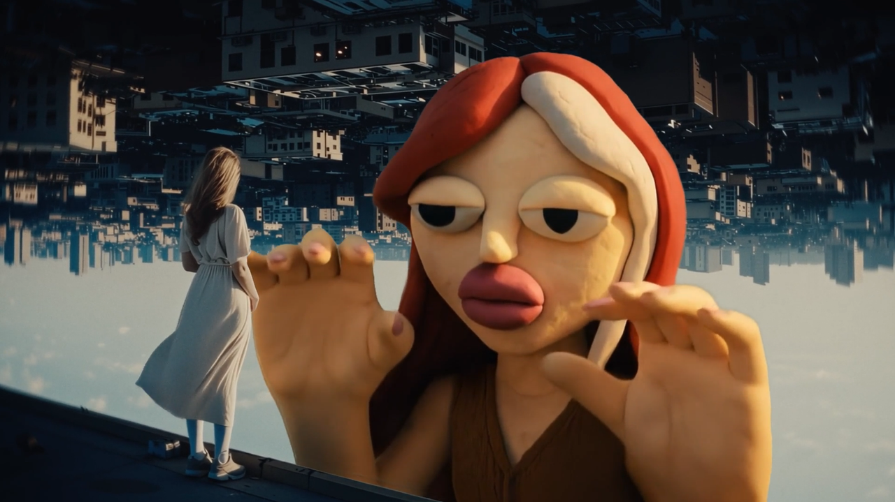
• Sharpen the story – a design guide to start-up’s pitch decks

    In early-stage start-ups, the pitch deck is often the first thing investors see. Sometimes, it’s the only thing. And yet, it rarely gets the same attention as the website or the socials. Most decks are pulled together last minute, with slides that feel rushed, messy, or just off.
    That’s where designers can really make a difference.
    The deck might seem like just another task, but it’s a chance to work on something strategic early on and help shape how the company is understood. It offers a rare opportunity to collaborate closely with copywriters, strategists and the founders to turn their vision into a clear and convincing story.
    Founders bring the vision, but more and more, design and brand teams are being asked to shape how that vision is told, and sold. So here are five handy things we’ve learned at SIDE ST for the next time you’re asked to design a deck.
    Think in context
    Designers stepping into pitch work should begin by understanding the full picture – who the deck is for, what outcomes it’s meant to drive and how it fits into the broader brand and business context. Their role isn’t just to make things look good, but to prioritise clarity over surface-level aesthetics.
    It’s about getting into the founders’ mindset, shaping visuals and copy around the message, and connecting with the intended audience. Every decision, from slide hierarchy to image selection, should reinforce the business goals behind the deck.
    Support the narrative
    Visuals are more subjective than words, and that’s exactly what gives them power. The right image can suggest an idea, reinforce a value, or subtly shift perception without a single word.
    Whether it’s hinting at accessibility, signalling innovation, or grounding the product in context, design plays a strategic role in how a company is understood. It gives designers the opportunity to take centre stage in the storytelling, shaping how the company is understood through visual choices.
    But that influence works both ways. Used thoughtlessly, visuals can distort the story, suggesting the wrong market, implying a different stage of maturity, or confusing people about the product itself. When used with care, they become a powerful design tool to sharpen the narrative and spark interest from the very first slide.
    Keep it real
    Stock photos can be tempting. They’re high-quality and easy to drop in, especially when the real images a start-up has can be grainy, unfinished, or simply not there yet.
    But in early-stage pitch decks, they often work against your client. Instead of supporting the story, they flatten it, and rarely reflect the actual team, product, or context.
    This is your chance as a designer to lean into what’s real, even if it’s a bit rough. Designers can elevate even scrappy assets with thoughtful framing and treatment, turning rough imagery into a strength. In early-stage storytelling, “real” often resonates more than “perfect.”
    Pay attention to the format
    Even if you’re brought in just to design the deck, don’t treat it as a standalone piece. It’s often the first brand touchpoint investors will see—but it won’t be the last. They’ll go on to check the website, scroll through social posts, and form an impression based on how it all fits together.
    Early-stage startups might not have full brand guidelines in place yet, but that doesn’t mean there’s no need for consistency. In fact, it gives designers a unique opportunity to lay the foundation. A strong, thoughtful deck can help shape the early visual language and give the team something to build on as the brand grows.
    Before you hit export
    For designers, the deck isn’t just another deliverable. It’s an early tool that shapes and impacts investor perception, internal alignment and founder confidence. It’s a strategic design moment to influence the trajectory of a company before it’s fully formed.
    Designers who understand the pressure, pace and uncertainty founders face at this stage are better equipped to deliver work that resonates. This is about more than simply polishing slides, it’s about helping early-stage teams tell a sharper, more human story when it matters most.
    Maor Ofek is founder of SIDE ST, a brand consultancy that works mainly with start-ups. 
    #sharpen #story #design #guide #startups
    Sharpen the story – a design guide to start-up’s pitch decks
    In early-stage start-ups, the pitch deck is often the first thing investors see. Sometimes, it’s the only thing. And yet, it rarely gets the same attention as the website or the socials. Most decks are pulled together last minute, with slides that feel rushed, messy, or just off. That’s where designers can really make a difference. The deck might seem like just another task, but it’s a chance to work on something strategic early on and help shape how the company is understood. It offers a rare opportunity to collaborate closely with copywriters, strategists and the founders to turn their vision into a clear and convincing story. Founders bring the vision, but more and more, design and brand teams are being asked to shape how that vision is told, and sold. So here are five handy things we’ve learned at SIDE ST for the next time you’re asked to design a deck. Think in context Designers stepping into pitch work should begin by understanding the full picture – who the deck is for, what outcomes it’s meant to drive and how it fits into the broader brand and business context. Their role isn’t just to make things look good, but to prioritise clarity over surface-level aesthetics. It’s about getting into the founders’ mindset, shaping visuals and copy around the message, and connecting with the intended audience. Every decision, from slide hierarchy to image selection, should reinforce the business goals behind the deck. Support the narrative Visuals are more subjective than words, and that’s exactly what gives them power. The right image can suggest an idea, reinforce a value, or subtly shift perception without a single word. Whether it’s hinting at accessibility, signalling innovation, or grounding the product in context, design plays a strategic role in how a company is understood. It gives designers the opportunity to take centre stage in the storytelling, shaping how the company is understood through visual choices. But that influence works both ways. Used thoughtlessly, visuals can distort the story, suggesting the wrong market, implying a different stage of maturity, or confusing people about the product itself. When used with care, they become a powerful design tool to sharpen the narrative and spark interest from the very first slide. Keep it real Stock photos can be tempting. They’re high-quality and easy to drop in, especially when the real images a start-up has can be grainy, unfinished, or simply not there yet. But in early-stage pitch decks, they often work against your client. Instead of supporting the story, they flatten it, and rarely reflect the actual team, product, or context. This is your chance as a designer to lean into what’s real, even if it’s a bit rough. Designers can elevate even scrappy assets with thoughtful framing and treatment, turning rough imagery into a strength. In early-stage storytelling, “real” often resonates more than “perfect.” Pay attention to the format Even if you’re brought in just to design the deck, don’t treat it as a standalone piece. It’s often the first brand touchpoint investors will see—but it won’t be the last. They’ll go on to check the website, scroll through social posts, and form an impression based on how it all fits together. Early-stage startups might not have full brand guidelines in place yet, but that doesn’t mean there’s no need for consistency. In fact, it gives designers a unique opportunity to lay the foundation. A strong, thoughtful deck can help shape the early visual language and give the team something to build on as the brand grows. Before you hit export For designers, the deck isn’t just another deliverable. It’s an early tool that shapes and impacts investor perception, internal alignment and founder confidence. It’s a strategic design moment to influence the trajectory of a company before it’s fully formed. Designers who understand the pressure, pace and uncertainty founders face at this stage are better equipped to deliver work that resonates. This is about more than simply polishing slides, it’s about helping early-stage teams tell a sharper, more human story when it matters most. Maor Ofek is founder of SIDE ST, a brand consultancy that works mainly with start-ups.  #sharpen #story #design #guide #startups
    WWW.DESIGNWEEK.CO.UK
    Sharpen the story – a design guide to start-up’s pitch decks
    In early-stage start-ups, the pitch deck is often the first thing investors see. Sometimes, it’s the only thing. And yet, it rarely gets the same attention as the website or the socials. Most decks are pulled together last minute, with slides that feel rushed, messy, or just off. That’s where designers can really make a difference. The deck might seem like just another task, but it’s a chance to work on something strategic early on and help shape how the company is understood. It offers a rare opportunity to collaborate closely with copywriters, strategists and the founders to turn their vision into a clear and convincing story. Founders bring the vision, but more and more, design and brand teams are being asked to shape how that vision is told, and sold. So here are five handy things we’ve learned at SIDE ST for the next time you’re asked to design a deck. Think in context Designers stepping into pitch work should begin by understanding the full picture – who the deck is for, what outcomes it’s meant to drive and how it fits into the broader brand and business context. Their role isn’t just to make things look good, but to prioritise clarity over surface-level aesthetics. It’s about getting into the founders’ mindset, shaping visuals and copy around the message, and connecting with the intended audience. Every decision, from slide hierarchy to image selection, should reinforce the business goals behind the deck. Support the narrative Visuals are more subjective than words, and that’s exactly what gives them power. The right image can suggest an idea, reinforce a value, or subtly shift perception without a single word. Whether it’s hinting at accessibility, signalling innovation, or grounding the product in context, design plays a strategic role in how a company is understood. It gives designers the opportunity to take centre stage in the storytelling, shaping how the company is understood through visual choices. But that influence works both ways. Used thoughtlessly, visuals can distort the story, suggesting the wrong market, implying a different stage of maturity, or confusing people about the product itself. When used with care, they become a powerful design tool to sharpen the narrative and spark interest from the very first slide. Keep it real Stock photos can be tempting. They’re high-quality and easy to drop in, especially when the real images a start-up has can be grainy, unfinished, or simply not there yet. But in early-stage pitch decks, they often work against your client. Instead of supporting the story, they flatten it, and rarely reflect the actual team, product, or context. This is your chance as a designer to lean into what’s real, even if it’s a bit rough. Designers can elevate even scrappy assets with thoughtful framing and treatment, turning rough imagery into a strength. In early-stage storytelling, “real” often resonates more than “perfect.” Pay attention to the format Even if you’re brought in just to design the deck, don’t treat it as a standalone piece. It’s often the first brand touchpoint investors will see—but it won’t be the last. They’ll go on to check the website, scroll through social posts, and form an impression based on how it all fits together. Early-stage startups might not have full brand guidelines in place yet, but that doesn’t mean there’s no need for consistency. In fact, it gives designers a unique opportunity to lay the foundation. A strong, thoughtful deck can help shape the early visual language and give the team something to build on as the brand grows. Before you hit export For designers, the deck isn’t just another deliverable. It’s an early tool that shapes and impacts investor perception, internal alignment and founder confidence. It’s a strategic design moment to influence the trajectory of a company before it’s fully formed. Designers who understand the pressure, pace and uncertainty founders face at this stage are better equipped to deliver work that resonates. This is about more than simply polishing slides, it’s about helping early-stage teams tell a sharper, more human story when it matters most. Maor Ofek is founder of SIDE ST, a brand consultancy that works mainly with start-ups. 
    Like
    Love
    Wow
    Sad
    Angry
    557
    2 Comentários 0 Compartilhamentos
  • Why Designers Get Stuck In The Details And How To Stop

    You’ve drawn fifty versions of the same screen — and you still hate every one of them. Begrudgingly, you pick three, show them to your product manager, and hear: “Looks cool, but the idea doesn’t work.” Sound familiar?
    In this article, I’ll unpack why designers fall into detail work at the wrong moment, examining both process pitfalls and the underlying psychological reasons, as understanding these traps is the first step to overcoming them. I’ll also share tactics I use to climb out of that trap.
    Reason #1 You’re Afraid To Show Rough Work
    We designers worship detail. We’re taught that true craft equals razor‑sharp typography, perfect grids, and pixel precision. So the minute a task arrives, we pop open Figma and start polishing long before polish is needed.
    I’ve skipped the sketch phase more times than I care to admit. I told myself it would be faster, yet I always ended up spending hours producing a tidy mock‑up when a scribbled thumbnail would have sparked a five‑minute chat with my product manager. Rough sketches felt “unprofessional,” so I hid them.
    The cost? Lost time, wasted energy — and, by the third redo, teammates were quietly wondering if I even understood the brief.
    The real problem here is the habit: we open Figma and start perfecting the UI before we’ve even solved the problem.
    So why do we hide these rough sketches? It’s not just a bad habit or plain silly. There are solid psychological reasons behind it. We often just call it perfectionism, but it’s deeper than wanting things neat. Digging into the psychologyshows there are a couple of flavors driving this:

    Socially prescribed perfectionismIt’s that nagging feeling that everyone else expects perfect work from you, which makes showing anything rough feel like walking into the lion’s den.
    Self-oriented perfectionismWhere you’re the one setting impossibly high standards for yourself, leading to brutal self-criticism if anything looks slightly off.

    Either way, the result’s the same: showing unfinished work feels wrong, and you miss out on that vital early feedback.
    Back to the design side, remember that clients rarely see architects’ first pencil sketches, but these sketches still exist; they guide structural choices before the 3D render. Treat your thumbnails the same way — artifacts meant to collapse uncertainty, not portfolio pieces. Once stakeholders see the upside, roughness becomes a badge of speed, not sloppiness. So, the key is to consciously make that shift:
    Treat early sketches as disposable tools for thinking and actively share them to get feedback faster.

    Reason #2: You Fix The Symptom, Not The Cause
    Before tackling any task, we need to understand what business outcome we’re aiming for. Product managers might come to us asking to enlarge the payment button in the shopping cart because users aren’t noticing it. The suggested solution itself isn’t necessarily bad, but before redesigning the button, we should ask, “What data suggests they aren’t noticing it?” Don’t get me wrong, I’m not saying you shouldn’t trust your product manager. On the contrary, these questions help ensure you’re on the same page and working with the same data.
    From my experience, here are several reasons why users might not be clicking that coveted button:

    Users don’t understand that this step is for payment.
    They understand it’s about payment but expect order confirmation first.
    Due to incorrect translation, users don’t understand what the button means.
    Lack of trust signals.
    Unexpected additional coststhat appear at this stage.
    Technical issues.

    Now, imagine you simply did what the manager suggested. Would you have solved the problem? Hardly.
    Moreover, the responsibility for the unresolved issue would fall on you, as the interface solution lies within the design domain. The product manager actually did their job correctly by identifying a problem: suspiciously, few users are clicking the button.
    Psychologically, taking on this bigger role isn’t easy. It means overcoming the fear of making mistakes and the discomfort of exploring unclear problems rather than just doing tasks. This shift means seeing ourselves as partners who create value — even if it means fighting a hesitation to question product managers— and understanding that using our product logic expertise proactively is crucial for modern designers.
    There’s another critical reason why we, designers, need to be a bit like product managers: the rise of AI. I deliberately used a simple example about enlarging a button, but I’m confident that in the near future, AI will easily handle routine design tasks. This worries me, but at the same time, I’m already gladly stepping into the product manager’s territory: understanding product and business metrics, formulating hypotheses, conducting research, and so on. It might sound like I’m taking work away from PMs, but believe me, they undoubtedly have enough on their plates and are usually more than happy to delegate some responsibilities to designers.
    Reason #3: You’re Solving The Wrong Problem
    Before solving anything, ask whether the problem even deserves your attention.
    During a major home‑screen redesign, our goal was to drive more users into paid services. The initial hypothesis — making service buttons bigger and brighter might help returning users — seemed reasonable enough to test. However, even when A/B testsshowed minimal impact, we continued to tweak those buttons.
    Only later did it click: the home screen isn’t the place to sell; visitors open the app to start, not to buy. We removed that promo block, and nothing broke. Contextual entry points deeper into the journey performed brilliantly. Lesson learned:
    Without the right context, any visual tweak is lipstick on a pig.

    Why did we get stuck polishing buttons instead of stopping sooner? It’s easy to get tunnel vision. Psychologically, it’s likely the good old sunk cost fallacy kicking in: we’d already invested time in the buttons, so stopping felt like wasting that effort, even though the data wasn’t promising.
    It’s just easier to keep fiddling with something familiar than to admit we need a new plan. Perhaps the simple question I should have asked myself when results stalled was: “Are we optimizing the right thing or just polishing something that fundamentally doesn’t fit the user’s primary goal here?” That alone might have saved hours.
    Reason #4: You’re Drowning In Unactionable Feedback
    We all discuss our work with colleagues. But here’s a crucial point: what kind of question do you pose to kick off that discussion? If your go-to is “What do you think?” well, that question might lead you down a rabbit hole of personal opinions rather than actionable insights. While experienced colleagues will cut through the noise, others, unsure what to evaluate, might comment on anything and everything — fonts, button colors, even when you desperately need to discuss a user flow.
    What matters here are two things:

    The question you ask,
    The context you give.

    That means clearly stating the problem, what you’ve learned, and how your idea aims to fix it.
    For instance:
    “The problem is our payment conversion rate has dropped by X%. I’ve interviewed users and found they abandon payment because they don’t understand how the total amount is calculated. My solution is to show a detailed cost breakdown. Do you think this actually solves the problem for them?”

    Here, you’ve stated the problem, shared your insight, explained your solution, and asked a direct question. It’s even better if you prepare a list of specific sub-questions. For instance: “Are all items in the cost breakdown clear?” or “Does the placement of this breakdown feel intuitive within the payment flow?”
    Another good habit is to keep your rough sketches and previous iterations handy. Some of your colleagues’ suggestions might be things you’ve already tried. It’s great if you can discuss them immediately to either revisit those ideas or definitively set them aside.
    I’m not a psychologist, but experience tells me that, psychologically, the reluctance to be this specific often stems from a fear of our solution being rejected. We tend to internalize feedback: a seemingly innocent comment like, “Have you considered other ways to organize this section?” or “Perhaps explore a different structure for this part?” can instantly morph in our minds into “You completely messed up the structure. You’re a bad designer.” Imposter syndrome, in all its glory.
    So, to wrap up this point, here are two recommendations:

    Prepare for every design discussion.A couple of focused questions will yield far more valuable input than a vague “So, what do you think?”.
    Actively work on separating feedback on your design from your self-worth.If a mistake is pointed out, acknowledge it, learn from it, and you’ll be less likely to repeat it. This is often easier said than done. For me, it took years of working with a psychotherapist. If you struggle with this, I sincerely wish you strength in overcoming it.

    Reason #5 You’re Just Tired
    Sometimes, the issue isn’t strategic at all — it’s fatigue. Fussing over icon corners can feel like a cozy bunker when your brain is fried. There’s a name for this: decision fatigue. Basically, your brain’s battery for hard thinking is low, so it hides out in the easy, comfy zone of pixel-pushing.
    A striking example comes from a New York Times article titled “Do You Suffer From Decision Fatigue?.” It described how judges deciding on release requests were far more likely to grant release early in the daycompared to late in the daysimply because their decision-making energy was depleted. Luckily, designers rarely hold someone’s freedom in their hands, but the example dramatically shows how fatigue can impact our judgment and productivity.
    What helps here:

    Swap tasks.Trade tickets with another designer; novelty resets your focus.
    Talk to another designer.If NDA permits, ask peers outside the team for a sanity check.
    Step away.Even a ten‑minute walk can do more than a double‑shot espresso.

    By the way, I came up with these ideas while walking around my office. I was lucky to work near a river, and those short walks quickly turned into a helpful habit.

    And one more trick that helps me snap out of detail mode early: if I catch myself making around 20 little tweaks — changing font weight, color, border radius — I just stop. Over time, it turned into a habit. I have a similar one with Instagram: by the third reel, my brain quietly asks, “Wait, weren’t we working?” Funny how that kind of nudge saves a ton of time.
    Four Steps I Use to Avoid Drowning In Detail
    Knowing these potential traps, here’s the practical process I use to stay on track:
    1. Define the Core Problem & Business Goal
    Before anything, dig deep: what’s the actual problem we’re solving, not just the requested task or a surface-level symptom? Ask ‘why’ repeatedly. What user pain or business need are we addressing? Then, state the clear business goal: “What metric am I moving, and do we have data to prove this is the right lever?” If retention is the goal, decide whether push reminders, gamification, or personalised content is the best route. The wrong lever, or tackling a symptom instead of the cause, dooms everything downstream.
    2. Choose the MechanicOnce the core problem and goal are clear, lock the solution principle or ‘mechanic’ first. Going with a game layer? Decide if it’s leaderboards, streaks, or badges. Write it down. Then move on. No UI yet. This keeps the focus high-level before diving into pixels.
    3. Wireframe the Flow & Get Focused Feedback
    Now open Figma. Map screens, layout, and transitions. Boxes and arrows are enough. Keep the fidelity low so the discussion stays on the flow, not colour. Crucially, when you share these early wires, ask specific questions and provide clear contextto get actionable feedback, not just vague opinions.
    4. Polish the VisualsI only let myself tweak grids, type scales, and shadows after the flow is validated. If progress stalls, or before a major polish effort, I surface the work in a design critique — again using targeted questions and clear context — instead of hiding in version 47. This ensures detailing serves the now-validated solution.
    Even for something as small as a single button, running these four checkpoints takes about ten minutes and saves hours of decorative dithering.
    Wrapping Up
    Next time you feel the pull to vanish into mock‑ups before the problem is nailed down, pause and ask what you might be avoiding. Yes, that can expose an uncomfortable truth. But pausing to ask what you might be avoiding — maybe the fuzzy core problem, or just asking for tough feedback — gives you the power to face the real issue head-on. It keeps the project focused on solving the right problem, not just perfecting a flawed solution.
    Attention to detail is a superpower when used at the right moment. Obsessing over pixels too soon, though, is a bad habit and a warning light telling us the process needs a rethink.
    #why #designers #get #stuck #details
    Why Designers Get Stuck In The Details And How To Stop
    You’ve drawn fifty versions of the same screen — and you still hate every one of them. Begrudgingly, you pick three, show them to your product manager, and hear: “Looks cool, but the idea doesn’t work.” Sound familiar? In this article, I’ll unpack why designers fall into detail work at the wrong moment, examining both process pitfalls and the underlying psychological reasons, as understanding these traps is the first step to overcoming them. I’ll also share tactics I use to climb out of that trap. Reason #1 You’re Afraid To Show Rough Work We designers worship detail. We’re taught that true craft equals razor‑sharp typography, perfect grids, and pixel precision. So the minute a task arrives, we pop open Figma and start polishing long before polish is needed. I’ve skipped the sketch phase more times than I care to admit. I told myself it would be faster, yet I always ended up spending hours producing a tidy mock‑up when a scribbled thumbnail would have sparked a five‑minute chat with my product manager. Rough sketches felt “unprofessional,” so I hid them. The cost? Lost time, wasted energy — and, by the third redo, teammates were quietly wondering if I even understood the brief. The real problem here is the habit: we open Figma and start perfecting the UI before we’ve even solved the problem. So why do we hide these rough sketches? It’s not just a bad habit or plain silly. There are solid psychological reasons behind it. We often just call it perfectionism, but it’s deeper than wanting things neat. Digging into the psychologyshows there are a couple of flavors driving this: Socially prescribed perfectionismIt’s that nagging feeling that everyone else expects perfect work from you, which makes showing anything rough feel like walking into the lion’s den. Self-oriented perfectionismWhere you’re the one setting impossibly high standards for yourself, leading to brutal self-criticism if anything looks slightly off. Either way, the result’s the same: showing unfinished work feels wrong, and you miss out on that vital early feedback. Back to the design side, remember that clients rarely see architects’ first pencil sketches, but these sketches still exist; they guide structural choices before the 3D render. Treat your thumbnails the same way — artifacts meant to collapse uncertainty, not portfolio pieces. Once stakeholders see the upside, roughness becomes a badge of speed, not sloppiness. So, the key is to consciously make that shift: Treat early sketches as disposable tools for thinking and actively share them to get feedback faster. Reason #2: You Fix The Symptom, Not The Cause Before tackling any task, we need to understand what business outcome we’re aiming for. Product managers might come to us asking to enlarge the payment button in the shopping cart because users aren’t noticing it. The suggested solution itself isn’t necessarily bad, but before redesigning the button, we should ask, “What data suggests they aren’t noticing it?” Don’t get me wrong, I’m not saying you shouldn’t trust your product manager. On the contrary, these questions help ensure you’re on the same page and working with the same data. From my experience, here are several reasons why users might not be clicking that coveted button: Users don’t understand that this step is for payment. They understand it’s about payment but expect order confirmation first. Due to incorrect translation, users don’t understand what the button means. Lack of trust signals. Unexpected additional coststhat appear at this stage. Technical issues. Now, imagine you simply did what the manager suggested. Would you have solved the problem? Hardly. Moreover, the responsibility for the unresolved issue would fall on you, as the interface solution lies within the design domain. The product manager actually did their job correctly by identifying a problem: suspiciously, few users are clicking the button. Psychologically, taking on this bigger role isn’t easy. It means overcoming the fear of making mistakes and the discomfort of exploring unclear problems rather than just doing tasks. This shift means seeing ourselves as partners who create value — even if it means fighting a hesitation to question product managers— and understanding that using our product logic expertise proactively is crucial for modern designers. There’s another critical reason why we, designers, need to be a bit like product managers: the rise of AI. I deliberately used a simple example about enlarging a button, but I’m confident that in the near future, AI will easily handle routine design tasks. This worries me, but at the same time, I’m already gladly stepping into the product manager’s territory: understanding product and business metrics, formulating hypotheses, conducting research, and so on. It might sound like I’m taking work away from PMs, but believe me, they undoubtedly have enough on their plates and are usually more than happy to delegate some responsibilities to designers. Reason #3: You’re Solving The Wrong Problem Before solving anything, ask whether the problem even deserves your attention. During a major home‑screen redesign, our goal was to drive more users into paid services. The initial hypothesis — making service buttons bigger and brighter might help returning users — seemed reasonable enough to test. However, even when A/B testsshowed minimal impact, we continued to tweak those buttons. Only later did it click: the home screen isn’t the place to sell; visitors open the app to start, not to buy. We removed that promo block, and nothing broke. Contextual entry points deeper into the journey performed brilliantly. Lesson learned: Without the right context, any visual tweak is lipstick on a pig. Why did we get stuck polishing buttons instead of stopping sooner? It’s easy to get tunnel vision. Psychologically, it’s likely the good old sunk cost fallacy kicking in: we’d already invested time in the buttons, so stopping felt like wasting that effort, even though the data wasn’t promising. It’s just easier to keep fiddling with something familiar than to admit we need a new plan. Perhaps the simple question I should have asked myself when results stalled was: “Are we optimizing the right thing or just polishing something that fundamentally doesn’t fit the user’s primary goal here?” That alone might have saved hours. Reason #4: You’re Drowning In Unactionable Feedback We all discuss our work with colleagues. But here’s a crucial point: what kind of question do you pose to kick off that discussion? If your go-to is “What do you think?” well, that question might lead you down a rabbit hole of personal opinions rather than actionable insights. While experienced colleagues will cut through the noise, others, unsure what to evaluate, might comment on anything and everything — fonts, button colors, even when you desperately need to discuss a user flow. What matters here are two things: The question you ask, The context you give. That means clearly stating the problem, what you’ve learned, and how your idea aims to fix it. For instance: “The problem is our payment conversion rate has dropped by X%. I’ve interviewed users and found they abandon payment because they don’t understand how the total amount is calculated. My solution is to show a detailed cost breakdown. Do you think this actually solves the problem for them?” Here, you’ve stated the problem, shared your insight, explained your solution, and asked a direct question. It’s even better if you prepare a list of specific sub-questions. For instance: “Are all items in the cost breakdown clear?” or “Does the placement of this breakdown feel intuitive within the payment flow?” Another good habit is to keep your rough sketches and previous iterations handy. Some of your colleagues’ suggestions might be things you’ve already tried. It’s great if you can discuss them immediately to either revisit those ideas or definitively set them aside. I’m not a psychologist, but experience tells me that, psychologically, the reluctance to be this specific often stems from a fear of our solution being rejected. We tend to internalize feedback: a seemingly innocent comment like, “Have you considered other ways to organize this section?” or “Perhaps explore a different structure for this part?” can instantly morph in our minds into “You completely messed up the structure. You’re a bad designer.” Imposter syndrome, in all its glory. So, to wrap up this point, here are two recommendations: Prepare for every design discussion.A couple of focused questions will yield far more valuable input than a vague “So, what do you think?”. Actively work on separating feedback on your design from your self-worth.If a mistake is pointed out, acknowledge it, learn from it, and you’ll be less likely to repeat it. This is often easier said than done. For me, it took years of working with a psychotherapist. If you struggle with this, I sincerely wish you strength in overcoming it. Reason #5 You’re Just Tired Sometimes, the issue isn’t strategic at all — it’s fatigue. Fussing over icon corners can feel like a cozy bunker when your brain is fried. There’s a name for this: decision fatigue. Basically, your brain’s battery for hard thinking is low, so it hides out in the easy, comfy zone of pixel-pushing. A striking example comes from a New York Times article titled “Do You Suffer From Decision Fatigue?.” It described how judges deciding on release requests were far more likely to grant release early in the daycompared to late in the daysimply because their decision-making energy was depleted. Luckily, designers rarely hold someone’s freedom in their hands, but the example dramatically shows how fatigue can impact our judgment and productivity. What helps here: Swap tasks.Trade tickets with another designer; novelty resets your focus. Talk to another designer.If NDA permits, ask peers outside the team for a sanity check. Step away.Even a ten‑minute walk can do more than a double‑shot espresso. By the way, I came up with these ideas while walking around my office. I was lucky to work near a river, and those short walks quickly turned into a helpful habit. And one more trick that helps me snap out of detail mode early: if I catch myself making around 20 little tweaks — changing font weight, color, border radius — I just stop. Over time, it turned into a habit. I have a similar one with Instagram: by the third reel, my brain quietly asks, “Wait, weren’t we working?” Funny how that kind of nudge saves a ton of time. Four Steps I Use to Avoid Drowning In Detail Knowing these potential traps, here’s the practical process I use to stay on track: 1. Define the Core Problem & Business Goal Before anything, dig deep: what’s the actual problem we’re solving, not just the requested task or a surface-level symptom? Ask ‘why’ repeatedly. What user pain or business need are we addressing? Then, state the clear business goal: “What metric am I moving, and do we have data to prove this is the right lever?” If retention is the goal, decide whether push reminders, gamification, or personalised content is the best route. The wrong lever, or tackling a symptom instead of the cause, dooms everything downstream. 2. Choose the MechanicOnce the core problem and goal are clear, lock the solution principle or ‘mechanic’ first. Going with a game layer? Decide if it’s leaderboards, streaks, or badges. Write it down. Then move on. No UI yet. This keeps the focus high-level before diving into pixels. 3. Wireframe the Flow & Get Focused Feedback Now open Figma. Map screens, layout, and transitions. Boxes and arrows are enough. Keep the fidelity low so the discussion stays on the flow, not colour. Crucially, when you share these early wires, ask specific questions and provide clear contextto get actionable feedback, not just vague opinions. 4. Polish the VisualsI only let myself tweak grids, type scales, and shadows after the flow is validated. If progress stalls, or before a major polish effort, I surface the work in a design critique — again using targeted questions and clear context — instead of hiding in version 47. This ensures detailing serves the now-validated solution. Even for something as small as a single button, running these four checkpoints takes about ten minutes and saves hours of decorative dithering. Wrapping Up Next time you feel the pull to vanish into mock‑ups before the problem is nailed down, pause and ask what you might be avoiding. Yes, that can expose an uncomfortable truth. But pausing to ask what you might be avoiding — maybe the fuzzy core problem, or just asking for tough feedback — gives you the power to face the real issue head-on. It keeps the project focused on solving the right problem, not just perfecting a flawed solution. Attention to detail is a superpower when used at the right moment. Obsessing over pixels too soon, though, is a bad habit and a warning light telling us the process needs a rethink. #why #designers #get #stuck #details
    SMASHINGMAGAZINE.COM
    Why Designers Get Stuck In The Details And How To Stop
    You’ve drawn fifty versions of the same screen — and you still hate every one of them. Begrudgingly, you pick three, show them to your product manager, and hear: “Looks cool, but the idea doesn’t work.” Sound familiar? In this article, I’ll unpack why designers fall into detail work at the wrong moment, examining both process pitfalls and the underlying psychological reasons, as understanding these traps is the first step to overcoming them. I’ll also share tactics I use to climb out of that trap. Reason #1 You’re Afraid To Show Rough Work We designers worship detail. We’re taught that true craft equals razor‑sharp typography, perfect grids, and pixel precision. So the minute a task arrives, we pop open Figma and start polishing long before polish is needed. I’ve skipped the sketch phase more times than I care to admit. I told myself it would be faster, yet I always ended up spending hours producing a tidy mock‑up when a scribbled thumbnail would have sparked a five‑minute chat with my product manager. Rough sketches felt “unprofessional,” so I hid them. The cost? Lost time, wasted energy — and, by the third redo, teammates were quietly wondering if I even understood the brief. The real problem here is the habit: we open Figma and start perfecting the UI before we’ve even solved the problem. So why do we hide these rough sketches? It’s not just a bad habit or plain silly. There are solid psychological reasons behind it. We often just call it perfectionism, but it’s deeper than wanting things neat. Digging into the psychology (like the research by Hewitt and Flett) shows there are a couple of flavors driving this: Socially prescribed perfectionismIt’s that nagging feeling that everyone else expects perfect work from you, which makes showing anything rough feel like walking into the lion’s den. Self-oriented perfectionismWhere you’re the one setting impossibly high standards for yourself, leading to brutal self-criticism if anything looks slightly off. Either way, the result’s the same: showing unfinished work feels wrong, and you miss out on that vital early feedback. Back to the design side, remember that clients rarely see architects’ first pencil sketches, but these sketches still exist; they guide structural choices before the 3D render. Treat your thumbnails the same way — artifacts meant to collapse uncertainty, not portfolio pieces. Once stakeholders see the upside, roughness becomes a badge of speed, not sloppiness. So, the key is to consciously make that shift: Treat early sketches as disposable tools for thinking and actively share them to get feedback faster. Reason #2: You Fix The Symptom, Not The Cause Before tackling any task, we need to understand what business outcome we’re aiming for. Product managers might come to us asking to enlarge the payment button in the shopping cart because users aren’t noticing it. The suggested solution itself isn’t necessarily bad, but before redesigning the button, we should ask, “What data suggests they aren’t noticing it?” Don’t get me wrong, I’m not saying you shouldn’t trust your product manager. On the contrary, these questions help ensure you’re on the same page and working with the same data. From my experience, here are several reasons why users might not be clicking that coveted button: Users don’t understand that this step is for payment. They understand it’s about payment but expect order confirmation first. Due to incorrect translation, users don’t understand what the button means. Lack of trust signals (no security icons, unclear seller information). Unexpected additional costs (hidden fees, shipping) that appear at this stage. Technical issues (inactive button, page freezing). Now, imagine you simply did what the manager suggested. Would you have solved the problem? Hardly. Moreover, the responsibility for the unresolved issue would fall on you, as the interface solution lies within the design domain. The product manager actually did their job correctly by identifying a problem: suspiciously, few users are clicking the button. Psychologically, taking on this bigger role isn’t easy. It means overcoming the fear of making mistakes and the discomfort of exploring unclear problems rather than just doing tasks. This shift means seeing ourselves as partners who create value — even if it means fighting a hesitation to question product managers (which might come from a fear of speaking up or a desire to avoid challenging authority) — and understanding that using our product logic expertise proactively is crucial for modern designers. There’s another critical reason why we, designers, need to be a bit like product managers: the rise of AI. I deliberately used a simple example about enlarging a button, but I’m confident that in the near future, AI will easily handle routine design tasks. This worries me, but at the same time, I’m already gladly stepping into the product manager’s territory: understanding product and business metrics, formulating hypotheses, conducting research, and so on. It might sound like I’m taking work away from PMs, but believe me, they undoubtedly have enough on their plates and are usually more than happy to delegate some responsibilities to designers. Reason #3: You’re Solving The Wrong Problem Before solving anything, ask whether the problem even deserves your attention. During a major home‑screen redesign, our goal was to drive more users into paid services. The initial hypothesis — making service buttons bigger and brighter might help returning users — seemed reasonable enough to test. However, even when A/B tests (a method of comparing two versions of a design to determine which performs better) showed minimal impact, we continued to tweak those buttons. Only later did it click: the home screen isn’t the place to sell; visitors open the app to start, not to buy. We removed that promo block, and nothing broke. Contextual entry points deeper into the journey performed brilliantly. Lesson learned: Without the right context, any visual tweak is lipstick on a pig. Why did we get stuck polishing buttons instead of stopping sooner? It’s easy to get tunnel vision. Psychologically, it’s likely the good old sunk cost fallacy kicking in: we’d already invested time in the buttons, so stopping felt like wasting that effort, even though the data wasn’t promising. It’s just easier to keep fiddling with something familiar than to admit we need a new plan. Perhaps the simple question I should have asked myself when results stalled was: “Are we optimizing the right thing or just polishing something that fundamentally doesn’t fit the user’s primary goal here?” That alone might have saved hours. Reason #4: You’re Drowning In Unactionable Feedback We all discuss our work with colleagues. But here’s a crucial point: what kind of question do you pose to kick off that discussion? If your go-to is “What do you think?” well, that question might lead you down a rabbit hole of personal opinions rather than actionable insights. While experienced colleagues will cut through the noise, others, unsure what to evaluate, might comment on anything and everything — fonts, button colors, even when you desperately need to discuss a user flow. What matters here are two things: The question you ask, The context you give. That means clearly stating the problem, what you’ve learned, and how your idea aims to fix it. For instance: “The problem is our payment conversion rate has dropped by X%. I’ve interviewed users and found they abandon payment because they don’t understand how the total amount is calculated. My solution is to show a detailed cost breakdown. Do you think this actually solves the problem for them?” Here, you’ve stated the problem (conversion drop), shared your insight (user confusion), explained your solution (cost breakdown), and asked a direct question. It’s even better if you prepare a list of specific sub-questions. For instance: “Are all items in the cost breakdown clear?” or “Does the placement of this breakdown feel intuitive within the payment flow?” Another good habit is to keep your rough sketches and previous iterations handy. Some of your colleagues’ suggestions might be things you’ve already tried. It’s great if you can discuss them immediately to either revisit those ideas or definitively set them aside. I’m not a psychologist, but experience tells me that, psychologically, the reluctance to be this specific often stems from a fear of our solution being rejected. We tend to internalize feedback: a seemingly innocent comment like, “Have you considered other ways to organize this section?” or “Perhaps explore a different structure for this part?” can instantly morph in our minds into “You completely messed up the structure. You’re a bad designer.” Imposter syndrome, in all its glory. So, to wrap up this point, here are two recommendations: Prepare for every design discussion.A couple of focused questions will yield far more valuable input than a vague “So, what do you think?”. Actively work on separating feedback on your design from your self-worth.If a mistake is pointed out, acknowledge it, learn from it, and you’ll be less likely to repeat it. This is often easier said than done. For me, it took years of working with a psychotherapist. If you struggle with this, I sincerely wish you strength in overcoming it. Reason #5 You’re Just Tired Sometimes, the issue isn’t strategic at all — it’s fatigue. Fussing over icon corners can feel like a cozy bunker when your brain is fried. There’s a name for this: decision fatigue. Basically, your brain’s battery for hard thinking is low, so it hides out in the easy, comfy zone of pixel-pushing. A striking example comes from a New York Times article titled “Do You Suffer From Decision Fatigue?.” It described how judges deciding on release requests were far more likely to grant release early in the day (about 70% of cases) compared to late in the day (less than 10%) simply because their decision-making energy was depleted. Luckily, designers rarely hold someone’s freedom in their hands, but the example dramatically shows how fatigue can impact our judgment and productivity. What helps here: Swap tasks.Trade tickets with another designer; novelty resets your focus. Talk to another designer.If NDA permits, ask peers outside the team for a sanity check. Step away.Even a ten‑minute walk can do more than a double‑shot espresso. By the way, I came up with these ideas while walking around my office. I was lucky to work near a river, and those short walks quickly turned into a helpful habit. And one more trick that helps me snap out of detail mode early: if I catch myself making around 20 little tweaks — changing font weight, color, border radius — I just stop. Over time, it turned into a habit. I have a similar one with Instagram: by the third reel, my brain quietly asks, “Wait, weren’t we working?” Funny how that kind of nudge saves a ton of time. Four Steps I Use to Avoid Drowning In Detail Knowing these potential traps, here’s the practical process I use to stay on track: 1. Define the Core Problem & Business Goal Before anything, dig deep: what’s the actual problem we’re solving, not just the requested task or a surface-level symptom? Ask ‘why’ repeatedly. What user pain or business need are we addressing? Then, state the clear business goal: “What metric am I moving, and do we have data to prove this is the right lever?” If retention is the goal, decide whether push reminders, gamification, or personalised content is the best route. The wrong lever, or tackling a symptom instead of the cause, dooms everything downstream. 2. Choose the Mechanic (Solution Principle) Once the core problem and goal are clear, lock the solution principle or ‘mechanic’ first. Going with a game layer? Decide if it’s leaderboards, streaks, or badges. Write it down. Then move on. No UI yet. This keeps the focus high-level before diving into pixels. 3. Wireframe the Flow & Get Focused Feedback Now open Figma. Map screens, layout, and transitions. Boxes and arrows are enough. Keep the fidelity low so the discussion stays on the flow, not colour. Crucially, when you share these early wires, ask specific questions and provide clear context (as discussed in ‘Reason #4’) to get actionable feedback, not just vague opinions. 4. Polish the Visuals (Mindfully) I only let myself tweak grids, type scales, and shadows after the flow is validated. If progress stalls, or before a major polish effort, I surface the work in a design critique — again using targeted questions and clear context — instead of hiding in version 47. This ensures detailing serves the now-validated solution. Even for something as small as a single button, running these four checkpoints takes about ten minutes and saves hours of decorative dithering. Wrapping Up Next time you feel the pull to vanish into mock‑ups before the problem is nailed down, pause and ask what you might be avoiding. Yes, that can expose an uncomfortable truth. But pausing to ask what you might be avoiding — maybe the fuzzy core problem, or just asking for tough feedback — gives you the power to face the real issue head-on. It keeps the project focused on solving the right problem, not just perfecting a flawed solution. Attention to detail is a superpower when used at the right moment. Obsessing over pixels too soon, though, is a bad habit and a warning light telling us the process needs a rethink.
    Like
    Love
    Wow
    Angry
    Sad
    596
    0 Comentários 0 Compartilhamentos
  • 1,000-year-old Viking Age hoard has a pendant that may be a cross or Thor's hammer

    A metal detectorist in Germany has unearthed an Early Middle Ages hoard that contains 200 artifacts, including a pendant that may be a cross or an unfinished Thor's hammer.
    #1000yearold #viking #age #hoard #has
    1,000-year-old Viking Age hoard has a pendant that may be a cross or Thor's hammer
    A metal detectorist in Germany has unearthed an Early Middle Ages hoard that contains 200 artifacts, including a pendant that may be a cross or an unfinished Thor's hammer. #1000yearold #viking #age #hoard #has
    WWW.LIVESCIENCE.COM
    1,000-year-old Viking Age hoard has a pendant that may be a cross or Thor's hammer
    A metal detectorist in Germany has unearthed an Early Middle Ages hoard that contains 200 artifacts, including a pendant that may be a cross or an unfinished Thor's hammer.
    0 Comentários 0 Compartilhamentos
  • RoboCop: Rogue City – Unfinished Business preview: ‘We created something bigger than we expected’

    RoboCop: Rogue City – Unfinished Business preview: ‘We created something bigger than we expected’

    Adam Starkey

    Published June 3, 2025 9:00am

    Stay out of troubleGameCentral goes hands-on with the standalone expansion of RoboCop: Rogue City, which dials up the action and gory splatter of 2023’s surprise hit.
    For a franchise that has arguably done nothing of worth since the early 90s, the future of RoboCop is looking surprisingly bright. Following Amazon’s acquisition of MGM, a new TV show is currently in the works, with rumbles of a new film as well. Whether this leads to a major rejuvenation for everyone’s favourite cyborg law enforcer remains to be seen, but the original source of any RoboCop redemption arc has to start with 2023’s RoboCop: Rogue City. 
    Developed by Polish studio Teyon, RoboCop: Rogue City was the kind of unexpected surprise you rarely get from licensed games. It recaptured the original’s wit and 80s aesthetic, but also found a way to deliver the fantasy of playing as the half-human cyborg without streamlining any of the character’s personality.
    The bloody action was built around his hulking, slow movement, dry one-liners were in abundance, and missions weren’t always reduced to mowing down thugs in corridors – you also handed people parking tickets, settled trivial civilian disputes, and, in one wonderfully mundane side mission, did the rounds in the office for a get well card. 
    The game became publisher Nacon’s ‘best ever launch’ with 435,000 players within two weeks. Now, a year and a half later, developer Teyon is back with a standalone expansion. Marketing around Unfinished Business has purposefully dodged the term *DLC*, but as explained by the studio’s communications manager, Dawid Biegun, it started out as exactly that. 
    ‘When we released RoboCop: Rogue City, we were thinking about, this story has many thingsdo in the future,’ says Biegun. ‘We had many paths we could choose. So we basically started slowly developing some new storyline. The game was planned to be DLC but it grew out of control. It was a really rare situation where we created something bigger than we expected, so it became a standalone expansion from then.’
    Unlike Rogue City, this expansion, which we’re told spans around eight hours on average, is centred around one location in the OmniTower. Like most things in the RoboCop realm created by OCP, this promised idyllic housing complex quickly goes south when a band of mercenaries assume control. To restore order, and after a creepy opening where an attack on the Detroit police station leaves several officers frozen solid, RoboCop is assigned to the case. 

    RoboCop has new moves at his disposalUnfinished Business wastes little time in throwing you into the action, and quickly amps up the chaos. For anyone who has played Rogue City, all the original tenets of the combat are here, albeit with a slight increase in difficulty.
    You’ll be looking for explosive cans to blast, illuminated panels to ricochet bullets off walls, and all the while trying not to expose yourself to too much gunfire. The combat purposefully doesn’t have the slick speed of Call Of Duty, but it is still aggressively punchy, with headshots resulting in satisfyingly bloody splatters and RoboCop’s famed Auto-9 machine pistol still having the kickback of a pocket pneumatic drill. 
    From the get-go, Unfinished Business pushes back in a way Rogue City never did. New enemies equipped with riot shields are a real nuisance if you don’t utilise the ricochet panels, while the ability to slow down time is a much bigger crutch to chip down the enemy numbers from a distance. Health pick-ups felt in shorter supply too, even on the normal difficulty, to the point where we barely scraped through several encounters. 
    While it’s unclear if this applies to the whole game, Unfinished Business feels like a gnarlier experience, when compared to the original. RoboCop has some new context sensitive finishing moves, like throwing enemy heads into concrete walls or vending machines, which is a satisfying addition to the melee arsenal. There’s greater enemy variety too, between fierce minigun heavyweights and flying drones, along with some neat action set pieces.
    In one standout, we had to operate a walkway bridge to deactivate a giant turret at the end of a room, dashing between cover as it rains down bullets and destroys the surrounding environment. Anyone who has played action games before will recognise all the mechanics at play in this scenario, but it was still well executed and effective. Another had a whiff of Star Wars, as you rush around shooting electrical panels to stop a trash compactor from crushing you via the descending ceiling.
    The action shift in Unfinished Business is best defined by a later sequence we got to play, where you take control of the franchise’s signature mech, ED-209. If the power fantasy of playing as RoboCop is tested in this expansion, ED-209’s section was pure mental catharsis, where you blast away enemy hordes with miniguns and rockets, and clean up any stragglers with a rigid, robotic stomp. The rush of piloting ED-209, with its cacophony of explosions and bullets, felt like a throwback to vehicle sections in a long lost Xbox 360 game – but in a good way. 
    While there’s a definite lean towards combat, rather than gift card signing, when compared to Rogue City, it hasn’t entirely abandoned the detective side. According to the developers, if Rogue City had a 60/40 percent split between guns and detective work, Unfinished Business ‘would be like 70/30, or 80/20’ in comparison.

    More Trending

    We saw some of this , with one memorable encounter seeing you quizzed by a RoboCop superfan who is unconvinced you’re the actual RoboCop, leading to a series of questions based on the history of the franchise. There is optional side missions too, although the time we had with our preview limited our chance to fully delve into them.
    The sales and positive reviews for RoboCop: Rogue City emboldened Teyon’s vision and scope for Unfinished Business – and that confidence shines through in what we played. Some might be disappointed by the steer towards action, and we were heading into this preview, but by the end, this felt like a welcome extension with its own unique flavour. This is RoboCop: Rogue City with its pedal to the floor, confined and concentrated into a lean, tightly focused machine. 
    As for the studio’s next steps, the success of RoboCop has only reaffirmed Teyon’s strengths and identity as a team. Between its three studios across Poland and Japan, with over 140 employees in total, Teyon wants to maintain its grip within the AA space.
    ‘We feel strong here in such games,’ Biegun said. ‘We wouldn’t want to grow like 200, 300, 400 people, because we’re going to lose our soul this way. We want to stay as we are right now.’

    ED-209 needs be wary of stairsEmail gamecentral@metro.co.uk, leave a comment below, follow us on Twitter, and sign-up to our newsletter.
    To submit Inbox letters and Reader’s Features more easily, without the need to send an email, just use our Submit Stuff page here.
    For more stories like this, check our Gaming page.
    Arrow
    MORE: How to get a Nintendo Switch 2 this week in the UK

    GameCentral
    Sign up for exclusive analysis, latest releases, and bonus community content.
    This site is protected by reCAPTCHA and the Google Privacy Policy and Terms of Service apply. Your information will be used in line with our Privacy Policy
    #robocop #rogue #city #unfinished #business
    RoboCop: Rogue City – Unfinished Business preview: ‘We created something bigger than we expected’
    RoboCop: Rogue City – Unfinished Business preview: ‘We created something bigger than we expected’ Adam Starkey Published June 3, 2025 9:00am Stay out of troubleGameCentral goes hands-on with the standalone expansion of RoboCop: Rogue City, which dials up the action and gory splatter of 2023’s surprise hit. For a franchise that has arguably done nothing of worth since the early 90s, the future of RoboCop is looking surprisingly bright. Following Amazon’s acquisition of MGM, a new TV show is currently in the works, with rumbles of a new film as well. Whether this leads to a major rejuvenation for everyone’s favourite cyborg law enforcer remains to be seen, but the original source of any RoboCop redemption arc has to start with 2023’s RoboCop: Rogue City.  Developed by Polish studio Teyon, RoboCop: Rogue City was the kind of unexpected surprise you rarely get from licensed games. It recaptured the original’s wit and 80s aesthetic, but also found a way to deliver the fantasy of playing as the half-human cyborg without streamlining any of the character’s personality. The bloody action was built around his hulking, slow movement, dry one-liners were in abundance, and missions weren’t always reduced to mowing down thugs in corridors – you also handed people parking tickets, settled trivial civilian disputes, and, in one wonderfully mundane side mission, did the rounds in the office for a get well card.  The game became publisher Nacon’s ‘best ever launch’ with 435,000 players within two weeks. Now, a year and a half later, developer Teyon is back with a standalone expansion. Marketing around Unfinished Business has purposefully dodged the term *DLC*, but as explained by the studio’s communications manager, Dawid Biegun, it started out as exactly that.  ‘When we released RoboCop: Rogue City, we were thinking about, this story has many thingsdo in the future,’ says Biegun. ‘We had many paths we could choose. So we basically started slowly developing some new storyline. The game was planned to be DLC but it grew out of control. It was a really rare situation where we created something bigger than we expected, so it became a standalone expansion from then.’ Unlike Rogue City, this expansion, which we’re told spans around eight hours on average, is centred around one location in the OmniTower. Like most things in the RoboCop realm created by OCP, this promised idyllic housing complex quickly goes south when a band of mercenaries assume control. To restore order, and after a creepy opening where an attack on the Detroit police station leaves several officers frozen solid, RoboCop is assigned to the case.  RoboCop has new moves at his disposalUnfinished Business wastes little time in throwing you into the action, and quickly amps up the chaos. For anyone who has played Rogue City, all the original tenets of the combat are here, albeit with a slight increase in difficulty. You’ll be looking for explosive cans to blast, illuminated panels to ricochet bullets off walls, and all the while trying not to expose yourself to too much gunfire. The combat purposefully doesn’t have the slick speed of Call Of Duty, but it is still aggressively punchy, with headshots resulting in satisfyingly bloody splatters and RoboCop’s famed Auto-9 machine pistol still having the kickback of a pocket pneumatic drill.  From the get-go, Unfinished Business pushes back in a way Rogue City never did. New enemies equipped with riot shields are a real nuisance if you don’t utilise the ricochet panels, while the ability to slow down time is a much bigger crutch to chip down the enemy numbers from a distance. Health pick-ups felt in shorter supply too, even on the normal difficulty, to the point where we barely scraped through several encounters.  While it’s unclear if this applies to the whole game, Unfinished Business feels like a gnarlier experience, when compared to the original. RoboCop has some new context sensitive finishing moves, like throwing enemy heads into concrete walls or vending machines, which is a satisfying addition to the melee arsenal. There’s greater enemy variety too, between fierce minigun heavyweights and flying drones, along with some neat action set pieces. In one standout, we had to operate a walkway bridge to deactivate a giant turret at the end of a room, dashing between cover as it rains down bullets and destroys the surrounding environment. Anyone who has played action games before will recognise all the mechanics at play in this scenario, but it was still well executed and effective. Another had a whiff of Star Wars, as you rush around shooting electrical panels to stop a trash compactor from crushing you via the descending ceiling. The action shift in Unfinished Business is best defined by a later sequence we got to play, where you take control of the franchise’s signature mech, ED-209. If the power fantasy of playing as RoboCop is tested in this expansion, ED-209’s section was pure mental catharsis, where you blast away enemy hordes with miniguns and rockets, and clean up any stragglers with a rigid, robotic stomp. The rush of piloting ED-209, with its cacophony of explosions and bullets, felt like a throwback to vehicle sections in a long lost Xbox 360 game – but in a good way.  While there’s a definite lean towards combat, rather than gift card signing, when compared to Rogue City, it hasn’t entirely abandoned the detective side. According to the developers, if Rogue City had a 60/40 percent split between guns and detective work, Unfinished Business ‘would be like 70/30, or 80/20’ in comparison. More Trending We saw some of this , with one memorable encounter seeing you quizzed by a RoboCop superfan who is unconvinced you’re the actual RoboCop, leading to a series of questions based on the history of the franchise. There is optional side missions too, although the time we had with our preview limited our chance to fully delve into them. The sales and positive reviews for RoboCop: Rogue City emboldened Teyon’s vision and scope for Unfinished Business – and that confidence shines through in what we played. Some might be disappointed by the steer towards action, and we were heading into this preview, but by the end, this felt like a welcome extension with its own unique flavour. This is RoboCop: Rogue City with its pedal to the floor, confined and concentrated into a lean, tightly focused machine.  As for the studio’s next steps, the success of RoboCop has only reaffirmed Teyon’s strengths and identity as a team. Between its three studios across Poland and Japan, with over 140 employees in total, Teyon wants to maintain its grip within the AA space. ‘We feel strong here in such games,’ Biegun said. ‘We wouldn’t want to grow like 200, 300, 400 people, because we’re going to lose our soul this way. We want to stay as we are right now.’ ED-209 needs be wary of stairsEmail gamecentral@metro.co.uk, leave a comment below, follow us on Twitter, and sign-up to our newsletter. To submit Inbox letters and Reader’s Features more easily, without the need to send an email, just use our Submit Stuff page here. For more stories like this, check our Gaming page. Arrow MORE: How to get a Nintendo Switch 2 this week in the UK GameCentral Sign up for exclusive analysis, latest releases, and bonus community content. This site is protected by reCAPTCHA and the Google Privacy Policy and Terms of Service apply. Your information will be used in line with our Privacy Policy #robocop #rogue #city #unfinished #business
    METRO.CO.UK
    RoboCop: Rogue City – Unfinished Business preview: ‘We created something bigger than we expected’
    RoboCop: Rogue City – Unfinished Business preview: ‘We created something bigger than we expected’ Adam Starkey Published June 3, 2025 9:00am Stay out of trouble (Nacon) GameCentral goes hands-on with the standalone expansion of RoboCop: Rogue City, which dials up the action and gory splatter of 2023’s surprise hit. For a franchise that has arguably done nothing of worth since the early 90s, the future of RoboCop is looking surprisingly bright. Following Amazon’s acquisition of MGM, a new TV show is currently in the works, with rumbles of a new film as well. Whether this leads to a major rejuvenation for everyone’s favourite cyborg law enforcer remains to be seen, but the original source of any RoboCop redemption arc has to start with 2023’s RoboCop: Rogue City.  Developed by Polish studio Teyon, RoboCop: Rogue City was the kind of unexpected surprise you rarely get from licensed games. It recaptured the original’s wit and 80s aesthetic, but also found a way to deliver the fantasy of playing as the half-human cyborg without streamlining any of the character’s personality. The bloody action was built around his hulking, slow movement, dry one-liners were in abundance, and missions weren’t always reduced to mowing down thugs in corridors – you also handed people parking tickets, settled trivial civilian disputes, and, in one wonderfully mundane side mission, did the rounds in the office for a get well card.  The game became publisher Nacon’s ‘best ever launch’ with 435,000 players within two weeks. Now, a year and a half later, developer Teyon is back with a standalone expansion. Marketing around Unfinished Business has purposefully dodged the term *DLC*, but as explained by the studio’s communications manager, Dawid Biegun, it started out as exactly that.  ‘When we released RoboCop: Rogue City, we were thinking about, this story has many things [we can] do in the future,’ says Biegun. ‘We had many paths we could choose. So we basically started slowly developing some new storyline. The game was planned to be DLC but it grew out of control. It was a really rare situation where we created something bigger than we expected, so it became a standalone expansion from then.’ Unlike Rogue City, this expansion, which we’re told spans around eight hours on average, is centred around one location in the OmniTower. Like most things in the RoboCop realm created by OCP, this promised idyllic housing complex quickly goes south when a band of mercenaries assume control. To restore order, and after a creepy opening where an attack on the Detroit police station leaves several officers frozen solid, RoboCop is assigned to the case.  RoboCop has new moves at his disposal (Nacon) Unfinished Business wastes little time in throwing you into the action, and quickly amps up the chaos. For anyone who has played Rogue City, all the original tenets of the combat are here, albeit with a slight increase in difficulty. You’ll be looking for explosive cans to blast, illuminated panels to ricochet bullets off walls, and all the while trying not to expose yourself to too much gunfire. The combat purposefully doesn’t have the slick speed of Call Of Duty, but it is still aggressively punchy, with headshots resulting in satisfyingly bloody splatters and RoboCop’s famed Auto-9 machine pistol still having the kickback of a pocket pneumatic drill.  From the get-go, Unfinished Business pushes back in a way Rogue City never did. New enemies equipped with riot shields are a real nuisance if you don’t utilise the ricochet panels, while the ability to slow down time is a much bigger crutch to chip down the enemy numbers from a distance. Health pick-ups felt in shorter supply too, even on the normal difficulty, to the point where we barely scraped through several encounters.  While it’s unclear if this applies to the whole game, Unfinished Business feels like a gnarlier experience, when compared to the original. RoboCop has some new context sensitive finishing moves, like throwing enemy heads into concrete walls or vending machines, which is a satisfying addition to the melee arsenal. There’s greater enemy variety too, between fierce minigun heavyweights and flying drones, along with some neat action set pieces. In one standout, we had to operate a walkway bridge to deactivate a giant turret at the end of a room, dashing between cover as it rains down bullets and destroys the surrounding environment. Anyone who has played action games before will recognise all the mechanics at play in this scenario, but it was still well executed and effective. Another had a whiff of Star Wars, as you rush around shooting electrical panels to stop a trash compactor from crushing you via the descending ceiling. The action shift in Unfinished Business is best defined by a later sequence we got to play, where you take control of the franchise’s signature mech, ED-209. If the power fantasy of playing as RoboCop is tested in this expansion, ED-209’s section was pure mental catharsis, where you blast away enemy hordes with miniguns and rockets, and clean up any stragglers with a rigid, robotic stomp. The rush of piloting ED-209, with its cacophony of explosions and bullets, felt like a throwback to vehicle sections in a long lost Xbox 360 game – but in a good way.  While there’s a definite lean towards combat, rather than gift card signing, when compared to Rogue City, it hasn’t entirely abandoned the detective side. According to the developers, if Rogue City had a 60/40 percent split between guns and detective work, Unfinished Business ‘would be like 70/30, or 80/20’ in comparison. More Trending We saw some of this , with one memorable encounter seeing you quizzed by a RoboCop superfan who is unconvinced you’re the actual RoboCop, leading to a series of questions based on the history of the franchise. There is optional side missions too, although the time we had with our preview limited our chance to fully delve into them. The sales and positive reviews for RoboCop: Rogue City emboldened Teyon’s vision and scope for Unfinished Business – and that confidence shines through in what we played. Some might be disappointed by the steer towards action, and we were heading into this preview, but by the end, this felt like a welcome extension with its own unique flavour. This is RoboCop: Rogue City with its pedal to the floor, confined and concentrated into a lean, tightly focused machine.  As for the studio’s next steps, the success of RoboCop has only reaffirmed Teyon’s strengths and identity as a team. Between its three studios across Poland and Japan, with over 140 employees in total, Teyon wants to maintain its grip within the AA space. ‘We feel strong here in such games,’ Biegun said. ‘We wouldn’t want to grow like 200, 300, 400 people, because we’re going to lose our soul this way. We want to stay as we are right now.’ ED-209 needs be wary of stairs (Nacon) Email gamecentral@metro.co.uk, leave a comment below, follow us on Twitter, and sign-up to our newsletter. To submit Inbox letters and Reader’s Features more easily, without the need to send an email, just use our Submit Stuff page here. For more stories like this, check our Gaming page. Arrow MORE: How to get a Nintendo Switch 2 this week in the UK GameCentral Sign up for exclusive analysis, latest releases, and bonus community content. This site is protected by reCAPTCHA and the Google Privacy Policy and Terms of Service apply. Your information will be used in line with our Privacy Policy
    0 Comentários 0 Compartilhamentos
  • At the Projective Territories Symposium, domesticity, density, and form emerge as key ideas for addressing the climate crisis

    A small home in Wayne County, Missouri was torn apart by a tornado.
    An aerial image by Jeff Roberson taken on March 15 depicts chunks of stick-framed walls and half-recognizable debris strewn across a patchy lawn in an eviscerated orthography of middle-American life. Elisa Iturbe, assistant professor of Architecture at Harvard’s Graduate School of Design, describes this scene as “an image of climate impact, climate victimhood…these walls are doing the hard work of containment, of containing the rituals of human lifestyle.”

    Roberson’s image embodied the themes that emerged from the Projective Territories Symposium: The atomized fragility of contemporary American domesticity, the fundamental link between ways of living and modes of land tenure, and the necessary primacy of form in architecture’s response to the incoming upheaval of climate change.
    Lydia Kallipoliti talked about her 2024 book Histories of Ecological Design; An Unfinished Cyclopedia.Projective Territories was hosted at Kent State University’s College of Architecture and Environmental Design on April 3 and 4. Organized and led by the CAED’s assistant professor Paul Mosley, the symposium brought Iturbe, Columbia University’s associate professor Lydia Kallipoliti, California College of the Arts’ associate professor Neeraj Bhatia, and professor Albert Pope of Rice University to Kent, Ohio, to discuss the relationship between territory and architecture in the face of climate change.
    “At its core, territory is land altered by human inhabitation,” read Mosley’s synopsis. “If ensuring a survivable future means rethinking realities of social organization, economy, and subsistence, then how might architecture—as a way of thinking and rethinking the world—contribute to these new realities?”

    Projective Territories kicked off on the afternoon of April 3 with a discussion of Bhatia’s Life After Property exhibition hosted at the CAED’s Armstrong Gallery. The exhibition collected drawings, renderings, and models by Bhatia’s practice The Open Workshop on a puzzle-piece shaped table constructed from plywood and painted blue. Nestled into the table’s geometric subtractions, Bhatia, Pope, Mosley, and CAED associate professor Taraneh Meshkani discussed Bhatia’s research into the commons: A system of land tenure by which communities manage and share resources with minimal reliance on the state through an ethic of solidarity, mutualism, and reciprocity.
    Neeraj Bhatia presented new typologies for collective living.The symposium’s second day was organized into a morning session, “The Erosion of Territory,” with lectures by Kallipoliti and Iturbe, and an afternoon session, “The Architecture of Expanding Ecologies,” with lectures by Bhatia and Pope.
    Mosley’s introduction to “The Erosion of Territory” situated Kallipoliti and Iturbe’s work in a discussion about “how territories have been historically shaped by extraction and control and are unraveling under strain.”

    Lydia Kallipoliti’s lecture “Ecological Design; Cohabiting the World” presented questions raised by her 2024 book Histories of Ecological Design; An Unfinished Cyclopedia, which she described as “an attempt to clarify how nature as a concept was used in history.” Kallipoliti proposed an ecological model that projects outward from domestic interiors to the world to generate a “universe of fragmented worldviews and a cloud of stories.” Iturbe’s “Transgressing Immutable Lines” centered on her research into the formal potentials for Community Land Trusts—nonprofits that own buildings in trust on existing real estate. Iturbe described these trusts as “Not just a juridical mechanism, but a proposal for rewriting the relationship between land and people.”
    “Ecology is the basis for a more pleasurable alternative,” said Mosley in his introduction to the day’s second session. “Cooperation and care aren’t the goals, but the means of happiness.”
    An exhibition complementing the symposium shared drawings, renderings, and models.Neeraj Bhatia’s lecture “Life After Property” complemented the previous days’ exhibition, problematizing the housing crisis as an ideological commitment to housing rooted in market speculation. Bhatia presented new typologies for collective living with the flexibility to formally stabilize the interpersonal relationships that define life in the commons. Albert Pope finished the day’s lectures with “Inverse Utopia,” presenting work from his 2024 book of the same name, which problematizes postwar American urban sprawl as an incapability to visualize the vast horizontal expansion of low-density development.
    Collectively, the day’s speakers outlined a model that situated the American domestic form at the center of the global climate crisis. Demanding complete separation from productive territories, this formal ideology of the isolated object is in a process of active dismemberment under climate change. The speakers’ proposed solutions were unified under fresh considerations of established ideas of typology and form, directly engaging politics of the collective as an input for shaping existing space. As Friday’s session drew to a close, the single-family home appeared as a primitive relic which architecture must overcome. Albert Pope’s images of tower complexes in Hong Kong and council estates in London that house thousands appeared as visions of the future.
    “The only way we can begin to address this dilemma is to begin to understand who we are in order to enlist the kinds of collective responses to this problem,” said Pope.
    Walker MacMurdo is an architectural designer, critic, and adjunct professor who studies the relationship between architecture and the ground at Kent State University’s College of Architecture and Environmental Design.
    #projective #territories #symposium #domesticity #density
    At the Projective Territories Symposium, domesticity, density, and form emerge as key ideas for addressing the climate crisis
    A small home in Wayne County, Missouri was torn apart by a tornado. An aerial image by Jeff Roberson taken on March 15 depicts chunks of stick-framed walls and half-recognizable debris strewn across a patchy lawn in an eviscerated orthography of middle-American life. Elisa Iturbe, assistant professor of Architecture at Harvard’s Graduate School of Design, describes this scene as “an image of climate impact, climate victimhood…these walls are doing the hard work of containment, of containing the rituals of human lifestyle.” Roberson’s image embodied the themes that emerged from the Projective Territories Symposium: The atomized fragility of contemporary American domesticity, the fundamental link between ways of living and modes of land tenure, and the necessary primacy of form in architecture’s response to the incoming upheaval of climate change. Lydia Kallipoliti talked about her 2024 book Histories of Ecological Design; An Unfinished Cyclopedia.Projective Territories was hosted at Kent State University’s College of Architecture and Environmental Design on April 3 and 4. Organized and led by the CAED’s assistant professor Paul Mosley, the symposium brought Iturbe, Columbia University’s associate professor Lydia Kallipoliti, California College of the Arts’ associate professor Neeraj Bhatia, and professor Albert Pope of Rice University to Kent, Ohio, to discuss the relationship between territory and architecture in the face of climate change. “At its core, territory is land altered by human inhabitation,” read Mosley’s synopsis. “If ensuring a survivable future means rethinking realities of social organization, economy, and subsistence, then how might architecture—as a way of thinking and rethinking the world—contribute to these new realities?” Projective Territories kicked off on the afternoon of April 3 with a discussion of Bhatia’s Life After Property exhibition hosted at the CAED’s Armstrong Gallery. The exhibition collected drawings, renderings, and models by Bhatia’s practice The Open Workshop on a puzzle-piece shaped table constructed from plywood and painted blue. Nestled into the table’s geometric subtractions, Bhatia, Pope, Mosley, and CAED associate professor Taraneh Meshkani discussed Bhatia’s research into the commons: A system of land tenure by which communities manage and share resources with minimal reliance on the state through an ethic of solidarity, mutualism, and reciprocity. Neeraj Bhatia presented new typologies for collective living.The symposium’s second day was organized into a morning session, “The Erosion of Territory,” with lectures by Kallipoliti and Iturbe, and an afternoon session, “The Architecture of Expanding Ecologies,” with lectures by Bhatia and Pope. Mosley’s introduction to “The Erosion of Territory” situated Kallipoliti and Iturbe’s work in a discussion about “how territories have been historically shaped by extraction and control and are unraveling under strain.” Lydia Kallipoliti’s lecture “Ecological Design; Cohabiting the World” presented questions raised by her 2024 book Histories of Ecological Design; An Unfinished Cyclopedia, which she described as “an attempt to clarify how nature as a concept was used in history.” Kallipoliti proposed an ecological model that projects outward from domestic interiors to the world to generate a “universe of fragmented worldviews and a cloud of stories.” Iturbe’s “Transgressing Immutable Lines” centered on her research into the formal potentials for Community Land Trusts—nonprofits that own buildings in trust on existing real estate. Iturbe described these trusts as “Not just a juridical mechanism, but a proposal for rewriting the relationship between land and people.” “Ecology is the basis for a more pleasurable alternative,” said Mosley in his introduction to the day’s second session. “Cooperation and care aren’t the goals, but the means of happiness.” An exhibition complementing the symposium shared drawings, renderings, and models.Neeraj Bhatia’s lecture “Life After Property” complemented the previous days’ exhibition, problematizing the housing crisis as an ideological commitment to housing rooted in market speculation. Bhatia presented new typologies for collective living with the flexibility to formally stabilize the interpersonal relationships that define life in the commons. Albert Pope finished the day’s lectures with “Inverse Utopia,” presenting work from his 2024 book of the same name, which problematizes postwar American urban sprawl as an incapability to visualize the vast horizontal expansion of low-density development. Collectively, the day’s speakers outlined a model that situated the American domestic form at the center of the global climate crisis. Demanding complete separation from productive territories, this formal ideology of the isolated object is in a process of active dismemberment under climate change. The speakers’ proposed solutions were unified under fresh considerations of established ideas of typology and form, directly engaging politics of the collective as an input for shaping existing space. As Friday’s session drew to a close, the single-family home appeared as a primitive relic which architecture must overcome. Albert Pope’s images of tower complexes in Hong Kong and council estates in London that house thousands appeared as visions of the future. “The only way we can begin to address this dilemma is to begin to understand who we are in order to enlist the kinds of collective responses to this problem,” said Pope. Walker MacMurdo is an architectural designer, critic, and adjunct professor who studies the relationship between architecture and the ground at Kent State University’s College of Architecture and Environmental Design. #projective #territories #symposium #domesticity #density
    WWW.ARCHPAPER.COM
    At the Projective Territories Symposium, domesticity, density, and form emerge as key ideas for addressing the climate crisis
    A small home in Wayne County, Missouri was torn apart by a tornado. An aerial image by Jeff Roberson taken on March 15 depicts chunks of stick-framed walls and half-recognizable debris strewn across a patchy lawn in an eviscerated orthography of middle-American life. Elisa Iturbe, assistant professor of Architecture at Harvard’s Graduate School of Design, describes this scene as “an image of climate impact, climate victimhood…these walls are doing the hard work of containment, of containing the rituals of human lifestyle.” Roberson’s image embodied the themes that emerged from the Projective Territories Symposium: The atomized fragility of contemporary American domesticity, the fundamental link between ways of living and modes of land tenure, and the necessary primacy of form in architecture’s response to the incoming upheaval of climate change. Lydia Kallipoliti talked about her 2024 book Histories of Ecological Design; An Unfinished Cyclopedia. (Andy Eichler) Projective Territories was hosted at Kent State University’s College of Architecture and Environmental Design on April 3 and 4. Organized and led by the CAED’s assistant professor Paul Mosley, the symposium brought Iturbe, Columbia University’s associate professor Lydia Kallipoliti, California College of the Arts’ associate professor Neeraj Bhatia, and professor Albert Pope of Rice University to Kent, Ohio, to discuss the relationship between territory and architecture in the face of climate change. “At its core, territory is land altered by human inhabitation,” read Mosley’s synopsis. “If ensuring a survivable future means rethinking realities of social organization, economy, and subsistence, then how might architecture—as a way of thinking and rethinking the world—contribute to these new realities?” Projective Territories kicked off on the afternoon of April 3 with a discussion of Bhatia’s Life After Property exhibition hosted at the CAED’s Armstrong Gallery. The exhibition collected drawings, renderings, and models by Bhatia’s practice The Open Workshop on a puzzle-piece shaped table constructed from plywood and painted blue. Nestled into the table’s geometric subtractions, Bhatia, Pope, Mosley, and CAED associate professor Taraneh Meshkani discussed Bhatia’s research into the commons: A system of land tenure by which communities manage and share resources with minimal reliance on the state through an ethic of solidarity, mutualism, and reciprocity. Neeraj Bhatia presented new typologies for collective living. (Andy Eichler) The symposium’s second day was organized into a morning session, “The Erosion of Territory,” with lectures by Kallipoliti and Iturbe, and an afternoon session, “The Architecture of Expanding Ecologies,” with lectures by Bhatia and Pope. Mosley’s introduction to “The Erosion of Territory” situated Kallipoliti and Iturbe’s work in a discussion about “how territories have been historically shaped by extraction and control and are unraveling under strain.” Lydia Kallipoliti’s lecture “Ecological Design; Cohabiting the World” presented questions raised by her 2024 book Histories of Ecological Design; An Unfinished Cyclopedia, which she described as “an attempt to clarify how nature as a concept was used in history.” Kallipoliti proposed an ecological model that projects outward from domestic interiors to the world to generate a “universe of fragmented worldviews and a cloud of stories.” Iturbe’s “Transgressing Immutable Lines” centered on her research into the formal potentials for Community Land Trusts—nonprofits that own buildings in trust on existing real estate. Iturbe described these trusts as “Not just a juridical mechanism, but a proposal for rewriting the relationship between land and people.” “Ecology is the basis for a more pleasurable alternative,” said Mosley in his introduction to the day’s second session. “Cooperation and care aren’t the goals, but the means of happiness.” An exhibition complementing the symposium shared drawings, renderings, and models. (Andy Eichler) Neeraj Bhatia’s lecture “Life After Property” complemented the previous days’ exhibition, problematizing the housing crisis as an ideological commitment to housing rooted in market speculation. Bhatia presented new typologies for collective living with the flexibility to formally stabilize the interpersonal relationships that define life in the commons. Albert Pope finished the day’s lectures with “Inverse Utopia,” presenting work from his 2024 book of the same name, which problematizes postwar American urban sprawl as an incapability to visualize the vast horizontal expansion of low-density development. Collectively, the day’s speakers outlined a model that situated the American domestic form at the center of the global climate crisis. Demanding complete separation from productive territories, this formal ideology of the isolated object is in a process of active dismemberment under climate change. The speakers’ proposed solutions were unified under fresh considerations of established ideas of typology and form, directly engaging politics of the collective as an input for shaping existing space. As Friday’s session drew to a close, the single-family home appeared as a primitive relic which architecture must overcome. Albert Pope’s images of tower complexes in Hong Kong and council estates in London that house thousands appeared as visions of the future. “The only way we can begin to address this dilemma is to begin to understand who we are in order to enlist the kinds of collective responses to this problem,” said Pope. Walker MacMurdo is an architectural designer, critic, and adjunct professor who studies the relationship between architecture and the ground at Kent State University’s College of Architecture and Environmental Design.
    0 Comentários 0 Compartilhamentos
  • Talking Point: What Are You Playing This Weekend? (31st May)

    Seven days

    It's basically good in all possible ways

    I guess you could say I "yearn for the mines" now

    Jim Norman, Staff Writer
    The weather is looking good this weekend and next week promises a lot of gaming, so I'm planning to take it easy on the playtime front. Old Skies has got me back on a point-and-click hit, and I have some train journeys to make, so I might crack out Broken Sword: Shadow of the Templars on GBA to keep me going through the inevitable delays and jam-packed services.

    But otherwise, a bit of sun, a bit of BBQ, and a bit of constantly checking my bank account for confirmation that my Switch 2 payment has finally been taken.
    Ollie Reynolds, Staff Writer
    I’m still tinkering with The Hundred Line here and there, but I must admit that with the Switch 2 mere days away at this point, I’m spending a bit less time gaming in general at the moment; just to give myself a bit of breathing space before the avalanche hits.
    I read a lot though, so at the moment, I’ve got two books on the go: Michael Crichton’s Jurassic Parkand The Road to Jonestown by Jeff Guinn on my Kindle. I find a nice combination of fiction and non-fiction is the way to go most of the time! Have a good one, folks.
    Subscribe to Nintendo Life on YouTube814kWatch on YouTube
    Gonçalo Lopes, Contributor
    It really happened last weekend: Closure for a story that was left unfinished a decade ago. Xenoblade Chronicles X: Definitive Edition is most certainly one of my desert island games, and the possibility of a proper sequel is just too sweet to ignore. After all, Monolith has been quietly working on something these past years, right?

    My physical Mobile Suit Gundam SEED: Battle Destiny Remastered copy arrived, and since I never owned the game on Vita, this is all-new content for yours truly. Other physical copies arriving include the amazing Star Overdrive and the SEGA Dreamcast-fuelled extravaganza known as Capcom Fighting Collection 2. This could very well be the best Capcom compilation yet, my arcade stick will surely see a lot of action this weekend.
    My game of the week is… the waiting game! For these past few weeks, and to ensure that all goes smoothly on the 5th, I have executed my plan to the letter. The new TV is hooked up and ready for the arrival of the Switch 2. If my next week’s entry is just me pasting “Mario Kart World!!!” repeatedly, you will know it all worked out.
    Alana Hagues, Deputy Editor
    I caved in. I have Fantasy Life i: The Girl Who Steals Time ready to… steal my time. The Switch 2 version launching next week pushed me over the edge. Confession: I never played the 3DS game, so this will be my first taste of Fantasy Life, which honestly sounds like a combination of things made specifically for me.

    The other thing Fantasy Life will steal time fromis Prince of Persia: The Lost Crown, which I’ve just started and I’m having a blast. If the weather is nice where you are, get out there, because next weekend, many of us will have a Switch 2 in hand, and sunshine is the last thing we’ll want. Enjoy!
    Subscribe to Nintendo Life on YouTube814kWatch on YouTube
    Kate Gray, Contributor
    I'm playing Fantasy Life i like my life depends on it. Which, in a way, it does. Because it's about Lives. Do you get it? DO YOU? DO YOUUUU????
    On the opposite end of the cheerful/morose spectrum, I finished Expedition 33, but it's such a delightful game that I don't want to leave. Luckily, there's TONS of post-ending content to mop up like a greedy little child licking gravy off the plate, and a New Game+, although that's a significant investment when I have so many other games to play. However, I know that all the dialogue and scenes that baffled me in my first playthroughwill gain new and horrifying meaning in a second playthrough, plus I'll get to keep all my hard-earned Pictos...

    ...but I really should get around to playing Hundred Line. Uchikoshi and Kodaka? Zero Escape and Danganronpa? It's a wonder I haven't played it yet. I love a murder game!

    Gavin Lane, Editor
    This time next week, Mario Kart World will be old news and we'll be bleary-eyed and knee-deep in Knockout Tours. So, before the excitement of a new console launch, I'm looking to chill the beans way, way down. As I have over the past few weeks, I'll be hitting 51 Clubhouse Games with the kids once more, but I also intend to finally tuck into to Thank Goodness You're Here, a game I don't think the 4K output of the Switch 2 will improve. Have a great one, everyone - we'll speak again when the next generation has arrived.
    Subscribe to Nintendo Life on YouTube814kWatch on YouTube

    That's what we have planned for the weekend, but what about you? Let us know in the following poll which games you're planning on booting up over the next couple of days.

    What are you playing this weekend?Related Games
    See Also
    #talking #point #what #are #you
    Talking Point: What Are You Playing This Weekend? (31st May)
    Seven days It's basically good in all possible ways I guess you could say I "yearn for the mines" now Jim Norman, Staff Writer The weather is looking good this weekend and next week promises a lot of gaming, so I'm planning to take it easy on the playtime front. Old Skies has got me back on a point-and-click hit, and I have some train journeys to make, so I might crack out Broken Sword: Shadow of the Templars on GBA to keep me going through the inevitable delays and jam-packed services. But otherwise, a bit of sun, a bit of BBQ, and a bit of constantly checking my bank account for confirmation that my Switch 2 payment has finally been taken. Ollie Reynolds, Staff Writer I’m still tinkering with The Hundred Line here and there, but I must admit that with the Switch 2 mere days away at this point, I’m spending a bit less time gaming in general at the moment; just to give myself a bit of breathing space before the avalanche hits. I read a lot though, so at the moment, I’ve got two books on the go: Michael Crichton’s Jurassic Parkand The Road to Jonestown by Jeff Guinn on my Kindle. I find a nice combination of fiction and non-fiction is the way to go most of the time! Have a good one, folks. Subscribe to Nintendo Life on YouTube814kWatch on YouTube Gonçalo Lopes, Contributor It really happened last weekend: Closure for a story that was left unfinished a decade ago. Xenoblade Chronicles X: Definitive Edition is most certainly one of my desert island games, and the possibility of a proper sequel is just too sweet to ignore. After all, Monolith has been quietly working on something these past years, right? My physical Mobile Suit Gundam SEED: Battle Destiny Remastered copy arrived, and since I never owned the game on Vita, this is all-new content for yours truly. Other physical copies arriving include the amazing Star Overdrive and the SEGA Dreamcast-fuelled extravaganza known as Capcom Fighting Collection 2. This could very well be the best Capcom compilation yet, my arcade stick will surely see a lot of action this weekend. My game of the week is… the waiting game! For these past few weeks, and to ensure that all goes smoothly on the 5th, I have executed my plan to the letter. The new TV is hooked up and ready for the arrival of the Switch 2. If my next week’s entry is just me pasting “Mario Kart World!!!” repeatedly, you will know it all worked out. Alana Hagues, Deputy Editor I caved in. I have Fantasy Life i: The Girl Who Steals Time ready to… steal my time. The Switch 2 version launching next week pushed me over the edge. Confession: I never played the 3DS game, so this will be my first taste of Fantasy Life, which honestly sounds like a combination of things made specifically for me. The other thing Fantasy Life will steal time fromis Prince of Persia: The Lost Crown, which I’ve just started and I’m having a blast. If the weather is nice where you are, get out there, because next weekend, many of us will have a Switch 2 in hand, and sunshine is the last thing we’ll want. Enjoy! Subscribe to Nintendo Life on YouTube814kWatch on YouTube Kate Gray, Contributor I'm playing Fantasy Life i like my life depends on it. Which, in a way, it does. Because it's about Lives. Do you get it? DO YOU? DO YOUUUU???? On the opposite end of the cheerful/morose spectrum, I finished Expedition 33, but it's such a delightful game that I don't want to leave. Luckily, there's TONS of post-ending content to mop up like a greedy little child licking gravy off the plate, and a New Game+, although that's a significant investment when I have so many other games to play. However, I know that all the dialogue and scenes that baffled me in my first playthroughwill gain new and horrifying meaning in a second playthrough, plus I'll get to keep all my hard-earned Pictos... ...but I really should get around to playing Hundred Line. Uchikoshi and Kodaka? Zero Escape and Danganronpa? It's a wonder I haven't played it yet. I love a murder game! Gavin Lane, Editor This time next week, Mario Kart World will be old news and we'll be bleary-eyed and knee-deep in Knockout Tours. So, before the excitement of a new console launch, I'm looking to chill the beans way, way down. As I have over the past few weeks, I'll be hitting 51 Clubhouse Games with the kids once more, but I also intend to finally tuck into to Thank Goodness You're Here, a game I don't think the 4K output of the Switch 2 will improve. Have a great one, everyone - we'll speak again when the next generation has arrived. Subscribe to Nintendo Life on YouTube814kWatch on YouTube That's what we have planned for the weekend, but what about you? Let us know in the following poll which games you're planning on booting up over the next couple of days. What are you playing this weekend?Related Games See Also #talking #point #what #are #you
    WWW.NINTENDOLIFE.COM
    Talking Point: What Are You Playing This Weekend? (31st May)
    Seven days It's basically good in all possible ways I guess you could say I "yearn for the mines" now Jim Norman, Staff Writer The weather is looking good this weekend and next week promises a lot of gaming, so I'm planning to take it easy on the playtime front. Old Skies has got me back on a point-and-click hit, and I have some train journeys to make, so I might crack out Broken Sword: Shadow of the Templars on GBA to keep me going through the inevitable delays and jam-packed services. But otherwise, a bit of sun, a bit of BBQ, and a bit of constantly checking my bank account for confirmation that my Switch 2 payment has finally been taken. Ollie Reynolds, Staff Writer I’m still tinkering with The Hundred Line here and there, but I must admit that with the Switch 2 mere days away at this point, I’m spending a bit less time gaming in general at the moment; just to give myself a bit of breathing space before the avalanche hits. I read a lot though, so at the moment, I’ve got two books on the go: Michael Crichton’s Jurassic Park (via a stunning Folio Society edition I bought a while back) and The Road to Jonestown by Jeff Guinn on my Kindle. I find a nice combination of fiction and non-fiction is the way to go most of the time! Have a good one, folks. Subscribe to Nintendo Life on YouTube814kWatch on YouTube Gonçalo Lopes, Contributor It really happened last weekend: Closure for a story that was left unfinished a decade ago. Xenoblade Chronicles X: Definitive Edition is most certainly one of my desert island games, and the possibility of a proper sequel is just too sweet to ignore. After all, Monolith has been quietly working on something these past years, right? My physical Mobile Suit Gundam SEED: Battle Destiny Remastered copy arrived, and since I never owned the game on Vita, this is all-new content for yours truly. Other physical copies arriving include the amazing Star Overdrive and the SEGA Dreamcast-fuelled extravaganza known as Capcom Fighting Collection 2. This could very well be the best Capcom compilation yet, my arcade stick will surely see a lot of action this weekend. My game of the week is… the waiting game! For these past few weeks, and to ensure that all goes smoothly on the 5th, I have executed my plan to the letter. The new TV is hooked up and ready for the arrival of the Switch 2. If my next week’s entry is just me pasting “Mario Kart World!!!” repeatedly, you will know it all worked out. Alana Hagues, Deputy Editor I caved in. I have Fantasy Life i: The Girl Who Steals Time ready to… steal my time. The Switch 2 version launching next week pushed me over the edge. Confession: I never played the 3DS game, so this will be my first taste of Fantasy Life, which honestly sounds like a combination of things made specifically for me. The other thing Fantasy Life will steal time from (probably) is Prince of Persia: The Lost Crown, which I’ve just started and I’m having a blast. If the weather is nice where you are, get out there, because next weekend, many of us will have a Switch 2 in hand, and sunshine is the last thing we’ll want. Enjoy! Subscribe to Nintendo Life on YouTube814kWatch on YouTube Kate Gray, Contributor I'm playing Fantasy Life i like my life depends on it. Which, in a way, it does. Because it's about Lives. Do you get it? DO YOU? DO YOUUUU???? On the opposite end of the cheerful/morose spectrum, I finished Expedition 33, but it's such a delightful game that I don't want to leave. Luckily, there's TONS of post-ending content to mop up like a greedy little child licking gravy off the plate, and a New Game+, although that's a significant investment when I have so many other games to play. However, I know that all the dialogue and scenes that baffled me in my first playthrough (and there are many) will gain new and horrifying meaning in a second playthrough, plus I'll get to keep all my hard-earned Pictos... ...but I really should get around to playing Hundred Line. Uchikoshi and Kodaka? Zero Escape and Danganronpa? It's a wonder I haven't played it yet. I love a murder game! Gavin Lane, Editor This time next week, Mario Kart World will be old news and we'll be bleary-eyed and knee-deep in Knockout Tours. So, before the excitement of a new console launch, I'm looking to chill the beans way, way down. As I have over the past few weeks, I'll be hitting 51 Clubhouse Games with the kids once more (I never realised how long games of Ludo could last), but I also intend to finally tuck into to Thank Goodness You're Here, a game I don't think the 4K output of the Switch 2 will improve. Have a great one, everyone - we'll speak again when the next generation has arrived. Subscribe to Nintendo Life on YouTube814kWatch on YouTube That's what we have planned for the weekend, but what about you? Let us know in the following poll which games you're planning on booting up over the next couple of days. What are you playing this weekend (31st May/1st Jun)? (43 votes) Related Games See Also
    0 Comentários 0 Compartilhamentos
  • Competition: Baghdad Central Station

    An open international ideas contest is being held to rethink Baghdad’s underused main railway stationOpen to architects, students, engineers, planners and designers – the single-stage competition seeks proposals to upgrade and revitalize the landmark 1953 complex which was designed by Scottish architect JM Wilson and originally provided a range of domestic and international services but now only operates one overnight train to Basra.
    The call for ideas – organised by Iraqi architectural awards initiative Tamayouz – aims to generate ideas that celebrate the partially disused station’s heritage while also helping to unlock renewal in the surrounding area. The overall winner will receive the Dewan Award named after a practice in Dubai which sponsors the competition.
    Baghdad Central Station
    Credit: Image by Mondalawy Creative Commons Attribution-Share Alike 4.0 International license
    According to the brief: ‘This is more than a design challenge. It’s an open call to envision how architecture can honour the past while shaping the future. We welcome bold, context-sensitive proposals that balance heritage preservation with civic ambition, and architectural vision with urban integration.
    ‘Participants will have the opportunity to contribute to a meaningful dialogue about the role of public space, mobility, and memory in shaping Baghdad’s urban fabric. Whether working individually or in multidisciplinary teams, entrants are encouraged to explore innovative and inclusive ideas that reconnect this iconic site with the life of the city.’
    The competition focusses on the site of Baghdad Central Station on Qahira Street which opened in 1953 and was renovated in the early 2000s but has now become ‘disconnected from Baghdad’s urban life’ and is considered in a state of decline.
    The station is located in a major development zone a short distance from the Green Zone and the site of the unfinished ‘Grand Saddam Mosque’ which had been earmarked for a new Iraqi parliament designed by Zaha Hadid Architects.
    The brick-built station – which is crowned by a 21-metre turquoise dome framed by two prominent clock towers – is currently severed from the wider city by several large congested roads and suffers from underuse and outdated infrastructure.
    Baghdad Central Station
    Credit: Image by Mondalawy Creative Commons Attribution-Share Alike 4.0 International license
    The call for concepts seeks to reconnect the landmark building with the surrounding city and transform it into a ‘vibrant, functional civic space’ which could accommodate new modes of transport including a planned future metro system and other mobility needs.
    Submissions will be expected to highlight the architectural and cultural value of the station, restore the existing entrance hall and platforms, upgrade the public realm by creating a safe and pedestrian-friendly station forecourt, introduce new small-scale retail and food outlets that support everyday use, and integrate new sustainable and energy efficient technologies.
    Judges will include Wendy Pullan, professor at Cambridge University; Sebastian Hicks from Oxford Brookes University; Jala Makhzoumi, professor of landscape architecture at the American University of Beirut; and Nadia Habash, head of the Palestinian Engineers Association.
    The latest contest is the 13th Dewan Award competition to be organised by Tamayouz which is headquartered in Coventry, England. In 2020, the organisation held a contest to regenerate the post-industrial Dakeer Island in Basra which was won by ADD Architects from Alexandria, Egypt.
    The overall winner, to be announced in November, will receive USD or a half-year paid internship at Dewan Architects and Engineers in Dubai. A second prize of USD and third prize of will also be awarded. The competition language is English.

    How to apply
    Deadline: 1 October

    Fee: from April to 31 May; from 1 June to 31 Aug; from 1 Sep to 29 Sept
    Competition Funding Source: Sponsored by Dewan Architect + Engineers in Dubai
    Project Funding Source: N/A , Ideas competition at this stage
    Owner of Site: Iraqi Republic Railways CompanyVisit the competition website for more information
    #competition #baghdad #central #station
    Competition: Baghdad Central Station
    An open international ideas contest is being held to rethink Baghdad’s underused main railway stationOpen to architects, students, engineers, planners and designers – the single-stage competition seeks proposals to upgrade and revitalize the landmark 1953 complex which was designed by Scottish architect JM Wilson and originally provided a range of domestic and international services but now only operates one overnight train to Basra. The call for ideas – organised by Iraqi architectural awards initiative Tamayouz – aims to generate ideas that celebrate the partially disused station’s heritage while also helping to unlock renewal in the surrounding area. The overall winner will receive the Dewan Award named after a practice in Dubai which sponsors the competition. Baghdad Central Station Credit: Image by Mondalawy Creative Commons Attribution-Share Alike 4.0 International license According to the brief: ‘This is more than a design challenge. It’s an open call to envision how architecture can honour the past while shaping the future. We welcome bold, context-sensitive proposals that balance heritage preservation with civic ambition, and architectural vision with urban integration. ‘Participants will have the opportunity to contribute to a meaningful dialogue about the role of public space, mobility, and memory in shaping Baghdad’s urban fabric. Whether working individually or in multidisciplinary teams, entrants are encouraged to explore innovative and inclusive ideas that reconnect this iconic site with the life of the city.’ The competition focusses on the site of Baghdad Central Station on Qahira Street which opened in 1953 and was renovated in the early 2000s but has now become ‘disconnected from Baghdad’s urban life’ and is considered in a state of decline. The station is located in a major development zone a short distance from the Green Zone and the site of the unfinished ‘Grand Saddam Mosque’ which had been earmarked for a new Iraqi parliament designed by Zaha Hadid Architects. The brick-built station – which is crowned by a 21-metre turquoise dome framed by two prominent clock towers – is currently severed from the wider city by several large congested roads and suffers from underuse and outdated infrastructure. Baghdad Central Station Credit: Image by Mondalawy Creative Commons Attribution-Share Alike 4.0 International license The call for concepts seeks to reconnect the landmark building with the surrounding city and transform it into a ‘vibrant, functional civic space’ which could accommodate new modes of transport including a planned future metro system and other mobility needs. Submissions will be expected to highlight the architectural and cultural value of the station, restore the existing entrance hall and platforms, upgrade the public realm by creating a safe and pedestrian-friendly station forecourt, introduce new small-scale retail and food outlets that support everyday use, and integrate new sustainable and energy efficient technologies. Judges will include Wendy Pullan, professor at Cambridge University; Sebastian Hicks from Oxford Brookes University; Jala Makhzoumi, professor of landscape architecture at the American University of Beirut; and Nadia Habash, head of the Palestinian Engineers Association. The latest contest is the 13th Dewan Award competition to be organised by Tamayouz which is headquartered in Coventry, England. In 2020, the organisation held a contest to regenerate the post-industrial Dakeer Island in Basra which was won by ADD Architects from Alexandria, Egypt. The overall winner, to be announced in November, will receive USD or a half-year paid internship at Dewan Architects and Engineers in Dubai. A second prize of USD and third prize of will also be awarded. The competition language is English. How to apply Deadline: 1 October Fee: from April to 31 May; from 1 June to 31 Aug; from 1 Sep to 29 Sept Competition Funding Source: Sponsored by Dewan Architect + Engineers in Dubai Project Funding Source: N/A , Ideas competition at this stage Owner of Site: Iraqi Republic Railways CompanyVisit the competition website for more information #competition #baghdad #central #station
    WWW.ARCHITECTURAL-REVIEW.COM
    Competition: Baghdad Central Station
    An open international ideas contest is being held to rethink Baghdad’s underused main railway station (Deadline: 1 October) Open to architects, students, engineers, planners and designers – the single-stage competition seeks proposals to upgrade and revitalize the landmark 1953 complex which was designed by Scottish architect JM Wilson and originally provided a range of domestic and international services but now only operates one overnight train to Basra. The call for ideas – organised by Iraqi architectural awards initiative Tamayouz – aims to generate ideas that celebrate the partially disused station’s heritage while also helping to unlock renewal in the surrounding area. The overall winner will receive the Dewan Award named after a practice in Dubai which sponsors the competition. Baghdad Central Station Credit: Image by Mondalawy Creative Commons Attribution-Share Alike 4.0 International license According to the brief: ‘This is more than a design challenge. It’s an open call to envision how architecture can honour the past while shaping the future. We welcome bold, context-sensitive proposals that balance heritage preservation with civic ambition, and architectural vision with urban integration. ‘Participants will have the opportunity to contribute to a meaningful dialogue about the role of public space, mobility, and memory in shaping Baghdad’s urban fabric. Whether working individually or in multidisciplinary teams, entrants are encouraged to explore innovative and inclusive ideas that reconnect this iconic site with the life of the city.’ The competition focusses on the site of Baghdad Central Station on Qahira Street which opened in 1953 and was renovated in the early 2000s but has now become ‘disconnected from Baghdad’s urban life’ and is considered in a state of decline. The station is located in a major development zone a short distance from the Green Zone and the site of the unfinished ‘Grand Saddam Mosque’ which had been earmarked for a new Iraqi parliament designed by Zaha Hadid Architects. The brick-built station – which is crowned by a 21-metre turquoise dome framed by two prominent clock towers – is currently severed from the wider city by several large congested roads and suffers from underuse and outdated infrastructure. Baghdad Central Station Credit: Image by Mondalawy Creative Commons Attribution-Share Alike 4.0 International license The call for concepts seeks to reconnect the landmark building with the surrounding city and transform it into a ‘vibrant, functional civic space’ which could accommodate new modes of transport including a planned future metro system and other mobility needs. Submissions will be expected to highlight the architectural and cultural value of the station, restore the existing entrance hall and platforms, upgrade the public realm by creating a safe and pedestrian-friendly station forecourt, introduce new small-scale retail and food outlets that support everyday use, and integrate new sustainable and energy efficient technologies. Judges will include Wendy Pullan, professor at Cambridge University; Sebastian Hicks from Oxford Brookes University; Jala Makhzoumi, professor of landscape architecture at the American University of Beirut; and Nadia Habash, head of the Palestinian Engineers Association. The latest contest is the 13th Dewan Award competition to be organised by Tamayouz which is headquartered in Coventry, England. In 2020, the organisation held a contest to regenerate the post-industrial Dakeer Island in Basra which was won by ADD Architects from Alexandria, Egypt. The overall winner, to be announced in November, will receive USD $6,000 or a half-year paid internship at Dewan Architects and Engineers in Dubai. A second prize of USD $3,000 and third prize of $1,000 will also be awarded. The competition language is English. How to apply Deadline: 1 October Fee: $75 from April to 31 May; $90 from 1 June to 31 Aug; $100 from 1 Sep to 29 Sept Competition Funding Source: Sponsored by Dewan Architect + Engineers in Dubai Project Funding Source: N/A , Ideas competition at this stage Owner of Site(s): Iraqi Republic Railways CompanyVisit the competition website for more information
    14 Comentários 0 Compartilhamentos
  • Is Rendering Is the New Sketch? The Rise of Visualization in Architecture Today

    Got a project that’s too bold to build? Submit your conceptual works, images and ideas for global recognition and print publication in the 2025 Vision Awards! The Main Entry deadline of June 6th is fast approach — submit your work today.
    Architectural visualization has gone from a technical exercise to a creative discipline in its own right. Once treated as abehind-the-scenes tool for client approval, rendering is now front and center, circulating online, shaping public perception, and winning awards of its own.
    There are many reasons for this shift. More powerful software, changing client expectations, and a deeper understanding of what visualizations can actually do have all contributed to it. As a result, photorealism has definitely reached staggering levels of clarity, but that’s just one part of the story. In this new era of rendering, visualizations also have a role in exploring what a building or a space could represent, evoke or question.
    This conceit is precisely why the Architizer’s Vision Awards were created. With categories for every style and approach, the program highlights the artists, studios and images pushing architectural rendering forward. With that in mind, take a closer look at what defines this new era and explore the Vision Awards categories we’ve selected to help you find where your work belongs.

    Rendering Is Now Part of the Design Process
    New Smyril Line headquarters, Tórshavn, Faroe Islands by ELEMENT, Studio Winner, 2023 Architizer Vision Awards, Photorealistic Visualization
    For years, renderings were treated as the final step in the process. Once the design was complete, someone would generate a few polished visuals to help sell the concept. They weren’t exactly part of the design conversation, but rather, a way to illustrate it after the fact.
    That’s no longer the case, however. The best rendering artists are involved early, helping shape how a project is perceived and even how it develops. This results in visualizations that don’t just represent architecture, but influence it, affecting crucial decisions in the process. Through framing, atmosphere and visual tone, renderings can set the emotional register of an entire design, meaning that rendering artists have a much bigger role to play than before.
    Image by Lunas Visualization, Special Mention, 2023 Architizer Vision Awards, Architectural Visualizer Of The Year
    Recognizing this shift in studio culture and design thinking, the Vision Awards treats rendering as its own form of architectural authorship, capable of shaping how buildings are imagined, remembered and understood. To reflect that sentiment, the program includes categories that celebrate mood, meaning and precision alike:

    Photorealistic Rendering – For visuals that bring spatial clarity and technical realism to life.
    Artistic Rendering – For painterly, stylized or interpretive representations.
    Architecture & Atmosphere – For renderings that evoke emotion through light, weather or tone.

    Technology Expanded the Medium
    Image by iddqd Studio, Special Mention, 2023 Architizer Vision Awards, Architectural Visualizer Of The Year
    Rendering used to be a time-consuming process with limited flexibility. Now, however, entire scenes can be generated, re-lit, re-textured and even redesigned in mere minutes. Want to see a project at dawn, dusk and golden hour? You can. Want to swap out a concrete façade for charred timber without starting from scratch? That’s part of the workflow.
    But these new capabilities are not limited to speed or polish. They open the door to new kinds of creativity where rendering becomes a tool for exploration, not just presentation. What if a building had no fixed scale? What if its context was imagined, not real?
    Silk & Stone by Mohammad Qasim Iqbal, Student Winner, 2023 Architizer Vision Awards, AI Assisted Visualization
    And then, of course, there’s AI. Whether used to generate inspiration or build fully composed environments, AI-assisted rendering is pushing authorship into uncharted territory. The results are sometimes surreal, sometimes speculative, but they speak to a medium that’s still expanding its identity.
    The Vision Awards recognizes these new roles of visualizations, offering categories for rendering artists that focus on experimenting with tools, tone or technique, including:

    AI-assisted Rendering – For images that push the boundaries of representation using generative tools.
    Artistic Rendering – For stylized visuals that embrace abstraction, mood, or imagination.

    Context Became a Key Part of the Picture
    Image by BINYAN Studios, Special Mention, 2023 Architizer Vision Awards, Architectural Visualizer Of The Year
    Architecture doesn’t exist in isolation and, increasingly, neither do the renderings that represent it. By showing how a design sits within its surroundingsvisualization becomes a way of understanding context, not just composition.
    In this new era of visualization, renderings show where people gather, how light travels across a building, or what it feels like to approach it through trees, traffic or rain. Movement, interaction and use-cases are highlighted, allowing viewers to grasp the idea that architecture is more than a single object, but rather, a part of a bigger picture.
    Image by Lunas Visualization, Special Mention, 2023 Architizer Vision Awards, Architectural Visualizer Of The Year
    That shift comes from a growing awareness that design is experienced, not just observed. A rendering can communicate density or calm, movement or pause, the rhythm of a city or the quiet of a field. It can reveal how a project sits in its environment or how it reshapes it.
    The Vision Awards includes several categories that speak directly to this expanded role of rendering, including:

    Architecture & Urban Life — For renderings that depict street-level energy, crowds, or civic scale.
    Architecture & Environment — For visuals grounded in landscape, terrain, or ecosystem.

    Exterior Rendering — For exteriors that communicate architectural form through environment, setting and scale.

    Architecture & People — For moments that highlight human presence, interaction, or use.

    Details Tell the Story
    Natura Veritas by David Scott Martin, Special Mention, 2023 Architizer Vision Awards, Photorealistic Visualization
    New tools have made it easier to render with nuance by highlighting texture, light and atmosphere in ways that feel specific rather than generic. With real-time engines, expanded material libraries and refined lighting controls, rendering artists are spending more time on the parts of a project that might once have gone unnoticed.
    Image by ELEMENT, Studio Winner, 2023 Architizer Vision Awards, Architectural Visualizer Of The Year
    This shift reflects changing priorities in architectural storytelling. Material choices, interior qualities and subtle transitions are becoming central to how a space is communicated. Whether it’s the grain of unfinished timber or the glow of morning light across a tiled floor, these moments give architecture its tone.
    The Vision Awards includes categories that reward this level of focus, recognizing renderings that carry weight through surface, rhythm and mood:

    Exterior Rendering — For close-up visuals that highlight the materials, textures, and design details of a building’s outer skin.
    Interior Rendering — For immersive representations of interior space.
    Architecture & Materiality — For images that showcase texture, depth and construction logic.

    Rendering Is Architecture’s Visual Language — and the Vision Awards are Here to Celebrate It
    Cloud Peak Hotel above the Rainforest Mist by FTG Studio / Zhiwei Liu, Xianfang Liu, Special Mention, 2023 Architizer Vision Awards, AI Assisted Visualization
    Architectural rendering is no longer a supporting act. It’s a growing creative field with its own voice, influence and momentum. As visualization continues to shape how projects are developed, discussed and shared, it’s clear that the people creating these images deserve recognition for their role in the architectural process.
    The Vision Awards were built to recognize exactly this. By highlighting both the artistic, technical and conceptual strength of architectural imagery, the program gives visualization the space it’s earned — alongside architecture itself.
    If you’re an Arch Viz artist, you can explore multiple categories that reflect the challenges, innovations and opportunities of this new era of rendering—from photorealism to abstraction, mood to material. And if your work reflects a strong point of view across multiple images, the Rendering Artist of the Year accolade was created with you in mind.
    Winners are featured across Architizer’s global platforms, published in print, included in the Visionary 100 and celebrated by a jury of industry leaders. Winning means visibility, credibility and long-term recognition at a global scale.
    So if your work helps shape how architecture is seen and understood, this is your platform to share it.
    Enter the Vision Awards
    Got a project that’s too bold to build? Submit your conceptual works, images and ideas for global recognition and print publication in the 2025 Vision Awards! The Main Entry deadline of June 6th is fast approach — submit your work today.
    The post Is Rendering Is the New Sketch? The Rise of Visualization in Architecture Today appeared first on Journal.
    #rendering #new #sketch #rise #visualization
    Is Rendering Is the New Sketch? The Rise of Visualization in Architecture Today
    Got a project that’s too bold to build? Submit your conceptual works, images and ideas for global recognition and print publication in the 2025 Vision Awards! The Main Entry deadline of June 6th is fast approach — submit your work today. Architectural visualization has gone from a technical exercise to a creative discipline in its own right. Once treated as abehind-the-scenes tool for client approval, rendering is now front and center, circulating online, shaping public perception, and winning awards of its own. There are many reasons for this shift. More powerful software, changing client expectations, and a deeper understanding of what visualizations can actually do have all contributed to it. As a result, photorealism has definitely reached staggering levels of clarity, but that’s just one part of the story. In this new era of rendering, visualizations also have a role in exploring what a building or a space could represent, evoke or question. This conceit is precisely why the Architizer’s Vision Awards were created. With categories for every style and approach, the program highlights the artists, studios and images pushing architectural rendering forward. With that in mind, take a closer look at what defines this new era and explore the Vision Awards categories we’ve selected to help you find where your work belongs. Rendering Is Now Part of the Design Process New Smyril Line headquarters, Tórshavn, Faroe Islands by ELEMENT, Studio Winner, 2023 Architizer Vision Awards, Photorealistic Visualization For years, renderings were treated as the final step in the process. Once the design was complete, someone would generate a few polished visuals to help sell the concept. They weren’t exactly part of the design conversation, but rather, a way to illustrate it after the fact. That’s no longer the case, however. The best rendering artists are involved early, helping shape how a project is perceived and even how it develops. This results in visualizations that don’t just represent architecture, but influence it, affecting crucial decisions in the process. Through framing, atmosphere and visual tone, renderings can set the emotional register of an entire design, meaning that rendering artists have a much bigger role to play than before. Image by Lunas Visualization, Special Mention, 2023 Architizer Vision Awards, Architectural Visualizer Of The Year Recognizing this shift in studio culture and design thinking, the Vision Awards treats rendering as its own form of architectural authorship, capable of shaping how buildings are imagined, remembered and understood. To reflect that sentiment, the program includes categories that celebrate mood, meaning and precision alike: Photorealistic Rendering – For visuals that bring spatial clarity and technical realism to life. Artistic Rendering – For painterly, stylized or interpretive representations. Architecture & Atmosphere – For renderings that evoke emotion through light, weather or tone. Technology Expanded the Medium Image by iddqd Studio, Special Mention, 2023 Architizer Vision Awards, Architectural Visualizer Of The Year Rendering used to be a time-consuming process with limited flexibility. Now, however, entire scenes can be generated, re-lit, re-textured and even redesigned in mere minutes. Want to see a project at dawn, dusk and golden hour? You can. Want to swap out a concrete façade for charred timber without starting from scratch? That’s part of the workflow. But these new capabilities are not limited to speed or polish. They open the door to new kinds of creativity where rendering becomes a tool for exploration, not just presentation. What if a building had no fixed scale? What if its context was imagined, not real? Silk & Stone by Mohammad Qasim Iqbal, Student Winner, 2023 Architizer Vision Awards, AI Assisted Visualization And then, of course, there’s AI. Whether used to generate inspiration or build fully composed environments, AI-assisted rendering is pushing authorship into uncharted territory. The results are sometimes surreal, sometimes speculative, but they speak to a medium that’s still expanding its identity. The Vision Awards recognizes these new roles of visualizations, offering categories for rendering artists that focus on experimenting with tools, tone or technique, including: AI-assisted Rendering – For images that push the boundaries of representation using generative tools. Artistic Rendering – For stylized visuals that embrace abstraction, mood, or imagination. Context Became a Key Part of the Picture Image by BINYAN Studios, Special Mention, 2023 Architizer Vision Awards, Architectural Visualizer Of The Year Architecture doesn’t exist in isolation and, increasingly, neither do the renderings that represent it. By showing how a design sits within its surroundingsvisualization becomes a way of understanding context, not just composition. In this new era of visualization, renderings show where people gather, how light travels across a building, or what it feels like to approach it through trees, traffic or rain. Movement, interaction and use-cases are highlighted, allowing viewers to grasp the idea that architecture is more than a single object, but rather, a part of a bigger picture. Image by Lunas Visualization, Special Mention, 2023 Architizer Vision Awards, Architectural Visualizer Of The Year That shift comes from a growing awareness that design is experienced, not just observed. A rendering can communicate density or calm, movement or pause, the rhythm of a city or the quiet of a field. It can reveal how a project sits in its environment or how it reshapes it. The Vision Awards includes several categories that speak directly to this expanded role of rendering, including: Architecture & Urban Life — For renderings that depict street-level energy, crowds, or civic scale. Architecture & Environment — For visuals grounded in landscape, terrain, or ecosystem. Exterior Rendering — For exteriors that communicate architectural form through environment, setting and scale. Architecture & People — For moments that highlight human presence, interaction, or use. Details Tell the Story Natura Veritas by David Scott Martin, Special Mention, 2023 Architizer Vision Awards, Photorealistic Visualization New tools have made it easier to render with nuance by highlighting texture, light and atmosphere in ways that feel specific rather than generic. With real-time engines, expanded material libraries and refined lighting controls, rendering artists are spending more time on the parts of a project that might once have gone unnoticed. Image by ELEMENT, Studio Winner, 2023 Architizer Vision Awards, Architectural Visualizer Of The Year This shift reflects changing priorities in architectural storytelling. Material choices, interior qualities and subtle transitions are becoming central to how a space is communicated. Whether it’s the grain of unfinished timber or the glow of morning light across a tiled floor, these moments give architecture its tone. The Vision Awards includes categories that reward this level of focus, recognizing renderings that carry weight through surface, rhythm and mood: Exterior Rendering — For close-up visuals that highlight the materials, textures, and design details of a building’s outer skin. Interior Rendering — For immersive representations of interior space. Architecture & Materiality — For images that showcase texture, depth and construction logic. Rendering Is Architecture’s Visual Language — and the Vision Awards are Here to Celebrate It Cloud Peak Hotel above the Rainforest Mist by FTG Studio / Zhiwei Liu, Xianfang Liu, Special Mention, 2023 Architizer Vision Awards, AI Assisted Visualization Architectural rendering is no longer a supporting act. It’s a growing creative field with its own voice, influence and momentum. As visualization continues to shape how projects are developed, discussed and shared, it’s clear that the people creating these images deserve recognition for their role in the architectural process. The Vision Awards were built to recognize exactly this. By highlighting both the artistic, technical and conceptual strength of architectural imagery, the program gives visualization the space it’s earned — alongside architecture itself. If you’re an Arch Viz artist, you can explore multiple categories that reflect the challenges, innovations and opportunities of this new era of rendering—from photorealism to abstraction, mood to material. And if your work reflects a strong point of view across multiple images, the Rendering Artist of the Year accolade was created with you in mind. Winners are featured across Architizer’s global platforms, published in print, included in the Visionary 100 and celebrated by a jury of industry leaders. Winning means visibility, credibility and long-term recognition at a global scale. So if your work helps shape how architecture is seen and understood, this is your platform to share it. Enter the Vision Awards Got a project that’s too bold to build? Submit your conceptual works, images and ideas for global recognition and print publication in the 2025 Vision Awards! The Main Entry deadline of June 6th is fast approach — submit your work today. The post Is Rendering Is the New Sketch? The Rise of Visualization in Architecture Today appeared first on Journal. #rendering #new #sketch #rise #visualization
    ARCHITIZER.COM
    Is Rendering Is the New Sketch? The Rise of Visualization in Architecture Today
    Got a project that’s too bold to build? Submit your conceptual works, images and ideas for global recognition and print publication in the 2025 Vision Awards! The Main Entry deadline of June 6th is fast approach — submit your work today. Architectural visualization has gone from a technical exercise to a creative discipline in its own right. Once treated as a (more or less) behind-the-scenes tool for client approval, rendering is now front and center, circulating online, shaping public perception, and winning awards of its own. There are many reasons for this shift. More powerful software, changing client expectations, and a deeper understanding of what visualizations can actually do have all contributed to it. As a result, photorealism has definitely reached staggering levels of clarity, but that’s just one part of the story. In this new era of rendering, visualizations also have a role in exploring what a building or a space could represent, evoke or question. This conceit is precisely why the Architizer’s Vision Awards were created. With categories for every style and approach, the program highlights the artists, studios and images pushing architectural rendering forward. With that in mind, take a closer look at what defines this new era and explore the Vision Awards categories we’ve selected to help you find where your work belongs. Rendering Is Now Part of the Design Process New Smyril Line headquarters, Tórshavn, Faroe Islands by ELEMENT, Studio Winner, 2023 Architizer Vision Awards, Photorealistic Visualization For years, renderings were treated as the final step in the process. Once the design was complete, someone would generate a few polished visuals to help sell the concept. They weren’t exactly part of the design conversation, but rather, a way to illustrate it after the fact. That’s no longer the case, however. The best rendering artists are involved early, helping shape how a project is perceived and even how it develops. This results in visualizations that don’t just represent architecture, but influence it, affecting crucial decisions in the process. Through framing, atmosphere and visual tone, renderings can set the emotional register of an entire design, meaning that rendering artists have a much bigger role to play than before. Image by Lunas Visualization, Special Mention, 2023 Architizer Vision Awards, Architectural Visualizer Of The Year Recognizing this shift in studio culture and design thinking, the Vision Awards treats rendering as its own form of architectural authorship, capable of shaping how buildings are imagined, remembered and understood. To reflect that sentiment, the program includes categories that celebrate mood, meaning and precision alike: Photorealistic Rendering – For visuals that bring spatial clarity and technical realism to life. Artistic Rendering – For painterly, stylized or interpretive representations. Architecture & Atmosphere – For renderings that evoke emotion through light, weather or tone. Technology Expanded the Medium Image by iddqd Studio, Special Mention, 2023 Architizer Vision Awards, Architectural Visualizer Of The Year Rendering used to be a time-consuming process with limited flexibility. Now, however, entire scenes can be generated, re-lit, re-textured and even redesigned in mere minutes. Want to see a project at dawn, dusk and golden hour? You can. Want to swap out a concrete façade for charred timber without starting from scratch? That’s part of the workflow. But these new capabilities are not limited to speed or polish. They open the door to new kinds of creativity where rendering becomes a tool for exploration, not just presentation. What if a building had no fixed scale? What if its context was imagined, not real? Silk & Stone by Mohammad Qasim Iqbal, Student Winner, 2023 Architizer Vision Awards, AI Assisted Visualization And then, of course, there’s AI. Whether used to generate inspiration or build fully composed environments, AI-assisted rendering is pushing authorship into uncharted territory. The results are sometimes surreal, sometimes speculative, but they speak to a medium that’s still expanding its identity. The Vision Awards recognizes these new roles of visualizations, offering categories for rendering artists that focus on experimenting with tools, tone or technique, including: AI-assisted Rendering – For images that push the boundaries of representation using generative tools. Artistic Rendering – For stylized visuals that embrace abstraction, mood, or imagination. Context Became a Key Part of the Picture Image by BINYAN Studios, Special Mention, 2023 Architizer Vision Awards, Architectural Visualizer Of The Year Architecture doesn’t exist in isolation and, increasingly, neither do the renderings that represent it. By showing how a design sits within its surroundings (whether it’s a busy street, a lakeside, or a forest) visualization becomes a way of understanding context, not just composition. In this new era of visualization, renderings show where people gather, how light travels across a building, or what it feels like to approach it through trees, traffic or rain. Movement, interaction and use-cases are highlighted, allowing viewers to grasp the idea that architecture is more than a single object, but rather, a part of a bigger picture. Image by Lunas Visualization, Special Mention, 2023 Architizer Vision Awards, Architectural Visualizer Of The Year That shift comes from a growing awareness that design is experienced, not just observed. A rendering can communicate density or calm, movement or pause, the rhythm of a city or the quiet of a field. It can reveal how a project sits in its environment or how it reshapes it. The Vision Awards includes several categories that speak directly to this expanded role of rendering, including: Architecture & Urban Life — For renderings that depict street-level energy, crowds, or civic scale. Architecture & Environment — For visuals grounded in landscape, terrain, or ecosystem. Exterior Rendering — For exteriors that communicate architectural form through environment, setting and scale. Architecture & People — For moments that highlight human presence, interaction, or use. Details Tell the Story Natura Veritas by David Scott Martin, Special Mention, 2023 Architizer Vision Awards, Photorealistic Visualization New tools have made it easier to render with nuance by highlighting texture, light and atmosphere in ways that feel specific rather than generic. With real-time engines, expanded material libraries and refined lighting controls, rendering artists are spending more time on the parts of a project that might once have gone unnoticed. Image by ELEMENT, Studio Winner, 2023 Architizer Vision Awards, Architectural Visualizer Of The Year This shift reflects changing priorities in architectural storytelling. Material choices, interior qualities and subtle transitions are becoming central to how a space is communicated. Whether it’s the grain of unfinished timber or the glow of morning light across a tiled floor, these moments give architecture its tone. The Vision Awards includes categories that reward this level of focus, recognizing renderings that carry weight through surface, rhythm and mood: Exterior Rendering — For close-up visuals that highlight the materials, textures, and design details of a building’s outer skin. Interior Rendering — For immersive representations of interior space. Architecture & Materiality — For images that showcase texture, depth and construction logic. Rendering Is Architecture’s Visual Language — and the Vision Awards are Here to Celebrate It Cloud Peak Hotel above the Rainforest Mist by FTG Studio / Zhiwei Liu, Xianfang Liu, Special Mention, 2023 Architizer Vision Awards, AI Assisted Visualization Architectural rendering is no longer a supporting act. It’s a growing creative field with its own voice, influence and momentum. As visualization continues to shape how projects are developed, discussed and shared, it’s clear that the people creating these images deserve recognition for their role in the architectural process. The Vision Awards were built to recognize exactly this. By highlighting both the artistic, technical and conceptual strength of architectural imagery, the program gives visualization the space it’s earned — alongside architecture itself. If you’re an Arch Viz artist, you can explore multiple categories that reflect the challenges, innovations and opportunities of this new era of rendering—from photorealism to abstraction, mood to material. And if your work reflects a strong point of view across multiple images, the Rendering Artist of the Year accolade was created with you in mind. Winners are featured across Architizer’s global platforms, published in print, included in the Visionary 100 and celebrated by a jury of industry leaders. Winning means visibility, credibility and long-term recognition at a global scale. So if your work helps shape how architecture is seen and understood, this is your platform to share it (and, hopefully, your time to shine!). Enter the Vision Awards Got a project that’s too bold to build? Submit your conceptual works, images and ideas for global recognition and print publication in the 2025 Vision Awards! The Main Entry deadline of June 6th is fast approach — submit your work today. The post Is Rendering Is the New Sketch? The Rise of Visualization in Architecture Today appeared first on Journal.
    0 Comentários 0 Compartilhamentos