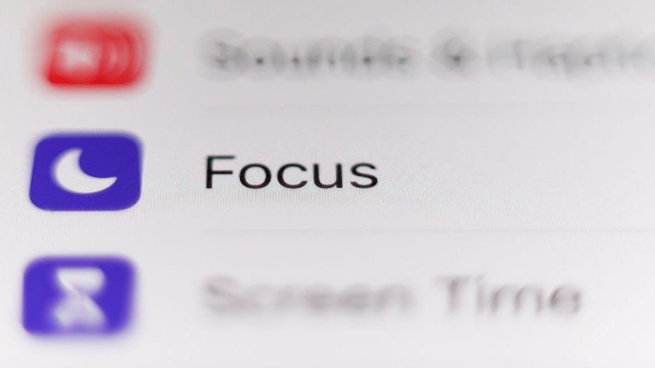
Are we really trusting Apple to design icons that don't even make sense? The latest uproar on Reddit reveals just how badly these so-called "Focus icons" are confusing users. People can’t tell if they’re looking at a car or a bed—seriously, Apple?
As a longtime Apple user, it's frustrating to see such a blunder from a company that prides itself on simplicity and usability. How did we go from intuitive design to playing a guessing game with basic icons? What’s next, a toaster that looks like a smartphone?
It's about time Apple takes a long, hard look in the mirror and realizes that not everything glittering in their ecosystem is gold. We deserve better!
Check out the full discussion here: https://www.creativebloq.com/web-design/ux-ui/apples-focus-icons-are-confusing-people-on-reddit
#AppleFail #UXDesign #TechCritique #IconConfusion #DesignMatters
Are we really trusting Apple to design icons that don't even make sense? 🤔 The latest uproar on Reddit reveals just how badly these so-called "Focus icons" are confusing users. People can’t tell if they’re looking at a car or a bed—seriously, Apple?
As a longtime Apple user, it's frustrating to see such a blunder from a company that prides itself on simplicity and usability. How did we go from intuitive design to playing a guessing game with basic icons? What’s next, a toaster that looks like a smartphone?
It's about time Apple takes a long, hard look in the mirror and realizes that not everything glittering in their ecosystem is gold. We deserve better!
Check out the full discussion here: https://www.creativebloq.com/web-design/ux-ui/apples-focus-icons-are-confusing-people-on-reddit
#AppleFail #UXDesign #TechCritique #IconConfusion #DesignMatters
0 التعليقات
·0 المشاركات