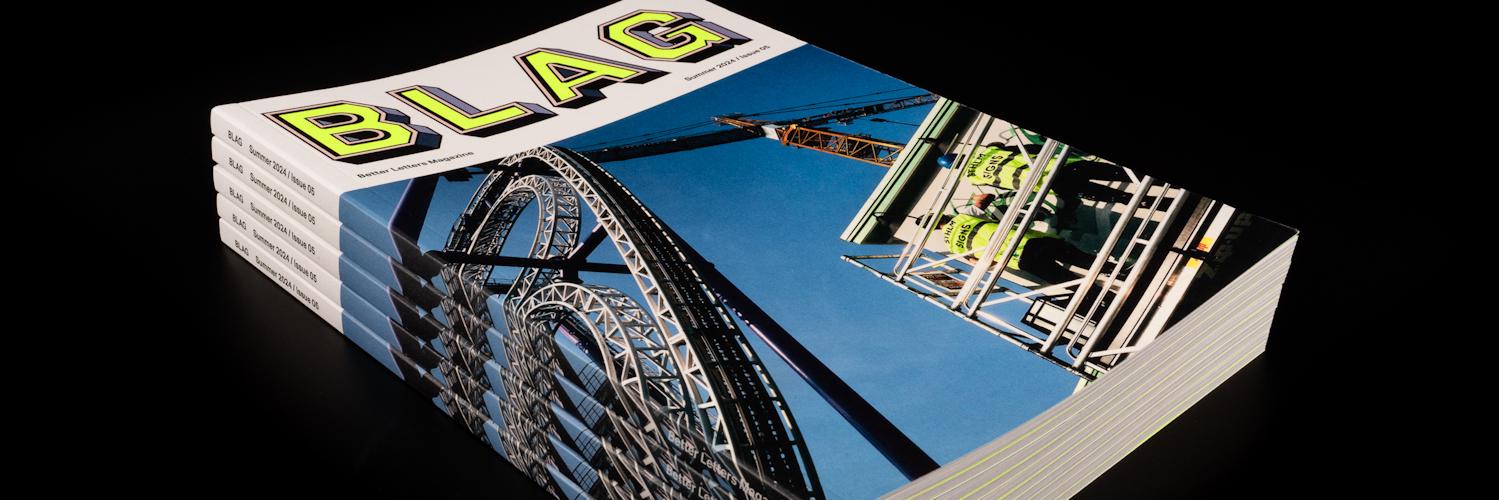
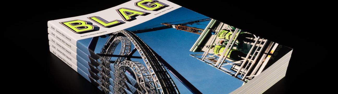
BLAG Magazine: Adventures in sign painting craft, community, and culture.
The world's only print and online publication dedicated to sign painting.
Atualizações Recentes
-
Letterheads Per L'Horta: An Intimate International Meet
Events
Letterheads Per L'Horta: An Intimate International Meet
The masses amass in Almàssera for an inspiring four days painting in the Valencian sun.
Better Letters
Jun 5, 2025
• 8 min read
Letterheads Per L'Horta in Almàssera, Valencia, 1–4 May 2025.
This time last month, over 45 guests from 11 countries were feeling the post-Letterheads blues after four days in the small town of Almàssera, just outside Valencia, Spain. Letterheads Per L'Horta was organised by Nico Barrios, and it was a wonderfully intimate experience, with a host of activities to enjoy and learn from.Something that made the event feel extra special was the involvement of people from the local community, who were just as much a part of it as those that had travelled from as far afield as Australia and Mexico to attend. This included bidding in the auction for a souvenir of the long weekend in May spent with friends, new and old.Almàssera and L'HortaAlmàssera is a small town set within a vast expanse of small-scale agricultural production. While each plot of land is known as a huerto, they are collectively referred to as horta, which doesn't really have a direct translation. The Horta Nordthat surrounds Almàssera is the largest and best surviving example of this type of terrain.We were based in the town's Museu de l'Horta, which consists of an old and a modern building with a yard between them that housed the panel jam area.A traditional alqueríain l'horta, a view down on the meet, and the tents protecting the panel jam area.Inside the modern building there was a selection of pieces from Juan Nava's 2022 Gráfica Urbana de Valenciaexhibition. There was also a trip down memory lane for Valencian locals in the form of another exhibition, L'ombra de les lletres, with photos of signs spanning the period 1880–2000.L'ombra de les lletres was originally curated by Tomàs Gorria in 2024. Pedal PowerAlmàssera, and the city of Valencia, are easily navigated by bicycle, which Nico used to facilitate a cycling tour of the old signs of l'horta. In addition to the stories of the individual companies advertised, he was also able to identify the painters responsible for some of the signs.The tour took guests into the heart of l'horta, which, as a largely agricultural area, boasts a surprising number of old and hand-painted signs.Panel JammingAfter a windy first day or so, the event was bathed in beautiful Mediterranean sunshine. The protective tents were essential, although those in the middle had to carefully manage their colour schemes in light of the red hue they cast across the easels.Getting painty in l'horta: Nathan Collis, Xis Gomes, Maria Cano, Mike Meyer, and Loughlin Brady Smith.Panels set to dry in the early evening sun.WorkshopsAcross the first three days, Thursday to Saturday, there was a series of lettering and calligraphy workshops that were also open to those outside of the Letterheads event proper.Pictured are workshops being led by Ester Gradolí, Juanjo López, and Joan Quiros.TV TimeThe meet was profiled in the local newspaper on the day before it opened, and then a TV crew turned up to cover proceedings.Local press coverage and Letterheads Per L'Horta host Nico Barrios being interviewed for the TV report.
0:00
/1:34
Letterheads Per L'Horta makes the news! If you look closely at the top of the paper that Daniel Esteve Carbonell is working on it says "Collons de rètol"which clearly escaped the attention of the censors.
Talks & DemosIn addition to workshops, the museum building also hosted a busy programme of talks. These were delivered by the Asociación de Diseñadores de la Comunidad Valenciana, the errorerror.studio creative typography studio, graphic designer Juan Nava, and type designer Juanjo López.Juan Nava talking about the evolution of his Letras Recuperadasproject, previously featured here at bl.ag online.One of the highlights was hearing from veteran local sign painters Ricardo Moreno and Paco Vivó, both of whom appear in the Tipos Que Importan film that was screened. They were interviewed by Nico and brought a host of goods with them, including their sign kits, photographic portfolios, work samples, books, and other reference materials.Ricardoand Pacowere mobbed after talking about their lives on the brush in Valencia.Following the session, everyone moved outside to watch Paco Vivó paint one of the motifs that he produced many times in his career: the Pepsi-Cola bottle top.Paco Vivó painted his demonstration piece on a canvas which was subsequently sold in the auction.Meanwhile, over in the town square, David Vanderh had set up his screenprinting station to apply Nico's event design in a single colour to any material that the public brought to him.The live screenprinting was in just blue, while the official event t-shirt combined this with a striking orange.Panels on Show and on SaleOn the Sunday, a small exhibition was mounted with the panels that folks could bid on in the auction. This was an open invitation, with those from the neighbourhood stopping by to inspect and snag some goods.Panels getting ready for new owners in the charity auction.Panels by Veronika Skilte, Joe Coleman, Rachel E Millar, and Victor Calligraphy.This panelby Joe Coleman was inspired by the truck lettering that was a lucky incidental on the earlier cycling tour.The auction raised over 2,000€ in support of those affected by the devastating DANA floods in 2024.The assembled crowd were ready with open wallets as the auction got underway.The auction was expertly hosted by Mike Meyer and Nico Barrios, with Nil Muge logging all the winning bids and accounting for the cash payments.Thank YouAs with any event, the photos never show the challenges that must be overcome behind the scenes. Some of these were substantial but Nico took each one in his stride, maintaining a smile throughout. Thank you, Nico, for facilitating these special days that will live long in the collective memory.Letterheads Per L'Horta host Nico Barrios.Letterheads Per L'Horta was hosted by Nico Barrios with the support of the following organisations: AVV Carraixet d'Almàssera; Ajuntament d'Almàssera; BLAG; A.S. Handover; 1 Shot; ADCV; gráffica. Also check out the event's dedicated Instagram account, @letterheadsperlhorta, for even more photos and videos. More LetterheadsFuture Meets
#letterheads #per #l039horta #intimate #internationalLetterheads Per L'Horta: An Intimate International MeetEvents Letterheads Per L'Horta: An Intimate International Meet The masses amass in Almàssera for an inspiring four days painting in the Valencian sun. Better Letters Jun 5, 2025 • 8 min read Letterheads Per L'Horta in Almàssera, Valencia, 1–4 May 2025. This time last month, over 45 guests from 11 countries were feeling the post-Letterheads blues after four days in the small town of Almàssera, just outside Valencia, Spain. Letterheads Per L'Horta was organised by Nico Barrios, and it was a wonderfully intimate experience, with a host of activities to enjoy and learn from.Something that made the event feel extra special was the involvement of people from the local community, who were just as much a part of it as those that had travelled from as far afield as Australia and Mexico to attend. This included bidding in the auction for a souvenir of the long weekend in May spent with friends, new and old.Almàssera and L'HortaAlmàssera is a small town set within a vast expanse of small-scale agricultural production. While each plot of land is known as a huerto, they are collectively referred to as horta, which doesn't really have a direct translation. The Horta Nordthat surrounds Almàssera is the largest and best surviving example of this type of terrain.We were based in the town's Museu de l'Horta, which consists of an old and a modern building with a yard between them that housed the panel jam area.A traditional alqueríain l'horta, a view down on the meet, and the tents protecting the panel jam area.Inside the modern building there was a selection of pieces from Juan Nava's 2022 Gráfica Urbana de Valenciaexhibition. There was also a trip down memory lane for Valencian locals in the form of another exhibition, L'ombra de les lletres, with photos of signs spanning the period 1880–2000.L'ombra de les lletres was originally curated by Tomàs Gorria in 2024. Pedal PowerAlmàssera, and the city of Valencia, are easily navigated by bicycle, which Nico used to facilitate a cycling tour of the old signs of l'horta. In addition to the stories of the individual companies advertised, he was also able to identify the painters responsible for some of the signs.The tour took guests into the heart of l'horta, which, as a largely agricultural area, boasts a surprising number of old and hand-painted signs.Panel JammingAfter a windy first day or so, the event was bathed in beautiful Mediterranean sunshine. The protective tents were essential, although those in the middle had to carefully manage their colour schemes in light of the red hue they cast across the easels.Getting painty in l'horta: Nathan Collis, Xis Gomes, Maria Cano, Mike Meyer, and Loughlin Brady Smith.Panels set to dry in the early evening sun.WorkshopsAcross the first three days, Thursday to Saturday, there was a series of lettering and calligraphy workshops that were also open to those outside of the Letterheads event proper.Pictured are workshops being led by Ester Gradolí, Juanjo López, and Joan Quiros.TV TimeThe meet was profiled in the local newspaper on the day before it opened, and then a TV crew turned up to cover proceedings.Local press coverage and Letterheads Per L'Horta host Nico Barrios being interviewed for the TV report. 0:00 /1:34 Letterheads Per L'Horta makes the news! If you look closely at the top of the paper that Daniel Esteve Carbonell is working on it says "Collons de rètol"which clearly escaped the attention of the censors. Talks & DemosIn addition to workshops, the museum building also hosted a busy programme of talks. These were delivered by the Asociación de Diseñadores de la Comunidad Valenciana, the errorerror.studio creative typography studio, graphic designer Juan Nava, and type designer Juanjo López.Juan Nava talking about the evolution of his Letras Recuperadasproject, previously featured here at bl.ag online.One of the highlights was hearing from veteran local sign painters Ricardo Moreno and Paco Vivó, both of whom appear in the Tipos Que Importan film that was screened. They were interviewed by Nico and brought a host of goods with them, including their sign kits, photographic portfolios, work samples, books, and other reference materials.Ricardoand Pacowere mobbed after talking about their lives on the brush in Valencia.Following the session, everyone moved outside to watch Paco Vivó paint one of the motifs that he produced many times in his career: the Pepsi-Cola bottle top.Paco Vivó painted his demonstration piece on a canvas which was subsequently sold in the auction.Meanwhile, over in the town square, David Vanderh had set up his screenprinting station to apply Nico's event design in a single colour to any material that the public brought to him.The live screenprinting was in just blue, while the official event t-shirt combined this with a striking orange.Panels on Show and on SaleOn the Sunday, a small exhibition was mounted with the panels that folks could bid on in the auction. This was an open invitation, with those from the neighbourhood stopping by to inspect and snag some goods.Panels getting ready for new owners in the charity auction.Panels by Veronika Skilte, Joe Coleman, Rachel E Millar, and Victor Calligraphy.This panelby Joe Coleman was inspired by the truck lettering that was a lucky incidental on the earlier cycling tour.The auction raised over 2,000€ in support of those affected by the devastating DANA floods in 2024.The assembled crowd were ready with open wallets as the auction got underway.The auction was expertly hosted by Mike Meyer and Nico Barrios, with Nil Muge logging all the winning bids and accounting for the cash payments.Thank YouAs with any event, the photos never show the challenges that must be overcome behind the scenes. Some of these were substantial but Nico took each one in his stride, maintaining a smile throughout. Thank you, Nico, for facilitating these special days that will live long in the collective memory.Letterheads Per L'Horta host Nico Barrios.Letterheads Per L'Horta was hosted by Nico Barrios with the support of the following organisations: AVV Carraixet d'Almàssera; Ajuntament d'Almàssera; BLAG; A.S. Handover; 1 Shot; ADCV; gráffica. Also check out the event's dedicated Instagram account, @letterheadsperlhorta, for even more photos and videos. More LetterheadsFuture Meets #letterheads #per #l039horta #intimate #internationalBL.AGLetterheads Per L'Horta: An Intimate International MeetEvents Letterheads Per L'Horta: An Intimate International Meet The masses amass in Almàssera for an inspiring four days painting in the Valencian sun. Better Letters Jun 5, 2025 • 8 min read Letterheads Per L'Horta in Almàssera, Valencia, 1–4 May 2025. This time last month, over 45 guests from 11 countries were feeling the post-Letterheads blues after four days in the small town of Almàssera, just outside Valencia, Spain. Letterheads Per L'Horta was organised by Nico Barrios, and it was a wonderfully intimate experience, with a host of activities to enjoy and learn from.Something that made the event feel extra special was the involvement of people from the local community, who were just as much a part of it as those that had travelled from as far afield as Australia and Mexico to attend. This included bidding in the auction for a souvenir of the long weekend in May spent with friends, new and old.Almàssera and L'HortaAlmàssera is a small town set within a vast expanse of small-scale agricultural production. While each plot of land is known as a huerto (allotment), they are collectively referred to as horta, which doesn't really have a direct translation. The Horta Nord (North Horta) that surrounds Almàssera is the largest and best surviving example of this type of terrain.We were based in the town's Museu de l'Horta (Horta Museum), which consists of an old and a modern building with a yard between them that housed the panel jam area.A traditional alquería (farmhouse) in l'horta, a view down on the meet, and the tents protecting the panel jam area.Inside the modern building there was a selection of pieces from Juan Nava's 2022 Gráfica Urbana de Valencia (Urban Graphics of Valencia) exhibition. There was also a trip down memory lane for Valencian locals in the form of another exhibition, L'ombra de les lletres (the shadow of the letters), with photos of signs spanning the period 1880–2000.L'ombra de les lletres was originally curated by Tomàs Gorria in 2024. Pedal PowerAlmàssera, and the city of Valencia, are easily navigated by bicycle, which Nico used to facilitate a cycling tour of the old signs of l'horta. In addition to the stories of the individual companies advertised, he was also able to identify the painters responsible for some of the signs.The tour took guests into the heart of l'horta, which, as a largely agricultural area, boasts a surprising number of old and hand-painted signs.Panel JammingAfter a windy first day or so, the event was bathed in beautiful Mediterranean sunshine. The protective tents were essential, although those in the middle had to carefully manage their colour schemes in light of the red hue they cast across the easels.Getting painty in l'horta: Nathan Collis, Xis Gomes, Maria Cano, Mike Meyer, and Loughlin Brady Smith.Panels set to dry in the early evening sun.WorkshopsAcross the first three days, Thursday to Saturday, there was a series of lettering and calligraphy workshops that were also open to those outside of the Letterheads event proper.Pictured are workshops being led by Ester Gradolí, Juanjo López, and Joan Quiros.TV TimeThe meet was profiled in the local newspaper on the day before it opened, and then a TV crew turned up to cover proceedings.Local press coverage and Letterheads Per L'Horta host Nico Barrios being interviewed for the TV report. 0:00 /1:34 Letterheads Per L'Horta makes the news! If you look closely at the top of the paper that Daniel Esteve Carbonell is working on it says "Collons de rètol" (it's only a fucking sign) which clearly escaped the attention of the censors. Talks & DemosIn addition to workshops, the museum building also hosted a busy programme of talks. These were delivered by the Asociación de Diseñadores de la Comunidad Valenciana (Valencian Graphic Design Association), the errorerror.studio creative typography studio, graphic designer Juan Nava, and type designer Juanjo López.Juan Nava talking about the evolution of his Letras Recuperadas (Recovered Letters) project, previously featured here at bl.ag online.One of the highlights was hearing from veteran local sign painters Ricardo Moreno and Paco Vivó, both of whom appear in the Tipos Que Importan film that was screened. They were interviewed by Nico and brought a host of goods with them, including their sign kits, photographic portfolios, work samples, books, and other reference materials.Ricardo (in glasses) and Paco (with beard) were mobbed after talking about their lives on the brush in Valencia.Following the session, everyone moved outside to watch Paco Vivó paint one of the motifs that he produced many times in his career: the Pepsi-Cola bottle top.Paco Vivó painted his demonstration piece on a canvas which was subsequently sold in the auction.Meanwhile, over in the town square, David Vanderh had set up his screenprinting station to apply Nico's event design in a single colour to any material that the public brought to him.The live screenprinting was in just blue, while the official event t-shirt combined this with a striking orange.Panels on Show and on SaleOn the Sunday, a small exhibition was mounted with the panels that folks could bid on in the auction. This was an open invitation, with those from the neighbourhood stopping by to inspect and snag some goods.Panels getting ready for new owners in the charity auction.Panels by Veronika Skilte (Vermut), Joe Coleman (Mental on the Rental), Rachel E Millar (Rotulos, Gracias), and Victor Calligraphy.This panel (right) by Joe Coleman was inspired by the truck lettering that was a lucky incidental on the earlier cycling tour.The auction raised over 2,000€ in support of those affected by the devastating DANA floods in 2024.The assembled crowd were ready with open wallets as the auction got underway.The auction was expertly hosted by Mike Meyer and Nico Barrios, with Nil Muge logging all the winning bids and accounting for the cash payments.Thank YouAs with any event, the photos never show the challenges that must be overcome behind the scenes. Some of these were substantial but Nico took each one in his stride, maintaining a smile throughout. Thank you, Nico, for facilitating these special days that will live long in the collective memory.Letterheads Per L'Horta host Nico Barrios.Letterheads Per L'Horta was hosted by Nico Barrios with the support of the following organisations: AVV Carraixet d'Almàssera; Ajuntament d'Almàssera; BLAG; A.S. Handover; 1 Shot; ADCV; gráffica. Also check out the event's dedicated Instagram account, @letterheadsperlhorta, for even more photos and videos. More LetterheadsFuture MeetsFaça Login para curtir, compartilhar e comentar! -
Hand-Painted Shopfronts in Rural Uganda
Places
Hand-Painted Shopfronts in Rural Uganda
Olivia Krawczyk introduces the hand-painted signs for businesses large and small in Kumi, Uganda.
Better Letters
May 22, 2025
• 6 min read
"Pure & Tasty" in Kumi, Eastern Uganda.
Outside of the continent itself, the most well-known facets of signs and sign painting from Africa are perhaps the Ghana's wild film posters and the 'Danfo' vehicle lettering from Nigeria. Last year, I shared some books and articles in the bonus material that accompanied the Deadly Prey feature in BLAG 04, but these are also heavily skewed towards countries in West Africa.Books about hand-painted signs in Africa. From left: African Signsby Rob Floor and Gert van Zanten, and Chez Bonne Idéeand Ici Bon Coiffeur, both by Jean-Marie Leratby.I was therefore very happy to see some material from Uganda, East Africa, which graphic designer Olivia Krawczyk shares here alongside her comments on what she's learned about the signs.Hand-Painted Shopfronts in Rural UgandaWalking along the streets of rural Uganda, you can’t help but notice the almost random ‘pop’ of colour on buildings. Their striking exteriors are, more often than not, part of the hand-painted advertisements that cover them.Nile is one of the most popular Ugandan beer brands and their signs are frequently painted on bars where you can quench your thirst for one.During my working visits to Uganda, I'm based in Kumi town, which is about a five-hour drive from the capital, Kampala. I spend a lot of time in the surrounding rural areas of the Kumi District, where the painted buildings have always caught my eye. This was nothing more than a passing interest until my last trip in 2023 when curiosity took over and I set out to learn a little bit more about the signs.The Art of Making DoIn Uganda's Kumi District, money is short, but competition is high, with whole rows of shops frequently selling exactly the same products and services. The most common are hairdressers, tailors, DIY stores, and, in the central market, food and drink stalls.So how do you stand out in this environment where the buildings all look similar, the streets are packed with people, and you have limited funds? Armed with paint and a whole lot of determination, shopkeepers turn their spaces into vibrant reflections of their trades. These amateur creations convey the impression of a competition to see who can fit the most writing onto their shop or sign, often including multiple phone numbers. The results might not be polished, but they sure are authentic.A classic DIY sign cramming five phone numbers into the pricing of meats sold by this butchers on the side of the road just outside of Kumi.Y.Y. Coaches, Kumi's public transport booking office, gives you no less than six numbers to try, and if any of those phones need repairing, there's always the Agg & Sons Phone Clinic, which is advertised by this more professionally finished shopfront.With tight budgets, the upkeep of these signs isn’t always a priority and this, paired with the constant exposure to the sun, means that they start looking rundown pretty quickly.This abandoned shopping plaza has old remnants of hand-painted, including one for the New York City Salon. Even the barbeque in front has a 'sausages' ghost sign on it.In the process of looking more closely at these faded walls, I started to notice some that are quite distinct from these DIY creations. They frequently advertise things unrelated to the shop inside — a launderette painted with advertising for a SIM card, for example — and the designs are often repeated on multiple buildings.White Star Magic laundry bars being advertised on a farmers' wholesale and retail shop, and spaghetti promoted via the medium of a hairdressing salon frontage.Corporate MuralsI soon realised that not everyone has the time, skill, or resources to paint their shop, This, coupled with bigger companies looking to advertise their products, has lead to a mutually beneficial arrangement: the companies paint the shop with their advertising, while the small business owner gets some extra income from renting the space. As a bonus, their shop looks smarter than the one next door, helping to attract more customers.The Renedol painkiller brand have painted this entire building, in stark contrast to the bare concrete on the one next door.Before the addition of these painted billboards, the buildings all look very much alike, and are often in a poor state of repair. So its a no-brainer to say 'yes' when a company offers to paint your whole shop for free in exchange for their logo being front and centre.It's unlikely you can actually buy milk here, but the shop owner is happy to host the hand-painted sign and save money on decorating.Condom signs are quite common, and this one does have a connection with its host building via the Medi-Care Clinic below.These corporate messages are eye-catching bursts of colour as you walk along the streets of Kumi, and almost all of them are hand-painted — it took me a while to realise this, as the pictorial elements are so often convincing.Freshly painted signs covering the entrance to Kumi's central market. They are advertising the Fortune Gold vegetable oil brand, the self-proclaimed 'Taste of Uganda'.The DownsideNothing lasts forever, though. Walking around Kumi and other rural areas of Uganda, you will see many buildings that were once brightly coloured but are now left in a state of disrepair. The advertisers that commissioned the signs rarely maintain them, leaving business owners with crumbling paint and no funds to fix it.Business continues below while the paint comes loose on the Gentex advertising above.However, these aren't just buildings; they're storytellers. They tell tales of resilience, resourcefulness, and the bridge between small local businesses and large corporations.Photography and text by Olivia Krawczyk.More brand advertising for Fortune sunflower oil and Star laundry bars.In Kumi, Uganda, hand-painted messages like this — "Pray for my enemies alwas, Kumi Boys" — are a common sight on trucks, mixing faith, local pride, and personal expression to create a form of moving street poetry.The Ugandan take on 'commit no nuisance' signs with the fine being about £20, and advertising for Sadolin paints providing the back drop for street vendor displays in Kumi, Uganda.
#handpainted #shopfronts #rural #ugandaHand-Painted Shopfronts in Rural UgandaPlaces Hand-Painted Shopfronts in Rural Uganda Olivia Krawczyk introduces the hand-painted signs for businesses large and small in Kumi, Uganda. Better Letters May 22, 2025 • 6 min read "Pure & Tasty" in Kumi, Eastern Uganda. Outside of the continent itself, the most well-known facets of signs and sign painting from Africa are perhaps the Ghana's wild film posters and the 'Danfo' vehicle lettering from Nigeria. Last year, I shared some books and articles in the bonus material that accompanied the Deadly Prey feature in BLAG 04, but these are also heavily skewed towards countries in West Africa.Books about hand-painted signs in Africa. From left: African Signsby Rob Floor and Gert van Zanten, and Chez Bonne Idéeand Ici Bon Coiffeur, both by Jean-Marie Leratby.I was therefore very happy to see some material from Uganda, East Africa, which graphic designer Olivia Krawczyk shares here alongside her comments on what she's learned about the signs.Hand-Painted Shopfronts in Rural UgandaWalking along the streets of rural Uganda, you can’t help but notice the almost random ‘pop’ of colour on buildings. Their striking exteriors are, more often than not, part of the hand-painted advertisements that cover them.Nile is one of the most popular Ugandan beer brands and their signs are frequently painted on bars where you can quench your thirst for one.During my working visits to Uganda, I'm based in Kumi town, which is about a five-hour drive from the capital, Kampala. I spend a lot of time in the surrounding rural areas of the Kumi District, where the painted buildings have always caught my eye. This was nothing more than a passing interest until my last trip in 2023 when curiosity took over and I set out to learn a little bit more about the signs.The Art of Making DoIn Uganda's Kumi District, money is short, but competition is high, with whole rows of shops frequently selling exactly the same products and services. The most common are hairdressers, tailors, DIY stores, and, in the central market, food and drink stalls.So how do you stand out in this environment where the buildings all look similar, the streets are packed with people, and you have limited funds? Armed with paint and a whole lot of determination, shopkeepers turn their spaces into vibrant reflections of their trades. These amateur creations convey the impression of a competition to see who can fit the most writing onto their shop or sign, often including multiple phone numbers. The results might not be polished, but they sure are authentic.A classic DIY sign cramming five phone numbers into the pricing of meats sold by this butchers on the side of the road just outside of Kumi.Y.Y. Coaches, Kumi's public transport booking office, gives you no less than six numbers to try, and if any of those phones need repairing, there's always the Agg & Sons Phone Clinic, which is advertised by this more professionally finished shopfront.With tight budgets, the upkeep of these signs isn’t always a priority and this, paired with the constant exposure to the sun, means that they start looking rundown pretty quickly.This abandoned shopping plaza has old remnants of hand-painted, including one for the New York City Salon. Even the barbeque in front has a 'sausages' ghost sign on it.In the process of looking more closely at these faded walls, I started to notice some that are quite distinct from these DIY creations. They frequently advertise things unrelated to the shop inside — a launderette painted with advertising for a SIM card, for example — and the designs are often repeated on multiple buildings.White Star Magic laundry bars being advertised on a farmers' wholesale and retail shop, and spaghetti promoted via the medium of a hairdressing salon frontage.Corporate MuralsI soon realised that not everyone has the time, skill, or resources to paint their shop, This, coupled with bigger companies looking to advertise their products, has lead to a mutually beneficial arrangement: the companies paint the shop with their advertising, while the small business owner gets some extra income from renting the space. As a bonus, their shop looks smarter than the one next door, helping to attract more customers.The Renedol painkiller brand have painted this entire building, in stark contrast to the bare concrete on the one next door.Before the addition of these painted billboards, the buildings all look very much alike, and are often in a poor state of repair. So its a no-brainer to say 'yes' when a company offers to paint your whole shop for free in exchange for their logo being front and centre.It's unlikely you can actually buy milk here, but the shop owner is happy to host the hand-painted sign and save money on decorating.Condom signs are quite common, and this one does have a connection with its host building via the Medi-Care Clinic below.These corporate messages are eye-catching bursts of colour as you walk along the streets of Kumi, and almost all of them are hand-painted — it took me a while to realise this, as the pictorial elements are so often convincing.Freshly painted signs covering the entrance to Kumi's central market. They are advertising the Fortune Gold vegetable oil brand, the self-proclaimed 'Taste of Uganda'.The DownsideNothing lasts forever, though. Walking around Kumi and other rural areas of Uganda, you will see many buildings that were once brightly coloured but are now left in a state of disrepair. The advertisers that commissioned the signs rarely maintain them, leaving business owners with crumbling paint and no funds to fix it.Business continues below while the paint comes loose on the Gentex advertising above.However, these aren't just buildings; they're storytellers. They tell tales of resilience, resourcefulness, and the bridge between small local businesses and large corporations.Photography and text by Olivia Krawczyk.More brand advertising for Fortune sunflower oil and Star laundry bars.In Kumi, Uganda, hand-painted messages like this — "Pray for my enemies alwas, Kumi Boys" — are a common sight on trucks, mixing faith, local pride, and personal expression to create a form of moving street poetry.The Ugandan take on 'commit no nuisance' signs with the fine being about £20, and advertising for Sadolin paints providing the back drop for street vendor displays in Kumi, Uganda. #handpainted #shopfronts #rural #ugandaBL.AGHand-Painted Shopfronts in Rural UgandaPlaces Hand-Painted Shopfronts in Rural Uganda Olivia Krawczyk introduces the hand-painted signs for businesses large and small in Kumi, Uganda. Better Letters May 22, 2025 • 6 min read "Pure & Tasty" in Kumi, Eastern Uganda. Outside of the continent itself, the most well-known facets of signs and sign painting from Africa are perhaps the Ghana's wild film posters and the 'Danfo' vehicle lettering from Nigeria. Last year, I shared some books and articles in the bonus material that accompanied the Deadly Prey feature in BLAG 04, but these are also heavily skewed towards countries in West Africa.Books about hand-painted signs in Africa. From left: African Signs (2010) by Rob Floor and Gert van Zanten, and Chez Bonne Idée (1986) and Ici Bon Coiffeur (1992), both by Jean-Marie Leratby.I was therefore very happy to see some material from Uganda, East Africa, which graphic designer Olivia Krawczyk shares here alongside her comments on what she's learned about the signs.Hand-Painted Shopfronts in Rural UgandaWalking along the streets of rural Uganda, you can’t help but notice the almost random ‘pop’ of colour on buildings. Their striking exteriors are, more often than not, part of the hand-painted advertisements that cover them.Nile is one of the most popular Ugandan beer brands and their signs are frequently painted on bars where you can quench your thirst for one.During my working visits to Uganda, I'm based in Kumi town, which is about a five-hour drive from the capital, Kampala. I spend a lot of time in the surrounding rural areas of the Kumi District, where the painted buildings have always caught my eye. This was nothing more than a passing interest until my last trip in 2023 when curiosity took over and I set out to learn a little bit more about the signs.The Art of Making DoIn Uganda's Kumi District, money is short, but competition is high, with whole rows of shops frequently selling exactly the same products and services. The most common are hairdressers, tailors, DIY stores, and, in the central market, food and drink stalls.So how do you stand out in this environment where the buildings all look similar, the streets are packed with people, and you have limited funds? Armed with paint and a whole lot of determination, shopkeepers turn their spaces into vibrant reflections of their trades. These amateur creations convey the impression of a competition to see who can fit the most writing onto their shop or sign, often including multiple phone numbers. The results might not be polished, but they sure are authentic.A classic DIY sign cramming five phone numbers into the pricing of meats sold by this butchers on the side of the road just outside of Kumi.Y.Y. Coaches, Kumi's public transport booking office, gives you no less than six numbers to try, and if any of those phones need repairing, there's always the Agg & Sons Phone Clinic, which is advertised by this more professionally finished shopfront.With tight budgets, the upkeep of these signs isn’t always a priority and this, paired with the constant exposure to the sun, means that they start looking rundown pretty quickly.This abandoned shopping plaza has old remnants of hand-painted, including one for the New York City Salon. Even the barbeque in front has a 'sausages' ghost sign on it.In the process of looking more closely at these faded walls, I started to notice some that are quite distinct from these DIY creations. They frequently advertise things unrelated to the shop inside — a launderette painted with advertising for a SIM card, for example — and the designs are often repeated on multiple buildings.White Star Magic laundry bars being advertised on a farmers' wholesale and retail shop, and spaghetti promoted via the medium of a hairdressing salon frontage.Corporate MuralsI soon realised that not everyone has the time, skill, or resources to paint their shop, This, coupled with bigger companies looking to advertise their products, has lead to a mutually beneficial arrangement: the companies paint the shop with their advertising, while the small business owner gets some extra income from renting the space. As a bonus, their shop looks smarter than the one next door, helping to attract more customers.The Renedol painkiller brand have painted this entire building, in stark contrast to the bare concrete on the one next door.Before the addition of these painted billboards, the buildings all look very much alike, and are often in a poor state of repair. So its a no-brainer to say 'yes' when a company offers to paint your whole shop for free in exchange for their logo being front and centre.It's unlikely you can actually buy milk here, but the shop owner is happy to host the hand-painted sign and save money on decorating.Condom signs are quite common, and this one does have a connection with its host building via the Medi-Care Clinic below.These corporate messages are eye-catching bursts of colour as you walk along the streets of Kumi, and almost all of them are hand-painted — it took me a while to realise this, as the pictorial elements are so often convincing.Freshly painted signs covering the entrance to Kumi's central market. They are advertising the Fortune Gold vegetable oil brand, the self-proclaimed 'Taste of Uganda'.The DownsideNothing lasts forever, though. Walking around Kumi and other rural areas of Uganda, you will see many buildings that were once brightly coloured but are now left in a state of disrepair. The advertisers that commissioned the signs rarely maintain them, leaving business owners with crumbling paint and no funds to fix it.Business continues below while the paint comes loose on the Gentex advertising above.However, these aren't just buildings; they're storytellers. They tell tales of resilience, resourcefulness, and the bridge between small local businesses and large corporations.Photography and text by Olivia Krawczyk.More brand advertising for Fortune sunflower oil and Star laundry bars.In Kumi, Uganda, hand-painted messages like this — "Pray for my enemies alwa[y]s, Kumi Boys" — are a common sight on trucks, mixing faith, local pride, and personal expression to create a form of moving street poetry.The Ugandan take on 'commit no nuisance' signs with the fine being about £20 ($25), and advertising for Sadolin paints providing the back drop for street vendor displays in Kumi, Uganda.0 Comentários 0 Compartilhamentos 0 Anterior -
Thoughts on the 2025 BLAG Reader Survey
BLAG
Thoughts on the 2025 BLAG Reader Survey
"An absurdly cool niche publication" and more feedback from the third annual BLAG reader survey.
Better Letters
May 15, 2025
• 6 min read
It all started with BLAG 01 in the summer of 2022. Photo: Yanina Shevchenko.
Working for yourself means no performance reviews, no one-to-ones with managers, and no 360-degree assessments of your work and your attitude.While I've been more than happy to see the back of all that, it does leave me somewhat in the dark as to whether my work is 'landing' with BLAG readers, and especially those that pay me for what I do.free at BLAG.)My response is the annual BLAG Reader Survey, which gives me a structured way to gather feedback and shape my future plans.This is the third year I've run the survey, and here I share some of my thoughts and responses to a handful of the themes that emerged.Readers Value BLAGThe top line is that BLAG is well received by a readership that spans professional sign painters, hobbyists, and those with a tangential interest in the craft. The hard-copy magazine is prized in an increasingly digital world, and so is the publication's tight focus on sign painting and sign painters."A gazillion times better than keeping up with the trade via social media.""BLAG is a beautifully curated and thoughtfully crafted love letter to the art of sign painting and lettering."
If you'd like to get even more from BLAG, then membership plans start from /month for digital access, rising to /month for just the print magazine, or /month for everything.You can save by paying annually.
Join BLAG Today
For marketing folk, the 'net promoter score' was 67%, rising to 75% among the paid readership, both of which are solid scores. These would have been even higher if it weren't for a handful that would recommend the magazine, if their friends and family shared their interest in sign painting!We're An International Community
This article is for subscribers only.
Sign up for a free membership to unlock sign painting resources and the latest news.
Subscribe now
Already have an account? Sign in
#thoughts #blag #reader #surveyThoughts on the 2025 BLAG Reader SurveyBLAG Thoughts on the 2025 BLAG Reader Survey "An absurdly cool niche publication" and more feedback from the third annual BLAG reader survey. Better Letters May 15, 2025 • 6 min read It all started with BLAG 01 in the summer of 2022. Photo: Yanina Shevchenko. Working for yourself means no performance reviews, no one-to-ones with managers, and no 360-degree assessments of your work and your attitude.While I've been more than happy to see the back of all that, it does leave me somewhat in the dark as to whether my work is 'landing' with BLAG readers, and especially those that pay me for what I do.free at BLAG.)My response is the annual BLAG Reader Survey, which gives me a structured way to gather feedback and shape my future plans.This is the third year I've run the survey, and here I share some of my thoughts and responses to a handful of the themes that emerged.Readers Value BLAGThe top line is that BLAG is well received by a readership that spans professional sign painters, hobbyists, and those with a tangential interest in the craft. The hard-copy magazine is prized in an increasingly digital world, and so is the publication's tight focus on sign painting and sign painters."A gazillion times better than keeping up with the trade via social media.""BLAG is a beautifully curated and thoughtfully crafted love letter to the art of sign painting and lettering." If you'd like to get even more from BLAG, then membership plans start from /month for digital access, rising to /month for just the print magazine, or /month for everything.You can save by paying annually. Join BLAG Today For marketing folk, the 'net promoter score' was 67%, rising to 75% among the paid readership, both of which are solid scores. These would have been even higher if it weren't for a handful that would recommend the magazine, if their friends and family shared their interest in sign painting!We're An International Community This article is for subscribers only. Sign up for a free membership to unlock sign painting resources and the latest news. Subscribe now Already have an account? Sign in #thoughts #blag #reader #surveyBL.AGThoughts on the 2025 BLAG Reader SurveyBLAG Thoughts on the 2025 BLAG Reader Survey "An absurdly cool niche publication" and more feedback from the third annual BLAG reader survey. Better Letters May 15, 2025 • 6 min read It all started with BLAG 01 in the summer of 2022. Photo: Yanina Shevchenko. Working for yourself means no performance reviews, no one-to-ones with managers, and no 360-degree assessments of your work and your attitude.While I've been more than happy to see the back of all that, it does leave me somewhat in the dark as to whether my work is 'landing' with BLAG readers, and especially those that pay me for what I do. (Here's a reminder of why everything is(n't) free at BLAG.)My response is the annual BLAG Reader Survey, which gives me a structured way to gather feedback and shape my future plans.This is the third year I've run the survey, and here I share some of my thoughts and responses to a handful of the themes that emerged.Readers Value BLAGThe top line is that BLAG is well received by a readership that spans professional sign painters, hobbyists, and those with a tangential interest in the craft. The hard-copy magazine is prized in an increasingly digital world, and so is the publication's tight focus on sign painting and sign painters."A gazillion times better than keeping up with the trade via social media.""BLAG is a beautifully curated and thoughtfully crafted love letter to the art of sign painting and lettering." If you'd like to get even more from BLAG, then membership plans start from $5/month for digital access, rising to $9/month for just the print magazine, or $12/month for everything.You can save by paying annually. Join BLAG Today For marketing folk, the 'net promoter score' was 67%, rising to 75% among the paid readership, both of which are solid scores. These would have been even higher if it weren't for a handful that would recommend the magazine, if their friends and family shared their interest in sign painting!We're An International Community This article is for subscribers only. Sign up for a free membership to unlock sign painting resources and the latest news. Subscribe now Already have an account? Sign in0 Comentários 0 Compartilhamentos 0 Anterior -
BL.AGIntroducing a New Better Letters FilmLast summer during my trip to London, I met with retired Hackney signwriter Brian Walker. And I took filmmaker Irene Chirita with me.We have since been working on the next in the 'When Better Letters Met' series, but we need your support to get it over the line.Kickstarter video for When Better Letters Met Brian Walker.Please back our dedicated Kickstarter, which includes the opportunity to get your name in the film's credits, while also supporting independent filmmaking.Back the Kickstarter'When Better Letters Met'When Better Letters Met - BLAG Magazine: Adventures in Sign Painting Craft, Community & CultureAdventures in sign painting craft, community and culture with BLAG (Better Letters Magazine), the only print and online publication dedicated to the trade.BLAG Magazine: Adventures in Sign Painting Craft, Community & CultureBetter LettersMore FilmsFilm & Video Content on Better Letters MagazineShort and feature length films about sign painting and lettering.BLAG Magazine: Adventures in Sign Painting Craft, Community & CultureBetter Letters0 Comentários 0 Compartilhamentos 0 Anterior
-
BL.AGBrush Up Your Single-Stroke Skills at Letterboy's Block PartyLearning Brush Up Your Single-Stroke Skills at Letterboy's Block Party Review and sample video from the new online course and community, Block Lettering with a Brush. Jenna Homen May 1, 2025 • 5 min read Thank you to everyone that has shared feedback via the reader survey. I would like to get a few more responses, so have extended the deadline to this Sunday, 4 May. This includes the chance to win a lifetime BLAG membership, and some other nice runners-up prizes. Complete the Reader Survey While a master of many styles, Peter Liedberg, aka Letterboy, is known for his bold and crisp block lettering. With over 12 years of practice under his belt, he recently rolled out an online course, Block Lettering with a Brush, to share his knowledge with a wider audience beyond his in-person workshops.The course is marketed toward designers and hobbyists alike, noting that “if this is the first time you try this, it’s going to feel pretty difficult in the beginning, but don’t worry, it’s the same for everyone”. It’s broken up into 13 chapters, covering setup and materials, guidelines, basic strokes, individual letters, numbers, and punctuation, as well as spacing and contrast. Peter walks you through the process of each step through video tutorials accompanied by helpful PDFs that summarise each lesson and expand upon them, making them valuable references to print and have by your side while practising.The longest video is 13 minutes, but most hover between 5 to 10 minutes, which keeps them from feeling too long. This allows you to digest the lessons in bitesize pieces. A student who took the course, Sam Hollis, echoes this: “I only intended to watch the first video tonight and I ended up watching the whole course in one go and absorbed so much information!”Course OverviewSetup and MaterialsTo get you started, Peter walks through how to set up your painting station with an angled easel, and explains the pros and cons of other ways of painting, ie flat and vertically. Recommendations for paper, paint, brushes, and other tools are covered as well.Peter shows two different flat brushes that he recommends for practising single-stroke block letters with.Guidelines and Basic StrokesThese two lessons discuss how to mark out your paper, as well as how to thin your paint and hold your brush, paint cup, and palette. Included is a simple way to determine your letter height in relation to your brush, as well as instructions on ‘scribing’ or pulling lines with a yardstick.The stroke width of the brush is used to determine the letter heights before starting out with some basic practise strokes.Vertical and horizontal strokes are demonstrated, but a small area of improvement here would be to include diagonal and curved strokes to practise, as they can be tricky; however, they are covered through practising complete letters in later lessons.Letters and Numerals, Spacing and ContrastIn the tradition of lettering instruction, Peter groups his individual letter lessons by similar strokes, so letters that feature vertical and horizontal strokes, like HEFLT, compose one lesson, and letters like AKMNVWXYZ that feature diagonal strokes are in another lesson.These videos are filmed with a split screen to show the brushwork from different angles. Peter offers tips on how to balance individual letters with stroke length and counterspace (negative space), and also demonstrates numerals and punctuation, a welcome lesson that isn’t always guaranteed in lettering instruction.The split screen allows you to see how the brush is positiioned and to follow its movements as Peter paints. Subtitles are available in English and Japanese, with other languages available on request.Peter then walks through the spacing between letters so that you can paint words with appropriate visual balance — BLAG members can watch this video at the end of this post. In the section on contrast, he shares a simple way to adjust the widths of your letters while maintaining proportions.Still from the course video on letter spacing, which BLAG members can watch at the end of this post.The Result? A Well-Paced Course for Flat Brush LetteringAs a whole, Block Lettering with a Brush is a thorough, easy-to-navigate, and well-paced introduction to block lettering with a flat brush. Gently and confidently, Peter guides you lesson by lesson with ease, sprinkling in helpful advice and tips along the way at the appropriate moments.In the introduction, Peter notes that a lettering quill can also be used; however, the course and its corresponding advice are centered around using a flat brush. If you are just starting out with single stroke block lettering, or are a complete beginner, I recommend you follow the course with a flat. For those with previous experience working with quills, or that have made good progress working with a flat, feel free to follow it with a quill.The $85 price is fair for the amount of information and guidance shared. You also gain access to a community board, where you can post questions or practice work so that Peter can help out further; previous enquiries include tailored advice based on a practice sheet and instruction on how to clean a brand new brush.While the course is best suited for the beginner, more experienced painters will still pick up tips and tricks along the way — I know I did. Thank you, Peter, for bringing it to life and making lettering more accessible for all! Block Lettering with a Brush is recommended for:Beginners interested in block lettering with a flat brush.Designers wanting to expand their hand-lettering toolkit.Seasoned sign painters looking to practise more. Join the Block Party More ResourcesSpacing VideoExclusively for BLAG members, Peter has shared this video on spacing from the course. This article is for paid subscribers on the Browser, Blagger, Patron/Studio and Sponsor/Group tiers only Subscribe now Already have an account? Sign in0 Comentários 0 Compartilhamentos 0 Anterior
-
BL.AG"We Are Not Superstitious, But We Believe in Signs"History "We Are Not Superstitious, But We Believe in Signs" The Gawthorp sign firm in Leeds were renowned in the trade at the turn of the twentieth century. Better Letters Apr 24, 2025 • 5 min read 1906 advertisement for the Gawthorp sign business in Leeds. Three years ago, I shared the picture above in a newsletter, but only recently picked up the loose threads from my research into the Gawthorp sign company. I share the following post in the hope that more might be uncovered about what appears to have been quite an influential firm during its 27 years of operation.I first stumbled across the Gawthorp business while researching T.L. Hamlyn for the 'Ye Olde Sign Shoppe' column in BLAG 02. This involved poring over the pages of the Journal of Decorative Art at the British Library, and the many detours this took me on. One of these involved a couple of mentions of the Gawthorp sign firm in Leeds, including their slogan 'We Believe in Signs' that I'm sure you'll agree is as relevant today as it was 120 years ago!Founder, Albert Hallas GawthorpThe Gawthorp firm was established in 1889 by Albert Hallas Gawthorp. Gawthorp was a man of many talents and interests, and it was his role as an amateur actor, rather than his business in signs, that dominated his obituaries in 1909. That, and his charitable endeavours, which continued in his name with the establishment of a memorial fund.Gawthorp was about 23 years old when he set up shop, which, in 1899, was based on Cookridge Street in the centre of Leeds, Yorkshire.Albert Hallas Gawthorp's entry in the 1899 street directory for Leeds, Yorkshire.St George's Sign WorksBy 1905, the firm had moved to a larger facility, which was located at at 30 Great George Street, and patriotically dubbed 'St George's Sign Works'. This was just a short walk from the firm's previous premises and, as evidence of Gawthorp's belief in signs, he used the building to advertise his own business. This included a large chimney with the company name painted in white letters descending vertically down its length.Two views of 'St George's Sign Works' from 1913 and 1914. Photos © Leeds Libraries, via Leodis (9800 and 20021016_89109439).In addition to being signwriters and wood letter makers, the firm could also count enamel signs within its repetoire. This article is for subscribers only. Sign up for a free membership to unlock sign painting resources and the latest news. Subscribe now Already have an account? Sign in0 Comentários 0 Compartilhamentos 0 Anterior
-
BL.AGA Golden Opportunity to Learn at the Return to El DoradoEvents A Golden Opportunity to Learn at the Return to El Dorado Ghi Sign Service resumes its gilding-themed Letterheads meets following their pandemic postponement. Better Letters Apr 17, 2025 • 5 min read Gold slinging returns to Ghi Sign Service in Canaan, Connecticut. Panel: Philip Ghi. Philip Ghi, owner of Ghi Sign Service, has been hosting Letterheads meets since 1995, and the recent gathering in Canaan, Connecticut, saw the ressurection of his long-running series of gilding themed events. However, he is quick to credit his friend Mike Szczoczarz with the original 'El Dorado' concept, which emerged during an encounter at the USSC trade show in Atlantic City, New Jersey:"There was a corner of the convention centre that was affectionately referred to as the 'Bullpen'. This was a place where we could escape the noise of the hi-tech cutters, routers, and vinyl vendors, and actually ply our craft with paint and brush."Philip Ghi lettering his 'Fishheads' panel at the recent 'Return to El Dorado' meet. His son Dominic is behind, working on a glass panel.Their shared passion for hand-crafted work led to a conversation about the changes they were witnessing in the trade. These included the proliferation of 22 karat gold vinyl, which was replacing more and more of the gilding work on signs and vehicles. As a retired firefighter, Mike was particularly saddened by the impact on the long tradition of firetrucks being gilded and lettered by hand."He [Mike] pitched me the idea of a Letterhead meet that focused primarily on gold and metal leaf. I quickly agreed and offered to host it at our shop. The details are a little foggy but I think it was a couple of years later, and with some encouragement from other sign buddies, that I committed to a meet in March 2013."Guests from the 2017 El Dorado meet at Ghi Sign Service, and panels from the event in 2018.After that first gathering, Ghi's 'El Dorado' events were an annual fixture until the series was brought to an abrupt halt by the pandemic. He likens them to the old-style meets of the 1980s and 1990s, with no cover charge and everything run on a loose 'come as you are' basis. He tells attendees that they can:"Work on whatever you feel like working on when you get here. I do have glass and books of gold available at cost for anyone that needs it. I also provide paint, panels and all the fixings even though most attendees come pretty well equipped. I have a couple of screens burned to do the yearly themed reverse-glass panel project, which gives people the opportunity to leave with a finished (or nearly finished) glass piece at the end of the weekend."Work-in-progress on some of the diverse projects that participants got busy with at the recent 'Return to El Dorado' meet: 'DeWayne Cannot' striping a skateboard, Louie Pacuzzi applying water size to a glass piece, and Frank 'Rooster' Inzerillo using his dagger on a sword.As any past host knows, these events are what Ghi describes as "a labour of love", and they also double as "an excuse to finally clean the shop a little better than usual!" They're invariably team efforts, and would never have happened without the tireless help and support of his wife Maria and his son Dominic who each "rolled up their sleeves and got the hard work done".Frank 'Rooster' Inzerillo (left), Dominic Ghi (right), and jewellery maker Lucinda with her freshly painted nameplate.And what about the 'El Dorado' name, or in the case of the most recent event, the 'Return to El Dorado'?"It was meant to conjure up the idea of the never-ending search for gold, or in our case, the never-ending search for the perfect gold leaf application. Mike would say 'I can show you how to gild in 15 minutes ... but it would take years to master the skill'."Shop talk: Zeke Lemanski, Dan Danzenbaker, Paul Quinn and Frank 'Rooster' Inzerillo in conversation.Each of these events has had attendees at different stages of that search, ensuring the passing of knowledge from one generation to the next. Part of this comes from the opportunity to work with a pre-designed glass panel, with screens used to replicate the artwork. However, the final panels are anything but carbon copies, as Ghi points out:"Even though the back screens are the same, the finished pieces come out very different with the use of different karats of gold, abalone, mother of pearl, etching, chipping, and opaque and transparent paints. I'm always amazed at the creativity and imagination that goes in to each and every project."Hot Rod Jen working with Philip Ghi's design, and Ghi's finished piece for the 2025 Return to El Dorado meet.Project designs from past meets: 'Cigars' (2018) by Mike Szczoczarz; 'El Dorado' (2016) by Doug Bernhardt; and 'Lost City' (2017) by 'DeWayne Cannot'.Personal projects from the 2025 Return to El Dorado meet: Mayan head with palm leaves by Brian Schofield; stone jaguar by Paul Quinn; and 'Clingstone' by Shawn Gilheeney.After a wonderful time back in the hosting saddle, Ghi feels like he'll be returning to El Dorado again in the near future. He enjoys their informality — "it ends up being about half social event and half working" — and also the sharing that happens through one of his favourite traditions, the panel swap:"This happens near the end of the day on Saturday, and is very simple: bring a panel to swap and get a panel in return. Participants pull a name out of a hat and the name you draw is the person's panel you get. The projects and the panels become the lasting reminder of a weekend spent with friends new and old."Team El Dorado with souvenirs of their adventures in gilding.Thank you to Philip Ghi for sharing these photos and the El Dorado back story. And to Maria and Dominic Ghi for helping to make it all happen.More Letterheads0 Comentários 0 Compartilhamentos 0 Anterior
-
BL.AGMr. Plywood Stands Proud Again: Recreating a Portland IconProjectsMr. Plywood Stands Proud Again: Recreating a Portland IconKirsten Bauer and Alina Radetsky collaborate to replace a celebrity sign of 60 years' standing.Better LettersApr 3, 2025 5 min readAlina Radetsky recreating the unforgettable face of Portland's Mr. Plywood.Last year, Kirsten Bauer shared a project via her newsletter that brought a smile to my face. It was a collaboration with studio pal Alina Radetsky, and I invited them to tell the story of their work to recreate Portland's popular Mr. Plywood sign.Mr. Plywood Stands Proud Again: Recreating a Portland IconThe Mr. Plywood sign, an iconic and beloved landmark, has stood proudly in the Montavilla neighbourhood in Portland, Oregon, for decades. The caricature was designed by one of the founders of the locally owned Mr. Plywood lumber and building supply store, shortly after it opened in 1963. His unique character, made with three stacked sheets of plywood, has become a recognisable symbol of the business and, fittingly, the material it represents. His charming cartoonish appearance customers often mistakenly refer to him as a pig has etched him into the memories of Portlanders for decades.The sign's authentic 1990s replacement had weathered the Pacific Northwest elements remarkably well over the years, largely due to the durability of MDO (medium-density overlay) plywood. (Mr. Plywood is one of the few lumber stores in Portland to stock MDO making it a favourite stop of most local sign painters!) However, it was starting to show its age.Portland's original Mr. Plywood went up in the 1960s and was replaced by a local sign painter in the 1990s. Photo: Plywood blog.When Tom Jardine, a collector passionate about preserving eye-catching local relics, sought to acquire the ageing sign, he presented Mr. Plywoods owner Bret Brantner with a unique proposition: he would keep the original, while taking care of the process to replace it, to include its removal, hiring sign painters to faithfully replicate it on new panels, and installing the new sign. It took some convincing, and a few reminders, but Bret finally agreed, and in March 2023, Tom began the process of removing the old sign.Tom Jardine and Mr. Plywood store staff removing the 2.4 x 3.0 m (8 x 10 ft) sign in 2023.We were forwarded Toms email request from another sign painter in town who couldn't take on the project, and the opportunity to recreate it was too compelling for us to pass up! We had been sharing a studio space and assisting each other with smaller projects for a while, but this seemed like the perfect opportunity to team up and take on a larger job. Having the support of another sign painter to bounce ideas off was invaluable as we navigated the process. We were excited but also justifiably apprehensive about replicating something so ingrained in Portlands visual history.Tom saw the faded sign as a sort of 'crown jewel' in his collection, but he also sought to preserve its original legacy by recreating the new sign as faithfully to the original as possible. It was therefore a project that demanded both precision and reverence for the original work.We worked closely with Tom, who provided the cut and primed MDO plywood as well as a space to paint at his warehouse. We traced the original design and made paper patterns. We then brought Mr. Plywood back to life by hand-painting with enamel paints and painstakingly colour matching the original hues a difficult task, seeing as the old sign was so faded in areas!Mr. Plywood Snr. settling into retirement as details on his successor are finessed by All Good Signs' Alina Radetsky before reaching the half-way point.The challenge lay in balancing the historical accuracy of the original with the need to create a fresh, high-gloss version of the sign. There were no modern shortcuts or digital tools involved, just the careful application of time-honoured methods."Where's my pencil?" asks Mr. Plywood, to which Kirsten Bauer replies, "Hold tight, it'll be back behind your ear as soon as this paint has cured".Seeing the ease of the brushstrokes on the faded paint made us appreciate the craftsmanship of the original sign painters. There was a real joy in tracing the old signs lines, capturing not only its visual impact but the personality and texture of the hand-painted work."I feel as good as new!"Once the new sign was complete, Tom and his brother handled the installation, ensuring it was put in place with the same care as the original."I'm going up in the world!" But team Mr. Plywood still have a few touch-ups to do before coming back down to earth.For all of us involved, this project was more than just painting a sign. It was about honouring a piece of Portlands visual culture, while respecting the craftsmanship of those who came before us. We felt incredibly fortunate to play a part in preserving this little bit of Portlands history for future generations to enjoy.Written by Kirsten Bauer and Alina RadetskyIt's job done for Alina Radetsky, Tom Jardine, and Kirsten Bauer, but there's still time for a little surprise for Mr. Plywood owner Bret Brantner. More Projects0 Comentários 0 Compartilhamentos 0 Anterior
-
BL.AGUncovering the Spectacular Commercial Art of Wes CookPeopleUncovering the Spectacular Commercial Art of Wes CookA mural at McDonald's, Centralia, Washington, leads Cabel Sasser down a delightful rabbit hole.Better LettersMar 27, 2025 3 min readA portion of the mural at McDonald's in Centralia, Washington, that took Cabel Sasser down the Wes Cook rabbit hole.When I saw a link to this video posted to Mastodon, it was accompanied by a comment that said, "watch to the end". I did, and was floored.Cabel Sasser, Panic XOXO Festival (2024) on YouTube.The talk by Cabel Sasser is about his research into the life and work of Wes Cook, an outstanding commercial artist whose clients included Disney, McDonald's, and Universal.Sasser has gone deep, including gradually scanning and publishing pieces from Cook's portfolio to a dedicated website that honours the artist and designer.The original drawing for the McDonald's mural above is among these, and here are just ten more that offer a glimpse into the variety of Cook's work. They show the stages his ideas would pass through before becoming a mural, set design, or themepark attraction.In 1979, Cook designed this custom mural painting platform for the work he was doing for McDonald's at Setmakers Studio.Interior design work, possibly for his own home/studio, 1973.Unbuilt plan for the proposed Comic Strip Street at Universal Islands of Adventure, 1994.Circus mural for the McDonald's in Dsseldorf-Oberkassel, Germany, 1979.Neptune's Domain, the entrance to an attraction visualised for an unknown themepark.Exploratory sketch for Tokyo DisneySea.Exploration for the Renaissance Galleon at Tokyo DisneySea.Magellans Globe, designed for the Magellans restaurant at Tokyo DisneySea. You can see how it turned out here at wescook.art.Mural artwork for a McDonald's in Hawaii, 1978.For more, visit wescook.art, where you'll also find this 'unused' McDonald's piece that I'll let you learn about yourself...PS. Although they never met, both Wes Cook and Mark Oatis were involved in the work that brought Tokyo DisneySea to life. Oatis was designing signs and other graphics for the American Waterfront feature, which consisted of two blocks inspired by 1910-era New York. However, one faade remained un-named, as Mark explains:"Many ideas had been floated, but none had hit the mark. I was asked for my opinion, and I suggested that, with all these signs in such profusion, there probably had to be sign shop somewhere! The idea was embraced on the spot, and I threw myself into creating the full complement of designs found on any quality shop of the era, right down to the 'A business with no Sign is a Sign of No Business' sign, lettered on the front door."Oatis named the shop The Asmus Co. in recognition of Denver sign painter Henry Asmus who, via his daughter Ellie Ulmer, gave him his first sight of Atkinson's Sign Painting. That book, in that moment, resolved him to pursue a sign painting career, and everything that followed, which included Ulmer becoming his mother-in-law.More PeopleMore History0 Comentários 0 Compartilhamentos 0 Anterior
-
BL.AGYe Olde Sign Shoppe at the American Sign MuseumHistoryYe Olde Sign Shoppe at the American Sign MuseumSigns, photos, and other artefacts from sign shops of old in the American Sign Museum's collections.Better LettersMar 20, 2025 7 min readTilden, Nebraska, was once served for up-to-date signs by Russell & Sons.During my week at the American Sign Museum, I was blown away by the history preserved there in terms of old sign firms, sign painters, and gilders see searches for 'sign painter' and 'sign shop' in their online collections for example.I featured some of these Beverly Sign Co., George C. Brooke, Cassius Marcellus Clay Sr., Keith Knecht, Raymond LeBlanc, and Mike Stevens in last week's post, so the following is more of a photo dump of other 'ye olde sign shoppes' that can be found at the museum.I've had to resist the urge to get into local historical research for these, but if you have any knowledge to add, then I'd be happy to edit accordingly.'Ye Olde Sign Shoppe' is a regular column in BLAG (see all back issues), and one of my favourite research topics. There are dozens of bl.ag online pieces with the 'ye olde sign shop' tag, and I'm always excited to hear new and interesting stories: please share yours by emailing sam@bl.ag.Original Sign DesignsLet's pick up more or less where we left off with the 1941 Original Sign Designs book.Brown Sign Co.These sequential pages show the design by J.L. Beardsley and a photo of its fabrication following a few small adjustments.Beardsley's credit (first image) locates them in Dayton, Ohio, so assuming they worked for the Brown Sign Co., we'd have a location for this shopfront. Wittich / Hastings Co.The credit on this page reads "Hastings Co., Philadelphia, PA". It's not clear to me if the firm is Wittich or Hastings Co., as the latter doesn't seem to correspond to an easily identifiable location in/near Philadelphia...Vehicle EvolutionNext up some pairings of sign shops with vehicles, theirs or otherwise, outside.Wilmore & Co. / A.A. RitterLet's take it right back to when sign painters used to get to jobs on a penny-farthing bicycle. (Check out this bl.ag online feature for more sign painters on two wheels.)My guess for the whited-out letters is 'Company' to read 'Wilmore & Company' with the ampersand above the window.The new sign placed above the doorway advertises A.A. Ritter, perhaps placing the photo to a time when this sign painter took over the Willmore & Co. firm.Looks like an ornate piece of reverse glass work in the frame.Ryan SignsCheck out the massive manicule/printer's fist pointing to the way in to Chas. Ryan's shop, which is located above a restaurant and a barbers.Lowdown lettering in the restaurant window boasts of "tables for ladies", and the vehicle looks to date from the 1910s.Russell & SonsHere's Russell and his sons with their well-appointed mode of transport for big signs in Tilden, Nebraska.Russell & Sons are proudly sponsored by Red Seal White Lead, whose mascot bears an uncanny resemblance to the Dutch Boy brand.Yes, that sign on the floor really does say "paint with pure white lead and end your troubles", if you work your way around the layout in the right way. In fact, as we now know, lead spells trouble.Maybe one of the sons did this one.Neon BreakdownIs the guy on the left the mechanic, or the sign man expressing frustration with the pace of this tyre change?R. & H. Strachan, Inc."We made signs before we could talk" and we're ready to make more in Brooklyn, New York.I think that Strachan has a brother of the brush in Cuba.Anon., Lufkin, TexasAnd, finally, bringing things into the modern era.If you enjoyed those, then get right up-to-date with this extended photo post of contemporary sign painter vehicles.Self-Promotion'Be wise, advertise' they say, and the sign game is no different.Pierrepont Signs, Inc.These blocks were produced for printing advertisements in newspapers and magazines, most likely Signs of the Times in this case. Pierrepont Signs is still trading in Rochester, New York.The blocks would be positioned alongside others, and/or with type, to set the page for printing.I've flipped these two over so that you can also see the layout as it would have appeared in print, although in negative, as the lighter parts here are where the ink would be taken, while the darker parts remained white/the colour of the paper.Geo. C. Kirn & Co.These look to be original artwork for reproduction at smaller sizes, perhaps as trade or business cards, or in press.The winged woman brought to mind the one on the Signs of the Times artwork in last week's post and I'm wondering if they perhaps represent Iris, messenger of the gods in Greek mythology?This relatively large piece is marked up with the reproduction size of 2 1/8 in (5.4 cm).Detail of the lower portion of the above advertisement showing the address and direction details.At the ShopStriking a pose at the shop.Raiford Sign Co.What a smart bunch of fellows in Houston, Texas, and we'd expect nothing less from a firm established in 1892.Six suited men posing in the doorway of a shop adorned with signs for the Raiford Sign Co.Signs by LeeBut which one's Lee?Low PricesIf these guys put their prices up, they might be able to afford a better photographer.Cincinnati LocalsEagle-eyed Jenna Homen spotted these in the Historic Photos of Cincinnati book.John the Sign WriterIs that the man himself in the upper left window? John's Cincinnati Sign House was located on West 5th Street, with this photo taken in the 1880s.Dilts Advertising Sign ServiceThis photo was taken on Queen City Avenue in 1915."High-water streetcards had their motors mounted up in the body of the car that was elevated from the tracks"Queen City Sign Co.This one rang a bell, and then I recalled I'd seen it somewhere online, colourised. My notes have it on Vine, between 4th and 5th streets in the late 1880s.The photo presented in the book is actually slightly cropped versus the colourised version below.Gary Godby has an alternative treatment here with the sign in red, and showing the annotations on the original photo.On Main StreetAnd, to close, a sneak preview of some of the signs for sign painters that are on display in the Main Street sign shop at the American Sign Museum.Ad-Art DisplayFormerly Elliott & Johnson?Winsted Sign ServiceGrant Signs / Olga SignsDo you know how the (presumably local) three-digit phone number can be used to date Olga's sign?Stades SignsL.D. Van OrdenMack's SignsWhatever you need, Mack has you covered for quality sign work.PS. I Miss YouAnd, last but not least, is this beautiful envelope, hand-drawn by Charles N. Dunlap in 1898. He was a former employee at the Smith & Quehl shop, and the letter inside expresses discontent with his new employment in Youngstown, Ohio, and nostalgia for those happier days back in Cincinnati.More Olde Sign ShoppesMore History0 Comentários 0 Compartilhamentos 0 Anterior
-
BL.AGMy Week at the American Sign MuseumPlacesMy Week at the American Sign MuseumReport from this incredible museum, which celebrates its 25th anniversary with a new book this year.Better LettersMar 13, 2025 12 min readLarge-scale neon at the American Sign Museum.When I visited the American Sign Museum in 2015, my ability to focus on the location itself was somewhat overwhelmed by the Letterheads 40 event that was in full swing there. Then, on the last day, we hit the road for the original Better Letters Circus tour, but I swore that one day I'd return.That day came last Monday, when I turned up for a week of research for a book I'm writing to celebrate the museum's 25th anniversary.Pre-Order the Book HereArriving at the museum on the first day I was greeted by this display of local and iconic Cincinnati signage. The Cincinnati Gardens were once a major sports and entertainment venue, and to avoid confusion the final 'S' was moved and augmented for this reinstallation at the museum.It was an incredible week in an incredible place, but I was initially awestruck by everything there was to take in; it was like the 'freeze' from the 'fight, flight, or freeze' responses to threats, but with a positive twist!'Messy vitality' is embedded in the museum's approach to displaying its wares, which at first hits you hard, and then invites you in to take a closer look.After I'd pulled myself together, I got to work on learning everything I could from the exhibits, and the people that have brought it all together. This included time in the expansive library, where I set up my work station for the week, and a trip to the nearby storage facility where there is a vast collection of artefacts queuing up to get into the main buidling.This point-of-purchase sign for Nu-Enamel paints was one of my favourite pieces from the collection of 'one day, maybe' items in the museum's nearby storage facility.Even with a whole week, long days due to jetlag, and an access-all-areas pass, I still feel like I've only scratched the surface of what the museum has to offer. Luckily I'll be back for Letterheads 50 in June, but in the meantime, here's a taste of my week at the American Sign Museum.The LetterwallWhen you first enter the museum, you're greeted by the Letterwall, which provides myriad examples of the materials and production methods used for creating letters and signs.The museum showcases the numerous ways that different materials can be used and combined to create a seemingly endless variety of letterforms.The museum's collections span about one hundred years from 18701970.Painting & GildingThe museum should be a place of pilgrimage for sign painters, with everything from showcards to kit boxes and giant glue-chipped and gilded signs. (I'll follow up on this post with another piece focusing on some more of the 'Ye Olde Sign Shoppe' goodness that I came across.)The intricately gilded and painted portfolio of George C. Brooke dates from 1870, which makes it the oldest item in the museum's displays.Keith Knecht's kit box is one of my favourite items at the museum, and I was able to get a look at the back side on this visit. There will be more from Knecht in 'Meet the Letterheads' in BLAG 07, and I've previously shared even ore kit boxes from the museum.Original sketches from Chicago's Beverly Sign Co. (Check out the new book on the firm, and the feature about them in BLAG 06.)Flick the SwitchThe museum is overflowing with illuminated signs, from early incandescent bulbs to neon and backlit plastics. Their collective brilliance is truly awesome, but there was also something special about seeing them unplugged, including the various details that are only visible this way.With museum founder and curator Tod Swormstedt, checking out some of the details on the huge Howard Johnson's sign that is a centrepiece of the museum's Main Street exhibit.Sign shop salespeople used these portable sample kits to show the variety of colours that can be achieved by combining different glass coatings with either neon or argon (and mercury) in the tubes.Neon in full effect on this 1963 McDonald's sign that features Ronald's predecesor, the Speedy mascot.Signs, signs, signs on Main Street, and every alley that comes off it.This one is from the 1930s and was once illuminated with actual gas flames for PennFuel Gas / Counties Gas Co. Needless to say, it remains switched off for display in the museum.If you're interested in the era of illuminated signs before neon, then museum founder Tod Swormstedt gets deeper into it in his Tod Talks Live! The Lightbulb Era talk, part of the wider 'Tod Talks' series.Main Street DetailsThe flagship exhibit at the museum is the Main Street installation. This blends original signs with complementary shopfronts and displays from contemporary craftspeople. The exhibit was completed in two phases: 2012 for the opening at the current Camp Washington site, and 2024 (profiled in BLAG 06).The Main Street Reunion Project (2012) on YouTube.The opening spread from Mark Oatis' account of the second round of intense activity on Main Street (2024) in BLAG 06.My visit was enriched enormously by getting to spend time on Main Street with some of those that had the vision and the skills to realise it. These were museum founder and curator Tod Swormstedt, the architect Paul Muller, construction maestro Sean Druley, and David & Suze Butler, who brought together and managed the teams that customised each individual shop.Window panel for the jewellers by Noel B. Weber, Elaine Wallis' Snapper's Tavern mural, and concave gilded letters behind glass by Jeff Lang for the tailors.The windows in the shops are then filled with a huge array of smaller items from the museum's collections. These range from DIY sign kits, to point-of-purchase signs, to fun stuff like toys.The Blitz Beer point-of-purchase sign is animated by a rotating disc set behind the outer ring.Justin GreenIn the same display as the toys and games are original drawings from Justin Green's 'Sign Game' series. Sadly I never got to meet Justin on my 2015 visit, but I did see his widow Carol Tyler on this trip. I also passed by some of his work, and the ghost sign that he talks in front of in Sign Painters. (Check out Married to Comics to learn more about Justin, Carol, and their relationship.)"Great Moments in Sign History: When Pathfinder landed this July 4th, its tiny Sojourner robot car went sightseeing across the red planet's surface. Within a month it had located graphic evidence of an ancient civilization. Pictured above is some decaying signage, apparently of a gaming district much like Earth's Las Vegas.Great Moments in Sign History: When Pathfinder landed this July 4th, its tiny Sojourner robot car went sightseeing across the red planet's surface. Within a month it had located graphic evidence of an ancient civilization. Pictured above is some decaying signage, apparently of a gaming district much like Earth's Las Vegas."From the hand of Justin Green at Shake It Records and the Blue Jay Restaurant.As I was taking this photo, a man started making a beeline for me shouting something about photos and cameras, so I made haste in the opposite direction. There's more about this sign in the story of Chuck Keiger who painted it.Lights, Camera, Action!While the whole book team was in town, a local TV station came in to do a live broadcast from the museum. Each of us was interviewed, and of course the signs made the perfect backdrop for shooting.Going live with Jen on Local 12, and the book team. From left: Erin Holland, Natalie Grilli, Ioanna Paraskevopoulos, Jen from Local 12, Kathy Kikkert, and some guy in a Manning Signs t-shirt. Behind us is Bob, the West Coast name for Frisch's iconic 'Big Boy' sign, right in the middle of Main Street.Local 12 interviews American Sign Museum book photographer Natalie Grilli for the morning show, at 25:00 on YouTube. Also available here.Kathy Kikkert and yours truly talking signs and the book for Local 12, at 49:05 on YouTube. Also available here.When Better Letters Met Jenna HomenJenna Homen has been involved with BLAG since the very beginning, and in addition to sub-editing each issue, she now writes the regular 'Shop Talk' column. When I told her about the trip, she hinted that she might try to come along for some of it, and I was chuffed when she followed through on the idea.Jenna Homen and John Cox enjoying the inside of the new Main Street sign shop.Jenna was first out of the blocks with her write-up of her visit, which you can read in full here, including a look at my first ever taste of Cincinnati's famous Chili. It was lovely to hang out, and to do so in such an inspirational location, so thank you for coming Jenna!Team BLAG: Sam Roberts & Jenna Homen.Behind-the-ScenesI have no idea how the museum's founder and curator Tod Swormstedt decides what is included in the public displays, and what gets left outside. (In fact, it's a question I'll be putting to him for the book!) As part of the visit, I was lucky to get to see some of the stuff that isn't on general display.These shelves of antique and vintage sign painting and gilding materials are in the museum's nearby storage facility. There's also plenty like this in the museum itself.Paint, brushes, and metal leaf. The weight of that tin of Dutch Boy white lead was quite something.In addition to a case of gilded samples from Raymond LeBlanc, the museum has the original reverse glass piece that features as a step-by-step in his Gold Leaf Techniques book. This is in founder Tod Swormstedt's office, so knock on his door if you want to get a look.By the time you read this, the inside of Main Street's sign shop may be open to the public. These are some of the pieces in the extensive display of Mike Stevens' showcard and lettering work which now fills two walls. We'll be profiling Stevens and his showcards in BLAG 07.More Mike Stevens.Also in the storage facility is this three-part sign that was painted, and signed, by Mohammad Alis father, Cassius Marcellus Clay Sr. Read the American Sign Museum entry, and check out more celebrity sign painters in this bl.ag online post.Support Your Local LibraryNot surprisingly the museum has a vast library with over a century of publications straddling all aspects of signs and sign making. This includes a full set of bound Signs of the Times magazines dating back to the first issue from 1906. The library was where I set up for the week, and it can be visited by appointment, which I highly recommend.One of two original drawings for Signs of the Times. It's signed H.C. Williamson, NY, 15, which I guess is the year 1915. It doesn't correspond to any of the covers in the period that the magazine had that masthead, so it was either rejected or wasn't intended as a cover design.Aside from some of the classics like Atkinson's Sign Painting and Strong's Book of Designs, this book caught my eye. It was published in 1941 by the Ohio State Conference of Sign and Pictorial Artists' Local Unions to "improve, extend, and develop more business for the benefit of our craft". There are echoes of the 1935 Modernize Main Street publication, although this more recent book contains a series of technical illustrations in the back pages.0:00 /0:09One box I opened had a number of flipbooks inside. These were the 1922 'Instructograph' series, which claimed to be "The First Employment of Moving Pictures in Teaching Show Card Writing". The eight flipbooks, which were later published as a chunky compendium, covered paletting, the basic strokes, and the construction of the letter 'A' shown here.The Instructograph series was published by the American Show Card School in Toronto, Canada.All Play and No WorkThe week was a brilliant way to immerse myself in the museum ahead of knuckling down to write the book. Sometimes work doesn't feel like work, and I'm excited about the next stage of collaborating with the wonderful team that the museum has brought together for this special publication.The American Sign Museum: Celebrating 25 Years will be out in the Autumn/Fall, and is now available for pre-order.Pre-Order the BookEnjoying my work with photographer Natalie Grilli and designer Kathy Kikkert at the Mom 'n 'Em cafe near the American Sign Museum. Photos: Mom 'n 'Em staff.Thank you to everyone that was part of an unforgetable week at the museum: All American Sign Museum Staff; David & Suze Butler; Camp Washington Chili; John Cox; David Greene; Natalie Grilli; Erin Holland; Jen at Local 12; Jenna Homen; Kathy Kikkert; Mark Kissling; Mom 'n 'Em Coffee; Paul Muller; Ioanna Paraskevopoulos; Jesse Sandman; Tod Swormstedt; Carol Tyler; Tom Wartman.More Places0 Comentários 0 Compartilhamentos 0 Anterior
-
BL.AGWomen in Sign Painting: Burds of the BrushEventsWomen in Sign Painting: Burds of the BrushRachel E Millar shares her and her guests' reflections on the first Burds of the Brush in Glasgow.Better LettersMar 6, 2025 7 min readJorge Jacobs, Dee Maher Ring, Hana Sunny Whaler, and Tozer Signs at the 2022 Burds of the Brush Letterheads meet in Glasgow.Hot on the heels of events in Bristol and Copenhagen (see BLAG 04), the fourth annual Burds of the Brush will take place in Berlin, 57 September. With that in mind, and International Women's Day happening this week, here is Rachel E Millar's BLAG 03 article about hosting the inaugural Burds, and why these events are important for the trade at large.Rachel E Millar's article was first published in BLAG 03, Summer 2023.Burds of the Brush: One Year* On*Now three years.In 2022, I hosted a weekend sign painters meet called Burds of the Brush in Glasgow, Scotland. In attendance were 44 women and non-binary sign painters from nine countries, and it drew attention to how these spaces are vital to supporting and uplifting those who dont fit the stereotypical image of a sign painter.This article is for subscribers only.Sign up for a free membership to unlock sign painting resources and the latest news.Subscribe nowAlready have an account? Sign in0 Comentários 0 Compartilhamentos 0 Anterior
-
BL.AGSketched Buk Brings the Brilliance of Gold to BangkokPeopleSketched Buk Brings the Brilliance of Gold to BangkokThailand's Buk overcomes challenges to make glass gilding an important part of his design practice.Better LettersFeb 27, 2025 6 min readWork-in-progress on the front door for the Smile Club Thailnd hairdressers.Suchan Chaveewan, aka Buk (pronounced 'book'), is a graphic designer, gilder, and sign painter from Bangkok, Thailand. He has worked hard to make his ornate glass gilding a core component of his work, and BLAG caught up with him in his studio to learn about the challenges he's faced along the way.One of a number of pieces of interior decoration for the Sui Heng chicken shop that were exhibited as part of the 2018 Bangkok Design Festival. Bangkok and BackWhen Buk was still a child, his family relocated from the busy streets of Bangkok to the tourist hotspot of Phuket, an island in the south of Thailand. His dad worked as a tour guide, while his mum and auntie ran a restaurant. As Buk was approaching adolescence, they moved back to the capital to broaden his horizons, and to give him access to a better education than was available on the island.Back in Bangkok, Buk's dad was working as an art dealer for the Museum of Contemporary Art, which opened his eyes to the possibility of creative career paths. He went on to study communication and graphic design at Srinakharinwirot University before starting his own working life as a freelance graphic designer, working on projects from branding and logo design to album covers.The majority of Buk's clientelle are from the hospitality sector, allowing him to integrate hand-painted and gilded work into his graphic design assigments. Shown here is a project for Otsu bar.Striking GoldIn 2010, Buk went to work in Sydney, Australia, for a couple of years. One day, he noticed a sign in a cafe window that wasn't like anything he'd ever seen before. Inspecting it carefully, he realised that it was done by hand and made use of real gold.Curious, Buk scrolled through the cafe's Instagram, and soon hit upon their post about the sign, which name-checked Lynes & Co. as the firm responsible. This led to him reaching out to the firm's founder, Will Lynes, who invited him to take a workshop.The Learning CurveIt was on another trip that Buk finally got to take the workshop, and the already steep learning curve was compounded by his relatively low level of English, and the fact that he had exactly zero previous brush experience. Added to this was the entirely new mindset required to work in reverse on glass.Work-in-progress for Laun, a diner in Bangkok.Buk pushed through these challenges, and Will guided him through the basics of water gilding, screenprinting, matte gilding, blending, and backing up. Buk's head was buzzing from the experience, but he was unable to continue his learning journey in Bangkok due to an inability to source the supplies he needed to practise.In the two years that followed, Buk returned to Sydney for two more workshops, taught by David Adrian Smith, and hosted at Lynes & Co. The second of these was in 2018, and in the year between them he formed a relationship with Urban Billmeier at W&B Gold Leaf. This finally allowed him to get the tools and materials he needed directly from the USA.Letterheads Bangkok was a personal project where Buk experimented with the idea of setting up a gilding supply service in Thailand.Finding a MarketGilding in Bangkok, and more widely in Thailand, is largely limited to its application to temples and statues; some matte gilds on Chinese jewellers' windows are an exception in terms of commercial work. This meant that Buk needed to begin marketing his work from scratch.Buk created this sample piece to show clients the variety of effects that can be achieved with gilded work on glass.The process started by suggesting gilded work to existing graphic design clients, mainly in the hospitality sector, but the take-up was slow for the first couple of years. Buk found that what worked was showing the entire process, educating clients about what goes into it, and the results that can be achieved.Things then started to take off for this side of Buk's business when his work was picked up by some Thai media outlets, which resulted in a short film being made by the Cadson Demak type foundry.Glass Gilding on YouTube.Global ConnectionsWhile Buk's bread and butter remains his graphic design work, he now spends about 30% of his time on gilding and sign painting projects. He has also continued to forge connections internationally, growing his friendship and support network.In 2020, he hosted John Studden and Andrew & Kelsey McClellan for a workshop event in his home studio, where they were joined by Alan from Old Soul Sign Co.. It was literally on the eve of the lockdowns that swept across the world, but fortunately everyone managed to finish up and fly home safely.This piece reads in both Thai and English, and was awarded a Typographic Certificate of Excellence at Type Directors Club 69.In 2023, Buk's work was recognised by the Type Directors Club, but he is doing anything but resting on his laurels, motivated as ever by what is left to learn in this noble craft.Here are three more projects to enjoy, and there are lots more on Buk's portfolio site at sketchedbuk.com and his Instagram @sketchedbuk.Thanks Buk for taking the time to talk to me, and for sharing your gilding journey with BLAG.10th Anniversary A special piece to mark the 10th wedding anniversary of friends, Aum and Yingsita.FishmongerBuk has created a variety of interior and external signage for this fish restaurant. More here, here, and here.Super Machine StudioBangkok architects brought Buk in to decorate their studio door.More People0 Comentários 0 Compartilhamentos 0 Anterior
-
BL.AG'Classifying Signs' by Harry LeesonPlaces'Classifying Signs' by Harry LeesonClass, taste, and the impact of street signs and public lettering policy on our built environments.Better LettersFeb 20, 2025 5 min readThe Kindersley typeface is used for Kensington and Chelsea's street names. Photo: Alistair Hall.I am often contacted by design and communication students doing research into various facets of sign painting, ghost signs, and public lettering, and I love to see the work that they produce. I help in a variety of ways, including sharing articles I've written, and links to other writing of relevance to their work.One of the articles I've found myself recommending a lot over the years is 'Classifying Signs' by Harry Leeson, but it has never been available online since it was first published in The Recorder by Monotype in 2014. I finally got in touch with Leeson to ask if I could make the following digital copy available, and he kindly said 'yes'.Classifying SignsBy Harry LeesonPublic lettering has always been intriguing. Whether as a source of inspiration for designers and practitioners, a form of typographic archaeology, or simply as part of our everyday experience of the city, vernacular signage plays an enormous cultural role. In an early publication on the subject, entitled Signs in Action, James Sutton cast a critical eye over the public lettering of 1960s era London, with the aim of improving the field of signage design and the general typographical appearance of the city. He argued that while signage can offer wide opportunities for lively and original work, the field is rather neglected. It's a point that still holds true today.Other authors have been more concerned with nostalgia, and lettering's historic resonance. Stephen Banham's Characters: Cultural Stories Revealed Through Typography focuses on the city of Melbourne, and in particular the untold stories behind some of the city's much-loved historic signage, including some of its elaborate neon works.But aside from its vibrant design history, examining the subject raises questions about how public lettering affects our relationship with the surrounding environment, and more particularly the social cues it offers. So, what has class got to do with graphic design? The answer, it would appear, is quite a lot.Sociologist Pierre Bourdieu puts forward the theory that the key determining factor of social status lies in taste. He suggests that this isn't something we're born with, but something that's closely tied to our education and social origin, determining ideas of what is in good or bad taste. Bourdieu asserts that the distinctions in taste create barriers between classes in much the same way that the good and bad signage in London acts as a signifier for the different boroughs of London.How does a sociologist's ideas on taste and class relate to urban signage? It's evident in the stark contrast between the different London areas use of visual language, and the good and bad examples of typography from borough to borough. It's there in the conflict between the authoritative sans serifs of Hampstead, and the hastily pasted plastic signage of Southwark; the Goudy-style blackletter of Kensington and the informal mishmash of typographic styles on Peckham's shop fronts.Street signs from two of London's socially contrasting areas Kensington and Southwark offer a concise visual demonstration. Walking round parts of Kensington reveals a consistent use of serif typefaces, combined with carefully crafted execution and use of material. This ranges from personalised door numbering to the public signage that fills Kensington Gardens. The blackletter script Kensington uses for its signs potentially hand-lettered originally, and then repeated is paired with Kindersley for the street name. The use of blackletter suggests the borough's royal status, conveying heritage and prestige. It's in stark contrast to the signage found in the council estates of Southwark, which rely on laminated plastic plaques that demonstrate little or no consideration for their impact on the character of the area.Phil Baines and Catherine Dixon also hinted at the impact of public lettering in Signs: Lettering in the Environment, published in 2003, stating that:In addition to directing and instructing you in your way finding, public lettering can contribute to the way in which we identify, and to some degree, respond to the space and places we visit.This is also apparent in London's many and varied shop fronts, which play a key role in the typographic language of an area.The shopfronts of Peckham, in the London Borough of Southwark, reveal a riot of typographic styles and letterforms, with serif, slab serif, sans serif and imitation handwriting combining to reveal an absence of any formal typographic education. This education if we consider Bourdieu is one that is based on what is considered 'good taste' in design. In the middle-class environments of Kensington and Hampstead, shopfronts use more formality and refinement, with greater consideration for the relationships between type, colour, design and environment. One store on Dukes Lane uses an elegant serif font cast in metal against the shop's understated colour scheme. In harsh comparison with the shopfronts of less privileged areas, the language is minimal, and its placement and scale reveal a much more considered overall composition.Interestingly, it seems typographical consistency may owe something to strict local council guidelines. The Shopfront Design Guidelines Supplementary Planning Document (SPD) for the Royal Borough of Kensington and Chelsea recognises the contribution of shopfronts, stating that they play a key part in establishing and defining the visual character of our high streets. The same guidelines make clear provisions for a consistent design style, advocating for uncluttered shopfronts, and avoidance of excessive signage or superfluous content.Hampstead also has its own version of design guidelines that govern what cannot be done to building exteriors. The guidelines include much advice about the appearance of shopfronts, which feature the avoidance of strident colours and internally illuminated box signs, as well as expressing concern about security shutters and grilles that are particularly unattractive. It's interesting to note that many of the features mentioned are commonly found in the visual language of shopfronts in London's more working-class environments.How do these restrictions relate to Bourdieu's own theories, and are they a rejection of what is considered bad taste? If so, what issues does this raise? Such concern about appearance demonstrated by two of London's most middle-class areas highlights an attempt to strike a visual distinction between themselves and other areas of London. In turn, this is a desire to express the distinction in class on the very surface of the city itself.Perhaps the real issue here is the lack of consistent design regulation across London's boroughs, regardless of their social status. Hampstead and Kensington's strict guidelines offer up a sharp contrast with other areas total lack of interest in typographic language. It makes for an even greater counterpoint when the number of design schools in these boroughs the London College of Communication in Southwark, Goldsmiths in Lewisham, the Sir John Cass Faculty of Art, Architecture and Design at London Metropolitan University in Tower Hamlets is taken into account. Do these schools need to provide a greater contribution to the visual language of their areas?Or perhaps, on a more basic level, what is required is a greater understanding of the impact that this seemingly overlooked aspect of visual culture has. An understanding that goes beyond the functional aspect of public lettering to recognise its social, political and cultural contributions.Thank you to Harry Leeson for giving permission to reproduce this article, which first appeared in Issue 1 of The Recorder from Monotype. And to Alistair Hall for his input into identifying the typefaces used on the Kensington and Chelsea street signs for a small edit to that paragraph.Further ReadingCharacters: Cultural Stories Revealed Through Typography by Stephen BanhamDistinction: A Social Critique of the Judgement of Taste (Originally La Distinction: Critique sociale du jugement) by Pierre BourdieuLift and Separate: Graphic Design and the Vernacular by the Herb Lubalin Study Center of Design & Typography'London Street Name Fonts' by Alistair HallLondon Street Signs by Alistair HallSigns in Action by James SuttonSigns: Lettering in the Environment by Phil Baines and Catherine Dixon0 Comentários 0 Compartilhamentos 0 Anterior
-
BL.AGLisbon's Letreiro Galeria Glows in a Beautiful Short FilmFilmsLisbon's Letreiro Galeria Glows in a Beautiful Short FilmDocumenting Rita Mrias and Paulo Barata's tireless work to preserve a city's graphic heritage.Better LettersFeb 13, 2025 2 min readLetreiro Galeria houses over 400 salvaged signs from the Portuguese capital. Photo: Adriano Fagundes.At the 2019 Letterheads meet in Porto, I was approached by a woman holding a book in her hand that she wanted to show me. I started flicking through it, and was instantly blown away by its contents: meticulous research into signs from Lisbon, Portugal, including archival photographs, blueprints, and, in the front section, pictures of their removal from buildings.Cidade Grfica: Letreiros e Reclames, Lisboa no Sculos XX, available from Bibliotecas de Lisboa.That woman was Rita Mrias, and the book, Cidade Grfica (Graphic City), was a gift for me. (Thank you again Rita!) It was produced to coincide with an exhibition from Letreiro Galeria, a small collective of volunteers led by Rita and her husband Paulo Barata. They work tirelessly to preserve the graphic heritage of the Portuguese capital, which is being eroded as global brands replace local business, and their distinctive signs, on its high streets.Spreads from the 272 packed pages of Cidade Grfica.The book documents the group's research and conservation activities, which extend to salvaging signs threatened with destruction. Over 400 of these are now housed in a storage facility, with about half of these lovingly restored, and, in the case of the many neon signs, plugged in. However, their warehouse is soon to be demolished, and so they are seeking a new space, as documented in this beautiful short film by Irish director Gar O'Rourke.PORTICO_#07 - ON & OFF on Vimeo.The film is accompanied by an online article by Sandra Nobre, with photography from Adriano Fagundes, that can also be read in magazine format.More FilmsMore Books0 Comentários 0 Compartilhamentos 0 Anterior
-
BL.AGIs this a crazy idea?EventsIs this a crazy idea?Help give the Letterheads anniversary celebrations in June an international dimension...Better LettersFeb 6, 2025 3 min readThe original Letterheads first got to know each other at Jerry Albright's shop in Denver, Colorado. There will be more about Albright, and his influence on the Letterheads movement, in BLAG 07.With news that Letterheads 50 sold out in just two days, I want to revisit an idea I had a year or two ago when the anniversary first crossed my mind.You can tell me if it's crazy...50 Mini MeetsThe event at the American Sign Museum was capped at 350 guests a big meet by any measure but there are thousands of us worldwide.What if, on the same weekend, there were folks meeting in sign shops/studios across the globe in a parallel series of small, local events?There could even be 50 of these gatherings...Remember: it all started with small meetings of apprentices in shops, so this would be a truly authentic way to celebrate five decades of the movement.All it needs are volunteers to open their shop/studio doors and invite local Letterheads to connect, share, and spend time together for some/all of the weekend of 2122 June.Could that be you?Or is there someone near you that could be pursuaded?Letterheads is all about participation, and what better way to defeat the FOMO (fear of missing out) than to share the occasion with other likeminded people in your area? To join together for a weekend of embracing the spirit of the movement as a globally-connected community of people passionate about the craft?If you're 'host curious', then this could be the opportunity you've been waiting for...Risk AssessmentBut, be warned: you might develop a habit. Here's serial host Mike Meyer on the experience of organising his first meet:"The first meet I hosted was in 1992: a one day get together to pretty much put faces to names of sign painters in a 100 mile radius."I thought maybe five or six would show."We had about 25 turn up!"I was hooked!"Support NetworkIf you feel inspired to do something, then let me know: I'll be more than happy to pass on what I've learned from hosting meets, and the same is true of anyone else that has done the same. (There are details of past hosts in many of these event reviews.)I can also list confirmed gatherings on the events page of bl.ag online, just like these: Letterheads per lHorta in Almssera, Valncia, 14 May; Burds of the Brush in Berlin, 57 September; and Amsterdam Letterheads, Netherlands, 2830 August 2026.Crazy, or Not?I'll let you decide, but here's what original Letterhead Mark Oatis replied with when I floated the idea with him:"I do hope some satellite meetings ARE held. I wish I could attend every one."The scene at the 2023 Sydney Paint Jam, hosted by Ryan Donnelly and Emiel Saada at Emiel's Studio Mielo.More LetterheadsBLAG 070 Comentários 0 Compartilhamentos 0 Anterior
-
BL.AGBookish Good Luck at McLellan Signs in Nampa, IdahoBooksBookish Good Luck at McLellan Signs in Nampa, IdahoJay Smith embraces serendipity to add to his library of sign painting and lettering books.Better LettersJan 30, 2025 5 min readInside Elmore McLellan's copy of the Coast Manual of Lettering and Designs.For the 'Book Club' section of BLAG 07, we'll be taking a look back at some of the publications that inspired the original Letterheads. And drained the toner in more than one photocopier! Some of these now grace the shelves of Jay Smith in Boise, Idaho, and here he tells the story of his recent good fortune.McLellan Signs, Nampa, IdahoOn an otherwise innocuous Fall morning, I was making breakfast and boxed lunches for my daughters when I received a message from a good friend of mine who deals in estate sales. It contained a link to a Craigslist ad for a retirement sale at McLellan Signs, a local, generational sign shop; my interest was instantly piqued.Then, as I was driving the girls to school, I got a call from a local number. It was Scott McLellan, the owner of the shop in Nampa, Idaho. Another friend of mine in the antique business had given him my details, suggesting that I might be interested in some of the sign painting tools and equipment.I guess it was meant to be, and straight after the school run I drove the 35 km (20 miles) to Nampa to meet with Scott. He was the third generation to run the McLellan business, which was started by his grandfather Elmore 'Mac' McLellan in 1913 there can't be many shops in the world that can claim over 110 years of heritage!Three generations of the McClellan Sign Co. in 1982. From left: Scott, Don, and Elmore, the firm's founder.Scott and I spent hours discussing the history of signs in Idaho, techniques, tools, and every aspect of the trade. It's rare to meet someone with such a wealth of generational knowledge, and I soaked up everything I could from him.1950s press clipping, captioned: West Junior High School in Nampa is getting a new sign today the first since it became a junior high school in the fall of 1955. Don McLellan is shown painting the school's new name on the north side of the building. The old "Nampa High School" sign was covered before the painting job started.1957 billboard by Don McClellan, captioned: The sign was painted Monday at Stampede Stadium announcing that Eddy Arnold will be star of this year's Snake River Stampede, July 1620. Each year, name of the Stampede star is painted on the Highway 30 wall of the Stadium. Singer Arnold has sold more than 30,000,000 records in the past 10 years, which makes him one of the nation's leading recording artists, announced Stampede officials.After purchasing all of his hand-built workbenches, remaining cans of 1 Shot, his Electro-Pounce, some shelves, and everything else I could get my hands on, Scott unveiled what could be considered our trade's equivalent of the 'Dead Sea Scrolls'.In his hands were six tomes I had never before seen in-person, let alone touched. And, while I had electronic scans of some, downloaded from the Internet Archive, holding them was a mystical experience.These treasures were: Atkinson Sign Painting by Frank Atkinson (1916, 2nd edition); Atkinsons Last and Final Book on Sign Art (1950); Hendersons Sign Painter by John G. Ohnimus (1906, 1st edition); Modern Signs and Show Cards by E.C. Matthews (1951, 1st edition); 35 New Alphabets for Modern Brush Lettering (1931, 1st edition); and the Coast Manual of Lettering and Designs by Fred Knopf and J. M. Mahaffey (1907)."Atkinson" Sign Painting is available digitally from archive.org and via the Lettering Library.Another Atkinson classic among these extremely rare volumes. Henderson's Sign Painter is available online at the Library of Congress.The well-used copy of E.C. Matthews' Modern Signs and Show Cards.These books are well-worn, with personal inserts, clippings, and sketches inside, showing they were used daily in the shop by Scott's grandfather.A hand-rendered McClellan Signs bookplate inside the Coast Manual of Lettering and Designs.I couldn't afford them that day, having already bought nearly everything else. However, knowing how much I revered and cherished these books, Scott called me a couple days later with an offer I couldn't refuse. He knew they would be protected and respected in my hands, and wanted them to go to someone that truly appreciated these fountains of historical wisdom and technique.Tucked inside one of the books was this 'Half Block' alphabet from The Detroit School of Lettering.After a few weeks of saving client deposits and finishing jobs, I met with Scott and bought the books. To have them now in my collection is a dream come true.I can't wait to dive in, and I'm sure I'll be reading these with white gloves for the rest of my sign painting career.Thanks Scott, and wishing you a very happy retirement!Written by Jay SmithFor more from Jay Smith, check out his recent 'Mural School' experience, just one of the projects in the 'On the Brush' section of BLAG 06. More BooksMore History0 Comentários 0 Compartilhamentos 0 Anterior
-
BL.AGThe BLAG 06 Digital CompanionBLAGThe BLAG 06 Digital CompanionBonus content from the adventures in sign painting in Issue 06 of BLAG (Better Letters Magazine).Better LettersJan 23, 2025 19 min readWork-in-progress on Elaine Wallis' sign painter portrait of Andrew McClellan at the American Sign Museum.As with previous issues, here is a deep dive into material that we couldn't squeeze into the pages of BLAG 06. As well as the pretty pictures, you'll also find videos, useful links, and further reading.I've set it up to follow the page order of the magazine, so that it serves as a digital companion to the print publication.Pillow GildThe photograph used for the poster insert by Veronika Jrgensen was taken by Brian Kure. While he was there he also captured this lovely reflective shot.Veronika Jrgensen reflecting on her 'Pillow Gild'. Photo: Brian Kure.Ye Olde Sign ShoppeHere is some more of the prolific output of Nicolo Granata in Caltanissetta, Sicily, shared by Serena Lanzalaco. And these are the two LussoGrafica books about his work.Mezzo Secolo di Pubblicit a Caltanissetta (Half a Century of Advertising in Caltanissetta) by the Marcel Duchamp AssociationL'uomo dal basco (The Man with the Beret) by Walter GuttadauriaShopfrontsSketch for the faade of the Marrocco fabric shop.The G. Falci toy shop, Salamone jewellers, and Michele Al patisserie.PackagingThis article is for paid subscribers only.Sign up to the Browser plan for access, or upgrade to Blagger for the added bonus of receiving BLAG (Better Letters Magazine) in print twice yearly.Subscribe nowAlready have an account? Sign in0 Comentários 0 Compartilhamentos 0 Anterior
-
BL.AGWhat's Inside Issue 06 of BLAG (Better Letters Magazine?BLAGWhat's Inside Issue 06 of BLAG (Better Letters Magazine?Between the covers of the worldwide adventures in sign painting from Issue 06 of BLAG.Better LettersJan 16, 2025 7 min readBLAG 06 and the 'Pillow Gild' poster insert.The sixth installment of our adventures in sign painting craft, community, and culture is out now. Inside, you'll find work and contributions from 18 countries spanning five continents, so read on for an appetiser...BLAG 06 contains 80 pages packed with our latest adventures in sign painting from around the world. GIF and all magazine photography: Edgar Gonzalez.The magazine's 80 pages are once again completely free of advertising, thanks to members around the world . Then, sandwiched in the alphabetic centre spread, is our latest limited edition poster insert: a how-to for Veronika Jrgensen's 'Pillow Gild' effect.The poster came about after Veronika shared the results of a project on social media, and then kind of snowballed when I suggested it could make for a nice poster/instructional piece. So thank you Veronika for rolling with it, and to Brian Kure who took on the photography side of things.Inside each copy of BLAG 06 there's a folded poster insert with a step-by-step guide to creating the 'Pillow Gild' in reverse on glass.BLAG in print ships exclusively to members worldwide twice each year. Join today to get your first copy sent straight away.Join BLAGBLAG Meet: Inside Issue 06The BLAG Meet event for Issue 06 is happening on Saturday, 26 April. Register here for this free online event, and catch up on the recordings from previous events.On the CoverThe cover photo comes from the 'Pillow Gild' how-to that sits on the reverse of the poster insert. Gilding features a few times across the issue, which inspired the designers at UTILE to suggest a special foil finish for the masthead.A magnesium plate was created to apply the gold foil to the letter outlines. The cover photo is from Veronika Jrgensen's poster insert that shows how she created the 'Pillow Gild' effect.ContentsThe absence of advertising inside the magazine means that all 80 pages are packed with what we're all here for: the sign painting. From the longer features, to the tidbits in the 'Sundries' section, this content is intended to inform and inspire in equal measure, with a few pleasant surprises along the way.The BLAG 06 contents, showing the numerous articles, features, and sections that fill the issue. Before getting deeper into it, I'd like to thank our wonderful sponsors, whose support is a big part of making BLAG what it is:And to give a big shout out to BLAG's patrons: Blackout Signs & Metalworks; Chicago Sign Systems; Colossal Media; Dragging the Line; John Moran; Right Way Signs; Romana Schrift; Sepp Leaf Products; Skiltmaler Gundersen; Through the Wood Signs; and W&B Gold Leaf.BLAG patrons receive two copies of the magazine, in addition to recognition of their support in print and online. It's a good option for larger shops, or for those that want to gift a membership to someone less able to pay.American SignsOne of the three main features looks at the American Sign Museum's recent expansion, and the sign painting and gilding produced for the new 'buildings' on its flagship flagship Main Street exhibit.Also at the museum are drawings from Chicago's Beverly Sign Co., whose influence on sign design is explored in another feature from the authors of The Golden Era of Sign Design. (The book will soon be available in the BLAG Shop.)'Magic on Main Street at the American Sign Museum' and a spread from Kelsey & Andrew McClellan's piece on the enduring influence of Chicago's Beverly Sign Co.Books, Books, BooksIn addition to the Beverly Sign Co. book, this issue's 'Book Club' profiles publications from no less than five countries: Argentina, Belgium, Costa Rica, India, and The Netherlands.There's also a bookish theme for 'Inside Letterform Archive', where Stephen Coles introduces The Complete Commercial Artist from Japan, and the archive's new publication about this 1920s/30s periodical.Books in BLAG 06: The Complete Commercial Artist; Estudio de Fileteado Porteo; Arti Letterboek; Publi Fluor; Pura Vida, Costa Rica; and SADAK.The RegularsIn some of the other regular columns and sections, you'll find: San Francisco's secret palimpsests in 'Ghost Sign Corner'; thoughts and advice on pricing in 'Doing it the Right Way'; negative space in 'Interowriting'; painting dragons in 'The Sercrets of Fileteado Porteo'; and Rob Cooper's 'Inscribe' alphabet.Alice Mazzilli's adventures in writing continue in her latest 'Interowriting' column, while Gustavo Ferrari's next instructional is on painting the dragons of Fileteado Porteo.ProfilesEvery sign painter, and every firm connected with the trade, has their own story to tell, and the pages of BLAG once again feature a host of these. In addition to celebrating significant birthdays for A.S. Handover and Colossal Media, we get to meet Italy's Nicolo Granata in 'Ye Olde Sign Shoppe' and the Lee family behind Portland's Studio Sign Co. in the 'Shop Talk' column.This issue's 'Ye Olde Sign Shoppe' tells the story of Sicily's graphic design pioneer, Nicolo Granata, while Jenna Homen looks back at more than 60 years of Studio Sign Co. in her 'Shop Talk' column.Fernanda Martins introduces us to the unique output of Brazil's Nelson Stefanelli for our latest 'Lettering Location', while Vanessa Power builds on her research into the history of Irish mosaics by sharing her experience of trying out the medium.We once again 'Meet the Letterheads' at some recent events, while also remembering and honouring those that have left us: Hanif Kureshi, Brian Heppell, and Chris Mackenzie-Gray.Adventures mosaic making in Sligo, Ireland, and remembering those we have lost, but not forgotten.Projects'On the Brush' features ten projects from around the world, while the third main feature is a deep dive into sign painting for film and television, including a number of productions with work from the five profiled painters. (There's even more sign painting for film in the feature on Wes Anderson's French Despatch in BLAG 01.)'On the Brush' shares new, fun, and interesting projects from around the world, while BLAG 06 also has an extended feature profiling the work of sign painters on film and TV productions.End MatterAs always, the back of the issue is given over to 'Sundries', with some 'not safe for work' lettering and sign painting, more miniature goodness from Danielle McGurran (also see BLAG 03), an award-winning business card, and some fan art.'Wise Words' and 'Back to the Future' are some of the regulars in BLAG's 'Sundries' section.'Tools of the Trade' takes a look at the nifty proportion wheel, and there's also a full page cartoon with the humble mahl stick as its subject. It's creator, Hana Sunny Whaler, has also turned it into a tea towel, so go buy one and dry your dishes in style!ThanksMore than 65 contributors from around the world made BLAG 06 possible, and it was once again a pleasure to collaborate with so many brilliant people. Thank you all.Nothing happens without the members, patrons, and sponsors that fund all the work that goes into the magazine. Thank you! If you're not one already, then join today and receive everything above, and more, delivered directly to your mail/post box.Join BLAG HereFeatured bl.ag online articles and details of contributors, sponsors and patrons in BLAG 06.Thanks also to the wonderful team that brings the final print magazine to fruition: Jenna Homen on sub-editing; UTILE on design; SYL, The Art of Books on print; and Ra & Olly on distribution.Fonts in Use are Aktiv Grotesk by Dalton Maag and Utile by Sibylle Hagmann from Kontour.BLAG Back IssuesBLAG Meet0 Comentários 0 Compartilhamentos 0 Anterior
-
BL.AGGetting (Back) Into It for 2025PeopleGetting (Back) Into It for 2025Advice on getting into the craft of sign painting from five people who have done just that.Better LettersJan 9, 2025 10 min readElisa Perz (Madame Letters) painting for the TACA Italian takeaway restaurant in Granada.One of 2024's most popular bl.ag online posts was 'Getting Into It' by Lauren Kerbel. This profiled the journeys and experiences of different sign painters around the world, and this year she's added another five people to the list. Read on for their stories, and advice for those just starting out in the business.If your resolution for 2025 is to pick up the brush, and you feel inspired by the wise words below, then make sure you get a copy of the Sign Painting book, and check out the various opportunities to learn the craft in-person and online.Sara Pasternak (Fine Letters)Sara sports a London Letterheads t-shirt on this project for an organic grocers and cafe.LocationFranceTrainingMike Meyer workshopLetterheads 2018 in LondonGed Palmers Script & Casual workshop in BarcelonaWhat are your creative interests and passions? How did they lead you to sign painting?I do hand-lettering and typographic artwork as often as I can. Im also interested in silkscreen printing, as well as linocut printing. I always keep an eye on street art, and art in general, and love travelling to cities where I can see different styles and crafts.Sara is based in the Bay of Biscay in southwest France, with all the associated seaside activities you'd expect.Im a particular lover of all things Japanese the language (which I studied for a few years), the culture and Japanese calligraphy. I guess I can say Im into letters. I always hated painting illustrations at school, but I love hand-lettering, which led me naturally to sign painting.A novel piece of livery work, and more projects from Biarritz and surrounds.Whats the best way to learn sign painting techniques today?I think learning at workshops is super interesting. We learn from great people who love to share the craft and their knowledge, but we also learn alongside other people. I think [sign painting] is one of these crafts and passions that you learn more about day after day. Meet, talk to, and watch others work, and never stop learning.Sara Pasternak (Fine Letters) / @sarapasternakBrigitte JaggiBrigitte learned the craft through a traditional apprenticeship.LocationSwitzerlandTrainingFour-year sign painting apprenticeshipWorkshopsSelf-taughtTraining as a craftswoman for the preservation of historical monumentsCan you tell us what your career path to sign painting looked like?Back in the 1990s, it was still possible to complete an apprenticeship as a sign painter in Switzerland. It lasted four years and was based on a dual education system, combining practical training with theory. I attended trade school on Mondays, a special class for calligraphy and lettering one evening a week, and the other four days I went to work and was given practical training by my two masters.Vehicles and gilded hotel room numbers are among the diverse projects in Brigitte's portfolio.How has your career changed over the years?Shortly after I completed my apprenticeship, the training regulations completely changed. From then on, sign painters were called sign makers, and worked mainly with computers, plotters, and vinyl. In order to continue working in my profession or what was left of it I had to teach myself how to use these machines and the software. I started my own business in 2005 and, over the years, I have been able to specialise more and more in hand-painted and gilded lettering, and thus going back to my roots.In 2023, I successfully completed my further education as a craftswoman for the preservation of historical monuments. It was an interdisciplinary training course in which painters, stuccoworkers, bricklayers, stonemasons, carpenters, gardeners, and woodworkers specialise in traditional techniques in their skilled trades.Heritage projects are a new line of work for Brigitte following her recent training.What barriers or challenges have you faced as a woman and business owner working in the industry?What I find very difficult are the disparaging comments and behaviour of some male customers. Especially at the beginning of my self-employment, I often heard that as a woman, my work should only be seen as my hobby and that I shouldn't demand money for it, ie I should consider it more of an honour to be able to work for them. Others didn't even greet me but explicitly only wanted to speak to 'the boss'. If my partner happened to be visiting my studio, they would address him as the boss; he always just smiled and referred them back to me.I'm glad that I now have much more experience in dealing with such situations and know how to handle people like that. I no longer put up with it. Nevertheless, I still find it hard to understand how, as a woman in business, you often have to do much more to be seen as a person. [See Rachel E Millar's article in BLAG 03 for more on this topic.]Brigitte Jaggi / @brigitte_jaggiAlinaKiliwaAlina is based in Mexico City, where the recent whitewashing of hand-painted signs took place.LocationMxicoTrainingGraphic design at Universidad Nacional Autnoma de Mxico (Autonomous University of Mxico)Calligraphy at the Society of Scribes and IlluminatorsWorkshops with Brian Yonki and Carga Mxima (see the bl.ag online article about this style from Peru) How did you start working in the industry? Did you work full time right away?I had a job at Correos de Mxico (the Mexican Postal Service) as a designer. In the afternoons and weekends I did freelance design and murals, and attended many urban art festivals. Eventually sign painting started to take up more of my time and I had to give up my full-time job to dedicate myself to painting that was approximately eight years ago.What road blocks have you run into along the way?Many older colleagues that I approached refused to teach me lettering techniques; many because I was a woman and many others because I was not part of their family. Others told me they didnt want competition because there wasnt enough work. I had a steep learning curve, which is why I like to share knowledge now in the workshops I teach. [Alina also has her own online course with Domestika.]Another barrier is that there are no professional-quality paints in Mexico, specifically enamels, so I have to ask acquaintances who travel to bring me good paints to use for some specific projects. Fortunately we have good brushes that are sold in a very famous store in Mexico City called Casa Serra.Whats the best way to learn about sign painting?Its always good to get to know others in the industry, whether they are in the same city or from other parts of the world. In general, younger painters tend to be more open to sharing knowledge.Attend workshops and meetups because you can learn so much from your peers. Now there are also so many in-person and online workshops to learn the trade.I think the only limit is having the desire to do it, and the discipline to practise a lot.AlinaKiliwa / @alinakiliwaElena Albertoni (La Letteria)LocationGermanyTrainingGraphic & Type DesignWhat drives the passion for your work?I'm very much in love with letterforms, regardless of their style, technology or application. I really enjoy the process of creating a visual identity by tweaking details of the letters, and I appreciate the variety and quality of old type and lettering.Personal project, and a detail from the transom window at Berlin's Gran Casino pizzeria. Photo (left): Yanina Isla.Theres something very special about our craft: making ideas tangible and creating unique, individualised objects. Unlike mass-produced, uniform designs, each piece carries its own character, shaped by materials like paint, gold leaf, and the variety of surfaces we work on.How did you learn the skills you use as a painter?My graphic design education gave me a solid foundation to work on layouts and colour schemes. My training in type design has also been invaluable to learn how to draw readable and consistent letters from scratch, and to develop a good eye over time. At the same time, it took me a while to shake off the reflex to perfect micro-details, which are completely useless when it comes to painted letters! Its more important to see the bigger picture and work quickly.Sketches and finished work from Elena's La Letteria studio in Berlin. Esst Obst (eat fruit) photo: Yanina Isla.When did you start painting full time, and what was that transition like for you?I started after taking some time off following the birth of my first daughter. My previous collaboration had also ended so I said to myself, "its now or never"!I had some side income from licensing my typefaces, but it was a rough start. Balancing motherhood with all aspects of running a business, in addition to learning on the job, was a challenge like no other.Making a living solely from sign painting is still far from easy, to be honest. While there have been fascinating projects and unique encounters over the years that keep me motivated, the job also comes with its share of stress and frustration that shouldnt be underestimated.Elena Albertoni (La Letteria) / @letteristaElisa Prez (Madame Letters)Elisa at work on the windows at Bonobo Training in Granada, Spain.LocationSpain / GermanyTrainingWorkshops with Adrian Prez, Jeff Marshall and Jakob EngbergCourses in Fine Arts, Graphic Design, and TypographyCan you tell us what your career path to sign painting looked like?I was young and very lost (career-wise). But then again, who isn't? It took me some time to realise that all those Friday afternoons painting oil canvases with old ladies in the back of an art supply store had to mean something.I dont have a degree; I was always starting something to drop out later because it didnt feel right. In total I did one year of fine arts, one of graphic design, and a brief typography course. The first time I saw a sign painter was at a tattoo convention. I couldnt stop thinking about it, so I started looking for a beginners course.Gilded and painted windows by Elisa in Cdiz (The Line Club) and Granada, Spain.Where do you look for inspiration for your work?I think what drives me most in life is watching other craftspeople doing their thing: jewellery makers, ceramists, film photographers, calligraphers, tattoo artists I can relate to them and find tons of inspiration to do my thing.Besides that, at the risk of sounding clich, cartoons, cinema, and music were always very present in my childhood.These risograph-printed zines were a personal project, and its back on the brush for Barrio Specialty Coffee in Granada.A lot of us started sign painting while still working at another job. How did you make the transition from side hustle to a full-time career?I was working as a graphic designer in a start-up office for two years but resigned six months after taking my first sign painting workshop. I had enough money to survive one year without working, but I still worked as a calligraphy teacher once a week to make extra money.What advice would you give to anyone just starting out?Dont be hard on yourself. Follow your instinct and listen to your gut!Elisa Perz (Madame Letters)Interviews by Lauren Kerbel / @torontosignpainterThank you to all the sign painters that shared their experiences and work for this feature. Now it's your turn!More PeopleMore Learning0 Comentários 0 Compartilhamentos 0 Anterior
Mais Stories