


Designing for AI Engineers: UI patterns you need to know
uxdesign.cc
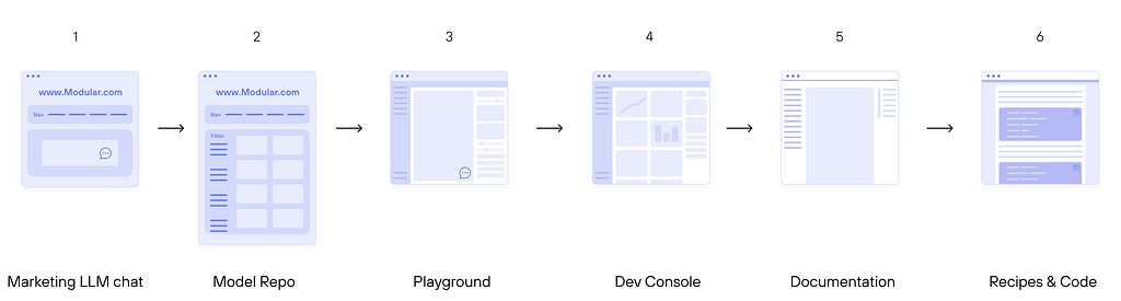
A reference article with guiding principles, patterns, and personas to help designers become more AI literate.As the Head of Design at Modular AI, my team is going from 0 to 1 on a lot of AI products and workflows this year. Even though Ive been designing for developers for years, Ive personally had to quickly ramp up on some AI specific topics and build out our personas, so I thought Id share a few best practices and top references Ive established formyself.Guiding UI principles:Condensed information is welcomed. Much like the B2B industries of data science and fintech, these personas welcome dense dataas well as its designed with a strong hierarchy. So, reduce thosemargins!Parsed metadata is the most clear. Extracting out the metadata and making it search/filter/sortable is important. Tables, side drawers, tagging systemsthese are the main design system elements torefine.Remember Jakobs lawusers spend more time on other sites than your own. There are strong leaders in AI, such as HuggingFace and OpenAI. If theyve established a pattern and theres no strong reason to deviate, go with it. I know, I know, this goes against first principles, but theres a time and a place for first principles. Illl leave it to you to decide that for your team androadmap.A great sources for designing for developers is Githubs design system. Here are a few of their principles that are clearly custom to the developer persona:Its not fully shipped until itsfastAnything added dilutes everything elsePracticality beatspurityApproachable is better thansimpleHalf measures are as bad as nothing atallEncourage flowFavor focus overfeaturesSo with those principles in mind here are some key interfaces that my team has released this year. Keep in mind my team is 4 people (2 designers & 2 developers), and were a fast-paced start-up. Our designs are all released as MVPs at first, then iterated once live, and often built off of existing systems to get from 0 to 1 and get real external validation as fast as possible. All of the designs in this post were created by myself and Will Rust together. Design is a teamsport.The screens Illcover:Product 1: Chat with an LLM (Simple marketing pageversion)As end users, were very familiar with chat interfaces by now. Chatting with an LLM (large language model) as a developer is almost identical to the end user experiences on AI platforms like Chat GPT, Duck Assist, or Perplexity. Its about being as clean as possible and providing fast and conciseanswers.The main difference is that an AI developer is also evaluating the model in terms of its speed, ease of building on top of it, its compatibility, and deploying it.Keep it as clean as a traditional search engine, but offer a subtle 2nd layer of whats happening under the hood, including things like links to the documentation, benchmarking data showcasing the speed of the model, and other data such as cost per token. Here is how we solved for that atModular.UI frameworks we used: https://www.gradio.app/, Mantine,TailwindScreen 1simple start chatting intro screen showing the user which model it is, what hardware its running on, and the traffic volume its handling.And of course everything is light/dark mode compatible. Heres the darkmode version where we embedded the chat inside our developer console.Screen 2 chat results, showing benchmarked data, as well as links to tutorials, the code, and next steps for deployment of thismodel.Left: Expanded benchmark results; Right: Consolidated benchmarksScreen 3The embedded version. For this version, we trained MAX specifically on our documentation using RAG. We started this experiment for internal users only and are hoping to releasesoon.A few choice references:Chatgpt; PerplexityGroq, HuggingFace chatProduct 2: Model RepositoryOne of the most important things that an AI developer needs to do is evaluate GenAI models. This starts with searching through a model repositoryalso called a model garden, model library, or model hub. For marketing/SEO reasons, this is usually a logged out experience, with the main goal being to show users all the models that your platform is compatible with, and encouraging them to log in if they want to test the model more seriously. Our model repo is live at builds.modular.comThe most important features here are essentially search and filter. You want to make sure the user can find what theyre looking for, from a large dataset of what might be hundreds to thousands ofmodels.Screen 2Model detail page. This page tells the user how many variants we have of each model, how to quickly run the model locally, and how to deploy it to a GPU in the cloud if they wantto.There are some fun technical details related to model parameter size, quantization, hardware compatibility, etc. But in the end it all comes down to gestalt clustering and creating the right hierarchy.Designs created by Eve Weinberg (me) and WillRustMy top references here are Huggingface (because theyre the leader in this space), Kaggle (because they have a thriving community), together AI (because theyre Enterprise), and Replicate (because 80k hits per day isalot):Together.aiLike with all successful UI, keep in mind the users mindset here. The AI developer is thinking about models in terms of what task the model can complete, the size of the model, its performance, and who madeit.Product 3: PlaygroundA playground refers to an environment designed for experimentation, testing, and learning without the risks of affecting live systems or production environments. For AI developers, it more specifically will include things like trying out the AI models, testing prompts, and fine-tuning parameters without the need for extensive infrastructure.Were just getting ours up and running now, so Ill just talk about the main features and show some references.Main features:Logged in and Billing connected. Just a small note, but users usually need to connect a credit card because youre officially running AI computenow.Sliders to control the models parameters, change the model entirely.Pay-as-you-go pricingLeft: Vercel; Right:GoogleThis segues perfectly into the whole console experience.Product 4: Developer ConsoleFrom a layout and information architecture perspective, this is like any other desktop console. We use tailwind, mantine, and chartjs to makeours.We got a ittle carried away with bespoke numbering for abitThe fun UI features here are the data monitoring dashboards. If youve ever designed an Enterprise dashboard then the rest honestly is the sameRole based access control, billing, organization hierarchy with members inside that can invite other members, notifications, settings, etc.Product 5: DocumentationOk, lets get into some bread and butterDocumentation! Everyones favorite thing to design;) Heres ours. This was actually my first time ever fully owning the design of a documentation site. We use Docusuarus for ours, as well as Algolia search, which has fantastic UI out of thebox!https://docs.modular.com/maxAs far as the information architecture goes, weve discussed a few approaches here, and narrowed in on two overarching concepts:Follow the users JTBD (jobs to be done)in what order do they accomplish these tasks. For us, its: test locally, serve, deploy to cloud, monitor,scale.Follow the architecture of your product. For us, we have a whole platform that goes from low-level GPU programming to auto-scaling in cloud, so this is also compelling for us to categorize in thisway.Whichever you choose, a landing page that reiterates this is critical.Our most visited page is our Quickstart (not surprisingly!). And were continuously optimizing this page for faster competition, and higher completion rates.Some references:Streamlit Docs (easier when the product surface issmaller)And as I mentioned, Algolia search is fantastic. Heres how it looks forus:Search lightboxedSearch page allows for search across all products andversionsProduct 6: Recipes &CodeRecipes (or cookbooks) is a silly, yet standardized way, of referring to step-by-step instructions. In their most interactive form they are notebooks, where each section is executable code. In their simplest form theyre just a series of instructions with copy/paste-able code snippets.As I mentioned, we build extremely iteratively, so our MVP is truly just rendering a github code example, with metadata called out on the right. I find this this audience, the cleaner and simpler the better. The content itself is so dense, the design shouldnt call attention toitself.A large part of the design system for these articles, is just how you render code, so having an organized system for light and darkmode is a key focus. We use mantine system for this and set our custom colors there, and you can lean on established best practices for CLI color schemes, as shown in this article: https://hamvocke.com/blog/lets-create-a-terminal-color-scheme/Design system for stylingcodeAnd dont forget to have some fun with the CLI, ascii art, and clear progress bars! For UX of the CLI, I just try and teach my engineering teammates the basic 10 NNG principles, and the top one leveraged is visibility of systemstatus.Progress bars in theterminalUsing the ascii art generator tool: https://convertcase.net/ascii-art-generator/Whats next?Im really excited to build so many more workflows and share them. I hope to focus on agentic workflows and cloud monitoring dashboards next.Two low code agentic workflow images from the tooln8n.Bonus imageAI EngineerPersonasAs a reference, here is a genericized version of the personas that I created for Modular. Our bullseye is the Solution Builder fornow.Stay tuned, and thx forreading.EveDesigning for AI Engineers: UI patterns you need to know was originally published in UX Collective on Medium, where people are continuing the conversation by highlighting and responding to this story.
0 Comments
·0 Shares
·71 Views