


 map
map


Curated stories on user experience, usability, and product design. By
@fabriciot
and
@caioab
.
@fabriciot
and
@caioab
.
208 persone piace questo elemento
28 Articoli
0 Foto
0 Video
Condividi
Condiviso con
News
Aggiornamenti recenti
-
 Designing the Jarvis momentuxdesign.ccApps SDK, design principles, and the future of contextual UX.Current ChatGPT app integrations like Zillow, Booking.com, and Canva, illustrating seamless in-chat access. Source: OpenAIIntroducing Apps inChatGPTDo you remember how Tony Stark talked to JARVIS in IronMan?He simply said what he wanted to do, and JARVIS got it done. There was no need to open menus, switch applications, or decide which interface to use next. Every option that could have slowed him down was already resolved for him, so his attention stayed on the taskitself.The scene captures J.A.R.V.I.S. natural-language interface giving Tony instant access to multiple suit configurations and diagnostics with a singlecommand.That kind of experience is exactly what OpenAI is now reaching for. In Brad Lightcaps recent interview with Bloomberg, he shared a vision where third-party apps could work together seamlessly inside ChatGPT. Users would never have to leave a conversation to get something done.Its the contextual aspect of Im doing X or I need YIm on a road trip and I want to know what playlist would go well with thisthat allows you to use ChatGPT to solve higher-level tasks and integrate apps contextually, said Brad Lightcap in a Bloomberg interview.For designers, the real challenge lies in understanding what this shift implies. When conversations become the new interface and tools can appear contextually, how should we design the flow, timing, and handoff between chat and visual elements?Evolution from plugins, MCP, toSDKTo understand what this shift truly means for design, we first need to look at how the systemevolved.In the early days of plugins, tools lived in separate spaces. Users had to switch between apps, browser extensions, or new tabs to complete even the simplesttask.Then came the Model Context Protocol, or MCP. It created a standard way for ChatGPT to talk with external tools and data sources. MCP allowed the model to call a tool and pass structured information through a single, consistent channel. It was an invisible bridge between the model and the outsideworld.Building on that foundation, OpenAI introduced the Apps Software Development Kit (SDK), a toolkit that makes this bridge visible and interactive. It determines when a tool appears, how it looks, and how people can interact with it directly inside the chat. With the SDK, users can engage directly with apps through buttons, cards, or widgets without leaving the conversation.Image from OpenAIs Apps SDK Design Guidelines illustrating how integrated apps visually coexist within ChatGPTs conversation interface. Source: OpenAIApps SDK Design GuidelinesHow the apps SDK boosts efficiency and productgrowthAt this point, designers can probably already imagine how the Apps SDK begins to reshape the user experience. In essence, the SDK embodies the logic behind Hicks Law and Fittss Law: it reduces the visual noise that slows decision-making and shortens the physical distance between intention and completion.Take Coursera for example. Previously, a learner exploring UX courses might spend minutes choosing which platform to open, typing UX design into a search bar, scrolling through long lists, and clicking in and out of pages to check ratings or instructors. Every choice added a moment of hesitation, fragmenting attention and stretching the time it took toact.Image from Courseras page illustrating how users face a complex, multi-step interface when searching for UX design courses. Source: CourseraUniversity of Michigan UX DesignSearchHowever, Courseras integration with ChatGPT illustrates a successful application of Hicks Law principles, significantly reducing decision complexity. A learner can simply ask a question with natural language inside ChatGPTs text field. A video preview of relevant courses then appears directly within the chat, reducing the number of immediate choices presented to the learner. Learners no longer needs to spend time filtering or comparing endless options in a long, scrolling list, thereby simplifying the selection process and dramatically decreasing the reaction time required to commit to acourse.Image illustrating how users can search for and explore UX design courses on Coursera directly within ChatGPT using natural language prompts. Source: OpenAIIntroducing Apps inChatGPTSome in-house designers might wonder what is the impact on their products. If users can complete tasks entirely inside ChatGPT, would they still visit the originalapp?This concern is reasonable because the SDK might reduce users page-level engagement within the native environment. Yet the same decreased friction of opening the app can also widen the apps reach. By allowing users to call the app directly within ChatGPT, the SDK raises visit frequency among existing members and opens the door for non-members to try it for the firsttime.The experience no longer depends on downloading, logging in, or navigating to a separate website. Each interaction inside ChatGPT becomes an entry point that can lead to higher engagement and new conversions, expanding the apps reach without adding extrasteps.Designing experiences that belong in a conversationAfter understanding the broader impact of the Apps SDK, designers can start thinking about how to shape these experiences in practice.Designing for the SDK means clearly defining who the users are, what their goals look like in context, and which parts of their workflow feel most natural to complete through conversation. The task must be specific enough for ChatGPT to assist, yet simple enough to avoid overwhelming the interaction.OpenAI offers several guiding questions to help designers identify good use cases, each of which can also be viewed through the lens of Hicks Law, showing how the SDK minimizes the number of decisions users need to make. Ask yourself:How do your user task fit naturally into a conversation? (for example, booking, ordering, scheduling, quicklookups)Is it time-bound or action-oriented? (short or medium duration tasks with a clear start andend)Is the information valuable in the moment? (users can act on it right away or get a concise preview before divingdeeper)Can it be summarized visually and simply? (one card, a few key details, a clearCTA)Does it extend ChatGPT in a way that feels additive or differentiated?Designers should also avoid designing interfaces that:Display long-form or static content better suited for a website orapp.Require complex multi-step workflows that exceed the inline or fullscreen displaymodes.Use the space for ads, upsells, or irrelevant messaging.Surface sensitive or private information directly in a card where others might seeit.Duplicate ChatGPTs system functions (for example, recreating the input composer).From most of these principles, we can notice that OpenAI encourages designers to avoid tasks that involve too many steps, or think about what information is valuable to show on the interface.Take Figma SDK for example. The workflows like converting a short piece of text into a user flow represents a much stronger use case. It is easier for users to describe with natural language, and this information can immediate be summarized into visual feedback that users can act on rightaway.Image demonstrating how users can generate a complete user-flow diagram in Figma through a simple natural-language request and sketches inside ChatGPT. Source: OpenAIIntroducing Apps inChatGPTIn contrast, designing a complex design system with ChatGPT may not be a good user case. Because it require both users and computers to access complicate information on multiple design pages, and users have to constantly make fragmented decisions and repeatedly step in to guide the AI, which interrupts the flow of interaction and increases the overall time to complete atask.For designers, building for the Apps SDK starts with defining a clear, focused task. ChatGPT favors apps that serve a single, well-scoped purpose, something users can complete in one short interaction. Try to describe your users key goal in plain language, outline its input and output, and make sure it fits naturally into a conversation.Designing Interfaces that belong in a conversationOpenAI also provides a set of UI guidelines that can be examined through the lens of Hicks and FittssLaw.For example, designers should display only the most relevant information and present it in a simple visual form, such as a clean card with a short list of three keyitems.The guidelines also suggest limiting each card to a maximum of two primary actions: one main call to action and one optional secondary choice. These approach helps users find what they need without navigating through layers of menus or dense tables, allowing them to act morequickly.Image from OpenAIs Apps SDK Design Guidelines emphasizing that ChatGPT app interfaces should avoid complex navigation and redundant elements. Source: OpenAIApps SDK Design GuidelinesPrimary actions are usually placed at the bottom of the card, effectively reducing the distance the thumb-pointer musttravel.Image from OpenAIs Apps SDK Design Guidelines illustrating how different UI components are organized consistently within ChatGPTs in-chat interface. Source: OpenAIApps SDK Design GuidelinesWhen a card contains richer media such as images, maps, or interactive diagrams, the expand option can open a fullscreen view. This action significantly increases the effective target width, allowing users to work within a larger, more precise area and improves control when interacting with detailed visualcontent.Image from OpenAIs Apps SDK Design Guidelines demonstrating how full-screen views allow immersive map-interactions directly inside ChatGPT. Source: OpenAIApps SDK Design GuidelinesIf youre interested in the details of how to design user experiences and interfaces, please check out the Apps SDK Design Guidelines and the Figma component library.The future of agents and UX designers roleAs Brad Lightcap mentioned in his Bloomberg interview, the future of ChatGPT will begin to behave more like an operating system (or Jarvis, your personalagent).It will not only execute commands but also integrate information across multiple apps, anticipate user needs, and determine when to act and when to ask for confirmation.Similar directions are already being explored or developed in products like Gemini and Google Suite products, signaling a shift toward more unified, context-aware environments.For UX designers, this evolution expands the scope of design beyond screens and buttons. The focus moves toward designing flows, contexts, and systems that help users think clearly and act confidently. Designers must learn to define how an AI communicates, makes decisions, and aligns with humangoals.Yet no matter how advanced the system becomes, there will always be a need to clarify what people truly need, and bringing that clarity to complexity to just simple interactions.References:Bloomberg Originals. (2025, May 14). OpenAI COO Brad Lightcap talks whats next for OpenAI [Video]. Bloomberg Talks. https://www.youtube.com/watch?v=rNY2HVBIZ6IJohnson, J. (2021). Designing with the mind in mind: Simple guide to understanding user interface design guidelines (3rd ed., Chapter 13: Our handeye coordination follows laws). Morgan Kaufmann.OpenAI. (2024). App design guidelines: Design guidelines for developers building on the Apps SDK. https://developers.openai.com/apps-sdk/concepts/design-guidelinesOpenAI. (2024, September). Introducing apps in ChatGPT and the new Apps SDK: A new generation of apps you can chat with and the tools for developers to build them. https://openai.com/index/introducing-apps-in-chatgpt/Soegaard, M. (2020, August 15). Hicks Law: Making the choice easier for users. Interaction Design Foundation. https://www.interaction-design.org/literature/article/hick-s-law-making-the-choice-easier-for-usersDesigning the Jarvis moment was originally published in UX Collective on Medium, where people are continuing the conversation by highlighting and responding to this story.0 Commenti ·0 condivisioniEffettua l'accesso per mettere mi piace, condividere e commentare!
 -
 Typography Basicsuxdesign.ccTypography basicsA practical introduction to typographyfrom anatomy and spacing to legibility and alignmentfor designers who want to create type that reads beautifully and feels intentional.Typography isnt just about picking a pretty font. Its the craft of shaping written language into a visual experiencehow words look, breathe, and interact on a page or screen. Good typography quietly guides the reader, while poor typography shouts for attention in all the wrong ways. Every detailfrom letter spacing to line heightaffects how users read, feel, and engage. Lets unpack the essentials.Every letter has a structure, and understanding it helps you design with precision. Terms like ascender, descender, baseline, and x-height describe the invisible skeleton that keeps type coherent. The x-height, for instance, determines how big a typeface feels even at the same pointsize.Serif and sans-serif typefaces differ in tone partly because of these structures: serifs guide the eye along lines of text, while sans-serifs often feel cleaner and more modern. Knowing anatomy allows you to mix typefaces consciously rather than by vibealone.Typographic AnatomyKerning, tracking, leadingThese three terms define the rhythm and flow of text. Kerning adjusts the space between individual letters, tracking controls spacing across whole words or paragraphs, and leading (pronounced ledding) sets the space betweenlines.Think of them as the breathing room of type. Too tight, and words feel suffocating; too loose, and they drift apart like strangers at a party. Consistent, intentional spacing is one of the clearest markers of professional typographyand one of the easiest to overlook.Type alignmentLeft, right, center, or justifiedeach alignment changes how the reader experiences text. Left-aligned text feels natural for most Western readers; it mirrors how our eyes expect to move. Centered text adds elegance in small doses, like headings or invitations, but strains readability in long paragraphs.Justified text can look neat but often introduces awkward gaps between words. Theres no one right choiceonly what fits the tone and purpose of thecontent.Indents, outdents, and hanging punctuationsIndenting the first line of a paragraph subtly signals a new thought, while outdents (negative indents) can highlight lists or quotes. Hanging punctuation, where quotation marks or bullets sit outside the text block, preserves clean visual alignment.These are the small design manners that readers might never noticebut would feel their absence. They lend rhythm and grace to long-form content.Legibility and readabilityThey sound similar but mean different things. Legibility is about how clearly letters can be distinguisheda function of font design, size, and contrast. Readability is about how easy it feels to read longer passagesaffected by line length, spacing, and even the surrounding design.A beautifully legible font can still be unreadable in practice if the text is too dense or too wide. The goal isnt just to be seen but to be comfortably followed.Specialized usesTypography takes on unique forms in different contexts: interfaces, signage, packaging, books, motion graphics. In UI design, type must perform at small sizes and varying screens. In print, it must hold character at high resolutions and long durations.Display type can afford drama; body text should feel invisible. Understanding how context shapes your typographic decisions is what separates art fromnoise.Typography isnt decorationits communication shaped with care. Once you see how subtle its impact is, you start noticing type everywhere: on screens, in streets, on receipts. Every font choice tells a story. The more fluently you speak the language of type, the more precisely you can design experiences that speakback.Typography has a strange power: its both invisible and unforgettable. The best type never demands your attention, yet it defines how every word feels. A letters curve can suggest warmth or precision, while spacing can create calm or urgency. This is why typography sits at the heart of designconnecting language withemotion.So when we adjust a line height or choose between Helvetica and Garamond, were not just picking styles; were shaping how people interpret meaning. Typography is the quiet storyteller behind every interface, poster, and page. Mastering it means learning to speak softly but leave a lasting impression.Further reading &viewing The Elements of Typographic Style by Robert BringhurstWidely regarded as a typography bibleit covers type anatomy, spacing, history, meaning and practice. Just My Type: A Book About Fonts by Simon GarfieldA lively, readable exploration of how fonts shape culture, emotion and everyday designchoices. The Anatomy of Type: A Graphic Guide to 100 Typefaces by Stephen ColesHighly visual and practicala great reference for seeing how anatomy, spacing and alignment vary across real typefaces. Helvetica (2007, dir. Gary Hustwit)A design-documentary classic that shows how a single typeface (Helvetica) touches legibility, meaning, alignment and culturalhistory. Typeface (2009, dir. Justine Nagan)Looks at wood-type printing and the material roots of typographyhelpful to ground the anatomy and spacing discussions in tangibleform. Graphic design for filmmaking, prop design workshop by Annie Atkins.Learn how to start designing a collection of graphic props that can tell a directors story, as well as contributing to the genre, period, and visual aesthetic of afilm.Visuals by @oscarsunFigma Community Thanks forreading.Typography Basics was originally published in UX Collective on Medium, where people are continuing the conversation by highlighting and responding to this story.0 Commenti ·0 condivisioni
 -
 The day the internet crashed: What the AWS outage teaches us about dependenciesuxdesign.ccA single fault in the cloud revealed just how connected and dependent weve all become and why good UX must plan for failure.Continue reading on UX Collective0 Commenti ·0 condivisioni
 -
How design radically transformed a dying industryuxdesign.ccAll it takes is one creative spark to ignite afire.source: DSRUPTR.comI recently wrote about the 5 powerful business insights that prove the value ofdesign.While its incredible to see the business results on the value of design from McKinsey, Harvard, Forbes, and Adobe, I really appreciate the everyday examples to help illustrate the value ofdesign.And the creative spark it takes to move a mountainThe Story of Jacek Utko and His CreativeSparkJacek Utko is a former architect who got a job as a newspaper art director. He really thought newspapers were boring and bland, and that was easily reflected in the low circulationnobody was readingthem!source: Pew ResearchCenterHe was really frustrated. His parents and friends thought he was crazy wasting his time working at a newspaper.And the general public thought newspapers would soon become extinct because most people were reading news online. Not to mention most newspapers were outdated by the time they were printed, and environmentalist thought newspapers wasted valuable resources.source: Pew ResearchCenterBut what should he do? He knew that newspapers werent appealing to consumers, he just wasnt sure how to make them better. Or if they could even besaved.Stepping away from work, he took a trip up to London to attend a Cirque du Soleil performance with somefriends.https://medium.com/media/159d9a937486f25d82878ed2a1bfca82/hrefHe was blown away. He told his friends that they totally transformed a creepy run-down entertainment into performance art!This one performance was the creative spark that would ignite a fire inJacek.He knew right away that he should use design to transform his newspaper from boring text into performance art.Just like a Cirque du Soleil performance.Much like when Einstein was a child and received a magnetic compass as a gift, sparking his lifelong fascination with the invisible forces ofnature.source: created with MidjourneyOr Steve Jobs being inspired during a calligraphy course at Reed College, where he was captivated by the elegance and beauty of typography. This sparked his passion for design. He embraced design to create beautiful form factors and interfaces in Apples productsbecoming a unique differentiator from the bland PC computers.source: DSRUPTR.comJacek quickly returned home to Poland to focus his energy on selling leadership on his vision to radically redesign the newspaper into visually engaging and artisticpieces.The Revolution of Newspaper DesignJacek worked closely with newspaper executives to figure out the business goals of their papers, and then radically reformatted the product to fit thosegoals.Part of the transformation was Jaceks strategic rethinking the newspaper design, moving away from individual page layouts to seeing the whole newspaper as a single composition.As the art director at Warsaws Puls Biznesu in 2004, he redesigned this small business-focused newspaper and immediately won the SND award for worlds best-designed newspaper. Readers responded, and circulation wentup.source: PulsBiznesuIts clear from these covers that Jacek has completely elevated an old newspaper from static information into dynamiccontent.source: PulsBiznesuThe info graphics that Jacek and his team designed are not just interesting bits of data, but compelling stories that take their readers on ajourney.source: PulsBiznesuJacek and his team got people to notice newspapers again. And quite frankly, the designs he created made newspapers hard toignore.source: WyborczaPeople rushed to pick up these redesigned newspapers, often seeing others holding them and curious about the artistry and creativity they saw on thepages.source: DM.focusJacek sat back in his chair with a smile. He and his team had successfully transformed a newspaper into performance art. What seemed like an impossible dream was nowreality.The BusinessResultsUtkos extraordinary design work demonstrates that strategic, user-focused design significantly enhances business performance and reader engagement.The amount of awards and revenue created by Jacek and his team are inspiring:Increased Circulation by Up to 100%: Utkos redesigns for newspapers in Eastern Europe, including titles in Poland, Russia, Bulgaria, Lithuania, and Latvia, consistently boosted circulation, with some publications seeing increases of up to 100% due to enhanced visual appeal and reader engagement.35% Circulation Growth in Poland: A Polish newspaper Utko redesigned saw a 35% circulation increase over three years, reversing nearly a decade of stagnation, by aligning design with business goals and reader preferences.Boosted Ad Revenue: His redesigns, such as for Bonniers business publications, led to increased advertising revenue, often by as much as 100%, by creating visually compelling layouts that attracted advertisers.Award-Winning Designs: Utkos redesigns won the Society of News Design (SND) Worlds Best Designed Newspaper award in 2004 and 2007 for Warsaws Puls Biznesu, enhancing brand prestige and marketability.European Newspaper of the Year Awards: Three newspapers he redesigned were recognized as European Newspaper of the Year in 2015, 2016, and 2019, driving higher readership and industry recognition.Global Impact Across 35 Countries: Utkos redesigns for dozens of newspapers and magazines in Europe, Asia, Australia, and Africa (e.g., Singapore, South Africa) consistently increased readership and revenue, leveraging strategic design.ConclusionBeyond the extraordinary business results from McKinsey, Harvard, Forbes, and Adobe, the world can easily see in this simple example that design has the transformative power as a spark for innovation and a driver of businessvalue.Jacek not only proved that good design can help readers reconnect with newspapers, but he also proved that good design can bring a dying industry back from the edge of extinction.https://medium.com/media/8229a39f9e4605e7d4bc15e0cd1867aa/hrefAnd he accomplished this by going beyond just aesthetics by improving the overall product and aligning content and design with a clear strategy. He collaborated with business leaders every step of theway.Jacek is now an art director for the Bonnier Business Press, overseeing papers in Eastern Europe and the Baltic states, and the work he oversees consistently wins major prizes (including another SND worlds-best in 2007 for Estonias ripev), despite their small teams and limited resources.source: DSRUPTR.comThe story shows that designers have the power to change not only a product but also the entire workflow and culture of acompany.To all designers and innovatorsthis is our creative spark! We need to embrace this story and seize the moment to use design to solve the biggest challenges in our organizations. We all need to be likeJacek.If Jacek can revolutionize the newspaper industry with design, then you can utilize design to revolutionize any industry.How design radically transformed a dying industry was originally published in UX Collective on Medium, where people are continuing the conversation by highlighting and responding to this story.0 Commenti ·0 condivisioni
-
 Building a product that doesnt existuxdesign.ccDesigners, product, and engineers are all guided by the Product Ideal. The problem is, theyre all seeing a different one.Continue reading on UX Collective0 Commenti ·0 condivisioni
 -
 Why does Tesla have a bad reputation?uxdesign.ccAnalysis of how Elon Musks politics, manufacturing failures, and service disasters destroyed Teslas market dominanceContinue reading on UX Collective0 Commenti ·0 condivisioni
 -
 Building trust in opaque systemsuxdesign.ccWhy the better AI gets at conversation, the worse we get at questioning itillustration byauthorHow do we know when to trust what someone tells us? In person conversations give us many subtle cues we might pick up on, but when they happen with AI system designed to sound perfectly human, we lose any sort of frame of reference we mayhave.With every new model, conversational AI sounds more and more genuinely intelligent and human-like, so much so that every day, millions of people chat with these systems as if talking to their most knowledgeable friend.From a design perspective, theyre very successful in the way they feel natural, authoritative and even empathetic, but this very naturalness becomes problematic as it makes it hard to distinguish when outputs are true or simply just plausible.This creates exactly the setup for misplaced trust: trust works best when paired with critical thinking, but the more we rely on these systems, the worse we get at it, ending up in this odd feedback loop thats surprisingly difficult toescape.The illusion of understandingTraditional software is straightforwardclick this button, get that result. AI systems are something else entirely because theyre unpredictable as they can make new decisions based on their training data. If we ask the same question twice we might get completely different wording, reasoning, or even different conclusions eachtime.How this thing thinks and speaks in such human ways, feels like magic to many users. Without understanding whats happening under the hood, its easy to miss that those magical sentences are simply the most statistically probable chain of words, making these systems something closer to a glorified Magic 8Ball.Back in 2022 when ChatGPT opened to public, I was also admittedly mesmerised by it, and after it proved useful in a couple of real-world situations, I started reaching for it more and more, even for simple questions andtasks.Until one day I was struggling with a presentation segment that felt flat compared to the rest and asked Claude for ideas on how to make it more compelling. We came up with a story I could reference, one I was already familiar with, but there was this one detail that felt oddly specific, so I asked for thesource.Part of the conversation with Claude (screenshot byauthor)You can imagine my surprise when Claude casually mentioned it had essentially fabricated that detail for emphasis.How I could have so easily accepted that made-up information genuinely unsettled me and became the catalyst for me to really try and understand what I was playing with. What I didnt know at the time was that this behaviour represents exactly what these systems are designed to do: generate responses that sound right, regardless if theyre actually true ornot.Human-like, but nothumanThe core problem when it comes to building trust in AI is that the end goal of these systems (utility) works directly against the transparency needed to establish genuinetrust.To maximise usefulness, AI needs to feel seamless and naturalnobody wants to talk to a robot, its assistance should be almost invisible. We wouldnt consciously worry about the physics of speech during conversation, so why should we think about AI mechanics? We ask a question, we get ananswer.But healthy scepticism requires transparency, which inevitably introduces friction. We should pause, question, verify, and think critically about the information we receive. We should treat these systems as the sophisticated tools they are rather than all-knowing beings.The biggest players seem to be solving for trust by leaning into illusion rather than transparency.Claude thinking indicator (screenshot by author, Sept2025)One key technique is anthropomorphising the interface through language choices. For example, the many thinking indicators that appear while actually just preparing a response, its a deliberate attempt at building trust. This works brilliantly because these human-like touches make users feel connected and understood.However, giving AI qualities like these thinking indicators, conversational tone, personality, and empathy creates two subtle yet critical problems:#1Giving AI human-like qualities, makes us lose the uncertainty signals that would normally help us detect when something is off. Humans naturally show knowing what they dont know through hesitation, qualifying statements (like I think maybe), or simply by admitting uncertainty. These are very helpful signals that let us know when to be more careful about trusting what someone issaying.AI systems however, rarely do thisthey can sound equally confident whether theyre giving you the population of Tokyo (which they probably know) or making up a detail about a case study (which they definitely dont know). Thats why detecting a mistake or a lie in these cases can be extremely hard.#2On top of this, users are more likely to assume the AI will perform better while feeling a deeper connection to it. So we end up trusting it based on how it feels rather than how well it actuallyworks.The industry calls this trust calibration, which is about finding the right level of trust so that users rely on AI systems appropriately, or in other words, in just the right amount based on what those systems can actually do. This is no easy feat in general, but because AI often sounds confident while being opaque and inconsistent, getting this balance right is extremely challenging.So how are companies currently attempting to solve this calibration problem?The limits of current solutionsAs a solution, theres a lot of talk around explainability. This refers to turning AI systems hidden logic into something humans can make sense of, helping users decide when to trust the output (and more importantly, when not to doso).Yet, this information only appears spontaneously in scenarios like medical or financial advice, or when training data is limited. In more routine interactionsbrainstorming, seeking adviceusers would need to actively prompt the AI to reveal the reasoning (as I had to do withClaude).Imagine constantly interrupting a conversation to ask someone where they heard something. The chat format creates an illusion of natural conversation that ends up discouraging the very critical thinking that explainability is meant toenable.Recognising these challenges, companies implement various other guardrails: refusal behaviours for harmful tasks, contextual warnings for sensitive topics, or straight up restriction of certain capabilities. These aim to prevent automation bias: our tendency to over-rely on automated systems.These guardrails, tho, have significant limitations. Not only are there known workarounds, but they fail to account for how these tools are actually used by millions of people with vastly different backgrounds and technical literacy.The contradiction becomes obvious when you notice where warnings actually appear. ChatGPTs disclaimer that it can make mistakes. Check important info sits right below the input field, yet I wonder how many people actually see it, and of those who do, how many take that advice. After all that effort to anthropomorphise the interface and create connection, a small grey disclaimer hardly feels like genuine transparency.Although tiny, Claudes disclaimer appears more contextually within the last reply provided (screenshot by author, Sept2025)Companies invest heavily in making AI feel more human and trustworthy through conversational interfaces, while simultaneously expecting users to maintain critical distance through small warnings and occasional guardrails. The result is that these become another form of false reassurance allowing companies to claim plausible deniability while essentially paying lip service to transparency andtrust.Scaffolding overcrutchesThis reveals a fundamental flaw in the current approach: theyre asking users to bear the weight of responsible use while providing tools designed to discourage the very scepticism they require. This, not only contradicts established UX principles about designing for your users actual capabilities and contexts, but also ignores how trust is actuallyformed.In fact, trust isnt built through one single intervention, but rather systematically across many touchpoints. So how might we approach this problem differently?Photo by Ricardo Gomez Angel onUnsplashA first step, I believe, would be ditching the seamless approach and rethinking friction. What if, instead of treating transparency as friction to reduce, design treated it as a capability to build upon? Instead of hiding complexity to fast-track utility, interfaces could gradually build users ability to work effectively with AI systemseventually teaching them not only how to use them responsibly, but when to trust them aswell.As a parallel, think scaffolding versus crutches. Current AI systems function more like crutchesthey provide so much support that users become dependent on them. Users lean on AI for answers without developing the skills to evaluate them, and much like actual crutches, this helps in the moment but prevents underlying capabilities (critical thinking, in this case) from getting stronger overtime.Designing transparency as scaffoldingIn a scaffolding model instead, AI systems could be much more flexible and adaptable so to surface transparency and guidance based on the users developing skills and the stakes of the decision.For example, we could imagine having different modes. A learning mode could surface uncertainty more explicitly within responsesalerts prompting users to verify claims the AI cannot back up directly, or inviting users to take answers with a grain of salt. This could happen in expandable sections so as not to intrude on the conversation flow, and as users interact with these components, the interface could gradually reduce explicit prompts while maintaining the underlying safeguards.Quick and dirty explorations of a learning mode (byauthor)For high-stakes decision, the interface could default to maximum transparency, like for example requiring users to verify factual claims with external sources before accessing final outputs. Visual indicators could distinguish between trained knowledge, recent search results, and generated examples, helping users understand where information comesfrom.This approach would treats AI as temporary support that builds user capabilities rather than replacing them, and instead of optimising for immediate task completion, scaffolding design would help fostering long-term competence by helping users develop verification habits and critical thinkingskills.Googles Gemini offers inline tips while images are being generated and then persist them on screen. This type of content is clearly distinguishable from the rest of the conversation and provides useful and contextual information based on the task the user is performing (screenshot by author, Sept2025)A trade-off worthmakingMuch of this goes against conventional product design principles around maximising ease of use. Adding these steps and indicators might seem like deliberate obstacles to user engagement because they are, but thats thepoint.The friction introduced in this case, would serve a different purpose than arbitrary barriersits protective and educational rather than obstructive. If designed mindfully, friction can help users treat AI tools as scaffolding rather than crutches, by developing the judgment skills needed to work safely with thesesystems.That conversation with Claude taught me something crucial about the gap between how these systems are presented and what they actually are. We face a choice between immediate utility while undermining our critical thinking, or building people up rather than making them dependent by accepting some friction as the price of maintaining our ability to think independently. The path forward isnt avoiding AI, but demanding better design that teaches us to use these tools wisely rather than depending on them entirely.Footnotes Im aware that my example here is a pretty silly one compared to the amount of misinformation, bad advice and just factually incorrect tidbits people are potentially exposed to everyday through these interactions. But aha moments work in mysterious waysSuggested reads- Co-constructing intent with AI agents by TenoLiu- The Psychology Of Trust In A World Where Products Keep Breaking Promises by Mehekk Bassi- Designing for control in AI UX by RobChappellBuilding trust in opaque systems was originally published in UX Collective on Medium, where people are continuing the conversation by highlighting and responding to this story.0 Commenti ·0 condivisioni
 -
 From products to systems: The agentic AI shiftuxdesign.ccAgents are here, how we build and use them is challenging many of the foundations for building software that we established over the last few decadesand even the very idea of what a productis.Prompt by the author, image bySora.This article is a continuation of previous explorations on the theme of how AI is impacting design and product (Vibe-code designing, Evolving roles), and is based on a presentation delivered at The Age of TOO MUCH exhibition in Protein studios, as part of London Design Week2025.Theres a scene in one of my favorite movies, Interstellar, where the characters are on a remote, water-covered planet. In the distance there is what initially appears to be a large landmass, but as Cooper, the main character, looks on, he realizes that they arent in fact mountains, but enormous waves steadily building and towering ominously overthem.Those arent mountains, those are waves CooperWith AI, it feels like weve had a similarly huge wave building on the horizon for the last few years. I wrote previously about how Generative AI and Vibe Coding are changing how we design. In recent months it feels like another seismic shift is underway with agentic AI. So what exactly is this wave, and how is it reshaping the landscape we thought weknew?I lead the product design team at DataRobot, an enterprise platform that helps teams build, govern and operate AI models and agents at scale. From this vantage point, Im seeing these changes reshape not just how we design, but also many long-held assumptions about what products are and how theyrebuilt.Whats actuallychangingAgents are a fundamentally different paradigm to predictive and generative AI. What sets them apart, aside from being multimodal and capable of deep reasoning, is their autonomous nature. It sounds deceptively simple, but when software has agencythe ability to make decisions and take actions on its ownthe results can be quite profound.This creates a fundamental challenge for companies integrating AI software, which is traditionally built for deterministic, predictable workflows. Agentic AI is inherently probabilisticthe same input can produce different outputs, and agents may take unexpected paths to reach their goals. This mismatch between deterministic infrastructure and probabilistic behavior creates new design challenges around governance, monitoring, and user trust. These arent just theoretical concerns, theyre already playing out in enterprise environments. Thats why we partnered with Nvidia to build on their AI Factory design and delivered as agentic apps embedded directly into SAP environments, so customers can run these systems securely and atscale.But even with this kind of hardened infrastructure, moving from experimentation to impact remains difficult. Recent MIT research found that 95% of enterprise generative AI pilots fail to deliver measurable impact, highlighting an industry-wide challenge in moving from prototype to production. Our AI Expert servicewhere specialised consultants work directly with customers to deploy and run agentsdelivers outstanding results through personalized support. To extend this level of guidance to a broader customer base, we needed to develop scalable approaches that could address complexity barriers atscale.Datarobot homepageMoving from AI experimentation to production involves significant technical complexity. Rather than expecting customers to build everything from the ground up, we decided to flip the offering and lead instead with a series of agent and application templates that give them a headstart.To use a food analogy, instead of handing customers a pantry full of raw ingredients (components and frameworks), we now provide something closer to HelloFresh meal kits: pre-scaffolded agent and application templates with prepped components and proven recipes that work out of the box. These templates codify best practices across common customer use cases and frameworks. AI builders can clone them, then swap out or modify components using our platform or in their preferred tools viaAPI.Use case specific Agentic Application TemplatesThis approach is changing how AI practitioners use our platform. One significant challenge is creating front-end interfaces that consume the agents and modelsapps for forecasting demand, generating content, retrieving knowledge or exploring data.Larger organisations with dedicated development teams can handle this easily. But smaller organisations often rely on IT teams or our AI experts to build these interfaces, and app development isnt their primaryskill.We mitigated this by providing customisable reference apps as starting points. These work if they are close to what you need, but theyre not straightforward to modify or extend. Practitioners also use open-source frameworks like Streamlit, but the quality of these often falls short of enterprise requirements for scale, security and user experience.To address this, were exploring solutions that use agents to generate dynamic applicationsdashboards with complex user interface components and data visualizations, tailored to specific customer needs, all using the DataRobot platform as the back-end. The result is that users can generate production-quality applications in days, not weeks ormonths.https://medium.com/media/1c5c875292b4c38002fa61e15fab4140/hrefThis shift towards autonomous systems raises a fundamental question: how much control should we hand over to agents, and how much should users retain? At the product level, this plays out in two layers: the infrastructure AI practitioners use to create and govern workflows, and the front-end apps people use to consume them. Our customers are now building both layers simultaneouslyguidance agents configure the platform scaffolding while different generative agents build the React-based applications that sit ontop.These arent prototypestheyre production applications serving enterprise customers. AI practitioners who might not be expert app developers can now create customer-facing software that handles complex workflows, rich data visualization, and business logic. The agents handle React components, layout and responsive design, while the practitioners focus on domain logic and user workflows.We are seeing similar changes in other areas too. Teams across the organisation are using new AI tools to build compelling demos and prototypes using tools like V0. Designers are working alongside front-end developers to contribute production code. But this democratization of development creates new challenges; now that anyone can build production software, the mechanisms for ensuring quality and scalability of code, user experience, brand and accessibility need to evolve. Instead of checkpoint-based reviews, we need to develop new systems that can scale quality to match the new pace of development.An example of an app built by our field team using V0 that leverages agent-aware design systemdocs.Learning from the controlparadoxThere are lessons from our AutoML (automated machine learning) experience that apply here. While AutoML workflows helped democratize access for many users, some experienced data scientists and ML engineers felt control was being taken away. We had automated the parts they found most rewardingthe creative, skilled work of selecting algorithms and crafting featureswhile leaving them with the tedious infrastructure work they actually wanted toavoid.Earlier version of the DataRobot UI that focused on democratizing access to machinelearningWere applying this lesson directly to how we build agentic applications. Just as AutoML worked when it automated feature engineering but not always model interpretation, our customers will succeed when agents handle UI implementation while AI/ML experts retain control over the agentic workflow design. The agents automate what practitioners dont want to do (component wiring, state management) while preserving agency over what they do care about (business logic, user experience decisions).Now, with agentic AI, this tension plays out at a much broader scale with added complexity. Unlike the AutoML era when we primarily served data scientists and analysts, we now target a broader range of practitioners including App developers who might be new to AI workflows, along with the agents themselves as endusers.Each group has different expectations about control and automation. Developers are comfortable with abstraction layers and black-box systemstheyre used to frameworks that handle complexity under the hood, but they still want to debug, extend, and customise when needed. Data scientists still want explainability and intervention capabilities. Business users just wantresults.But theres another user type were designing for: the agents themselves. This represents a fundamental shift in how we think about user experience. Agents arent just tools that humans usetheyre collaborative partners that need to interact with our platform, make decisions, and work alongside human practitioners.Overview of the users who interact with the DataRobot platformWhen we evaluate new features now, we ask: will the primary user be human or agent? This changes everything about how we approach information architecture, API design, and even visual interfaces (if required). Agents need different types of feedback, different error handling, and different ways to communicate their reasoning to human collaborators.Looking ahead, its possible agents may emerge as primary users of enterprise platforms. This means designing for human-agent collaboration rather than just human-computer interaction, creating systems where agents and humans can work together effectively, each contributing their strengths to the workflow.From designing flows to architecting systemsThese changes challenge fundamental assumptions about what a product is. Traditionally, products are solutions designed to solve specific problems for defined user groups. They usually represent a series of trade-offs: teams research diverse user needs, then create single solutions that attempt to strike the best balance of multiple use cases. This often means compromising on specificity and simplicity to achieve broaderappeal.Generative AI has already begun disrupting this model by enabling users to bypass traditional product design and development processes entirely. Teams can now get to an approximation of an end result almost instantaneously, then work backward to refine and perfect it. This compressed timeline is reshaping how we think about iteration and validation.But agentic AI offers something more fundamental: the ability to generate products and features on demand. Instead of static experiences that try to serve a broad audience, we can create dynamic systems that generate specific solutions for specific contexts and audiences. Users dont just get faster prototypesthey get contextually adaptive experiences that reshape themselves based on individual needs.How the product development process is evolving with AI. Creditunknown.This shift changes the role of design and product teams. Instead of executing individual products, we become architects of systems that can create products. We curate the constraints, contexts, and components that agents use to generate experiences while maintaining brand guidelines, product principles, and UX standards.But this raises fundamental questions about interaction design. How do affordances work when interfaces are generated on demand? Traditional affordancesvisual cues that suggest how an interface element can be usedrely on consistent patterns that users learn over time. Interestingly, AI tools like Cursor, V0, and Lovable address this challenge by leveraging well-established UX frameworks like Tailwind and ShadCN. Rather than creating novel patterns that users need to learn, these tools generate interfaces using robust, widely-adopted design systems that provide familiar starting points. When agents generate interfaces contextually using these established frameworks, users encounter recognizable patterns even when the specific interface isnew.At DataRobot, weve approached this challenge by systematizing our design process and standards as agent-aware artifacts. Weve converted our Figma design system into machine-readable markdown files that agents can consume directly. Using Claude, we translated our visual design guidelines, component specifications, and interaction principles into structured text that can be dropped as context into AI tools like Cursor, V0, andLovable.Translating design files into agent-aware artifacts like markdownfiles.This approach allows us to maintain design quality at scale. Instead of manually reviewing every generated interface, we encode our design standards upstream, ensuring that agents generate consistent, accessible, and brand-appropriate experiences bydefault.Were already seeing this in action within DataRobot itself. Our AI Experts use these agent-aware design artifacts when building agentic applications, maintaining design consistency through our systematized guidelines while focusing on the unique business logic and user workflows.What this means for product & designleadersI previously wrote about how the boundaries between disciplines are blurring. What shape the product triad will take, or if it remains a triad at all, is unclear. While its likely that design will absorb many front-end development tasks (and vice-versa), and some PMs will take on design tasks, I dont think any roles will disappear entirely. There will always be a need for specialists; while individuals can indeed do a lot more than before, there is only a certain amount of context that we can allretain.So while we might be able to execute more, we still need people who can go deep on complex problems along with a level of craft that becomes increasingly valuable as a differentiator. In a world where anyone can create anything, the quality of execution and depth of understanding that comes from specialization will be what separates good work from exceptional work.The companies that are going to distinguish themselves are the ones that show their craft. That they show their true understanding of the product, the true understanding of their customer, and connect the two in meaningful ways. Krithika Shankarraman (Product, OpenAI)The blurring boundaries of the producttriad.As these boundaries blur and new capabilities emerge, its worth remembering what remains constant. The hard problems remainhard:Understanding people and their needs within complex contexts. What unmet needs are we addressing?Building within interdependent systems and enterprise constraints. Will this work with existing architectures?Aligning technical capabilities to business value. Is this solving a problem thatmatters?Our role as design leaders is evolving from crafting individual experiences to architecting systems that generate experiences. Were evolving from designing screens to designing systems that can make contextual decisions while maintaining design integrity.This changes our methodology fundamentally. Instead of designing for personas or generalised scenarios, were designing systems that adapt to individual contexts in real-time. Rather than creating single user journeys, were building adaptive frameworks that change pathways based on user intent and behavior.User research also evolves: we still need to understand human needs, but now we must translate those insights into rules and constraints that agents can interpret. The challenge isnt just knowing what users want, but encoding that knowledge to maintain design quality across infinite interface variations.https://medium.com/media/0adf05b68982681f7579e5f9734e2af3/hrefThis fundamental truth doesnt changebut our methods for translating human understanding into actionable systems do. The uniquely human work of developing deep contextual understanding becomes more valuable, not less, as we learn to encode that wisdom for AI systems to use effectively.Design quality in an agent-first worldThis shift toward agent-generated experiences creates new design challenges. If agents are creating interfaces on demand, how do you maintain coherence across an organisation? How do you ensure accessibility compliance? How do you handle edge cases that training data didntcapture?We believe that part of the answer lies in creating foundational artifacts that both humans and agents can consume. At DataRobot, we are currently exploring:Making documentation agent-aware using formats like MCP, agents.md and llms.txt.Converting our design system into foundational markdown files that codify principles and patterns, for use in AI development tools.Creating automated checks for UI language, accessibility standards, and interaction patterns.This approach enables others in our organisation to build compelling applications with AI tools while adhering to our design system and brand consistency. But heres the crucial insight: while these AI-generated applications might look impressive, the polish can mask underlying UX challenges. As Prestonnotes:https://medium.com/media/1deda45b93d917a65c099af08ac55b7e/hrefAI tools excel at execution, but they dont replace the difficult UX work required to ensure youre executing the rightthing.This creates a new challenge for design teams: when everyone is a builder, how do we ensure we build the right things and ensure we meet quality standards? Weve struggled with knowing when to lean in. There are times, like creating demos or throwaway prototypes, when its fine for design to be less involved. But there are critical moments when our involvement is important, otherwise poor quality experiences can ship to production. Our customers dont care about how or who created the products they interactwith.The key is catching issues as far upstream as possible. This means the documentation and enablement materials that guide how people use and customise our templates have become the new products our design team is responsible for. By creating thorough agent-aware guidelines and design system documentation, we can ensure higher quality output atscale.But we still need quality checks without slowing down the process too much. Were still learning how to balance speed with standardswhen to trust the system weve built and when human design judgment is a musthave.Riding thewaveThe last few years have felt like a rollercoaster because they have been. But I believe our job as designers is to lean into uncertainty, to make sense of it, shape it, and help others navigateit.Like Cooper in Interstellar, weve recognised that what seemed like distant mountains are actually massive waves bearing down on us. The question isnt whether the wave will hit, its already here. The question is whether well be caught off guard or whether well have prepared ourselves to harness itspower.Heres what weve learned so far at DataRobot, for anyone navigating this transition:Embrace the change & challenge orthodoxiesTry new tools and workflows outside your traditional lane. As roles blur, staying relevant means expanding your capabilitiesBuild systems, not just products Focus on creating the foundations, constraints, and contexts that enable good experiences to emerge, rather than crafting every detailyourselfFocus on the enduring hard thingsDouble down on the uniquely human work of understanding needs, behaviours, and contexts that no algorithm can fullygrasp.Exercise (your) judgment Use AI for speed and capability, but rely on your experience and values to decide whatsright.AI doesnt make design irrelevant. It makes the uniquely human aspects of design more valuable than ever. The wave is here, and those who learn to harness it will find themselves in an incredibly powerful position to shape what comes next. This isnt about nostalgia for how design used to work, its about taking an optimistic stance and embracing whats possible with these technologies, doing things and going further than we ever could before. As Andy Grove put it perfectly:Dont bemoan the way things were, they will never be that way again. Pour your energyevery bit of itinto adapting to your new world, into learning the skills you need to prosper in it, and into shaping it aroundyou.John Moriarty leads the design team at DataRobot, an enterprise AI platform that helps AI practitioners to build, govern and operate agents, predictive and generative AI models. Before this, he worked in Accenture, HMH and Design Partners.From products to systems: The agentic AI shift was originally published in UX Collective on Medium, where people are continuing the conversation by highlighting and responding to this story.0 Commenti ·0 condivisioni
 -
 Why design agencies are dying & why integration matters to designs futureuxdesign.ccHow to go from separate creative unit to a strategic design partnerContinue reading on UX Collective0 Commenti ·0 condivisioni
 -
 Look past the smart glasses: Meta just unveiled the future of wearablesuxdesign.ccThe controls demonstrated by the Meta Neural Band offer an exciting new answer to the question of how well interact with the tech of theContinue reading on UX Collective0 Commenti ·0 condivisioni
 -
 Interview with Lan Johnson, Senior Designer at Squareuxdesign.ccLan Johnson is a Senior Product Designer at Square. We met over 10 years ago in 2014 in Dallas, at Tekzenit where we both worked as user experience designers.Lan is a military brat and grew up in Japan and South Korea, and Guam. Lans father retired in Las Vegas and then they eventually moved toDallas.Lan currently lives in Seattle, Washington with her boyfriend and theirdog.You can find Lan on LinkedIn.What was your journey getting into product design?I actually started out thinking I wanted to be a graphic designer. I was really into anime as a kid, and when I got my hands on a (very outdated and pirated) copy of Photoshop 6 at around age 11, I was hooked. In high school, I also taught myself how to code, which opened the door to doing small freelance jobs here and there while I was still inschool.Eventually, I joined a startup in New York, before moving back to Dallas to finish my degree. From there, I spent about 10 years in consulting, working across different agencies and design shops. That period was fun and full of variety, but I found myself missing the feeling of being deeply connected to a singleproduct.In 2020, just a few weeks before the pandemic hit, I made the leap to go in-house. I stayed almost two years in that role, and now Im continuing my journey atSquare.For better or worse, how do you think your parents, family, or friends influenced how you approach problem solving in your day to day work?I had to learn how to problem-solve on my own from a young age, which made me very independent. My family moved around a lot, so I was constantly rebuilding my support system and adapting to new cultures. That experience shaped the way I work todayit taught me how to be flexible, resilient, and comfortable walking into unfamiliar environments.Those skills came in handy when I moved into consulting. I had no trouble starting conversations, building relationships quickly, and feeling at ease in different rooms. In high school, I went to a Department of Defense school in East Asia with only about a thousand students total from kindergarten through senior year. With so few people, it felt like being in a small startupyou had to be resourceful, self-sufficient, and figure things out because there werent always obvious answers. That mindset has carried through into my approach to design and problem-solving today.How would you describe your background at Capital One, Project202 and Tekzenit?Each place was really different and shaped me in unique ways. At Tekzenit, I was just starting out. It was in the telecom space, and honestly, I was still figuring out how to navigate the corporate world while learning an industry that didnt end up being directly relevant to me later. But it was an important firststep.At Project202, I had the chance to work across a wide range of industries and clients. For example, I worked with Southwest Airlines, learning how they assign pilots and cabin crew, which gave me insight into complex scheduling and logistics. I also helped JCPenney retrofit their site to be mobile and desktop friendly, back when responsive design was still a big shift. That variety really sharpened my ability to adapt quickly and problem-solve across different domains.Capital One was especially interesting because of how structured and unionized their systems were. They had this massive scheduling platform that auto-generated crew schedules, but it always had to be corrected by hand. Once a year or so, pilots and crew reps from the union would come in to review and debate the schedules, approving what worked and pushing back on what didnt. It gave me a fascinating look into how large-scale systems intersect with human needs and negotiations.How would you describe your current role and experience at Square?Stepping away from management, I joined Square as an individual contributor, and Im really happy with that shift. At my last four jobs I was in management, so it feels good to be back in the weeds, hands-on with the workagain.Previously, I worked on identity verification, so moving into printers recently has been a big jump, but a good one. I think what I missed most in management was the craft. In consulting especially, so much of the role was about selling the work and managing stakeholders, rather than actually building. I enjoyed mentoring and growing talent, but I often felt pulled away from the fun of shipping products with ateam.At Square, I feel like Ive come full circle. I get to contribute directly, push projects over the finish line, and rediscover the parts of design that made me love this work in the firstplace.What are the biggest challenges you are currently facing at work?Right now, my biggest challenge is onboarding into the world of printers. There are so many nuances I didnt anticipate, especially since I focus on food and beverage, where every kitchen has very specific needs for how things run. Navigating those requirements has been a steep but interesting learningcurve.Another challenge is balancing engineering costs, business priorities, and whats ultimately best for the end user. Like all teams, were constantly deciding whether to patch immediate issues or invest in longer-term fixes that will pay off later. Were making progress, but its definitely ajourney.What are some ways that you leverage AI in your workflow?AI is a big focus for us. Our CEO, Jack Dorsey, is very forward-looking when it comes to future technologies like Bitcoin and decentralized identity, so adopting AI has become a company-wide initiative. We use a tool called Goose that allows us to automate some tasks. It saves me from having to wait on a data team to pull stats I can access the information I need instantly, which is incredibly helpful.Personally, I also use ChatGPT for writing tasks since its just more efficient, and Ive been experimenting with v0 to prototype. That tool can be a little frustrating at times, but its also fun and pushes me to think about design workflows in newways.What are parts of your job where you find using AI unnecessary or inefficient?AI is mostly useful as a baseline. I dont rely on it heavily in my day-to-day design work, since it cant really handle more sophisticated tasks. Where I do find it helpful is when teammates who arent as design focused, like PMs, use it to get their ideas across. Even if the output isnt perfect, it gives us something concrete to reactto.Recently, I organized a V0 prototyping workshop where participants used AI to create solutions for the same problem. None of the prototypes were perfect, but I was able to pull useful pieces from each. So while AI isnt my main tool, it does provide a good startingpoint.What are the most important aspects of pitching your design work to stakeholders?For me, the most important part is setting the right context. Ive found that when I take the time to explain the problem, why it matters, and the broader landscape were working within, stakeholders are naturally more aligned with my design decisions. Jumping straight into the solution can leave gaps, but grounding the conversation in the why builds trust andclarity.I often include a few introductory slides or notes at the beginning of my Figma files for this reason. It gives everyone a shared foundation and makes the actual design discussion more productive.Where do you get your design inspiration from?I use Dribbble a lot, but lately Ive been really inspired by the resurgence of 90s aesthetics. I especially love 35mm film because it feels so raw and honest. Square has been leaning into that vibe too, with a stronger focus on photography and visual storytelling that highlights our sellers. Im excited to see our design move more in that direction.Whats one failure or misstep that taught you something invaluable?I learned a lot during my time at AT&T, which often felt like trial by fire. The work environment was chaotic, and I made the mistake of pushing myself too hard, working while sick, putting in extra hours, and sacrificing balance. In hindsight, none of that effort really mattered, because it wasnt appreciated and didnt change the outcome. That experience taught me the importance of work-life balance and setting boundaries.I also got my first crash course in corporate politics. I had to learn how to navigate different personalities, especially difficult ones. For example, there was a teammate who constantly needed to feel important, and if you didnt give him that, he could make things unnecessarily difficult. I eventually figured out how to work through a proxy to get what I needed. As frustrating as it was, it taught me how to manage around egos and still get work done, something I carry with metoday.When you start on a new design team, where do you spend your time and energy?When I join a new team, the first thing I do is dig through all the files I can get my hands on: org charts, Figma files, documentation, anything available. That exploration helps me form better questions and makes my one-on-ones more productive.I also schedule 1:1s with my core team, partners, and anyone Ill be working closely with. A lot of those conversations are informal, just getting to know each other on a personal level, which I find really valuable. But when it comes to PMs or engineering leads, Ill bring specific questions based on what Ive already uncovered. That way, instead of a vague chat, I walk away with concrete answers or more resources to diveinto.Do you work on any side projects outside of work?Lately, Ive been struggling to enjoy my hobbies the way I used to, but Ive been trying to make space for them again. Drawing has always been a big part of my creative life; its actually what led me into design in the first place. Im especially drawn to food illustration, and Ive been experimenting with watercolors, alcohol markers, and colored pencils to get back intoit.Ive also been getting into photography. I recently picked up a film camera and Im looking forward to bringing it with me on upcoming trips to New York and San Francisco. For me, these side projects are less about output and more about reconnecting with the creative activities that inspire me outside ofwork.What are the most important qualities you look for in a design leader?Humility is the big one. Of course, a good leader should know their craft and be able to guide a team, but at this level those qualities are often a given. What really stands out to me is whether they can say no and whether they can admit when theyre wrong. If a leader can do those two things, chances are theyre strong in the other areas that mattertoo.How do you balance business goals with design integrity when theyre at odds?I think about it the same way I think about relationships. Compromise alone doesnt really solve anything. If one side simply gives in, it often leads to resentment. Instead, I try to collaborate closely with the team to understand the trade-offs and find a solution that works for everyone. There are usually many ways to slice an experience: some features can be a fast follow, or we can plan milestones that eventually reach the same outcome in a more balancedway.Of course, there are cases where trade-offs are unavoidable, like when legacy code ties everyones hands. In those situations, its about recognizing the limitation and planning for the larger migration effort that will ultimately make better solutions possible.What skills do you find relevant to product design that are not taught in school?One of the biggest lessons I had to learn early on was how to protect myself in the workplace. As a younger designer, I often felt taken advantage of, and no one had prepared me for that. I always encourage people to read up on employment laws and understand their rights. Ideally, youll also have a manager or senior teammate who can help you navigate those situations.Another important skill is knowing when not to overwork. In product design, were rarely saving lives, so putting in constant overtime doesnt necessarily create better results. In fact, protecting your peace and maintaining balance makes you a better creative, because good decisions and strong design work come from clarity and energy, notburnout.What are the most common aspects in designer portfolios that bother you?One thing Ive noticed is that many portfolios still lean on process checklists, showing every step of the design process without really explaining the thinking behind it. What Im really looking for is decision-making: why you chose a certain methodology, what you learned, where you failed, and the trade-offs you had to make along the way. Every project involves trade-offs, and understanding those is often more valuable than a polished checklist.Ill admit, writing case studies is tough, and I dont always enjoy it myself. One tip I picked up at Square is to keep a hype doc, a running log of your accomplishments, metrics you moved, and decisions you influenced. If you spend even an hour a month updating it, youll have a backlog of material that makes writing case studies so much easier later. I struggle to keep it up myself, but its an invaluable habit.Do you have any tips for designers trying to break into the product design world?When youre starting out, the biggest challenge is building work you can actually show in applications. My advice is to pick a problem you personally care about and design a solution end to end. Avoid random problem generators; when the problem is real to you, your work will feel more authentic. You can even use tools like V0 to prototype without needing engineering support, which makes it easier to bring your ideas tolife.Ive seen great examples of this. At Tekzenit, one intern designed an app to help their sister manage diabetes. It wasnt just a design exercise; it was personal and meaningful. Projects like that standout.Beyond the work itself, do your homework. Learn about your rights as an employee, research salary ranges so you can advocate for yourself, and come prepared to interviews. And dont underestimate the power of networking. Reach out to people on LinkedIn who work at companies you admire and ask for 1530 minutes of their time. Even better if theyre local, because those connections can turn into ongoing mentorship.Have you gotten your jobs through referrals or cold applications?Almost every job Ive had has come through a referral. The one exception was early in my career when I cold-applied to an agency that focused on lawyers. I only stayed there for a few months because the environment was reallytoxic.After that, I started leaning on my network more. I ended up working at the same company as my brother, who needed a WordPress developer, and then moved on to Tekzenit after a referral from JK (our mutual friend), who I had almost hired at my previous role. Later, I joined Project202 by following Andy and Ryan, who I knew from Texas. Building those connections made each transition much smoother than applyingcold.How do you see the product designer role evolving in the next few years?I think product design will continue to shift beyond just creating visuals and flows and move more toward empathy and problem-solving. In many ways, our role already overlaps with product management, but we bring a different lens by championing the user. That perspective is still something many organizations struggle to fullyembrace.AI will likely take on more of the executional work, but I believe the real value of designers will be in weaving stories, framing decisions, and making sure user needs stay at the center. That is the part of the role I do not see being automated anytime soon, and hopefully what will keep us not just relevant but essential.Interview with Lan Johnson, Senior Designer at Square was originally published in UX Collective on Medium, where people are continuing the conversation by highlighting and responding to this story.0 Commenti ·0 condivisioni
 -
Your next design might be your lastuxdesign.ccWhat Randy Pauschs last lecture teaches us about designing with urgency and purpose.Continue reading on UX Collective0 Commenti ·0 condivisioni
-
 When UX dad meets board games for kidsuxdesign.ccGreat kids board games are tangible UX journeys. Using Nielsens principles, they teach control, learning & social joy throughplay.As a father of a 5-year-old boy, I deeply understand the importance of productive/creative pleasure for children. Its not the passive stimulation from cartoons, but the vibration he feels when his little hand pushes the wooden snail shell across the table in the board game Rouleboule lEscargot; its the confident smile on his face when he answers a question card correctly in Journey to the West Encyclopedia; its also the thoughtful concentration as he clutches colorful travel tickets in My First Journey: Discover China, studying the best route on the map. The time spent with my child is thus filled with joy found in one exquisitely designed, colorful box of childrens board games afteranother.Time and again, picking up scattered pieces, explaining the rules over and over, and witnessing those moments of growth from clumsy attempts to slightly strategic thinking, Ive come to realize that excellent childrens board games are essentially tangible user experience journeys. They, too, are interactions between people and a system (rules, components). Players need to understand complex rules, process information, make decisions, and derive fun, challenge, and social satisfaction from it. And within this, Ive glimpsed the vivid application of Nielsens 10 Usability Heuristics.Nielsens 10 Usability Heuristics are important reference standards in user experience design and a tool that has become second nature to me in my daily work. Yet, seeing this framework come to life vividly on the small tabletop has been a fascinating cross-disciplinary experience. Therefore, I want to combine my personal experiences as a father playing alongside my child with the perspective of a UX designer to discuss, based on these 10 heuristics, the UX design wisdom hidden within childrens board games. What exactly is it that allows little kids to pick up these games so easily and enjoythem?I. Visibility of SystemStatusThe design should always keep users informed about what is going on, through appropriate feedback within a reasonable amount of time.JakobNielsenThe principle of visibility of system status emphasizes that systems should provide immediate feedback to communicate the current state of the system and prevent cognitive gaps. For children whose cognitive abilities are still developing, this principle directly impacts their gaming experience, learning outcomes, and emotional engagement. Its importance and application in board games can be analyzed in the following threeways:1. Cognitive Support: Lowering the Barrier to Understanding and Reducing MemoryBurdenChildren (especially those aged 38) have limited working memory capacity and underdeveloped abstract reasoning skills. Visibility of status transforms the game process into perceivable signals through physical feedback.This principle is widely applied in board games. Most score-based board games feature dedicated scorekeeping boards to record each players current status, allowing players to adjust their strategies based onscores.For example, in Venture into Seasons, players can determine which solar term cards to exchange for points based on the number of solar term fragments they hold. In My First Journey: Discover China, the strong association between the colors of travel tickets and routes determines which cities players canaccess.In Venture into Seasons, solar term fragments can be exchanged for corresponding solar term cards; in My First Journey: Discover China, travel tickets must match the color of the routes on themap2. Emotional Experience: Incremental Rewards & Immersive EngagementThe visibility of system status empowers children with a sense of control over the games progression, reducing anxiety and amplifying enjoyment. For my son, watching scores shift on the trackerexperiencing each rounds triumphs and comebacksfills him with palpable excitement.. Structuring ultimate victory into phased rewards, which transforms a single moment of joy into multiple peaks of achievement, sustains childrens enthusiasm throughout the entiregame.The Solar Cycle Rotation uses the edge of the games box as a score tracker, while Tiny Acrobats features both scoring and score measurement boards.3. Strategic Thinking: Breaking Visibility to Foster Skill DevelopmentTo enhance challenge and engagement, some board games deliberately conceal certain game states. For example, in Polar Party, each players collected fish remain hidden. Players must speculate and deduce opponents fish quantities to decide whether their penguin should hibernate with the current catch. Similarly, games like Venture into Seasons incorporate special scoring rules in some cards, allowing players to seize last-minute opportunities for a dramatic comeback.In Polar Party, what is on the reverse side of the tokens is concealed from players, while Venture into Seasons features a set collection mechanic that grants bonus points for completing specific combinations.In Bunny Boo, the designer intentionally conceals the sequence guidance for block stacking, encouraging children to complete structures through self-observation, thereby enhancing their spatial reasoning skills. In Monster Soup, the rules deliberately require children to identify tactile features by touching concealed components inside a drawstring bag, refining sensory recognition abilities. On the other hand, games like Gobblet Gobblers and Macrco Teubner strengthen memory retention by obscuring objectives, compelling children to recall and reconstruct hidden information.II.Match Between the System and the RealWorldThe design should speak the users language. Use words, phrases, and concepts familiar to the user, rather than internal jargon. Follow real-world conventions, making information appear in a natural and logical order.JakobNielsenBy connecting with the real world, board games often provide children with tangible and relatable experiences. Integrating gameplay with real-world operations enhances the ease of learning. This approach fully leverages players existing knowledge and intuition, reducing errors and enabling rapid rule acquisition. Not only does this lower cognitive barriers, but it also serves educational purposesmany board games with common-sense educational value exemplify this connection toreality.1. Lowering Cognitive Barriers: Natural Transition from Known to UnknownWhen we bring out the board game Shopping List, its componentsshopping carts, checklists, and item cards (e.g., apple, milk, clothing, etc.)instantly convey the gameplay and objectives to children. With only a brief explanation of win conditions, a three-year-old can directly grasp the find-and-check task based on prior supermarket experience, immediately understanding the game without needing to learn abstractsymbols.Draw a cardCheck the listLoad thecart2. Igniting Learning Motivation & Reinforcing Knowledge InternalizationThis is exactly why my wife and I adore board gamesthey seamlessly integrate knowledge into gameplay, embodying the popular educational philosophy of learning through play, where engaging activities naturally spark childrens curiosity and drive tolearn.When my son plays My First Journey: Discover China, watching his fingertips trace rainbow-colored routes to locate cities on the map, I know he has become deeply familiar with the geography ofChina.Watching my son play Tiny Acrobats, I see his small hands gripping those tiny props, his eyes filled with focused determination. In the game, he must carefully place balls, elephants, horses, and other elements onto the balance beam, or they will fall. For him, this is more than just entertainment. He is gradually, bit by bit, grasping the concept ofbalance.Alignment with the real world is particularly crucial in board games for kids because abstract rules are often challenging for young minds to comprehend. Outstanding board game designers, much like UX designers, leverage real-world elements to facilitate understanding and translate childrens lived experiences into the language of play. When board games become tangible stories they can touch and play rather than a set of abstract rules, educational goals are quietly achieved through laughter and exploration.III. User Control andFreedomUsers often perform actions by mistake. They need a clearly marked emergency exit to leave the unwanted action without having to go through an extended process.JakobNielsenIn UX design, the principle of user control and freedom gives users a sense of agency, preventing them from feeling trapped or frustrated. In childrens board games, this principle is central to fostering autonomy and decision-making skills, directly influencing their motivation and self-confidence.Children crave a sense of control just as much as adults do. The principle empowers them with the initiative of I can decide!a cornerstone of self-confidence. Thus, many excellent childrens board games deliberately place varying degrees of decision-making power in the hands of children.In Polar Party, rolling the dice earns players fish tokens (points), but landing on a killer whale space results in the loss of all accumulated tokens. The key design lies in the hibernation mechanism: players can choose to put their penguin into hibernation to safely store their current fish tokens, avoiding the threat of the killer whale. However, hibernating also means forfeiting an additional dice roll each round to potentially gain more tokens. This creates an ongoing decision point where players must weigh their options: risk pursuing more rewards, or play it safe to secure existinggains?After a few rounds of gameplay, my son began observing opponents, assessing his own position, and actively making judgmentsTime to hibernate now! Even though sometimes his plans were thwarted just before he could act, the process of making his own choices and bearing the consequences (whether success or failure) brought him a profound sense of accomplishment and joy. Faced with failure, he no longer became easily discouraged but instead eagerly said, Lets play anotherround!The killer whale in the distance has already taken a heavy toll, while the player below has chosen to start hibernating with one of their penguins.Whats even more fascinating is how my son sometimes invents new rules. While playing Dog Bingo, he modified the rules to: Flip a card, and whoever finds the matching dog first scores a point! His declarationPlay by my rules!was a bold assertion of independence. Through board games, he grasped the scepter of control for the first timeno longer just a passive participant, but a creator of the game itself.Truly exceptional designs genuinely respect childrens autonomy and intentionally leave room for rule innovation. They encourage children to move beyond basic gameplay, make their own decisions about how to play, and ultimately enhance their creativity.You have the right to explore, the right to make mistakes, and the right to reach your destination in your own way. This is especially true when designing for children, whether in interaction design or board game design. True freedom lies in entrusting children to navigate their own starship through the galaxy ofrules.IV. Consistency and StandardsUsers should not have to wonder whether different words, situations, or actions mean the same thing. Follow platform and industry conventions.JakobNielsenThe consistency and standards principle plays a foundational role in childrens board game design, serving as a cognitive efficiency cornerstone that significantly lowers learning costs through clear design language.Color consistency is the first key for children to grasp complex rules. Take My First Journey: Discover China as an example: its rigorous color-mapping systemgreen tickets only work on green paths, red tickets on red routestransforms abstract rules into visual intuition. Children can navigate routes without memorizing complex symbols. This consistency extends to symbolic systems: in Great Explorers, the pickaxe icon represents mineral collection, the camera symbol marks animal spotting, and the specimen bag indicates plant gathering. The strong association between tools and functions creates a visualized operating manual. This consistency is a core part of the gamesdesign.The tools on the right correspond to the cards obtainedbelow.A series of games turns children into skill transfer experts. After playing My First Journey: Discover China, when my son tried Globetrotter: Discover the World, he discovered both games retained the core rule of Color-ticket for color-path redemption, with only the map differing (Chinese cities world landmarks). This is exactly like how Microsoft Office suites share a unified interface. The way to complete tasks remains consistent, significantly reducing the learning curve for new tools. Children can embark on new adventures without needing to relearn game mechanics.Microsoft suite consistencyCore Ticket Mechanics of My First Journey: Discover China and Globetrotter: Discover theWorldV. Error PreventionGood error messages are important, but the best designs carefully prevent problems from occurring in the first place. Either eliminate error-prone conditions, or check for them and present users with a confirmation option before they commit to the action.JakobNielsenIn board game design for kids, frequent mistakes can lead to frustration, feelings of inadequacy, anxiety, and even angerultimately causing children to resist the game. This principle is not merely a technical consideration; it is a gentle shield guarding the innocence of childhood against the sting offailure.Physical Error-Proofing: Building Safe Tracks for CuriosityChildrens motor coordination is still developing, requiring structural designs to mitigate risks. For example, while playing Tim tAide Ranger, I often watched my son try to fit a card into the wrong slot. After a few attempts, he naturally understood it wasnt the right match. Error prevention in childrens board games isnt about restricting explorationits about creating safe tracks for enthusiastic yet clumsy littlehands.In Rouleboule Lescargot, the playing area is enclosed by a barrier. When a child throws the ball too forcefully, the barrier blocks it from flying out, preventing the game from devolving into a frustrating search for the ball all over the floor scenario. Im reminded of an episode of Peppa Pig where George ends up as a ball retriever for his sister and Suzy Sheepconstantly fetching balls until he bursts into tears. The barrier in Rouleboule Lescargot avoids this exact frustration by minimizing time wasted on retrieving strayballs.Left: Tim tAide Ranger, Right: Rouleboule LescargotInclusive DesignOften, the absence of inclusive design itself is the most critical error. In the board game My First Journey: Discover China, the extensive use of green and red immediately struck me as a potential disaster for children with red-green color blindness. The core mechanic of the game relies on matching travel tickets to accessible routes based on color. This system would render paths indistinguishable as a gray path for colorblind players. This issue is not unique to board games; it reflects a broader oversight in many digital product designs, where accessibility is frequently neglected.Left: board as seen by normal vision, Right: board as seen by red-green colorblindnessThe Fun from MistakesTo enhance gameplay engagement, some board games intentionally incorporate controllable mistakes into their design. These features act like built-in airbagspreserving space for adventure within an error-proof framework, allowing children to experience the thrill of risk-aware decision-making within safe boundaries.In Rouleboule Lescargot, players often inevitably bump into each others counters, but this typically leads to shared laughter rather than post-mistake embarrassment. Similarly, in Tiny Acrobats, the collapse of poorly balanced blocks doesnt frustrate childreninstead, it motivates them to try again eagerly. The intentionally non-reinforced structure transforms the collapse from a failure into a lesson in engineering thinking: through repeated collapses, children intuitively grasp principles like triangles are the most stable shape and a wider base improves balance.Such designs deeply understand child psychology: a sense of controlled chaos can actually strengthen the desire for mastery. When children know that mistakes wont lead to harsh consequences but are instead transformed into fun challenges or opportunities for exploration, they become more willing to take risks. This is precisely the growth value that controllable mistakes bring.Knock them alldown!VI. Recognition Rather thanRecallMinimize the users memory load by making elements, actions, and options visible. The user should not have to remember information from one part of the interface to another. Information required to use the design should be visible or easily retrievable when needed.JakobNielsenWhile the rules of childrens board games are relatively simple, and the burden of recall may seem insignificant, this is precisely where design wisdom shines. In the games my son and I have played, we rarely need to refer to the instruction manual after the first playthroughbecause the principle of recognition rather than recall is deeply embedded in their design: they use environmental cues to trigger intuitive responses, transforming fragile memory reliance into solid sensory cognition.Cognitive psychology reveals that recognition is like answering a true/false questionit activates familiarity through external cues, requiring far less cognitive effort than recall (which is like filling in blanks and demands active retrieval of details).Children under seven are in the preoperational stage of Piagets theory, where abstract thinking is underdeveloped but concrete perception is keen. Excellent board games convert recall into recognition through three key design strategies:1. Visual Symbol SystemsMy First Journey: Discover China employs color-matching rules (green tickets green paths), transforming abstract route selection into intuitive color matching. Globetrotter: Discover the World establishes an icon dictionarya pickaxe for minerals, a camera for animalsenabling players to understand corresponding actions without consulting themanual.2. Physical Guidance MechanismsTim tAide Ranger uses geometric error-proof slots that only allow corresponding shapes to be inserted, allowing children to complete puzzles through tactile feedback rather than memorization. In Dog Bingo, blue discs are used to cover completed content, visually distinguishing finished and unfinished tasks through physical coverage.3. Environmental Dynamic FeedbackIn The Origin of Everything, rivers and grasslands are spatially arranged to concretize the impact of the environment on animals and scoring. Spotlight utilizes light and shadow effects: by inserting a paper flashlight into the dark board layers, hidden patterns are instantly revealed, creating an illuminate-to-discover visual feedback. When searching for characters, the dynamic shift from blurred to vivid colors intensifies the suspense and sense of accomplishment in exploration.Left: terrain tiles from The Origins of Everything, Right: visual feedback in SpotlightI remember my mother always used to say, The palest ink is better than the sharpest memory. When I entered the field of UX design, I came to understand that the mission of UX is to evolve every writing tool into a sensory bridgeunfolding before us as something visible, tangible, andaudible.VII. Flexibility and Efficiency ofUseShortcutshidden from novice usersmay speed up the interaction for the expert user so that the design can cater to both inexperienced and experienced users. Allow users to tailor frequent actions.JakobNielsenFlexibility and efficiency serve as a core mechanism in childrens board game design, balancing gameplay objectives with cognitive load. Together, they create a dynamic learning space where entry barriers are low and skill ceilings are high. In digital product design, this principle is often implemented through shortcuts or customizable settings, while in board games, it can be broken down into two key approaches:1. Reducing Redundant Actions to Focus on CoreSkillsBy simplifying processes and strengthening feedback, cognitive load is reduced, allowing children to quickly engage with core challenges. For example, My First Journey: Discover China uses color-matching between paths and tickets, eliminating the need to memorize rulesplayers can intuitively match colors without consulting a manual. Similarly, Tim tAide Ranger employs a uniquely matching design between cards and cutout shapes, making results instantly visible.Such designs significantly minimize unnecessary steps, allowing players to focus rapidly on the games core mechanics and objectives.2. Dynamic adaptability that leaves room for creativityChildrens cognitive development varies widely, and outstanding board games should function like trees that growusing modular design or rule switches to accommodate different age groups and skill levels. For instance, Tim tAide Ranger offers age-specific challenges through varied use of clothingcards:Toddlers can simply sort cards bycolor.Young children can categorize by item function.Older children can flip the card to hide colors and items, relying solely on card shapes to guess content and completetasks.In Tiny Acrobats, the scoring system allows players to earn points based on either action difficulty or stack height. Players can choose to focus solely on height or complexity, enabling personalized gameplay.Through expandable rules and open-ended components, these games support multi-age and multi-skill engagement. This growth-with-the-child model prevents younger players from frustration with overly complex rules while reserving deeper exploration space for older children.In Tim tAide Ranger, players can either look at the card faces or flip them over and choose by shape alone; in Tiny Acrobats they can chase a high score by stacking tall or opt for trickier shapes to earn extrapoints.VIII. Aesthetic and Minimalist DesignInterfaces should not contain information that is irrelevant or rarely needed. Every extra unit of information in an interface competes with the relevant units of information and diminishes their relative visibility.JakobNielsenCompared to adults, young childrens attention is scarce and easily distracted, and their cognitive processing abilities are still developing. Outstanding board game designs for kids employ visual and interactive subtraction to create a pure, focused playground for young playersstripping away all redundant information unrelated to the core gameplaymaking objectives, rules, and key action points crystalclear.In Bunny Boo, the entire game consists of just three primary-colored (red, yellow, blue) geometric blocks and a series of minimalist challenge cards. These cards clearly outline the target structure against a plain background free of decorative borders or distracting patterns. There are no extraneous character backstories, no flashy frames, and no attention-stealing background details. All of the childs cognitive resources are naturally directed toward one clear task: observe, think, and manually recreate the spatial structure. This extreme visual subtraction ensures that no unnecessary elements interfere with spatial reasoning, allowing the core experiencespatial cognitive trainingto proceed efficiently and without distraction.Designing with White Space does not refer to physical emptiness, but rather to creating a breathing room in information presentation and interaction design to prevent cognitive overload. It manifests through removing distractions, simplifying visual language, and emphasizing critical information.Spotlight achieves dynamic white space through a clever physical interaction design. While the games scene boards are rich with detailed content, the designers did not expect children to process the entire image at once. Instead, they provided a flashlight prop with a spotlight. When the child moves the flashlight, only a small illuminated area remains clearly visible, while the surrounding environment naturally recedes into darkness (visual white space). This design forces the childs visual attention and cognitive focus precisely onto the key details needed for the search, blocking out surrounding elements that could cause confusion or distraction. It cleverly leverages physical constraints to create a dynamic, highly focused attention zone, perfectly aligning with the core objective of finding specific items and significantly reducing the complexity of information processing.The flashlight in SpotlightThese two examples vividly demonstrate the power of UX design principles in board games for kids: By eliminating noise and creating focused spaces, the design effectively protects childrens precious attention resources, directing cognitive energy precisely toward core game mechanics and learning objectives. This not only lowers the barrier to entry and enhances smoothness and fun but, more importantly, provides a structurally clear and appropriately challenging environment for children developing executive functions and information processing abilities. It allows them to focus on exploration, thinking, and problem-solving without being overwhelmed by irrelevant design details. This essentially builds a pure and efficient stage for childrens valuable cognitive development.IX. Help Users Recognize, Diagnose, and Recover fromErrorsError messages should be expressed in plain language, precisely indicate the problem, and constructively suggest a solution.JakobNielsenIn childrens board games, making mistakes is not only common but also a crucial opportunity for learning. However, how can we ensure that young children, when faced with errors, avoid falling into frustration and instead learn from them, regroup, and try again? This is precisely where the UX design principle of Help Users Recognize, Diagnose, and Recover from Errors comes into play. For young players whose cognitive and emotional abilities are still developing, well-designed error-handling mechanisms can help build confidence, cultivate resilience, and protect their enthusiasm for learning.1. Clear and Immediate Error RecognitionChildren need to intuitively sense when an error occurs, rather than relying on abstract explanations or others instructions. For example, in Gobblet Gobblers, the physical limitation that prevents a large piece from being placed inside a smaller one allows children to instantly understand the underlying logic. In Bunny Boo, if a childs structure does not match the challenge card, the obvious visual and structural differences intuitively indicate that something is wrong. This kind of direct physical or visual cause-and-effect feedback is the most natural and effective language for children to understand errors.2. Diagnosing and Understanding the ProblemSimply knowing that something is wrong is not enoughchildren need to understand why it is wrong. This is where diagnosing the problem becomes valuable. Well-designed games make the cause of errors obvious and tightly linked to core mechanics. In Tim tAide Ranger, if a child tries to force a mismatched furniture card into a room board, the physical jamming or inability to fit clearly diagnoses the problem: The shape is wrong! The cause of the error directly points to the games core mechanic: shape recognition and matching. Spotlight uses its unique flashlight mechanism: if the child fails to find the target within the illuminated area, the game cannot progress. This naturally guides the child to diagnose the issueperhaps the target is not there, and they need to move the light more carefully to search. The mechanism itself limits the scope of errors, preventing aimless confusion.3. Effortless Error ResolutionHowever, the most human-centered design lies in creating a stress-free recovery process. Childrens board games should eliminate punitive consequences, making it simple, quick, and full of hope to try again. Bunny Boo and Gobblet Gobblers are perfect examples: built something wrong? Just dismantle and rebuild! Placed something incorrectly? Pick it up and try again! There are no point deductions or forced pauses, let alone blame. The cost of recovery is minimized, encouraging children to experiment boldly and explore repeatedly. In memory games like Shopping List, if a child flips the wrong card, they simply cover it again, leaving the game state almost unaffected, allowing them to immediately engage in the next attempt. Even in Tiny Acrobats, the collapse of the circus members is designed as a thrilling climax, with the joy of rebuilding following closely behind, cleverly transforming failure into the starting point of a new round ofplay.4. Reversal as a Form of Error RecoveryFor board games, I find one of the most interesting forms of error recovery to be the element of serendipitous reversal. Reversal mechanisms essentially provide players with a systematic compensation for dynamic error correction and balance restoration. When players fall behind due to strategic mistakes, poor resource allocation, or plain bad luck, the game offers specific rules or events that transform their disadvantaged state into a new strategic opportunity.For example, the special opportunities in the shop in Venture into Seasons. When players fall behind due to suboptimal early-game strategies or other reasons, the in-game shop provides nonlinear comeback opportunities. Although the shop may also pose risks of losing points, for players already significantly behind, the potential rewards far outweigh the risks. Through the shop, players can quickly catch up on scores and rejoin the competitive race. This effectively serves as a systematic recovery for errors caused by earlier strategic missteps, bad luck, or opponent pressure.Serendipity ShopCardIn Great Explorers, players may occasionally stumble upon bonus cards or draw event cards, which can provide an immediate catch-up effect for those who are falling behind. Compare to the shop opportunities in Venture into Seasons, the surprises in Great Explorers rely more on luck rather than strategy. From a design perspective, the strategic choice of higher-risk but higher-reward opportunities in Venture into Seasons tends to be less frustrating for leading players and more acceptable than purely luck-based opportunities.Fortune smiles!In board games for kids, carefully designed comeback mechanisms are far more than clever tricks to enhance fun. They represent a gameplay extension of the UX design principle: helping users recover from errors or disadvantages. These mechanisms ensure that temporary setbacks do not push young players into the abyss of despair but instead pave a hopeful path for them to catch up. By providing clear and visible opportunities for reversalwhether through strategic reserves or moderate luckdesigners effectively safeguard the games fairness, suspense, and every young players positive experience. This allows them to play with anticipation and smiles until the very end, even through the twists and turns of thegame.X. Help and DocumentationIts best if the system doesnt need any additional explanation. However, it may be necessary to provide documentation to help users understand how to complete their tasks.JakobNielsenAn effective instruction manual for childrens board games is a critical component of UX design, directly determining whether playersespecially parents responsible for teaching and the children themselvescan smoothly and enjoyably enter the world of the game. An outstanding manual not only clearly communicates the rules but also lowers the learning barrier, sparks interest, and even immerses users in the games atmosphere.Excellent board game manuals for kids avoid being a dry list of rules. Instead, they address the core needs of both young players and their guides (parents), transforming rule-learning into a smooth and enjoyable experience through the following key features:1. Clear Information Hierarchy and Visual GuidanceA well-structured information hierarchy and visual guidance form the optimal cognitive pathway when encountering a new board game. An excellent instruction manual helps children and parents avoid information overload during their first interaction with the game. Through careful visual architecture, complex rules are broken down and reorganized, using icons, colors, typography, and illustrations to establish a clear information flow that guides the eye naturally and makes key points immediately understandable.For example, the manual for The Origin of Everything relies almost entirely on vivid imagery: children can instantly see how to set up the game board, place cards, perform actions, and earn points, with step-by-step numbering to clarify procedures. This allows even young children with limited literacy to imitate and understand gameplay through visuals, significantly enhancing their sense of autonomous participation.The instruction manual for The Origin of Everything directly utilizes in-game visuals as explanatory contentFor board games like Polar Party designed for young children, the instruction manual only requires a small section at the bottom of the packaging box. It uses large, contextual illustrations and brief text, allowing children to imitate actions just by looking at the images, so literacy is no longer a barrier to understanding the gameplay.The instructions for Polar Party are succinctly explained on the back of the packaging box2. Layering of Gameplay and Educational ContentMany board games for kids carry the dual mission of being both entertaining and educational. However, forcibly inserting knowledge into rule explanations often backfires. Excellent instruction manuals strategically separate and blend the core gameplay rules (how to play) with educational content (what to learn), ensuring that fun takes priority while knowledge is seamlessly integrated.Most board game manuals distinguish between rule-based content and knowledge-based content:Core game mechanics are explained in detail through clear rule modules and rich contextual illustrations, ensuring smooth gameplay.Educational content (e.g., seasonal climate features, animal habits, historical backgrounds of wonders) is primarily presented in independent card descriptions, detailed map illustrations, or dedicated Knowledge Tips sections in the manual. This content is designed for exploration during breaks or for interested players.This layered approach allows parents to easily focus on teaching the rules during gameplay, while educational elements naturally emerge as surprises or topics for extended discussion, which never interfere with the coreflow.Solar-Term Knowledge Cards from Venture into Seasons, the stand-alone character brochure in Journey to the West Encyclopedia, and the City Knowledge Cards in My First Journey: DiscoverChina,3. Multimedia AssistanceBuilding on paper-based instructions, many board games now incorporate digital multimedia resources, opening new doors for rule learning and knowledge exploration. While not essential, when used effectively, these tools significantly enhance the experienceparticularly for explaining complex rules or abstract concepts and fostering immersive play. For example, Journey to the West Encyclopedia allows players to scan a QR code to access officially produced, lively demonstrations packed with educational content. This multimedia extension does not disrupt the logical flow of the physical manual but serves as an on-demand supplementary resource. It simultaneously supports rule comprehension and enriches knowledge delivery, achieving educational goals in a more vivid and engagingmanner.Tiny Acrobats, on the other hand, leverages a carefully composed, joy-filled circus-themed soundtrack to intensely amplify the games thematic atmosphere. This approach:Instantly immerses children in an exciting circussetting;Establishes a sense of ritual, marking the official start of gameplay and helping children transition and focus their attention;Serves a practical function: players must complete corresponding circus performance actions before the music ends. The music acts as a timer, much like real circus acts requiring timed performances, thereby heightening the games excitement and immersion.This use of sound for emotional warm-up and atmosphere building is a powerful complement to traditional paper manuals in terms of first impressions and emotional connection.A truly outstanding board game manual for kids demonstrates its design wisdom by transforming complex information into an experience easily understood by both children and parents. Its not just about accurately conveying rulesits about using thoughtful design strategies to reduce cognitive load, ignite enthusiasm for participation, and skillfully balance fun with learning objectives. Unlike digital product design, where interactive guidance can be embedded during use, board games rarely allow in-game prompts, making clear instructions and documentation even more critical.Conclusion: Board GamesA Childs First Well-Designed ProductNielsens 10 Usability Principles have been a key, unlocking my understanding of the design secrets behind childrens board games. Board games are likely the first complex products children encounter in their lives. A well-designed game, grounded in solid UX principles, doesnt just bring joyit subtly teaches children how to understand rules (systems), make choices (control), face setbacks (error tolerance), and seek help (documentation). It shapes a positive, confident, and exploration-driven user experience.As a UX designer, my greatest joy lies in discovering the nuances of user experience in everyday life. Beyond digital products, the colorful cards and exquisitely crafted wooden components reflect the essence of our UX pursuits: understanding user motivations, helping users achieve goals, and creating Aha moments. This matters equallywhether for adults facing screens or children playing on thefloor.Bonus: My Recommendations of Board Games forKids1. Dog Bingo (Age3+)Highlights: Memory-matching gameplay; children can create their own rules to practice reaction skills and rule awareness.2. Shopping List (Age3+)Highlights: Simulates supermarket shopping; develops categorization skills through find-and-check tasks.3. Spotlight (Age4+)Highlights: Innovative flashlight focusing mechanism; dynamic white space design protects attention span and enhances observation and patience.4. Polar Party (Age5+)Highlights: Risk-based decision-making design; fosters strategic thinking and emotional management.5. Rouleboule Lescargot (Age3+)Highlights: Helps understand how height affects speed; improves hand-eye coordination.6. Tim tAide Ranger (Age3+)Highlights: Age-tiered play that grows with developing skills (color shape memory challenges).7. Bunny Boo (Age3+)Highlights: Minimalist blocks and target cards focus on spatial cognition training; visual guidance for self-correction.8. Gobblet Gobblers (Age4+)Highlights: Physical error prevention with piece sizes; hidden objectives exercise memory and strategy; simple rules with deep gameplay.9. My First Journey: Discover China (Age4+)Highlights: Intuitive color-bound paths and tickets; integrates Chinese geography knowledge; combines strategy and education.10. Journey to the West Encyclopedia (Age4+)Highlights: Card-based Q&A + multimedia knowledge extension; seamlessly integrates traditional culture learning into gameplay.11. Tiny Acrobats (Age4+)Highlights: Combines balance building with musical timer; collapses transform into engineering thinkinglessons.12. Venture into Seasons (Age5+)Highlights: Explore the magical world of the 24 solarterms.13. Great Explorers (Age5+)Highlights: Tour the worlds classic four natural wonders fromhome.14. The Origin of Everything (Age5+)Highlights: Play as Gaias little helper in Greek mythology to restore ecosystems and revitalize wastelands.When UX dad meets board games for kids was originally published in UX Collective on Medium, where people are continuing the conversation by highlighting and responding to this story.0 Commenti ·0 condivisioni
 -
 How Apple fooled users with fake infinite scrolluxdesign.ccWhy your iPhones date picker was never infinite.Continue reading on UX Collective0 Commenti ·0 condivisioni
 -
 Vibe coding, corrupt personalization, responsible AI workflowsuxdesign.ccWeekly curated resources for designersthinkers andmakers.Vibe Coding began with a modest description: Karpathy framed it as a way to use AI as a coding assistant through natural language. But as the term spread, it was quickly inflatedspawning offshoots like context engineering and promises of faster prototyping, instant creation, and lowered barriers, even the idea that anyone could code without really coding. A lighter vision than the Metaverse, but one that also stretches language further than reality canhold.Both are wrapped in the language of transformation.Vibe coding vs. the metaverse By YoujinNamPut customer insights on autopilot with Marvin [Sponsored] Say hello to Marvins AI Moderated Interviewer. A completely new tool for collecting customer feedback. Add AI Moderated Interviewer to your research toolkit, and scale your ability to explore the why behind key findings. - Complement your existing research methods- Turn survey insights into deeper understanding- Rich, qualitative insights vs. checkbox answers- Real conversations, real understandingGive your research team the best tools for every challenge. Try it forfree!Editor picksYou might be a victim of corrupt personalization Is your feed populated by your interests or corporate interests?By DaleyWilhelmThe airport: Where we pretend to have arrived The junkspace non-place of the modern aerotropolis.By VioletPiperHonda Preludes Porsche problem When mainstream brands borrow luxury design language, who wins?By ElvisHsiaoThe UX Collective is an independent design publication that elevates unheard design voices and helps designers think more critically about theirwork.Brutal Types: unearthing Europes forgotten interwar letterforms Make methinkAI as teleportation There are huge benefits. Global commerce is supercharged. Instead of commuting, people can spend more time with family and friends. Pollution is way down. The AGI company runs a sweet commercial of people teleporting to see their parents one last time before they die. At the same time, some weird things start happeningThe destination for AI interfaces is Do What I Mean Freed from interface bureaucracy, you want to optimise for capturing user intent with ease, expressiveness, and resolutionvery different from the low bandwidth interface paradigm of jabbing single fingers at big buttons.You dont need animations When done right, animations make an interface feel predictable, faster, and more enjoyable to use. They help you and your product stand out. But they can also do the opposite. They can make an interface feel unpredictable, slow, and annoying. They can even make your users lose trust in your product. So how do you know when and how to animate to improve the experience?Little gems thisweekHow can AI UI capture intent? By SharangSharmaTake your pleasure seriously: why joy sustains serious work By TakumaKakehiWhat digital UX can learn from the physical media revival By AndrewTippTools and resourcesMaking Figma and Notion play ball Convert text layers in Figma into Notion databases.By EdOrozcoResponsible AI workflows for UX Research Human + machine.By Sahil AfridFarookhiAuditing your design system for accessibility How to fix A11y issues at the system-level.By AlliePaschalSupport the newsletterIf you find our content helpful, heres how you can supportus:Check out this weeks sponsor to support their worktooForward this email to a friend and invite them to subscribeSponsor aneditionVibe coding, corrupt personalization, responsible AI workflows was originally published in UX Collective on Medium, where people are continuing the conversation by highlighting and responding to this story.0 Commenti ·0 condivisioni
 -
Your poor work/life balance might be my faultuxdesign.ccUnplugging isnt just an individual responsibility.Photo by Declan Sun onUnsplashYes! I could take care of review tasks during my sons baseball game. My interviewee chewed on her fingernails. I feel like Im chained to my desk. I would definitely use anapp.I was appalled.Our brief was to concept test the idea of a mobile app for financial and regulatory compliance users. It would complement the companys existing software, allowing users to review tasks and comments on the go. We received requests for this from Sales, Marketing, and customer surveysafter all, every B2B or B2C company needs its own mobile app,right?But I walked away from the research feeling shaken. The people we interviewed were excited about the app conceptnot because it would decrease their workload or simplify anything, but because they could use it to workmore.Creating something that entices people to spend extra time, off-the-clock, on work? Thats exploitation.Unethical design or flexibility enhancer?Let me explain. That mobile app could encourage inequity and manipulation in multipleways:Some folks start responding at all hours, which pressures the rest of the team to do the same. Failure to participate leads to resentment (shes not working as hard as I am) and poor performance reviewswhich disproportionately impact caretakers, parents (especially women), and people with disabilities.Hourly employees arent paid for overtime spent using the appwhich is corporate wagetheft.Companies often expect people to use their personal phones for work instead of providing one. This means agreeing to let the company wipe the device remotely including personal apps, data, andphotos.People cant properly unplug and rest after work. Burnout ensues. (Not so good for business in the long run,either.)At least, thats what I thought at thetime.Then the 2020 pandemic descended. All of those bad effects happened anyway as businesses shifted to remote workalong with positivechanges.We found out that working from home improves productivity and job satisfaction for manypeople.Remote work is good for the environment as fewer people commute. Hey, thats unpaid timetoo!Flexible schedules become the norm, benefitting the same groups singled outbefore.Now I work remotely too, and while I dont use mobile apps for my job, its due to diligent culture-building by management: loudly announcing PTO, mildly shaming folks who respond when out of office, and respecting workinghours.Were living in a cultural moment where work/life balance is seen as an individual responsibility. But the systems we design shape peoples lived experience just as much. As designers, we must take responsibility forthat.First of all, dont design deceptive patternsDeceptive patterns are designs that force the user to take an action that is not in their best interest. They are prolific on the web because they are phenomenally effective at boosting conversions. However, their use is unethical and legally problematic.Maria Rosala for Nielsen NormanGroupThese patterns are usually associated with ecommerce sites or services, but can also sneak into B2B software that people use for work. For example, making certain essential features of your web-based software available only in the mobile app to force people into downloading it. (Not cool,Etsy.)Etsy screenshot by mtmadhatt onReddit.Another common deceptive pattern in B2B settings is naggingsending repeated emails or notifications to users trying to upsell the product or touting a new feature. Dont waste peoples time by emailing them constantly and driving up the number of pings competing for their attention during (or outside of) theworkday.Further reading on deceptive patterns:Types of deceptive patternWhy I dont use the term dark patternanymoreSolid examples of deceptive patternsHelp users set boundariesIf your app is collaborative, provide settings for working hours and timezone. (You can prompt new users to set this up early to encourage consistent usage.) Then, consider how working hours should affect other features like notifications and messaging. Can the software shift subtly into night mode at the end of the day? Are login timeouts long enough to accommodate most workingdays?Google Calendars setting lets users automatically decline meetings outside working hours, and informs others when they book or view meetings outside that timeframe.Google Calendars working hours settings. Image byme.Outside working hours indicator, shown when a meeting is auto-declined. Image byme.Announce boundaries so users dont havetoClearly indicate when people are out of office, in a different timezone, or have upcoming PTO. Software can serve as a gentle buffer between coworkers, setting expectations for when a message will be read or responded to.Slack does this wellcoworkers can even schedule messages to be delivered later. This results in more intentional interactions and fewer that come across as rude orurgent.Some of Slacks automated messages about notifications and timezone. Image byme.Help people perceivetimeIts great to get into a flow state at work, but sometimes that leads to working right through the end of the day and cutting into family time. Consumer apps like Youtube help people disengage with bedtime reminders and sleep timers. (Reminders are automatically on for minors.) And Tiktok took this a step farther by partnering with Headspace to interrupt doomscrolling with mini meditation breaks. Consider: how could your product could help build time awareness without becoming annoying?Image credit:TiktokFor employees, its often meetings or busywork that eat up time rather than bite-size videos. Good UX can help users understand where their time is going in your product so they can better manage their workday. (Even better if you can eliminate busywork before it happens.)Google Calendar has solved for time awareness pretty well. Time Insights allow users to analyze how much focus time and meeting time their week contains and plan ahead. They can even present this data to a manager or team to help advocate for reducing unproductive meetings.Googles Time Insights. Image byme.Provide notification optionsMake sure users have flexibility in choosing which notifications are muted and when. Can a working hours setting double as quiet hours, with notifications muted outside that range? Can newsletters, updates, and direct messages be managed independently, so only the most important updates gothrough?Slack provides lots of notification pausing options. Image byme.The future of work/life balance is in ourhandsRemote work is here to stay. UX and product designers are set to shape the future of workplace culture so lets do itwell.What other patterns have you seen that affect users work-life balance? Leave a comment and keep the discussion going! And feel free to connect with me on LinkedIn.No AI was used in the creation of thisarticle.Your poor work/life balance might be my fault was originally published in UX Collective on Medium, where people are continuing the conversation by highlighting and responding to this story.0 Commenti ·0 condivisioni
-
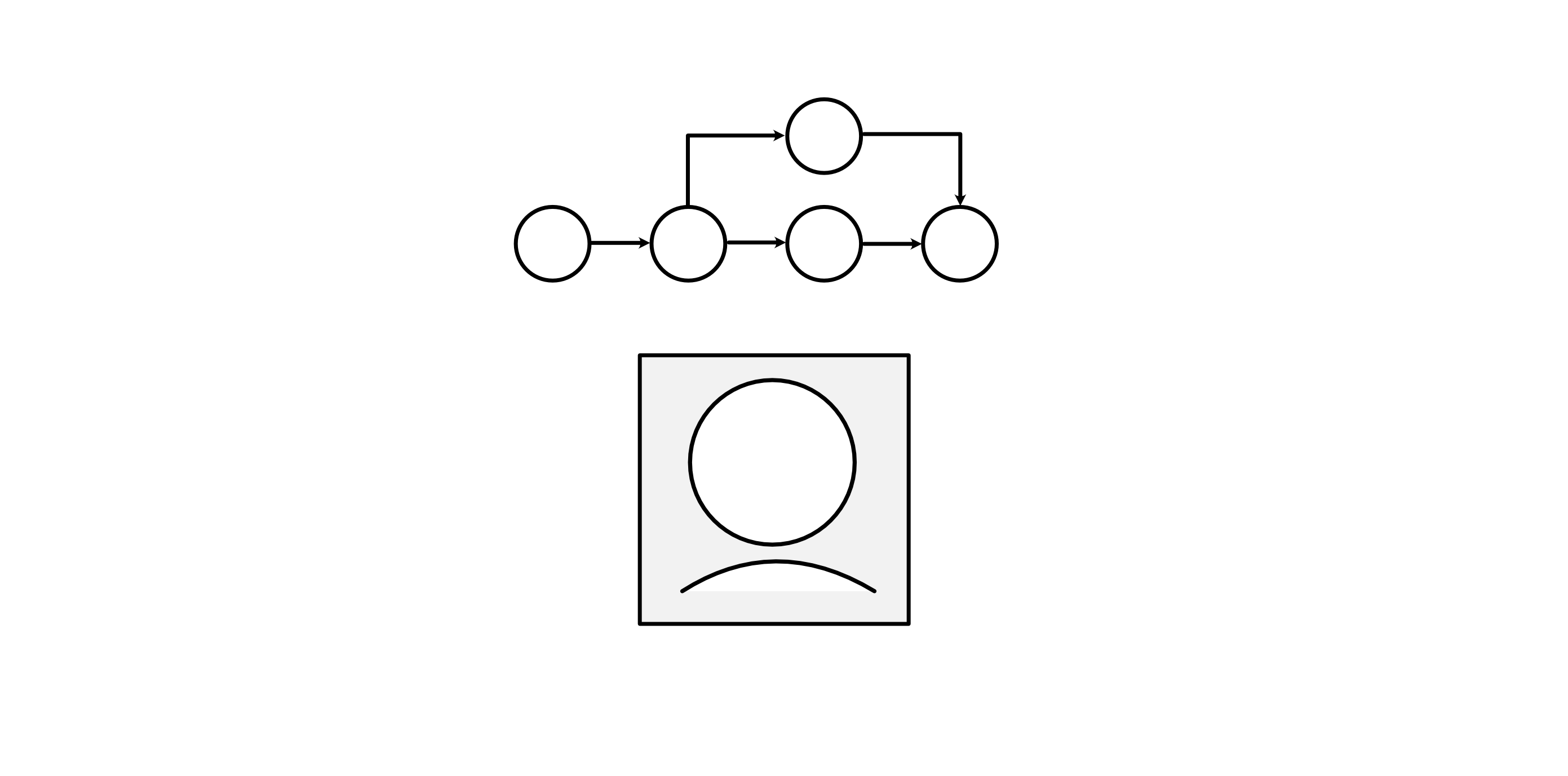 Humanist IT: getting unstuckuxdesign.ccDiagram of a person in a box, crowned by a closed process. Image by the author,2025.The short version: IT is broken. Its not working, to the point where people are ready to give it up, just like they would a mangled hammer. I think the brokenness is rooted in a lack of humanism: it doesnt work for people; it uses people towards the builders ends. Its also more complicated than that, which I parse through while also giving a clue about how to get out of beingstuck.At the end of this piece, there are intros to two concepts and a book. Truth is, Im on the edge; I shouldnt be publishing it like this in the usurious world we now live in. Any business person would tell me to build it and sell it if I am so certain its useful (and I am). But I freaking love information. If we dont pull this backif we dont start offering nodes where it works again, showing through juxtaposition that the brokenness is a product of decisions rather than fundamentally bad toolswe lose IT. It is an act ofhope.Information technologyinternet, genAI, software, all of itis stuck. Ive heard more people in the past month want to walk away from using what they consider irredeemably broken tools than I had the three years previously. The first time I heard it was from a developer, complaining around seven years ago about all the move fast and break things brokenness. In other words, this isnt a sudden awareness of an idea, but an escalated spreading of astance.Its supported by the recent upswing in people deciding to return to analog media, concerns about how to fix the infrastructure AI is breaking, so much fuckupedness in what AI is enabling, deeper usury of platforms, degrading previous workhorse productsand so much more. Really, the shift is that its so bad non-technologists think itsbroken.People get stuck, not knowing how to break a cycle, a routine; sometimes not even able to pin down this sense of disquiet and frustration to, oh, Im stuck. Enough of it happens, and cultures get stuck. Get enough cultures stuck, and society getsstuck.The thing about getting stuck is that its predicated on information. Were doing the same thing over and over again because this is how we problem-solved an information set. Various pressuresall constructed. Really.keep the problem set static, so there seems to be no otherway.Anything that has information can get stuck. Our internet, software, IT infrastructure, etc., is information before its technology. Our businesses are information before theyre profit centers. People are information beings; information is invested in everything wedo.Theres always another way. Theres ALWAYS a choice. The choice might not be something warm and fuzzy, but theres a choice. If someone tells you there is no choice, or there is only one way, they have an agenda and it needs your complacency (at least) or physical/mental/emotional energy (preferred).Information technology was stumbling along for so long, and then: stuck. Quality and service issues, creating frustration, locking us in, locking us away from possibility, requiring very specific pathways to make things work, only in the way the builders want it to work. Cory Doctorow focused on the how of enshitification. Ed Zitron focused on the why of rot economy. This isnt new, its notunique.Big tech built for stuckness.It doesnt have to be this way. The way out of being stuck is to expand the problem setto understand the domain of where the stuckness livesand then realign withinit.It sometimes means giving up one of those intractable pressure points that became more prioritized than its actual worth, once its seen against the larger domain. Sometimes it means seeing a wonky decision for its real value, changing your mind, and reworking the problem. Sometimes its as simple as seeing a workaround that was previously unseen.To see the possibilities, we need diversity. Its really that simple: dont assume everyone is the same, and dont keep them stuck. Honor humanity for our totality, and people for their specificity; and then build dynamic information around everythingeverythingwe can think of. Since our perceptions are a limited subset of reality, we will iterate. Maintenance and recasting need to be built in as standard worklines.Getting stuckGetting stuck is actually really easy. It comes from a belief that choice is governed. It can have a thousand options within it, like all the potato chip flavors youre hit with as you walk down the snack aisle. It can feel like youre dealing with TMI, when actually youre dealing with a governed data set that is exorbitantly expansive, exhausting to peruse, sensing that if you just kept at it another minute youd see exactly what would hit the spot, and still requires compromising yourgoals.Governance goes beyond data sets. Governance is also in our user pathways, our processes, and how well or poorly our digital information structures mesh with real-world information structures. And once we see that the structures are also in real-world, its easier to see that governance can also be behavioral. Human.Monopolies love stuckness. What they are doing informationally is curtailing a governed information set, forming or leveraging some kind of requirement, and then working to get as close to a single option as theycan.They saw a problem and offered a solution. Other people saw the same, offered a different solution, and the solution set became sharedno one had 100% of the potential market base. But in the process, more people liked the full set of available pathways, decided this was a problem worth solving, and bought in. That creates a governed dataset.If enough people buy in, and what was once a solution now becomes an expectation, that sets a requirement. Thats governed processes.Maybe the business is befuddled by humanity being a part of their information setwhich they are, always, because humanity and information are inextricably intertwingled. Humanity can be enough of shift that the designed infrastructure doesnt work to business wishstates. The only option the befuddled business sees to increase market share is to buy other outfits that seem to have figured something out. It might even be to try to cross-pollinate whatever the purchased company figured out. But in subsuming instead of mixing in, they lost the humanist spark that made the whole shebang work; to them, it lookedextraneous. They are bigger, but still not understanding the key ingredient. They try again. All along, they are governing human behavior through lack of supporting information structure.Maybe they were urged to it through social and financial pressures. Maybe they were provided a blueprint in their education that they never questioned.Maybe they are assholes.There are hundreds of behaviors that could get the ball rolling, and keep it going. The endstate is still the same: anti-competitive behavior until its an non-competitive market.A monopoly is imposed stuckness. If it becomes required, even better. Situations like losing cellphone communications leading to a lack of work, which is needed to survive, makes cellphones a necessity. The stuckness isnt just about a companys monopolistic behaviors. Its about the cultures and social expectations that surround the products use. Expectations too deeply and unquestionably grasped are a social governance.Most regulations (not all), including those around monopolies, are put in place because some asshole decided it was ok to cause wider harm as long as they could make some money doing it. Those regulations are necessary for society to function. For whatever reason, we have a bunch of people who seem unable to understand that money is an abstracted construct that goes away if people go away. Poison water, people die, they no longer produce what could be sold, no money. Pollute the air, people die, they no longer produce what could be sold, no money. Nuclear war, people die, no money. Climate change, food cant be grown, people die, no money. Control the production base of a necessity, charge too much, people cant afford to eat, people die, no money. Its not the next step, but its setting up the dominos in a way that gets harder and harder to shift in a direction of people-not-dying and money continuing to have the conceptual foundation of exchange betweenpeople.We are hitting the ceiling of yes-and that just heightens what is already in the mixthat adds to the governed data set, thinking we just need shrimp-and-pickle-flavored chips.We need the yes-and that transforms, that adds a whole other facet which in turn adds complexity and possibility. It is going to the network and saying, and now well include this node, too; and to do that we need to balance with this node, and Thats how we find ourchoices.And someone is going to not like what those choices are. The trick is to find that pathway that is broadly humanist.ChoiceDiagram of a person in a fuzzy box, crowned by a subjective process and surrounded in a see of additional nodes. Image by the author,2025.Underlying the baseline function of a governed data set is a thread of controlling behavior. The same playbooks are used in egregious monopolistic behavior, 1:1 abusers, cults, and authoritarian regimes. Its primary tool is simplifying information down to a false choice. When that doesnt work, start lying. When lying doesnt work, start hitting, or killing off the competition, or policing the streets over-armed. In other words, forcefully curtail choice. Moat the information. Lock them in. Scarethem.To get an effective list of the behaviors involved in controlling others is as simple as studying dark triad. Those behaviorslike siloing, gaslighting, love bombingare all behaviorally informed levers to manipulate information into a false choice. Not everyone using these behaviors are dark triad; but they are probably within a few degrees ofone.If all the choices boil down to one option, like use genAI or get left behind; its not a choice. That phrase, in context of our economic model, is a threat. Getting left behind is just an exchange for or else. In this case, it means no longer making money. Its really just one option: use genAI. This should be making people incredible suspect as a startingpoint.When we oversimplify a user path, were removing information, which also changes the flavor of the choice/non-choice being made. When we hide the ability to cancel, were gaslighting. All the patterns of deceptive design are rooted in manipulating information to manipulate people into a falsechoice.Curtailed choices are everywhere in our IT. They have become the norm. In the push to simplifyto make a flow so easy people could do it while barely paying attentionwe often scoped too finitely. We called all the things we didnt really want people to do or be edge cases, vowed to circle back someday, and then started a newMVP.If those edge cases were 60% of our users, we didnt know because we were focused on the positive-form metric of what we were tracking. We didnt track what we didnt want to see. We tracked what made our company feel good, what gave us a sense of job security, or stroked the ego of someone with too muchpower.As more companies did this, it sent out everyday waves of frustration. Little curtailments, scattered everywhere. It is the status quo, so its hard to see. But little by little, the frustration grew. Little by little, stuckness coalesced.People get stuck because information getsstuck.Information, usually, that has been simplified without allowing for easily found, increased density and/or alternative, functioning pathways. I am positive that some of this is because our industry was following best practices; following where others had proven the least pain-inducing (but still painful for some, even sometimes most because of how best practice is calculated) experience.Some of it is because information technology is constructed and documented information. When you build information to spec, manipulating it at the source is incredibly tempting for some of our individuals. They developed metrics of success that often implicated the deceptive behavior they built in the information, and werecopied.We gotstuck.How to getunstuckDiagram of a person centered in a rough network, crowned by a subjective process with optional links to the network. Key nodes are highlighted, some with pathways to connect and one with a pathway to find. Image by the author,2025.The way out of this is both incredible simple and incredibly complex, and it is almost the samephrase.Understand the domain. In other words, understand the context; reach for the yes-and that adds nodes to transform, not just a heightened expression of whats already there. Make a bet, experiment, and see what finds traction without resorting to pressure, hype, and falsechoices.The hard part is understanding domains. When we scope a problem to solve, we are trying to wrap our heads around a finite set within a perceptually infinity. We do that by picking out a border, restructuring the informationwith betsand seeing if, how, and how-well it works. Thats information structure, and it can be a complexbeast.Information is also entirely human. All the human behaviors that so many of us have decided need to be shamed, or denigrated, or dismissed, or non-existent to perception still affects our information. All the manipulation that some of us do so well, and others of us are copying in hopes to increase some facet of sensed success, still affects our information. All the points of dissonance, some real and debilitating and some sensed and used as reason for a manipulative power play and an excuse for aggression, still affects our information. All of our ability to love, find connection, and to work together, fix and buildits all in our information.And all of thatall of the complex structure, all of the humanityare in time. What we know now is not what well always understand as meaningful. What we have understood can follow us for ages, when there is some delightfully prescient nugget of encapsulated meaning. We work together for a sensed future, fix what doesnt work, build more, and keep the food growing and the lights on. Especially if the things we depend on arent functioning well in the overall system, we need to understand them and shiftnot go hungry or make electricity a luxury. None of these are throw-away functions; all of the people focused on any of our continued existence should be honored. Right now we dont, and its pervasive.All of this functions more fluidly, with less pain, when we understand the information as close to reality as we can currently conceptualize.We bring it all back in closer alignment with reality by reformulating information to be humanist; in our policies, in our laws, in our information, and in ourtools.I have two forms to help people more easily see it is possible, as well as how I understand information. Both forms are based on work done in my own time, outside of NDA, and were not a financial zero-sum situation; they came at a cost to me. Using it, or springboarding from it in the same general form? Pay me. Business or invested startup, pay me like you would your best experts. Start or continue your humanist streak by treating me as a real person with living expenses. Bootstrapper or non-profit, buy me a coffee. Links for payments and all three documents are on https://www.lenthic.com/humanist-it.In my grandest dreams, I hope that many will use them. A single point of entry, while capitalistic and keeping me fed maybe at some point in the future, is too small a ripple for how broken it isnow.No AI was used to research, create, write, or build any ofthis.Prioritized searchSearch right now is returns based on all kinds of information being smudged for us in the background, not by us as the immediate problem solvers. Its a bit of a mental twist, but not a huge one. Look at it. Exists already, right? Look at it again. Its not that it exists already (at least as of this writing, that I or my longest-standing IT cohort are aware of). Its that its very closely aligned with how people think outside of the binary. And yet, it smudges the binarymaking the returns slightly impreciseby using multiple binaries and a precise data set. If someone had seen it, we could have done it ten yearsago.The presentation goes through the cognitive function, interface, logic, and potential expansions after the big push of the initial data cleanup and coding is complete.What this concept alsodoes:conceptualized to honor peoples data privacy: no need to pay data brokers; not relying on user data reduces temptation for hacking your systems, so it might reduce securityevents;honors peoples ability to troubleshoot their own problem solving, capturing unknown/unanticipated long tail conversions;helps to level the playing field for small business, creating more competition and more options in a dynamic marketplace;long-term reduces metadata maintenance by not having to think of and manage adjacencies.Riffpoints architectureIt started by trying to fix my own annoyance at having to spend so much time just churning through design files. There have been limited designer-time savings pushed through to the design functions since Adobe first cracked how to get all the elements of design encoded. More effort went into genAI design software, which doesnt live up the to precision that is expected from and by designers.There are solutions available by leveraging well-architected design tokens. On the development side, there is opportunity to be able to open up the site to be accessible by any sightedness.The presentation goes through the architecture, what drove each subset, and what can be enabled by the architecture.What this concept alsodoes:Reduce design churn time while improving consistency and maintaining precision; how effective that is depends on business stakeholders willingness to work with designers, and potential updates to existing design software or development of new design software;Potentially optimize for any-sighted accessibility, making it so there are no invisible inks;Offers an alternative to the environmentally wasteful imprecision of genAI with sustainable precise fluidity.MovementsWhat I do isnt magic. Its complexthe below image is the traced connections in the bookbut it is explicable. Ive been working on it for a lifetime; it took five years to write what I currently understand. The copyright remainsmine.Humanist IT: getting unstuck was originally published in UX Collective on Medium, where people are continuing the conversation by highlighting and responding to this story.0 Commenti ·0 condivisioni
 -
What digital UX can learn from the physical media revivaluxdesign.ccVinyl, CDs and cassettes are back. What does it mean for designers?Sony Walkman WM-2011. Photo by FlorianSchmetzPhysical media has made a comeback. Sortof.While the masses are hardly abandoning streaming giants like Spotify and Netflix, something real is happening with the archaic formats they supposedly left behind forgood.And there are lessons to take away for anyone working in digitalUX.Whats happeningandwhy?Vinyl has experienced a sustained resurgence recently, with record sales steadily rising each year. Last year CD sales increased year-on-year for the first time since their peak in 2001. This year, theres been huge growth in sales of cassette tapes. Some people are even returning to DVDs. Maybe next year well start seeing signs of a revival for VHS or LaserDisc.Vinyl sales 20162023. Source:LuminateIts tempting to come up with one simple explanation for this data. But like most things, its more complicated than that. Here are a few nuances driving thistrend:Nostalgia: Aging Millennials and Gen Xers revisiting the tech of their youth, rediscovering memories and breathing new life into their CD or cassette collections.Practicality: Streaming services and their content are becoming increasingly fragmented and ephemeral. In response, more people are buying physical media so they physically own their music and movies (and it cant suddenly disappear).Culture: Retro music aesthetic and vibes are officially cool, thanks to pop culture phenomena such as Stranger Things and Guardians of the Galaxy. Stars like Taylor Swift are also putting out huge amounts of vinyl, CDs and tapes for fanbases who want to collect everything.Interesting sidenote: 50% of people buying vinyl dont even own a record player. But before rolling your eyes, consider if youd do the same about a sci-fi geek that collects mint-in-box toys with no intention of every playing withthem.While all these factors help explain this mini revival of physical media, the one that matters from a design perspective is the user experience of interacting with these archaic technologies.The UX of physicalmediaPhysical media and devices have texture. Weight. They have sensory controls, like clicky buttons, snappy lids, twisty dials and smooth sliders. You can see and hear the technology working: it crackles, hisses and spins in a viscerally satisfying way. It also has quirks and imperfections, which somehow makes it feel more human. Finally, it forces us to slow down, grounding us in the present with its format limitations and feature constraints. There are no software updates. No apps. No distractions.Cassettes are a tactile experience. Photo by cottonbro studioMaybe this appeal is accentuated by the relentless pace of technological development, specifically AI.In a world thats changing so fast, that feels so fleeting and full of existential considerations, perhaps were drawn to experiences that are tactile, unchanging and easy to understand.And in a media landscape thats become complex, opaque and driven by algorithms, the simplicity of choosing something from a limited physical music collection and going through the ritual of playing it is comforting.We should also consider the physical devices we play these formats on, which can be beautifully designed objects in their own right. Consider the aesthetic of either a vintage or sleek modern record player; products that both perform functional utility, but can also be displayed on a shelf as an object to be appreciated.Record players can create a vibe. Photo by Alice KotlyarenkThe drawbacks of digitalmediaIn contrast to physical counterparts, digital media products and services are all about convenience, speed and technical quality. In many ways, this is a good thing: weve designed a world where accessing media is quicker, easier and more reliable.But it also means weve started missing out on all the pleasures and benefits of old school physical media and devices. And thats because our tools and technology have trended towards flat screens and homogenised interactions.The obvious example is the smartphone, which has consolidated countless tools (camera, calculator, notepad, music player, etc) into a single device. While this is obviously convenient, its created a ubiquitous interface where every interaction and all intent is expressed through the same scrolling, swiping, pinching andtapping.Emerging technologies are taking it a step further to become even less tactile: AI, VR/AR, voice user interfaces (VUI) and brain-computer interfaces (BCI) promise a future that requires only gestures, speech or simply thought to interact with the world. While this brings ever increasing speed and convenienceas well as empowering users with disabilitiesit takes us even further away from the textures and pleasures of physicaldevices.And then theres the issue of unlimited choice and instant gratification.Today, we can consume everything, everywhere, anytime, immediately. But this can make media feel less valuable. More disposable.And unlike physical media, where skipping tracks and changing albums are more difficult, theres no need to stick with anything. As such, we miss out on stuff we might enjoy. And Gen Z seem to have figured this out better than any of us, because theyve been leading the revival of physical media more than any other generation.So what can digital UX learn fromthis?Firstly, we need to talk about the trap to avoid: simply making your interface look a bit like physical controls. Theres a reason why UI trends like neumorphism (new skeuomorphism) have never really taken off: it coveys the semblance of physical controls while not feeling or behaving like them. The allusion to depth and texture creates a disconnect between what we see, expect and experience; an uncanny UIvalley.Neumorphism hasnt taken off. Image by JustinmindInstead, designers should go deeper than interface aesthetics to consider what psychological needs physical media meets that digital products dont(yet).Here are some suggestions1. Reduce choice and embrace constraintsHaving access to practically all the films, TV series and music ever made sounds like a good thing. But counterintuitively, the more options we have, the less satisfied we feel with our decision. This is a concept called the paradox ofchoice.Choice paradox occurs because having too many choices requires more time and cognitive effort, leading to decision fatigue and increased regret over ourchoices.The classic example of choice paradox is the jam experiment, which showed people were more likely to make a purchase when presented with fewer options. While these sorts of studies and behavioural psychology nuggets have hidden nuances, they do suggest a problem with media streaming: we have too muchchoice.The classic jam experiment. Source: ModelThinkersThe human race has probably collectively wasted whole lifetimes stuck in a loop scrolling through movie categories and song playlists. This abundance of choice causes mass indecision, as we know if we keep searching we might find something better from the bottomless bucket ofcontent.So whats the solution? Well, using physical media as our inspiration one option is to reduce the abundance of choice for users, e.g. fewer categories, fewer playlists. This could be complemented by adding constraints to the user interface. For example, making it harder to skip a track, abandon an album or even monthly limits on albums to listen to or save in yourlibrary.Im fully aware how thissounds.Why would anyone take away user control and enforce arbitrary restrictions? Wont that lead to subscribers jumping ship to a competitor who gives them everything theywant?But what if it actuallyworks?What if less is more, and these changes actually improve the UX? Instead of flitting from one thing to another, users might prefer enjoying media within constraints, and being more present in the experience. Rather than this experience being the default, it could be offered as a different subscription tier or simply a settings opt-in for those who want to tryit.2. Less personalisation; more customisationPersonalisation sounds great in theory: algorithms learn what you like, then give you more ofit.But in reality, personalisation works against us, reinforcing our tastes by constantly spoon-feeding us more of the same. Its like going to a restaurant where the menu is based solely on what you previously ordered there. Sure, you can go off menu to find something a bit different, but youre working against how the experience has been designed.And this design didnt come about by accident. Its intentional.Media streaming platforms want to push content youll probably like to stop you leaving. So they overwhelm us with personalisation, engineering passive consumption that traps us in a loop of the same artists andgenres.This is all a bit like a marriage of convenience we wearily accept so we can still do what we wantplay music, films and seriesonline.But what many of us need is to arrange our streaming experience the same way we would with physical media collections, devices and accessories. I dont just mean organising an app library, but allowing users to customise UI layouts and categories. For example, instead of seeing endless automated playlists, we might like to organise our app home screen to show trending albums, or simply the latest releases by artists wefollow.A bad Spotify user journey. Image byauthorThe screenshots above show that to find a simple list of new music by artists you follow on Spotify you have to exit the main interface and go into this odd Whats new screen. Why cant users configure their home screen to see this? Its like Spotify doesnt want you to make active choices, just passively consume the first generated playlist they put in front ofyou.As with the previous suggestion about choice and constraints, customising your layout would be an opt-in thing rather than every user being tasked with the mental load of configuring your ownUI.Perhaps we might also want the interface to have more of a human touch, and see recommendations by real people with something to say about it. Which leads meto3. More human curation and recommendationsFinding new shows or music to enjoy on streaming services is an isolating experience. Its just us and the algorithm. While its perfectly possible to search, navigate and find things to consume, its all very impersonal. Its like the interface is saying heres the content, take it or leaveit.Of course, theres no way to replicate real-world word-of-mouth recommendations or music shop suggestions which create human connection and a sense of like-minded community, isthere?Well, maybe thereis.Years ago the UK book chain Waterstones started adding personal notes written by staff for selected books. It added a real human touch, and even inspired customers to cheekily start adding their own hand-written notes. With a simple change, the shopping experience felt more like being part of a community ofreaders.Waterstones staff notes. Source:RedditThe suggestion here is that streaming platforms add or increase the level of human curation and recommendations to their services.What would this look like in practice? Well, for a start there should be more human-created playlists and fewer generated byand featuringAI.There should be a greater sense of humans curating the best content to watch or listen to, rather than users feeling powerless and at the mercy of algorithms.At a granular level, this would involve staff notes on albums, playlists, TV series and films. Not just an Editor picks featured list, but actual human commentary similar to the Waterstones notes. Users could get involved tooperhaps there could be a system for them to submit personalised recommendations for their favourite albums ormovies.All of this would make discovering new content feel like a human, communal experience rather than a battle against technology to find something different.4. Get creative with retro emulationsWait, didnt I say dont imitate retro tech aesthetics?Yes, Idid.But Im not talking about controls, but the experience of the playbackwhat we can do to evoke the feel of enjoying media on physicalformats.Heres one example: in addition to users being able to toggle between audio and music video modes when streaming a song, allow them to switch to a cassette playing view that transformations their screen into a vintageWalkman.If Spotify emulated the Sony Walkman WM-24. Image byauthor.Users could choose their Walkman style from pre-set options, or create their own (possibly using generative AI). They could even opt to emulate the sound of a cassette, e.g. some gentlehiss.The visuals, sound effects and constraints could combine to create an immersive experience that encourages users to be present and minimises distractions.Similarly, video streaming services could offer the option of an immersive VHS player mode, which changes the aspect ratio and adds a grainy tape filter. Skipping through the video could emulate video tape fast forward. Live video could include the red record dot flashing and a date in a retro digital typeface. You get theidea.These are just random ideas, which Im sure you could improve through some iterative, collaborative, user-centred design. But the point is to give some users the option of emulating fun aspects of physicalmedia.SummaryOk, heres a summary of what UX designers could take from physical media to make digital streaming feel more human, more communal and more satisfying:Reduce choicedecreasing cognitive load, decision fatigue and userregret.Add constraintsmaking it harder to skip through or abandon content, grounding users in the present and appreciating what wed otherwise miss.Less personalisationthis traps us in a loop of repeated behaviour, avoids challenging us and limits discovery of different content.More customisationletting users configure and organise their streaming interface the way theyd have control over their physicalmedia.Increase curationadding more humanity and community to the experience of exploring and enjoyingmedia.Retro emulationsallowing people without physical media the chance to enjoy the vibes of playing a cassette or videotape.In some ways a lot of this is just better application of existing UX principles and heuristics, like minimalist design, constraints and user control. But its also a way to rethink some of those principles. For example, user control shouldnt just be about being able to do more with an interface, but choosing to doless.ConclusionThe lazy reaction to the physical media revival is to dismiss it; hand-wave it away as a small-scale and short-lived trend. After all, there are good reasons people abandoned these formats for MP3 players and then online streaming. And even now unit sales of vinyl, CDs and cassettes are a tiny fraction of their respective heydays.But I think thats amistake.Theres a lot digital UX can learn from why people are increasingly engaging with supposedly obsolete physical media. Theres something about interacting with limited physical objects that scratches a psychological itch, and in our modern world their constraints become the USP, and remind us what we trade off for speed and convenience.Im not proposing a full-on nerfing of media streaming. But perhaps by reflecting on what we appreciate about physical media, designers could improve the UX to scratch those itches digitally. And theres probably a balance that can be foundbetween:default features (enhanced human curation/user submissions)opt-in features (user customisation, reduced choice, constraints, retro emulations, etc).While this article feels like its only aimed at those working for huge streaming platforms, there are surely lessons all UX designers take from this, e.g. scaling back personalisation, or re-thinking how to implement constraints to improveUX.As for the streaming giants themselves, its possible theyll decide to do nothing. Because they think they dont need to. Were already using these services, and we have very few like-for-like alternatives. So why try harder? Why invest in more designers/curators, and more user-centred design?Well, all I can say is if they do take that attitude, they shouldnt be surprised if people increasingly shun enshittified digital services and spend more time playing records and CDs, making actual mixtapes and maybe even resurrecting the once mighty DVDboxset.The choice istheirs.What digital UX can learn from the physical media revival was originally published in UX Collective on Medium, where people are continuing the conversation by highlighting and responding to this story.0 Commenti ·0 condivisioni
-
What grief can teach us about the future of designuxdesign.ccThe loss AI brings to the design industry could be what clarifies its truepurpose.Photo by Ann onUnsplashWhen my father died a few years ago, it changed me. We had a complicated relationship, but as adults, we did our best to mend the past and build something better. After he passed, I held onto the good memories, but I also regretted the things we never got the chance to do while he wasalive.Thats how grief worksit strips life down, the noise falls away, and whats left is a sharper sense of what truly matters, a new way of seeing the people around you that you never hadbefore.Lately, Ive been looking at design through that same lens. And while much of what I write may sound jaded and cynicaleven doom-and-gloombeneath it all, Im an optimist, always searching for meaning in thechaos.Grief shatters what we thought was stable, forcing us to confront what remains. In a way, AI has created a similar quake. Its unsettled many of us because the design world we once knew has withered, and it isnt comingback.Yet this loss doesnt mean design is gone. If anything, it requires us to find meaning in the turmoil and ask what design truly is, and what it still has the potential tobecome.Heres the differenceAI can generate outputs. It can mimic styles, assemble patterns, and even simulate decisions. But it cant create meaning. Meaning is rooted in memory, context, and emotion. Machines dont live, so they cant feel the depths ofbeing.Thats why our role as designers is more important than ever. The future of design isnt about competing with AIits about doing the one thing AI cannotcreate meaning. Our work will be to take the flood of machine-made material and shape it into something that resonates with human experience. To inject life where the machine only providesform.So while the design industry we knew is gone, like any loss, what remains isnt just absenceits the clarity of what truly mattered.Pre-AI design often obsessed over surface interpretations. We argued skeuomorphism versus flat, minimalism versus maximalism. But in the end, those were arguments about veneer, notpurpose.Even UX design itself fell into this trap of superficiality. A field that was supposed to champion human-centered design sometimes reduced itself to surface buzzwords like user delight, seamlessness, and frictionless flow, while the systems of meaning beneath remained unexamined. In that sense, AI isnt just disrupting the visible layer of designits revealing how much of what we called design was little more thantheater.Now that AI can generate those same facades instantly, the truth is clearersurface was never the point. What mattered was the meaning beneath it. Skeuomorphism worked because it made unfamiliar technology feel approachable. Flat design resonated because it spoke to a cultural hunger for clarity and efficiency. Frictionless flow isnt just about ease of use, its about building trust with the unknown. These werent just stylistic or usability choicesthey were reflections of the human experience.And yet, despite this deeper role, many will still argue design is on the verge of obsolescence. Some, like Greg Nudelman suggests that when it comes to AI-first design, where the boxes are, or what color, or labels, etc., almost doesnt matter. Even Ive written about this topic not long ago, arguing that AI will render traditional design obsolete by bypassing the very processes design was once neededfor.On the surface, these arguments seem rationaluntil you remember that humans are anything but. Take music, for example. From a utilitarian perspectiveor even a purely biological onewe dont need musicat least not to survive. Yet music gives us connection, meaning, and experience. The same is true for design that reaches beyond utility. It may seem impractical, like the ornate details of a historic church, but it generates meaning that transcends a pragmatic approach todesign.One could argue that machines can now generate music or images of beautiful architecture. But have you ever stood in front of a band you love, swept up in the emotional charge as the sound shakes through your body? Or stood at the foot of a historic building, in awe of its presence? Those are experiences no machine can replicateand thats the kind of resonance we as designers should be strivingfor.By this definition, its easy to confuse design with art. However, design has always been, at its core, a form of communication. And communication isnt confined to the transactional or utilitarianit can also be symbolic, emotional, even spiritual. Much like art, yes, but not quite thesame.A beautifully designed object, interface, or space doesnt just functionit says something, it connects, it resonates. Thats what separates design from raw aesthetic expressionit speaks to people in ways that guide understanding, foster connection, and shape experience.Moving forward, our focus has to be understanding the needs and meanings design expresses, not chasing whatever form happens to be popular or usable. Machines can spin out endless variations based on this criteria, but only humans can connect those forms to culture, memory, and lived experience.So yes, design as we once knew it may be gone. But in its absence, weve been handed something invaluableperspective. The reminder that meaningnot surfaceis what endures. And thats the part of design we carryforward.Dont miss out! Join my email list and receive the latestcontent.What grief can teach us about the future of design was originally published in UX Collective on Medium, where people are continuing the conversation by highlighting and responding to this story.· 0 Commenti ·0 condivisioni


 1K
1K
-
 Why designing terrible solutions makes you a better designeruxdesign.ccApplying the anchoring effect to design practice.Heres a nutty idea: designing terrible solutions makes you a better designer. I know that sounds backwards. Designer portfolios share only the most pristine of examples. And were taught about efficiency and time savings. Best practices tell us to move fast, fail fast, and get to good solutions quickly. So why waste your time thinking about the worst possibleoption?Just a few weeks ago, I was working with my team to reinvent a complex workflow. We were struggling a bit. Stuck in the land of today. Instead of jumping straight into good solutions or what might be better, I provoked the team by asking to produce a deliberately badversion.What happens if you design bad solutions onpurpose?What happened next surprised us all. As we looked at what we thought would be terrible solutions, we discovered they had some redeeming qualities. Elements that seemed obviously bad at first glance turned out to solve problems we hadnt even identified yet. Our bad solutions were teaching us about the problem space in ways our good thinking never could. Plus, as we intentionally worked towards a bad option we better understood what did and didnt work for theuser.That terrible solution acted as a powerful filter for what it means to be good. The critical point was that we knew we were creating terribleoptions.The Single OptionTrapMost of the time we think were exploring when were really just optimizing minor variations of one good solution. We brainstorm solutions that are all reasonably acceptable (and eerily similar), tweak them until theyre slightly better, then pick the least problematic (cheapest) option.Butif you only explore acceptable solutions, how do you know what makes them actually good? Whats the definition of good? Something thats good is only good if its in juxtaposition to something thats bad. And if bad is the complete absence of a solution, then the bar is set prettylow.Its like trying to understand fast without ever experiencing slow. You might think youre ripping down the highway in your eco compact car, but you have no reference point to judge againstuntil a hot rod nearly blows your mirrors off as they pass you. The false efficiency of jumping straight to the right answer leaves us designing in avacuum.One of my cherished design mentors used to say, Its not design if you only explored one option. Lets push it a bit further: its definitely not great design if all your options exist in the same narrow band of acceptable.Without contrast, were making design decisions based on assumptions and feeling rather than understanding. Were optimizing within fake constraints instead of discovering the actual boundaries of our problemspace.The Psychology: Anchoring Effect inDesignTheres a well-documented psychological principle called the anchoring effect. When people make decisions, the first piece of information they encounter becomes an anchor that influences every subsequent judgment. Show someone a high price first, and even a discounted price seems good. Start with a low number, and everything else feels expensive.Without context, any option is subjective.In design, we rarely think about what were anchoring to. We start with existing patterns, competitor solutions, or our own assumptions about what good looks like. But what if we intentionally anchor our perspective to something horrible?When you establish a genuinely bad reference point, something magical happens. You start to pencil in defined boundaries. You can finally see the difference between acceptable, actually good, and incredible because you understand what completely broken lookslike.Without that bad anchor, good enough becomes your ceiling. You dont push further because you dont realize how much room you have to improve. But once youve introduced your partners to some truly terrible solutions, the path to breakthrough thinking becomesvisible.The same option in context suddenly seems different.The Method: Systematic Questions for BadDesignThis isnt about randomly making things worse. Its certainly not about shipping bad solutions either. To be productive with terrible design takes intention. I have a few helpful questions that help reveal the edges of any problemspace:What would make this experience completely unusable? Dont just think hard to use. Think impossible. What would make users give up immediately and neverreturn?What would hide the value so users never feel it? Even if your solution works perfectly, how could you ensure users never realize its helpingthem?What would utterly destroy user trust? What design choices would make users question your credibility, your motives, or your competence?What could make this impossible to find or access? How would you ensure the people who need this solution never discover itexists?What would make this take 10x longer than necessary? Not just slow-painfully, unnecessarily, infuriatingly slooooow.What would make users feel stupid or frustrated? How could you design something that makes people question their own intelligence?When I work through questions like these, I typically keep it low-fidelity (and encourage my teams to do the same). Quick sketches with a marker, pencil, or favorite pen. Keep them like rough wireframes on a whiteboard. The goal isnt to build terrible things. Its to understand what makes things terrible. So, dont spend too much time here, but just enough to learn fromit.Boundary Discovery vs. Constraint AcceptanceEach terrible solution you sketch teaches you something essential about the shape of the problem. Terrible solutions (along with good solutions) help you feel the edges of the problem space youre interacting with.Most designers work within perceived boundaries. Things we think are true, but have to assume for lack of information. But until you push against those boundaries and see what actually breaks, you dont know which constraints are real and which are just assumptions to restore comfort in the world of design problem ambiguity.Theres a crucial difference between constraints (what you must work within) and boundaries (what breaks the solution entirely). Constraints are negotiable. Boundaries arenot.Bad ideas help you determine the line between good andbad.When our team reinvented that workflow in the worst possible way, we learned that the boundaries we thought existed for users were in a different spot. We found that changing input methods and interaction style wasnt as detrimental as we thought. We became less focused on what was on the screen, and more focused on productive ways for users to input their information.Youre not just making stuff when you explore terrible solutions. Youre surveying the territory youre designing within. Youre understanding the landscape so you can map it and navigate it with confidence.The Innovation ConnectionThis connects to something Ive written about before: what do stakeholders want from design? The gist is that in the business rush to eliminate risk and guarantee outcomes, weve made design practice sterile. Many times, design practice isnt used to solve problems or innovate, its used to reduce risk. So, naturally we avoid anything that appears risky or impossible to validate. Which means we also tend to avoid anything that might be a breakthrough hit.Risk aversion kills innovation because it prevents exploration of new ideas that exist on the edges of the solution space. Including ideas that might be perceived as bad. However, controlled exploration of bad ideas prevents accidental bad outcomes. Its a little like a vaccineexposing yourself to a small, controlled dose of failure builds immunity against larger failureslater.You cant push boundaries if you dont know where they are. You cant create genuinely innovative solutions if youre afraid to understand the fine edge between what works and what doesnt. The sanitization of design has made us allergic to anything that appears like failure, which is exactly what breakthrough thinking requires. Just think of Dysons 1,000s of prototypes for the bagless vacuum, or Edisons 1,000s of filament tests to produce a valuable lightbulb. They werent simply failing, they were systematically exploring what didnt work to understand whatwould.When you deliberately explore a lot of solutions, including the bad ones, youre not wasting time. Youre doing reconnaissance. Youre gathering intelligence about the problem space that will inform every subsequent design decision.Making It WorkTomorrowAt this point, I hope youre thinking about how you could get started with this. It doesnt have to be complex. Just startsimple.Next time someone brings you (or your team) a design problem, spend 7 minutes sketching the worst possible solution. Dont overthink it. Just grab a marker, pen, or pencil and draw something genuinely awful. I mean abysmal. Ask yourself those systematic questions (from above) and see whathappens.Try it as a team exercise. In your next ideation session, say, Before we explore good solutions, lets spend five minutes mapping what we definitely dont want. Youll be surprised what you discover in just a few minutes. Maybe you can even give the winner aprize?Jot down what you learn from terrible ideas. Theyre as valuable as your good solutions because they teach you about boundaries, constraints, and problem edges that good solutions oftenmiss.Build this into your exploration routine, not as an exception or luxury. Make it a standard part of how you approach unfamiliar problems or early exploration phases. Keep it low-fidelity and time-boxed, and position it as mapping the problem space rather than wasting time. Even 5 minutes is valuable.This bad exploration delivers maximum value when youre dealing with unfamiliar problems, complex user workflows, or situations where you need to communicate risk to stakeholders. Its less valuable for well-understood patterns or incremental improvements where the boundaries are alreadyclear.Remember: the goal is understanding. Youre not trying to create the final solution. Youre trying to understand the problem well enough to create a final solution that actuallyworks.Including terrible options helps you determine what the best solution reallyis.Embracing Productive FailureSo yeahthis is backwards from how we typically think. Designing terrible solutions to become a better designer feels like taking a detour through failure when youre trying to reach success. As you explore terrible solutions, you start building a backlog of what suboptimal means in a variety of situations. You fill your bag of experience with solution paths that tend to fail to solve problems in specific types of situations.Its a bit unintuitive: the fastest path to breakthrough thinking sometimes takes a journey through the wasteland of terrible ideas. Not because terrible ideas are good, but because understanding what doesnt work gives you clarity about whatdoes.Design isnt about avoiding failure. Its about understanding what success looks like. And success is made clear when contrasted with failure. When you map the boundaries of bad, the territory of good becomesvisible.Your next design challenge is an opportunity to test this. Take just 7 minutes this week and intentionally design something terrible. Sketch the worst possible solution you can imagine. Ask yourself questions that surface the most painful experience. See what it teaches you about the problem youre actuallysolving.You might be surprised by what you discover in the wasteland. And you might be more surprised with how fun itis.Why designing terrible solutions makes you a better designer was originally published in UX Collective on Medium, where people are continuing the conversation by highlighting and responding to this story.· 0 Commenti ·0 condivisioni
1K
Why designing terrible solutions makes you a better designeruxdesign.ccApplying the anchoring effect to design practice.Heres a nutty idea: designing terrible solutions makes you a better designer. I know that sounds backwards. Designer portfolios share only the most pristine of examples. And were taught about efficiency and time savings. Best practices tell us to move fast, fail fast, and get to good solutions quickly. So why waste your time thinking about the worst possibleoption?Just a few weeks ago, I was working with my team to reinvent a complex workflow. We were struggling a bit. Stuck in the land of today. Instead of jumping straight into good solutions or what might be better, I provoked the team by asking to produce a deliberately badversion.What happens if you design bad solutions onpurpose?What happened next surprised us all. As we looked at what we thought would be terrible solutions, we discovered they had some redeeming qualities. Elements that seemed obviously bad at first glance turned out to solve problems we hadnt even identified yet. Our bad solutions were teaching us about the problem space in ways our good thinking never could. Plus, as we intentionally worked towards a bad option we better understood what did and didnt work for theuser.That terrible solution acted as a powerful filter for what it means to be good. The critical point was that we knew we were creating terribleoptions.The Single OptionTrapMost of the time we think were exploring when were really just optimizing minor variations of one good solution. We brainstorm solutions that are all reasonably acceptable (and eerily similar), tweak them until theyre slightly better, then pick the least problematic (cheapest) option.Butif you only explore acceptable solutions, how do you know what makes them actually good? Whats the definition of good? Something thats good is only good if its in juxtaposition to something thats bad. And if bad is the complete absence of a solution, then the bar is set prettylow.Its like trying to understand fast without ever experiencing slow. You might think youre ripping down the highway in your eco compact car, but you have no reference point to judge againstuntil a hot rod nearly blows your mirrors off as they pass you. The false efficiency of jumping straight to the right answer leaves us designing in avacuum.One of my cherished design mentors used to say, Its not design if you only explored one option. Lets push it a bit further: its definitely not great design if all your options exist in the same narrow band of acceptable.Without contrast, were making design decisions based on assumptions and feeling rather than understanding. Were optimizing within fake constraints instead of discovering the actual boundaries of our problemspace.The Psychology: Anchoring Effect inDesignTheres a well-documented psychological principle called the anchoring effect. When people make decisions, the first piece of information they encounter becomes an anchor that influences every subsequent judgment. Show someone a high price first, and even a discounted price seems good. Start with a low number, and everything else feels expensive.Without context, any option is subjective.In design, we rarely think about what were anchoring to. We start with existing patterns, competitor solutions, or our own assumptions about what good looks like. But what if we intentionally anchor our perspective to something horrible?When you establish a genuinely bad reference point, something magical happens. You start to pencil in defined boundaries. You can finally see the difference between acceptable, actually good, and incredible because you understand what completely broken lookslike.Without that bad anchor, good enough becomes your ceiling. You dont push further because you dont realize how much room you have to improve. But once youve introduced your partners to some truly terrible solutions, the path to breakthrough thinking becomesvisible.The same option in context suddenly seems different.The Method: Systematic Questions for BadDesignThis isnt about randomly making things worse. Its certainly not about shipping bad solutions either. To be productive with terrible design takes intention. I have a few helpful questions that help reveal the edges of any problemspace:What would make this experience completely unusable? Dont just think hard to use. Think impossible. What would make users give up immediately and neverreturn?What would hide the value so users never feel it? Even if your solution works perfectly, how could you ensure users never realize its helpingthem?What would utterly destroy user trust? What design choices would make users question your credibility, your motives, or your competence?What could make this impossible to find or access? How would you ensure the people who need this solution never discover itexists?What would make this take 10x longer than necessary? Not just slow-painfully, unnecessarily, infuriatingly slooooow.What would make users feel stupid or frustrated? How could you design something that makes people question their own intelligence?When I work through questions like these, I typically keep it low-fidelity (and encourage my teams to do the same). Quick sketches with a marker, pencil, or favorite pen. Keep them like rough wireframes on a whiteboard. The goal isnt to build terrible things. Its to understand what makes things terrible. So, dont spend too much time here, but just enough to learn fromit.Boundary Discovery vs. Constraint AcceptanceEach terrible solution you sketch teaches you something essential about the shape of the problem. Terrible solutions (along with good solutions) help you feel the edges of the problem space youre interacting with.Most designers work within perceived boundaries. Things we think are true, but have to assume for lack of information. But until you push against those boundaries and see what actually breaks, you dont know which constraints are real and which are just assumptions to restore comfort in the world of design problem ambiguity.Theres a crucial difference between constraints (what you must work within) and boundaries (what breaks the solution entirely). Constraints are negotiable. Boundaries arenot.Bad ideas help you determine the line between good andbad.When our team reinvented that workflow in the worst possible way, we learned that the boundaries we thought existed for users were in a different spot. We found that changing input methods and interaction style wasnt as detrimental as we thought. We became less focused on what was on the screen, and more focused on productive ways for users to input their information.Youre not just making stuff when you explore terrible solutions. Youre surveying the territory youre designing within. Youre understanding the landscape so you can map it and navigate it with confidence.The Innovation ConnectionThis connects to something Ive written about before: what do stakeholders want from design? The gist is that in the business rush to eliminate risk and guarantee outcomes, weve made design practice sterile. Many times, design practice isnt used to solve problems or innovate, its used to reduce risk. So, naturally we avoid anything that appears risky or impossible to validate. Which means we also tend to avoid anything that might be a breakthrough hit.Risk aversion kills innovation because it prevents exploration of new ideas that exist on the edges of the solution space. Including ideas that might be perceived as bad. However, controlled exploration of bad ideas prevents accidental bad outcomes. Its a little like a vaccineexposing yourself to a small, controlled dose of failure builds immunity against larger failureslater.You cant push boundaries if you dont know where they are. You cant create genuinely innovative solutions if youre afraid to understand the fine edge between what works and what doesnt. The sanitization of design has made us allergic to anything that appears like failure, which is exactly what breakthrough thinking requires. Just think of Dysons 1,000s of prototypes for the bagless vacuum, or Edisons 1,000s of filament tests to produce a valuable lightbulb. They werent simply failing, they were systematically exploring what didnt work to understand whatwould.When you deliberately explore a lot of solutions, including the bad ones, youre not wasting time. Youre doing reconnaissance. Youre gathering intelligence about the problem space that will inform every subsequent design decision.Making It WorkTomorrowAt this point, I hope youre thinking about how you could get started with this. It doesnt have to be complex. Just startsimple.Next time someone brings you (or your team) a design problem, spend 7 minutes sketching the worst possible solution. Dont overthink it. Just grab a marker, pen, or pencil and draw something genuinely awful. I mean abysmal. Ask yourself those systematic questions (from above) and see whathappens.Try it as a team exercise. In your next ideation session, say, Before we explore good solutions, lets spend five minutes mapping what we definitely dont want. Youll be surprised what you discover in just a few minutes. Maybe you can even give the winner aprize?Jot down what you learn from terrible ideas. Theyre as valuable as your good solutions because they teach you about boundaries, constraints, and problem edges that good solutions oftenmiss.Build this into your exploration routine, not as an exception or luxury. Make it a standard part of how you approach unfamiliar problems or early exploration phases. Keep it low-fidelity and time-boxed, and position it as mapping the problem space rather than wasting time. Even 5 minutes is valuable.This bad exploration delivers maximum value when youre dealing with unfamiliar problems, complex user workflows, or situations where you need to communicate risk to stakeholders. Its less valuable for well-understood patterns or incremental improvements where the boundaries are alreadyclear.Remember: the goal is understanding. Youre not trying to create the final solution. Youre trying to understand the problem well enough to create a final solution that actuallyworks.Including terrible options helps you determine what the best solution reallyis.Embracing Productive FailureSo yeahthis is backwards from how we typically think. Designing terrible solutions to become a better designer feels like taking a detour through failure when youre trying to reach success. As you explore terrible solutions, you start building a backlog of what suboptimal means in a variety of situations. You fill your bag of experience with solution paths that tend to fail to solve problems in specific types of situations.Its a bit unintuitive: the fastest path to breakthrough thinking sometimes takes a journey through the wasteland of terrible ideas. Not because terrible ideas are good, but because understanding what doesnt work gives you clarity about whatdoes.Design isnt about avoiding failure. Its about understanding what success looks like. And success is made clear when contrasted with failure. When you map the boundaries of bad, the territory of good becomesvisible.Your next design challenge is an opportunity to test this. Take just 7 minutes this week and intentionally design something terrible. Sketch the worst possible solution you can imagine. Ask yourself questions that surface the most painful experience. See what it teaches you about the problem youre actuallysolving.You might be surprised by what you discover in the wasteland. And you might be more surprised with how fun itis.Why designing terrible solutions makes you a better designer was originally published in UX Collective on Medium, where people are continuing the conversation by highlighting and responding to this story.· 0 Commenti ·0 condivisioni
1K


Altre storie
