iso.500px.com
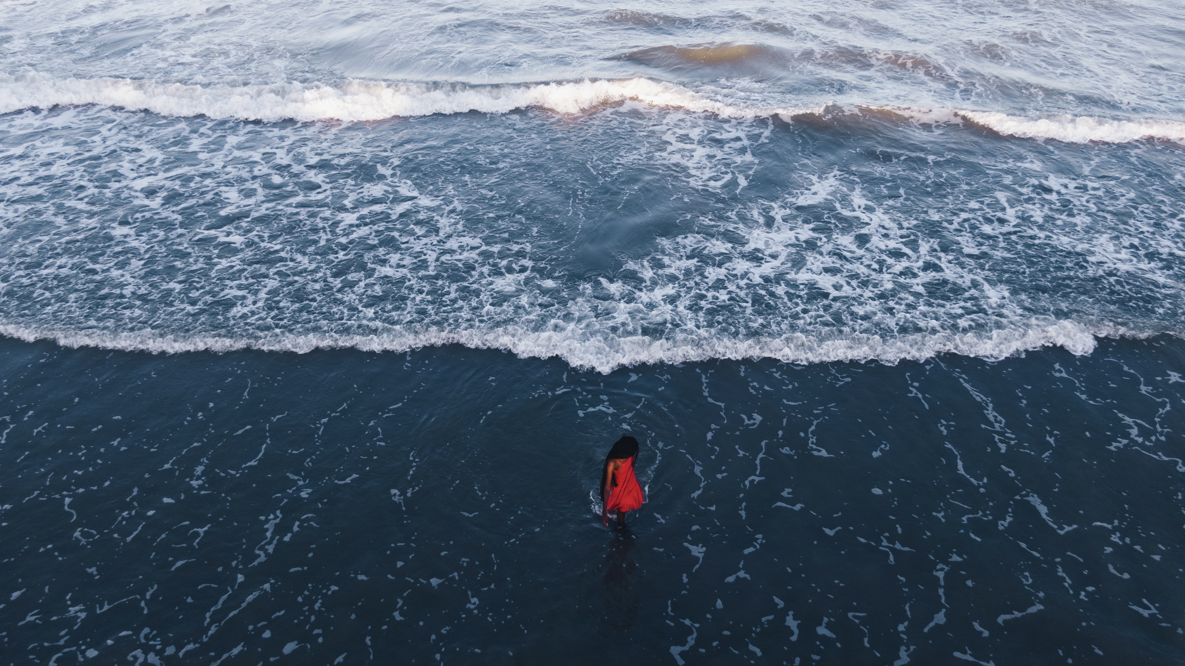
Photography is a visual art form, and few techniques draw attention quite like bold color clashes. By embracing unexpected combinations, you can create images that demand attention and evoke strong emotions. This approach isnt just about adding visual excitementits about breaking norms and experimenting with how colors interact in dynamic and unexpected ways.Understanding color clashesWhat are color clashes? Color clashes occur when two or more colors that are traditionally considered to conflict are placed together in a composition. These bold combinations often bypass harmony in favor of energy, creating a sense of movement and intensity. Why do they work? Color clashes challenge the viewers expectations, making the composition more engaging. When used thoughtfully, these combinations can amplify your subject, enhance mood, and create an unforgettable image.Techniques for using color clashes effectivelySeek contrasting palettes in your environmentLook for naturally contrasting colors in urban environments, markets, or nature. For example:Urban settings: Neon signs in muted alleyways or colorful murals against industrial backdrops offer great opportunities to play with contrasts.Natural scenes: Pair vibrant flowers against deep green leaves or catch a sunset where the fiery hues meet cool, dusky blues.Use clothing and accessoriesWhen working with a human subject, think about their wardrobe as a tool for creating contrast. A red jacket against a green field or a yellow scarf on a blue-gray day can transform a composition. These pops of color can help direct attention to your subject. Experiment with layers of clashing colorsDont stop at just two colorslayer multiple clashing elements in your frame. For example, frame a yellow house against a purple sky, while including a person in a bold orange outfit. Carefully layering these contrasts can elevate the complexity and impact of your image.Harnessing light for bold colorsLighting plays a crucial role in making clashing colors pop without overwhelming the composition.Golden hour glow: The warm light of golden hour can soften the harshness of a clash, making colors more cohesive while still standing out.Overcast days: Soft, diffused light is ideal for emphasizing colors without introducing distracting highlights or shadows.Artificial light: Neon lights in urban settings can create bold, unexpected clashes when combined with muted surroundings. Experiment with their interplay in low-light conditions. Advanced tips for bold color photographyControl the viewers focusUse clashing colors to frame or highlight your subject. For instance, position a person in front of a brightly colored wall with a clashing tone, ensuring the viewers eye is drawn directly to them.Isolate your subjectUse negative space to isolate your subject within a bold color clash. For example, a lone figure wearing red against a blue sea creates an arresting image without overwhelming the viewer. Post-processing tipsEnhance the vibrancy of clashing colors in post-processing, but keep the adjustments natural. Over-editing can reduce the authenticity and make the image feel artificial.Color clashes arent just about creating a visual punchtheyre about defying expectations and pushing boundaries. By understanding how to balance and use contrasting tones, you can transform ordinary scenes into extraordinary compositions that leave a lasting impression. Whether youre exploring bold palettes in urban environments or pairing vibrant hues in nature, embracing bold choices in color will elevate your creative vision. Not on 500px yet? Sign up here to explore more impactful photography.The post Color clashes and bold choices in photography appeared first on 500px.