


The power of empty stateshow Slack drives user activation
uxdesign.cc
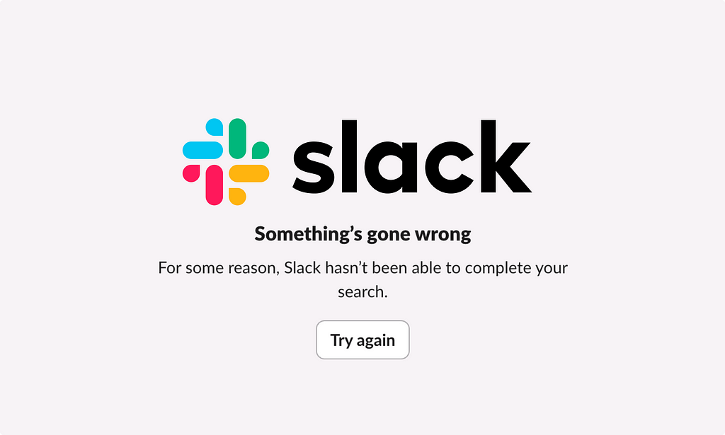
The power of empty stateshow Slack drives user activationOnboarding, delightful copy and the element ofsurpriseDo you know the dinosaur?The Lonely T-Rex ofChrome.Or perhaps youve seen the Blue screen of death onwindows.Image sourceOr maybe Apples Spinning wheel of deathPre-auto save these signalled the end of the world. Lost files. Reboots. Frozenscreens.Seeing these stirs feelings of frustration and dread (as the names suggest).These are what we call emptystates.Empty states are what you see when a page or area that could be blank. Like a search bar before youve started searching, a chat before youve sent a message, an error state or a new document youveopened.They are non-spaces where theres technically nothing to display. As a result, these are spaces that are often overlooked in productdesign.However, theyre actually incredibly important in creating positive user experiences. Why? Well,because:Without them, people get confused (often thinking theres a bug)They can communicate system status, giving a users a sense ofcontrolThey can be used to show people next steps or how to use the product in a subtlewaysAccording toNNGroup:Totally empty states cause confusion about how and whether the system is working. An empty screen leaves people with questions: Is the system finished processing the request? Is content still loading? Did an error occur? Did I set the wrong filters or parameters?The overarching goal of empty states is to build confidence that your product knows what its doing, show youre in control and show people nextsteps.What better way to explore this unloved area of UX than to look at one of the best examples.Slack.Well look at four types of empty states from Slack and show how they help onboarding, product adoption and reduce confusion throughout the experience, namely:Feature defaults to encourage engagementFirst use states to onboard andactivateEnd states to congratulate and give a dopamine hit post-taskError states to admit when theres been an issue and help with nextstepsBefore we dive in, heres a recap of Slacks growth from origin through unicorn, and from acquisition tonow.Slacks rather bumpy ride from 2013 to2025Slack is one of the startup worlds biggest success stories, having gone from nothing to unicorn status ($1bn) in as little as 8months.It started as an online multiplayer game called Glitch in 2009, however the team struggled to gain traction; the game was too complex, too slow and ultimately flopped.Instead, the team noticed that their internal communications tool theyd built to create the game was much more interesting.And hence, Slack wasborn.After launch in 2013, Slack grew 510% weekly in the first year and reached unicorn status not long after in2014.By the time I tried it first in 2019, Slack had reached 10 million daily activeusers.Slacks strong growth was due to a mix of factors: timing (as remote work grew), brand (goodbye stuffy enterprise tools, hello fun), strong backing (from Silicon Valley) and product-led growth (easy to get going and share withothers).In 2021, Salesforce bought Slack for $27.7 billion. Funnily enough, after the acquisition growth slowed. TechCrunch reported that growth dropped rapidly, from 46% YoY in Q3 2023 to just 16% in Q42024.Nevertheless, in 2025 Slack now has 200,000 paying customers across 150 countries, including 77% of Fortune 100 companies.Still eye-watering numbers, despite the growthslump.Ive been using Slack for five years at this point. One of my earliest memories of the UI is the empty states in their best feature: the searchbar.Empty states in searchI remember the first time Slack surprised me with its empty states. I was typing in the search bar, when I saw some entertaining copy:Surely thats around here somewhereHuh?So casual. Sounusual.The next time I hit the search bar, Iread:Search high andlowThe default copy in the search bar changes on each clickit cycles through various weird, fun and (occasionally) usefulcopy.It feels almost crafted instead of engineered.What this does is two-fold:It acts as a variable reward meaning that each time we visit, its new. Like a slot machine coaxing people back into thearcade.It creates a curiosity gap where intrigue is created through riddles, gaps in information or unusual experiences, leading the customer to seek out the nextstepBoth of these tactics drive engagement, as well as improve awareness about the searchfeature.Its a great example of how to turn mundane UI elements into engagement opportunities and memorable micro interactions.The injection of fun and personality into mundane, functional elements is one of the reasons Slack has been able to differentiate in a crowdedmarket.First use onboarding emptystatesMore recently, I created my own Slack workspace for the firsttime.I needed to use Slack connect, and so created Rosie Hogggmascalls workspace to accept invites to newclients.It was the first time in five years I felt like I was seeing Slack with fresheyes.The first thing I saw was the empty states within channels.Notice how theres no blank page. Instead, I see activity (myself joining), templates, a welcome message and direction of what totype.Without taking any action, my workspace feelsactive.I also see that not one, but three channels have been created forme.All with their own empty states, including:Passive onboarding tips for me to get started (nothing too in-your-face)Visuals to help me understandCore messaging to reiterate the value ofSlackDefault copy, helping me know what to type ( Hi everyone!, Roll call! Whoshere?)The suggested actions feel subtle and easy, thingslike:Share aGIFTake a coffee breaktogetherPersonalise a welcomemessageHowever theyre all driving to core actions that help you engage, onboard and get setup.Theres even an empty state for a DM withmyself.The default copy Note to self and Tomorrow, I should.. makes me feel so seen, given thats what I typically use a self-DM for in whatsapp, messenger orSlack.What these do is avoid users drawing ablank.Opening a new page is akin to walking through a doorway: you forget what you come for. You draw ablank.Thats what these empty states are avoiding.They are simultaneously:Helping you navigate a new workspaceShowing you how to usefeaturesGiving you a head start by taking steps foryouAvoiding writers block / blankstaresCreating a sense of activity from thestartNotice how Slack anticipates and solves for common friction points before theyarise.By avoiding friction, providing structure and reducing cognitive load, Slack creates motivation and momentum that carries new users through critical activation steps (like first message and channel creation).Whats key is that they feel helpful rather than intrusive. Instead of tooltips, repetition or popups, the use of entry states to onboard users feels like the natural flow of theproduct.Cleared End-goal emptystatesNext up: task complete emptystates.On Slack mobile, theres a feature called catchup.Its a tinder-like style summary of the messages you need to catch upon.Once youve swiped through your messages, youre met with a little congratulations message.Similar to the variable reward we saw in the search bar copy, this copy also changes every timemoving from cool, to hype-man, tochill: AllClearBoom. Youre up todate.All caught up. Whatsnext? Youve read everything you needed to. Take amoment.(Not sure why theres an applethere?)Again, these small, quirky messages inject personality.These consistent moments of personality across different features help create a cohesive brand experience, which is distinctly cooler, more casual and different from competitors (Teams would never say boom).As well as being important for brand, theyre also functional. These messages signal task = complete, and provide closure. Marking the dopamine hit of a complete task creates a mini reward, reinforcing the habitloop.Next: errorstates.Uh oh error emptystatesTo test error states, I do twothings:Turn off mywifiSearch for a non-resultFor the first, I see whats called a skeleton stateIts a loading state that shows what the UI would look like if there were results. Giving the perception that things are moving, filling the void instead of leaving it blank and removing the jump from blank white toerror.Overall, it feels less jarring and looks like the product is trying in the background, giving the labour illusion effectWhen I have no wifi, the empty state reads asfollows:Were having trouble loading your workspaceThis is one of those times when were not sure what went wrong, but we do have some suggestions that mighthelp.- Restart slack. Sometimes thats all ittakes- Check the Slack service to make sure that its not a Slackissue- Try our suggestions for troubleshooting connection issuesWhat I like here is the UX writing: clear admission that Slack doesnt know whats wrong and helpful advice to troubleshoot.When I search for something that doesnt exist, Isee:Nothing turnedupYou may want to try using different keywords, checking for typos or adjusting your filters. Learn more aboutsearchNot the results that you expected? GivefeedbackHere I like the conversational language.Users are often tired of Uh Oh, or Oh Snap. The new error messaging here feels almost refreshing.Again, Im given some helpful suggestions but note how Im also invited to feedback. This gives the users a sense that the product is open and theres people behind the scenes. It avoids the dead end feeling of many empty states, by giving multiuple exitpoints.Slack is using this real estate as an opportunity to build trust. Transforming potential areas of frustration into experiences that feel human andhelpful.Transparency + guidance = an excellent formula for an errorstate.In conclusion: empty states as strategic UXI love thisexample.The devil is in the details, and once you start paying attention to empty states you see them everywhere.What I take away from Slack is twothings:Be personable: state when you dont know, inject personality and brand voice, avoid any over-used phrases (avoid oh snap like the plague). Think: how would I like to be spokento?Be present: most importantly dont leave a blank. Dont leave dead-ends, or people hanging. Largely because youre missing out on really good opportunities to drive engagement.In terms of how to implement this, Id suggest fivesteps:Audit your empty statesmap all places where users might encounter blank screens, errors, or completion states in your productjourney.Add personalityuse variable rewards and conversational language that aligns with your brand to create a human connection with yourusers.Reduce cognitive loadprovide clear next steps, templates, structure and guidance that anticipate user needs before frustration setsin.Create momentumthink about how you can exite people and help them get to aha moments. Use empty states to guide users toward key activation actions without relying on more intrusive onboarding methods like tooltips.Be transparent When things go wrong, be honest about what happened and provide clear paths forward. Stating the obvious can give a sense of control, which reduces doubt and helps ease frustration.Have a go, and let me know how it goesThe power of empty stateshow Slack drives user activation was originally published in UX Collective on Medium, where people are continuing the conversation by highlighting and responding to this story.
0 Σχόλια
·0 Μοιράστηκε
·62 Views