


Inside the Transformation of an Ethereal Los Angeles Video Studio
www.housebeautiful.com
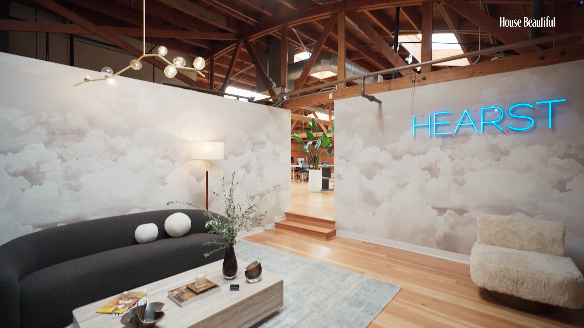
It makes sense that Adam Hunter was called upon to design the new Hearst video studio in West Hollywood, California. The interior designer and former Broadway stars approach to design is rooted in the idea that creativity needs to live out in the open. You wont see any cubicles in his commercial work. Instead, he balances refinement with drama. Theres a distinctly Californian spirit in my workelevated yet relaxed, like a warm breeze through palm trees, says Hunter, who is also a member of the House Beautiful Next Wave Class of 2014. For the Hearst studio, we brought that feeling to life with soft, muted tonessunset hues, warm neutrals, and airy bluesand even incorporated faux palm trees to ground the space with a sense of place.The result is a layered space that is equally dynamic and inspiring, a place where creativity lives in every corner but nothing feels overly styled, as he puts it. Hunters acumen for this type of work comes from years of working on residential design as well as creative workspace projects for Kate Somerville, FanDuel, and his own office on Melrose. What I love about commercial design is that it gives me the opportunity to shape the energy of a businesshow people feel when they walk in, how teams function within the space.We asked Hunter how he came to visualize the dreamy office space and make it a reality. Related Story Hearst MagazinesThe entry to the Hearst West Coast video studio in Los Angeles.House Beautiful: What were your first thoughts when you entered our empty studio? Adam Hunter: The space had great bonesoriginal hardwood floors and an industrial edge that gave it characterbut it initially felt stark and expansive, more like a warehouse than a workspace. I saw an opportunity to embrace that rawness while layering in warmth and personality. By creating defined zones and introducing texture, softness, and contrast, we transformed it into a space that feels inviting, grounded, and full of intention.The energy at Hearst is calm, creative, and elevateda space thats serene and stylish, which was really the goal. Because its a publisher, we knew the visual language needed to be strong, but not loud. Theres a quiet confidence to the space, where texture and light do most of the talking. HB: The first thing you see when you walk in is this ethereal cloud wallpaper. Tell us about that choice and how it sets the tone for the space. AH: First impressions are everything. They set the emotional tone. I wanted that first moment to feel groundinglike stepping into a creative sanctuary. The entry is open, quiet, and flooded with natural light. We designed it to feel like a breathopen and uncluttered but layered with thoughtful details that reveal themselves the longer youre in it. In this studio, we used materials that are textural but understatedlike a boucl sofa that invites you to sink in, pale-colored finishes that reflect natural light, and cloud wallpaper that adds depth without weight. Theres a softness that I find grounding. In a workspace, you dont want anything too visually noisy. The textures, the tonesthey all needed to speak quietly but with intention. HB: You mentioned in the studio tour that lighting is important in a space like this. Can you tell me more about that? What is the key lighting element here? Lighting is everything. Its the unsung hero of any good design. Here, we used a mix of architectural lighting for function and sculptural fixtures for atmosphere. The pendant in the main sitting areait anchors the room and casts this soft, ambient glow that warms the whole space.Hearst MagazinesThe video studios glam room.HB: How did you make such a large space feel more intimate? I carved the space into momentseach one with a distinct purpose and mood. By floating furniture, using rugs to anchor zones, and adjusting lighting levels, we created intimate pockets within the larger volume.The chill nook adds an essential softnessit signals that this is a place where ideas are meant to flow, not just perform. HB: The airy shelving does so much more than divide the space. Why are furnishings like these so important to include? Shelving is a backdrop and a personality piece. Its functional, surebut also a place to tell a story. We used it to display art, books, objects that speak to Hearsts heritage and modern creative pulse. Hearst MagazinesHearst MagazinesHB: You had the entire Hearst photography archives to pull art from. How did you choose these pieces? Art should feel inevitable, like it was always meant to be there. I tend to avoid obvious or overly literal pieces. Instead, I look for art that has soula sense of quiet tension or a visual rhythm that plays well with the rest of the space.HB: Lets talk about the finishes and textures of your decor choices. They create such a nice sense of equilibrium. AH: The decor was all about contrast and balance. Nubby boucl, smooth oak, brushed metals, vintage ceramicseach texture adds a layer without demanding attention. The space feels tactile but not fussy. You can feel that balance the moment you walk in.HB: How did you build the color palette? Every element was chosen to speak quietly but with intention. The palette of soft blues, sand tones, and warm whites creates cohesion without feeling flat. Start with one anchormaybe its the rug, maybe its the artworkand build from there. Keep your palette tight, but not flat. Layer tones of the same hue, vary your textures, and mix shapes. A round coffee table with a rectangular rug, a rough linen with a polished marbleits the contrast that makes it work.Hearst MagazinesHB: The nook with the pool table and couch looks so comfortable. Do you think everyone should have a couch in their office? Absolutely. Creative work is not linearit needs a place to pause and reset. That soft nook is an invitation to unplug, brainstorm, or just take a beat. A couch in a home office? Yes, if space allows. It changes the energy instantly.HB: Speaking of couches, how do you decide on the right shape, color, and material for a space? Its all about the context. The chill-out space needed something grounded and sculptural, hence the deeper color and low-slung shape of the Wayfair Professional sofa . The dove gray boucl sofa [in the glam room] is all about softness and silhouetteits an exhale in the middle of the space. You want your furniture to reflect how you want the room to feel. Follow House Beautiful on Instagram and TikTok.
0 التعليقات
·0 المشاركات
·41 مشاهدة