Double Drenching: What You Should Know About This New High-End Paint Technique
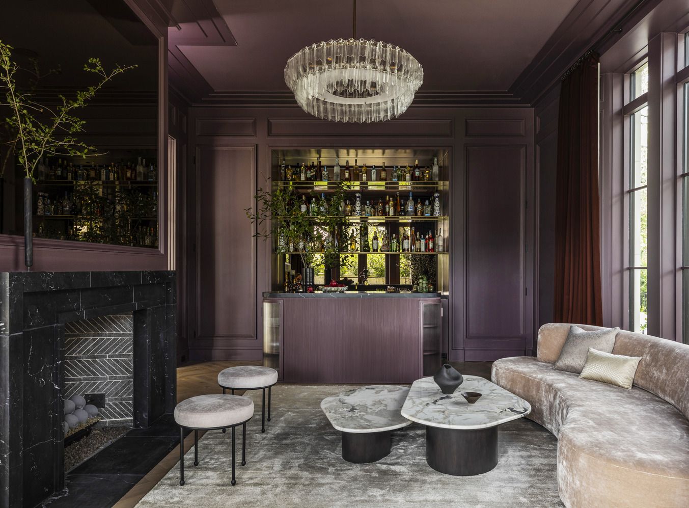
Julie SoeferEvery item on this page was hand-picked by a House Beautiful editor. We may earn commission on some of the items you choose to buy.It's pretty rare to see a new paint trend emerge onto the scene. Of-the-moment colors? Surejust look to any of the recent Colors of the Year to see which hues are trending. But it's less common to see a new paint technique gain traction, and there hasn't been one that's taken hold of the decor zeitgeist since limewashinguntil now. Enter: double drenching. Ideal for design lovers who adore color, the technique of double drenching involves selecting two colors in similar tones and using them to blanket your room. Similar to drenching a room in a singular paint color, double drenching adds an additional layer of dimension and interest with a secondary color in a varied tone, says designer Amy Studebaker. Double drenching allows for differentiation while maintaining a cohesive aesthetic, adds Ruth Mottershead, creative director of Little Greene Paint. The variation in hues, even when from the same color family creates a layered look, adding depth and dimension to a room, along with subtle contrast that feels dynamic and visually intriguing.Read on for everything you need to know about this emerging, colorful paint trend and how to get the look in your own space.Related StoriesWhere to Use Double DrenchingLittle Greene PaintLike with any design trend, you should use the double-drenching paint technique judiciously. Not every room is a prime candidateand not every color should be used in excess. Double-drenching is a great technique to use in smaller, more intimate spaces like bedrooms and powder rooms, says designer Meg McSherry. It gives these smaller areas more character and adds an element of surprise, without being overwhelming. Additionally, it can also be a great way to combat a builder-grade space, allowing you to accentuate architectural details or, at the very least, give the illusion of them. Double drenching can add unexpected contrast to homes where architectural detail is lacking, highlighting the ceiling, walls, and woodwork, adds Mottershead. All that said, there are a few spaces you should avoid using a double-drenching technique. This unique paint treatment is best applied in rooms that are contained by four walls, and ones that don't boast an overly large footprint. You want the wall separation to give you the space for the color to shine, as well as provide separation from nearby rooms, says designer Laura Solensky. I love to see it done in a dining room, bedroom, office, study, or sunroom.Related StoryThe Best Paint Colors for Double DrenchingThere aren't a lot of hard-and-fast rules when it comes to double drenching a room, though it is a good idea to remember that more isn't always more. Covering a space in floor-to-ceiling color is already a bold move, so choose a shade that conveys a quiet elegance, not one that requires sunglasses any time you walk into the room. Below, the pros share four double-drenching color schemes that would work beautifully in your space.Nature-Inspired GreensLittle Greene PaintBy using two or more shades of green, you can achieve a room that captures the power of nature while feeling cohesive, sophisticated, and visually engaging, says Mottershead. Bold green Hopper, a vibrant and highly pigmented shade reminiscent of leafy summer foliage, can be combined with contrasting zesty Citrine and smart and confident Dark Brunswick Green in a scheme that will feel cohesive, harmonious, and visually exciting.Cozy BrownsJared KuziaI just recently incorporated this concept into the bedroom at my cottagethe baseboard and beams are Benjamin Moores Sequoia and everything else is Hint of Mauve, says McSherry. It feels warm and cozy because you are enveloped in the color; it sets the mood for the entire room.Earthy HuesLittle Greene PaintRather than trying to flatten or disguise architectural features, create a subtle contrast with a double-drenching approach that combines colors not typically used alongside one another to highlight architectural elements, like a doorway or alcove, says Mottershead. Pair Light Bronze Green with attractive dark green Ambleside, and muted yellow Bassoon to create a focal point that draws the eye to architectural elements within the space. Calming BluesJared KuziaIn this bunkroom, we wanted dimension and depth to the tight space, so we used two similar colorsWales Gray and Water's Edge by Benjamin Moorethat gave a playful yet calm canvas for the rest of the colorful furnishings, says McSherry.Follow House Beautiful on Instagram and TikTok.


