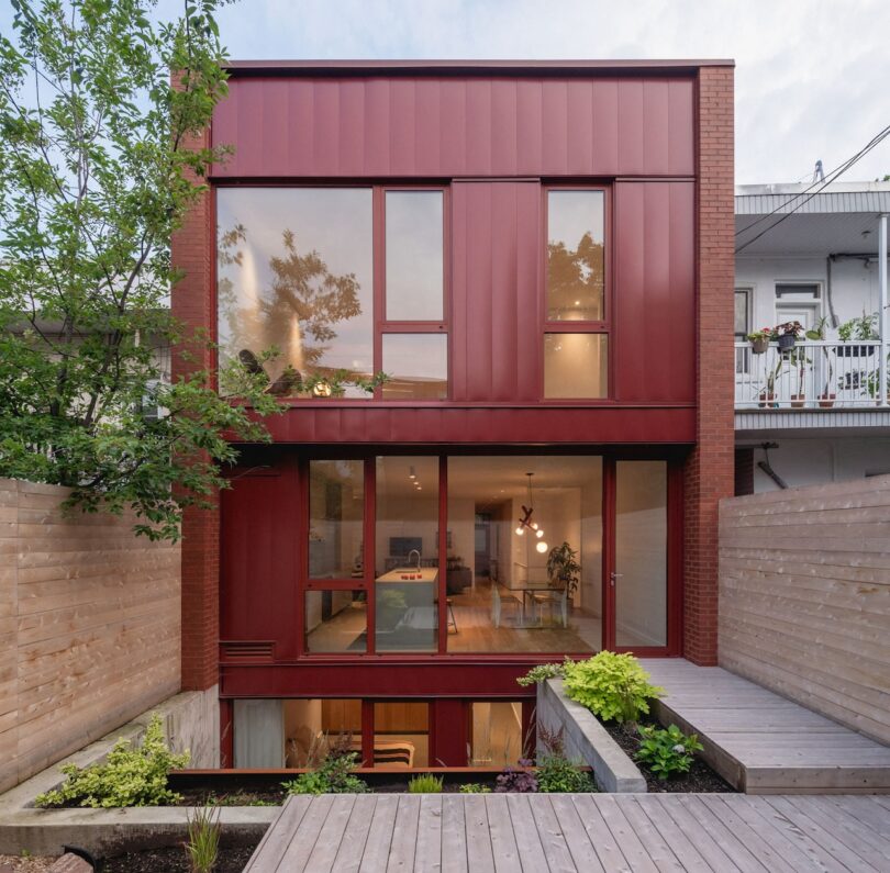
Le Petit Merlot Blends Heritage With Contemporary Design
As an expert vintner would transform humble grapes into extraordinary wine, _naturehumaines latest architectural work, Le Petit Merlot, converts a classic 1920s duplex into a contemporary haven. Nestled in the gastronomic heart of Montreals Plateau Mont-Royal, this thoughtful renovation embodies the same patient craftsmanship as its namesake a careful fermentation of old and new, where historical elements are preserved and enhanced through time.Sited on a compact lot without an alley, the duplex adjoins two neighboring homes and aligns with the shared front street boundary. It includes two stacked units, accessible through a rear courtyard via a porte-cochre. Restricted to two floors, the design adds a mezzanine level, extending the space for the upper unit without exceeding height limits. Heritage features were restored for the front facade, with the original red clay brick, painted hemlock lintels, and stone spandrels retained for architectural authenticity. French windows with divided panes and restored wooden cornices reflect the areas historical facades, contributing to a cohesive street presence.Inside, the lower 1,420-square-foot unit is designed to harmonize with the garden. A glass rear facade blurs the line between indoor and outdoor spaces, opening the living area, dining room, kitchen, and bedroom to the landscape. Below, a sunken courtyard introduces light to the basement-level office and additional bedroom. The upper unit prioritizes southern natural light, with a mezzanine housing the kitchen and dining area, leading to a wooden terrace featuring steel planters. A central staircase, clad in white perforated steel, visually connects the levels.In contrast to the heritage front, the rear facade takes a modern approach. Large glass sections span four levels between brick walls, lending the interior a soft, ambient light. To enhance the basement units light quality, floor-to-ceiling windows create a spacious feel in the bedroom and office. Interior finishes echo the exteriors red tones in materials and paint, maintaining visual unity. This color scheme is evident in brick, window mullions, steel accents, and select indoor elements like the library and lighting fixtures.For more information on _naturehumaine, visit naturehumaine.com.Photography by Raphal Thibodeau.


