Casa Emma Is a Tribute to Light, Space, and Ancestral Design in Morelia
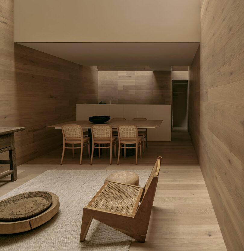
Located in the historic city of Morelia, Mexico, Casa Emma, designed by HW Studio, shares the transformative power of light and the evocative potential of architectural space. Inspired by a visit to the renowned Paula Rego Museum by Eduardo Souto de Moura, the architects set out to create a residence that embodies the same profound serenity they experienced within that museums walls. Casa Emma is not merely a home; it is a contemplative retreat that speaks to the soul, designed to evoke the warmth, calm, and reflective power of carefully channeled light.Casa Emma is a modern interpretation of Mexican architectural motifs, focusing on the Purepecha granary, or troje. This traditional structure carries cultural and historical significance in Mexico, where it serves as both a functional and spiritual form of architecture. The architects at HW Studio were drawn to the idea of carving out a dwelling space that resonates with this archetype, creating an excavation rather than a typical built structure. By hollowing out a void in the shape of a troje, the architects introduced an immersive environment where the rustic and intimate ambiance of a wooden interior could amplify the warmth of natural light, adding layers of meaning and nostalgia.The entire interior of Casa Emma is clad in wood, creating a rich, tactile environment that invites touch and heightens the sensory experience of the space. This choice of material is not only an homage to traditional construction methods but also a deliberate effort to envelop visitors in a warm and serene atmosphere. The woods natural texture and grain respond to changes in light throughout the day, creating subtle shifts in color and mood that mirror the rhythms of nature.Despite the homes modest dimensions measuring only 4 meters wide by 10 meters deep Casa Emma feels spacious and airy, thanks to the architects use of open-plan design and zenithal (overhead) lighting. Upon entering, visitors are led down a narrow access corridor that serves as a transitional space, setting a contemplative tone. The entryway cleverly conceals the roof structure, allowing the full height and openness of the interior to be revealed progressively. Once inside, an open-concept area seamlessly integrates the living room, dining room, and kitchen without any divisive walls. This lack of separation enhances the flow of light, allowing it to reach every corner of the main living area, where shadows bounce softly against the wood surfaces, creating a continuous play of light and shadow.At the rear of the main level, the refrigerator is discreetly hidden, as are utility and storage areas, ensuring that functionality remains invisible to the eye. Vertical circulation is placed thoughtfully toward the back, where stairs lead upward to a small mezzanine level.The mezzanine itself houses the bedroom encased in a sleek, floating white volume that appears almost weightless against the wooden backdrop. This material contrast serves both practical and aesthetic purposes. The light-colored volume stands in stark relief to the surrounding wood, creating a sense of levity, while the choice of reflective surfaces on this floating structure allows light to diffuse gently across its boundaries. The effect is one of a cloud suspended in space, providing a visual resting point within the home.For more information on HW Studio, visit hw-studio.com.Photography by Csar Bjar.


