UXDESIGN.CC
How I used AI to design brand-aligned illustrations
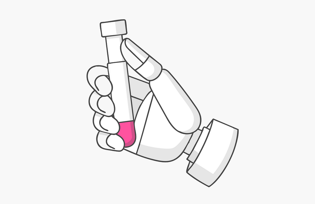
Can AI support brand consistency in design? My experience with Midjourney in capturing Lemonades iconicstyle.Illustration has never been my strong suit. Designing user interfaces, experiences, and products? No problem. But creating illustrations that perfectly reflect a brands unique style? Thats another challenge.After three years as a designer at Lemonade, working on web and mobile products, I gained a deep understanding of the brands distinct visual language: clean lines, a minimalist color palette, and that unmistakable pop of vivid pink. This got me wonderingcould Midjourney and todays AI capabilities actually fill in my gap in illustration skills? Could I finally bring my vision and design ideas to life on my own, without needing a professional illustrator? With that question in mind, I decided to dive in and test it out formyself.As I began experimenting with AI-driven illustration, I couldnt ignore the ethical questions this choice might raise. Could AI tools like Midjourney impact job security for professional illustrators? For me, the decision to use AI wasnt about avoiding the costs of hiring talent but about exploring how AI could complement my creative process, especially in the initial stages of visual experimentation. My goal was to see if AI could help streamline parts of the workflowlike quickly visualizing ideas or iterating on brand consistencywhile still appreciating the unique skills and depth that only a professional illustrator canbring.The challenge of achieving brand consistencyAchieving true brand consistency with AI involves more than just typing in a promptits about capturing the subtle details that reflect the brands core identity. Lemonades illustration style may seem straightforward at first glance, but designers know that simplicity demands precision. Its a style built on clarity: minimalist lines, grayscale tones, and that unmistakable pink accent. Together, these elements create a look thats instantly recognizable.Lemonade HomepageDirecting Midjourney to think in brandlanguageAnalyze existing brand illustrations: I used ChatGPT to create a foundational prompt by examining a variety of official illustrations, paying close attention to line quality, spacing, proportions, and color use. To keep the prompt simple, I decided to leave out pink initially, knowing it could be added later without confusing theAI.The first prompt I startedwith2. Select a reliable, iconic object for prompt testing: I selected an iconic objecta Mini Cooper. Its unique structure allowed me to see how well Midjourney could capture clean lines and simple, recognizable shapes. Using this as a reference helped me evaluate each prompt adjustment without introducing too many variables. I recommend choosing an object youre thoroughly familiar with, so you can easily spot any deviations from its trueform.Prompt inaction3. Refine through iteration: While Midjourney successfully captured the style for the Mini Cooper, other objects like buildings or animals lacked consistency. To address this, I refined the prompt with a focus on specifics like compositionhow each illustration should interact within its space, considering curves, relationships between objects, balance, and angles. These refinements helped align the illustrations with the brands unique perspective, making each object feel cohesive and purposefully positioned.To further enhance consistency, I incorporated thesref command with a range of official illustrations as style references. These included examples of broad structural shapes, rounded forms, depth, architectural elements, and line breaks. This combination enabled the AI to achieve a more unified brand look across diverse object types andforms.Final resultThis design captures the clean lines, minimalist style, and balanced composition.Achieving brand precision, soloAfter several iterations, I developed a powerful, versatile prompt that captured the style precisely, essentially illustrating how each object would appear in the brands visual language. This prompt became a foundational template: I only needed to replace the object description, and Midjourney consistently generated cohesive, brand-aligned illustrations. I was pleasantly surprised by the level of precision and creativity the AI brought to each illustration.The future of AI-driven brand illustrationThis experiment has opened my eyes to the potential of AI in scaling a brands visual identity across platforms. Imagine a company launching a new line of productswith the right AI setup, the brands unique style could be instantly applied to each new product, streamlining the visual identity process and enabling designers to adapt quickly while maintaining consistency. For designers seeking effective illustration solutions, experimenting with AI-driven tools can be a game-changer.This process allowed me to experiment, test ideas, and visualize concepts while staying fully aligned with the brands guidelines. It isnt just about output; it can help companies refine and sharpen their design language by requiring designers to create a precise textual description that captures the brands essence. This exercise enhances the brands clarity and strengthens its core identity, giving designers a solid foundation to approach future illustrations with a sharper, more structured mindset.While Midjourneys results may still require final touchessuch as vector conversion, line refinement, and detail enhancementit represents a significant step toward independence for designers who struggle with illustration, all while maintaining brand consistency.Learning to break down style requirements and refine prompts can elevate design skills and expand possibilities in brand illustration, making rapid prototyping and brand alignment both efficient and achievable.Quick tips to getstartedAnalyze the brand style:Dive deep into the brands visual language, identifying every detailline quality, colors, proportions, and composition. This understanding will guide you in creating a prompt that captures the brandsessence.Select a familiar, consistent object:Start testing your prompt with a single, iconic object that you know well. This will help you assess consistency and refine details without introducing too many variables.Refine the prompt thoughtfully:Focus on specifics like line weight, shadow behavior, spacing, and object relationships. Adjust each element to bring your prompt closer to the brands unique look andfeel.Build a prompt library:Save your most effective prompts to create a prompt bank you can easily reference for future illustrations, maintaining consistency across projects.Make final adjustments as needed:AI-generated results often need minor tweaksvector conversion, line refinement, or detail enhancementsto achieve production-ready quality. These adjustments ensure polished, brand-aligned visuals.Disclaimer:This post is based on my personal experiences and does not reflect Lemonades official branding.How I used AI to design brand-aligned illustrations was originally published in UX Collective on Medium, where people are continuing the conversation by highlighting and responding to this story.
0 التعليقات
0 المشاركات
128 مشاهدة


