UXDESIGN.CC
The semantic interface palette is simple
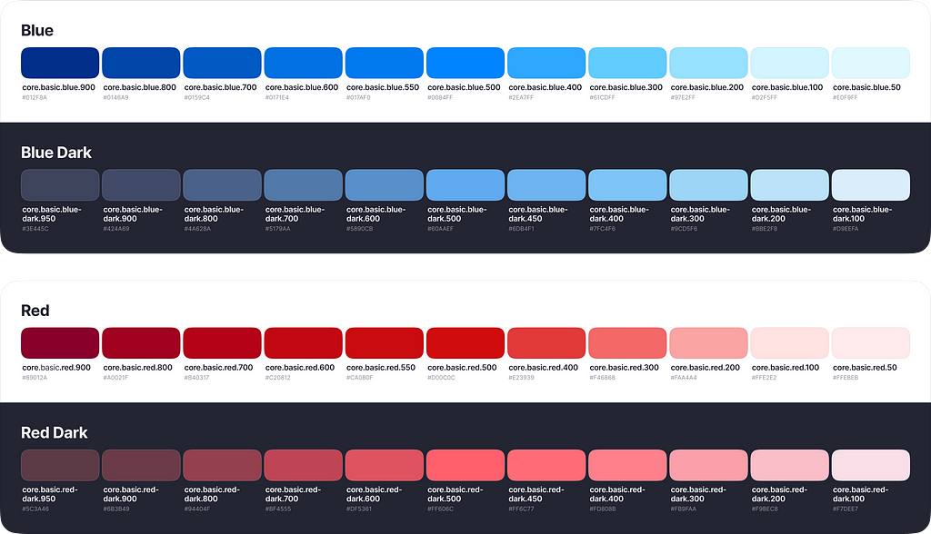
A consistent and accurate Core Palette is not enough for a consistent and accurate interface.In my previous article Creating a consistent color palette for your interface, I discussed creating a consistent color palette. This palette includes all the colors to be used in your interface. Lets call it the CorePalette.However, a consistent and accurate Core Palette is not enough for a consistent and accurate interface. We need a layer of rules about how to use these colors in the interface: which specific color to use for primary and secondary text, for input borders,etc.Lets introduce the Semantic Layer. The Semantic Layer is a list of rules for how to use colors from the Core Palette.So..The Core Layer shows all the available colors, while the Semantic Layer defines how to usethem.Im sure that most of you have seen really complex semantic palettes. They specify color tokens for each design system component, such as button-background, button-text, button-icon, etc. I have also tried this approach before, but now I can say that it is excessive and tootricky.Such a system is difficult to build and even harder to use. It can be a third layer under the simple semantic layer if you really need this level of detail. However, dont proceed with this complexity unless you are certain that it is necessary.The simple semantic layer Im showing will work in most interfaces.There are 5 main groups of the semantictokens:Textcolors for titles, paragraphs, captions, links, labels, button titles andetcFillcolors for button containers, icons, checkboxes, toggles andetcStrokecolors for input borders, dividers, banners borders andetcLayercolors for page backgounds, popup backgrounds, overlays andetcEffectcolors for shadows and touch feedbacksAt Aloha, we decided to skip Strokes and Effects for now. For Strokes, we chose to use colors from the Fills palette to simplify our system. Later, Ill discuss the pros and cons of this decision. We dont need special colors for Effects because we use standard effects from the Android and iOS libraries.TokensIn each semantic palette, there are a few semantic tokens. For example: text-primary, text-secondary, text-brand-primary, and text-on-accent.In Figma, we have two separate files for the Core Palette and the Semantic Palette. We use variables to manage color tokens. Tokens from the Semantic Palette refer to tokens from the CorePalette.ThemesA very valuable benefit of using the Semantic Layer is interface theming. A well-organized Semantic Layer allows you to easily manage light and dark modes, as well as color themes. At Aloha, we have 5 color themes, each available in both light and darkmodes.For each semantic token there are associated colors in each color scheme and mode. At Aloha, we only redefine brand tokens, but if needed, the entire semantic palette can be redefined for eachmode.Figma variables make it simple to manage and use color modes. You can set up your palettes in different modes and switch themes for your interface with just oneclick.A few tips for a good darkmodeDont simple invert the colors light dark or dark light, think about each particular case.The dark theme should have more depth. Surfaces that are closer to you should belighter.In contrast to the light theme, separators and borders in the dark theme should be lighter than the background.FillFill colors are used forthebackgrounds of buttons, tags, banners, etc. Fill colors are not used for page backgrounds, bottom sheets, or popup backgrounds.fill oficonsfill of checkboxes, radio buttons, toggle switch andetcDont forget about elements on dark or colorful backgrounds. It is a very, very important token. Adding just one fill-on-accent token is enough to cover mostcases.TextObviously, Text colors are used for text. We use them for titles, paragraphs, links, labels, button titles andothers.But the colors seem very similar to Fill. Why do we need an additional semantic group? The thing is that texts are thiner then the icons or interface controls. Therefore they look lighter even when they have absolutely samecolor.If we want to maintain the ability to manage text colors separately and adjust them slightly, we need separate tokens forthem.LayerLayers are the simplest yet trickiest aspect. There are few tokens and only 23 colors, but the structure of these tokens is very important, especially in darkmode.We should imagine our interface in the 3D prospect and decide how many layers we shouldhave.At Aloha, we have 3 floors and 1 overlay. In light mode, the floors use just 2 colors, but in dark mode, the interface looksdeeper.StrokeIn the Stroke section, we have colors for element borders and dividers. You might need brand colors, positive and negative colors, as well as a couple of light greycolors.Yes, the Stroke palette looks very very similar to the Fillpalette.Join Fill andStroke?In most cases, you will find all the necessary colors for your strokes in the Fill palette. It seems redundant to create another palette with exactly the same colors. At Aloha we decided to use Fill palette for both: fills andstrokes.But sometimes, you might want the same color used in light mode to behave differently for fill and stroke in darkmode.So, on one hand, it is easier to use the same palette for fills and strokes. You dont have to think about which palette to apply. But from the other perspective, two palettes give you more flexibility and more clarity about how to use specificcolors.Static colorsWe have talked about semantic tokens, which can be used in different color themes. Each token has a specific function in the interface. But what if there are colors that are the same in both light and dark modes? Usually, these are shades of black andwhite.For these colors, we should have a separate palette. Lets call it the Static Palette. Add colors that are not affected by the color mode. Each static token also refers to colors from the CorePalette.To summarize Having a streamlined Semantic Layer allows you to expand the color palette for your interface as much as you like while maintaining a clear and accurate structure.Creating a consistent color palette for your interfaceCreating accessible color palettes for humaneyesA Guide to Variables inFigmaDark Mode UI ConversionThe semantic interface palette is simple was originally published in UX Collective on Medium, where people are continuing the conversation by highlighting and responding to this story.
0 Comentários
0 Compartilhamentos
21 Visualizações


