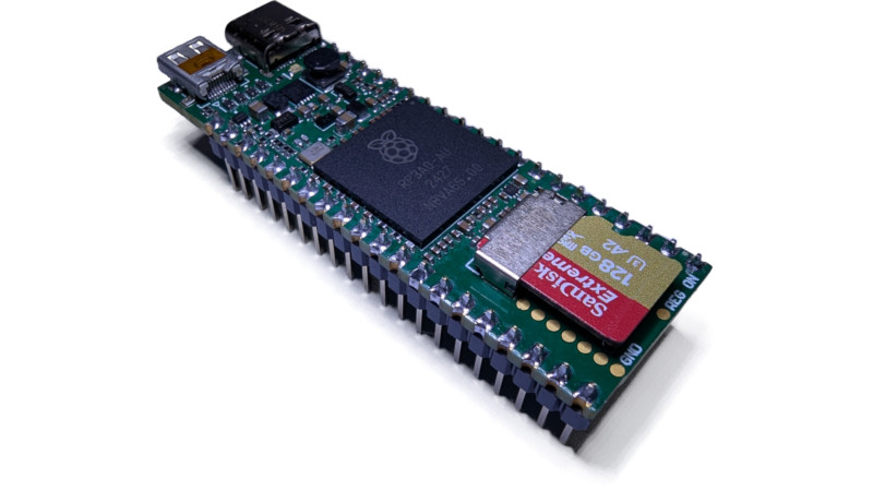
• Is the Dog Room the New Luxury Must-Have?

    Every item on this page was chosen by an ELLE Decor editor. We may earn commission on some of the items you choose to buy.When Corey Moriarty moved into a new home in Palm Beach, Florida with his four dogs—Maverick and Bauerand Blue and Titan—he found himself wondering what to do with his spare bedroom: “We had an extra room just sitting there, and instead of turning it into an office or a guest room no one ever uses, we thought, ‘Why not make it a space entirely for them?’”What started as a lark quickly turned delightfully over-the-top. Moriarty outfitted the room with custom bunk beds, a Murphy bed, and a wall lined with glass jars filled with the dogs' favorite snacks. There’s a ball pit, a full TV setup for nightly Bluey viewings, and a closet containing all of their outfits. Moriarty has been documenting the room’s evolution on TikTok, where his latest post racked up more than 24 million views.Corey MoriartyCorey Moriarty’s dogs have their own bonafide bedroom, complete with bunk beds, a TV area, and a treat wall. Pet ownership is booming in the U.S. In 2024, 59.8 million households had dogs, and 42.2 million had cats, according to the American Veterinary Medical Association. And people aren’t just adding pets to their families—they’re investing in them. In 2023, Americans spent more than billion on their pets, per the American Pet Products Association, with an increasing chunk of that going toward pet-focused home upgrades. These aren’t mere afterthoughts—they’re carefully crafted extensions of the home that call for thoughtful planning and, often, the expertise of an interior designer. In fact, the dog room has truly become the newest status symbol.View full post on TiktokA dog room's scale can range from a small nook under the stairs to a full-on suite complete with built-in feeding stations, toy storage, grooming areas, and plush four-poster beds. Some include tiled dog showers, temperature-controlled flooring, and built-in cabinetry. Others have more indulgent luxuries—like a TV with DOGTV, a streaming channel with programming designed specifically for canine attention spans. Think: dogs playing in fields, soothing nature sounds, and friendly humans doing relaxing things with pets. It’s ambient TV, but for your hyper-active schnauzer.For Moriarty, the trend taps into a bigger cultural shift. “There’s a continuing movement toward including pets more fully in people’s lives—as real family members,” he says. “Social media has poured gas on the fire. Everyone’s showing off these amazing pet spaces, and it’s inspiring others to level up.” The result is a growing “barkitecture” trend, where design for pets isn’t an afterthought—it’s part of the floor plan from day one. “We’re in the process of finding or building a more permanent home,” he adds, “and a huge part of that decision is based on what the dogs need—a pool, a yard, a room of their own, space to add a dog wash station.”Ken FulkKen Fulk’s three cream golden retrievers found a home in the curry colored library of his Provincetown home, overlooking the harbor in an antique captain’s daybed. Interior designers are seeing a rise in the trend, too. And some are even participating themselves. Ken Fulk, who shares his Provincetown home with four dogs—three English cream golden retrieversand a wirehaired Dachshund named Wiggy—says one room evolved into their dedicated canine space, though it wasn’t premeditated. “Our often-photographed curry colored library became a de facto nursery,” he says. “Soon, no one would come upstairs with us to bed. They preferred their perch overlooking the harbor in an antique captain’s daybed.”Matt McWaltersKen Fulk’s L.A. shop sells wicker dog beds. And for those not ready to sacrifice a spare room? You don’t have to ditch your home office to make your pets feel like part of the design. Fulk says more clients are requesting pet-focused features, like custom dog beds, built-in food stations, and dog-wash areas in stylish mudrooms. At his new shop in Los Angeles, Fulk even offers wicker dog beds upholstered in outdoor fabric, including his own Designer Dogs print for Pierre Frey, as well as an Air Blue and Indigo Stripe. In a world where dogs are living better than their owners, what's next? "I got some very positive feedback on my idea of our doggy hotel called DEN," Fulk laughs. "It was dreamed up as an April Fool’s joke, but there just might be something there."Rachel SilvaAssociate Digital EditorRachel Silva is the associate digital editor at ELLE DECOR, where she covers all things design, architecture, and lifestyle. She also oversees the publication’s feature article coverage, and is, at any moment, knee-deep in an investigation on everything from the best spa gifts to the best faux florals on the internet right now. She has more than 16 years of experience in editorial, working as a photo assignment editor at Time and acting as the president of Women in Media in NYC. She went to Columbia Journalism School, and her work has been nominated for awards from ASME, the Society of Publication Designers, and World Press Photo. 
    #dog #room #new #luxury #musthave
    Is the Dog Room the New Luxury Must-Have?
    Every item on this page was chosen by an ELLE Decor editor. We may earn commission on some of the items you choose to buy.When Corey Moriarty moved into a new home in Palm Beach, Florida with his four dogs—Maverick and Bauerand Blue and Titan—he found himself wondering what to do with his spare bedroom: “We had an extra room just sitting there, and instead of turning it into an office or a guest room no one ever uses, we thought, ‘Why not make it a space entirely for them?’”What started as a lark quickly turned delightfully over-the-top. Moriarty outfitted the room with custom bunk beds, a Murphy bed, and a wall lined with glass jars filled with the dogs' favorite snacks. There’s a ball pit, a full TV setup for nightly Bluey viewings, and a closet containing all of their outfits. Moriarty has been documenting the room’s evolution on TikTok, where his latest post racked up more than 24 million views.Corey MoriartyCorey Moriarty’s dogs have their own bonafide bedroom, complete with bunk beds, a TV area, and a treat wall. Pet ownership is booming in the U.S. In 2024, 59.8 million households had dogs, and 42.2 million had cats, according to the American Veterinary Medical Association. And people aren’t just adding pets to their families—they’re investing in them. In 2023, Americans spent more than billion on their pets, per the American Pet Products Association, with an increasing chunk of that going toward pet-focused home upgrades. These aren’t mere afterthoughts—they’re carefully crafted extensions of the home that call for thoughtful planning and, often, the expertise of an interior designer. In fact, the dog room has truly become the newest status symbol.View full post on TiktokA dog room's scale can range from a small nook under the stairs to a full-on suite complete with built-in feeding stations, toy storage, grooming areas, and plush four-poster beds. Some include tiled dog showers, temperature-controlled flooring, and built-in cabinetry. Others have more indulgent luxuries—like a TV with DOGTV, a streaming channel with programming designed specifically for canine attention spans. Think: dogs playing in fields, soothing nature sounds, and friendly humans doing relaxing things with pets. It’s ambient TV, but for your hyper-active schnauzer.For Moriarty, the trend taps into a bigger cultural shift. “There’s a continuing movement toward including pets more fully in people’s lives—as real family members,” he says. “Social media has poured gas on the fire. Everyone’s showing off these amazing pet spaces, and it’s inspiring others to level up.” The result is a growing “barkitecture” trend, where design for pets isn’t an afterthought—it’s part of the floor plan from day one. “We’re in the process of finding or building a more permanent home,” he adds, “and a huge part of that decision is based on what the dogs need—a pool, a yard, a room of their own, space to add a dog wash station.”Ken FulkKen Fulk’s three cream golden retrievers found a home in the curry colored library of his Provincetown home, overlooking the harbor in an antique captain’s daybed. Interior designers are seeing a rise in the trend, too. And some are even participating themselves. Ken Fulk, who shares his Provincetown home with four dogs—three English cream golden retrieversand a wirehaired Dachshund named Wiggy—says one room evolved into their dedicated canine space, though it wasn’t premeditated. “Our often-photographed curry colored library became a de facto nursery,” he says. “Soon, no one would come upstairs with us to bed. They preferred their perch overlooking the harbor in an antique captain’s daybed.”Matt McWaltersKen Fulk’s L.A. shop sells wicker dog beds. And for those not ready to sacrifice a spare room? You don’t have to ditch your home office to make your pets feel like part of the design. Fulk says more clients are requesting pet-focused features, like custom dog beds, built-in food stations, and dog-wash areas in stylish mudrooms. At his new shop in Los Angeles, Fulk even offers wicker dog beds upholstered in outdoor fabric, including his own Designer Dogs print for Pierre Frey, as well as an Air Blue and Indigo Stripe. In a world where dogs are living better than their owners, what's next? "I got some very positive feedback on my idea of our doggy hotel called DEN," Fulk laughs. "It was dreamed up as an April Fool’s joke, but there just might be something there."Rachel SilvaAssociate Digital EditorRachel Silva is the associate digital editor at ELLE DECOR, where she covers all things design, architecture, and lifestyle. She also oversees the publication’s feature article coverage, and is, at any moment, knee-deep in an investigation on everything from the best spa gifts to the best faux florals on the internet right now. She has more than 16 years of experience in editorial, working as a photo assignment editor at Time and acting as the president of Women in Media in NYC. She went to Columbia Journalism School, and her work has been nominated for awards from ASME, the Society of Publication Designers, and World Press Photo.  #dog #room #new #luxury #musthave
    WWW.ELLEDECOR.COM
    Is the Dog Room the New Luxury Must-Have?
    Every item on this page was chosen by an ELLE Decor editor. We may earn commission on some of the items you choose to buy.When Corey Moriarty moved into a new home in Palm Beach, Florida with his four dogs—Maverick and Bauer (Golden Retrievers) and Blue and Titan (Siberian Huskies)—he found himself wondering what to do with his spare bedroom: “We had an extra room just sitting there, and instead of turning it into an office or a guest room no one ever uses, we thought, ‘Why not make it a space entirely for them?’”What started as a lark quickly turned delightfully over-the-top. Moriarty outfitted the room with custom bunk beds, a Murphy bed, and a wall lined with glass jars filled with the dogs' favorite snacks. There’s a ball pit, a full TV setup for nightly Bluey viewings, and a closet containing all of their outfits. Moriarty has been documenting the room’s evolution on TikTok, where his latest post racked up more than 24 million views.Corey MoriartyCorey Moriarty’s dogs have their own bonafide bedroom, complete with bunk beds, a TV area, and a treat wall. Pet ownership is booming in the U.S. In 2024, 59.8 million households had dogs, and 42.2 million had cats, according to the American Veterinary Medical Association. And people aren’t just adding pets to their families—they’re investing in them. In 2023, Americans spent more than $147 billion on their pets, per the American Pet Products Association, with an increasing chunk of that going toward pet-focused home upgrades. These aren’t mere afterthoughts—they’re carefully crafted extensions of the home that call for thoughtful planning and, often, the expertise of an interior designer. In fact, the dog room has truly become the newest status symbol.View full post on TiktokA dog room's scale can range from a small nook under the stairs to a full-on suite complete with built-in feeding stations, toy storage, grooming areas, and plush four-poster beds. Some include tiled dog showers, temperature-controlled flooring, and built-in cabinetry. Others have more indulgent luxuries—like a TV with DOGTV, a streaming channel with programming designed specifically for canine attention spans. Think: dogs playing in fields, soothing nature sounds, and friendly humans doing relaxing things with pets. It’s ambient TV, but for your hyper-active schnauzer.For Moriarty, the trend taps into a bigger cultural shift. “There’s a continuing movement toward including pets more fully in people’s lives—as real family members,” he says. “Social media has poured gas on the fire. Everyone’s showing off these amazing pet spaces, and it’s inspiring others to level up.” The result is a growing “barkitecture” trend, where design for pets isn’t an afterthought—it’s part of the floor plan from day one. “We’re in the process of finding or building a more permanent home,” he adds, “and a huge part of that decision is based on what the dogs need—a pool, a yard, a room of their own, space to add a dog wash station.”Ken FulkKen Fulk’s three cream golden retrievers found a home in the curry colored library of his Provincetown home, overlooking the harbor in an antique captain’s daybed. Interior designers are seeing a rise in the trend, too. And some are even participating themselves. Ken Fulk, who shares his Provincetown home with four dogs—three English cream golden retrievers (above) and a wirehaired Dachshund named Wiggy—says one room evolved into their dedicated canine space, though it wasn’t premeditated. “Our often-photographed curry colored library became a de facto nursery,” he says. “Soon, no one would come upstairs with us to bed. They preferred their perch overlooking the harbor in an antique captain’s daybed.”Matt McWaltersKen Fulk’s L.A. shop sells wicker dog beds. And for those not ready to sacrifice a spare room? You don’t have to ditch your home office to make your pets feel like part of the design. Fulk says more clients are requesting pet-focused features, like custom dog beds, built-in food stations, and dog-wash areas in stylish mudrooms. At his new shop in Los Angeles, Fulk even offers wicker dog beds upholstered in outdoor fabric, including his own Designer Dogs print for Pierre Frey, as well as an Air Blue and Indigo Stripe. In a world where dogs are living better than their owners, what's next? "I got some very positive feedback on my idea of our doggy hotel called DEN," Fulk laughs. "It was dreamed up as an April Fool’s joke, but there just might be something there."Rachel SilvaAssociate Digital EditorRachel Silva is the associate digital editor at ELLE DECOR, where she covers all things design, architecture, and lifestyle. She also oversees the publication’s feature article coverage, and is, at any moment, knee-deep in an investigation on everything from the best spa gifts to the best faux florals on the internet right now. She has more than 16 years of experience in editorial, working as a photo assignment editor at Time and acting as the president of Women in Media in NYC. She went to Columbia Journalism School, and her work has been nominated for awards from ASME, the Society of Publication Designers, and World Press Photo. 
    Like
    Love
    Wow
    Sad
    Angry
    609
    0 Yorumlar 0 hisse senetleri
  • « Nous avons conçu des machines intelligentes, puis demandé aux médecins d’être encore plus intelligents »

    L’intelligence artificielleest souvent saluée comme la solution aux défis les plus complexes de la médecine moderne. Qu’il s’agisse de prédire des infections chez les prématurés ou de recommander des traitements personnalisés, les outils d’IA promettent plus de précision et d’efficacité. En tant que chercheurs et médecins, nous voyons l’immense potentiel de l’IA. Mais nous constatons aussi un problème croissant : bien que l’IA soit conçue pour alléger la charge des cliniciens, elle pourrait en réalité l’aggraver. Comme nous l’avons souligné en mars dans un article publié dans le JAMA Health Forum, on demande aux médecins d’accomplir l’impossible. L’IA s’introduit dans les hôpitaux à un rythme que les réglementations ne peuvent pas suivre. Les médecins doivent décider – souvent seuls – quand se fier aux recommandations d’un algorithme et quand les rejeter. Et si le résultat est mauvais, ce sont eux qui en portent la responsabilité. Des recherches montrent que le public tend à blâmer davantage les médecins qui suivent une recommandation erronée d’IA que ceux qui suivent un avis humain fautif. Les médecins restent perçus comme les décideurs finaux, même lorsque la technologie échoue. Résultat : on demande aux médecins d’évaluer parfaitement la fiabilité d’outils qu’ils n’ont pas conçus et ne peuvent entièrement comprendre, tout en les tenant seuls responsables du résultat. Lire aussi | Intelligence artificielle et médecine : des promesses et beaucoup de questions Nous appelons cela le « dilemme surhumain du médecin ». La société attend depuis longtemps des médecins qu’ils soient infaillibles et l’IA ne fait qu’amplifier ces attentes. On demande désormais aux médecins d’interpréter instantanément des résultats algorithmiques, en naviguant entre deux risques constants : les faux positifset les faux négatifs. « Boîtes noires » Les voilà ainsi pris dans un double piège. S’ils suivent l’IA et que celle-ci se trompe, ils peuvent être blâmés pour avoir fait confiance à une machine. S’ils la rejettent et qu’un préjudice survient, ils peuvent être blâmés pour l’avoir ignorée. Cela ajoute de la pression, brouille leur jugement et érode la confiance, tant envers la technologie qu’envers eux-mêmes. Il vous reste 60.99% de cet article à lire. La suite est réservée aux abonnés.
    #nous #avons #conçu #des #machines
    « Nous avons conçu des machines intelligentes, puis demandé aux médecins d’être encore plus intelligents »
    L’intelligence artificielleest souvent saluée comme la solution aux défis les plus complexes de la médecine moderne. Qu’il s’agisse de prédire des infections chez les prématurés ou de recommander des traitements personnalisés, les outils d’IA promettent plus de précision et d’efficacité. En tant que chercheurs et médecins, nous voyons l’immense potentiel de l’IA. Mais nous constatons aussi un problème croissant : bien que l’IA soit conçue pour alléger la charge des cliniciens, elle pourrait en réalité l’aggraver. Comme nous l’avons souligné en mars dans un article publié dans le JAMA Health Forum, on demande aux médecins d’accomplir l’impossible. L’IA s’introduit dans les hôpitaux à un rythme que les réglementations ne peuvent pas suivre. Les médecins doivent décider – souvent seuls – quand se fier aux recommandations d’un algorithme et quand les rejeter. Et si le résultat est mauvais, ce sont eux qui en portent la responsabilité. Des recherches montrent que le public tend à blâmer davantage les médecins qui suivent une recommandation erronée d’IA que ceux qui suivent un avis humain fautif. Les médecins restent perçus comme les décideurs finaux, même lorsque la technologie échoue. Résultat : on demande aux médecins d’évaluer parfaitement la fiabilité d’outils qu’ils n’ont pas conçus et ne peuvent entièrement comprendre, tout en les tenant seuls responsables du résultat. Lire aussi | Intelligence artificielle et médecine : des promesses et beaucoup de questions Nous appelons cela le « dilemme surhumain du médecin ». La société attend depuis longtemps des médecins qu’ils soient infaillibles et l’IA ne fait qu’amplifier ces attentes. On demande désormais aux médecins d’interpréter instantanément des résultats algorithmiques, en naviguant entre deux risques constants : les faux positifset les faux négatifs. « Boîtes noires » Les voilà ainsi pris dans un double piège. S’ils suivent l’IA et que celle-ci se trompe, ils peuvent être blâmés pour avoir fait confiance à une machine. S’ils la rejettent et qu’un préjudice survient, ils peuvent être blâmés pour l’avoir ignorée. Cela ajoute de la pression, brouille leur jugement et érode la confiance, tant envers la technologie qu’envers eux-mêmes. Il vous reste 60.99% de cet article à lire. La suite est réservée aux abonnés. #nous #avons #conçu #des #machines
    WWW.LEMONDE.FR
    « Nous avons conçu des machines intelligentes, puis demandé aux médecins d’être encore plus intelligents »
    L’intelligence artificielle (IA) est souvent saluée comme la solution aux défis les plus complexes de la médecine moderne. Qu’il s’agisse de prédire des infections chez les prématurés ou de recommander des traitements personnalisés, les outils d’IA promettent plus de précision et d’efficacité. En tant que chercheurs et médecins, nous voyons l’immense potentiel de l’IA. Mais nous constatons aussi un problème croissant : bien que l’IA soit conçue pour alléger la charge des cliniciens, elle pourrait en réalité l’aggraver. Comme nous l’avons souligné en mars dans un article publié dans le JAMA Health Forum, on demande aux médecins d’accomplir l’impossible. L’IA s’introduit dans les hôpitaux à un rythme que les réglementations ne peuvent pas suivre. Les médecins doivent décider – souvent seuls – quand se fier aux recommandations d’un algorithme et quand les rejeter. Et si le résultat est mauvais, ce sont eux qui en portent la responsabilité. Des recherches montrent que le public tend à blâmer davantage les médecins qui suivent une recommandation erronée d’IA que ceux qui suivent un avis humain fautif. Les médecins restent perçus comme les décideurs finaux, même lorsque la technologie échoue. Résultat : on demande aux médecins d’évaluer parfaitement la fiabilité d’outils qu’ils n’ont pas conçus et ne peuvent entièrement comprendre, tout en les tenant seuls responsables du résultat. Lire aussi | Intelligence artificielle et médecine : des promesses et beaucoup de questions Nous appelons cela le « dilemme surhumain du médecin ». La société attend depuis longtemps des médecins qu’ils soient infaillibles et l’IA ne fait qu’amplifier ces attentes. On demande désormais aux médecins d’interpréter instantanément des résultats algorithmiques, en naviguant entre deux risques constants : les faux positifs (faire confiance à une IA défectueuse) et les faux négatifs (rejeter une IA fiable). « Boîtes noires » Les voilà ainsi pris dans un double piège. S’ils suivent l’IA et que celle-ci se trompe, ils peuvent être blâmés pour avoir fait confiance à une machine. S’ils la rejettent et qu’un préjudice survient, ils peuvent être blâmés pour l’avoir ignorée. Cela ajoute de la pression, brouille leur jugement et érode la confiance, tant envers la technologie qu’envers eux-mêmes. Il vous reste 60.99% de cet article à lire. La suite est réservée aux abonnés.
    Like
    Love
    Wow
    Sad
    Angry
    383
    0 Yorumlar 0 hisse senetleri
  • How This Small Los Angeles Space Uses Color To "Keep It Tight"

    Nichols Canyon cuts through the south side of the Hollywood Hills, stretching from Hollywood Boulevard in the south up to Mulholland Drive in the north. Made famous by David Hockney, whose 1980 painting of the canyon sold for just over M in 2020, the area remains a thriving artist's community. What better place for Elle Decor A-List designer Oliver Furth to build a "creative cottage" for his partner, The Culture Creative founder Sean Yashar?Furth and Yashar, who've been together 14 years, met in the industry and purchased their home 7 years ago. When the lot next door—a pines-filled acre with a tiny house on it—came up for sale, the couple jumped at the chance to buy. "Anyone else would've torn it down and built something bigger," says Furth. "We replaced the windows and redid the kitchen and bathrooms, but we leaned into its size." Now drenched in Yashar's signature "eau de nil" pastel tones, the cottage embraces the character of its original 1940s structure while serving as a cutting-edge space for creativity.Kort HavensIn the sitting room, a Philippe Starck chrome side table from the original Royalton Hotel, from 1988, holds a place of pride with a group of Peter Shire and Ron Arad vintage chairs and a Rachel Shillander pyramidal lamp. Art includes greats of LA’s past and present: a Laddie John Dill mixed media, a Sam Falls tapestry, a Tom Holland metal relief, and a Strauss Bourque-LaFrance painting."All of my work is really portraiture." —Oliver Furth"My clients are all muses to me," says Yashar, who provides consulting services for designers. "I have to be a good listener and understand who the client is and how they connect to decorative arts history, so I spend a lot of time researching. How else can I be an authority?"To that end, the space is designed to provide a moment to reflect and the fodder to rev into high gear in equal measures; to facilitate rest as much as the chance to recharge. Following in the footsteps of Albert Hadley and Tony Duquette, Furth color-drenched the space in a mint green. "That color is the envelope—that's what I call it," says Furth. "We kept it very tight by lacquering the floors, the walls, and the ceiling in that color. Even the cabinetry and the appliances are in that mint. It allows us to have this object-driven interior space by unifying everything with color."Kort HavensA vintage Joe D’Urso for Knoll desk, Sam Maloof desk chair, Christopher Prinz stool and felt-clad speaker by Studio AHEAD create a sleek composition under an Ingo Mauer chandelier in the office. Art includes a triptych of photographs by David Benjamin Sherry, and framed magazine ads from Yashar’s parents’ furniture store, Moda Italia, from 1990.The seafoam hue unites not only the interior, but also decades of decorative history: Yashar found that the architect Paul Williams, who worked in LA in the 1940's and 50's, used a similar shade in many projects. "There's a lot of history and narrative within this color that maybe not everyone will be able to know, but hopefully everyone can feel," says Yashar. Clocking in at roughly 1,000-square-feet, the interior is now a mixture of millennial aesthetics, showcasing Yashar's love for design culture icons like Mario Buatta and Saul Bass. The entry sets the tone with its metal-and-glass Dutch door. A mixed-use meeting room offers a blend of contrasts, from Buatta-inspired shades in a Dickies-esque khaki twill to antique Chippendale chairs juxtaposed with 1990s Marc Newson tables. "All of my work is really portraiture," says Furth, "so this was an opportunity to help create this sort of portrait of Sean and his business." "Sometimes things just resonate...you just know when it's right." —Sean YasharThe sitting room features iconic design pieces, including a worn black leather sofa from the 1980s and a Philippe Starck table from the Royalton Hotel. Peter Shire and Ron Arad chairs are paired with conceptual furniture inspired by Dan Friedman. The kitchen celebrates postwar and ’80s influences with Smeg appliances and works by Soft Baroque and Patrick Nagel, grounded by a custom table from Studio MUKA. "A lot of people know me for my interest in eighties and nineties design culture," says Yashar. "But when I think eighties or nineties, I don't think of one thing. I don't want to choose. So I want to have Joe D'Urso high-tech track lighting, and I want it against these Mario Buatta-style balloon shades. I like that duality."Outside, a Persian-inspired courtyard nods to Yashar's heritage while offering dining and lounging areas that showcase rare 1980s furniture, including a Peter Lane ceramic table and one-off mint-colored Richard Schultz seating. The courtyard’s natural and faux vine murals create a satirical trompe-l’oeil effect, celebrating real-versus-virtual artistry. "I think we're both big believers in feeling," says Yashar. "Sometimes things just resonate. You can't really put your finger on it, but you just know that it's right."Sean SantiagoDeputy EditorSean Santiago is ELLE Decor's Deputy Editor, covering news, trends and talents in interior design, hospitality and travel, culture, and luxury shopping. Since starting his career at an interior design firm in 2011, he has gone on to cover the industry for Vogue, Architectural Digest, Sight Unseen, PIN-UP and Domino. He is the author of The Lonny Home, has produced scripted social content for brands including West Elm and Streeteasy, and is sometimes recognized on the street for his Instagram Reels series, #DanceToDecor
    #how #this #small #los #angeles
    How This Small Los Angeles Space Uses Color To "Keep It Tight"
    Nichols Canyon cuts through the south side of the Hollywood Hills, stretching from Hollywood Boulevard in the south up to Mulholland Drive in the north. Made famous by David Hockney, whose 1980 painting of the canyon sold for just over M in 2020, the area remains a thriving artist's community. What better place for Elle Decor A-List designer Oliver Furth to build a "creative cottage" for his partner, The Culture Creative founder Sean Yashar?Furth and Yashar, who've been together 14 years, met in the industry and purchased their home 7 years ago. When the lot next door—a pines-filled acre with a tiny house on it—came up for sale, the couple jumped at the chance to buy. "Anyone else would've torn it down and built something bigger," says Furth. "We replaced the windows and redid the kitchen and bathrooms, but we leaned into its size." Now drenched in Yashar's signature "eau de nil" pastel tones, the cottage embraces the character of its original 1940s structure while serving as a cutting-edge space for creativity.Kort HavensIn the sitting room, a Philippe Starck chrome side table from the original Royalton Hotel, from 1988, holds a place of pride with a group of Peter Shire and Ron Arad vintage chairs and a Rachel Shillander pyramidal lamp. Art includes greats of LA’s past and present: a Laddie John Dill mixed media, a Sam Falls tapestry, a Tom Holland metal relief, and a Strauss Bourque-LaFrance painting."All of my work is really portraiture." —Oliver Furth"My clients are all muses to me," says Yashar, who provides consulting services for designers. "I have to be a good listener and understand who the client is and how they connect to decorative arts history, so I spend a lot of time researching. How else can I be an authority?"To that end, the space is designed to provide a moment to reflect and the fodder to rev into high gear in equal measures; to facilitate rest as much as the chance to recharge. Following in the footsteps of Albert Hadley and Tony Duquette, Furth color-drenched the space in a mint green. "That color is the envelope—that's what I call it," says Furth. "We kept it very tight by lacquering the floors, the walls, and the ceiling in that color. Even the cabinetry and the appliances are in that mint. It allows us to have this object-driven interior space by unifying everything with color."Kort HavensA vintage Joe D’Urso for Knoll desk, Sam Maloof desk chair, Christopher Prinz stool and felt-clad speaker by Studio AHEAD create a sleek composition under an Ingo Mauer chandelier in the office. Art includes a triptych of photographs by David Benjamin Sherry, and framed magazine ads from Yashar’s parents’ furniture store, Moda Italia, from 1990.The seafoam hue unites not only the interior, but also decades of decorative history: Yashar found that the architect Paul Williams, who worked in LA in the 1940's and 50's, used a similar shade in many projects. "There's a lot of history and narrative within this color that maybe not everyone will be able to know, but hopefully everyone can feel," says Yashar. Clocking in at roughly 1,000-square-feet, the interior is now a mixture of millennial aesthetics, showcasing Yashar's love for design culture icons like Mario Buatta and Saul Bass. The entry sets the tone with its metal-and-glass Dutch door. A mixed-use meeting room offers a blend of contrasts, from Buatta-inspired shades in a Dickies-esque khaki twill to antique Chippendale chairs juxtaposed with 1990s Marc Newson tables. "All of my work is really portraiture," says Furth, "so this was an opportunity to help create this sort of portrait of Sean and his business." "Sometimes things just resonate...you just know when it's right." —Sean YasharThe sitting room features iconic design pieces, including a worn black leather sofa from the 1980s and a Philippe Starck table from the Royalton Hotel. Peter Shire and Ron Arad chairs are paired with conceptual furniture inspired by Dan Friedman. The kitchen celebrates postwar and ’80s influences with Smeg appliances and works by Soft Baroque and Patrick Nagel, grounded by a custom table from Studio MUKA. "A lot of people know me for my interest in eighties and nineties design culture," says Yashar. "But when I think eighties or nineties, I don't think of one thing. I don't want to choose. So I want to have Joe D'Urso high-tech track lighting, and I want it against these Mario Buatta-style balloon shades. I like that duality."Outside, a Persian-inspired courtyard nods to Yashar's heritage while offering dining and lounging areas that showcase rare 1980s furniture, including a Peter Lane ceramic table and one-off mint-colored Richard Schultz seating. The courtyard’s natural and faux vine murals create a satirical trompe-l’oeil effect, celebrating real-versus-virtual artistry. "I think we're both big believers in feeling," says Yashar. "Sometimes things just resonate. You can't really put your finger on it, but you just know that it's right."Sean SantiagoDeputy EditorSean Santiago is ELLE Decor's Deputy Editor, covering news, trends and talents in interior design, hospitality and travel, culture, and luxury shopping. Since starting his career at an interior design firm in 2011, he has gone on to cover the industry for Vogue, Architectural Digest, Sight Unseen, PIN-UP and Domino. He is the author of The Lonny Home, has produced scripted social content for brands including West Elm and Streeteasy, and is sometimes recognized on the street for his Instagram Reels series, #DanceToDecor #how #this #small #los #angeles
    WWW.ELLEDECOR.COM
    How This Small Los Angeles Space Uses Color To "Keep It Tight"
    Nichols Canyon cuts through the south side of the Hollywood Hills, stretching from Hollywood Boulevard in the south up to Mulholland Drive in the north. Made famous by David Hockney, whose 1980 painting of the canyon sold for just over $41M in 2020, the area remains a thriving artist's community. What better place for Elle Decor A-List designer Oliver Furth to build a "creative cottage" for his partner, The Culture Creative founder Sean Yashar?Furth and Yashar, who've been together 14 years, met in the industry and purchased their home 7 years ago. When the lot next door—a pines-filled acre with a tiny house on it—came up for sale, the couple jumped at the chance to buy. "Anyone else would've torn it down and built something bigger," says Furth. "We replaced the windows and redid the kitchen and bathrooms, but we leaned into its size." Now drenched in Yashar's signature "eau de nil" pastel tones, the cottage embraces the character of its original 1940s structure while serving as a cutting-edge space for creativity.Kort HavensIn the sitting room, a Philippe Starck chrome side table from the original Royalton Hotel, from 1988, holds a place of pride with a group of Peter Shire and Ron Arad vintage chairs and a Rachel Shillander pyramidal lamp. Art includes greats of LA’s past and present: a Laddie John Dill mixed media, a Sam Falls tapestry, a Tom Holland metal relief, and a Strauss Bourque-LaFrance painting."All of my work is really portraiture." —Oliver Furth"My clients are all muses to me," says Yashar, who provides consulting services for designers. "I have to be a good listener and understand who the client is and how they connect to decorative arts history, so I spend a lot of time researching. How else can I be an authority?"To that end, the space is designed to provide a moment to reflect and the fodder to rev into high gear in equal measures; to facilitate rest as much as the chance to recharge. Following in the footsteps of Albert Hadley and Tony Duquette (who once declared malachite a neutral), Furth color-drenched the space in a mint green. "That color is the envelope—that's what I call it," says Furth. "We kept it very tight by lacquering the floors, the walls, and the ceiling in that color. Even the cabinetry and the appliances are in that mint. It allows us to have this object-driven interior space by unifying everything with color."Kort HavensA vintage Joe D’Urso for Knoll desk, Sam Maloof desk chair, Christopher Prinz stool and felt-clad speaker by Studio AHEAD create a sleek composition under an Ingo Mauer chandelier in the office. Art includes a triptych of photographs by David Benjamin Sherry, and framed magazine ads from Yashar’s parents’ furniture store, Moda Italia, from 1990.The seafoam hue unites not only the interior, but also decades of decorative history: Yashar found that the architect Paul Williams, who worked in LA in the 1940's and 50's, used a similar shade in many projects. "There's a lot of history and narrative within this color that maybe not everyone will be able to know, but hopefully everyone can feel," says Yashar. Clocking in at roughly 1,000-square-feet, the interior is now a mixture of millennial aesthetics, showcasing Yashar's love for design culture icons like Mario Buatta and Saul Bass. The entry sets the tone with its metal-and-glass Dutch door. A mixed-use meeting room offers a blend of contrasts, from Buatta-inspired shades in a Dickies-esque khaki twill to antique Chippendale chairs juxtaposed with 1990s Marc Newson tables. "All of my work is really portraiture," says Furth, "so this was an opportunity to help create this sort of portrait of Sean and his business." "Sometimes things just resonate...you just know when it's right." —Sean YasharThe sitting room features iconic design pieces, including a worn black leather sofa from the 1980s and a Philippe Starck table from the Royalton Hotel. Peter Shire and Ron Arad chairs are paired with conceptual furniture inspired by Dan Friedman. The kitchen celebrates postwar and ’80s influences with Smeg appliances and works by Soft Baroque and Patrick Nagel, grounded by a custom table from Studio MUKA. "A lot of people know me for my interest in eighties and nineties design culture," says Yashar. "But when I think eighties or nineties, I don't think of one thing. I don't want to choose. So I want to have Joe D'Urso high-tech track lighting, and I want it against these Mario Buatta-style balloon shades. I like that duality."Outside, a Persian-inspired courtyard nods to Yashar's heritage while offering dining and lounging areas that showcase rare 1980s furniture, including a Peter Lane ceramic table and one-off mint-colored Richard Schultz seating. The courtyard’s natural and faux vine murals create a satirical trompe-l’oeil effect, celebrating real-versus-virtual artistry. "I think we're both big believers in feeling," says Yashar. "Sometimes things just resonate. You can't really put your finger on it, but you just know that it's right."Sean SantiagoDeputy EditorSean Santiago is ELLE Decor's Deputy Editor, covering news, trends and talents in interior design, hospitality and travel, culture, and luxury shopping. Since starting his career at an interior design firm in 2011, he has gone on to cover the industry for Vogue, Architectural Digest, Sight Unseen, PIN-UP and Domino. He is the author of The Lonny Home (Weldon Owens, 2018), has produced scripted social content for brands including West Elm and Streeteasy, and is sometimes recognized on the street for his Instagram Reels series, #DanceToDecor
    0 Yorumlar 0 hisse senetleri
  • A new movie taking on the tech bros

    Hi, friends! Welcome to Installer No. 85, your guide to the best and Verge-iest stuff in the world.This week, I’ve been reading about Sean Evans and music fraud and ayahuasca, playing with the new Obsidian Bases feature, obsessing over every Cliche” more times than I’m proud of, installing some Elgato Key Lights to improve my WFH camera look, digging the latest beta of Artifacts, and downloading every podcast I can find because I have 20 hours of driving to do this weekend.I also have for you a very funny new movie about tech CEOs, a new place to WhatsApp, a great new accessory for your phone, a helpful crypto politics explainer, and much more. Short week this week, but still lots going on. Let’s do it.The DropMountainhead. I mean, is there a more me-coded pitch than “Succession vibes, but about tech bros?” It’s about a bunch ofbillionaires who more or less run the world and are also more or less ruining it. You’ll either find this hilarious, way too close to home, or both. WhatsApp for iPad. I will never, ever understand why Meta hates building iPad apps. But it finally launched the most important one! The app itself is extremely fine and exactly what you’d think it would be, but whatever. It exists! DO INSTAGRAM NEXT.Post Games.Polygon, all about video games. It’s only a couple episodes deep, but so far I love the format: it’s really smart and extremely thoughtful, but it’s also very silly in spots. Big fan.The Popsockets Kick-Out Grip. I am a longtime, die-hard Popsockets user and evangelist, and the new model fixes my one gripe with the thing by working as both a landscape and portrait kickstand. is highway robbery for a phone holder, but this is exactly the thing I wanted.“Dance with Sabrina.” A new, real-time competitive rhythm game inside of Fortnite, in which you try to do well enough to earn the right to actually help create the show itself. Super fun concept, though all these games are better with pads, guitars, or really anything but a normal controller.Lazy 2.0. Lazy is a stealthy but fascinating note-taking tool, and it does an unusually good job of integrating with files and apps. The new version is very AI-forward, basically bringing a personalized chatbot and all your notes to your whole computer. Neat!Elden Ring Nightreign. A multiplayer-heavy spinoff of the game that I cannot get my gamer friends to shut up about, even years after it came out. I’ve seen a few people call the game a bit small and repetitive, but next to Elden Ring I suppose most things are.The Tapo DL100 Smart Deadbolt Door Lock. A door lock with, as far as I can tell, every feature I want in a smart lock: a keypad, physical keys, super long battery life, and lots of assistant integrations. It does look… huge? But it’s pretty bland-looking, which is a good thing.Implosion: The Titanic Sub Disaster. One of a few Titan-related documentaries coming this summer, meant to try and explain what led to the awful events of a couple years ago. I haven’t seen this one yet, but the reviews are solid — and the story seems even sadder and more infuriating than we thought.“The growing scandal of $TRUMP.” I love a good Zeke Faux take on crypto, whether it’s a book or a Search Engine episode. This interview with Ezra Klein is a great explainer of how the Trump family got so into crypto and how it’s being used to move money in deeply confusing and clearly corrupt ways. Cameron Faulkner isn’t technically new to The Verge, he’s just newly back at The Verge. In addition to being a commerce editor on our team, he also wrote one of the deepest dives into webcams you’ll ever find, plays a lot of games, has more thoughts about monitors than any reasonable person should, and is extremely my kind of person. Since he’s now so very back, I asked Cam to share his homescreen with us, as I always try to do with new people here. Here it is, plus some info on the apps he uses and why:The phone: Pixel 9 Pro.The wallpaper: It’s an “Emoji Workshop” creation, which is a feature that’s built into Android 14 and more recent updates. It mashes together emoji into the patterns and colors of your choosing. I picked this one because I like sushi, and I love melon / coral color tones.The apps: Google Keep, Settings, Clock, Phone, Chrome, Pocket Casts, Messages, Spotify.I haven’t downloaded a new app in ages. What’s shown on my homescreen has been there, unmoved, for longer than I can remember. I have digital light switches, a to-do list with the greatStuff widget, a simple Google Fit widget to show me how much I moved today, and a couple Google Photos widgets of my lovely wife and son. I could probably function just fine if every app shuffled its location on my homescreen, except for the bottom row. That’s set in stone, never to be fiddled with.I also asked Cameron to share a few things he’s into right now. Here’s what he sent back:Righteous Gemstones on HBO Max. It’s a much smarter comedy than I had assumed, and I’m delighted to have four seasons to catch up on. I’m really digging Clair Obscur: Expedition 33, which achieves the feat of breakneck pacingand a style that rivals Persona 5, which is high praise. I have accrued well over a dozen Switch 2 accessories, and I’m excited to put them to the test once I get a console on launch day.CrowdsourcedHere’s what the Installer community is into this week. I want to know what you’re into right now, as well! Email installer@theverge.com or message me on Signal — @davidpierce.11 — with your recommendations for anything and everything, and we’ll feature some of our favorites here every week. For even more great recommendations, check out the replies to this post on Threads and this post on Bluesky.“The Devil’s Plan. This Netflix original South Korean reality show locks 14 contestants in a windowless living space that’s part mansion, part prison, part room escape, and challenges them to eliminate each other in a series of complicated tabletop games.” — Travis“If you’re a fan of Drive to Survive, I’m happy to report that the latest season of Netflix’s series on NASCAR is finally good, and a reasonable substitute for that show once you’ve finished it.” — Christopher“I switched to a Pixel 9 Pro XL and Pixel Watch 3 from an iPhone and Apple Watch about 6 months ago and found Open Bubbles, an open source alternative to BlueBubbles that does need a Mac but doesn’t need that Mac to remain on, You just need a one-time hardware identifier from it, then it gives you full iMessage, Find My, FaceTime, and iCloud shared albums on Android and Windows using an email address. So long as you can get your contacts to iMessage your email instead of your number, it works great.” — Tim“Playing Mario Kart 8 Deluxe for the last time before Mario Kart World arrives next week and takes over my life!” — Ravi“With Pocket being killed off I’ve started using my RSS reader — which is Inoreader — instead as a suitable replacement. I only switched over to Pocket after Omnivore shut down.” — James“I just got a Boox Go 10.3 for my birthday and love it. The lack of front lighting is the biggest downfall. It is also only on Android 12 so I cannot load a corporate profile. It feels good to write on just, almost as good as my cheaper fountain pen and paper. It is helping me organize multiple notebooks and scraps of paper.” — Sean“Giving Tweek a bit of a go, and for a lightweight weekly planner it’s beautiful. I also currently use Motion for project management of personal tasks and when I was doing my Master’s. I really like the Gantt view to map out long term personal and study projects.” — Astrid“Might I suggest Elle Griffin’s work at The Elysian? How she’s thinking through speculative futures and a cooperative media system is fascinating.” — Zach“GeForce Now on Steam Deck!” — SteveSigning offOne of the reasons I like making this newsletter with all of you is that it’s a weekly reminder that, hey, actually, there’s a lot of awesome people doing awesome stuff out there on the internet. I spend a lot of my time talking to people who say AI is going to change everything, and we’re all going to just AI ourselves into oblivion and be thrilled about it — a theory I increasingly think is both wrong and horrifying.And then this week I read a blog post from the great Dan Sinker, who called this moment “the Who Cares Era, where completely disposable things are shoddily produced for people to mostly ignore.” You should read the whole thing, but here’s a bit I really loved:“Using extraordinary amounts of resources, it has the ability to create something good enough, a squint-and-it-looks-right simulacrum of normality. If you don’t care, it’s miraculous. If you do, the illusion falls apart pretty quickly. The fact that the userbase for AI chatbots has exploded exponentially demonstrates that good enough is, in fact, good enough for most people. Because most people don’t care.”I don’t think this describes everything and everyone, and neither does Sinker, but I do think it’s more true than it should be. And I increasingly think our job, maybe our method of rebellion, is to be people who care, who have taste, who like and share and look for good things, who read and watch and look at those things on purpose instead of just staring slackjawed at whatever slop is placed between the ads they hope we won’t really notice. I think there are a lot of fascinating ways that AI can be useful, but we can’t let it train us to accept slop just because it’s there. Sorry, this got more existential than I anticipated. But I’ve been thinking about it a lot, and I’m going to try and point Installer even more at the stuff that matters, made by people who care. I hope you’ll hold me to that.See you next week!See More:
    #new #movie #taking #tech #bros
    A new movie taking on the tech bros
    Hi, friends! Welcome to Installer No. 85, your guide to the best and Verge-iest stuff in the world.This week, I’ve been reading about Sean Evans and music fraud and ayahuasca, playing with the new Obsidian Bases feature, obsessing over every Cliche” more times than I’m proud of, installing some Elgato Key Lights to improve my WFH camera look, digging the latest beta of Artifacts, and downloading every podcast I can find because I have 20 hours of driving to do this weekend.I also have for you a very funny new movie about tech CEOs, a new place to WhatsApp, a great new accessory for your phone, a helpful crypto politics explainer, and much more. Short week this week, but still lots going on. Let’s do it.The DropMountainhead. I mean, is there a more me-coded pitch than “Succession vibes, but about tech bros?” It’s about a bunch ofbillionaires who more or less run the world and are also more or less ruining it. You’ll either find this hilarious, way too close to home, or both. WhatsApp for iPad. I will never, ever understand why Meta hates building iPad apps. But it finally launched the most important one! The app itself is extremely fine and exactly what you’d think it would be, but whatever. It exists! DO INSTAGRAM NEXT.Post Games.Polygon, all about video games. It’s only a couple episodes deep, but so far I love the format: it’s really smart and extremely thoughtful, but it’s also very silly in spots. Big fan.The Popsockets Kick-Out Grip. I am a longtime, die-hard Popsockets user and evangelist, and the new model fixes my one gripe with the thing by working as both a landscape and portrait kickstand. is highway robbery for a phone holder, but this is exactly the thing I wanted.“Dance with Sabrina.” A new, real-time competitive rhythm game inside of Fortnite, in which you try to do well enough to earn the right to actually help create the show itself. Super fun concept, though all these games are better with pads, guitars, or really anything but a normal controller.Lazy 2.0. Lazy is a stealthy but fascinating note-taking tool, and it does an unusually good job of integrating with files and apps. The new version is very AI-forward, basically bringing a personalized chatbot and all your notes to your whole computer. Neat!Elden Ring Nightreign. A multiplayer-heavy spinoff of the game that I cannot get my gamer friends to shut up about, even years after it came out. I’ve seen a few people call the game a bit small and repetitive, but next to Elden Ring I suppose most things are.The Tapo DL100 Smart Deadbolt Door Lock. A door lock with, as far as I can tell, every feature I want in a smart lock: a keypad, physical keys, super long battery life, and lots of assistant integrations. It does look… huge? But it’s pretty bland-looking, which is a good thing.Implosion: The Titanic Sub Disaster. One of a few Titan-related documentaries coming this summer, meant to try and explain what led to the awful events of a couple years ago. I haven’t seen this one yet, but the reviews are solid — and the story seems even sadder and more infuriating than we thought.“The growing scandal of $TRUMP.” I love a good Zeke Faux take on crypto, whether it’s a book or a Search Engine episode. This interview with Ezra Klein is a great explainer of how the Trump family got so into crypto and how it’s being used to move money in deeply confusing and clearly corrupt ways. Cameron Faulkner isn’t technically new to The Verge, he’s just newly back at The Verge. In addition to being a commerce editor on our team, he also wrote one of the deepest dives into webcams you’ll ever find, plays a lot of games, has more thoughts about monitors than any reasonable person should, and is extremely my kind of person. Since he’s now so very back, I asked Cam to share his homescreen with us, as I always try to do with new people here. Here it is, plus some info on the apps he uses and why:The phone: Pixel 9 Pro.The wallpaper: It’s an “Emoji Workshop” creation, which is a feature that’s built into Android 14 and more recent updates. It mashes together emoji into the patterns and colors of your choosing. I picked this one because I like sushi, and I love melon / coral color tones.The apps: Google Keep, Settings, Clock, Phone, Chrome, Pocket Casts, Messages, Spotify.I haven’t downloaded a new app in ages. What’s shown on my homescreen has been there, unmoved, for longer than I can remember. I have digital light switches, a to-do list with the greatStuff widget, a simple Google Fit widget to show me how much I moved today, and a couple Google Photos widgets of my lovely wife and son. I could probably function just fine if every app shuffled its location on my homescreen, except for the bottom row. That’s set in stone, never to be fiddled with.I also asked Cameron to share a few things he’s into right now. Here’s what he sent back:Righteous Gemstones on HBO Max. It’s a much smarter comedy than I had assumed, and I’m delighted to have four seasons to catch up on. I’m really digging Clair Obscur: Expedition 33, which achieves the feat of breakneck pacingand a style that rivals Persona 5, which is high praise. I have accrued well over a dozen Switch 2 accessories, and I’m excited to put them to the test once I get a console on launch day.CrowdsourcedHere’s what the Installer community is into this week. I want to know what you’re into right now, as well! Email installer@theverge.com or message me on Signal — @davidpierce.11 — with your recommendations for anything and everything, and we’ll feature some of our favorites here every week. For even more great recommendations, check out the replies to this post on Threads and this post on Bluesky.“The Devil’s Plan. This Netflix original South Korean reality show locks 14 contestants in a windowless living space that’s part mansion, part prison, part room escape, and challenges them to eliminate each other in a series of complicated tabletop games.” — Travis“If you’re a fan of Drive to Survive, I’m happy to report that the latest season of Netflix’s series on NASCAR is finally good, and a reasonable substitute for that show once you’ve finished it.” — Christopher“I switched to a Pixel 9 Pro XL and Pixel Watch 3 from an iPhone and Apple Watch about 6 months ago and found Open Bubbles, an open source alternative to BlueBubbles that does need a Mac but doesn’t need that Mac to remain on, You just need a one-time hardware identifier from it, then it gives you full iMessage, Find My, FaceTime, and iCloud shared albums on Android and Windows using an email address. So long as you can get your contacts to iMessage your email instead of your number, it works great.” — Tim“Playing Mario Kart 8 Deluxe for the last time before Mario Kart World arrives next week and takes over my life!” — Ravi“With Pocket being killed off I’ve started using my RSS reader — which is Inoreader — instead as a suitable replacement. I only switched over to Pocket after Omnivore shut down.” — James“I just got a Boox Go 10.3 for my birthday and love it. The lack of front lighting is the biggest downfall. It is also only on Android 12 so I cannot load a corporate profile. It feels good to write on just, almost as good as my cheaper fountain pen and paper. It is helping me organize multiple notebooks and scraps of paper.” — Sean“Giving Tweek a bit of a go, and for a lightweight weekly planner it’s beautiful. I also currently use Motion for project management of personal tasks and when I was doing my Master’s. I really like the Gantt view to map out long term personal and study projects.” — Astrid“Might I suggest Elle Griffin’s work at The Elysian? How she’s thinking through speculative futures and a cooperative media system is fascinating.” — Zach“GeForce Now on Steam Deck!” — SteveSigning offOne of the reasons I like making this newsletter with all of you is that it’s a weekly reminder that, hey, actually, there’s a lot of awesome people doing awesome stuff out there on the internet. I spend a lot of my time talking to people who say AI is going to change everything, and we’re all going to just AI ourselves into oblivion and be thrilled about it — a theory I increasingly think is both wrong and horrifying.And then this week I read a blog post from the great Dan Sinker, who called this moment “the Who Cares Era, where completely disposable things are shoddily produced for people to mostly ignore.” You should read the whole thing, but here’s a bit I really loved:“Using extraordinary amounts of resources, it has the ability to create something good enough, a squint-and-it-looks-right simulacrum of normality. If you don’t care, it’s miraculous. If you do, the illusion falls apart pretty quickly. The fact that the userbase for AI chatbots has exploded exponentially demonstrates that good enough is, in fact, good enough for most people. Because most people don’t care.”I don’t think this describes everything and everyone, and neither does Sinker, but I do think it’s more true than it should be. And I increasingly think our job, maybe our method of rebellion, is to be people who care, who have taste, who like and share and look for good things, who read and watch and look at those things on purpose instead of just staring slackjawed at whatever slop is placed between the ads they hope we won’t really notice. I think there are a lot of fascinating ways that AI can be useful, but we can’t let it train us to accept slop just because it’s there. Sorry, this got more existential than I anticipated. But I’ve been thinking about it a lot, and I’m going to try and point Installer even more at the stuff that matters, made by people who care. I hope you’ll hold me to that.See you next week!See More: #new #movie #taking #tech #bros
    WWW.THEVERGE.COM
    A new movie taking on the tech bros
    Hi, friends! Welcome to Installer No. 85, your guide to the best and Verge-iest stuff in the world. (If you’re new here, welcome, sorry in advance that this week is a tiny bit politics-y, and also you can read all the old editions at the Installer homepage.) This week, I’ve been reading about Sean Evans and music fraud and ayahuasca, playing with the new Obsidian Bases feature, obsessing over every Cliche” more times than I’m proud of, installing some Elgato Key Lights to improve my WFH camera look, digging the latest beta of Artifacts, and downloading every podcast I can find because I have 20 hours of driving to do this weekend.I also have for you a very funny new movie about tech CEOs, a new place to WhatsApp, a great new accessory for your phone, a helpful crypto politics explainer, and much more. Short week this week, but still lots going on. Let’s do it.(As always, the best part of Installer is your ideas and tips. What are you reading / playing / watching / listening to / shopping for / doing with a Raspberry Pi this week? Tell me everything: installer@theverge.com. And if you know someone else who might enjoy Installer, tell them to subscribe here. And if you haven’t subscribed, you should! You’ll get every issue for free, a day early, in your inbox.)The DropMountainhead. I mean, is there a more me-coded pitch than “Succession vibes, but about tech bros?” It’s about a bunch of (pretty recognizable) billionaires who more or less run the world and are also more or less ruining it. You’ll either find this hilarious, way too close to home, or both. WhatsApp for iPad. I will never, ever understand why Meta hates building iPad apps. But it finally launched the most important one! The app itself is extremely fine and exactly what you’d think it would be, but whatever. It exists! DO INSTAGRAM NEXT.Post Games.Polygon, all about video games. It’s only a couple episodes deep, but so far I love the format: it’s really smart and extremely thoughtful, but it’s also very silly in spots. Big fan.The Popsockets Kick-Out Grip. I am a longtime, die-hard Popsockets user and evangelist, and the new model fixes my one gripe with the thing by working as both a landscape and portrait kickstand. $40 is highway robbery for a phone holder, but this is exactly the thing I wanted.“Dance with Sabrina.” A new, real-time competitive rhythm game inside of Fortnite, in which you try to do well enough to earn the right to actually help create the show itself. Super fun concept, though all these games are better with pads, guitars, or really anything but a normal controller.Lazy 2.0. Lazy is a stealthy but fascinating note-taking tool, and it does an unusually good job of integrating with files and apps. The new version is very AI-forward, basically bringing a personalized chatbot and all your notes to your whole computer. Neat!Elden Ring Nightreign. A multiplayer-heavy spinoff of the game that I cannot get my gamer friends to shut up about, even years after it came out. I’ve seen a few people call the game a bit small and repetitive, but next to Elden Ring I suppose most things are.The Tapo DL100 Smart Deadbolt Door Lock. A $70 door lock with, as far as I can tell, every feature I want in a smart lock: a keypad, physical keys, super long battery life, and lots of assistant integrations. It does look… huge? But it’s pretty bland-looking, which is a good thing.Implosion: The Titanic Sub Disaster. One of a few Titan-related documentaries coming this summer, meant to try and explain what led to the awful events of a couple years ago. I haven’t seen this one yet, but the reviews are solid — and the story seems even sadder and more infuriating than we thought.“The growing scandal of $TRUMP.” I love a good Zeke Faux take on crypto, whether it’s a book or a Search Engine episode. This interview with Ezra Klein is a great explainer of how the Trump family got so into crypto and how it’s being used to move money in deeply confusing and clearly corrupt ways. Cameron Faulkner isn’t technically new to The Verge, he’s just newly back at The Verge. In addition to being a commerce editor on our team, he also wrote one of the deepest dives into webcams you’ll ever find, plays a lot of games, has more thoughts about monitors than any reasonable person should, and is extremely my kind of person. Since he’s now so very back, I asked Cam to share his homescreen with us, as I always try to do with new people here. Here it is, plus some info on the apps he uses and why:The phone: Pixel 9 Pro.The wallpaper: It’s an “Emoji Workshop” creation, which is a feature that’s built into Android 14 and more recent updates. It mashes together emoji into the patterns and colors of your choosing. I picked this one because I like sushi, and I love melon / coral color tones.The apps: Google Keep, Settings, Clock, Phone, Chrome, Pocket Casts, Messages, Spotify.I haven’t downloaded a new app in ages. What’s shown on my homescreen has been there, unmoved, for longer than I can remember. I have digital light switches, a to-do list with the great (but paid) Stuff widget, a simple Google Fit widget to show me how much I moved today, and a couple Google Photos widgets of my lovely wife and son. I could probably function just fine if every app shuffled its location on my homescreen, except for the bottom row. That’s set in stone, never to be fiddled with.I also asked Cameron to share a few things he’s into right now. Here’s what he sent back:Righteous Gemstones on HBO Max. It’s a much smarter comedy than I had assumed (but it’s still dumb in the best ways), and I’m delighted to have four seasons to catch up on. I’m really digging Clair Obscur: Expedition 33, which achieves the feat of breakneck pacing (the game equivalent of a page-turner) and a style that rivals Persona 5, which is high praise. I have accrued well over a dozen Switch 2 accessories, and I’m excited to put them to the test once I get a console on launch day.CrowdsourcedHere’s what the Installer community is into this week. I want to know what you’re into right now, as well! Email installer@theverge.com or message me on Signal — @davidpierce.11 — with your recommendations for anything and everything, and we’ll feature some of our favorites here every week. For even more great recommendations, check out the replies to this post on Threads and this post on Bluesky.“The Devil’s Plan. This Netflix original South Korean reality show locks 14 contestants in a windowless living space that’s part mansion, part prison, part room escape, and challenges them to eliminate each other in a series of complicated tabletop games. (If this sounds familiar, it’s a spiritual successor to the beloved series The Genius from the mid-2010s.)” — Travis“If you’re a fan of Drive to Survive, I’m happy to report that the latest season of Netflix’s series on NASCAR is finally good, and a reasonable substitute for that show once you’ve finished it.” — Christopher“I switched to a Pixel 9 Pro XL and Pixel Watch 3 from an iPhone and Apple Watch about 6 months ago and found Open Bubbles, an open source alternative to BlueBubbles that does need a Mac but doesn’t need that Mac to remain on, You just need a one-time hardware identifier from it, then it gives you full iMessage, Find My, FaceTime, and iCloud shared albums on Android and Windows using an email address. So long as you can get your contacts to iMessage your email instead of your number, it works great.” — Tim“Playing Mario Kart 8 Deluxe for the last time before Mario Kart World arrives next week and takes over my life!” — Ravi“With Pocket being killed off I’ve started using my RSS reader — which is Inoreader — instead as a suitable replacement. I only switched over to Pocket after Omnivore shut down.” — James“I just got a Boox Go 10.3 for my birthday and love it. The lack of front lighting is the biggest downfall. It is also only on Android 12 so I cannot load a corporate profile. It feels good to write on just, almost as good as my cheaper fountain pen and paper. It is helping me organize multiple notebooks and scraps of paper.” — Sean“Giving Tweek a bit of a go, and for a lightweight weekly planner it’s beautiful. I also currently use Motion for project management of personal tasks and when I was doing my Master’s. I really like the Gantt view to map out long term personal and study projects. (I also got a student discount for Motion, but it’s still expensive.)” — Astrid“Might I suggest Elle Griffin’s work at The Elysian? How she’s thinking through speculative futures and a cooperative media system is fascinating.” — Zach“GeForce Now on Steam Deck!” — SteveSigning offOne of the reasons I like making this newsletter with all of you is that it’s a weekly reminder that, hey, actually, there’s a lot of awesome people doing awesome stuff out there on the internet. I spend a lot of my time talking to people who say AI is going to change everything, and we’re all going to just AI ourselves into oblivion and be thrilled about it — a theory I increasingly think is both wrong and horrifying.And then this week I read a blog post from the great Dan Sinker, who called this moment “the Who Cares Era, where completely disposable things are shoddily produced for people to mostly ignore.” You should read the whole thing, but here’s a bit I really loved:“Using extraordinary amounts of resources, it has the ability to create something good enough, a squint-and-it-looks-right simulacrum of normality. If you don’t care, it’s miraculous. If you do, the illusion falls apart pretty quickly. The fact that the userbase for AI chatbots has exploded exponentially demonstrates that good enough is, in fact, good enough for most people. Because most people don’t care.”I don’t think this describes everything and everyone, and neither does Sinker, but I do think it’s more true than it should be. And I increasingly think our job, maybe our method of rebellion, is to be people who care, who have taste, who like and share and look for good things, who read and watch and look at those things on purpose instead of just staring slackjawed at whatever slop is placed between the ads they hope we won’t really notice. I think there are a lot of fascinating ways that AI can be useful, but we can’t let it train us to accept slop just because it’s there. Sorry, this got more existential than I anticipated. But I’ve been thinking about it a lot, and I’m going to try and point Installer even more at the stuff that matters, made by people who care. I hope you’ll hold me to that.See you next week!See More:
    0 Yorumlar 0 hisse senetleri
  • A housing design catalogue for the 21st century

    The housing catalogue includes 50 low-rise home designs, including for garden suites, duplexes, four-plexes and six-plexes. Each design was developed by local architecture and engineering teams with the intent of aligning with regional building codes, planning rules, climate zones, construction methods and materials.

    TEXT John Lorinc
    RENDERINGS Office In Search Of
    During the spring election, the Liberals leaned into messaging that evoked a historic moment from the late 1940s, when Ottawa succeeded in confronting a severe housing crisis. 
    “We used to build things in this country,” begins Prime Minister Mark Carney in a nostalgic ad filled with archival images of streets lined with brand new post-World War II “strawberry box” bungalows, built for returning Canadian soldiers and their young families. 

    The video also includes montages from the now-iconic design “catalogues,” published by Canada Mortgage and Housing Corporation. These supplied floor plans and unlocked cheap mortgages for tens of thousands of simple suburban houses found in communities across the country. “The government built prefabricated homes that were easy to assemble and inexpensive,” Carney said in the voice-over. “And those homes are still here.” 
    Over the past year, CMHC has initiated a 21st century re-do of that design catalogue, and the first tranche of 50 plans—for garden suites, duplexes, four-plexes and six-plexes—went live in early March. A second tranche, with plans for small apartments, is under development. 
    Unlike the postwar versions, these focus on infill sites, not green fields. One of CMHC’s goals is to promote so-called gentle density to residential properties with easily constructed plans that reflect regional variations, local zoning and building-code regulations, accessibility features and low-carbon design. As with those postwar catalogues, CMHC’s other goal was to tamp down on soft costs for homeowners or small builders looking to develop these kinds of housing by providing no-cost designs that were effectively permit sets.
    The early reviews are generally positive. “I find the design really very compelling in a kind of understated way,” says SvN principal Sam Dufaux. By making available vetted plans that can be either pre-approved or approved as of right, CMHC will remove some of the friction that impedes this scale of housing. “One of the elements of the housing crisis has to do with how do we approve these kinds of projects,” Dufaux adds. “I’m hoping it is a bit of a new beginning.”
    Yet other observers offer cautions about the extent to which the CMHC program can blunt the housing crisis. “It’s a small piece and a positive one,” says missing middle advocate and economist Mike Moffatt, who is executive in residence at the Smart Prosperity Institute and an assistant professor at Western’s Ivey Business School. “Butone that probably captures a disproportionate amount of attention because it’s something people can visualize in a way that they can’t with an apartment tax credit.”
    This kind of new-build infill is unlikely to provide much in the way of affordable or deeply affordable housing, adds Carolyn Whitzman, housing and social policy researcher, and author of Home Truths: Fixing Canada’s Housing Crisis. She estimates Canada needs about three million new dwellings that can be rented for per month or less. The policies that will enable new housing at that scale, she says, involve financing subsidies, publicly owned land, and construction innovation, e.g., prefabricated or factory-built components, as well as “consistent and permissive zoning and consistent and permissive building codes.” 
    Indeed, the make-or-break question hovering over CMHC’s design catalogue is whether municipalities will green-light these plans or simply find new ways to hold up approvals.
     
    An axonometric of a rowhouse development from the Housing Catalogue, designed for Alberta.
    A team effort
    Janna Levitt, partner at LGA Architectural Partners, says that when CMHC issued an RFP for the design catalogue, her firm decided to pitch a team of architects and peer reviewers from across Canada, with LGA serving as project manager. After they were selected, Levitt says they had to quickly clarify a key detail, which was the assumption that the program could deliver pre-approved, permit-ready plans absent a piece of property to build on. “Even in 1947,” she says, “it wasn’t a permit set until you had a site.”
    LGA’s team and CMHC agreed to expand the scope of the assignment so that the finished product wasn’t just a catalogue of plans but also included details about local regulations and typical lot sizes. Re-Housing co-founder Michael Piper, an associate professor at U of T’s John H. Daniels Faculty of Architecture, Landscape, and Design, came on board to carry out research on similar programs, and found initiatives in places like Georgia, Indiana and Texas. “I have not found any that moved forward,” he says. “Canada’s national design catalogue is pretty novel in that regard, which is exciting.” The noteworthy exceptions are California, which has made significant advances in recent years in pre-approving ADUs across the state, and British Columbia, which last fall released its own standardized design catalogue. 
    He also carried out a scan of land use and zoning rules in Ontario for 15 to 20 municipalities. “We looked to seetheir zoning permitted and what the rules were, and as you might expect, they’re all over the place,” he says. “Hence the challenge with the standardized design.”
    At present, high-level overviews for the 50 designs are available, including basic floor plans, 3D axonometrics, and building dimensions. Full architectural design packages are expected to be released later this year.
    Levitt says the architects on the team set out to come up with designs that used wood frame construction, had no basements, and drew on vernacular architectural styles. They researched representative lot sizes in the various regions, and configured designs to suit small, medium and large properties. Some versions have accessibility features—CMHC’s remit included both accessible units and aging-in-place as objectives—or can be adapted later on. 
    As for climate and energy efficiency considerations, the recommended materials include low-carbon components and cladding. The designs do reflect geographical variations, but Levitt says there’s only so much her team could do in terms of energy modelling. “How do you do heat energy calculations when you don’t have a site? You don’t have north, south, east, westand you don’t have what zone are you in. In B.C. and Ontario, there are seven climatic regions. There was a lot of working through those kinds of very practical requirements, which were very complicated and actually fed into the design work quite significantly.” As Levitt adds, “in 1947, there were no heat loss models because the world wasn’t like that.”
    LGA provided the architects on the team with templates for interior elements, such as bathrooms, as well as standards for features such as bedroom sizes, dining areas, storage sufficient to hold strollers, and access to outdoor space, either at grade or via a balcony. “We gathered together these ideas about the quality of life that we wanted baked into each of the designs, so thatexpressed a really good quality of life—modest but good quality,” she says. “It’s not about the finishes. People had to be able to live there and live there well.”
    “This isn’t a boutique home solution,” Whitzman says. “This is a cheap and mass-produced solution. And compared to other cheap and mass-produced solutions, whether they be condos or suburban subdivisions,look fine to my untrained eye.”
    A selection of Housing Catalogue designs for the Atlantic region.
    Will it succeed? 
    With the plans now public, the other important variables, besides their conformity with local bylaws, have to do with cost and visibility to potential users, including homeowners, contractors and developers specializing in smaller-scale projects. 
    On the costing side, N. Barry Lyons Consultantshas been retained by CMHC to develop models to accompany the design catalogue, but those figures have yet to be released. While pricing is inevitably dynamic, the calculus behind the entire exercise turns on whether the savings on design outlays and the use of prefabricated components will make such small-scale projects pencil, particularly at a time when there are live concerns about tariffs, skilled labour shortages, and supply chain interruptions on building materials. 
    Finally, there’s the horse-to-water problem. While the design catalogue has received a reasonable amount of media attention since it launched, does CMHC need to find ways to market it more aggressively? “From my experience,” says Levitt, “they are extremely proactive, and have assembled a kind of dream team with a huge range of experience and expertise. They are doing very concerted and deep work with municipalities across the country.”
    Proper promotion, observes Moffatt, “is going to be important in particular, just for political reasons. The prime minister has made a lot of bold promises about500,000 homes.” Carney’s pledge to get Canada back into building will take time to ramp up, he adds. “I do think the federal government needs to visibly show progress, and if they can’t point to abuilding across the road, they could at least, `We’ve got this design catalogue. Here’s how it works. We’ve already got so many builders and developers looking at this.’” 
    While it’s far too soon to draw conclusions about the success of this ambitious program, Levitt is well aware of the long and rich legacy of the predecessor CMHC catalogues from the late 40s and the 1950s, all of which gave many young Canadian architects their earliest commissions and then left an enduring aesthetic on countless communities across Canada.  
    She hopes the updated 21st-century catalogue—fitted out as it is for 21st-century concerns about carbon, resilience and urban density—will acquire a similar cachet. 
    “These are architecturally designed houses for a group of people across the country who will have never lived in an architecturally designed house,” she muses. “I would love it if, 80 years from now, the consistent feedbackwas that they were able to live generously and well in those houses, and that everything was where it should be.”
    ARCHITECTURE FIRM COLLABORATORS Michael Green Architecture, Dub Architects, 5468796 Architecture Inc, Oxbow Architecture, LGA Architectural Partners, KANVA Architecture, Abbott Brown Architects, Taylor Architecture Group

     As appeared in the June 2025 issue of Canadian Architect magazine 

    The post A housing design catalogue for the 21st century appeared first on Canadian Architect.
    #housing #design #catalogue #21st #century
    A housing design catalogue for the 21st century
    The housing catalogue includes 50 low-rise home designs, including for garden suites, duplexes, four-plexes and six-plexes. Each design was developed by local architecture and engineering teams with the intent of aligning with regional building codes, planning rules, climate zones, construction methods and materials. TEXT John Lorinc RENDERINGS Office In Search Of During the spring election, the Liberals leaned into messaging that evoked a historic moment from the late 1940s, when Ottawa succeeded in confronting a severe housing crisis.  “We used to build things in this country,” begins Prime Minister Mark Carney in a nostalgic ad filled with archival images of streets lined with brand new post-World War II “strawberry box” bungalows, built for returning Canadian soldiers and their young families.  The video also includes montages from the now-iconic design “catalogues,” published by Canada Mortgage and Housing Corporation. These supplied floor plans and unlocked cheap mortgages for tens of thousands of simple suburban houses found in communities across the country. “The government built prefabricated homes that were easy to assemble and inexpensive,” Carney said in the voice-over. “And those homes are still here.”  Over the past year, CMHC has initiated a 21st century re-do of that design catalogue, and the first tranche of 50 plans—for garden suites, duplexes, four-plexes and six-plexes—went live in early March. A second tranche, with plans for small apartments, is under development.  Unlike the postwar versions, these focus on infill sites, not green fields. One of CMHC’s goals is to promote so-called gentle density to residential properties with easily constructed plans that reflect regional variations, local zoning and building-code regulations, accessibility features and low-carbon design. As with those postwar catalogues, CMHC’s other goal was to tamp down on soft costs for homeowners or small builders looking to develop these kinds of housing by providing no-cost designs that were effectively permit sets. The early reviews are generally positive. “I find the design really very compelling in a kind of understated way,” says SvN principal Sam Dufaux. By making available vetted plans that can be either pre-approved or approved as of right, CMHC will remove some of the friction that impedes this scale of housing. “One of the elements of the housing crisis has to do with how do we approve these kinds of projects,” Dufaux adds. “I’m hoping it is a bit of a new beginning.” Yet other observers offer cautions about the extent to which the CMHC program can blunt the housing crisis. “It’s a small piece and a positive one,” says missing middle advocate and economist Mike Moffatt, who is executive in residence at the Smart Prosperity Institute and an assistant professor at Western’s Ivey Business School. “Butone that probably captures a disproportionate amount of attention because it’s something people can visualize in a way that they can’t with an apartment tax credit.” This kind of new-build infill is unlikely to provide much in the way of affordable or deeply affordable housing, adds Carolyn Whitzman, housing and social policy researcher, and author of Home Truths: Fixing Canada’s Housing Crisis. She estimates Canada needs about three million new dwellings that can be rented for per month or less. The policies that will enable new housing at that scale, she says, involve financing subsidies, publicly owned land, and construction innovation, e.g., prefabricated or factory-built components, as well as “consistent and permissive zoning and consistent and permissive building codes.”  Indeed, the make-or-break question hovering over CMHC’s design catalogue is whether municipalities will green-light these plans or simply find new ways to hold up approvals.   An axonometric of a rowhouse development from the Housing Catalogue, designed for Alberta. A team effort Janna Levitt, partner at LGA Architectural Partners, says that when CMHC issued an RFP for the design catalogue, her firm decided to pitch a team of architects and peer reviewers from across Canada, with LGA serving as project manager. After they were selected, Levitt says they had to quickly clarify a key detail, which was the assumption that the program could deliver pre-approved, permit-ready plans absent a piece of property to build on. “Even in 1947,” she says, “it wasn’t a permit set until you had a site.” LGA’s team and CMHC agreed to expand the scope of the assignment so that the finished product wasn’t just a catalogue of plans but also included details about local regulations and typical lot sizes. Re-Housing co-founder Michael Piper, an associate professor at U of T’s John H. Daniels Faculty of Architecture, Landscape, and Design, came on board to carry out research on similar programs, and found initiatives in places like Georgia, Indiana and Texas. “I have not found any that moved forward,” he says. “Canada’s national design catalogue is pretty novel in that regard, which is exciting.” The noteworthy exceptions are California, which has made significant advances in recent years in pre-approving ADUs across the state, and British Columbia, which last fall released its own standardized design catalogue.  He also carried out a scan of land use and zoning rules in Ontario for 15 to 20 municipalities. “We looked to seetheir zoning permitted and what the rules were, and as you might expect, they’re all over the place,” he says. “Hence the challenge with the standardized design.” At present, high-level overviews for the 50 designs are available, including basic floor plans, 3D axonometrics, and building dimensions. Full architectural design packages are expected to be released later this year. Levitt says the architects on the team set out to come up with designs that used wood frame construction, had no basements, and drew on vernacular architectural styles. They researched representative lot sizes in the various regions, and configured designs to suit small, medium and large properties. Some versions have accessibility features—CMHC’s remit included both accessible units and aging-in-place as objectives—or can be adapted later on.  As for climate and energy efficiency considerations, the recommended materials include low-carbon components and cladding. The designs do reflect geographical variations, but Levitt says there’s only so much her team could do in terms of energy modelling. “How do you do heat energy calculations when you don’t have a site? You don’t have north, south, east, westand you don’t have what zone are you in. In B.C. and Ontario, there are seven climatic regions. There was a lot of working through those kinds of very practical requirements, which were very complicated and actually fed into the design work quite significantly.” As Levitt adds, “in 1947, there were no heat loss models because the world wasn’t like that.” LGA provided the architects on the team with templates for interior elements, such as bathrooms, as well as standards for features such as bedroom sizes, dining areas, storage sufficient to hold strollers, and access to outdoor space, either at grade or via a balcony. “We gathered together these ideas about the quality of life that we wanted baked into each of the designs, so thatexpressed a really good quality of life—modest but good quality,” she says. “It’s not about the finishes. People had to be able to live there and live there well.” “This isn’t a boutique home solution,” Whitzman says. “This is a cheap and mass-produced solution. And compared to other cheap and mass-produced solutions, whether they be condos or suburban subdivisions,look fine to my untrained eye.” A selection of Housing Catalogue designs for the Atlantic region. Will it succeed?  With the plans now public, the other important variables, besides their conformity with local bylaws, have to do with cost and visibility to potential users, including homeowners, contractors and developers specializing in smaller-scale projects.  On the costing side, N. Barry Lyons Consultantshas been retained by CMHC to develop models to accompany the design catalogue, but those figures have yet to be released. While pricing is inevitably dynamic, the calculus behind the entire exercise turns on whether the savings on design outlays and the use of prefabricated components will make such small-scale projects pencil, particularly at a time when there are live concerns about tariffs, skilled labour shortages, and supply chain interruptions on building materials.  Finally, there’s the horse-to-water problem. While the design catalogue has received a reasonable amount of media attention since it launched, does CMHC need to find ways to market it more aggressively? “From my experience,” says Levitt, “they are extremely proactive, and have assembled a kind of dream team with a huge range of experience and expertise. They are doing very concerted and deep work with municipalities across the country.” Proper promotion, observes Moffatt, “is going to be important in particular, just for political reasons. The prime minister has made a lot of bold promises about500,000 homes.” Carney’s pledge to get Canada back into building will take time to ramp up, he adds. “I do think the federal government needs to visibly show progress, and if they can’t point to abuilding across the road, they could at least, `We’ve got this design catalogue. Here’s how it works. We’ve already got so many builders and developers looking at this.’”  While it’s far too soon to draw conclusions about the success of this ambitious program, Levitt is well aware of the long and rich legacy of the predecessor CMHC catalogues from the late 40s and the 1950s, all of which gave many young Canadian architects their earliest commissions and then left an enduring aesthetic on countless communities across Canada.   She hopes the updated 21st-century catalogue—fitted out as it is for 21st-century concerns about carbon, resilience and urban density—will acquire a similar cachet.  “These are architecturally designed houses for a group of people across the country who will have never lived in an architecturally designed house,” she muses. “I would love it if, 80 years from now, the consistent feedbackwas that they were able to live generously and well in those houses, and that everything was where it should be.” ARCHITECTURE FIRM COLLABORATORS Michael Green Architecture, Dub Architects, 5468796 Architecture Inc, Oxbow Architecture, LGA Architectural Partners, KANVA Architecture, Abbott Brown Architects, Taylor Architecture Group  As appeared in the June 2025 issue of Canadian Architect magazine  The post A housing design catalogue for the 21st century appeared first on Canadian Architect. #housing #design #catalogue #21st #century
    WWW.CANADIANARCHITECT.COM
    A housing design catalogue for the 21st century
    The housing catalogue includes 50 low-rise home designs, including for garden suites, duplexes, four-plexes and six-plexes. Each design was developed by local architecture and engineering teams with the intent of aligning with regional building codes, planning rules, climate zones, construction methods and materials. TEXT John Lorinc RENDERINGS Office In Search Of During the spring election, the Liberals leaned into messaging that evoked a historic moment from the late 1940s, when Ottawa succeeded in confronting a severe housing crisis.  “We used to build things in this country,” begins Prime Minister Mark Carney in a nostalgic ad filled with archival images of streets lined with brand new post-World War II “strawberry box” bungalows, built for returning Canadian soldiers and their young families.  The video also includes montages from the now-iconic design “catalogues,” published by Canada Mortgage and Housing Corporation (CMHC). These supplied floor plans and unlocked cheap mortgages for tens of thousands of simple suburban houses found in communities across the country. “The government built prefabricated homes that were easy to assemble and inexpensive,” Carney said in the voice-over. “And those homes are still here.”  Over the past year, CMHC has initiated a 21st century re-do of that design catalogue, and the first tranche of 50 plans—for garden suites, duplexes, four-plexes and six-plexes—went live in early March. A second tranche, with plans for small apartments, is under development.  Unlike the postwar versions, these focus on infill sites, not green fields. One of CMHC’s goals is to promote so-called gentle density to residential properties with easily constructed plans that reflect regional variations, local zoning and building-code regulations, accessibility features and low-carbon design. As with those postwar catalogues, CMHC’s other goal was to tamp down on soft costs for homeowners or small builders looking to develop these kinds of housing by providing no-cost designs that were effectively permit sets. The early reviews are generally positive. “I find the design really very compelling in a kind of understated way,” says SvN principal Sam Dufaux. By making available vetted plans that can be either pre-approved or approved as of right, CMHC will remove some of the friction that impedes this scale of housing. “One of the elements of the housing crisis has to do with how do we approve these kinds of projects,” Dufaux adds. “I’m hoping it is a bit of a new beginning.” Yet other observers offer cautions about the extent to which the CMHC program can blunt the housing crisis. “It’s a small piece and a positive one,” says missing middle advocate and economist Mike Moffatt, who is executive in residence at the Smart Prosperity Institute and an assistant professor at Western’s Ivey Business School. “But [it’s] one that probably captures a disproportionate amount of attention because it’s something people can visualize in a way that they can’t with an apartment tax credit.” This kind of new-build infill is unlikely to provide much in the way of affordable or deeply affordable housing, adds Carolyn Whitzman, housing and social policy researcher, and author of Home Truths: Fixing Canada’s Housing Crisis (UBC Press, 2024). She estimates Canada needs about three million new dwellings that can be rented for $1,000 per month or less. The policies that will enable new housing at that scale, she says, involve financing subsidies, publicly owned land, and construction innovation, e.g., prefabricated or factory-built components, as well as “consistent and permissive zoning and consistent and permissive building codes.”  Indeed, the make-or-break question hovering over CMHC’s design catalogue is whether municipalities will green-light these plans or simply find new ways to hold up approvals.   An axonometric of a rowhouse development from the Housing Catalogue, designed for Alberta. A team effort Janna Levitt, partner at LGA Architectural Partners, says that when CMHC issued an RFP for the design catalogue, her firm decided to pitch a team of architects and peer reviewers from across Canada, with LGA serving as project manager. After they were selected, Levitt says they had to quickly clarify a key detail, which was the assumption that the program could deliver pre-approved, permit-ready plans absent a piece of property to build on. “Even in 1947,” she says, “it wasn’t a permit set until you had a site.” LGA’s team and CMHC agreed to expand the scope of the assignment so that the finished product wasn’t just a catalogue of plans but also included details about local regulations and typical lot sizes. Re-Housing co-founder Michael Piper, an associate professor at U of T’s John H. Daniels Faculty of Architecture, Landscape, and Design, came on board to carry out research on similar programs, and found initiatives in places like Georgia, Indiana and Texas. “I have not found any that moved forward,” he says. “Canada’s national design catalogue is pretty novel in that regard, which is exciting.” The noteworthy exceptions are California, which has made significant advances in recent years in pre-approving ADUs across the state, and British Columbia, which last fall released its own standardized design catalogue.  He also carried out a scan of land use and zoning rules in Ontario for 15 to 20 municipalities. “We looked to see [what] their zoning permitted and what the rules were, and as you might expect, they’re all over the place,” he says. “Hence the challenge with the standardized design.” At present, high-level overviews for the 50 designs are available, including basic floor plans, 3D axonometrics, and building dimensions. Full architectural design packages are expected to be released later this year. Levitt says the architects on the team set out to come up with designs that used wood frame construction, had no basements (to save on cost and reduce embodied carbon), and drew on vernacular architectural styles. They researched representative lot sizes in the various regions, and configured designs to suit small, medium and large properties. Some versions have accessibility features—CMHC’s remit included both accessible units and aging-in-place as objectives—or can be adapted later on.  As for climate and energy efficiency considerations, the recommended materials include low-carbon components and cladding. The designs do reflect geographical variations, but Levitt says there’s only so much her team could do in terms of energy modelling. “How do you do heat energy calculations when you don’t have a site? You don’t have north, south, east, west [orientations] and you don’t have what zone are you in. In B.C. and Ontario, there are seven climatic regions. There was a lot of working through those kinds of very practical requirements, which were very complicated and actually fed into the design work quite significantly.” As Levitt adds, “in 1947, there were no heat loss models because the world wasn’t like that.” LGA provided the architects on the team with templates for interior elements, such as bathrooms, as well as standards for features such as bedroom sizes, dining areas, storage sufficient to hold strollers, and access to outdoor space, either at grade or via a balcony. “We gathered together these ideas about the quality of life that we wanted baked into each of the designs, so that [they] expressed a really good quality of life—modest but good quality,” she says. “It’s not about the finishes. People had to be able to live there and live there well.” “This isn’t a boutique home solution,” Whitzman says. “This is a cheap and mass-produced solution. And compared to other cheap and mass-produced solutions, whether they be condos or suburban subdivisions, [the catalogue designs] look fine to my untrained eye.” A selection of Housing Catalogue designs for the Atlantic region. Will it succeed?  With the plans now public, the other important variables, besides their conformity with local bylaws, have to do with cost and visibility to potential users, including homeowners, contractors and developers specializing in smaller-scale projects.  On the costing side, N. Barry Lyons Consultants (NBLC) has been retained by CMHC to develop models to accompany the design catalogue, but those figures have yet to be released. While pricing is inevitably dynamic, the calculus behind the entire exercise turns on whether the savings on design outlays and the use of prefabricated components will make such small-scale projects pencil, particularly at a time when there are live concerns about tariffs, skilled labour shortages, and supply chain interruptions on building materials.  Finally, there’s the horse-to-water problem. While the design catalogue has received a reasonable amount of media attention since it launched, does CMHC need to find ways to market it more aggressively? “From my experience,” says Levitt, “they are extremely proactive, and have assembled a kind of dream team with a huge range of experience and expertise. They are doing very concerted and deep work with municipalities across the country.” Proper promotion, observes Moffatt, “is going to be important in particular, just for political reasons. The prime minister has made a lot of bold promises about [adding] 500,000 homes.” Carney’s pledge to get Canada back into building will take time to ramp up, he adds. “I do think the federal government needs to visibly show progress, and if they can’t point to a [new] building across the road, they could at least [say], `We’ve got this design catalogue. Here’s how it works. We’ve already got so many builders and developers looking at this.’”  While it’s far too soon to draw conclusions about the success of this ambitious program, Levitt is well aware of the long and rich legacy of the predecessor CMHC catalogues from the late 40s and the 1950s, all of which gave many young Canadian architects their earliest commissions and then left an enduring aesthetic on countless communities across Canada.   She hopes the updated 21st-century catalogue—fitted out as it is for 21st-century concerns about carbon, resilience and urban density—will acquire a similar cachet.  “These are architecturally designed houses for a group of people across the country who will have never lived in an architecturally designed house,” she muses. “I would love it if, 80 years from now, the consistent feedback [from occupants] was that they were able to live generously and well in those houses, and that everything was where it should be.” ARCHITECTURE FIRM COLLABORATORS Michael Green Architecture, Dub Architects, 5468796 Architecture Inc, Oxbow Architecture, LGA Architectural Partners, KANVA Architecture, Abbott Brown Architects, Taylor Architecture Group  As appeared in the June 2025 issue of Canadian Architect magazine  The post A housing design catalogue for the 21st century appeared first on Canadian Architect.
    0 Yorumlar 0 hisse senetleri
  • Outlets 8, Conghua by E Plus Design: Chromatic Urbanism and Ecological Renewal

    Outlets 8, Conghua | © Wu Siming
    In the landscape of contemporary Chinese urbanism, few typologies encapsulate the contradictions of late-capitalist development more vividly than the pseudo-European commercial complex. These replicated enclaves, constructed en masse in the early 2000s, were once marketed as symbols of international sophistication. Over time, however, many were abandoned, becoming architectural vestiges of speculative urbanism. Outlets 8 in Conghua, Guangzhou, is one such project that has undergone a radical architectural reinterpretation. Originally completed in 2018 but long dormant, it has been reimagined by E Plus Design in collaboration with URBANUS/LXD Studio. Through a precise, light-touch intervention, the project avoids wholesale demolition and reprograms space through color, rhythm, and landscape strategy.

    Outlets 8, Conghua Technical Information

    Architects1-14: E Plus Design
    Central Plaza Design: URBANUS / LXD Studio
    Location: Conghua District, Guangzhou, China
    Gross Area: 80,882 m2 | 870,000 Sq. Ft.
    Project Years: 2022 – 2023
    Photographs: © Wu Siming

    This approach is like a contemporary remix of classical music. The four blocks correspond to four movements. Without extensive demolition or altering the European-style architectural rhythm, we reinterpreted the emotional tones, chords, and cadenzas. Through a blend of color and modern gestures, the outdated and disproportionate ‘faux-antique’ complex has been reorchestrated into a contemporary architectural symphony.
    – Li Fu, Chief Architect at E Plus Design

    Outlets 8, Conghua Photographs

    Aerial View | © Wu Siming

    © Wu Siming

    © Wu Siming

    © Wu Siming

    © Wu Siming

    © Wu Siming

    © Wu Siming

    © Chen Liang Liu Shan

    © Chen Liang Liu Shan

    © Chen Liang Liu Shan
    Outlets 8 Context and Typological Challenge
    Outlets 8 was initially conceived as a 110,000-square-meter faux-European outlet village. Despite its scale and investment, it struggled to resonate with local cultural dynamics and remained idle. The typology itself, rooted in nostalgic mimicry, was already facing obsolescence. The challenge, then, was not only architectural but also conceptual: how to resuscitate a typology that had become both spatially and culturally inert.
    The design team chose a strategy of minimal physical intervention coupled with maximal perceptual impact. Rather than demolish or drastically reconstruct, they aimed to re-signify the existing structures. This approach reflects a growing trend in urban renewal across China, where sustainability, cost-efficiency, and cultural specificity take precedence over spectacle.
    Spatial Transformation Through Chromatic Reprogramming

    After | © Wu Siming

    Before | Original Facade, © E+

    At the intervention’s core is using color as a spatial and psychological agent. The ornament-heavy facades were stripped of their polychromatic excess and repainted in low-saturation hues. This chromatic cleansing revealed the formal rhythms of the architecture beneath. By doing so, the design avoids mimicry and opts for abstraction, reintroducing clarity to the site’s visual language.
    The design framework is structured as a musical metaphor, with each of the four blocks conceived as a separate movement in a visual symphony. The street-facing facades, now unified through a golden “variation,” establish a new urban frontage that is both legible and symbolically rich. A ribbon-like golden band traces across the main elevations, creating continuity and contrast between old and new volumes.
    In contrast, the sports block adopts a cooler, blue-toned palette, offering a different spatial and functional rhythm. New architectural insertions are rendered in transparent materials, signaling temporal and programmatic distinctions. At the center, the elliptical plaza becomes a spatial crescendo, defined by a sculptural intervention inspired by Roman aqueducts. This feature functions as a landmark and a temporal break, juxtaposing historical references with performative landscape elements.
    Rewriting Landscape as Urban Ecology

    After | © Wu Siming

    Before | Original Facade, © E+

    Water, derived from the nearby Liuxi River, serves as the thematic and material backbone of the landscape design. Its integration is not symbolic but functional. Water flows through constructed channels, interactive fountains, and sculptural cascades that encourage observation and participation. These elements create a multisensory environment that enhances the spatial experience while reinforcing ecological awareness.
    The planting strategy emphasizes native species capable of withstanding Guangzhou’s subtropical climate. The design maximizes greenery wherever regulatory conditions allow, particularly along the main entrance, central corridors, and arcaded walkways. The result is a layered landscape that balances visual density with ecological resilience.
    Integrating landscape and architecture as a singular design operation, the project shifts away from ornamental greening toward environmental synthesis. This approach foregrounds interaction and immersion, aligning with broader shifts in landscape architecture toward performative and participatory ecologies.
    Programmatic Rebirth and Urban Implications

    After | © Wu Siming

    Before | Original Facade, © E+

    Beyond formal and material considerations, the project redefines the programmatic potential of large-scale retail environments. Positioned as a “micro-vacation” destination, Outlets 8 is a hybrid typology. It combines retail, leisure, and outdoor experience within a cohesive spatial narrative. This reprogramming responds to changing patterns of consumption and leisure in Chinese cities, particularly among younger demographics seeking experiential value over transactional efficiency.
    Statistical metrics underscore the project’s social impact. In its first nine days, the outlet attracted over half a million visitors and became a trending location across multiple digital platforms. While not the focus of architectural critique, these figures reflect a successful alignment between spatial renewal and public resonance.
    More importantly, the project offers a replicable model for dealing with the vast inventory of misaligned commercial developments across China. The intervention avoids nostalgia and cynicism by foregrounding perceptual clarity, ecological integration, and cultural recontextualization. Instead, it offers a clear path forward for reimagining the built remnants of a prior urban paradigm.
    Outlets 8, Conghua Plans

    Elevations | © E Plus Design

    Floor Plan | © E Plus Design

    Floor Plan | © E Plus Design

    Floor Plan | © E Plus Design

    Floor Plan | © E Plus Design

    Sections | © E Plus Design
    Outlets 8, Conghua Image Gallery

    About E Plus Design
    E Plus Design is a multidisciplinary architecture studio based in Shenzhen, China, known for its innovative approaches to urban renewal, adaptive reuse, and large-scale public space transformations. The firm emphasizes minimal intervention strategies, spatial clarity, and contextual sensitivity, often working at the intersection of architecture, landscape, and urban design to create integrated environments that are both socially responsive and experientially rich.
    Credits and Additional Notes

    Chief Design Consultant: Liu Xiaodu
    Master Plan, Architecture, and Landscape Schemes: E Plus Design
    Lead Architects: Li Fu, Coco Zhou
    Project Managers: Guo Sibo, Huang Haifeng
    Architectural Design Team: Wang Junli, Zhang Yan, Cai Yidie, Zhu Meng, Lin Zhaomei, Li Geng, Stephane Anil Mamode, Liu Shan, Zhou Yubo
    Central Plaza Design: URBANUS / LXD Studio
    Architect of Central Plaza: Liu Xiaodu
    Project Manager: Li An’hong
    Facade Design: Song Baolin, Li Minggang
    Lighting Design: Fang Yuhui
    Lighting Consultant: Han Du Associates
    Client: Guangzhou Outlets 8 Commercial Management Co., Ltd.
    Client Design Management Team: Yin Mingyue, Zhao Xiong
    Landscape Area: 29,100 m²
    Chief Landscape Architect: Gao Yan
    Project Manager: Zhang Yufeng
    Landscape Design Team: Yu Xiaolei, Li Zhaozhan, Liu Chenghua
    Landscape Construction Drawings: E Plus Design
    Project Manager: Wang Bin
    Design Team: Wang Bin. Huang Jinxiong. Li GenStructural Design Team: Wang Kaiming, Yang Helin, Wu Xingwei, Zhuang Dengfa
    Electrical Design Team: Sun Wei, Yang Ying
    Interior Design Concept Design: Shenzhen Juanshi Design Co., Ltd.
    Chief Interior Designer: Feng Feifan
    Project Manager: Liu Hongwei
    Design Team: Niu Jingxian, Shi Meitao
    Construction Drawings: Shenzhen Shiye Design Co., Ltd.
    Project Manager: Shen Kaizhen
    Design Team: Yao Yijian, Yang Hao, Liu Chen
    Wayfinding Design Studio: Hexi Brand Design Co., Ltd.
    Curtain Wall Design Firm: Positive Attitude Group
    #outlets #conghua #plus #design #chromatic
    Outlets 8, Conghua by E Plus Design: Chromatic Urbanism and Ecological Renewal
    Outlets 8, Conghua | © Wu Siming In the landscape of contemporary Chinese urbanism, few typologies encapsulate the contradictions of late-capitalist development more vividly than the pseudo-European commercial complex. These replicated enclaves, constructed en masse in the early 2000s, were once marketed as symbols of international sophistication. Over time, however, many were abandoned, becoming architectural vestiges of speculative urbanism. Outlets 8 in Conghua, Guangzhou, is one such project that has undergone a radical architectural reinterpretation. Originally completed in 2018 but long dormant, it has been reimagined by E Plus Design in collaboration with URBANUS/LXD Studio. Through a precise, light-touch intervention, the project avoids wholesale demolition and reprograms space through color, rhythm, and landscape strategy. Outlets 8, Conghua Technical Information Architects1-14: E Plus Design Central Plaza Design: URBANUS / LXD Studio Location: Conghua District, Guangzhou, China Gross Area: 80,882 m2 | 870,000 Sq. Ft. Project Years: 2022 – 2023 Photographs: © Wu Siming This approach is like a contemporary remix of classical music. The four blocks correspond to four movements. Without extensive demolition or altering the European-style architectural rhythm, we reinterpreted the emotional tones, chords, and cadenzas. Through a blend of color and modern gestures, the outdated and disproportionate ‘faux-antique’ complex has been reorchestrated into a contemporary architectural symphony. – Li Fu, Chief Architect at E Plus Design Outlets 8, Conghua Photographs Aerial View | © Wu Siming © Wu Siming © Wu Siming © Wu Siming © Wu Siming © Wu Siming © Wu Siming © Chen Liang Liu Shan © Chen Liang Liu Shan © Chen Liang Liu Shan Outlets 8 Context and Typological Challenge Outlets 8 was initially conceived as a 110,000-square-meter faux-European outlet village. Despite its scale and investment, it struggled to resonate with local cultural dynamics and remained idle. The typology itself, rooted in nostalgic mimicry, was already facing obsolescence. The challenge, then, was not only architectural but also conceptual: how to resuscitate a typology that had become both spatially and culturally inert. The design team chose a strategy of minimal physical intervention coupled with maximal perceptual impact. Rather than demolish or drastically reconstruct, they aimed to re-signify the existing structures. This approach reflects a growing trend in urban renewal across China, where sustainability, cost-efficiency, and cultural specificity take precedence over spectacle. Spatial Transformation Through Chromatic Reprogramming After | © Wu Siming Before | Original Facade, © E+ At the intervention’s core is using color as a spatial and psychological agent. The ornament-heavy facades were stripped of their polychromatic excess and repainted in low-saturation hues. This chromatic cleansing revealed the formal rhythms of the architecture beneath. By doing so, the design avoids mimicry and opts for abstraction, reintroducing clarity to the site’s visual language. The design framework is structured as a musical metaphor, with each of the four blocks conceived as a separate movement in a visual symphony. The street-facing facades, now unified through a golden “variation,” establish a new urban frontage that is both legible and symbolically rich. A ribbon-like golden band traces across the main elevations, creating continuity and contrast between old and new volumes. In contrast, the sports block adopts a cooler, blue-toned palette, offering a different spatial and functional rhythm. New architectural insertions are rendered in transparent materials, signaling temporal and programmatic distinctions. At the center, the elliptical plaza becomes a spatial crescendo, defined by a sculptural intervention inspired by Roman aqueducts. This feature functions as a landmark and a temporal break, juxtaposing historical references with performative landscape elements. Rewriting Landscape as Urban Ecology After | © Wu Siming Before | Original Facade, © E+ Water, derived from the nearby Liuxi River, serves as the thematic and material backbone of the landscape design. Its integration is not symbolic but functional. Water flows through constructed channels, interactive fountains, and sculptural cascades that encourage observation and participation. These elements create a multisensory environment that enhances the spatial experience while reinforcing ecological awareness. The planting strategy emphasizes native species capable of withstanding Guangzhou’s subtropical climate. The design maximizes greenery wherever regulatory conditions allow, particularly along the main entrance, central corridors, and arcaded walkways. The result is a layered landscape that balances visual density with ecological resilience. Integrating landscape and architecture as a singular design operation, the project shifts away from ornamental greening toward environmental synthesis. This approach foregrounds interaction and immersion, aligning with broader shifts in landscape architecture toward performative and participatory ecologies. Programmatic Rebirth and Urban Implications After | © Wu Siming Before | Original Facade, © E+ Beyond formal and material considerations, the project redefines the programmatic potential of large-scale retail environments. Positioned as a “micro-vacation” destination, Outlets 8 is a hybrid typology. It combines retail, leisure, and outdoor experience within a cohesive spatial narrative. This reprogramming responds to changing patterns of consumption and leisure in Chinese cities, particularly among younger demographics seeking experiential value over transactional efficiency. Statistical metrics underscore the project’s social impact. In its first nine days, the outlet attracted over half a million visitors and became a trending location across multiple digital platforms. While not the focus of architectural critique, these figures reflect a successful alignment between spatial renewal and public resonance. More importantly, the project offers a replicable model for dealing with the vast inventory of misaligned commercial developments across China. The intervention avoids nostalgia and cynicism by foregrounding perceptual clarity, ecological integration, and cultural recontextualization. Instead, it offers a clear path forward for reimagining the built remnants of a prior urban paradigm. Outlets 8, Conghua Plans Elevations | © E Plus Design Floor Plan | © E Plus Design Floor Plan | © E Plus Design Floor Plan | © E Plus Design Floor Plan | © E Plus Design Sections | © E Plus Design Outlets 8, Conghua Image Gallery About E Plus Design E Plus Design is a multidisciplinary architecture studio based in Shenzhen, China, known for its innovative approaches to urban renewal, adaptive reuse, and large-scale public space transformations. The firm emphasizes minimal intervention strategies, spatial clarity, and contextual sensitivity, often working at the intersection of architecture, landscape, and urban design to create integrated environments that are both socially responsive and experientially rich. Credits and Additional Notes Chief Design Consultant: Liu Xiaodu Master Plan, Architecture, and Landscape Schemes: E Plus Design Lead Architects: Li Fu, Coco Zhou Project Managers: Guo Sibo, Huang Haifeng Architectural Design Team: Wang Junli, Zhang Yan, Cai Yidie, Zhu Meng, Lin Zhaomei, Li Geng, Stephane Anil Mamode, Liu Shan, Zhou Yubo Central Plaza Design: URBANUS / LXD Studio Architect of Central Plaza: Liu Xiaodu Project Manager: Li An’hong Facade Design: Song Baolin, Li Minggang Lighting Design: Fang Yuhui Lighting Consultant: Han Du Associates Client: Guangzhou Outlets 8 Commercial Management Co., Ltd. Client Design Management Team: Yin Mingyue, Zhao Xiong Landscape Area: 29,100 m² Chief Landscape Architect: Gao Yan Project Manager: Zhang Yufeng Landscape Design Team: Yu Xiaolei, Li Zhaozhan, Liu Chenghua Landscape Construction Drawings: E Plus Design Project Manager: Wang Bin Design Team: Wang Bin. Huang Jinxiong. Li GenStructural Design Team: Wang Kaiming, Yang Helin, Wu Xingwei, Zhuang Dengfa Electrical Design Team: Sun Wei, Yang Ying Interior Design Concept Design: Shenzhen Juanshi Design Co., Ltd. Chief Interior Designer: Feng Feifan Project Manager: Liu Hongwei Design Team: Niu Jingxian, Shi Meitao Construction Drawings: Shenzhen Shiye Design Co., Ltd. Project Manager: Shen Kaizhen Design Team: Yao Yijian, Yang Hao, Liu Chen Wayfinding Design Studio: Hexi Brand Design Co., Ltd. Curtain Wall Design Firm: Positive Attitude Group #outlets #conghua #plus #design #chromatic
    ARCHEYES.COM
    Outlets 8, Conghua by E Plus Design: Chromatic Urbanism and Ecological Renewal
    Outlets 8, Conghua | © Wu Siming In the landscape of contemporary Chinese urbanism, few typologies encapsulate the contradictions of late-capitalist development more vividly than the pseudo-European commercial complex. These replicated enclaves, constructed en masse in the early 2000s, were once marketed as symbols of international sophistication. Over time, however, many were abandoned, becoming architectural vestiges of speculative urbanism. Outlets 8 in Conghua, Guangzhou, is one such project that has undergone a radical architectural reinterpretation. Originally completed in 2018 but long dormant, it has been reimagined by E Plus Design in collaboration with URBANUS/LXD Studio. Through a precise, light-touch intervention, the project avoids wholesale demolition and reprograms space through color, rhythm, and landscape strategy. Outlets 8, Conghua Technical Information Architects1-14: E Plus Design Central Plaza Design: URBANUS / LXD Studio Location: Conghua District, Guangzhou, China Gross Area: 80,882 m2 | 870,000 Sq. Ft. Project Years: 2022 – 2023 Photographs: © Wu Siming This approach is like a contemporary remix of classical music. The four blocks correspond to four movements. Without extensive demolition or altering the European-style architectural rhythm, we reinterpreted the emotional tones, chords, and cadenzas. Through a blend of color and modern gestures, the outdated and disproportionate ‘faux-antique’ complex has been reorchestrated into a contemporary architectural symphony. – Li Fu, Chief Architect at E Plus Design Outlets 8, Conghua Photographs Aerial View | © Wu Siming © Wu Siming © Wu Siming © Wu Siming © Wu Siming © Wu Siming © Wu Siming © Chen Liang Liu Shan © Chen Liang Liu Shan © Chen Liang Liu Shan Outlets 8 Context and Typological Challenge Outlets 8 was initially conceived as a 110,000-square-meter faux-European outlet village. Despite its scale and investment, it struggled to resonate with local cultural dynamics and remained idle. The typology itself, rooted in nostalgic mimicry, was already facing obsolescence. The challenge, then, was not only architectural but also conceptual: how to resuscitate a typology that had become both spatially and culturally inert. The design team chose a strategy of minimal physical intervention coupled with maximal perceptual impact. Rather than demolish or drastically reconstruct, they aimed to re-signify the existing structures. This approach reflects a growing trend in urban renewal across China, where sustainability, cost-efficiency, and cultural specificity take precedence over spectacle. Spatial Transformation Through Chromatic Reprogramming After | © Wu Siming Before | Original Facade, © E+ At the intervention’s core is using color as a spatial and psychological agent. The ornament-heavy facades were stripped of their polychromatic excess and repainted in low-saturation hues. This chromatic cleansing revealed the formal rhythms of the architecture beneath. By doing so, the design avoids mimicry and opts for abstraction, reintroducing clarity to the site’s visual language. The design framework is structured as a musical metaphor, with each of the four blocks conceived as a separate movement in a visual symphony. The street-facing facades, now unified through a golden “variation,” establish a new urban frontage that is both legible and symbolically rich. A ribbon-like golden band traces across the main elevations, creating continuity and contrast between old and new volumes. In contrast, the sports block adopts a cooler, blue-toned palette, offering a different spatial and functional rhythm. New architectural insertions are rendered in transparent materials, signaling temporal and programmatic distinctions. At the center, the elliptical plaza becomes a spatial crescendo, defined by a sculptural intervention inspired by Roman aqueducts. This feature functions as a landmark and a temporal break, juxtaposing historical references with performative landscape elements. Rewriting Landscape as Urban Ecology After | © Wu Siming Before | Original Facade, © E+ Water, derived from the nearby Liuxi River, serves as the thematic and material backbone of the landscape design. Its integration is not symbolic but functional. Water flows through constructed channels, interactive fountains, and sculptural cascades that encourage observation and participation. These elements create a multisensory environment that enhances the spatial experience while reinforcing ecological awareness. The planting strategy emphasizes native species capable of withstanding Guangzhou’s subtropical climate. The design maximizes greenery wherever regulatory conditions allow, particularly along the main entrance, central corridors, and arcaded walkways. The result is a layered landscape that balances visual density with ecological resilience. Integrating landscape and architecture as a singular design operation, the project shifts away from ornamental greening toward environmental synthesis. This approach foregrounds interaction and immersion, aligning with broader shifts in landscape architecture toward performative and participatory ecologies. Programmatic Rebirth and Urban Implications After | © Wu Siming Before | Original Facade, © E+ Beyond formal and material considerations, the project redefines the programmatic potential of large-scale retail environments. Positioned as a “micro-vacation” destination, Outlets 8 is a hybrid typology. It combines retail, leisure, and outdoor experience within a cohesive spatial narrative. This reprogramming responds to changing patterns of consumption and leisure in Chinese cities, particularly among younger demographics seeking experiential value over transactional efficiency. Statistical metrics underscore the project’s social impact. In its first nine days, the outlet attracted over half a million visitors and became a trending location across multiple digital platforms. While not the focus of architectural critique, these figures reflect a successful alignment between spatial renewal and public resonance. More importantly, the project offers a replicable model for dealing with the vast inventory of misaligned commercial developments across China. The intervention avoids nostalgia and cynicism by foregrounding perceptual clarity, ecological integration, and cultural recontextualization. Instead, it offers a clear path forward for reimagining the built remnants of a prior urban paradigm. Outlets 8, Conghua Plans Elevations | © E Plus Design Floor Plan | © E Plus Design Floor Plan | © E Plus Design Floor Plan | © E Plus Design Floor Plan | © E Plus Design Sections | © E Plus Design Outlets 8, Conghua Image Gallery About E Plus Design E Plus Design is a multidisciplinary architecture studio based in Shenzhen, China, known for its innovative approaches to urban renewal, adaptive reuse, and large-scale public space transformations. The firm emphasizes minimal intervention strategies, spatial clarity, and contextual sensitivity, often working at the intersection of architecture, landscape, and urban design to create integrated environments that are both socially responsive and experientially rich. Credits and Additional Notes Chief Design Consultant: Liu Xiaodu Master Plan, Architecture, and Landscape Schemes: E Plus Design Lead Architects: Li Fu, Coco Zhou Project Managers (Architecture): Guo Sibo, Huang Haifeng Architectural Design Team: Wang Junli, Zhang Yan, Cai Yidie, Zhu Meng, Lin Zhaomei, Li Geng, Stephane Anil Mamode, Liu Shan, Zhou Yubo Central Plaza Design: URBANUS / LXD Studio Architect of Central Plaza: Liu Xiaodu Project Manager: Li An’hong Facade Design: Song Baolin, Li Minggang Lighting Design (Concept): Fang Yuhui Lighting Consultant: Han Du Associates Client: Guangzhou Outlets 8 Commercial Management Co., Ltd. Client Design Management Team: Yin Mingyue, Zhao Xiong Landscape Area: 29,100 m² Chief Landscape Architect: Gao Yan Project Manager (Landscape): Zhang Yufeng Landscape Design Team: Yu Xiaolei, Li Zhaozhan, Liu Chenghua Landscape Construction Drawings: E Plus Design Project Manager: Wang Bin Design Team: Wang Bin (Landscape Architecture). Huang Jinxiong (Greening Design). Li Gen (Water & Electricity Design) Structural Design Team: Wang Kaiming, Yang Helin, Wu Xingwei, Zhuang Dengfa Electrical Design Team: Sun Wei, Yang Ying Interior Design Concept Design: Shenzhen Juanshi Design Co., Ltd. Chief Interior Designer: Feng Feifan Project Manager: Liu Hongwei Design Team: Niu Jingxian, Shi Meitao Construction Drawings: Shenzhen Shiye Design Co., Ltd. Project Manager: Shen Kaizhen Design Team: Yao Yijian, Yang Hao, Liu Chen Wayfinding Design Studio: Hexi Brand Design Co., Ltd. Curtain Wall Design Firm: Positive Attitude Group (PAG)
    0 Yorumlar 0 hisse senetleri
  • Vintage Kitchen Buys to Make Your Kitchen Demure

    From soft yellows to heirloom-worthy teacups, vintage kitchen pieces add a sense of charm and comfort. These pieces can contribute to a cozy nook in your kitchen or simply make your countertops feel a little more timeless. Read on for some of the best nostalgic buys!

    Lily’s Home Retro Kitchen Wall Clock

    Buy on Amazon

    Equal parts retro and practical, this sunny yellow wall clock includes a thermometer and timer, bringing cheerful utility to your cooking space. A bestseller for a reason; it’s cute, clear, and accurate.

    VIYYIEA Vintage Framed Canvas Art

    Buy on Amazon

    A gentle still life of florals and lemons, this 9”x11” framed canvas painting has farmhouse written all over it. It’s graceful and adds just the right touch of old-world elegance. You can also find this artwork in other prints and sizes.

    Vanselia Ceramic Flower VaseBuy on Amazon

    Rough-hewn and beautifully aged, this ceramic vase is the perfect home for fresh stems or faux greenery. Its earthen finish makes it look like it was plucked out of a vintage countryside kitchen.

    CHILDIKE European Porcelain Tea for One Set

    Buy on Amazon

    Nothing says quiet indulgence like a solo tea moment with this gold-rimmed, floral porcelain teapot and saucer set. Stackable, dainty, and dishwasher-safe: it’s the kind of piece that feels like a little ceremony in your day.
    #vintage #kitchen #buys #make #your
    Vintage Kitchen Buys to Make Your Kitchen Demure
    From soft yellows to heirloom-worthy teacups, vintage kitchen pieces add a sense of charm and comfort. These pieces can contribute to a cozy nook in your kitchen or simply make your countertops feel a little more timeless. Read on for some of the best nostalgic buys! Lily’s Home Retro Kitchen Wall Clock Buy on Amazon Equal parts retro and practical, this sunny yellow wall clock includes a thermometer and timer, bringing cheerful utility to your cooking space. A bestseller for a reason; it’s cute, clear, and accurate. VIYYIEA Vintage Framed Canvas Art Buy on Amazon A gentle still life of florals and lemons, this 9”x11” framed canvas painting has farmhouse written all over it. It’s graceful and adds just the right touch of old-world elegance. You can also find this artwork in other prints and sizes. Vanselia Ceramic Flower VaseBuy on Amazon Rough-hewn and beautifully aged, this ceramic vase is the perfect home for fresh stems or faux greenery. Its earthen finish makes it look like it was plucked out of a vintage countryside kitchen. CHILDIKE European Porcelain Tea for One Set Buy on Amazon Nothing says quiet indulgence like a solo tea moment with this gold-rimmed, floral porcelain teapot and saucer set. Stackable, dainty, and dishwasher-safe: it’s the kind of piece that feels like a little ceremony in your day. #vintage #kitchen #buys #make #your
    WWW.HOME-DESIGNING.COM
    Vintage Kitchen Buys to Make Your Kitchen Demure
    From soft yellows to heirloom-worthy teacups, vintage kitchen pieces add a sense of charm and comfort. These pieces can contribute to a cozy nook in your kitchen or simply make your countertops feel a little more timeless. Read on for some of the best nostalgic buys! Lily’s Home Retro Kitchen Wall Clock Buy on Amazon Equal parts retro and practical, this sunny yellow wall clock includes a thermometer and timer, bringing cheerful utility to your cooking space. A bestseller for a reason; it’s cute, clear, and accurate. VIYYIEA Vintage Framed Canvas Art Buy on Amazon A gentle still life of florals and lemons, this 9”x11” framed canvas painting has farmhouse written all over it. It’s graceful and adds just the right touch of old-world elegance. You can also find this artwork in other prints and sizes. Vanselia Ceramic Flower Vase (Retro) Buy on Amazon Rough-hewn and beautifully aged, this ceramic vase is the perfect home for fresh stems or faux greenery. Its earthen finish makes it look like it was plucked out of a vintage countryside kitchen. CHILDIKE European Porcelain Tea for One Set Buy on Amazon Nothing says quiet indulgence like a solo tea moment with this gold-rimmed, floral porcelain teapot and saucer set. Stackable, dainty, and dishwasher-safe: it’s the kind of piece that feels like a little ceremony in your day.
    0 Yorumlar 0 hisse senetleri
  • Real TikTokers are pretending to be Veo 3 AI creations for fun, attention

    The turing test in reverse

    Real TikTokers are pretending to be Veo 3 AI creations for fun, attention

    From music videos to "Are you a prompt?" stunts, "real" videos are presenting as AI

    Kyle Orland


    May 31, 2025 7:08 am

    |

    13

    Of course I'm an AI creation! Why would you even doubt it?

    Credit:

    Getty Images

    Of course I'm an AI creation! Why would you even doubt it?

    Credit:

    Getty Images

    Story text

    Size

    Small
    Standard
    Large

    Width
    *

    Standard
    Wide

    Links

    Standard
    Orange

    * Subscribers only
      Learn more

    Since Google released its Veo 3 AI model last week, social media users have been having fun with its ability to quickly generate highly realistic eight-second clips complete with sound and lip-synced dialogue. TikTok's algorithm has been serving me plenty of Veo-generated videos featuring impossible challenges, fake news reports, and even surreal short narrative films, to name just a few popular archetypes.
    However, among all the AI-generated video experiments spreading around, I've also noticed a surprising counter-trend on my TikTok feed. Amid all the videos of Veo-generated avatars pretending to be real people, there are now also a bunch of videos of real people pretending to be Veo-generated avatars.
    “This has to be real. There’s no way it's AI.”
    I stumbled on this trend when the TikTok algorithm fed me this video topped with the extra-large caption "Google VEO 3 THIS IS 100% AI." As I watched and listened to the purported AI-generated band that appeared to be playing in the crowded corner of someone's living room, I read the caption containing the supposed prompt that had generated the clip: "a band of brothers with beards playing rock music in 6/8 with an accordion."

    @kongosmusicWe are so cooked. This took 3 mins to generate. Simple prompt: “a band of brothers playing rock music in 6/8 with an accordion”♬ original sound - KONGOS

    After a few seconds of taking those captions at face value, something started to feel a little off. After a few more seconds, I finally noticed the video was posted by Kongos, an indie band that you might recognize from their minor 2012 hit "Come With Me Now." And after a little digging, I discovered the band in the video was actually just Kongos, and the tune was a 9-year-old song that the band had dressed up as an AI creation to get attention.
    Here's the sad thing: It worked! Without the "Look what Veo 3 did!" hook, I might have quickly scrolled by this video before I took the time to listen to thesong. The novel AI angle made me stop just long enough to pay attention to a Kongos song for the first time in over a decade.

    Kongos isn't the only musical act trying to grab attention by claiming their real performances are AI creations. Darden Bela posted that Veo 3 had "created a realistic AI music video" over a clip from what is actually a 2-year-old music video with some unremarkable special effects. Rapper GameBoi Pat dressed up an 11-month-old song with a new TikTok clip captioned "Google's Veo 3 created a realistic sounding rapper... This has to be real. There's no way it's AI". I could go on, but you get the idea.

    @gameboi_pat This has got to be real. There’s no way it’s AI #google #veo3 #googleveo3 #AI #prompts #areweprompts? ♬ original sound - GameBoi_pat

    I know it's tough to get noticed on TikTok, and that creators will go to great lengths to gain attention from the fickle algorithm. Still, there's something more than a little off-putting about flesh-and-blood musicians pretending to be AI creations just to make social media users pause their scrolling for a few extra seconds before they catch on to the joke.
    The whole thing evokes last year's stunt where a couple of podcast hosts released a posthumous "AI-generated" George Carlin routine before admitting that it had been written by a human after legal threats started flying. As an attention-grabbing stunt, the conceit still works. You want AI-generated content? I can pretend to be that!

    Are we just prompts?
    Some of the most existentially troubling Veo-generated videos floating around TikTok these days center around a gag known as "the prompt theory." These clips focus on various AI-generated people reacting to the idea that they are "just prompts" with various levels of skepticism, fear, or even conspiratorial paranoia.
    On the other side of that gag, some humans are making joke videos playing off the idea that they're merely prompts. RedondoKid used the conceit in a basketball trick shot video, saying "of course I'm going to make this. This is AI, you put that I'm going to make this in the prompt." User thisisamurica thanked his faux prompters for putting him in "a world with such delicious food" before theatrically choking on a forkful of meat. And comedian Drake Cummings developed TikTok skits pretending that it was actually AI video prompts forcing him to indulge in vices like shots of alcohol or online gambling.

    @justdrakenaround Goolgle’s New A.I. Veo 3 is at it again!! When will the prompts end?! #veo3 #google #ai #aivideo #skit ♬ original sound - Drake Cummings

    Beyond the obvious jokes, though, I've also seen a growing trend of TikTok creators approaching friends or strangers and asking them to react to the idea that "we're all just prompts." The reactions run the gamut from "get the fuck away from me" to "I blame that, I now have to pay taxes" to solipsistic philosophical musings from convenience store employees.
    I'm loath to call this a full-blown TikTok trend based on a few stray examples. Still, these attempts to exploit the confusion between real and AI-generated video are interesting to see. As one commenter on an "Are you a prompt?" ambush video put it: "New trend: Do normal videos and write 'Google Veo 3' on top of the video."
    Which one is real?
    The best Veo-related TikTok engagement hack I've stumbled on so far, though, might be the videos that show multiple short clips and ask the viewer to decide which are real and which are fake. One video I stumbled on shows an increasing number of "Veo 3 Goth Girls" across four clips, challenging in the caption that "one of these videos is real... can you guess which one?" In another example, two similar sets of kids are shown hanging out in cars while the caption asks, "Are you able to identify which scene is real and which one is from veo3?"

    @spongibobbu2 One of these videos is real… can you guess which one? #veo3 ♬ original sound - Jett

    After watching both of these videos on loop a few times, I'm relativelyconvinced that every single clip in them is a Veo creation. The fact that I watched these videos multiple times shows how effective the "Real or Veo" challenge framing is at grabbing my attention. Additionally, I'm still not 100 percent confident in my assessments, which is a testament to just how good Google's new model is at creating convincing videos.

    There are still some telltale signs for distinguishing a real video from a Veo creation, though. For one, Veo clips are still limited to just eight seconds, so any video that runs longeris almost certainly not generated by Google's AI. Looking back at a creator's other videos can also provide some clues—if the same person was appearing in "normal" videos two weeks ago, it's unlikely they would be appearing in Veo creations suddenly.
    There's also a subtle but distinctive style to most Veo creations that can distinguish them from the kind of candid handheld smartphone videos that usually fill TikTok. The lighting in a Veo video tends to be too bright, the camera movements a bit too smooth, and the edges of people and objects a little too polished. After you watch enough "genuine" Veo creations, you can start to pick out the patterns.
    Regardless, TikTokers trying to pass off real videos as fakes—even as a joke or engagement hack—is a recognition that video sites are now deep in the "deep doubt" era, where you have to be extra skeptical of even legitimate-looking video footage. And the mere existence of convincing AI fakes makes it easier than ever to claim real events captured on video didn't really happen, a problem that political scientists call the liar's dividend. We saw this when then-candidate Trump accused Democratic nominee Kamala Harris of "A.I.'d" crowds in real photos of her Detroit airport rally.
    For now, TikTokers of all stripes are having fun playing with that idea to gain social media attention. In the long term, though, the implications for discerning truth from reality are more troubling.

    Kyle Orland
    Senior Gaming Editor

    Kyle Orland
    Senior Gaming Editor

    Kyle Orland has been the Senior Gaming Editor at Ars Technica since 2012, writing primarily about the business, tech, and culture behind video games. He has journalism and computer science degrees from University of Maryland. He once wrote a whole book about Minesweeper.

    13 Comments
    #real #tiktokers #are #pretending #veo
    Real TikTokers are pretending to be Veo 3 AI creations for fun, attention
    The turing test in reverse Real TikTokers are pretending to be Veo 3 AI creations for fun, attention From music videos to "Are you a prompt?" stunts, "real" videos are presenting as AI Kyle Orland – May 31, 2025 7:08 am | 13 Of course I'm an AI creation! Why would you even doubt it? Credit: Getty Images Of course I'm an AI creation! Why would you even doubt it? Credit: Getty Images Story text Size Small Standard Large Width * Standard Wide Links Standard Orange * Subscribers only   Learn more Since Google released its Veo 3 AI model last week, social media users have been having fun with its ability to quickly generate highly realistic eight-second clips complete with sound and lip-synced dialogue. TikTok's algorithm has been serving me plenty of Veo-generated videos featuring impossible challenges, fake news reports, and even surreal short narrative films, to name just a few popular archetypes. However, among all the AI-generated video experiments spreading around, I've also noticed a surprising counter-trend on my TikTok feed. Amid all the videos of Veo-generated avatars pretending to be real people, there are now also a bunch of videos of real people pretending to be Veo-generated avatars. “This has to be real. There’s no way it's AI.” I stumbled on this trend when the TikTok algorithm fed me this video topped with the extra-large caption "Google VEO 3 THIS IS 100% AI." As I watched and listened to the purported AI-generated band that appeared to be playing in the crowded corner of someone's living room, I read the caption containing the supposed prompt that had generated the clip: "a band of brothers with beards playing rock music in 6/8 with an accordion." @kongosmusicWe are so cooked. This took 3 mins to generate. Simple prompt: “a band of brothers playing rock music in 6/8 with an accordion”♬ original sound - KONGOS After a few seconds of taking those captions at face value, something started to feel a little off. After a few more seconds, I finally noticed the video was posted by Kongos, an indie band that you might recognize from their minor 2012 hit "Come With Me Now." And after a little digging, I discovered the band in the video was actually just Kongos, and the tune was a 9-year-old song that the band had dressed up as an AI creation to get attention. Here's the sad thing: It worked! Without the "Look what Veo 3 did!" hook, I might have quickly scrolled by this video before I took the time to listen to thesong. The novel AI angle made me stop just long enough to pay attention to a Kongos song for the first time in over a decade. Kongos isn't the only musical act trying to grab attention by claiming their real performances are AI creations. Darden Bela posted that Veo 3 had "created a realistic AI music video" over a clip from what is actually a 2-year-old music video with some unremarkable special effects. Rapper GameBoi Pat dressed up an 11-month-old song with a new TikTok clip captioned "Google's Veo 3 created a realistic sounding rapper... This has to be real. There's no way it's AI". I could go on, but you get the idea. @gameboi_pat This has got to be real. There’s no way it’s AI 😩 #google #veo3 #googleveo3 #AI #prompts #areweprompts? ♬ original sound - GameBoi_pat I know it's tough to get noticed on TikTok, and that creators will go to great lengths to gain attention from the fickle algorithm. Still, there's something more than a little off-putting about flesh-and-blood musicians pretending to be AI creations just to make social media users pause their scrolling for a few extra seconds before they catch on to the joke. The whole thing evokes last year's stunt where a couple of podcast hosts released a posthumous "AI-generated" George Carlin routine before admitting that it had been written by a human after legal threats started flying. As an attention-grabbing stunt, the conceit still works. You want AI-generated content? I can pretend to be that! Are we just prompts? Some of the most existentially troubling Veo-generated videos floating around TikTok these days center around a gag known as "the prompt theory." These clips focus on various AI-generated people reacting to the idea that they are "just prompts" with various levels of skepticism, fear, or even conspiratorial paranoia. On the other side of that gag, some humans are making joke videos playing off the idea that they're merely prompts. RedondoKid used the conceit in a basketball trick shot video, saying "of course I'm going to make this. This is AI, you put that I'm going to make this in the prompt." User thisisamurica thanked his faux prompters for putting him in "a world with such delicious food" before theatrically choking on a forkful of meat. And comedian Drake Cummings developed TikTok skits pretending that it was actually AI video prompts forcing him to indulge in vices like shots of alcohol or online gambling. @justdrakenaround Goolgle’s New A.I. Veo 3 is at it again!! When will the prompts end?! #veo3 #google #ai #aivideo #skit ♬ original sound - Drake Cummings Beyond the obvious jokes, though, I've also seen a growing trend of TikTok creators approaching friends or strangers and asking them to react to the idea that "we're all just prompts." The reactions run the gamut from "get the fuck away from me" to "I blame that, I now have to pay taxes" to solipsistic philosophical musings from convenience store employees. I'm loath to call this a full-blown TikTok trend based on a few stray examples. Still, these attempts to exploit the confusion between real and AI-generated video are interesting to see. As one commenter on an "Are you a prompt?" ambush video put it: "New trend: Do normal videos and write 'Google Veo 3' on top of the video." Which one is real? The best Veo-related TikTok engagement hack I've stumbled on so far, though, might be the videos that show multiple short clips and ask the viewer to decide which are real and which are fake. One video I stumbled on shows an increasing number of "Veo 3 Goth Girls" across four clips, challenging in the caption that "one of these videos is real... can you guess which one?" In another example, two similar sets of kids are shown hanging out in cars while the caption asks, "Are you able to identify which scene is real and which one is from veo3?" @spongibobbu2 One of these videos is real… can you guess which one? #veo3 ♬ original sound - Jett After watching both of these videos on loop a few times, I'm relativelyconvinced that every single clip in them is a Veo creation. The fact that I watched these videos multiple times shows how effective the "Real or Veo" challenge framing is at grabbing my attention. Additionally, I'm still not 100 percent confident in my assessments, which is a testament to just how good Google's new model is at creating convincing videos. There are still some telltale signs for distinguishing a real video from a Veo creation, though. For one, Veo clips are still limited to just eight seconds, so any video that runs longeris almost certainly not generated by Google's AI. Looking back at a creator's other videos can also provide some clues—if the same person was appearing in "normal" videos two weeks ago, it's unlikely they would be appearing in Veo creations suddenly. There's also a subtle but distinctive style to most Veo creations that can distinguish them from the kind of candid handheld smartphone videos that usually fill TikTok. The lighting in a Veo video tends to be too bright, the camera movements a bit too smooth, and the edges of people and objects a little too polished. After you watch enough "genuine" Veo creations, you can start to pick out the patterns. Regardless, TikTokers trying to pass off real videos as fakes—even as a joke or engagement hack—is a recognition that video sites are now deep in the "deep doubt" era, where you have to be extra skeptical of even legitimate-looking video footage. And the mere existence of convincing AI fakes makes it easier than ever to claim real events captured on video didn't really happen, a problem that political scientists call the liar's dividend. We saw this when then-candidate Trump accused Democratic nominee Kamala Harris of "A.I.'d" crowds in real photos of her Detroit airport rally. For now, TikTokers of all stripes are having fun playing with that idea to gain social media attention. In the long term, though, the implications for discerning truth from reality are more troubling. Kyle Orland Senior Gaming Editor Kyle Orland Senior Gaming Editor Kyle Orland has been the Senior Gaming Editor at Ars Technica since 2012, writing primarily about the business, tech, and culture behind video games. He has journalism and computer science degrees from University of Maryland. He once wrote a whole book about Minesweeper. 13 Comments #real #tiktokers #are #pretending #veo
    ARSTECHNICA.COM
    Real TikTokers are pretending to be Veo 3 AI creations for fun, attention
    The turing test in reverse Real TikTokers are pretending to be Veo 3 AI creations for fun, attention From music videos to "Are you a prompt?" stunts, "real" videos are presenting as AI Kyle Orland – May 31, 2025 7:08 am | 13 Of course I'm an AI creation! Why would you even doubt it? Credit: Getty Images Of course I'm an AI creation! Why would you even doubt it? Credit: Getty Images Story text Size Small Standard Large Width * Standard Wide Links Standard Orange * Subscribers only   Learn more Since Google released its Veo 3 AI model last week, social media users have been having fun with its ability to quickly generate highly realistic eight-second clips complete with sound and lip-synced dialogue. TikTok's algorithm has been serving me plenty of Veo-generated videos featuring impossible challenges, fake news reports, and even surreal short narrative films, to name just a few popular archetypes. However, among all the AI-generated video experiments spreading around, I've also noticed a surprising counter-trend on my TikTok feed. Amid all the videos of Veo-generated avatars pretending to be real people, there are now also a bunch of videos of real people pretending to be Veo-generated avatars. “This has to be real. There’s no way it's AI.” I stumbled on this trend when the TikTok algorithm fed me this video topped with the extra-large caption "Google VEO 3 THIS IS 100% AI." As I watched and listened to the purported AI-generated band that appeared to be playing in the crowded corner of someone's living room, I read the caption containing the supposed prompt that had generated the clip: "a band of brothers with beards playing rock music in 6/8 with an accordion." @kongosmusicWe are so cooked. This took 3 mins to generate. Simple prompt: “a band of brothers playing rock music in 6/8 with an accordion”♬ original sound - KONGOS After a few seconds of taking those captions at face value, something started to feel a little off. After a few more seconds, I finally noticed the video was posted by Kongos, an indie band that you might recognize from their minor 2012 hit "Come With Me Now." And after a little digging, I discovered the band in the video was actually just Kongos, and the tune was a 9-year-old song that the band had dressed up as an AI creation to get attention. Here's the sad thing: It worked! Without the "Look what Veo 3 did!" hook, I might have quickly scrolled by this video before I took the time to listen to the (pretty good!) song. The novel AI angle made me stop just long enough to pay attention to a Kongos song for the first time in over a decade. Kongos isn't the only musical act trying to grab attention by claiming their real performances are AI creations. Darden Bela posted that Veo 3 had "created a realistic AI music video" over a clip from what is actually a 2-year-old music video with some unremarkable special effects. Rapper GameBoi Pat dressed up an 11-month-old song with a new TikTok clip captioned "Google's Veo 3 created a realistic sounding rapper... This has to be real. There's no way it's AI" (that last part is true, at least). I could go on, but you get the idea. @gameboi_pat This has got to be real. There’s no way it’s AI 😩 #google #veo3 #googleveo3 #AI #prompts #areweprompts? ♬ original sound - GameBoi_pat I know it's tough to get noticed on TikTok, and that creators will go to great lengths to gain attention from the fickle algorithm. Still, there's something more than a little off-putting about flesh-and-blood musicians pretending to be AI creations just to make social media users pause their scrolling for a few extra seconds before they catch on to the joke (or don't, based on some of the comments). The whole thing evokes last year's stunt where a couple of podcast hosts released a posthumous "AI-generated" George Carlin routine before admitting that it had been written by a human after legal threats started flying. As an attention-grabbing stunt, the conceit still works. You want AI-generated content? I can pretend to be that! Are we just prompts? Some of the most existentially troubling Veo-generated videos floating around TikTok these days center around a gag known as "the prompt theory." These clips focus on various AI-generated people reacting to the idea that they are "just prompts" with various levels of skepticism, fear, or even conspiratorial paranoia. On the other side of that gag, some humans are making joke videos playing off the idea that they're merely prompts. RedondoKid used the conceit in a basketball trick shot video, saying "of course I'm going to make this. This is AI, you put that I'm going to make this in the prompt." User thisisamurica thanked his faux prompters for putting him in "a world with such delicious food" before theatrically choking on a forkful of meat. And comedian Drake Cummings developed TikTok skits pretending that it was actually AI video prompts forcing him to indulge in vices like shots of alcohol or online gambling ("Goolgle’s [sic] New A.I. Veo 3 is at it again!! When will the prompts end?!" Cummings jokes in the caption). @justdrakenaround Goolgle’s New A.I. Veo 3 is at it again!! When will the prompts end?! #veo3 #google #ai #aivideo #skit ♬ original sound - Drake Cummings Beyond the obvious jokes, though, I've also seen a growing trend of TikTok creators approaching friends or strangers and asking them to react to the idea that "we're all just prompts." The reactions run the gamut from "get the fuck away from me" to "I blame that [prompter], I now have to pay taxes" to solipsistic philosophical musings from convenience store employees. I'm loath to call this a full-blown TikTok trend based on a few stray examples. Still, these attempts to exploit the confusion between real and AI-generated video are interesting to see. As one commenter on an "Are you a prompt?" ambush video put it: "New trend: Do normal videos and write 'Google Veo 3' on top of the video." Which one is real? The best Veo-related TikTok engagement hack I've stumbled on so far, though, might be the videos that show multiple short clips and ask the viewer to decide which are real and which are fake. One video I stumbled on shows an increasing number of "Veo 3 Goth Girls" across four clips, challenging in the caption that "one of these videos is real... can you guess which one?" In another example, two similar sets of kids are shown hanging out in cars while the caption asks, "Are you able to identify which scene is real and which one is from veo3?" @spongibobbu2 One of these videos is real… can you guess which one? #veo3 ♬ original sound - Jett After watching both of these videos on loop a few times, I'm relatively (but not entirely) convinced that every single clip in them is a Veo creation. The fact that I watched these videos multiple times shows how effective the "Real or Veo" challenge framing is at grabbing my attention. Additionally, I'm still not 100 percent confident in my assessments, which is a testament to just how good Google's new model is at creating convincing videos. There are still some telltale signs for distinguishing a real video from a Veo creation, though. For one, Veo clips are still limited to just eight seconds, so any video that runs longer (without an apparent change in camera angle) is almost certainly not generated by Google's AI. Looking back at a creator's other videos can also provide some clues—if the same person was appearing in "normal" videos two weeks ago, it's unlikely they would be appearing in Veo creations suddenly. There's also a subtle but distinctive style to most Veo creations that can distinguish them from the kind of candid handheld smartphone videos that usually fill TikTok. The lighting in a Veo video tends to be too bright, the camera movements a bit too smooth, and the edges of people and objects a little too polished. After you watch enough "genuine" Veo creations, you can start to pick out the patterns. Regardless, TikTokers trying to pass off real videos as fakes—even as a joke or engagement hack—is a recognition that video sites are now deep in the "deep doubt" era, where you have to be extra skeptical of even legitimate-looking video footage. And the mere existence of convincing AI fakes makes it easier than ever to claim real events captured on video didn't really happen, a problem that political scientists call the liar's dividend. We saw this when then-candidate Trump accused Democratic nominee Kamala Harris of "A.I.'d" crowds in real photos of her Detroit airport rally. For now, TikTokers of all stripes are having fun playing with that idea to gain social media attention. In the long term, though, the implications for discerning truth from reality are more troubling. Kyle Orland Senior Gaming Editor Kyle Orland Senior Gaming Editor Kyle Orland has been the Senior Gaming Editor at Ars Technica since 2012, writing primarily about the business, tech, and culture behind video games. He has journalism and computer science degrees from University of Maryland. He once wrote a whole book about Minesweeper. 13 Comments
    0 Yorumlar 0 hisse senetleri
  • Ina Garten Wants You to Stop Making These Dinner Party Mistakes

    Even the most gracious host can be thrown off by a well-meaning—but ill-timed—gift. Just ask Ina Garten. During a recent Sunday Sitdown with TODAY’s Willie Geist, the beloved entertainer and cookbook author known by her blog name, Barefoot Contessa, shared her top two dinner party don’ts—and they’re more common than you’d think.Geist mentioned that there can be a "gift that messes with the plan of the evening," noting, "in other words, don't show up with chips and guac to a dinner party." Garten agreed and added in some other common dinner party blunders. “There are two things that I don’t think you should ever bring to a dinner party—and they’re so common—is something that the host feels like they should serve," she said, adding that Jell-O salad first comes to mind. "What are you going to do with that?" she adds. The second faux pas? Loose flowers. “Don’t ever bring flowers that aren’t in a vase,” she advised. “You're there. You're like, everyone's arriving, and then all of a sudden you’ve got these flowers and you have to figure out what to do." John M. Hall for ELLE DecorIna Garten’s lush garden in East Hampton.Garten knows a thing or two about effortless entertaining. In her hit series Be My Guest, viewers got a peek into her many gatherings at her verdant East Hampton garden, which features a kitchen garden, flower beds for miles, and an orchard with 25 crab apple trees—all thanks, in part, to landscape designer Edwina von Gal. There's also a wood-shingle farmhouse on the property that is prime for dinner party moments, which she had shared with many of her famous friends on the show, including Wendell Pierce, Julia Louis-Dreyfus, Stephen Colbert—even Geist and his wife, Christina.In 2022, Garten appeared on the TODAY show with cohosts Savannah Guthrie and Hoda Kotb, teaching them how to how to set a table for a dinner party. “The first thing about a dinner party is it can be four people," she said in the show . "It doesn’t have to be 12; it’s overwhelming, even for me,” she said on the show. Rachel SilvaAssociate Digital EditorRachel Silva is the associate digital editor at ELLE DECOR, where she covers all things design, architecture, and lifestyle. She also oversees the publication’s feature article coverage, and is, at any moment, knee-deep in an investigation on everything from the best spa gifts to the best faux florals on the internet right now. She has more than 16 years of experience in editorial, working as a photo assignment editor at Time and acting as the president of Women in Media in NYC. She went to Columbia Journalism School, and her work has been nominated for awards from ASME, the Society of Publication Designers, and World Press Photo. 
    #ina #garten #wants #you #stop
    Ina Garten Wants You to Stop Making These Dinner Party Mistakes
    Even the most gracious host can be thrown off by a well-meaning—but ill-timed—gift. Just ask Ina Garten. During a recent Sunday Sitdown with TODAY’s Willie Geist, the beloved entertainer and cookbook author known by her blog name, Barefoot Contessa, shared her top two dinner party don’ts—and they’re more common than you’d think.Geist mentioned that there can be a "gift that messes with the plan of the evening," noting, "in other words, don't show up with chips and guac to a dinner party." Garten agreed and added in some other common dinner party blunders. “There are two things that I don’t think you should ever bring to a dinner party—and they’re so common—is something that the host feels like they should serve," she said, adding that Jell-O salad first comes to mind. "What are you going to do with that?" she adds. The second faux pas? Loose flowers. “Don’t ever bring flowers that aren’t in a vase,” she advised. “You're there. You're like, everyone's arriving, and then all of a sudden you’ve got these flowers and you have to figure out what to do." John M. Hall for ELLE DecorIna Garten’s lush garden in East Hampton.Garten knows a thing or two about effortless entertaining. In her hit series Be My Guest, viewers got a peek into her many gatherings at her verdant East Hampton garden, which features a kitchen garden, flower beds for miles, and an orchard with 25 crab apple trees—all thanks, in part, to landscape designer Edwina von Gal. There's also a wood-shingle farmhouse on the property that is prime for dinner party moments, which she had shared with many of her famous friends on the show, including Wendell Pierce, Julia Louis-Dreyfus, Stephen Colbert—even Geist and his wife, Christina.In 2022, Garten appeared on the TODAY show with cohosts Savannah Guthrie and Hoda Kotb, teaching them how to how to set a table for a dinner party. “The first thing about a dinner party is it can be four people," she said in the show . "It doesn’t have to be 12; it’s overwhelming, even for me,” she said on the show. Rachel SilvaAssociate Digital EditorRachel Silva is the associate digital editor at ELLE DECOR, where she covers all things design, architecture, and lifestyle. She also oversees the publication’s feature article coverage, and is, at any moment, knee-deep in an investigation on everything from the best spa gifts to the best faux florals on the internet right now. She has more than 16 years of experience in editorial, working as a photo assignment editor at Time and acting as the president of Women in Media in NYC. She went to Columbia Journalism School, and her work has been nominated for awards from ASME, the Society of Publication Designers, and World Press Photo.  #ina #garten #wants #you #stop
    WWW.ELLEDECOR.COM
    Ina Garten Wants You to Stop Making These Dinner Party Mistakes
    Even the most gracious host can be thrown off by a well-meaning—but ill-timed—gift. Just ask Ina Garten. During a recent Sunday Sitdown with TODAY’s Willie Geist, the beloved entertainer and cookbook author known by her blog name, Barefoot Contessa, shared her top two dinner party don’ts—and they’re more common than you’d think.Geist mentioned that there can be a "gift that messes with the plan of the evening," noting, "in other words, don't show up with chips and guac to a dinner party." Garten agreed and added in some other common dinner party blunders. “There are two things that I don’t think you should ever bring to a dinner party—and they’re so common—is something that the host feels like they should serve," she said, adding that Jell-O salad first comes to mind. "What are you going to do with that?" she adds. The second faux pas? Loose flowers. “Don’t ever bring flowers that aren’t in a vase,” she advised. “You're there. You're like, everyone's arriving, and then all of a sudden you’ve got these flowers and you have to figure out what to do." John M. Hall for ELLE DecorIna Garten’s lush garden in East Hampton.Garten knows a thing or two about effortless entertaining. In her hit series Be My Guest, viewers got a peek into her many gatherings at her verdant East Hampton garden, which features a kitchen garden, flower beds for miles, and an orchard with 25 crab apple trees—all thanks, in part, to landscape designer Edwina von Gal (who she was introduced to by Martha Stewart). There's also a wood-shingle farmhouse on the property that is prime for dinner party moments, which she had shared with many of her famous friends on the show, including Wendell Pierce, Julia Louis-Dreyfus, Stephen Colbert—even Geist and his wife, Christina.In 2022, Garten appeared on the TODAY show with cohosts Savannah Guthrie and Hoda Kotb, teaching them how to how to set a table for a dinner party. “The first thing about a dinner party is it can be four people," she said in the show . "It doesn’t have to be 12; it’s overwhelming, even for me,” she said on the show. Rachel SilvaAssociate Digital EditorRachel Silva is the associate digital editor at ELLE DECOR, where she covers all things design, architecture, and lifestyle. She also oversees the publication’s feature article coverage, and is, at any moment, knee-deep in an investigation on everything from the best spa gifts to the best faux florals on the internet right now. She has more than 16 years of experience in editorial, working as a photo assignment editor at Time and acting as the president of Women in Media in NYC. She went to Columbia Journalism School, and her work has been nominated for awards from ASME, the Society of Publication Designers, and World Press Photo. 
    0 Yorumlar 0 hisse senetleri