Collaboration: The Most Underrated UX Skill No One Talks About
When people talk about UX, it’s usually about the things they can see and interact with, like wireframes and prototypes, smart interactions, and design tools like Figma, Miro, or Maze. Some of the outputs are even glamorized, like design systems, research reports, and pixel-perfect UI designs. But here’s the truth I’ve seen again and again in over two decades of working in UX: none of that moves the needle if there is no collaboration.
Great UX doesn’t happen in isolation. It happens through conversations with engineers, product managers, customer-facing teams, and the customer support teams who manage support tickets. Amazing UX ideas come alive in messy Miro sessions, cross-functional workshops, and those online chatswhere people align, adapt, and co-create.
Some of the most impactful moments in my career weren’t when I was “designing” in the traditional sense. They have been gaining incredible insights when discussing problems with teammates who have varied experiences, brainstorming, and coming up with ideas that I never could have come up with on my own. As I always say, ten minds in a room will come up with ten times as many ideas as one mind. Often, many ideas are the most useful outcome.
There have been times when a team has helped to reframe a problem in a workshop, taken vague and conflicting feedback, and clarified a path forward, or I’ve sat with a sales rep and heard the same user complaint show up in multiple conversations. This is when design becomes a team sport, and when your ability to capture the outcomes multiplies the UX impact.
Why This Article Matters Now
The reason collaboration feels so urgent now is that the way we work since COVID has changed, according to a study published by the US Department of Labor. Teams are more cross-functional, often remote, and increasingly complex. Silos are easier to fall into, due to distance or lack of face-to-face contact, and yet alignment has never been more important. We can’t afford to see collaboration as a “nice to have” anymore. It’s a core skill, especially in UX, where our work touches so many parts of an organisation.
Let’s break down what collaboration in UX really means, and why it deserves way more attention than it gets.
What Is Collaboration In UX, Really?
Let’s start by clearing up a misconception. Collaboration is not the same as cooperation.
Cooperation: “You do your thing, I’ll do mine, and we’ll check in later.”
Collaboration: “Let’s figure this out together and co-own the outcome.”
Collaboration, as defined in the book Communication Concepts, published by Deakin University, involves working with others to produce outputs and/or achieve shared goals. The outcome of collaboration is typically a tangible product or a measurable achievement, such as solving a problem or making a decision. Here’s an example from a recent project:
Recently, I worked on a fraud alert platform for a fintech business. It was a six-month project, and we had zero access to users, as the product had not yet hit the market. Also, the users were highly specialised in the B2B finance space and were difficult to find. Additionally, the team members I needed to collaborate with were based in Malaysia and Melbourne, while I am located in Sydney.
Instead of treating that as a dead end, we turned inward: collaborating with subject matter experts, professional services consultants, compliance specialists, and customer support team members who had deep knowledge of fraud patterns and customer pain points. Through bi-weekly workshops using a Miro board, iterative feedback loops, and sketching sessions, we worked on design solution options. I even asked them to present their own design version as part of the process.
After months of iterating on the fraud investigation platform through these collaboration sessions, I ended up with two different design frameworks for the investigator’s dashboard. Instead of just presenting the “best one” and hoping for buy-in, I ran a voting exercise with PMs, engineers, SMEs, and customer support. Everyone had a voice. The winning design was created and validated with the input of the team, resulting in an outcome that solved many problems for the end user and was owned by the entire team. That’s collaboration!
It is definitely one of the most satisfying projects of my career.
On the other hand, I recently caught up with an old colleague who now serves as a product owner. Her story was a cautionary tale: the design team had gone ahead with a major redesign of an app without looping her in until late in the game. Not surprisingly, the new design missed several key product constraints and business goals. It had to be scrapped and redone, with her now at the table. That experience reinforced what we all know deep down: your best work rarely happens in isolation.
As illustrated in my experience, true collaboration can span many roles. It’s not just between designers and PMs. It can also include QA testers who identify real-world issues, content strategists who ensure our language is clear and inclusive, sales representatives who interact with customers on a daily basis, marketers who understand the brand’s voice, and, of course, customer support agents who are often the first to hear when something goes wrong. The best outcomes arrive when we’re open to different perspectives and inputs.
Why Collaboration Is So Overlooked?
If collaboration is so powerful, why don’t we talk about it more?
In my experience, one reason is the myth of the “lone UX hero”. Many of us entered the field inspired by stories of design geniuses revolutionising products on their own. Our portfolios often reflect that as well. We showcase our solo work, our processes, and our wins. Job descriptions often reinforce the idea of the solo UX designer, listing tool proficiency and deliverables more than soft skills and team dynamics.
And then there’s the team culture within many organisations of “just get the work done”, which often leads to fewer meetings and tighter deadlines. As a result, a sense of collaboration is inefficient and wasted. I have also experienced working with some designers where perfectionism and territoriality creep in — “This is my design” — which kills the open, communal spirit that collaboration needs.
When Collaboration Is The User Research
In an ideal world, we’d always have direct access to users. But let’s be real. Sometimes that just doesn’t happen. Whether it’s due to budget constraints, time limitations, or layers of bureaucracy, talking to end users isn’t always possible. That’s where collaboration with team members becomes even more crucial.
The next best thing to talking to users? Talking to the people who talk to users. Sales teams, customer success reps, tech support, and field engineers. They’re all user researchers in disguise!
On another B2C project, the end users were having trouble completing the key task. My role was to redesign the onboarding experience for an online identity capture tool for end users. I was unable to schedule interviews with end users due to budget and time constraints, so I turned to the sales and tech support teams.
I conducted multiple mini-workshops to identify the most common onboarding issues they had heard directly from our customers. This led to a huge “aha” moment: most users dropped off before the document capture process. They may have been struggling with a lack of instruction, not knowing the required time, or not understanding the steps involved in completing the onboarding process.
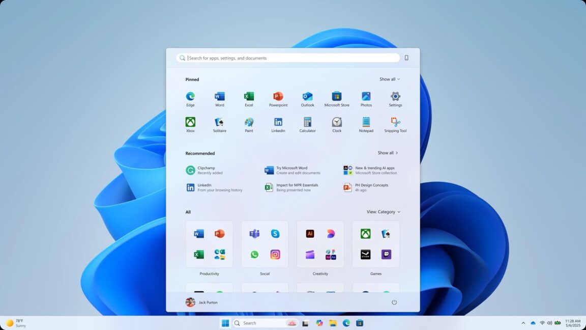
That insight reframed my approach, and we ultimately redesigned the flow to prioritize orientation and clear instructions before proceeding to the setup steps. Below is an example of one of the screen designs, including some of the instructions we added.
This kind of collaboration is user research. It’s not a substitute for talking to users directly, but it’s a powerful proxy when you have limited options.
But What About Using AI?
Glad you asked! Even AI tools, which are increasingly being used for idea generation, pattern recognition, or rapid prototyping, don’t replace collaboration; they just change the shape of it.
AI can help you explore design patterns, draft user flows, or generate multiple variations of a layout in seconds. It’s fantastic for getting past creative blocks or pressure-testing your assumptions. But let’s be clear: these tools are accelerators, not oracles. As an innovation and strategy consultant Nathan Waterhouse points out, AI can point you in a direction, but it can’t tell you which direction is the right one in your specific context. That still requires human judgment, empathy, and an understanding of the messy realities of users and business goals.
You still need people, especially those closest to your users, to validate, challenge, and evolve any AI-generated idea. For instance, you might use ChatGPT to brainstorm onboarding flows for a SaaS tool, but if you’re not involving customer support reps who regularly hear “I didn’t know where to start” or “I couldn’t even log in,” you’re just working with assumptions. The same applies to engineers who know what is technically feasible or PMs who understand where the business is headed.
AI can generate ideas, but only collaboration turns those ideas into something usable, valuable, and real. Think of it as a powerful ingredient, but not the whole recipe.
How To Strengthen Your UX Collaboration Skills?
If collaboration doesn’t come naturally or hasn’t been a focus, that’s okay. Like any skill, it can be practiced and improved. Here are a few ways to level up:
Cultivate curiosity about your teammates.Ask engineers what keeps them up at night. Learn what metrics your PMs care about. Understand the types of tickets the support team handles most frequently. The more you care about their challenges, the more they'll care about yours.
Get comfortable facilitating.You don’t need to be a certified Design Sprint master, but learning how to run a structured conversation, align stakeholders, or synthesize different points of view is hugely valuable. Even a simple “What’s working? What’s not?” retro can be an amazing starting point in identifying where you need to focus next.
Share early, share often.Don’t wait until your designs are polished to get input. Messy sketches and rough prototypes invite collaboration. When others feel like they’ve helped shape the work, they’re more invested in its success.
Practice active listening.When someone critiques your work, don’t immediately defend. Pause. Ask follow-up questions. Reframe the feedback. Collaboration isn’t about consensus; it’s about finding a shared direction that can honour multiple truths.
Co-own the outcome.Let go of your ego. The best UX work isn’t “your” work. It’s the result of many voices, skill sets, and conversations converging toward a solution that helps users. It’s not “I”, it’s “we” that will solve this problem together.
Conclusion: UX Is A Team Sport
Great design doesn’t emerge from a vacuum. It comes from open dialogue, cross-functional understanding, and a shared commitment to solving real problems for real people.
If there’s one thing I wish every early-career designer knew, it’s this:
Collaboration is not a side skill. It’s the engine behind every meaningful design outcome. And for seasoned professionals, it’s the superpower that turns good teams into great ones.
So next time you’re tempted to go heads-down and just “crank out a design,” pause to reflect. Ask who else should be in the room. And invite them in, not just to review your work, but to help create it.
Because in the end, the best UX isn’t just what you make. It’s what you make together.
Further Reading On SmashingMag
“Presenting UX Research And Design To Stakeholders: The Power Of Persuasion,” Victor Yocco
“Transforming The Relationship Between Designers And Developers,” Chris Day
“Effective Communication For Everyday Meetings,” Andrii Zhdan
“Preventing Bad UX Through Integrated Design Workflows,” Ceara Crawshaw
#collaboration #most #underrated #skill #one
Collaboration: The Most Underrated UX Skill No One Talks About
When people talk about UX, it’s usually about the things they can see and interact with, like wireframes and prototypes, smart interactions, and design tools like Figma, Miro, or Maze. Some of the outputs are even glamorized, like design systems, research reports, and pixel-perfect UI designs. But here’s the truth I’ve seen again and again in over two decades of working in UX: none of that moves the needle if there is no collaboration.
Great UX doesn’t happen in isolation. It happens through conversations with engineers, product managers, customer-facing teams, and the customer support teams who manage support tickets. Amazing UX ideas come alive in messy Miro sessions, cross-functional workshops, and those online chatswhere people align, adapt, and co-create.
Some of the most impactful moments in my career weren’t when I was “designing” in the traditional sense. They have been gaining incredible insights when discussing problems with teammates who have varied experiences, brainstorming, and coming up with ideas that I never could have come up with on my own. As I always say, ten minds in a room will come up with ten times as many ideas as one mind. Often, many ideas are the most useful outcome.
There have been times when a team has helped to reframe a problem in a workshop, taken vague and conflicting feedback, and clarified a path forward, or I’ve sat with a sales rep and heard the same user complaint show up in multiple conversations. This is when design becomes a team sport, and when your ability to capture the outcomes multiplies the UX impact.
Why This Article Matters Now
The reason collaboration feels so urgent now is that the way we work since COVID has changed, according to a study published by the US Department of Labor. Teams are more cross-functional, often remote, and increasingly complex. Silos are easier to fall into, due to distance or lack of face-to-face contact, and yet alignment has never been more important. We can’t afford to see collaboration as a “nice to have” anymore. It’s a core skill, especially in UX, where our work touches so many parts of an organisation.
Let’s break down what collaboration in UX really means, and why it deserves way more attention than it gets.
What Is Collaboration In UX, Really?
Let’s start by clearing up a misconception. Collaboration is not the same as cooperation.
Cooperation: “You do your thing, I’ll do mine, and we’ll check in later.”
Collaboration: “Let’s figure this out together and co-own the outcome.”
Collaboration, as defined in the book Communication Concepts, published by Deakin University, involves working with others to produce outputs and/or achieve shared goals. The outcome of collaboration is typically a tangible product or a measurable achievement, such as solving a problem or making a decision. Here’s an example from a recent project:
Recently, I worked on a fraud alert platform for a fintech business. It was a six-month project, and we had zero access to users, as the product had not yet hit the market. Also, the users were highly specialised in the B2B finance space and were difficult to find. Additionally, the team members I needed to collaborate with were based in Malaysia and Melbourne, while I am located in Sydney.
Instead of treating that as a dead end, we turned inward: collaborating with subject matter experts, professional services consultants, compliance specialists, and customer support team members who had deep knowledge of fraud patterns and customer pain points. Through bi-weekly workshops using a Miro board, iterative feedback loops, and sketching sessions, we worked on design solution options. I even asked them to present their own design version as part of the process.
After months of iterating on the fraud investigation platform through these collaboration sessions, I ended up with two different design frameworks for the investigator’s dashboard. Instead of just presenting the “best one” and hoping for buy-in, I ran a voting exercise with PMs, engineers, SMEs, and customer support. Everyone had a voice. The winning design was created and validated with the input of the team, resulting in an outcome that solved many problems for the end user and was owned by the entire team. That’s collaboration!
It is definitely one of the most satisfying projects of my career.
On the other hand, I recently caught up with an old colleague who now serves as a product owner. Her story was a cautionary tale: the design team had gone ahead with a major redesign of an app without looping her in until late in the game. Not surprisingly, the new design missed several key product constraints and business goals. It had to be scrapped and redone, with her now at the table. That experience reinforced what we all know deep down: your best work rarely happens in isolation.
As illustrated in my experience, true collaboration can span many roles. It’s not just between designers and PMs. It can also include QA testers who identify real-world issues, content strategists who ensure our language is clear and inclusive, sales representatives who interact with customers on a daily basis, marketers who understand the brand’s voice, and, of course, customer support agents who are often the first to hear when something goes wrong. The best outcomes arrive when we’re open to different perspectives and inputs.
Why Collaboration Is So Overlooked?
If collaboration is so powerful, why don’t we talk about it more?
In my experience, one reason is the myth of the “lone UX hero”. Many of us entered the field inspired by stories of design geniuses revolutionising products on their own. Our portfolios often reflect that as well. We showcase our solo work, our processes, and our wins. Job descriptions often reinforce the idea of the solo UX designer, listing tool proficiency and deliverables more than soft skills and team dynamics.
And then there’s the team culture within many organisations of “just get the work done”, which often leads to fewer meetings and tighter deadlines. As a result, a sense of collaboration is inefficient and wasted. I have also experienced working with some designers where perfectionism and territoriality creep in — “This is my design” — which kills the open, communal spirit that collaboration needs.
When Collaboration Is The User Research
In an ideal world, we’d always have direct access to users. But let’s be real. Sometimes that just doesn’t happen. Whether it’s due to budget constraints, time limitations, or layers of bureaucracy, talking to end users isn’t always possible. That’s where collaboration with team members becomes even more crucial.
The next best thing to talking to users? Talking to the people who talk to users. Sales teams, customer success reps, tech support, and field engineers. They’re all user researchers in disguise!
On another B2C project, the end users were having trouble completing the key task. My role was to redesign the onboarding experience for an online identity capture tool for end users. I was unable to schedule interviews with end users due to budget and time constraints, so I turned to the sales and tech support teams.
I conducted multiple mini-workshops to identify the most common onboarding issues they had heard directly from our customers. This led to a huge “aha” moment: most users dropped off before the document capture process. They may have been struggling with a lack of instruction, not knowing the required time, or not understanding the steps involved in completing the onboarding process.
That insight reframed my approach, and we ultimately redesigned the flow to prioritize orientation and clear instructions before proceeding to the setup steps. Below is an example of one of the screen designs, including some of the instructions we added.
This kind of collaboration is user research. It’s not a substitute for talking to users directly, but it’s a powerful proxy when you have limited options.
But What About Using AI?
Glad you asked! Even AI tools, which are increasingly being used for idea generation, pattern recognition, or rapid prototyping, don’t replace collaboration; they just change the shape of it.
AI can help you explore design patterns, draft user flows, or generate multiple variations of a layout in seconds. It’s fantastic for getting past creative blocks or pressure-testing your assumptions. But let’s be clear: these tools are accelerators, not oracles. As an innovation and strategy consultant Nathan Waterhouse points out, AI can point you in a direction, but it can’t tell you which direction is the right one in your specific context. That still requires human judgment, empathy, and an understanding of the messy realities of users and business goals.
You still need people, especially those closest to your users, to validate, challenge, and evolve any AI-generated idea. For instance, you might use ChatGPT to brainstorm onboarding flows for a SaaS tool, but if you’re not involving customer support reps who regularly hear “I didn’t know where to start” or “I couldn’t even log in,” you’re just working with assumptions. The same applies to engineers who know what is technically feasible or PMs who understand where the business is headed.
AI can generate ideas, but only collaboration turns those ideas into something usable, valuable, and real. Think of it as a powerful ingredient, but not the whole recipe.
How To Strengthen Your UX Collaboration Skills?
If collaboration doesn’t come naturally or hasn’t been a focus, that’s okay. Like any skill, it can be practiced and improved. Here are a few ways to level up:
Cultivate curiosity about your teammates.Ask engineers what keeps them up at night. Learn what metrics your PMs care about. Understand the types of tickets the support team handles most frequently. The more you care about their challenges, the more they'll care about yours.
Get comfortable facilitating.You don’t need to be a certified Design Sprint master, but learning how to run a structured conversation, align stakeholders, or synthesize different points of view is hugely valuable. Even a simple “What’s working? What’s not?” retro can be an amazing starting point in identifying where you need to focus next.
Share early, share often.Don’t wait until your designs are polished to get input. Messy sketches and rough prototypes invite collaboration. When others feel like they’ve helped shape the work, they’re more invested in its success.
Practice active listening.When someone critiques your work, don’t immediately defend. Pause. Ask follow-up questions. Reframe the feedback. Collaboration isn’t about consensus; it’s about finding a shared direction that can honour multiple truths.
Co-own the outcome.Let go of your ego. The best UX work isn’t “your” work. It’s the result of many voices, skill sets, and conversations converging toward a solution that helps users. It’s not “I”, it’s “we” that will solve this problem together.
Conclusion: UX Is A Team Sport
Great design doesn’t emerge from a vacuum. It comes from open dialogue, cross-functional understanding, and a shared commitment to solving real problems for real people.
If there’s one thing I wish every early-career designer knew, it’s this:
Collaboration is not a side skill. It’s the engine behind every meaningful design outcome. And for seasoned professionals, it’s the superpower that turns good teams into great ones.
So next time you’re tempted to go heads-down and just “crank out a design,” pause to reflect. Ask who else should be in the room. And invite them in, not just to review your work, but to help create it.
Because in the end, the best UX isn’t just what you make. It’s what you make together.
Further Reading On SmashingMag
“Presenting UX Research And Design To Stakeholders: The Power Of Persuasion,” Victor Yocco
“Transforming The Relationship Between Designers And Developers,” Chris Day
“Effective Communication For Everyday Meetings,” Andrii Zhdan
“Preventing Bad UX Through Integrated Design Workflows,” Ceara Crawshaw
#collaboration #most #underrated #skill #one