Design can make you feel things
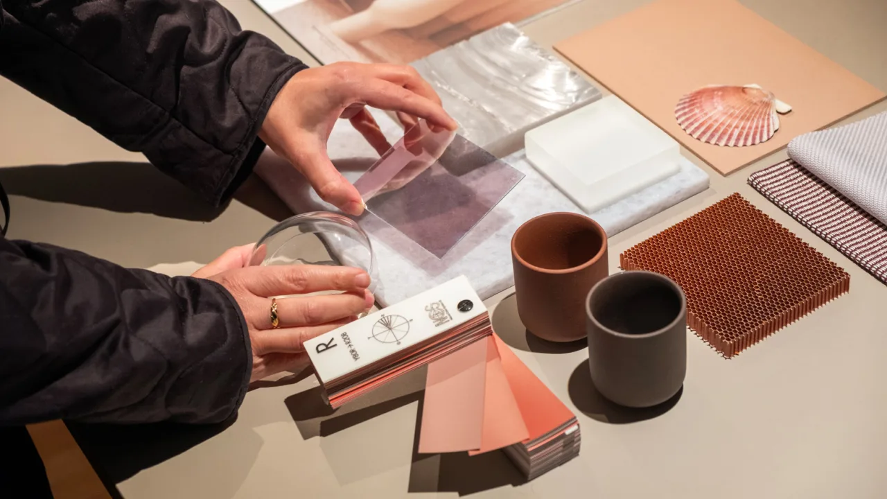
Lyse Martel is a Berlin-based “Color, Materials, and Finish”designer and strategist in the mobility and consumer electronics industries. Her work combines craftsmanship and emerging technology to shape design strategy, drive material innovation, and create new sensory experiences. Lyse is fascinated by design’s power to shape how people feel and act. She believes design can foster emotional connection and wellbeing at a time when AI and automation are making their way into many new consumer product experiences, from the car to the living room. Below, Martel explores the emotional dimension of circular design and how the CMF field is evolving to meet the global challenges of circularity and sustainability. Fast Company: Please introduce yourself to our readers.Lyse MartelLyse Martel: I’m Lyse Martel, a CMF designer and design strategist, working primarily in automotive and consumer electronics. CMF, which stands for Color, Materials, and Finish, is about how a product looks, feels, and connects emotionally. So my work focuses on those elements as well as on strategy, brand identity, and sustainability. Although I mainly work in automotive and consumer electronics, CMF can apply to many different areas. Over the years I’ve worked with brands like Bang & Olufsen, Hopium, and NIO. And most recently I was directing a circular design project at Volkswagen Group—designing for circularity from the start with a large team of designers from different disciplines. How did you find your way into this field? It was step by step. My love for design was always there, even before I knew what to call it. It was shaped by my family’s craftsmanship, as well as my own curiosity for shapes, textures, colors, and sensory experiences. On my father’s side, I grew up around a lot of woodworking and carpentry. And on my mother’s side are generations of tailors. So that gave me an appreciation for textiles and textures and detailing and crafts. And I’ve always loved illustration and drawing and building small architectures with natural elements—everything that could involve materials and aesthetics. And I think that brought me to materiality and storytelling and eventually to CMF design. Were you able to find an educational path that encouraged your interests? I went to a specialized high school for applied arts and design, where I grew immensely as a creative person, and had a teacher who supported me and saw my potential with conceptual thinking. At university another teacher encouraged me to apply to a design internship in the automotive sector in Paris, and that’s how I formally entered the CMF design field. I was immediately drawn to the innovation and complexity of using material and color to shape the brand identity for a mobility project. How do you stay on top of trends in color and material?Much of it is intuitive, but we also learn to connect the dots and see trends. I’m very much inspired by psychology and by what’s going on in the world—anything that could possibly impact human experiences and emotions. I’m paying attention to developments in architecture, interiors, digital and physical design, and material innovation. I’m also looking at global trends that have nothing to do with the design industry, including culture and the natural world. Nature plays a big role because you can look at how light interacts, how materials evolve with time, the functioning of ecosystems, and agriculture. I’m also very interested in how CMF design intersects with concepts like wellbeing and happiness, so I follow influential practitioners like Ivy Ross from Google, and Susan Magsamen, who works on neuroaesthetics, and Carol Gilligan, the psychologist and philosopher. Could you share more about neuroaesthetics? Neuroaesthetics looks at how design makes people feel: how beauty and art and design influence our brain, and how things like color, textures, light, and sound make us react cognitively or emotionally. We know that certain visual experiences will calm or excite us, while others make us feel uncomfortable. Designers can leverage those insights to create more meaningful and intuitive interactions. I’ve always been fascinated by how design makes people feel, and neuroaesthetics gives us the scientific reasoning behind those ideas. For instance, when I’m working with color and material for a car interior, I can decide to craft a more calming atmosphere with natural materials, or use soft lighting or a color gradient that can guide the user’s eye. I can think about how textures and tactility will influence the user’s feeling of comfort, or their perception of product quality or durability. When it comes to sustainability, there are a lot of materials that may not be readily acceptable to a user. In that case it can be helpful to lean into the authenticity of that material, perhaps by making it warmer or softer, or relating it to nature through colors or grain. So if we can somehow elevate or upscale the experience with that material, then we can start to shift the mindset to embrace sustainable materials or choices. Earlier you mentioned your work in circular design. Could you share more about that? Circular design is rethinking how we create and use products. It means designing for longevity, adaptability, and regeneration. We seek out the right materials, we design for easy reuse and repair, and we try to ensure that the product stays in circulation for as long as possible. Longevity is the number one criteria, because the longer you use a product, the less impact it has in terms of greenhouse gas emissions and other waste metrics. With circularity do you encounter pushback from industries that simply need consumers to keep buying more stuff? It does clash with short-term profit models, so it’s not easy for businesses to embrace it completely. But there is momentum for circular design, which is driven by consumer expectations, tighter regulations, and a growing recognition that resource efficiency is also smart business. I’ve seen mobility and consumer electronics firms try out concepts like modularity, repairability, and designing with disassembly in mind. Neuroaesthetics seems to be a strategy for tapping into people’s innate preferences for certain colors, materials, and finishes. But could also instigate behavior change, by tapping into the emotional layer of circularity? Absolutely, it can be surprisingly comforting, even if the materials are unexpected. When designing a circular product, you’re often working with waste, like a polymer that’s meant to circulate between cars. The challenge is making that material feel good, both emotionally and physically. What works is embracing the material’s character, maybe it has a soft texture or a slight irregularity, like a grain or uneven thread. Or it comes in a natural color that feels ultra-fresh. These little details shift the focus from what it is to how it makes you feel. You might not even realize it’s recycled plastic, but it just feels right. Sometimes, a car interior can feel like a cozy cabin, all because of the right textures and tones. That emotional layer is what really connects circularity.How could neuroaesthetics help make people comfortable with something new, like self-driving cars? It’s really about how shapes, colors and textures support the digital experience; all the micro-details working together to help the user feel at ease. I’ve been testing self-driving vehicles recently, and it’s surprising how much the environment impacts your reaction. In one case, the layout was minimal, with just the right number of buttons, and that simplicity helped me relax. But I also tested a car that was entirely gray, and it felt dull and dated. Light tones or soft gradients, something that evokes a sunrise or sunset, can go a long way in making the space feel more inviting.With automation, trust becomes a key part of the brief. How easily will someone understand what’s happening? Are they okay letting go of the wheel? That’s where CMF design needs to be fully integrated. I have to work closely with the interior and UX designers so that everything speaks the same language. If I propose a soft, natural palette and the shapes are cold or aggressive, it creates a disconnect.Can you share how you use AI in your work, or how AI factors into the CMF design process? It’s part of my creative process in that it helps me visualize materials, colors, and sensory experiences I’m considering for a project. It’s a great way to communicate an idea visually, and also to put it out there so someone else can pick it up and build on it. So for me, it’s really a tool that helps us be more precise in how we express and share ideas.There are also really promising use cases in circular design, where AI can help us map local resources and integrate them more intelligently into products. For example, there’s a lot of bamboo in China, linen in the north of France, or paper waste around Berlin. So what can we do with that knowledge? We can see where materials are available, but also think about how to reduce waste, predict life cycles, or imagine new reuse scenarios. Anything that involves localizing or optimizing can be supported by AI.And as the digital world increasingly shapes the physical one, I think there’s real potential in using these new, hyper-sensory AI-generated visuals to inspire physical experiences. Neuroaesthetics helps us design for emotion, and AI can help translate those emotional cues into visual concepts that, when made real, feel meaningful and multi-sensory. Do you ever get any pushback for the decisions that you or your team might make as CMF designers? Sometimes there’s a strong reaction to a particular color or material choice. I remember working on a concept car called Eve, developed with a strong focus on emerging markets and innovative design languages. I proposed an exterior in a rose gold tone, which could be read as pink. That sparked some discomfort in the room. I think it challenged certain expectations of what a car should look like, especially in Western automotive culture. But in China, rose gold is often associated with refinement and quality. It’s not seen as gendered in the same way. So for me, it was an opportunity to bring a fresh, culturally relevant aesthetic into the project. I understood the hesitation, but that’s part of the role. Sometimes CMF invites us to gently shift the visual language and open up new emotional possibilities.Are there certain colors and finishes that are timeless and others that are more transitory? In the last decade we used a lot of neutrals, like beige and gray. Many brands also decided to shape themselves around their core colors—“our black,” “our white,” etc. And they would build up from there to include more exciting colors into their identity. Today I see those approaches being challenged. Gen Z is coming in and they have other ideas about what’s fresh. In the past few years we saw a lot of yellows. Recently, dark reds have been popping up everywhere, and they’re a powerful, timeless choice that adds richness and sophistication. These colors grab attention and can work well, but we need to be mindful of their relevance for long-term products.I believe there is still a need for that core timelessness. You might use black as a core color, but you might tint it blue to make it more interesting or less intense. When I was at Bang & Olufsen, we often discussed how to stand out from typical black consumer electronics. For a more lifestyle-oriented, subtle design in the home, why not use gray?Are you ever surprised when a particular color takes off? The latest Pantone color of the year is a brown-beige shade, which honestly surprised me. I’ve used warm grays before when I wanted to give a product a cozier, inviting feel, but this one doesn’t feel as fresh to me. I’m not sure it resonates with the moment in the same way other trends do. I love when a heritage brand takes an unexpected turn, like the paper company GF Smith, which recently rebranded with vibrant, poppy colors and introduced a bespoke, rounded sans-serif typeface, GF Smith Homie. I like to see they are brushing off the history to embrace different values and just be human. They want to stand for inclusivity, so they’re going to speak up about that and make sure it’s seen in the brand.Where do you draw creative inspiration? It’s really what makes me burn, what is calling my heart. I also need to talk to people—not only creatives, but people from all walks of life. I enjoy traveling through my city and looking at how people live. I learn a lot simply from riding the train, overhearing conversations, and observing how the mood changes with the seasons. I also read the news and check out certain magazines. There’s one I like, Imagine5, that focuses on how to make sustainability joyful. It explores that from all angles and it’s very accessible. You don’t have to be a sustainability expert to enjoy it. Could you share some of the projects you’ve worked on that you’re most proud of? I joined the global smart EV brand NIO in its early stages, when the brand vision was still taking shape, and contributed to the initial direction of color, materials, and finishes as part of the design team. The objective was to align with their vision of “Blue Sky Coming,” so we had to come up with progressive aesthetics and human-centered design, which later evolved into design principles. Shaping that brand was extremely rich for me in terms of learning and collaborating with so many talented designers. I also led a couple of projects – one was the previously mentioned concept car called Eve. I had the opportunity to introduce more natural materials and different colors that were not commonly used in the automotive space.Introducing new aesthetics became an important theme for my later work with Bang & Olufsen, which was about connecting the dots between sound and material and design. And then more recently, the circularity project I’ve been leading for Volkswagen Group is really close to my heart. The brief was to introduce longevity, adaptability, and recyclability across all design touch points for Volkswagen. To that end we provided creative direction that considered everything from exterior design, interior, user experience, and materiality.It was an interesting challenge to find the emotional layer of circularity, while staying on brand for Volkswagen. Circularity has a lot of very technical aspects, but as designers we can make circularity tangible. How do you deal with mistakes or failure in the creative process? I view mistakes or failure as an opportunity to test more, to rethink, and to reframe. If a design doesn’t work, how can we regroup and find a solution that’s way more interesting and beyond the obvious? In the creative process there can be a lot of fear associated with going against the grain. What I’ve noticed is that if we stay in that fear space, we close ourselves off to opportunities. It’s important to be in an open space of creativity and curiosity. Allow mistakes and failure to happen. When there is joy in the process and a strong intuition, you produce better results in the end. What advice would you give to aspiring designers, but also anyone who wants to enter the world you inhabit? Great design comes from a constantly growing and inspired mind. Stay curious and know that inspiration comes from everywhere. Embrace your uniqueness, but also be able to evolve from that. Be open to change and to new perspectives. There will be tough feedback and creative disagreements, but the important thing is how you receive those situations. Maintain a mindset of abundance and try to see the positive in anything you do. Finally, as creatives it’s important for us to take time alone to recharge, to reflect, and to work on our magic. When you’re feeling well and thriving individually, your creativity also does. At that point it’s crucial to rejoin the collective, where you have a chance to collaborate and experience the diversity of perspectives that fuels creativity. It can be a tough road for aspiring designers, but I would encourage them to proceed with care and openness, and to leave their fears behind.
#design #can #make #you #feelDesign can make you feel things
Lyse Martel is a Berlin-based “Color, Materials, and Finish”designer and strategist in the mobility and consumer electronics industries. Her work combines craftsmanship and emerging technology to shape design strategy, drive material innovation, and create new sensory experiences. Lyse is fascinated by design’s power to shape how people feel and act. She believes design can foster emotional connection and wellbeing at a time when AI and automation are making their way into many new consumer product experiences, from the car to the living room. Below, Martel explores the emotional dimension of circular design and how the CMF field is evolving to meet the global challenges of circularity and sustainability. Fast Company: Please introduce yourself to our readers.Lyse MartelLyse Martel: I’m Lyse Martel, a CMF designer and design strategist, working primarily in automotive and consumer electronics. CMF, which stands for Color, Materials, and Finish, is about how a product looks, feels, and connects emotionally. So my work focuses on those elements as well as on strategy, brand identity, and sustainability. Although I mainly work in automotive and consumer electronics, CMF can apply to many different areas. Over the years I’ve worked with brands like Bang & Olufsen, Hopium, and NIO. And most recently I was directing a circular design project at Volkswagen Group—designing for circularity from the start with a large team of designers from different disciplines. How did you find your way into this field? It was step by step. My love for design was always there, even before I knew what to call it. It was shaped by my family’s craftsmanship, as well as my own curiosity for shapes, textures, colors, and sensory experiences. On my father’s side, I grew up around a lot of woodworking and carpentry. And on my mother’s side are generations of tailors. So that gave me an appreciation for textiles and textures and detailing and crafts. And I’ve always loved illustration and drawing and building small architectures with natural elements—everything that could involve materials and aesthetics. And I think that brought me to materiality and storytelling and eventually to CMF design. Were you able to find an educational path that encouraged your interests? I went to a specialized high school for applied arts and design, where I grew immensely as a creative person, and had a teacher who supported me and saw my potential with conceptual thinking. At university another teacher encouraged me to apply to a design internship in the automotive sector in Paris, and that’s how I formally entered the CMF design field. I was immediately drawn to the innovation and complexity of using material and color to shape the brand identity for a mobility project. How do you stay on top of trends in color and material?Much of it is intuitive, but we also learn to connect the dots and see trends. I’m very much inspired by psychology and by what’s going on in the world—anything that could possibly impact human experiences and emotions. I’m paying attention to developments in architecture, interiors, digital and physical design, and material innovation. I’m also looking at global trends that have nothing to do with the design industry, including culture and the natural world. Nature plays a big role because you can look at how light interacts, how materials evolve with time, the functioning of ecosystems, and agriculture. I’m also very interested in how CMF design intersects with concepts like wellbeing and happiness, so I follow influential practitioners like Ivy Ross from Google, and Susan Magsamen, who works on neuroaesthetics, and Carol Gilligan, the psychologist and philosopher. Could you share more about neuroaesthetics? Neuroaesthetics looks at how design makes people feel: how beauty and art and design influence our brain, and how things like color, textures, light, and sound make us react cognitively or emotionally. We know that certain visual experiences will calm or excite us, while others make us feel uncomfortable. Designers can leverage those insights to create more meaningful and intuitive interactions. I’ve always been fascinated by how design makes people feel, and neuroaesthetics gives us the scientific reasoning behind those ideas. For instance, when I’m working with color and material for a car interior, I can decide to craft a more calming atmosphere with natural materials, or use soft lighting or a color gradient that can guide the user’s eye. I can think about how textures and tactility will influence the user’s feeling of comfort, or their perception of product quality or durability. When it comes to sustainability, there are a lot of materials that may not be readily acceptable to a user. In that case it can be helpful to lean into the authenticity of that material, perhaps by making it warmer or softer, or relating it to nature through colors or grain. So if we can somehow elevate or upscale the experience with that material, then we can start to shift the mindset to embrace sustainable materials or choices. Earlier you mentioned your work in circular design. Could you share more about that? Circular design is rethinking how we create and use products. It means designing for longevity, adaptability, and regeneration. We seek out the right materials, we design for easy reuse and repair, and we try to ensure that the product stays in circulation for as long as possible. Longevity is the number one criteria, because the longer you use a product, the less impact it has in terms of greenhouse gas emissions and other waste metrics. With circularity do you encounter pushback from industries that simply need consumers to keep buying more stuff? It does clash with short-term profit models, so it’s not easy for businesses to embrace it completely. But there is momentum for circular design, which is driven by consumer expectations, tighter regulations, and a growing recognition that resource efficiency is also smart business. I’ve seen mobility and consumer electronics firms try out concepts like modularity, repairability, and designing with disassembly in mind. Neuroaesthetics seems to be a strategy for tapping into people’s innate preferences for certain colors, materials, and finishes. But could also instigate behavior change, by tapping into the emotional layer of circularity? Absolutely, it can be surprisingly comforting, even if the materials are unexpected. When designing a circular product, you’re often working with waste, like a polymer that’s meant to circulate between cars. The challenge is making that material feel good, both emotionally and physically. What works is embracing the material’s character, maybe it has a soft texture or a slight irregularity, like a grain or uneven thread. Or it comes in a natural color that feels ultra-fresh. These little details shift the focus from what it is to how it makes you feel. You might not even realize it’s recycled plastic, but it just feels right. Sometimes, a car interior can feel like a cozy cabin, all because of the right textures and tones. That emotional layer is what really connects circularity.How could neuroaesthetics help make people comfortable with something new, like self-driving cars? It’s really about how shapes, colors and textures support the digital experience; all the micro-details working together to help the user feel at ease. I’ve been testing self-driving vehicles recently, and it’s surprising how much the environment impacts your reaction. In one case, the layout was minimal, with just the right number of buttons, and that simplicity helped me relax. But I also tested a car that was entirely gray, and it felt dull and dated. Light tones or soft gradients, something that evokes a sunrise or sunset, can go a long way in making the space feel more inviting.With automation, trust becomes a key part of the brief. How easily will someone understand what’s happening? Are they okay letting go of the wheel? That’s where CMF design needs to be fully integrated. I have to work closely with the interior and UX designers so that everything speaks the same language. If I propose a soft, natural palette and the shapes are cold or aggressive, it creates a disconnect.Can you share how you use AI in your work, or how AI factors into the CMF design process? It’s part of my creative process in that it helps me visualize materials, colors, and sensory experiences I’m considering for a project. It’s a great way to communicate an idea visually, and also to put it out there so someone else can pick it up and build on it. So for me, it’s really a tool that helps us be more precise in how we express and share ideas.There are also really promising use cases in circular design, where AI can help us map local resources and integrate them more intelligently into products. For example, there’s a lot of bamboo in China, linen in the north of France, or paper waste around Berlin. So what can we do with that knowledge? We can see where materials are available, but also think about how to reduce waste, predict life cycles, or imagine new reuse scenarios. Anything that involves localizing or optimizing can be supported by AI.And as the digital world increasingly shapes the physical one, I think there’s real potential in using these new, hyper-sensory AI-generated visuals to inspire physical experiences. Neuroaesthetics helps us design for emotion, and AI can help translate those emotional cues into visual concepts that, when made real, feel meaningful and multi-sensory. Do you ever get any pushback for the decisions that you or your team might make as CMF designers? Sometimes there’s a strong reaction to a particular color or material choice. I remember working on a concept car called Eve, developed with a strong focus on emerging markets and innovative design languages. I proposed an exterior in a rose gold tone, which could be read as pink. That sparked some discomfort in the room. I think it challenged certain expectations of what a car should look like, especially in Western automotive culture. But in China, rose gold is often associated with refinement and quality. It’s not seen as gendered in the same way. So for me, it was an opportunity to bring a fresh, culturally relevant aesthetic into the project. I understood the hesitation, but that’s part of the role. Sometimes CMF invites us to gently shift the visual language and open up new emotional possibilities.Are there certain colors and finishes that are timeless and others that are more transitory? In the last decade we used a lot of neutrals, like beige and gray. Many brands also decided to shape themselves around their core colors—“our black,” “our white,” etc. And they would build up from there to include more exciting colors into their identity. Today I see those approaches being challenged. Gen Z is coming in and they have other ideas about what’s fresh. In the past few years we saw a lot of yellows. Recently, dark reds have been popping up everywhere, and they’re a powerful, timeless choice that adds richness and sophistication. These colors grab attention and can work well, but we need to be mindful of their relevance for long-term products.I believe there is still a need for that core timelessness. You might use black as a core color, but you might tint it blue to make it more interesting or less intense. When I was at Bang & Olufsen, we often discussed how to stand out from typical black consumer electronics. For a more lifestyle-oriented, subtle design in the home, why not use gray?Are you ever surprised when a particular color takes off? The latest Pantone color of the year is a brown-beige shade, which honestly surprised me. I’ve used warm grays before when I wanted to give a product a cozier, inviting feel, but this one doesn’t feel as fresh to me. I’m not sure it resonates with the moment in the same way other trends do. I love when a heritage brand takes an unexpected turn, like the paper company GF Smith, which recently rebranded with vibrant, poppy colors and introduced a bespoke, rounded sans-serif typeface, GF Smith Homie. I like to see they are brushing off the history to embrace different values and just be human. They want to stand for inclusivity, so they’re going to speak up about that and make sure it’s seen in the brand.Where do you draw creative inspiration? It’s really what makes me burn, what is calling my heart. I also need to talk to people—not only creatives, but people from all walks of life. I enjoy traveling through my city and looking at how people live. I learn a lot simply from riding the train, overhearing conversations, and observing how the mood changes with the seasons. I also read the news and check out certain magazines. There’s one I like, Imagine5, that focuses on how to make sustainability joyful. It explores that from all angles and it’s very accessible. You don’t have to be a sustainability expert to enjoy it. Could you share some of the projects you’ve worked on that you’re most proud of? I joined the global smart EV brand NIO in its early stages, when the brand vision was still taking shape, and contributed to the initial direction of color, materials, and finishes as part of the design team. The objective was to align with their vision of “Blue Sky Coming,” so we had to come up with progressive aesthetics and human-centered design, which later evolved into design principles. Shaping that brand was extremely rich for me in terms of learning and collaborating with so many talented designers. I also led a couple of projects – one was the previously mentioned concept car called Eve. I had the opportunity to introduce more natural materials and different colors that were not commonly used in the automotive space.Introducing new aesthetics became an important theme for my later work with Bang & Olufsen, which was about connecting the dots between sound and material and design. And then more recently, the circularity project I’ve been leading for Volkswagen Group is really close to my heart. The brief was to introduce longevity, adaptability, and recyclability across all design touch points for Volkswagen. To that end we provided creative direction that considered everything from exterior design, interior, user experience, and materiality.It was an interesting challenge to find the emotional layer of circularity, while staying on brand for Volkswagen. Circularity has a lot of very technical aspects, but as designers we can make circularity tangible. How do you deal with mistakes or failure in the creative process? I view mistakes or failure as an opportunity to test more, to rethink, and to reframe. If a design doesn’t work, how can we regroup and find a solution that’s way more interesting and beyond the obvious? In the creative process there can be a lot of fear associated with going against the grain. What I’ve noticed is that if we stay in that fear space, we close ourselves off to opportunities. It’s important to be in an open space of creativity and curiosity. Allow mistakes and failure to happen. When there is joy in the process and a strong intuition, you produce better results in the end. What advice would you give to aspiring designers, but also anyone who wants to enter the world you inhabit? Great design comes from a constantly growing and inspired mind. Stay curious and know that inspiration comes from everywhere. Embrace your uniqueness, but also be able to evolve from that. Be open to change and to new perspectives. There will be tough feedback and creative disagreements, but the important thing is how you receive those situations. Maintain a mindset of abundance and try to see the positive in anything you do. Finally, as creatives it’s important for us to take time alone to recharge, to reflect, and to work on our magic. When you’re feeling well and thriving individually, your creativity also does. At that point it’s crucial to rejoin the collective, where you have a chance to collaborate and experience the diversity of perspectives that fuels creativity. It can be a tough road for aspiring designers, but I would encourage them to proceed with care and openness, and to leave their fears behind.
#design #can #make #you #feel