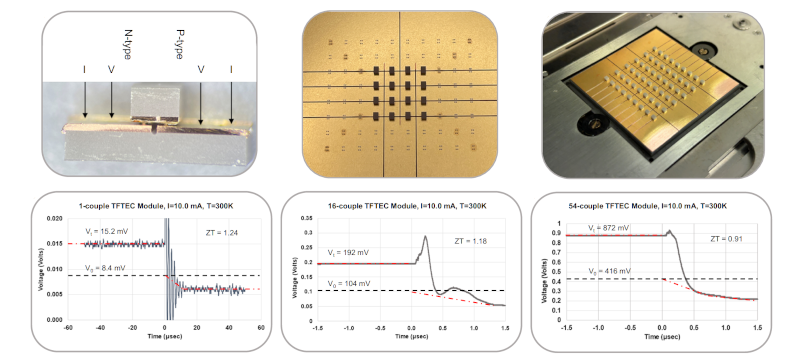
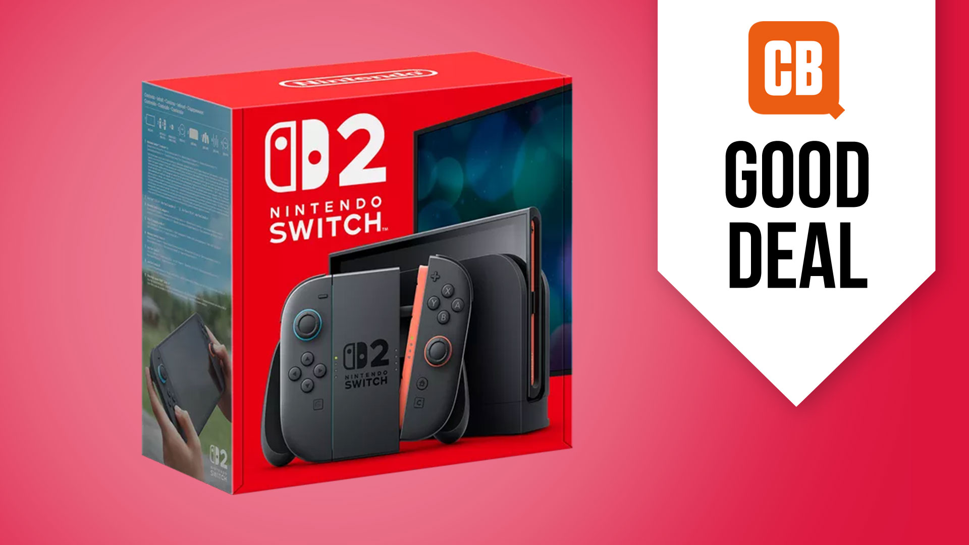
• WWW.POLYGON.COM
    Palias new Home Tours showcase some delightful and creative plots
    Image: Singularity 6 via Polygon A magical mystery Home Tour Continue reading
    0 Commentarii 0 Distribuiri 209 Views
  • WWW.POLYGON.COM
    Microsoft embraces transparent tech with new metallic sky blue Xbox controller
    Image: Microsoft Pre-order the Sky Cipher Special Edition Xbox wirelessgamepad ahead of its Aug. 13 release Continue reading
    0 Commentarii 0 Distribuiri 208 Views
  • WWW.POLYGON.COM
    College Football 25 wouldnt have been possible without AI, EA boss says
    Image: EA Tiburon/Electronic Arts Machine learning and AI helped EA Sports get 11,000 players into its college football game Continue reading
    0 Commentarii 0 Distribuiri 200 Views
  • WWW.POLYGON.COM
    Heres the official slate of upcoming Star Wars movies and TV
    Image: Lucasfilm/Disney The future of a galaxy far, far away Continue reading
    0 Commentarii 0 Distribuiri 197 Views
  • SMASHINGMAGAZINE.COM
    Hidden vs. Disabled In UX
    Both hiding and disabling features can be utterly confusing to users. And for both, we need very, very good reasons. Lets take a closer look at what we need to consider when it comes to hiding and disabling and possible alternatives that help enhance the UX.This article is part of our ongoing series on design patterns. Its also an upcoming part of the 10h-video library on Smart Interface Design Patterns and the upcoming live UX training as well. Use code BIRDIE to save 15% off.Show Whats Needed, Declutter The RestYouve probably been there before: Should you hide or disable a feature? When we hide a feature, we risk hurting discoverability. When we disable it without any explanation, we risk that users get frustrated. So, whats the best way to design for those instances when some options might be irrelevant or unavailable to users?As a rule of thumb, disable if you want the user to know a feature exists but is unavailable. Hide if the value shown is currently irrelevant and cant be used. But never hide buttons or key filters by default as users expect them to persist.Unlike hidden features, disabled features can help users learn the UI, e.g., to understand the benefits of an upgrade. So, instead of removing unavailable options or buttons, consider disabling them and allowing the user to Hide all unavailable options. Be sure to explain why a feature is disabled and also how to re-enable it.Another thing to watch out for: When we allow users to switch between showing and hiding a feature, we also need to ensure the switch doesnt cause any layout shifts.For both hiding and disabling, we need very thorough considerations of available alternatives, e.g., enabled buttons, read-only state, better empty states, hide/reveal accordions, error messages, and customization. We need to show whats needed and de-clutter the rest.Whenever possible, I try to keep buttons and features in their default state enabled, accessible, and legible. When a user interacts with that feature, we can explain why they cant use it, how to enable it, and how to keep it enabled. Possible exceptions are confirmation codes and loading/processing states.Hiding vs. Disabling RoadmapAs Sam Salomon suggests, if youre unsure whether hiding or disabling is the best option for your use case, ask yourself the following question: Will a given user ever be able to interact with this element? Depending on your answer, follow the steps below. Yes Disable it (as disabled buttons or read-only state). For temporary restrictions or filter incompatibility. When a value or status is relevant but not editable. When an action isnt available yet (e.g., Export in progress...). No Hide it (remove from a toolbar, collapse in accordion). E.g., due to permissions, access controls, safety, and security. For inaccessible features: e.g., admin buttons, overrides. Hide such controls by default and reveal them once a condition is met.Key TakeawaysHiding important features hurts their discoverability.Disabling features is frustrating without an explanation.But some options might be irrelevant/unavailable to users.Users might expect a feature to exist but wont find it.We need to show whats needed and de-clutter the rest.Avoid disruptive layout shifts as you show and hide features.Dont remove unavailable options or buttons automatically.Instead, disable them and allow it to Hide all unavailable options.Allow users to hide sections with a lot of disabled functionality.Explain why a feature is disabled and how to re-enable it.Hidden vs. Disabled In Design SystemsThe design systems below provide useful real-world examples of how products design their hidden and disabled states.Carbon (disabled state)Carbon (read-only state)UnityVaadinSAPMotifEmplifiUseful ResourcesDisabled Buttons And What To Do Instead, by Adam SilverHidden vs. Disabled States, by Maria PanagiotidiMaking Disabled Buttons Inclusive, by Sandrina PereiraHide or Disable, by Sam SolomonThe Disabled State In UI Design (Sketchnotes), by Krisztina SzerovayUsability Pitfalls of Disabled Buttons, by yours truly Vitaly FriedmanAlternative Design Patterns For Disabled Features, by Katie JacquezDesigning Filters UX That Works, by yours truly Vitaly FriedmanUI Traps: Disabled Buttons and Inputs, by James CarletonMeet Smart Interface Design PatternsIf you are interested in similar insights around UX, take a look at Smart Interface Design Patterns, our 10h-video course with 100s of practical examples from real-life projects with a live UX training later this year. Everything from mega-dropdowns to complex enterprise tables with 5 new segments added every year. Jump to a free preview.Meet Smart Interface Design Patterns, our video course on interface design & UX.Jump to the video course100 design patterns & real-life examples.10h-video course + live UX training. Free preview.
    0 Commentarii 0 Distribuiri 282 Views
  • SMASHINGMAGAZINE.COM
    Building A User Segmentation Matrix To Foster Cross-Org Alignment
    Do you recognize this situation? The marketing and business teams talk about their customers, and each team thinks they have the same understanding of the problem and what needs to be done. Then, theyre including the Product and UX team in the conversation around how to best serve a particular customer group and where to invest in development and marketing efforts. Theyve done their initial ideation and are trying to prioritize, but this turns into a long discussion with the different teams favoring different areas to focus on. Suddenly, an executive highlights that instead of this customer segment, there should be a much higher focus on an entirely different segment and the whole discussion starts again.This situation often arises when there is no joint-up understanding of the different customer segments a company is serving historically and strategically. And there is no shared understanding beyond using the same high-level terms. To reach this understanding, you need to dig deeper into segment definitions, goals, pain points, and jobs-to-be-done (JTBD) so as to enable the organization to make evidence-based decisions instead of having to rely on top-down prioritization.The hardest part about doing the right thing for your user or customers (please note Im aware these terms arent technically the same, but Im using them interchangeably in this article so as to be useful to a wider audience) often starts inside your own company and getting different teams with diverging goals and priorities to agree on where to focus and why.But how do you get there thinking user-first AND ensuring teams are aligned and have a shared mental model of primary and secondary customer segments?Personas vs SegmentsTo explore that further, lets take a brief look at the most commonly applied techniques to better understand customers and communicate this knowledge within organizations.Two frequently employed tools are user personas and user segmentation.Product/UX (or non-demographic) personas aim to represent the characteristics and needs of a certain type of customer, as well as their motivations and experience. The aim is to illustrate an ideal customer and allow teams to empathize and solve different use cases. Marketing (or demographic) personas, on the other hand, traditionally focus on age, socio-demographics, education, and geography but usually dont include needs, motivations, or other contexts. So theyre good for targeting but not great for identifying new potential solutions or helping teams prioritize.In contrast to personas, user segments illustrate groups of customers with shared needs, characteristics, and actions. They are relatively high-level classifications, deliberately looking at a whole group of needs without telling a detailed story. The aim is to gain a broader overview of the wider markets wants and needs.Tony Ulwick, creator of the jobs-to-be-done framework, for example, creates outcome-based segmentations, which are quite similar to what this article is proposing. Other types of segmentations include geographic, psychographic, demographic, or needs-based segmentations. What all segmentations, including the user segmentation matrix, have in common is that the segments are different from each other but dont need to be mutually exclusive.As Simon Penny points out, personas and segments are tools for different purposes. While customer segments help us understand a marketplace or customer base, personas help us to understand more about the lived experience of a particular group of customers within that marketplace.Both personas and segmentations have their applications, but this article argues that using a matrix will help you prioritize between the different segments. In addition, the key aspect here is the co-creation process that fosters understanding across departments and allows for more transparent decision-making. Instead of focusing only on the outcome, the process of getting there is what matters for alignment and collaboration across teams. Lets dig deeper into how to achieve that.User Segmentation Matrix: 101At its core, the idea of the user segmentation matrix is meant to create a shared mental model across teams and departments of an organization to enable better decision-making and collaboration.And it does that by visualizing the relevance and differences between a companys customer segments. Crucially, input into the matrix comes from across teams as the process of co-creation plays an essential part in getting to a shared understanding of the different segments and their relevance to the overall business challenge.Additionally, this kind of matrix follows the principle of just enough, not too much to create meaning without going too deep into details or leading to confusion. It is about pulling together key elements from existing tools and methods, such as User Journeys or Jobs-to-be-done, and visualizing them in one place. For a high-level first overview, see the matrix scaffolding below.Case Study: Getting To A Shared Mental Model Across TeamsLets look at the problem through a case study and see how building a user segmentation matrix helped a global data products organization gain a much clearer view of its customers and priorities. Here is some context. The organization was partly driven by NGO principles like societal impact and partly by economic concerns like revenue and efficiencies. Its primary source of revenue was raw data and data products, and it was operating in a B2B setting. Despite operating for several decades already, its maturity level in terms of user experience and product knowledge was low, while the amount of different data outputs and services was high, with a whole bouquet of bespoke solutions for individual clients. The level of bespoke solutions that had to be maintained and had grown organically over time had surpassed the featuritis stage and turned utterly unsustainable.And you probably guessed it: The business focus had traditionally been What can we offer and sell? instead of What are our customers trying to solve?That means there were essentially two problems to figure out:Help executives and department leaders from Marketing through Sales, Business, and Data Science see the value of customer-first product thinking.Establish a shared mental model of the key customer segments to start prioritizing with focus and reduce the completely overgrown service offering.For full disclosure, heres a bit about my role in this context: I was there in a fractional product leader role at first, after running a discovery workshop, which then developed into product strategy work and eventually a full evaluation of the product portfolio according to user & business value.ApproachSo how did we get to that outcome? Basically, we spent an afternoon filling out a table with different customer segments, presented it to a couple of stakeholders, and everyone was happy THE END. You can stop readingOr not, because from just a few initial conversations and trying to find out if there were any existing personas, user insights, or other customer data, it became clear that there was no shared mental model of the organizations customer segments.At the same time, the Business and Account management teams, especially, had a lot of contact with new and existing customers and knew the market and competition well. And the Marketing department had started on personas. However, they were not widely used and werent able to act as that shared mental model across different departments.So, instead of thinking customer-first the organization was operating inside-out first, based on the services they offered. With the user segmentation matrix, we wanted to change this perspective and align all teams around one shared canvas to create transparency around user and business priorities.But How To Proceed Quickly While Taking People Along On The Journey?Heres the approach we took:1. Gather All Existing ResearchFirst, we gathered all user insights, customer feedback, and data from different parts of the organization and mapped them out on a big board (see below). Initially, we really tried to map out all existing documentation, including links to in-house documents and all previous attempts at separating different user groups, analytics data, revenue figures, and so on.The key here was to speak to people in different departments to understand how they were currently thinking about their customers and to include the terms and documentation they thought most relevant without giving them a predefined framework. We used the dimensions of the matrix as a conversation guide, e.g., asking about their definitions for key user groups and what makes them distinctly different from others.2. Start The Draft ScaffoldingSecondly, we created the draft matrix with assumed segments and some core elements that have proven useful in different UX techniques.In this step, we started to make sense of all the information we had collected and gave the segments draft labels and draft definitions based on input from the teams, but creating this first draft version within the small working group. The aim was to reduce complexity, settle on simple labels, and introduce primary vs secondary groups based on the input we received. We then made sure to run this summarized draft version past the stakeholders for feedback and amends, always calling out the DRAFT status to ensure we had buy-in across teams before removing that label. In addition to interviews, we also provided direct access to the workboard for stakeholders to contribute asynchronously and in their own time and to give them the option to discuss with their own teams.3. RefineIn the next step, we went through several rounds of joint sense-making with stakeholders from across different departments. At this stage, we started coloring in the scaffolding version of the matrix with more and more detail. We also asked stakeholders to review the matrix as a whole and comment on it to make sure the different business areas were on board and to see the different priorities between, e.g., primary and secondary user groups due to segment size, pain points, or revenue numbers.4. PromptWe then promoted specifically for insights around segment definitions, pain points, goals, jobs to be done, and defining differences to other segments. Once the different labels and the sorting into primary versus secondary groups were clear, we tried to make sure that we had similar types of information per segment so that it would be easy to compare different aspects across the matrix.5. CommunicateFinally, we made sure the core structure reached different levels of leadership. While we made sure to include senior stakeholders in the process throughout, this step was essential prior to circulating the matrix widely across the organization.However, due to the previous steps, we had gone through, at this point, we were able to assure senior leadership that their teams had contributed and reviewed several times, so getting that final alignment was easy.We did this in a team of two external consultants and three in-house colleagues, who conducted the interviews and information gathering exercises in tandem with us. Due to the size and global nature of the organization and various different time zones to manage, it took around 3 weeks of effort, but 3 months in time due to summer holidays and alignment activities. So we did this next to other work, which allowed us to be deeply plugged into the organization and avoid blind spots due to having both internal and external perspectives.Building on in-house advocates with deep organizational knowledge and subject-matter expertise was a key factor and helped bring the organization along much better than purely external consultants could have done.User Segmentation Matrix: Key IngredientsSo, what are the dimensions we included in this mapping out of primary and secondary user segments?The dimensions we used were the following:Segment definitionWho is this group?Define it in a simple, straightforward way so everyone understands NO acronyms or abbreviations. Further information to include thats useful if you have it: the size of the segment and associated revenue.Their main goalsWhat are their main goals?Thinking outside-in and from this user groups perspective these would be at a higher level than the specific JTBD field, big picture and longer term.What are their Jobs-to-be-done?Define the key things this group needs in order to get their own work done (whether thats currently available in your service or not; if you dont know this, its time for some discovery). Please note this is not a full JTBD mapping, but instead seeks to call out exemplary practical tasks.How are they different from other segments?Segments should be clearly different in their needs. If theyre too similar, they might not be a separate group.Main pain pointsWhat are the pain points for each segment? What issues are they currently experiencing with your service/product? Note the recurring themes.Key contacts in the organizationWho are the best people holding knowledge about this user segment?Usually, these would be the interview partners who contributed to the matrix, and it helps to not worry too much about ownership or levels here; it could be from any department, and often, the Business or Product org are good starting points.This is an example of a user segmentation matrix:Outcomes & LearningWhat we found in this work is that seeing all user segments mapped out next to each other helped focus the conversation and create a shared mental model that switched the organizations perspective to outside-in and customer-first.Establishing the different user segment names and defining primary versus secondary segments created transparency, focus, and a shared understanding of priorities.Building this matrix based on stakeholder interviews and existing user insights while keeping the labeling in DRAFT mode, we encouraged feedback and amends and helped everyone feel part of the process. So, rather than being a one-time set visualization, the key to creating value with this matrix is to encourage conversation and feedback loops between teams and departments.In our case, we made sure that every stakeholder (at different levels within the organization, including several people from the executive team) had seen this matrix at least twice and had the chance to input. Once we then got to the final version, we were sure that we had an agreement on the terminology, issues, and priorities.Below is the real case study example (with anonymized inputs):Takeaways And What To Watch Out ForSo what did this approach help us achieve?It created transparency and helped the Sales and Business teams understand how their asks would roughly be prioritized seeing the other customer segments in comparison (especially knowing the difference between primary vs secondary segments).It shifted the thinking to customer-first by providing an overview for the executive team (and everyone else) to start thinking about customers rather than business units and see new opportunities more clearly.It highlighted the need to gather more customer insights and better performance data, such as revenue per segment, more detailed user tracking, and so on.In terms of the challenges we faced when conducting and planning this work, there are a few things to watch out for:We found that due to the size and global nature of the organization, it took several rounds of feedback to align with all stakeholders on the draft versions. So, the larger the size of your organization, the more buffer time to include (or the ability to change interview partners at short notice). If youre planning to do this in a startup or mid-sized organization, especially if theyve got the relevant information available, you might need far less time, although it will still make sense to carefully select the contributors.Having in-house advocates who actively contributed to the work and conducted interviews was a real benefit for alignment and getting buy-in across the organization, especially when things started getting political. Gathering information from Marketing, Product, Business, Sales and Leadership and sticking with their terms and definitions initially was crucial, so everyone felt their inputs were heard and saw it reflected, even if amended, in the overall matrix.And finally, a challenge thats not to be underestimated is the selection of those asked to input where its a tightrope walk between speed and inclusion.We found that a snowball system worked well, where we initially worked with the C-level sponsor to define the crucial counterparts at the leadership level and have them name 3-4 leads in their organization, looking after different parts of the organization. These leaders were asked for their input and their teams input in interviews and through asynchronous access to the joint workboard.Whats In It For You?To summarize, the key benefits of creating a user segmentation matrix in your organization are the following:Thinking outside-in and user-first.Instead of thinking this is what you offer, your organization starts to think about solving real customer problems the matrix is your GPS view of your market (but like any GPS system, dont forget to update it occasionally).Clarity and a shared mental model.Everyone is starting to use the same language, and theres more clarity about what you offer per customer segment. So, from Sales through to Business and Product, youre speaking to users and their needs instead of talking about products and services (or even worse, your in-house org structure). Shared clarity drastically reduces meeting and decision time and allows you to do more impactful work.Focus, and more show than tell.Having a matrix helps differentiate between primary, secondary, and other customer segments and visualizes these differences for everyone.When Not To Use ItIf you already have a clearly defined set of customer segments that your organization is in agreement on and working towards good for you; you wont need this and can rely on your existing data.Another case where you will likely not need this full overview is when youre dealing with a very specific customer segment, and there is good alignment between the teams serving this group in terms of focus, priorities, and goals.Organizations that will see the highest value in this exercise are those who are not yet thinking outside-in and customer-first and who still have a traditional approach, starting from their own services and dealing with conflicting priorities between departments.Next StepsAnd now? Youve got your beautiful and fully aligned customer segmentation matrix ready and done. Whats next? In all honesty, this work is never done, and this is just the beginning.If you have been struggling with creating an outside-in perspective in your organization, the key is to make sure that it gets communicated far and wide.For example, make sure to get your executive sponsors to talk about it in their rounds, do a road show, or hold open office hours where you can present it to anyone interested and give them a chance to ask questions. Or even better, present it at the next company all-hands, with the suggestion to start building up an insights library per customer segment.If this was really just the starting point to becoming more product-led, then the next logical step is to assess and evaluate the current product portfolio. The aim is to get clarity around which services or products are relevant for which customers. Especially in product portfolios plagued by featuritis, it makes sense to do a full audit, evaluate both user and business value, and clean out your product closet.If youve seen gaps and blind spots in your matrix, another next step would be to do some deep dives, customer interviews, and discovery work to fill those. And as you continue on that journey towards more customer-centricity, other tools from the UX and product tool kit, like mapping out user journeys and establishing a good tracking system and KPIs, will be helpful so you can start measuring customer satisfaction and continue to test and learn.Like a good map, it helps you navigate and create a shared understanding across departments. And this is its primary purpose: getting clarity and focus across teams to enable better decision-making. The process of co-creating a living document that visualizes customer segments is at least as important here as the final outcome.Further ReadingData-Driven Personas for Enhanced User Understanding: Combining Empathy with Rationality for Better Insights to Analytics, Bernard J. Jansen, Joni O. Salminen, Soon-Gyo Jung (Data and Information Management, 2020)Most Effective Ways To Segment Your Users, Ilia Lotarev (Adapty.io)The 6 Types Of User Segmentation And What They Mean For Your Product, Pavel Malos (UX Collective, Medium)Understanding Users By Going Beyond Personas, Demographics, And Affinity Groups, Kate Matesic (UX Magazine)The Difference Between Customer Segmentation And Customer Personas, Simon Penny (UX Collective, Medium)
    0 Commentarii 0 Distribuiri 295 Views
  • SMASHINGMAGAZINE.COM
    Beyond CSS Media Queries
    Media queries have been around almost as long as CSS itself and with no flex, no grid, no responsive units, and no math functions, media queries were the most pragmatic choice available to make a somewhat responsive website.In the early 2010s, with the proliferation of mobile devices and the timely publication of Ethan Marcottes classic article Responsive Web Design, media queries became much needed for crafting layouts that could morph across screens and devices. Even when the CSS Flexbox and Grid specifications rolled out, media queries for resizing never left.While data on the actual usage of media queries is elusive, the fact that they have grown over time with additional features that go well beyond the viewport and into things like user preferences continues to make them a bellwether ingredient for responsive design.Today, there are more options and tools in CSS for establishing layouts that allow page elements to adapt to many different conditions besides the size of the viewport. Some are more widely used Flexbox and Grid for certain but also things like responsive length units and, most notably, container queries, a concept we will come back to in a bit.But media queries are still often the de facto tool that developers reach for. Maybe its muscle memory, inconsistent browser support, or that were stuck in our ways, but adoption of the modern approaches we have for responsive interfaces seems slow to take off.To be clear, I am all for media queries. They play a significant role in the work we do above and beyond watching the viewport size to make better and more accessible user experiences based on a users OS preferences, the type of input device theyre using, and more.But should media queries continue to be the gold standard for responsive layouts? As always, it depends, butIt is undeniable that media queries have evolved toward accessibility solutions, making space for other CSS features to take responsibility for responsiveness.The Problem With Media QueriesMedia queries seemed like a great solution for most responsive-related problems, but as the web has grown towards bigger and more complex layouts, the limits of media queries are more prevalent than ever.Problem #1: They Are Viewport-FocusedWhen writing media query breakpoints where we want the layout to adapt, we only have access to the viewports properties, like width or orientation. Sometimes, all we need is to tweak a font size, and the viewport is our best bud for that, but most times, context is important.Components on a page share space with others and are positioned relative to each other according to normal document flow. If all we have access to is the viewport width, knowing exactly where to establish a particular breakpoint becomes a task of compromises where some components will respond well to the adapted layout while others will need additional adjustments at that specific breakpoint.So, there we are, resizing our browser and looking for the correct breakpoint where our content becomes too squished.The following example probably has the worst CSS you will see in a while, but it helps to understand one of the problems with media queries.That same layout in mobile simply does not work. Tables have their own set of responsive challenges as it is, and while there is no shortage of solutions, we may be able to consider another layout using modern techniques that are way less engineered.We are doing much more than simply changing the width or height of elements! Border colors, element visibility, and flex directions need to be changed, and it can only be done through a media query, right? Well, even in cases where we have to completely switch a layout depending on the viewport size, we can better achieve it with container queries.Again, Problem #1 of media queries is that they only consider the viewport size when making decisions and are completely ignorant of an elements surrounding context.That may not be a big concern if all were talking about is a series of elements that are allowed to take up the full page width because the full page width is very much related to the viewport size, making media queries a perfectly fine choice for making adjustments.See the Pen Responsive Cards Using Media Queries [forked] by Monknow.But say we want to display those same elements as part of a multi-column layout where they are included in a narrow column as an <aside> next to a larger column containing a <main> element. Now were in trouble.A more traditional solution is to write a series of media queries depending on where the element is used and where its content breaks. But media queries completely miss the relationship between the <main> and <aside> elements, which is a big deal since the size of one influences the size of the other according to normal document flow.See the Pen Responsive Cards Using Media Queries Inside Container [forked] by Monknow.The .cards element is in the context of the <aside> element and is squished as a result of being in a narrow column. What would be great is to change the layout of each .card component when the .cards element that contains them reaches a certain size rather than when the viewport is a certain size.Thats where container queries come into play, allowing us to conditionally apply styles based on an elements size. We register an element as a container, which, in our current example, is the unordered list containing the series of .card components. Were essentially giving the parent selector a great deal of power to influence the current layout..cards { container-name: cards;}Container queries monitor an element by its size, and we need to tell the browser exactly how to interpret that size by giving .cards a container-type, which can be the containers size (i.e., in the block and inline directions) or its inline-size (i.e., the total length in the inline direction). Theres a normal value that removes sizing considerations but allows the element to be queried by its styles..cards { container-name: cards; container-type: inline-size;}We can simplify things down a bit using the container shorthand property..cards { container: cards / inline-size;}Now, we can adjust the layout of the .card components when the .cards container is a certain inline size. Container queries use the same syntax as media queries but use the @container at-rule instead of @media..cards { container: cards / inline-size;}@container cards (width < 700px) { .cards li { flex-flow: column; }}Now, each .card is a flexible container that flows in the column direction when the width of the .cards container is less than 700px. Any wider than that, we have the same to lay them out in a row direction instead.See the Pen Responsive Cards Using Container Queries [forked] by Monknow.Style queries are a cousin to container queries in the sense that we can query the containers styles and conditionally apply style changes to its children, say changing a child elements color to white when the containers background-color is set to a dark color. Were still in the early days, and support for style queries and browser support is still evolving.I hope this gives you a sense of how amazing it is that we have this context-aware way of establishing responsive layouts. Containers are a completely new idea in CSS (although weve used the term synonymously with parent element for ages) that is novel and elegant.So, Are Media Queries Useless?NO! While media queries have been the go-to solution for responsive design, their limitations are glaringly obvious now that we have more robust tools in CSS that are designed to solve those limits.That doesnt make media queries obsolete merely a different tool thats part of a larger toolset for building responsive interfaces. Besides, media queries still address vital accessibility concerns thanks to their ability to recognize a users visual and motion preferences among other settings at the operating system level.So, yes, keep using media queries! But maybe reach for them sparingly since CSS has a lot more to offer us.
    0 Commentarii 0 Distribuiri 296 Views
  • SMASHINGMAGAZINE.COM
    Transforming The Relationship Between Designers And Developers
    In the forever-shifting landscape of design and technology, some rare artifacts surprisingly never change.Throughout the last two decades, we have witnessed the astonishing evolution of creative tooling, methodologies, and working practices. However, after all of this advancement, we still have clients asking to make the logo bigger, designers despairing as their creations are built with not quite the exact amount of bottom-margin, and developers going crazy about last-minute design changes.Quite frankly, Ive had enough. So join me in a parenting-style-hands-on-hips pose of disdain, roll up your sleeves, and lets fix this mess together, once and for all!Why Is This Still An Important Topic?Ultimately, the quality of your designer-developer relations will have a vital impact on the quality of your product. In turn, this will impact customer experience (be it internal or external).Customer experience is everything, and these days the smallest of chinks can create an even bigger dent in the business itself.It may not even be an obvious or noticeable issue. Over time, those moments of misunderstanding in your team could result in a series of micro-inconsistencies that are felt by the customer yet sneak underneath the radar of quality assurance.Perhaps youll catch these things during user research, but in this scenario, youd be playing catch-up instead of advancing forward.To cut a long story short, it could be slowing you down in the race against your competitors and costing you more money in the process.So, with that in mind, lets get stuck into the techniques that can steer us in the right direction and inspire everyone on the team to deliver the slickest of user experiences together.Working CultureIn my opinion, process improvements may only get you so far. The working culture in your organization will heavily influence the output of your digital teams. Whilst the subject of culture is incredibly vast, there are a few key elements that I think are hugely important to foster a greater level of collaboration between design and developers:Alignment on the goals of the project and/or business.Encouraging a more robotic attitude to feedback. Of course, you can be passionate about what you do, but when it comes to feedback, I always try to encourage people to respond with logic before emotion.Communication: Ultimately, you have to trust people to be proactive. You can have a great process, but the gaps and edge cases will still slip through the net unless you have people who are open and ready to prod each other when issues arise.This may seem like common sense to many of us, but many organizations (big ones, too!) still operate without this crucial foundation to motivate and support their teams.However, it is essential to be honest with yourself and consider the role you play within your team. Even if you think you have already fulfilled these criteria, Id encourage you to investigate this further to ensure everyone feels the same. It can be as simple as having a 121 discussion with each member of the team, or you could even send out short questionnaires to gauge your workplaces suitability for an optimal designer and developer collaboration.You might be surprised by what you hear back from people. Treat any criticism as gold dust. Its an opportunity to improve.Once youve created this foundation within your organization, its important to maintain and protect it. Keep reviewing it regularly, and make sure that anyone joining the team will be able to fit in. This leads us nicely on toHiringIf youre scaling your team, maintaining quality can always be a challenge as you grow. Despite the challenges, its important to continue hiring people who have a positive and empathetic attitude to ensure you can maintain this foundation within your workplace.In order to gauge this, I would like to include the following interview questions.DeveloperBegin by showing a sample screenshot of your product or a specially crafted concept design:Youve just built X, and the designer wants to change Y. How do you respond?Follow up:The designer and PM reject your suggestion because of ___. How do you respond?DesignerBegin by showing a sample screenshot of your product or a specially crafted concept design:The developer says, We cant build X quickly; can we do Y instead to deliver faster? How do you react?Follow up:The product owner says they are then disappointed with the design. How do you react?I recommend asking these kinds of questions in the middle or towards the end of the interview so you have already built rapport. If the candidate is at ease, they are more likely to let slip any negative attitudes that lurk beneath the surface.Ive asked interview questions like these to many designers and developers, and every so often, they will openly criticize and stereotype each other with a smile on their faces. Ive even seen some candidates become visibly frustrated as they recount real-life scenarios from their own experiences.How you score this is more difficult. Ultimately, skills and work ethic are the most important things, so concerning answers to these questions may not necessarily lead to an outright rejection but perhaps flag something you may need to work on with the candidate if they do later join your team.Hopefully, in most cases, the stronger candidates you speak to will naturally provide balanced and conscientious responses to these tests of character!ProcessWe talked a bit about hiring, but Id imagine many people who need this article are more likely to be in the midst of a designer-developer flame-war as opposed to trying to prevent one in the future!So, what can we do process-wise to keep things flowing?Provided that there is plenty of early and ongoing collaboration in your workflow, there is no absolute right or wrong answer. Its about what fits your team and your product best. Ultimately, you need to discard the silos of the past and start working together as a team early on.Developers would typically be the last people to get involved, but they should be involved from the start to guide technical feasibility and provide their own ideas.Designers are often more involved in the beginning but can often drift away before the end of a release. However, we need to keep them onboard and get them to play with the product so we can keep making it even better!Its important to be open-minded about the solutions. Alas, I have even worked in organizations where different teams have different approaches. Bearing that in mind, here are some good places to start in terms of exploring what might work for your workplace.ScopingWhen new features are on the horizon, getting everyone involved in these discussions is crucial.Sometimes, it can be difficult for developers to detach from the current sprint and think ahead, but its important that we have their guidance, and it is ultimately going to save them (and the whole team) time further down the line.Scoping can appear in many different forms across the spectrum of agile methodologies out there. Its not my intention to cover any of these and discuss all the positives and negatives of each (thatd make this into a book, and not one that anyone would like to read!); in fact, I am deliberately not mentioning any of them. This article is ultimately about people, and the people we need at this early stage are not just the stakeholders and a product manager. We need designers and developers shaping these early discussions for the following reasons:They will bring their own ideas.They will visualize the idea very quickly and assess its feasibility.They will connect the concept with other parts of the domain.They will also (albeit rarely!) prevent an impossible dream or daft idea from growing on the face of the business like a festering wart.Another Perspective On Scoping: SquaredUpIn order to take a deeper dive into the subject of scoping, I spoke to Dave Clarke, product manager at SquaredUp.Developers are looped in during the design stage, and well test interactive mockups with the engineering team as well as other internal stakeholders before going out to external audiences for feedback. This means that when a feature is ready to be built by an engineer, theyre already really familiar with what were building Dave ClarkeBack in late 2018, I met the SquaredUp team at an open day in their UK hub in Maidenhead. I was impressed by the quality of their product, considering it was a very technical audience. It looked beautiful, and you could tell that they went the extra mile in terms of collaboration. Not only do they involve developers in the design phase, but they get them involved even earlier than that.We send engineers to events so they can talk to customers and hear their pain points first-hand. This helps foster a real appreciation and understanding of the user and ensures designers/developers/PMs are all coming at a problem with a solid understanding of the issue from the users perspective. Dave ClarkeThis brings us back again to that all-important foundation. Alignment on goals is key, and what better way to reinforce that message than by getting everyone involved in hearing directly from the end users of your product?Design PresentationsOnce the wheels are in motion on the big new thing, many teams like to have the designer present their work for forthcoming iteration(s) to the team. This allows everyone to have a say and get excited about what is coming up.Once again, there are many organizations that would simply agree on the design between stakeholders and designers alone. From the developer perspective, this is incredibly frustrating. Not only will it result in a lower-quality output, but it will also make developers feel as though their opinion doesnt matter.With my developer hat on, though, I absolutely love these kinds of sessions. They allow us to question the details, suggest alternatives, and consider how we slice stuff up into smaller bundles of value that can be released faster.With my design hat on, it caters to my need to think about the bigger picture. Its not always practical to design iteratively, but in these sessions, we can all get together and appreciate the end-to-end experience.Typically, we allow the designer time to talk through everything, allowing for questions throughout, and give everyone a chance to dive in and bring their ideas to the table. However, do what works for your team. If you have a designer who wants to present, take all questions at the end and then make changes afterward, do that. If you have one who likes handling lots of questions throughout and makes changes live, go with that.Perhaps even give it your own identity, too. In my current workplace, one of the squads calls it Design Time and in our squad, we decided to open the name to a poll, and thus (with one cheeky addition to the poll from a colleague) the Itty Bitty Refinement Committee was born!Managing ConflictHowever, these kinds of sessions do have the potential to get sidetracked. So, as with any meeting, it is essential to have a clear agenda and ensure that good facilitation prevents things from going off-piste. If there are conflicts, I always try to find resolutions by considering where we might find the answers. For example,Can we look at our analytics?Which option is a better fit for our company goals?Could we do an A/B test to see what is more effective?When people bring ideas to the table, its always important to acknowledge them positively and seek further exploration. Sometimes, we can agree on an approach quickly, and on other occasions, we can defer the discussion to a later refinement session.Sharing ResponsibilitiesIn my opinion, there is also a gray area between designers and developers, where it often isnt clear who holds responsibility. This is a big risk because, in many organizations, essential aspects can be completely forgotten.From my past experience, there are two key areas where I see this happening often. So this may not be exhaustive, but I encourage you to think about these and then ask yourself: Is there anything else specific to my organization that could have fallen into this void between our designers and developers?See if you can identify these risks and agree on a way of working together to ensure they are tackled effectively.AnimationsNowadays, many dev teams are working on JavaScript-heavy applications, and most of us will have the power of CSS transitions at our disposal. Yet, I frequently land on new projects where they arent being leveraged to enhance the customer experience.Animations can be quite time-consuming to create using many design tools. In particular, I often find that loading states are quite fiddly to prototype in some cases.In my recent work at Floww, I collaborated with designer Hidemi Wenn on an animated progress bar. For the first version, Hidemi had begun with an idea crafted in After Effects. I replicated this in a CodePen and suggested adding some bubbles to highlight the changes in the numbers.Note: Of course, CodePen is just one example of this. There are many other tools out there, such as Storybook, that can also allow us to build and collaborate on ideas quickly.See the Pen Bar Chart of Destiny [forked] by Chris Day. This allowed Hidemi to see her creation working in the browser early before it had been fully implemented into the product and we then collaborated further to make more enhancements.Working together like this was awesome! We could easily bounce around ideas, and tweaking the animation was a breeze. Hidemi Wenn, Product Designer at FlowwPairing is often between developers, but why not jump on a call and pair with a designer whilst you write the CSS? This gives them full transparency, and you can collaborate together.Nowadays, we have amazing tools at our disposal to collaborate, and yet still, so many designers and developers elect to operate in silos.AccessibilityOne of the first things I do when joining any existing digital project is to spin up Wave (an accessibility testing tool) and subsequently slump into my seat in despair.Accessibility is something that always suffers as a result of a designer/developer standoff. Some might say its the realm of design, while others would argue its quite a technical thing and, therefore, lives in dev land. The truth is it is a shared responsibility.Take something like :focus, for example. Whenever I review code, this is something I always check and often discover its missing. Ask the developer, and theyll say, We didnt have designs for it. Well, perhaps, ask the designer to create them, just as Id expect the designer to query an unimplemented state they had designed for.We should scrutinize each others work and continue to channel our inner robot to respond with logic when it comes to constructive criticism. Keep encouraging everyone to embrace feedback because that is the gold dust that makes our product shine brighter.During ImplementationHaving steered our way together through the implementation of our features, at some point, we begin to approach the time to release our features into the wild. We are on the final stretch, and thus, its time for developers to stage a reverse-design presentation!Whilst mentoring developers on this subject, I always remind them not to take the feedback personally.Likewise, I ask designers to never hold back. Be persnickety (in a kind way!) and ensure all your concerns are addressed.Its only natural for a developer to behave defensively in these scenarios. As a result, designers may hold back on some of the feedback they provide in order to prevent upsetting the developer.Developers are often very vocal, and if you are tasked with delivering a barrage of design feedback to them, it can appear daunting and make designers fearful of a backlash.Prevent the silo. Perhaps have a third party, such as the product owner/manager, attend the meetings. They can diffuse any situation by referring us all back to the business value.Ive also witnessed rare cases where the developer has nodded and agreed with all the feedback and then just hasnt implemented any of it afterward! So, make sure its all captured in whatever project management tools you use so you can follow up on the status. Sometimes, its easy to forget to do this when the changes are so small, so often (in my current team), we might create a single ticket on our board to implement all the feedback changes as opposed to creating a work item for each.Another common issue Ive found is that Ive met many designers who dont actually ever test out the products that they design. For me, they are missing out on the opportunity to further hone their work, and to learn.If youre a designer, ensure that you can log in to the app/website. Get a test account from someone, and try to break stuff!Once all the feedback is in, we can create more work items to give our product those magical finishing touches and ship our masterpiece to the World.Design SystemsHaving mentioned focus states earlier on, you were probably already thinking about design systems before this heading came along! Of course, the design system plays a key role in helping us maintain that consistency, and ensuring accessibility concerns are baked-in to our library of beautiful components.There are many, many articles about design systems out there already but here, I am going to just consider them in the context of the working relationship.As the design system encourages reuse, it encourages us to think about other teams in our organization and be more mindful.If the basic building blocks are covered, we can focus on solving more complex challenges together. I think this is also a really important value to get your teams on board with.Design systems can also cause friction. Not everyone will get on board with it. Some designers will feel as though it restricts their creativity. Some developers will be frustrated at having to update the design system instead of cracking on with their own features.In my opinion, these attitudes will not only slow you down but could harm the working culture of your business. Nowadays, Id say its absolutely crucial for any product team (big or small) to have a design system and have the majority of your team buying into it.Ive been present at organizations where the design system is neglected, and in these cases, it actually ends up worse than not having one at all. You really need the majority of your team to be committed to it; otherwise, some people will go off-piste and keep reinventing the wheel (probably without those focus states!).Another Perspective On Design Systems: GOV.UKThe GDS (Government Digital Service) of the UK has built a design system that serves a vast spectrum of different services and tech stacks. An enormous challenge, which is almost certain to be of interest in our quest for knowledge! So, I got in touch with product designer Ed Horsford who has worked on a series of government services that make use of this.GDS provides the GOV.UK Prototype Kit, so as a designer, I can create something in the kit, make full use of the functionality of the design system, and point developers towards the prototype. Edward HorsfordWhilst many other organizations are now making use of tools such as Figmas excellent Dev Mode feature to streamline design handover, this still requires naming conventions to be lined up between the codebase and the Figma component library. Whats impressive about GDS approach here is that the provision of their own prototyping tool makes it absolutely clear to developers which components need to be used. However, the availability of a great design system tooling doesnt always guarantee a smooth outcome, as Ed explains:It can be a bit of a mind-shift for developers new to the UK government or using design systems in general they may default to hand coding the HTML and CSS to match a design, rather than using the components from the design system to match the prototype.If there is a bespoke requirement outside of the design system, then I will always call it out early so I can discuss it with the team. Edward HorsfordOnce again, this takes us back to the importance of communication. In a landscape where a design system must be deployed amongst many different teams, its up to the designers and developers to scrutinize each others work. It was great to hear that as a designer, Ed was actively looking at the front-end code to assist the developer, ensuring the design system was respected so that all of its many benefits could be embedded into the product.Crisis ModeI appreciate that much of the advice in this article requires planning and a fair bit of trial and error. So what do you do if your designers and developers are already engulfed in a mass brawl that needs to be quelled?In these scenarios, I think it is an ideal moment to pause and simply ask each member of the team: What is our goal? What are we working towards?If people are angry, in some ways, its a good thing because you know they care. People who care should always be open to a bit of a reset. Openly discuss what everyone wants, and youll probably be surprised at how aligned people really are; I always go back to this fundamental and work onwards from there.Sometimes, we get so tangled up in the details we forget what is truly important.ApathyFor every angry team, there are probably many more that just dont give a crap. For me, this is a far worse situation.Every problem described in this article could be present. The designers make mockups, the designers build them without question, and everyone gets paid. Who needs to question anything? Its just a job, right?Can we really fix this?Well, in my opinion, you are going to need a much deeper dive into company culture to try and revive that team spirit. I have worked at places like this in the past, and it is very challenging to try and implement solutions when the people are just not bought into the vision of the organization.Whether this is feasible or not depends on your role and the organization itself. I have walked away from situations like this in the past because I didnt feel as though the organization was willing to change or even be able to acknowledge the problem.ConclusionThe dynamic between designers and developers is a subject that has always been of great interest to me, as Ive worked in both roles as well as being an agency owner.Im confident as the years continue to progress, this will become less of a problem as the world of work continues to gravitate towards greater levels of inclusivity, honesty, and openness. The foundations of great company culture are so crucial to ensuring that designers and developers can unite and take on the world side-by-side on behalf of your organization.For now, though, in todays fragmented and divided world, you can gain a true competitive advantage by leveraging the power of a harmonious digital team built on the foundations of your organizational values.Go smash it!
    0 Commentarii 0 Distribuiri 318 Views
  • SMASHINGMAGAZINE.COM
    Why Designers Arent Understood
    As designers, especially in large enterprises, we often might feel misunderstood and underappreciated. It might feel like every single day you have to fight for your users, explain yourself and defend your work. Its unfair, exhausting, painful and frustrating.Lets explore how to present design work, explain design decisions and get stakeholders on your side and speak the language that other departments understand.As designers, we might feel slightly frustrated by the language that often dominates business meetings. As Jason Fried has noted, corporate language is filled with metaphors of fighting. Companies conquer the market, they capture mindshare, they target customers, they destroy the competition, they want to attract more eye-balls, get users hooked, and increase life-time value.Designers, on the other hand, dont speak in such metaphors. We speak of how to reduce friction, improve consistency, empower users, enable and help users, meet their expectations, bridge the gap, develop empathy, understand user needs, design an inclusive experience.In many ways, these words are the direct opposite of the metaphors commonly used in corporate environments and business meetings. So no wonder that our beliefs and principles might feel misunderstood and underappreciated. A way to solve is to be deliberate when choosing words you use in the big meeting. In fact, its all about speaking the right language.This article is part of our ongoing series on design patterns. Its also an upcoming part of the 10h-video library on Smart Interface Design Patterns and the upcoming live UX training as well. Use code BIRDIE to save 15% off.Speaking The Right LanguageAs designers, we often use design-specific terms, such as consistency, friction and empathy. Yet to many managers, these attributes dont map to any business objectives at all, often leaving them utterly confused about the actual real-life impact of our UX work.One way out that changed everything for me is to leave UX vocabulary at the door when entering a business meeting. Instead, I try to explain design work through the lens of the business, often rehearsing and testing the script ahead of time.When presenting design work in a big meeting, I try to be very deliberate and strategic in the choice of the words Im using. I wont be speaking about attracting eye-balls or getting users hooked. Its just not me. But I wont be speaking about reducing friction or improving consistency either.Instead, I tell a story.A story that visualizes how our work helps the business. How design team has translated business goals into specific design initiatives. How UX can reduce costs. Increase revenue. Grow business. Open new opportunities. New markets. Increase efficiency. Extend reach. Mitigate risk. Amplify word of mouth.And how well measure all that huge impact of our work.Typically, its broken down into eight sections: Goals Business targets, KRs we aim to achieve. Translation Design initiatives, iterations, tests. Evidence Data from UX research, pain points. Ideas Prioritized by an impact/effort-matrix. Design work Flows, features, user journeys. Design KPIs How well measure/report success. Shepherding Risk management, governance. Future What we believe are good next steps.Key Takeaways Businesses rarely understand the impact of UX. UX language is overloaded with ambiguous terms. Business cant support confusing initiatives. Leave UX language and UX jargon at the door. Explain UX work through the lens of business goals. Avoid consistency, empathy, simplicity. Avoid cognitive load, universal design. Avoid lean UX, agile, archetypes, JTBD. Avoid stakeholder management, UX validation. Avoid abbreviations: HMW, IxD, PDP, PLP, WCAG. Explain how youll measure success of your work. Speak of business value, loyalty, abandonment. Show risk management, compliance, governance. Refer to cost reduction, efficiency, growth. Present accessibility as industry-wide best practice.Next time you walk in a meeting, pay attention to your words. Translate UX terms in a language that other departments understand. It might not take long until youll see support coming from everywhere just because everyone can now clearly see how your work helps them do their work better.Useful ResourcesBusiness Thinking For Designers, by Ryan RumseyBusiness For Designers (d.mba), by Alen FaljicCorporate Language Metaphors, by Jason FriedFive Things That Business Cares About, by Jared SpoolDirect Impact Of Design Work, by Andy BuddIts Time To End The Tyranny Of UX Terminology, by Joe NatoliHow To Use Storytelling In UX Research, by Allison Grayce MarshallHow To Defend Your Design Decisions, by Vitaly FriedmanMeet Smart Interface Design PatternsIf you are interested in similar insights around UX, take a look at Smart Interface Design Patterns, our 10h-video course with 100s of practical examples from real-life projects with a live UX training later this year. Everything from mega-dropdowns to complex enterprise tables with 5 new segments added every year. Jump to a free preview.Meet Smart Interface Design Patterns, our video course on interface design & UX.Jump to the video course100 design patterns & real-life examples.10h-video course + live UX training. Free preview.
    0 Commentarii 0 Distribuiri 317 Views
  • SMASHINGMAGAZINE.COM
    The Times You Need A Custom @property Instead Of A CSS Variable
    We generally use a CSS variable as a placeholder for some value we plan to reuse to avoid repeating the same value and to easily update that value across the board if it needs to be updated.:root { --mix: color-mix(in srgb, #8A9B0F, #fff 25%);}div { box-shadow: 0 0 15px 25px var(--mix);}We can register custom properties in CSS using @property. The most common example youll likely find demonstrates how @property can animate the colors of a gradient, something were unable to do otherwise since a CSS variable is recognized as a string and what we need is a number format that can interpolate between two numeric values. Thats where @property allows us to define not only the variables value but its syntax, initial value, and inheritance, just like youll find documented in CSS specifications.For example, heres how we register a custom property called --circleSize, which is formatted as a percentage value that is set to 10% by default and is not inherited by child elements.@property --circleSize { syntax: "<percentage>"; inherits: false; initial-value: 10%;}div { /* red div */ clip-path: circle(var(--circleSize) at center bottom); transition: --circleSize 300ms linear;}section:hover div { --circleSize: 125%; }In this example, a circle() function is used to clip the <div> element into you guessed it a circle. The size value of the circle()s radius is set to the registered custom property, --circleSize, which is then independently changed on hover using a transition. The result is something close to Material Designs ripple effect, and we can do it because weve told CSS to treat the custom property as a percentage value rather than a string:See the Pen CSS @property [forked] by Preethi Sam. The freedom to define and spec our own CSS properties gives us new animating superpowers that were once only possible with JavaScript, like transitioning the colors of a gradient.Heres an idea I have that uses the same basic idea as the ripple, only it chains multiple custom properties together that are formatted as colors, lengths, and angle degrees for a more complex animation where text slides up the container as the text changes colors.See the Pen Text animation with @property [forked] by Preethi Sam.Lets use this demo as an exercise to learn more about defining custom properties with the @property at-rule, combining what we just saw in the ripple with the concept of interpolating gradient values.The HTML<div class="scrolling-text"> <div class="text-container"> <div class="text"> <ruby><rt>one</rt></ruby> <ruby><rt>two</rt></ruby> <ruby><rt>three</rt></ruby> </div> </div></div>The HTML contains Chinese characters were going to animate. These Chinese characters are marked up with <ruby> tags so that their English translations can be supplied in <rt> tags. The idea is that .scrolling-text is the components parent container and, in it, is a child element holding the sliding text characters that allow the characters to slide in and out of view.Vertical SlidingIn CSS, lets make the characters slide vertically on hover. What were making is a container with a fixed height we can use to clip the characters out of view when they overflow the available space..scrolling-text { height: 1lh; overflow: hidden; width: min-content;}.text-container:has(:hover, :focus) .text { transform: translateY(-2lh) ;}.text { transition: transform 2.4s ease-in-out;}See the Pen Vertical text transition [forked] by Preethi Sam.Setting the .scrolling-text containers width to min-content gives the characters a tight fit, stacking them vertically in a single column. The containers height is set 1lh. And since weve set overflow: hidden on the container, only one character is shown in the container at any given point in time.Tip: You can also use the HTML <pre> element or either the white-space or text-wrap properties to control how text wraps.On hover, the text moves -2lh, or double the height of a single text character in the opposite, or up, direction. So, basically, were sliding things up by two characters in order to animate from the first character to the third character when the container holding the text is in a hovered state.Applying Gradients To TextHeres a fun bit of styling:.text { background: repeating-linear-gradient( 180deg, rgb(224, 236, 236), rgb(224, 236, 236) 5px, rgb(92, 198, 162) 5px, rgb(92, 198, 162) 6px); background-clip: text; color: transparent; /* to show the background underneath */ background-size: 20% 20%;}How often do you find yourself using repeating gradients in your work? The fun part, though, is what comes after it. See, were setting a transparent color on the text and that allows the repeating-linear-gradient() to show through it. But since text is a box like everything else in CSS, we clip the background at the text itself to make it look like the text is cut out of the gradient.See the Pen A gradient text (Note: View in Safari or Chrome) [forked] by Preethi Sam.Pretty neat, right? Now, it looks like our text characters have a striped pattern painted on them.Animating The GradientThis is where we take the same animated gradient concept covered in other tutorials and work it into what were doing here. For that, well first register some of the repeating-linear-gradient() values as custom properties. But unlike the other implementations, ours is a bit more complex because we will animate several values rather than, say, updating the hue.Instead, were animating two colors, a length, and an angle.@property --c1 { syntax: "<color>"; inherits: false; initial-value: rgb(224, 236, 236);}@property --c2 { syntax: "<color>"; inherits: false; initial-value: rgb(92, 198, 162);}@property --l { syntax: "<length> | <percentage>"; inherits: false; initial-value: 5px;}@property --angle { syntax: "<angle>"; inherits: false; initial-value: 180deg;}.text { background: repeating-linear-gradient( var(--angle), var(--c1), var(--c1) 5px, var(--c2) var(--l), var(--c2) 6px);}We want to update the values of our registered custom properties when the container that holds the text is hovered or in focus. All that takes is re-declaring the properties with the updated values..text-container:has(:hover, :focus) .text { --c1: pink; --c2: transparent; --l: 100%; --angle: 90deg; background-size: 50% 100%; transform: translateY(-2lh);}To be super clear about whats happening, these are the custom properties and values that update on hover:--c1: Starts with a color value of rgb(224, 236, 236) and updates to pink.--c2: Starts with a color value of rgb(92, 198, 162) and updates to transparent.--l: Starts with length value 5px and updates to 100%.--a: Starts with an angle value of 180deg and updates to 90deg.So, the two colors used in the gradient transition into other colors while the overall size of the gradient increases and rotates. Its as though were choreographing a short dance routine for the gradient.Refining The TransitionAll the while, the .text element containing the characters slides up to reveal one character at a time. The only thing is that we have to tell CSS what will transition on hover, which we do directly on the .text element:.text { transition: --l, --angle, --c1, --c2, background-size, transform 2.4s ease-in-out; transition-duration: 2s; }Yes, I could just as easily have used the all keyword to select all of the transitioning properties. But I prefer taking the extra step of declaring each one individually. Its a little habit to keep the browser from having to watch for too many things, which could slow things down even a smidge.Final DemoHeres the final outcome once again:See the Pen Text animation with @property [forked] by Preethi Sam.I hope this little exercise not only demonstrates the sorts of fancy things we can make with CSS custom properties but also helps clarify the differences between custom properties and standard variables. Standard variables are excellent placeholders for more maintainable code (and a few fancy tricks of their own) but when you find yourself needing to update one value in a property that supports multiple values such as colors in a gradient the @property at-rule is where its at because it lets us define variables with a custom specification that sets the variables syntax, initial value, and inheritance behavior.When we get to amend values individually and independently with a promise of animation, it both helps streamline the code and opens up new possibilities for designing elaborate animations with relatively nimble code.Thats why @property is a useful CSS standard to keep in mind and keep ready to use when you are thinking about animations that involve isolated value changes.Further Reading On SmashingMagHow To Create Advanced Animations With CSS, Yosra EmadUnderstanding Easing Functions For CSS Animations And Transitions, Adrian BeceThe Path To Awesome CSS Easing With The linear() Function, Jhey TompkinsA Deep CSS Dive Into Radial And Conic Gradients, Ahmad Shadeed
    0 Commentarii 0 Distribuiri 340 Views