www.yankodesign.com
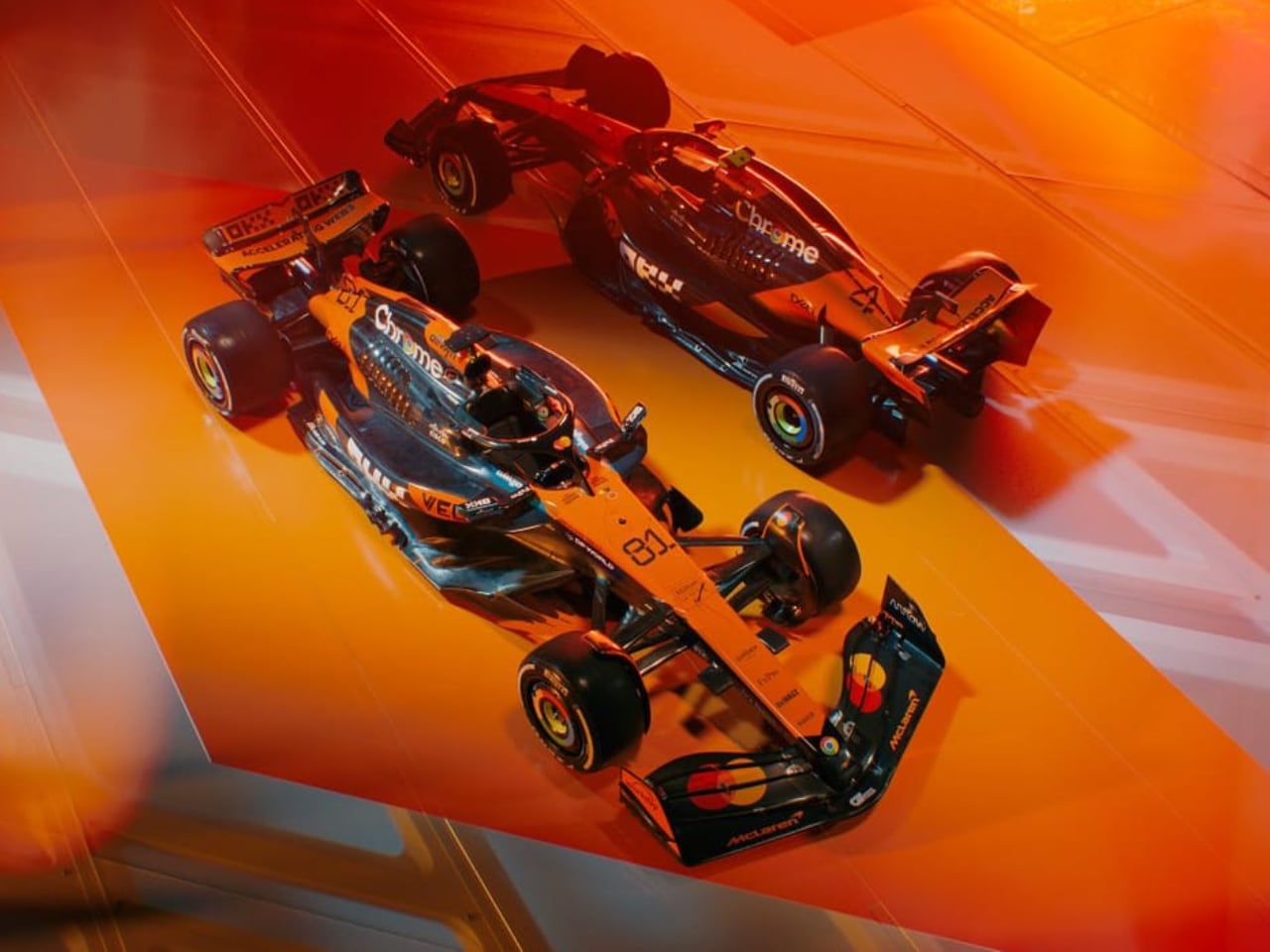
The 2025 Formula 1 season introduced a landmark moment in the sports history with the first-ever collective livery reveal at Londons O2 Arena during the F1 75 Live event. This marked Formula 1s 75th anniversary with an extravagant showcase of the grids visual identity. Teams presented their designs in a coordinated spectacle, merging entertainment, fan interaction, and commercial strategy. For the first time, all ten teams debuted their liveries under one roof, setting a new precedent for how the sport unveils its aesthetics. This analysis explores the events significance, the design philosophies of each team, their visual appeal, and how these liveries fit into the broader evolution of Formula 1s branding.The F1 75 Live Event: Redefining Livery LaunchesFormula 1 car launches have historically been individual affairs, each team unveiling their new challenger through digital campaigns or private ceremonies. The F1 75 Live event changed that formula entirely, creating a high-energy, globally broadcast show blending motorsport heritage with mainstream entertainment. Hosted by comedian Jack Whitehall, the event featured performances from artists like Take That and Machine Gun Kelly, attracting a live audience of 15,000 and over a million online viewers.The reveal sequence followed reverse championship order, beginning with Sauber and concluding with reigning champions McLaren. This ensured a climactic build-up while giving each team a dedicated spotlight. Unlike previous years, where full cars were unveiled, teams presented their liveries on generic show cars, preventing rival teams from scrutinizing new aerodynamic developments before pre-season testing. This strategy balanced marketing demands with competitive secrecy.One of the events most talked-about moments was Lewis Hamiltons first public appearance in Ferrari red, signifying one of the biggest driver transfers in recent history. His move from Mercedes to Ferrari after a 12-year tenure underscored the changing dynamics of the sport, making the event a symbol of both continuity and transformation.Team-by-Team Livery AnalysisMcLaren MCL39: Stability Over ExperimentationMcLarens 2025 livery stays true to the teams well-established papaya-orange-and-anthracite color scheme, maintaining a visual identity that has defined its recent resurgence. While the overall look remains largely unchanged from the previous season, the introduction of subtle teal accents provides a nod to McLarens historic colorways, subtly differentiating the new design from its predecessors.Designer: McLarenAndrea Stella justified the decision to retain the familiar aesthetic, citing the importance of brand consistency and championship-winning continuity. From a marketing perspective, maintaining an instantly recognizable look strengthens McLarens global appeal. However, critics and fans alike voiced mixed reactions, with some praising the cohesive design and others lamenting the lack of risk-taking. Given McLarens dominant 2024 season, some expected a more celebratory or aggressive revision to mark its status as reigning champions.The strategic placement of sponsors, including Mastercards prominent front-wing branding, significantly shaped the final look of the MCL39. The integration of commercial elements appears more refined this year, avoiding the visual clutter seen on some rival cars. However, skeptics argue that corporate obligations constrained McLarens ability to experiment with bolder artistic elements.To inject some visual intrigue ahead of the season, McLaren utilized a geometric camouflage wrap during its pre-season shakedown, reminiscent of the eye-catching test liveries used in motorsports and automotive prototypes. This suggests that special edition or one-off designs could be introduced during the year, maintaining engagement despite a relatively unchanged base livery. While this generated excitement, it also underscored how the launch livery itself felt somewhat predictable.McLarens approach ultimately prioritizes stability over dramatic reinvention. While the MCL39 remains one of the most visually cohesive cars on the grid, whether its understated evolution will continue resonating with fans depends on how it performs on the track.Ferrari SF-25: A New Chapter in ScarletFerrari retained its classic Rosso Corsa but introduced a stark white engine cover featuring title sponsor HPs branding. The shift in color balance drew mixed reactions, with some appreciating the contrast while others lamented the departure from Ferraris signature aesthetic.Designer: FerrariThe removal of last years gold accents, replaced by IBMs blue, sparked debate. While some felt it modernized the look, others believed it disrupted Ferraris refined image. The liverys aggressive design mirrors the teams technical overhaul, including a transition from pushrod to pullrod front suspension. Hamiltons excitement about his Scuderia debut reflected the emotional weight of this moment, stating he felt invigorated by new energy.Though the cars performance remains to be seen, the livery represents Ferraris willingness to embrace new partnerships while maintaining its historic color scheme. Whether fans warm up to the changes will depend on how the SF-25 performs on track.Red Bull Racing RB21: Corporate Branding Over CreativityFor the eighth consecutive year, Red Bulls matte navy-and-yellow color scheme remains unchanged, reinforcing its status as the most recognizable car on the grid. The only notable adjustment is a redesigned rear-wing sponsor placement, which subtly alters the cars branding presence but does little to address growing criticism over the teams lack of visual evolution.Designer: Red BullThe static nature of Red Bulls livery has become a point of contention among fans and design experts. While continuity strengthens brand recognition, many argue that Formula 1 liveries should evolve to reflect the sports dynamic nature. Competitors have made strategic tweaks to their liveries, balancing heritage with fresh design elements, whereas Red Bull appears content with stagnation.One underlying factor in Red Bulls approach is the aggressive corporate branding strategy that has turned the RB21 into a moving billboard. The team prioritizes brand identity over aesthetic innovation, ensuring that its car remains instantly recognizable across all global markets. However, the approach has sparked divisive reactions, with some seeing it as a testament to brand strength and others criticizing it as an uninspired design choice.The RB21s colors and matte finish have remained largely untouched since the team first introduced this aesthetic in 2016. While effective from a marketing standpoint, the reluctance to experiment with design elements has left some fans yearning for a more daring look. In contrast, sister team Racing Bulls took a more audacious approach with its white-based livery, raising questions about why Red Bull Racing itself refuses to deviate from its established template.Despite the growing calls for change, the RB21 remains a visual embodiment of Red Bulls dominant presence in Formula 1. Whether this consistency is, a strategic masterstroke or a failure to evolve remains an ongoing debate as the team heads into the 2025 season.Mercedes F1 W16: Subtle Refinements for a New EraMercedes refined its silver-and-black livery for 2025 by removing the prominent INEOS red accents, opting for a cleaner, more unified aesthetic. This change streamlines the cars look, bringing back a greater emphasis on its heritage silver while maintaining the sleek black elements that have defined the teams recent designs. The Petronas teal elements were widened along the side pods and engine cover, creating a stronger visual flow while reinforcing the teams deep-rooted partnership with the Malaysian oil giant.Designer: MercedesThe removal of excess red gives the car a sharper, more aggressive stance, enhancing its on-track presence. However, while the modifications were intended to refine the design, critics have pointed to ongoing issues with number visibility, particularly in low-light conditions or during rain races, making it challenging for spectators and broadcasters to distinguish the car from a distance.Toto Wolff defended the design choices, emphasizing that the evolution of the livery reflects the teams continued pursuit of performance and aesthetic balance. However, some feel that in the post-Hamilton era, Mercedes could have used this moment to introduce a more dramatic shift in identity rather than incremental refinements. As the season unfolds, the effectiveness of these visual tweaks will be tested under race conditions, determining whether this livery manages to make a lasting impression beyond its subtle elegance.Aston Martin AMR25: A Clash of IdentitiesAston Martins British Racing Green remains the defining feature of its 2025 challenger, but the introduction of black side pods has disrupted the previously harmonious color scheme. The fluorescent yellow accents, which once provided a striking contrast, now compete with the darker elements, leaving the overall balance of the livery feeling fragmented. While this adjustment may have been influenced by weight-saving carbon exposure, its execution has divided opinion. Some fans appreciate the stealthy look, while others argue that it diminishes the brands signature racing heritage.Designer: Aston MartinThe team leveraged its longstanding connection to James Bond for the reveal, reinforcing its luxury branding with an elaborate, cinematic presentation. However, the livery itself failed to capture the same sophistication and refinement associated with Aston Martins automotive legacy. Unlike the sleek, polished look of its road cars, the AMR25s design appears more functional than elegant.Fernando Alonso was vocal in his support of the new look, calling it the best-looking car of the night, though opinions from design experts were less favorable. Many placed the AMR25 in the lower tier of aesthetic rankings, citing a lack of cohesiveness and missed potential in refining the teams visual identity.Despite the critique, Aston Martins branding remains strong, and the livery is unmistakable on the grid. Whether the design choice ultimately resonates with fans may depend on its on-track performance and how well it integrates with the teams evolving competitive ambitions.Alpine A525: A Bold ResurgenceAlpine took a drastic turn away from the carbon-heavy aesthetics of 2024, reintroducing bold color in a striking pink-and-metallic-blue scheme that recalls Brabhams BT60B from 1992. This vibrant livery signals a renewed confidence in the teams branding, prioritizing visual impact over weight-saving carbon exposure. The glossy finish enhances the cars lines under different lighting conditions, ensuring a dynamic presence both on and off the track.Designer: AlpineOne of the A525s defining features is its prominent Eni sponsorship, which integrates seamlessly into the livery without overpowering Alpines identity. The balance between BWTs signature pink and Alpines historic blue creates a unique fusion of corporate influence and team heritage. The metallic elements add a premium feel, setting it apart from the matte-heavy designs dominating the grid.While the pink-blue contrast was widely praised for its originality, it also proved polarizing. Some fans admired the daring choice, while others felt the combination clashed when viewed at certain angles. The design ranked high in fan polls and designer evaluations, consistently listed among the most visually captivating liveries of the season. However, the ultimate verdict will depend on its appearance under race conditions, where lighting and motion will determine whether the bold aesthetic translates into an enduring classic or a fleeting experiment.Racing Bulls VCARB 02: Red Bulls Experimental OffspringRacing Bulls, formerly AlphaTauri, unveiled a bold new identity with a striking white base, integrating Red Bulls signature red and yellow branding in a dynamic, high-contrast design. The decision to incorporate the Blue Bull pattern on the rear not only ties the teams lineage to Red Bull Racing but also adds a layer of fluidity and movement to the overall aesthetic.Designer: Racing BullsA notable departure from AlphaTauris previous dark themes, this livery embraces a more aggressive commercial strategy, with Visa Cash Apps green accents subtly punctuating the clean layout. While the redesign has been praised for its vibrancy and connection to Red Bulls core identity, some critics argue it lacks distinction, as it closely mirrors its senior teams branding rather than forging a unique visual presence.The teams commitment to maintaining a fresh yet recognizable identity will likely manifest in potential one-off liveries throughout the season, but for now, the VCARB 02 walks the line between homage and individuality, sparking debate on whether its a masterstroke in brand synergy or an uninspired replication.Williams FW47: Nostalgia Meets Modern BrandingWilliams unveiled a refined navy-to-royal-blue gradient, reflecting its partnership with new title sponsor Atlassian while maintaining the legacy of its signature blue tones. The livery retains the widely admired Duracell battery airbox, a distinctive feature that continues to resonate with fans.Designer: WilliamsYouve seen the car but now its time for the *actual* livery! That is VERY blue pic.twitter.com/LlcN4ml6UT The Race (@wearetherace) February 18, 2025The design direction reflects a careful balance between heritage and commercial appeal. While James Vowles highlighted the importance of celebrating Williams rich racing legacy, the heavy influence of sponsor integration resulted in a conservative and safe approach. The absence of bold visual experiments led some critics to view the design as lacking creativity, though its clean execution and cohesive branding were seen as a positive step for the teams modern identity. The blend of deep blue hues with contemporary branding elements underscores Williams ongoing transition from an independent icon to a commercially competitive entity in the Formula 1 landscape.Haas VF-25: Incremental EvolutionHaas continued its trend of iterative design changes, opting for an expanded white-dominant livery while retaining bold red accents across key aerodynamic surfaces. The teams decision to reduce exposed carbon elements was a clear attempt to refine the visual appeal, though the execution received mixed reactions. The increased white coverage gave the car a cleaner, more streamlined look in renders, but on-track appearances revealed inconsistencies in how the colors interacted under varying lighting conditions.Designer: HaasThe red accents, particularly around the side pods and rear wing, provided a necessary contrast, but some critics found the overall aesthetic disjointed. The busy layout, influenced by an attempt to integrate multiple sponsor placements, made certain areas of the car look cluttered rather than sleek. Compared to its rivals, Haas livery lacked the sophistication and cohesive branding that marked some of the seasons more well-received designs.While the VF-25 maintains continuity with previous Haas liveries, it still falls short of making a significant visual impact. With the teams ongoing push for competitive progress, a bolder approach to its design philosophy could have helped reinforce a stronger identity on the grid. For now, the Haas VF-25 remains functional but uninspired, failing to command the same attention as some of the more daring liveries of 2025.Sauber C45: A Farewell to NeonSaubers 2025 livery takes a bold approach with an intensified neon green front end that gradually fades into a sleek carbon gray rear. This transition offers a modern and aggressive aesthetic, signaling the teams commitment to maintaining a striking visual presence on the grid. Compared to the 2024 design, which suffered from inconsistencies in its color layout, the new gradient effect aims to provide a more seamless integration of the two tones. However, real-world lighting conditions have revealed alignment issues, making the transition appear less polished than the initial renders suggested.Designer: SauberA closer look at the livery reveals subtle refinements in sponsor integration, with the neon green serving as an eye-catching backdrop for the Kick.com branding. The decision to retain high-contrast colors ensures the car remains highly visible in motion, a factor that can influence commercial appeal. Despite the bold color choices, the design still conveys a sense of finalitySaubers last independent livery before its transition to an Audi-backed operation.As the team prepares for its corporate transformation, the C45 livery serves as both a farewell to Saubers distinctive identity and a bridge to the next era. Fans have expressed mixed reactions, with some appreciating the commitment to a unique neon aesthetic, while others view the execution as somewhat disjointed. Whether this final chapter in Saubers independent history will be remembered fondly or seen as a missed opportunity will largely depend on its performance on the track.Final Thoughts: A Grid of ContrastsThe 2025 liveries capture the tension between innovation and brand consistency. Alpine and Racing Bulls took risks that paid off, while Red Bull and Aston Martin played it safe to mixed results. Ferraris controversial white sections and McLarens stability-driven approach illustrate the sports evolving priorities. As teams head to pre-season testing, these designs will gain new context under track conditions, proving whether their visual statements translate into competitive success.The post Unveiling Speed: The Art and Critique of 2025 Formula 1 Liveries first appeared on Yanko Design.