ArchDaily
ArchDaily
The latest architecture news, events, publications, and a continually growing collection of the best in architectural works around the world.
  • 2 Bu gibi insanlar
  • 120 Yazı
  • 2 Fotoğraflar
  • 0 Videolar
  • 0 önizleme
  • News
Site içinde arama yapın
Son Güncellemeler
  • WWW.ARCHDAILY.COM
    Faculty of Medicine of Laayoune, Ibn Zohr University / SAMA ARCHITECTES
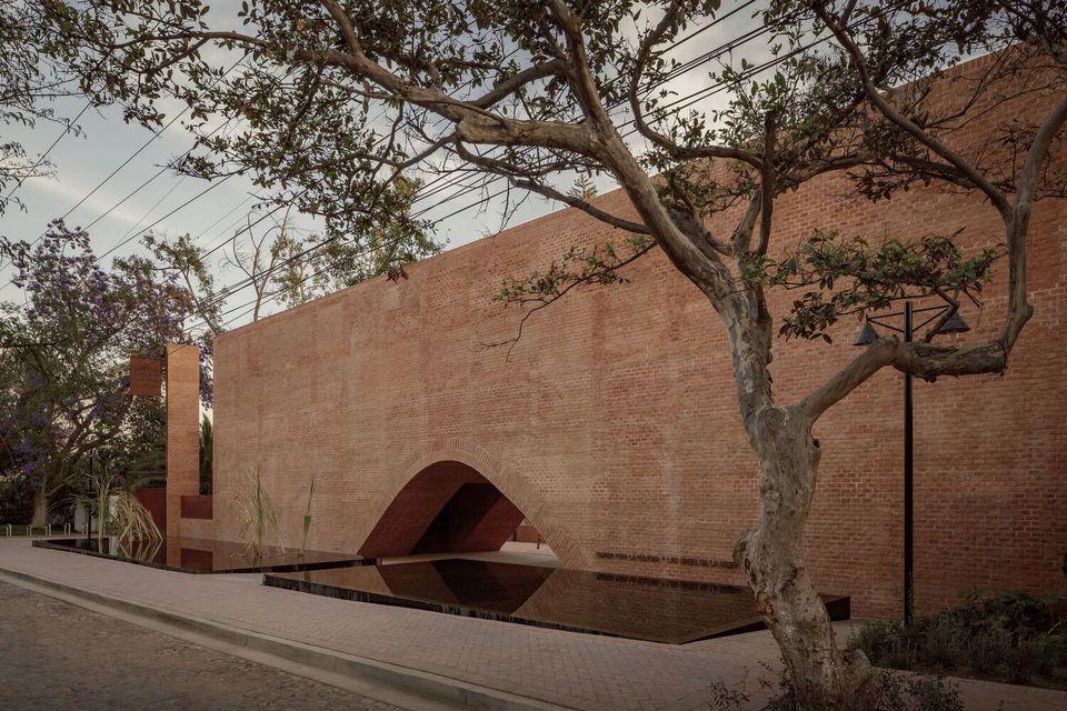
    Faculty of Medicine of Laayoune, Ibn Zohr University / SAMA ARCHITECTESSave this picture! Samir KhaldounUniversity, MoroccoArchitects: SAMA ARCHITECTESAreaArea of this architecture projectArea:23500 mYearCompletion year of this architecture project Year: 2024 PhotographsPhotographs:Samir KhaldounManufacturersBrands with products used in this architecture project Manufacturers: AVOLUX, Armstrong Ceilings, Auxenco, Disano, FOSNOVA, Faro , Onok Lighting, Rockfon, Sepalumic, VitrA Lead Architects: Samir Khaldoun, Malika Nassif More SpecsLess SpecsSave this picture!Text description provided by the architects. Our ambition is to create an iconic building imbued with authenticity, an architecture that evokes our heritage. The local context is highlighted to establish a strong identity while adding a distinctly contemporary touch, reflective of our time.As a nod to traditional architecture, we have used local materials such as Travertine marble-volubilis, crowned with geometric patterns inspired by Moroccan heritage, as well as perforated panels reminiscent of "moucharabiehs." The traditional motifs of these panels adorn the faades of the project, giving it an identity inspired by southern Morocco.Save this picture!The project engages in a subtle dialogue with its environment, reflected in its scale, proportions, rhythms, and architecture, which is both powerful and measured, sober yet rich. The different entities of the faculty are characterized by architectural expressions that make them easily identifiable, ensuring both the richness of the architecture and the diversity of spatial experiences. However, the overall harmony of the project is achieved through the careful treatment of the faades and the architectural language adopted, focused on simplicity, the refinement of mass, and the geometry of the volumes.Save this picture!Save this picture!Save this picture!Save this picture!The silhouette of the building projects itself into the space, forming a structure strong in its symbolism, an imprint that enhances the urban landscape. From within, users enjoy pleasant atmospheres, soft natural light, and a spectacular play of light and shadow on the faades throughout the day.As night falls, this perception is reversed, and the dramatic effect is felt from the outside: the faade shifts continuously through beams of light escaping through the patterns, emanating from the illuminated spaces, in rhythm with the activities taking place inside the faculty.Save this picture!Save this picture!The overall atmosphere of the project is enhanced by color, transforming the space with the changing sun and seasons. This is brought about by the ochre hue of the walls, which contrasts with the blue sky of Laayoune and the greenery of the garden/oasis nestled in the shadow of the building's mass. The Travertine marble walls give the project a unique charm with their rich textures and varied, undulating lines in different shades, typical of this natural stone.Save this picture!Project gallerySee allShow lessProject locationAddress:, MoroccoLocation to be used only as a reference. It could indicate city/country but not exact address.About this officeSAMA ARCHITECTESOfficePublished on November 23, 2024Cite: "Faculty of Medicine of Laayoune, Ibn Zohr University / SAMA ARCHITECTES" 23 Nov 2024. ArchDaily. Accessed . <https://www.archdaily.com/1023844/faculty-of-medicine-of-laayoune-ibn-zohr-university-sama-architectes&gt ISSN 0719-8884Save!ArchDaily?You've started following your first account!Did you know?You'll now receive updates based on what you follow! Personalize your stream and start following your favorite authors, offices and users.Go to my stream
    0 Yorumlar 0 hisse senetleri 3 Views
  • WWW.ARCHDAILY.COM
    Stella Casa / Idee architects
    Stella Casa / Idee architectsSave this picture! Trieu ChienHousesVnh Yn, VietnamArchitects: Idee architectsAreaArea of this architecture projectArea:600 mYearCompletion year of this architecture project Year: 2023 PhotographsPhotographs:Trieu Chien Lead Architects: Tran Ngoc Linh More SpecsLess SpecsSave this picture!Text description provided by the architects. Perched gracefully on the hillside, Stella Casa is an embodiment of contemporary design, thoughtfully crafted to harmonize with its natural surroundings. The architectural layout is carefully adapted to the steep terrain, with a series of interconnected functional volumes stacked along the slope. Each volume is carefully oriented to capture the best views and create a sense of openness across the property. The design not only responds to the land's topography but also emphasizes a fluid connection between the indoor and outdoor spaces, ensuring that each section of the villa feels integrated into the landscape.Save this picture!Save this picture!The layout consists of parallel blocks that are subtly stacked, creating a dynamic and visually engaging arrangement. These stacked volumes define the villa's form, with each level purposefully placed to maximize both spatial experience and views. Between the blocks, a series of garden courtyards and open-air walkways are strategically positioned, allowing for continuous green spaces that naturally connect the different zones of the home. The courtyards offer a sense of openness and tranquility, inviting natural elements into the living spaces while encouraging a constant visual flow between the interior and the landscape.Save this picture!Save this picture!Save this picture!One of the standout features of this villa is its extensive use of glass windows and transparent elements, which blur the boundary between the inside and outside. Expansive glass panels are incorporated into each level, offering unobstructed views of the panoramic landscape. The large windows allow an abundance of natural light to flood the interior, creating a bright and airy atmosphere throughout the day. These carefully positioned glass openings frame the beautiful surroundings, making the stunning vistas an integral part of the villa's design, enhancing the overall sense of openness and connection to nature.Save this picture!Save this picture!Save this picture!A large, sculptural swimming pool with a dramatic waterfall feature occupies a prominent position at the front of the villa, serving as both a visual centerpiece and a luxurious outdoor retreat. The pool is designed to flow seamlessly into the surrounding landscape, creating a serene space for relaxation and leisure. The cascading waterfall further enhances the sense of tranquility, providing a soothing soundtrack to the outdoor experience. This key feature serves as a focal point that unites the villa's open-plan spaces and the surrounding gardens, reinforcing the villa's emphasis on outdoor living and connection to the environment.Save this picture!Save this picture!The villa's design also includes a series of carefully designed staircasesboth internal and externalthat link the various levels of the home. These stairs create a seamless connection between floors and the roof, offering pathways for movement while reinforcing the architectural rhythm of the stacked volumes. The open-plan living and kitchen areas are extended directly to the pool and the garden spaces, creating an effortless flow between the interior and exterior. This thoughtful layout fosters a sense of openness and flexibility, where the living spaces continuously interact with the outdoor environment, inviting both relaxation and social interaction in equal measure.Save this picture!Project gallerySee allShow lessAbout this officeMaterialsGlassConcreteMaterials and TagsPublished on November 24, 2024Cite: "Stella Casa / Idee architects" 23 Nov 2024. ArchDaily. Accessed . <https://www.archdaily.com/1023622/stella-casa-idee-architects&gt ISSN 0719-8884Save!ArchDaily?You've started following your first account!Did you know?You'll now receive updates based on what you follow! Personalize your stream and start following your favorite authors, offices and users.Go to my stream
    0 Yorumlar 0 hisse senetleri 3 Views
  • WWW.ARCHDAILY.COM
    400 Wood Road / Balance Architects
    400 Wood Road / Balance ArchitectsSave this picture! Chris RucinskiBraintree, United StatesArchitects: Balance ArchitectsAreaArea of this architecture projectArea:58000 ftYearCompletion year of this architecture project Year: 2024 PhotographsPhotographs:Chris Rucinski, Michael J. MucciaccioManufacturersBrands with products used in this architecture project Manufacturers: Kingspan Insulated Panels, Hunter Douglas, NBK North America Lead Architects: Balance Architects Architectural Design: Chad Wulleman, Phil Sima More SpecsLess SpecsSave this picture!Text description provided by the architects. In 2019, Balance Architects embarked on the ambitious conversion of an outdated office and warehouse complex into a best-in-class, Class-A GMP/advanced manufacturing and life science facility in Braintree, MA. In addition to the complete transformation of the building, significant infrastructure investments were made in both the power and water systems to meet the needs of future tenants. Today, the building is fully leased to two tenants: Integra LifeSciences, a leader in neurosurgery, and First Electronics Corporation, an advanced manufacturing company specializing in high-grade cabling.Save this picture!The initial phase of the project involved stripping the building down to its core elements: the slab, steel columns, and roof. Prior to this intervention, the building, which housed a combination of office, lab and warehouse areas, was clad in dented and damaged metal panels, with outdated architectural concrete masonry units (CMU) at the entrance. The overgrown landscape had obscured the building, and the limited fenestration allowed minimal natural light to penetrate the interior. The interior space functioned as a dismal labyrinth of cubicles and corridors, completely devoid of natural light.Save this picture!Save this picture!With the primary goal of bringing light deep into the building, the Balance team designed large windows across the facade and created a fully glazed, double-height entry. On the warehouse side, typically associated with artificial lighting, we introduced a double-height curtain wall along the entire length of the loading bay.To create a highly energy-efficient envelope, the design team used a combination of insulated metal panels and a terra cotta rain-screen system, placing all insulation on the exterior. By carefully selecting the size and color of the terra cotta tiles, Balance created subtle shifts in color and movement along the expansive facade. Weston Architectural Supply oversaw the Herculean effort of unloading and installing the custom terracotta pieces, which were shipped out of orderthe parking lot resembled a giant jigsaw puzzle for nearly a month.Save this picture!Save this picture!Save this picture!For the interior fit-out, Balance collaborated with The First Electronics Corporation (FEC), a manufacturing company specializing in high-grade cabling. The business needed a space that would not only accommodate its office and manufacturing needs, but also transform the way its team worked. With a legacy spanning over 60 years, Boston-based FEC crafts custom electrical assemblies for challenging environments.Save this picture!For FEC, 400 Wood Road represented a unique opportunity to revolutionize the company's operations. The sprawling facility enabled a reimagining of manufacturing workflows and office layouts, enhancing collaboration and connectivity across departments. Through strategic spatial planning and the installation of a prominent interior curtain wall, the new design fosters visual connectivity among manufacturing, assembly, and engineering teams.Save this picture!Save this picture!The revitalized lobby serves as a beacon of openness and innovation. Acting as a central gathering point for employees and visitors alike, the spacious lobby cultivates a sense of unity and pride among its workforce. A striking barrel vault spans the front section of the building, seamlessly linking various areas and departments. Natural light now floods every corner of the manufacturing floor, a dramatic improvement from the dim confines of FEC's former facilities. This abundance of daylight not only enhances the working environment, but also underscores the company's commitment to creating a modern, inspiring workplace for its employees.Save this picture!Project gallerySee allShow lessProject locationAddress:Braintree, United StatesLocation to be used only as a reference. It could indicate city/country but not exact address.About this officeBalance ArchitectsOfficePublished on November 22, 2024Cite: "400 Wood Road / Balance Architects" 22 Nov 2024. ArchDaily. Accessed . <https://www.archdaily.com/1023697/400-wood-road-balance-architects&gt ISSN 0719-8884Save!ArchDaily?You've started following your first account!Did you know?You'll now receive updates based on what you follow! Personalize your stream and start following your favorite authors, offices and users.Go to my stream
    0 Yorumlar 0 hisse senetleri 5 Views
  • WWW.ARCHDAILY.COM
    ISHIMIRAI Lab. Showroom / POINT + Spicy Architects
    ISHIMIRAI Lab. Showroom / POINT + Spicy ArchitectsSave this picture! Kenta HasegawaShowroomBunkyo City, JapanArchitects: POINT Inc., Spicy ArchitectsAreaArea of this architecture projectArea:65 mYearCompletion year of this architecture project Year: 2024 PhotographsPhotographs:Kenta Hasegawa Construction: butter inc.More SpecsLess SpecsSave this picture!Text description provided by the architects. To showcase and display the flexibility of the new, lightweight "uni Marble Panel" from Yabashi Marble, an architectural stone company founded in 1901, we proposed a showroom with a specific system and environment, that allows users to freely reconfigure the space and test out different variations and material combinations.Save this picture!Save this picture!Following Yabashi Marble's goals, "ISHI-MIRAI Lab." aims to not only become a space to discover the charm of marble but also discover the possibilities of the stone in the future, where the "uni Marble Panel," designed specifically for interior use, shows the way.Save this picture!Save this picture!The system revolves around 4 booths finished in 4 different basic colors black, gray, beige, and reddish brown varying in color shades and materials. On a large display wall, 14 different types of "uni Marble Panel" can be viewed and prepared to be introduced into the differently-toned rooms. Each panel can be easily attached to and removed from the wall or furniture modules using special brackets.Save this picture!Save this picture!Samples of different materials and textures, such as wood and metal, are also provided to facilitate an even more extensive testing of combinations with different materials. The chairs and other furniture around the central meeting table are made from a variety of materials and colors, including wood, aluminum, cork, and plastic. With "ISHI-MIRAI Lab." we are combining the atmosphere of possible interior scenarios and a functional, furnished space, which aids in expanding the imagination by focusing on the many uses of marble and in maximizing the appeal of the stone.Save this picture!The "ISHI-MIRAI Lab." is intended to be a laboratory where the client, designers, and builders can explore how stone and marble can be used in building and architecture on various scales and in the future through dialogue and experience.Save this picture!Project gallerySee allShow lessProject locationAddress:Bunkyo City, JapanLocation to be used only as a reference. It could indicate city/country but not exact address.About this officeSpicy ArchitectsOfficePOINT Inc.OfficeMaterialStoneMaterials and TagsPublished on November 23, 2024Cite: "ISHIMIRAI Lab. Showroom / POINT + Spicy Architects" 22 Nov 2024. ArchDaily. Accessed . <https://www.archdaily.com/1023626/ishimirai-lab-showroom-point-plus-spicy-architects&gt ISSN 0719-8884Save!ArchDaily?You've started following your first account!Did you know?You'll now receive updates based on what you follow! Personalize your stream and start following your favorite authors, offices and users.Go to my stream
    0 Yorumlar 0 hisse senetleri 5 Views
  • WWW.ARCHDAILY.COM
    Billboard Headquarters/ Branco del Ro, Arquitectos
    Billboard Headquarters/ Branco del Ro, ArquitectosSave this picture! Frederico MartinhoOffices InteriorsTorre de Vilela, PortugalArchitects: Branco del Ro, ArquitectosAreaArea of this architecture projectArea:395 mYearCompletion year of this architecture project Year: 2023 Lead Architects: Joo Branco e Paula del Rio More SpecsLess SpecsSave this picture!Text description provided by the architects. As the client, a billboard company, took over an old metal workshop for its new headquarters, all the workflow and organisation had to be adapted. This project followed that process, and evolved with it. A work in progress that comprised two phases, simultaneously and alternately developed: the revamp of the existing industrial warehouse and the construction of a new office space in a narrow vacant plot.Save this picture!As the process had to be integrated into the company's daily activities, the entire intervention was slowly built and assembled inside the facilities. As such, slow tempo and constant prototyping were part of the design and building process and led to a very delicate construction, carefully undertaken by two experienced locksmiths.Save this picture!Save this picture!In the existing industrial warehouse, small adaptations were made to fit the building for its new use. In the area previously occupied by the factory offices, new changing rooms, screwing room, and laser cutting machine room were introduced on the ground floor, while a kitchen dining area and production room were added on the upper floor. A new metal gallery extends the existing area, and a retractable railing allows for loading and unloading with a forklift. Both this structure and the interior partitions, furniture, and the door system that creates a new interior faade were either produced on-site or reused from existing parts.Save this picture!Regarding the new offices, the limitations of the available area led to a solution of an elongated building, adapted to the natural topography. Its total length, 3 x 50m, is interrupted by courtyards that introduce natural light and ventilation. These courtyards, along with the interior, form a single integrated space, functioning as outdoor interiors. Sliding windows were used to spatially connect the ensemble, and a continuous matte black finish was chosen for both to highlight the external light and the lushness of the vegetation.Save this picture!Save this picture!Save this picture!Save this picture!The building was designed to be lightweight, efficient, and easy to assemble on-site. For this purpose, the structure, the large longitudinal shelving that spans the entire building, worktables, exterior facade, decks, and shading elements were built in the adjacent factory using metal components that can be handled by just two people. An assembly system was devised to fix the panels to the building structure without the need for glues or screws. From the ground up (excluding the windows), the entire building has been crafted on-site by just two pairs of hands. And looking ahead, it was designed to be easily dismantled and repurposed or recycled. The interior is dominated by wooden finishes: walls, ceiling, and tables are made of wood. The constant matte black appearance of the office hides diverse haptic qualities. Additionally, it functions as an acoustic and humidity regulator. Winter climate control is achieved with a wood stove in the centre of the space and with a radiant floor heating system that takes advantage of the concrete inertia. During the summer, the environment is controlled solely through shading and natural ventilation.Save this picture!Save this picture!Save this picture!Project gallerySee allShow lessProject locationAddress:Torre de Vilela, PortugalLocation to be used only as a reference. It could indicate city/country but not exact address.About this officePublished on November 21, 2024Cite: "Billboard Headquarters/ Branco del Ro, Arquitectos" [Escritrios Billboard / Branco del Ro, Arquitectos] 21 Nov 2024. ArchDaily. Accessed . <https://www.archdaily.com/1023618/billboard-headquarters-branco-del-rio-arquitectos&gt ISSN 0719-8884Save!ArchDaily?You've started following your first account!Did you know?You'll now receive updates based on what you follow! Personalize your stream and start following your favorite authors, offices and users.Go to my stream
    0 Yorumlar 0 hisse senetleri 31 Views
  • WWW.ARCHDAILY.COM
    Casa Quilla / RLL Estudio Arquitectura
    Casa Quilla / RLL Estudio ArquitecturaSave this picture!HousesCahuil, ChileArchitects: RLL Estudio ArquitecturaAreaArea of this architecture projectArea:143 mYearCompletion year of this architecture project Year: 2024 PhotographsPhotographs:Nico Saieh Lead Architect: Ral Lucero More SpecsLess SpecsSave this picture!Text description provided by the architects. Cahuil House is a project that combines design and functionality in a privileged natural environment. With a total area of 150 square meters, the house is built on concrete pillars and beams that existed at the time of the purchase of the land, which conditioned both the dimensions and the distribution of the space. This solid base made it possible to take advantage of the extraordinary views of the surrounding landscape, especially towards the Cahuil lagoon and the Pacific Ocean, key elements in the concept of the project.Save this picture!Save this picture!Save this picture!One of the most important aspects of the house is the use of panels (SIP), which are covered in brushed pine wood. This material not only provides warmth and a natural texture, but also establishes a visual dialogue with the surroundings, integrating the structure into the coastal landscape. The choice of wood seeks to reinforce the link between nature and architecture, generating a welcoming atmosphere within the home. The design of the house was conceived to maximize the relationship with the natural environment, placing special emphasis on capturing the views of the sea and the lagoon, and on taking advantage of the climatic conditions, such as the sea breeze. The wind becomes a tangible element within the living spaces, bringing freshness and dynamism to the everyday experience. An outstanding detail of the project is its habitable roof, which includes a simple bench of railroad ties. This decision allows the occupants not only to enjoy the views from a privileged height, but also to transform the roof into a functional and recreational area. The viewing platform reinforces the connection with the environment, offering an additional outdoor space where the landscape can be observed in 360 degrees. This habitable roof expands the functionality of the house, providing a place for contemplation and disconnection, while making the most of the beachfront location.Save this picture!Save this picture!In short, Casa Cahuil is a project that balances aesthetics and functionality, achieving harmonious integration with the natural environment. The use of local materials such as wood, adaptation to pre-existing conditions, and the creation of a habitable roof turn this home into a refuge that maximizes the sensorial and visual experience of the place.Save this picture!Save this picture!Save this picture!Project gallerySee allShow lessAbout this officePublished on November 21, 2024Cite: "Casa Quilla / RLL Estudio Arquitectura" [Casa Quilla / RLL Estudio Arquitectura] 21 Nov 2024. ArchDaily. Accessed . <https://www.archdaily.com/1023739/casa-quilla-rll-estudio-arquitectura&gt ISSN 0719-8884Save!ArchDaily?You've started following your first account!Did you know?You'll now receive updates based on what you follow! Personalize your stream and start following your favorite authors, offices and users.Go to my stream
    0 Yorumlar 0 hisse senetleri 32 Views
  • WWW.ARCHDAILY.COM
    Bung Binh House / NH Village Architects
    Bung Binh House / NH Village ArchitectsSave this picture! Trieu ChienHousesThi Bnh, VietnamArchitects: NH Village ArchitectsAreaArea of this architecture projectArea:450 mYearCompletion year of this architecture project Year: 2022 PhotographsPhotographs:Trieu ChienManufacturersBrands with products used in this architecture project Manufacturers: BETONLAB, Rng ng, Toto, Viglacera More SpecsLess SpecsSave this picture!Keywords - Traffic roundabout, triangular site, house in the city, buffer zone as vertical garden, Rice shape concrete block, natural light and shadow, natural ventilation, security, family communication. The site is characterized by a triangular shape located at the corner of a traffic roundabout in a new urban area in Thai Binh province - a region famous for rice cultivation in the North of Vietnam. This place is predicted to increase traffic density. The family consists of 3 generations: grandparents, parents, 2 young children.Save this picture!Save this picture!Save this picture!The challenge with the design was to create an urban living space that takes advantage of natural elements while still ensuring privacy in the triangular shape and location of the site. The solution was to create a buffer space between the outside and the living space inside the double skin faade system consisting of 2 layers: the outer concrete block bricklayer to block the view with security functions and an atrium and garden space. The living spaces are pushed back to the inside to avoid the direct influence of traffic and solar radiation on the facade.Save this picture!Save this picture!Save this picture!The concrete block system has a hollow section that simulates the 3-D shape of a grain of rice, a figure inspired by the pride of the region as a major part of Vietnam's rice production area. The block has a 3D grain-shaped concave and is stacked together to create a facade. Blocks have 2 types: solid and hollow, the blocks are arranged in appropriate positions on the facade to get wind, and light, and block the view from outside in accordance with the function of the interior spaces.Day and night light penetrates through these voids and casts shadows around the surroundings, creating the image of a garden of rice grains imprinted in space, moving according to the time of day and the different seasons during the year. Experience with this shimmering dynamic garden will create positive emotions and energy for the family every day.Save this picture!Save this picture!A corner of the triangular atrium garden is created in connection with the kitchen area on the first floor; the garden can be accessed through a long narrow space buffer corridor without going into the house. Thus, the space of the kitchen, dining, and guests has an open and airy feeling from the inside. This buffer space is also a place for air convection to both protect and cool the interior space. The 2nd and 3rd floors have balconies overlooking the garden, where the family can relax.Save this picture!The space used inside is planned to ensure communication between family members and the connection with the surrounding green space and garden. Stairs are arranged in the inner atrium. On the 2nd floor, the common space is like a small open library in contact with the garden and buffer space, where the family can study and work. The private bedrooms are arranged mainly on the 2nd and 3rd floors, interspersed with small courtyards. The front-facing bedrooms are arranged with another layer of doors inside the concrete Block layer, creating a sense of security. and ensure proper ventilation and natural light in the room.Save this picture!Save this picture!Save this picture!A skylight with a glass roof is placed in the middle of the house to ensure that the interior spaces are always bright enough. The stairs connecting the floors are in this atrium space, connecting the common spaces from the 1st floor to the 3rd floor.Save this picture!Project gallerySee allShow lessAbout this officeMaterialConcreteMaterials and TagsPublished on November 21, 2024Cite: "Bung Binh House / NH Village Architects" 21 Nov 2024. ArchDaily. Accessed . <https://www.archdaily.com/992426/bung-binh-house-nh-village-architects&gt ISSN 0719-8884Save!ArchDaily?You've started following your first account!Did you know?You'll now receive updates based on what you follow! Personalize your stream and start following your favorite authors, offices and users.Go to my stream
    0 Yorumlar 0 hisse senetleri 30 Views
  • WWW.ARCHDAILY.COM
    Revitalizing Historic Cairo: May al-Ibrashy's Vision for Heritage, Community, and Sustainable Conservation
    Save this picture!Al-Imam Al-Shafi'i. Image Courtesy of Megawra - Built Environment CollectiveCairo, often called the "City of a Thousand Minarets," boasts one of the richest cultural and architectural tapestries in the world. Its heritage reflects centuries of diverse influences from Pharaonic monuments to Islamic and Mamluk architecture. However, preserving this legacy is an ongoing challenge in the face of urban pressures, climate change, and socio-economic dynamics. Heritage conservation in Cairo is not just about safeguarding these structures; it's about integrating them into the lives of local communities, ensuring they remain dynamic and accessible spaces.At the forefront of this mission is Dr. May al-Ibrashy, an architect and conservationist whose innovative and community-driven approach has redefined how heritage is preserved. As the founder of MegawraBuilt Environment Collective, she has worked tirelessly in neighborhoods like Al-Khalifa, Al-Hattaba, and Sayyida Zeinab to restore historic monuments while creating vibrant public spaces. Her work bridges the gap between architectural preservation and urban regeneration, ensuring that these historic districts serve both as cultural landmarks and as living, functional spaces for their residents.Through initiatives like Athar Lina, al-Ibrashy has championed a participatory model of conservation, engaging local communities and fostering a sense of ownership over their heritage. Launched in 2012 in Al-Khalifa District, this initiative aims to translate the concept of heritage as a socio-economic resource into tangible actions. As a pioneering woman in architecture, her efforts extend beyond the physical restoration of monuments; she also advocates for inclusivity, sustainability, and empowerment in a field where women's contributions are often overlooked. Her work highlights how heritage can inspire not only cultural preservation but also social and urban transformation in Historic Cairo. Related Article Exploring the Grand Egyptian Museum Through Photography: Bridging Past and Present in Cairo Spiritual Significance and Cultural MemorySave this picture!Between 2016 and 2021, the Megawra collective undertook the comprehensive renovation of the Al-Imam Al-Shafi'i Mausoleum, a 13th-century architectural and spiritual landmark in Historic Cairo. As a major destination for pilgrims, the Al-Imam Al-Shafi'i Mausoleum now stands as an example of how sensitive architectural restoration can bridge the past and present, preserving its significance for future generations while maintaining its role in the living cultural and spiritual fabric of Cairo.Save this picture!Save this picture!Restoration efforts included leveling the floors, stabilizing load-bearing walls, and conserving the intricate wooden ceilings and coffins. The team also restored the colored marble and tiled flooring, adding to the site's visual and historical integrity. Key discoveries were made during the project, including a previously undocumented Fatimid-era dome, which was meticulously recorded and integrated into the conservation plan. The project also introduced modern interventions, such as improved lighting design and wayfinding systems, to enhance the visitor experience without compromising the site's historical and spiritual character.Community Engagement in Heritage ConservationSave this picture!Another project that MegawraBuilt Environment Collective initiated was the Yahya al-Sabih Mausoleum, a significant monument from the Fatimid era in Cairo. The project centered around restoring the mausoleum and reestablishing its role within the community. Through fostering a sense of ownership and stewardship among local residents, the collective aimed to transform the monument from an isolated relic into an active component of the urban fabric of Historic Cairo. Key conservation efforts included the structural stabilization of the building, which faced a high risk of collapse due to advanced deterioration.Save this picture!Furthermore, emergency documentation missions were conducted to record the mausoleum's fragile state, including the evacuation and preservation of priceless 9th-century inscription panels. In addition to the technical restoration, the project prioritized community engagement. Local residents were actively involved in the process, contributing their perspectives and building a shared responsibility for the mausoleum's upkeep. This participatory approach not only built trust but also integrated local knowledge into the conservation strategy. Through this collaboration, the site was reopened to the public, allowing the community to reconnect with a critical piece of its heritage.Adaptive Reuse of Heritage SpacesSave this picture!The Safiyy al-Din Jawhar Dome, a Mamluk-era monument in Cairo's al-Khalifa district, faced significant structural challenges due to climate change, including groundwater rise, temperature fluctuations, and pollution. These issues led to material loss, erosion, and critical cracks, rendering the site unsafe and inaccessible to the public. Under the leadership of May al-Ibrashy, the MegawraBuilt Environment Collective initiated a comprehensive conservation project to restore and adapt the dome for contemporary use. The restoration process, which is still ongoing, encompassed several key interventions: addressing groundwater infiltration through dewatering and drainage, stabilizing the stonework through masonry repairs, and conserving decorative elements like wood, stucco, and stone to maintain historical authenticity.Save this picture!Acentral aspect of this project was the adaptive reuse of the dome. By transforming the historic structure into a functional space for community and cultural activities, the initiative ensured the site's sustainability and relevance within the urban fabric. Additionally, local residents were actively involved in the conservation process. The project also included training programs to build local capacity in heritage conservation and climate adaptation, ensuring the long-term preservation of the site. This approach exemplifies al-Ibrashy's philosophy of integrating historical spaces into contemporary urban life through adaptive reuse, providing both utility and cultural resonance.Addressing Public Space Deficits Through Heritage ConservationSave this picture!The transformation of Al-Khalifa Park exemplifies the intersection of urban regeneration and heritage conservation in Historic Cairo. Located in the heart of the Al-Khalifa district, the site was once a neglected urban space surrounded by significant heritage landmarks. Through the efforts of May al-Ibrashy and the MegawraBuilt Environment Collective, the area was reimagined into a vibrant public park, addressing the lack of accessible green spaces in this dense urban environment.The project involved careful landscaping and subtle architectural interventions to respect the historical context while creating a functional and inviting space for residents. By incorporating community input throughout the design and implementation phases, the initiative ensured that the park met local needs and fostered a sense of shared ownership. The revitalized park now serves as a hub for communal activities, such as cultural events, art workshops, and heritage walks, bridging the gap between heritage preservation and modern urban life.Save this picture!In her transformative work across Historic Cairo, May al-Ibrashy aims to redefine heritage as a dynamic resource for urban regeneration, integrating cultural, social, and economic dimensions into conservation efforts. Her participatory approach ensures that local communities are active stakeholders, creating a sense of ownership and connection to their heritage. By combining disciplines such as archaeology, history, and urban planning, she tackles complex challenges with innovative, interdisciplinary solutions. Through adaptive reuse, she ensures that historical sites are not only preserved but reintegrated into contemporary life as vibrant and functional spaces. Ultimately, her work exemplifies how heritage conservation can be a powerful tool for building sustainable, equitable, and inclusive urban futures in historic Cairo, Egypt.This article is part of the ArchDaily Topics: Women in Architecturepresented by Sky-Frame.Sky-Frame is characterized by its empathic ability to take on different perspectives and points of view. We are interested in people and their visions, whether in architecture or in a social context. We deeply care about creating living spaces and in doing so we also question the role of women in architecture. From the arts to the sciences, women shape our society. We want to shed more light on this role, increase the visibility of Women in Architecture and empower/encourage them to realize their full potential.Initiated by Sky-Frame, the "Women in Architecture" documentary is an impulse for inspiration, discussion, and reflection. The film's release is on November 12, 2024.Every month we explore a topic in-depth through articles, interviews, news, and architecture projects. We invite you to learn more about our ArchDaily Topics. And, as always, at ArchDaily we welcome the contributions of our readers; if you want to submit an article or project, contact us.
    0 Yorumlar 0 hisse senetleri 32 Views
  • WWW.ARCHDAILY.COM
    Tan Hair Studio / oftn studio
    Tan Hair Studio / oftn studioSave this picture! Choi Yong JunWellness InteriorsMapo-gu, South KoreaArchitects: oftn studioAreaArea of this architecture projectArea:105 mYearCompletion year of this architecture project Year: 2024 PhotographsPhotographs:Choi Yong Jun Lead Architects: Jinsoo Kim, Suji Kim, Ayoung Yoon More SpecsLess SpecsSave this picture!Text description provided by the architects. Tan Hapjeong is the second location of the Tan brand, following the first store in Yeonnam, both designed by oftn Studio. Before beginning the design of the Hapjeong branch, two primary points were emphasized. The first was to create a space with a distinctly different mood from the Yeonnam store. Interestingly, before starting the design, the team explored the hair portfolios and social media profiles of the designers who would work in this space. The goal was to reflect the personality and style of the actual users in the design, thereby completing the brand's identity. The client also aimed to differentiate this location by appealing to designers with unique styles or those pursuing alternative approaches to hairstyling compared to the first store.Save this picture!The second point was the unique characteristics of the site itself. The space featured a gabled wooden ceiling structure and grid-patterned framed windows on the faade. During the initial site visit, the design team was captivated by these existing architectural elements and decided to highlight them as key features. The aim was to incorporate the charm of aged elements accumulated over time into the branding.Save this picture!While the Yeonnam store conveys a casual and modern image, primarily using neutral-toned tiles and metallic materials to achieve a clean and sophisticated look, the Hapjeong store takes a different approach. By embracing the aged and weathered qualities of the existing building, the design aimed to evoke a sense of craftsmanship. The intention was to create a space that is unrefined yet exudes the brand's unique taste, turning the imperfections of the old structure into a defining feature.Save this picture!Both locations share a common theme, which is evident in their naming. Rather than being called a "hair salon," they are referred to as "hair studios," emphasizing the idea of a workspace. The goal is to provide customers with a relaxed experience, as though they are visiting a friend's creative studio to get their hair done.Save this picture!Save this picture!Natural light was utilized as much as possible, and materials that reflect light retained their natural texture and properties. The transition from the main hall to the shampoo area features a subtle change in level, highlighted with pressure-treated wood that reveals its charm as it ages. This transition creates an open yet distinctly separate spatial experience. Functional furniture pieces throughout the space incorporate a variety of materials and patterns, adding diversity and character to the design.Save this picture!Project gallerySee allShow lessProject locationAddress:Mapo-gu, South KoreaLocation to be used only as a reference. It could indicate city/country but not exact address.About this officeoftn studioOfficeMaterialsSteelStoneMaterials and TagsPublished on November 20, 2024Cite: "Tan Hair Studio / oftn studio" 20 Nov 2024. ArchDaily. Accessed . <https://www.archdaily.com/1023729/tan-hair-studio-oftn-studio&gt ISSN 0719-8884Save!ArchDaily?You've started following your first account!Did you know?You'll now receive updates based on what you follow! Personalize your stream and start following your favorite authors, offices and users.Go to my stream
    0 Yorumlar 0 hisse senetleri 34 Views
  • WWW.ARCHDAILY.COM
    Inherited lifestyle - House Renovation / Architrip Inc.
    Inherited lifestyle - House Renovation / Architrip Inc.Save this picture! Yoshiki YokoyamaHouses, RenovationFukushima, JapanArchitects: Architrip Inc.AreaArea of this architecture projectArea:198 mYearCompletion year of this architecture project Year: 2024 PhotographsPhotographs:Yoshiki Yokoyama Lead Architects: Syota Kuwana, Ryota Hiraoka More SpecsLess SpecsSave this picture!Text description provided by the architects. We worked on the design and construction of a renovation of an old folk house in Fukushima City, Fukushima Prefecture. The house has a long history, dating back 150 years, and is located in a suburban area of Fukushima City, rich in nature. In designing and constructing the house, we valued the passage of time that has been etched into this place, and aimed to create a place that could be passed on to the next generation.Save this picture!The house used many traditional Japanese techniques, and we planned to preserve these materials and construction methods as much as possible. Our approach to the restoration of old folk homes is not to dismantle the old and rebuild it anew, but to add new value while retaining as much of the traditional Japanese techniques and materials as possible. Even when new materials were used, we selected natural materials that would blend well with the existing finishes.Save this picture!Sericulture has been popular in this area for a long time and is also practiced on this property. The building was designed to retain the appearance of sericulture in those days, with baskets used in sericulture being used as part of the railing and as wall material to create a sericultural image.Save this picture!The interior of the house is divided into two main sections: living space and earthen floor space. The total floor area is about 200 square meters, but due to changes in family structure and lifestyle, it is no longer necessary to use all the rooms as living space, so it was planned to accommodate a variety of living styles. The living space is insulated, and a flow line was created so that food, clothing, and shelter can be completed. It is a Japanese-style space with tatami mats as the main flooring so that many people can gather around the dining table while enjoying the coziness of an old folk house.Save this picture!Save this picture!Save this picture!Save this picture!The earthen floor space, which occupies about half of the building, is intended for a variety of uses. The earthen floor is characterized by its continuity with the outside. By lowering the threshold from the outside, visitors can enter directly with their feet in the dirt. This makes it ideal for the owner, who cultivates the fields, to use when taking a break, or for a casual gathering place for neighbors. This space is also airy and ideal for storing vegetables and fruits and it is characterized by the sense of local character that is unique to this place where farming and sericulture are practiced.Save this picture!Originally, Japanese architecture was primarily based on a variable floor plan. Shoji screen and fusuma sliding doors were used to create a place that suited one's lifestyle, adjusting the way light entered the room and creating a cutaway view of the landscape. Such houses have become rare in recent years, but this property created a highly variable space by incorporating a shoji screen and fusuma sliding doors. Looking out through the windows, one can cut out and view the surrounding landscape. This scenery becomes a part of the residence, and one can feel the changing seasons and environment.Save this picture!Project gallerySee allShow lessAbout this officeArchitrip Inc.OfficeMaterialWoodMaterials and TagsPublished on November 21, 2024Cite: "Inherited lifestyle - House Renovation / Architrip Inc." 20 Nov 2024. ArchDaily. Accessed . <https://www.archdaily.com/1023621/inherited-lifestyle-house-renovation-architrip-inc&gt ISSN 0719-8884Save!ArchDaily?You've started following your first account!Did you know?You'll now receive updates based on what you follow! Personalize your stream and start following your favorite authors, offices and users.Go to my stream
    0 Yorumlar 0 hisse senetleri 34 Views
  • WWW.ARCHDAILY.COM
    Transforming Portland: How a Demolished Highway Became a Pioneering Waterfront Park
    Transforming Portland: How a Demolished Highway Became a Pioneering Waterfront ParkSave this picture!Aerial View of Portland Steel Bridge Over Calm River. Image Nicholas J Klein via ShutterstockUrban landscapes are shaped by the infrastructure we prioritize, reflecting the needs and values of society at a given moment in time. One striking example of this evolution is Portland's Harbor Drivea highway that was once an artery of heavy automobile traffic but was later demolished to make way for a waterfront park. This transformation not only reshaped downtown Portland, Oregon, United States but also marked a significant milestone in urban planning: the removal of a major highway in favor of public space. Harbor Drive's story set the stage for a growing trend of reducing urban traffic infrastructure and reimagining cities for people rather than cars.The United States started the construction of a new interstate highway system which was mainly completed between 1956 and 1973. The construction boom expanded from the approval of the 1956 highway legislation. It was supported by lobbyists from businesses like automobile manufacturers, oil companies, makers of cement and steel, construction firms, and other businesses, who all recognized the significance of modern, high-speed highways. These roads were going to connect all the nation's major cities and would speed long-distance travel by truck and automobile. Along with the interstate lines, there was also a system of urban expressways that linked the central cities with the surrounding suburbs and facilitated commuting.Save this picture!Portland, like all the other big American urban centers, was part of this trend and embraced highway construction. That is why in 1942, Harbor Drive was built as a solution to its growing traffic congestion and a means to support the city's economy. Positioned along the west bank of the Willamette River, the highway was a vital link between the industrial heart of the city and the expanding suburbs. It represented the prevailing urban planning philosophy of the mid-20th century, which prioritized cars as symbols of modernity and progress. Related Article The Rose Kennedy Greenway: How Boston Unpaved its Way to a Greener City Center This was further reinforced by the decision in 1943 to hire New York City's most famous city planner, Robert Moses, to develop a blueprint for Portland's future. Even though Moses's plans were well received by the local government, they were dropped by 1945 due to high costs. However, some pieces of his proposal survived, notably the Interstate 405/I-5 loop around downtown composed of Stadium Freeway which would be joined to the East Bank Freeway through the Fremont Bridge.Save this picture!This raised the question of whether Harbor Drive would remain essential to Portland's connectivity once the new loop was constructed around it. By the 1960s, Harbor Drive began to show its limitations. Portland's population and the city's dependency on cars had grown. As traffic volumes increased, the highway became clogged, causing delays and frustration for commuters. At this point, Harbor Drive was a continuous scene of elevated passes and upgrades which never completely solved the traffic problem. Meanwhile, the central city's waterfront had become an unappealing backdrop of asphalt and concrete.Save this picture!This problem was not exclusive to Portland. Throughout the United States, many cities had been implementing highway projects passing through the central parts of downtown, leading to the increasing dissatisfaction from local communities. Entire neighborhoods, as well as parks and historic districts, were being demolished to make way for these central arteries. This caused a general discontent nationwide which is known today as the Freeway Revolt. It saw its first expression in San Francisco, specifically revolving around the construction of the massive double-decked Embarcadero Freeway that ran along the city's historic waterfront. In Portland, it rose under the name of "Riverfront for People". While most of the efforts focused on avoiding planned freeway construction, Portland's revolt was the first to actually achieve the destruction of an existing highway.Save this picture!The turning point for Harbor Drive came in 1974 when Governor Tom McCall boldly decided to close it. Later, Harbor Drive was demolished, and in its place, the city developed the waterfront park as a green space that reconnected downtown with the River, and commissioned the architecture firm Wolff Zimmer Gunsul Frasca (ZGF) to draft a $20 million Master Plan in 1975. This decision was radical for its time, as Harbor Drive became the first major highway in the United States to be permanently removed. Nonetheless, the project faced significant opposition from some business leaders and suburban commuters who feared that removing the highway would lead to increased congestion and economic decline.Save this picture!The removal of Harbor Drive and the creation of Tom McCall Waterfront Park symbolized a broader shift in urban priorities. Officially opened in 1978, the park spans approximately 30 acres and features walking paths, open lawns, and access to the river. By prioritizing green space over highway infrastructure, the city pioneered in creating a more livable urban core that attracted residents, businesses, and tourists. The removal of Harbor Drive did not lead to the catastrophic traffic problems some had predicted; instead, traffic was absorbed by other routes such as Moses' Freeway loop, and people adapted to new transportation patterns. It was a transformative moment that showed Portland's willingness to prioritize public space over automobile infrastructure. Save this picture!In the decades that followed, other cities in the United States and around the world began to take examples from the Tom McCall Waterfront Park project. San Francisco's Embarcadero Freeway was demolished after it was damaged in the 1989 Loma Prieta earthquake, leading to the creation of a waterfront boulevard. Another example is Boston's Rose Kennedy Greenway, which in the 1990s started the Big Dig. It replaced the Central Artery highway with a network of tunnels and a green belt of parks, reconnecting the city with its waterfront. Similarly, in 2004 Seoul, South Korea, removed a major elevated highway to restore the Cheonggye Stream, creating a linear park right in the heart of the city's downtown. Finally, in 2016, Taipei City in Taiwan, demolished the Zhongxiao overpass which crossed a historic area that included the last surviving Qing dynasty-style North Gate, restoring the monument to its former dignity and creating a plaza around it.Save this picture!This trend toward highway removal reflects a growing shift from car-centric urban planning inherited from the 20th century, into urban trends that take a more thoughtful approach toward their impact on the fabric of their cities. Throughout the decades, highways have been recognized for dividing neighborhoods, contributing to air and noise pollution, and occupying valuable land that could otherwise support housing, parks, or other community assets. In most cases, removing them has allowed cities to reclaim urban space and promote sustainable modes of transportation like walking, cycling, and public transit.Save this picture!Save this picture!The story of Harbor Drive's removal is one of pioneering transformation and innovation. By demolishing a highway and replacing it with a park, Portland not only reconnected its downtown with the river but also paved the way for a new approach to urban planning. Harbor Drive's legacy extends far beyond Portland, influencing cities worldwide to rethink the role of traffic infrastructure and embrace a more human-centered vision for urban life.This feature is part of an ArchDaily series titled AD Narratives, where we share the story behind a selected project, diving into its particularities. Every month, we explore new constructions from around the world, highlighting their story and how they came to be. We also talk to the architects, builders, and community, seeking to underline their personal experiences. As always, at ArchDaily, we highly appreciate the input of our readers. If you think we should feature a certain project, please submit your suggestions.Image gallerySee allShow lessAbout this authorMoises CarrascoAuthorCite: Moises Carrasco. "Transforming Portland: How a Demolished Highway Became a Pioneering Waterfront Park" 20 Nov 2024. ArchDaily. Accessed . <https://www.archdaily.com/1023649/transforming-portland-how-a-demolished-highway-became-a-pioneering-waterfront-park&gt ISSN 0719-8884Save!ArchDaily?You've started following your first account!Did you know?You'll now receive updates based on what you follow! Personalize your stream and start following your favorite authors, offices and users.Go to my stream
    0 Yorumlar 0 hisse senetleri 9 Views
  • WWW.ARCHDAILY.COM
    Miniature Architecture: 17 Projects that Explore Interior Design for Children
    Miniature Architecture: 17 Projects that Explore Interior Design for ChildrenSave this picture!NUBO Kindergarten / PAL Design. Image Michelle Young, Amy PiddingtonThe world certainly looks different through the eyes of a young child; enormous, intriguing, and somewhat overwhelming, and it has long been believed that what we encounter as children shapes our perspective of the world. When asked about his childhood memories in Switzerland, Peter Zumthor shared that the memories of his youth contain the deepest architectural experience, which has become reservoirs of the architectural atmospheres and images that he explores in his work as an architect today.Having a complete understanding of how children change and grow physically and psychologically throughout their childhood requires an in-depth observation of different factors, such as their hereditary traits and genetics, the interactions they have with other children and adults, as well as the environment they are living, playing, and learning in. In celebration of World Children's Day on November 20th, we look at how architects and designers stimulated children's autonomy and promoted their mental and physical well-being through architecture and interior design. This initiative aligns with the theme of World Architecture Day 2024: "Mobilizing the Next Generation for Urban Transformation," emphasizing the crucial role that thoughtful design plays in shaping a sustainable and inclusive future for our cities and the communities within them.Dr. Maria Montessori, an Italian physician and educator, began to develop her educational method at the beginning of the 20th century. The famed Montessori pedagogy provides techniques and methods that contribute to the healthy development of children by setting up an environment that caters to their physical and mental well-being and stimulates their autonomy, self-esteem, and socialization skills. Related Article Learning Through Play: Architecture for Kids in Educational Spaces and Playgrounds Save this picture!The method tackles three pillars: the child, the conscious adult, and the prepared environment, all joined together and codependent on one another. This implies that a conscious adult who is well knowledgeable of child development is required to design the environment, one that is calm, peaceful, patient, welcoming, harmonious, and respectful for both the children and adults equally. With that being said, most architects started with the bedroom since it is where the child spends most of their time, and created spaces that follow through with the Montessori methodology, combined with other kid-friendly architectural features.Save this picture!Curved FormsSafety is perhaps one of the topmost priorities when designing children's spaces, and one of the most dangerous features is sharp edges and angles, especially when they're aligned with kids' eye levels or near their heads, hands, and legs. To avoid having to add protective extensions or stickers on the corners of furniture pieces, designers have resorted to designing curved forms with rounded and/or smoothed edges. In terms of aesthetics, curved silhouettes give spaces a young, fun, and modern look that "takes us back to our childhood" as explained in ArchDaily's 2020 Interior Design Trends. WeGrow / Bjarke Ingels GroupSave this picture!Sarreguemines Nursery / Michel Grasso + Paul Le QuernecSave this picture!Safe Materials and Fit-outsIt is very critical to keep kids zones bacteria-free, which is why parents often prefer to have surfaces that are easy to clean, harsh-chemicals free, and not prone to housing small insects, such as antibacterial glossy or semi-glossy surfaces, microfiber, or vinyl. In terms of fit-outs, interior designers have replaced handles and knobs on drawers and cabinets in kitchens and bedrooms with invisible hardware, ranging from magnetic push latches to integrated handles with concealed beveled edges. Initially, the objective was to have a minimal space with a seamless and sleek look, but designers found them to be appropriate and safe for kids' furniture as well.Save this picture!Lolly-Laputan Educational Restaurant / Wutopia LabSave this picture!Blue and Glue / HAO DesignSave this picture!ScaleIn his seminal text Towards a New Architecture, Le Corbusier stated that "a man looks at the creation of architecture with his eyes, which are 5 feet 6 inches from the ground" and not from the standpoint of a young child's eyes, which are on average, about 3 feet 6 inches from the ground. Interior spaces built for children should be scaled down to match their height and spatial needs so that they can move around and interact with the space without the intervention or help of an adult. In addition, being in smaller-scaled spaces removes the feeling of being overpowered by regular-sized rooms and furniture pieces, allowing kids to feel more safe and unrestrained. Michelberger Hotel, Room 304 / Sigurd LarsenSave this picture!Ouchi / HIBINOSEKKEI, Youji no Shiro, Kids Design LaboSave this picture!Interactive Spaces that Promote Physical ActivityTo further promote healthy physical and mental growth, architects have designed spaces that enable natural creativity and freedom of playing and exploring, whether it's through stacked geometric structures or built-in games and entertainment since kids learn best through physical engagement in the form of games or physical exercises. While some parents prefer to refrain from using digital screens and technology at such a young age, others like to engage their children early on through interactive screens built into their playrooms.Save this picture!Na School / Sulkin AskenaziSave this picture!Surfaces that Enable the Use of SensesIn addition to the digital screens mentioned above, the use of textured surfaces has proved to further enhance children's sensory receptors. Surfaces that create sound with friction or change colors help stimulate kids' senses. The same can be said for chalk or whiteboards, which help children improve their motor skills through drawing and painting. Mirrors, for instance, stimulate children's recognition of their own body and face and help them learn how to identify facial expressions and emotions.Save this picture!Charles House / Austin Maynard ArchitectsSave this picture!Accessibility and AdaptabilityOne of the most important characteristics of child-oriented architecture is child-only features, allowing them to rely solely on themselves. Similar to scale, accessible architecture gives room for children to explore and navigate the space themselves, however, no child is the same, and each age group has a different set of spatial needs. This is why it is recommended that spaces be flexible,evolving in parallel to children's growth.Geometrical Space for a Two Kid Family / Atelier D+YSave this picture!My Secret Garden / YestudioSave this picture!Openness to the OutdoorsChildren are not meant to be confined to one particular space; It is at this age that they get to use all their senses to explore the world around them. Taking into account the importance of the outdoors, architects incorporated access to nature through direct sunlight, extended landscapes from the outdoors, or water features. Projects built on the ground floor benefit from direct access to adjacent landscapes, giving children room to be out in the open.Act for Kids / m3architectureSave this picture!AKN Nursery / HIBINOSEKKEI + Youji no ShiroSave this picture!Color PaletteAccording to the Montessori method, having a lot of colors and textures in the same environment can cause confusion and irritation for children, especially those in the younger age spectrum. Therefore, the method recommends selecting very few options to facilitate the development of decision-making capacities. Save this picture!Hangzhou Neobio Family Park / X+LivingSave this picture!This article is part of an ArchDaily series that explores features of interior architecture, from our own database of projects. Every month, we will highlight how architects and designers are utilizing new elements, new characteristics, and new signatures in interior spaces around the world. As always, at ArchDaily, we highly appreciate the input of our readers. If you think we should mention specific ideas, please submit your suggestions.Editor's Note: This article was originally published on November 17, 2021, and updated on November 20, 2023. Related Article Learning Through Play: Architecture for Kids in Educational Spaces and Playgrounds Image gallerySee allShow lessAbout this authorDima StouhiAuthorCite: Dima Stouhi. "Miniature Architecture: 17 Projects that Explore Interior Design for Children " 20 Nov 2024. ArchDaily. Accessed . <https://www.archdaily.com/971939/miniature-architecture-15-projects-that-explore-interior-design-for-children&gt ISSN 0719-8884Save? 17 You've started following your first account!Did you know?You'll now receive updates based on what you follow! Personalize your stream and start following your favorite authors, offices and users.Go to my stream
    0 Yorumlar 0 hisse senetleri 10 Views
  • WWW.ARCHDAILY.COM
    Women Architects and their Material Strategies: Bo Bardi, Merrick & Hadid
    Save this picture!Sesc Pompia / Lina Bo Bardi. Image Mara GonzlezAlthough there is more of a balance between women and men in architecture today, the landscape was quite different a few decades ago. Pioneering women architects have been resistant in a profession dominated by men, and have faced skepticism in challenging contexts, such as construction sites itself. Zaha Hadid commented on the difficulty of inclusion in what she called the "boys club", listing the difficulties in coming to agreements or creating partnerships. Lina Bo Bardi, in turn, used her strong personality to overcome the sexism of her time. Even though these difficulties, women have always found a way to stand out and bring priceless contributions to the profession.On countless occasions architecture has remembered famous architects and their material discoveries through time, but what about recognizing women's contributions to the discipline? Discussing their pioneering material explorations is key to understanding their role in projects. With an analysis of the work of the well-known architects Lina Bo Bardi, Norma Merrick Sklarek and Zaha Hadid which introduced innovative techniques and material trends the following discussion brings to light how women's ideas have influenced the development of architecture. Identifying their approaches on how to managing structures and materials helps to understand the personality of their work and how to implement similar strategies in the future. Lina Bo Bardi (1914-1992)The work of the Italian-Brazilian architect contains her life history within it. After her studies at the University of Rome, she moved to Milan, where she collaborated with Gio Ponti and later became interested in editorial work. Posterior to the devastation caused by the Second World War, she met Pietro Maria Bardi and moved permanently to Brazil. Characterized by creating a dialogue between modernism and popular culture, her work aimed to reinvent space and reconstruct architecture. Her approach to concrete design of public buildings follows the same line of exploring new strategies to define space. 'Architecture and architectural freedom are above all a social issue that must be seen from inside a political structure, not from outside it.' - Lina Bo Bardi SESC Pompia: Public Concrete DesignWithin her work in the SESC Pompia in So Paulo, Lina Bo Bardi plays with concrete to add expression to architecture. Located on the site of an old factory, the architect created a community center that incorporates culture, sports and pleasure.Save this picture!Keeping the old factory's brick materiality, the strategy adds two concrete volumes connected by elevated walkways, maintaining the city level free from visual and physical disruptions. The building highlights concrete as its main feature, which not only functions as a structure but also includes vertical and horizontal planking for aesthetic purposes.Save this picture!The architect established a connection between the building and its surroundings, while also creating a gathering place for people in the heart of the city.Save this picture!So Paulo Museum of Art (MASP): A Floating Concrete BlockSome might wonder why this project brought worldwide attention to Bo Bardi. In part, the answer lies in the fact that creating an architectural model that was concerned with its public role promoted a democratic, horizontal and plural urban life. Save this picture!After receiving the commission to build the new museum of art, Bo Bardi had one condition to respond to: the building couldn't block the panoramic views of the lower-lying parts of the city. As such, suspended under two pre-stressed concrete beams which rest on massive piers the building frames an unobstructed collective space for the gathering of So Paulo's residents.Save this picture!Playing with the contrast of the building's structure and space, the architect creates a dialogue between lightness and mass. The material strategy brings out two architectural movements: modernism and brutalism. The encounter of glazing and free floor plans with the concrete piers and structural system defines the project's identity. Applying color to the beams, the design highlights the project's main structure, clarifying how structure dominates the building's formal language.Norma Merrick Sklarek (1926-2012)Born in Harlem, New York City, Norma Merrick Sklarek is known as one of the pioneering women in architecture and the first woman to achieve an architecture license in California. After collaborating in different projects that played with glass faades in architecture firms such as Gruen Associates, she co-founded a female-only firm: Sklarek, Siegel and Diamond. 'Architecture should be working on improving the environment of people in their homes, in their places of work and their places of recreation. It should be functional and pleasant, not just in the image of the architects ego.' - Norma Merrick Sklarek U.S Embassy in Tokyo: Modular SystemsWith a modernist design, the US Embassy building combines materials to define a modular faade system. Without overloading the building, the design strategy incorporates glass panels with exterior faade cladding panels to distinguish the horizontal bars, creating a simple and well-organized look to its rectangular shape.Save this picture!Pacific Design Center: New Dimensions of Glass BuildingDuring her time at Gruen Associates, she participated in the design of the Pacific Design Center, located in West Hollywood, Los Angeles. In collaboration with the architect Cesar Pelli, their work is known as an architectural landmark of the city. The multi-use facility for the design community reinvents a center that used to be a low-scale residential and commercial area into an enormously colorful milestone. Save this picture!From workshops and showrooms to spaces of leisure, the layout was developed in three stages, where Merrick participated in the first two. The first building, known as the 'Blue Whale' is distinguished by its 750,000 square foot blue glass cladding, followed by the incorporation of a bright green building. The project's design strategy highlights the use of out-scale dimensions, new shapes and bright colors.Zaha Hadid (1950-2016)"There are 360 degrees. Why stick to one?" Just as Zaha Hadid questions staying with one point of view, her architecture develops a different face from every point of view. The Pritzker Prize-winning architect and mathematician is recognized for designing outside creative and technological boundaries, which led her work to experiment with sensuous curves, geometry, and parametricism. Maintaining traditional materials like concrete and steel, she achieves innovative forms which play with traditional structural possibilities and create a visual appearance that defies gravity. 'I don't think that architecture is only about shelter, is only about a very simple enclosure. It should be able to excite you, to calm you, to make you think." - Zaha Hadid Heydar Aliyev Center: Developing the Building's SkinBreaking the rigid Soviet architecture commonly seen in the city of Baku, Zaha Hadid Architects proposed a new architectural expression for the nation's building for cultural programs. Save this picture!Through a continued relationship between the building's interior and the surrounding plaza, the project merges with the city's urban fabric. Aiming to connect both spaces and guide users into the building, the strategy applies undulations, bifurcations, floods and inflections to the surface. With the right use of geometry and technology, the project creates a fluid space.Save this picture!The design process adds a combination of construction systems and advanced technologies to achieve the building's envelope. Based on two collaborating systems a concrete structure combined with a space frame system the project develops a column-free space that allows continuity in the user's movement. The architect's proposal in the surface geometry introduces innovative structural solutions such as curved 'boot columns' or 'dovetail' tapering to support the building's skin.Save this picture!The material strategy incorporates Glass Fiber Reinforced Concrete (GRFC) and Glass Fiber Reinforced Polyester (GFRP), which are able to respond to different situations: from the plaza to the envelope.Dongdaemun Design Plaza: Digitizing ConstructionFollowing her passion with parametric building design, Zaha Hadid explores construction digitalization such as three dimensional building information modeling (BIM) within the design process. With the incorporation of advanced softwares, the project was able to test engineering and construction requirements to achieve the complexity of the design, without losing control of details.Save this picture!The building's material strategy was also achieved through the digitization process. For example, the faade's cladding system is built from over 45,000 panels, each of them in different sizes and curvatures, which was managed after a mass-customization system. Depending on the season and time of the day, the building creates a dynamic visual effect produced by pixelation and perforation patterns within the facade.Save this picture!This article is part of the ArchDaily Topics: Women in Architecturepresented by Sky-Frame.Sky-Frame is characterized by its empathic ability to take on different perspectives and points of view. We are interested in people and their visions, whether in architecture or in a social context. We deeply care about creating living spaces and in doing so we also question the role of women in architecture. From the arts to the sciences, women shape our society. We want to shed more light on this role, increase the visibility of Women in Architecture and empower/encourage them to realize their full potential.Initiated by Sky-Frame, the "Women in Architecture" documentary is an impulse for inspiration, discussion, and reflection. The film's release is on November 12, 2024.Every month we explore a topic in-depth through articles, interviews, news, and architecture projects. We invite you to learn more about our ArchDaily Topics. And, as always, at ArchDaily we welcome the contributions of our readers; if you want to submit an article or project, contact us.__________Originally published on October 13, 2022.
    0 Yorumlar 0 hisse senetleri 7 Views
  • WWW.ARCHDAILY.COM
    Riken Yamamoto Honored in 2024 Pritzker Architecture Prize Ceremony Video
    Riken Yamamoto Honored in 2024 Pritzker Architecture Prize Ceremony VideoSave this picture! Shigeru Ohno | Nagoya Zokei UniversityThe Pritzker Architecture Prize has released a special video honoring Riken Yamamoto, the 2024 Laureate. Presented in a documentary-style format, the film celebrates Yamamoto's distinguished architectural career and his contributions as the 53rd Laureate, honored earlier this year in Chicago. This milestone coincided with the 100th birthday of Cindy Pritzker, co-founder of the Prize with her late husband, Jay A. Pritzker.The film offers viewers a closer look of Yamamoto's approach, highlighting key moments from the Pritzker Prize ceremony, including "Cindy's Dinner"a tradition where new Laureates gather with previous winners and Jury members at the Jay Pritzker Pavilion. Additionally, the documentary features Yamamoto's Laureate Lecture and a panel discussion at S.R. Crown Hall, organized in collaboration with the Illinois Institute of Technology's College of Architecture. These segments provide insights into Yamamoto's belief in architecture's power to shape society and address social needs.Save this picture!Born in 1945 in Beijing and later relocating to Yokohama, Japan, Yamamoto developed a passion for architecture as a means of social transformation. He founded Riken Yamamoto & Field Shop in 1973, creating works that bridge public and private life, focused on human connection. His projects span residential and civic spaces across Japan, China, South Korea, and Switzerland, notable for their transparency, modularity, and community focus. Among his acclaimed works are The Circle at Zrich Airport (2020), the Tianjin Library (2012), and Nagoya Zokei University (2022). Related Article https://www.archdaily.com/1014408/listen-to-2024-pritzker-prize-winner-riken-yamamoto-explain-his-creative-process-and-architectural-journey?ad_campaign=special-tag Riken Yamamoto is showing us that the architect has the possibility, if not the responsibility, to change the current system from within. The ordinary can be extraordinary. That architecture can bring change to a social system regarded as unchangeable. --Manuela Luc-Dazio, Executive Director Save this picture!The video also presents commentary from notable architects and past Laureates, such as Norman Foster and Deborah Berke. Foster remarks on Yamamoto's influence on urban spaces, while Berke highlights, "His work is exquisite and precise, but I think the most important thing about it is how subtle it is and how willing he is as an architect to let the buildings be background in order to foreground human interaction." Yamamoto's commitment to using architecture as a tool for social change is a recurring theme throughout the film, as emphasized by Jury Chair Alejandro Aravena: "Architecture is a tool to achieve a much bigger goal and creating a sense of community in a world that is desperate to get that may be the way that we architects can give a modest contribution."Save this picture!With built projects worldwide, Riken Yamamoto's five-decade career is marked by designs that foster community awareness and emphasize social responsibility. His portfolio includes diverse works such as housing, schools, civic spaces, and city planning worldwide. Honored with numerous accolades, Yamamoto's commitment extends beyond buildings. Recognized as an Academician by the International Academy of Architecture in 2013, his legacy is redefining architecture's societal impact on a global scale. Image gallerySee allShow lessAbout this authorNour FakharanyAuthorCite: Nour Fakharany. "Riken Yamamoto Honored in 2024 Pritzker Architecture Prize Ceremony Video" 20 Nov 2024. ArchDaily. Accessed . <https://www.archdaily.com/1023796/pritzker-architecture-prize-ceremony-video-honors-2024-laureate-riken-yamamoto&gt ISSN 0719-8884Save!ArchDaily?You've started following your first account!Did you know?You'll now receive updates based on what you follow! Personalize your stream and start following your favorite authors, offices and users.Go to my stream
    0 Yorumlar 0 hisse senetleri 9 Views
  • WWW.ARCHDAILY.COM
    Tasting Rooms Tasting Rooms Culinary Center / Abruzzo Bodziak Architects
    Tasting Rooms Tasting Rooms Culinary Center / Abruzzo Bodziak ArchitectsSave this picture! Michael VahrenwaldNorwalk, United StatesArchitects: Abruzzo Bodziak ArchitectsAreaArea of this architecture projectArea:15020 mYearCompletion year of this architecture project Year: 2024 PhotographsPhotographs:Michael Vahrenwald, Megan HollowayManufacturersBrands with products used in this architecture project Manufacturers: C.R. Laurence, Hansgrohe, Duravit, Grohe, TON, AYTM, Akdo, Benjamin Moore, Binks Glass, Bobrick, Daltile, Elkay, Farrow and Ball, Jesco Lighting Group, Kohler, Nuvo Lighting, Stuff by Andrew Neyer, TechLighting, Wasco Commercial, White Oak Lead Architects: Emily Abruzzo, Gerald Bodziak More SpecsLess SpecsSave this picture!Text description provided by the architects. Norwalk, CT, USA - Abruzzo Bodziak Architects (ABA) has designed an innovative culinary center that reimagines post-pandemic work and production spaces within an underutilized facility in Norwalk, Connecticut. After taking over a vast kitchen and warehouse originally designed for large-scale food service, ABA's clienta team of cooking and event planning professionals known for innovative cuisine, bespoke presentation techniques, and an award-winning cookbookapproached the Architects with what they described as a "happiness project." Their goal was to attract both current and potential employees back to in-office work post-pandemic by transforming their new space into a welcoming, light-filled workplace for planners and chefs alike, and to craft an immersive experience for their own clients.Save this picture!Save this picture!Tucked away in an industrial complex, the original building lacked light, comfort, and connectivity. A key challenge was introducing natural light into the centrally-located kitchen, the roof above which was fully obstructed by ductwork. Utilizing an adjacent area with minimal rooftop equipment, large rhythmically arranged skylights were added to bring light into a spacious, gallery-like open office. 50-foot-long parallel glazed walls are situated between the office and kitchen to distribute natural light deep into the building and foster connection between planning staff and chefs.Save this picture!As the glass walls inhabit this threshold, they define a third space: a series of rooms designed as the social heart of the project. The tasting rooms, detailed in white oak and illuminated by warm, party-like lighting, create refined spaces that soften the adjacent stainless steel, white tiles, and brightly lit food preparation zone. The wood and glass bar is divided into three areas tailored for in-house hospitality: a cozy room for private tastings, a larger room accommodating twenty people for team meetings or larger tastings, and a secluded nook for private calls, paperwork, or one-on-one discussions. Each space features bespoke stone tables tailored to the architecture. Doors on both sides facilitate easy access and service, while the glass mitigates heat and noise, maintaining visibility into the bustling kitchen.Save this picture!Guests move freely through the open-plan office side, where large custom furniture pieces define areas for collaborative work, casual seating, and office administration. On either side of the large space, private offices and connecting halls are clad in blue-green panels that offset the unfinished trussed ceilings above. The paneling uses color to unify doorways, windows, and kitchenette millwork and to differentiate the semi-back-of-house experience for guests on their way to individual bathrooms. While prioritizing the culinary team's employees and workflows in the renovation's design, the building also warmly welcomes guests with its blend of raw and refined spaces. Its layout of adaptable rooms and seamless visual continuity allows the building to support external events while also serving as a compelling event venue on its own. "Our clients work on everything from no-waste dinners, to teaming with wine producers for intimate tastings, to serving thousands at large public events, so there's no one-fits-all solution," says ABA partner Emily Abruzzo. "To support their activities from testing and experimentation to high-yield production, to seamless and chic on-site hosting, the design provides character while allowing for tremendous flexibility and openness."Save this picture!Project gallerySee allShow lessProject locationAddress:Norwalk, United StatesLocation to be used only as a reference. It could indicate city/country but not exact address.About this officePublished on November 19, 2024Cite: "Tasting Rooms Tasting Rooms Culinary Center / Abruzzo Bodziak Architects" 19 Nov 2024. ArchDaily. Accessed . <https://www.archdaily.com/1023650/tasting-rooms-abruzzo-bodziak-architects&gt ISSN 0719-8884Save!ArchDaily?You've started following your first account!Did you know?You'll now receive updates based on what you follow! Personalize your stream and start following your favorite authors, offices and users.Go to my stream
    0 Yorumlar 0 hisse senetleri 7 Views
  • WWW.ARCHDAILY.COM
    Africa Hall Cultural Center / Architectus Conrad Gargett
    Africa Hall Cultural Center / Architectus Conrad GargettSave this picture! Rory GardinerRenovation, Cultural CenterAddis Ababa, EthiopiaArchitects: Conrad GargettAreaArea of this architecture projectArea:5450 mYearCompletion year of this architecture project Year: 2024 PhotographsPhotographs:Rory GardinerSave this picture!Text description provided by the architects. Architectus Conrad Gargett has revitalized the United Nations' historic Africa Hall in a landmark decade-long renovation. The 1961 Arturo Mezzdimi modernist masterpiece in Addis Ababa, Ethiopia, has played a key role in shaping modern African history. It now stands as a world-class conference and cultural venue.Save this picture!Africa Hall was gifted by Emperor Haile Selassie I as a meeting place for African nations and headquarters for the United Nations Economic Commission for Africa (ECA). It was here, in 1963, that the Organisation of African Unity (OAU) was established, a key step in the formation of today's African Union (AU). The ECA initiated the renovation in collaboration with UNESCO, the African Union, and the Ethiopian Government with Architectus Conrad Gargett engaged to lead the design.Save this picture!Save this picture!A holistic renovation - A Conservation Management Strategy guided all aspects of the renovation, ensuring changes respected the building's historical and cultural significance. The design team conducted extensive research into Italian architect Arturo Mezzdimi's original plans to ensure the renovation honored his vision.Key elements were painstakingly restored including the reinforced concrete structure, original mosaic ceramic tiles, and stained-glass artwork by Ethiopian artist Afewerk Tekle. Thirteen million new tiles were fabricated to match the original, and Tekle's famous 150-square-metre stained glass artwork was restored by the grandson of the original maker. The renovation also included the restoration of over 500 bespoke furniture pieces that were custom-designed by Mezzdimi. These iconic pieces were restored and returned to their original configurations and positions within the building.Save this picture!Modernized for the future - Africa Hall's functionality as a world-class contemporary conference center was critical to the renovation. The Assembly Hall, a central space where African Union meetings are held, was reconfigured to accommodate 55 member statesup from the original 32. It now also features new audio-visual systems and a 13-metre-wide LED display. Physical changes are expressed as distinctly contemporary, with a clear respect for Mezzdimi's original design. Services spaces on the rooftop and a new external lift core are clad in zinc shingles in a pattern that is a contemporary reference to the original mosaic tile profile. Safety, accessibility, and sustainability were also at the forefront of the renovation. The project aligned with the UN's "Greening the Blue" initiative and UN Disability Inclusion Strategy.Save this picture!Save this picture!New visitor experience -Africa Hall now also offers an engaging cultural experience for the public. Architectus Conrad Gargett designed a new museum and exhibition space that tells the story of the building's historical significance. The visitor experience is further enhanced with the addition of a caf, separate visitor center, bus drop-off, and car parking. This monumental renovation ensures Africa Hall will continue to be a beacon of African unity and progress for generations to come.Save this picture!Project gallerySee allShow lessProject locationAddress:Addis Ababa, EthiopiaLocation to be used only as a reference. It could indicate city/country but not exact address.About this officeConrad GargettOfficePublished on November 20, 2024Cite: "Africa Hall Cultural Center / Architectus Conrad Gargett" 19 Nov 2024. ArchDaily. Accessed . <https://www.archdaily.com/1023551/africa-hall-cultural-center-architectus-conrad-gargett&gt ISSN 0719-8884Save!ArchDaily?You've started following your first account!Did you know?You'll now receive updates based on what you follow! Personalize your stream and start following your favorite authors, offices and users.Go to my stream
    0 Yorumlar 0 hisse senetleri 7 Views
  • WWW.ARCHDAILY.COM
    Ammodo Architecture Announces Inaugural Global Awards Recipients for Social and Ecological Innovation
    Ammodo Architecture Announces Inaugural Global Awards Recipients for Social and Ecological InnovationSave this picture!Courtesy of POOL IS COOL | FlowAmmodo Architecture has just revealed the first 23 recipients of its inaugural Ammodo Architecture Awards, an annual recognition dedicated to advancing socially and ecologically conscious architecture worldwide. The awardees, chosen for their exemplary contributions, will receive financial support ranging from 10,000 to 150,000 to further their work and projects across three categories: Social Architecture, Social Engagement, and Local Scale.Save this picture!The Ammodo Architecture Awards, based in Amsterdam, Netherlands, seeks to amplify architecture's vital role in tackling pressing social and environmental issues and aims to spotlight both established and emerging practitioners globally. The awarded projects reflect innovative efforts to address contemporary challenges through fresh perspectives and architectural solutions. To enhance visibility and promote knowledge sharing, Ammodo Architecture plans to establish a knowledge platform, including an expanding online archive.Save this picture!The awardees were selected by a multidisciplinary advisory committee led by Joumana El Zein Khoury, Executive Director of the World Press Photo Foundation, alongside notable figures such as Andrs Jaque, Dean at Columbia University GSAPP; Anupama Kundoo, Professor at TU Berlin; Floris Alkemade, former Chief Government Architect of the Netherlands; and Mariam Issoufou, Professor at ETH Zurich. The nomination process included an open call and contributions from regional ambassadors worldwide. Related Article The XIII Ibero-American Biennial of Architecture and Urbanism: Discover the 10 Awarded Projects In the Social Architecture category, two projects were honored for their commitment to socially and ecologically responsible design. Recognized works include "Long House with an Engawa" by Yamazaki Kentaro Design Workshop in Japan, a healthcare facility fostering intergenerational connection, and "La Balma" by Lacol in Spain, which redefines affordable and collective housing.Save this picture!The Social Engagement category highlighted 12 projects demonstrating exceptional progress in social and ecological architecture. Among these, "One Green Mile" by StudioPOD in India transforms a congested area into a community-centric green space, while "Pivadenco Rural School" by Duque Motta & AA and MAPAA in Chile serves as a flexible gathering place for education and social programming, constructed with locally sourced materials.Save this picture!Save this picture!Nine projects received recognition in the Local Scale category for initiating impactful community-driven efforts. Examples include the "Warwick Junction Brook Street Child Care Facility" by Asiye eTafuleni in South Africa, offering childcare to support working mothers within a market community, and "10th of July Family Group's Community Hub" by Habitable in Peru, creating public spaces centered around food and community interaction.See the full list of awardees here, and below.Ammodo Architecture Award for Social Architecture Long House with an Engawa by Yamazaki Kentaro Design Workshop (Yachiyo, Japan) La Balma by Lacol (Barcelona, Spain) Ammodo Architecture Award for Social Engagement Outros Bairros Initiative by Outros Bairros Initiative (So Vicente, Cabo Verde) One Green Mile Public Space and Streetscape Design by StudioPOD (Mumbai, India) FLOW by POOL IS COOL with Decoratelier Jozef Wouters (Brussels, Belgium) Living above Garages by Falk Schneemann Architektur FSA (Karlsruhe, Germany) Wooncoperatie De Warren by Natrufied Architecture (Amsterdam, the Netherlands) Bronwen's Sanctuary by Studio Propolis Ltd (Cardiff, UK) Architecture in the Periphery by IAM Institute (Belo Horizonte, Brazil) Reference Centre for Babassu Coconut Harvesters by Estdio Flume (Vitoria do Mearim, Brazil) Pivadenco Rural School by Duque Motta & AA and MAPAA (Los Sauces, Chile) Forest of Memory by Puente Consultoras Culturales (San Jose del Fragua, Colombia) Sustainable Alleys by RAMA estudio (Quito, Ecuador) Las Tejedoras by Natura Futura + Juan Carlos Bamba (Chongn, Ecuador) Ammodo Architecture Award for Local Scale Warwick Junction Brook Street Child Care Facility by Asiye eTafuleni (Durban, South Africa) Community Art Creative Project (CACP) by Team CACP/YIIIE Architects (Chengdu, China) Designing (In)Constant Infrastructures by Chaal.Chaal.Agency (Bhuj, India) Gouron Museum Community Trail: Shipwrecks Reimagined by Studio Chahar (Qeshm Island, Iran) Hbitat_Meeting Place for Urban Pedagogy by Ad Urbis (La Habana, Cuba) Community Added Value Center by Cooperativa CIMBRA (Caimancito, Argentina) Jardin Maloka by Colectivo Aula Viva (Inirida, Colombia) Community Fog Catcher Prototype by Alsar-Atelier + Oscar Zamora (Bogot, Colombia) '10th of July' Family Group's Community Hub by Habitable (Lima, Peru) Image gallerySee allShow lessAbout this authorNour FakharanyAuthorCite: Nour Fakharany. "Ammodo Architecture Announces Inaugural Global Awards Recipients for Social and Ecological Innovation" 19 Nov 2024. ArchDaily. Accessed . <https://www.archdaily.com/1023692/ammodo-architecture-announces-inaugural-global-awards-recepients-social-and-ecological-innovation-in-architecture&gt ISSN 0719-8884Save!ArchDaily?You've started following your first account!Did you know?You'll now receive updates based on what you follow! Personalize your stream and start following your favorite authors, offices and users.Go to my stream
    0 Yorumlar 0 hisse senetleri 11 Views
  • WWW.ARCHDAILY.COM
    The Impact of Co-Living in Spain: 5 Projects with Multigenerational Shared Spaces
    The Impact of Co-Living in Spain: 5 Projects with Multigenerational Shared SpacesSave this picture!Dozen Doors Coliving / gon architects. Image Imagen Subliminal (Miguel de Guzman + Rocio Romero)Amid a significant global housing shortage and an increase in urban growth, the residential phenomenon of co-living is expanding, fostering a community-based lifestyle where socialization becomes a fundamental principle. Resources, values, interests, and experiences are shared, creating new ways of living. While co-living buildings also incorporate spaces for individuality, this new form of communal domesticity emerges as a viable alternative suitable for diverse users, not only students or young adults but also older residents, promoting efficient space utilization and intergenerational interaction.Save this picture!In recent decades, numerous professionals in architecture, design, and urban planning have taken on the challenge of exploring new ideas and philosophies of living, where harmonious coexistence among residents enables the creation of environments that address sustainable and environmentally efficient variables, as well as resourceful and material-conscious solutions tailored to users' needs. For example, MVRDV's new design study focuses on investigating various typologies that, through communal living, can shape the future of housing. By addressing contemporary living needs, the climate crisis, and affordability issues, the studio aims to foster inclusion and community participation, whether in new constructions, adaptively reused existing structures or underutilized spaces.Save this picture!Although, as Eduardo Souza argues, the term co-living originated in Denmark in the 1970s, the concept has since expanded globally with proposals that aim to innovate and require rethinking what models of cities, neighborhoods, and housing need to be designed to improve the quality of life in communities. According to estimates from the Bank of Spain, there is a deficit of 600,000 homes in the country between 2022 and 2025, which means finding various ways to counteract this trend will likely require public-private partnerships as well as architectural, typological, and construction solutions, among many other strategies needed to ensure access to decent housing. Co-living has seen significant growth in Spain in recent years, driven by social, economic, and cultural factors such as lifestyle changes, the promotion of social connections, rising property values, cost-saving, and the availability of services, among others. Cities like Barcelona and Madrid represent the epicenters of this trend, which continues to grow in a region that has emerged as one of the leaders in this practice. Related Article The Rise of Co-Living: Designing for Communal Life Below, discover a selection of 5 co-living projects in Spain along with their descriptions and stories that allow us to understand the possible uses of these spaces and the dialogue between their different inhabitants.Save this picture!Beyond-the-family Kin seeks to empower aging by addressing the growing isolation of elderly residents or their confinement to institutionalized forms of living. The project introduces various approaches to intergenerational care that extend beyond the nuclear family, supported by technological and financial strategies to enhance the lives of its occupants. Different living arrangements are incorporated on each floor, with varying degrees of autonomy and interdependence. For instance, the first floor features a series of spaces for an elderly couple with mobility challenges. Additionally, a pair of guest rooms are located on this level around a shared common area for the couples frequent visitors. The lower level is organized as a one-bedroom apartment that the couple could rent out for financial stability or use to accommodate someone who could assist them if needed. In this way, constructed notions of the family home as an autonomous and stable social unit are countered, recognizing the dependency relationships among inhabitants and their social and material environments.Cohousing San Juan / eneseis ArquitecturaSave this picture!Cohousing San Juan arises from the initiative of three families to create a collaborative housing project where they can share the synergies generated by a shared approach to life. This project is based on a mutual understanding of the relationship between public and private spaces, as well as the economic and social benefits of sharing them. The configuration of the homes is determined by the size of the plot and the principle of including a large green area and common spaces. The three homes are arranged around a central courtyard that organizes life through circulation paths, communal areas, and a swimming pool. Thus, this type of project carries a certain social responsibility, as the homes coexist with spaces for collective activities that residents shape according to their needs, fostering socialization and cooperation among its inhabitants and placing people at the center of action.Save this picture!Co-living Dozen Doors involves transforming a single-family home from the early 21st century into a co-living space for university students from various parts of the world. The project proposes an interior urban spatial structure designed to house individuals united by similar life positions, fostering communal living while still accommodating individuality. The building's overall organization revolves around a central staircase that facilitates vertical circulation and horizontally distributes and organizes both common and private spaces. The design includes a wide variety of shared indoor and outdoor community spaces equipped for different activities. From the community kitchen, dining room, or living room to the basement game room or terraces, the building establishes a series of public spaces undefined areas for interaction and conversation. It represents a residential solution that focuses on coexistence and social dialogue, demonstrating the home's flexibility to move beyond being an exclusively private space and becoming, instead, an arena for public engagement. A hub for social production where different bodies share spaces, times, resources, and activities, fostering the construction of an advanced human fabric that enhances cohesion among the neighborhood community and the co-living residents.Save this picture!Taking a realistic approach aligned with the available resources, the La Balma cooperative housing project proposes a building designed as an "energy poverty refuge," where comfort-related housing expenses can be reduced by more than 50%. During the competition phase, where this project won the site on Espronceda Street (Poblenou), a socioeconomic assessment of the residents was conducted alongside a participatory process in which the user and the community played central roles. The building evolves through three social spheres: the neighborhood, the community, and the homes. The structure includes 20 housing units, one of which is designated as a transitional apartment for families undergoing social reintegration. The units are designed around a grid of spaces with various divisions and layouts, allowing residents to make decisions about their own living spaces.Senior Cohousing / arqbagSave this picture!The project involves rehabilitating an agricultural building into a "senior" cohousing space. By aiming to accommodate two families within the same structure, the team studied each individual's lifestyle to redesign and reorganize the home's spaces according to their use, considering the degree of collectivization at different times. This approach resulted in individual, couple, communal, and neighborhood-oriented spaces. A central core was introduced to address the shift in scale from an agricultural building to a residence, the multiplicity of functional spaces, and varying levels of privacy. This core enables reconfiguring the preexisting open space into multiple sub-spaces, distributed in plan and section.This article is part of an ArchDaily curated series that focuses on built projects from our database grouped under specific themes related to cities, typologies, materials, or programs. Every month, we will highlight a collection of structures that find a common thread between previously uncommon contexts, unpacking the depths of influence on our built environments. As always, at ArchDaily, we highly appreciate the input of our readers. If you think we should mention specific ideas, please submit your suggestions.Image gallerySee allShow lessAbout this authorAgustina IiguezAuthorCite: Iiguez, Agustina. "The Impact of Co-Living in Spain: 5 Projects with Multigenerational Shared Spaces" [El impacto del co-living en Espaa: 5 proyectos con espacios compartidos para diferentes generaciones] 19 Nov 2024. ArchDaily. (Trans. Pieiro, Antonia ) Accessed . <https://www.archdaily.com/1023388/the-impact-of-co-living-in-spain-5-projects-with-multigenerational-shared-spaces&gt ISSN 0719-8884Save!ArchDaily?You've started following your first account!Did you know?You'll now receive updates based on what you follow! Personalize your stream and start following your favorite authors, offices and users.Go to my stream
    0 Yorumlar 0 hisse senetleri 11 Views
  • WWW.ARCHDAILY.COM
    EA Residence / Jacobsen Arquitetura
    EA Residence / Jacobsen ArquiteturaSave this picture! Fernando Guerra | FG + SGHousesPorto Feliz, BrazilArchitects: Jacobsen ArquiteturaAreaArea of this architecture projectArea:3660 mYearCompletion year of this architecture project Year: 2022 PhotographsPhotographs:Fernando Guerra | FG + SGManufacturersBrands with products used in this architecture project Manufacturers: Alves Pisos, Arali, Deca, Galleria dela Pietra, JRG, Lumisystem, NeobambuMore SpecsLess SpecsSave this picture!Text description provided by the architects. Envisioned as a pavilion house that explores the physical and visual permeability of its spaces, generous eaves, large glass frames, and a circulation gallery that opens to the gardens define this weekend home. Situated on a privileged plot in a residential condominium in the interior of So Paulo, the design for this country residence, conceived for a couple, their children, and grandchildren, explores the physical and visual permeability of its spaces.Save this picture!During our first visit to the lot, which is sloped and identified by a wide plateau with views on both sidesthe first towards the hills and the second towards the interior of the condominiumit seemed essential to place the residence at the highest elevation, avoiding significant topographic changes and integrating the program into the landscape. From this reading, the design of the layout emerges as a direct response to the physical and geographical constraints of the site (topography, solar orientation, prevailing winds, position of the neighboring property, and predominant views): a long linear volume at an oblique angle accommodates the entire intimate wing, which in turn is intersected by a perpendicular axis housing the social and leisure wings, open to two gardens. Envisioned as a pavilion house, structurally, few elements define the construction: two horizontal planes mark the faadea garden slab elevated a few centimeters off the ground and the wide eave with generous chamfered overhangs. Between them, programmatic boxes and vertical brise-soleils rhythm the faades. The linearity of the architecture emerges as a silent approach to the territory, which, although expansive, seeks to dematerialize itself.Save this picture!Save this picture!Save this picture!Approaching the concept of Promenade Architecturale (architectural promenade), in this project, the experience between the built landscape and the natural intertwines through the idea of the pathgradually revealing a play of solids and voids, light and shadow, supported by vegetation. Upon arrival, access to the main entrance of the residence is through a winding cobblestone path leading to the generous eave extending 13.50 meters, serving as a porte-cochre. As a welcoming gesture, pivoting wooden doors reveal the internal garden, a convergence point from which access to the different wingssocial, intimate family, and guestdistributes. Bathing the space with permanent natural light, a skylight of the same dimensions pierces the roof, while the slatted ceilings transform into a pergola. With fluid architecture, bilateral ramps accentuate the transition while increasing the height of the ceiling. In the shadow of the eave, the living and dining rooms emerge integrated with the beautiful view unfolding on the horizon, framed by large glass frames that, when opened, merge with the balconies nestled under the 4.35-meter overhangdissolving the boundaries between inside and outside.Save this picture!On the continuous axis, a monolith clad in Tauari wood serves as a transition between the living rooms and the gourmet balcony, acting as the element responsible for zoning. In the living room, predominantly wooden pieces by Brazilian designers prevail, underscoring the simplicity of a country dwelling. The dual glass faades maximize natural light and play a fundamental role in the constant air exchanges, facilitated by cross ventilation.Save this picture!Save this picture!In the dining room, a striated stone monolith, suspended a few centimeters above the floor by slender pillars, serves as a rustic sideboard supporting the family's meals. Above the table that accommodates 16 people, the Papir pendantdesigned for the first collection of furniture and accessories by Jacobsen Arquiteturalightly complements the space. The gourmet balcony, enclosed by glass panels, features seating areas, a dining table, and a cooking counter. Wooden panels mimic the access doors to the lavatory and supporting pantry. Inside, the presence of natural materials enhances the sense of comfort and well-being. White Siena granite appears on the floors and extends to the walls of the monoliths that contain the service and entertainment spaces, as well as the perimeter brise-soleils, while wood covers the entire ceiling. The continuous application, extending outward, reinforces the physical and visual connection between the different spaces.Save this picture!A volume positioned at the edge of the eave distributes the entertainment and wellness areas: a gym, surrounded by sliding glass panels that open on both sides; wet and steam saunas with closures of the same material, organized towards the adjacent garden; as well as a massage room and changing room, concealed behind stone doors. Embracing the end of the social pavilion, an inviting ornamental pond harmoniously integrates with the exuberance of the landscaping developed in partnership with Rodrigo Oliveira. With topographical variations reaching up to 3 meters in depth, the boundary walls are covered with Moledo stone, while the interior consists of large rocks, white sand, geysers, and aquatic plantswhich contribute to the natural maintenance of the water and ecological balanceand more than 6,000 cichlid fish of various species. The sand's hue and variations in depth contribute to the clear and gradient appearance of blue from the water's refraction, enhancing the pleasurable experience of swimming among the fish.Save this picture!For greater privacy, in the section facing the smaller garden, to create a private beach, the edges take on sinuous contours. The hot tub, equipped with a heating system, is bordered by walkable areas made of granite slabs that integrate with the waters of the pond. On the opposite side, a sun deck, swimming pool, and fire pit appear on a linear axis perpendicular to the social pavilion. We opted for the fragmentation of the intimate and service wings through five independent volumes resting on a slightly elevated metal tray, shaded by a boomerang-shaped roofunited by the same linear axis. The kitchen and home theater, in turn, are accommodated near the intersection point, with access through the social wing. Dissolving the boundaries between inside and outside, in the fluid circulation gallery, stone brise-soleils rhythm the path, while the absence of glass frames allows the breeze to flow freely.Save this picture!The extension of the eaves towards the adjacent garden is supported by modularly distributed cross-shaped metal pillars. Gardened areas covered by wooden pergolas break the empty spaces between the volumes, softening the formal rigidity and framing views of the main garden. Considering privacy concerning the social area, the family wing is carefully arranged at an oblique angle, directed towards the calmer view and benefiting from the morning sun. The first volume, smaller in size, is entirely dedicated to the master suite, equipped with individual bathrooms and closets, while the second houses three childrens suites and a nursery, which can be converted into a pair of bedrooms. On the opposite side, the volume that extends to the end organizes four guest bedrooms. In each bedroom, a few steps increase the height of the ceilings. Full-height frames frame the landscape, while the metal tray gives rise to a linear planter that runs along the entire faade.Save this picture!Project gallerySee allShow lessAbout this officeJacobsen ArquiteturaOfficePublished on November 18, 2024Cite: "EA Residence / Jacobsen Arquitetura" [Residncia EA / Jacobsen Arquitetura] 18 Nov 2024. ArchDaily. Accessed . <https://www.archdaily.com/1023676/ea-residence-jacobsen-arquitetura&gt ISSN 0719-8884Save!ArchDaily?You've started following your first account!Did you know?You'll now receive updates based on what you follow! Personalize your stream and start following your favorite authors, offices and users.Go to my stream
    0 Yorumlar 0 hisse senetleri 10 Views
  • WWW.ARCHDAILY.COM
    California College of the Arts / Studio Gang
    California College of the Arts / Studio GangSave this picture! Jason O RearUniversitySan Francisco, United StatesArchitects: Studio GangYearCompletion year of this architecture project Year: 2024 PhotographsPhotographs:Jason O Rear Lead Architect: Jeanne Gang Structural Engineer: ArupMore SpecsLess SpecsSave this picture!Text description provided by the architects. Studio Gang, the international architecture and urban design firm led by Jeanne Gang, has completed an expansion on the California College of the Arts (CCA) campus in San Francisco. The new building physically extends from CCA's existing main academic building to create a vibrant indoor-outdoor environment for learning and making, strengthening relationships among varied people, ideas, and creative practices. "The design intends to create a dynamic environment for art and design education, while also inspiring new forms of making through unexpected interactions between disciplines," says Jeanne Gang, Founding Partner of Studio Gang. "I'm excited to see how our addition to CCA's campus shapes the future of art and design and adds to San Francisco's storied creative community."Save this picture!Save this picture!Save this picture!Founded during the Arts and Crafts movement at the turn of the 20th century, CCA has grown to encompass 34 art and design disciplines, from jewelry, ceramics, and textiles to metal arts, architecture, and animation. Conceived as a creative ecosystem where different disciplines can productively interact and overlap, the 82,305-square-foot building provides new art-making facilities, learning spaces, and green spaces that support its diverse community. The concrete ground level is a hub of indoor-outdoor workshops for more physically intensive creative practices and large-scale fabrication. Organized around shared materials and equipment, this level's open, flexible plan makes the different programs visible and accessible to one another, promoting interdisciplinary interaction. Carved out of the concrete lower level, two large maker yards provide additional workspace and enable fresh air and natural light to penetrate deep within the interior.Save this picture!Save this picture!Save this picture!Save this picture!Emerging from the building's base, two mass timber pavilions house classrooms, art studios, and the new home of the CCA Wattis Institute for Contemporary Arts. Both pavilions lead onto a green terraced landscape that unites the building's lower and upper levels. Their deep balconies enable exterior circulation as well as informal learning, working, and social spaces where the CCA community can enjoy San Francisco's mild climate. Their structures, which are among the first exposed mass timber structures in California and include a one-of-a-kind eccentric braced frame system, allow their natural materiality and lateral and gravity loads to be visible. Through a welcoming new streetscape and programs that seek to increase the impact of art in the wider community, the new building enhances CCA's connection to San Francisco's design and innovation district as well as the wider Bay Area and its environmental, entrepreneurial, and creative cultures.Save this picture!The design also supports CCA's commitment to sustainability through strategies that serve environmental and experiential purposes. The hybrid mass timber structure and minimal finishes reduce the building's embodied carbon footprint by almost half that of a typical baseline building. Physically intensive practices with heavy equipment are strategically located to concentrate structural loads and mechanical infrastructure on the ground level as well as provide adaptability as new needs, mediums, and technologies develop. Other passive design strategies, such as self-shading faades and night-flush ventilation, naturally cool the building to reduce the size and energy demand of mechanical systems. The building also has infrastructure in place to enable a closed-loop, net-positive building in the future.Save this picture!Studio Gang's design for the California College of the Arts builds on the firm's growing portfolio of work in California, which includes Verde, a residential tower in San Francisco's new Mission Rock neighborhood for which Studio Gang also led the development of design principles and guidelines; an expansion plan, academic building, and three residential buildings for Kresge College at the University of California Santa Cruz; and MIRA, a high-rise residential tower in the heart of San Francisco.Save this picture!Project gallerySee allShow lessProject locationAddress:San Francisco, United StatesLocation to be used only as a reference. It could indicate city/country but not exact address.About this officeStudio GangOfficePublished on November 18, 2024Cite: "California College of the Arts / Studio Gang" 18 Nov 2024. ArchDaily. Accessed . <https://www.archdaily.com/1023587/california-college-of-the-arts-studio-gang&gt ISSN 0719-8884Save!ArchDaily?You've started following your first account!Did you know?You'll now receive updates based on what you follow! Personalize your stream and start following your favorite authors, offices and users.Go to my stream
    0 Yorumlar 0 hisse senetleri 11 Views
  • WWW.ARCHDAILY.COM
    Kings Road House / Matthew Giles Architects
    Kings Road House / Matthew Giles ArchitectsSave this picture! French + TyeArchitects: Matthew Giles ArchitectsAreaArea of this architecture projectArea:299 mYearCompletion year of this architecture project Year: 2023 PhotographsPhotographs:French + TyeManufacturersBrands with products used in this architecture project Manufacturers: Wienerberger, L2iMore SpecsLess SpecsSave this picture!Text description provided by the architects. Overlooking the South Park Gardens in Wimbledon, south London, this Edwardian house has been transformed in every possible way. Through a tactile and warm approach to massing and architectural detailing, this bold yet quietly resolving family home now enhances the character of the street and is a contemporary equivalent to the traditional brick homes along Kings Road. The client is a family of four with two young children who approached Matthew Giles Architects to develop designs to extend, remodel and refurbish their home. Having recently purchased a dilapidated building in a part of London they wanted to live in, the client saw an opportunity to create a truly bespoke family home. A schedule of spaces required was provided, and they expressed an interest in modifying the appearance of the building externally while improving the thermal efficiency of their detached home.Save this picture!Save this picture!Following a study of local Victorian buildings, the architects developed a modern interpretation of the traditional brick homes along Kings Road, re-establishing the design principles of the South Park Gardens Conservation area by reinstating brickwork to all faades in place of white renderings. Replacing the previously unkept garage and half turret is a bold new series of front, side and rear extensions, alongside a new sheltered front porch and a bay window. At the rear, a full-width dormer has drastically expanded the internal living spaces, together with an inset dormer/balcony to the front roof slope which opens out the surrounding park.Save this picture!A new masonry canopy unifies the front elevation and was designed to emulate traditional brick banding across surrounding Victorian houses. A new sheltered front porch is carefully articulated using heavy masonry elements and poured in-situ concrete, leading the visitor towards the front door. Chamfered edges are a consistent form throughout the home and entice views while reducing the impact on neighbours. A textured limewash process known in Scandinavia as 'Skkeskuring' was used over the face of the brick to add to the now monolithic appearance. To establish a continuity of language, the rear faade and side elevation treatment feature the same limewashed brick finish while gutters are concealed behind parapets and deep reveals to create a sense of robust solidity. A first-floor rear bay window is angled away from overlooking neighbouring extensions, enhancing views and privacy, while beneath this within the punctured extension, an internal planted lightwell is positioned between the study and garden-facing seating area to separate work, dining, and lounge while supporting cross ventilation.Save this picture!Save this picture!The L-shaped rear extensions make the most of the sunlight throughout the day, and the complete overhaul has resulted in the now warm and bright living space, which centres around connection, quality and texture. Fun is had with a playful kite-shaped roof light and a sculptural, turned oak handrail that signals the passage upstairs. The front chimney breast has been retained, providing a memory of the original house, drawing the eye up through the building. Exposed elements contrast the new building fabric, with a simple interior material palette providing a strong focus on quality and texture including bespoke joinery throughout designed by Matthew Giles Architects, maintaining a consistency of language internally.Save this picture!Save this picture!Save this picture!Parts of the front and rear walls have also been retained, along with the first-floor floor structure and as many internal partitions as possible. Moreover, the entire house has been insulated on the outside of the existing solid brickwork walls with an insulated brick slip system, Eurobrick, which offers significantly better thermal efficiency than insulating on the inside with insulated plasterboard. The new EPC score is now 'C' rated - the highest possible rating without renewable energy systems: a radical increase on the previous 'F' rated EPC before the works.Save this picture!The remodelled Kings Road House is a world away from the building the clients purchased designed to exacting requirements providing generous living spaces full of warmth and life. The top floor roof space now houses 3 bedrooms and a bathroom with an open mezzanine accessed via the birch ply-lined hallway. The new house does not feel grand, but rather an exemplar of natural, sustainable materials that stands as an ornament for the area. Matthew Giles, Founder & Architect at Matthew Giles Architects, said, "The success of Kings Road is a result of a client who had the vision to support a bold architectural solution to the site constraints. Our whole house retrofit has not only repurposed the best parts of the home and radically boosted environmental performance, but it has also delivered a large new family home full of warmth and life, which sits contextually within the South Park Gardens Conservation area and enhances the local area."Save this picture!Project gallerySee allShow lessProject locationAddress:London, United KingdomLocation to be used only as a reference. It could indicate city/country but not exact address.About this officeMaterialBrickMaterials and TagsPublished on November 18, 2024Cite: "Kings Road House / Matthew Giles Architects" 18 Nov 2024. ArchDaily. Accessed . <https://www.archdaily.com/1023615/kings-road-house-matthew-giles-architects&gt ISSN 0719-8884Save!ArchDaily?You've started following your first account!Did you know?You'll now receive updates based on what you follow! Personalize your stream and start following your favorite authors, offices and users.Go to my stream
    0 Yorumlar 0 hisse senetleri 11 Views
  • WWW.ARCHDAILY.COM
    Utopia vs. Public Reality: Lessons from 20th Century Urban Planning
    Utopia vs. Public Reality: Lessons from 20th Century Urban PlanningSave this picture!Semaphore: an Ecological Utopia Proposed by Vincent Callebaut. Image Vincent Callebaut ArchitecturesKenzo Tange's 1960 Tokyo Bay Plan reflected the zeitgeist of a society enamored by rapid technological advancement and post-war optimism. Buckminster Fuller's 1959 dome concept over Manhattan was developed on a belief in humanity's ability to shape its environment on an unprecedented scale. All throughout the mid-20th century, utopian urban planning ideas sprouted in various parts of the world, driven by a unique combination of societal factors and psychological motivations. While these visions were often marked by hope and ambition, they also reflected the broader economic growth and technological innovation of the timefactors that contributed to the bold fantasies of architects and urban designers eager to transform the urban landscape. Many saw an opportunity to redesign cities from the ground up, often bypassing the complexities of existing urban fabrics in favor of futuristic ideals. However, while these visions provoked forward-thinking practices, they often surprised the public and seemed distant or unattainable. How might these concepts have evolved if shaped by today's participatory planning, which prioritizes public engagement and community input?Save this picture!The disconnect between these grand visions and public acceptance brings to light a fundamental challenge in urban planning - bridging the gap between architectural ambition and community needs. The mid-20th century's top-down approach to urban planning, while producing bold theories, often failed to consider the human scale of city life. Le Corbusier's Ville Radieuse, for instance, proposed a "reorganized urban life" that is argued to have ignored the organic nature of community development and social interaction that makes cities vibrant. Related Article 6 Urban Design Projects With Nature-Based Solutions Buckminster Fuller's proposal for a giant dome over Manhattan is a popular depiction of the era's elaborate ambitions. The project promised benefits of "mild winters, cool summers, no need for any buildings in the dome to run heating or cooling." More than just an architectural fancy, the dome reflected the psychological landscape of post-war America a time of "deep paranoia, of reds under the bed, of the Cuban Missile Crisis." The dome symbolized safety, playing with ideas of inclusion and exclusion, However, the immense cost and practical challenges of entering and exiting the dome proved insuperable, with the concept seen as both fascinating and fundamentally impractical.Save this picture!Kenz Tange's 1960 Tokyo Bay Plan captured both the dreams and anxieties of post-war Japan. His vision of Tokyo expanding onto the bay complete with floating platforms and a water-bound Champs-lyses spoke to a public eager to prove their nation's technological prowess yet wary of such radical transformation. While many Japanese citizens admired the ambition, they questioned the decision to abandon centuries of traditional urban planning for a city on stilts. When Kansai built its artificial island airport decades later, many saw it as a more practical evolution of Tange's original vision. The Tokyo Bay Plan's journey from a controversial mega-project to an inspirational reference shows how radical ideas can be gradually digested and transformed by public sentiment over time.Save this picture!Berlin's post-war planning also shows how public perception influenced ambitious designs. The Smithsons' 1957 plan for West Berlin proposed a multi-level city connected by escalators a vision that never came to fruition. Despite being technically possible, the project's alien presence in a city still nursing its war wounds ultimately relegated it to fiction and architectural history. The future can arrive too fast, even for a city known for its forward-thinking spirit.These ambitious projects often faced resistance not because they lacked merit, but because they failed to engage with the very communities they aimed to serve. The public's skepticism stemmed from a natural desire to preserve familiar urban patterns and social connections that gave their neighborhoods identity and meaning. While architects and planners saw blank canvases for innovation, residents saw their homes, their histories, and their communities at stake.Save this picture!The evolution of public input in urban planning is particularly evident in historical examples like Robert Bruce's 1945 Glasgow plan, where planners "did not ask anyone living there what they wanted" an approach that would be unthinkable today. Glasgow's ultimate development provides a compromise, achieving a balance between preserving historical elements and introducing modern developments. The evolution of public participation in urban planning has created new opportunities for innovation that better align with community needs. Modern projects often incorporate elements of both visionary thinking and practical implementation, guided by extensive public feedback and iterative design processes.Save this picture!Looking back at mid-century urban proposals through a contemporary lens raises questions about how these projects might have evolved differently with modern approaches to public engagement. Would Tange's Tokyo Bay Plan have incorporated more elements of traditional Japanese urban patterns if shaped by community input? Might Fuller's Manhattan dome concept have evolved into more feasible interventions that still achieved his goals of environmental control?Save this picture!The legacy of mid-century urban planning reminds us that while bold visions can inspire progress, their success ultimately depends on public acceptance and engagement. As architects reimagine cities for the future, the balance between visionary thinking and community participation will remain crucial to creating urban environments that are both innovative and viable. The question is no longer just what can be built, but how cities be built together.Image gallerySee allShow lessAbout this authorAnkitha GattupalliAuthorCite: Ankitha Gattupalli. "Utopia vs. Public Reality: Lessons from 20th Century Urban Planning" 18 Nov 2024. ArchDaily. Accessed . <https://www.archdaily.com/1023648/utopia-vs-public-reality-lessons-from-20th-century-urban-planning&gt ISSN 0719-8884Save!ArchDaily?You've started following your first account!Did you know?You'll now receive updates based on what you follow! Personalize your stream and start following your favorite authors, offices and users.Go to my stream
    0 Yorumlar 0 hisse senetleri 10 Views
  • WWW.ARCHDAILY.COM
    Trends in Hotel Common Spaces: From Lounges and Co-Working Rooms to Terraces and Swimming Pools
    Trends in Hotel Common Spaces: From Lounges and Co-Working Rooms to Terraces and Swimming PoolsSponsored ContentSave this picture!Courtesy of onixThe evolution of new technologies, innovative applications, and a shift towards sustainable solutions are central to contemporary hotel architecture. These developments aim to raise awareness about environmental care while enhancing indoor comfort and well-being. From expansive resorts and tourist complexes to cabins and remote retreats, the design of common areas incorporates essential furniture for effective activities, proper climate control equipments, and wall and floor finishes that align with specific needs.Today's architects and interior designers are embracing diverse concepts, notably incorporating biophilia into indoor spaces, utilizing renewable energy for interior comfort, and involving local artists and artisans in the creation of furniture, equipments, and artworks. The design of communal placessuch as lounges, meeting rooms, co-working areas, restaurants, terraces, and sports facilitiesfocuses on providing a range of services and experiences that enhance external views, lighting, ventilation, and overall user comfort.Save this picture!International fairs, seminars, conferences, and business meetingslike Feria Hbitat Valencia, Cersaie in Bologna, and Marmomac in Verona serve as platforms for companies in construction, architecture, and design to showcase their products, detailing from manufacturing processes to design methodologies and specific material properties. The public entity ICEX Espaa Exportacin e Inversiones aims to promote the internationalization of companies through various programs and supports businesses seeking to expand into global markets. One of ICEX's core activities includes organizing trade missions and participating in international fairs and exhibitions while offering training and consulting services to Spanish companies. This support equips businesses with the tools they need to thrive in the global market. Companies like Actiu, Ezarri, Grespania, and Flexbrick are exploring materials, designs, finishes, and textures to improve facility efficiency and user experiences.Actiu and Andreu World: Blending Work and LeisureWhat are digital nomads, and how do their needs impact contemporary hotel architecture? Following the COVID-19 pandemic, global work practices have shifted towards hybrid or fully remote models, depending on the industry. The trend of combining work with leisure presents a significant opportunity for hotel architecture. By integrating co-working zones, meeting rooms, and areas equipped with multiple outlets and high-speed Wi-Fi, hotels are continuously adapting their services to meet the demands of this emerging and growing sector.Save this picture!At Casa de Mareas in Escalante (Cantabria), common areas have been transformed into co-working spaces designed to promote the physical, mental, and emotional well-being of guests. Actiu has equipped these spaces with versatile, operational solutions, installing professional tables and chairs to provide flexibility for individual and collaborative work tasks. Meanwhile, Andreu World focuses on creating quality products with comfortable furniture and innovative designs for large conference spaces like in the Hotel Arenas Valencia and individualized meeting rooms like those in the Gensler project in California.Save this picture!Ezarri and Onix: Beyond Wellness SpacesThe growing interest in self-care, treatments, and wellness experiences indicates a trend that is leading hotels to incorporate new spaces and uses that meet these needs. Beyond traditional beauty and relaxation services, there is an increasing range of personalized diagnostics and treatment plans related to health, sports performance, nutrition, emotional balance, and sleep. What requirements do spaces for spas, saunas, meditation, and yoga demand? What materials can enhance the performance and functionality of floors and walls?Save this picture!Onix considers glass mosaics a fundamental element in both interior and exterior decoration due to their aesthetic possibilities and customization. For instance, at the Hotel Capella Sydney, they utilized various models of glass mosaics in shades of gray and beige that harmonize with other materials. By blending tradition and modernity, they provided customized pieces with a smooth, slip-resistant finish, ensuring comfort and safety in wet areas. Ezarri offers a range of slip-resistant, easy-to-clean designs, applicable in projects from private spas in the UK to wellness spaces like Banya Wellness in Montenegro and Hotel Stary Zdrj in Poland.Save this picture!Gresmanc and Flexbrick: Facade Solutions for Interior ComfortIn terms of sustainability, reducing carbon footprints and waste in construction, along with the economic benefits of lowering a building's energy consumption, are current priorities for many hotels and resorts. Utilizing renewable energies such as solar and wind power, sourcing local materials, and implementing passive bioclimatic architectural strategies from the design phase are critical. It's essential to consider how strategies like smart lighting, efficient heating systems, water recycling, composting systems, etc., will support activities and meet the needs of guests, visitors, and employees.Save this picture!From residential projects to office buildings, hospitals, and hotels, Gresmanc Group's ventilated facades offer a range of solutions in extruded ceramics, with designs that meet the creative and efficient demands of professionals. Their participation in Cersaie 2024 showcases their energy performance, aesthetics, and a production model based on the circular economy that promotes responsible production and consumption. Meanwhile, Flexbrick's ceramic fabrics contribute to this global paradigm shift in facade installation, made from recycled and recyclable materials and installed using dry mechanical fastenings for complete recyclability. For example, the Parking Saint-Roch features a ceramic mesh as a smart curtain, connecting with the environment while saving time and energy by eliminating the need for forced ventilation.Save this picture!Grespania and Piedra Paloma: Purity and Naturalness in Interior Finishes for Dining AreasArchitecture and gastronomy have always been related, as many construction materials are like culinary recipes, following specific instructions to create a finished product. In hospitality, common areas like breakfast spaces, daily dining rooms, and evening restaurants are constantly busy hosting guests, employees, and visitors. Using interior finishes for floors and walls can create fresh, natural, warm, and elegant environments through the application of porcelain and ceramics resembling stone, marble, and wood.Save this picture!At Cersaie 2024, Grespania introduced a new concept symbolizing a return to the origins where the true essence of raw materials lies. Through CarvedTechnology, they achieve maximum realism with a very natural look for their pieces, while 3DTechnology creates an aged stone or marble effect. Grespania's porcelain applications, available in various formats, proportions, textures, and colors, aim to create feelings of spaciousness and visual continuity. Additionally, companies like Piedra Paloma specialize in marketing natural stone sourced from their own quarries. Their installation in the interiors of the Hotel SeaMarq in Seoul showcases potential uses in circulation areas and dining spaces.Save this picture!Gres Aragn and Daplast: Recreational Areas and Outdoor SpacesAmong the various amenities offered by hotels and resorts, recreational areas are becoming increasingly important in guests' vacation routines, in children's leisure time, etc. Just as Daplast develops specific seating solutions for sports facility bleachers, Gres Aragn creates ceramics for recreational and sports pool floors, demonstrating the capacity of extruded gres to merge top technical performance with a range of finishes, from warm wood and elegant marble to the natural look of stone and modern cement designs.Save this picture!Ceramics are considered one of the safest and most timeless construction options due to their versatility, durability, and resistance, qualities that carry over to outdoor applications. Within ceramics, extruded gres is a low-maintenance material with high versatility, applicable to floors, walls, stairs, facades, and pools, among other uses.Save this picture!A tip of the hat to these companies for offering a truly customer-centric travel experience. By continually raising the bar in hotel architecture, they are boldly venture into uncharted territories, stretching beyond the trends of the moment to bring new insights and thoughts. From the artistry of ceramics to the final frontier of space travel, these trailblazers are redefining the very essence of leisure, enriching it with innovative solutions and a thoughtful, design-led approach.Image gallerySee allShow lessAbout this authorAgustina IiguezAuthorCite: Agustina Iiguez. "Trends in Hotel Common Spaces: From Lounges and Co-Working Rooms to Terraces and Swimming Pools" 18 Nov 2024. ArchDaily. Accessed . <https://www.archdaily.com/1022465/trends-in-hotel-common-spaces-from-lounges-and-co-working-rooms-to-terraces-and-swimming-pools&gt ISSN 0719-8884Save!ArchDaily?You've started following your first account!Did you know?You'll now receive updates based on what you follow! Personalize your stream and start following your favorite authors, offices and users.Go to my stream
    0 Yorumlar 0 hisse senetleri 13 Views
  • WWW.ARCHDAILY.COM
    The Blue Insight Cave Space / 3andwich Deisgn / He Wei Studio
    The Blue Insight Cave Space / 3andwich Deisgn / He Wei StudioSave this picture! DONG ImageGallery, Sustainability & Green DesignChao Yang Qu, ChinaArchitects: 3andwich Deisgn / He Wei StudioAreaArea of this architecture projectArea:460 mYearCompletion year of this architecture project Year: 2024 PhotographsPhotographs:DONG Image Lead Architects: He Wei More SpecsLess SpecsSave this picture!Text description provided by the architects. The project is situated along Donghai No.1 Road in Xiapu, Ningde City, Fujian Province, and serves as a crucial element in the construction of Ningde's "Zero Carbon Island". The original site comprised a viewing platform and a parking lot. Adjacent to the East China Sea, it boasts a vast vista. Directly in front of the platform stands Bijia Mountain Island, rising majestically from the sea, with numerous reefs and sea caves lining the cliffs below. The sea breeze, waves, islands, reefs, and sea caves collectively create a unique coastal scenery.Save this picture!Save this picture!Save this picture!After discussing with the owner, a consensus on the design principles had been reached. As Chairman Zhou Wenling of Ningde Tourism Development Group stated, the building should embody three words: "precipitousness, concealment, and integration." Precipitousness means facing the sea but not exceeding it, while also giving people a sense of danger and suspension. Concealment means hiding in the ground, like what grows in the ground, appearing humbly, not disturbing the environment, and not making noise. Integration means blending into the coastal landscape and local culture.Save this picture!Save this picture!The design inspiration comes from the reefs and sea caves around the site. The building has an irregular shape, and the nonright angled shape reminds people of the reefs around the site. The building adopts a soil-covering form, which minimizes the occupation of land to the greatest extent possible. The main body of the building is hidden underground, which not only respects environmental factors but also maintains a relatively stable indoor temperature, reducing the energy consumption of cooling in summer.Save this picture!Save this picture!The main entrance of the building is located on the west side of the roof, with a semi-circular shape that extends from underground. From here, people can enter the interior of the building through the descending passage. The interior of the building is composed of multiple interconnected "cave" spaces. The architect drew inspiration from the surrounding sea-eroded landforms and created an organic and dramatic space through mimicry. This place can host exhibitions, and small gatherings, and provide catering services.Save this picture!Save this picture!Save this picture!The Blue Insight Cave Space is a small cultural and tourism project, yet also important for the local community. Firstly, the building provides a brand new public space for tourists coming to Donghai No.1 Road, filling the regret of the long-term lack of high-quality cultural space in the area. Secondly, the unique appearance and experience of the building have become a new cultural and tourism landmark in the area, playing a good role in attracting people.Save this picture!Project gallerySee allShow lessProject locationAddress:Room 12B02, Building A, Joy city, Chaoyang District, Beijing , ChinaLocation to be used only as a reference. It could indicate city/country but not exact address.About this officeMaterialConcreteMaterials and TagsPublished on November 18, 2024Cite: "The Blue Insight Cave Space / 3andwich Deisgn / He Wei Studio" 18 Nov 2024. ArchDaily. Accessed . <https://www.archdaily.com/1023446/the-blue-insight-cave-space-3andwich-deisgn-he-wei-studio&gt ISSN 0719-8884Save!ArchDaily?You've started following your first account!Did you know?You'll now receive updates based on what you follow! Personalize your stream and start following your favorite authors, offices and users.Go to my stream
    0 Yorumlar 0 hisse senetleri 12 Views
  • WWW.ARCHDAILY.COM
    andwander GINZA SIX Store / Jo Nagasaka + Schemata Architects
    andwander GINZA SIX Store / Jo Nagasaka + Schemata ArchitectsSave this picture! Nacasa&Partners Inc.Store, Retail InteriorsChuo City, JapanArchitects: Jo Nagasaka, Schemata ArchitectsAreaArea of this architecture projectArea:167 mYearCompletion year of this architecture project Year: 2024 PhotographsPhotographs:Nacasa&Partners Inc.ManufacturersBrands with products used in this architecture project Manufacturers: Glory More SpecsLess SpecsSave this picture!Text description provided by the architects. and wander features a wide range of unisex items available in various colors. Each item has its own unique cutting and design, which you only notice when you hold it in your hands, giving you the pleasure of discovering something new each time. A grid system suspended from the ceiling was used to create a moveable layout, allowing flexible arrangements of lighting, hangers, posters, fitting rooms, etc.Save this picture!Save this picture!Save this picture!We intend to use a consistent system for all of the brand's stores while customizing it to suit individual environments and target customers, allowing customers to enjoy different designs.Save this picture!Save this picture!Save this picture!The GINZA SIX building, the new store's location, houses high-end brands and attracts many visitors from overseas, and we felt the need to create a similar solid feel for the background. The floors were mainly finished in the mortar at the and wander stores we have designed previously. This time, we decided to use stainless steel on the floor for the first time, eliminating the street feel and successfully taking the brand to the next stage. The brand, themed around nature, always uses wood for the interior. This time, we placed blocks of red cedar as display fixtures to counter the strong presence of stainless steel. The cracks, dents, and scent of the wood added a remarkable quality that standard materials lack. We wanted to continue the design spirit of the previous designs, which exposed the concrete walls and ceiling. However, since we could not reveal concrete by removing finishes on this building, we used wood fiber cement boards to create a concrete-like appearance.Save this picture!Save this picture!In addition, a movable system consisting of flat plates and hooks was introduced on the walls to effectively showcase the store's popular bags, which allows for flexible arrangements of bags and other small items in various shapes.Save this picture!Project gallerySee allShow lessProject locationAddress:Chuo City, JapanLocation to be used only as a reference. It could indicate city/country but not exact address.About this officeSchemata ArchitectsOfficeJo NagasakaOfficePublished on November 18, 2024Cite: "andwander GINZA SIX Store / Jo Nagasaka + Schemata Architects" 18 Nov 2024. ArchDaily. Accessed . <https://www.archdaily.com/1023588/andwander-ginza-six-store-jo-nagasaka-plus-schemata-architects&gt ISSN 0719-8884Save!ArchDaily?You've started following your first account!Did you know?You'll now receive updates based on what you follow! Personalize your stream and start following your favorite authors, offices and users.Go to my stream
    0 Yorumlar 0 hisse senetleri 9 Views
  • WWW.ARCHDAILY.COM
    Proudly presenting: ArchDaily Plus!
    Proudly presenting: ArchDaily Plus!For a while now, ArchDaily has been striving to enhance your experience exploring how to dive deeper into its content and reshape the ways in which it is delivered. What additional value can be brought to both new and established members of the community that enhances what ArchDaily represents?The result: ArchDaily Plus a membership plan offering a completely fresh user interface and exclusive new features while simultaneously supporting the continued delivery of tools and knowledge essential for everyone involved in creating a better-built environment. It provides even more daily inspiration while keeping critical information freely accessible (projects, news, in-house articles not older than six months).As a member, you will be able to enjoy new features like ArchDaily Audio, ArchDaily Maps, ArchDaily Benefits, or the ArchDaily Archive and can help us achieve our mission of democratizing architecture while getting closer to our community at the same time. In addition, you will receive a monthly newsletter with tailor-made content and exclusive interviews, videos, and articles. And you will be able to browse all our content without the interruption of ads or an article limit.Fresh User InterfaceMy ArchDaily has always been a tool for personal curation, creativity, and research. With ArchDaily Plus, the individual user experience now features a fresh design alongside new tools aimed at improving platform usability and effectiveness for daily applications.This update includes a new visual language that draws on the history of the ArchDaily logo while introducing streamlined shapes for easier navigation and added value. Look out for the new icons upon logging into My ArchDaily they enable more effective searches for inspiration and personalize the reading experience.Exclusive Membership FeaturesBut that's not all. To better package its content and improve access to a world of architectural insights, ArchDaily has designed new features within ArchDaily Plus that make navigating the platform (and the real world) more intuitive and rewarding. Here is an overview of what members can expect: ArchDaily Archive: A centralized library of architectural information and insights spanning decades, now equipped with a brand-new search function. ArchDaily Audio: For those without time to read, this curated selection of articles, project stories, and design trends offers an easy listening option to stay inspired anytime, anywhere. ArchDaily Maps: An interactive tool akin to a Global Architecture Atlas, offering guides to the world's metropolises and their built environment highlights. ArchDaily Benefits: Exclusive discounts and perks from industry partners, including software tools, event tickets, and learning opportunities offered by top architecture and design brands and institutions. How to JoinCurious? Learn more about signing up here. While there is no free trial period, a reduced price is available for those who choose annual payments or join the program before the end of 2024. For anyone uncertain, month-to-month payments are also an option before committing to a full year.We can't wait to share this new dimension with you and want to thank you for your continued support!About this authorArchDaily TeamAuthorCite: ArchDaily Team. "Proudly presenting: ArchDaily Plus!" 18 Nov 2024. ArchDaily. Accessed . <https://www.archdaily.com/1023606/proudly-presenting-archdaily-plus&gt ISSN 0719-8884Save!ArchDaily?You've started following your first account!Did you know?You'll now receive updates based on what you follow! Personalize your stream and start following your favorite authors, offices and users.Go to my stream
    0 Yorumlar 0 hisse senetleri 9 Views
  • WWW.ARCHDAILY.COM
    Frough-E-Mehr Secondary School / Padiav Parth Architects
    Frough-E-Mehr Secondary School / Padiav Parth ArchitectsSave this picture! Mohammad Hassan EttefaghArchitects: Padiav Parth ArchitectsAreaArea of this architecture projectArea:450 mYearCompletion year of this architecture project Year: 2023 PhotographsPhotographs:Mohammad Hassan Ettefagh Lead Architects: Bahram Shokouhian, Amir Fazeli More SpecsLess SpecsSave this picture!Text description provided by the architects. Ja'farabad is a village with a 250-year history, located in the Khorramdasht district of Takestan County, Qazvin Province. According to the 2016 census by the Iranian Statistics Center, its population was 750. The project for constructing a school in Ja'farabad was brought to us when the village had only two schools for elementary and first-year secondary education. One of these schools, which housed the first three grades, was old and had poor spatial quality. Consequently, with the donation of a plot of land by the city council adjacent to the elementary school, it was decided to design and construct a school for the first cycle of secondary education.Save this picture!The new secondary school's site is bordered by the village's elementary school to the east, a cemetery to the south, and a residential building to the west. Since the existing plot, measuring 801 square meters was insufficient for the school, the cemetery to the south and the elementary school to the east allocated 2 meters and 8 meters of their land, respectively, increasing the total area to 1112 square meters. During meetings with the client and the intermediary charity organization, we learned that the school space is intended not only for first-year secondary students but also for second-year secondary girls in the afternoons. Additionally, the schoolyard is to be used for group sports such as volleyball. Therefore, this school is not merely designed to provide educational space for first-year secondary students but also aims to create a space for further education and physical activities for both girls and boys, enhancing its educational impact to a socio-cultural one.Save this picture!Save this picture!Save this picture!The initial concept for the school's form was developed based on the arrangement of educational and multifunctional spaces around a central axis. As the design process continued, the form's geometry evolved in harmony with the trapezoidal angles of the site and its connection with the adjacent fabric. Key considerations in the school's design include adequate natural lighting, proper classroom proportions, strategic classroom placement to minimize noise pollution, easy access to restrooms, and the oversight of administrative spaces over internal and external gathering areas.Save this picture!The design of the three-classroom secondary school includes three classrooms, a multipurpose space, a principal's office, a teacher's room, student restrooms, teacher restrooms, a kitchenette, a mechanical room, and a storage room. The classrooms are located on the southern side of the site, away from the street and facing south, to benefit from southern light and overlook a dedicated, tranquil green space. The classrooms, which are the main elements of the school, are proportioned to accommodate the number of students, with dimensions of 8.60 meters in width and 7.20 meters in length. Lockers for students are provided on the shared wall between the classrooms and the corridor, outside the classrooms. Each classroom is aligned with one of the site's boundary angles through rotation.Save this picture!Save this picture!The longitudinal corridor connects all spaces, acting as a buffer between the classrooms and the yard. The corridor wall at the main entrance is open and transparent, while along the classrooms, it is designed with a perforated pattern inspired by traditional "Fakhro-Madin" motifs, allowing light from the northern facade facing the yard. The parapet heights in the corridor area are higher than usual to block the view of air conditioning units and other rooftop mechanical elements.Save this picture!Project gallerySee allShow lessProject locationAddress:, IranLocation to be used only as a reference. It could indicate city/country but not exact address.About this officeMaterialBrickMaterials and TagsPublished on November 17, 2024Cite: "Frough-E-Mehr Secondary School / Padiav Parth Architects" 17 Nov 2024. ArchDaily. Accessed . <https://www.archdaily.com/1023517/frough-e-mehr-secondary-school-padiav-parth-architects&gt ISSN 0719-8884Save!ArchDaily?You've started following your first account!Did you know?You'll now receive updates based on what you follow! Personalize your stream and start following your favorite authors, offices and users.Go to my stream
    0 Yorumlar 0 hisse senetleri 9 Views
  • WWW.ARCHDAILY.COM
    Flow House / Out & About Architects
    Flow House / Out & About ArchitectsSave this picture! DOF Sky | GroundHousesSan Sai Noi, ThailandArchitects: Out & About ArchitectsAreaArea of this architecture projectArea:150 mYearCompletion year of this architecture project Year: 2024 PhotographsPhotographs:DOF Sky | Ground Lead Architects: Kitsupphat Na Lampang, Yusuma Ponnsmith More SpecsLess SpecsSave this picture!Compact and Climate-Conscious: Enhancing Circulation in a Chiang Mai Home -Flow House is located within a housing estate in Chiang Mai, Thailand, and was designed to explore how circulation can harmonize with the tropical climate and surrounding environment while preserving privacy. Presented with an undeveloped plot amid completed properties, the owner envisioned a compact, one-story home that would offer a seamless and comfortable space for herself and her parents to enjoy in retirement.Save this picture!Save this picture!Save this picture!As architects working in a tropical climate, our goal is to design a home where every room benefits from full cross-ventilationa vital feature for keeping the house cool and maximizing natural airflow. This is a key aspect of our climate-responsive strategy, tailored to enhance thermal comfort and energy efficiency in Chiang Mai's environment. Additionally, we sought to create a faade that harmonizes with the surrounding community, using an appropriate scale and materials to minimize visual impact while maintaining security and a strong connection to the garden and surrounding landscape.Save this picture!Save this picture!Save this picture!Save this picture!During the design process, circulation was identified as a key element in achieving our climate-responsive goal. Since circulation is an inherent feature in all architecture, utilizing this area will result in optimizing space without introducing additional areas. The only circulation in this house is designed as a semi-outdoor space, requiring minimal maintenance. By shaping this circulation as a transition between rooms and nature, spatial quality is enhanced while design functionality is preserved.Save this picture!Save this picture!With this in mind, the main circulation was placed at the center of the house, running from the front to the back of the property. This straight, linear corridor establishes a gradient of privacy, with increasingly private functions positioned toward the back. In essence, this corridor creates a dynamic interplay between public and private spaces.Along this pathway, we introduced a central concrete block wall as a key element, providing privacy while allowing air to flow through the blocks. This design enables residents to enjoy fresh air, the visual appeal of concrete blocks, and filtered sunlight while ensuring privacy in the living spaces.Save this picture!Project gallerySee allShow lessAbout this officePublished on November 18, 2024Cite: "Flow House / Out & About Architects" 17 Nov 2024. ArchDaily. Accessed . <https://www.archdaily.com/1023589/flow-house-out-and-about-architects&gt ISSN 0719-8884Save!ArchDaily?You've started following your first account!Did you know?You'll now receive updates based on what you follow! Personalize your stream and start following your favorite authors, offices and users.Go to my stream
    0 Yorumlar 0 hisse senetleri 9 Views
  • WWW.ARCHDAILY.COM
    The Green House / MORFEUS arkitekter
    The Green House / MORFEUS arkitekterSave this picture! Finn Stle FeldbergOslo, NorwayArchitects: MORFEUS arkitekterAreaArea of this architecture projectArea:260 mYearCompletion year of this architecture project Year: 2022 PhotographsPhotographs:Finn Stle FeldbergManufacturersBrands with products used in this architecture project Manufacturers: FLOS, Svane, Vileroy & Boch, nordvestvinduet Lead Architects: Caroline Stvring, Cecilie Wille, Matthew Dylan Anderson, Mari Hstmlingen Grenns More SpecsLess SpecsSave this picture!Text description provided by the architects. MORFEUS arkitekter was engaged by clients Astri and Henrik Botten Taubll in 2017 to design a new home on their recently inherited property, Sorbyhaugen 24 in Oslo. The choice fell jointly on rebuilding, transforming, and extending the original house from 1933, even though the house was in poor condition. The result is a contemporary, unique architectural object with a distinctive local, historical anchoring. The property is in the district of Ullern in Oslo, on a ridge sloping westwards towards the small stream "Makrellbekken". The terrain falls steeply, approximately 30 meters in a westerly direction, and the site is characterized by tall pine trees amidst a splendid view towards the Oslo fjord in the southwest.Save this picture!Save this picture!Save this picture!The original residence on the property dates back to 1933 and belonged to the client's grandmother. Early functionalist wooden villas are typical for this neighborhood. The original house on this site, Sorbyhaugen 24, had no distinct conservation value. Typical functionalistic detailing, and the use of colors in the exterior and interior, have therefore been reintroduced, yet with a more modern twist on architectural expression, detailing, and floor plans.Save this picture!Save this picture!Save this picture!The original layout of the floor plans involved a lot of corridor space and subdivided, separate rooms. The new floor plans for the house are almost a mirror image: with large open living areas around a central core consisting of kitchen, wash- and bathrooms. Vertical openings up and down from the ground floor living areas provide more contact between different floors and provide a new openness to the house that otherwise has a limited 2,4-meter ceiling height.Save this picture!The property's location is magnificent with a beautiful view of the Oslo Fjord and the proximate tall pine trees. Contact with the surroundings was limited in the original house as the windows were quite small but are now taken to full extent through large windows from floor to ceiling. The use of color both inside and outside is generally inspired by the color scheme of the functionalism period, and also by the client's colorful grandmother. The project involves a high degree of sustainable reuse. Existing floor beams, chimneys, fireplaces, and large parts of the outer wall construction have been preserved and used. At the same time, new windows and doors have been installed, and the external walls and roof have been insulated to match today's energy standards. The house is now ready for a new generation, and more to come for another 90 years.Save this picture!Project gallerySee allShow lessAbout this officeMORFEUS arkitekterOfficeMaterialWoodMaterials and TagsPublished on November 17, 2024Cite: "The Green House / MORFEUS arkitekter" 17 Nov 2024. ArchDaily. Accessed . <https://www.archdaily.com/1023533/the-green-house-morfeus-arkitekter&gt ISSN 0719-8884Save!ArchDaily?You've started following your first account!Did you know?You'll now receive updates based on what you follow! Personalize your stream and start following your favorite authors, offices and users.Go to my stream
    0 Yorumlar 0 hisse senetleri 9 Views
  • WWW.ARCHDAILY.COM
    Hilti Innovation Center / Carpus+Partner AG
    Hilti Innovation Center / Carpus+Partner AGSave this picture!Courtesy of Carpus+Partner AGOffice BuildingsKaufering, GermanyArchitects: Carpus+Partner AGAreaArea of this architecture projectArea:20509 mYearCompletion year of this architecture project Year: 2023 ManufacturersBrands with products used in this architecture project Manufacturers: Rieder Group, Sika, Brichta, EWO, FSB - Franz Schneider Brakel GmbH, Kone, Mosa, Mrz, Nsing, Schco, Strhle Raum-Systeme, Stbich, Wesemann GmbH, Zumtobel Lead Architect: Alexander Patt More SpecsLess SpecsSave this picture!Text description provided by the architects. Fostering Innovation: A Look Inside Hilti's New People-Centric Design Hub - The recently opened Hilti Innovation Center in Kaufering, Germany, exemplifies a new wave of architectural design that prioritizes people and their needs. This forward-thinking project by Carpus+Partner AG breaks away from traditional workspaces to foster collaboration, and knowledge sharing, and inspire creativity.Save this picture!Save this picture!Human-Centered Design at its Core - The vision behind the Hilti Innovation Center was to bring together various departments under one roof, fostering interdisciplinary collaboration and communication. The key to achieving this? Extensive user involvement throughout the design process. By incorporating the specific needs of employees, the architects crafted a space that is both technically adept and inspiring.Save this picture!BIM: Building a Vision, Virtually - Building Information Modeling (BIM) played a crucial role in the project's success. This digital modeling technique facilitated seamless collaboration between internal and external specialists. By working on a central digital twin, the team ensured all aspects of the design, from complex technical areas to light-filled office spaces, functioned cohesively.Save this picture!A Space Designed to Connect - The building itself embodies the philosophy of connection. A central "head building" serves as the heart of the complex, with laboratories, test fields, and offices arranged around light-filled atriums. Open floor plans and strategically placed terraced courtyards blur the lines between work areas, encouraging interaction and knowledge exchange.Save this picture!Save this picture!Materiality Matters - The Hilti Innovation Center's material choices resonate with its human-centric focus. The exposed concrete plinth reflects the industrial surroundings, while the upper floors embrace natural light through extensive glazing and a continuous strip-light facade. Warm colors and the use of wood throughout the interior create a welcoming and inspiring work environment.Save this picture!A Model for the Future of Work - The Hilti Innovation Center exemplifies the power of design in shaping a new era of work. By prioritizing user needs and embracing collaboration, this project sets a high bar for future workplaces, where innovation thrives and people feel empowered to do their best work.Save this picture!Project gallerySee allShow lessProject locationAddress:Kaufering, GermanyLocation to be used only as a reference. It could indicate city/country but not exact address.About this officeCarpus+Partner AGOfficePublished on November 17, 2024Cite: "Hilti Innovation Center / Carpus+Partner AG" 17 Nov 2024. ArchDaily. Accessed . <https://www.archdaily.com/1023481/hilti-innovation-center-carpus-plus-partner-ag&gt ISSN 0719-8884Save!ArchDaily?You've started following your first account!Did you know?You'll now receive updates based on what you follow! Personalize your stream and start following your favorite authors, offices and users.Go to my stream
    0 Yorumlar 0 hisse senetleri 10 Views
  • WWW.ARCHDAILY.COM
    Apartment in Russafa / Quadrat Estudio
    Apartment in Russafa / Quadrat EstudioSave this picture! Mariela ApollonioRenovation, Apartment InteriorsValencia, SpainArchitects: Quadrat EstudioAreaArea of this architecture projectArea:110 mYearCompletion year of this architecture project Year: 2022 Lead Architects: Ramon Campos Carceller and Hugo Momp Salvador More SpecsLess SpecsSave this picture!Text description provided by the architects. A flat unused for 50 years, located in a corner building in the Ruzafa neighborhood in the city of Valencia. An obsolete and excessively compartmentalized distribution that deprived the property of spatial quality and natural light. An opportunity.Save this picture!The space is stripped bare, eliminating partitions, cladding and false ceilings in poor condition, leaving the original structure uncovered. At the entrance are the common areas through which the rest of the rooms are accessed. The use of the traditional Alicante shutter delimits the public area of the flat and, in addition to resolving the different alignments existing in the central space, provides flexibility and gives the necessary degree of intimacy to each space.Save this picture!The colour white dominates, leaving the spotlight on the spatial richness and the textures of the different materials. Wooden flooring runs throughout the house, except in the bathrooms where the original hydraulic tiles have been recovered.Save this picture!Save this picture!The south-west orientation of the main facade guarantees large thermal gains in winter. In summer, on the other hand, the window openings are protected with external alicantina blinds which protect us from the sun while allowing the cross ventilation so necessary in these Mediterranean areas. The interior shutters are also of great importance as they allow visual privacy to be preserved without impeding the circulation and renewal of air in each room.Save this picture!Project gallerySee allShow lessProject locationAddress:Valencia, SpainLocation to be used only as a reference. It could indicate city/country but not exact address.About this officePublished on November 16, 2024Cite: "Apartment in Russafa / Quadrat Estudio" [Apartmento en Russafa / Quadrat Estudio] 16 Nov 2024. ArchDaily. Accessed . <https://www.archdaily.com/1023493/apartment-in-russafa-quadrat-estudio&gt ISSN 0719-8884Save!ArchDaily?You've started following your first account!Did you know?You'll now receive updates based on what you follow! Personalize your stream and start following your favorite authors, offices and users.Go to my stream
    0 Yorumlar 0 hisse senetleri 10 Views
  • WWW.ARCHDAILY.COM
    Niddrie Autistic School / Guymer Bailey Architects
    Niddrie Autistic School / Guymer Bailey ArchitectsSave this picture! Ian Ten Seldam PhotographySchoolsNiddrie, AustraliaArchitects: Guymer Bailey ArchitectsAreaArea of this architecture projectArea:4950 mYearCompletion year of this architecture project Year: 2021 PhotographsPhotographs:Ian Ten Seldam PhotographyManufacturersBrands with products used in this architecture project Manufacturers: Armstrong, Dulux, Gerflor, Gunnersens, HY-TEC, Lysaght, Melbourne Brick, Opal, Polytec, Rockcote, Shaw, StoneSet, Street and Garden Furniture, Urban Salvage Timber, Wattyl, Wortley Lead Architects: Patrick Giles More SpecsLess SpecsSave this picture!Text description provided by the architects. Guymer Bailey were engaged to design a masterplan and first-stage development of new educational facilities for Western Autistic School's Niddrie campus, now independently known as Niddrie Autistic School. The brief of works entailed demolishing a classroom block, site amenities and playgrounds that remained underdeveloped for twenty-five years. Originally a mainstream school, the aging facilities were failing to accommodate modern criteria for special needs learning and ill-suited to face unique challenges for young children with ASD (autism spectrum disorder).Save this picture!The school's pedagogy requires supportive environments to help students achieve learning autonomy in preparation for mainstream education. Teaching spaces are arranged to assist students develop natural skills in problem-solving and independent thinking. These skills form a coping mechanism that, when combined with external stimuli, build confidence to learn in conventional schools. Curriculums are taught in small classes where students feel safe, and allow teachers to build close, supportive relationships.Save this picture!Save this picture!Niddrie Autistic School's ideology is that the 'child is at the heart of their work'. This concept divided the built form into a series of adaptable, interconnecting learning spaces that respond uniquely to student's primary, shared, or community needs. This multi-functionality begins in classrooms and gently unfolds into larger school settings. The design's overarching diversity encourages inquisitive and analytical behavior allowing students to gain confidence learning in diverse environments. Individual teaching spaces address primary student & curriculum needs, guided by staff and specialists, and are accessible to visiting families. Where shared needs arise, classes combine into learning networks and communities that facilitate collaboration, engagement, and cross-support.Save this picture!Save this picture!The project's integration between indoor and outdoor learning saw opportunity to reclaim natural landscapes within the school's centre and utilize their value to develop student's physical, cognitive, and social skills. Activity spaces, courtyards and playgrounds are centralized around the school's eldest trees, unifying historical and new site aspects. The building's layout balances engaging group learning areas with private retreat zones to accommodate students requiring attentive care. Each class features private sensory gardens, opens to adjacent outdoor common learning areas, and observation nodes enabling passive oversight and assistance. Shared resource spaces are versatile to allow lesson diversity, can function independently, and enable mixed teaching methods in different sizes and arrangements.Save this picture!Save this picture!Save this picture!Interior student wayfinding presented complications due to young age-groups and common reading difficulties for autistic students. The solution converted signage into murals that assist children pictorially. Their colours and shapes are a wayfinding tool, assisting navigation and memory in a passive, visual format. Images focus on species native to Niddrie's region, encouraging students to explore looking for them around the school.Save this picture!Save this picture!Project gallerySee allShow lessProject locationAddress:Niddrie, AustraliaLocation to be used only as a reference. It could indicate city/country but not exact address.About this officePublished on November 17, 2024Cite: "Niddrie Autistic School / Guymer Bailey Architects" 16 Nov 2024. ArchDaily. Accessed . <https://www.archdaily.com/1023354/niddrie-autistic-school-guymer-bailey-architects&gt ISSN 0719-8884Save!ArchDaily?You've started following your first account!Did you know?You'll now receive updates based on what you follow! Personalize your stream and start following your favorite authors, offices and users.Go to my stream
    0 Yorumlar 0 hisse senetleri 11 Views
  • WWW.ARCHDAILY.COM
    Grin Sunray Kindergarten / ARCPLUS ECADI Shanghai Xian Dai Architectural Decoration & Landscape Design
    Grin Sunray Kindergarten / ARCPLUS ECADI Shanghai Xian Dai Architectural Decoration & Landscape DesignSave this picture! Liang ShanKindergartenJing An Qu, ChinaArchitects: ARCPLUS ECADI Shanghai Xian Dai Architectural Decoration & Landscape DesignAreaArea of this architecture projectArea:4182 mYearCompletion year of this architecture project Year: 2024 PhotographsPhotographs:Liang Shan Lead Architects: Liu Haiyang More SpecsLess SpecsSave this picture!Text description provided by the architects. Grin Sunray Kindergarten, dreaming Space in a Tree Hole. Design starts with a tree. We hope to create a tree that only exists in fairy tales and cartoons. The children climbed up and down and looked at each other. The children would have the chance to explore different tree cave spaces, sit in rows and chat about the world they discover. Caves are the most primitive form of architecture and the most innocent way for children to perceive space. We want this to be the place where children's dreams begin.Save this picture!The sun-filled atrium, with its curved surface encircling the children, is the space's center and the starting point for exploration. The texture and shape of the atrium are designed in a smoothly curved combination so that it feels like being in a valley. The friendly and warm wooden texture allows every child to touch it at will. Caves in different sizes and shapes are the outposts for discovering fun things. The corridors connecting the atrium and the functional rooms while the staircase windows look at each other, creating more surprises for the children to play around with, also serve as the buffer and linking layer in the space, just like "branches" according to "Big Tree".Save this picture!Save this picture!Save this picture!Save this picture!Save this picture!It's highly possible to find out children poking their little heads out at the cave holes. It matters more for children to have this small world to explore on their own rather than a symbolic and organized architectural experience. The cavernous entrance to the multi-functional hall is interspersed with the atrium and walkways to inspire children to explore. The classroom space is a complete square without division in a low-saturation color of warm grey. We hope that the "white space" for activity and "white space" of color will provide as many possibilities to give the freedom for children to arrange and decorate their classrooms.Save this picture!Save this picture!From a tree to a dream space in a tree hole. Although those who are grownups might no longer be able to look at the world with "children's eyes", they are willing to create spaces for dreaming for the children to become the person he or she has fantasized about being.Save this picture!Project gallerySee allShow lessProject locationAddress:Jing An Qu, ChinaLocation to be used only as a reference. It could indicate city/country but not exact address.About this officePublished on November 17, 2024Cite: "Grin Sunray Kindergarten / ARCPLUS ECADI Shanghai Xian Dai Architectural Decoration & Landscape Design" 17 Nov 2024. ArchDaily. Accessed . <https://www.archdaily.com/1023534/grin-sunray-kindergarten-arcplus-ecadi-shanghai-xian-dai-architectural-decoration-and-landscape-design&gt ISSN 0719-8884Save!ArchDaily?You've started following your first account!Did you know?You'll now receive updates based on what you follow! Personalize your stream and start following your favorite authors, offices and users.Go to my stream
    0 Yorumlar 0 hisse senetleri 11 Views
  • WWW.ARCHDAILY.COM
    Full House / WARchitect
    Full House / WARchitectHousesBangkok, ThailandArchitects: WARchitectAreaArea of this architecture projectArea:730 mYearCompletion year of this architecture project Year: 2021 Lead Architects: Thawin Harnboonseth More SpecsLess SpecsText description provided by the architects. This white gable-shaped house appears to be a single structure from the exterior, but it is two residences with very different purposes. The older brother owns the larger house, while his younger brother is the owner of the smaller one. Despite having their own families of their own, they still choose to be near each other and their parents, who are the grandparents of their offspring, as the focal point of the family, so that the grandparents can enjoy seeing their grandchildren grow up. In addition, on weekends their younger sister and her husband always visit. Up to ten people are living in this endearing gable house.In addition to the fact that this site has roadways on three sides, the usable space for the functions must be taken into consideration. Property owners must be cautious about "setbacks," a building restriction since the useable area is decreasing from the setback borders (counted from the center of the streets). All things considered, we began by creating a relatively small three-story house plan that included all necessary features. The "living room" with its expansive sliding doors leading to the courtyards, "a decent number of bedrooms," depending on how many family members live on each side, and the "kitchen," which connects the two houses, are the common features of both.The front of this home was intended to face north, which is consistent with the possibility of voids, and this side of the street is also wider than the others, according to the house's placement. This side of the home allows the house to show off its beauty more than other sides because no electricity lines run through it to obstruct the view. This house has a few holes in its design due to the electrical line surrounding its back, which is on the south side. Direct sunlight always shines on the east and west sides of the house, which are constructed with two layers of thick walls and without a single hole. Adopt the natural light into the courtyard inside the house to create privacy and make the building tidier with no uncontrollable openings (for example, bathrooms' small windows).Our attempts to produce 3D representations revealed that the house's design is awkwardly proportioned and completely devoid of warmth. Next, we used architectural language to tackle the issue and create a distinctive shape for this house. We did this by using a gable shape that doesn't encroach on the design and that instantly conjures up images of "warm houses." Divide the form in half, making one side a solid wall and the other filled with empty space. In order to maximize the expression of a whole room, we construct thin edges using steel plates.The primary six-column grids of the home were positioned at equal center distances from one another in the plan design. Two column spansone on the solid side and one on the open sidewill be needed for a single gable shape. We discovered that when all of the gables' dimensions and angles are the same, four identical pieces of gable form make a fantastic composition. The four gables are not connected to one another, but they do link from corner to corner or have no tangent at all. Additionally, a vertical level of gables and a size of a non-equivalent depth were planned methodically.The simple white wall and light-colored wooden floor of this house are the architectural materials chosen to produce a "heart-warming" image. Suitable for children and the elderly, it is also easily maintained. White marble paneling highlighted a significant portion of the wall. A railing with a thin steel plate was designed in the hall stairs zone to make it safer for houses with children and to conserve space on the stairs. Hemispherical profile fiber-cement panels covering the fence add a unique dimension of light and shadow throughout the day.Project gallerySee allShow lessAbout this officeWARchitectOfficePublished on November 16, 2024Cite: "Full House / WARchitect" 16 Nov 2024. ArchDaily. Accessed . <https://www.archdaily.com/1023462/full-house-warchitect&gt ISSN 0719-8884Save!ArchDaily?You've started following your first account!Did you know?You'll now receive updates based on what you follow! Personalize your stream and start following your favorite authors, offices and users.Go to my stream
    0 Yorumlar 0 hisse senetleri 12 Views
  • WWW.ARCHDAILY.COM
    Green View Residence / 3 Points Consultant
    Green View Residence / 3 Points ConsultantSave this picture! Junaid Hasan PrantoHousesNetrakona, BangladeshArchitects: 3 Points ConsultantAreaArea of this architecture projectArea:1105 mYearCompletion year of this architecture project Year: 2023 PhotographsPhotographs:Junaid Hasan PrantoManufacturersBrands with products used in this architecture project Manufacturers: Akij Ceramics Ltd., Altech Thai Aluminium Limited, Mirpur and Khadim Ceramics, Nasir Glass, RAK Ceramics Ltd. MEP: 3 Points ConsultantMore SpecsLess SpecsSave this picture!Text description provided by the architects. This multifamily residential building is located at Ananda Bazaar, Netrakona, a small district almost 150km north of Dhaka city. The project is very adjacent to the district bus stand in the southwest, the LGED complex in the east, the vast paddy farm of BADC in the south, the local kancha bazaar in the north, and the main access road in the west. West facing plot and diagonal site lines were both challenges for this project. Service zones placed west with solid walls, and deep verandahs with green and orthogonal planning following the diagonal site lines were the primary design considerations.Save this picture!Two types of living facilities are designed in this project. 1st to 3rd floors for rental purposes and 4th & 5th floors for the landowner. Both options are facilitated with natural light and cross ventilation, ensuring a comfortable living. Repetitive verandahs around the west and south create visual harmony for the project, provide a deep shadow against the strong glare of the tropical sun, and act as shading devices against heavy rainfall. Planter boxes are incorporated with verandahs to give a natural softness to the structure and also act as a natural heat insulator. Full-height openings along with verandahs give transparency, invite soft natural light, and give an opportunity to relate with the surroundings.Save this picture!Save this picture!Save this picture!Save this picture!At the client's portion, open terraces are introduced with living and dining areas to ensure indoor-outdoor relations, including a social communication facility on the upper floor. Double height volume with glass roof invites sky and rain, creating visual connections between two levels. A small study room is placed on the roof. The rest of the roof is kept open with a plantation facility, thus users can enjoy the roof and relate themselves to the city views. Landscaping on every floor along with a roof garden reduces heat absorption and ensures less energy consumption.Save this picture!Red tile bricks are used as core exterior materials which help to reduce heat and establish a strong integrity with the context. West side solid faade and the plane walls cladding with brick tiles create monumentality; and enhance the gravity of the project.Save this picture!Save this picture!Completing a project following the design is not a very common fact in our context. Outside Dhaka, it's even rarer. But this project sets an example that an honest approach, respecting designs, coordination among different sections, and proper follow-up can make a difference, and create a successful project. This project is now declaring a strong vocabulary and clear identity in its locality. People generally know it as a Lalbari (Red Building).Save this picture!Save this picture!Project gallerySee allShow lessAbout this office3 Points ConsultantOfficeMaterialsMaterials and TagsPublished on November 17, 2024Cite: "Green View Residence / 3 Points Consultant" 16 Nov 2024. ArchDaily. Accessed . <https://www.archdaily.com/1023467/green-view-residence-3-points-consultant&gt ISSN 0719-8884Save!ArchDaily?You've started following your first account!Did you know?You'll now receive updates based on what you follow! Personalize your stream and start following your favorite authors, offices and users.Go to my stream
    0 Yorumlar 0 hisse senetleri 8 Views
  • WWW.ARCHDAILY.COM
    House in a Meadow / Group Projects Architecture
    House in a Meadow / Group Projects ArchitectureSave this picture! Nicholas VeneziaResidential Architecture, HousesNorth East, United StatesArchitects: Group Projects ArchitectureAreaArea of this architecture projectArea:2800 ftYearCompletion year of this architecture project Year: 2024 PhotographsPhotographs:Nicholas VeneziaManufacturersBrands with products used in this architecture project Manufacturers: Arcadia Custom Lead Architects: Andrew Feuerstein More SpecsLess SpecsSave this picture!Text description provided by the architects. The home is situated on a 30-acre wooded parcel in the town of North East, New York. The site's defining features are a ridge at the property's highest elevation and a large meadow 15' below. The meadow is ringed by trees and has long, westerly views out to the Catskill Mountains. The ridge to the east is dotted with wildflowers and rocky outcroppings. Access to the house is via a winding driveway that climbs the steep eastern edge of the site and terminates at the top of the ridge. In addition to the main home, the design brief also called for a guest house and pool.Save this picture!Save this picture!Save this picture!At the outset of the project, the determination was made to locate the house at the lower meadow level and along the baseline of the ridge, eliminating the need to clear existing trees. This shielded the building from prevailing winds and views at the higher arrival elevation, providing a serene and secluded environment for the home. With the house positioned, a 20' wide x 100' long adjacent section of land was removed from the downslope side of the ridge. The excavated area was then retained by a cast-in-place concrete wall, creating a flat pad between the house and the ridge. This space functions as an intimate outdoor room and forecourt, offering a contrasting experience to the wide-open meadow setting to the building's west.Save this picture!Save this picture!Save this picture!Save this picture!To foreground the colors and textures of the site, the home and guest house were developed as muted, black gable-shaped structures. This was achieved by taking a totalized approach to the exterior materials, cladding the buildings' facades and roof surfaces in the same black corrugated metal. The waves of corrugation give a subtle texture to the forms. Open eaves at the roof express black painted rafter tails, supplying another layer of detail and rhythm to the project. Large expanses of glass offer views through the house to the landscape beyond, adding visual interest and depth to the building's simple barn-like shape. Orientation-wise, the long exposures of the home run parallel to the ridge, maximizing opportunities for views out to the east and west. The entrance hall is centrally located in plan and creates a buffer between two primary bedrooms at the north end of the building and the communal spaces to the south. Two smaller bedrooms bookend the southern side of the house.Save this picture!Save this picture!Floating in the communal spaces are four linear blocks of millwork wrapped in a warm Douglas fir veneer. The blocks establish boundaries between public and private zones and contain essential components of the house. Each has a slightly different character in terms of their height, proportion, and materiality. Their functions are: housing the attic stair, enclosing the living room fireplace, providing kitchen counter surfaces, and concealing the kitchen appliances. The kitchen counter and fireplace blocks incorporate cast-in-place concrete elements for their durability and fire-retardant properties. In addition to the wood-clad millwork, the interior palette is composed of white walls and ceilings, gray concrete floors, and dark bronze aluminum sliding door frames. To add variation to spaces within the home, the ceiling above the living, kitchen, and dining room has been given a gable-shaped vault, while the private rooms have more intimate ceiling heights. The vault's eaves and peak are softened into gentle curves, diffusing the light spilling onto its surfaces, giving it a cloud-like appearance. On either side of the common areas are two 16' wide banks of sliding glass doors, providing access and immersive views of the meadow to the west and the ridge to the east. The pool and guest house are located in the meadow, while an outdoor dining space is situated between the house and the ridge.Save this picture!Project gallerySee allShow lessAbout this officeMaterialWoodMaterials and TagsPublished on November 15, 2024Cite: "House in a Meadow / Group Projects Architecture" 15 Nov 2024. ArchDaily. Accessed . <https://www.archdaily.com/1023579/house-in-a-meadow-group-projects-architecture&gt ISSN 0719-8884Save!ArchDaily?You've started following your first account!Did you know?You'll now receive updates based on what you follow! Personalize your stream and start following your favorite authors, offices and users.Go to my stream
    0 Yorumlar 0 hisse senetleri 13 Views
  • WWW.ARCHDAILY.COM
    The Recessed Residence / WARchitect
    The Recessed Residence / WARchitectSave this picture! Rungkit CharoenwatHousesBangkok, ThailandArchitects: WARchitectAreaArea of this architecture projectArea:650 mYearCompletion year of this architecture project Year: 2022 PhotographsPhotographs:Rungkit Charoenwat Lead Architects: Thawin Harnboonseth More SpecsLess SpecsSave this picture!Text description provided by the architects. Initially, the landowner told us that he intended to construct two houses on the same plot of land. His parents will live in the first residence. It will have an exquisite, classic style. A person of working age will live in a different dwelling designed in a simple style. After giving it some thought, we discovered that although the area is larger than one rai, more than half of it is not suitable for infrastructure development since it crosses high-voltage electrical lines. It would be too crowded to build two homes close to one another. Moreover, the overall aesthetic appeal of two different house styles in one location is diminished.Save this picture!In light of this, we would like to suggest merging them into one house with distinct internal functions. We will work on architectural design by fusing traditional and contemporary styles, using white frame angle recesses for the walls and ceiling to create a basic yet sophisticated effect.Save this picture!Save this picture!As a result, the house's elevation will produce a dimension of light and shadow throughout the day. If you would like, we may create strip light lines behind the walls to give it a more contemporary appearance and make it appropriate for hosting parties in the garden at night. To ensure that the house has natural light throughout the day, its long sides will run parallel to its east and west sides. We will design the east side to be a completely solid wall because it will be adjacent to the road, giving the impression that it is the museum-like back of the house. For the west side of the house which has no construction area, it will connect with a big garden which will be the front of the house.Save this picture!The apertures' height will be shortened by using the angle recess architectural style, which will help it avoid absorbing too much light from the west side. The concept for the son's space is "1 big room in the house," which will connect other locations, such as the pantry, shoe hall, and guest area. These sections will be constructed using the angle-recess approach, and the levels will be played with to create sofas and staircases.Save this picture!Then, to make it appear like a big picture frame from the outside, connect the vacant space in the vertical line by building a stairway across the tree court. You'll find your bedroom and a mezzanine area for working as you ascend the stairs. It is also possible to open connections between these two places.Save this picture!However, your parent's side space will be a large hall that appears to have no connections, but in reality, we will conceal revolving doors to blend in with the walls for your privacy and to keep the area neat.Save this picture!Project gallerySee allShow lessAbout this officeWARchitectOfficePublished on November 16, 2024Cite: "The Recessed Residence / WARchitect" 16 Nov 2024. ArchDaily. Accessed . <https://www.archdaily.com/1023461/the-recessed-residence-warchitect&gt ISSN 0719-8884Save!ArchDaily?You've started following your first account!Did you know?You'll now receive updates based on what you follow! Personalize your stream and start following your favorite authors, offices and users.Go to my stream
    0 Yorumlar 0 hisse senetleri 13 Views
  • WWW.ARCHDAILY.COM
    The Duo Coffee Shop and Bar / Design Next Agency
    The Duo Coffee Shop and Bar / Design Next AgencySave this picture! Kaylee WongQueens, United StatesArchitects: Design Next AgencyAreaArea of this architecture projectArea:1070 mYearCompletion year of this architecture project Year: 2024 PhotographsPhotographs:Kaylee WongManufacturersBrands with products used in this architecture project Manufacturers: Home Depot, LED Striplights, Signages, Webstaurant Lead Architects: Tenzin Samphel More SpecsLess SpecsSave this picture!Text description provided by the architects. Design Next Agency, a leading hospitality design-build group, introduces The Duo, a dynamic day-to-night caf and bar at 36-20 Main St, Queens, NY. Spanning 1,070 square feet, The Duo offers Flushing locals a fresh, adaptable experience that seamlessly transitions from a cozy caf by day to a lively cocktail bar by night. Tasked with maximizing the 30-ft ceilings without adding a second floor, DNA initially proposed an upper level for additional seating.Save this picture!Save this picture!When the landlord declined, the team embraced the challenge, seizing an opportunity to make creative use of the expansive vertical space within budget. Looking upward, the blank canvas above called for something dramatic that would complement The Duo's elegant cocktail atmosphere at night. DNA envisioned a floating, twisting glass sculpture resembling a dragon in flighta striking centerpiece designed to captivate.Save this picture!"We wanted a centerpiece that truly embodies 'The Duo,'" says Tenzin Samphel, co-founder of Design Next Agency. "The dragon isn't just decorativeit's a dynamic light source that shifts with the time of day, setting the tone for a seamless transition from caf to bar." The team developed a custom glass dragon installation with color-changing LED lights, allowing Duo's ambiance to shift effortlessly from day to night.Save this picture!Each glass segment, weighing over 80 pounds, was suspended with reinforced steel wire, while a gridded floor guide helped align each piece with precision. The installation's tubular LED lights adjust in color and intensity, blending subtly by day and becoming a vibrant focal point by night. Designed with care and creativity, this unique feature resonates with the local's young, social-media-savvy crowd, giving The Duo a memorable and distinctive identity.Other design highlights include:Save this picture! Interior layout & functionality: The space features a dual-bar design, with a quick-service coffee bar at the front for a morning rush, while the back transforms into a cocktail bar with a mirrored effect, creating a vibrant, immersive atmosphere. This setup accommodates a range of patrons, from solo workers enjoying a quiet morning coffee to groups gathering for evening drinks. Material selection & aesthetics: The design blends stainless steel, brown leather, gray boucle, and light oak wood for a contemporary yet inviting feel. Mirrored panels play a key role, enhancing the sense of space and reflecting the changing light throughout the day, adding depth and energy to the ambiance. Matte black accents provide contrast, emphasizing the venue's adaptable day-to-night transformation. Mood lighting: Lighting is a core component of the design, with adjustable settings that transition from warm, welcoming tones during the day to vibrant, energetic hues at night, enabling the venue to shift effortlessly between its dual roles. Save this picture!Save this picture!Now with The Duo soft opened, it has quickly become a go-to destination for young people in the Flushing neighborhood, offering a fresh hospitality model that accommodates different social needs. "Our goal was to craft a space that is both adaptable and timeless, driving engagement and growth," says Tenzin, "And we are glad we achieved it. Maximizing return on investment is always central to our design strategy, and 'The Duo' is a perfect example of how we achieve that through innovative design and industry expertise."Building on the success of 'The Duo,' DNA is excited to announce upcoming projects, including 'Fleur' in Park Slope, Brooklyn, and 'Ren' on Grand Street, Brooklyn, both set to open soon.Save this picture!Project gallerySee allShow lessProject locationAddress:36-20 Main St, Queens, NY, United StatesLocation to be used only as a reference. It could indicate city/country but not exact address.About this officeDesign Next AgencyOfficeMaterialsMaterials and TagsPublished on November 15, 2024Cite: "The Duo Coffee Shop and Bar / Design Next Agency" 15 Nov 2024. ArchDaily. Accessed . <https://www.archdaily.com/1023468/the-duo-coffee-shop-and-bar-design-next-agency&gt ISSN 0719-8884Save!ArchDaily?You've started following your first account!Did you know?You'll now receive updates based on what you follow! Personalize your stream and start following your favorite authors, offices and users.Go to my stream
    0 Yorumlar 0 hisse senetleri 10 Views
  • WWW.ARCHDAILY.COM
    Kinya Coffee Shop / Studio Bomb
    Kinya Coffee Shop / Studio BombSave this picture! Jovin Dsouza, Karthik ShettyCoffee ShopBengaluru, IndiaArchitects: Studio BombAreaArea of this architecture projectArea:200 ftYearCompletion year of this architecture project Year: 2024 PhotographsPhotographs:Jovin Dsouza, Karthik Shetty Lead Architects: Shankar Kallutla More SpecsLess SpecsSave this picture!Text description provided by the architects. Kinya is a project that narrates the pursuit of uniqueness. In the client's native language, Tulu, "Kinya" translates to "small." Spanning just 200 sq. ft., this intimate space invites guests to explore the comforting ritual of specialty coffee, offering a richly layered experience.Save this picture!Save this picture!Save this picture!Tucked away in a tranquil neighborhood of Bangalore, embodying a design philosophy of simplicity, utilizing a restrained yet impactful material palette to create a calming retreat, where people can feel in every way the importance of spending time in the chaotic city to take care of themselves, slowly and with pleasure. The design embraces an open, spacious feel that includes a caf bar, and indoor and outdoor seating.Save this picture!Save this picture!Marked by the spontaneous expression of thought with a gentle invitation to materiality a soft palette of earthy colors composes a sequence of textures that modulate light and space, allowing timely gradation between inside and out. A profusion of lime plaster, thatch and stainless steel turn into canvases for the space to express itself gradually in various forms creating comfort reminiscent of a warm huga perfect companion to the coffee. The material choice not only enhances the aesthetic but also brings in a tactile element that invites customers to experience the space beyond just visual appeal.Save this picture!Save this picture!The caf, is crafted by artisan hands that desire to achieve not perfection but real environment. It transforms the simple act of drinking coffee into a sensory journey, enveloped in thoughtful design and natural materials, making it more than just a caf, but a warm, tactile experience.Save this picture!Project gallerySee allShow lessProject locationAddress:Bengaluru, IndiaLocation to be used only as a reference. It could indicate city/country but not exact address.About this officeStudio BombOfficePublished on November 16, 2024Cite: "Kinya Coffee Shop / Studio Bomb" 15 Nov 2024. ArchDaily. Accessed . <https://www.archdaily.com/1023331/kinya-coffee-shop-studio-bomb&gt ISSN 0719-8884Save!ArchDaily?You've started following your first account!Did you know?You'll now receive updates based on what you follow! Personalize your stream and start following your favorite authors, offices and users.Go to my stream
    0 Yorumlar 0 hisse senetleri 10 Views
  • WWW.ARCHDAILY.COM
    Chalet Le Thuya / MacDonald Architecture + Design
    Chalet Le Thuya / MacDonald Architecture + DesignSave this picture! Joshua MacDonaldLodgingSainte-mlie-de-l'nergie, CanadaArchitects: MacDonald Architecture + DesignAreaArea of this architecture projectArea:1415 ftYearCompletion year of this architecture project Year: 2024 PhotographsPhotographs:Joshua MacDonaldMore SpecsLess SpecsSave this picture!Text description provided by the architects. Le Thuya Chalet: A Sanctuary of Serenity in the Heart of Sainte-mlie-de-l'nergie - In the picturesque region of Lanaudire, nestled along the banks of the Le Prohon River, lies Chalet Le Thuya. This unique architectural project, designed by architectural designer Joshua MacDonald, embodies the essence of a nature retreat while seamlessly blending into its exceptional natural surroundings. With its imposing rock face, mature mixed forest, and the soothing cascade of the river, this remarkable location served as the backdrop for a creation that surpasses expectations in both design and comfort.Save this picture!Save this picture!Save this picture!Save this picture!A Project Born from the Fusion of Nature and Architecture - The story of Chalet Le Thuya begins with the discovery of a rare plot of land, where the tranquility and privacy of the forest blend with the raw beauty of Sainte-mlie-de-l'nergie's natural landscape. Inspired by this enchanting setting, the owners sought to create a space that would not just be a mere accommodation, but a truly immersive experience for those seeking to reconnect with nature. The design of the chalet was centered around two main principles: harmony with the natural environment and excellence in design. Every detail was carefully crafted to offer refined simplicity, uncompromising hospitality, and comfort that invites contemplation and rejuvenation. The result is a warm, welcoming space, perfect for relaxation in any season.Save this picture!Design: Simplicity and Elegance in Harmony with the Landscape - Joshua MacDonald's design philosophy, shaped by his education at McGill University and the University of Waterloo, is fully realized in Chalet Le Thuya. Specializing in sustainable construction and the creation of welcoming spaces, the architectural designer skillfully incorporated design elements that strengthen the connection between the indoors and outdoors. Large windows flood the rooms with natural light while offering breathtaking views of the forest and river, creating a constant connection with the enchanting surroundings of the chalet. The materials used, selected for their durability and natural aesthetic, align with an eco-friendly approach, reflecting a commitment to preserving the local environment. The simplicity of the design is evident throughout the space, from the open kitchenthe true heart of the hometo the bathroom, which offers calming views of the forest.Save this picture!Save this picture!Save this picture!An Intimate Haven for Nature Lovers - Chalet Le Thuya is designed to welcome four guests in two comfortable bedrooms, with a modern bathroom and two terraces, one of which is covered, allowing enjoyment of the outdoors in any season. Whether it's a quiet moment by the fire, a peaceful read with nature as the backdrop, or full immersion in the wild beauty of Lanaudire, this chalet offers a unique experience far from the hustle and bustle of daily life. This intimate retreat is more than just a place to stayit's an invitation to slow down, reflect, and rejuvenate in the simplicity of nature.Save this picture!Project gallerySee allShow lessProject locationAddress:Sainte-mlie-de-l'nergie, Qubec, CanadaLocation to be used only as a reference. It could indicate city/country but not exact address.About this officeMaterialsWoodGlassMaterials and TagsPublished on November 14, 2024Cite: "Chalet Le Thuya / MacDonald Architecture + Design" 14 Nov 2024. ArchDaily. Accessed . <https://www.archdaily.com/1023398/chalet-le-thuya-macdonald-architecture-plus-design&gt ISSN 0719-8884Save!ArchDaily?You've started following your first account!Did you know?You'll now receive updates based on what you follow! Personalize your stream and start following your favorite authors, offices and users.Go to my stream
    0 Yorumlar 0 hisse senetleri 37 Views
Daha Hikayeler