abdz
abdz
generative inspiration
  • 1 أشخاص أعجبو بهذا
  • 7 المنشورات
  • 2 الصور
  • 0 الفيديوهات
  • 0 معاينة
  • Design & Architecture
البحث
التحديثات الأخيرة
  • ABDUZEEDO.COM
    Dickensian Art: Exploring Classic Illustration
    05/01 — 2025 by abduzeedo Dive into the rich illustration history of Charles Dickens's novels with a new digital gallery. Discover Victorian art and storytelling. Stepping into the world of classic literature often brings to mind the words themselves. But for fans of Charles Dickens, the visual side is just as key. His novels weren't just read; they were seen. A new online resource, the Charles Dickens Illustrated Gallery, shines a light on this often-overlooked partnership between author and artist. Think about how we consume stories today. Trailers, movie posters, cover art – visuals draw us in. Back in Victorian times, illustrations served a similar purpose for serial novels. As Michael John Goodman, the creator of the gallery, points out, print shops would display illustrations from the latest monthly part in their windows. This was the Victorian-era trailer, building anticipation and intrigue . Dickens understood this power. He wrote his stories knowing they would be illustrated. He even briefed his illustrators on characters and scenes before writing them, ensuring the visuals were ready for publication . This makes the illustrations more than just pictures; they offer a window into Dickens's creative process and Victorian visual culture. The Charles Dickens Illustrated Gallery brings over 2,100 of these historical illustrations together. It includes the original illustrations for his novels, Christmas books, and collections. You'll also find illustrations from notable editions like the Household Edition and the Library Edition, which features 500 illustrations by Harry Furniss alone . Getting these illustrations online is a process. Goodman describes the tangible nature of scanning the old books – the "whirr and buzz" of the scanner creating a workshop feel. After scanning, the images need digital cleanup in Photoshop to remove signs of age like foxing or staining. Then comes the work of adjusting contrast and brightness so they look their best on modern screens . The concept of a "gallery" is central to the project's design. It echoes those Victorian shop windows, allowing users to browse and contemplate each illustration at their own pace . It's a way to celebrate the artists who contributed so much to the success and reception of Dickens's work. Looking through the gallery, you see the distinct styles of different illustrators. Images like the dramatic scene in or the atmospheric street view in  capture the essence of Dickens's narratives. The detail in illustrations like  or the character portrayal in  highlight the skill involved. Even a seemingly simple image like  from a Christmas book holds historical and artistic value. These illustrations were crucial to how readers first experienced these stories. The gallery encourages users to download, share, and use the illustrations. It's a resource for research, remixing, or simply browsing for inspiration . The goal is to make these important visual artifacts accessible, addressing the frustration of finding poor-quality or missing illustrations in some modern editions . Exploring this collection offers a unique perspective on classic literature and the art of illustration. It reminds us that storytelling is often a multi-sensory experience, where words and images work together to create something lasting. Dive into the gallery and see how illustration shaped the world of Charles Dickens. www.charlesdickensillustration.org  Illustration artifacts  Tags illustration
    0 التعليقات 0 المشاركات 36 مشاهدة
  • ABDUZEEDO.COM
    PS9 Branding: Playful Visual Identity Meet Academic Strength
    04/29 — 2025 by abduzeedo Explore PS9's branding and visual identity by Billur Eda Bilgi, blending academic rigor with playful, approachable design. Creating a visual identity for a school is a unique challenge. It needs to speak to kids, parents, and educators all at once. It has to feel trustworthy and academic, but also warm and inviting. Billur Eda Bilgi tackled this balancing act for Public School 9 in Manhattan, and the result is pretty cool. PS9, serving Pre-K through fifth grade, wanted a brand that reflected its focus on a growth mindset and exploration, while still highlighting its academic foundation (Source: Public School 9 PDF). The school even has a cool glass mosaic, "Man In Space" by Vincent Cavallaro, from 1963, celebrating discovery, which sits in the auditorium foyer (Source: Public School 9 PDF). This mosaic was a key piece of inspiration. The Design Approach Billur Eda Bilgi, working with The Working Assembly, aimed to capture this spirit. The goal was to "embody the spirit of exploration while still standing strong as an academic institution first and foremost," says Eda (Source: Public School 9 PDF). The visual identity needed to connect with everyone – parents, teachers, and students – making it feel "youthful and fun yet academic and reliable." (Source: Public School 9 PDF). Ease of use was also critical. Teachers, with their busy schedules, needed a system that was simple and straightforward (Source: Public School 9 PDF). This led to a clean, impactful design built on a simple grid system. Eda notes the grid provides a "strong framework for easy use" and brings a sense of "structure and academic authority" (Source: Public School 9 PDF). Playful Details and Strong Typography The brand incorporates illustrations that celebrate imperfection, with slightly offset outlines and fills creating an intentional misprint effect (Source: Public School 9 PDF). This adds a touch of whimsy and approachability. (Suggest Image 9 showing the various icons). Custom patterns add another layer of playfulness. Eda explains these patterns use brush styles that reference materials found in a classroom, making the brand feel tied to the school itself (Source: Public School 9 PDF). (Suggest Image 11 showing the pattern with the book). 
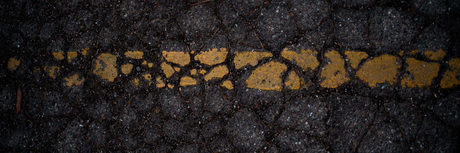
The color palette is vibrant, featuring shades like Off-White, Mint, Cotton Candy, Sunshine, Sky, Green Grape, Cantaloupe, and Lavender (Source: Public School 9 PDF). This palette, combined with the patterns and illustrations, brings the playful energy. (Suggest Image 4 showing the color palette). 
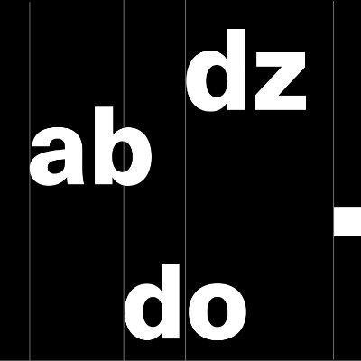
Typography grounds the brand in academia while maintaining approachability. The system uses two headline fonts: Mackinac by P22, a serif font described as academic yet approachable, and Nichrome by Mass-Driver, a bold sans serif (Source: Public School 9 PDF). Eda chose Nichrome partly because it references 1970s/80s sci-fi paperbacks, a subtle nod to the school's space mosaic (Source: Public School 9 PDF). (Suggest Image 6, 7, or 8 showing the typography in use for events). Bringing the Brand to Life The new visual identity is seen across various applications, from welcome signage that pops (Suggest Image 1) to t-shirts that kids can wear with pride (Suggest Image 2). It appears on open house invitations (Suggest Image 3), yearbooks (Suggest Image 5), social media graphics (Suggest Image 6, 7, 8), and even merchandise like pins and hats (Suggest Image 9, 10, 13). The website also reflects the updated look (Suggest Image 12). The result is a visual identity that successfully balances the fun and exploratory nature of elementary school with the necessary seriousness of an academic institution. It's simple, striking, and effectively communicates PS9's values to its community. This project shows how a thoughtful visual identity can truly capture the essence of an organization, even something as dynamic as a public school. It’s a great example of how design can be both functional and full of personality. Want to see more of Billur Eda Bilgi's work? Check out their portfolio at https://edabilgi.com/ Branding and Visual Identity Artifacts Tags branding
    0 التعليقات 0 المشاركات 76 مشاهدة
  • ABDUZEEDO.COM
    Noi Café: Branding That Feels Like a Warm Hug
    04/25 — 2025 by abduzeedo Explore Noi café's cozy branding by true agency. Warm colors & embracing illustrations create a unique visual identity. Ever walked into a place and just felt... welcomed? Like a warm hug? That's the feeling Chisinau-based true agency aimed to capture with their branding and visual identity work for "Noi," a café whose name translates to "us" or "beside us." And looking at the results, they nailed it. This isn't just about serving coffee; it's about creating a space that embraces you. More Than Just Coffee The core idea behind Noi is simple but powerful: warmth, comfort, and connection. The design team at true agency didn't just slap a logo on a cup; they built an entire sensory experience around this concept. It starts with the name itself, "Noi," immediately setting a tone of community and togetherness. The visual language flows directly from this core idea. Forget stark minimalism or overly slick corporate vibes. Noi feels human, approachable, and genuinely caring. Colors and Connection The color palette is the first clue. Soft, natural tones – warm brown, gentle cream, clean white – instantly bring to mind the comforting colors of coffee, cozy blankets, and moments of calm. It’s an earthy, grounded selection that feels instantly relaxing. Then there's the logo. It combines simple, handwritten-style typography with a beautiful illustration: an open hand. This isn't just a graphic; it's a symbol. It speaks directly to the café's mission – offering care, connection, and that welcoming gesture. It’s friendly, unassuming, and memorable. Visual Identity That Embraces Where the branding truly shines is in its application. The branding and visual identity extend far beyond the logo. True agency developed a series of simple, line-drawn illustrations depicting people embracing. These aren't complex artworks, but their emotional resonance is clear. You see these gentle figures on coffee cups, takeaway bags, and even subtly integrated into the café's environment. Each illustration reinforces the central message: Noi is a place to connect, to feel comfortable, to feel at home. It’s a constant, gentle reminder of the café’s welcoming spirit. This approach cleverly merges a clean, modern aesthetic with deep emotional warmth. The typography is clean, the layouts are uncluttered, but the hand-drawn elements and earthy tones prevent it from feeling cold or impersonal. It strikes a beautiful balance. Building a Feeling Ultimately, the branding for Noi succeeds because it’s holistic. Every element, from the name and logo to the color palette and illustrations, works together seamlessly. It supports the café's positioning not just as another coffee shop, but as a community hub – a place to slow down, connect, and enjoy a moment of comfort. The signage, the interior details, the packaging – it all whispers the same message of welcome. You don't just get a coffee at Noi; you get an experience wrapped in a feeling of belonging. It’s a great example of how thoughtful branding and visual identity can translate an abstract feeling like a "hug" into a tangible, relatable brand experience. It makes you think about how often branding aims for "cool" or "edgy," sometimes forgetting the simple power of warmth and human connection. Noi reminds us that sometimes, the most effective design is the one that simply makes people feel good. Designed by: true agency (https://www.instagram.com/trueagency.md/) Branding and visual identity artifacts | Tags branding
    0 التعليقات 0 المشاركات 64 مشاهدة
  • ABDUZEEDO.COM
    Sweet Scandy Skincare Branding and Packaging Design
    04/27 — 2025 by abduzeedo Explore the vibrant, playful branding and packaging design for Scandy Skincare by Classmate Studio. Stepping into the world of youth skincare, Scandy Beauty brings a burst of color and fun. This Scandinavian brand, with a global reach, is all about ditching old beauty norms and celebrating who you are. Think inclusivity, self-expression, and giving the next generation the power to embrace their unique look. Classmate Studio teamed up with Scandy to whip up a visual identity and webshop that perfectly captures this joyful vibe. The look and feel of Scandy are seriously inspired by candy. It's all about uplifting, colorful, and bubbly shapes that just feel fresh and fun. You see these elements throughout the branding and packaging design artifacts. The shapes are instantly recognizable and add a playful touch to every product. Color Palette and Typography The color palette is bright and diverse, a direct nod to celebrating variety and individuality. This isn't a one-size-fits-all brand, and the colors make that clear. Alongside the vibrant colors, the typography keeps things clean and elegant. It's a nice balance between playful visuals and a refined presentation. Packaging Details Let's talk packaging. The designs continue the candy-inspired theme with colorful shapes and a clear, elegant typeface for product information. For instance, the "Spot the F Off Invisible Blemish Patches" packaging features the bubbly shapes and concise text like "Evicting unwanted guests. one patch at a time". Even the details like the barcode and expiration date are integrated cleanly. From the serum bottles to the patches, the branding is consistent and engaging. The visual identity extends to their online presence too, with an engaging webshop that reflects the brand's spirit. The overall design creates a cohesive and inviting experience for the target audience. More Than Just Packaging What Classmate Studio has done with Scandy Skincare is a great example of how branding and packaging design can tell a story. It's not just about putting a label on a product; it's about creating a whole universe that resonates with the brand's values of inclusivity and self-expression. The candy-like inspiration translates into a feeling of joy and approachability. [Suggested Image: Image 5 - Side-by-side images showing a Scandy product outside and a flat packaging design] It's a reminder that design can be a powerful tool to connect with people and make them feel seen and celebrated. The vibrant visual identity and engaging packaging make Scandy Skincare stand out. Check out more work from the studio behind this sweet branding: Classmate Studio Credits Photography: Silja Minkkinen Client: Scandy BeautyBranding and packaging design artifacts
    0 التعليقات 0 المشاركات 54 مشاهدة
  • ABDUZEEDO.COM
    Sky-Inspired Packaging Design for Cuatro Cielos
    04/28 — 2025 by abduzeedo Explore how Fugitiva captured Mexico's skies in the beautiful packaging design for gourmet snack brand Cuatro Cielos. Designers often look to unexpected places for inspiration. For the gourmet snack brand Cuatro Cielos, the creative team at Fugitiva turned their gaze upwards, drawing directly from the dynamic beauty of Mexico's skies. This approach resulted in a visual identity and packaging design that feels both grounded and ethereal. Cuatro Cielos aims to elevate everyday snack moments into something more. Fugitiva's task was to translate this idea into a tangible visual language. Their primary source? The four distinct skies experienced throughout the day: dawn, midday, dusk, and night. Hues Reflecting Flavors The design team meticulously observed the shifting colors of the sky. They built a visual system where each sky's palette correlates with specific ingredients and flavors of Cuatro Cielos' products. This connection enhances the sensory experience and deepens the brand story. Dawn's soft yellows, blues, and intense oranges and golds mirror the gentle awakening of flavors. Think of the comforting warmth found in toasted oats or the sweet sparkle of crystallized nuts. The packaging for products like artisanal granola might feature these warm, transitioning hues. Midday's pure, unwavering azure embodies the clean essence of select ingredients. Light and airy elements, perhaps found in flour mixes for hotcakes, are represented by this clear blue sky. Dusk brings a fiery serenade of vibrant oranges, pinks, purples, and lilacs. This palette reflects an exciting dance of flavors, like the bold heat of chili meeting the richness of roasted nuts. Spicy almond or cashew products could live within this visually dynamic packaging. Night's deep indigo and black, dotted with starlight, evoke profound and delicate notes. Dark chocolate products, inspiring wonder, find their home in this enigmatic, darker design. Crafting the Experience The packaging design artifacts showcase this thoughtful application of color and pattern. Each pouch or container becomes a small canvas, telling a part of the sky's story and hinting at the flavor within. The consistent branding across different products, while utilizing varied sky palettes, creates a cohesive yet diverse family of goods. This project highlights how looking beyond conventional design tropes can lead to truly unique packaging design. By grounding the visual identity in a natural, relatable phenomenon like the sky, Fugitiva created a brand that feels authentic and evocative. It’s a strong reminder that inspiration is everywhere, sometimes just above our heads. Exploring how natural elements can inform your next packaging design project might just lead to something beautiful. Find more inspiring work from Fugitiva at https://fugitiva.co/. Packaging design artifacts Tags packaging design
    0 التعليقات 0 المشاركات 55 مشاهدة
  • 0 التعليقات 0 المشاركات 56 مشاهدة
  • 0 التعليقات 0 المشاركات 57 مشاهدة
المزيد من المنشورات