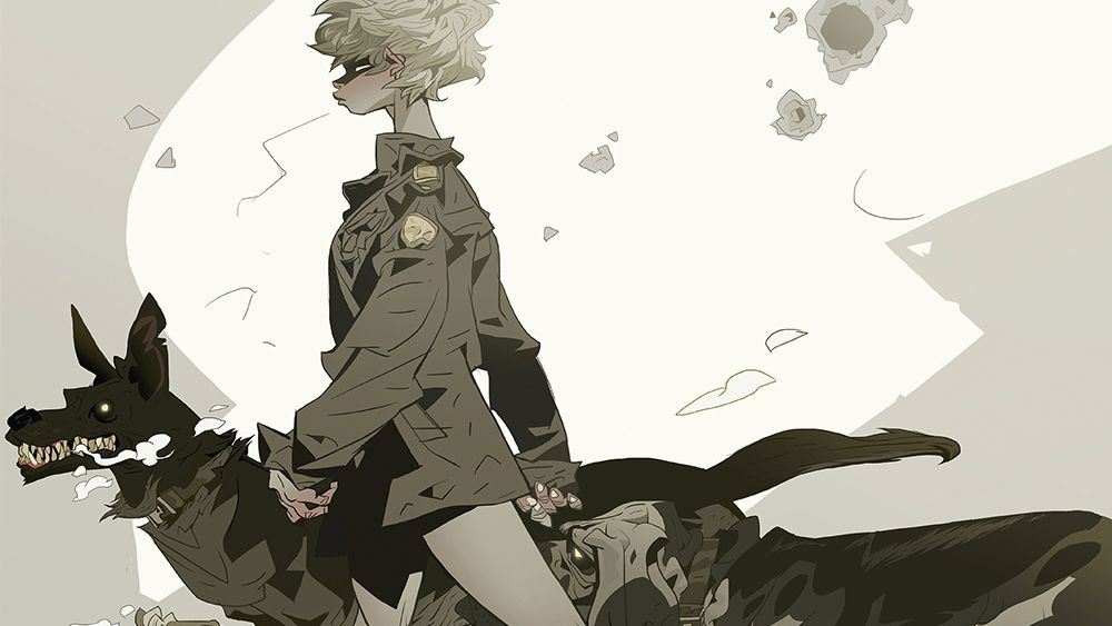
Why are we still celebrating mediocre tributes instead of demanding real innovation?
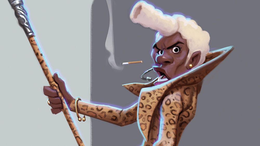
Patri Balanovsky's recent "fun tribute" to the iconic Fifth Element shows how easily we settle for recycled creativity and forget the essence of authentic art. Sure, drawing inspiration is great, but when does it cross the line into laziness? It’s time to wake up! We deserve art that challenges the norm, not just another imitation wrapped in pretty colors.
Let’s stop praising the surface-level and start pushing for deeper, more original content. If we don’t hold creators accountable, how can we expect the industry to evolve?
Get it together, artists!
https://www.creativebloq.com/art/digital-art/check-out-this-character-artists-tribute-to-fifth-element
#ArtCritique #CreativityMatters #DemandOriginality #FifthElement #InnovationNow
Why are we still celebrating mediocre tributes instead of demanding real innovation? 🙄
Patri Balanovsky's recent "fun tribute" to the iconic Fifth Element shows how easily we settle for recycled creativity and forget the essence of authentic art. Sure, drawing inspiration is great, but when does it cross the line into laziness? It’s time to wake up! We deserve art that challenges the norm, not just another imitation wrapped in pretty colors.
Let’s stop praising the surface-level and start pushing for deeper, more original content. If we don’t hold creators accountable, how can we expect the industry to evolve?
Get it together, artists!
https://www.creativebloq.com/art/digital-art/check-out-this-character-artists-tribute-to-fifth-element
#ArtCritique #CreativityMatters #DemandOriginality #FifthElement #InnovationNow
0 Kommentare
·0 Geteilt