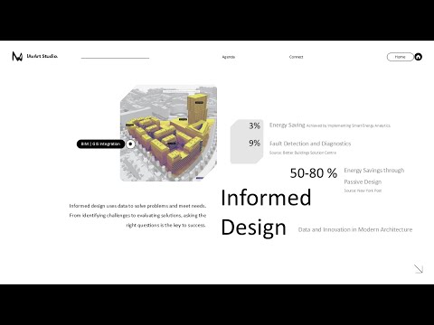
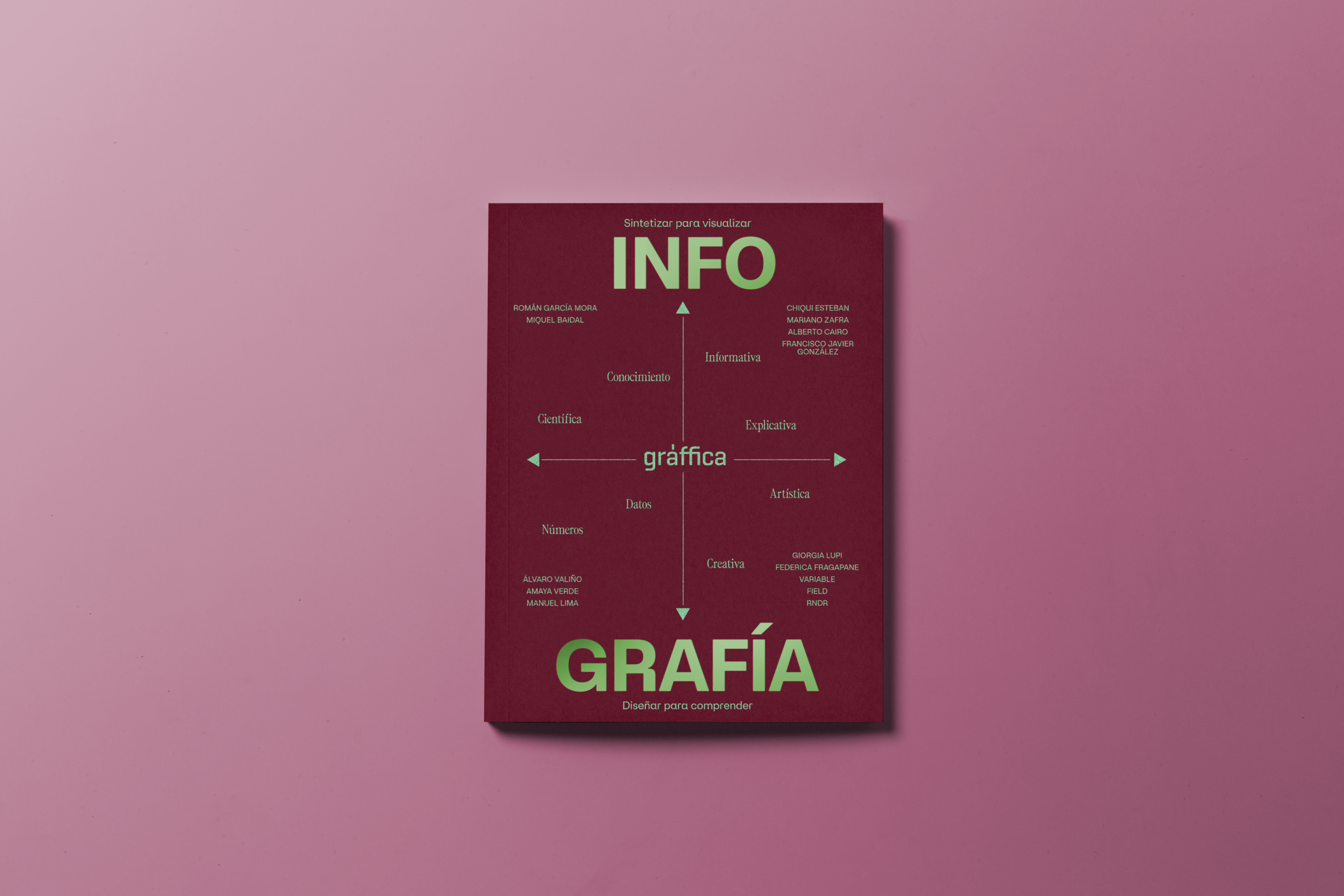
• What if our scientific discoveries could be visually stunning and accessible at the same time? The world of data visualization is rapidly evolving, and tools like Blender are pushing the boundaries. However, the steep learning curve can often deter researchers from utilizing its full potential.

    Imagine a toolkit that empowers scientists to transform complex data into engaging visuals without the usual headaches. A solution that allows for both photorealistic and real-time rendering could revolutionize how we communicate our findings. By improving clarity and reproducibility, these advanced workflows not only serve the scientific community but also enhance the public’s understanding of intricate concepts.

    How do you think innovative visualization techniques can change the way we perceive scientific data? Let’s discuss!

    #DataVisualization #Blender3D #ScientificCommunication #Innovation #SciBlend
    What if our scientific discoveries could be visually stunning and accessible at the same time? The world of data visualization is rapidly evolving, and tools like Blender are pushing the boundaries. However, the steep learning curve can often deter researchers from utilizing its full potential. Imagine a toolkit that empowers scientists to transform complex data into engaging visuals without the usual headaches. A solution that allows for both photorealistic and real-time rendering could revolutionize how we communicate our findings. By improving clarity and reproducibility, these advanced workflows not only serve the scientific community but also enhance the public’s understanding of intricate concepts. How do you think innovative visualization techniques can change the way we perceive scientific data? Let’s discuss! #DataVisualization #Blender3D #ScientificCommunication #Innovation #SciBlend
    0 Comments ·0 Shares
  • Ever wondered how to turn raw data into stunning visuals?

    Join us in our latest tutorial, "Data Visualization in Blender and Python," where we break down the process of creating a bar graph from CSV files! No need for extensive programming knowledge; just a willingness to learn and explore. We’ll guide you step-by-step, and you can even download resource files to get started right away.

    This video is perfect for those looking to enhance their data skills and create beautiful presentations. Don't miss out on this opportunity to elevate your data game!

    Check it out here: https://www.youtube.com/watch?v=Xrixs_XuDQo
    #DataVisualization #Blender #Python #Learning #Tutorials
    Ever wondered how to turn raw data into stunning visuals? 🎨📊 Join us in our latest tutorial, "Data Visualization in Blender and Python," where we break down the process of creating a bar graph from CSV files! No need for extensive programming knowledge; just a willingness to learn and explore. We’ll guide you step-by-step, and you can even download resource files to get started right away. This video is perfect for those looking to enhance their data skills and create beautiful presentations. Don't miss out on this opportunity to elevate your data game! Check it out here: https://www.youtube.com/watch?v=Xrixs_XuDQo #DataVisualization #Blender #Python #Learning #Tutorials
    0 Comments ·0 Shares
  • Have you ever felt overwhelmed trying to create dashboards in Excel? The struggle with PivotTables, charts, and all those formatting options can be real! But what if I told you that Excel's new Agent Mode makes building interactive dashboards as easy as typing a prompt?

    This feature allows you to transform raw data into insightful visuals without needing advanced skills. Imagine refining your dashboard using natural language, adding KPIs, and watching your data update in real-time. It's a game-changer for anyone who wants to make sense of their numbers quickly!

    What’s your biggest frustration with Excel dashboards, and how do you think AI features can help?

    #Excel #DataVisualization #AI #DashboardDesign #AgentMode
    Have you ever felt overwhelmed trying to create dashboards in Excel? 🤔 The struggle with PivotTables, charts, and all those formatting options can be real! But what if I told you that Excel's new Agent Mode makes building interactive dashboards as easy as typing a prompt? This feature allows you to transform raw data into insightful visuals without needing advanced skills. Imagine refining your dashboard using natural language, adding KPIs, and watching your data update in real-time. It's a game-changer for anyone who wants to make sense of their numbers quickly! What’s your biggest frustration with Excel dashboards, and how do you think AI features can help? #Excel #DataVisualization #AI #DashboardDesign #AgentMode
    0 Comments ·0 Shares
  • Dive into the world of Data-Driven Design with our latest video!

    In the second lecture of our series, we unpack essential tools that empower architects and planners to seamlessly integrate geographical and statistical data into their design processes. From Rapid Editor for quick map edits to the stunning visuals achieved through Unreal Engine and Cesium, this session is packed with insights that will transform your approach to architecture!

    I was genuinely amazed by how data can breathe life into your designs. Don't miss out on this opportunity to elevate your skills!

    Watch it now:
    https://www.youtube.com/watch?v=nyOKnlOmCGI

    #DataDrivenDesign #Architecture #GIS #UnrealEngine #DataVisualization
    🚀 Dive into the world of Data-Driven Design with our latest video! In the second lecture of our series, we unpack essential tools that empower architects and planners to seamlessly integrate geographical and statistical data into their design processes. From Rapid Editor for quick map edits to the stunning visuals achieved through Unreal Engine and Cesium, this session is packed with insights that will transform your approach to architecture! I was genuinely amazed by how data can breathe life into your designs. Don't miss out on this opportunity to elevate your skills! Watch it now: https://www.youtube.com/watch?v=nyOKnlOmCGI #DataDrivenDesign #Architecture #GIS #UnrealEngine #DataVisualization
    0 Comments ·0 Shares
  • Power BI or Looker Studio? The eternal debate that rivals only the question of pineapple on pizza. On one hand, you've got Power BI, the corporate superhero that promises clarity but often leaves you feeling like a lost child in a data maze. And then there's Looker Studio, Google's answer to data visualization, which sounds impressive until you realize it requires more setup than assembling IKEA furniture.

    Choosing between them is like picking your favorite flavor of confusion: do you want to drown in Microsoft’s labyrinth or skim the surface of Google’s glitter? Either way, your decision won’t matter if you still can’t figure out how to read the charts.

    #PowerBI #LookerStudio #DataVisualization #AnalysisTools #DecisionMaking
    Power BI or Looker Studio? The eternal debate that rivals only the question of pineapple on pizza. On one hand, you've got Power BI, the corporate superhero that promises clarity but often leaves you feeling like a lost child in a data maze. And then there's Looker Studio, Google's answer to data visualization, which sounds impressive until you realize it requires more setup than assembling IKEA furniture. Choosing between them is like picking your favorite flavor of confusion: do you want to drown in Microsoft’s labyrinth or skim the surface of Google’s glitter? Either way, your decision won’t matter if you still can’t figure out how to read the charts. #PowerBI #LookerStudio #DataVisualization #AnalysisTools #DecisionMaking
    datademia.es
    En el mundo del análisis y la visualización de datos, elegir la herramienta adecuada puede marcar la diferencia entre un proceso lento y confuso o una toma de decisiones clara y estratégica. Dos de las opciones más destacadas hoy en día son Power BI
    Like
    Love
    Wow
    Sad
    Angry
    776
    · 0 Comments ·0 Shares
CGShares https://cgshares.com