My unexpected Pride icon: Link from the Zelda games, a non-binary hero who helped me work out who I was
Growing up steeped in the aggressive gender stereotypes of the 1990s was a real trip for most queer millennials, but I think gamers had it especially hard. Almost all video game characters were hypermasculine military men, unrealistically curvaceous fantasy women wearing barely enough armour to cover their nipples, or cartoon animals. Most of these characters catered exclusively to straight teenage boys; overt queer representation in games was pretty much nonexistent until the mid 2010s. Before that, we had to take what we could get. And what I had was Link, from The Legend of Zelda.Link. Composite: Guardian Design; Zuma Press/AlamyLink is a boy, but he didn’t really look like one. He wore a green tunic and a serious expression under a mop of blond hair. He is the adventurous, mostly silent hero of the Zelda games, unassuming and often vulnerable, but also resourceful, daring and handy with a sword. In most of the early Zelda games, he is a kid of about 10, but even when he grew into a teenager in 1998’s Ocarina of Time on the Nintendo 64, he didn’t become a furious lump of muscle. He stayed androgynous, in his tunic and tights. As a kid, I would dress up like him for Halloween, carefully centre-parting my blond fringe. Link may officially be a boy, but for me he has always been a non-binary icon.As time has gone on and game graphics have evolved, Link has stayed somewhat gender-ambiguous. Gay guys and gender-fluid types alike appreciate his ageless twink energy. And given the total lack of thought that most game developers gave to players who weren’t straight and male, I felt vindicated when I found out that this was intentional. In 2016, the Zelda series’ producer Eiji Aonuma told Time magazine that the development team had experimented a little with Link’s gender presentation over the years, but that he felt that the character’s androgyny was part of who he was.“back during the Ocarina of Time days, I wanted Link to be gender neutral,” he said. “I wanted the player to think: ‘Maybe Link is a boy or a girl.’ If you saw Link as a guy, he’d have more of a feminine touch. Or vice versa … I’ve always thought that for either female or male players, I wanted them to be able to relate to Link.”As it turns out, Link appeals perhaps most of all to those of us somewhere in between. In 2023, the tech blog io9 spoke to many transgender and non-binary people who saw something of themselves in Link: he has acquired a reputation as an egg-cracker, a fictional character who prompts a realisation about your own gender identity.Despite their outdated reputation as a pursuit for adolescent boys, video games have always been playgrounds for gender experimentation and expression. There are legions of trans, non-binary and gender non-conforming people who first started exploring their identity with customisable game characters in World of Warcraft, or gender-swapping themselves in The Sims – the digital equivalent of dressing up. Video games are the closest you can come to stepping into a new body for a bit and seeing how it feels.It is no surprise to me that a lot of queer people are drawn to video games. A 2024 survey by GLAAD found that 17% of gamers identify as LGBTQ+, a huge number compared with the general population. It may be because people who play games skew younger – 40 and below – but I also think it’s because gender is all about play. What fun it is to mess with the rules, subvert people’s expectations and create your own character. It is as empowering as any world-saving quest.
#unexpected #pride #icon #link #zelda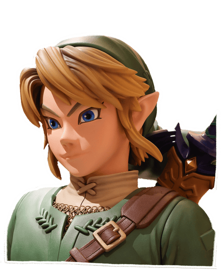
0 Kommentare
·0 Geteilt
·0 Bewertungen