Aga Khan Award for Architecture 2025 announces 19 shortlisted projects from 15 countries
html PUBLIC "-//W3C//DTD HTML 4.0 Transitional//EN" ";
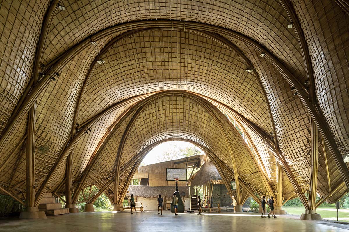
19 shortlisted projects for the 2025 Award cycle were revealed by the Aga Khan Award for Architecture. A portion of the million prize, one of the biggest in architecture, will be awarded to the winning proposals. Out of the 369 projects nominated for the 16th Award Cycle, an independent Master Jury chose the 19 shortlisted projects from 15 countries.The nine members of the Master Jury for the 16th Award cycle include Azra Akšamija, Noura Al-Sayeh Holtrop, Lucia Allais, David Basulto, Yvonne Farrell, Kabage Karanja, Yacouba Konaté, Hassan Radoine, and Mun Summ Wong.His Late Highness Prince Karim Aga Khan IV created the Aga Khan Award for Architecture in 1977 to recognize and promote architectural ideas that effectively meet the needs and goals of communities where Muslims are a major population. Nearly 10,000 construction projects have been documented since the award's inception 48 years ago, and 128 projects have been granted it. The AKAA's selection method places a strong emphasis on architecture that stimulates and responds to people's cultural ambitions in addition to meeting their physical, social, and economic demands.The Aga Khan Award for Architecture is governed by a Steering Committee chaired by His Highness the Aga Khan. The other members of the Steering Committee are Meisa Batayneh, Principal Architect, Founder, maisam architects and engineers, Amman, Jordan; Souleymane Bachir Diagne, Professor of Philosophy and Francophone Studies, Columbia University, New York, United States of America; Lesley Lokko, Founder & Director, African Futures Institute, Accra, Ghana; Gülru Necipoğlu, Director and Professor, Aga Khan Program for Islamic Architecture, Harvard University, Cambridge, United States of America; Hashim Sarkis, Founder & Principal, Hashim Sarkis Studios; Dean, School of Architecture and Planning, Massachusetts Institute of Technology, Cambridge, United States of America; and Sarah M. Whiting, Partner, WW Architecture; Dean and Josep Lluís Sert Professor of Architecture, Graduate School of Design, Harvard University, Cambridge, United States of America. Farrokh Derakhshani is the Director of the Award.Examples of outstanding architecture in the areas of modern design, social housing, community development and enhancement, historic preservation, reuse and area conservation, landscape design, and environmental enhancement are recognized by the Aga Khan Award for Architecture.Building plans that creatively utilize local resources and relevant technologies, as well as initiatives that could spur such initiatives abroad, are given special consideration. It should be mentioned that in addition to honoring architects, the Award also recognizes towns, builders, clients, master craftspeople, and engineers who have contributed significantly to the project.Projects had to be completed between January 1, 2018, and December 31, 2023, and they had to have been operational for a minimum of one year in order to be eligible for consideration in the 2025 Award cycle. The Award is not available for projects that His Highness the Aga Khan or any of the Aga Khan Development Networkinstitutions have commissioned.See the 19 shortlisted projects with their short project descriptions competing for the 2025 Award Cycle:Khudi Bari. Image © Aga Khan Trust for Culture / City SyntaxBangladeshKhudi Bari, in various locations, by Marina Tabassum ArchitectsMarina Tabassum Architects' Khudi Bari, which can be readily disassembled and reassembled to suit the needs of the users, is a replicable solution for displaced communities impacted by geographic and climatic changes.West Wusutu Village Community Centre. Image © Aga Khan Trust for Culture / Dou YujunChinaWest Wusutu Village Community Centre, Hohhot, Inner Mongolia, by Zhang PengjuIn addition to meeting the religious demands of the local Hui Muslims, Zhang Pengju's West Wusutu Village Community Centre in Hohhot, Inner Mongolia, offers social and cultural spaces for locals and artists. Constructed from recycled bricks, it features multipurpose indoor and outdoor areas that promote communal harmony.Revitalisation of Historic Esna. Image © Aga Khan Trust for Culture / Ahmed SalemEgyptRevitalisation of Historic Esna, by Takween Integrated Community DevelopmentBy using physical interventions, socioeconomic projects, and creative urban planning techniques, Takween Integrated Community Development's Revitalization of Historic Esna tackles the issues of cultural tourism in Upper Egypt and turns the once-forgotten area around the Temple of Khnum into a thriving historic city.The Arc at Green School. Image © Aga Khan Trust for Culture / Andreas Perbowo WidityawanIndonesiaThe Arc at Green School, in Bali, by IBUKU / Elora HardyAfter 15 years of bamboo experimenting at the Green School Bali, IBUKU/Elora Hardy created The Arc at Green School. The Arc is a brand-new community wellness facility built on the foundations of a temporary gym. High-precision engineering and regional handicraft are combined in this construction.Islamic Centre Nurul Yaqin Mosque. Image © Aga Khan Trust for Culture / Andreas Perbowo WidityawanIndonesiaIslamic Centre Nurul Yaqin Mosque, in Palu, Central Sulawesi, by Dave Orlando and Fandy GunawanDave Orlando and Fandy Gunawan built the Islamic Center Nurul Yaqin Mosque in Palu, Central Sulawesi, on the location of a previous mosque that was damaged by a 2018 tsunami. There is a place for worship and assembly at the new Islamic Center. Surrounded by a shallow reflecting pool that may be drained to make room for more guests, it is open to the countryside.Microlibrary Warak Kayu. Image © Aga Khan Trust for Culture / Andreas Perbowo WidityawanIndonesiaMicrolibraries in various cities, by SHAU / Daliana Suryawinata, Florian HeinzelmannFlorian Heinzelmann, the project's initiator, works with stakeholders at all levels to provide high-quality public spaces in a number of Indonesian parks and kampungs through microlibraries in different towns run by SHAU/Daliana Suryawinata. So far, six have been constructed, and by 2045, 100 are planned.Majara Residence. Image © Aga Khan Trust for Culture / Deed StudioIranMajara Complex and Community Redevelopment, in Hormuz Island by ZAV Architects / Mohamadreza GhodousiThe Majara Complex and Community Redevelopment on Hormuz Island, designed by ZAV Architects and Mohamadreza Ghodousi, is well-known for its vibrant domes that offer eco-friendly lodging for visitors visiting Hormuz's distinctive scenery. In addition to providing new amenities for the islanders who visit to socialize, pray, or utilize the library, it was constructed by highly trained local laborers.Jahad Metro Plaza. Image © Aga Khan Trust for Culture / Deed StudioIranJahad Metro Plaza in Tehran, by KA Architecture StudioKA Architecture Studio's Jahad Metro Plaza in Tehran was constructed to replace the dilapidated old buildings. It turned the location into a beloved pedestrian-friendly landmark. The arched vaults, which are covered in locally manufactured brick, vary in height to let air and light into the area they are protecting.Khan Jaljulia Restoration. Image © Aga Khan Trust for Culture / Mikaela BurstowIsraelKhan Jaljulia Restoration in Jaljulia by Elias KhuriElias Khuri's Khan Jaljulia Restoration is a cost-effective intervention set amidst the remnants of a 14th-century Khan in Jaljulia. By converting the abandoned historical location into a bustling public area for social gatherings, it helps the locals rediscover their cultural history.Campus Startup Lions. Image © Aga Khan Trust for Culture / Christopher Wilton-SteerKenyaCampus Startup Lions, in Turkana by Kéré ArchitectsKéré Architecture's Campus Startup Lions in Turkana is an educational and entrepreneurial center that offers a venue for community involvement, business incubation, and technology-driven education. The design incorporates solar energy, rainwater harvesting, and tall ventilation towers that resemble the nearby termite mounds, and it was constructed using local volcanic stone.Lalla Yeddouna Square. Image © Aga Khan Trust for Culture / Amine HouariMoroccoRevitalisation of Lalla Yeddouna Square in the medina of Fez, by Mossessian Architecture and Yassir Khalil StudioMossessian Architecture and Yassir Khalil Studio's revitalization of Lalla Yeddouna Square in the Fez medina aims to improve pedestrian circulation and reestablish a connection to the waterfront. For the benefit of locals, craftspeople, and tourists from around the globe, existing buildings were maintained and new areas created.Vision Pakistan. Image © Aga Khan Trust for Culture / Usman Saqib ZuberiPakistanVision Pakistan, in Islamabad by DB Studios / Mohammad Saifullah SiddiquiA tailoring training center run by Vision Pakistan, a nonprofit organization dedicated to empowering underprivileged adolescents, is located in Islamabad by DB Studios/Mohammad Saifullah Siddiqui. Situated in a crowded neighborhood, this multi-story building features flashy jaalis influenced by Arab and Pakistani crafts, echoing the city's 1960s design.Denso Hall Rahguzar Project. Image © Aga Khan Trust for Culture / Usman Saqib ZuberiPakistanDenso Hall Rahguzar Project, in Karachi by Heritage Foundation Pakistan / Yasmeen LariThe Heritage Foundation of Pakistan/Yasmeen Lari's Denso Hall Rahguzar Project in Karachi is a heritage-led eco-urban enclave that was built with low-carbon materials in response to the city's severe climate, which is prone to heat waves and floods. The freshly planted "forests" are irrigated by the handcrafted terracotta cobbles, which absorb rainfall and cool and purify the air.Wonder Cabinet. Image © Aga Khan Trust for Culture / Mikaela BurstowPalestineWonder Cabinet, in Bethlehem by AAU AnastasThe architects at AAU Anastas established Wonder Cabinet, a multifunctional, nonprofit exhibition and production venue in Bethlehem. The three-story concrete building was constructed with the help of regional contractors and artisans, and it is quickly emerging as a major center for learning, design, craft, and innovation.The Ned. Image © Aga Khan Trust for Culture / Cemal EmdenQatarThe Ned Hotel, in Doha by David Chipperfield ArchitectsThe Ministry of Interior was housed in the Ned Hotel in Doha, which was designed by David Chipperfield Architects. Its Middle Eastern brutalist building was meticulously transformed into a 90-room boutique hotel, thereby promoting architectural revitalization in the region.Shamalat Cultural Centre. Image © Aga Khan Trust for Culture / Hassan Al ShattiSaudi ArabiaShamalat Cultural Centre, in Riyadh, by Syn Architects / Sara Alissa, Nojoud AlsudairiOn the outskirts of Diriyah, the Shamalat Cultural Centre in Riyadh was created by Syn Architects/Sara Alissa, Nojoud Alsudairi. It was created from an old mud home that artist Maha Malluh had renovated. The center, which aims to incorporate historic places into daily life, provides a sensitive viewpoint on heritage conservation in the area by contrasting the old and the contemporary.Rehabilitation and Extension of Dakar Railway Station. Image © Aga Khan Trust for Culture / Sylvain CherkaouiSenegalRehabilitation and Extension of Dakar Railway Station, in Dakar by Ga2DIn order to accommodate the passengers of a new express train line, Ga2D extended and renovated Dakar train Station, which purposefully contrasts the old and modern buildings. The forecourt was once again open to pedestrian traffic after vehicular traffic was limited to the rear of the property.Rami Library. Image © Aga Khan Trust for Culture / Cemal EmdenTürkiyeRami Library, by Han Tümertekin Design & ConsultancyThe largest library in Istanbul is the Rami Library, designed by Han Tümertekin Design & Consultancy. It occupied the former Rami Barracks, a sizable, single-story building with enormous volumes that was constructed in the eighteenth century. In order to accommodate new library operations while maintaining the structure's original spatial features, a minimal intervention method was used.Morocco Pavilion Expo Dubai 2020. Image © Aga Khan Trust for Culture / Deed StudioUnited Arab EmiratesMorocco Pavilion Expo Dubai 2020, by Oualalou + ChoiOualalou + Choi's Morocco Pavilion Expo Dubai 2020 is intended to last beyond Expo 2020 and be transformed into a cultural center. The pavilion is a trailblazer in the development of large-scale rammed earth building techniques. Its use of passive cooling techniques, which minimize the need for mechanical air conditioning, earned it the gold LEED accreditation.At each project location, independent professionals such as architects, conservation specialists, planners, and structural engineers have conducted thorough evaluations of the nominated projects. This summer, the Master Jury convenes once more to analyze the on-site evaluations and choose the ultimate Award winners.The top image in the article: The Arc at Green School. Image © Aga Khan Trust for Culture / Andreas Perbowo Widityawan.> via Aga Khan Award for Architecture
#aga #khan #award #architecture #announces
Aga Khan Award for Architecture 2025 announces 19 shortlisted projects from 15 countries
html PUBLIC "-//W3C//DTD HTML 4.0 Transitional//EN" ";
19 shortlisted projects for the 2025 Award cycle were revealed by the Aga Khan Award for Architecture. A portion of the million prize, one of the biggest in architecture, will be awarded to the winning proposals. Out of the 369 projects nominated for the 16th Award Cycle, an independent Master Jury chose the 19 shortlisted projects from 15 countries.The nine members of the Master Jury for the 16th Award cycle include Azra Akšamija, Noura Al-Sayeh Holtrop, Lucia Allais, David Basulto, Yvonne Farrell, Kabage Karanja, Yacouba Konaté, Hassan Radoine, and Mun Summ Wong.His Late Highness Prince Karim Aga Khan IV created the Aga Khan Award for Architecture in 1977 to recognize and promote architectural ideas that effectively meet the needs and goals of communities where Muslims are a major population. Nearly 10,000 construction projects have been documented since the award's inception 48 years ago, and 128 projects have been granted it. The AKAA's selection method places a strong emphasis on architecture that stimulates and responds to people's cultural ambitions in addition to meeting their physical, social, and economic demands.The Aga Khan Award for Architecture is governed by a Steering Committee chaired by His Highness the Aga Khan. The other members of the Steering Committee are Meisa Batayneh, Principal Architect, Founder, maisam architects and engineers, Amman, Jordan; Souleymane Bachir Diagne, Professor of Philosophy and Francophone Studies, Columbia University, New York, United States of America; Lesley Lokko, Founder & Director, African Futures Institute, Accra, Ghana; Gülru Necipoğlu, Director and Professor, Aga Khan Program for Islamic Architecture, Harvard University, Cambridge, United States of America; Hashim Sarkis, Founder & Principal, Hashim Sarkis Studios; Dean, School of Architecture and Planning, Massachusetts Institute of Technology, Cambridge, United States of America; and Sarah M. Whiting, Partner, WW Architecture; Dean and Josep Lluís Sert Professor of Architecture, Graduate School of Design, Harvard University, Cambridge, United States of America. Farrokh Derakhshani is the Director of the Award.Examples of outstanding architecture in the areas of modern design, social housing, community development and enhancement, historic preservation, reuse and area conservation, landscape design, and environmental enhancement are recognized by the Aga Khan Award for Architecture.Building plans that creatively utilize local resources and relevant technologies, as well as initiatives that could spur such initiatives abroad, are given special consideration. It should be mentioned that in addition to honoring architects, the Award also recognizes towns, builders, clients, master craftspeople, and engineers who have contributed significantly to the project.Projects had to be completed between January 1, 2018, and December 31, 2023, and they had to have been operational for a minimum of one year in order to be eligible for consideration in the 2025 Award cycle. The Award is not available for projects that His Highness the Aga Khan or any of the Aga Khan Development Networkinstitutions have commissioned.See the 19 shortlisted projects with their short project descriptions competing for the 2025 Award Cycle:Khudi Bari. Image © Aga Khan Trust for Culture / City SyntaxBangladeshKhudi Bari, in various locations, by Marina Tabassum ArchitectsMarina Tabassum Architects' Khudi Bari, which can be readily disassembled and reassembled to suit the needs of the users, is a replicable solution for displaced communities impacted by geographic and climatic changes.West Wusutu Village Community Centre. Image © Aga Khan Trust for Culture / Dou YujunChinaWest Wusutu Village Community Centre, Hohhot, Inner Mongolia, by Zhang PengjuIn addition to meeting the religious demands of the local Hui Muslims, Zhang Pengju's West Wusutu Village Community Centre in Hohhot, Inner Mongolia, offers social and cultural spaces for locals and artists. Constructed from recycled bricks, it features multipurpose indoor and outdoor areas that promote communal harmony.Revitalisation of Historic Esna. Image © Aga Khan Trust for Culture / Ahmed SalemEgyptRevitalisation of Historic Esna, by Takween Integrated Community DevelopmentBy using physical interventions, socioeconomic projects, and creative urban planning techniques, Takween Integrated Community Development's Revitalization of Historic Esna tackles the issues of cultural tourism in Upper Egypt and turns the once-forgotten area around the Temple of Khnum into a thriving historic city.The Arc at Green School. Image © Aga Khan Trust for Culture / Andreas Perbowo WidityawanIndonesiaThe Arc at Green School, in Bali, by IBUKU / Elora HardyAfter 15 years of bamboo experimenting at the Green School Bali, IBUKU/Elora Hardy created The Arc at Green School. The Arc is a brand-new community wellness facility built on the foundations of a temporary gym. High-precision engineering and regional handicraft are combined in this construction.Islamic Centre Nurul Yaqin Mosque. Image © Aga Khan Trust for Culture / Andreas Perbowo WidityawanIndonesiaIslamic Centre Nurul Yaqin Mosque, in Palu, Central Sulawesi, by Dave Orlando and Fandy GunawanDave Orlando and Fandy Gunawan built the Islamic Center Nurul Yaqin Mosque in Palu, Central Sulawesi, on the location of a previous mosque that was damaged by a 2018 tsunami. There is a place for worship and assembly at the new Islamic Center. Surrounded by a shallow reflecting pool that may be drained to make room for more guests, it is open to the countryside.Microlibrary Warak Kayu. Image © Aga Khan Trust for Culture / Andreas Perbowo WidityawanIndonesiaMicrolibraries in various cities, by SHAU / Daliana Suryawinata, Florian HeinzelmannFlorian Heinzelmann, the project's initiator, works with stakeholders at all levels to provide high-quality public spaces in a number of Indonesian parks and kampungs through microlibraries in different towns run by SHAU/Daliana Suryawinata. So far, six have been constructed, and by 2045, 100 are planned.Majara Residence. Image © Aga Khan Trust for Culture / Deed StudioIranMajara Complex and Community Redevelopment, in Hormuz Island by ZAV Architects / Mohamadreza GhodousiThe Majara Complex and Community Redevelopment on Hormuz Island, designed by ZAV Architects and Mohamadreza Ghodousi, is well-known for its vibrant domes that offer eco-friendly lodging for visitors visiting Hormuz's distinctive scenery. In addition to providing new amenities for the islanders who visit to socialize, pray, or utilize the library, it was constructed by highly trained local laborers.Jahad Metro Plaza. Image © Aga Khan Trust for Culture / Deed StudioIranJahad Metro Plaza in Tehran, by KA Architecture StudioKA Architecture Studio's Jahad Metro Plaza in Tehran was constructed to replace the dilapidated old buildings. It turned the location into a beloved pedestrian-friendly landmark. The arched vaults, which are covered in locally manufactured brick, vary in height to let air and light into the area they are protecting.Khan Jaljulia Restoration. Image © Aga Khan Trust for Culture / Mikaela BurstowIsraelKhan Jaljulia Restoration in Jaljulia by Elias KhuriElias Khuri's Khan Jaljulia Restoration is a cost-effective intervention set amidst the remnants of a 14th-century Khan in Jaljulia. By converting the abandoned historical location into a bustling public area for social gatherings, it helps the locals rediscover their cultural history.Campus Startup Lions. Image © Aga Khan Trust for Culture / Christopher Wilton-SteerKenyaCampus Startup Lions, in Turkana by Kéré ArchitectsKéré Architecture's Campus Startup Lions in Turkana is an educational and entrepreneurial center that offers a venue for community involvement, business incubation, and technology-driven education. The design incorporates solar energy, rainwater harvesting, and tall ventilation towers that resemble the nearby termite mounds, and it was constructed using local volcanic stone.Lalla Yeddouna Square. Image © Aga Khan Trust for Culture / Amine HouariMoroccoRevitalisation of Lalla Yeddouna Square in the medina of Fez, by Mossessian Architecture and Yassir Khalil StudioMossessian Architecture and Yassir Khalil Studio's revitalization of Lalla Yeddouna Square in the Fez medina aims to improve pedestrian circulation and reestablish a connection to the waterfront. For the benefit of locals, craftspeople, and tourists from around the globe, existing buildings were maintained and new areas created.Vision Pakistan. Image © Aga Khan Trust for Culture / Usman Saqib ZuberiPakistanVision Pakistan, in Islamabad by DB Studios / Mohammad Saifullah SiddiquiA tailoring training center run by Vision Pakistan, a nonprofit organization dedicated to empowering underprivileged adolescents, is located in Islamabad by DB Studios/Mohammad Saifullah Siddiqui. Situated in a crowded neighborhood, this multi-story building features flashy jaalis influenced by Arab and Pakistani crafts, echoing the city's 1960s design.Denso Hall Rahguzar Project. Image © Aga Khan Trust for Culture / Usman Saqib ZuberiPakistanDenso Hall Rahguzar Project, in Karachi by Heritage Foundation Pakistan / Yasmeen LariThe Heritage Foundation of Pakistan/Yasmeen Lari's Denso Hall Rahguzar Project in Karachi is a heritage-led eco-urban enclave that was built with low-carbon materials in response to the city's severe climate, which is prone to heat waves and floods. The freshly planted "forests" are irrigated by the handcrafted terracotta cobbles, which absorb rainfall and cool and purify the air.Wonder Cabinet. Image © Aga Khan Trust for Culture / Mikaela BurstowPalestineWonder Cabinet, in Bethlehem by AAU AnastasThe architects at AAU Anastas established Wonder Cabinet, a multifunctional, nonprofit exhibition and production venue in Bethlehem. The three-story concrete building was constructed with the help of regional contractors and artisans, and it is quickly emerging as a major center for learning, design, craft, and innovation.The Ned. Image © Aga Khan Trust for Culture / Cemal EmdenQatarThe Ned Hotel, in Doha by David Chipperfield ArchitectsThe Ministry of Interior was housed in the Ned Hotel in Doha, which was designed by David Chipperfield Architects. Its Middle Eastern brutalist building was meticulously transformed into a 90-room boutique hotel, thereby promoting architectural revitalization in the region.Shamalat Cultural Centre. Image © Aga Khan Trust for Culture / Hassan Al ShattiSaudi ArabiaShamalat Cultural Centre, in Riyadh, by Syn Architects / Sara Alissa, Nojoud AlsudairiOn the outskirts of Diriyah, the Shamalat Cultural Centre in Riyadh was created by Syn Architects/Sara Alissa, Nojoud Alsudairi. It was created from an old mud home that artist Maha Malluh had renovated. The center, which aims to incorporate historic places into daily life, provides a sensitive viewpoint on heritage conservation in the area by contrasting the old and the contemporary.Rehabilitation and Extension of Dakar Railway Station. Image © Aga Khan Trust for Culture / Sylvain CherkaouiSenegalRehabilitation and Extension of Dakar Railway Station, in Dakar by Ga2DIn order to accommodate the passengers of a new express train line, Ga2D extended and renovated Dakar train Station, which purposefully contrasts the old and modern buildings. The forecourt was once again open to pedestrian traffic after vehicular traffic was limited to the rear of the property.Rami Library. Image © Aga Khan Trust for Culture / Cemal EmdenTürkiyeRami Library, by Han Tümertekin Design & ConsultancyThe largest library in Istanbul is the Rami Library, designed by Han Tümertekin Design & Consultancy. It occupied the former Rami Barracks, a sizable, single-story building with enormous volumes that was constructed in the eighteenth century. In order to accommodate new library operations while maintaining the structure's original spatial features, a minimal intervention method was used.Morocco Pavilion Expo Dubai 2020. Image © Aga Khan Trust for Culture / Deed StudioUnited Arab EmiratesMorocco Pavilion Expo Dubai 2020, by Oualalou + ChoiOualalou + Choi's Morocco Pavilion Expo Dubai 2020 is intended to last beyond Expo 2020 and be transformed into a cultural center. The pavilion is a trailblazer in the development of large-scale rammed earth building techniques. Its use of passive cooling techniques, which minimize the need for mechanical air conditioning, earned it the gold LEED accreditation.At each project location, independent professionals such as architects, conservation specialists, planners, and structural engineers have conducted thorough evaluations of the nominated projects. This summer, the Master Jury convenes once more to analyze the on-site evaluations and choose the ultimate Award winners.The top image in the article: The Arc at Green School. Image © Aga Khan Trust for Culture / Andreas Perbowo Widityawan.> via Aga Khan Award for Architecture
#aga #khan #award #architecture #announces