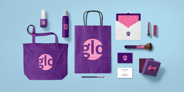
Smashing Animations Part 4: Optimising SVGs
SVG animations take me back to the Hanna-Barbera cartoons I watched as a kid. Shows like Wacky Races, The Perils of Penelope Pitstop, and, of course, Yogi Bear. They inspired me to lovingly recreate some classic Toon Titles using CSS, SVG, and SMIL animations.
But getting animations to load quickly and work smoothly needs more than nostalgia. It takes clean design, lean code, and a process that makes complex SVGs easier to animate. Here’s how I do it.
Start Clean And Design With Optimisation In Mind
Keeping things simple is key to making SVGs that are optimised and ready to animate. Tools like Adobe Illustrator convert bitmap images to vectors, but the output often contains too many extraneous groups, layers, and masks. Instead, I start cleaning in Sketch, work from a reference image, and use the Pen tool to create paths.
Tip: Affinity Designerand Sketchare alternatives to Adobe Illustrator and Figma. Both are independent and based in Europe. Sketch has been my default design app since Adobe killed Fireworks.
Beginning With Outlines
For these Toon Titles illustrations, I first use the Pen tool to draw black outlines with as few anchor points as possible. The more points a shape has, the bigger a file becomes, so simplifying paths and reducing the number of points makes an SVG much smaller, often with no discernible visual difference.
Bearing in mind that parts of this Yogi illustration will ultimately be animated, I keep outlines for this Bewitched Bear’s body, head, collar, and tie separate so that I can move them independently. The head might nod, the tie could flap, and, like in those classic cartoons, Yogi’s collar will hide the joins between them.
Drawing Simple Background Shapes
With the outlines in place, I use the Pen tool again to draw new shapes, which fill the areas with colour. These colours sit behind the outlines, so they don’t need to match them exactly. The fewer anchor points, the smaller the file size.
Sadly, neither Affinity Designer nor Sketch has tools that can simplify paths, but if you have it, using Adobe Illustrator can shave a few extra kilobytes off these background shapes.
Optimising The Code
It’s not just metadata that makes SVG bulkier. The way you export from your design app also affects file size.
Exporting just those simple background shapes from Adobe Illustrator includes unnecessary groups, masks, and bloated path data by default. Sketch’s code is barely any better, and there’s plenty of room for improvement, even in its SVGO Compressor code. I rely on Jake Archibald’s SVGOMG, which uses SVGO v3 and consistently delivers the best optimised SVGs.
Layering SVG Elements
My process for preparing SVGs for animation goes well beyond drawing vectors and optimising paths — it also includes how I structure the code itself. When every visual element is crammed into a single SVG file, even optimised code can be a nightmare to navigate. Locating a specific path or group often feels like searching for a needle in a haystack.
That’s why I develop my SVGs in layers, exporting and optimising one set of elements at a time — always in the order they’ll appear in the final file. This lets me build the master SVG gradually by pasting it in each cleaned-up section. For example, I start with backgrounds like this gradient and title graphic.
Instead of facing a wall of SVG code, I can now easily identify the background gradient’s path and its associated linearGradient, and see the group containing the title graphic. I take this opportunity to add a comment to the code, which will make editing and adding animations to it easier in the future:
<svg ...>
<defs>
<!-- ... -->
</defs>
<path fill="url" d="…"/>
<!-- TITLE GRAPHIC -->
<g>
<path … />
<!-- ... -->
</g>
</svg>
Next, I add the blurred trail from Yogi’s airborne broom. This includes defining a Gaussian Blur filter and placing its path between the background and title layers:
<svg ...>
<defs>
<linearGradient id="grad" …>…</linearGradient>
<filter id="trail" …>…</filter>
</defs>
<!-- GRADIENT -->
<!-- TRAIL -->
<path filter="url" …/>
<!-- TITLE GRAPHIC -->
</svg>
Then come the magical stars, added in the same sequential fashion:
<svg ...>
<!-- GRADIENT -->
<!-- TRAIL -->
<!-- STARS -->
<!-- TITLE GRAPHIC -->
</svg>
To keep everything organised and animation-ready, I create an empty group that will hold all the parts of Yogi:
<g id="yogi">...</g>
Then I build Yogi from the ground up — starting with background props, like his broom:
<g id="broom">...</g>
Followed by grouped elements for his body, head, collar, and tie:
<g id="yogi">
<g id="broom">…</g>
<g id="body">…</g>
<g id="head">…</g>
<g id="collar">…</g>
<g id="tie">…</g>
</g>
Since I export each layer from the same-sized artboard, I don’t need to worry about alignment or positioning issues later on — they’ll all slot into place automatically. I keep my code clean, readable, and ordered logically by layering elements this way. It also makes animating smoother, as each component is easier to identify.
Reusing Elements With <use>
When duplicate shapes get reused repeatedly, SVG files can get bulky fast. My recreation of the “Bewitched Bear” title card contains 80 stars in three sizes. Combining all those shapes into one optimised path would bring the file size down to 3KB. But I want to animate individual stars, which would almost double that to 5KB:
<g id="stars">
<path class="star-small" fill="#eae3da" d="..."/>
<path class="star-medium" fill="#eae3da" d="..."/>
<path class="star-large" fill="#eae3da" d="..."/>
<!-- ... -->
</g>
Moving the stars’ fill attribute values to their parent group reduces the overall weight a little:
<g id="stars" fill="#eae3da">
<path class="star-small" d="…"/>
<path class="star-medium" d="…"/>
<path class="star-large" d="…"/>
<!-- ... -->
</g>
But a more efficient and manageable option is to define each star size as a reusable template:
<defs>
<path id="star-large" fill="#eae3da" fill-rule="evenodd" d="…"/>
<path id="star-medium" fill="#eae3da" fill-rule="evenodd" d="…"/>
<path id="star-small" fill="#eae3da" fill-rule="evenodd" d="…"/>
</defs>
With this setup, changing a star’s design only means updating its template once, and every instance updates automatically. Then, I reference each one using <use> and position them with x and y attributes:
<g id="stars">
<!-- Large stars -->
<use href="#star-large" x="1575" y="495"/>
<!-- ... -->
<!-- Medium stars -->
<use href="#star-medium" x="1453" y="696"/>
<!-- ... -->
<!-- Small stars -->
<use href="#star-small" x="1287" y="741"/>
<!-- ... -->
</g>
This approach makes the SVG easier to manage, lighter to load, and faster to iterate on, especially when working with dozens of repeating elements. Best of all, it keeps the markup clean without compromising on flexibility or performance.
Adding Animations
The stars trailing behind Yogi’s stolen broom bring so much personality to the animation. I wanted them to sparkle in a seemingly random pattern against the dark blue background, so I started by defining a keyframe animation that cycles through different opacity levels:
@keyframes sparkle {
0%, 100% { opacity: .1; }
50% { opacity: 1; }
}
Next, I applied this looping animation to every use element inside my stars group:
#stars use {
animation: sparkle 10s ease-in-out infinite;
}
The secret to creating a convincing twinkle lies in variation. I staggered animation delays and durations across the stars using nth-child selectors, starting with the quickest and most frequent sparkle effects:
/* Fast, frequent */
#stars use:nth-child:nth-child{
animation-delay: .1s;
animation-duration: 2s;
}
From there, I layered in additional timings to mix things up. Some stars sparkle slowly and dramatically, others more randomly, with a variety of rhythms and pauses:
/* Medium */
#stars use:nth-child:nth-child{ ... }
/* Slow, dramatic */
#stars use:nth-child:nth-child{ ... }
/* Random */
#stars use:nth-child{ ... }
/* Alternating */
#stars use:nth-child{ ... }
/* Scattered */
#stars use:nth-child{ ... }
By thoughtfully structuring the SVG and reusing elements, I can build complex-looking animations without bloated code, making even a simple effect like changing opacity sparkle.
Then, for added realism, I make Yogi’s head wobble:
@keyframes headWobble {
0% { transform: rotatetranslateY; }
100% { transform: rotatetranslateY; }
}
#head {
animation: headWobble 0.8s cubic-bezierinfinite alternate;
}
His tie waves:
@keyframes tieWave {
0%, 100% { transform: rotateZrotateYscaleX; }
33% { transform: rotateZrotateYscaleX; }
66% { transform: rotateZrotateYscaleX; }
}
#tie {
transform-style: preserve-3d;
animation: tieWave 10s cubic-bezierinfinite;
}
His broom swings:
@keyframes broomSwing {
0%, 20% { transform: rotate; }
30% { transform: rotate; }
50%, 70% { transform: rotate; }
80% { transform: rotate; }
100% { transform: rotate; }
}
#broom {
animation: broomSwing 4s cubic-bezierinfinite;
}
And, finally, Yogi himself gently rotates as he flies on his magical broom:
@keyframes yogiWobble {
0% { transform: rotatetranslateYscale; }
30% { transform: rotatetranslateY; }
100% { transform: rotatetranslateYscale; }
}
#yogi {
animation: yogiWobble 3.5s cubic-bezierinfinite alternate;
}
All these subtle movements bring Yogi to life. By developing structured SVGs, I can create animations that feel full of character without writing a single line of JavaScript.
Try this yourself:
See the Pen Bewitched Bear CSS/SVG animationby Andy Clarke.
Conclusion
Whether you’re recreating a classic title card or animating icons for an interface, the principles are the same:
Start clean,
Optimise early, and
Structure everything with animation in mind.
SVGs offer incredible creative freedom, but only if kept lean and manageable. When you plan your process like a production cell — layer by layer, element by element — you’ll spend less time untangling code and more time bringing your work to life.
#smashing #animations #part #optimising #svgs