


0 Reacties
·0 aandelen
·24 Views
Bedrijvengids
-
 InZoi Karma Explained And How To Change Your Karmawww.gamespot.comAs pleasant as it might be for us if the world were exclusively full of nice people, that's not necessarily the right formula for an entertaining life sim video game. If all the characters in InZoi only gave each other compliments, it would get boring immediately--fortunately, that's not what InZoi is like at all. Here's a full explainer of how InZoi karma works.Table of Contents [hide]InZoi karma explainedInZoi karma explainedIn InZoi, you can be a good Zoi or a bad Zoi, and your behavior is reflected by your karma level. InZoi's karma is not something that has a direct parallel in The Sims 4--the closest mechanic would be its reputation system, but that's based on what other characters think of you, and this karma system is more like the game's judgment of your behavior.With that being the case, it's best to think of InZoi's karma as akin to a dark side/light side meter in a Star Wars game, or the renegade/paragon system from Mass Effect. The more your karma slides one way or the other, the more options you'll have to do things that correspond with your alignment. If you have bad karma, you'll unlock new methods for being a jerk, like picking fights and shoving people to the ground for no reason. You'll even be able to start committing crimes, like robbing ATMs. You can go to jail for that kind of thing, though, so be careful.Continue Reading at GameSpot0 Reacties ·0 aandelen ·24 Views
 -
 Assassins Creed Shadows Protagonists Are the Yin to Syndicates Yanggamerant.comOver the years, the Assassin's Creed franchise has experimented with its approach to protagonists. The first couple of games followed a pretty standard action-adventure model. Assassin's Creed Unity tried to provide more of a co-op experience, and the RPG titles have given players multiple protagonists to control during their journey. That final path would not have been possible without Assassin's Creed Syndicate blazing that trail, but with Assassin's Creed Shadows, Ubisoft has taken the dual protagonist concept to new heights.0 Reacties ·0 aandelen ·28 Views
 -
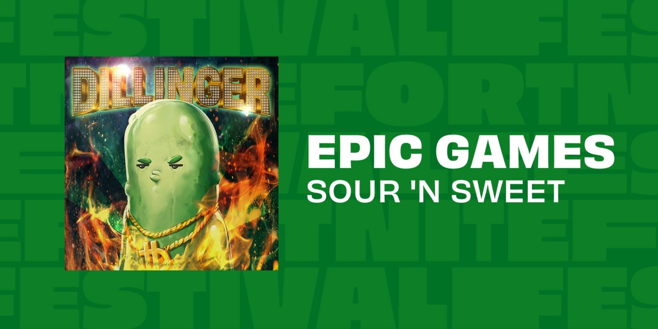 How to Get the Free Big Dill Jam Track in Fortnitegamerant.comFortnite's in-game locker options have steadily grown over the past few years. With the permanent addition of several game modes, such as Rocket Racing and Fortnite Festival, both of which have their own items, such as Car Bodies and musical instruments, Epic Games had no choice but to add Locker tabs for more items.0 Reacties ·0 aandelen ·27 Views
 -
 [Ynamar Engine] #1 - Beginninggamedev.netSummaryYnamar Engine is a side project developed by me.About the Project: There's almost nothing done yet.I intended for it to be an Open Source MMORPG Game Engine, developed with .net.It's heavily based on the older engines: Elysium Engine and Eclipse Origins, either visual b0 Reacties ·0 aandelen ·27 Views
 -
 Mufasa: The Lion King, Queer, Dead Talents Society on Netflix, and every movie new to streaming this weekwww.polygon.comEach week on Polygon, we round up the most notable new releases to streaming and VOD, highlighting the biggest and best new movies for you to watch at home.This week, Mufasa: The Lion King, the Barry Jenkins-directed animated prequel to 2019s The Lion King, comes to streaming on Disney Plus following its theatrical run last year and subsequent arrival on VOD. Theres plenty of other exciting new releases on streaming to choose from this week, like the Taiwanese horror comedy Dead Talents Society on Netflix, the fraternal college drama The Line starring Alex Wolff, the Nicole Kidman-starring mystery thriller Holland on Prime Video, and much more.Heres everything new thats available to watch this weekend!New on NetflixDead Talents SocietyWhere to watch: Available to stream on NetflixGenre: Horror comedyRun time: 1h 45mDirector: John HsuCast: Bolin Chen, Sandrine Pinna, Gingle WangThis Taiwanese horror comedy follows a recently deceased teenager (Gingle Wang) who must learn how to scare the living or risk vanishing forever. Taken under the wings of an opportunistic ghost talent agent (Bolin Chen) and a once-famous phantom diva (Sandrine Pinna) desperate to rekindle her reputation, the trio sets out on a quest to scare the living daylights out of the living. So, think Beetlejuice meets Monsters, Inc.From our review:There are messages at work here about how so many people these days are hungry to be seen, but can only get attention online by chasing trends and employing gimmicks, leaving any recognition and applause they get feeling a little hollow and lonely. But the movie never hits those notes hard enough to make them maudlin, any more thanBeetlejuicefeels like a serious exploration of loneliness and loss for gothy teenager Lydia. Rookies feelings of frustration and fear are authentic enough to give the movie a little sympathetic warmth.The Life ListWhere to watch: Available to stream on NetflixGenre: Rom-comRun time: 2h 3mDirector: Adam BrooksCast: Sofia Carson, Kyle Allen, Connie BrittonAfter the death of her mother, a young woman embarks on a quest to fulfill a bucket list that she wrote when she was 13. Every time she fulfills one of the items on the list, she gets a new DVD with some life wisdom from her mom. She discovers more secrets about her family, and eventually becomes smitten with a few different guys including her moms estate lawyer. Based on the book of the same name.New on HuluA Complete UnknownWhere to watch: Available to stream on HuluGenre:DocudramaRun time:2h 21mDirector:James MangoldCast:Timothe Chalamet, Edward Norton, Elle FanningTimothe Chalamet stars as Bob Dylan in thisheavily Oscar-nominateddocudrama from director James Mangold (Ford v Ferrari). After arriving in New York City, the 19-year-old folk music prodigy navigates the pitfalls of fame as his meteoric rise to stardom coincides with the political and social upheaval of the 1960s.The LineWhere to watch: Available to stream on HuluGenre: DramaRun time: 1h 40mDirector: Ethan BergerCast: Alex Wolff, Lewis Pullman, Halle BaileyAlex Wolff (Midsommar) stars in this coming-of-age drama as Tom, a scholarship student desperate to break free from his working-class background to achieve success. After pledging to KNA, a prestigious fraternity touting promises of high social status and influential alumni connections, Tom finds himself torn between his devotion to the frat life and his feelings for Annabelle (Halle Bailey), a classmate with whom he strikes up a relationship. Will their love be able to withstand the barrage of hazing rituals Tom is forced to undergo, or will he succumb to his darkest impulses in order to secure his so-called future?New on MaxQueerWhere to watch: Available to stream on MaxGenre:Period romantic dramaRun time:2h 16mDirector:Luca GuadagninoCast:Daniel Craig, Drew Starkey, Jason SchwartzmanBased on William S. Burroughs 1985 novella,Queerstars Daniel Craig as American expatriate William Lee a pen name for Burroughs living in Mexico City. After meeting Eugene Allerton (Drew Starkey), a GI turned expatriate, William becomes infatuated with his new acquaintance, sparking a relationship that proves exhilarating, beautiful, and ultimately destructive.New on Disney PlusMufasa: The Lion KingWhere to watch: Available to stream on Disney PlusGenre:Family adventureRun time:1h 58mDirector:Barry JenkinsCast:Aaron Pierre, Kelvin Harrison Jr., Tiffany BooneAcademy Award-winning director Barry Jenkins dives into the surprisingly complicated origin story of Mufasa, Simbas father inThe Lion King. Turns out, instead of inheriting the lion-throne, Mufasa was an orphan who floated down a river before being discovered by a young prince and his mother, la Moses. Theres a good, toothy thread in this movie about Scar and Mufasas relationship if you can dig it out from beneath the photorealistic lions, Lin-Manuel Miranda soundtrack, and super-duper simplified plot.From ourreview:There is a glimmer of something wonderful inMufasa. Jenkins and Nathanson put a twist on Mufasa and Takas relationship that couldve given a beautifully tragic edge to the confrontation we know is coming inThe Lion King. But while their ill-fated brotherhood couldve added even more heartbreak to the original movie, it was also the thread that was doomed to never be explored thoroughly in this prequel. Theres just too much working against it, from the flat animation and subpar songs to the preordained fate that awaits both characters. Sanding the nuance off that relationship mightve worked for a DTV prequel, but on a big screen, it feels jarringly abrupt.New on Prime VideoHollandWhere to watch: Available to stream on Prime VideoGenre: Mystery thrillerRun time: 1h 48mDirector: Mimi CaveCast: Nicole Kidman, Matthew Macfadyen, Jude HillHolland, Michigan, is a small, idyllic Midwestern town where the residents take the towns namesakeveryseriously. In the midst of planning for various Dutch-themed festivities, one teacher begins to suspect that her husband is hiding something. She investigates his secret double life with a co-worker, but soon realizes that the secret hes hiding may be even more dangerous than she initially realized.New on Paramount PlusThe Fire InsideWhere to watch: Available to stream on Paramount PlusGenre:Biographical sportsRun time:1h 49mDirector:Rachel MorrisonCast:Ryan Destiny, Brian Tyree Henry, Olunik AdeliyiWritten byMoonlightdirector Barry Jenkins, this biographical sports drama stars Ryan Destiny (Grown-ish) as Claressa T-Rex Shields, an aspiring boxer training to become the first woman in U.S. history to win an Olympic gold medal in the sport. Together with her coach, Jason (Brian Tyree Henry), Claressa must overcome the institutional hurdles of the sport if shes to have any chance of achieving her dream.New on MubiBring Them DownWhere to watch: Available to stream on Mubi USGenre: Psychological thrillerRun time: 1h 46mDirector: Chris AndrewsCast: Christopher Abbott, Barry Keoghan, Colm MeaneyChristopher Abbott (Possessor) and Barry Keoghan (The Banshees of Inisherin) star as Jack and Michael, two bitter archenemies living in rural west Ireland whose animosity stems from a lingering feud between their fathers and a terrible accident that scared their families for life. Bring Them Down chronicles their feud over the years, eventually escalating into a chain of events that will leave nothing unscathed.New on ShudderThe Rule of Jenny PenWhere to watch: Available to stream on ShudderGenre: Horror thrillerRun time: 1h 44mDirector: James AshcroftCast: John Lithgow,Geoffrey Rush, George HenareGeoffrey Rush (Pirates of the Caribbean: The Curse of the Black Pearl) stars in this new horror thriller as Stefan, a former judge who is committed to an assisted living facility after suffering a stroke. When a fellow patient (John Lithgow) with a fixation for a baby doll hand puppet begins to display signs of psychopathic behavior, Stefan must fight to stop them from abusing the homes other residents before something terrible happens.New to rentDevils StayWhere to watch: Available to rent on Amazon, Apple, and VuduGenre: HorrorRun time: 1h 35mDirector: Hyun Moon-subCast: Park Shin-yang, Lee Min-ki, Lee ReThis new Korean horror film centers on a heart surgeon grieving the loss of his daughter following a failed exorcism that claimed her life. Despite rulings from medical examiners, the surgeon still believes his daughter is somehow alive after hearing her still-beating heart. As the funeral rites commence, strange occurrences begin to manifest, forcing everyone to question whether or not the malevolent spirit that occupied the childs body somehow remains trapped inside.Operation UndeadWhere to watch: Available to rent on Amazon, Apple, and VuduGenre: Horror dramaRun time: 1h 50mDirector: Kongkiat KomesiriCast: Awat Ratanapintha, Chanon Santinatornkul, Supicha SangkhachindaSet during Thailands involvement in WWII, Operation Undead follows a troupe of inexperienced soldiers who witness a growing undead threat left in the wake of a Japan-engineered chemical weapon that grants superhuman strength at the cost of the subjects humanity.From our review:Operation Undead is a stellar new entry in the zombie-movie canon that takes some real big swings: It respects the genres roots and need for thrills while providing a strong emotional backbone. Its one of the standout horror movies of 2025 so far, and a must-watch for anyone interested in new twists on a tried-and-true genre formula.Los FrikisWhere to watch: Available to rent on Amazon, Apple, and VuduGenre: DramaRun time: 1h 51mDirectors: Tyler Nilson, Michael SchwartzCast: Hctor Medina, Eros de la Puente, Adria ArjonaBased on true events, Los Frikis follows a group of young adults in a punk rock band in Cuba in 1991. Facing economic insecurity, they decide to purposely infect themselves with HIV. This allows them to live in an isolated sanatorium, where they experience a level of community and freedom that they wouldnt have otherwise.0 Reacties ·0 aandelen ·23 Views
 -
 Assassins Creed Shadows is the perfect sizewww.polygon.comI cannot believe Im saying this, but: Im thrilled that Assassins Creed is huge again.Thats not a remark on the launch-window buzz for Assassins Creed Shadows (3 million players in a week) or the cultural cachet earned by its social media managers (so far, at least one vindictive billionaire defenestrated on his own social media platform). Its meant quite literally: Assassins Creed Shadows is a massive game, and that rules.Over the years, Assassins Creed games have evolved from modest open-world stealth adventures into the type of bloat thats synonymous with Ubisoft map game. This evolution culminated with 2020s Assassins Creed Valhalla, which was infamously too much game. The data-tracking site Howlongtobeat puts an average Valhalla playthrough at around 100 hours, and closer to 150 hours for a completionist run. Thats in addition to three expansions and a free roguelike mode that was practically designed in a lab to devour my time. I sunk 91 hours into Valhalla before hitting the credits, and I skipped an entire region of the base game.In the wake of Valhalla, 2023s Assassins Creed Mirage was a breath of fresh air. The entire game was situated in one city (Baghdad during the 9th century) and its surrounding area, mimicking the form of older series entries like Assassins Creed Brotherhood. There were a couple types of collectibles and a few recurrent puzzles, but gone were the byzantine menus and stat micromanagement of Origins, Odyssey, and Valhalla. Reviews (including ours at Polygon) praised its restraint, and I have to admit, it was nice to play a focused Assassins Creed game for the first time in years.But the recent release of Assassins Creed Shadows has unleashed my inner Goldilocks. Valhalla was a tour de force, but with every new gray hair I find, my patience for games of that size wanes. Mirage was a welcome change of pace, but it lacked staying power. Shadows nails the balance.Where Valhalla presented too many things to do, Mirage lacked the flow thats been present in every Assassins Creed game released into a post-Witcher 3 world. You know the one: You scale a castle spire or a giant tree or the central mast of a galleon. You scan the horizon and assess all the little question mark icons peppering your view. Then you pick one. Because maybe its something cool, like a fascinating platforming sequence over a subterranean river. Or maybe its something rewarding, like a sword with the word unique or legendary in its item description. Maybe its a quick-time event.Shadows presents a mastery of this flow state. Theres an almost meditative quality to hopping from objective to objective through the countryside of 16th-century Japan. (It sure doesnt hurt that Shadows is quite easy on the eyes, rendered with painterly beauty.) Not knowing what youll find is part of the fun. And for the most part, what you come across is indeed worth your time.Sometimes you stumble upon a castle where youre tasked with assassinating a few high-level enemies in exchange for rare armor, or you could come across a bandit camp replete with resources necessary for your hideout. But these activities are blissfully not all about assassin-ing, despite the games name. Platforming gauntlets called Hidden Trails and puzzle dungeons called kofun add some variety. Temples require you to track down a handful of hidden objects known as Lost Pages. Even the quick-time events rhythm-based minigames called Kuji-Kiri are compelling: They unlock missions that fill in the backstory for Naoe, one of the dual protagonists.To be clear, Im saying this all from the perspective of a pretty leisurely player. Ive played for a bit more than 20 hours and only just unlocked Yasuke, the second playable character. Peers whove finished Shadows say it takes about 40 hours to complete the main story, or something closer to twice that for a completionist run (a lot of time, no doubt, but significantly less than the Oh god, its never gonna end vibe of Valhalla). Who knows, maybe Ill burn out! But at this rate, the pace and the scope of the to-do list are perfect.Well, unless Ubisoft demolishes the peace with a free roguelike mode.0 Reacties ·0 aandelen ·24 Views
 -
 Mastering typography in design systems with semantic tokens and responsive scalinguxdesign.ccCreating efficient, consistent, and flexible typography for digital platforms using modern design system principles.When designers no longer have to reinvent the wheel for every project, the entire process becomes much smoother and more efficient. This is the beauty of a design system, it makes the whole process smoother and faster. As weibel explains, beyond just saving time, its about working more effectively, keeping all the parts consistent, and making sure users have a clear and organized experience [1].User profile card showing that the consistent use of fonts contributes to a clear and organized user experience.At the heart of this approach is typography, which is how we make text look and feel. Its more than just selecting fonts; as Abhishek emphasizes, its about carefully arranging words so they are easy to read, visually appealing, and engaging to the reader [2]. It sets the tone for the overall design by creating harmony and consistency throughout every element of a digitalproduct.A strong typographic framework simplifies development and makes products easier to maintain. By integrating typography into a design system, teams can effortlessly scale designs across desktop, tablet, and mobile, ensuring a consistent visual language. As vinney notes, this is a key aspect[3,4].Key typographic principles in designsystemsEffective typography within a design system is guided by several key principles, including usability, clarity, and hierarchy.Usability: Usability in typography refers to how easily users can read and interact with text within a digital product According to abhishek, this is a key consideration in design systems [5]. When typography is well-designed, users can engage with content smoothly without distraction. For example, the Nielsen Norman Group emphasizes that factors such as clear font selection, appropriate sizing, balanced spacing, and strong contrast are crucial for reducing cognitive load and promoting smoother navigation.A design showcasing clear typography, demonstrating principles of readability and usability in presenting information.Clarity: Clarity in typography ensures that the textual content is communicated effectively and is easily understood. Achieving clarity involves selecting highly legible fonts with distinct letterforms, ensuring characters are easy to differentiate.Additionally, proper line spacing (leading) prevents text from appearing cramped, improving readability and reducing visual strain. By prioritizing clarity, typography improves both user experience and accessibility, making content more engaging and easier to navigate[6].A side-by-side comparison of legible and illegible typography, illustrating key factors for clarity such as font choice, spacing, and contrast.Hierarchy: Hierarchy is another critical typographic principle in design systems, playing a vital role in guiding users through information and highlighting key elements within the content. By implementing a clear typographic hierarchy, users can quickly scan content and understand the relative importance of different sections and pieces of information. To guide users effectively, this visual structure is achieved through deliberate variations in font size, weight, color, and the placement of text elements, a point also made by oliver in their discussion on font size in web design [7]. Design systems often employ a defined type scale to ensure a consistent and effective visual hierarchy across aproduct.A visual representation of how typographic hierarchy guides the readers eye to the most important information.Typography and accessibility in designsystemsDesigning for accessibility ensures that digital products accommodate users with disabilities, from mild impairments to severe limitations. However, accessibility guidelines dont cover every potential usability issue. For example, if a font choice makes text difficult to read, thats a usability problem rather than a strict accessibility violation. When users struggle with readability, assuming contrast isnt the issue, the challenge often lies in the legibility of the typeface or the clarity of the overall layout[8].Understanding typography readability and legibility is key to designing accessible interfaces. Readability refers to how easily words and sentences can be understood, while legibility focuses on the clarity of individual letterforms. Making intentional choices in these areas can significantly improve the reading experience for allusers.To ensure text remains accessible:Font Size: Body text should be at least 16px for comfortable reading, and text below 9pt should be avoided[9].Color Contrast: The Web Content Accessibility Guidelines (WCAG) recommend a minimum contrast ratio of 4.5:1 for small text and 3:1 for large text to support users with lowvision.Screenshot showing an episode card and a contrast checker confirming WCAG compliance.Spacing & Line Height: A line height of at least 1.5 times the font size and adequate spacing between letters and words improve readability, particularly for individuals with dyslexia or low vision[10].Text Resizing: Users should be able to scale text up to 200% without loss of content or functionality [11].Screen Reader Compatibility: Avoid embedding important text within images; instead, use actual text to ensure compatibility with assistive technologies.Establishing primitive tokens for typographyPrimitive tokens lay the groundwork for a cohesive typographic system by defining key properties like font family, weight, size, line height, and letter tracking. These core tokens ensure that typography remains consistent and scalable across diverse platforms and screen sizes, serving as the basis for more detailed semantictokens.To begin, a font family token specifies the primary typeface (for example, Satoshi or Helvetica). Next, tokens for font weight differentiate between various levels such as regular, medium, and bold, each represented by a specificvalue.Instead of using fixed font sizes, the system employs scalable font size tokens that allow text to adapt fluidly across different devices. Similarly, line height tokens preserve readability and visual balance, while letter tracking tokens manage the spacing between characters for optimal legibility.In Figma, you can set up this system by creating a collection called Primitive Type to house all these primitive tokens. Within this collection, organize categories as shown in the image below for a clear structure. Additionally, consider creating a central unit category that standardizes all unit values across the design system. This approach not only ensures consistency but also makes it easier to update and maintain typographic values throughout your projects.Figma screenshot of a Primitive Type table, illustrating the organization of core typographic tokensNaming conventions for typography tokensTypography token naming conventions are designed to be hierarchical and modular, ensuring that tokens remain clear, scalable, and adaptable across various platforms and screen sizes. Typically, the naming structure follows thisformat:[Category] / [Size] / [Style] / [Attribute]Examples of typography token naming conventions, demonstrating a hierarchical structure for clarity and scalability.Each component of this structure serves a distinctpurpose:Category (Type Role): Defines the texts purpose, such as Display, Heading, Body, orCaption.Size: Indicates the type scale, often using labels like XL, L, M, orS.Style: Specifies the text styling, such as Regular, Bold, or SemiBold.Attribute: Identifies the typography property being defined, such as weight, size, line height, or letterspacing.Understanding semantic typography tokensSemantic tokens in typography are design tokens that provide meaning and context to the fundamental typographic properties. They act as an abstraction layer over primitive tokens (which store raw values like font names or sizes), defining how and where these properties should be used within the design system[12]A visual representation of semantic typography tokens in a user interface.Why use semantic tokens in typography?Using semantic tokens offers several key advantages:Consistency Across Platforms: They ensure that typography remains consistent across different platforms like web, tablet, and mobile, providing a unified user experience.Effortless Updates: Updating typographic styles becomes seamless, as changes to a semantic token automatically apply to all elements using that token. For instance, modifying the font size for all Bold Heading Large elements only requires updating the Heading/L/Bold/Size semantictoken.Flexibility and Scalability: They make theming and customization easy, allowing typography to adapt to different brands or contexts without changing the corevaluesImproved Collaboration: By establishing a shared language between designers and developers, semantic tokens streamline the design-to-development handoffprocess.Key components of a semantic typography tokenA semantic typography token encapsulates several essential properties that define its visual appearance andusage:Screen Variants: Although not always explicitly included in the token name, tokens can be designed with different values for various devices (e.g., web, tablet, mobile). This ensures responsive typography that adapts seamlessly to different viewportsizes.Illustration of responsive design across laptop, tablet, and mobile phone.FreepikFont Name (Typeface): This specifies the font family to be used, ensuring consistency throughout the design system. For instance, a token might define INTER or OJUJU as the chosen typeface.Examples of different typefaces, such as INTER, OJUJU, and others, showcasing the options for a font name token in a designsystem.Size: The font size is defined using units such as pixels (px), rems, or ems. Relative units like rems are often preferred for accessibility, allowing users to adjust text size according to theirneeds.Examples of extra-large, large, medium, and small heading sizes, demonstrating different font sizeoptions.Letter Spacing (Tracking): This property sets the horizontal space between characters, typically expressed in em, percentage (%), or pixels (px). Proper letter spacing can significantly enhance readability, especially for headings or text in allcaps.Four examples of the word tracking with varying degrees of letter spacing, from tight towide.Line Height (Leading): Line height, or leading, is the breathing room for your text, it makes your content both easy to read and visually appealing.In our typography system, we use a smart ratio-based approach to determine line height. Depending on the type scale, we adjust the ratio: a tighter 1.14 ratio works well for larger text like displays and prominent headings, while a 1.5 ratio is ideal for smaller text like body copy and captions.Once calculated, these line heights are rounded to the nearest 4px. This step helps maintain a structured layout.For example:For a large heading with a 48px font at a 1.14 ratio, the line height comes out to roughly56px.For body text with a 16px font using a 1.5 ratio, the line height is24px.This flexible, ratio-driven approach lets us adjust line height based on text size and purpose, ensuring optimal readability and a balanced visual experience on alldevices.Examples of text with line height (leading), demonstrating how vertical spacing between lines affects readability.Weight: This defines the boldness of the font, with typical options including Regular, Medium, Bold, Semibold, etc. Font weight helps establish visual hierarchy and emphasizes important text elements.Examples of Light, Medium, and Bold fontweights.Establishing a typographic hierarchyBy defining distinct type role for different content levels, designers enable users to quickly understand the importance and relationships between various pieces of information. To achieve a clear hierarchy, start by categorizing your text into the following groups:Display: Large, attention-grabbing text used for key visuals or standout messaging.Headings: Primary titles that introduce major sections.Subheadings: Secondary titles that further break downcontent.Body: Main text for paragraphs and detailed information.Captions: Smaller text that supports images or supplementary content.Labels: Brief descriptors for form fields, buttons, andicons.A visual representation of how different content levels (Display, Headings, Subheadings, Body, Captions, Labels) are styled using varying font weights and sizes to create a clear typographic hierarchy and guide the readerseye.Applying semantic labels for hierarchical textstylesOnce youve defined your type role (Display, Heading, Subheading, Body, Caption, Label), the next step is to apply type scales using semantic labels such as XL, L, M, and S. These labels indicate different size variations within each category, allowing for a more granular control over your typographic hierarchy. By assigning these size-based semantic labels to your text elements, you ensure that each component reflects its relative importance and role within the overall layout, while also offering flexibility in visual emphasis.For instance, within the Display category, you mighthave:Display-XL: For the most impactful, attention-grabbing text. Think of the main title on yourpage.Display-L: For slightly less prominent displaytext.Similarly, within the Heading category, you couldhave:Heading-L: For primary sectiontitles.Heading-M: For slightly less important headings.And for Bodytext:Body-M: For your standard paragraph text.Body-S: For smaller body text variations.This systematic approach not only reinforces consistency across your design by using a defined set of sizes but also streamlines the implementation process for designers and developers.Establishing semantic typography tokens inFigmaHeres a detailed process for setting up semantic typography tokens inFigma:1. Create the semantic typecategoryStart by defining a semantic type category to house all typography-related variables. This category should include predefined responsive breakpoints for desktop, tablet, and mobile, as modes ensuring typography scales seamlessly across different devices.Screenshot of a figma menu with the Semantic Type category created and highlighted2. Define the font namevariableWithin the semantic type category, add a string variable for the font family. This variable should reference your primitive token for the font name and should be applied across all breakpoints.Screenshot showing a Family semantic type variable referencing the Satoshi primitive token for Desktop, Tablet, andMobile.3. Organize by typeroleDefine a type role group. This group categorizes text styles based on their function, suchas:Display (for large, attention-grabbing text)Heading (for sectiontitles)Subheading (for secondary headings)Body (for main contenttext)Caption & Label (for small text elements like footnotes and formlabels)Organizing semantic typography tokens by their typerole.4. Establish type scales within each typeroleInside each type role, create a sub-group for different type scales, suchas:XL (ExtraLarge)L (Large)M (Medium)S (Small)Establishing type scales within different type roles in a designsystem.These sub-groups set up a clear type scale hierarchy, providing a flexible and consistent framework for typography usage within your designsystem.5. Set up variables for typographic propertiesFor each type scale (XL, L, M, S), define the following key typographic variables using your primitive tokens:Font Weight: Assign predefined values such as Regular, Medium,Bold.Font Size: Set scalable font sizes appropriate for each typerole.Line Height: Define line heights optimized for readability based on fontsize.Letter Tracking (Spacing): Adjust spacing for improved legibility based on type scale andcase.Setting up typographic variables for a semantictokensBy referencing primitive tokens, these variables ensure consistency and flexibility while maintaining design system integrity.After setting up your semantic typography tokens in Figma and defining the core typographic variables, the next step is to bring these elements to life by applying them to your textstyles.Applying semantic tokens to typography stylesThis guide outlines how to apply semantic tokens to your typography styles, using Heading XL as an example. The process ensures that your text styles are both consistent and adaptable across various breakpoints (Web, Tablet,Mobile).Semantic token definition for HeadingXLBegin by creating a type scale reference that outlines the various type scale you need, we would be using XL. (Note: The initial sizes and values can be arbitrary, as they will be updatedlater.)Heading XL type scale for thewebUpdate the names of each text style to match the semantic token convention defined in Figma. For example, rename the style to Heading/XL/BOLD. This semantic naming links the text style to its function (e.g., headings, subheadings), scale and fontweight.Renaming based on semantictokensUtilizing a plugin like Styler allows us to generate figma text styles based on our renamed elements.Figma screenshot showing the Styler plugin being used to generate text styles from renamed typography layersBy selecting each style and running the plugin, we create the initial text styles for HeadingXL.An image showing the result of using a plugin to generate textstyles.Right now, the Heading XL style doesnt have the correct font sizes, weight, tracking or line heights. To fix this, I rearranged the order to prioritize the Bold variant, then clicked on Edit Style to update the settings.Figma screenshot showing the Edit text style modal for the Bold variant of Heading XL, where font properties like family, weight, size, and line height are beingupdated.Currently, the values for font weight, size, line height, and letter spacing appear arbitrary. To standardize these, well apply the predefined structure. First, update the font family to match the semantic type token. Click on the variable icon (the settings icon) to access the field where you can make thischange.Screenshot showing the font family dropdown menu in the Edit text style modal, with Satoshi selected to match the semantic typetoken.Next, we update the font weight. An efficient method is to copy the text style name from the layers panel and paste it into the token search field. This approach eliminates the need to manually scan through tokens, streamlining theprocess.Figma screenshot showing the search for Heading/XL/Bold and the Edit text style modal with the Weight set toBold.After selecting the Bold weight, you can apply the same process to adjust the font size, line height, and letter spacing by choosing their corresponding semantictokens.Figma screenshot showing the Edit text style modal for Heading XL Bold, with settings for font family (token), size, line height, and letterspacing.Once the Bold variant has been updated, we apply the same process for the remaining font weights, medium and regular. Initially, we set arbitrary values, but after applying the semantic tokens, the values have been adjusted accurately. The updated styles now perfectly reflect our intendeddesign.A visual summary of the updated Heading XL typography style for theweb.Next, we need to adapt the typography style for our breakpoints, web, tablet, and mobile. To achieve this, we apply variable mode to the typography style. Since weve already established breakpoints using semantic tokens and created distinct modes for each, this approach allows for seamless switching and consistent typography across alldevices.Figma screenshot of the breakpoint selection dropdown (Desktop, Tablet, Mobile) for the Heading XL text style, showing variablemode.With the new settings in place, you can now switch between desktop, tablet, and mobile modes. Next, duplicate the typography scale twiceone copy for Tablet and one for Mobileand apply the variable mode for each. The image below illustrates thisprocess.Heading XL typography style adapted for web, tablet, and mobile, showing the varying properties for each breakpoint.Now, for Heading XL, I can easily switch between Web, Tablet, and Mobile modes. The benefit of this approach is that it consolidates the Heading XL style into a single category within the text styles, rather than creating separate categories for each breakpoint. This streamlined method makes toggling between breakpoints quick and efficient.Text styles panel showing Heading/XL as a single category with Bold, Medium, and Regular weight variations.A strong typography system ensures consistency, scalability, and accessibility within a design system. By leveraging clear tokens, teams create a flexible foundation that adapts seamlessly to different screens and user needs. Prioritizing readability, hierarchy, and responsiveness not only enhances the user experience but also strengthens collaboration between design and development, making typography a cornerstone of both usability and visuallanguageReferences[1] Weibel, A. (2025, February 5). What is a Design System and How Does it Work? Salesforce. Retrieved from https://www.salesforce.com/blog/what-is-a-design-system/[2] Abhishek. (2021, October 7). Role of typography in design systems. Strate School of Design. Retrieved from https://strate.in/role-of-typography-in-design-systems/[3] Vinney, C. (2024, October 31). What is a design system and why is it useful? UX Design Institute. Retrieved from https://www.uxdesigninstitute.com/blog/what-is-a-design-system/[4] Understanding typography in design systems. (n.d.). Retrieved from https://www.qed42.com/insights/understanding-typography-in-design-systems[5] Abhishek. (2021, October 7). Role of typography in design systems. Strate School of Design. Retrieved from https://strate.in/role-of-typography-in-design-systems/[6] Establishing a Visual Language: Typography. (n.d.). Design Systems. Retrieved from https://www.neue.world/learn/design-system/establishing-a-visual-language-typography-a-detailed-discussion-on-choosing-and-using-typography-in-a-design-system[7] Oliver. (2021, September 21). Whats the right font size in web design? Pimp My Type. Retrieved from https://pimpmytype.com/font-size/[8] Typography and accessibility. (2023, January 10). The Interconnected. Retrieved from https://theinterconnected.net/kirabug/typography-and-accessibility/[9] TypographyMaterial Design 3. (n.d.). Material Design. Retrieved from https://m3.material.io/styles/typography/applying-type[10] Understanding success criterion 1.4.4: Resize text. (n.d.). W3C. Retrieved from https://www.w3.org/WAI/WCAG21/Understanding/resize-text.html[11] Understanding variables, styles and tokens in design systems. (n.d.). Retrieved from https://figr.design/blog/figma-tokens-in-design-systems[12] Design tokenstokensfoundationsSAP digital design system. (n.d.). Retrieved from https://www.sap.com/design-system/digital/foundations/tokens/design-tokens/GlossaryBreakpoint: A specific screen width at which the layout and styling of a website or application adapt to provide an optimal viewing experience across different devices (e.g., desktop, tablet,mobile).Design System: A set of standards, reusable components, and guidelines that help teams design and develop digital products in a consistent and efficient way.Font Family: A group of related typefaces sharing similar design characteristicsFont Size: The size of the text, typically measured in pixels (px), ems, orrems.Font Weight: The degree of thickness or boldness of a typeface (e.g., Regular, Medium,Bold).Hierarchy (Typographic): The visual organization of text on a page to guide the reader and indicate the importance of different content sections.Letter Spacing (Tracking): The horizontal space between characters in a line oftext.Line Height (Leading): The vertical space between lines oftext.Primitive Tokens: Fundamental design tokens that store rawvaluesReadability: How easily words and sentences in a block of text can be understood.Relative Units (ems, rems): Units of measurement in web design that are relative to other values, allowing for scalability and accessibility.Scalability: The ability of a design system or its components to adapt and grow effectively as the product evolves and expands across different platforms and screensizes.Semantic Tokens: Design tokens that provide meaning and context to typographic properties.Text Styles: Predefined sets of typographic attributes (font family, size, weight, line height, letter spacing) that can be applied to text elements to ensure consistency.Type Scale: A defined set of font sizes used throughout a design system to establish visual hierarchy and consistency.Type Role: A categorization of text styles based on their function or purpose within the content (e.g., Display, Heading, Body, Caption,Label).Usability (in Typography): How easily users can read and interact with text within a digitalproduct.Variable Mode: A feature in design tools (like Figma) that allows for defining different sets of values for designtokens.WCAG (Web Content Accessibility Guidelines): A set of international standards and recommendations for making web content more accessible to people with disabilities.Mastering typography in design systems with semantic tokens and responsive scaling was originally published in UX Collective on Medium, where people are continuing the conversation by highlighting and responding to this story.0 Reacties ·0 aandelen ·30 Views
 -
 The Best Fitness Watches for Every Kind of Runnerlifehacker.comWe may earn a commission from links on this page.This post is part of Find Your Fit Tech, Lifehacker's fitness wearables buying guide. I'm asking the tough questions about whether wearables can really improve your health, how to find the right one for you, and how to make the most of the data wearables can offer.Runners were some of the first people to embrace smartwatches. I remember back when a running watch was a brick-like GPS device strapped to your wrist, and it was a game-changer when those bricks started tracking heart rate as well. These days, every smartwatch can track your heart rate, not to mention your location and potentially a half-dozen other things. For a running watch to be special, it needs tons of extra fitness-centric featuresand some critical small details, like physical buttons. Read on for my picks.What to look for in a running watchIts easy to get lost in spec sheets and marketing claims, but at the end of the day, what matters in a watch is whether it can do what you want a watch to do. Think of it like hiring an employee: you dont want the person who can do the most things, you want the person who can do the job that you need done.So here are some things to think about when crafting the job description for your running watch. Some might be critical to you; some might be irrelevant.Does it have physical buttons?For most everyday functions, it may not matter if youre clicking a physical button or booping an icon on a screen. But when youre running laps at the track, your shaky, sweaty fingers are going to have a hard time with a touchscreen. For that reason, runners often prefer a watch with real buttons. All of my picks below have physical buttons.How good is the GPS?All running smartwatches track your location with GPSthats the main reason they exist. (To be pedantic about it, GPS is just one type of global navigation satellite system, or GNSS, which is what we really mean when we talk about location tracking.)But some location systems are more accurate than others. The least accurate watches are the ones that rely on your phone's GPS rather than having their own built in. (Whoop and some Fitbits, for example.) The most accurate smartwatches use multiple bands of GPS, plus other location systems like GLONASS and Galileo. Pay attention to which systems a watch uses and whether there are settings to know about. Most watches allow you to switch between higher accuracy modes that use more battery and lower accuracy modes that save battery life.All of my picks below use multiple satellite systems (with one obvious exception, as youll see). Its worth noting that GNSS keeps getting better over the years, so newer models outperform older ones as a general rule.What is the battery life?While phone-based smartwatches like the Apple Watch usually need to be charged every day, running and fitness watches typically have a battery life that will last at least a few days between charges. Many will last a week or more, and some Garmins can make it a whole month. But if you do very long runsyoure training for a marathon, perhapsyoull also want to know how long you can run. Playing music and tracking your location use more power than just wearing a watch in its regular timekeeping mode, so check how many hours of active use the watch provides. Ill note battery life for my picks below.Does it help you navigate, or just track where youve been?Some running watches contain a full navigation system, with pre-loaded maps and turn-by-turn directions. Others can lay a trail of digital breadcrumbs for you, letting you see the path you've taken and retrace your steps, but without any extra information or help about where exactly you are in the world. All running watches can track your route in a way that lets you see a map when you get home. I'll note which watches include maps.Does it tell you what to do, or just track what youve done?Fancier running watches can track your fatigue and readiness, suggest workouts for you, and even guide you along a customized training plan. Meanwhile, the more basic watches will trust that youre planning your own training; their job is just to be a tool to track what youve done.Do you want a running watch, or a general purpose smartwatch?Before we get into the specs of the best running watches, an important question to ask yourself is whether you want a running-specific watch with general features, or a general watch that you can bring on a run.The models below are for running first, everyday life second. Check out my guide on trackers for general health and fitness if you want something thats more of a smartwatch I can run with.With those features in mind, I have picks for a variety of budgets and needs.The sweet spot: Garmin Forerunner 265 Credit: Beth Skwarecki The 2xx line of Forerunner has been the most popular for years. Strava's end-of-year reports have consistently found four- and five-year-old Forerunners among the most popular devices for serious runners. I personally run with a Forerunner 265S, and I've written here about why this is my favorite running watch out there. I don't need maps, so I didn't opt for the fancier 965; but I do appreciate the training status and upgraded GPS that the 265 series has and the 165 doesn't. The "S" at the end indicates that it's the smaller size; I also have a breakdown here of every difference between the 265 and 265S. (Bottom line: pick the one that fits you better.) The 265 has a bright, sharp AMOLED screen, where previous generations like the 255 had a MIP screen. I have a breakdown of the differences here; I prefer AMOLED, but MIP also has its die-hard fans. You can often catch a good sale on the older Forerunner 255, so it's worth considering if you want a good watch on a budget.Why the Forerunner 265S?Battery life: 13 to 14 days in smartwatch mode, 16 hours of running with GNSS, and 6 hours with GNSS and music. Provides suggested workouts and Garmin Coach training plans.Has a variety of training and recovery metrics, including VO2max, Body Battery, training load, recovery time, and intensity minutes.Location tracking: includes multi-band GPS, GLONASS, and Galileo. Garmin Forerunner 265 $390.00 at Amazon $449.99 Save $59.99 Shop Now Shop Now $390.00 at Amazon $449.99 Save $59.99 The best budget pick: Garmin Forerunner 165I previously called the Forerunner 55 my budget pick, but I'm changing my mind. This past Christmas, I bought a Forerunner 55 for my husband, since he said he wanted a lower-end watch. After spending a week with its low-resolution screen and clunky features, which looked positively archaic next to my 265, I asked him if he might be happier with a 165. We ended up returning the 55 and getting a 165 instead, and he's so much happier. That said, the 55 is fine. Don't let me talk you out of it, especially if you're able to get one on sale. (It's an aging model, so the price will likely continue to drop). The Forerunner 55 can track your runs just fine and provide some extras like sleep tracking. But the 165 has a nicer screen, better GPS, an altimeter, compass, Garmin Share (one of the best hidden features, in my opinion), HRV status, more workout modes, more ways to set your heart rate targetsjust so much more good stuff, for only $50 more. Honestly, it may be best to think of the Forerunner 165 as a pared-down version of the 265. For $200 less than my favorite watch, you get most of the same features. It's only really missing multi-band GPS and a few analytics like training readiness and training status. Do note that it comes in Music and non-Music versions, charging a premium if you want to be able to play music directly from the watch. Garmin Forerunner 165 Music $295.99 at Amazon Shop Now Shop Now $295.99 at Amazon The best-kept secret: Coros Pace Pro Credit: Beth Skwarecki Garmin has long been the unquestionable leader in the running watch biz, but Im seeing more and more runners move to Coros watches. They may not be as common, but their owners love them, citing the lower price for similar features compared to a Garmin. The Pace 3 model is a lightweight MIP screen device that I found couldn't quite beat out the Garmin on features, but put up a heck of a fight in my head-to-head comparison. The watch I'd like to spotlight here, though, is the newer Coros Pace Pro. It has an AMOLED screen and features onboard maps, making it pretty comparable to a Forerunner 965 for hundreds of dollars less. When it comes to personal favorites, I still prefer the Garmin ecosystem and the smaller sizes that are available in Garmin watches (the Pace Pro is only available in a 46 millimeter size). But I can't deny that, when it comes to features and price, the Coros Pace Pro outperforms the Garmin Forerunner 265. Coros Pace Pro $349.00 at Amazon Get Deal Get Deal $349.00 at Amazon The fancy watch for fancy runners: Garmin Fenix 8 Solar SapphireIf youve got a generous budget for a running watch and you want the best one out there, its hard to go wrong with the Fenix line. This one comes in three sizes and several different feature sets, but I'd like to highlight this one. It has a sapphire screen, meaning it's literally made of sapphire mineral for scratch resistance. It also features solar charging, so you can extend your battery life outdoors without needing to stop to charge on long outings. Garmin also introduced an AMOLED screen on the Fenix 8, but AMOLED and solar charging don't go together, so you'll have to choose one or the other.Fenix watches, generally, have all of Garmins best bells and whistles, with an incredible battery life. In smartwatch mode youre looking at a couple of weeks, not days (four weeks with solar charging is the official estimate), and the watch will last 13 hours of active use with all-systems GPS and music playing. Garmin Fenix 8 Solar Sapphire $1,099.99 at Amazon Shop Now Shop Now $1,099.99 at Amazon The barebones option that elite runners use: Timex IronmanYes, this is a "dumb" watch. No, Im not including it as a joke. A lot of runnersincluding, and I might say, especially the prosfind the fancy features of smartwatches to be more of a distraction than a help.The Timex Ironman is a watch with physical buttons, a stopwatch, and a backlight that you can turn on when needed, and it retails for $60. It can remember your split times for a whole workout, and your average and best splits for past workouts. Timex Ironman $33.50 at Amazon $63.00 Save $29.50 Shop Now Shop Now $33.50 at Amazon $63.00 Save $29.500 Reacties ·0 aandelen ·30 Views
 -
 You Can Finally Turn the Page on Some Kindles Without Tapping the Screenlifehacker.comWhen I reviewed the Kindle Colorsoft, one of my biggest points of criticism was how simple the tablet itself is. There's no stylus support or page turn buttons, even though Amazon previously had buttons on the now discontinued Kindle Oasis, and competitors like the Kobo Libra Colour and Boox Go Color 7 are still using them. Until now, that meant that turning the page required you to physically touch the screen, potentially leaving behind a distracting fingerprint. Personally, that's not a major issue to meI just tap the margins. But it's a major distraction to my husband, who's taken to reading all of his books on his Kobo instead. With its most recent Kindle update, though, Amazon has now introduced an alternative way to turn your page, albeit with some limitations.As part of the 5.18.1 Kindle Software update, the Kindle Colorsoft and the 12th Generation Kindle Paperwhite Signature Edition now let you turn the page by double-tapping pretty much anywhere on the device itself, whether that's the sides or the back. After updating, you'll get a brief intro screen, and then you're free to open a book and try it out. And don't worrytapping once on the screen instead still works.It can be a bit tricky to get the timing down at first, but keeping the window for a double tap short also helps prevent accidental skips forward. It only took me a couple of minutes to land on a cadence that works every time, and I wouldn't say double tapping requires too much force or is too uncomfortable. That said, I mostly tested it out on a novel. If you advance your pages more frequently than once every minute or so, I could see the gesture getting tiresome.As for the downsides, double tapping only lets you move your page forward. There's no double tapping to go back, which is a bit of a bummer. My guess is that the Kindle just doesn't have the tech to differentiate between taps on the left side of the device vs. taps on the right side, so Amazon opted to map all double taps to moving forward a page instead. Still, you might have to retrain your muscle memory a little bitusing your left hand for this won't suddenly make you start rewinding.If you're on your Kindle's home screen, the double tap gesture will also scroll down slightly, which is a nice touch.The 5.18.1 software update is available now, and you can theoretically access it under Settings > Device Options > Software updates. That said, my Kindle didn't show it as an over-the-air update option, instead saying I was "on the latest software" when I was clearly still on version 5.18.0.01. If this happens to you, you can instead manually download the update to a computer through Amazon's website, then transfer it to your Kindle using the instructions below.Download the 5.18.1 software update for your device using the above link.Turn on your Kindle.Connect your Kindle to your computer (Amazon suggests using the included charging cable, but this wasn't necessary for me).Using your computer's file manager app, drag and drop the software update to your Kindle. Note that, if you're on Mac, you might need a separate app to actually see your device.Tap "Disconnect" on your Kindle (or eject it from your computer) and unplug it from your cable.Navigate to Settings > Device Options and tap Software Updates. Your Kindle will restart and apply the update.With that, you should be all set. Your Kindle will show the double tap tutorial and automatically enable the feature. That said, if you do find yourself accidentally double tapping a little too much, you can toggle it off under Settings > Device Options > Double tap.0 Reacties ·0 aandelen ·30 Views