architizer.com
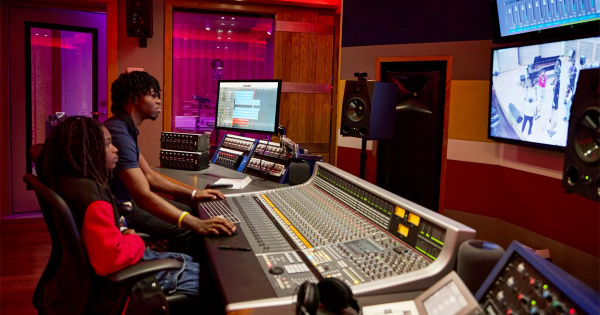
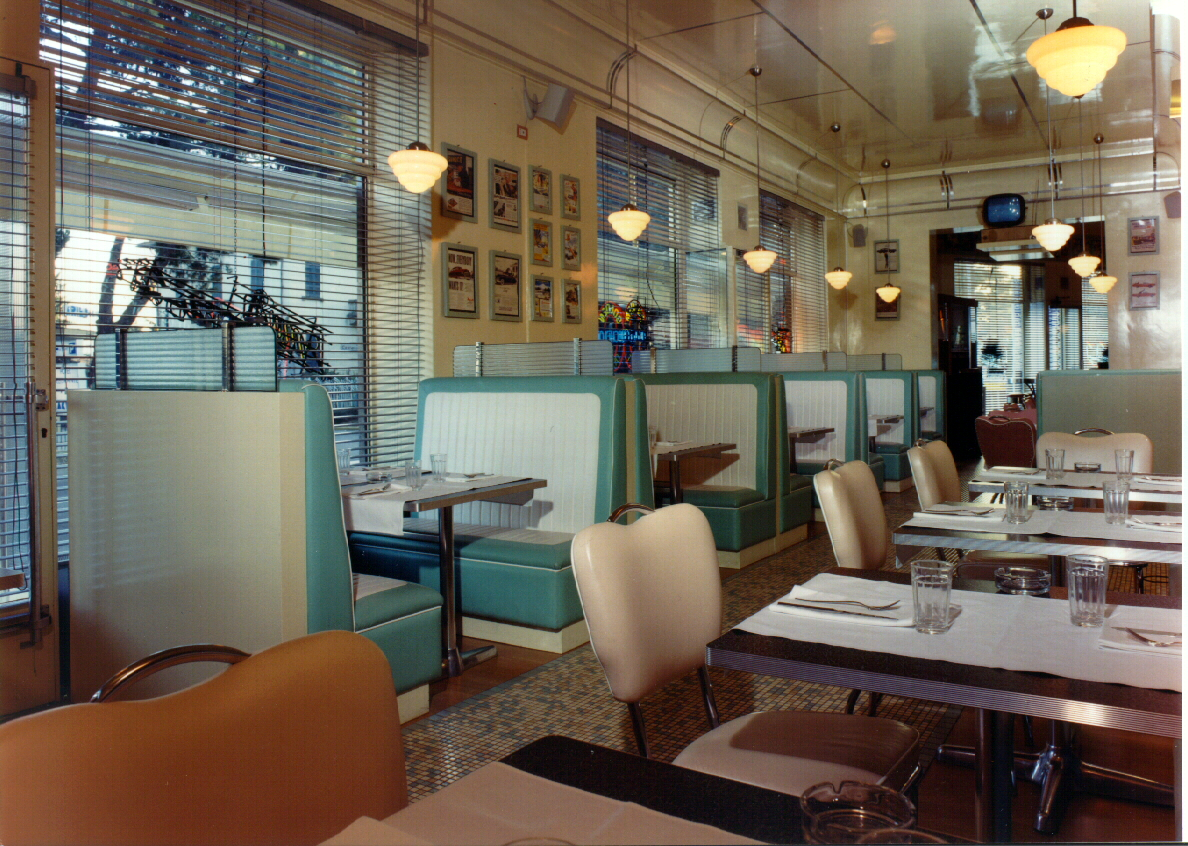
Architects: Want to have your project featured? Showcase your work throughArchitizerand sign up for ourinspirational newsletters.Architecture shapes how we perceive space how we move through it, how we feel within it, and ultimately, what we take away from the experience. A grand hotel lobby, all polished marble and towering ceilings, signals power and prestige. A dimly lit corridor, with its end just out of sight, stretches time, making every step more hesitant and uncertain. A cafe, with neat rows of booths and the heavy hum of fluorescent bulbs, should feel familiar and welcoming. That is, until the lighting is just a little too harsh, the symmetry is a little too perfect, or the exuberance is too over the top. Thats when things change. Architects understand this, and so did David Lynch.As a filmmaker, Lynch didnt just use locations as backdrops for scenes. He built experiences with the same precision any good architect would, carefully selecting materials, adjusting light levels, or forcing sightlines to evoke particular reactions. His sets, whether its the warm wood panelling of the Double R Diner or the eerie theatricality of Club Silencio, show his unmatched understanding of how space influences emotion. He knew that red velvet curtains dont just frame a scenethey absorb sound, close a space in, create an uncanny sense of isolation. A chevron-patterned floor isnt just a bold graphic choice. Its a pattern that tricks depth perception, making a room feel infinite and claustrophobic at once.With his passing, we reflect on the extraordinary depth of David Lynchs creative legacy not just in film, but in the way he shaped atmosphere, manipulated perception and turned everyday spaces into something layered with meaning. The following projects werent designed to mimic Lynchs films, but they tap into the same principles and mastery of place. These spaces, through contrast, repetition and material choices, guide interpretation just as Lynch so cleverly did, designing emotion as much as function. If his films teach us anything about architecture, its that a space is never just a space. Its an experience defined as much by what it suggests as by what it shows.The Double R Diner (Twin Peaks 1990)JULIETTES DINERBy: Andrea Langhi Design, Italy Its impossible to begin anywhere else. A roadside diner is an American institution. It promises comfort, routine and continuous coffee. In Twin Peaks The Double R Diner was never a typical diner. It was a controlled atmosphere where lighting, materiality and repetition combined into something that felt hyperreal. With its pastel booths, warm wood panelling and glowing pendant lights, it certainly did have the comfort, ritual and routine you would expect, but Lynch understood that when a space is too perfect, when every surface gleams, when every booth is neat as a pin, it stops feeling incidental and becomes unsettling.Juliettes Diner is a perfect example of this kind of heightened nostalgia. The colour palette is textbook mid-century Americana: mint-green and cream vinyl, pink leather chairs and checkerboard floors. The materials, chrome, laminate and glossy tile, reflect just enough light to make the space feel pristine and untouched by time. The lighting is carefully controlled, casting an even glow that flattens shadows, making everything feel crisp and defined. The effect isnt so much eerie, but it is certainly cinematic. A space so precisely composed that it almost feels lifted from a set.Club Silencio (Mulholland Drive, 2001)Bar LotusBy: Office AIO, Shanghai, ChinaMost of Lynchs sets exist only in film, but Club Silencio became real. Opened in 2011 beneath the streets of Paris as its first private members club, the venue was designed by Lynch himself down to the very last peanut on the bar, not as a replica of the films dreamlike cabaret but as an extension of the same idea.The design, if you can see it past the heavy crowds, is precise. Wooden block archways absorb sound, gold leaf tunnels catch the light just enough to shift focus, and the sharp neons create the ambient unease, so typically Lynch. The layout reinforces its purpose: the seating makes visitors passive spectators rather than active participants like those in the movies original theatre. The lighting changes subtly, ensuring that no moment feels entirely fixed. Even silence is deliberately engineered through soundproofing so that the absence of noise feels just as intentional as the thrumming music in the evenings when the general public are allowed to descend.Bar Lotus is designed with a similar sense of distorted reality. Its green archways creating a tunnel-like procession, framing the space while guiding movement and punctuating the atmosphere with pools of light. The rippled reflective ceiling skews the light and movement in the space, producing an atmosphere that feels in constant flux.The Red Room (Twin Peaks, 1990)Le StudioBy: Agence Spatiale, Quebec City, CanadaFew spaces in television history are as instantly recognizable as the Red Room. A dream world where reality is distorted. The relentless red curtains, the disorienting chevron pattern and the way the light pools in strange, uneven glows create a space that feels like its watching you.Le Studio taps into this same sense of theatricality. The deep red drapery stretches across the bar, swallowing sound, absorbing light and enclosing the space like a stage set waiting for something to begin. The lighting here is deliberate and feels performative. The round globes are suspended in looping formations that are both decorative and directional. The bar itself, clad in red vertical ridges, doubles the sense of enclosure, drawing the eye inward, while the raw concrete and black seating areas create a bold contrast and just enough darkness to make you aware of how the light is affecting the space.However, where the Red Room in Twin Peaks is designed to disorient, Le Studio is designed to immerse. It uses the same cinematic tools: repetition, contrast and materiality, but in this case, it channels them into an atmosphere thats immersive rather than unnerving.The Madisons Home (Lost Highway, 1997)BETON BRUTBy: tHE gRID Architects, Ahmedabad, India From the opening scene of Lost Highway, David Lynchs portrayal of Fred Madisons (Bill Pullman) home is unsettling because of its restraint. Its a space stripped down to its purest architectural elements walls, shadows, voids offering nothing unnecessary and certainly nothing personal. The small windows are intentionally limiting perspective, forcing the viewer to question whats hidden beyond them. It is architecture that holds power not by what it reveals but by what it withholds, much like the films main antagonist who resides there.Beton Brut operates with a similar sense of controlled minimalism, thankfully without the terrifying homeowner. Its sharp angles and raw concrete surfaces give it a monolithic presence, while the narrow, deeply set windows dictate precise slivers of light and visibility. There is no excess here, only structure, form and material. The architecture creates atmosphere through mass and proportion alone. Both the houses in Lost Highway and Beton Brut show architecture in its most stripped back yet commanding form.The Pink Room (Twin Peaks: Fire Walk With Me, 1992)MASSminorsBy: One Fine Day Studio & Partners, Guangzhou, China When people romanticize neon lighting, they usually reference some Blade Runnerstyle futurism. Lynch took neon and made it seedy. A magenta haze mixed with a swirl of smoke and sticky floors to boot. Even the camera seemed drunk in those scenes, spinning in the neon wash of red and pink. The Pink Room is a complete sensory onslaught of bright light and distorted sound, making everything feel slightly off-kilter. Its chaotic but deliberate, designed to pull people into its atmosphere.MASSminors is designed with that same heightened intensity. The deep red glow above the bar saturates the space. While the neon tubing, text projections and light washing are in contrast to the ornate detailing and modern art pieces. Its a dream-like space, where nothing sits comfortably together as every individual element is designed to consume attention, leaving no neutral ground. Like The Pink Room, it doesnt just set the sceneit is the scene.The Slow Club (Blue Velvet, 1986)The HookBy: NOOD, Atlantic City, New JerseyIn Blue Velvet, The Slow Club isnt what you would call extravagant but it is deliberate in its design. The main space is dark and full of atmosphere, while the stage, the central focal point, is backed by rich red velvet, as is Lynchs signature, with neon blue light forcing all attention on Dorothy Vallenss (Isabella Rossellinis) performance. Its overly saturated and hyperreal. Its a space designed entirely for mood and tension. Nothing distracts from the singer, yet the setting itself is not secondary. Its distinctively intense.The Hook, by NOOD, has this same hyperreality. Taking an even more elaborate approach than Lynch but with the same architectural intent, that is, to frame and heighten the act of performance using layering of embellishment and light. The proscenium is in sharp, geometric contrast to the heavy stage curtain, edged in blue neon, that acts to reinforce the separation between audience and performer. The seating layout is designed for immersion, while the rich colors, both material and light and the excessive objet dart create a heavily layered ambience that veers into oppressive. The elaborate patterns and intense lighting add to the surreal atmosphere that is a combination of theatrical glamour and grungy reality. The inclusion of an antler motif references Blue Velvets own club signage as a nod to the dramatic and strange.The Roadhouse (Twin Peaks, 1990)Best Friends: RoadHouse and MercantileBy: WOW atelier, Kanab, Utah The Roadhouse in Twin Peaks is quintessentially American. Its the kind of place that doesnt need reinvention. Wood, neon, a stage in the corner and a long history soaked into the floorboards are quite enough. Lynch understood this and he didnt distort the roadhouse archetype, he just turned up the contrast, sharpening its familiar edges until they felt mythic.Best Friends Roadhouse & Mercantile comes from that same architectural tradition but modernizes it. The extended overhang and exposed steel supports recall the classic roadside pitstop, while the mix of timber, metal and corrugated textures gives it a toughness suited to its desert landscape. The stacked firewood, the open-air seating, and the glow from within are all reminiscent of the historical roadhouse designed to be stopped at and gathered in across America.Both spaces lean into their setting one in the damp, pine-lined world of Twin Peaks, the other in the wide-open sprawl of the Utah desert. But they share the same core principle: a roadhouse is a waypoint, a landmark, a place where stories are told and retold.Architects: Want to have your project featured? Showcase your work throughArchitizerand sign up for ourinspirational newsletters.Top image: Blue Lounge Agli Amici 1887 by Visual Display Interior Architecture and Design, Udine, ItalyThe post Black Lodge and Blue Velvet: 7 Architectural Spaces That Blur Reality Like a David Lynch Film appeared first on Journal.